How to Draw a Female Face That Actually Looks Human
I still remember my first life drawing class like it was yesterday. I sat there, a brand-new stick of charcoal in hand, staring at a giant pad of newsprint, totally convinced I was about to create a masterpiece. An hour later? My paper was a smudged-up disaster. The face I’d tried to draw looked flat, weirdly distorted, and honestly, a little creepy. I was completely defeated.
In this article
My instructor, a quiet guy with permanently charcoal-stained fingers, came over. He didn’t say a word about my mess. He just took his own charcoal and, right next to my drawing, he drew a simple sphere. He showed me how a single light source created a bright highlight, a soft mid-tone, and a deep shadow. That little sphere taught me more than a dozen art books ever had. It hit me: drawing isn’t about tracing lines; it’s about understanding form.
For years now, I’ve filled countless sketchbooks with faces. This guide is basically everything I’ve learned, both from my own practice and from teaching others who started with that exact same frustration. It’s not a list of cheap tricks. It’s a deep dive into the solid foundation every good portrait is built on. We’ll look at the structure under the skin, the best tools for the job, and how the pros turn a flat circle into a living, breathing person. Let’s get into it.
First Things First: It’s All About Bone and Light
Before you even think about drawing an eye or a lip, you have to get this one thing straight: a face is not a collection of separate parts. It’s a soft layer of skin and muscle stretched over a hard, bony skull. Forgetting this is the #1 mistake beginners make. Their portraits end up looking like Mr. Potato Head, with features just floating on a page. Understanding the skull underneath will completely change your game.
The Skull: Your Hidden Blueprint
You don’t need a medical degree, but knowing a few key landmarks of the skull is a non-negotiable. These are the high points that catch the light and create the shadows that give a face its shape.
- The Cranium: This is the big, round part that holds the brain. We often start by drawing it as a simple ball, but it’s really more of an egg shape.
- The Brow Ridge: Feel that bony ridge right above your eyes? That’s it. It’s a huge plane change that casts the eye sockets into shadow, making them look deep and not just like flat ovals.
- The Cheekbones: These run from under your eye socket back toward your ear. They are a major high point on the face and usually catch a lot of light. The width and height of the cheekbones totally define the shape of a person’s face.
- The Jawbone: This creates the entire lower third of the face. Pay close attention to how it angles down from the ear before turning forward to form the chin. Getting that angle right is critical for a believable profile.
Seriously, take a moment and feel these points on your own face. It makes the whole concept feel real instead of like some abstract diagram in a book.
How Light Really Works
Okay, so light creates form. Without it, even a perfectly drawn face will look flat. Think of light as traveling in straight lines from a source, like a lamp or a window. When it hits the face, it creates a predictable pattern.
- Highlight: The brightest spot, where the light hits most directly.
- Mid-tone: The true color of the surface as it starts to turn away from the light.
- Core Shadow: The darkest part of the shadow on the object itself, right where the form turns completely away from the light.
- Reflected Light: This is the secret sauce! Light bounces off nearby surfaces (like a table or a shirt) and back into the shadow, making it not-so-dark. You’ll see this under the chin and jaw all the time.
- Cast Shadow: The shadow that the object throws onto another surface. Think of the shadow the nose casts onto the upper lip.
Try This Right Now: Go grab an egg from your fridge. Set it on the counter and shine your phone’s flashlight on it from one side. See if you can spot all five of those light effects. Sketch it! It’s the sphere lesson, but in your own kitchen. It’s a game-changer for your brain to see it in real life.
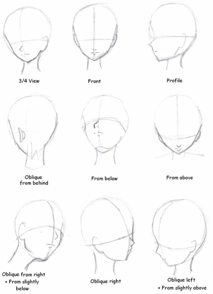
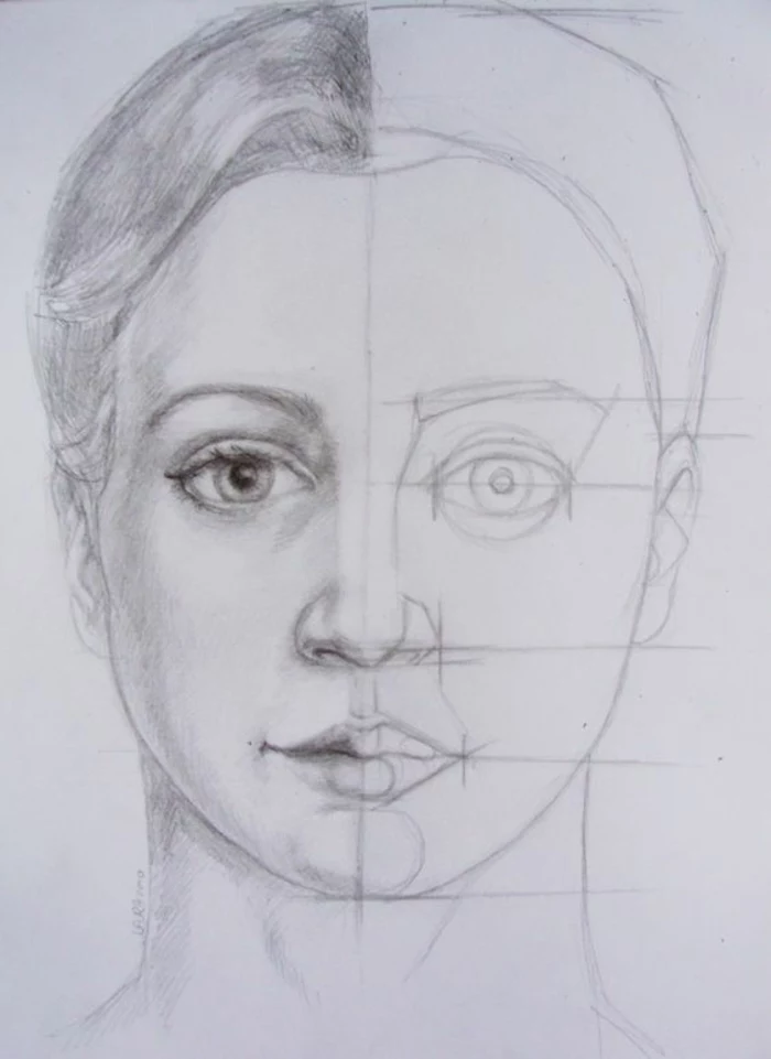
The Pro Method: Building a Head That Won’t Collapse
Over the years, many brilliant illustrators developed reliable methods for constructing the head so you don’t have to guess where the features go. One of the most trusted techniques starts with a simple ball but quickly turns it into something that feels three-dimensional.
Let’s walk through it. Grab a pencil and some paper.
- Start with a Ball: Lightly draw a circle. This is the main part of the cranium. Keep your lines light because we’re going to erase them later.
- Slice the Sides: Now, imagine that circle is a styrofoam ball. You’re going to shave a flat section off both the left and right sides. This creates two flat oval-like planes. This simple step is what stops the head from looking like a balloon and gives it structure. The ears will eventually go on these planes.
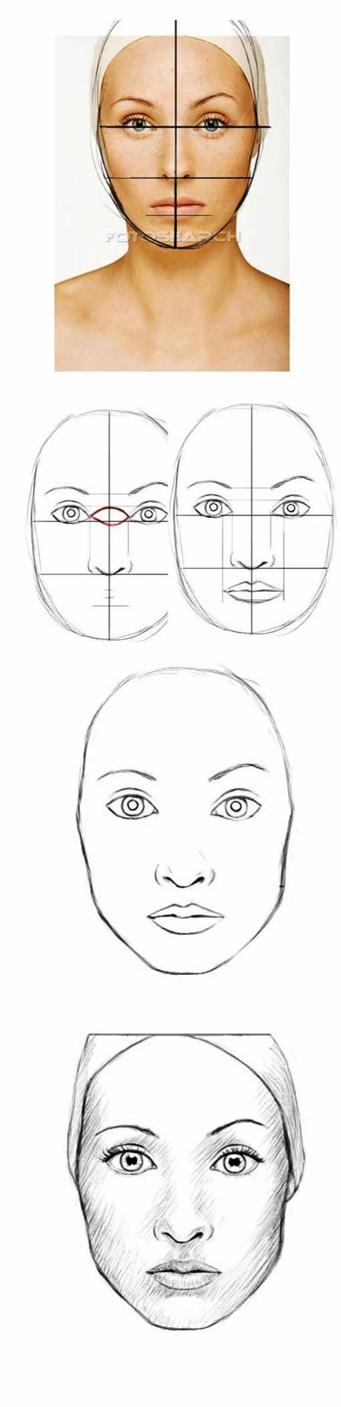
- Wrap Your Center Lines: This is the most important step! Draw a line that wraps vertically all the way around the ball, dividing it in half. This is the center line of the face. Then, draw a horizontal line that wraps around the middle of the ball. This is your brow line. If the head is tilted down, these lines will curve down. If it’s tilted up, they’ll curve up. This is how you show the head’s position in space.
- Drop the Jaw: Find where your brow line is. Measure the distance from that line to the bottom of the ball—that distance marks the bottom of the nose. Now, take that same measurement and measure down one more time from the bottom of the nose. That spot marks the bottom of the chin. Sketch in a simple jawline connecting the flat side planes down to that chin point. Boom. You’ve just created the classic proportions of the face.
Even after all this time, I still start every single portrait with this basic scaffolding. It’s my insurance policy against putting an eye where an ear should be.
Your First Portrait Drawing Kit (for Under $25)
You really don’t need a ton of expensive gear, but the right tools make a world of difference. Here’s a super simple shopping list to get you started without breaking the bank. You can find all this stuff at an art store like Blick or even online.
- Pencils: Don’t just grab a school pencil. Get a few graphite artist pencils. I’d recommend starting with a 2H (for light construction lines), an HB (your all-purpose workhorse), and a 2B (for nice, dark shadows). A brand like Staedtler or Faber-Castell is great, and they usually cost about $2 each.
- Paper: For practice, a big pad of newsprint is cheap and perfect. For a finished piece, a Strathmore 400 Series sketchpad (around $10-$12) is fantastic. It has a nice surface that’s easy to work on.
- Erasers: You need two. First, a kneaded eraser (looks like a gray square of putty, costs about $2). You can squish it into any shape to lift out soft highlights. Second, a stick eraser like the Tombow Mono Zero. It’s like a mechanical pencil but with a tiny eraser tip, perfect for erasing sharp details.
- Blending: You can use your fingers, but they leave oils on the paper. Grab a blending stump or a tortillon. It’s just tightly rolled paper that lets you smudge and blend your pencil marks smoothly.
Placing the Features (and Avoiding Common Mistakes)
With the head structure built, we can start placing the features. A huge pitfall is drawing what you think an eye looks like (a symbol) instead of what it actually looks like (a form).
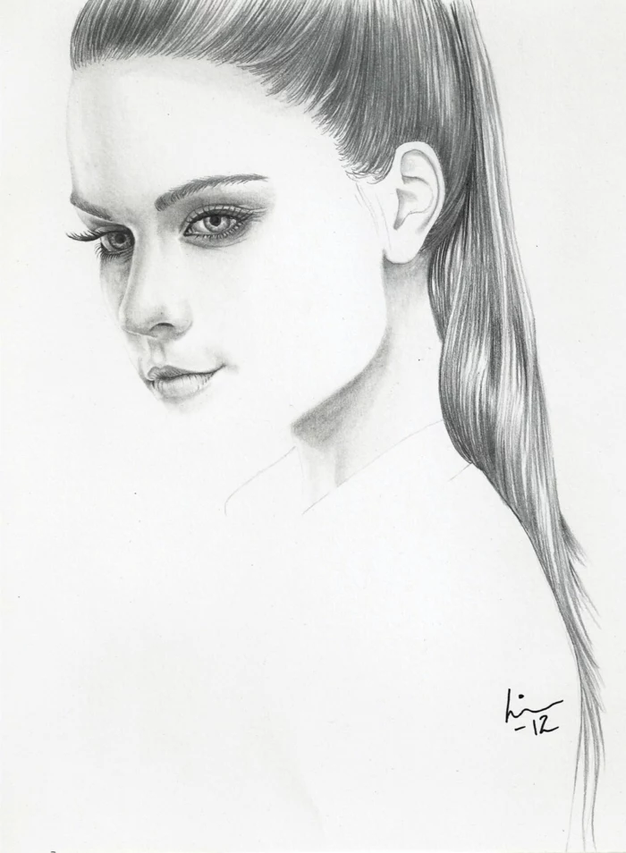
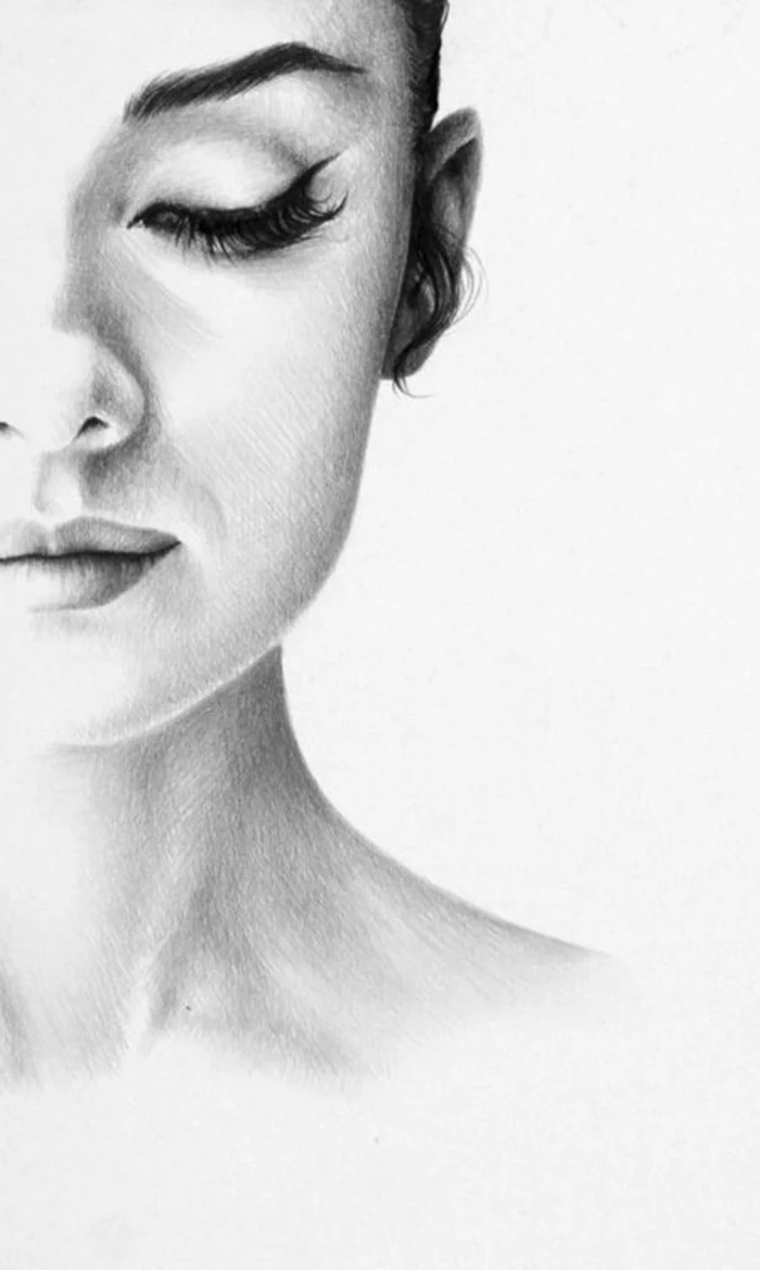
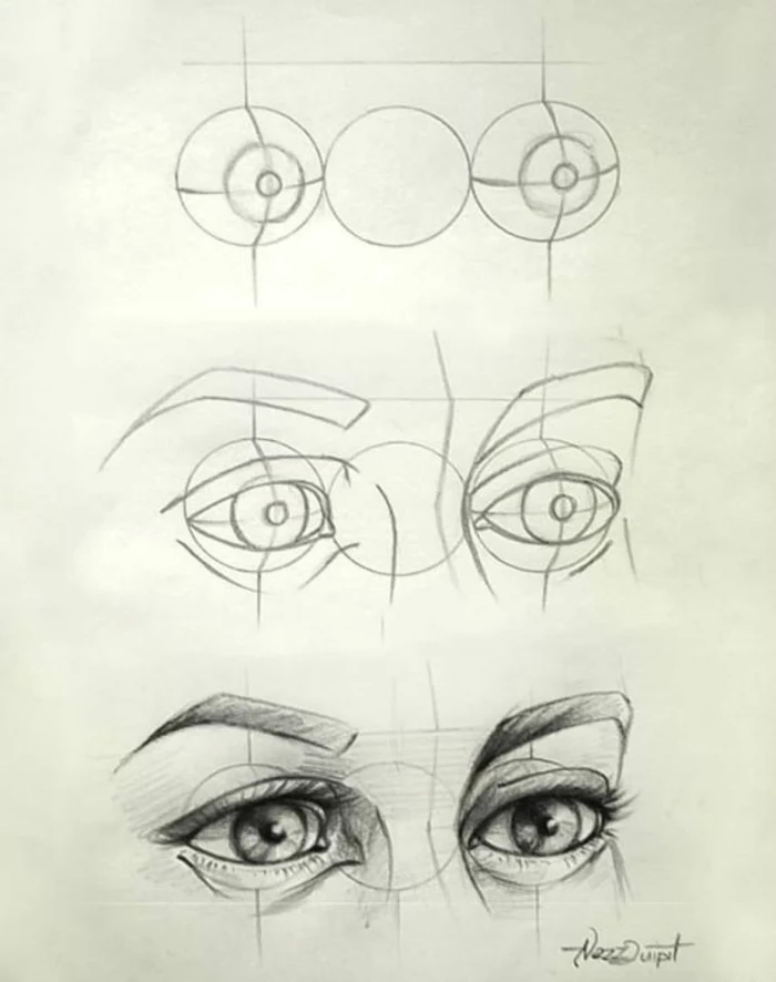
The Eyes: They’re Spheres, Not Stickers
Common Mistake: My eyes look like flat stickers on the face.
The Fix: Always remember that the eyeball is a sphere tucked into a socket. The eyelids aren’t thin lines; they’re thick pieces of flesh that wrap around that sphere. Notice the thickness of your own lower eyelid!
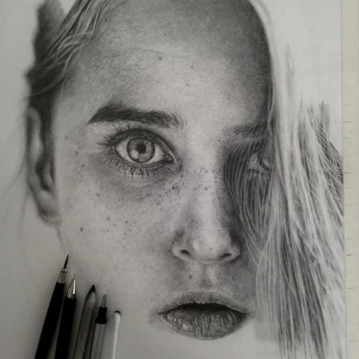
And here’s a pro tip: never leave the whites of the eyes pure white. Since the eyeball is a sphere, it will have shadows on it as it curves away from the light. A little bit of light grey shading makes the eye look round and believable.
The Nose: A Wedge of Planes
Don’t just draw two lines for the nose and a circle for the tip. Think of the nose as a simple wedge shape. It has a front plane (the bridge), two side planes, and a bottom plane where the nostrils are. By shading these planes based on your light source, you build the form of the nose without drawing a single hard outline. The nostrils aren’t just two black dots; they are openings with shape and depth.
The Mouth: Think in Threes
The lips curve around the cylinder of the teeth. The upper lip is often described as being made of three soft, pillowy forms (a central one and two smaller ones to the sides). The lower lip is typically two larger forms. By the way, the upper lip is almost always in shadow compared to the lower lip, which tends to catch more light from above. That line between the lips? It’s never just a simple curve. It has subtle dips and turns that are unique to every person.
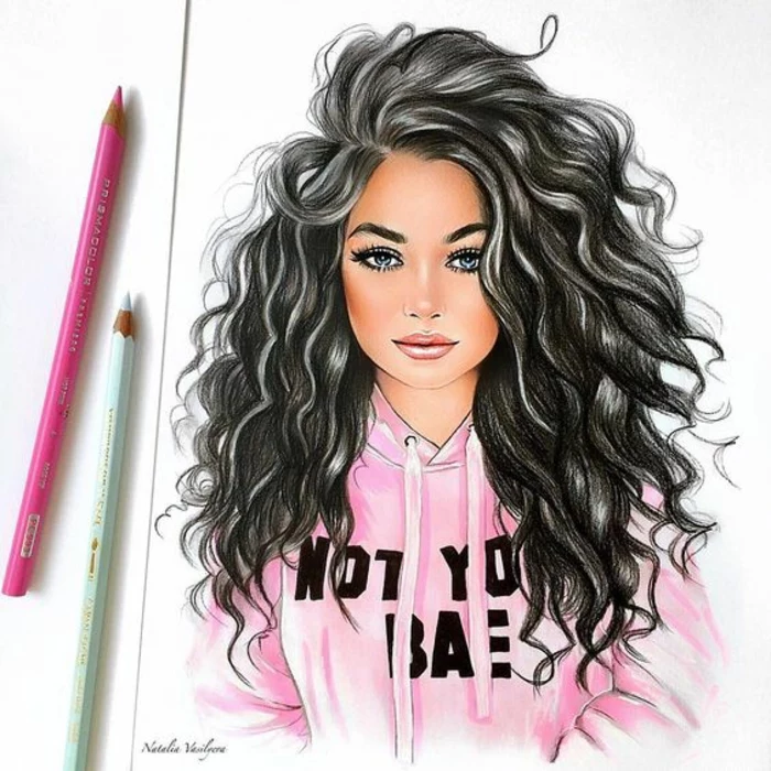
A Few Tips for a More Feminine Look
While every face is unique, there are some general characteristics you can emphasize for a portrait that reads more traditionally feminine. Keep these in mind as you observe your subject:
- Softer Jawline: Often, the angle of the jaw is less sharp and the chin is more rounded or pointed compared to a more masculine structure.
- Less Prominent Brow: The brow ridge is typically less pronounced, creating a smoother transition from the forehead to the eyes.
- Larger Eyes (Proportionally): The eyes can appear slightly larger in proportion to the rest of the face.
- Fuller Lips & Defined Cheekbones: Emphasizing the soft forms of the lips and the high plane of the cheekbones can enhance a feminine look.
Again, these are just generalities, not rules! The most important thing is to draw what you actually see.

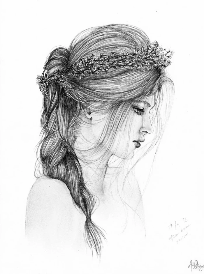
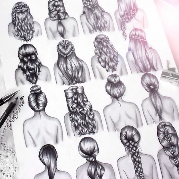
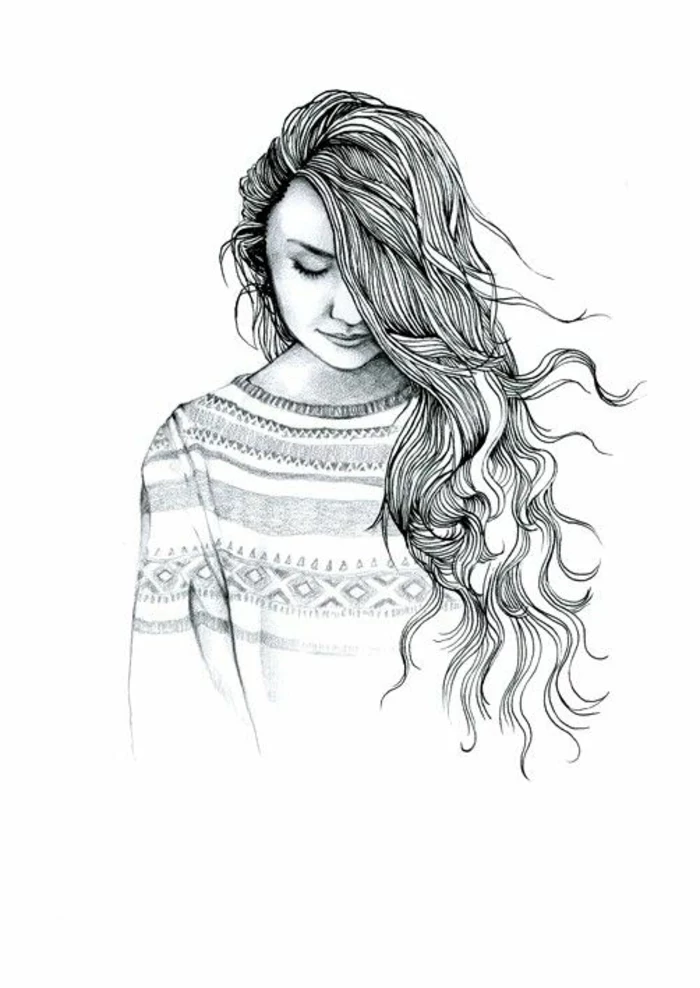
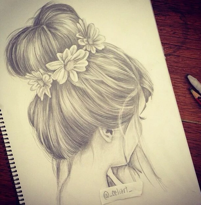
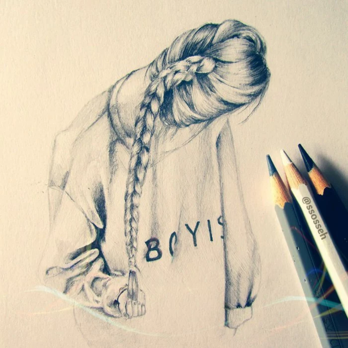
That Dreaded Hair: From Spaghetti to Silk
Hair is so intimidating. For years, my students would draw what I call ‘spaghetti hair’—just a tangled mess of individual lines. The breakthrough comes when you stop thinking about single strands and start seeing hair as large, simple masses.
First, block in the entire shape of the hair. How does it sit on the head? Hair has volume; it doesn’t just stick to the skull. Once you have the overall silhouette, look for the big ribbons or clumps of hair. These clumps have a light side, a mid-tone, and a shadow side, just like any other object. I use the side of a soft pencil (like a 2B) to shade in the big shadow shapes first. Only after those masses are established do I come in with a sharp point to add a few dark, precise lines to suggest individual strands. Then, I use my kneaded eraser, shaped into a sharp edge, to pull out some bright, clean highlights. It’s the contrast between the soft masses, dark accents, and bright highlights that creates the illusion of realistic hair.
The Nitty-Gritty: Time, Safety, and Staying out of Trouble
A few practical things to keep in mind. A detailed portrait can take anywhere from 5 to 30 hours. Be patient. The hours you put in are the real secret ingredient.
Heads up on safety! Drawing for hours can lead to repetitive strain injury in your wrist and hand. I learned this the hard way on a tight deadline. Take breaks, stretch your hands, and check your posture. Also, if you use a fixative spray to protect your finished drawing from smudging, always use it in a well-ventilated area, preferably outside. That stuff is no joke to inhale.
And finally, a little about professionalism. Using photos from the internet is fine for practice, but if you want to sell or display a drawing based on a photo someone else took, you could be violating their copyright. It’s always best to work from your own photos or from a live model. If you are drawing a specific person for a commercial project, it’s standard practice to have them sign a model release. It just protects both of you.
The Journey Is the Masterpiece
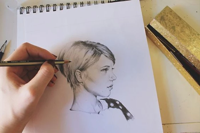
Drawing a face is a massive challenge. It’s part technical skill, part emotional interpretation. The methods I’ve laid out here aren’t a rigid formula, but a rock-solid foundation. Practice them, change them, and make them your own. Fill those sketchbooks. If you ever get the chance, take a life drawing class—nothing beats drawing a real person.
Remember that simple sphere my instructor drew? Every complex face you’ll ever draw is built from those same basic principles of structure and light. Be patient, stay observant, and most importantly, have fun with it. The skill you build with every single drawing is the real prize.
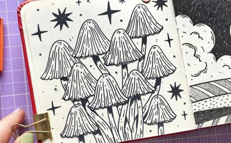
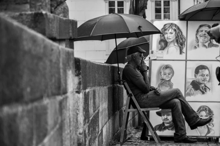
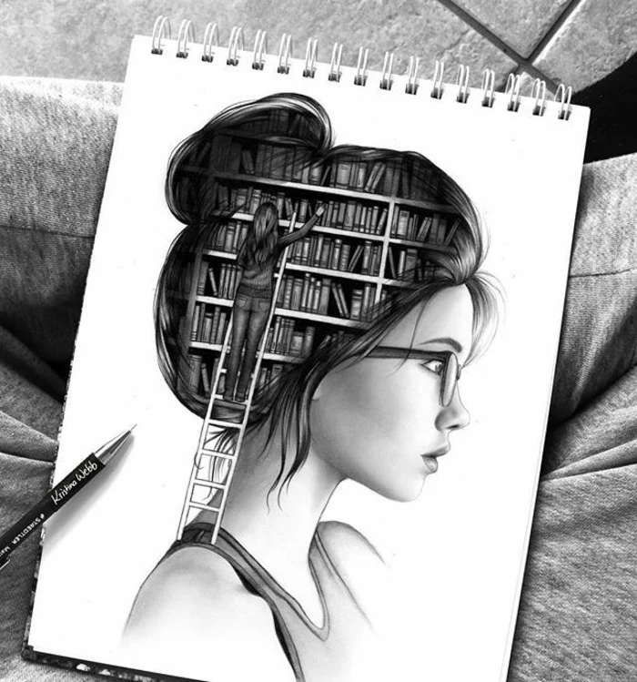
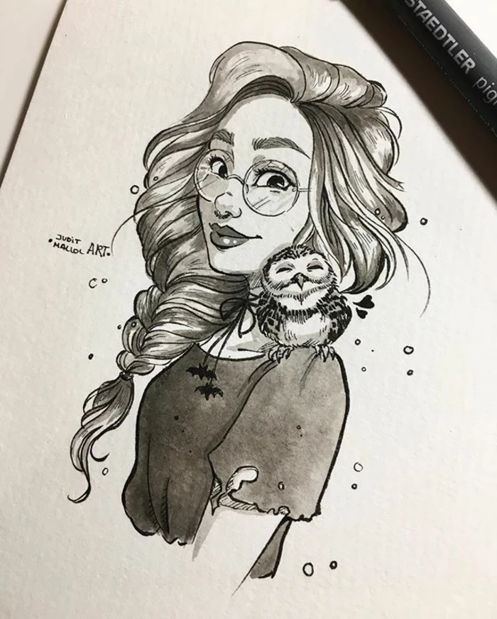
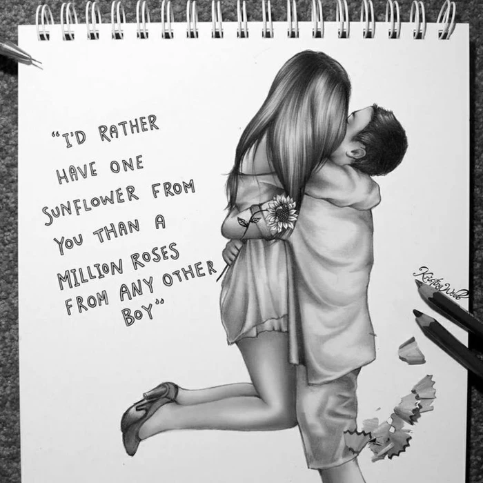
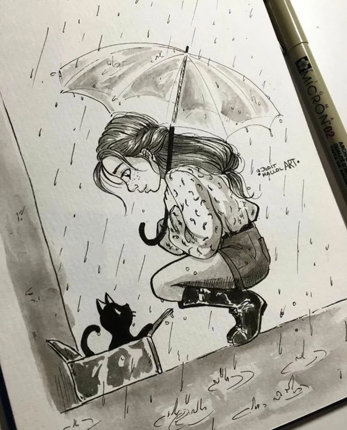
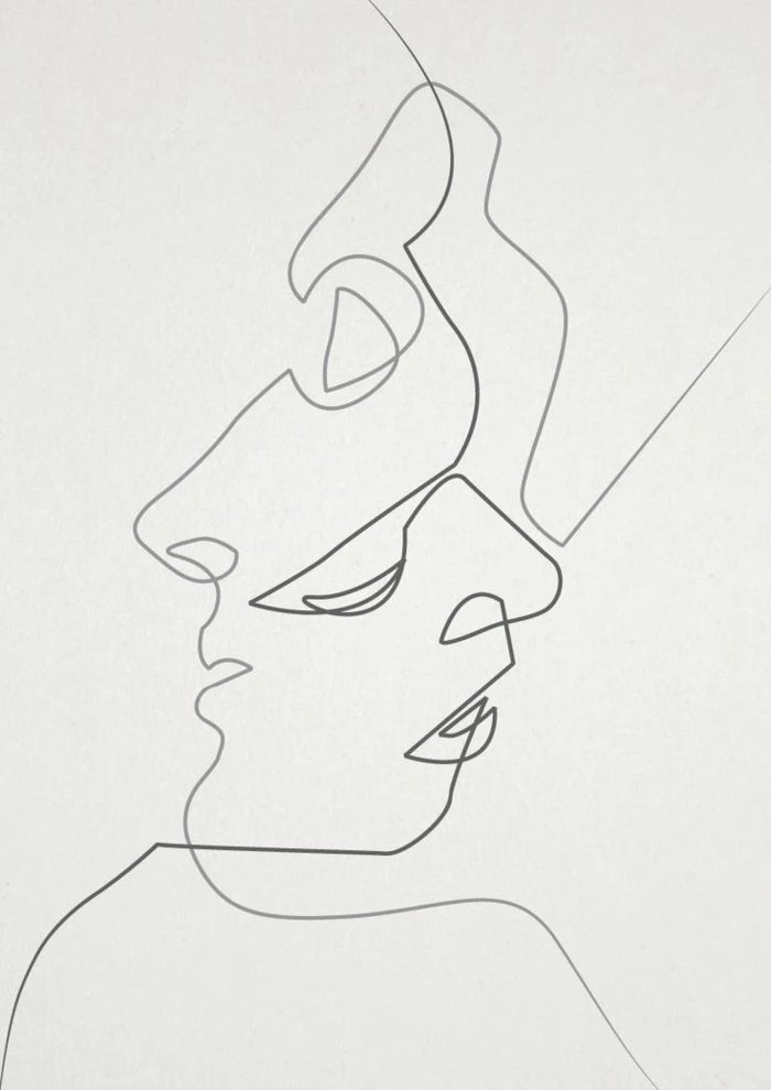
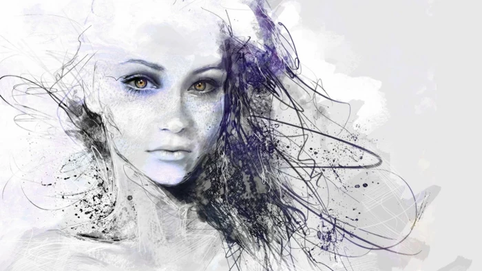
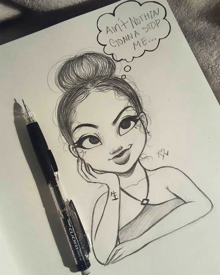
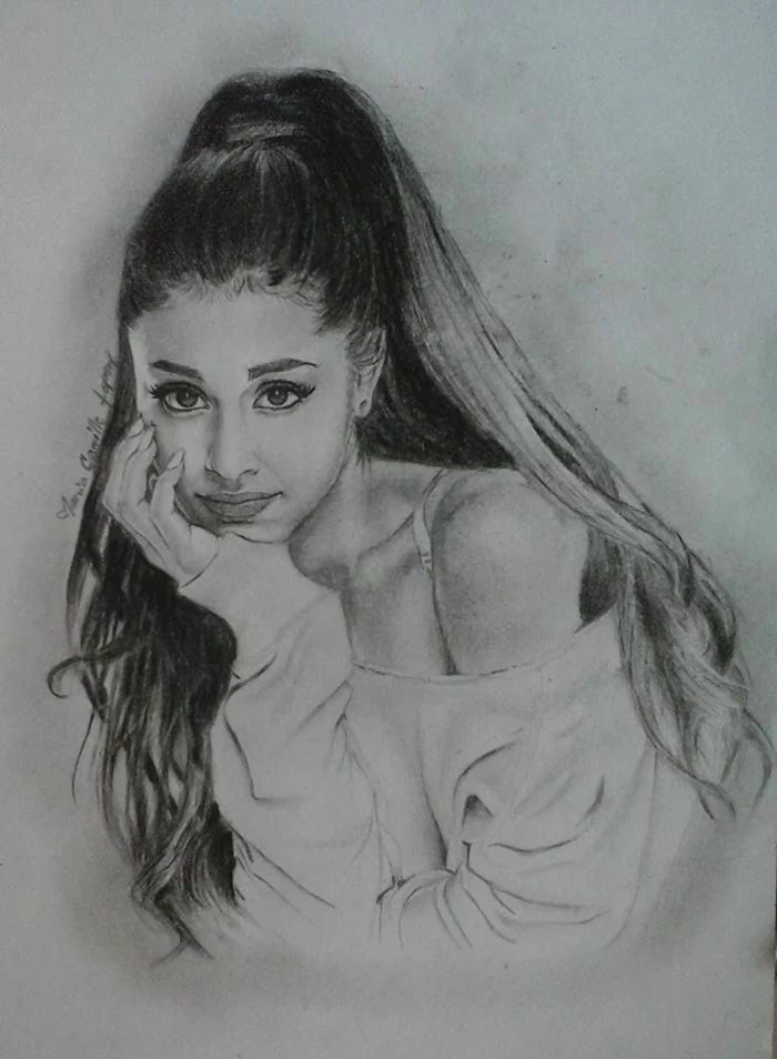
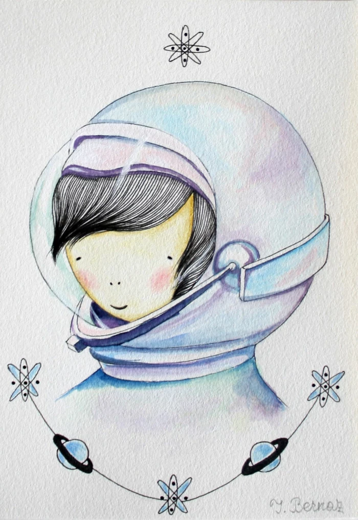
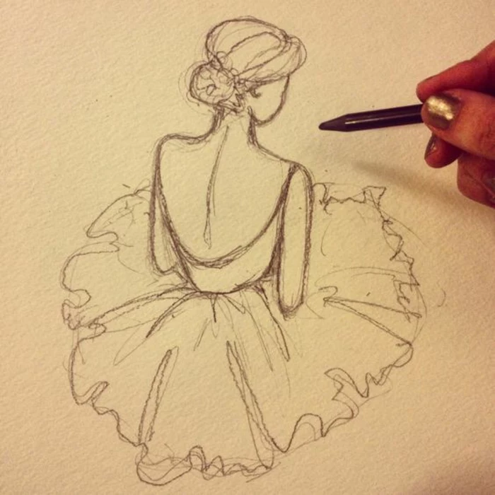
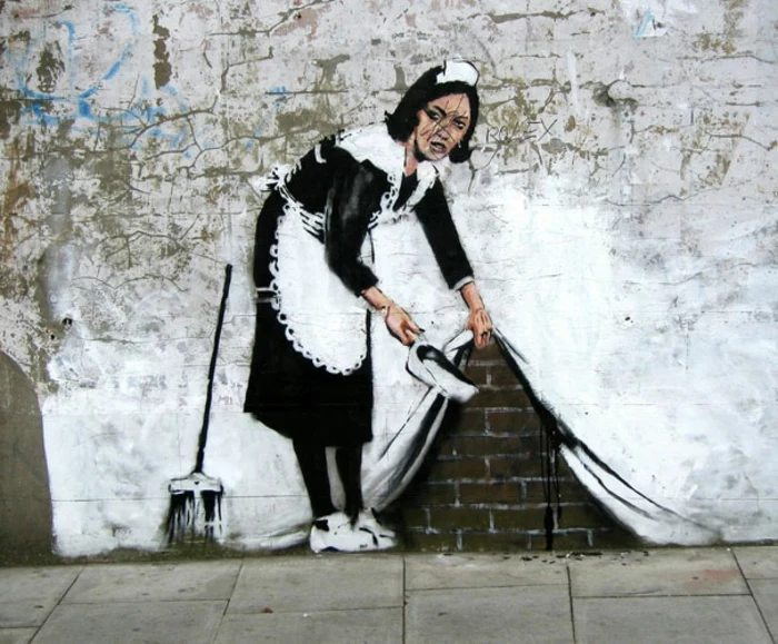
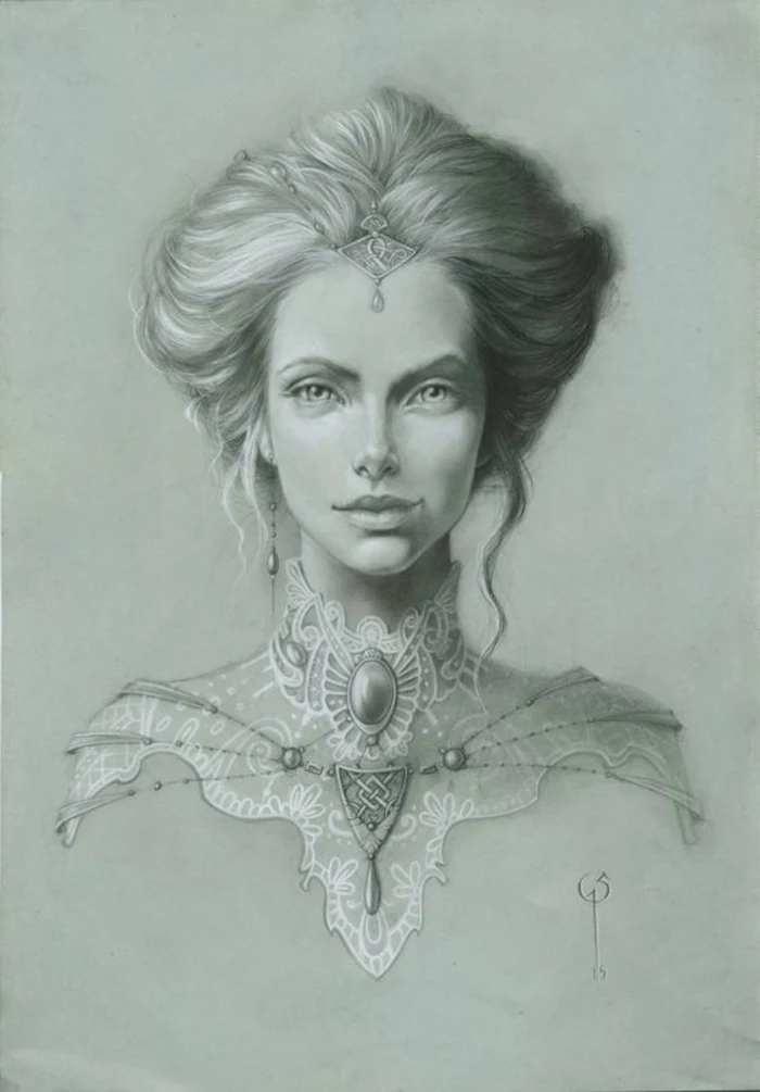
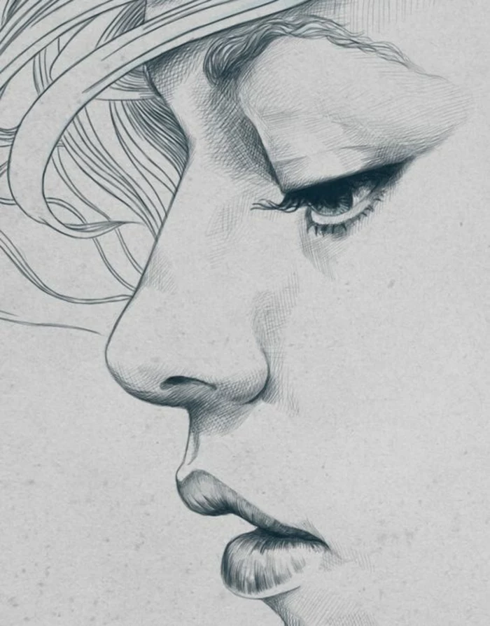
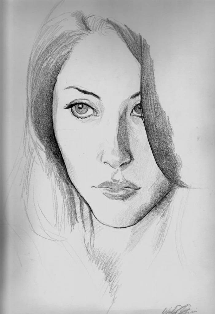
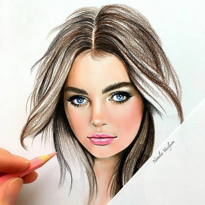
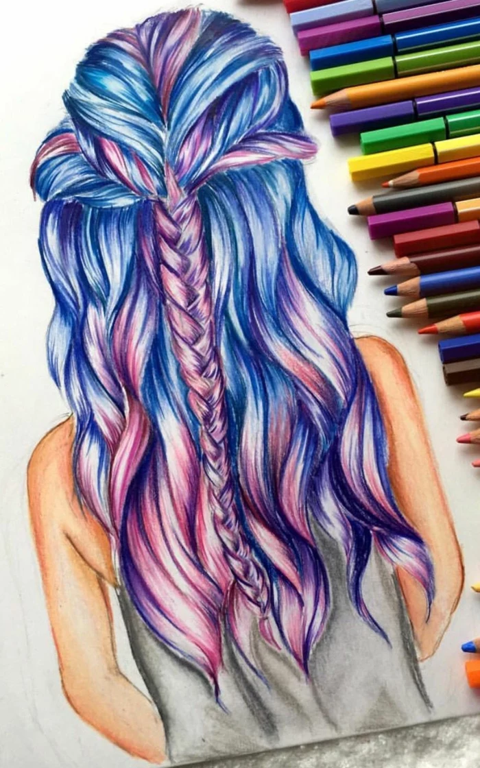
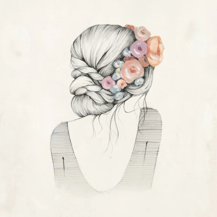
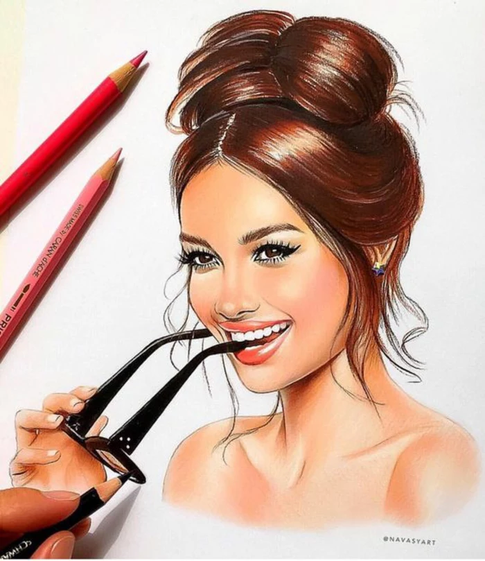
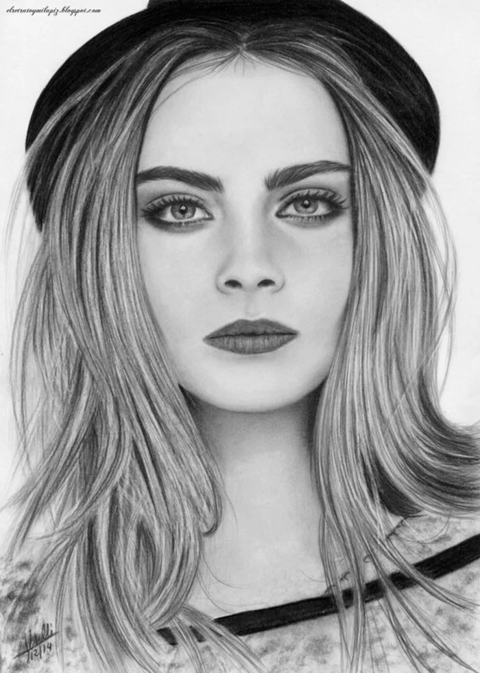
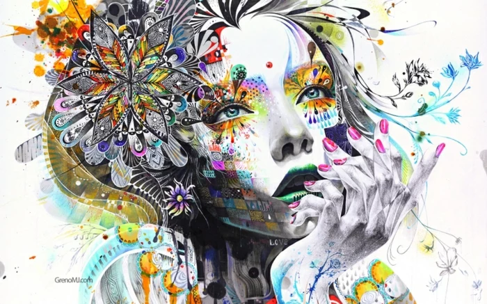
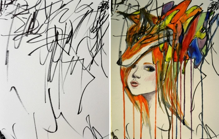
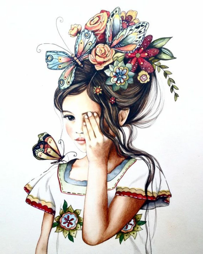
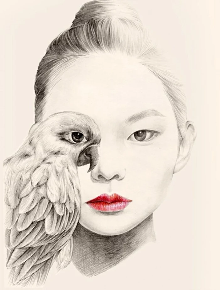
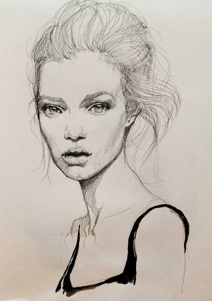
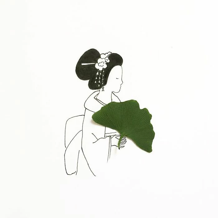
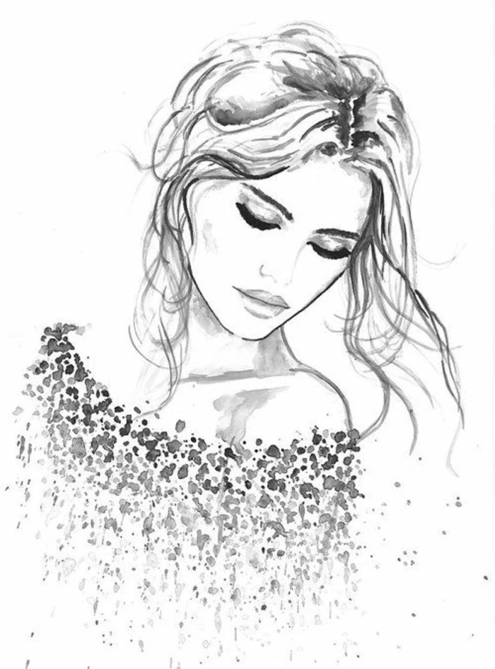
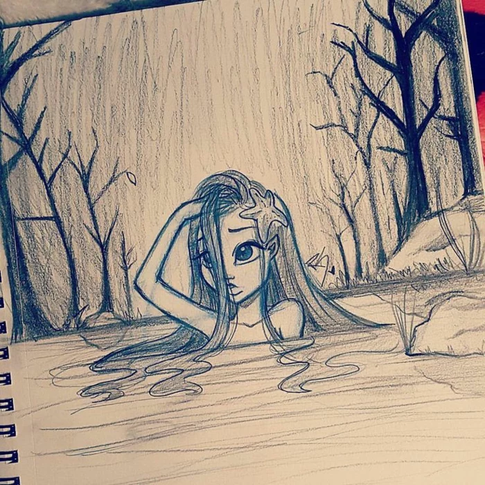
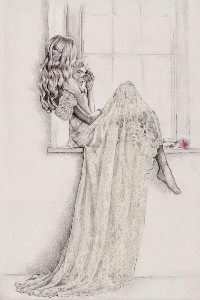
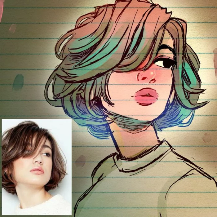
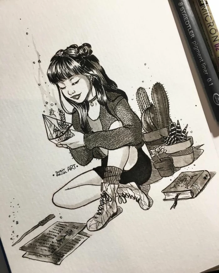
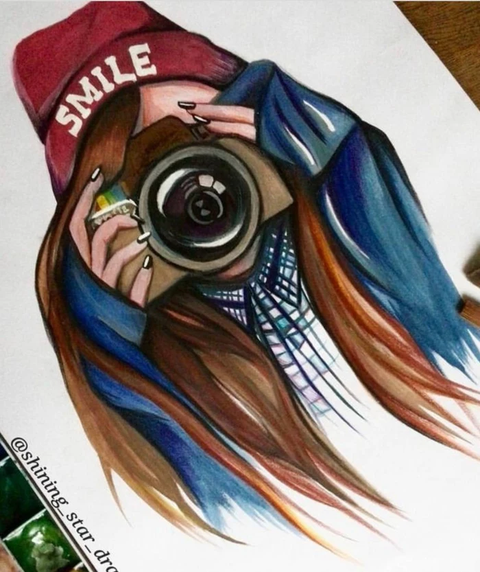
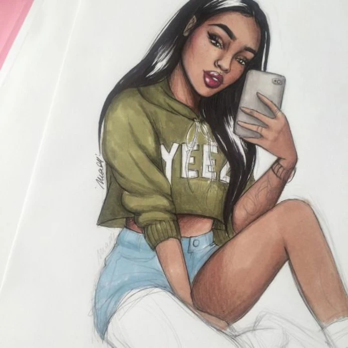
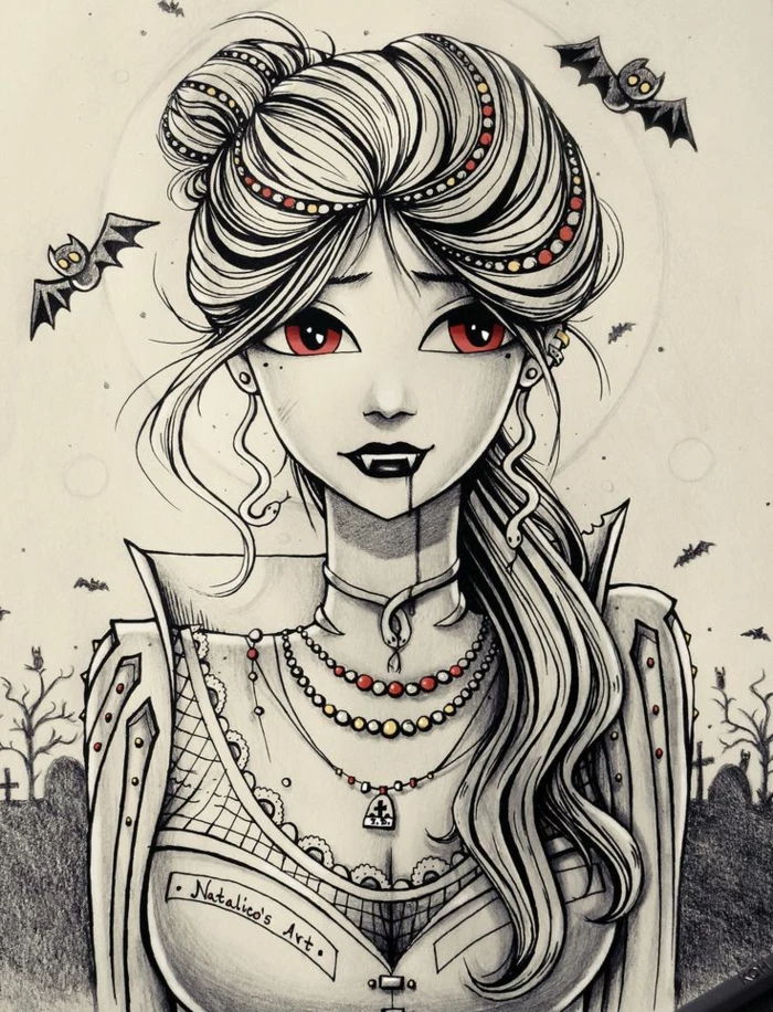
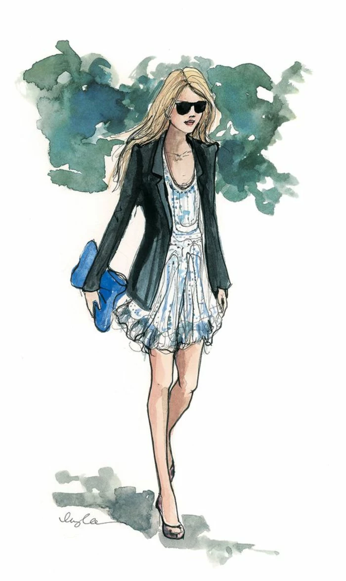
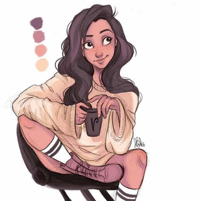
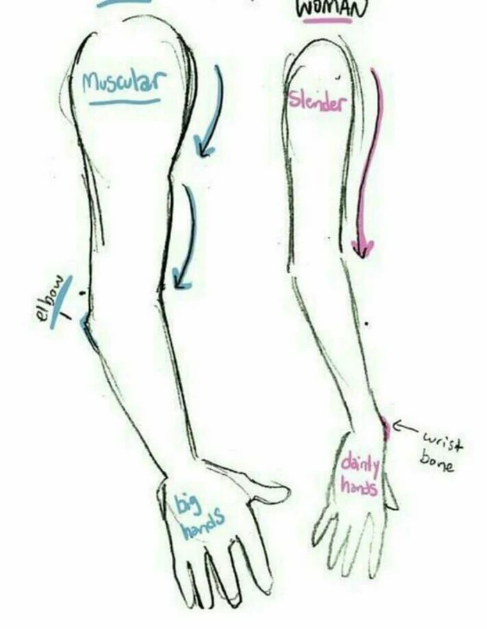
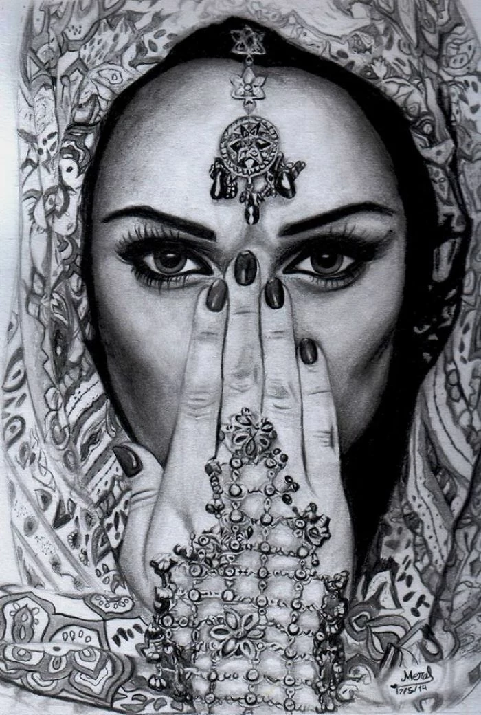
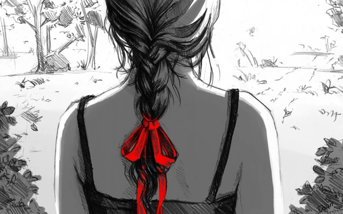
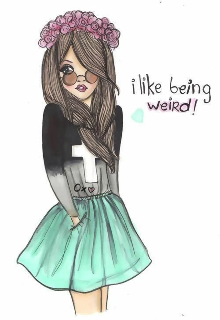
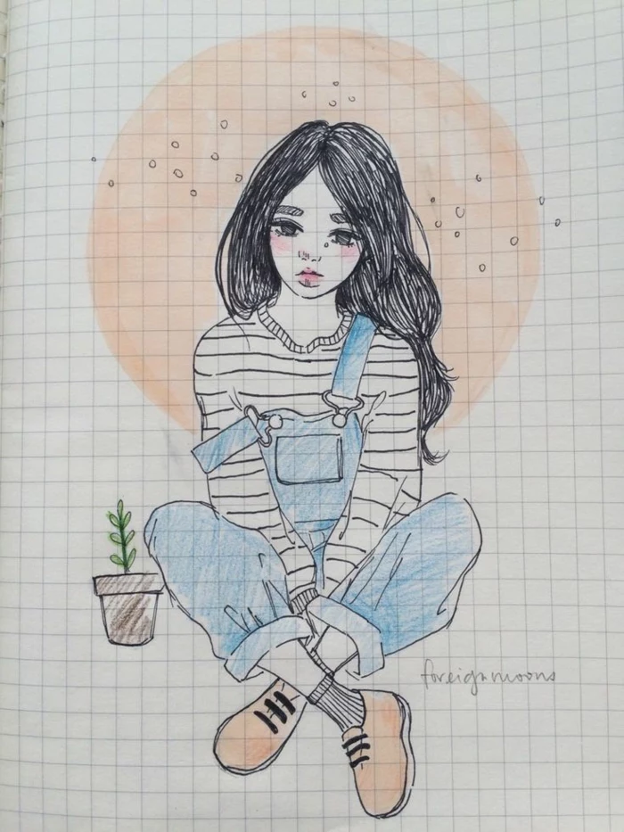
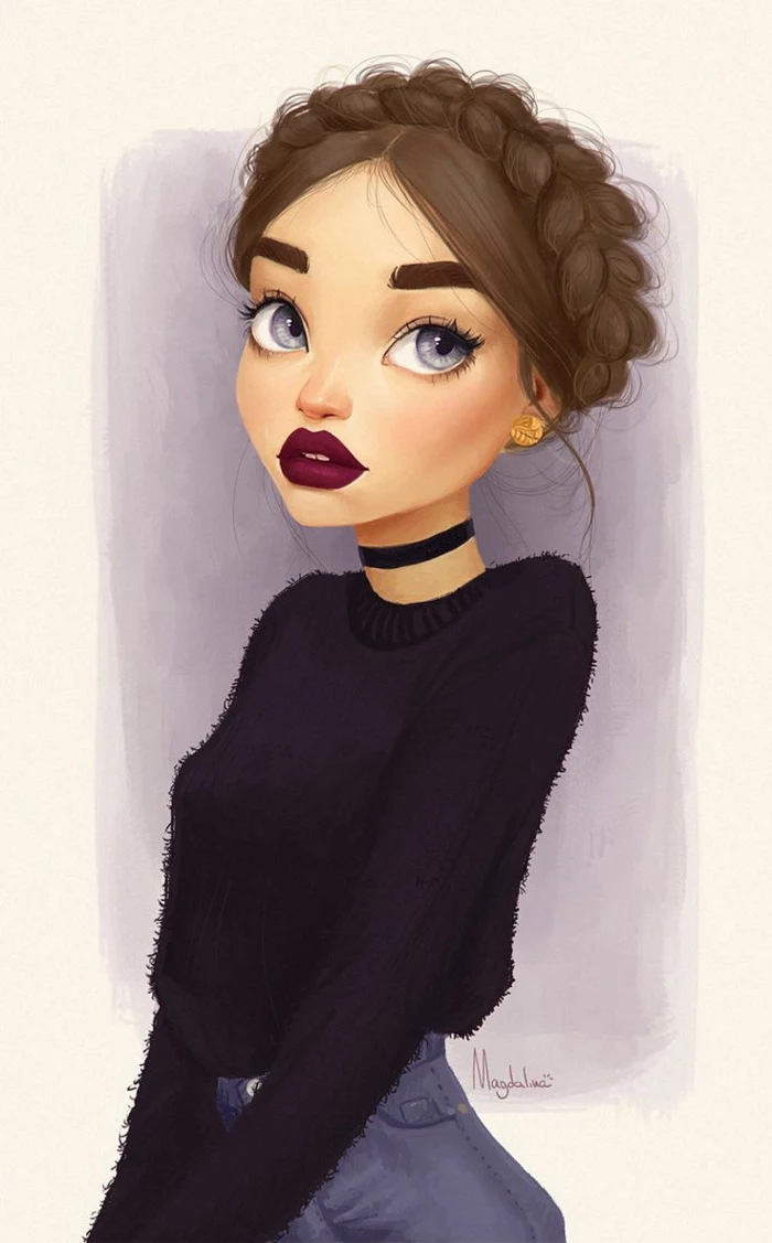
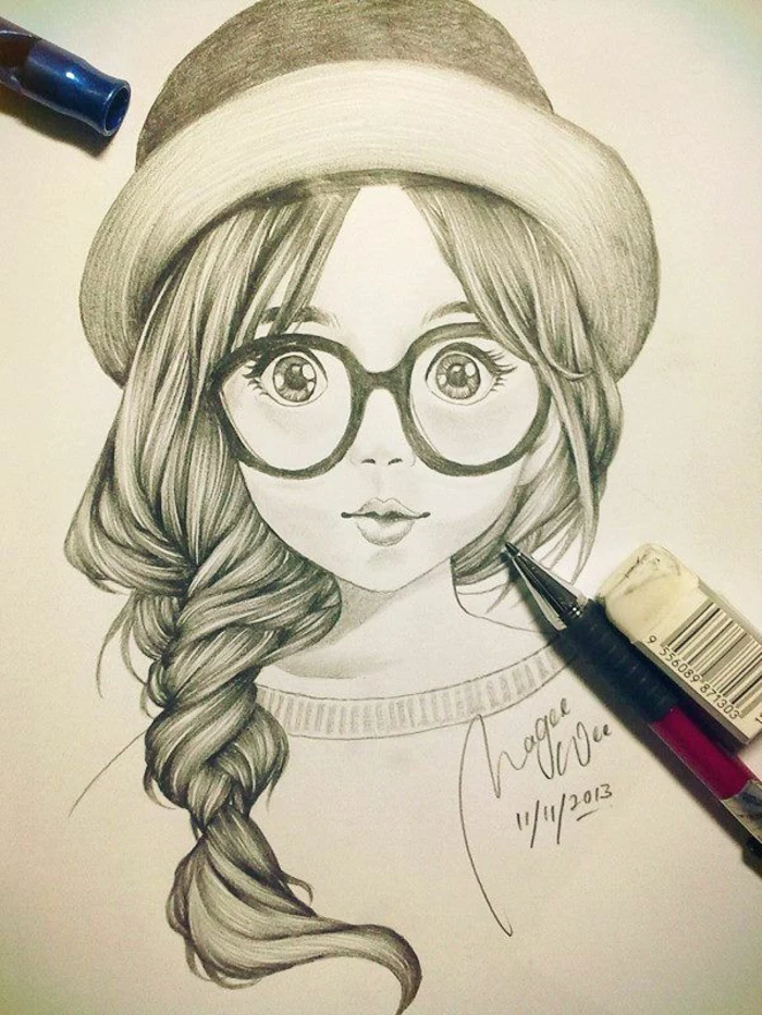
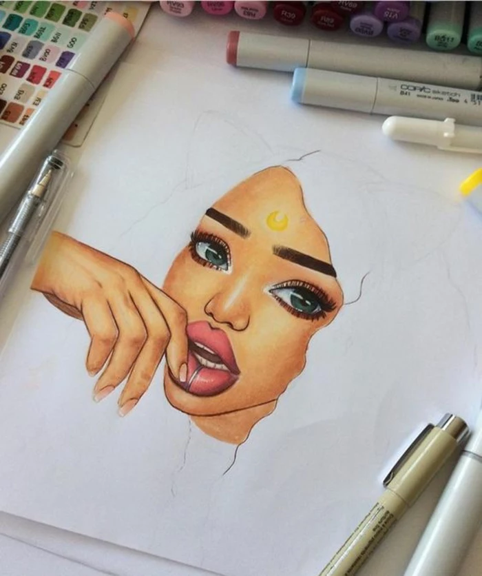
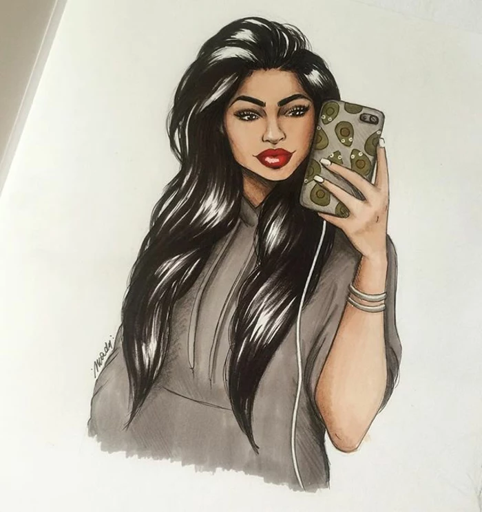
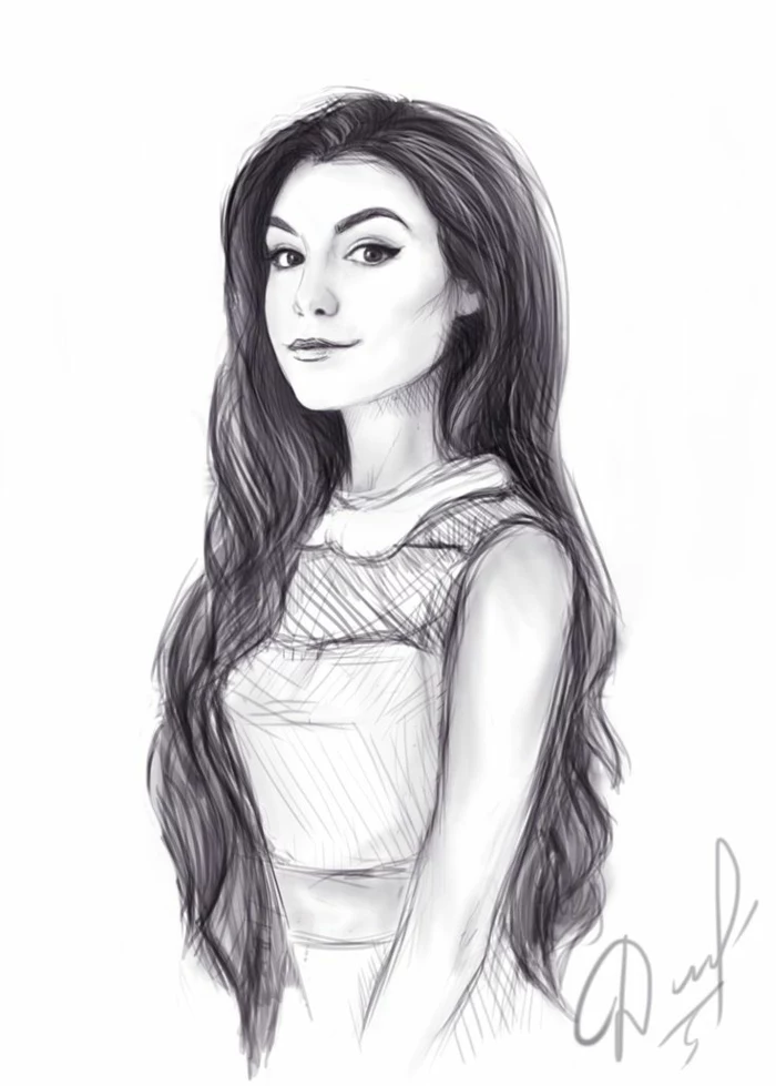
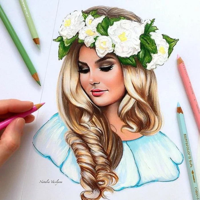
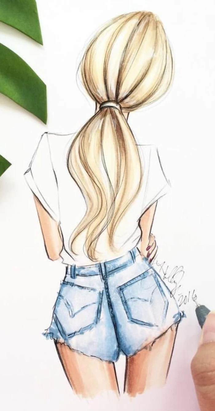
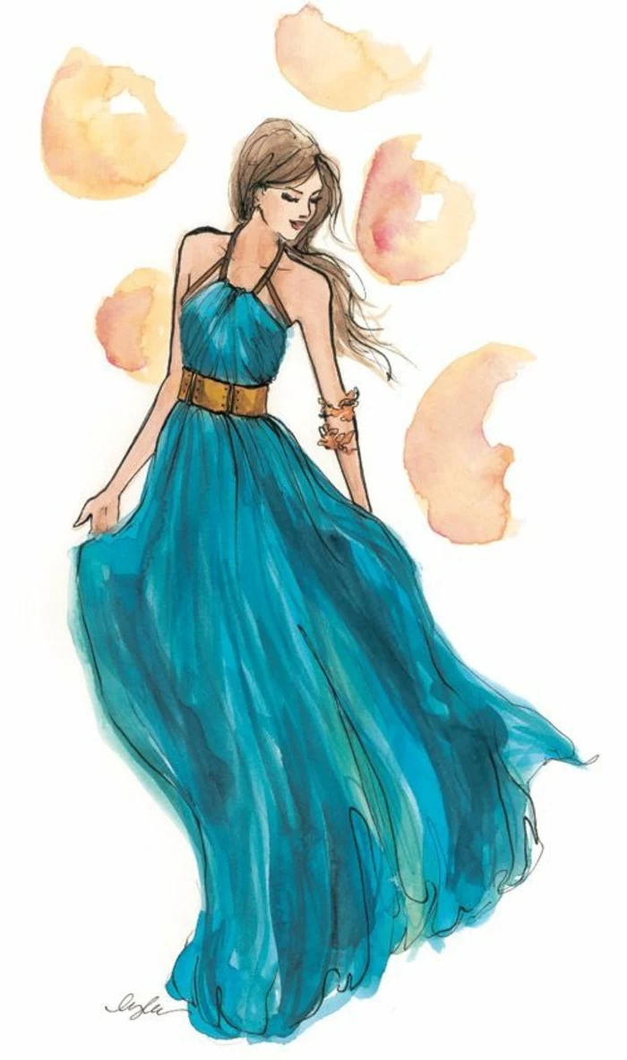
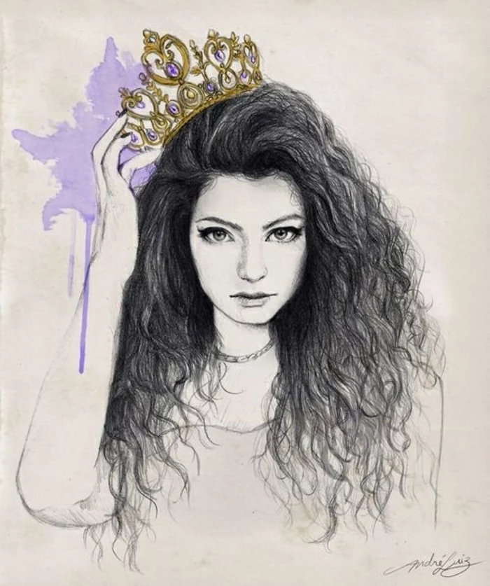
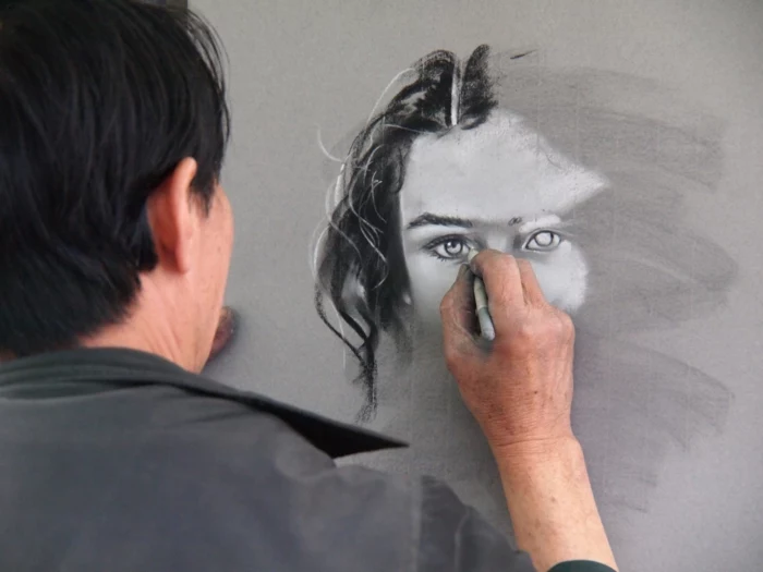
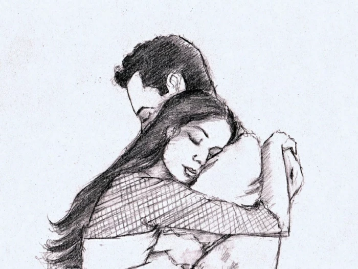
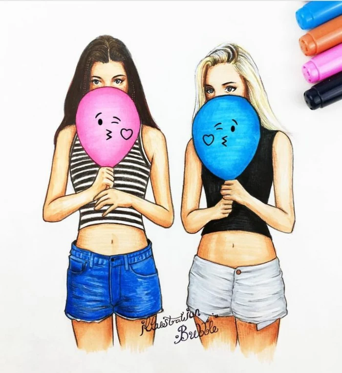
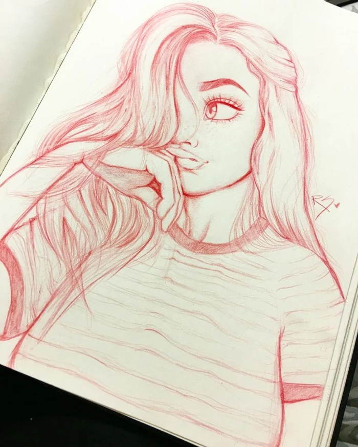
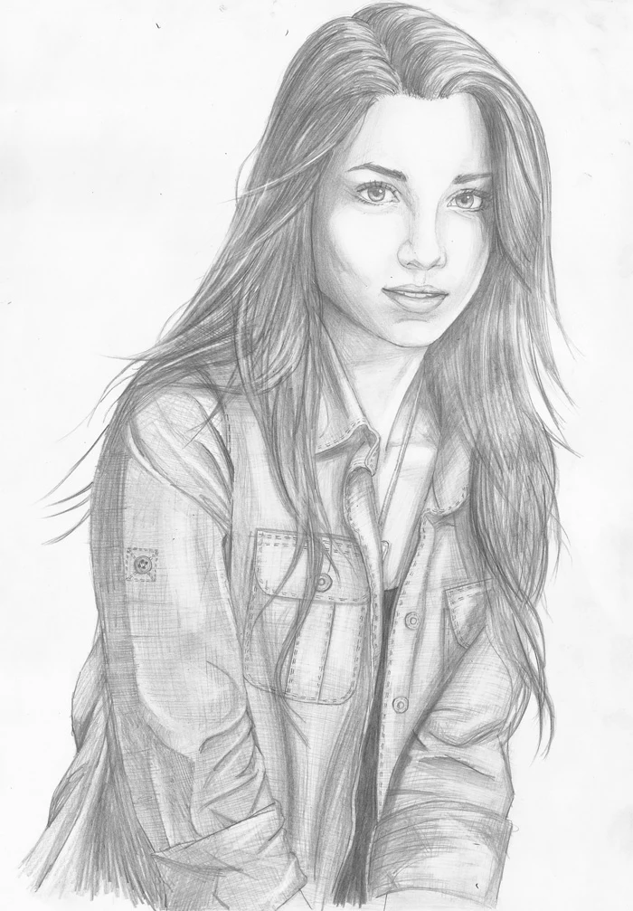
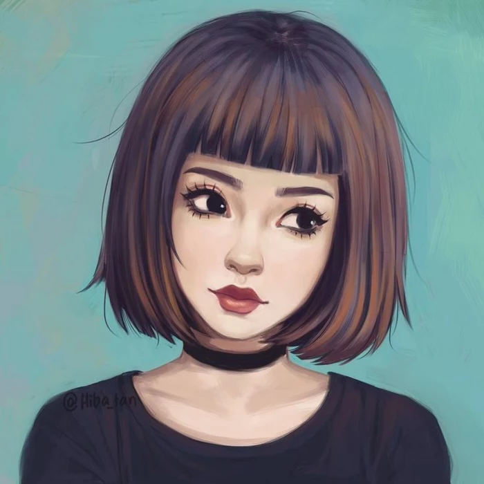
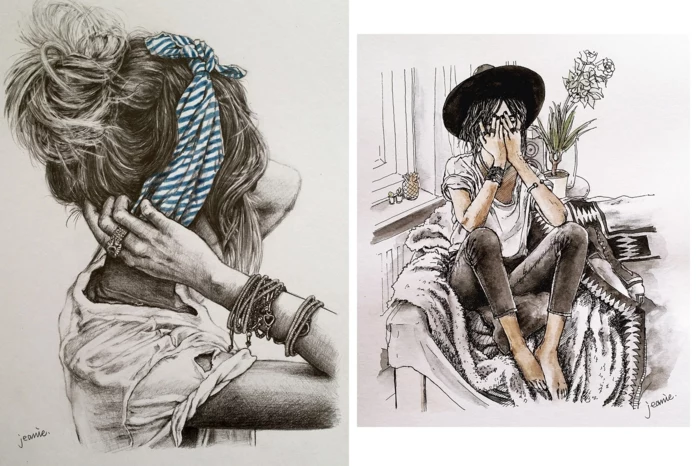
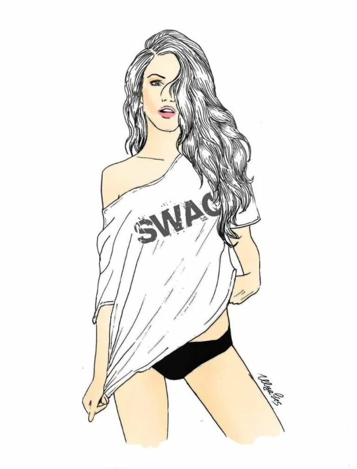
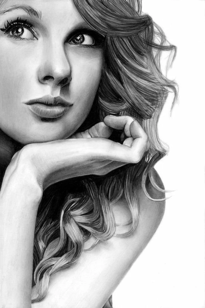
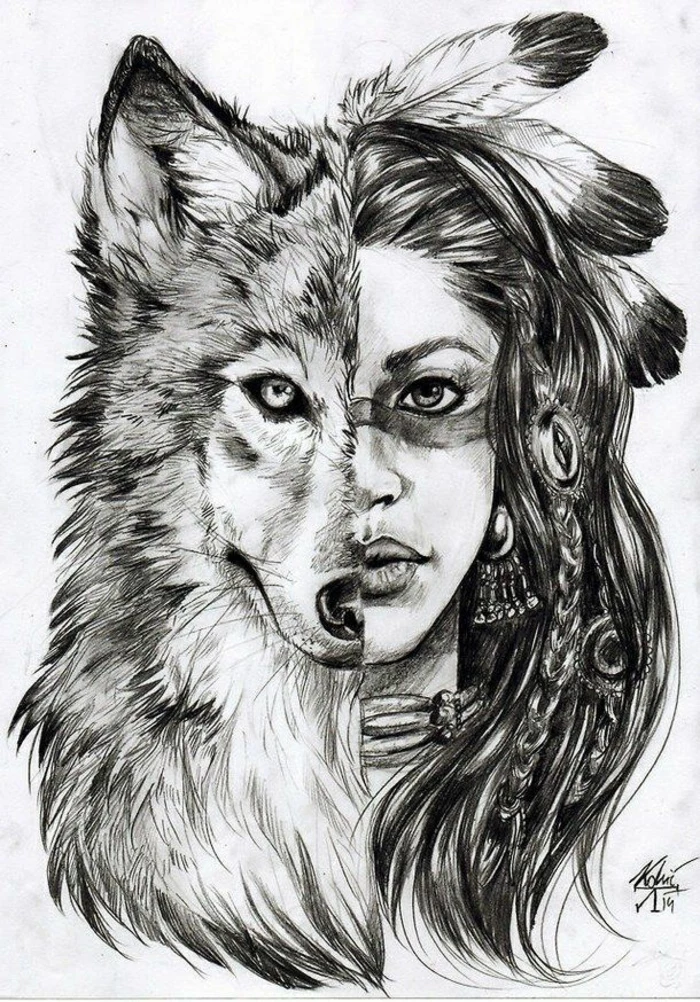
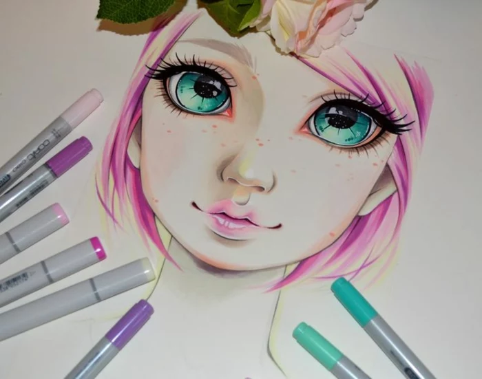
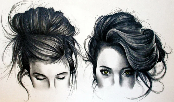
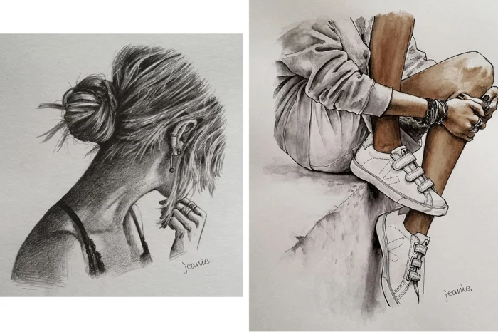
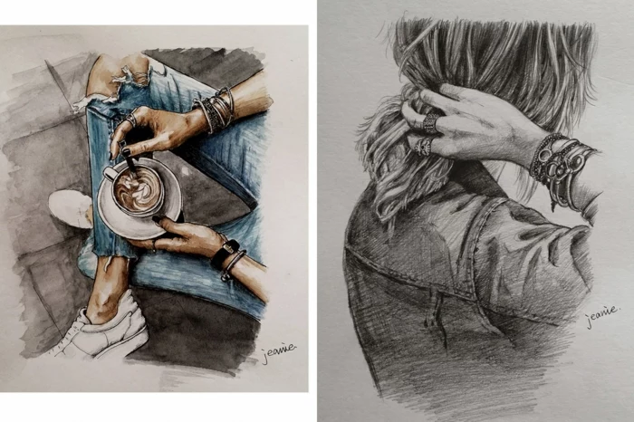
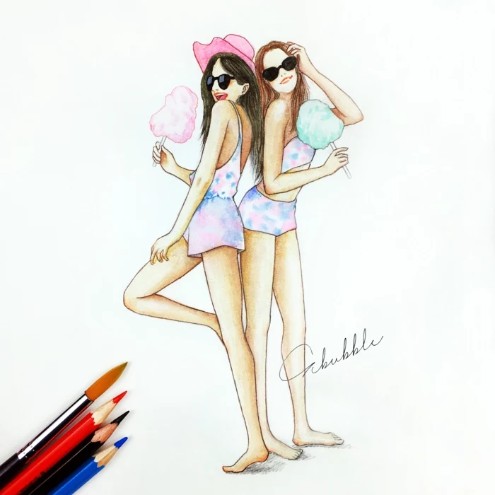
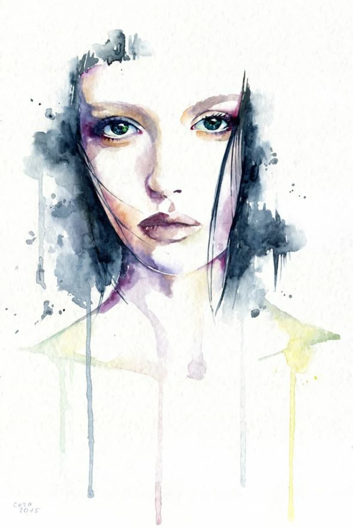
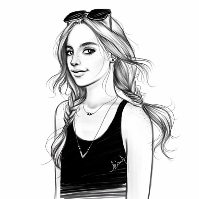
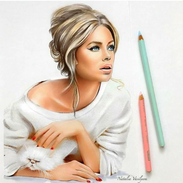
Inspiration Gallery
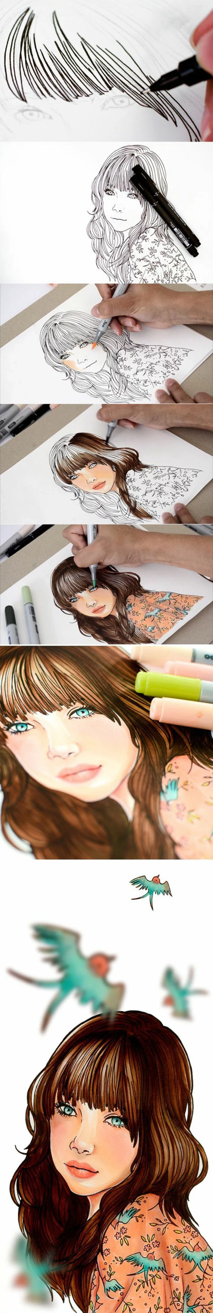
When tackling hair, resist the urge to draw every single strand. Instead, squint your eyes and see the hair as large, interlocking shapes of light, mid-tone, and shadow. Use the side of a soft graphite pencil, like a 6B, to block in these masses of value first. Individual strands are just the final, sparingly used detail.

- Create a more believable likeness by introducing subtle asymmetries.
- Capture genuine emotion by focusing on the slight tilt of the head or the tension in the jaw.
The secret? A living face is never perfectly still or symmetrical. Embracing these tiny imperfections is what breathes life into a static drawing, transforming a technical exercise into a true portrait.

Your most important tool isn’t a pencil, it’s your eyes. Spend at least as much time observing your subject as you do making marks on the paper. Notice the unique angle of the nose, the way one eyelid droops slightly lower than the other, or how light reflects off the bottom lip. Drawing is seeing.
The surface you draw on dramatically affects your final result. Don’t just grab any piece of paper; choose one that suits your goal.
- For sharp detail: A smooth Bristol board, like those from Canson or Strathmore’s 300 series, allows for crisp lines and fine detail work with graphite.
- For expressive shading: Toned paper, such as Strathmore’s Toned Tan or Gray, provides a mid-value starting point, making your highlights pop and your shadows feel richer.
- For practice: A large, inexpensive pad of newsprint is perfect for loose, gestural sketches where you’re focused on form, not perfection.
My portraits look flat and the eyes seem lifeless. What am I doing wrong?
This often happens when we draw eyes as flat almond shapes. Remember the eyeball is a sphere! The key to creating depth and life is twofold: first, add a distinct, bright highlight (the specular reflection) that follows the curve of the cornea. Second, draw the shadow that the upper eyelid casts onto the top of the eyeball. This simple shadow immediately makes the eye look round and set into the socket.
Graphite Pencils: Ideal for precision and control. A set of Faber-Castell 9000 pencils gives you a range from hard (2H) for light layout lines to soft (8B) for deep, rich shadows. They are less messy and easier to erase.
Charcoal Pencils: Perfect for expressive, dramatic portraits. Brands like General’s Charcoal offer deep, velvety blacks that graphite can’t match. They are better for covering large areas quickly but are smudgy and harder to control for fine details.
For beginners, starting with graphite is often easier before moving on to the expressive power of charcoal.
The human brain has a specific region, the Fusiform Face Area, which is hyper-specialized for recognizing faces.
This is why we’re so incredibly sensitive to portraits that look ‘wrong’. Our brains are hardwired to spot minute proportional errors in faces that we would easily ignore in a drawing of a car or a tree. It’s not just you being critical; it’s human nature. This is why mastering the underlying proportions is so crucial for portrait artists.

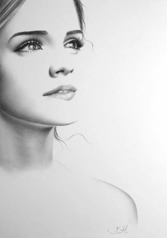
Drawing a head floating in space is a common beginner mistake. To ground your portrait and make it feel more natural, always include at least a hint of the neck and shoulders. Pay attention to the trapezius muscles, which slope down from the neck to the shoulders, giving the head a solid base to rest upon.
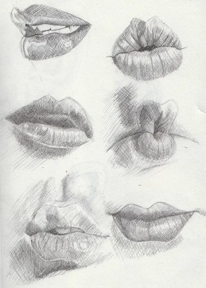
- Outlining the lips: Avoid drawing a hard line around the entire mouth. Lips are soft forms that transition into the skin. Use value and shadow, not lines.
- Ignoring the Cupid’s Bow: The double curve of the upper lip is a key feature. Make sure it’s defined, but not unnaturally sharp.
- Forgetting the philtrum: The vertical groove between the base of the nose and the top lip is essential for a realistic face.


I’m ready to try digital drawing. What’s a good setup to start with?
You have fantastic options at different price points. A popular choice is an Apple iPad with the Procreate app; it’s intuitive, powerful, and feels very natural. For a more traditional computer-based setup, a Wacom Intuos tablet is a reliable and affordable entry point. It connects to your Mac or PC and works beautifully with software like Adobe Photoshop, Clip Studio Paint, or the free program Krita.

Lost and Found Edges: This is a pro-level technique for creating realism and depth. A ‘lost’ edge is where two areas of similar value meet, and the line between them seems to disappear (like the side of the cheek turning away from the light). A ‘found’ edge is sharp and clear, where light and shadow meet dramatically (like the line of the jaw). Using both makes a drawing feel less like a coloring book and more like a three-dimensional form.
Build your own reference library to ensure you’re never out of inspiration. Your phone is your best tool.
- Take photos of friends in different lighting conditions—by a window, under a lamp, outside on a cloudy day.
- Use Pinterest to create boards dedicated to specific features: eyes, expressive hands, interesting hair textures.
- Screenshot scenes from movies with compelling cinematography and character lighting.
- Don’t be afraid to take selfies! It’s a great way to study your own face from different angles.
Mechanical Pencil: A Pentel GraphGear 1000 or a Rotring 600 offers a consistently sharp point, perfect for precise details like eyelashes or rendering fine lines without needing a sharpener.
Traditional Wood-cased Pencil: Offers superior artistic flexibility. You can use the sharp point for details, but also the wider side of the lead for broad, expressive strokes and shading.
Many artists use both: a mechanical pencil for the initial sketch and fine details, and wood-cased pencils for the shading and tonal work.
The ‘Uncanny Valley’ is the eerie feeling you get when a drawing is almost perfectly realistic, but something is slightly off. It can look creepier than a more stylized drawing. If your portrait falls into this trap, don’t add more detail. Instead, step back. Often, the solution is to simplify, soften some edges, or re-evaluate the core proportions that might be subtly wrong.
To truly get shading right, you need the right tools to blend your graphite or charcoal. Don’t just use your finger—the oils from your skin can create ugly, permanent smudges on the paper.
- Blending Stumps & Tortillons: These are sticks of tightly rolled paper that allow for precise, controlled blending in small areas.
- Chamois: A piece of soft leather that’s excellent for lifting material and creating smooth, subtle gradients over larger areas.
- A simple tissue or cotton swab: A great budget-friendly option for softening broad areas of tone.
How do I decide where to put detail and where to leave things simple?
Think like a photographer and create a focal point. In most portraits, the viewer’s attention should go to the eyes. This is where you should use your sharpest lines, highest contrast, and most careful rendering. Areas further from the focal point, like the hair, clothing, or the ear on the far side of the face, can be suggested more loosely with softer edges and less detail. This guides the viewer’s gaze and creates a more powerful composition.


- Get a better understanding of three-dimensional form.
- Train your eye to see subtle shifts in color and value.
- Capture the unique energy and personality of the subject.
The secret? Drawing from a live model. While photos are convenient, they flatten form and lose information in shadows and highlights. Sitting with a live person, even for 20 minutes, will teach you more about how a face truly exists in space than hours of copying a photograph.
Smooth Bristol (Plate finish): This paper is hot-pressed and has an almost glossy, ultra-smooth surface. It’s fantastic for technical pen work or highly detailed graphite drawing where you want zero paper texture to interfere.
Vellum Bristol (Kid finish): This paper is cold-pressed and has a subtle, toothy texture (called ‘vellum’ finish). This tooth is excellent at grabbing pigment from pencils, making it ideal for soft graphite, charcoal, and colored pencil work where rich blending and layering are desired.

Five minutes of warm-ups will make your entire drawing session more productive. Before starting a serious portrait, loosen up your hand and eye with these quick exercises:
- Gesture Drawings: Quickly sketch the overall shape and angle of the head in 30-second bursts. Don’t worry about features, just capture the energy.
- Blind Contour: Fix your eyes on your subject and draw their outline without looking at your paper. It will look weird, but it builds incredible hand-eye coordination.
- Shape Blocking: Draw a face using only simple geometric shapes—spheres, wedges, cylinders—to represent the major forms.
Think beyond the face itself. The negative space—the shape of the background around the head and shoulders—is a powerful compositional tool. Pay attention to this shape. Is it balanced? Is it interesting? Sometimes, adjusting the angle of the head to create a more dynamic negative space is all a drawing needs to go from good to great.
To preserve your finished graphite and charcoal drawings and prevent smudging, a final spray of fixative is essential. A popular choice is Krylon Workable Fixatif. The ‘workable’ part means you can apply a light coat to lock in a layer of drawing and then continue to work on top of it without smudging what’s underneath. Always spray in a well-ventilated area.
- It provides a beautiful mid-tone to work from instantly.
- Your white highlights, added with a white charcoal or pastel pencil, will pop dramatically.
- It helps you to harmonize the entire drawing.
The secret? Using toned paper. Starting on a pure white surface can be intimidating. A tan or gray paper, like Strathmore’s Toned series, feels less stark and makes achieving a full range of values feel more intuitive and faster.
Real emotion isn’t always in a big smile or a crying frown. Look for the micro-expressions. The slight pinch of the eyebrows, the subtle tightening of the corner of the mouth, the way an eyelid tenses—these are the details that convey complex, authentic feelings like concern, skepticism, or quiet joy. Capturing these is the key to a portrait that feels truly human.