Your Bedding Color Might Be Sabotaging Your Sleep—Here’s How to Fix It
I remember this one client, a super-successful lawyer who had ticked every box for a perfect night’s sleep. He had the fancy mattress, the blackout curtains, the whole nine yards. And yet, he felt totally on edge in his own bedroom. When I finally saw the room, it hit me like a ton of bricks: it was stark, brilliant white. White walls, white furniture, and these optic-white sateen sheets. He was going for a clean, minimalist look, but to his nervous system, it was like trying to sleep inside a lightbulb.
In this article
We changed just one thing. We swapped his sheets for a set in a deep, muted sage green. A week later, he called me, and honestly, the relief in his voice was palpable. He said the room finally felt like a refuge. This wasn’t some kind of magic trick; it was just a practical example of how our minds and bodies react to color. After years of working as a textile consultant and helping people create restful spaces, the biggest mistake I see is choosing bedding based only on how it looks on a shelf. Your bed is the centerpiece of your sanctuary. Its color isn’t just decoration—it’s an active player in your rest.
So let’s forget those simple lists of ‘good’ and ‘bad’ colors. The truth is way more nuanced and, frankly, more interesting. It’s about understanding why certain colors work and how to use them to your advantage.
Why Your Brain Cares So Much About Your Duvet Cover
First off, what even is color? It’s simply how our brain interprets different wavelengths of light. This has a direct biological effect on us. Your whole sleep-wake cycle is run by a tiny part of your brain that responds to light cues from your eyes. When it sees bright, cool-toned light, it thinks, “Hey, it’s daytime!” and stops producing melatonin, the hormone that makes you sleepy.
This is exactly why staring at your phone at night messes you up—that blue light is a powerful signal to stay awake. Your bed sheets work in a similar, though more subtle, way. They’re huge surfaces that reflect whatever ambient light is in your room.
In the design world, we have a term called Light Reflectance Value, or LRV. It’s a scale from 0 (jet black) to 100 (pure white) that tells us how much light a color bounces back. Those brilliant white sheets? They might have an LRV of 90 or more, meaning they reflect 90% of the light that hits them. So if a streetlight shines through your window or the morning sun peeks in, those sheets are basically amplifying that light right at your face. On the flip side, a deep navy or charcoal gray might have an LRV of 5 to 10. It absorbs most of the light, helping to keep your sleep space dark and cozy.
Quick tip: This applies to your light bulbs, too! Check your bedside lamps. You want bulbs that produce a warm-white light, around 2700K. Anything higher can cast a harsh, blue-toned light that makes even the coziest bedding feel sterile.
Colors That Can Be Tricky (And How to Use Them Right)
I almost never tell clients that a color is completely ‘off-limits.’ But let’s be real, some are just harder to get right in a bedroom. They need a bit of careful handling to work.
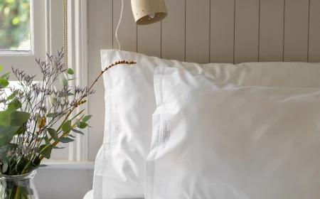
Stark, Brilliant White
Hotels love white sheets because they scream ‘clean’ and can be bleached. This has tricked a lot of us into thinking it’s the best choice for home. In my experience, it’s often a mistake. The main problem is that high LRV we talked about. Stark white is so reflective it can make a room feel clinical and sterile. It can also create a low-level stress of trying to keep it perfectly pristine, because it shows every single speck of dust. We fixed a guesthouse once that had this problem—guests were waking up way too early because the morning sun hitting the white bedding was just too intense. The fix was simple: we swapped them for a soft, warm ivory. The complaints stopped overnight.
The Solution: If you love white, just step away from the blue-toned, optic whites. Go for warmer, softer versions like cream, ivory, or a natural, un-dyed linen color. The material also makes a huge difference. A shiny white sateen will reflect way more light than a matte, textured white linen, which softens and diffuses the light.
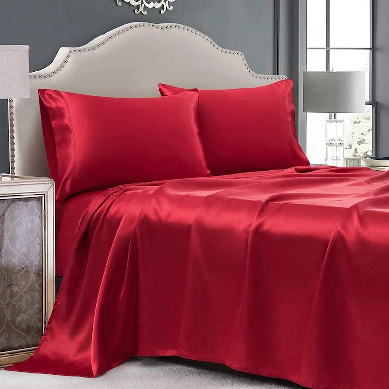
Vibrant, Fiery Red
Red is the color of energy. It’s been shown to actually increase heart rate and blood pressure. Great for a home gym, but the total opposite of what you want when you’re trying to wind down. A big splash of bright red on a duvet can feel visually jarring and even aggressive, putting your brain on high alert.
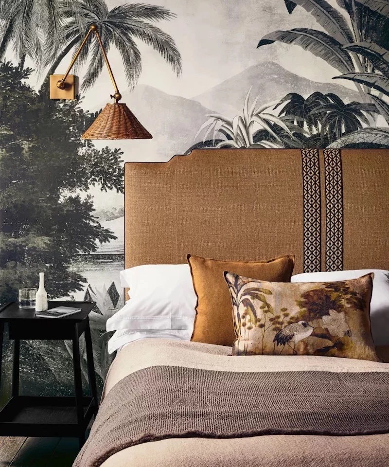
The Solution: Think of red as a spice, not the main course. I had a young client who was dead-set on red sheets. We compromised. We got him a gorgeous duvet in a deep charcoal gray and then brought in that pop of red with two small velvet accent pillows and a thin line of red embroidery on the pillowcases. He got the bold personality he wanted, but the area right around his body was calm and neutral. You can also explore the earthier side of the family—colors like terracotta, rust, or deep burgundy have all the warmth without the aggressive energy.
Dark Brown and Flat Black
On paper, dark colors sound perfect because they absorb light. But they can be tricky psychologically. Dark, muddy brown can feel a bit drab, while flat black can feel heavy or even sad for some people. The secret to making them work is all about texture and balance.
The Solution: If you want to go dark, choose rich, complex shades like charcoal, slate gray, or deep espresso. Then, focus on the fabric. A charcoal gray in a soft, washed linen or a chunky knit blanket looks incredibly inviting. The same color in a cheap, shiny polyester? Not so much. Always balance dark bedding with lighter elements in the room—light-colored walls, brighter curtains, or a nice piece of art to keep the space from feeling like a cave. (Heads up: If you struggle with low moods or seasonal affective disorder, I’d generally steer clear of huge swaths of dark colors in the bedroom.)
Let’s Go Shopping: The Pro’s Guide to Choosing Bedding
Alright, so how do you actually pick the good stuff? It’s a craft that goes beyond just pointing at a color you like online.
Material and Texture Are Everything
The fabric is just as important as the color. Here’s a quick rundown:
- Cotton Percale: Feels crisp, light, and cool, like a classic button-down shirt. Colors look clean and matte. It’s a fantastic choice for hot sleepers. Price-wise, a good queen set can run you anywhere from $80 to $200.
- Cotton Sateen: Has a silky, smooth feel with a subtle sheen that makes it look and feel luxurious. That sheen makes deep colors look incredibly rich. It’s a bit warmer than percale. Expect to pay in a similar range, maybe $90 to $250.
- Linen: Made from flax, linen is super breathable with a beautiful, natural texture that gets softer with every wash. It’s perfect for a relaxed, organic vibe. It’s a bit of an investment, usually $180 to $300+ for a quality queen set, but it lasts forever and just gets better with age.
- Tencel (Lyocell): Made from wood pulp, this fabric is incredibly soft, moisture-wicking, and cool to the touch. It drapes beautifully and holds dye really well. You can find sets from around $100 to $250.
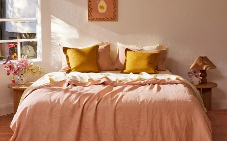
The Art of Layering
You rarely see a designer bed with just one solid color. Layering adds depth and lets you play with color without it being overwhelming. Here’s a simple formula:
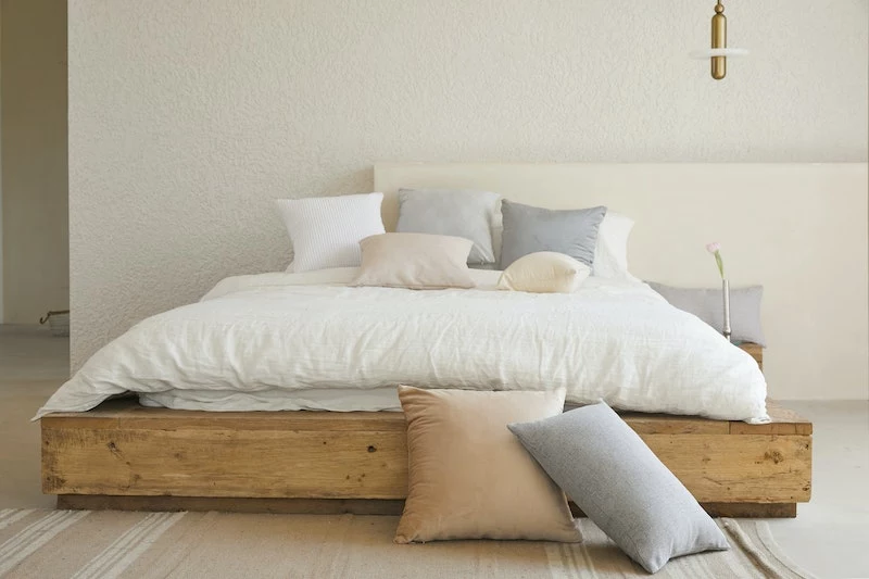
- The Foundation (Sheets & Pillowcases): Start with a comfortable neutral that will be right next to your skin. Think no-fail colors like off-white, dove gray, beige, or a pale sky blue.
- The Main Element (Duvet or Quilt): This is where you can introduce your primary color. Go for that deep forest green, warm terracotta, or sophisticated navy here.
- The Accent (Throws & Pillows): Add one or two smaller pieces for personality. This is the perfect spot for that pop of mustard yellow or a throw blanket with a pattern.
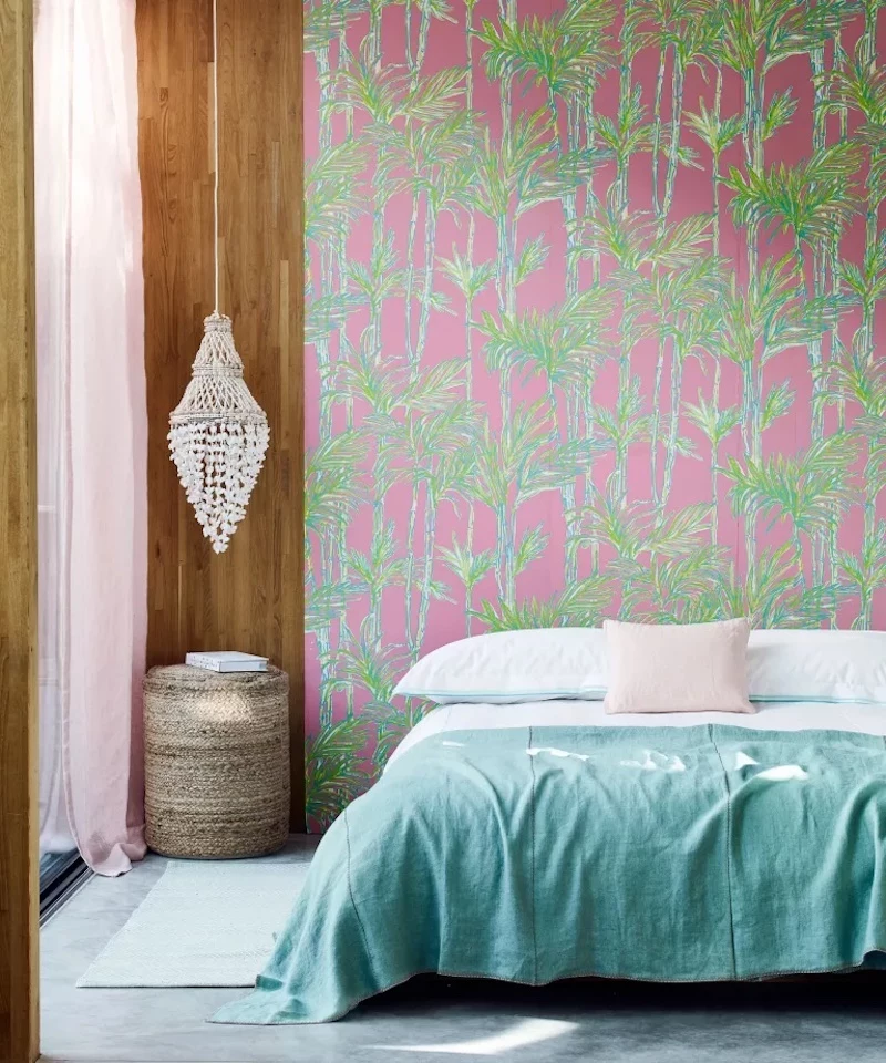
By the way, if you love patterns, this is how you do it! Opt for soft, organic shapes (like subtle florals) or simple, low-contrast stripes. Busy, high-contrast geometric prints can feel visually activating and might disrupt that sense of calm you’re going for.
Always, Always Get Swatches
This is probably the most important advice I can give you. Never buy a full set of sheets based on a picture online. Colors look different on every screen, and they’ll look different again under your bedroom lighting. Good companies will send you fabric swatches, often for free or a small fee. High-end brands like Parachute or Brooklinen are great for this. For more budget-friendly options, check out places like The Company Store or even Target’s Casaluna line, which often has good in-store displays.
When the swatches arrive, tape them to a white piece of paper and put them on your bed. Look at them in the morning, in the afternoon, and at night with your lamp on. A gray that looked perfect in the store can suddenly look purple under a warm bulb. You have to see it in your own space.
Lesser-known trick: In a hurry? Take one of your existing white pillowcases to a paint store. Find a few calming paint chips you like, then bring those chips with you to the bedding store. It’s a great way to compare colors in person without waiting for swatches to ship!
On a Budget? Try This $50 Trick
Not ready to drop $200 on a whole new bedding set? No problem. Just swap out your two main pillowcases. It’s the color closest to your face and eyes when you’re falling asleep. For under $50, you can grab a pair of high-quality pillowcases in a calming sage green or dusty blue and test the waters. It’s a small change that can make a surprisingly big difference.
A Few Final, Important Notes
Creating a healthy sleep space goes just a little deeper than color.
When you’re shopping, keep an eye out for the OEKO-TEX Standard 100 label. It’s a long name, but it basically means the fabric has been tested and is free of harmful chemicals and dyes. It’s a simple way to make sure what you’re sleeping on is truly safe, especially if you have sensitive skin.
And finally, it’s really important to keep perspective. Optimizing your bedroom can absolutely improve your sense of calm and contribute to better sleep, but it is not a substitute for professional medical care. If you’re dealing with chronic insomnia, anxiety, or depression, please talk to a doctor. Changing your sheets is a wonderful act of self-care, but it’s not a cure.
Your bedroom should be your personal sanctuary. Choosing the right bedding is a powerful way to make that space work for you, not against you. Trust your instincts, do a little testing, and you can create a bed that doesn’t just look good, but feels like coming home.
Inspirational Gallery
Matte Linen: Its textured surface absorbs light, giving colors a softer, more muted appearance. This creates a relaxed, lived-in feel perfect for earthy palettes. Think of the dusty, organic shades from brands like Cultiver or The Citizenry.
Luminous Sateen: This fabric has a subtle sheen that reflects light, making colors appear richer and more vibrant. It lends an air of understated luxury and works beautifully for deep jewel tones or sophisticated neutrals. Check out the sateen collections from Brooklinen or Frette for examples.
For ultimate calm, lean towards linen. For a touch of hotel-style polish, sateen is your answer.
The human eye is most sensitive to light in the green part of the spectrum, which is why it’s often perceived as restful and balanced.
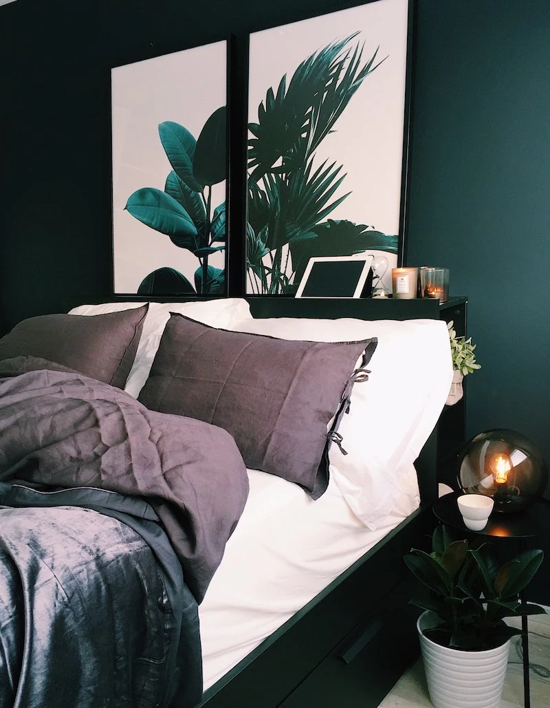
This biological fact is why shades of green are a designer’s secret weapon for bedrooms. Moving beyond the popular sage, consider deeper, more complex tones like eucalyptus, moss, or olive. These colors evoke a sense of grounding and security, creating a restorative sanctuary that quiets a busy mind.
Not ready to commit to a full set of rust-colored sheets? Dip your toe in the water with these low-risk strategies:
- Start with a pair of new pillowcases. It’s the fastest, most affordable way to see how a color works in your space.
- Add a single throw blanket or a quilt folded at the foot of the bed. It introduces the color without overwhelming the room.
- Buy just a flat sheet in the new hue and layer it under your current duvet for a subtle glimpse of color.
Thinking about pairing your new bedding with your wall color?
It’s all about harmony, not necessarily matching. If you have bold, dark walls (like a deep navy), you can either create a cozy, tonal look with bedding in a slightly lighter blue, or provide a sophisticated contrast with warm tones like burnt orange or mustard. For neutral walls, like greige or beige, you have more freedom. Use this as a canvas to introduce a calming color story with your sheets, like a palette of dusty rose and cream.
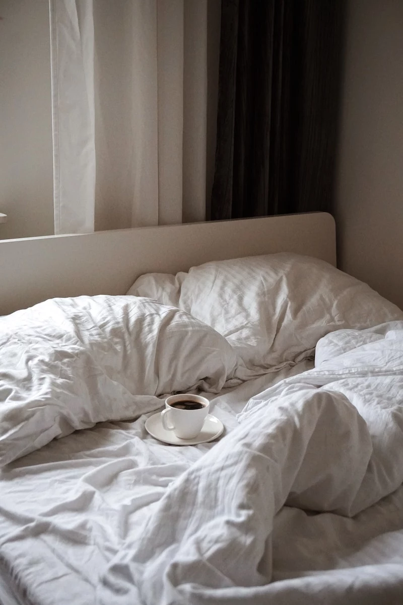
The design mistake to avoid: An obsession with perfection. A bed that looks too pristine, with every pillow karate-chopped and no wrinkles in sight, can feel sterile and uninviting. The most restful bedrooms embrace a little imperfection—the soft rumple of linen sheets, a casually draped throw. Your bed should look like a welcoming hug, not a museum exhibit.
- Your deep indigo sheets remain rich and saturated, wash after wash.
- That perfect earthy terracotta tone doesn’t fade into a dull peach.
- Your investment in high-quality color truly lasts for years.
The secret? Skip the hot water. Always wash your colored bedding on a cold, gentle cycle with a pH-neutral liquid detergent. Harsh powders and high heat are the primary culprits in fading and fiber damage.
The Japanese philosophy of Wabi-Sabi, which honors the beauty in imperfection and nature, is a perfect guide for a serene bedroom. This translates to choosing bedding not for its bright, uniform color, but for its texture and natural essence. Look for unbleached organic cotton or linen dyed with botanical ingredients, which results in unique, subtly varied shades of stone, clay, and moss. It’s a shift from seeking perfection to embracing a calming, authentic atmosphere.
A study from the University of Sussex found that blue is globally associated with feelings of calm, competency, and reliability.
In the bedroom, this translates to a sense of stability and peace. But not all blues are created equal for sleep. Steer clear of high-energy electric blues. Instead, opt for complex, muted shades with grey or green undertones, such as the slate blue from Parachute or the mineral-toned blues from Quince. These sophisticated hues promote mental clarity and deep relaxation.
The High-Low Mix: The secret to a magazine-worthy bed isn’t buying a complete $800 bedding set. It’s about smart mixing. Invest in the piece you interact with most—perhaps a high-quality linen duvet cover—and pair it with more affordable 100% cotton fitted sheets from a direct-to-consumer brand. A splurge on two luxe Euro shams combined with simple standard pillowcases can elevate the entire look for a fraction of the cost.
“Color can sway thinking, change actions, and cause reactions. It can irritate or soothe your eyes, raise your blood pressure or suppress your appetite.” – The Institute for Color Research