My No-Regrets Guide to Picking a Living Room Paint Color
I’ve spent more years than I can count with a brush in my hand, and let me tell you, the biggest headache for homeowners is always the same: choosing the paint color. I’ve seen it a hundred times. People get absolutely lost in that wall of tiny paint chips, squinting under the terrible fluorescent lights of the hardware store. They grab a color they loved in a magazine, only to find it looks completely, horribly different in their own house.
In this article
- First Things First: Understand Your Room’s Light
- The Pro’s Foolproof Method for Testing Paint
- Common Problems & Quick Fixes
- Building a Palette That Lasts
- Choosing the Right Sheen (This is Important!)
- The Pro’s Shopping List & Budget
- Applying Paint Like You Know What You’re Doing
- A Final Word on Safety
- Inspirational Gallery
It’s a super common and surprisingly costly mistake. A gallon of paint isn’t just color; it’s the entire mood and feel of a room. It’s the backdrop for your life!
So, let’s get this right from the start. Choosing a living room color is way less about what’s trendy and more about understanding your actual space. It’s a mix of science, a little observation, and my hard-won experience. Before you even think about buying a gallon, we need to have a serious chat about light, undertones, and the one step you absolutely cannot skip: testing. This is the process I use to get a beautiful result every single time. It saves money, avoids frustration, and keeps you from having to repaint a room you just finished.
First Things First: Understand Your Room’s Light
Before we even dream of colors, we have to understand what the paint will be interacting with. Paint color doesn’t exist in a vacuum; it’s 100% dependent on the light that hits it. Honestly, this is the most overlooked part of the whole deal, and it’s where most DIY projects go off the rails.
Let’s Talk LRV
Flip over any paint chip and you’ll see a number called the Light Reflectance Value, or LRV. It’s a scale from 0 (think absolute black) to 100 (pure white), and it tells you exactly how much light a color will reflect. This isn’t just a nerdy detail; it’s your secret weapon.
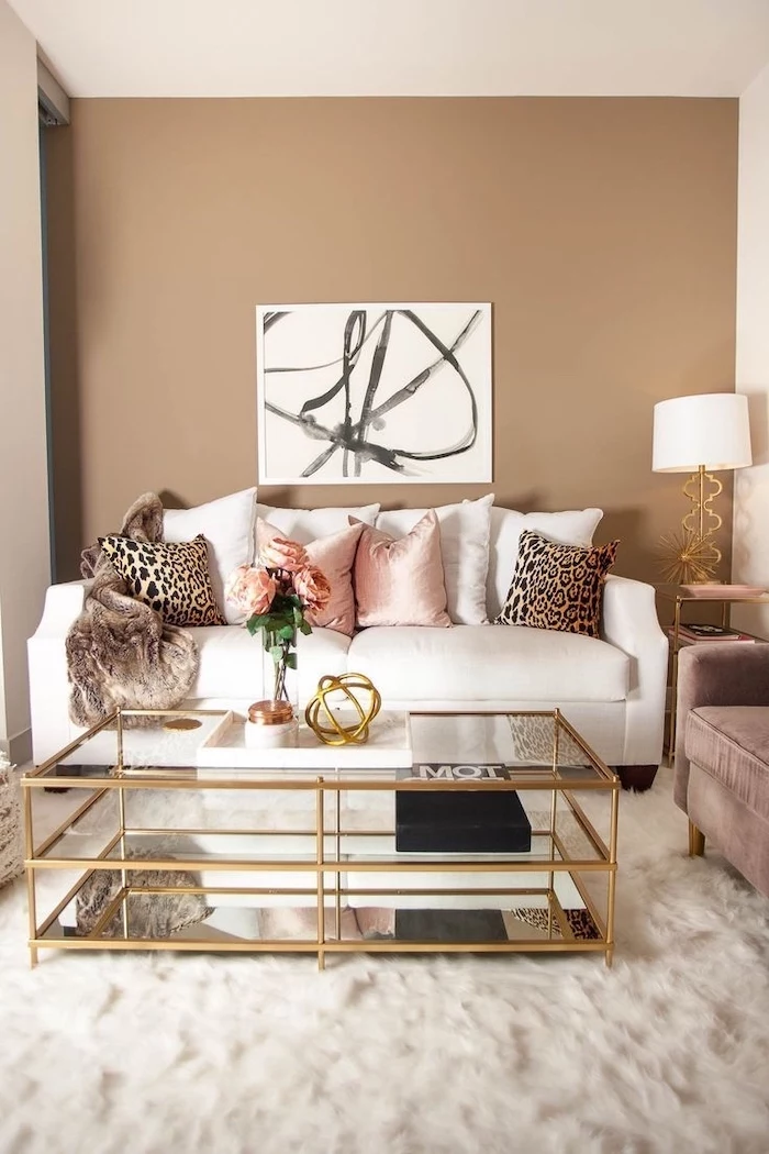
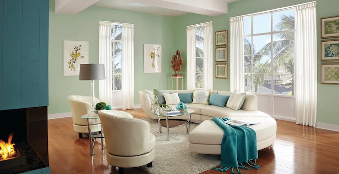
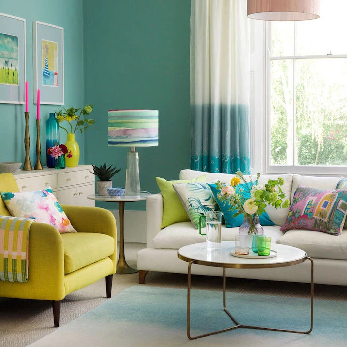
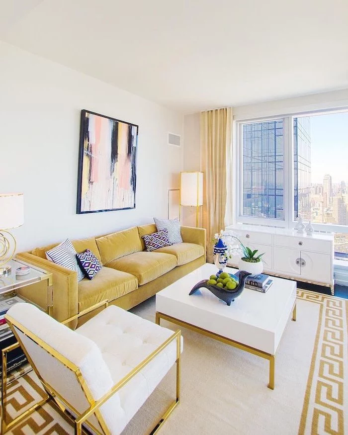
- High LRV (above 60): These are your light and airy colors. They bounce a ton of light around, making a room feel bigger and brighter. Perfect for small rooms or spaces that don’t get a lot of sun. A crisp white might have an LRV of 90, meaning it reflects 90% of the light that hits it.
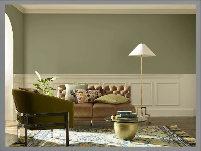
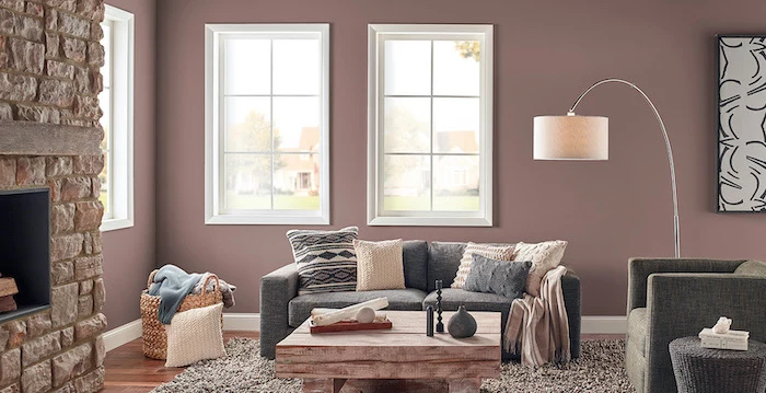
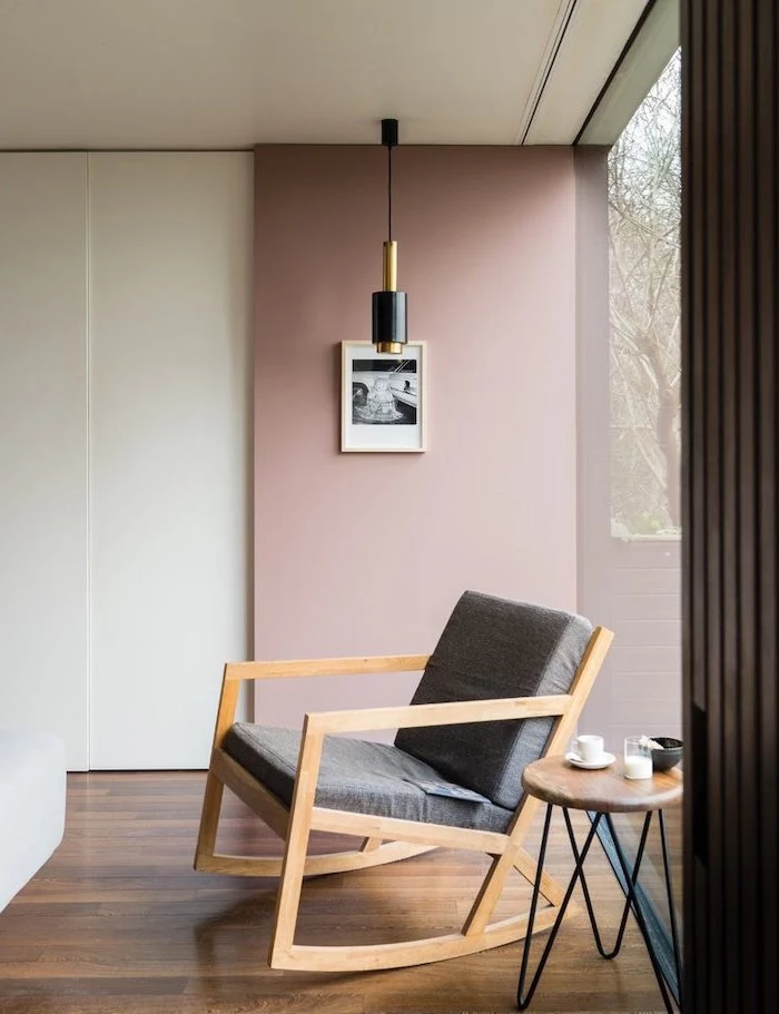
- Mid-Range LRV (35-60): This is the sweet spot for many popular colors. You get a good amount of personality and depth without making the room feel dark. Most of the popular greiges, beiges, and muted tones live here.
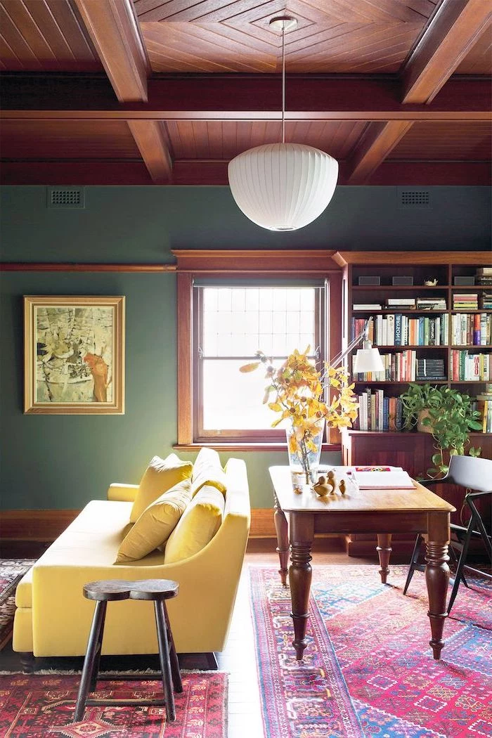
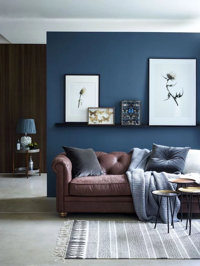
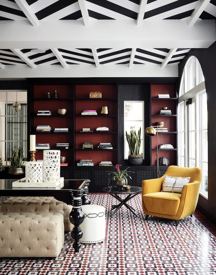
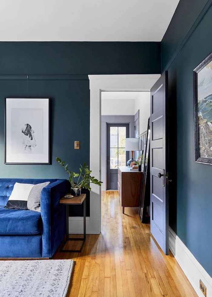
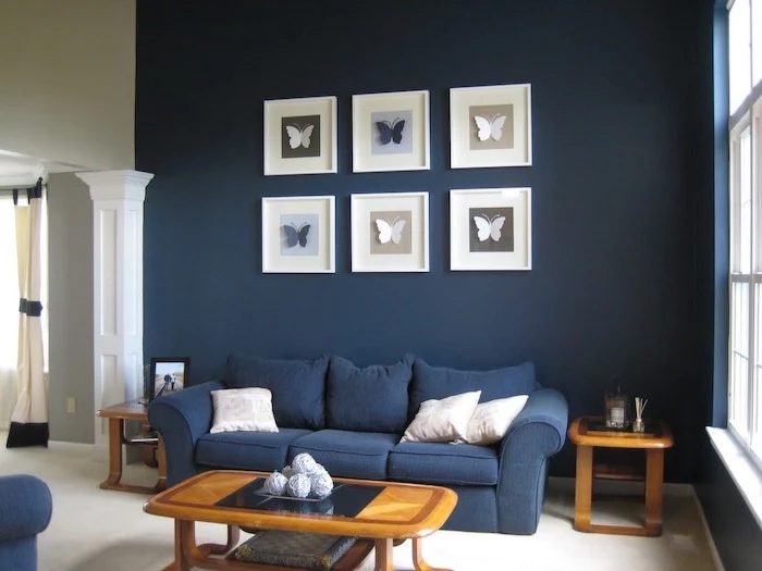
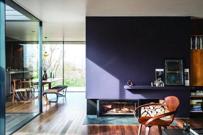
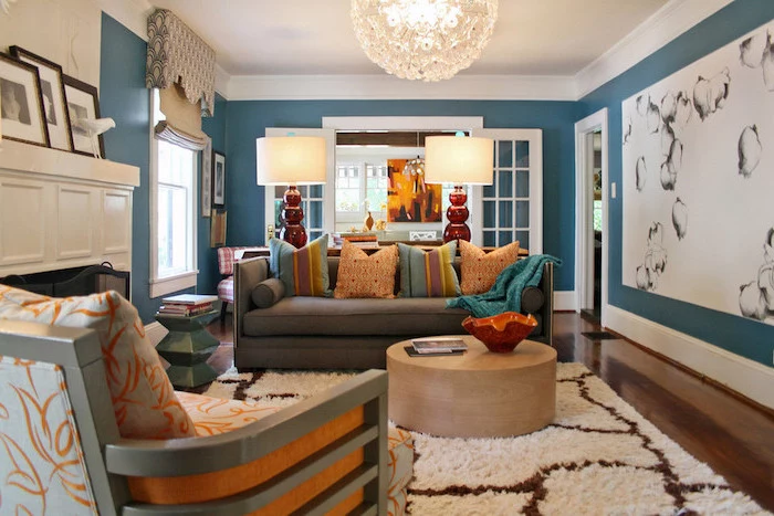
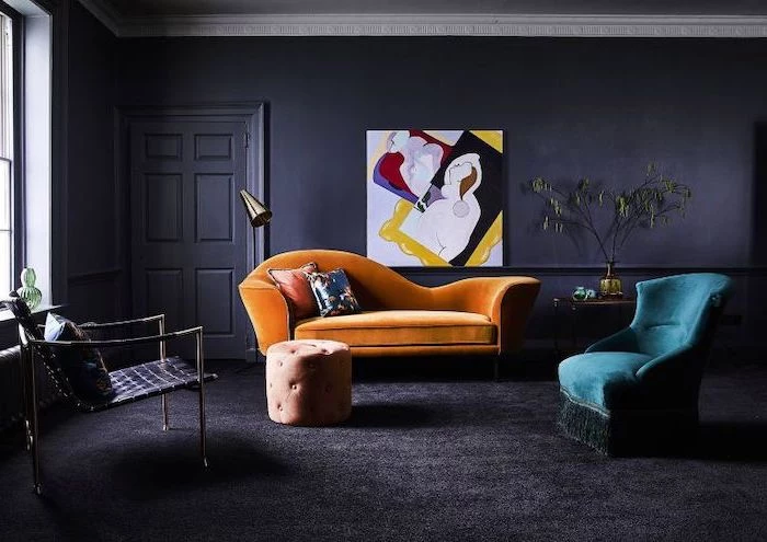
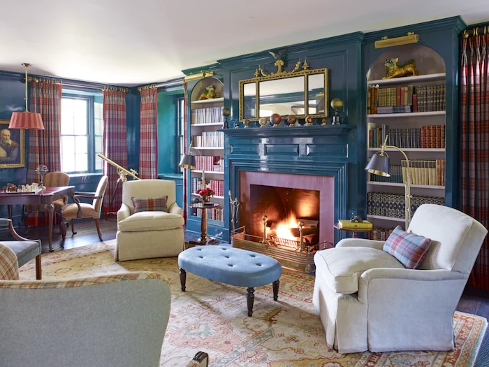
- Low LRV (below 35): These are the dark, saturated colors that create a cozy, dramatic, or moody vibe. They absorb more light than they reflect. Think deep navy or charcoal, which might have an LRV of 5 to 10. These can be stunning in a well-lit room where you want to create intimacy, or even in a tiny space like a library to create a cool, jewel-box effect.
I once had a client who chose a gray with an LRV of 20 for their north-facing living room. On the chip, it looked like a chic charcoal. On the walls? It felt like a cave because it soaked up all the cool, limited light coming in. We switched to a creamy off-white with an LRV of 85, and the room instantly felt twice as big and a million times more welcoming.
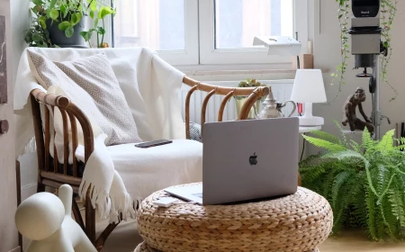
Your Windows Have a Big Say
The direction your windows face completely changes how a color looks throughout the day. It’s one of the first things I ask about.
- North-Facing Rooms: You get indirect, cool, blue-ish light all day. This light can make warm colors look a bit flat and will amplify the coolness in blues and grays. You can either lean into it with a crisp, clean color or fight it with a color that has warm undertones (like a creamy white or a warm gray).
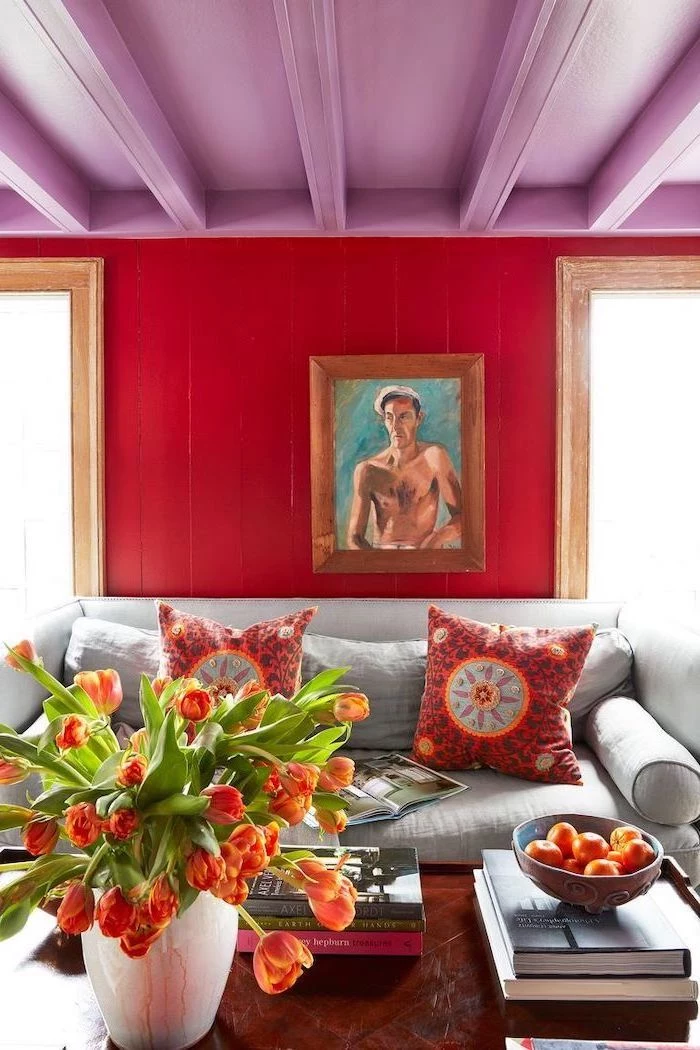
- South-Facing Rooms: Hello, sunshine! You get intense, warm light most of the day. This golden glow makes every color look brighter and warmer. Super pale colors can get washed out, while bold colors will really pop. A cool color can be great here to balance out all that intensity.
- East-Facing Rooms: Bright and clear light in the morning, which turns cooler and shadowier in the afternoon. Your color has to look good in both settings. I usually suggest something that isn’t too warm or too cool.
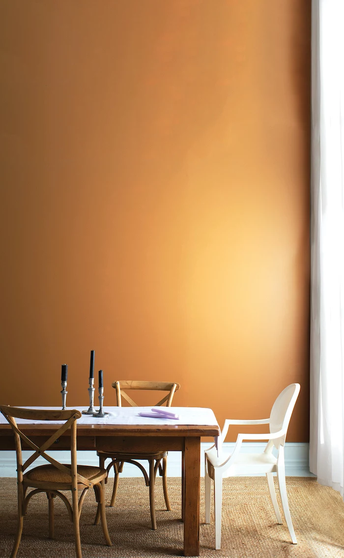
- West-Facing Rooms: These rooms can be a bit dim in the morning but are drenched in a warm, almost orange-y light in the evening. That evening light is gorgeous but can make some colors feel way too intense. Whites often look beautifully creamy, but be careful—warm colors can become straight-up fiery.
Quick Homework for You: Go stand in your living room right now and figure out which way your main windows face. Seriously, do it. Just knowing this one thing will help you narrow down your paint choices by at least 50%.
And Don’t Forget Your Lightbulbs!
At night, your lightbulbs take over. Their color temperature, measured in Kelvins (K), can drastically change your paint color. I’ve seen beautiful beige walls turn a sickly, dingy yellow at night because of old-school incandescent bulbs.
- Warm White (2700K-3000K): This is the cozy, yellowish light most people have. It enhances reds, yellows, and oranges and can mute cooler colors.
- Cool White/Bright White (3500K-4100K): This is a more neutral, white light that gives a truer read on colors.
- Daylight (5000K-6500K): This light has a blue-ish tint. It can make warm colors look dull and cool colors feel almost sterile.
When you’re testing paint swatches, you HAVE to look at them at night with your lamps on. That’s the color you’ll be living with most of the time.
The Pro’s Foolproof Method for Testing Paint
Okay, let’s get down to business. Never, ever, EVER choose a color from a tiny paper chip in the store. It’s the fastest way to disappointment. This method takes a bit more effort, but I promise it prevents the horror of repainting.
- Buy Sample Pots: Yes, you have to spend a little money here. Plan on buying at least three sample pots. They usually cost between $5 and $8 each, and it’s the best money you’ll spend.
- Make HUGE Swatches: Don’t just paint a little square on your current wall—the old color will mess with your perception. Get a few pieces of white poster board and paint a big swatch, at least 2 feet by 2 feet, on each one. And do two coats! This shows you the true color depth.
- Move Them Around: This is the magic step. Tape your painted boards to different walls in the room. Put one near a window and one on the darkest wall. See how it changes? The color opposite your window will look totally different from the one next to it.
- Live With It for 48 Hours: Watch those swatches for two full days. See them in the morning, midday, and evening. Then, turn on all your lights at night. A perfect daytime gray can suddenly look purple or green under your lamps. This is how you catch it before you commit.
Common Problems & Quick Fixes
Sometimes, even with testing, a color can surprise you. Here are some common complaints I hear and what’s likely going on:
- The Problem: “My perfect gray looks purple (or blue)!”
The Likely Cause: You’ve got a cool gray in a north-facing room, or you’re using “daylight” LED bulbs. The cool light is bringing out the gray’s subtle blue or violet undertones.
The Fix: Try a gray with warmer undertones, like one with a hint of green or beige in it. These are often called “greige” and are much more versatile. A popular starting point you’ll find at the paint store is something like ‘Agreeable Gray’ or ‘Classic Gray’. - The Problem: “My creamy white just looks yellow and dingy.”
The Likely Cause: The white probably has a strong yellow undertone that’s being amplified by warm, south-facing light or warm-toned light bulbs.
The Fix: Look for a more neutral white, or one with a touch of gray or greige to cut the yellow. And consider swapping your lightbulbs to a more neutral ‘Bright White’ (around 3500K).
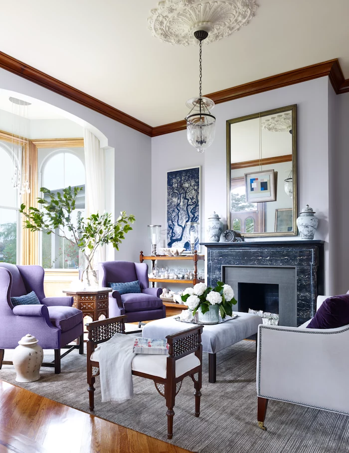
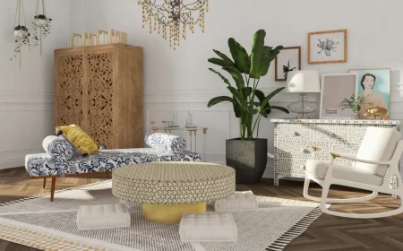
Building a Palette That Lasts
Forget the “color of the year.” Your home isn’t a handbag; it’s a long-term investment. A great color palette is one that works with the permanent fixtures in your home.
Before you even look at paint, look at what you can’t change. These are your anchors.
- Flooring: Do your wood floors have orange or red undertones? Does your carpet have cool gray or warm beige fibers? The wall has to play nice with the floor.
- Big Furniture: That huge gray sectional or brown leather sofa is a major player in the room.
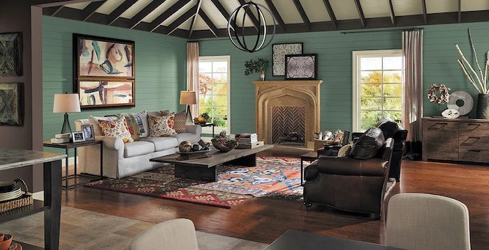
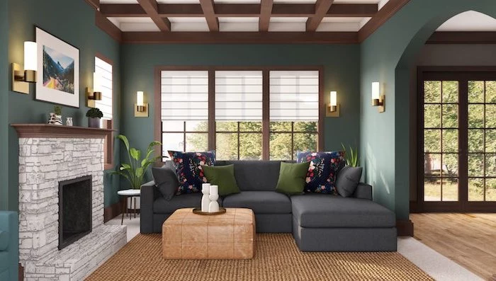
- Stone or Brick: Look closely at your fireplace. You’ll find flecks of tan, gray, brown, or even plum that you can pull out for your wall color.
- Open-Concept Neighbors: If your living room opens into your kitchen, the wall color has to flow. Look at your cabinet colors, countertops, and backsplash.
Choosing the Right Sheen (This is Important!)
Sheen, or the finish of the paint, is just as important as the color. It affects durability and how the paint hides (or shows) flaws. For living rooms, you’re usually deciding between two main options.
Flat or Matte is my go-to for ceilings. It has zero shine and a beautiful, velvety look that is fantastic at hiding imperfections. But, and this is a big but, it’s not durable. It scuffs if you look at it wrong and is a nightmare to clean. I only recommend it for very formal, low-traffic adult spaces.
Eggshell or Satin is the workhorse for most living rooms and what I recommend 99% of the time. It has a very soft, low luster (like an eggshell, go figure) and is way more durable and washable than flat. You can gently wipe off fingerprints or scuffs. Satin is a tiny bit shinier than eggshell, giving it a slight edge in durability but also showing a few more flaws. For a family living room, eggshell is the perfect blend of looks and practicality.
Heads up! Stay away from Semi-Gloss and Gloss for your walls. These are for trim, doors, and cabinets. The high shine will highlight every single tiny bump, crack, and imperfection on your drywall. It creates a distracting, almost plastic-like glare on a big wall.
The Pro’s Shopping List & Budget
Okay, you’re ready to head to the store. Here’s what you actually need to get a pro-level result, and a rough idea of what it’ll cost.
- Quality Paint: Expect to pay $50 to $80 for a gallon of good quality paint. Don’t cheap out here—premium paint has better pigments for richer color and binders for a more durable finish. It’s worth every penny.
- Primer: A gallon of quality primer will run you $25 to $40. It’s not optional!
- The Tools:
- A 2.5-inch Angled Brush: For cutting in along trim and ceilings. ($10-$15)
- A Roller Frame and Roller Covers: Get a 3/8-inch nap cover for standard smooth walls. ($20 for a starter kit)
- A Roller Tray & Liners: The liners make cleanup a breeze. ($10)
- Good Painter’s Tape: Something like FrogTape is great for getting sharp lines. ($8-$12)
- Canvas Drop Cloths: Spend the extra few bucks for canvas instead of plastic. It’s less slippery and absorbs drips. ($25)
- A 5-in-1 Tool: This is the Swiss Army knife for painters—it scrapes, cleans rollers, opens cans, you name it. ($8)
How much paint do I need? Here’s a quick formula: Add the length of all your walls together, multiply that by the ceiling height, then divide by 350 (one gallon covers about 350-400 sq ft). That’s roughly how many gallons you’ll need for one coat.

For a standard 12×15 foot living room, plan on this being a weekend project. One day for prep and priming, and another day for two coats of paint.
Applying Paint Like You Know What You’re Doing
The secret to a flawless finish is in the technique. Two quick tips:
For cutting in (those perfect lines): Use your quality 2.5-inch angled brush. Only dip the first third of the bristles into the paint, then tap off the excess (don’t scrape it). Brace your hand against the wall and pull the brush in a long, smooth, steady motion. It’s like breathing—don’t hold your breath, just go for it.
For rolling without marks: Don’t just roll up and down. Load your roller with paint and start by rolling a big “W” or “N” pattern on the wall, about 3 feet by 3 feet. Then, fill in that section with straight, parallel strokes without lifting the roller off the wall. This distributes the paint evenly and avoids those ugly roller lines.

A Final Word on Safety
Painting is a pretty safe DIY, but a couple of things are non-negotiable.
First, if your home was built before the late 1970s, you could have lead-based paint. This stuff is seriously hazardous if you scrape or sand it. You can grab a lead test kit from any hardware store. If it’s positive, you either need to safely paint over it without disturbing it, or you absolutely must call a certified lead abatement professional. This is a health issue, not an aesthetic one.
And even with modern low-VOC paints, make sure you have good ventilation. Open the windows and use a box fan to keep the air moving.
Taking your time to observe your room and test your colors is the key. A well-chosen color, applied with a bit of care, won’t just change your walls—it will genuinely improve how you feel every time you walk into the room.

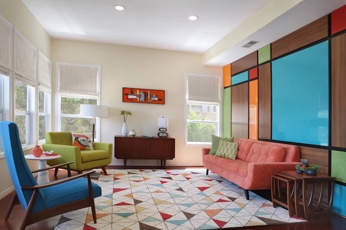
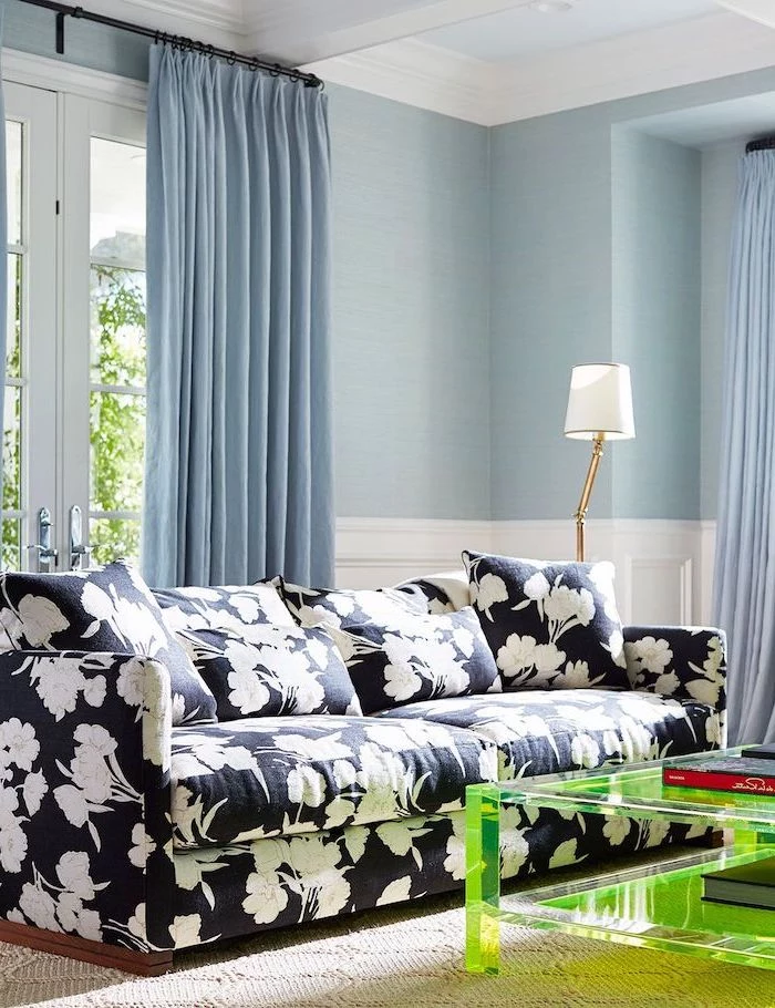
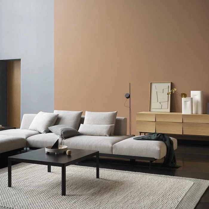
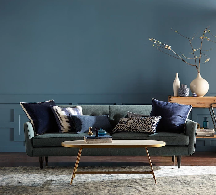
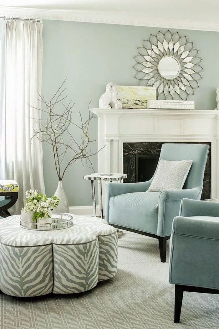
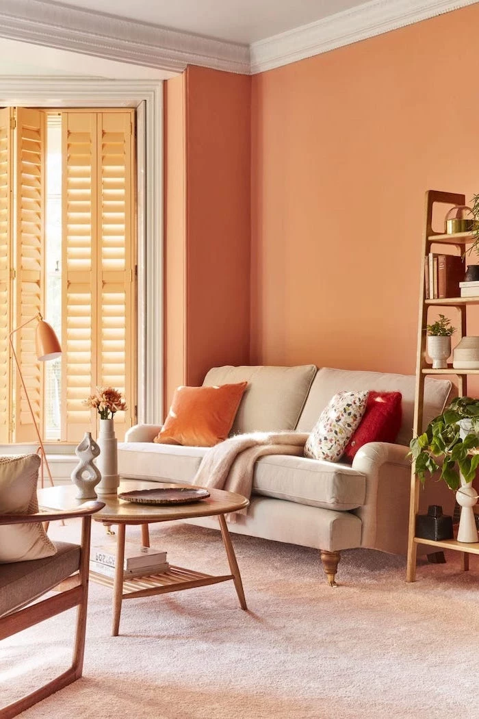
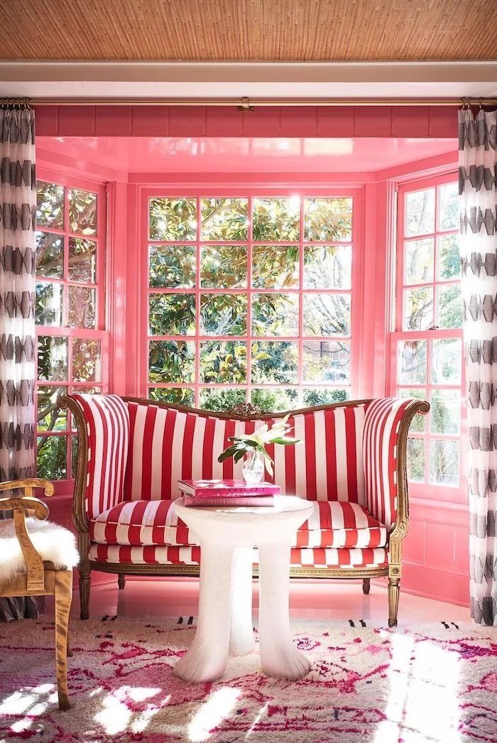
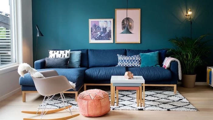
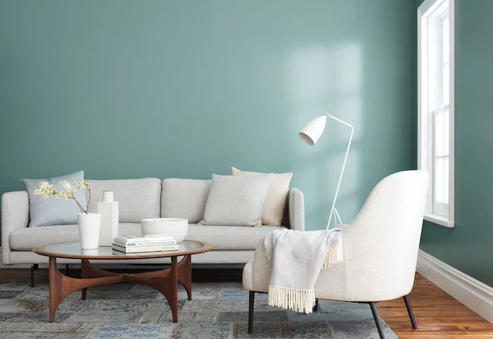
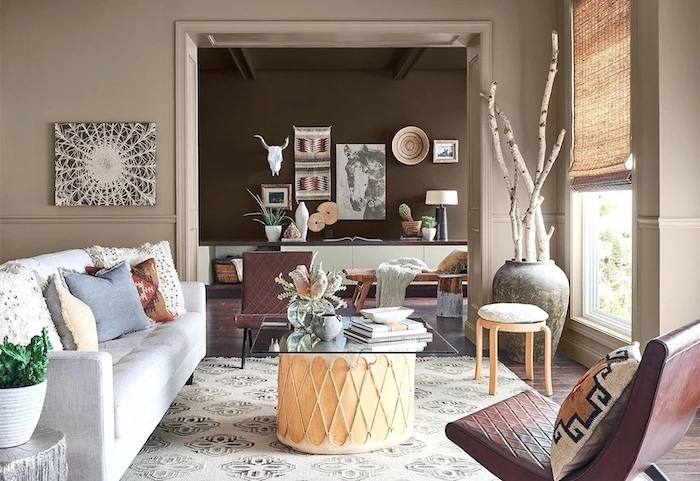
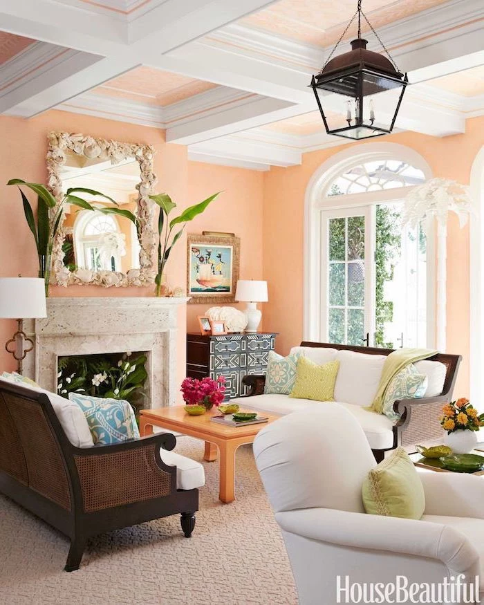
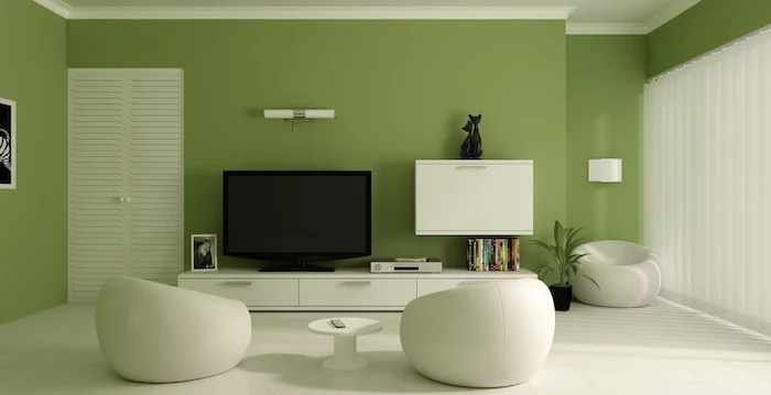
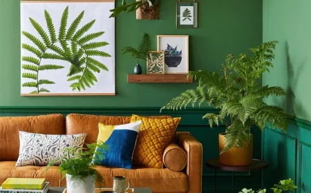
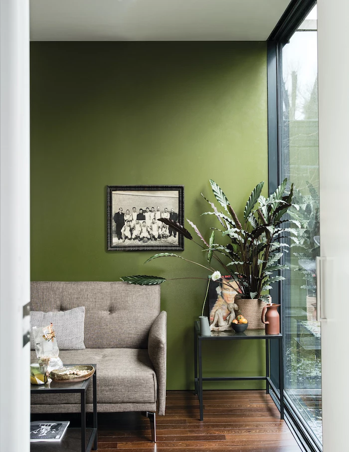
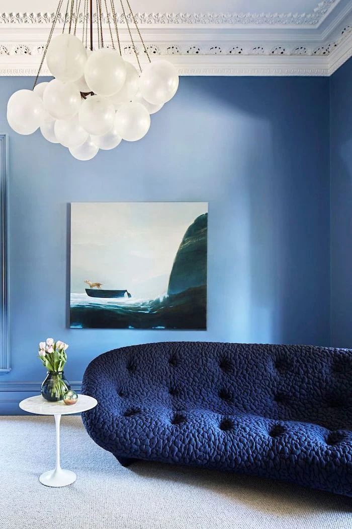
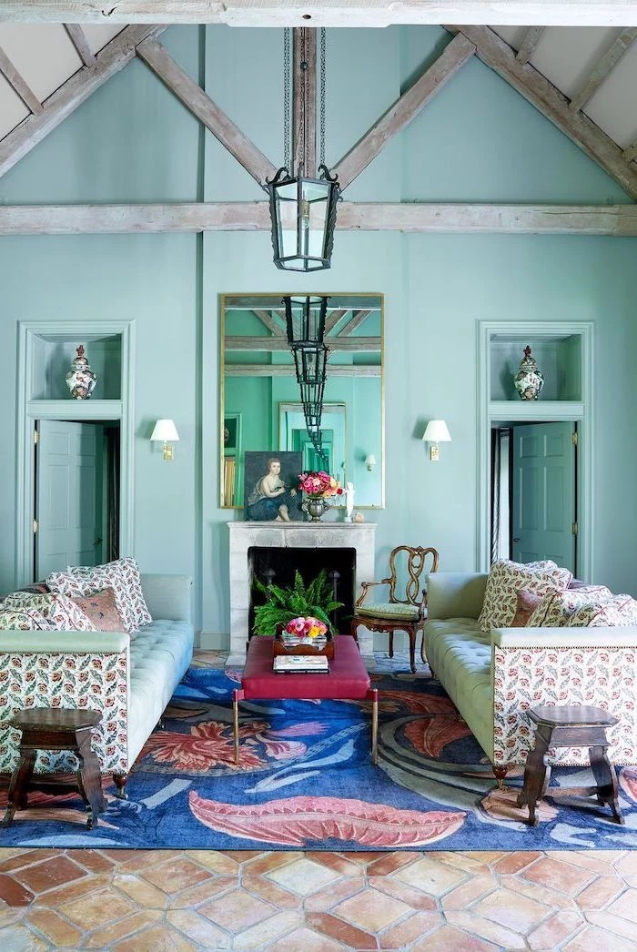
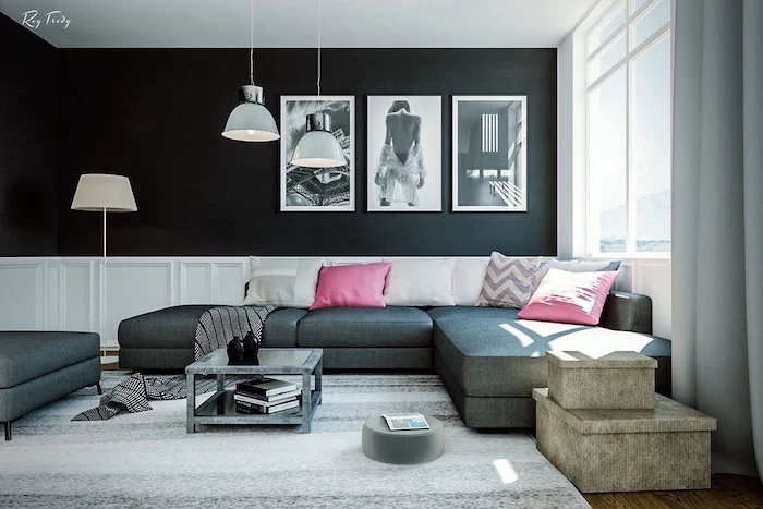
Inspirational Gallery


Matte Finish: Offers a modern, velvety look that excels at hiding surface imperfections like bumps or repaired patches. Its downside? It’s the least durable and can be difficult to clean, making it better for lower-traffic living rooms.
Eggshell or Satin Finish: These are the workhorses for most living spaces. They have a subtle sheen that reflects a small amount of light and, crucially, are far more wipeable and durable than matte. A great choice for families or anyone who might need to scrub off a mark or two.
For most, an eggshell finish provides the perfect balance of aesthetic appeal and practical longevity.

- A cohesive, sophisticated look.
- Makes a room feel larger and ceilings higher.
- Simplifies the painting process.
The secret? A technique called

How do I choose a color that works with my existing wood furniture and floors?
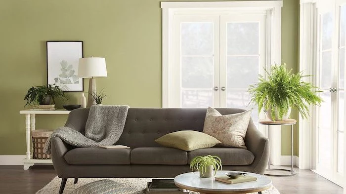
Look at the undertones in the wood. Oak and pine often have yellow or orange undertones, which pair beautifully with warm greens, deep blues, and creamy whites. Cherry wood has red undertones, making it a great match for sage green, charcoal gray, or even a muted blush. The key is to see if the wood’s warmth or coolness is complemented, not contested, by the wall color.

Nearly 60% of homeowners state that choosing the right paint color is the most stressful part of redecorating.
This statistic highlights a universal truth: paint paralysis is real. To combat it, narrow your choices to three or four shades at most before getting samples. Trying to decide between ten different beiges is a recipe for frustration. Trust your initial gut feeling and then test those few select options rigorously.

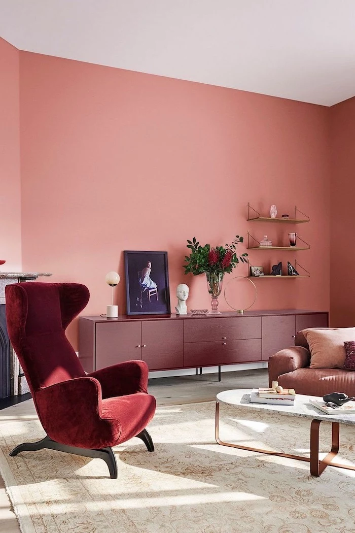
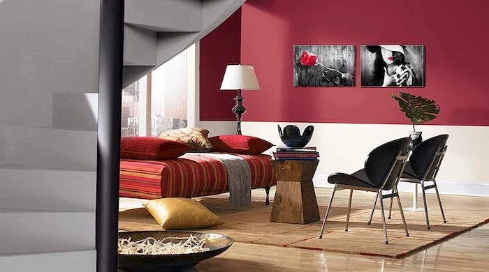
Before you even dip a brush, consider the 60-30-10 rule used by interior designers. It’s a simple recipe for a balanced room:
- 60% Main Color: This is your wall color. It anchors the space and serves as the backdrop.
- 30% Secondary Color: This is typically for furniture, curtains, or an accent wall. It should support the main color.
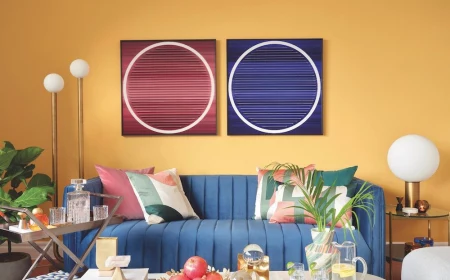
- 10% Accent Color: Think throw pillows, art, and accessories. This is your chance to be bold with a pop of contrast.
The one tool for a pro finish: A high-quality angled brush. Don’t skimp here. A premium 2.5-inch angled brush from a brand like Purdy or Wooster will give you razor-sharp lines when ‘cutting in’ around trim and ceilings, making the difference between an amateur job and a flawless result.

Ever wonder why a paint color looks perfect in the store but ghastly at home? You’re likely falling victim to ‘metamerism.’ This is the phenomenon where a color appears to change under different light sources. The harsh fluorescent lights of a hardware store are completely different from the warm, natural light in your west-facing living room. It’s why testing paint on your actual walls is the only way to be sure.

- Paint a large swatch (at least 2×2 feet) on a piece of white poster board, not directly on the current wall.
- Use two full coats, just as you would on the final wall.
- Move the board to different walls throughout the day to see how it looks in direct sun, in shadow, and with your lamps on at night.
- Check it next to your sofa, your curtains, and your flooring.

“Color is a power which directly influences the soul.”


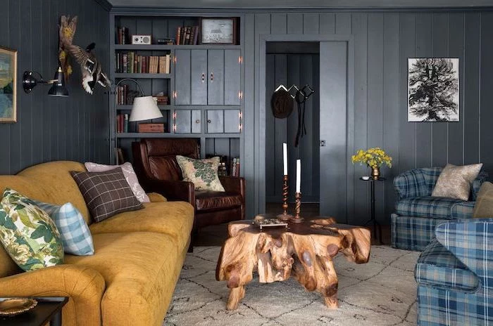
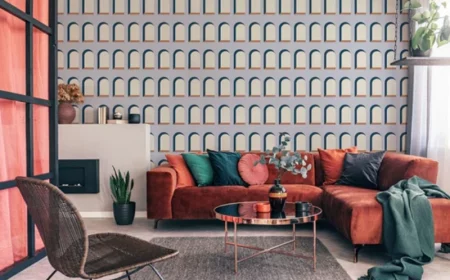
Feeling brave? A dark, moody living room can be incredibly chic and cozy. To avoid a cave-like feel, the secret is texture and light. Pair a deep color like Farrow & Ball’s ‘Hague Blue’ or Sherwin-Williams’ ‘Iron Ore’ with velvet furniture, metallic accents (brass or gold), and multiple light sources like floor lamps and sconces to create reflective points and a sophisticated, enveloping atmosphere.
Is ‘designer’ paint really worth the extra cost?
It can be. Premium paints from brands like Farrow & Ball or Benjamin Moore’s Aura line contain a higher percentage of solids (pigments and binders) and a finer grind of pigments. In practice, this means better coverage (often requiring fewer coats), richer and more complex colors that respond beautifully to light, and a more durable, long-lasting finish. If your budget allows, it’s an investment in the final quality.

Don’t just look at paint chips. Find inspiration in the items you already love. Pull the soft blue from a pattern on a throw pillow, the deep terracotta from a favorite ceramic vase, or the subtle gray-green from a piece of art. Building a color scheme around an existing object ensures the new wall color will harmonize with your decor from day one.


Budget-friendly tip: Check the ‘oops paint’ section at your local hardware store. These are custom-mixed paints that were returned by customers or mixed incorrectly. You can often find high-quality gallons for a fraction of the original price. It’s a bit of a lottery, but you might just find the perfect, unexpected color for your project.

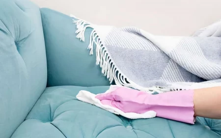
- Get rid of dust and grime for better paint adhesion.
- Achieve a smoother, more professional-looking finish.
- Prevent old stains or oils from bleeding through the new color.
The simple, non-negotiable first step? Washing your walls. A quick wipe-down with a sponge and a mild solution of TSP (trisodium phosphate) substitute or even just soap and water removes the invisible layer of grime that can ruin a paint job.
The annual


“For a successful interior, the paint color must be the thread that ties the sofa, the curtains, the carpet, the art, and the occupant’s personality together.” – David Hicks, Interior Designer
Painting over a dark wall with a light color: Use a high-quality, high-hide primer tinted gray. A gray primer helps neutralize the dark base color, allowing your new light color to appear true with fewer coats.
Painting over a light wall with a dark, saturated color: A tinted primer is also your best friend here. Having the primer tinted to a shade similar to your topcoat helps the final color achieve its full, rich depth without patchiness.

If you have an open-plan living space, create zones using color. You can define the living area with a bold accent wall behind the sofa, or paint the entire zone—walls and ceiling—in a distinct, cohesive color. This creates a ‘room within a room’ feeling without building any walls. A large area rug in a complementary color will further anchor the space.

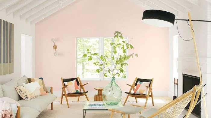
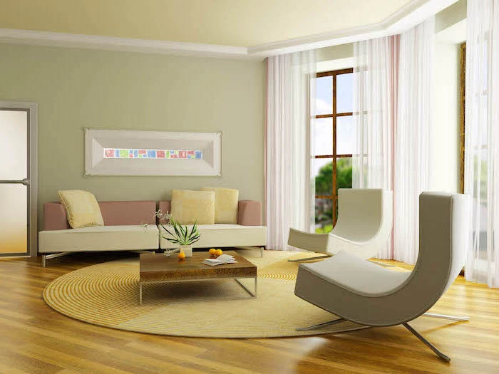
- Warm Whites: Have yellow, peach, or pink undertones. Benjamin Moore’s ‘Swiss Coffee’ is a classic. They create a cozy, inviting feel.
- Cool Whites: Have blue, gray, or green undertones, like Sherwin-Williams’ ‘Extra White’. They feel crisp, clean, and modern.
Holding a ‘pure’ white piece of paper next to the paint chip will help you see the subtle undertones immediately.
Think about the mood, not just the color. Instead of asking

Are low-VOC or zero-VOC paints actually better?
Yes, especially for interior spaces. VOCs (Volatile Organic Compounds) are solvents that are released into the air as paint dries, contributing to that strong ‘new paint smell’ and impacting indoor air quality. Low- or zero-VOC paints, like those in Behr’s Premium Plus line, minimize these emissions, making them a healthier choice for your home and family.

The human eye can distinguish about 10 million different colors, but struggles to remember a specific shade accurately for more than a few seconds.
This is precisely why you should never choose a color from memory. What you recall as the ‘perfect beige’ from a friend’s house will look completely different in your own. Always get a physical sample of the exact paint color (brand and name) to test in your space.
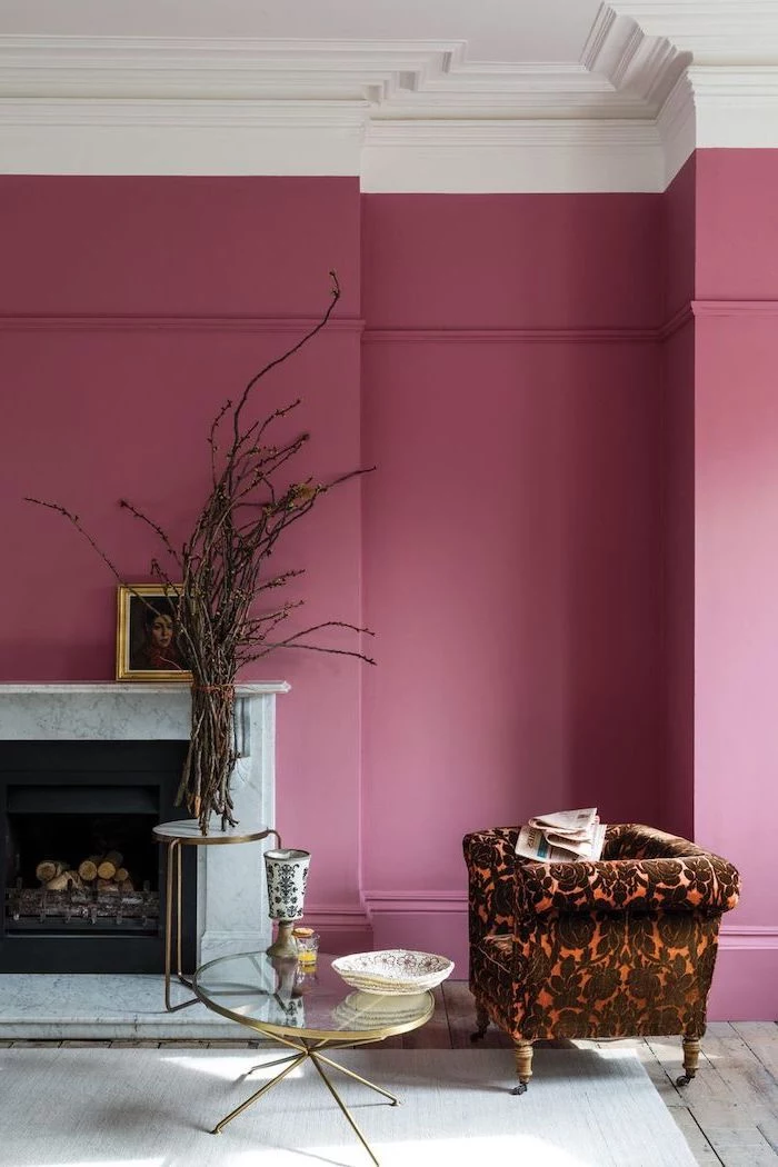
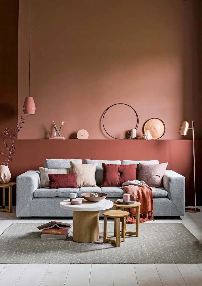
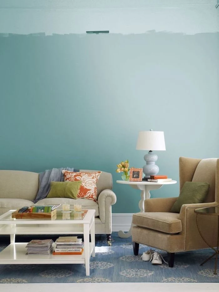
A simple trend with big impact is the half-painted wall. Painting the bottom half of the wall a darker or bolder color can ground the space, add interest without overwhelming, and even create the illusion of higher ceilings if the top half is painted a light color. It’s a perfect way to introduce a color you love without committing to four full walls.
To get a perfectly crisp line between two colors or along the ceiling, use this trick. After applying your painter’s tape, paint a thin layer of the *original* wall color along the edge of the tape. This seals the edge. Once it’s dry, paint your new color over it. When you peel the tape away, you’ll have a flawless, bleed-free line.