Gray and White Living Rooms: How to Make Them Cozy, Not Cold
I’ve been designing homes for a long time, and I’ve seen color trends flash in and out of style. But you know what never seems to go away? The classic gray and white combo. It’s the ultimate request for a reason—it feels clean, sophisticated, and just plain grown-up. People bring me photos of these impossibly serene, minimalist spaces and say, “I want that.”
In this article
But here’s the secret: it’s deceptively tricky. One wrong move, and your sophisticated dream room ends up feeling cold, sterile, and unwelcoming. Honestly, it can look like a sad, cloudy day, and nobody wants to live in a sad, cloudy day.
My job is to stop that from happening. And trust me, I learned some lessons the hard way. I once picked this gorgeous, cool-toned gray for a client’s north-facing living room. On the tiny paint chip, it was perfect. In their actual home? The cool northern light turned it into a dreary, purplish mess. We had to repaint the whole thing. That costly mistake taught me that getting this right is all about a hands-on approach. So, let’s get into the techniques the pros use to create gray and white living rooms that feel warm, inviting, and full of life.
First Things First: It’s All About the Light
Before you even think about looking at paint, you have to understand the light in your room. It’s the single most important factor, because it bosses your colors around and tells them how to behave. Two concepts are king here: Light Reflectance Value (LRV) and those sneaky color undertones.
Let’s Talk LRV
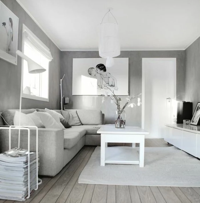
Every paint color has an LRV score from 0 (jet black) to 100 (pure white). This number simply tells you how much light a color will reflect. High LRV paints (think 80+) are like mirrors for light, bouncing it all around and making a space feel bigger and brighter. Low LRV paints do the opposite—they absorb light, creating a cozier, more dramatic vibe.
For whites, I typically aim for an LRV of 82 or higher to get that bright, clean feel. For grays, the range is huge. A light, airy gray might have an LRV around 60, still reflecting plenty of light. A deep, moody charcoal, on the other hand, could have an LRV as low as 13, creating a very intimate, grounded space.
The Hidden Colors in Your Gray Paint
Okay, this is the part that trips everyone up. Gray is never just gray. It’s black and white mixed with tiny drops of other colors, and these are called undertones. This is what makes a gray feel “cool” or “warm.”
- Cool Grays have hints of blue, green, or violet. They feel crisp, modern, and formal.
- Warm Grays (often called “greige”) have hints of brown, beige, or yellow. They feel much cozier and more inviting.
- Neutral Grays are the chameleons. They have very subtle undertones, making them super versatile.
The undertone is what caused my purple-room disaster. The cool, violet-undertone gray fought with the cool, blueish light from the window. So how do you avoid this? You match the undertone to the light source.
A little cheat sheet:
- North-Facing Rooms: The light is cool and indirect. A cool gray here can look very cold. I usually recommend a warm gray or a greige to balance things out and add some life.
- South-Facing Rooms: You’ve hit the jackpot! This bright, warm light is super forgiving. You can use almost any gray, and it will look great.
- East-Facing Rooms: You get warm light in the morning and cooler light in the afternoon. A balanced, neutral gray is often your safest and best bet.
- West-Facing Rooms: The light is soft in the morning but gets very warm and intense in the evening. A cool gray can be stunning here, as it balances out that fiery afternoon glow.
My #1 Rule: Never, ever, EVER choose a paint color from a tiny chip under the harsh fluorescent lights of a hardware store. Please don’t do it. Spend the $5-$10 on a sample pot. Paint a big poster board (at least 2×2 feet) with two coats. Then, move that board around your room for at least 48 hours. Seriously. Look at it in the morning, at noon, in the evening, and with your lamps on. This is the only way to know how that color will truly live in your space.
The Secret to a Non-Boring Room: Texture, Texture, Texture
Once you’ve got your color figured out, it’s time to build the room. And the secret to making a neutral palette feel rich and interesting is texture. Without it, gray and white is just flat and boring. Think about how things feel—you want a mix of rough and smooth, hard and soft.
Here’s how to layer it in:
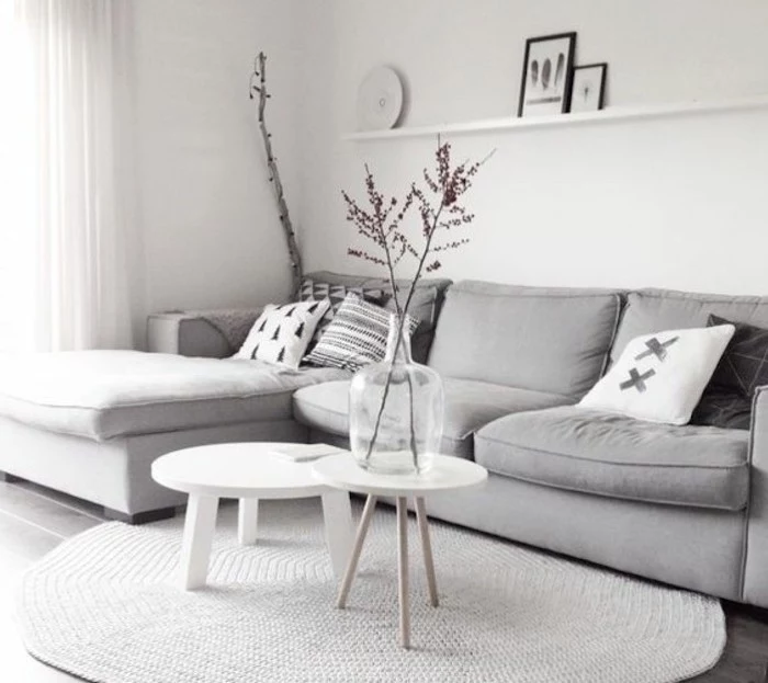
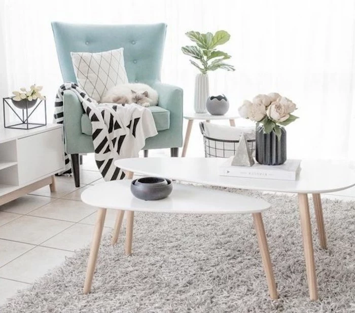
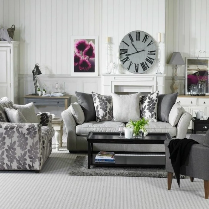
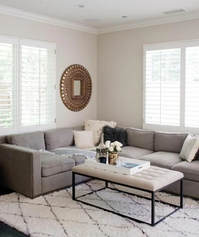
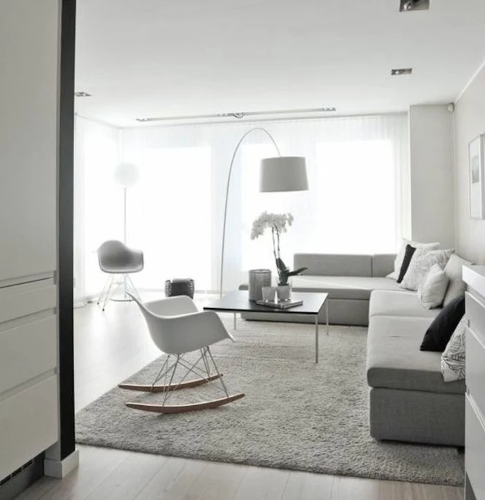
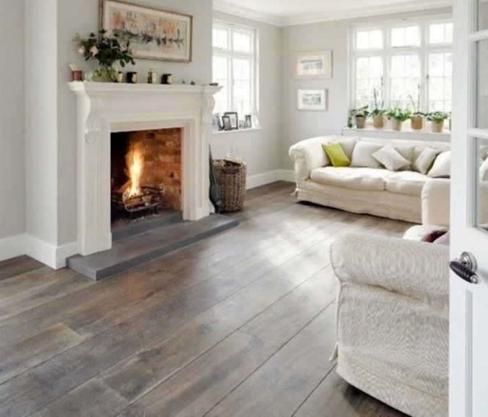
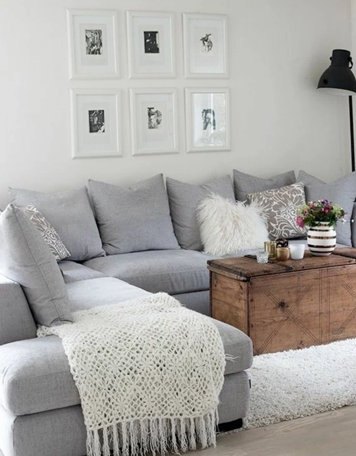
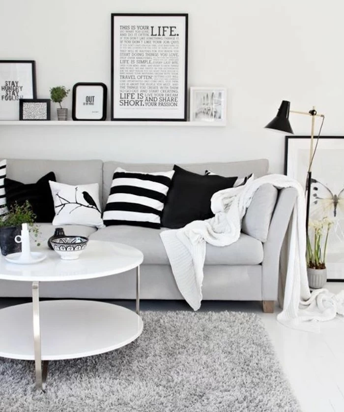
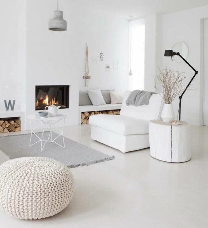
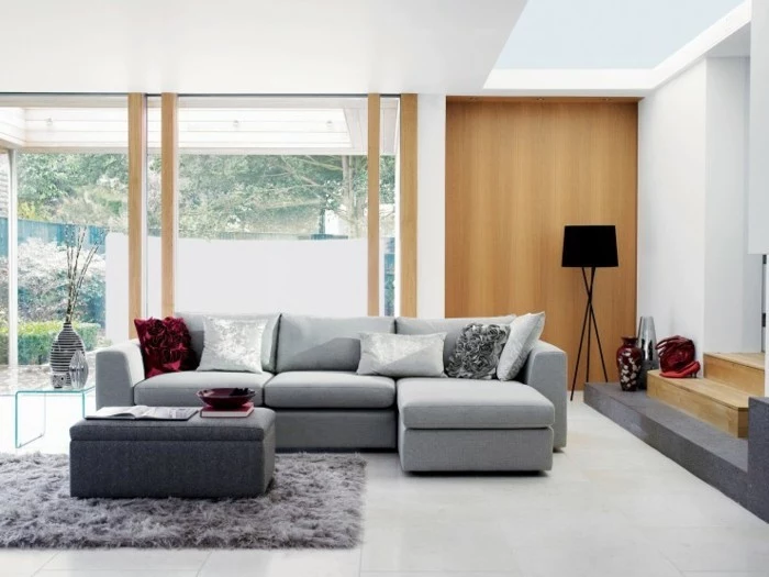
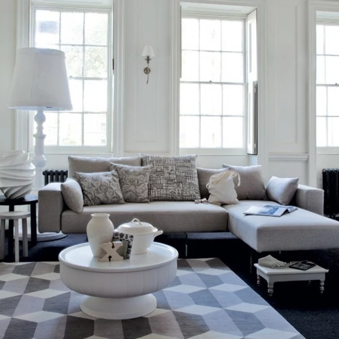
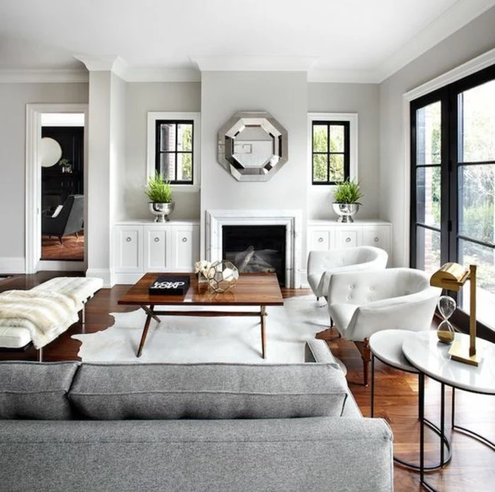
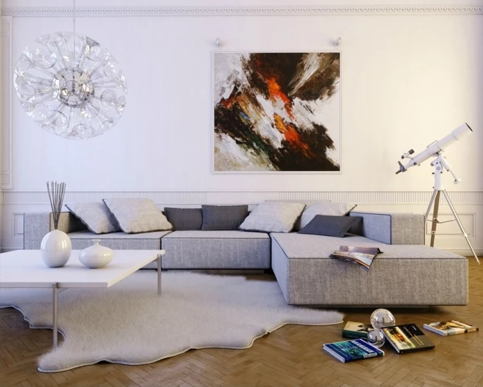
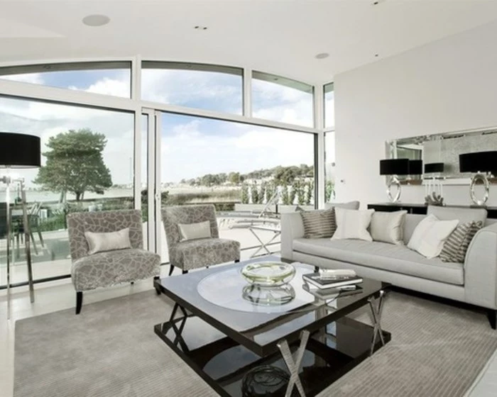
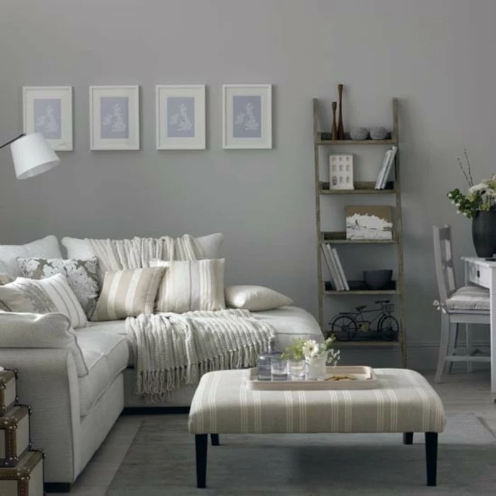
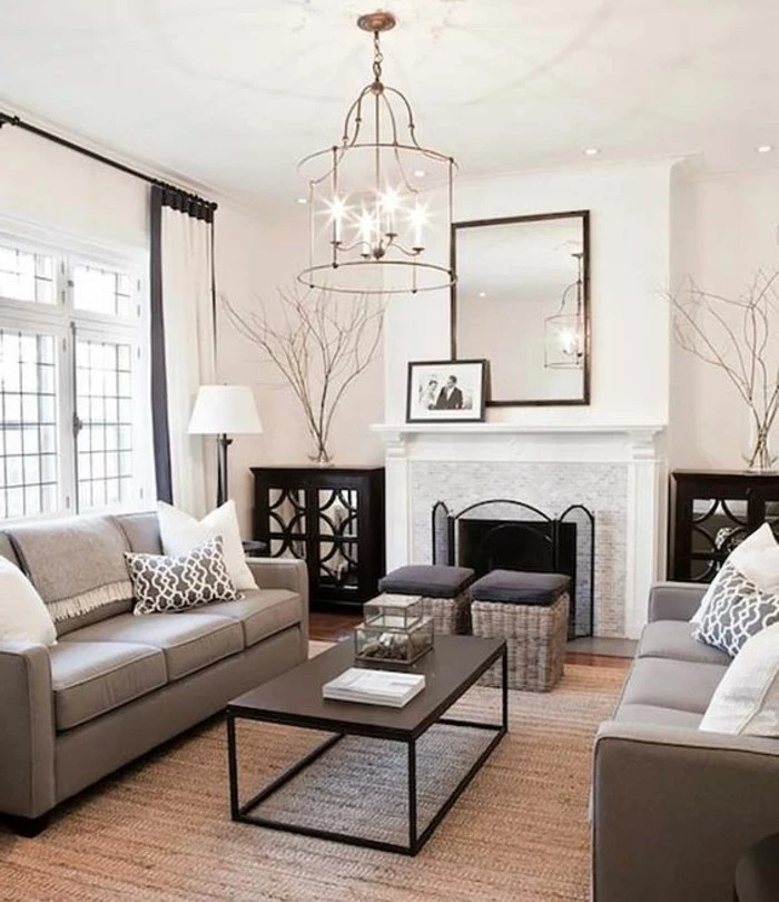
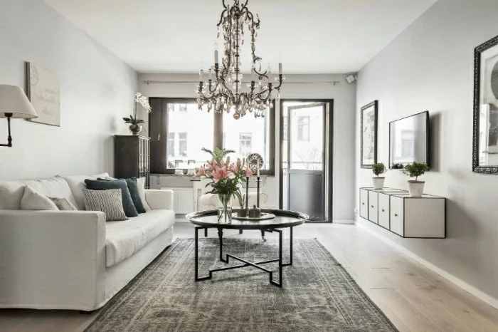
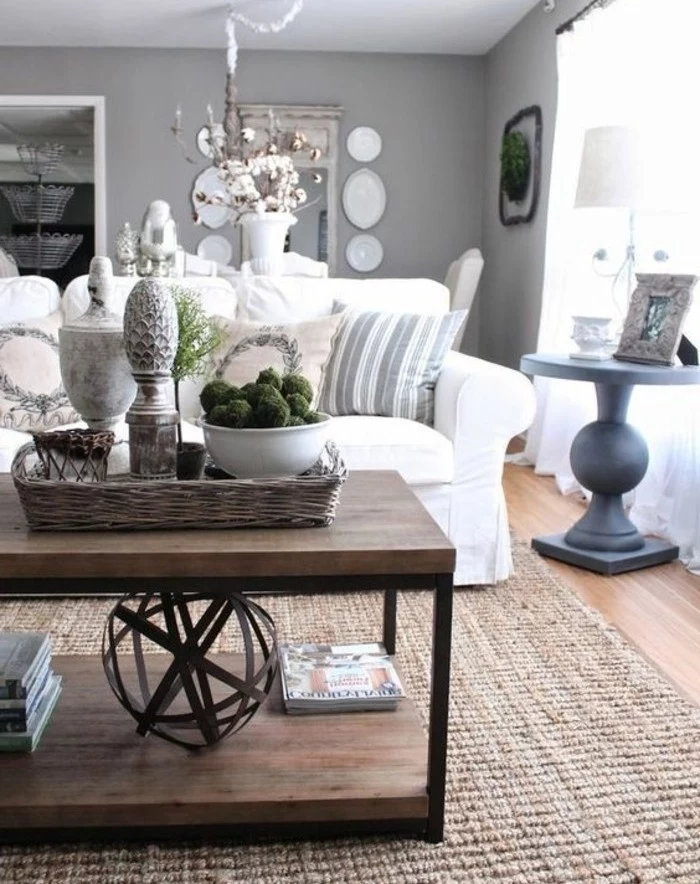
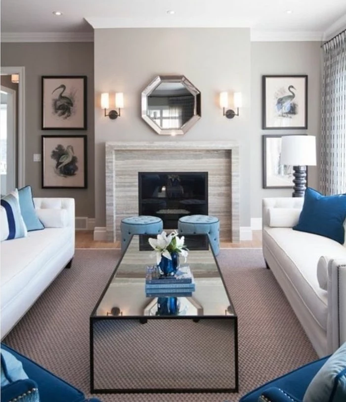
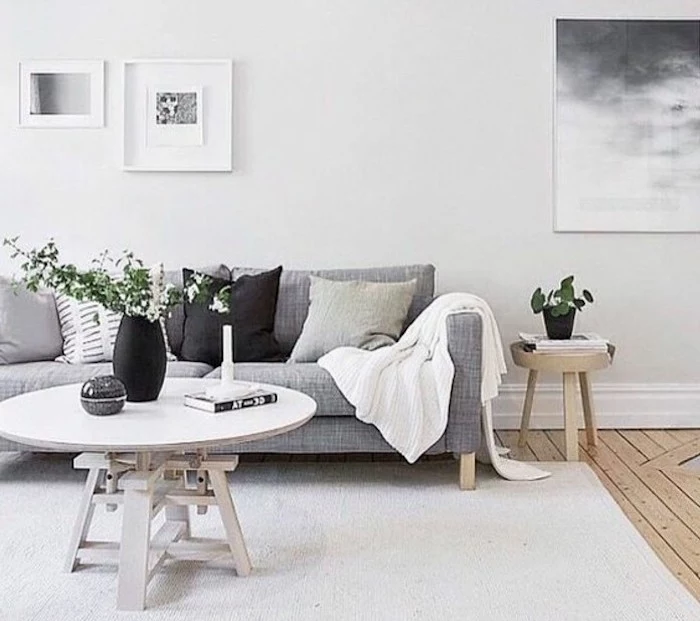
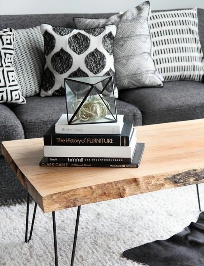
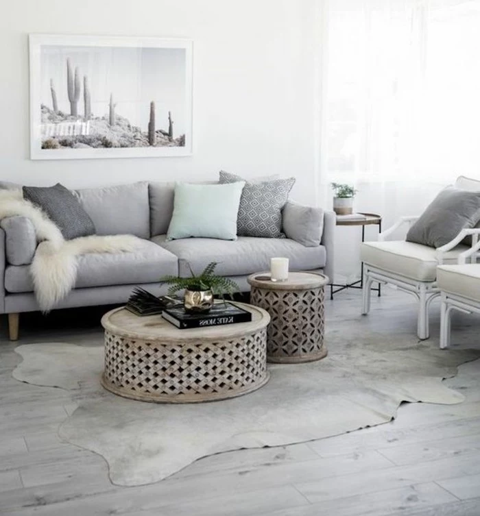
- The Rug: This is your foundation. A plush, high-pile wool rug adds instant warmth and feels incredible underfoot. For a more relaxed, organic vibe, a natural jute or sisal rug brings in a fantastic rough texture. Quick tip: make sure the rug is big enough! At least the front legs of your sofa and chairs should be sitting on it.
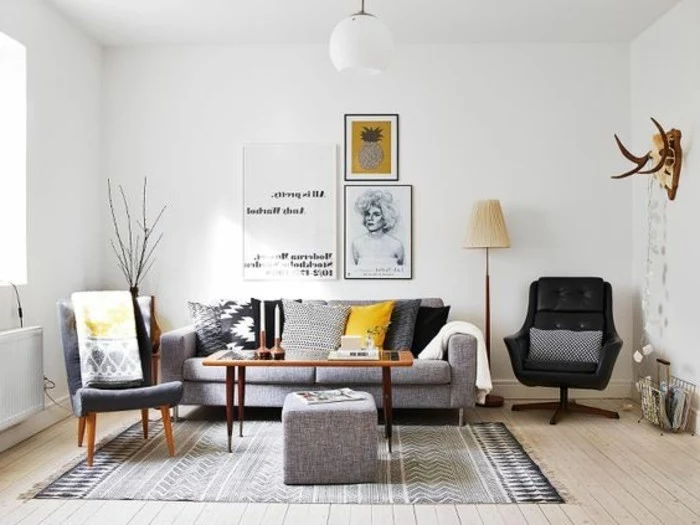
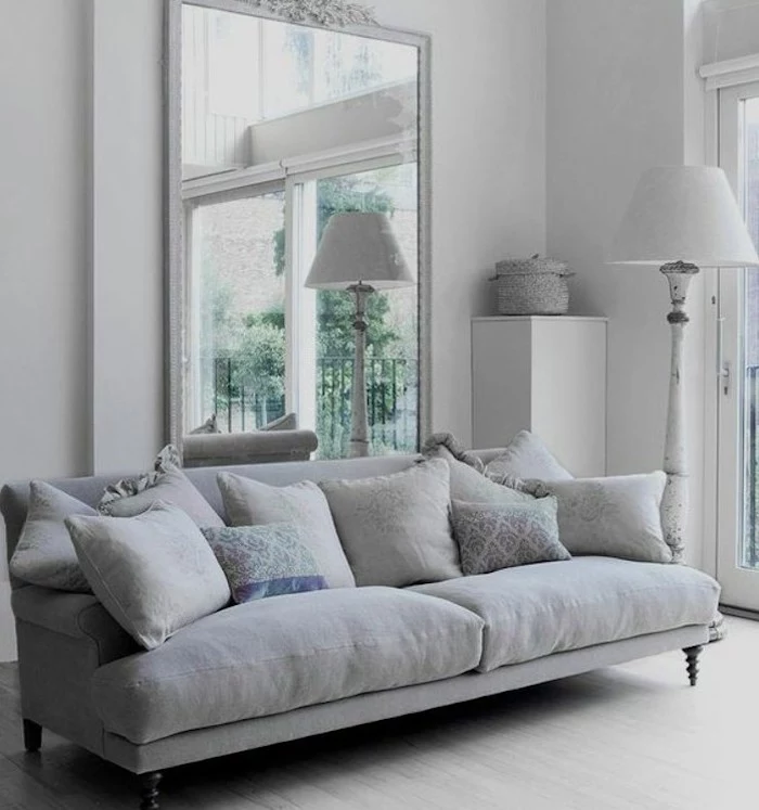
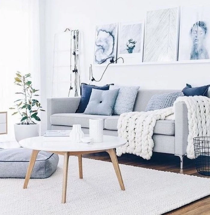
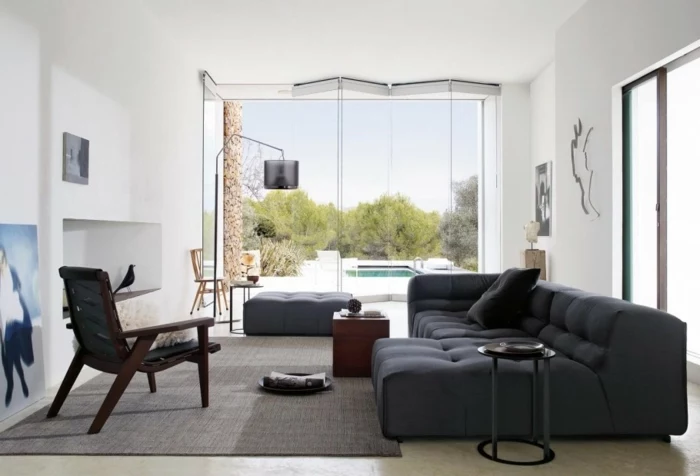
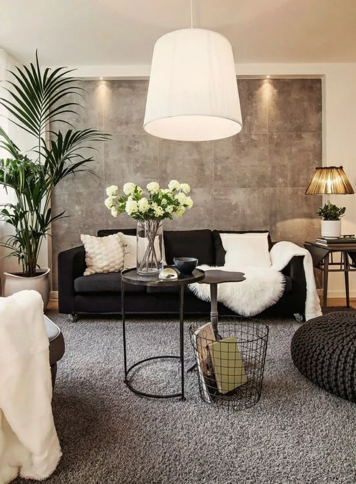
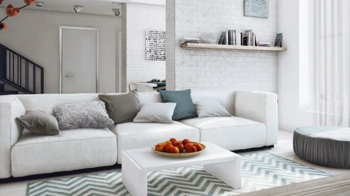
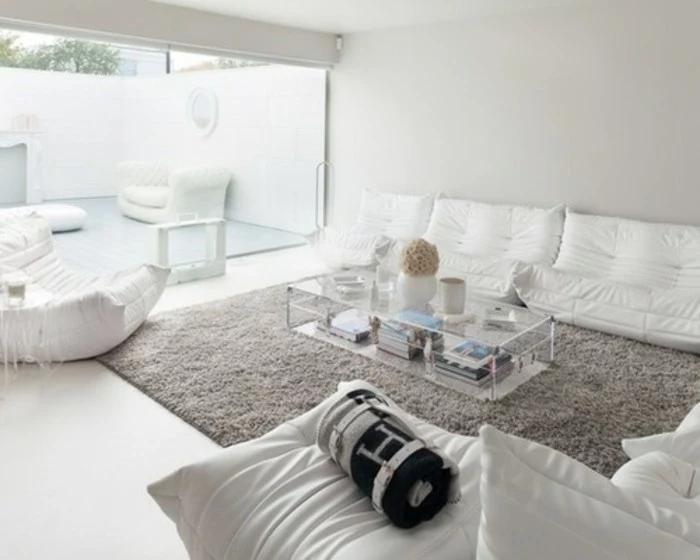
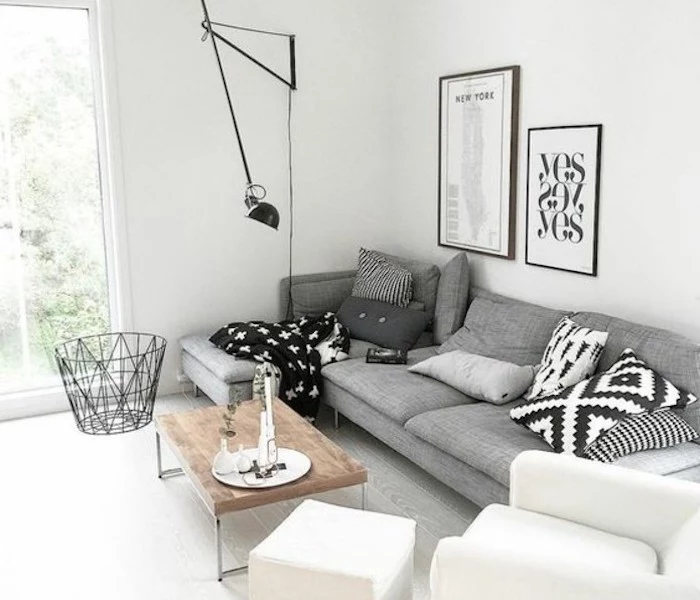
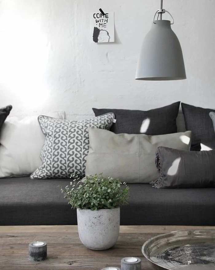
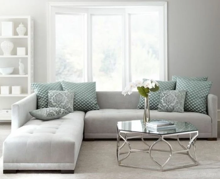
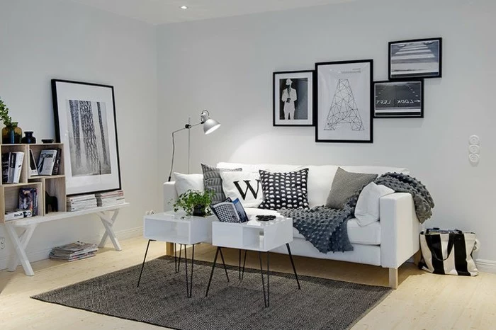
- The Sofa: A gray sofa is a classic, but the fabric makes all the difference. A crisp linen looks tailored and clean. A soft velvet feels luxurious and plays with the light beautifully. And the super popular boucle fabric adds a nubby, cozy texture that’s impossible not to touch.
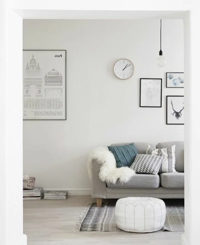
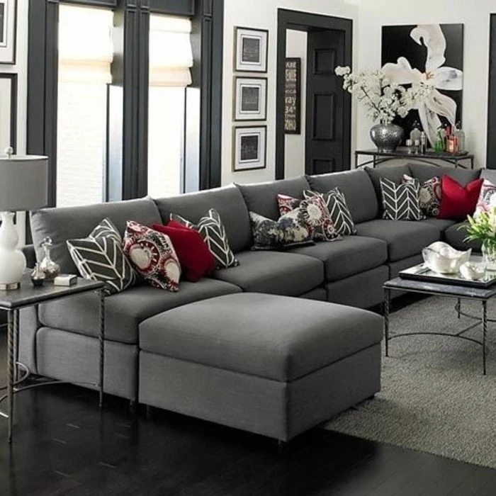
- Pillows & Throws: This is the easiest and cheapest place to go wild. Mix a chunky knit wool throw with some smooth velvet pillows. Toss in a faux fur pillow for a bit of glam. Don’t be afraid to mix and match!
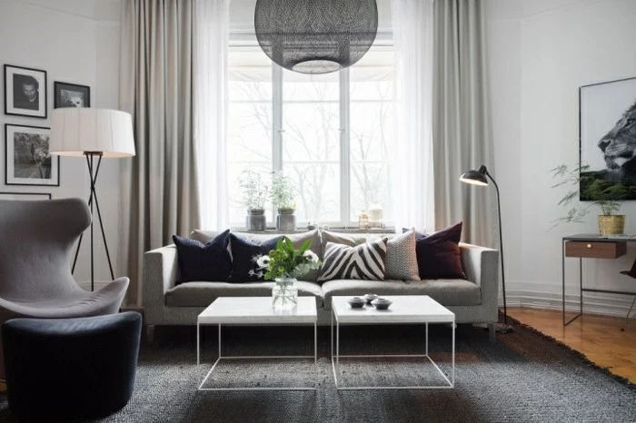
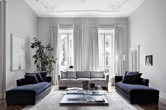
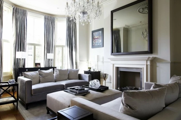
- Window Treatments: Sheer linen curtains will diffuse light and add a soft, breezy feel. If you want more drama and insulation, go for heavier drapes in a wool or velvet blend.
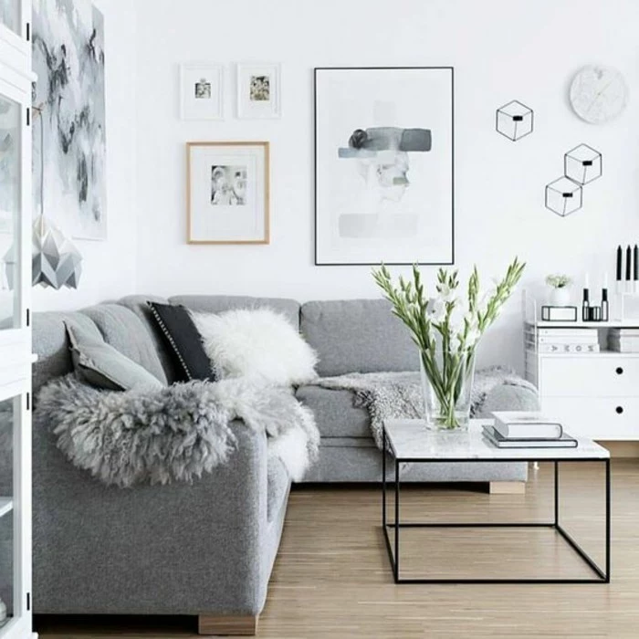
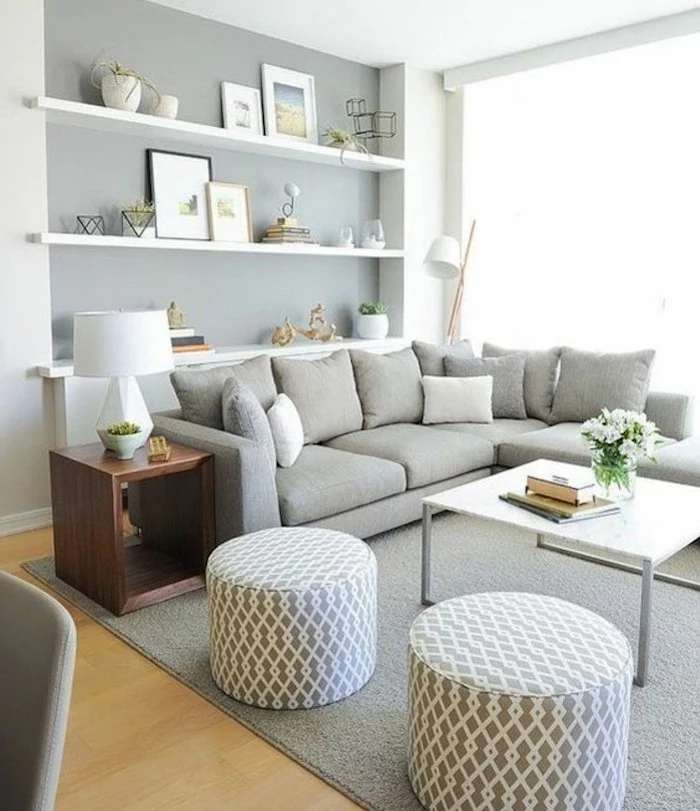
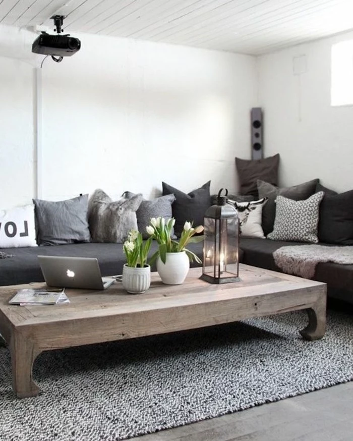
- Hard Surfaces: Contrast all that softness! A smooth marble coffee table, a warm wood side table, or a black metal bookcase all add necessary visual weight and keep the room from feeling like one big pillow.
Let’s Talk Money: Where to Splurge and Where to Save
Look, you don’t need to spend a fortune to get a high-end look. The trick is being strategic with your budget.
- Invest Here: Spend your money on the things you touch, use, and see the most. This means your sofa, your main area rug, and good lighting. A quality sofa is a game-changer; a good one might run you $1,500 – $4,000, but it will hold its shape and comfort for years. A cheap one will start sagging and looking sad in a year.
- Save Here: You can totally find deals on side tables, accessories, and decorative objects. Check out places like Target, HomeGoods, or Wayfair. You can get stylish side tables for under $150 and amazing pillows and throws for $20-$60. These are the items you can easily swap out later when you want a quick refresh.
The Finishing Touches That Make a Difference
Got the basics down? Awesome. Now let’s add the layers that really elevate the space from “nice” to “wow.”
A Pop of Something Extra
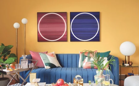
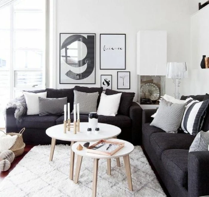
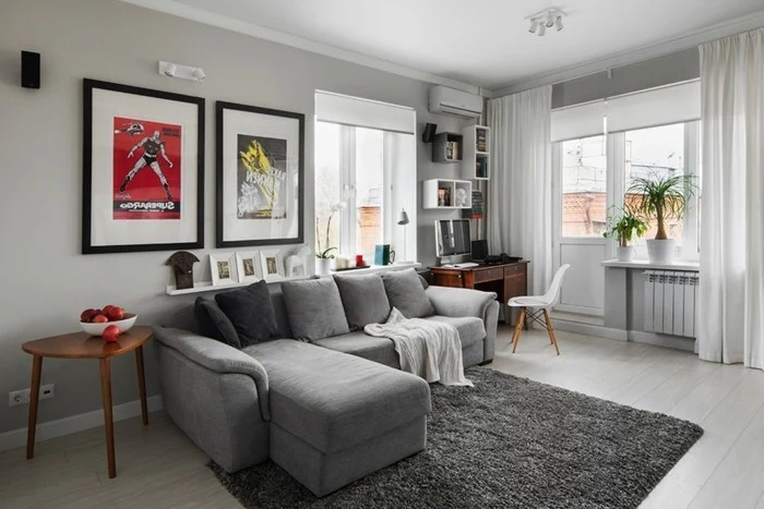
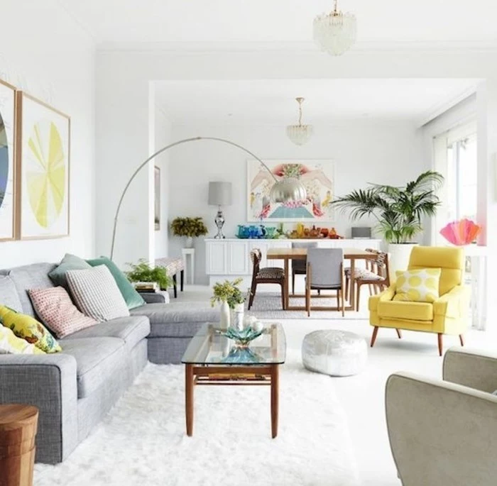
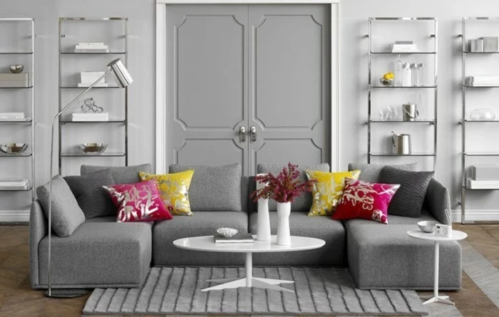
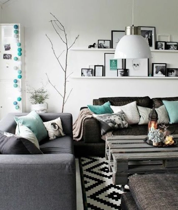
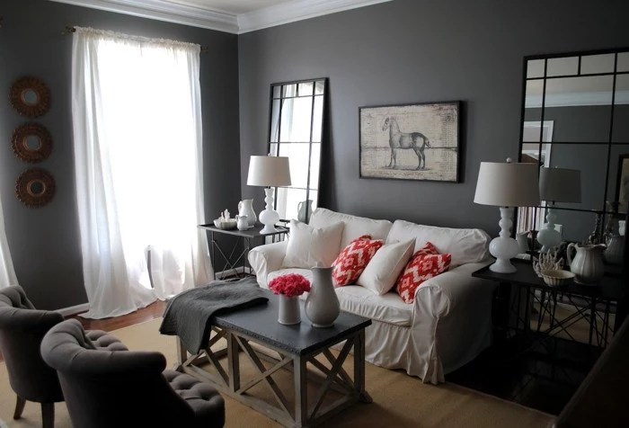
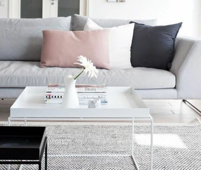
A purely gray and white room can sometimes use a little jolt of energy. An accent color, used in small doses, can work wonders. A good rule of thumb is the 60-30-10 rule: 60% of your room is your main color (like white walls), 30% is your secondary color (gray furniture), and 10% is your accent.
Some combos that always work:
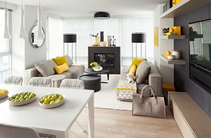
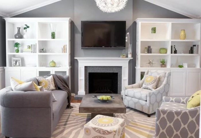
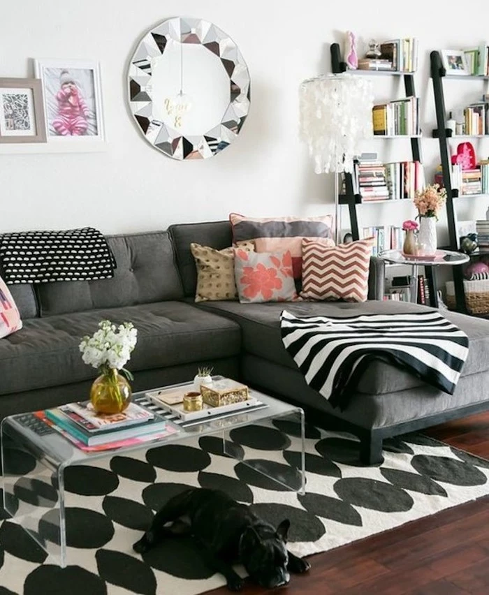
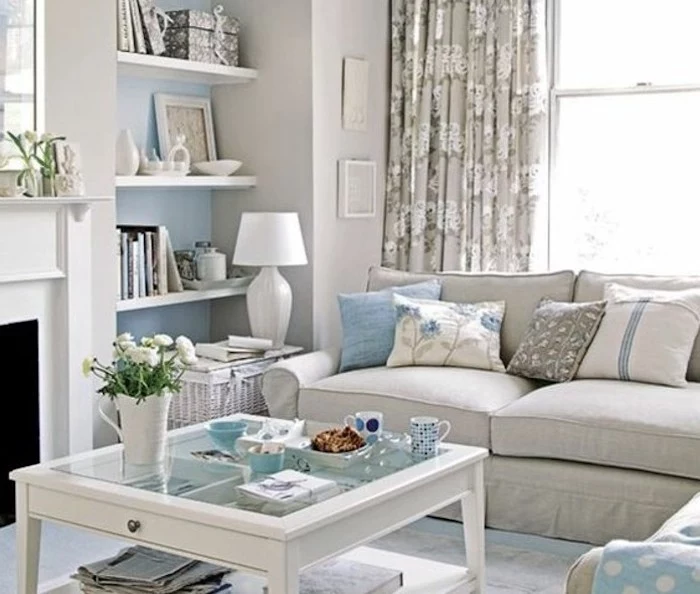
- Ochre or Mustard Yellow: Adds a vibrant, warm, and optimistic punch. A couple of pillows or a single throw is all you need.
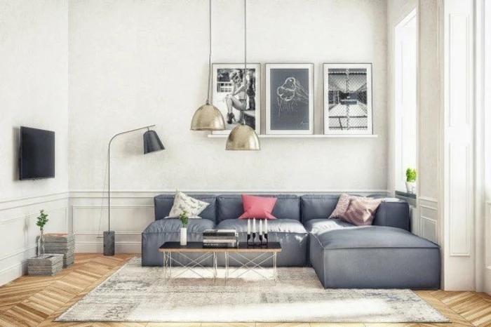
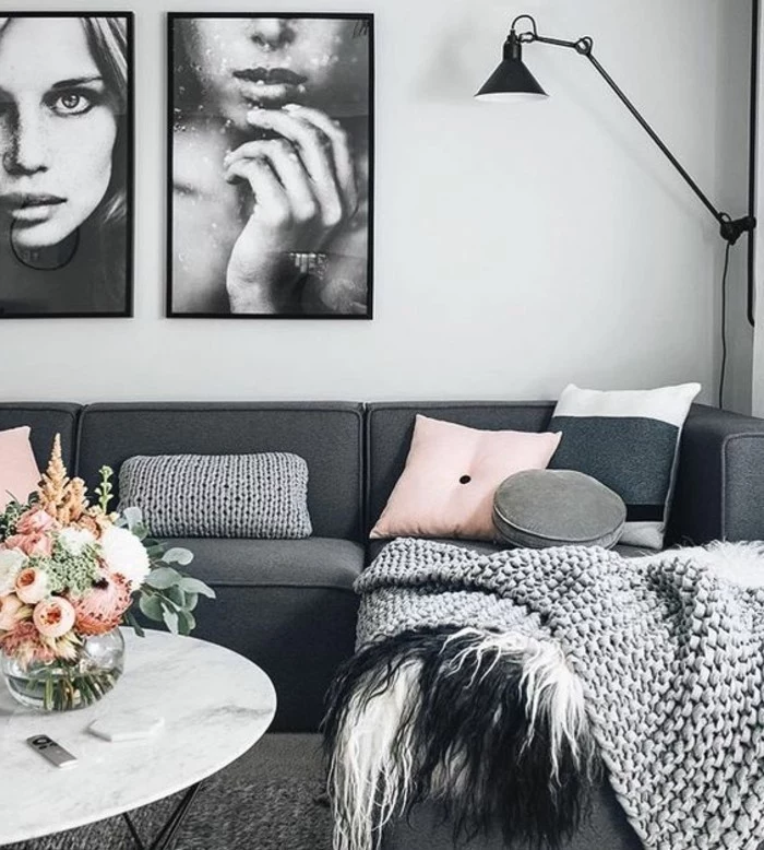
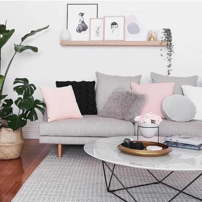
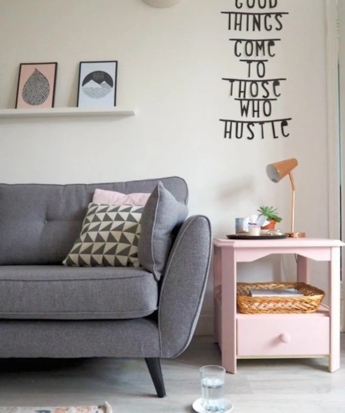
- Blush Pink or Dusty Rose: Instantly softens the gray and adds a touch of sophisticated, subtle color.
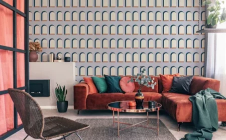
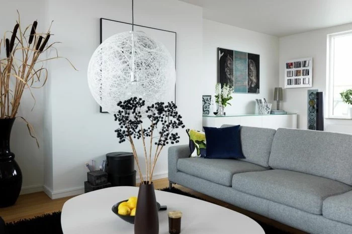
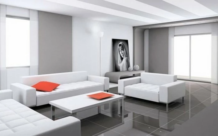
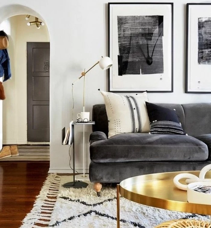
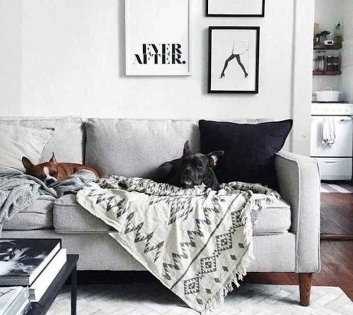
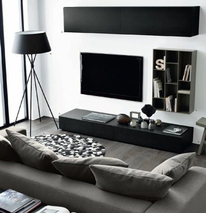
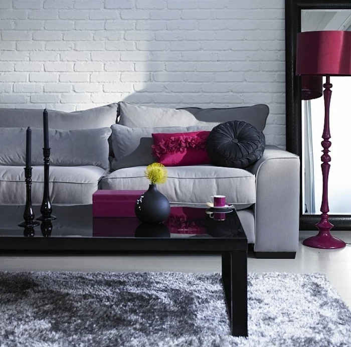
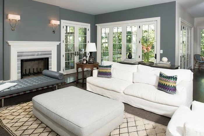
- Black: My personal favorite. It’s not a color, but it adds a graphic sharpness that grounds everything. Use it in picture frames, lamp bases, or the legs of a chair. It makes everything else look more intentional.
A Quick Win: The $75 Makeover
Not ready to repaint or buy a new sofa? No problem. Here’s a super-fast, budget-friendly way to test the waters. Go out and buy three new pillow covers for your current sofa: one with a chunky knit texture, one with a bold black-and-white graphic pattern, and one in a solid, luxurious velvet. This little trio will cost you less than $100 and will instantly make your living room feel more curated.
Layer Your Lighting
Please, I’m begging you, do not rely on a single overhead light. It’s harsh, unflattering, and creates weird shadows. You need at least three layers of light:
- Ambient: This is your overall light. It could be a cool ceiling fixture or recessed lights. Whatever it is, put it on a dimmer. Dimmers are non-negotiable for controlling the mood.
- Task: This is focused light for doing stuff. Think a floor lamp by a chair for reading or a table lamp next to the sofa. A stylish floor lamp from a place like IKEA can be had for around $100, and a great table lamp from West Elm or similar stores is often around $60-$150.
- Accent: This is the “mood” lighting. A small light pointed up at a plant or a picture light over your favorite piece of art.
Oh yeah, and check your light bulbs! For a cozy living room, you want bulbs in the 2700K to 3000K range. This gives off that warm, inviting glow. Anything higher will start to feel like a science lab.
A Final Word on Safety
This is the boring but important part. If you’re painting, make sure the room is well-ventilated, and look for low-VOC or no-VOC paints. They have fewer nasty chemicals. And a heads-up for anyone with kids or pets: any tall, heavy furniture like bookcases or TV consoles must be anchored securely to the wall. It’s a simple step that prevents serious accidents. Finally, always use a good-quality rug pad. It protects your floors and stops your rug from becoming a slippery death trap.
At the end of the day, creating a beautiful gray and white living room is all about finding that perfect balance. It’s a thoughtful mix of light, texture, and personal touches that create a space that’s both peaceful and packed with personality. When you get it right, it’s a timeless backdrop for a life well-lived.
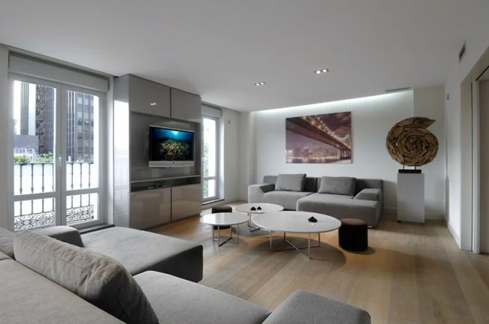
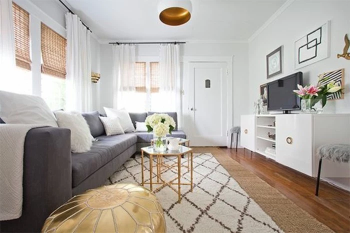
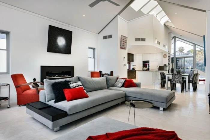
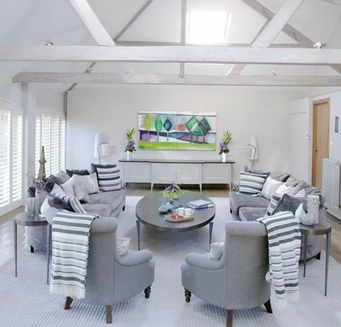
Inspiration Gallery
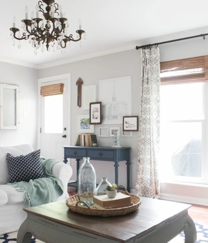
Warm Metals are Your Best Friend: While chrome and polished nickel look sharp, they can amplify the cool tones in a gray and white room. Instead, opt for warm metals to inject instant heat. Think brushed brass for light fixtures, aged bronze for cabinet handles, or a copper tray on the coffee table. These materials reflect a golden, flattering light that makes the space feel sunnier and more inviting.
- Choose a rug that’s significantly larger than your coffee table. The front legs of your sofa and armchairs should sit comfortably on it.
- Opt for plush, high-pile textures. A wool or even a shag rug feels luxurious underfoot and visually softens hard surfaces.
- Don’t be afraid of a subtle pattern. A faded oriental or a soft geometric can introduce character without overwhelming the serene palette.
What’s the quickest way to fix a ‘flat’ looking room?
Texture, texture, texture. Your eye reads a variety of textures as richness and depth. Swap flat cotton cushions for chunky knit wool, soft velvet, or nubby bouclé. Drape a faux fur or sheepskin throw over an armchair. Introduce woven elements like a rattan plant pot or a seagrass storage basket. This multi-sensory approach is the secret to a layered, sophisticated space.
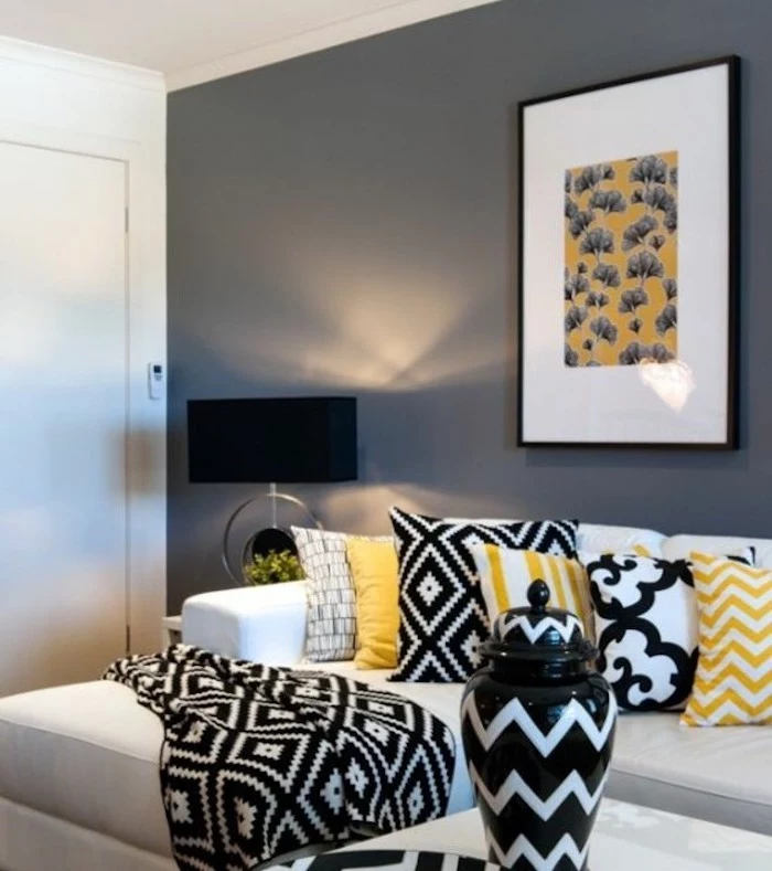
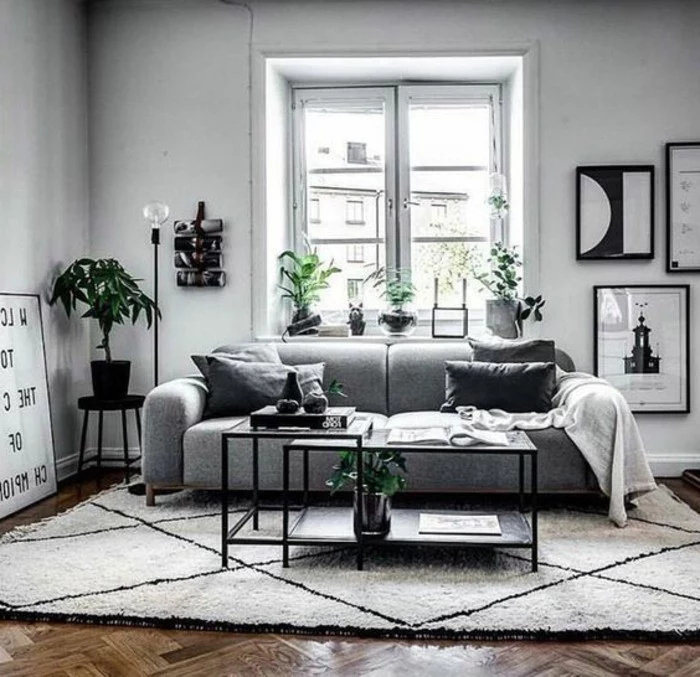
The secret weapon: Black. A common mistake in gray and white rooms is avoiding black for fear of making the space dark. In reality, small, deliberate touches of black are essential. They act as punctuation, grounding the lighter shades and making them feel more crisp and intentional. Try it with thin metal picture frames, a sculptural floor lamp, or the legs of a side table.
Consider the light’s temperature, not just its brightness. For a cozy atmosphere, choose LED bulbs with a ‘warm white’ color temperature, typically around 2700 Kelvin (2700K). This produces a soft, yellowish glow reminiscent of old incandescent bulbs, which is far more inviting than the harsh, blue-tinged light of ‘cool white’ or ‘daylight’ bulbs (4000K+).
Warm Gray vs. Cool Gray: Not all grays are created equal. A warm gray, like Benjamin Moore’s famous ‘Revere Pewter’, has beige or yellow undertones, giving it an earthy, cozy feel. A cool gray, like Sherwin-Williams’ ‘Passive’, has blue or purple undertones, creating a crisper, more modern look. For ultimate coziness, lean towards the warmer end of the spectrum.
- It provides a focal point without overwhelming the room.
- It adds a layer of dramatic, enveloping comfort.
- It makes your white furniture and trim pop with contrast.
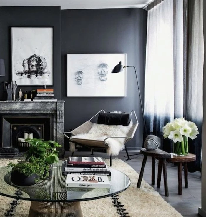
The secret? An accent wall. Paint the wall behind your sofa in a deep, moody charcoal like ‘Down Pipe’ by Farrow & Ball. It’s a bold move that delivers an incredible sense of depth and sophistication.
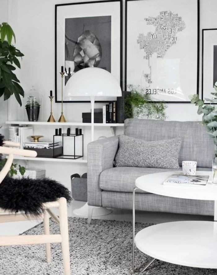
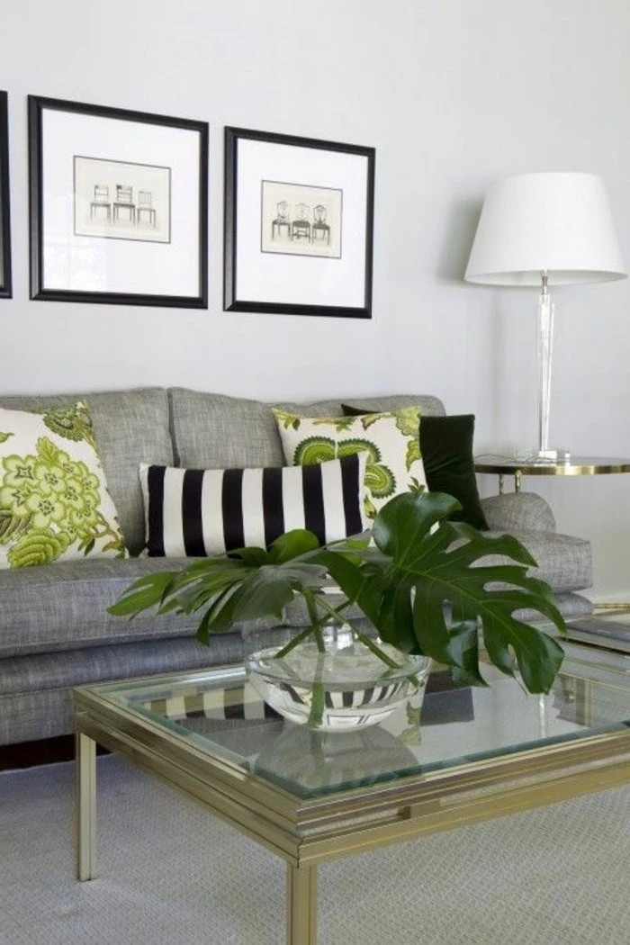
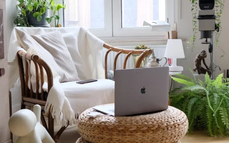
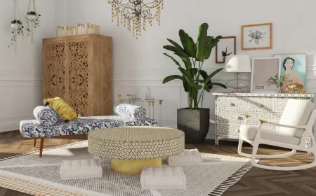
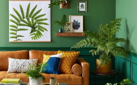
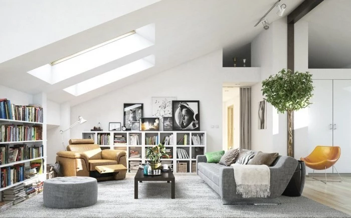
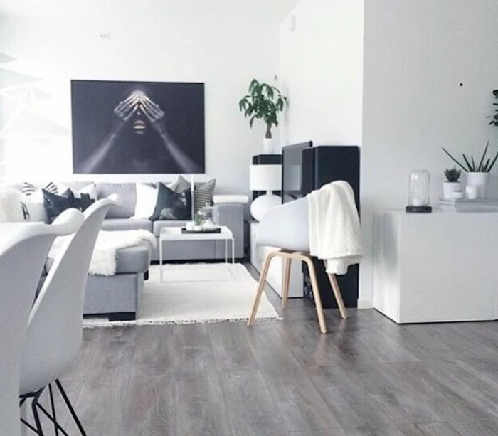
The right greenery can prevent a monochrome room from feeling lifeless. Look for plants with interesting leaf shapes and deep green colors. A tall Fiddle Leaf Fig adds vertical height and drama, while the lush, cascading leaves of a Golden Pothos on a bookshelf can soften sharp angles. The vibrant green is a perfect natural accent color.
Did you know that layered lighting can make a room feel up to twice as large and significantly more welcoming?
Instead of relying on a single overhead light, aim for a ‘lighting triangle’. Combine ambient light (a central pendant), task light (a reading lamp by a chair), and accent light (a small lamp on a console) to create pools of warmth and eliminate harsh shadows.
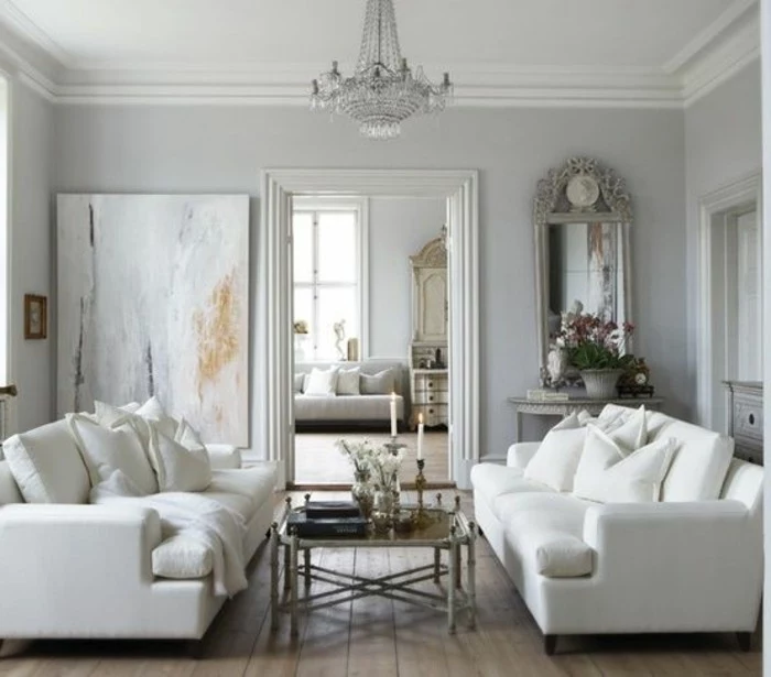
To keep the room from feeling like a sterile office, be selective with your white paint. A brilliant, stark white can be jarring. Instead, opt for a softer off-white with a hint of warmth. Shades like Farrow & Ball’s ‘Wimborne White’ or Benjamin Moore’s ‘White Dove’ provide clean contrast against gray but have a subtle creamy base that feels much more gentle and livable.
Can I use an accent color without it looking childish?
Absolutely. The key is sophistication in your color choice and moderation in its use. Instead of primary brights, think of muted, complex tones. A dusty rose, a deep teal, a rich ochre, or a sage green adds personality while maintaining an adult aesthetic. Apply this color sparingly—on a few throw pillows, a single piece of art, or a vase—to let it be a confident statement, not a desperate shout.
Natural Fibers: Think wool, linen, and cotton. They offer an organic, breathable texture that feels casual and earthy. Great for a relaxed, Scandinavian-inspired vibe.
Luxe Synthetics: Think performance velvet or bouclé. These materials add a touch of glamour and deep textural interest. They are perfect for elevating the space and adding a note of luxury.
A mix of both is often the ideal solution for a balanced, dynamic room.
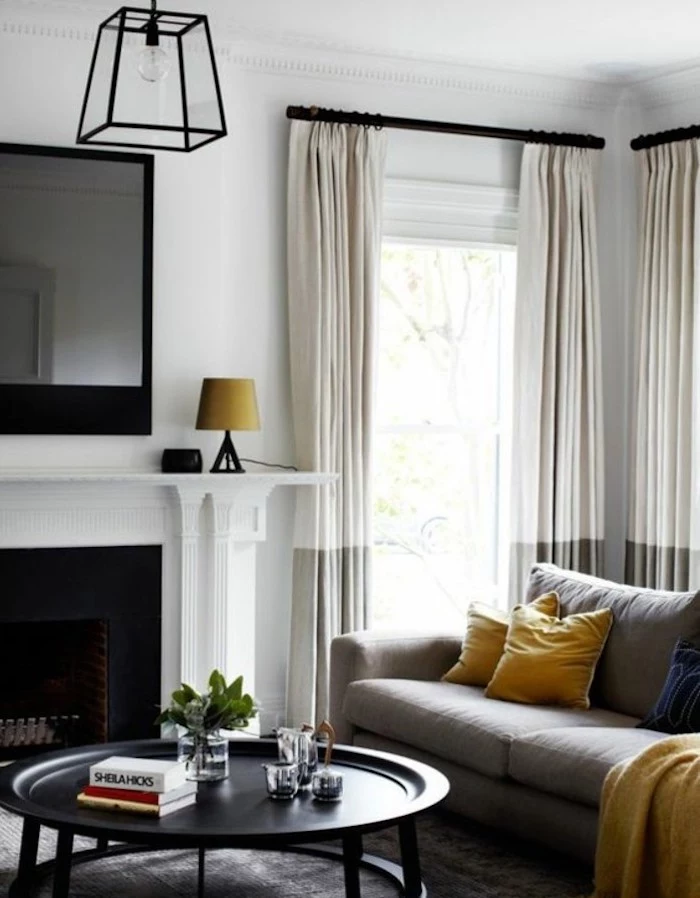
Don’t underestimate the power of curtains to add warmth. Sheer white curtains are nice, but for a truly cozy feel, consider heavier drapes. Floor-to-ceiling panels in a textured fabric like linen-blend or, for ultimate luxury, velvet, will instantly make the room feel more insulated, quiet, and plush. Choose a shade of gray slightly darker than your walls to add depth.
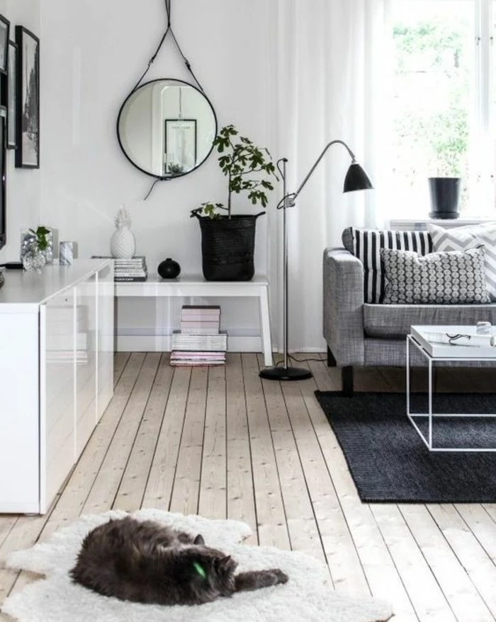
A large mirror placed opposite a window doesn’t just bounce light; it also reflects the view, creating a ‘second window’ that adds depth and life to the room.
In a gray and white living room, this trick is invaluable. Choose a mirror with a minimalist frame in black or a warm metallic to integrate it seamlessly into your design.
The Scandinavian concept of
- A stack of design books on the coffee table adds personality and subtle color.
- Swap out two cushions on your sofa for a bold accent color or texture.
- Use a decorative tray to corral remotes and coasters, creating an island of order.
The Power of Wood Tones: Wood is a non-negotiable element for warming up a gray and white palette. The natural grain and warm hues provide a crucial organic counterpoint. A white oak brings a light, airy feel; a rich walnut adds mid-century sophistication; and a rustic pine introduces character and history. Even a single element, like a wooden-legged armchair, can make a huge difference.
“The most common mistake I see is forgetting about the fifth wall: the ceiling.” – Designer Nate Berkus
While a crisp white ceiling is standard, consider painting it a very pale, warm gray—or even the same off-white as your walls. This blurs the lines of the room, making it feel like a soft, cohesive envelope and enhancing the sense of intimacy.
How do I choose art for a gray and white room?
Art is your chance to inject soul. For a chic, cohesive look, opt for a gallery wall of black and white photography with matching frames. For a bolder approach, choose one large, impactful abstract piece with a splash of your chosen accent color. This single piece can then inform the color of your cushions and other small accessories.
Matte Finish for Walls: Creates a soft, velvety look that absorbs light and hides imperfections, enhancing the cozy vibe.
Satin or Eggshell for Trim: Offers a slight sheen that provides a subtle, elegant contrast to the matte walls, making architectural details pop.
This combination creates a sophisticated, layered effect using paint finish alone.
- Incredibly soft and inviting to the touch.
- It catches and reflects light in a way that creates depth and shadow.
- It adds an instant feeling of luxury and glamour.
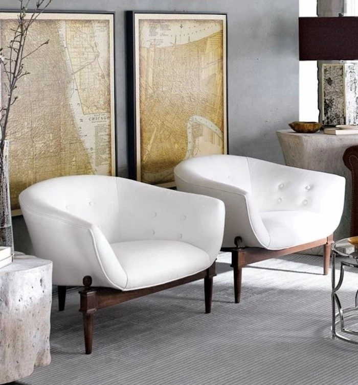
The hero material? Velvet. A gray velvet sofa is a game-changer, providing all the texture and opulence needed to counteract any potential coldness in a monochrome scheme. If a sofa is too much, try velvet armchairs or cushions.
The ‘Greige’ Solution: If you’re nervous about gray feeling too cold, ‘greige’ is your foolproof answer. A perfect fusion of gray and beige, it carries the modern sophistication of gray while retaining the inherent warmth of beige. Colors like Portola Paints’ ‘King’s Cove’ provide a warm, complex neutral base that feels serene and welcoming in any light.
According to a 2022 trend report, bouclé fabric saw a 120% increase in searches, and it’s not slowing down.
This nubby, looped yarn, once popularized by Chanel, is perfect for a gray and white room. A white or cream bouclé armchair adds immense textural interest and a chic, cloud-like comfort that begs you to curl up and relax.
Don’t just decorate, curate. A gray and white living room shines when it feels personal. Instead of generic decor, display objects that tell your story: a stack of books you’ve actually read, a vase brought back from a trip, a framed photo that makes you smile. This layer of personal history is the ultimate source of warmth.