A Stylist’s Guide to Using Color—Without Buying a Whole New Wardrobe
After years of working as a stylist, I’ve seen countless color trends come and go. One thing I’ve learned for sure is that the colors that stick around aren’t random. They’re the ones that just work for real people and their actual lives. Big trend reports are fun to look at, but they’re just predictions. The real magic happens when you learn how to bring a few new colors into your closet to make everything you already own feel fresh again.
In this article
My job has always been to close that gap between the runway and reality. It’s never about a total overhaul. It’s about being smart and strategic. This guide is built on my experience working with all sorts of fabrics, dyes, and amazing clients. We’re going to break down the key color families, but more importantly, I’ll show you how to use them with confidence. Ready?
First Things First: Know Your Skin’s Undertone
Before we even talk about specific colors, let’s figure out what works best for you. You’ve probably heard people say a color “washes them out.” That’s usually about skin undertone. It’s the subtle, underlying color of your skin that always stays the same, whether you’re tan or pale.
Quick trick: Look at the veins on the inside of your wrist in natural light. It’s the oldest trick in the book for a reason!
- If your veins look mostly blue or purple, you likely have a cool undertone.
- If they appear more green or olive, you probably have a warm undertone.
- Can’t really tell? If they seem to be a mix of blue and green, you might have a neutral undertone, which means you can pull off most colors. Lucky you!
Keep this in mind as we go. It’s not a hard-and-fast rule, but it’s a fantastic starting point for finding your most flattering shades.
The Secret Pro Stylists Know: Color + Texture = Magic
Okay, here’s a core principle you need to understand: the same exact dye will look completely different depending on the fabric it’s on. Seriously, this is half the battle when putting together a high-end look.
It all comes down to the fiber. Natural fibers like cotton and linen have a matte finish that soaks up light, making colors feel softer and more grounded. A bright red on a cotton tee? Casual and cool. But that same red dye on silk? The silk reflects light like crazy, so the color becomes luminous, deep, and instantly more formal. Then you have synthetics like polyester, which can be dyed with incredible vibrancy—that’s why your workout gear can be an electric, almost glowing color that you’d never find in nature.
This is my secret weapon for creating those effortlessly chic single-color (monochromatic) outfits. A wool sweater, a silk camisole, and leather pants all in the same shade of navy look incredibly rich and textured. If they were all just plain cotton, the outfit would fall flat. So, as you think about color, start thinking about texture, too.
The Modern Color Families That Always Work
Let’s forget the trendy names and get into the color groups that have real staying power. I’ll break down what makes them work and how to actually use them.
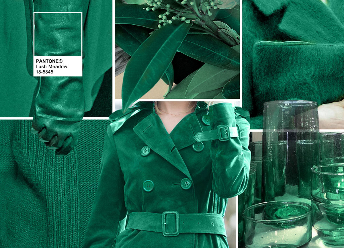
The New Greens: From Dusty Sage to Deep Bottle Green
Green is having a moment, but it’s shifted from bright, almost-neon shades to something much more sophisticated and connected to nature. Think moss on a stone, a dusty sage leaf, or the rich color of a dark green glass bottle.
Who does this color flatter most? Honestly, these muted and deep greens are almost universally flattering. The complexity—a mix of green with hints of grey, brown, or yellow—means they don’t clash easily. Sage green, in particular, acts like a neutral you can pair with almost anything.
Pro Techniques: I love using a deep bottle green as a modern substitute for black or navy. A well-tailored wool coat in bottle green has the same seriousness but with way more personality. It looks amazing with cream, camel, and even deep reds. I once helped a client who was tired of her boring corporate wardrobe swap a black blazer for a bottle green silk blouse. Paired with her grey trousers, it was still professional but felt so much more stylish and alive.
Budget-Friendly Tip: If you’re hesitant, start small. A moss-green suede belt or a pair of olive-green loafers can be a great entry point, usually under $60. For clothing, look for a cotton utility jacket in a faded olive—it’s a timeless piece that you can often find at stores like Old Navy or Gap for under $100.
Blue is a wardrobe staple, mostly thanks to denim. But let’s talk about the other blues that can do some heavy lifting. The first is a clear, open-sky blue—it’s clean, hopeful, and energetic. The other is a deep, inky navy that’s almost black, which is my personal favorite alternative to true black.
Who does this color flatter most? Sky blue is fantastic on most skin tones, especially cool and neutral ones, as it brightens the complexion. Deep navy is a true universal color; it’s a workhorse for everyone.
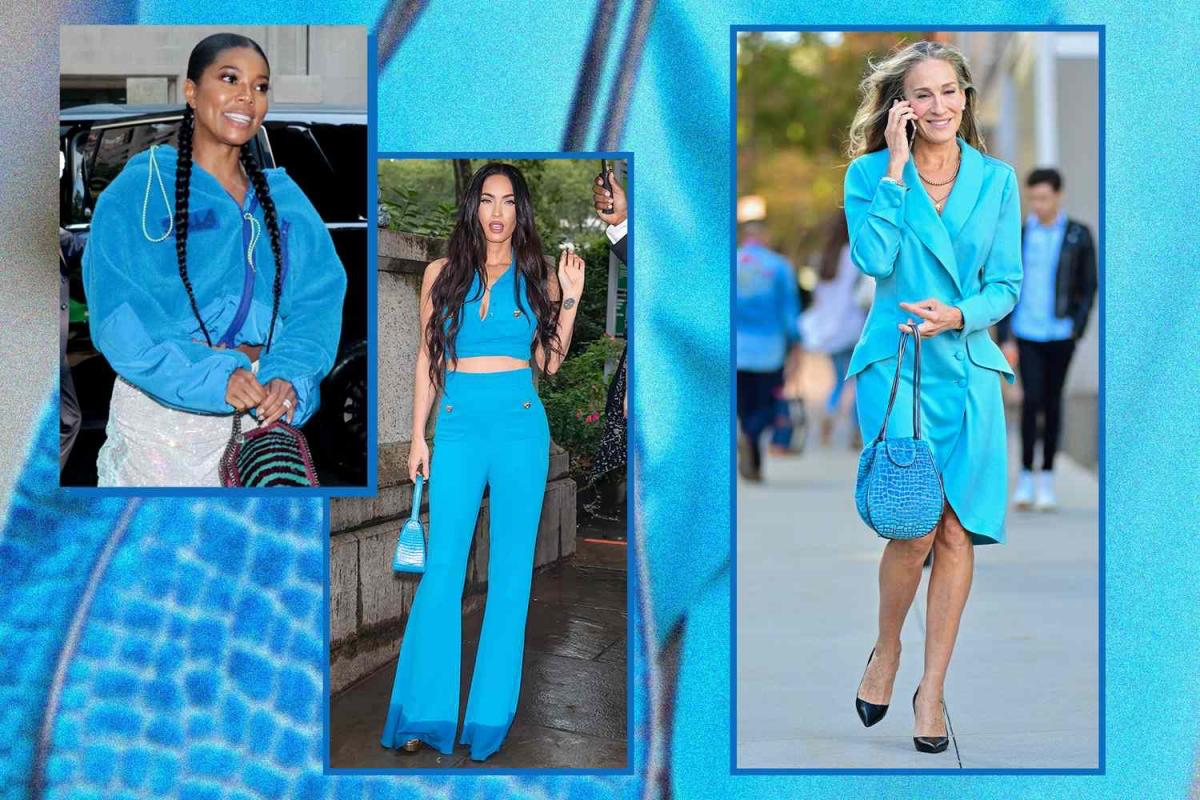
Pro Techniques: A sky-blue button-down shirt is a classic for a reason. Invest in a good one made from cotton poplin—the tight weave makes the color look so smooth and crisp. You can find excellent ones at places like Uniqlo or Everlane for around $40-$60. For a more advanced move, try pairing sky blue with a warm brown. I once styled a sky-blue cashmere sweater with chocolate-brown leather pants, and the cool/warm combo was just incredible.
Heads up! A quick warning about dark blues, especially the indigo dye in new raw denim. It WILL transfer. I have a horror story about a client who wore brand-new designer jeans and sat on a friend’s beautiful white sofa. It was a complete disaster. Always wash new, dark-wash jeans separately in cold water a couple of times before you wear them.
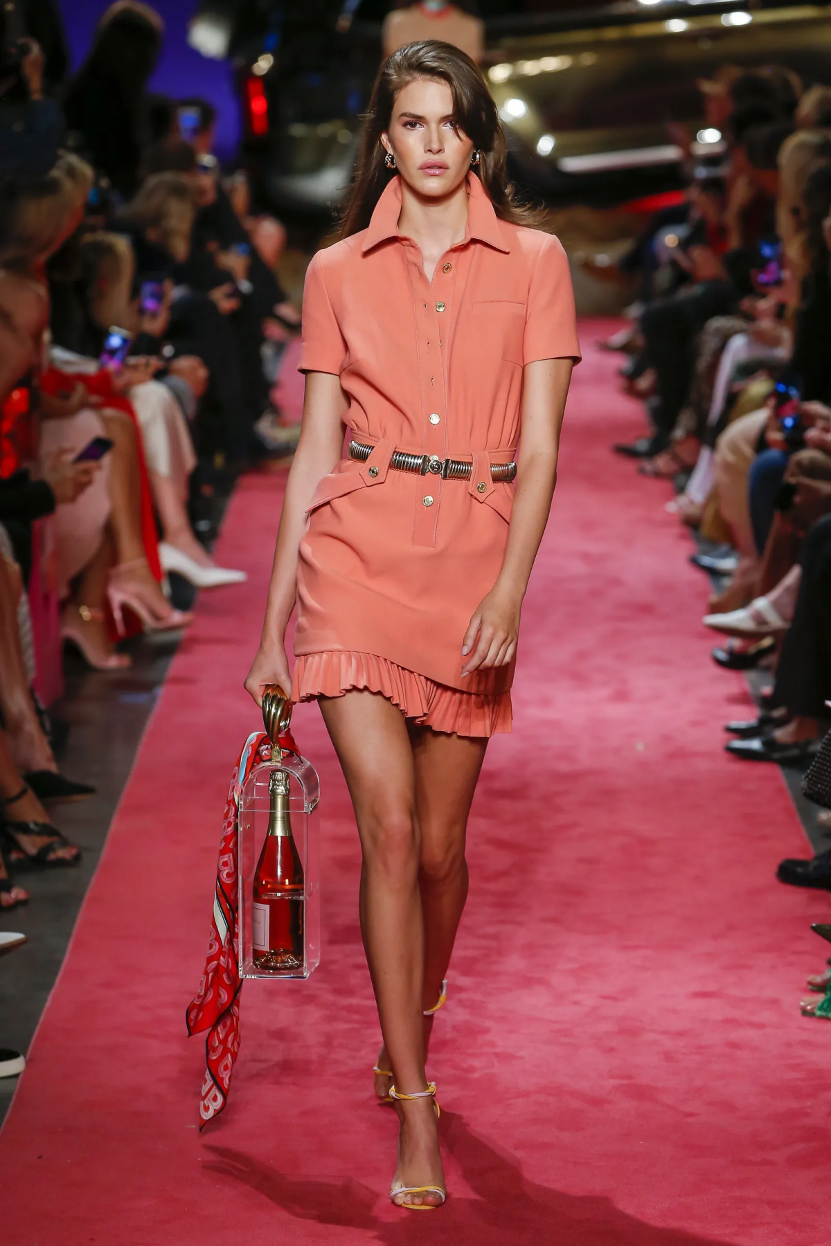
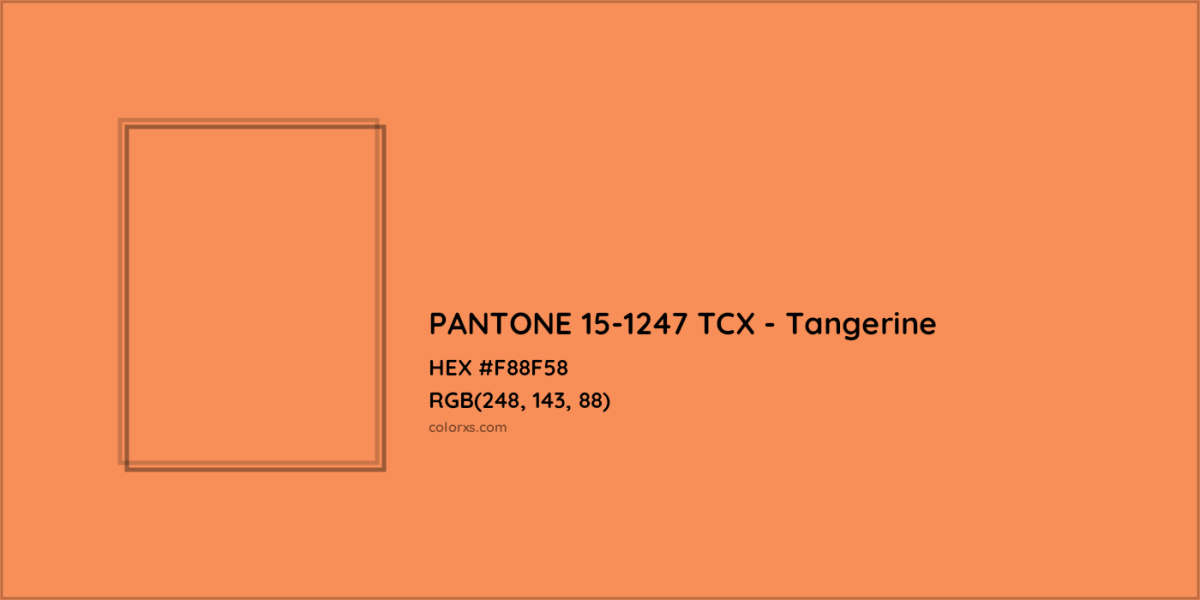
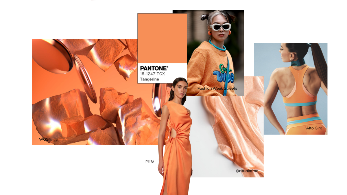
The Earthy Reds & Oranges: Terracotta, Rust, and Apricot
This color family is warm, inviting, and feels so grounded. We’re not talking about a loud fire-engine red, but rather the dusty red of a clay pot (terracotta), the deep orange-brown of rust, or the soft glow of a ripe apricot. They just feel sophisticated.
Who does this color flatter most? These shades are a dream for warm and neutral skin tones. If you have a cool undertone, you can absolutely still wear them! The trick is to wear them in pieces away from your face, like a great pair of rust-colored corduroys, a terracotta handbag, or chic loafers.
Pro Techniques: I love using these as accent colors. Imagine a simple outfit of a cream sweater and jeans. Now add a terracotta-colored leather bag (you can find beautiful ones on Etsy for $80-$150) and a scarf with hints of apricot. The whole outfit is instantly elevated. Texture is also key here. A matte terracotta linen looks relaxed and earthy, while a shiny apricot satin feels way more glam.
By the way, these colors look amazing paired with their opposite: blue. A rust-colored sweater with classic blue jeans is a timeless combination that just works, thanks to the perfect balance of warm and cool tones.
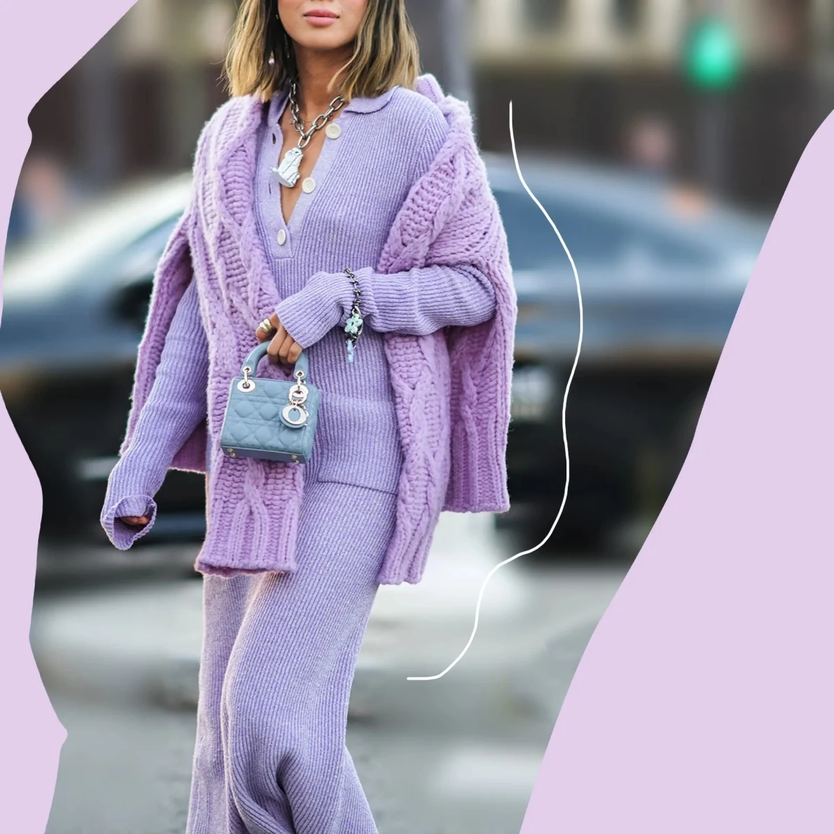
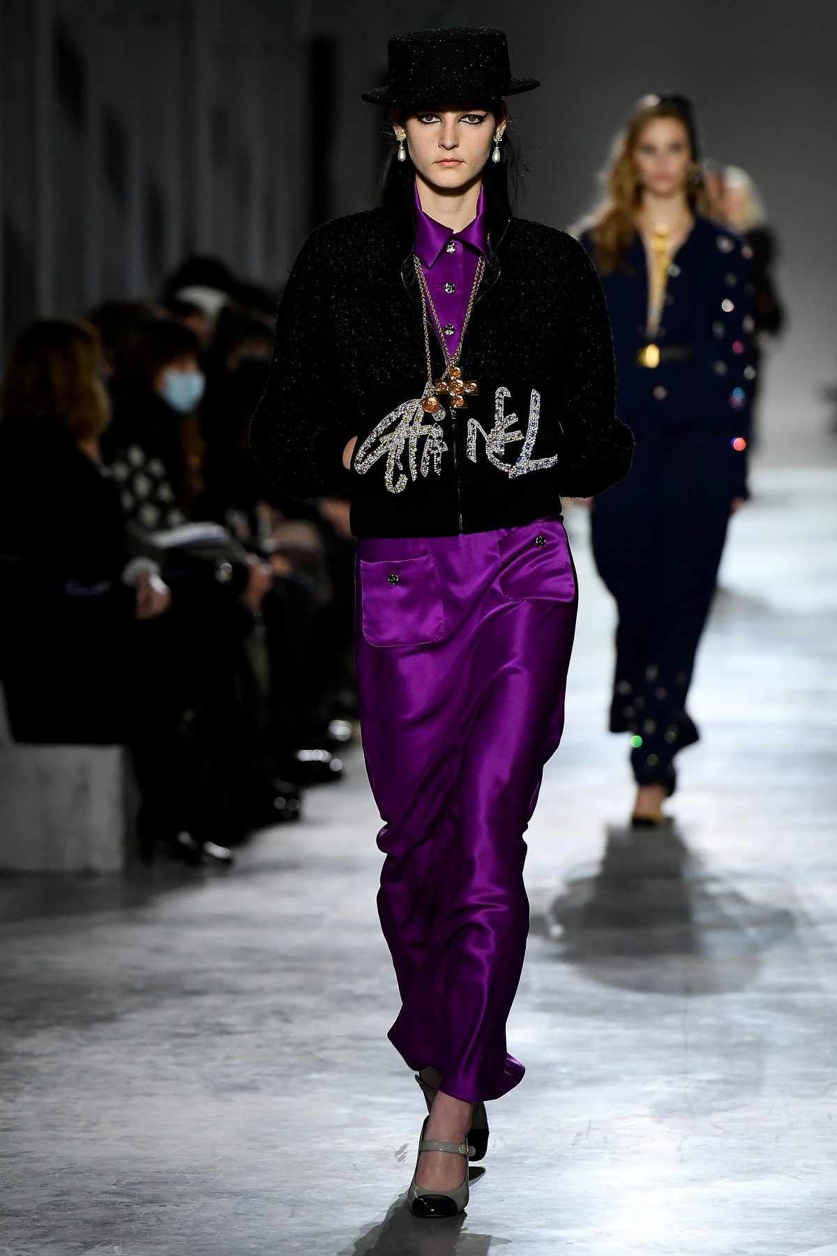
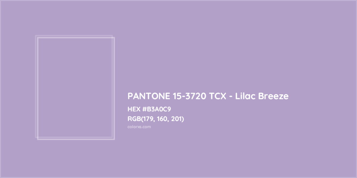
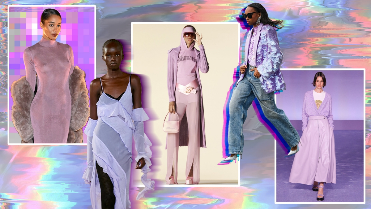
The Sophisticated Purples: Soft Lilac and Deep Plum
Purple can be tricky. It sometimes feels a bit loud or juvenile. But the purples that are truly stylish right now avoid that trap completely. We’re talking about a very soft, greyed-out lilac and a super deep, rich plum or eggplant shade.
Who does this color flatter most? Soft lilac can be stunning on cool undertones but can wash out warmer skin if worn as a solid top. If you’re warm-toned, try it in a print or as an accessory. Deep plum, however, is another one of those secret-weapon colors that looks fantastic on just about everyone.
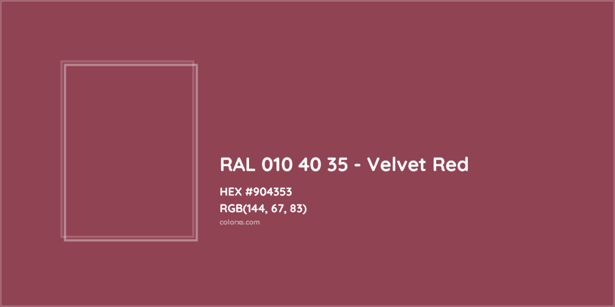
Pro Techniques: Deep plum is my go-to for evening wear. A velvet dress in a deep plum shade is ridiculously luxurious—so much more interesting than black. It’s just as formal but has way more character. For a client attending a formal gala, we swapped her planned black dress for a plum one, and she stood out in the most elegant way.
If you’re nervous about purple, start with plum. Because it’s so dark, it functions like a neutral. A plum-colored leather bag or a pair of trousers will fit right into your wardrobe. They pair beautifully with grey, cream, and even olive green.
The Essential Neutrals: Going Beyond Black & White
No wardrobe works without the neutrals that hold it all together. The best ones are warm, complex, and versatile. Think creamy off-whites, warm camel tones, and every shade of grey from pale dove to deep charcoal.
Pro Techniques: I tell every single client to build a strong foundation of neutrals first. This means a great camel coat, a perfect pair of grey wool trousers, and several tops in shades of cream. These are the workhorses. Once you have them, adding a pop of color is easy.
And don’t be afraid of an all-neutral outfit! The key is mixing textures. A cream cashmere sweater with ivory corduroy pants and a beige wool coat is anything but boring. The different textures make it visually interesting.
People often ask which dark neutral is best, especially for professional settings. Here’s my take:
- Black: It’s the highest in contrast and formality. It can be a bit harsh on some skin tones. It’s powerful and sharp, but not always the most versatile.
- Navy: Softer than black, and in my opinion, more versatile. It has a bit of color and richness that black lacks, and it pairs beautifully with other colors (like brown, which can be tricky with black). A navy suit often looks more modern and approachable than a black one.
- Charcoal Grey: The ultimate team player. It’s a true neutral, so it literally does not clash with anything. It’s less severe than black but just as professional. It lets other colors be the star of the show.
Let’s talk money: For these foundational neutral pieces—especially coats and trousers—this is where you should invest. A cheap camel coat won’t have the same rich color or elegant drape as one made from a good wool or cashmere blend. Expect to spend in the $200-$400 range for a great quality wool-blend coat from a brand like J.Crew, or upwards of $500 for true cashmere from a place like Theory. It’s better to have one fantastic pair of grey trousers that will last for years than three mediocre ones.
Common Color Pairing Mistakes (and How to Avoid Them)
A common mistake I see is pairing colors with clashing undertones. It can look a little… off. For example, pairing a warm, earthy terracotta with a cool, icy lilac can feel jarring because one is warm and one is cool.
For beginners: A good rule of thumb is to pair warm colors with other warm colors (like rust and camel) or with true neutrals (like rust and charcoal grey). Same for cools—pair lilac with navy or grey. This creates a much more harmonious look.
Putting It All Together: Your Action Plan
Knowing the colors is one thing; using them is another. Here’s how to start.
1. Start with a Closet Audit. Before you even think about shopping, look at what you have. You might already own pieces in these color families. Pull them out. Maybe that navy blazer you have would look amazing with a new terracotta-colored tee. This step alone can save you hundreds of dollars.
2. Use a Tiered Approach to Buying. Think of it in levels of commitment:
- Low Commitment (under $50): This is for playing! Think accessories. A moss-green belt, a lilac cashmere-blend sock, or a terracotta-colored scarf. If you decide you hate it, no big deal.
- Medium Commitment ($50 – $150): A single garment, like a top or sweater. A sky-blue cotton shirt from Everlane or an apricot-colored knit from Mango are great examples. Choose something that easily fits with the neutrals you already own.
- High Commitment ($200+): A coat, a suit, or a designer bag. I usually recommend sticking to the essential neutrals here. However, if you have your foundation and you truly love a color, a statement coat can be incredible.
3. Take Care of Your Clothes. Proper care is everything for keeping colors vibrant. Read the care label! Wash saturated colors (reds, indigos) separately in cold water at first. And try not to dry clothes in harsh, direct sunlight for hours—it’s a surefire way to fade your favorite pieces.

Okay, your turn. I want you to go to your closet right now. Find one thing you love but rarely wear because you don’t know what to pair it with. What color is it? Now, based on what we just talked about, what’s one neutral you already own that you could try it with? Try it on. You might just unlock your new favorite outfit.
Galerie d’inspiration
The Easiest Entry Point: The Accessory Pop. Before you commit to a tangerine trench coat, test the waters. A vibrant silk scarf from a brand like Liberty London, a pair of bold lilac earrings, or even a statement belt in a striking yellow can completely re-energize a simple jeans-and-tee or a classic black dress. It’s a low-investment, high-impact strategy that lets you play with trends without overhauling your closet.
- Keep vibrant colors looking new longer.
- Prevent bleeding onto lighter fabrics in the wash.
- Maintain the original intensity and richness of the dye.
The secret? Wash brights inside out in cold water with a gentle, color-preserving detergent. We love The Laundress Darks Detergent for preventing fade on deep, saturated shades like velvet red or navy.
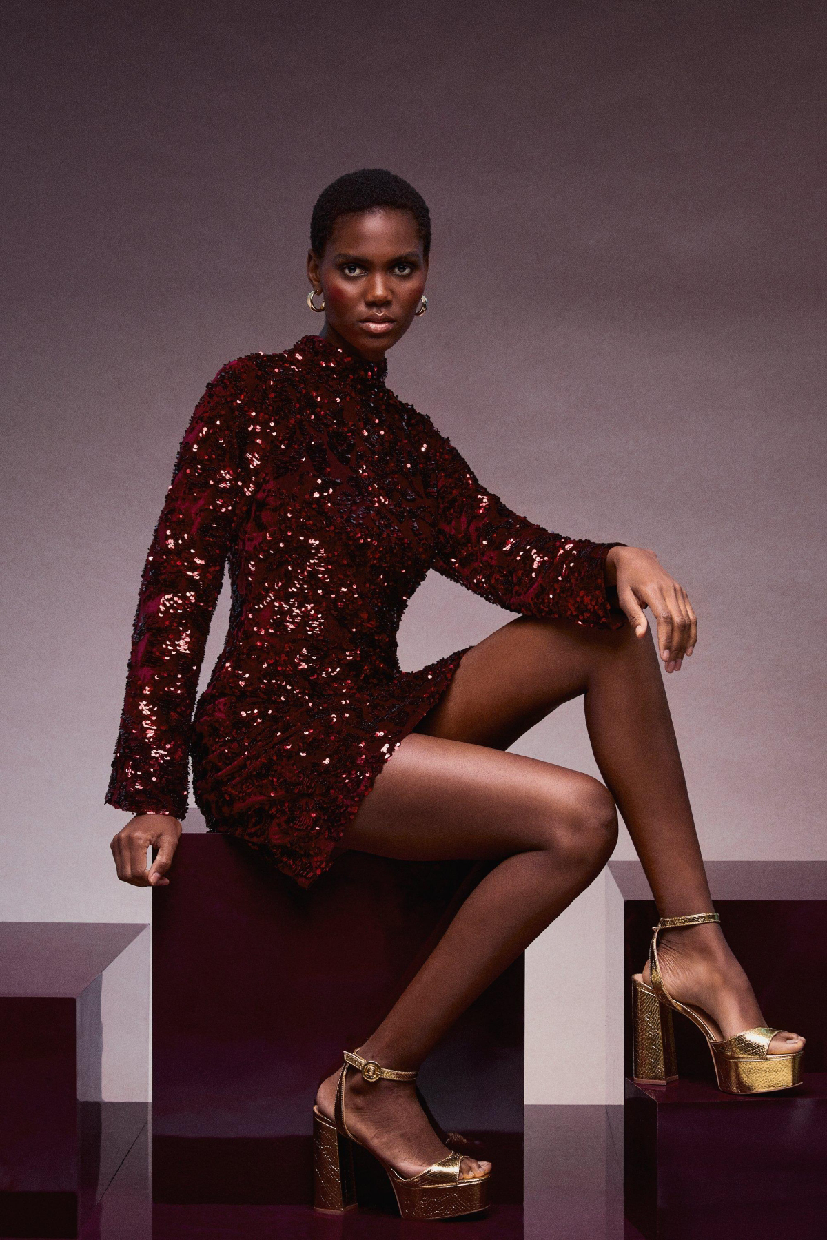
According to a 2014 study in the Journal of Experimental Social Psychology, wearing the color red can enhance performance in detail-oriented tasks and make the wearer feel more powerful and confident.
This isn’t just a style superstition. Choosing a bold red top or blazer for an important presentation or negotiation might give you a subtle psychological edge. It’s a color that commands attention and projects authority, making it a strategic choice for moments when you need to be at your sharpest.
Wondering how to wear a bold color like violet without looking like a cartoon character?
Think in terms of color families. Violet pairs beautifully with its neighbors on the color wheel, like deep blues and rich magentas, creating a sophisticated, analogous color scheme. For a more modern, high-contrast look, pair it with its opposite: a zesty, golden yellow. A violet knit sweater with tailored khaki trousers is an unexpected and chic combination for the office.
The Handbag Test: If you’re unsure about a new color, try it out with a handbag first. A purse is separate from your body, so it doesn’t clash with your skin tone or hair color in the same way a sweater might. A tangerine crossbody bag or a buttery yellow tote can be the perfect ‘third piece’ that ties a look together, adding a dose of personality to your neutral basics.
Don’t underestimate the power of colored denim. It’s not just for the bold and brave anymore.
Monochromatic Layering: This involves wearing different shades and tints of a single color. It’s a stylist’s secret for an instantly elongated and expensive-looking silhouette. Try pairing a light lilac breeze knit top with a deeper violet skirt. The key is to vary the textures—a silky camisole under a chunky knit, for instance—to create visual interest and depth.
For the Cool-Toned: While the article mentions you look best in blues and purples, don’t write off warmer colors entirely. The trick is to find the cool version of that color. Instead of a golden, sunny yellow, look for a pale, citrusy lemon yellow. Instead of a warm, rusty red, opt for a blue-based crimson or a rich berry shade. It’s about finding the right undertone within the color itself.