Tired of Wobbly Characters? Here’s How to Actually Draw in an Anime Style
I still remember the first character I drew that just… worked. It wasn’t amazing, not by a long shot. But after what felt like an eternity of trying to copy my favorite manga, something finally clicked. The head wasn’t a weird, flat balloon, and the eyes actually seemed to have some life in them. That tiny little victory wasn’t about some secret trick. It was because I’d finally started to understand a few basic principles. I had learned to build a drawing, not just copy one.
In this article
After more than fifteen years of filling sketchbooks and working on my own comics, the most common frustration I hear from new artists is, “Why can’t I make my art look like anime?” And honestly, the answer is usually that they’re getting distracted by the fun stuff—the spiky hair, the giant expressive eyes—while completely missing the solid foundation underneath. This guide is all about building that foundation. No shortcuts. We’re focusing on the structure, tools, and techniques the pros use. This is a skill you build with practice, not a talent you’re born with. Let’s get to it.
The Structure That Makes the Style Work
A lot of beginners think anime art just throws the rules of reality out the window. The truth? It just simplifies and exaggerates them. To stylize anything well, you first have to understand what it looks like in the real world. A solid grasp of basic anatomy is what separates a character that feels real from a wobbly, awkward caricature.
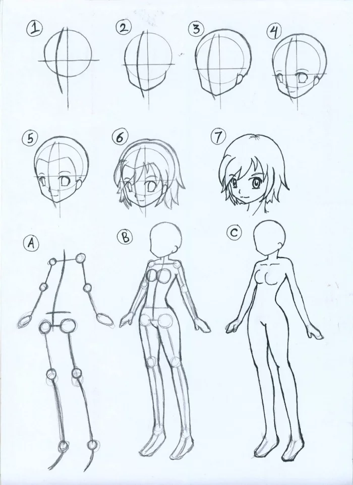
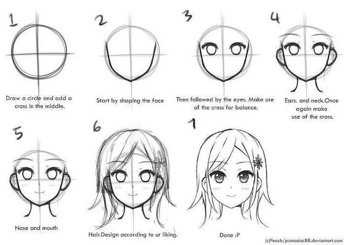
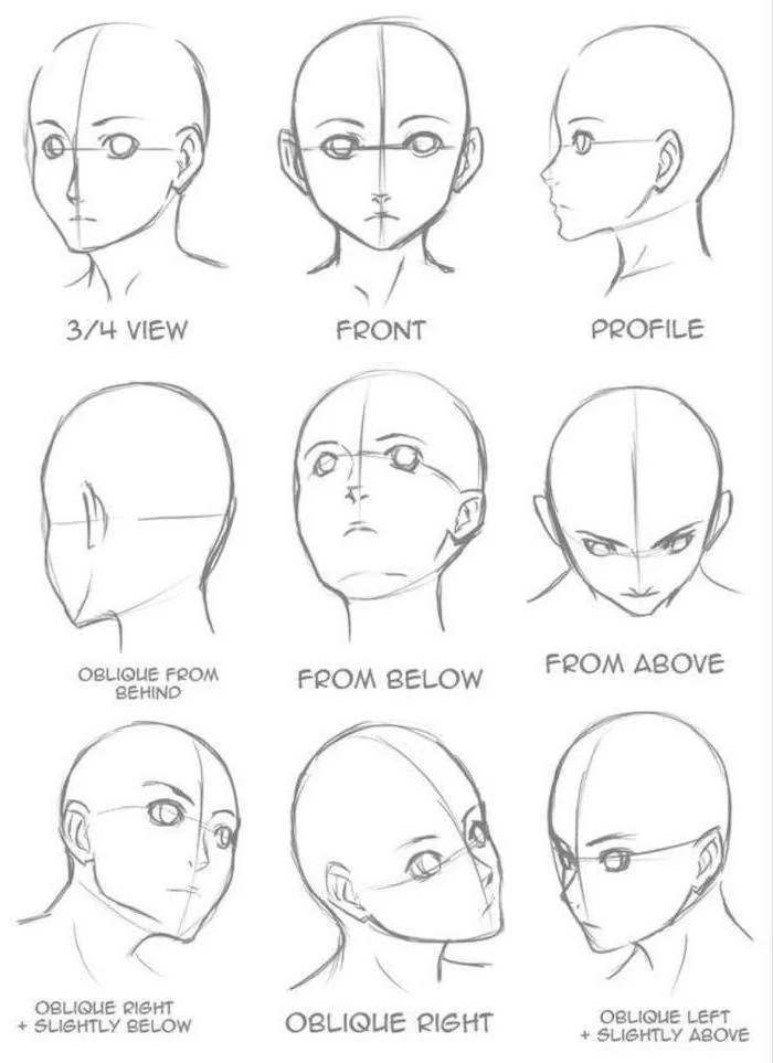
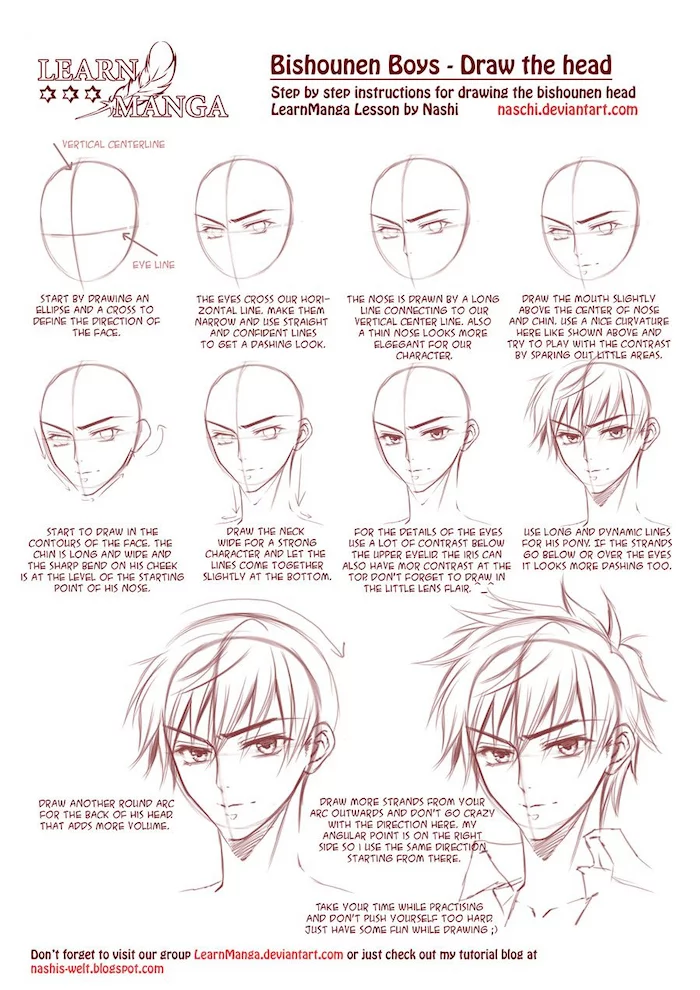
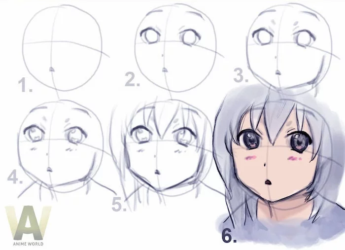
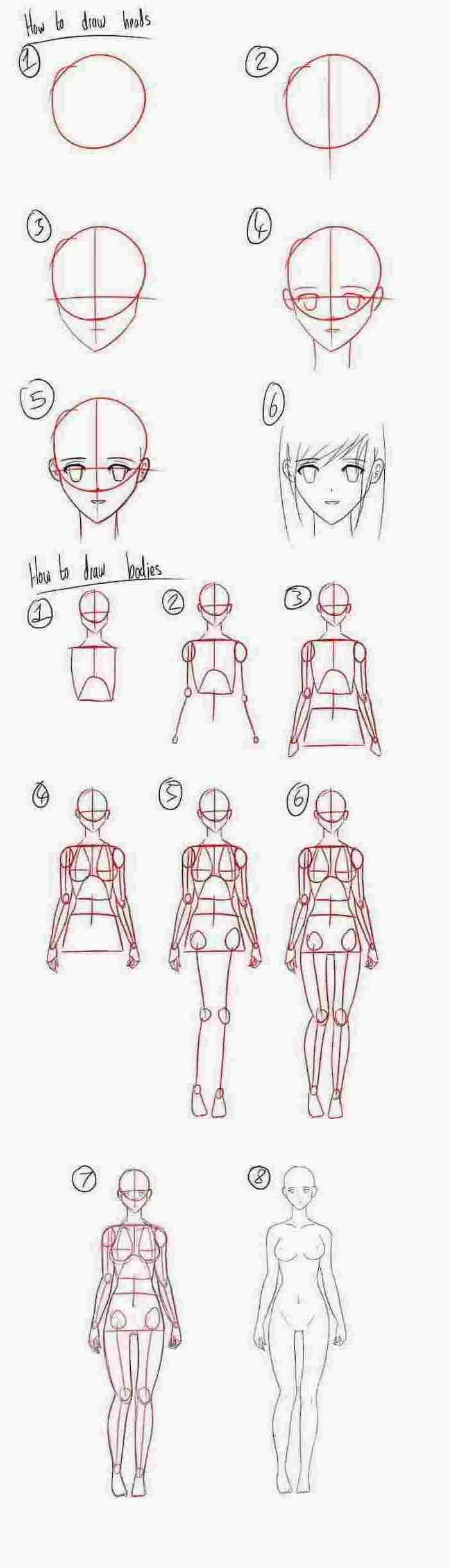
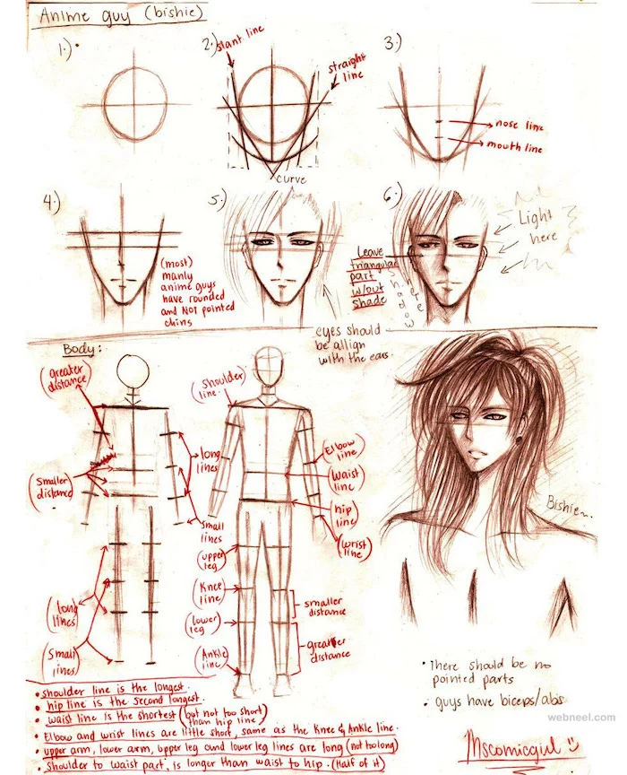
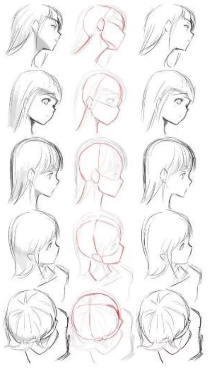
It All Starts with the Skull
Every single head, no matter the style, begins with a simple shape: a sphere. This is a non-negotiable first step, trust me on this. I’ve seen countless students draw a flat circle and then wonder why their character’s face looks pasted on. You have to think in three dimensions. A sphere has a front, sides, and a back, and visualizing this is critical.
There’s a popular method I learned ages ago that I still teach to everyone. It never fails.
- Start with a sphere. Don’t just sketch a circle; really try to feel its volume, like you’re holding a ball.
- Slice off the sides. Imagine gently shaving a small, flat plane off the left and right sides of the ball. This creates the flat area of the temples and is a game-changer for making a head look 3D.
- Draw your guide lines. Wrap a horizontal line around the very middle of the sphere—this will be your brow line, where the eyebrows sit. Then, draw a vertical line straight down the front. This centerline is your best friend for making sure the eyes, nose, and mouth are all lined up and symmetrical.
- Attach the jaw. From the bottom edge of those flat sides you sliced off, draw two lines down that meet at a point. This creates the jaw and chin. The shape you choose here is a huge part of your character’s personality. Is it a sharp, angular jaw for a determined hero? Or a soft, rounded one for a young child?
Why does this work so well? Because it’s basically a simplified skull. The sphere is the cranium, and the part you added is the jawbone. All the features—eyes, nose, mouth—now have a solid, 3D structure to sit on. Without it, your proportions will just float around randomly.
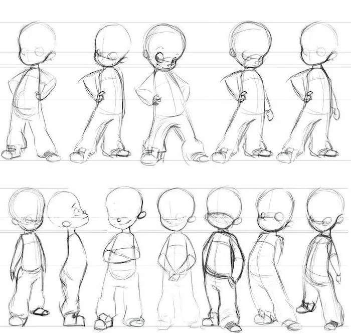
Building a Body That Looks Believable
You definitely don’t need a medical degree to draw convincing characters, but you do need a basic sense of how the body is put together and how it moves. For art, we simplify complex anatomy into clear, easy-to-draw forms. The goal is just to create a figure that looks like it can actually stand up and move, even if its proportions are totally stylized.
I always recommend thinking of the body as a collection of simple 3D shapes, like a wooden artist’s mannequin:
- The Torso: Think of it as two main blocks. A slightly tapered box for the ribcage and a flatter, wider box for the pelvis. These two blocks are connected by the spine, which we often draw first as a simple, flowing ‘line of action.’
- The Limbs: Just use cylinders. One for the upper arm, one for the forearm, one for the thigh, and one for the lower leg. Drawing them as cylinders forces you to think about them in 3D, which is essential for avoiding flat, awkward poses.
- The Joints: Use simple spheres for the shoulders, elbows, hips, and knees. This immediately helps you visualize how and where the body can bend and rotate.
This mannequin frame is your character’s skeleton. Once you have it in place and the pose feels balanced and natural, you can start drawing the actual outlines of the body over it. This construction method is the ultimate cure for the dreaded ‘noodle arms’ and stiff, lifeless poses.
The Physics of Hair and Clothes
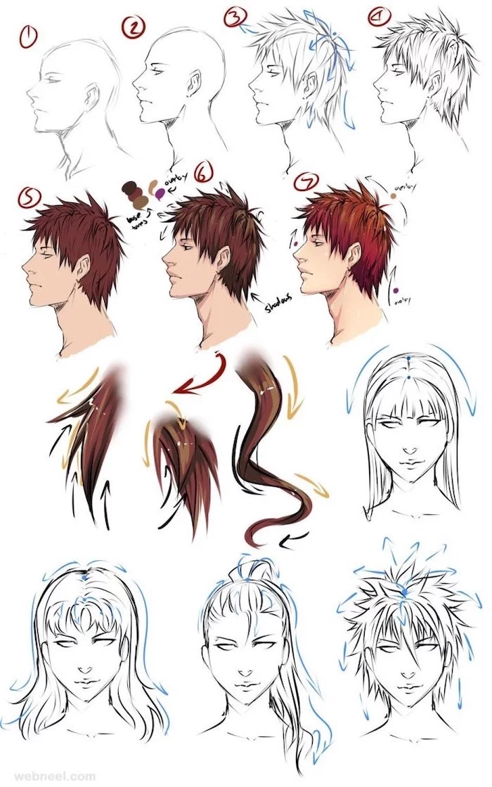
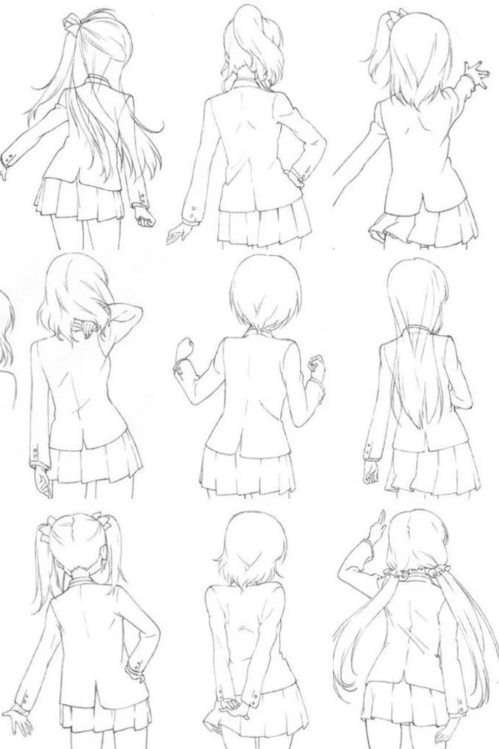
This is a big one. Hair and clothes are not glued to the body! They have their own weight, and they react to gravity and movement. So many beginners draw hair as one solid, spiky helmet. A much better way is to think of hair in large clumps or ribbons that all start from the scalp.
First, figure out the hairline on the head structure you already built. Then, draw the big, flowing shapes of the hairstyle moving away from the head. Is the hair long and heavy? It will hang down. Is the character jumping? The hair will fly up. The exact same idea applies to clothes. Fabric bunches and folds at the joints (like inside the elbow or behind the knee) and stretches over larger forms (like the chest and shoulders). Just lift your arm and look at how your own shirt folds. That real-world observation is the secret to making clothes look real.
Your Toolkit: Getting Started Without Breaking the Bank
Okay, let’s talk about tools. While a skilled artist can make great art with a cheap pen and a napkin, the right tools can definitely make the learning process a lot smoother. Here’s how you can get set up for both traditional and digital art for less than you probably think.
The ‘Under $50’ Starter Kit
You absolutely do not need to spend hundreds of dollars to get started. Here’s a perfectly good setup for either path.
For Traditional Art:
- Paper: Just grab a ream of basic printer paper. It’s cheap, you get a ton of it, and it’s perfect for practice. A pack will run you about $10.
- Pencils: A good mechanical pencil is great for sketching. I’d recommend one with 2H lead, which is hard and light, making it easy to erase. Cost: around $5-$10.
- Inking: A multipack of black fine-liner pens in different sizes is perfect. You can find decent sets for about $15-$20 at any craft store.
- Eraser: Get a good white plastic eraser. It won’t smudge your work like a pink one can. Maybe $2.
Total cost? Somewhere around $40. You’re all set.
For Digital Art:
- Software: Before you spend a dime, download Krita. It’s a professional-grade, open-source art program that is 100% FREE. It’s incredibly powerful and a fantastic place to start.
- Tablet: You don’t need a fancy screen tablet. A simple screenless drawing tablet from a reputable brand online will work perfectly. These connect to your computer via USB and will run you between $40 and $60 for a great entry-level model. This is all you need.
So for digital, your starting cost could be as low as $40 for the tablet. If you want to upgrade your software later, a program like Clip Studio Paint (an industry favorite) has a one-time purchase price of around $50, but they often have sales that cut the price in half.
The Power of Digital Layers
By the way, the single biggest advantage of working digitally is layers. The ability to hit ‘undo’ is a lifesaver, and organizing your drawing into a stack of layers will make your life so much easier. Here’s a typical workflow:
- Layer 1: Rough Sketch. This is where you get all your ideas out. It’s messy, loose, and full of energy. I like to use a light blue color so it’s easy to see.
- Layer 2: Refined Sketch. Lower the transparency of your messy sketch and draw a cleaner version on this new layer.
- Layer 3: Line Art (Inking). This is for your final, clean lines. I often use something called a vector layer for this, which lets you resize your lines without them getting blurry and makes editing them a breeze.
- Layers 4+: Color & Shading. I put each base color on its own layer. Then, I create new layers on top for shadows and highlights, which makes it super easy to change things later without repainting everything.
Choosing Your Style: More Than Just ‘Anime’
The term “anime style” is incredibly broad. It covers decades of art and dozens of genres. Understanding the different visual languages helps you make deliberate choices in your own art instead of just copying one specific look.
A classic way to see this is by comparing the two major traditional styles. On one hand, you have styles built for action-adventure stories. The art here is often defined by sharp angles, thick, bold lines, and dynamic, powerful poses. Characters tend to have smaller, more intense eyes and strong, muscular builds. The whole visual language is built around conflict, movement, and power.
On the other hand, you have styles built for stories about romance and relationships. Here, the art is much softer. The lines are thinner and more elegant. The eyes are famously large and incredibly expressive, often filled with detailed highlights and shading to convey subtle emotions. Characters are usually slender and graceful. The art’s focus is on emotion, atmosphere, and personal connection.
Of course, modern shows mix and match these traits all the time. But knowing where these visual conventions come from helps you understand why a certain character is designed the way they are.
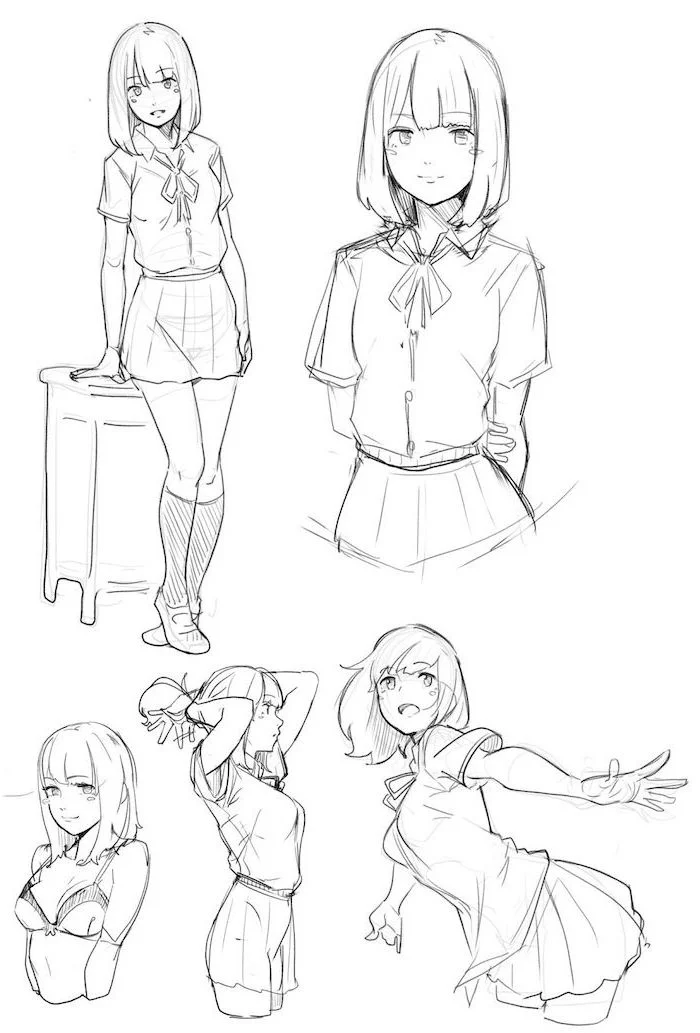
A Quick Walkthrough: Let’s Draw a Character
Okay, theory’s great, but let’s put it into practice. Grab your tools and let’s draw a full-body character from the ground up. Don’t worry about perfection; focus on following the process. For a beginner, this might take an hour or two. Take your time! The goal is to learn, not to be fast.
- The Line of Action: Before you draw a single shape, draw one single, flowing line on your page. This line represents the character’s spine and sets the energy for the whole pose. Is it a dynamic C-curve for someone mid-action? Or a relaxed S-curve for someone just standing around? This one line is your entire foundation.
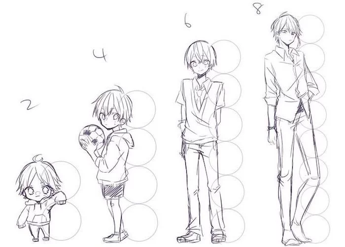
- The Mannequin Frame: Now, build your simple skeleton along that line of action. Draw the box for the ribcage and the box for the pelvis. Add spheres for the shoulders and hips, then connect them with cylinders for the arms and legs. A good starting point for proportions is that a typical character is about 7 to 8 heads tall.
- Flesh it Out: With your mannequin in place, start sculpting the body. Turn the cylinders into actual arms and legs. Connect the ribcage and pelvis to form the waist. This is where you’re essentially putting muscle and fat onto the skeleton.
- The Head and Face: Zoom in on the head oval and use the sphere construction we talked about. Draw your brow line and your centerline. Place the eyes on the brow line, then figure out where the nose and mouth go based on that.
- Hair and Clothes: Now for the fun stuff. Draw the hairline first, then have the clumps of hair flow from there. For the clothes, think about where the fabric would hang, stretch, and bunch up around the body’s forms.
- Refine and Ink: This is the final step. Go over your sketch with clean, confident lines. A huge pro tip: vary your line weight. Use slightly thicker lines for areas in shadow or things that are closer to the viewer. Use thinner lines for small details or things further away. This one technique adds an incredible amount of depth to your drawings.
Oh, and did you know? Many professional artists in Japan still use simple wooden mannequins or 3D models to help them figure out difficult poses. Using references isn’t cheating; it’s a professional technique for getting things right!
Troubleshooting: Fixing Common Problems
Every artist, and I mean every artist, hits roadblocks. Here are a few common ones I see all the time, and how to get past them.
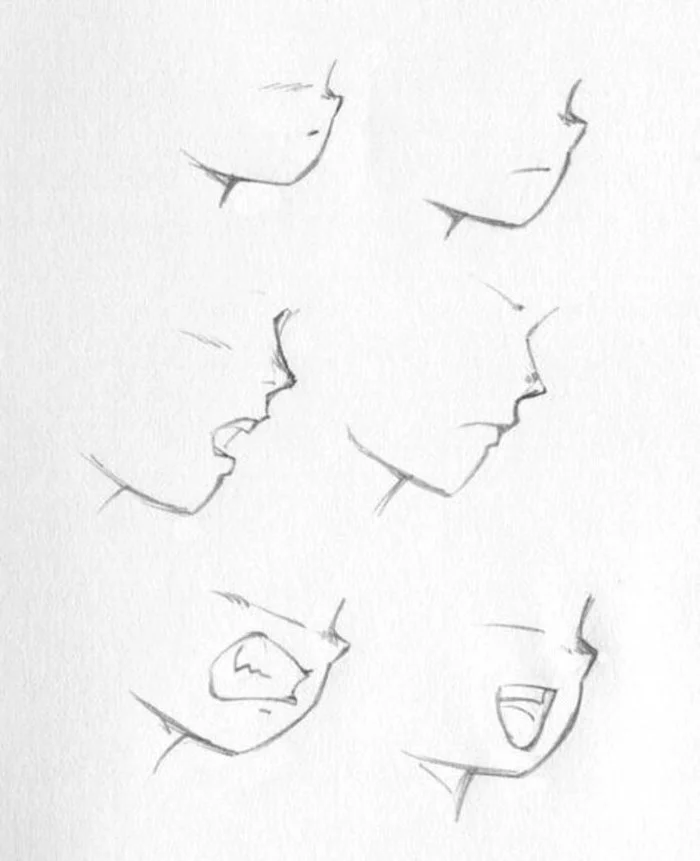
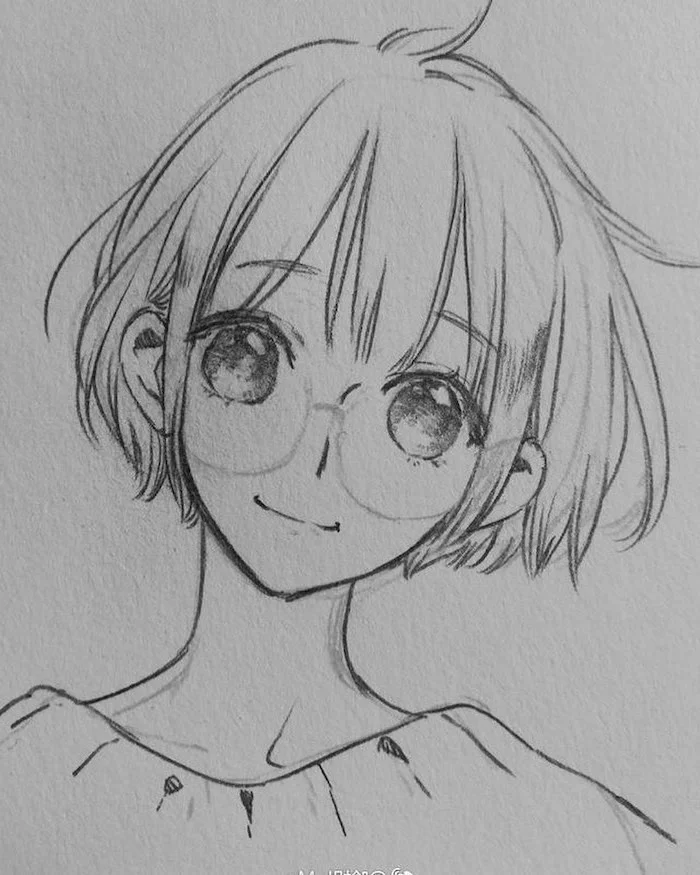
- “My faces look flat and the eyes are crooked!” This is almost always because you skipped the 3D head construction. You absolutely have to start with the sphere and draw those guide lines. If you just draw on a flat circle, your features will have nothing solid to anchor to.
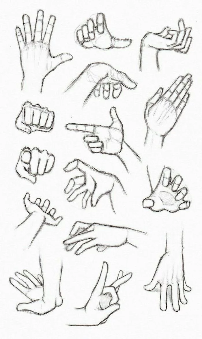
- “My hands look like weird claws or spatulas.” Hands are tough for everyone, even for me sometimes. The best way to learn is to simplify. Here’s a little exercise that really helps: Trace your own hand. Seriously. Then, on another sheet, try to rebuild that exact shape using only a simple block for the palm and cylinders for the fingers. It rewires your brain to see the underlying structure.
- “My characters look so stiff and boring!” This is a classic symptom of drawing the character’s outline first instead of their skeleton. You have to start with a strong, energetic line of action. Exaggerate it more than you think you need to! You can always tone it down later. A stiff skeleton will always, always lead to a stiff final drawing.
Quick Win: The 5-Minute Pose Builder
Feeling overwhelmed or short on time? Grab a piece of paper and just spend five minutes filling it with nothing but dynamic S-curves and C-curves. Don’t even try to draw a character. This simple exercise builds muscle memory and confidence for creating energetic poses later on.
A Quick Word on Staying Safe and Professional
Okay, let’s have a serious talk for a second. Drawing for hours on end can take a real toll on your body, and sharing your work online comes with its own rules. Please don’t ignore this stuff.
Protect Your Body. This is Not Optional.
I have friends who had to stop working professionally for months because of repetitive strain injury (RSI). Take ergonomics seriously from day one.
- Your Posture: Sit up straight. Don’t hunch over your desk. Your screen or sketchbook should be propped up at a comfortable angle to avoid wrecking your neck.
- Take Breaks: I like to use a timer. Draw for 25-30 minutes, then take a 5-minute break. Stand up, stretch your back, and look at something far away to rest your eyes. It makes a huge difference.
- Wrist Stretches: Gently stretch your wrists before and after you draw. Simple rotations and flexes can prevent a world of pain down the line. If you ever feel sharp pain or numbness, STOP immediately and rest.
A Note on Fan Art and Copyright
This can feel complicated, but the basics are simple. Drawing your favorite spiky-haired hero in your private sketchbook is fan art, and it’s a fantastic way to learn. But trying to sell prints of that drawing can get you into legal trouble, since the character design belongs to its original creator.
The line between studying and stealing is all about intent. Are you learning from another artist’s work so you can apply those lessons to your own original characters? Great. Are you just tracing their art and passing it off as yours? That’s plagiarism. Be honest, be respectful, and when in doubt, just focus on creating your own characters. It’s way more rewarding in the end.
The journey to becoming a skilled artist is a long one. It’s full of frustrating days and drawings you’ll want to crumple up. But it’s also filled with amazing moments of breakthrough and the incredible satisfaction of bringing an idea to life. If you commit to practicing these core exercises for even 30 minutes a day, I guarantee you’ll see a huge difference in your confidence and skill within a few weeks. Your first 100 drawings might be a bit rough. That’s okay. Mine were terrible. But the 101st will be a little bit better. Keep practicing, trust the process, and never stop learning.
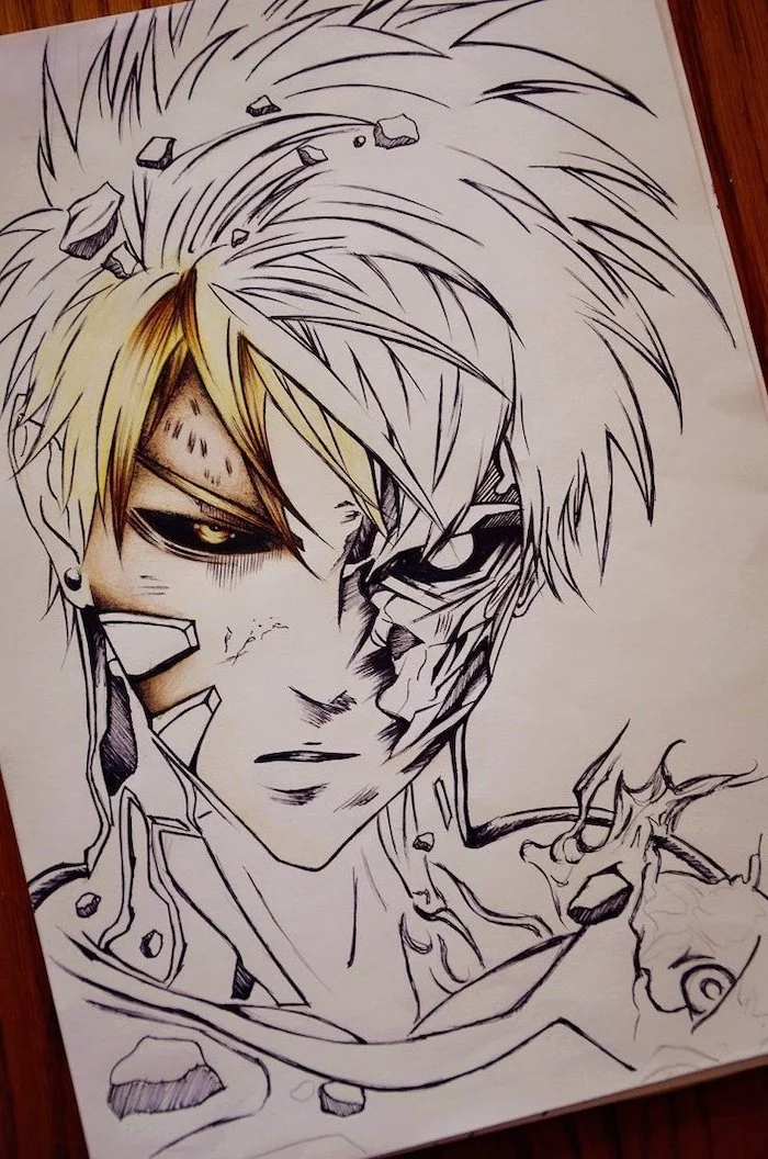
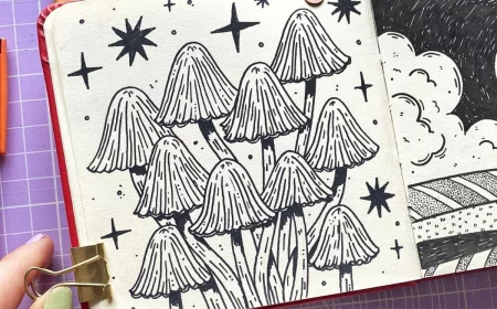
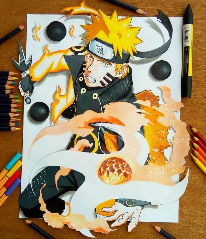
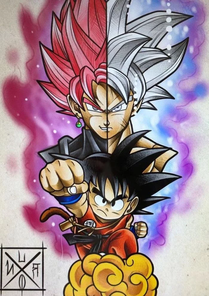
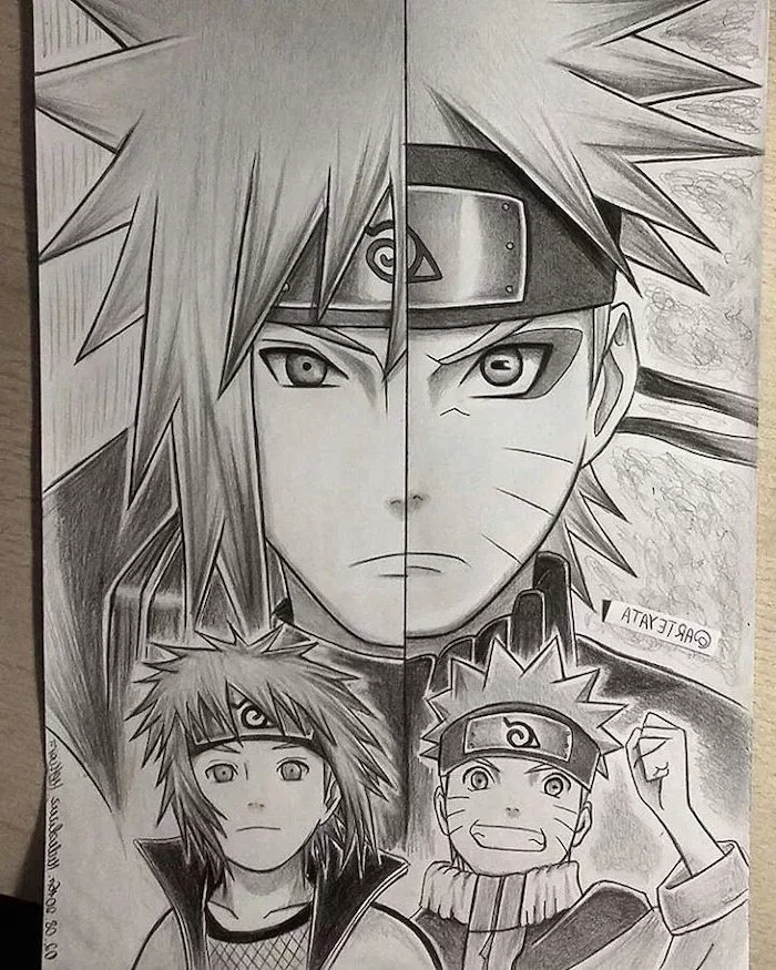
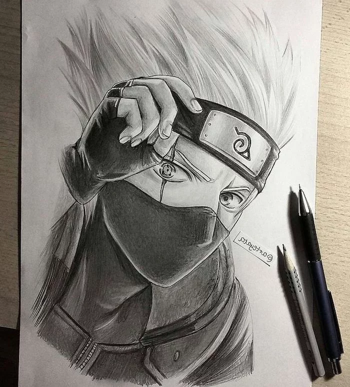
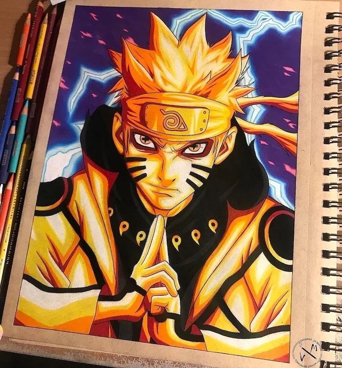
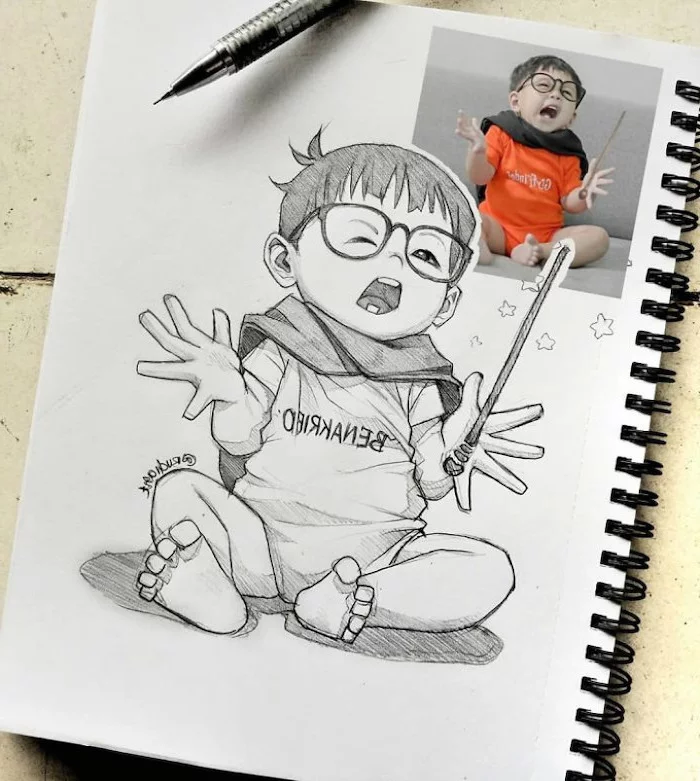
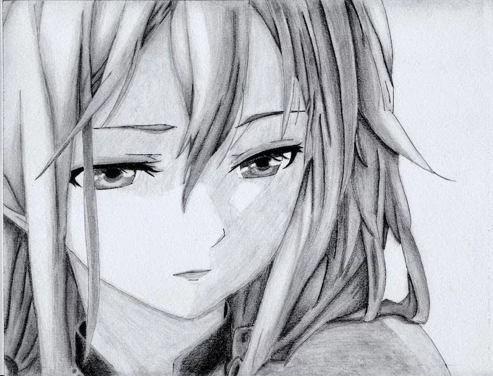
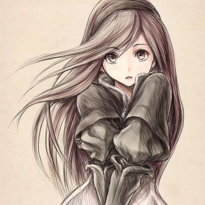
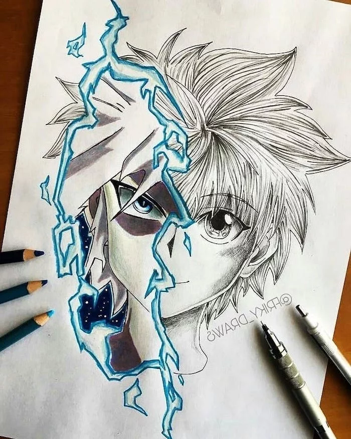
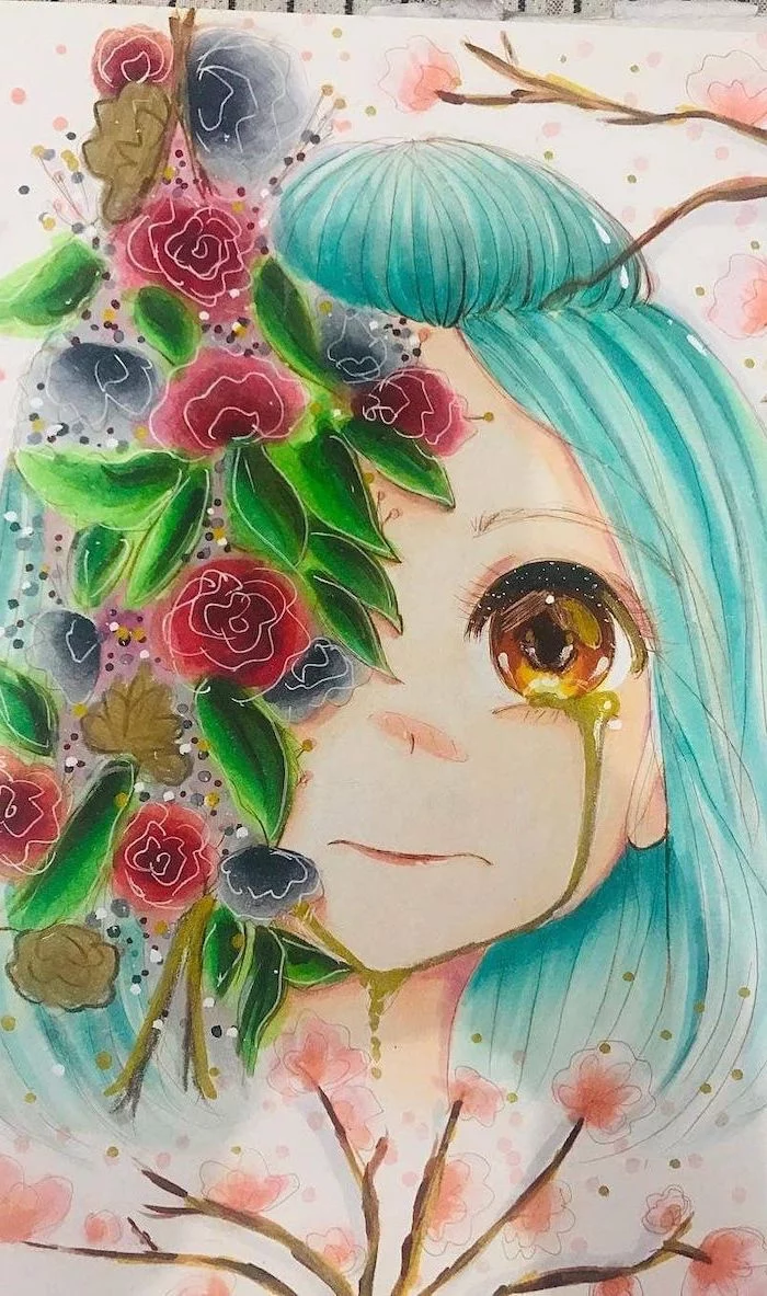
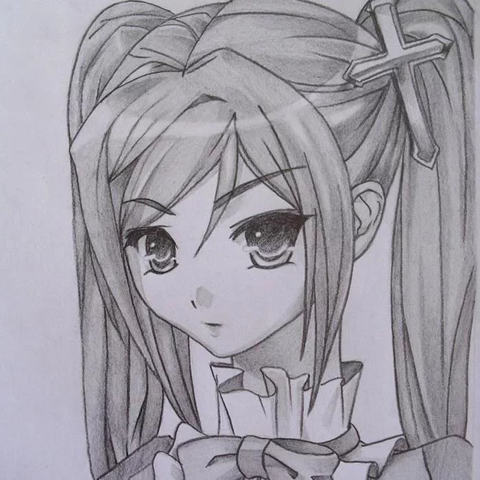
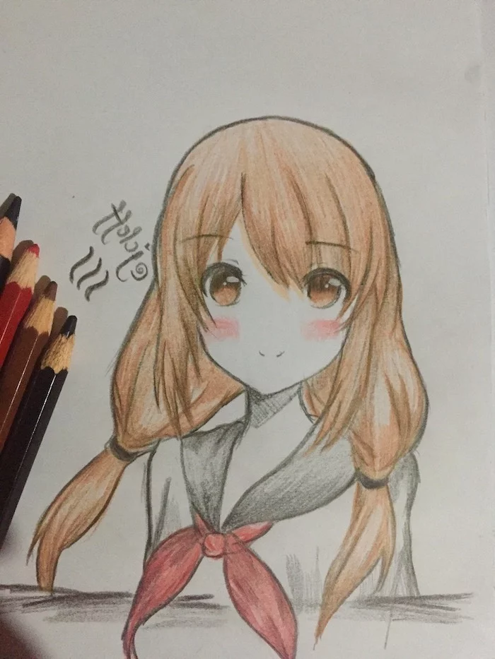
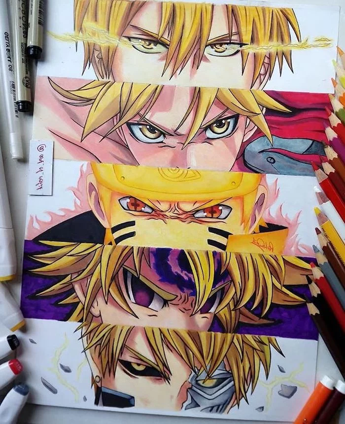
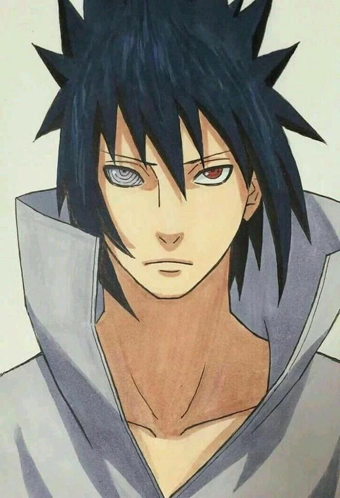
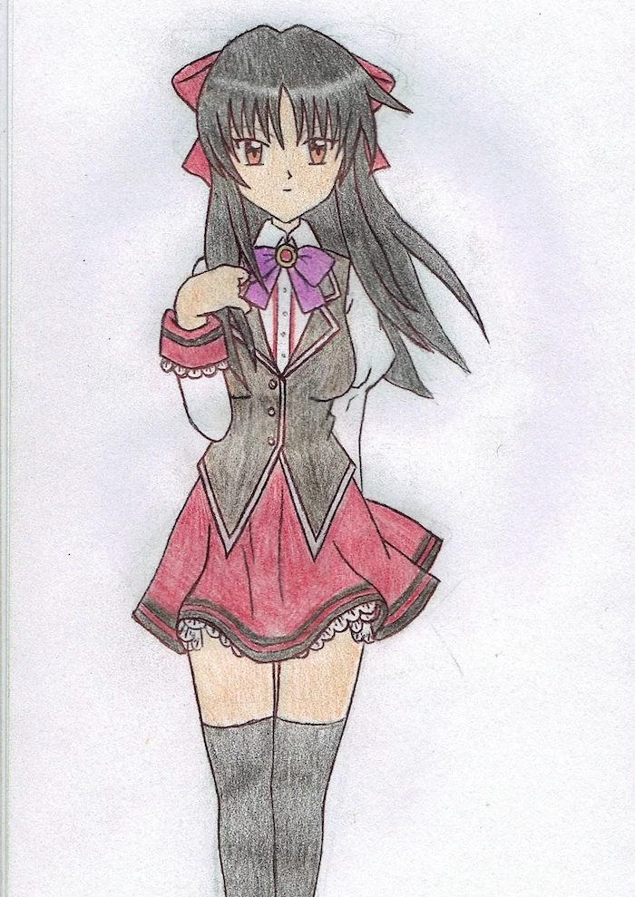
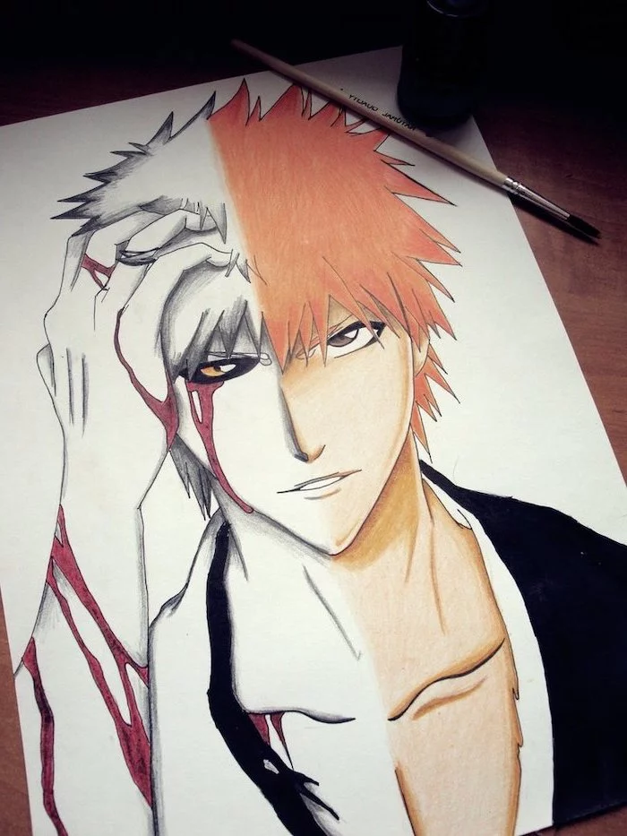
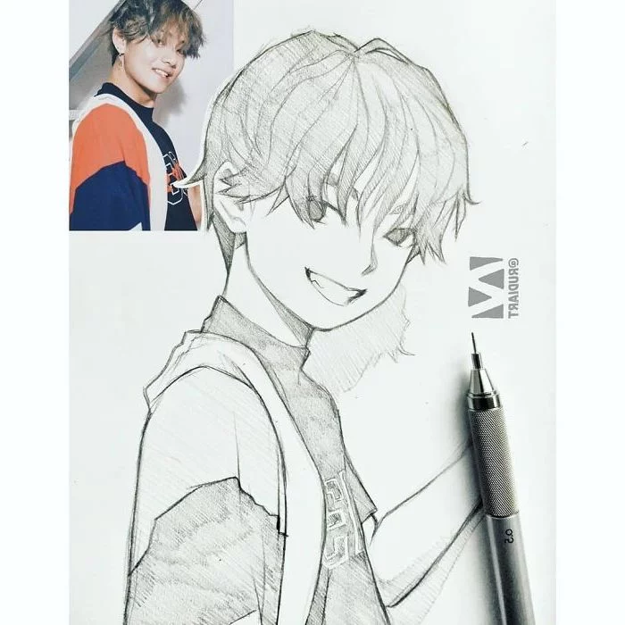
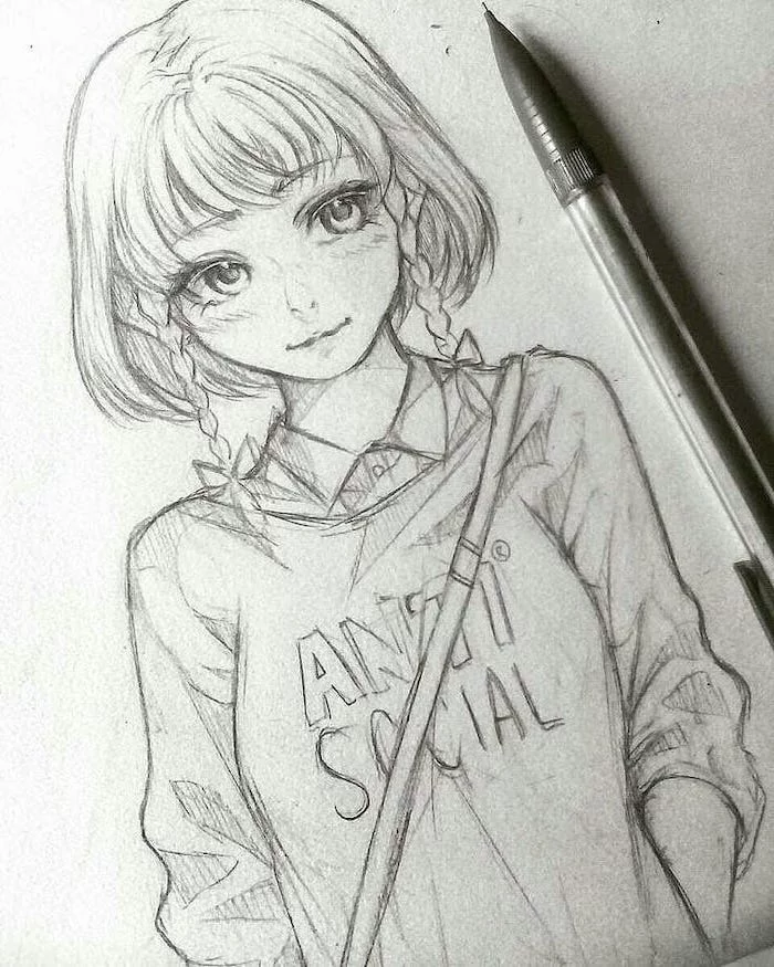
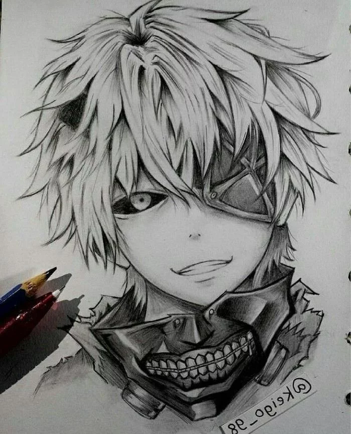
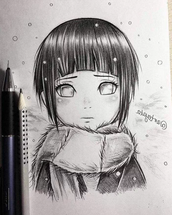
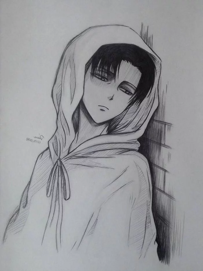
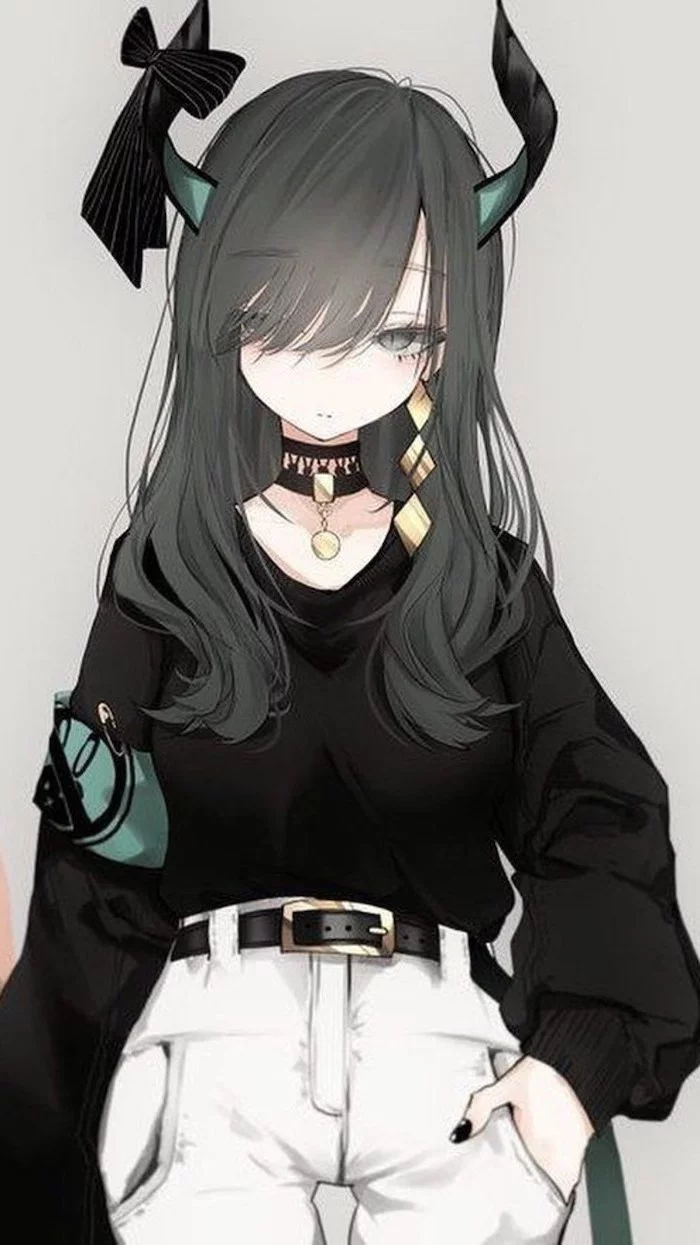
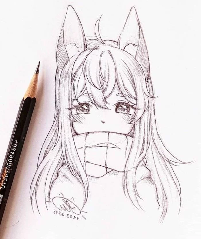
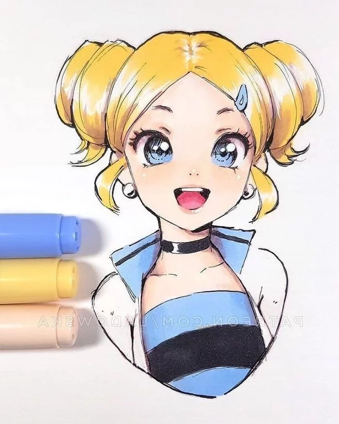
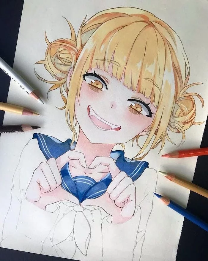
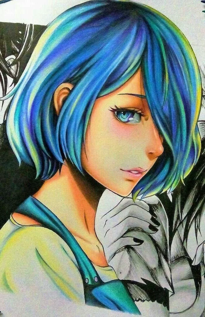
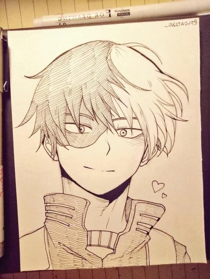
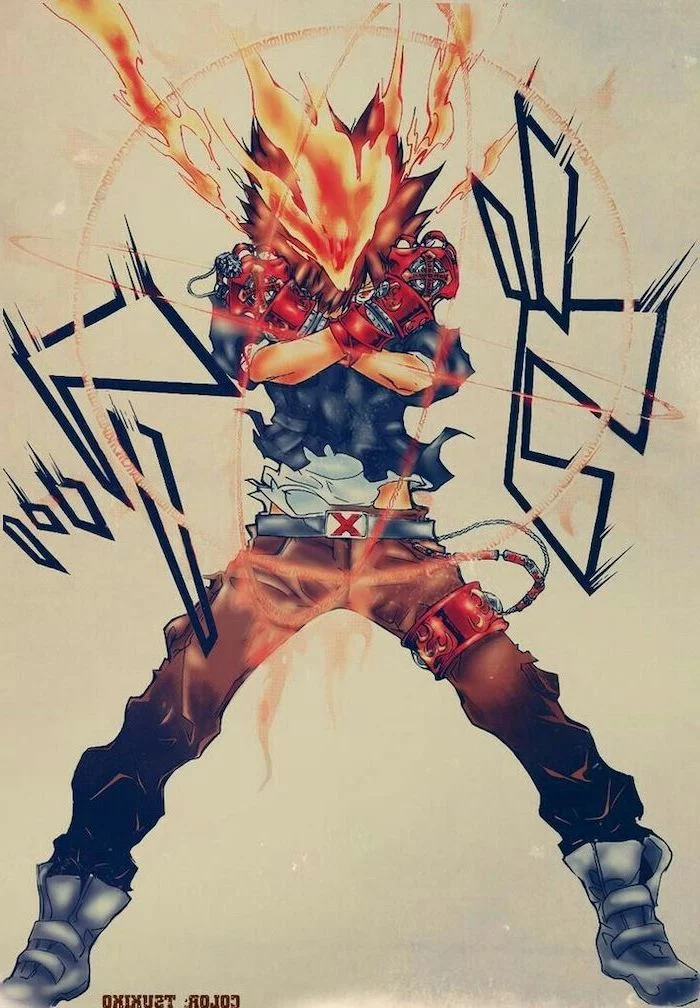
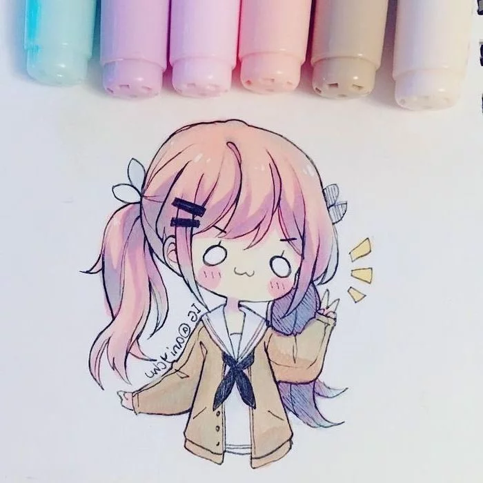
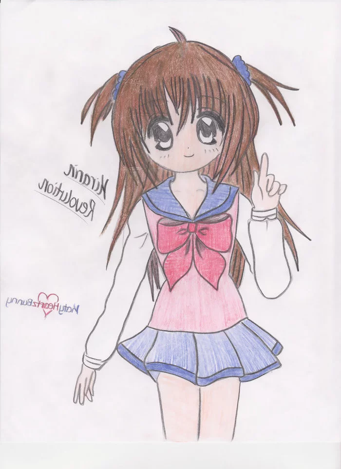
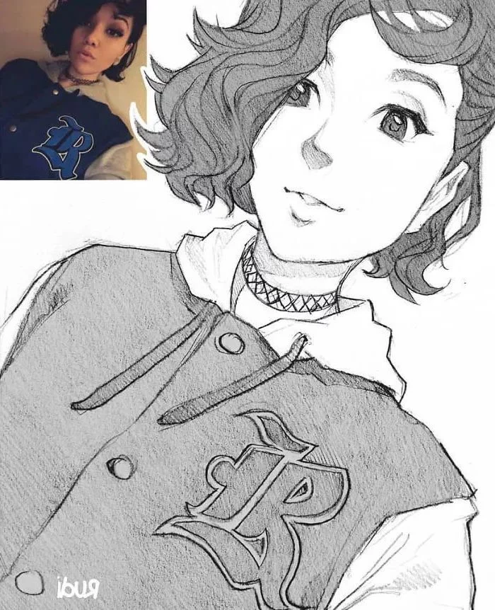
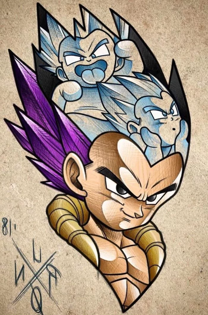
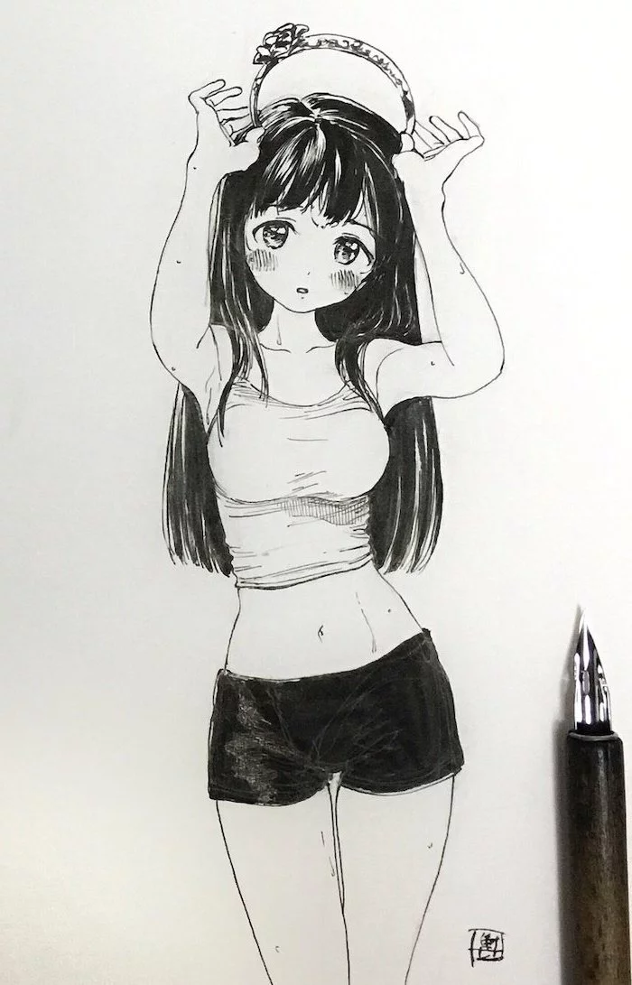
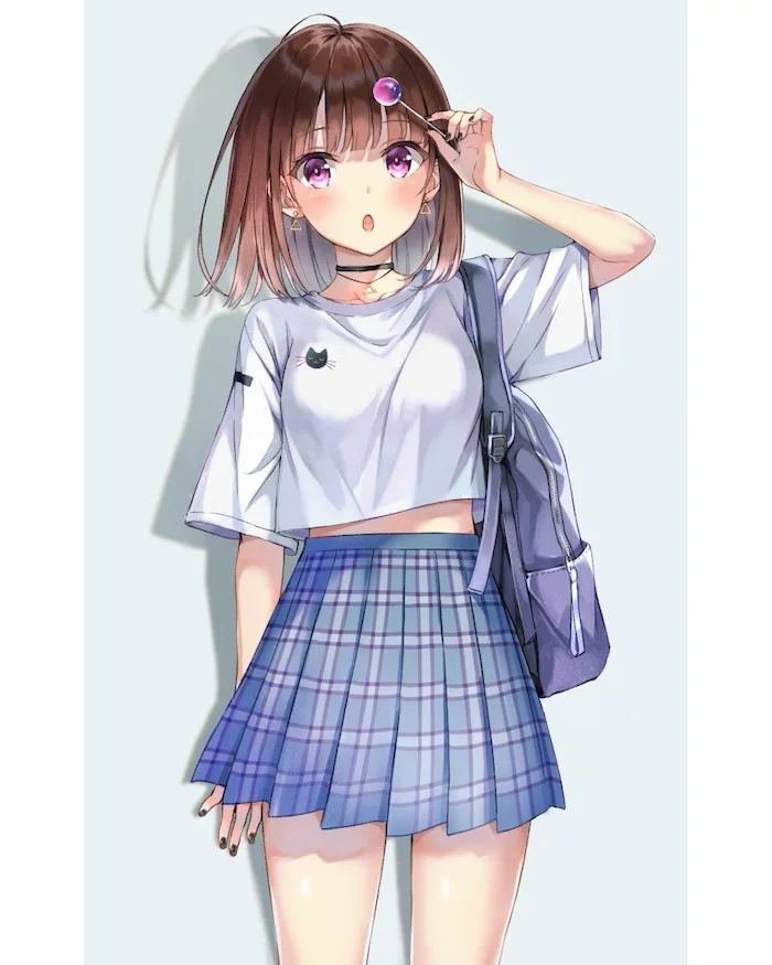
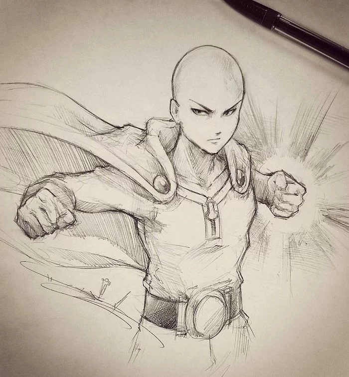
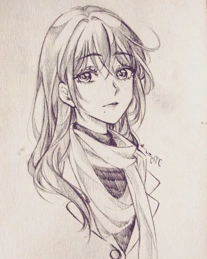
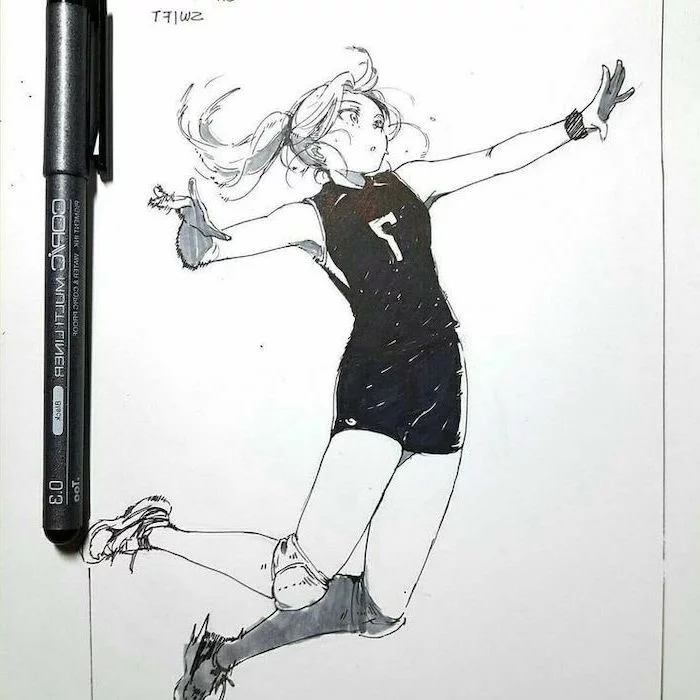
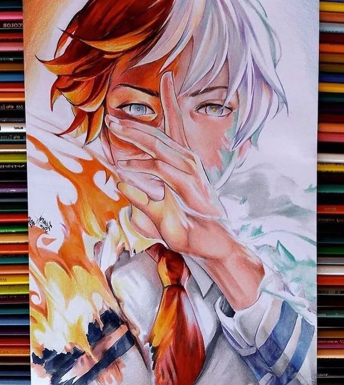
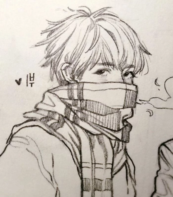
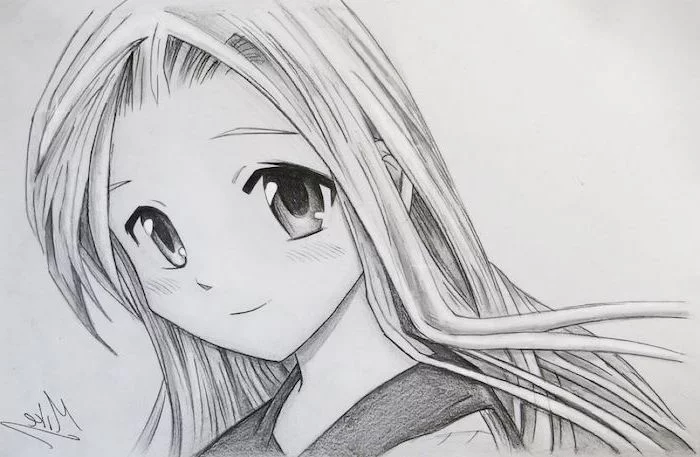
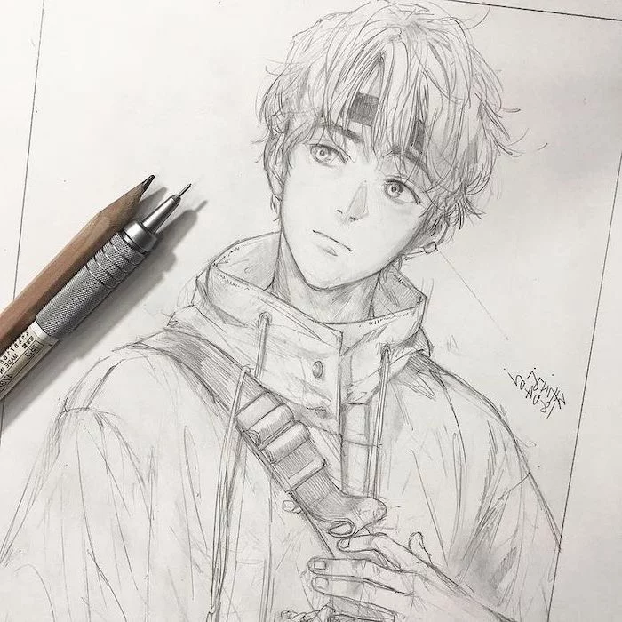
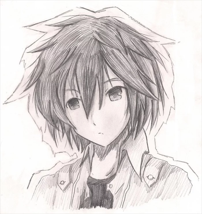
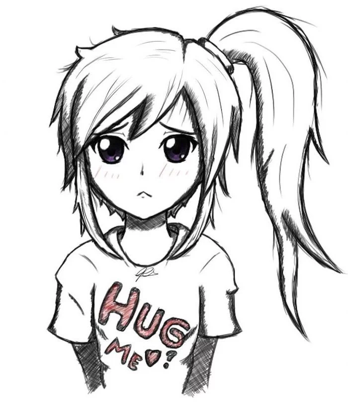
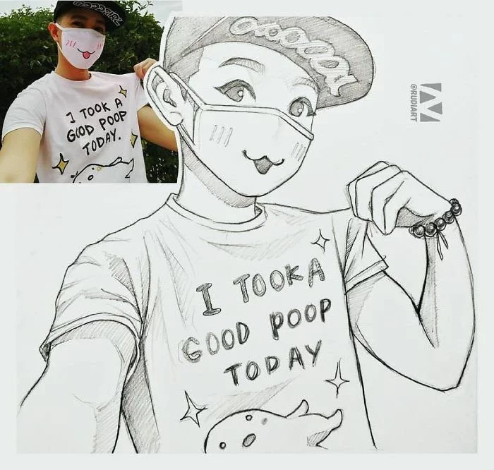
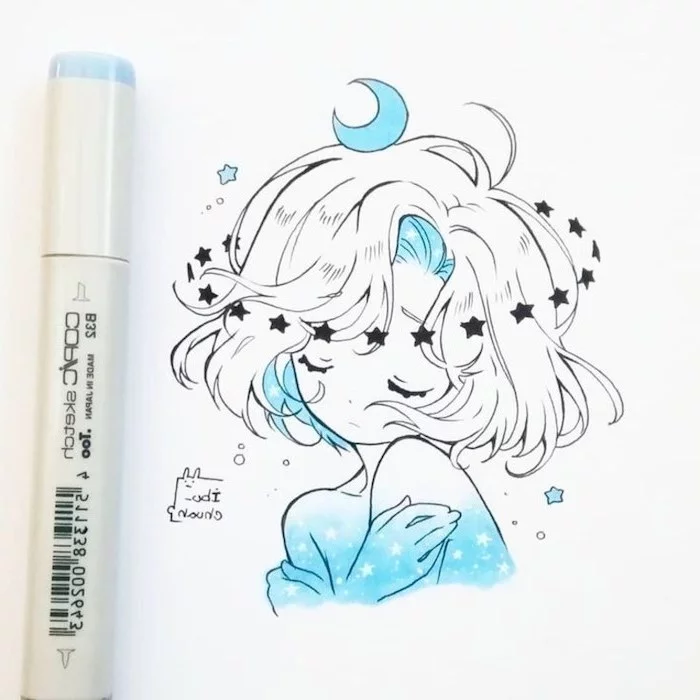
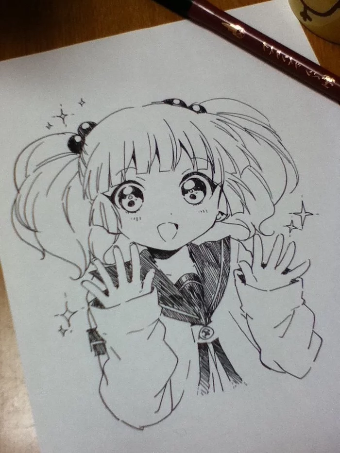
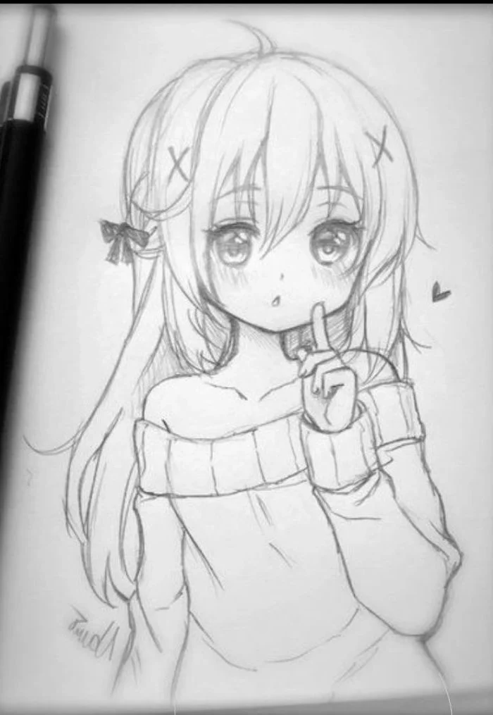
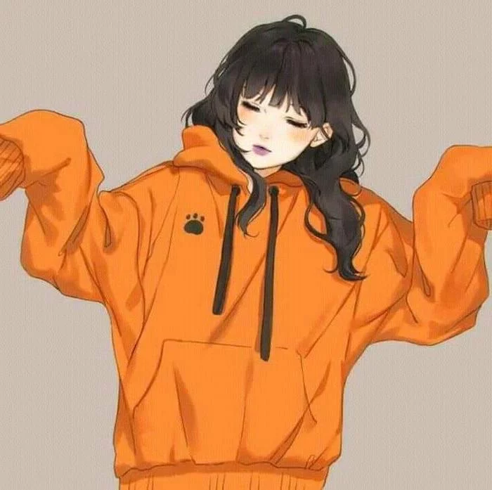
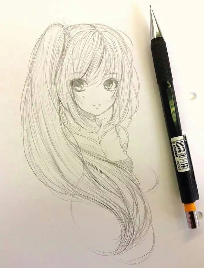
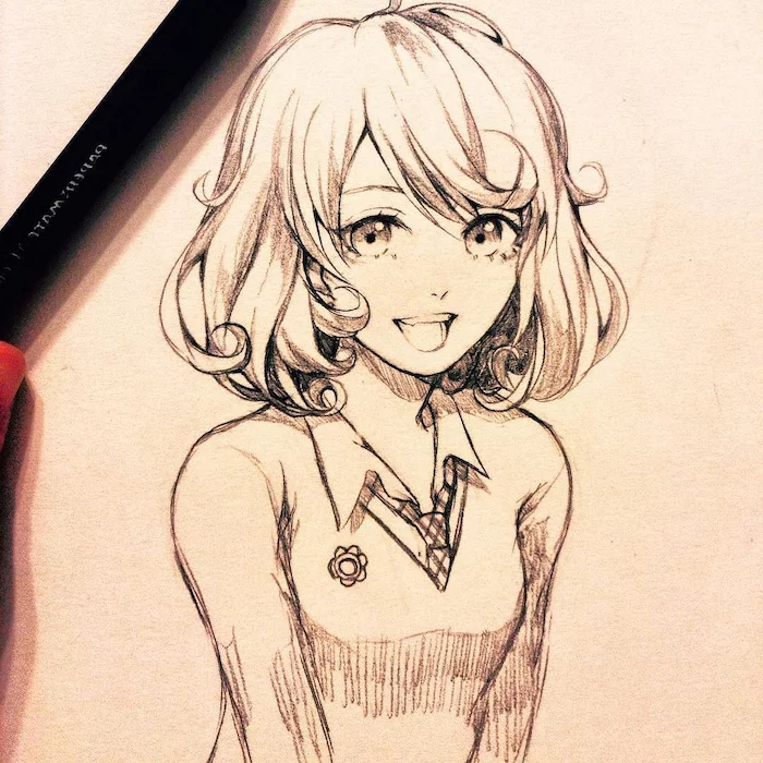
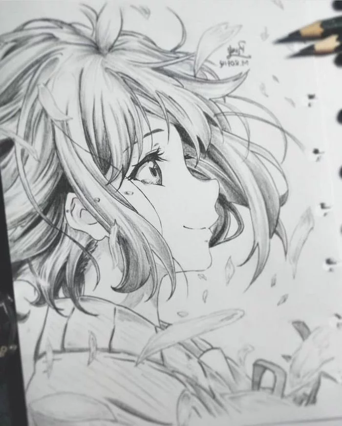
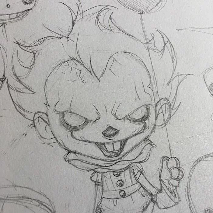
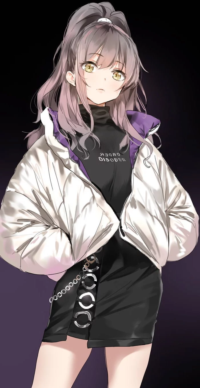
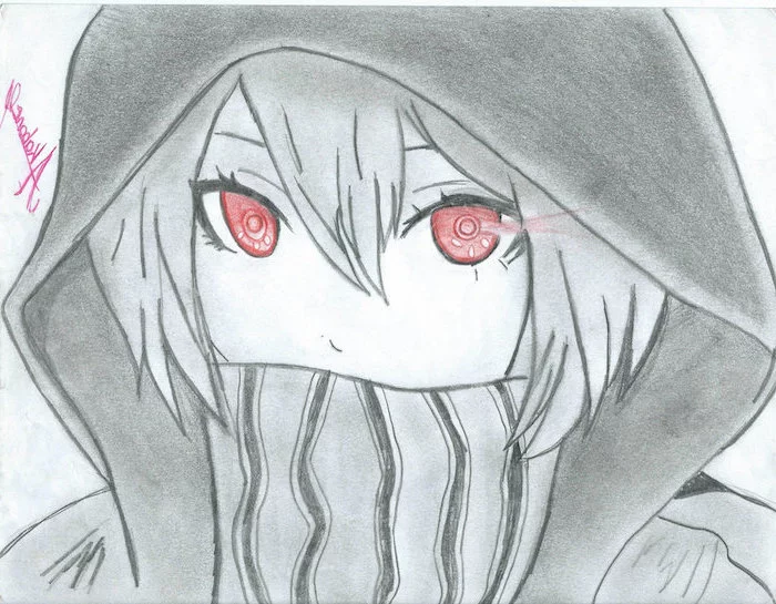
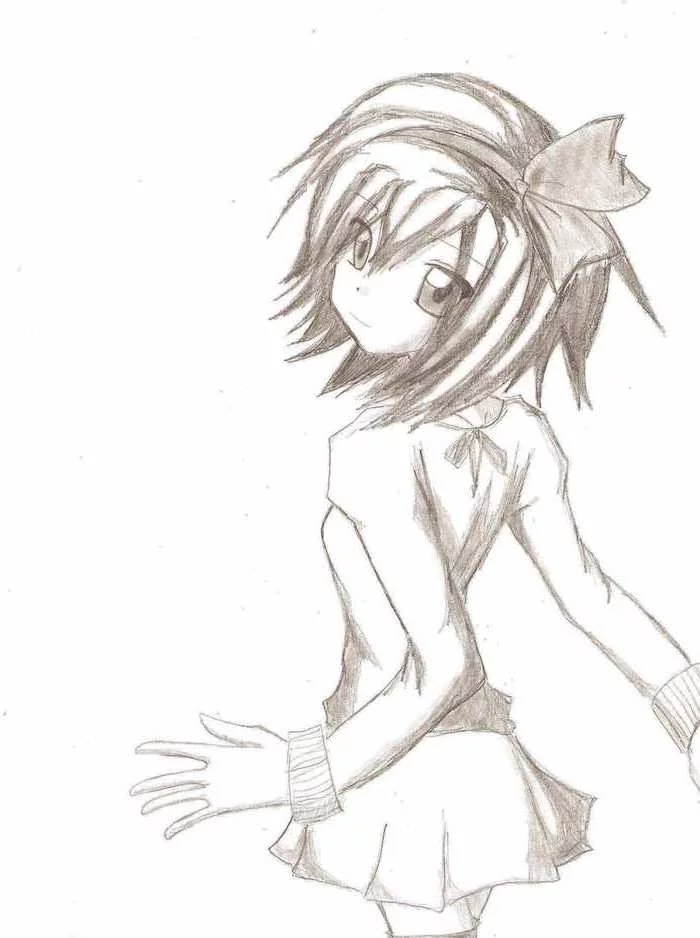
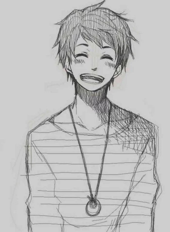
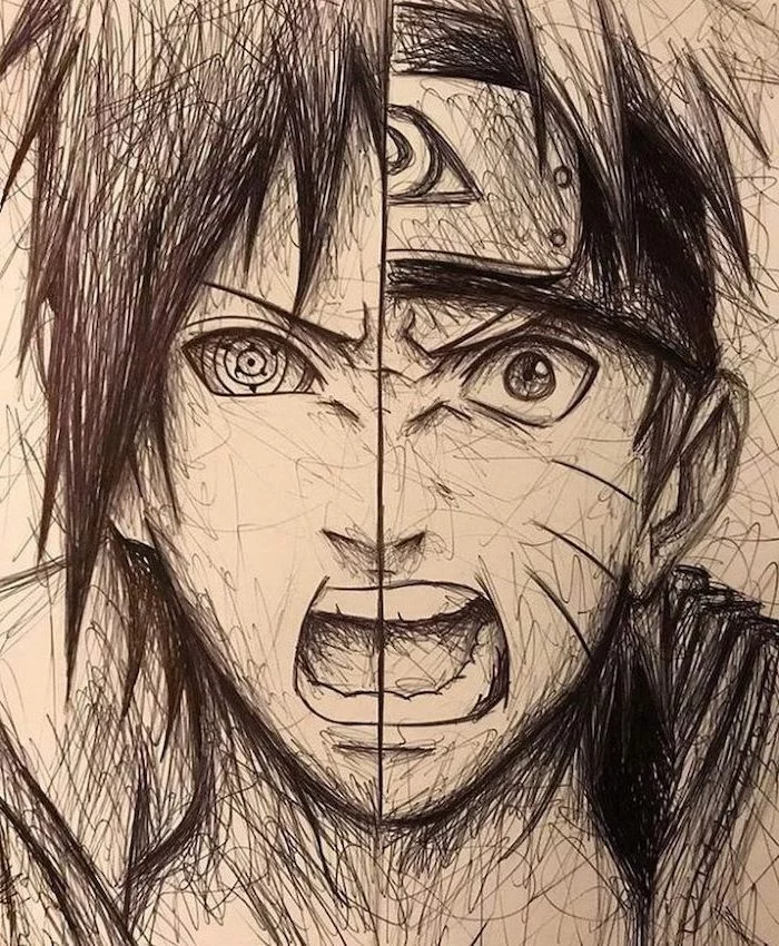
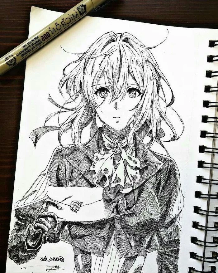
Inspiration Gallery
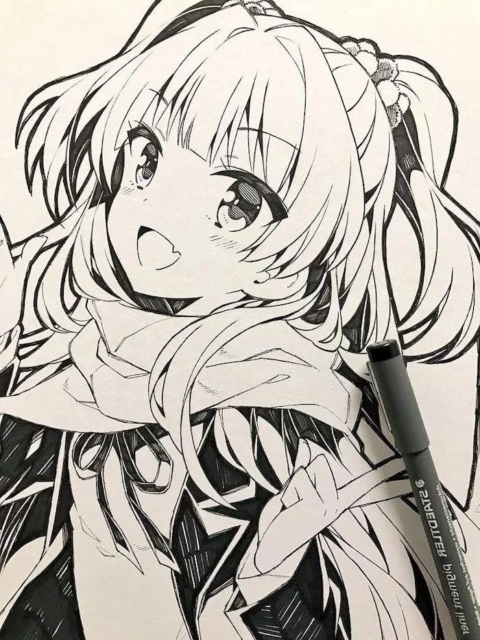
The right tools for the final touch: When it comes to inking your line art, not all pens are created equal. For crisp, permanent lines that won’t smudge when you color, artists often swear by pigment-based liners. Look for brands like Sakura Pigma Micron or Copic Multiliner. They come in various tip sizes, allowing you to create dynamic line weight—thicker lines for shadows or foreground elements, and thinner lines for details and distant objects.
- Create more dynamic poses by learning the ‘line of action’.
- Avoid stiff characters by thinking in terms of curves, not straight lines.
- Exaggerate the twist in the torso for more energy.
The secret? Quick gesture drawings. Spend 30-60 seconds capturing the flow of a pose from a real-life reference. Don’t worry about details, just the energy.
There are no shortcuts to any place worth going.
This old saying is doubly true for art. While tutorials can show you the path, only consistent practice—what artists call ‘pencil mileage’—can get you to your destination. Fill a sketchbook, even with what you think are bad drawings. Every line you draw builds muscle memory and a deeper understanding of form.
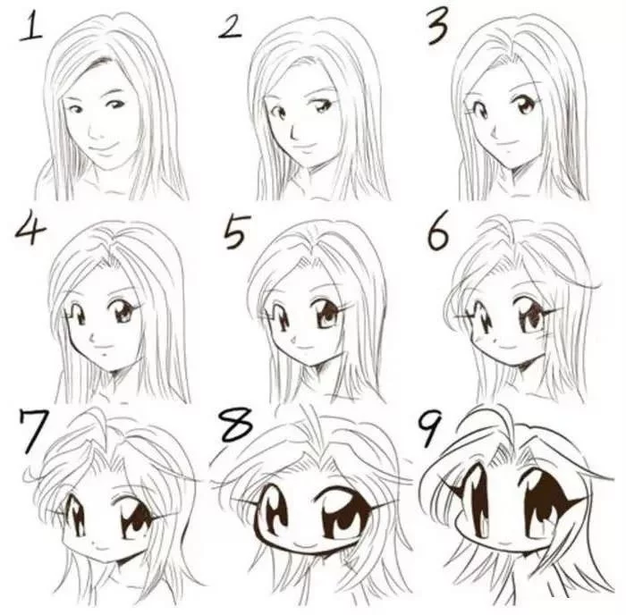
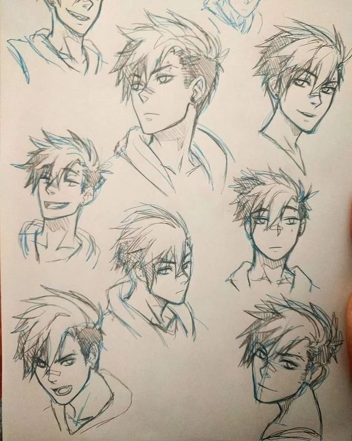
Why do my characters all have the same face?
It’s a common trap called ‘Same-Face Syndrome’! To break out of it, consciously vary the three key elements that define a face: the shape of the jaw (square, round, pointed), the distance and size of the eyes, and the structure of the nose and mouth. Try creating a lineup of characters where one has a wide jaw and close-set eyes, and another has a narrow chin and large, spaced-out eyes. The difference will be immediate.
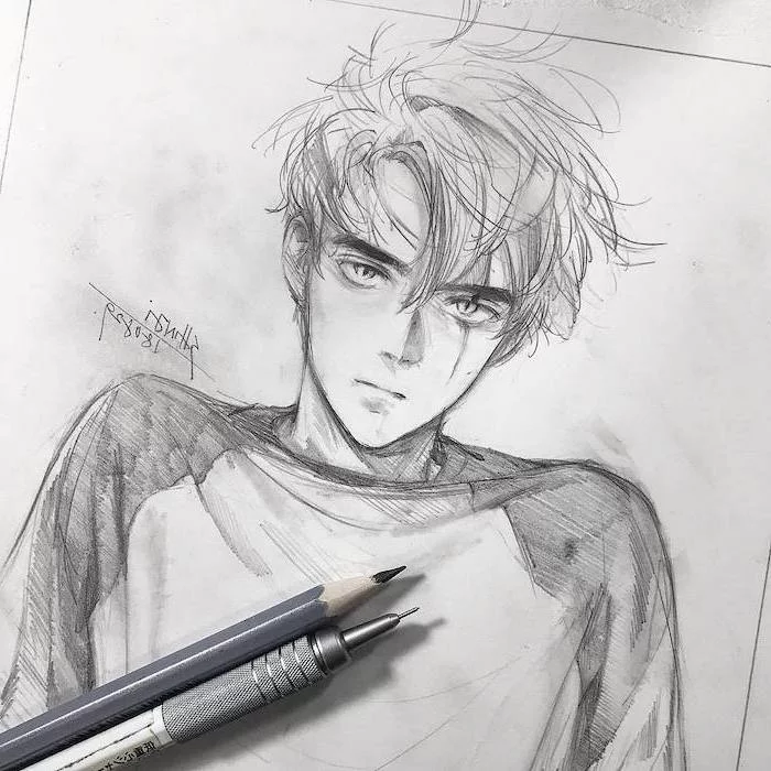
Pencil Sketching: The foundation of your drawing. Use a light-leaded pencil, like a 2H, for initial construction lines that are easy to erase. This is where you’ll build the sphere for the head and the body’s basic shapes.
Inking: The final, clean line art. This is done over your sketch with a fineliner or digitally on a new layer. This stage is about making confident, decisive marks.
Using both stages separates the messy, exploratory part of drawing from the clean, final presentation.
The choice of paper can dramatically affect your final piece. For ink and markers, a smooth, heavy paper like Bristol Board is ideal. It prevents ink from bleeding and allows for smooth blending with alcohol markers like Copics. For simple pencil sketching, any sketchbook will do, but for finished work, the right surface makes all the difference.
- Use simplified, blocky shapes for the palm and fingers first.
- Think of the fingers as three connected cylinders.
- Remember the natural curve the fingertips make—they aren’t all the same length.
- The thumb is positioned lower and on the side of the palm, not flat with the other fingers.
A 2021 survey showed that Clip Studio Paint is used by over 90% of animation studios in Japan for their digital drawing processes.
While Photoshop is an industry-standard for photo editing, Clip Studio Paint (CSP) is built specifically for illustration and comics. Its brush engine feels incredibly natural, and it includes features like 3D model posing, perspective rulers, and vector layers that are a lifesaver for comic and manga artists. There’s a reason the pros use it.
Think beyond the character. A compelling drawing often includes a hint of story. Where is your character? What are they doing? You don’t need a complex background; sometimes, a simple prop, a specific weather element like rain, or a stylized pattern is enough to add context and mood, making your artwork feel like a snapshot from a larger world.

How do I choose colors that work well together?
Start by learning basic color theory. A complementary color scheme (using colors opposite on the color wheel, like blue and orange) creates high contrast and visual pop. An analogous scheme (using colors next to each other, like blue, blue-green, and green) creates a more harmonious, serene feel. Many anime use a limited, deliberate palette for each scene to control the emotional tone.

Digital Drawing Tablet: Wacom is the famous industry leader, but brands like Huion and XP-Pen offer fantastic, budget-friendly alternatives for beginners that are more than capable of producing professional-quality work.
Traditional Drawing: You don’t need a 100-dollar set of markers. Start with a simple graphite pencil, an eraser, and a set of affordable fineliners. The skill is in the artist, not the price tag of the tool.
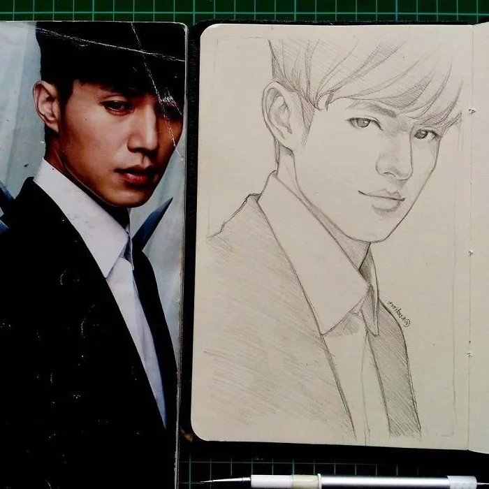
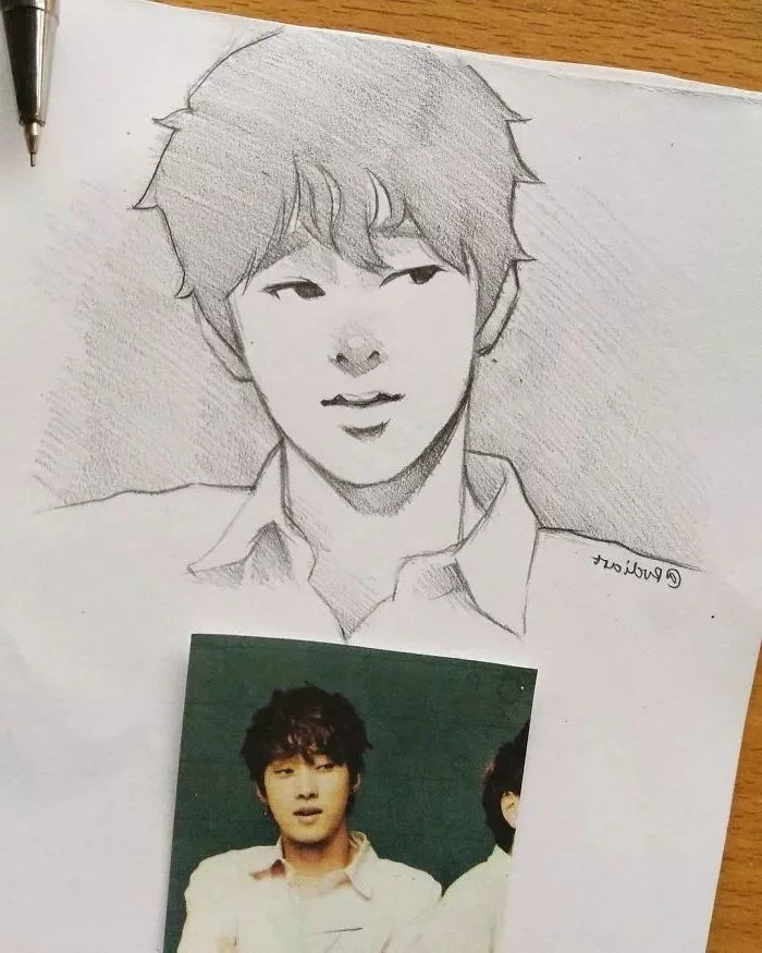
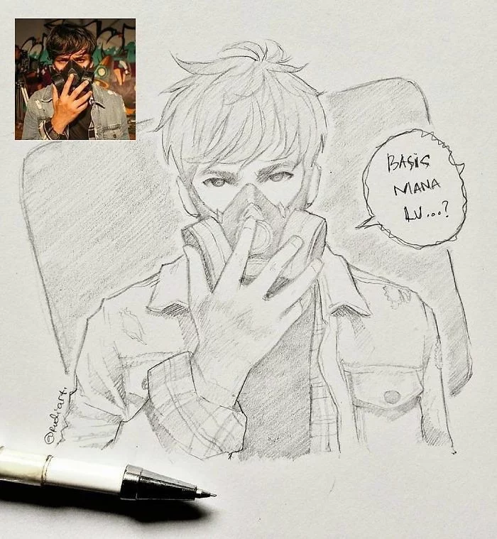
One of the fastest ways to improve is to stop drawing from your imagination alone. Create a reference library! Use Pinterest to create boards for dynamic poses, clothing folds, hand gestures, and unique facial expressions. Don’t copy them one-for-one; instead, use them to understand the mechanics of what you’re trying to draw.
- Your characters will have more believable and interesting outfits.
- You’ll understand how fabric drapes, folds, and stretches over the human form.
- You’ll develop a unique design sensibility for your original characters.
The secret? Spend an hour browsing fashion websites or magazines. Don’t just look at the clothes, but analyze the silhouettes and how the designers combine shapes and textures.
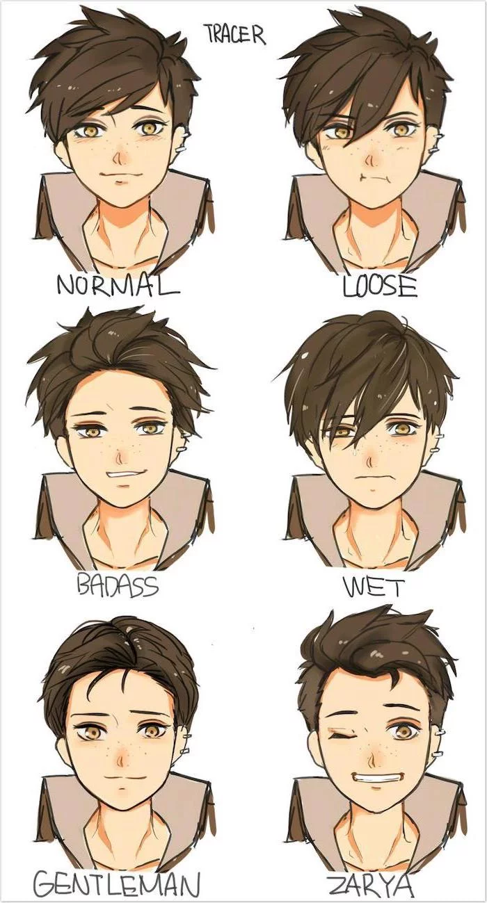
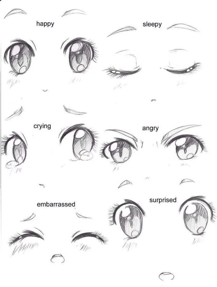
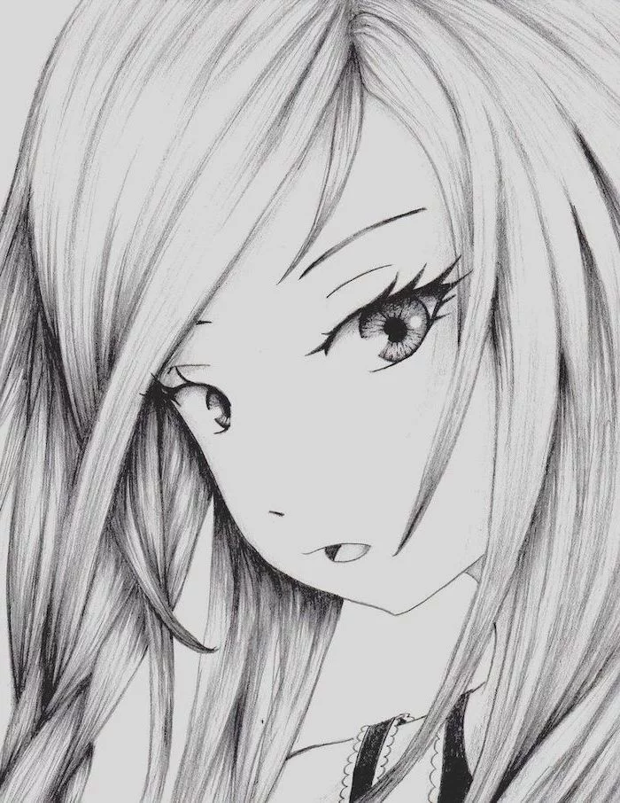
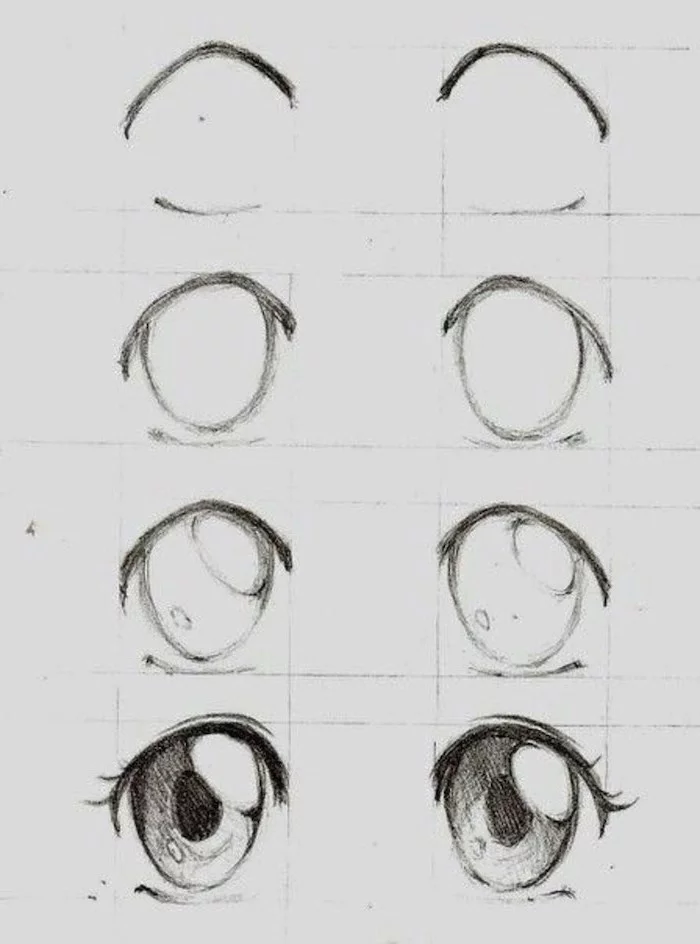
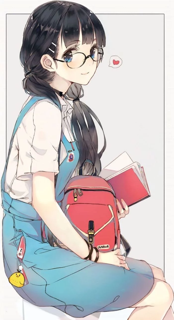
In anime, eye shape is a character design shortcut. Round, large eyes often signify youth, innocence, or naivety. Sharper, narrower eyes tend to denote seriousness, maturity, or villainy.
This visual language is a powerful tool. By consciously choosing the shape and size of your character’s eyes, you can instantly communicate key personality traits to the viewer before a single word of dialogue is spoken.
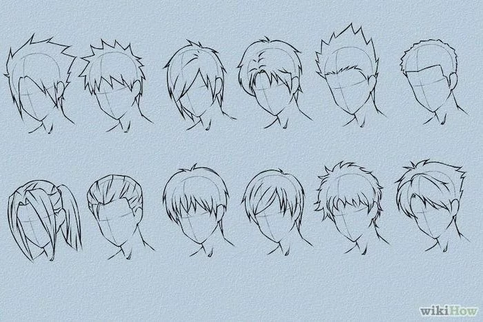
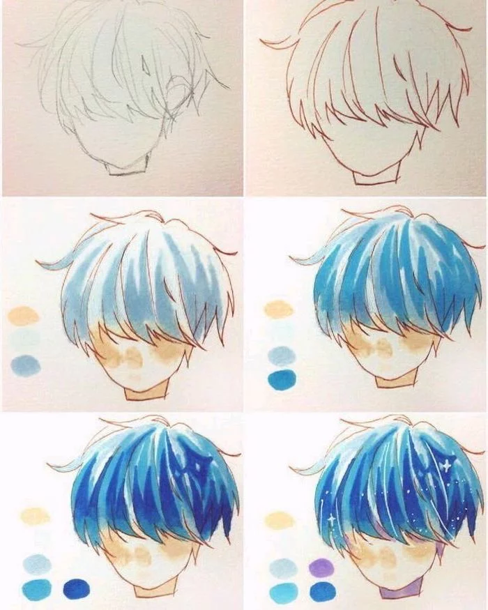
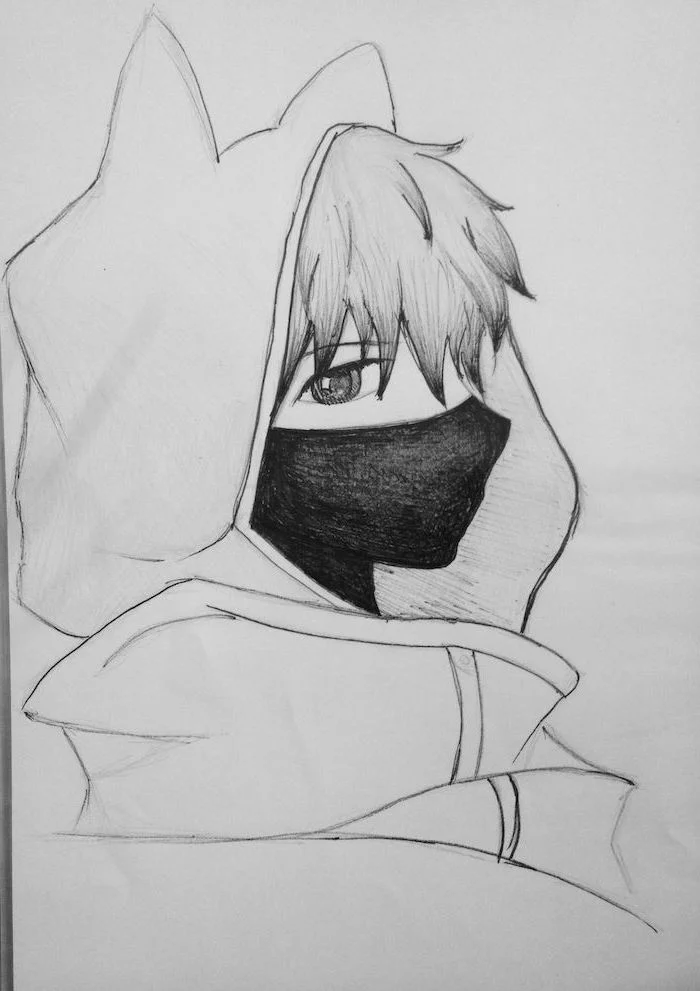
A common mistake: Drawing hair as one solid helmet-like shape. Instead, think of it in large, stylized chunks or locks. Start by mapping out the hairline on the skull you drew, then build the main shapes of the hair, paying attention to the direction of gravity. Finally, add a few smaller, stray strands to give it life and movement.

I want to draw digitally, but professional software is expensive. Are there free options?
Absolutely. Before you invest in a paid program, try out Krita. It’s a powerful, open-source, and completely free digital painting program that rivals many professional options. It has excellent brush tools, layers, and everything you need to start creating high-quality anime-style art today.

Ever notice how you can recognize a character from their shadow alone? That’s the power of a strong silhouette. When designing a character, step back and look at their outline. Is it distinct? Exaggerated hairstyles, unique clothing shapes, or signature accessories can create a memorable silhouette that makes your character stand out.
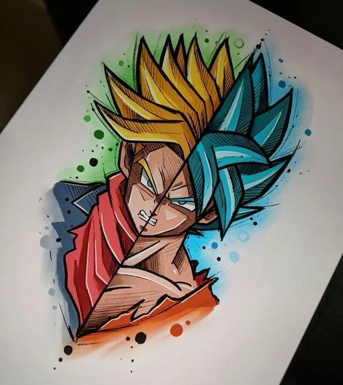
Shonen Style (e.g., Dragon Ball, My Hero Academia): Often characterized by sharp, angular lines, dynamic action poses, and intense expressions. Anatomy is typically more muscular and defined.
Shojo Style (e.g., Fruits Basket, Sailor Moon): Tends to use softer, more curved lines, with an emphasis on large, expressive eyes and flowing hair. The focus is often more on emotion and relationships.
Experimenting with both can help you find the elements you like best for your own style.
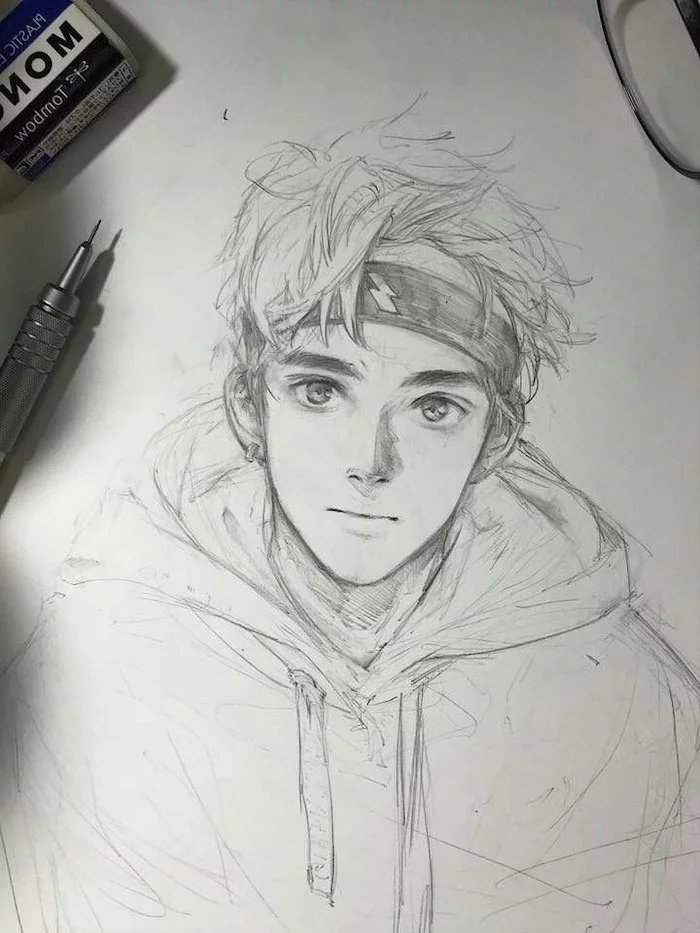
Don’t be afraid to use construction lines! Many beginners try to draw perfect final lines from the start and get frustrated. Pros work messily. They use light, sketchy lines to find the right shapes and proportions, and only commit to a dark, clean line once they’re sure of the placement. Embrace the process; a good drawing often starts with a messy sketch.
The human brain is wired to see faces in everything, a phenomenon called pareidolia. This is why even heavily stylized anime faces are so effective and emotionally resonant.
Your brain is already helping you! It wants to believe that the simple arrangement of two dots and a line is a face. Your job as an artist is to refine those simple shapes into something that conveys a specific personality and emotion.
Line weight is your secret weapon. It’s the variation in the thickness of your lines. Using thicker lines on the underside of an object can suggest shadow and weight. Outlines facing the viewer can be thicker to bring them forward, while distant objects can have thin, faint lines to push them back. This simple technique adds instant depth and professionalism to your drawings.

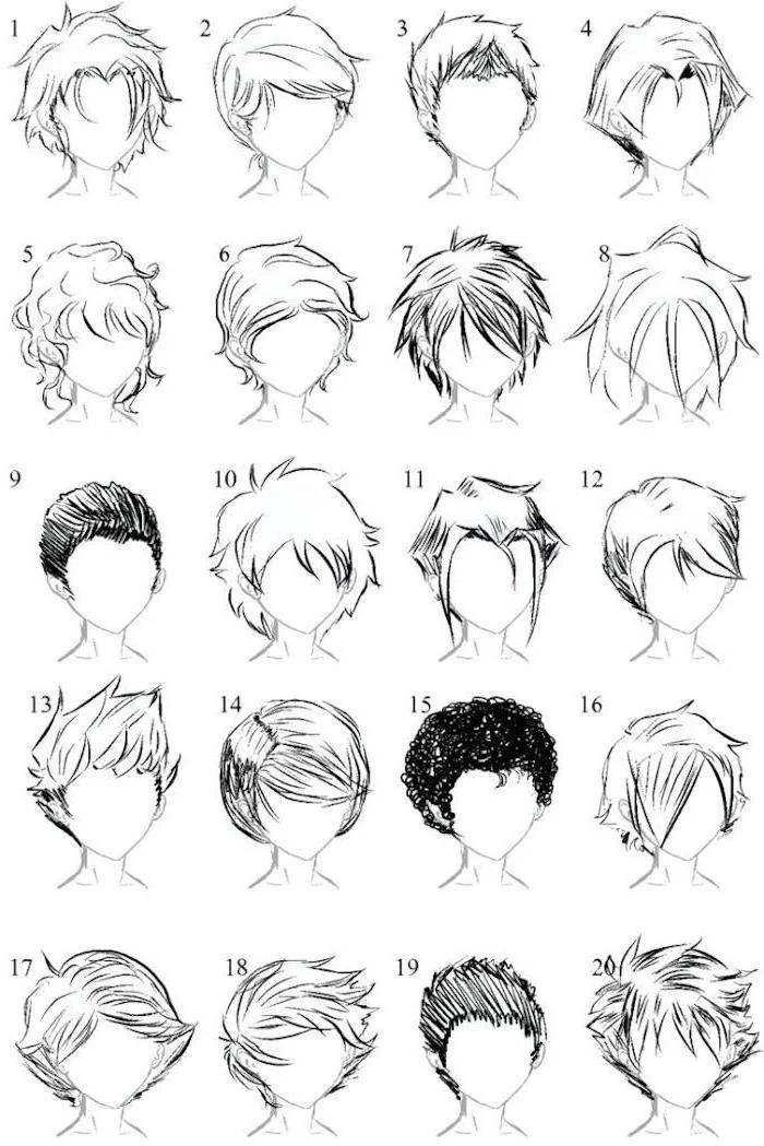
How do I draw those cool, spiky anime hairstyles?
The key is to avoid drawing individual strands of hair. Instead, focus on drawing large, defined clumps or spikes that flow from a single point on the back of the head. Think of it like drawing banana bunches or large leaves. Define the overall silhouette of the hair first, then add a few smaller lines within the clumps to suggest texture and direction.
- It can feel more tactile and direct, with a real connection to the paper.
- The initial investment is very low—just a pencil and paper.
- Your original artwork is a unique physical object.
But remember… mistakes are harder to correct, and materials like markers can be expensive to build a collection of.
Famed Studio Ghibli director Hayao Miyazaki is known for storyboarding his films himself, often without a finished script. He discovers the story through the process of drawing.
Let this inspire you. Don’t always wait for the perfect idea. Sometimes, the best way to develop a character or a story is to just start sketching. Let your hand and your imagination lead the way, and you might discover something you never would have planned.
The finishing touch: the eye light. No matter how well you’ve drawn the eye, it won’t look alive without that little white reflection, also known as a specular highlight. It’s the dot of light that gives the eye its wet, reflective quality. A common mistake is to forget it or place it randomly. Always place it on the same side in both eyes, according to your imaginary light source. It’s a tiny detail that makes a world of difference.