Getting Green Paint Right: A Pro’s No-Nonsense Guide to Picking the Perfect Shade
In my years helping people with their homes, I’ve seen color trends come and go. But green? Green is different. It’s not just a passing fad; it’s a constant. More than any color besides basic white, it’s what people ask for. They want to bring a bit of the outdoors inside, create a peaceful retreat, or go big with a bold statement. Here’s the catch, though: green is probably the trickiest color in the book to get right. I can’t tell you how many times I’ve been called in to fix a paint job where a beautiful, earthy sage on a tiny swatch turned into a sickly, minty mess on the actual wall.
In this article
Choosing a green paint is so much more than just finding a shade you like. It’s a technical decision that hinges on light, space, and the paint itself. A single green can look completely different from one room to the next, or even from wall to wall. So, let’s walk through this the way a pro does. We’ll cover the science behind the color, the best techniques for a perfect finish, and the honest truth about what it takes to bring this beautiful, complex color into your home without regrets.
First Things First: It’s All About the Light
Before you even think about looking at paint chips, you need to understand how color actually works in your home. It’s not just about the pigment in the can; it’s about how light interacts with that pigment. Honestly, ignoring this is the number one reason green paint jobs fail.
Light Reflectance Value (LRV)
Every paint color has a Light Reflectance Value, or LRV, on a scale of 0 (pure black) to 100 (pure white). This little number, usually on the back of the paint chip, tells you how much light a color reflects versus how much it absorbs. A deep forest green might have an LRV of 5, meaning it soaks up 95% of the light. On the other hand, a pale, soft green could have an LRV of 75, reflecting most of the light.
This is critical. In a small room with little natural light, a low-LRV green will make the space feel like a cave. I once had a client who was dead-set on a deep hunter green for a narrow, north-facing hallway. The effect was incredibly claustrophobic. We ended up with a gorgeous green with an LRV around 35—it still had the depth she wanted but didn’t swallow the space whole.
The Secret Language of Undertones
Green is rarely just green. It’s a mix of blue and yellow, of course, but paint manufacturers almost always add other pigments to create undertones of gray, brown, or even red. These undertones give the green its personality.
- Blue Undertones: Greens with a lot of blue, like teal or some mints, feel cooler and a bit more formal. They work beautifully in rooms with warm, south-facing light, which balances their coolness. Put a blue-green in a north-facing room, though, and it can feel downright chilly.
- Yellow Undertones: Think olive, chartreuse, or lime. These greens feel warmer and more energetic. They can bring a wonderful vibrancy to a room with cool, northern light. A heads-up, though: in a west-facing room with that intense afternoon sun, a yellow-green can become almost unpleasantly electric.
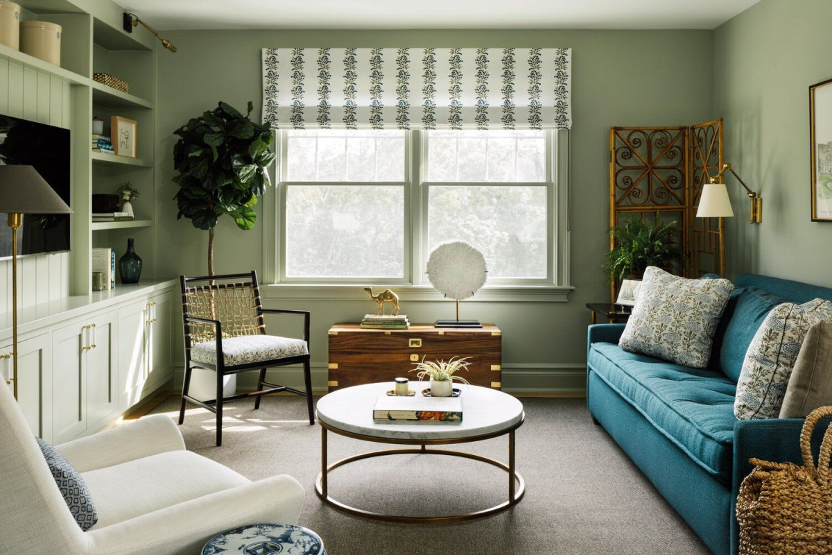
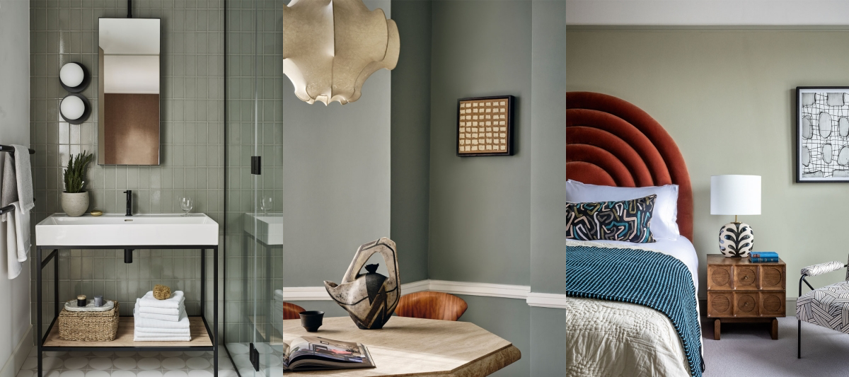
- Gray/Brown Undertones: These are my favorites—the earthy, muted greens like sage and moss. The gray or brown grounds the color, making it softer and more complex. They’re often the most versatile and easiest to live with, and they change beautifully as the light moves through the room during the day.
A Pro’s Field Guide to Green Shades
Forget the trendy paint names for a second. As a pro, I think of greens in terms of how they function. They basically fall into a few practical categories.
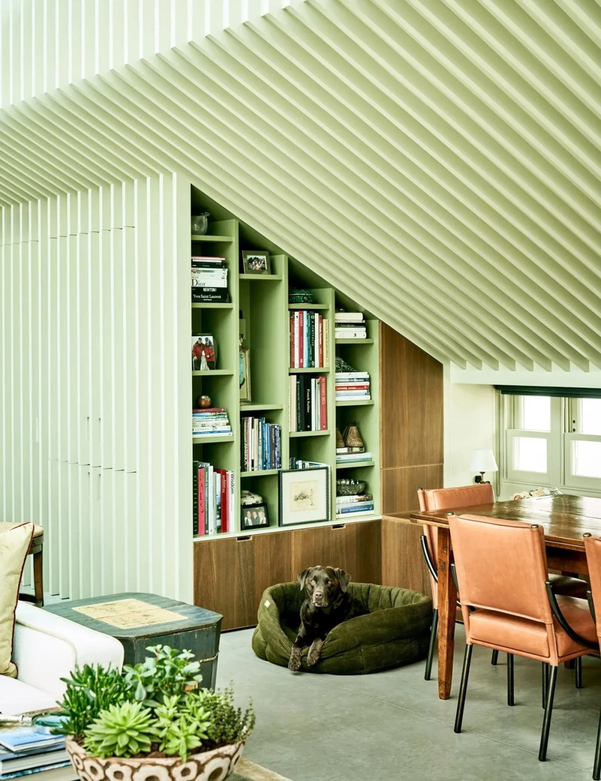
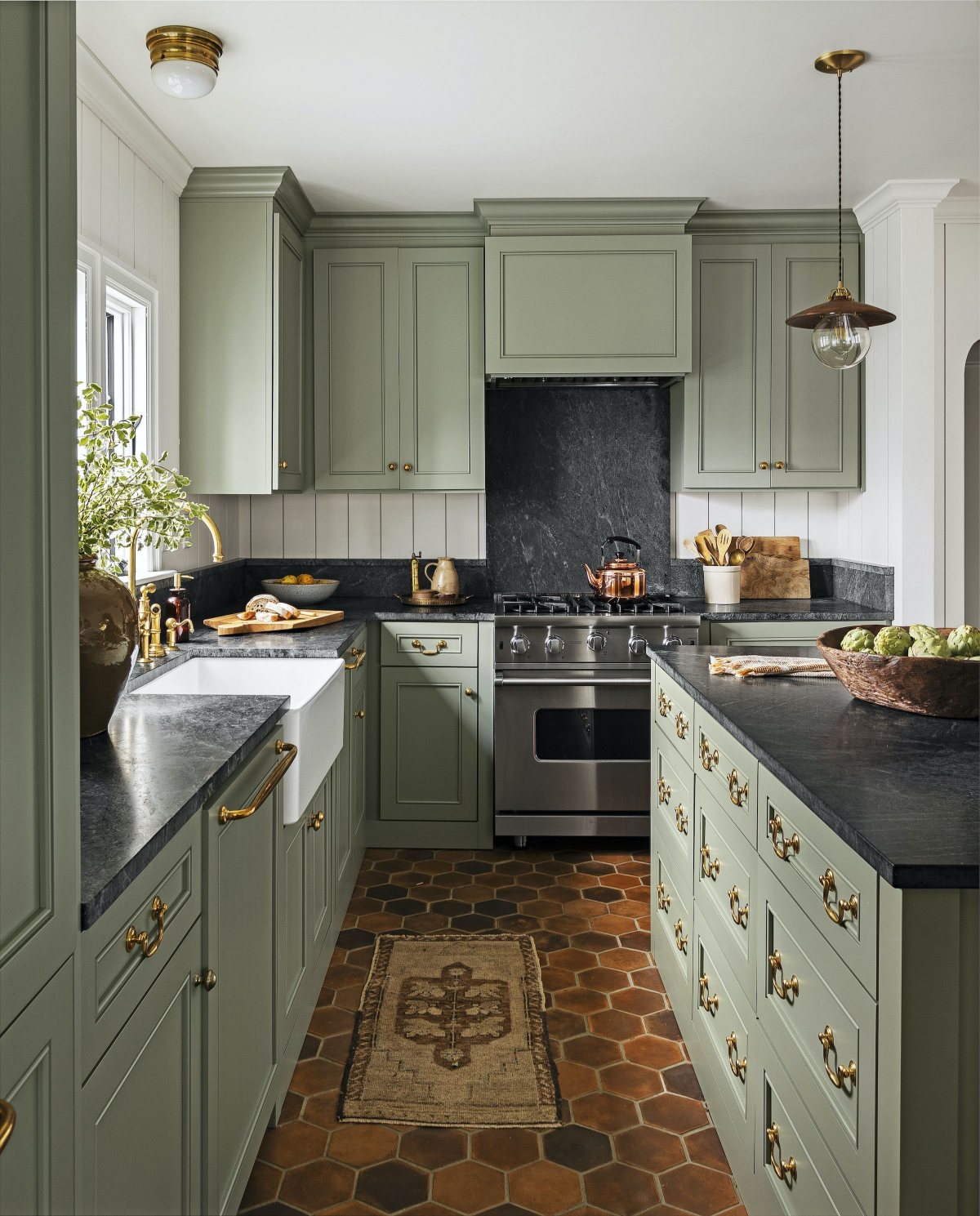
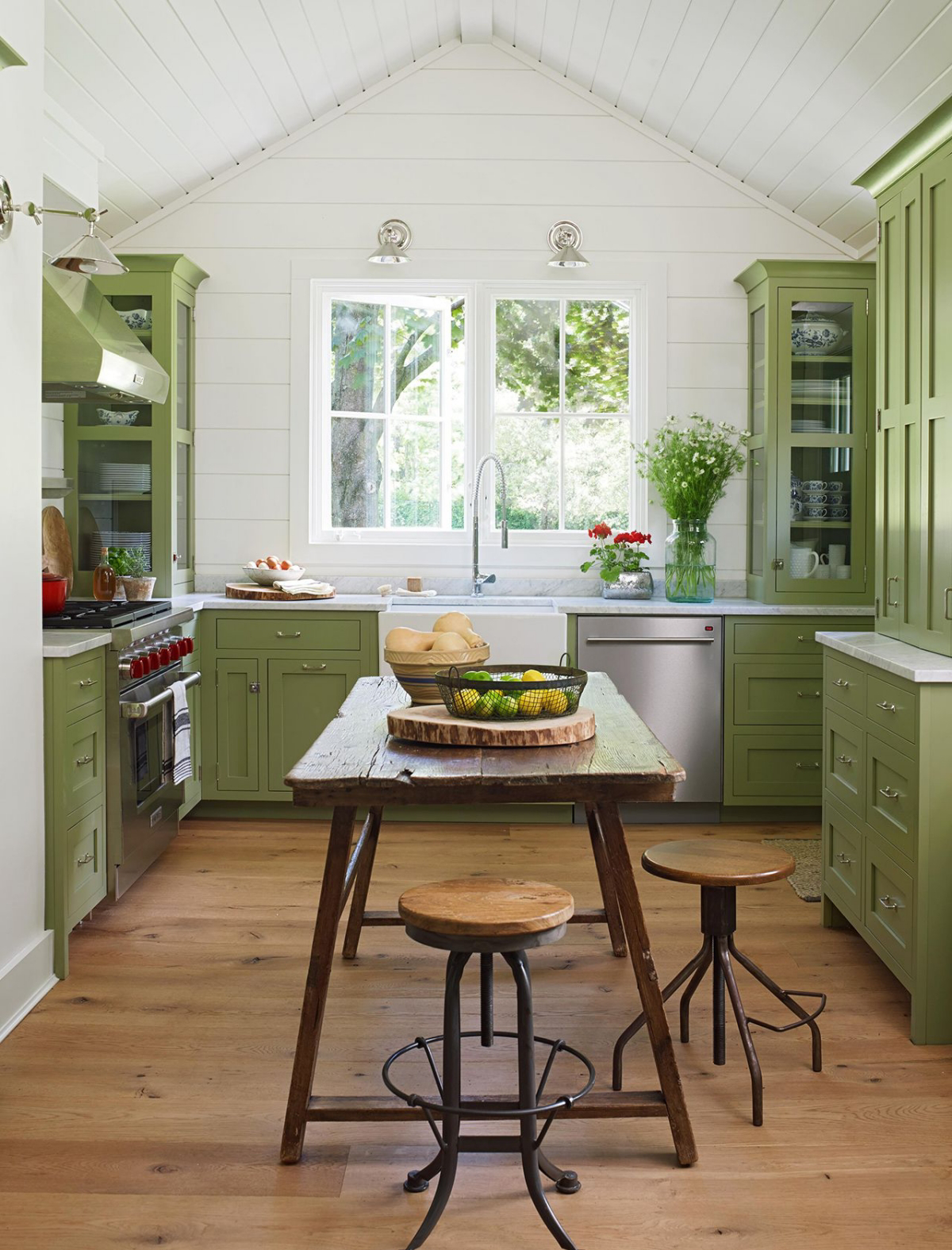
Earthy & Muted: Sage, Moss, and Olive
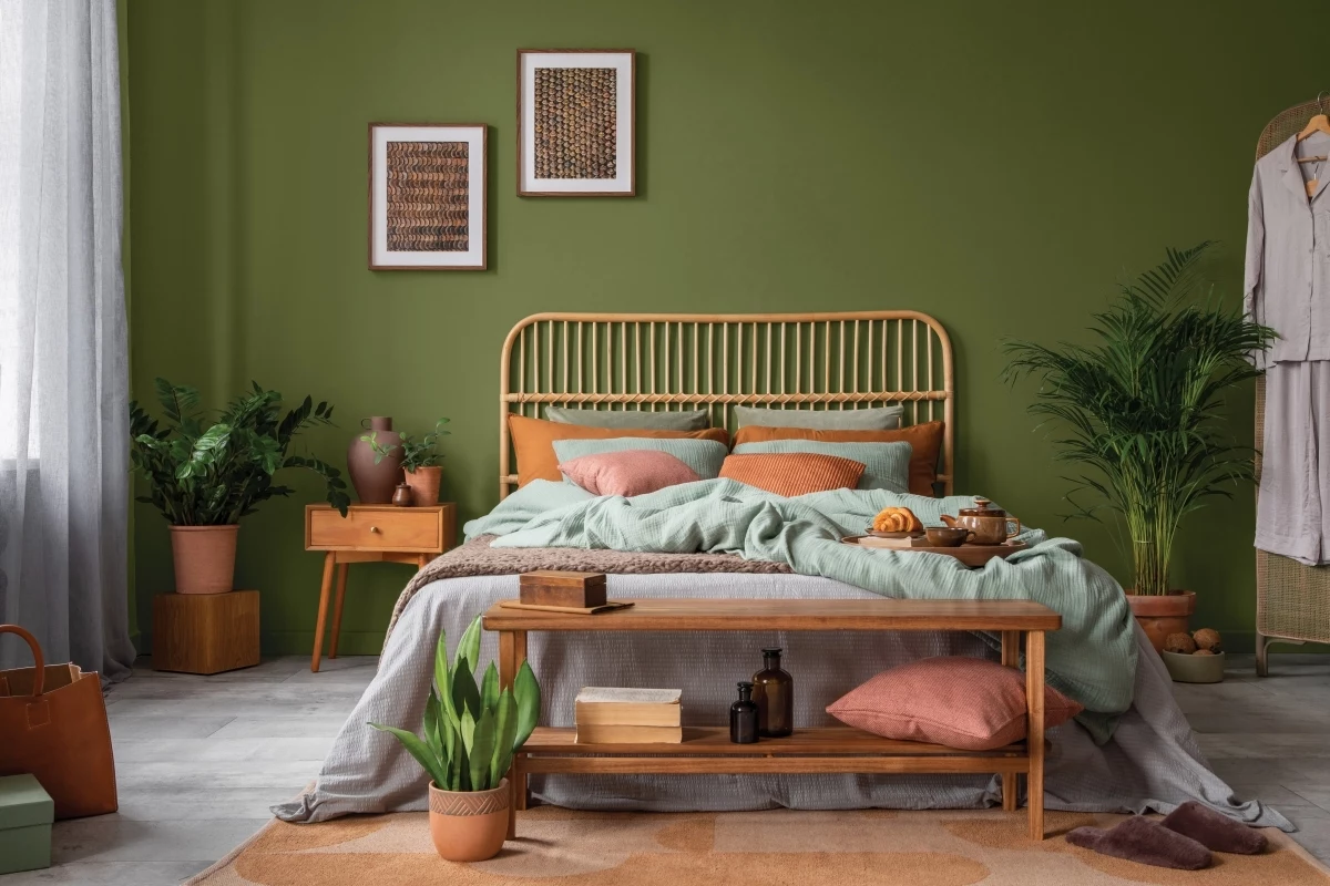
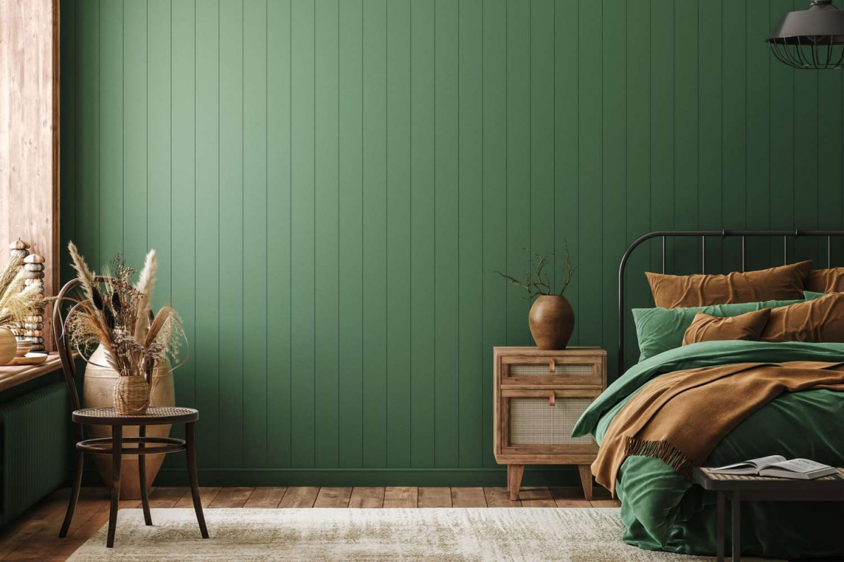
These are the absolute workhorses of the green family. Their complexity comes from those gray or brown undertones, making them feel sophisticated and natural. They’re forgiving, versatile, and work with everything from traditional decor to a more modern farmhouse vibe.
How I use them: Sage green is my go-to for bedrooms. Its gray undertone is incredibly calming. For a client who struggled with sleep, we used a mid-tone sage and paired it with warm woods. It completely transformed the room into a sanctuary. Olive green is fantastic for dining rooms or kitchens; its warm undertones feel appetizing and convivial. A great trick is to paint just the lower kitchen cabinets in a deep olive to ground the space.
Good to know: The biggest risk here is that they can look muddy in poor lighting. If a room is dark, a muted sage can lose its greenness and just read as gray.
Where to start looking: For a classic sage, check out samples of Benjamin Moore’s ‘October Mist’ or Sherwin-Williams’ ‘Evergreen Fog’. These are popular for a reason.
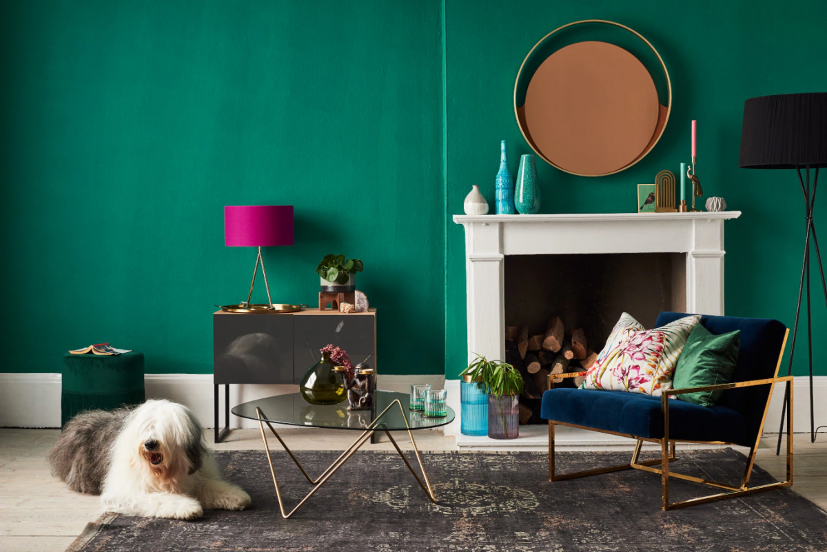
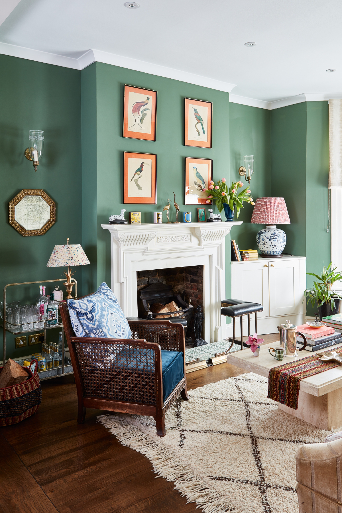
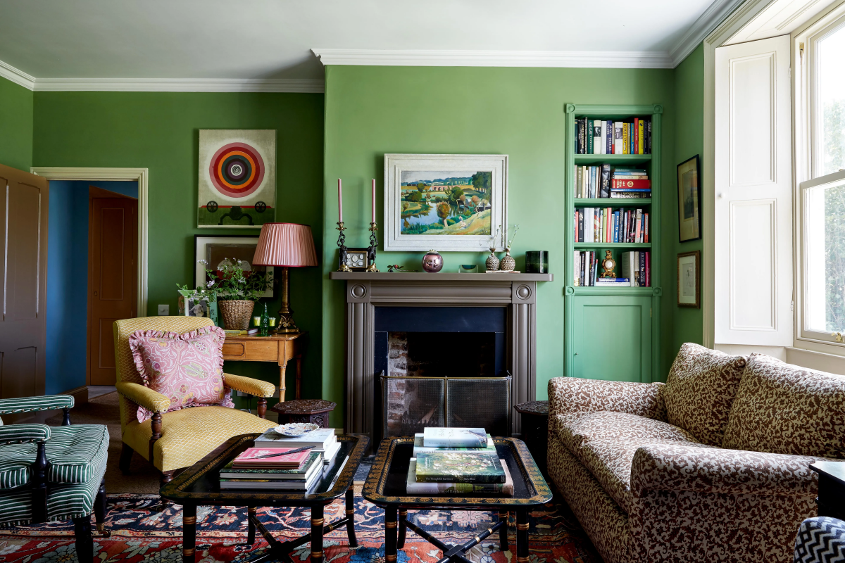
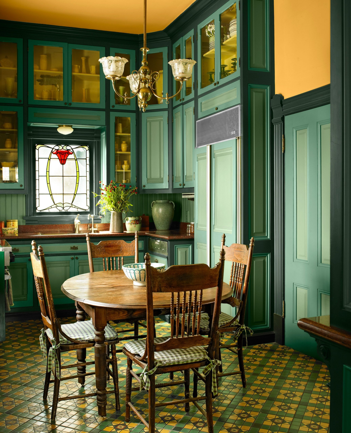
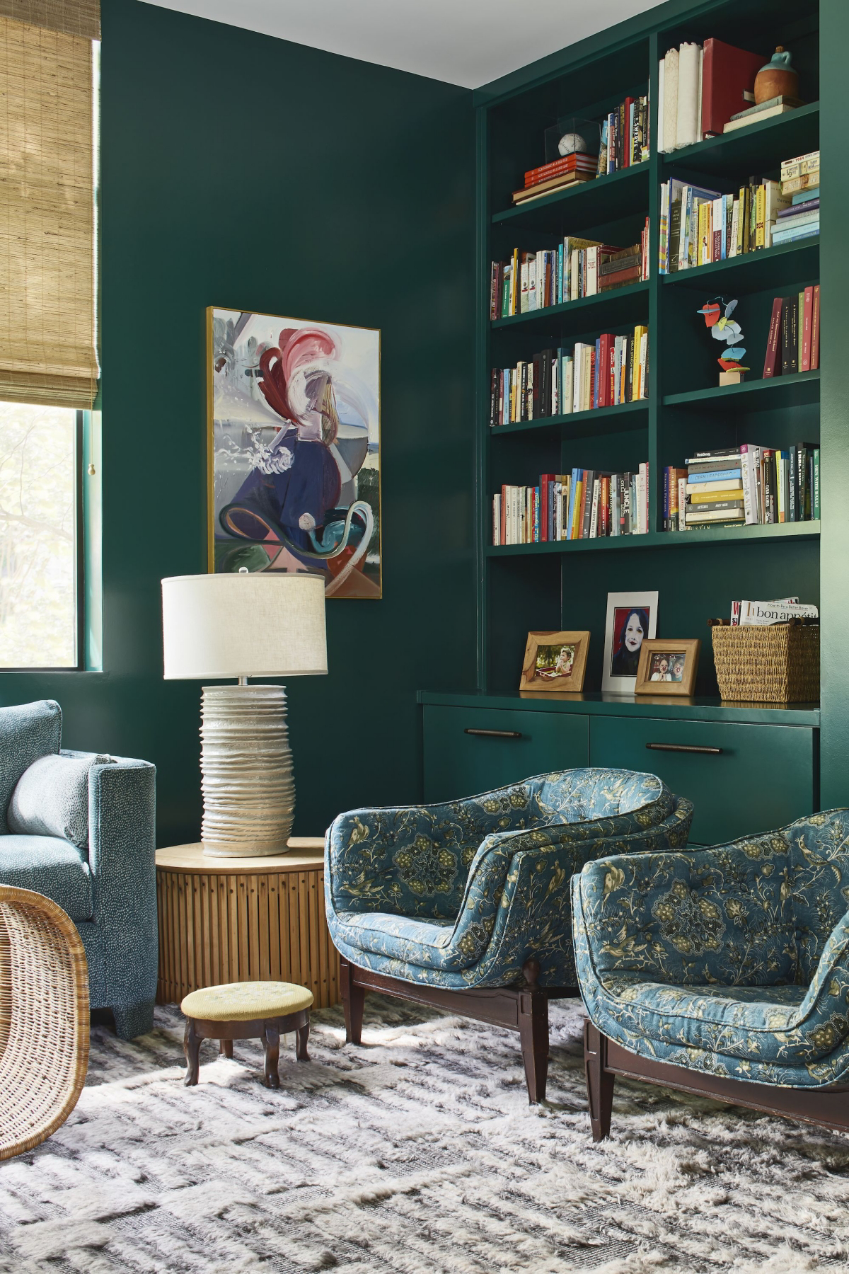
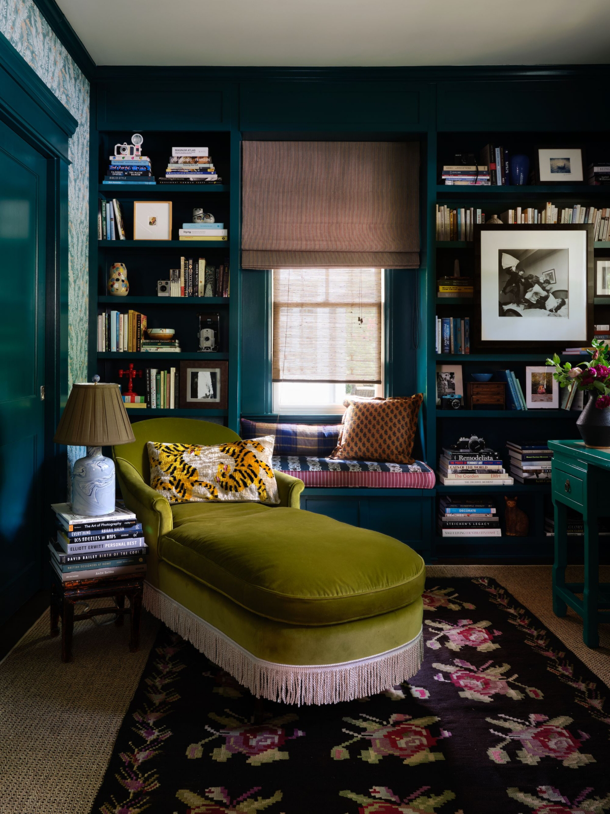
Deep & Saturated: Forest, Emerald, and Hunter
Ready to make a statement? These are your colors. They are dramatic and luxurious, and they create an instant sense of intimacy and mood. It’s a commitment, but the payoff can be spectacular.
How I use them: Deep greens are perfect for creating cozy, enveloping spaces like home offices, libraries, or powder rooms. A small space painted in a dark color feels like a little jewel box. For a writer’s office, we painted the walls and the built-in bookshelves a deep forest green in a matte finish. The matte sheen absorbs light and gives the color a soft, velvety texture that feels incredibly rich.
Heads up! Dark colors are unforgiving. Every nail hole and scuff will show. The wall prep has to be perfect. They also require more coats. A DIYer might need four or five coats, but a pro using a tinted primer can get a perfect finish in two topcoats.
Where to start looking: For a truly bold and classic deep green, look at samples of Farrow & Ball’s ‘Studio Green’ or Sherwin-Williams’ ‘Jasper’.
Crisp & Clear: Mint, Aqua, and Chartreuse
These greens are bright, energetic, and clean. They feel fresh and can lean retro or very modern depending on how you use them.
How I use them: I tend to use these more sparingly, often as an accent. A pale mint green can be lovely in a bathroom or laundry room for that clean, fresh feeling. Chartreuse is a high-energy color I wouldn’t use on a whole room, but painting the back of a bookshelf or an old piece of furniture with it can add a fantastic pop of personality.
What to watch out for: These colors can easily look dated. A mint green that’s just a little off can feel like a hospital room. Their intensity needs to be balanced with plenty of neutrals.
Why Did My Perfect Green Go Wrong? Common Disasters & Fixes
It happens. You followed all the steps, but the color on the wall is just… not right. Before you panic and buy more paint, check these things first.
- The Problem: My beautiful olive green looks like murky baby poop at night.
- The Quick Fix: It’s probably your lightbulbs! Many bulbs cast a very warm, yellow light that can turn a sophisticated green into something sickly. Before you repaint, try swapping your bulbs for a neutral LED (look for a color temperature between 3000K-3500K). It can completely change the color back to what you intended.
- The Problem: My dark green wall shows every single fingerprint and scuff mark.
- The Quick Fix: This is a classic issue with matte or flat finishes. For your next project in a high-traffic area, choose an eggshell or satin sheen. For the current wall, get a small sample pot of the same color and sheen for quick touch-ups. A light dab with an artist’s brush can make scuffs disappear.
Professional Techniques for a Flawless Finish
The difference between an amateur and a pro paint job isn’t just a steady hand; it’s the process. With a color like green, these steps are non-negotiable.
1. Sample the Right Way
Please, never paint a little test square directly on your wall. The current color will mess with your perception. Instead, do this:
- Get Sample Boards: Spend the $5 on two or three pieces of white foam core or poster board.
- Apply Two Full Coats: Paint your sample color onto the boards. One coat is not enough to see the true color.
- Move Them Around: For the next two days, move those boards all over the room. Tape one near the window, another in a dark corner. Look at them in the morning, at noon, and at night with the lights on. This is the only way to see how the undertones will really behave in your space.
2. Choose the Right Sheen
The paint’s finish will dramatically alter how the green looks. Matte is velvety and luxurious but isn’t washable, so it’s best for low-traffic areas. Eggshell and Satin are the most popular for a reason—they offer a soft look with good durability. I use eggshell for most living rooms and bedrooms. Semi-Gloss is for trim and doors; it’s too shiny for walls unless you want a very specific, high-drama look.
3. The Magic of a Tinted Primer
This is the step everyone wants to skip, and it’s a huge mistake with greens. For a deep forest green, you can’t just put it over a white or beige wall. Go to the paint counter and say, “I’m painting with a dark green. Can you tint my primer to a medium-to-dark gray, like a P4 or P5 shade?” This neutral gray base helps the green achieve its true, rich color in fewer coats, saving you time and money on that expensive paint. A quality high-adhesion primer will run you about $40 a gallon, and it’s worth every penny.
To DIY or Hire a Pro?
So, when should you absolutely call in a professional? My advice: if you’re going for a deep, saturated green, especially in a matte finish. That combination is the ultimate test of a wall’s surface. A pro’s prep work—skimming, sanding, and caulking to perfection—is what makes those moody colors look flawless instead of flawed. For lighter, more forgiving sages and olives, a confident DIYer can get great results.
Your Green Paint Shopping List
Ready to get started? Here’s a realistic look at what you’ll need and what it might cost:
- Quality Paint: For deep or complex greens, don’t cheap out. Expect to pay between $50 and $80 per gallon for a premium product. It has better pigments and will cover more evenly.
- High-Adhesion Tinted Primer: Around $40 per gallon. This is not optional!
- Sampling Supplies: White foam core boards ($5), and sample pots of paint ($5-$10 each).
- Application Tools: A good 2.5-inch angled brush ($15), a 9-inch roller frame, quality roller covers ($10 for a 2-pack), a paint tray, and painter’s tape.
By taking your time and using the right materials and techniques, you can absolutely bring the perfect shade of green into your home. It’s a color that gives back, creating spaces that feel alive, calm, and deeply personal. It just demands a little extra respect upfront.
Galerie d’inspiration
In the Victorian era, the most vibrant green pigment, Scheele’s Green, was all the rage for wallpapers and paints. It also happened to contain a significant amount of arsenic. Historians speculate this fashionable color may have contributed to illnesses and even deaths, as the pigment could flake off and become airborne.
Thankfully, today’s greens offer all the beauty with none of the danger. Modern chemistry allows brands like Farrow & Ball to create incredibly complex and historically inspired shades like ‘Arsenic’ (No. 214) as a cheeky nod to the past, achieving the same striking vibrancy with completely safe, water-based formulas.
Wondering why your sample of deep forest green looks perfect, but the finished wall has a subtle, uneven sheen?
The secret is often in the prep work, specifically the primer. For deep, saturated greens (those with a low LRV), standard white primer isn’t enough. It can take three, four, or even more coats of your expensive color to achieve full coverage. Pros use a gray-tinted primer. A medium-gray base, like Sherwin-Williams’ P3 or P4 shades, neutralizes the white wall, allowing the deep green pigment to pop in just two coats, saving you time, money, and frustration while ensuring a richer, more uniform final color.
The final finish of your paint can either elevate or undermine your chosen green. Don’t just focus on the color chip; consider the sheen.
- Matte or Flat: Hides wall imperfections and gives deep greens a velvety, luxurious depth. Perfect for a cozy study or a dramatic accent wall.
- Eggshell or Satin: Offers a soft, low-sheen glow that’s durable and easy to clean. An all-around great choice for living rooms and bedrooms using mid-tone greens like sage or olive.
- Semi-Gloss: Use it sparingly. Its high shine is great for trim and doors, but on a green wall, it can look cheap and highlight every tiny flaw.
For a Serene, Biophilic Retreat: Pair a soft, earthy green like ‘October Mist’ by Benjamin Moore with natural materials. Think light oak flooring, rattan furniture, linen curtains, and plenty of live plants. The goal is to blur the line between indoors and outdoors, creating a calm and restorative atmosphere.
For a Moody, Art Deco Vibe: Go bold with a jewel-toned emerald or malachite green. Combine it with dark woods like walnut, polished brass or gold accents, and plush textures like velvet. This creates a sophisticated, dramatic space that feels both luxurious and intimate.
Choosing a ‘green’ paint can also mean making an environmentally conscious choice. Modern paint technology has moved beyond just color. Look for paints labeled ‘Low-VOC’ or ‘Zero-VOC’ (Volatile Organic Compounds). These formulas release fewer harmful chemicals into the air, leading to better indoor air quality without sacrificing performance. Brands like Clare and ECOS Paints have built their entire philosophy around creating beautiful, high-quality paints that are healthier for you and the planet.


