Your Phone Is Begging for a Better Wallpaper: A Pro’s Guide to Epic Fall Backgrounds
I’ve lugged a camera around for the better part of two decades, mostly pointed at something outdoors. I still remember one of my first big gigs, a fall foliage brochure for a tourism board. I spent weeks tromping through the woods from sunrise to sunset, and I learned a tough lesson: a beautiful scene doesn’t automatically make a good photo. And an amazing photo? It often makes for a terrible phone background.
In this article
- First Things First: What Makes a Wallpaper Work?
- Composing a Wallpaper That’s Both Beautiful and Usable
- Want to Shoot Your Own? A Photographer’s Field Guide
- The Final Polish: Editing for Your Screen
- Where to Find Great Wallpapers (If You Don’t Shoot Your Own)
- A Final Thought on Your Digital Space
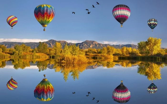
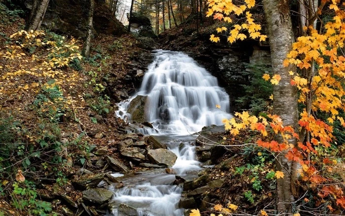
- Inspirational Gallery
Yeah, those two things are completely different animals.
Your phone screen isn’t just a tiny picture frame; it’s a workspace. It’s covered in icons, widgets, and notifications. A great wallpaper has to play nice with all of that stuff, not fight it. It needs to be easy on the eyes without making your app labels impossible to read. It’s a tricky balance, and over the years, I’ve supplied images for everything from operating systems to massive corporate displays. I’ve seen what works, and oh boy, have I seen what fails.
So, this is me sharing everything I’ve learned, the hard way, so you don’t have to. We’ll get into the nitty-gritty of why some images look crisp and others look like a blurry mess. We’ll even cover how to shoot your own so they’re perfectly functional. My goal? To help you pick or create a background that actually makes your phone better.
First Things First: What Makes a Wallpaper Work?
Before we even get to pretty colors and moody forests, we have to talk tech. It’s not as boring as it sounds, I promise. The quality of a digital image isn’t just a matter of opinion; it’s based on real, measurable data. Getting this part right is the foundation for everything else.
Let’s Talk Pixels and Resolution
Your screen is a grid of millions of tiny lights called pixels. Resolution is just the count of those pixels, like 1170 pixels across and 2532 pixels down. For a wallpaper to look sharp, it needs to have at least that many pixels. If your image is smaller, your phone has to stretch it, and that’s when you get that fuzzy, blocky look. It’s like stretching a t-shirt graphic until it cracks.
Quick tip: How do you find your phone’s resolution? It’s super easy. For an iPhone, just Google your specific model, like “iPhone 15 Pro screen resolution.” For most Android phones, you can usually find it in your settings under Settings > About Phone > Display, but honestly, a quick web search is almost always faster.
You’ll also see a term called PPI (Pixels Per Inch). Modern phones have a crazy high PPI, which is why text and images look so crisp. It’s also why they are so unforgiving of a low-quality wallpaper. Always, always go for the highest resolution image you can find.
Why Your Screen Type Matters for Fall Colors
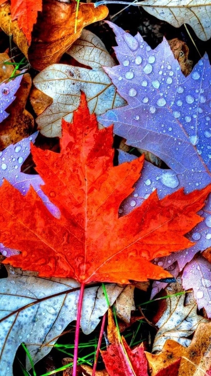
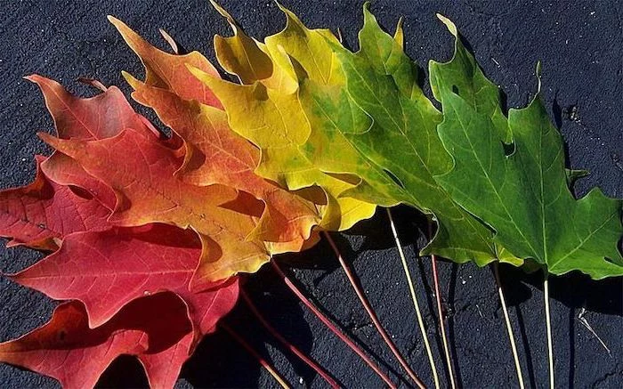
The screen on your phone creates color by mixing red, green, and blue light (RGB). This is super important for fall scenes because those rich oranges and reds are made by blasting the red and green pixels. The type of screen you have really changes the final look.
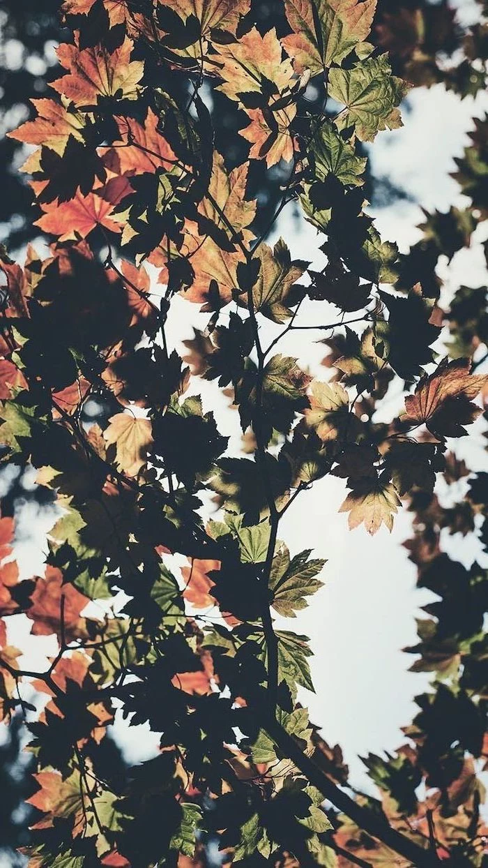
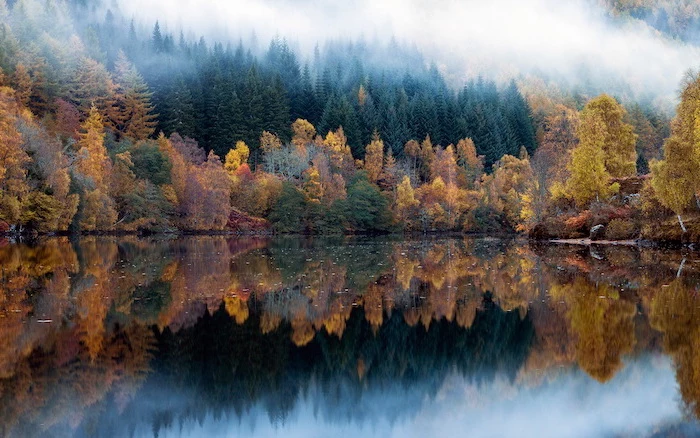
- OLED Screens: Most newer phones have these. On an OLED screen, each pixel makes its own light. To show black, the pixel just turns completely off. This gives you “true black” and insane contrast. Dark, moody autumn photos with deep shadows look absolutely stunning on these screens because the colors pop against the pure black.
- LCD Screens: Found on some older or more budget-friendly devices, these have a single backlight that’s always on. To make black, it just tries to block the light, which results in more of a dark gray. On these screens, brighter, more evenly lit fall scenes often look a bit better, as really dark images can feel a little washed out.
Composing a Wallpaper That’s Both Beautiful and Usable
Okay, now for the fun part. A good wallpaper uses color and composition to create a mood without causing a headache. Think about how you actually use your phone.
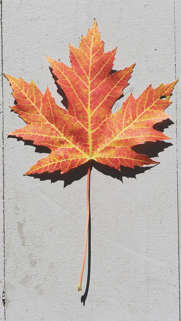
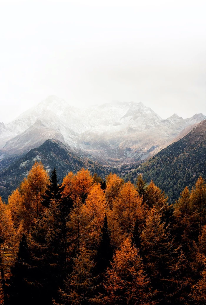
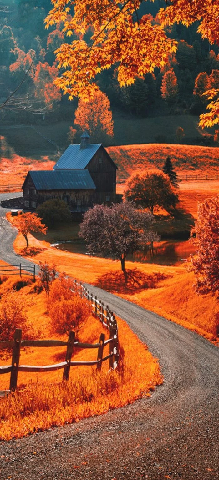
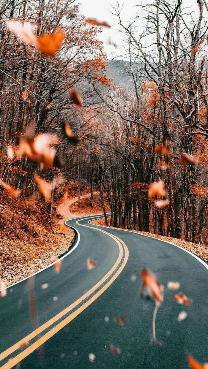
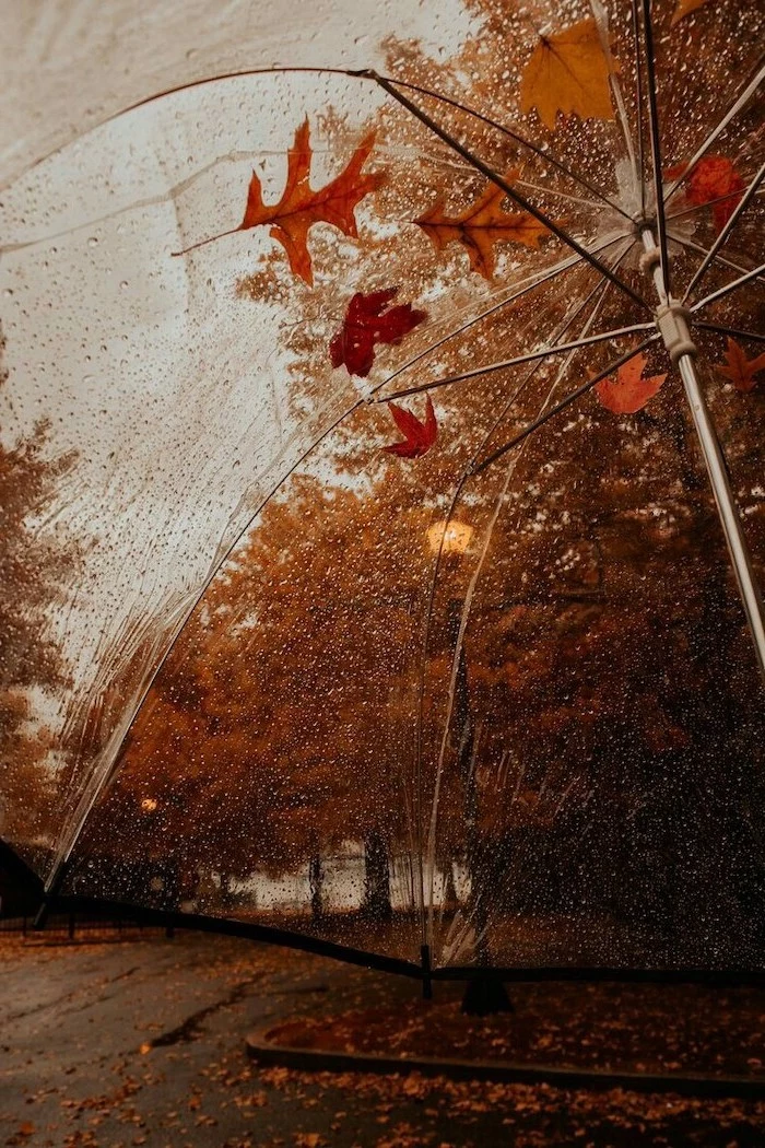
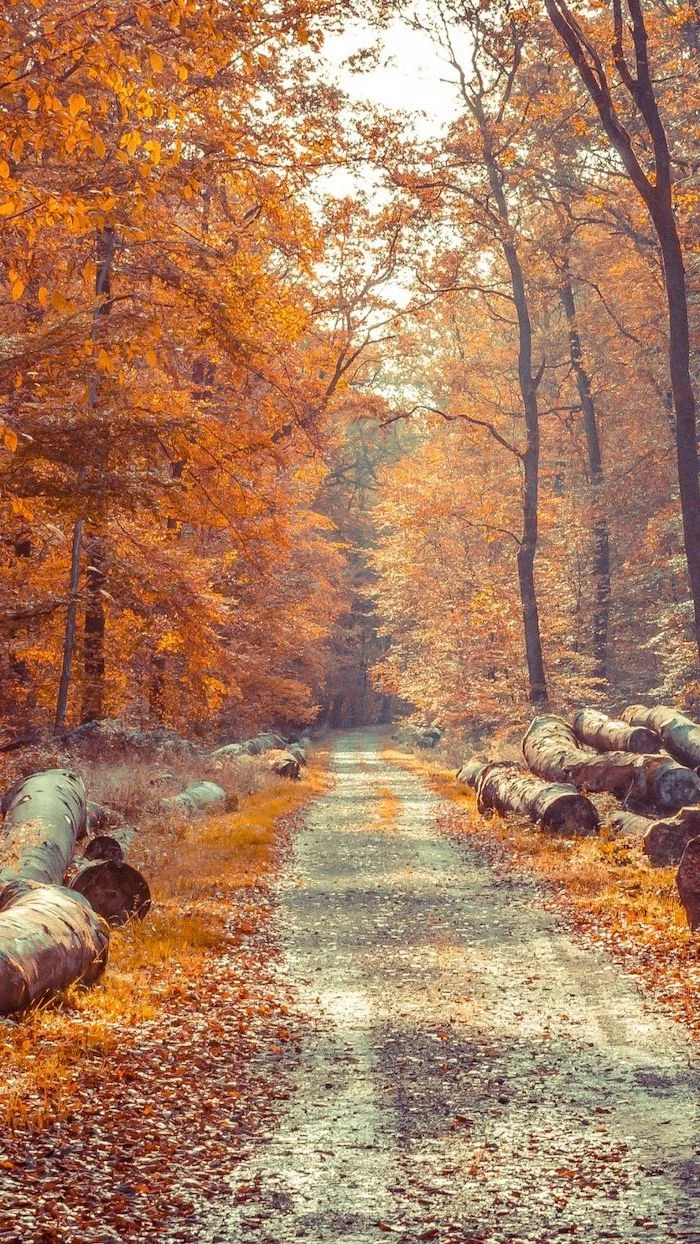
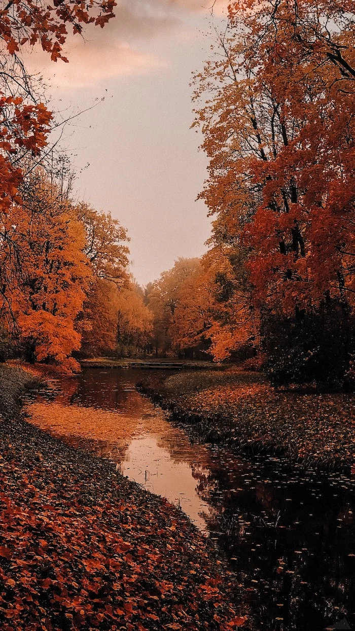
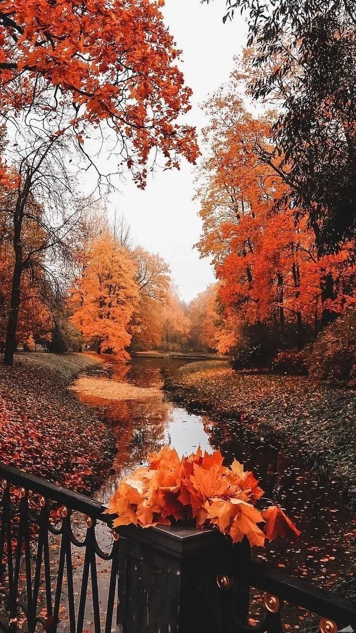
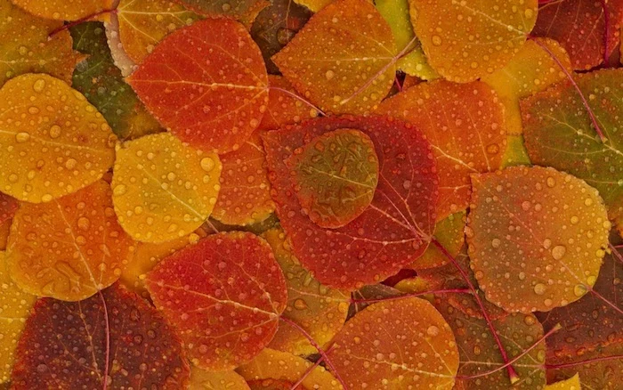
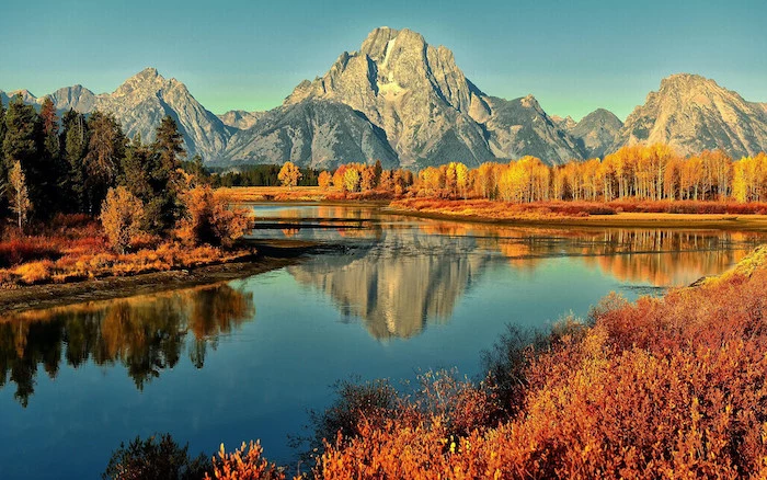
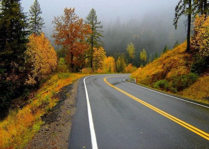
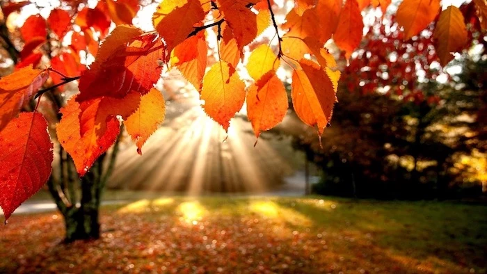
Imagine a photo of a forest that’s bursting with color everywhere. It’s gorgeous, but when you set it as your wallpaper, your app icons completely disappear into the visual chaos. Now, picture a single, bright red maple leaf against a soft, out-of-focus background. See the difference? That blurry area is called “negative space,” and it’s your best friend. It gives your icons and widgets a calm place to live so you can actually find them.
Try This Right Now: Pause for a second and go to a site like Unsplash. Search for “autumn negative space.” See how many of those images have a clear subject on one side and a lot of simple, open space? Download one and try it on your phone. Notice how much calmer your screen feels. That’s the power of good composition in action!
Want to Shoot Your Own? A Photographer’s Field Guide
The most rewarding wallpaper is always the one you took yourself. But taking a photo specifically for a screen requires a slightly different mindset. Here’s how I approach it.
My Go-To Gear (That Won’t Break the Bank)
Honestly, your phone’s camera is probably amazing, especially in Portrait Mode. But if you’re using a dedicated camera, my secret weapon is a 50mm f/1.8 prime lens. It’s a classic for a reason. They are fantastic for isolating a subject and creating that beautifully blurred background (the pros call it “bokeh”). And here’s the best part: they’re a total steal, usually running between $125 and $250 new, and you can find them even cheaper used.
Another must-have for me is a circular polarizing filter. It’s just a piece of glass that screws onto your lens. When you twist it, it cuts glare from things like wet leaves or water, making the colors look way more saturated and rich. It’s one of the few things you can’t perfectly fake with software later.
Chasing the Best Light
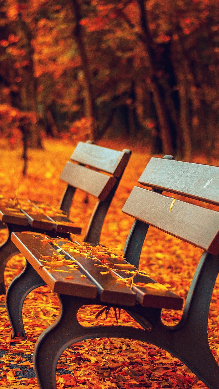
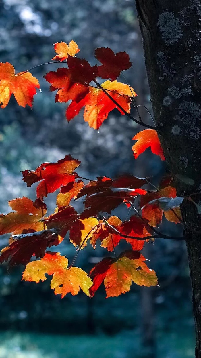
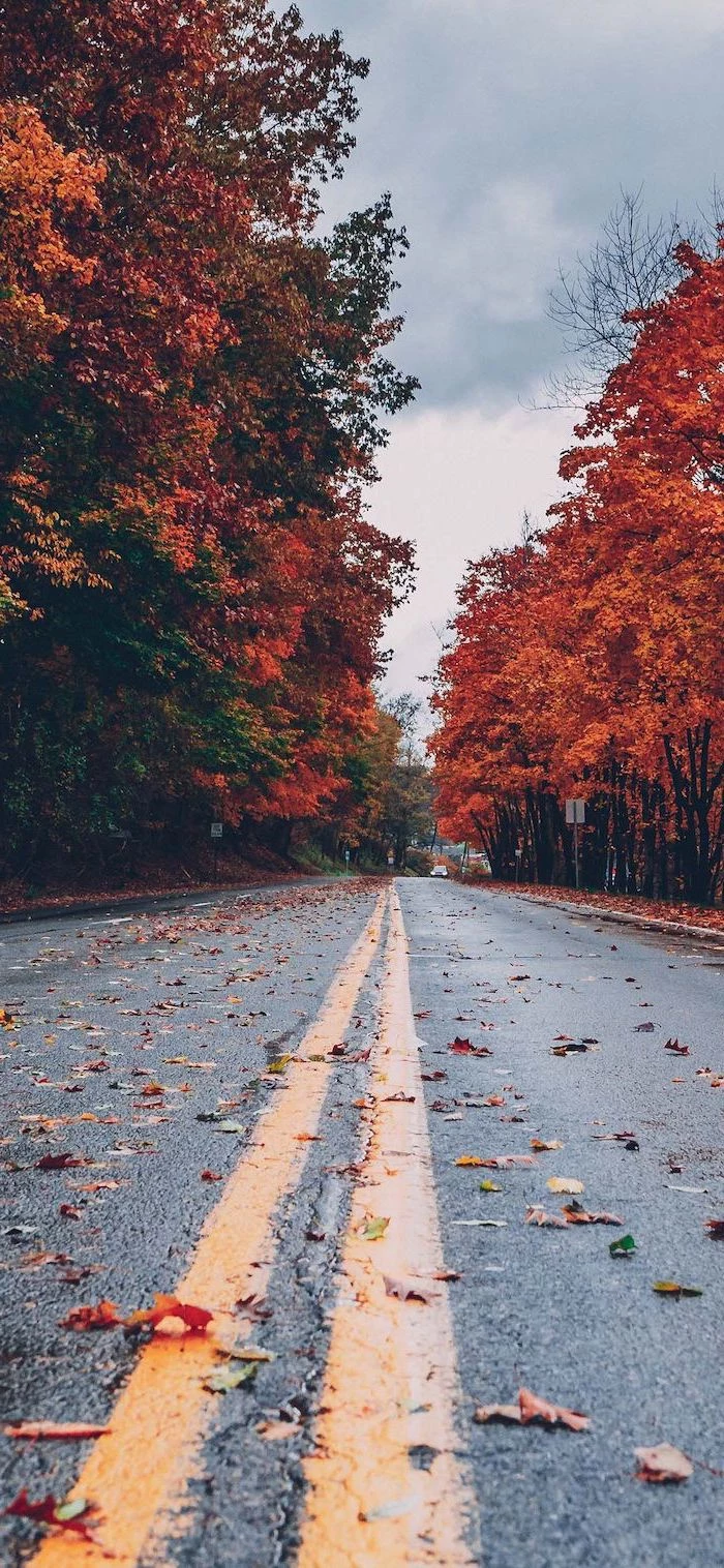
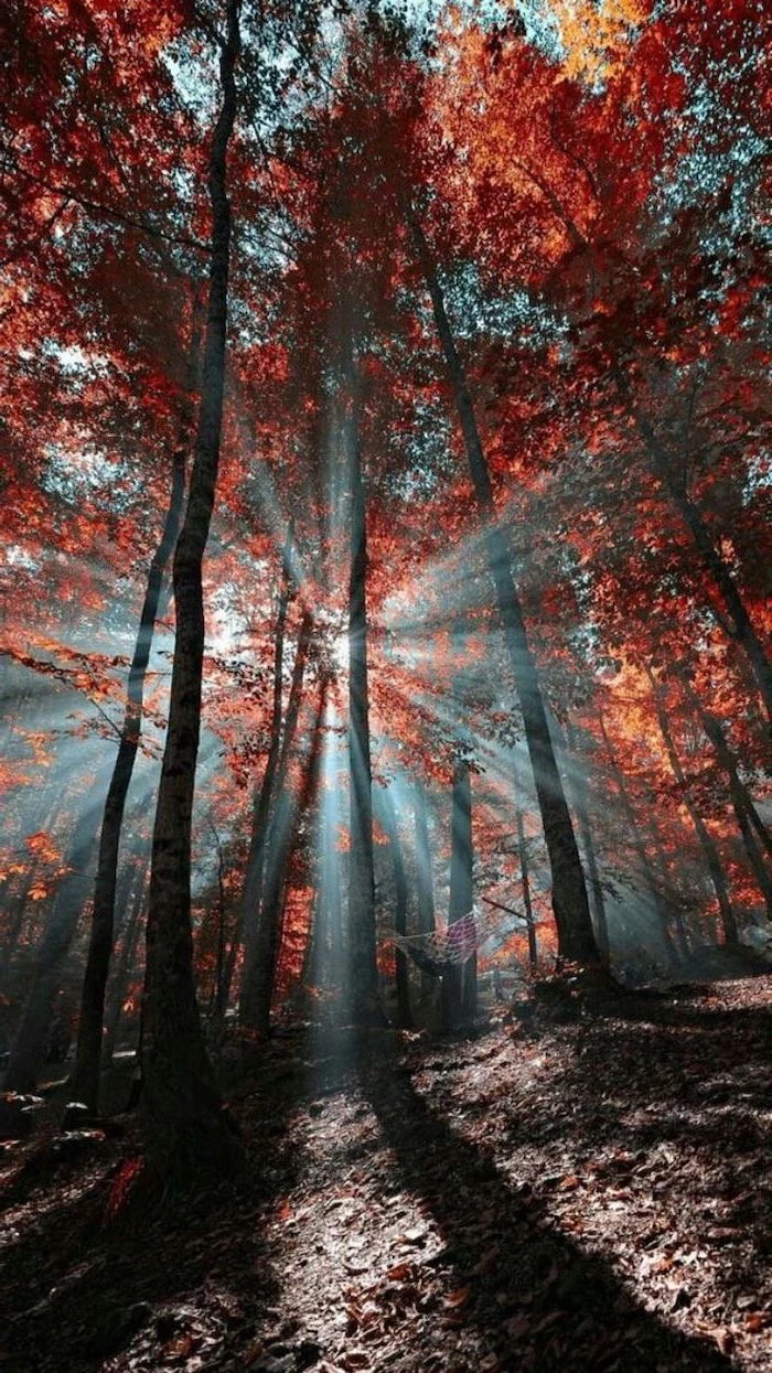
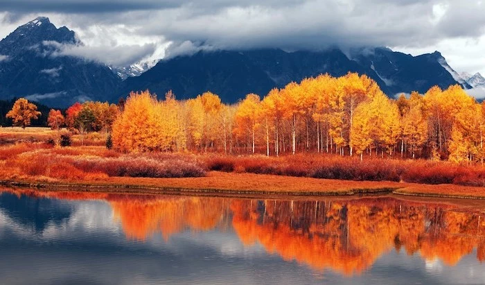
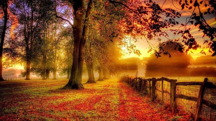
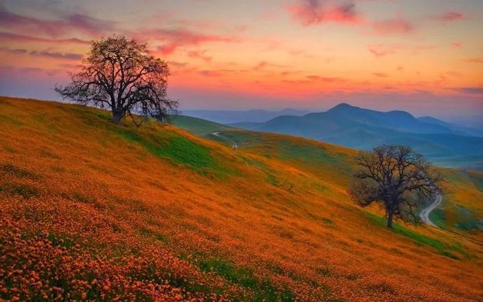
Light is everything. The absolute best time to shoot fall foliage is during the “Golden Hour”—the first hour after sunrise and the last hour before sunset. The light is soft, warm, and angled, which makes leaves practically glow and brings out all the texture in tree bark. Avoid shooting midday if you can; the overhead sun is harsh and washes everything out.
Composing for an Interface
This is the number one mistake people make. They center a beautiful pumpkin in the frame, but then the clock widget completely covers it up on their home screen. You have to think about the user interface!
I always use the Rule of Thirds. Imagine a tic-tac-toe grid over your screen. Instead of putting your subject in the middle square, place it on one of the lines, preferably on the left or right third. This leaves the other two-thirds of the image open and clean—the perfect home for your apps and widgets.
The Final Polish: Editing for Your Screen
A photo isn’t done when you click the shutter. A little bit of editing, or “post-processing,” is where you refine the image and make it shine.
Professionals often use software like Adobe Lightroom, but you absolutely don’t need to pay for a subscription. Snapseed (a free app for iOS and Android) is incredibly powerful and easy to use. If you prefer working on a desktop, Darktable is a fantastic free program that has all the pro-level controls.
My process is simple: First, I fix the white balance to make sure the colors are true-to-life. Then, I gently adjust the exposure and contrast. The real magic happens in the HSL (Hue, Saturation, Luminance) panel. Instead of just cranking up the saturation on the whole photo (which looks fake and tacky), I can pick out just the oranges and reds and give them a little pop while leaving everything else alone.
And whatever you do, practice restraint. I once edited a batch of fall photos to be super vibrant and saturated. I thought they were amazing. Then the client called and said they looked like a “clown show” on their office computers. Lesson learned. Most consumer screens are already overly bright, so a tastefully edited photo will look much better across more devices.
The Last Step: Cropping to Perfection
Once your edit is done, you need to export it correctly. A high-quality JPEG is perfect for this. But the crucial final step is cropping it to the exact pixel dimensions of your screen. This ensures you see exactly what you intended.
Here’s a lesser-known trick for cropping perfectly for free: Go to a website called Photopea (it’s basically a free version of Photoshop in your browser). Open your image. Go to the top menu and click Image > Image Size. Uncheck the ‘Resample’ box, then type your phone’s exact resolution into the width and height fields. You can then move the crop box around to frame your shot perfectly before saving it.
Where to Find Great Wallpapers (If You Don’t Shoot Your Own)
If you’d rather just download something, there are amazing options out there. You just need to know where to look.
My top recommendations are Unsplash and Pexels. They are full of high-resolution photos submitted by talented photographers, and they’re free for personal use. Use specific search terms like “fall bokeh” or “moody autumn forest” to find the best stuff.
Heads up! A serious warning: Please, whatever you do, don’t just go to Google Images and download a photo. Most of those images are copyrighted. Using them is illegal, and it can get expensive. I know someone who got a letter from a lawyer demanding a $2,000 licensing fee for using one photo on their small business’s social media. It’s just not worth the risk.
Also, be very careful with wallpaper apps from the app store. Many of the free ones are loaded with aggressive ads, and some have even been caught with malware or data trackers. A wallpaper app has no reason to ask for permission to your contacts or microphone! The safest bet is always to download an image file yourself from a trusted site and set it manually.
A Final Thought on Your Digital Space
We look at our phones hundreds of times a day. A wallpaper that’s too bright or chaotic can actually contribute to eye strain. Sometimes, the best choice is a calmer, more muted image that makes your phone feel less like an assault on your senses and more like a helpful tool.
Choosing a wallpaper seems like such a small thing, but it sets the tone for your entire digital experience. Now you have the knowledge to pick one that is technically perfect, beautifully composed, and genuinely works for you. Go make your screen a happier place.
Inspirational Gallery
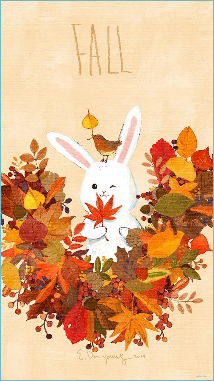
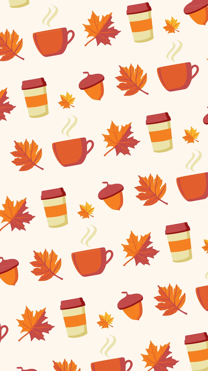
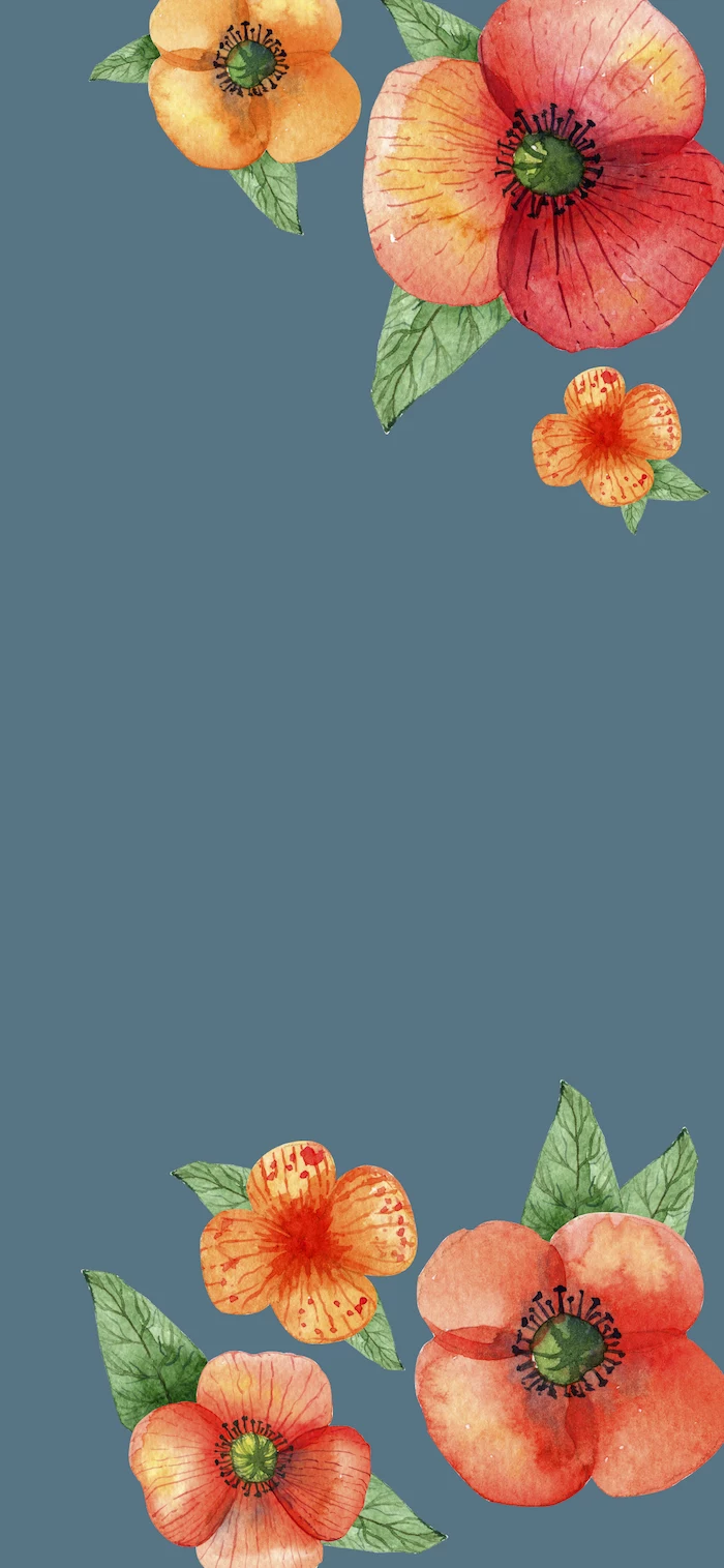
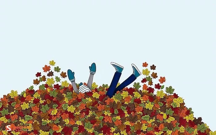
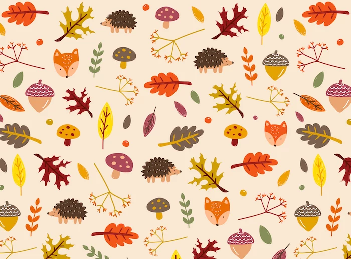
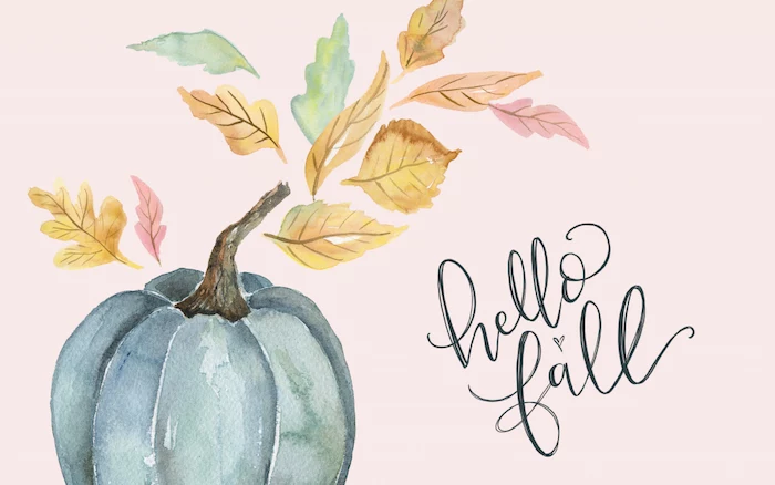
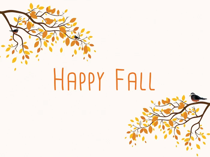
Photography vs. Illustration: A photograph captures a real moment, grounding your phone in reality—a misty morning, a sunlit leaf. An illustration, on the other hand, creates a mood or tells a story, offering a clean, graphic look. For a minimalist feel with clear icon visibility, illustrations often win. For an immersive, atmospheric vibe, a photo is unmatched. There’s no wrong choice; it’s about the personality you want for your digital space.
- Create visual breathing room for your icons by using photos with natural “negative space”—a clear sky, a foggy field, a calm lake.
- Avoid placing the main subject (a pumpkin, a person) right in the center where clocks or widgets usually live.
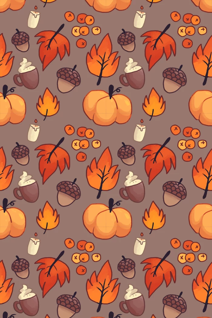
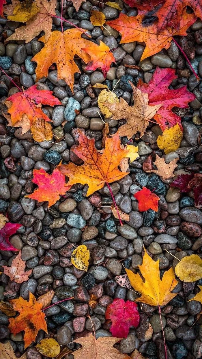
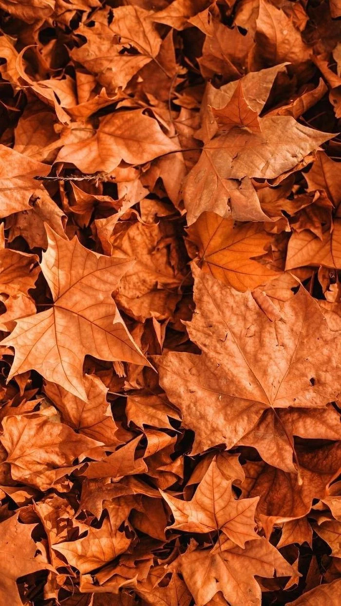
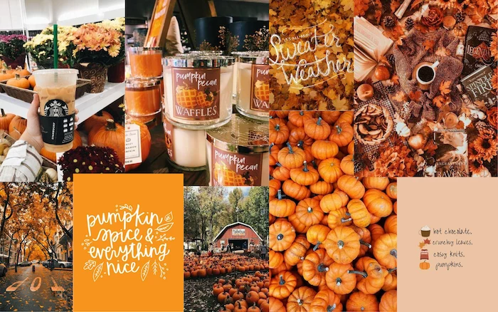
- Look for patterns and textures instead of busy scenes. A close-up of bark or a knitted sweater is less distracting than a whole forest.
The human eye is more sensitive to green than any other color.
This is a throwback to our ancestors spotting predators in the foliage. For your wallpaper, it means a fall scene with hints of late-season green or deep evergreen pines will have a surprising visual pop and a calming, natural feel.
How do I get that blurry background look (bokeh) with my phone?
Use your phone’s Portrait Mode. Get close to your subject—a single perfect leaf, an acorn, a small pumpkin—and let the phone’s software do the work. It will artificially create a shallow depth of field, blurring the background to make your subject stand out. This is a pro-level trick for making your app icons instantly more readable.
A common mistake: Ignoring the lock screen. Your lock screen is seen dozens of time a day and can feature a much bolder, more intricate photo than your home screen. Choose a stunning, detailed fall landscape for the lock screen, and a simpler, more textured companion image for the home screen. The continuity feels incredibly polished.
Embrace the cozy imperfection of
- Crisp text and icons, even on a detailed image.
- A wallpaper that feels dynamic and alive.
The secret? The Depth Effect on iOS. When choosing your wallpaper, look for an image where the subject has a clear foreground. The phone’s OS will then cleverly place the clock *behind* the subject, creating a stunning layered look that adds incredible dimension.
Over 85% of photos on the popular app VSCO are edited.
Don’t be afraid to tweak your fall photos. The key is subtlety. Instead of maxing out the saturation, try the ‘Warmth’ or ‘Tint’ sliders in apps like Adobe Lightroom Mobile or Snapseed. A tiny shift toward yellow or orange can infuse a photo with an instant autumnal glow without looking fake.
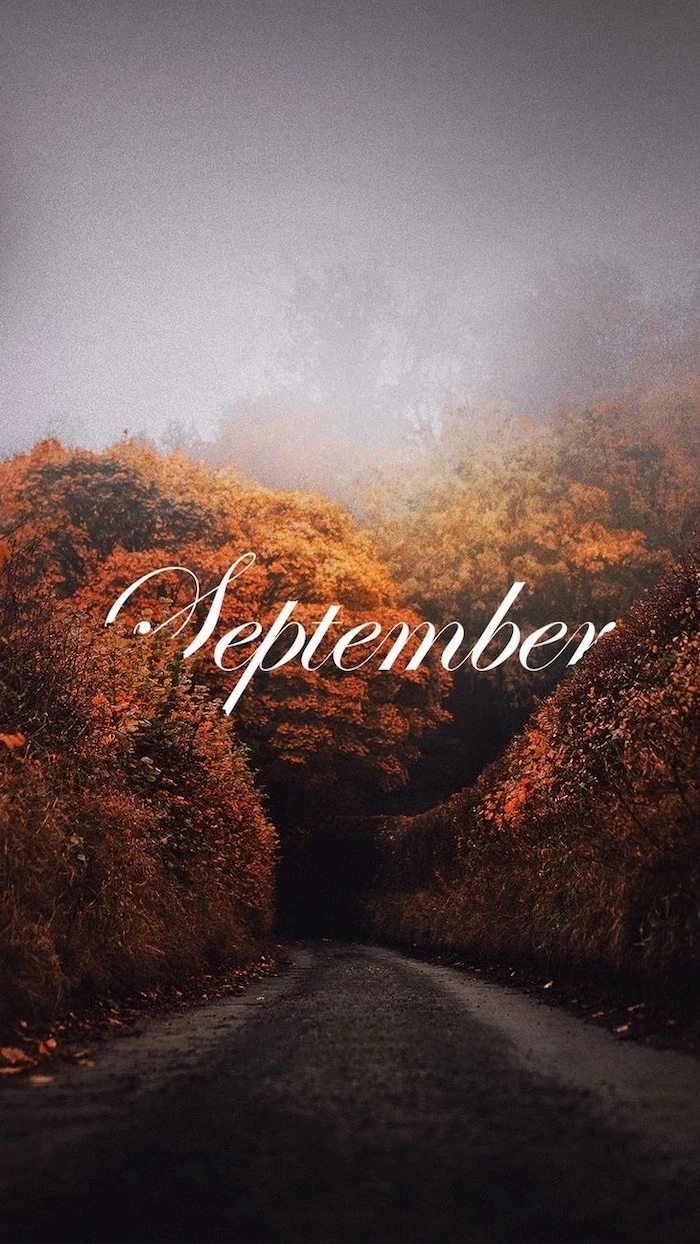
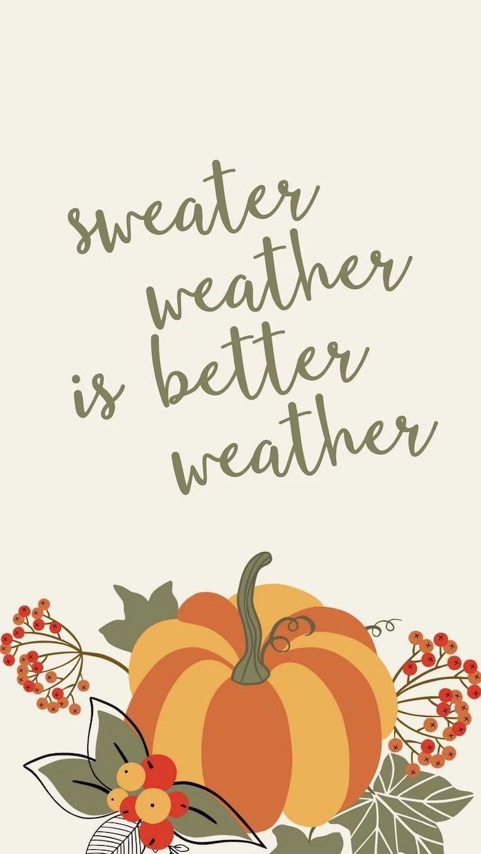
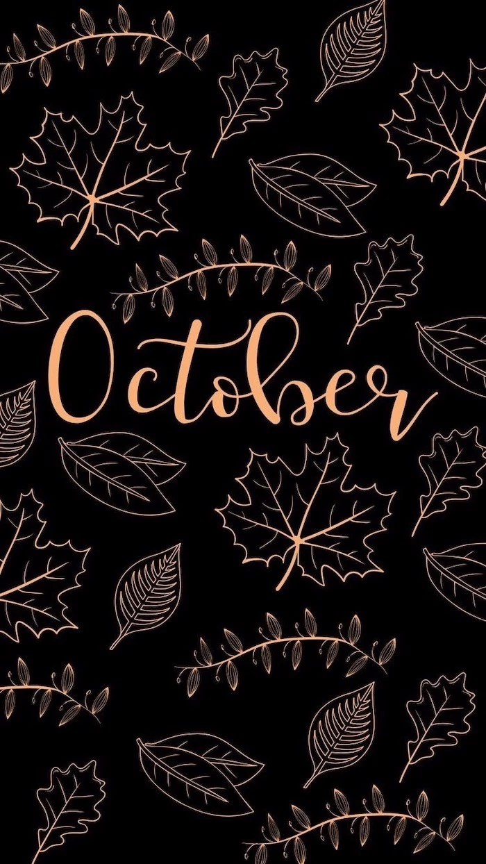
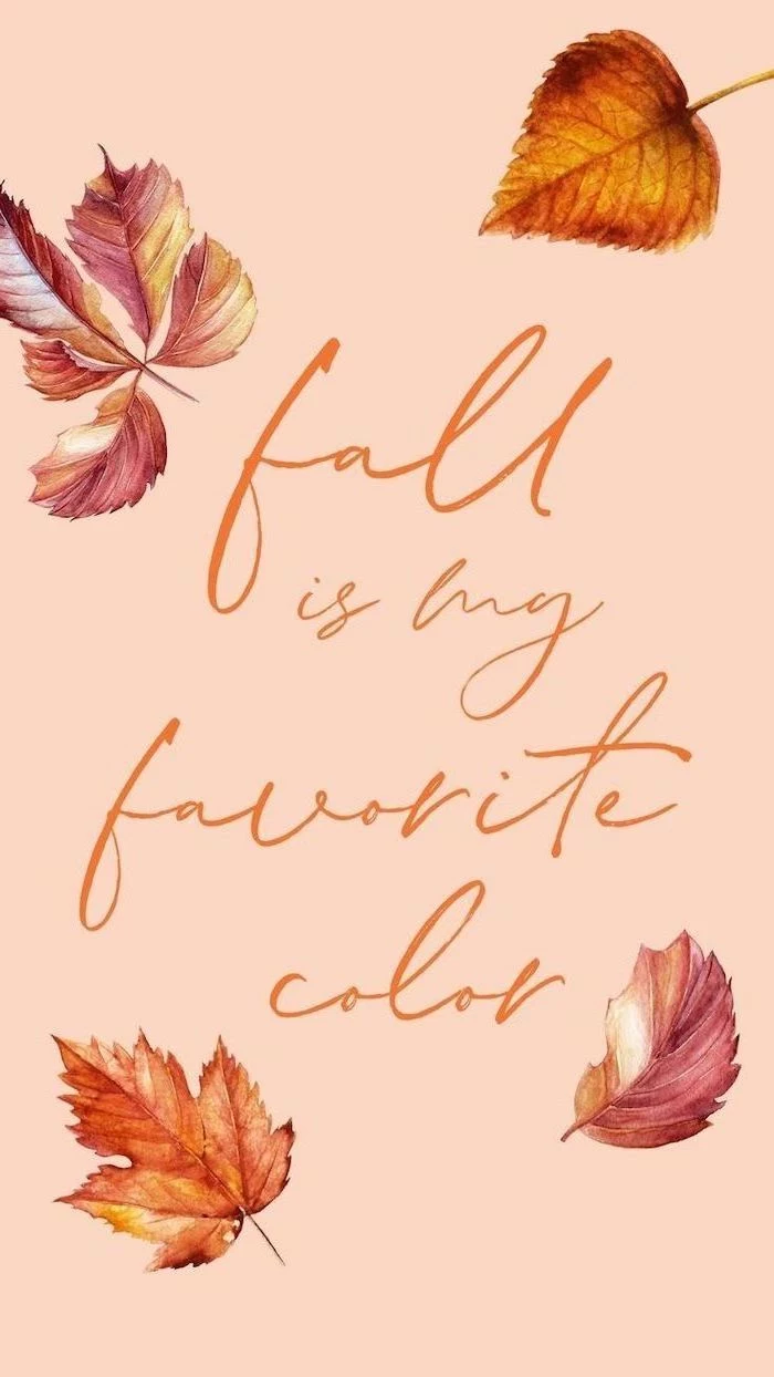
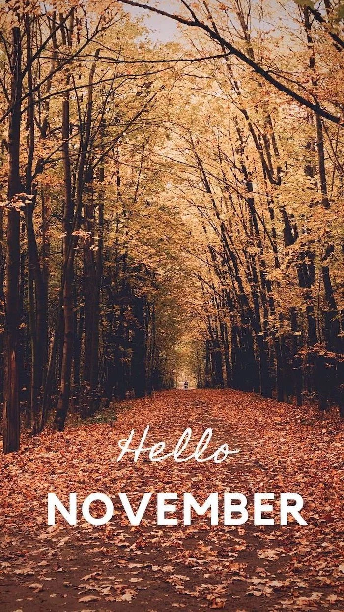
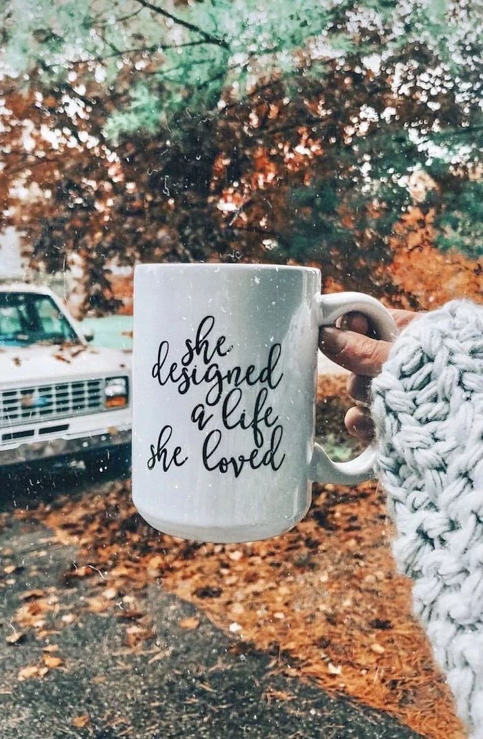
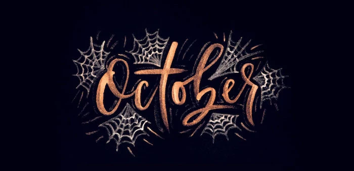
Go beyond photos and try a typographic wallpaper. A simple phrase like
Tired of the same orange and brown?
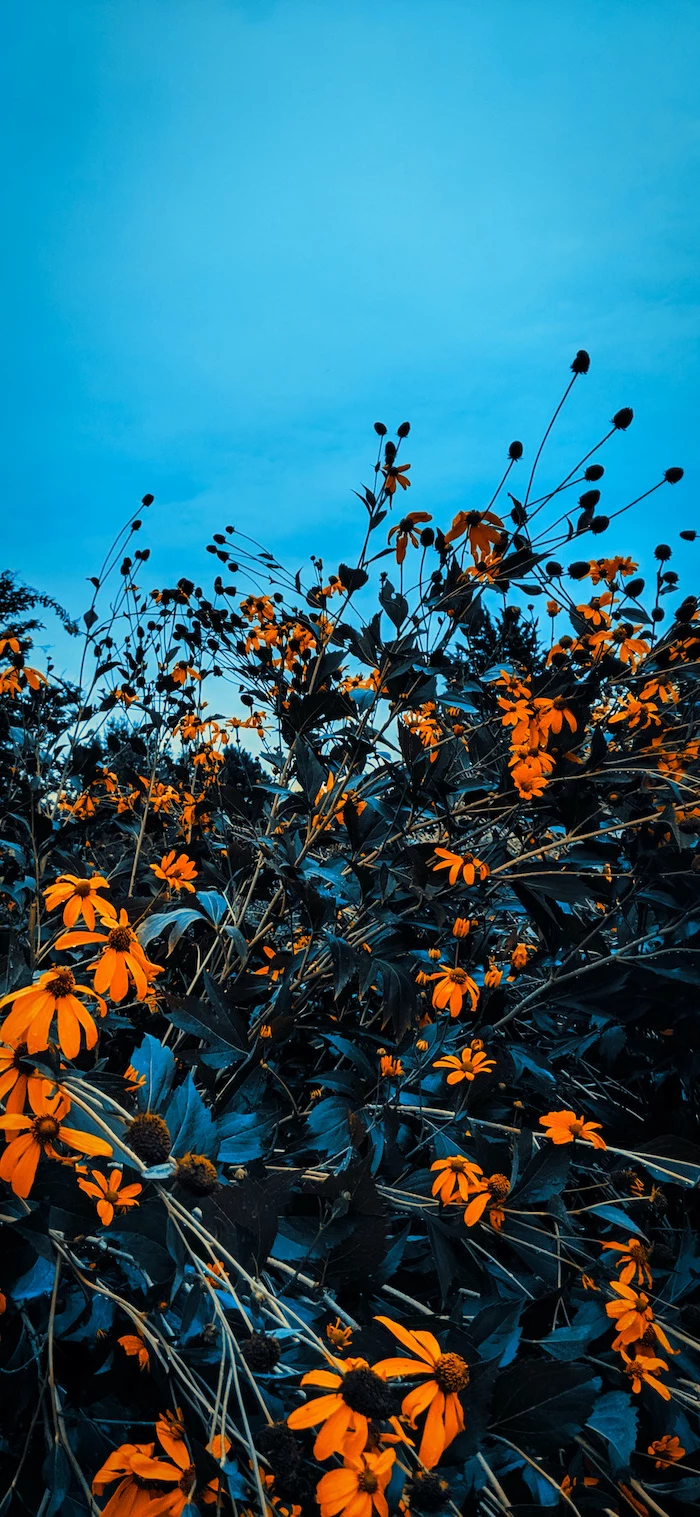
Explore an alternative fall palette. Think of the deep purples of late-season figs and asters, the moody blues of a twilight sky over a harvested field, and the rich greens of fir trees. This sophisticated approach feels unique and makes your screen stand out from the sea of pumpkin spice.
For the minimalist: A simple gradient wallpaper. Create a smooth transition from a deep maroon to a soft gold, or from a forest green to a misty grey. Apps like ‘Gradient’ or online tools can generate these for you. It’s the ultimate in clean, icon-friendly design while still evoking the season’s colors.
- Unsplash: For high-art, professional-grade photography. The quality is unmatched.
- Pexels: Great for both photos and video wallpapers, with a slightly more commercial and lifestyle feel.
- Zedge: A classic for a reason. It offers a huge variety of user-uploaded content, including live wallpapers, abstract designs, and illustrations.
The ‘Golden Hour’—the first hour after sunrise and the last hour before sunset—produces soft, diffused light that is ideal for photography.
For your wallpaper hunt, this is prime time. The low-angle sun makes fall colors glow and creates long, dramatic shadows. Photos taken during this period have a natural warmth and cinematic quality that’s perfect for a phone background.
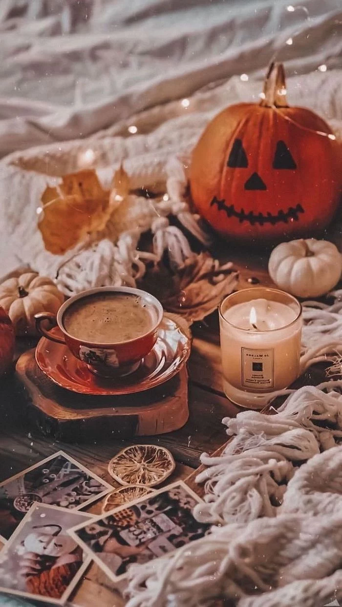
Dark Mode friendly: With many users opting for dark mode, your wallpaper choice matters more than ever. Look for fall scenes with deep shadows or nighttime shots—a bonfire, a candlelit pumpkin, or a streetlamp on a rain-slicked, leaf-covered street. These images create a seamless, easy-on-the-eyes experience.
Think in textures. The best wallpapers often have a tactile quality. Imagine the rough bark of a tree, the smooth skin of a gourd, the chunky knit of a wool blanket, or the delicate veins of a dried leaf. A close-up, macro shot of one of these textures creates a background that is both abstract and deeply evocative of the season.
My phone has a high refresh rate screen. Can I take advantage of that?
Absolutely. Look for ‘Live Wallpapers’ or ‘Video Wallpapers.’ A short, seamlessly looping video of gently falling leaves, steam rising from a coffee cup, or flickering candlelight can make your phone feel incredibly dynamic. Check out apps like ‘Videoleap’ to trim your own short video clips into the perfect wallpaper loop.
- Better search results that go beyond the clichés.
- Discovering unique, artistic compositions.
- Finding the perfect image that fits your specific needs.
The secret? Use photographer’s search terms. Instead of ‘fall leaves,’ search for ‘autumn bokeh’ for blurry backgrounds, ‘fall flatlay’ for top-down arrangements, or ‘moody autumn’ for atmospheric, darker images.
For a touch of class: Explore the public domain archives of museums like The Met or the Rijksmuseum. Search for 19th-century oil paintings of autumn landscapes or detailed botanical illustrations of fall flora by artists like Pierre-Joseph Redouté. You can download high-resolution versions for free and have a truly unique, artistic masterpiece on your screen.
‘Parallax’ is the effect where your wallpaper image moves slightly as you tilt your phone, creating an illusion of depth.
For this to work well, choose an image without hard, straight edges at the border of the screen. Images with a central subject and plenty of space around it, like a single leaf on a plain background, are ideal. The effect is subtle but adds a premium, 3D feel to your home screen.
Take a screenshot of your home screen. Open an editing app like Canva or Bazaart and import this screenshot. Lower its opacity and place your potential wallpaper image on a layer underneath. This allows you to perfectly position your photo’s subject so it doesn’t clash with your app icons or widgets *before* you set it as your background.
Animated Illustrations: A growing trend is subtly animated graphic wallpapers. Think illustrated leaves that gently sway or a cartoon fox whose tail twitches every few seconds. These offer the clean look of an illustration with the dynamic feel of a live wallpaper, often with less battery drain. Check out artist-centric platforms like Gumroad or Etsy for unique packs.
Don’t just shoot the colorful leaves. Capture the ‘after.’ The stark, beautiful silhouette of bare branches against a steel-grey November sky can make for a stunningly minimalist and moody wallpaper. It’s a more sophisticated, contemplative take on the season.
Matching your app icons to your wallpaper creates a cohesive, custom look.
On Android, the ‘Material You’ system can automatically theme your icons based on your wallpaper’s colors. On iOS, you can use the Shortcuts app to create custom icons or download pre-made fall-themed icon packs from designers on sites like Etsy to perfectly match your new autumn aesthetic.
Consider black and white: Stripping the color from a fall photo forces the eye to focus on texture, shape, and light. A monochrome image of rain on a windowpane, the intricate pattern of a pinecone, or the dramatic shadows of a low sun can feel incredibly artistic and makes colorful app icons pop.
Want a truly personal touch? Scan something. A beautiful fall leaf, a piece of tweed fabric, or even a slice of dried orange placed directly on your printer/scanner bed can create a super high-resolution, uniquely textured image that no one else will have. It’s a simple DIY trick for a one-of-a-kind background.


