A Room That Just Feels *Right*: The Unspoken Rules of Good Design
Over my career, I’ve walked into what feels like a million different homes. Some were huge, some were tiny, but the ones that really felt good all had a secret sauce. And spoiler alert: it was never about how much money was spent. It was about balance.
In this article
I figured this out early on, back when my job was mostly measuring for drapes and hauling heavy bolts of fabric. Good design isn’t about a rigid set of rules you find online. It’s about understanding a few core ideas that help a room breathe, tell a story, and actually work for the people living there.
So many of us get overwhelmed. We see a picture-perfect room in a magazine and try to copy it piece by piece, but a real home has its own quirks—its own weird corners and unique lighting. The goal is to work with those things, not fight them. So let’s get past the basic ‘do’s and ‘don’ts’ and talk about the ‘why’ behind a truly comfortable, balanced space.
1. It’s All About Flow: Mastering Your Layout
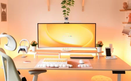
The number one mistake I see, time and time again, is all the furniture pushed up against the walls. People think it makes the room look bigger, but honestly, it does the exact opposite. It creates a dead, empty void in the middle—I call it the lonely dance floor—and makes the space feel staged and awkward.
A room needs to breathe. Seriously.
Try This Right Now: Go to your living room and pull your sofa just three or four inches away from the wall. Don’t just think about it, actually do it. Now step back. See that little shadow line it creates? See how the room suddenly feels a bit deeper and more intentional? That’s the magic. It’s a tiny change with a huge impact.
Let’s Talk Pathways and Sightlines
When you walk into a room, your brain is instinctively looking for a clear path. If a chair or a table is blocking the way, the room feels cluttered and just… off. It creates a subtle, low-grade stress because our brains are wired for efficiency. We want to see an easy way to get from the door to the sofa, or from the sofa to the kitchen.
My first step in any project is to map out these traffic flows. Your main pathways should be at least 36 inches wide. This isn’t some random number; it’s based on universal accessibility standards that ensure comfortable movement. You shouldn’t have to turn sideways to squeeze past the armchair. For less-traveled paths, you can shrink it to about 30 inches, but anything less than that feels cramped.
Arranging Furniture Like a Pro
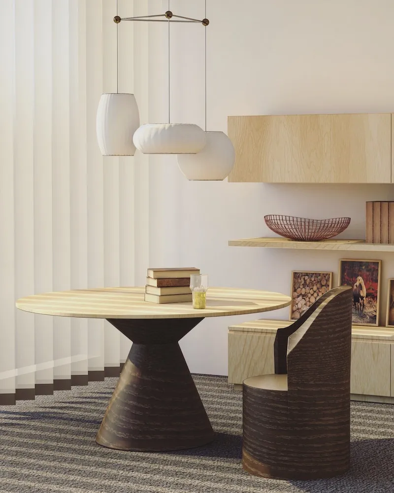
Instead of lining the walls, think about creating cozy conversation zones. Your sofa, chairs, and coffee table should feel like they’re having a little party together. Here are the go-to measurements I use on every single project:
- Sofa to Coffee Table: Keep it between 14 and 18 inches. This is the sweet spot—close enough to set down your mug, but far enough to walk through. I once had a client insist on a 2-foot gap. For weeks they said the room felt disconnected. We nudged the table to 16 inches from the sofa, and the whole space just clicked into place.
- Seating Spacing: For chairs in a conversational group, aim for a distance of 4 to 8 feet apart. Any further and you have to shout. Any closer and it feels a little too intimate for guests.
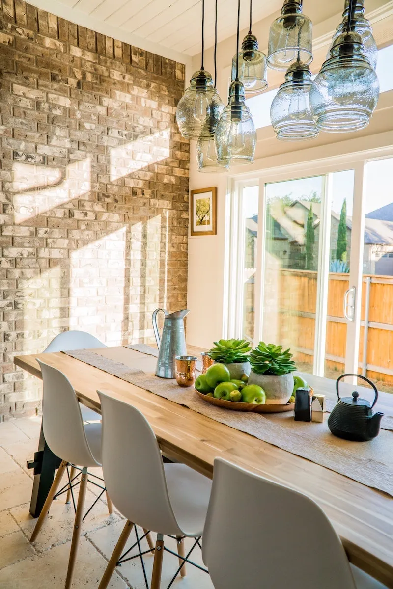
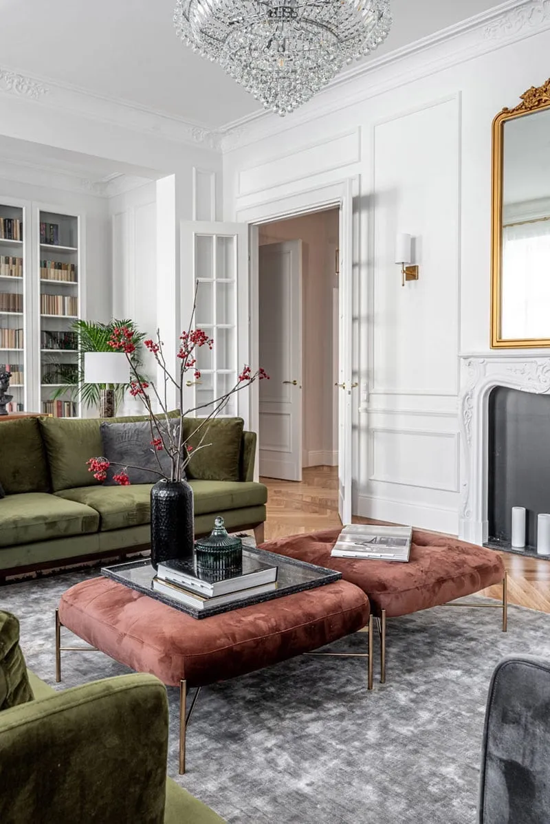
- Anchor with a Rug: In large, open-concept spaces, area rugs are your best friend. They define your zones. A key rule is that at least the front legs of your sofa and chairs must be on the rug. This anchors the whole arrangement and stops it from looking like all your furniture is drifting out to sea.
For those long, narrow, or just plain awkward rooms? The key is to break it up. Create two smaller zones instead of one big one. For example, a small seating area at one end and a reading nook with a single chair and a lamp at the other. This makes the space feel more intentional and usable.
2. The Art of the Mix: Building a Cohesive Collection
A room where every piece of furniture matches looks like it was plucked from page 72 of a catalog. It’s flat and has zero personality. A truly beautiful space is curated. It’s a mix of new and old, high-end and budget-friendly, hard and soft textures.
Where to Invest Your Money
Not everything needs to be a splurge, but you should absolutely invest in the pieces you use every single day. I’m talking about your sofa, your dining table, and your mattress. These are the workhorses of your home.
When you’re shopping for a sofa, for instance, ignore the fabric for a minute and ask about the bones. Here’s a quick cheat sheet:
- The Frame: Ask if it’s ‘kiln-dried hardwood.’ That’s the good stuff. If they say it’s ‘particleboard,’ walk away. A hardwood frame will last a lifetime; a particleboard frame held together with staples might start to wobble in a year.
- The Joints: Look for frames that are ‘corner-blocked and doweled.’ This is a sign of quality construction that will hold up to kids, pets, and years of lounging.
- The Price Tag: Let’s be real about cost. A well-made fabric sofa that will last you 5-10 years often starts around $2,000 to $3,000. A true ‘forever’ sofa with a hardwood frame and high-end cushions can easily be $5,000 or more. It’s an investment, but it’s better than buying a cheap $800 sofa every two years.
Oh yeah, and don’t be afraid to mix in a vintage piece! A small side table from a flea market or a hand-me-down dresser adds a sense of history and soul that brand-new furniture just can’t replicate.
3. The Magic of Color and Light
Paint is easily the most powerful and affordable design tool you have. It’s also the easiest to mess up. I can’t tell you how many panicked calls I’ve gotten to fix a paint disaster. A color looks perfect in the store, but on the wall, it’s a totally different beast.
The secret? It’s all about the light. The color on your walls is just a reflection of the light that hits it. That’s why testing is non-negotiable.
I learned this the hard way early in my career. I fell in love with a sophisticated, subtle gray for my own living room. I was so sure it was ‘the one.’ I painted the whole room… and it turned lavender. A bright, nursery-room lavender. It was awful. The cool, north-facing light in my room brought out hidden purple undertones I never saw in the store. It was a painful, but valuable, lesson.
The Pro’s Method for Testing Paint
Please, do not just paint a small swatch on your existing wall. The current color will trick your eye. Here’s the foolproof method:
- Get sample pots of your top 2-3 choices. You can find these at any hardware store for about $5-$10 each.
- Buy a few large white foam boards or poster boards.
- Paint two full coats on each board and let them dry completely.
- For the next 24-48 hours, move those boards around the room. Prop one in the darkest corner. Tape one next to a window. Look at them in the morning, at noon, and at night with the lamps on.
This is the only way to see how a color really behaves in your space. It’s a little extra work that can save you hundreds of dollars and a massive repainting headache.
Good to know: Check the back of the paint chip for its Light Reflectance Value, or LRV. It’s a number from 0 to 100. A high LRV (60+) will bounce a lot of light around, making a room feel bigger and brighter. A low LRV (below 50) absorbs light, creating a cozier, moodier vibe. And for safety’s sake, always opt for low-VOC or no-VOC paints. Brands like Benjamin Moore, Sherwin-Williams, and Behr all have excellent, readily available options.
Heads up! If your home is older, there’s a chance of lead paint lurking under newer layers. Before you do any sanding or scraping, please use a lead test kit from the hardware store. If it’s positive, this is not a DIY job. Call a certified pro. The health risks are no joke.
4. Work With What You’ve Got: Honor Your Home’s Bones
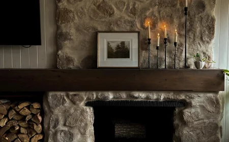
Great design works with a home’s architecture, not against it. I once visited a potential client in a gorgeous, historic home full of original dark wood trim, built-in cabinets, and a stunning handcrafted fireplace. They wanted to paint all that beautiful woodwork white and fill the space with shiny chrome furniture. I had to gently explain that they’d be erasing the very soul of the house.
Instead, we chose furniture with clean, simple lines that didn’t fight the intricate woodwork. We pulled colors from the earthy tones in the fireplace tile. The result was a space that felt updated but still honored its history.
So, before you buy anything, take a walk around and identify your home’s defining features. Are there rustic beams? Ornate plasterwork? Clean, modern lines? These are your assets. Lean into them.
5. The Final Layer: Curation Over Clutter
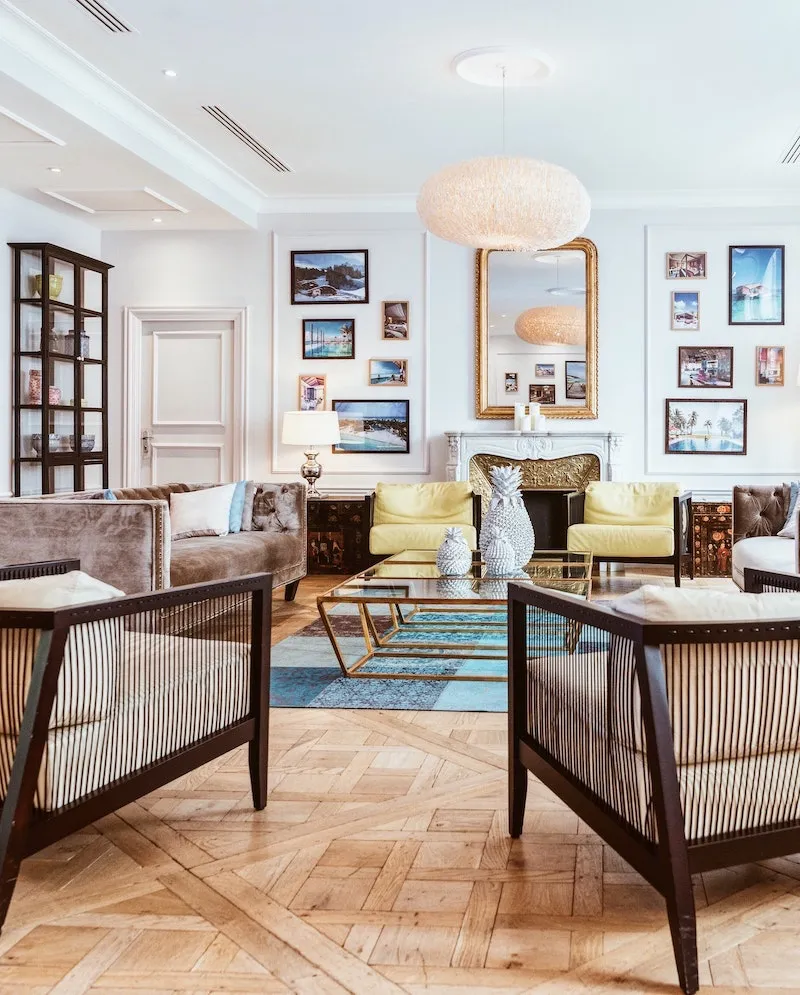
This last 10% of the process is what truly makes a room yours. It’s the art, the photos, the books, the plants. The goal here is to curate a meaningful collection, not just to fill every empty surface.
The most important skill at this stage is editing. After you’ve placed your favorite objects, step back and take a few things away. Your eyes need a place to rest. That visual breathing room, or negative space, is what makes the things you do display really shine.
How to Hang Art Like You Know What You’re Doing
This is a big one: people almost always hang art too high. We tend to hang it for a room full of standing people, but we spend most of our time at home sitting down.
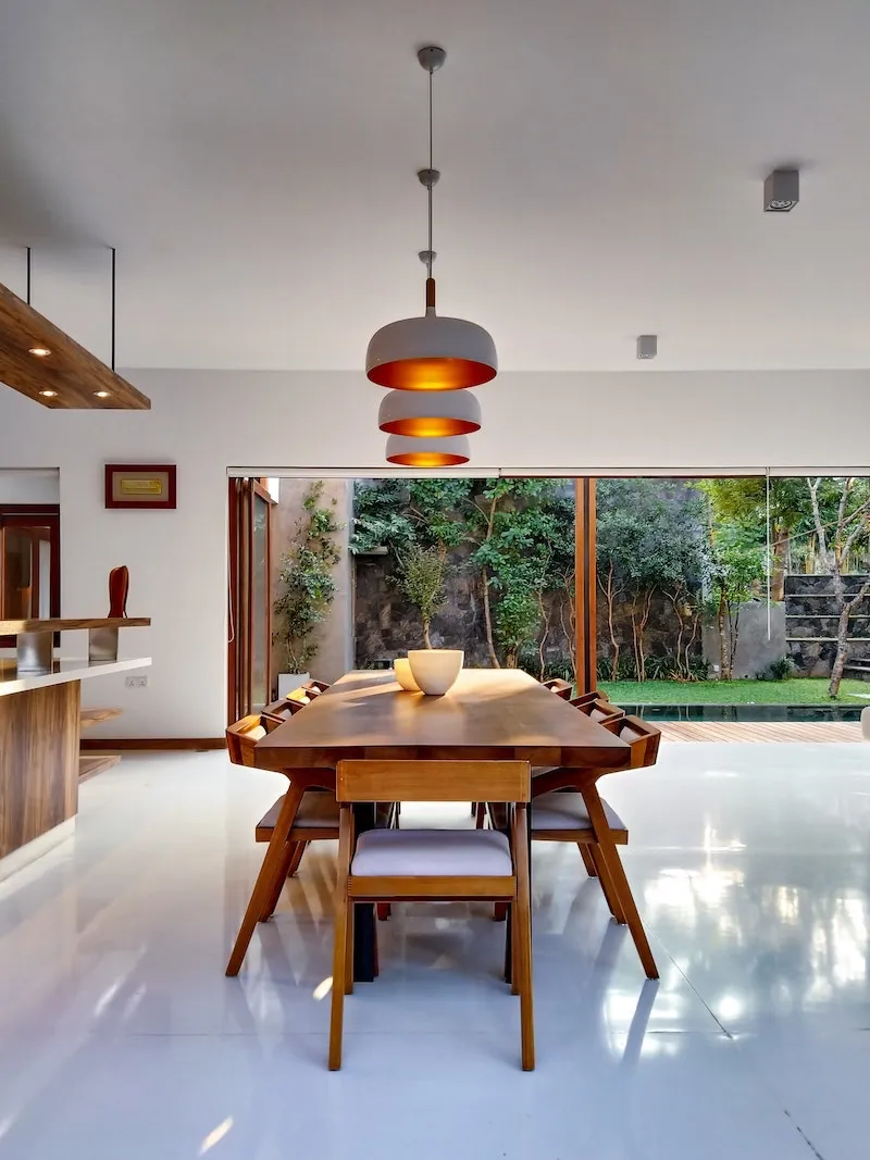
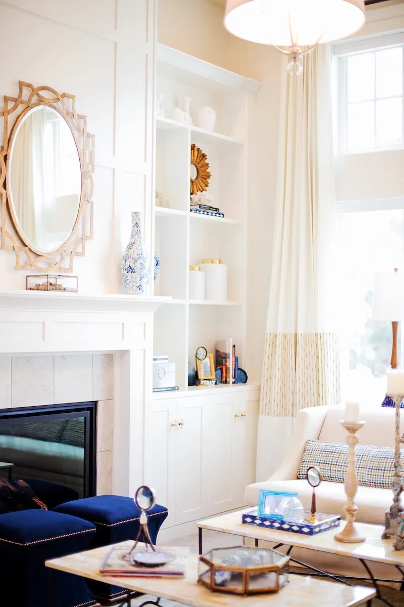
The gallery-standard rule I use in 99% of homes is to hang art so that its center point is between 57 and 60 inches from the floor. This is average human eye level, and it just feels right. When you hang art over a sofa, leave a gap of 6 to 8 inches from the bottom of the frame to the top of the sofa. This connects the two pieces visually, making them feel like a single, cohesive unit.
Feeling Stuck? Common Problems & Quick Fixes
Sometimes you just hit a wall. If your room isn’t quite working, it’s probably one of these common issues.
- The Problem: My room feels bland and lifeless.
The fix is almost always life and texture. Add a plant (real or a good fake one!). Toss a chunky knit blanket over a chair. Mix materials—wood, metal, linen, wool, ceramic. And hang art that you actually love, not just something that matches the sofa. - The Problem: The layout feels awkward and I’m always bumping into things.
Go back to basics. Identify your main traffic paths and make sure they’re at least 36 inches wide. Then, build your furniture groupings off those paths, not in them. Think of it as creating little islands of comfort in the river of traffic. - The Problem: It looks cluttered, not stylish.
You need to edit. Try the ‘one in, one out’ rule. For every new decorative item you bring home, an old one has to go. Also, remember to group things in odd numbers (1, 3, or 5). It’s a weird psychological trick, but it looks more dynamic and less rigid than even-numbered groupings.
Final Thoughts
Creating a home you truly love is a process. It doesn’t happen overnight. It’s about making thoughtful choices based on solid principles, not just chasing trends. Start with a good layout, invest in a few quality pieces, choose colors with intention, and respect the story your house is already telling.
And be honest about your limits. Some jobs are for the pros. Anything involving wiring, plumbing, or moving walls requires a licensed and insured contractor. It’s just not worth the risk. Your home should be your sanctuary, a place that reflects who you are and makes you feel completely at ease. With these ideas in mind, you can create a space that’s not just beautiful, but balanced, functional, and truly yours.
Inspiration:
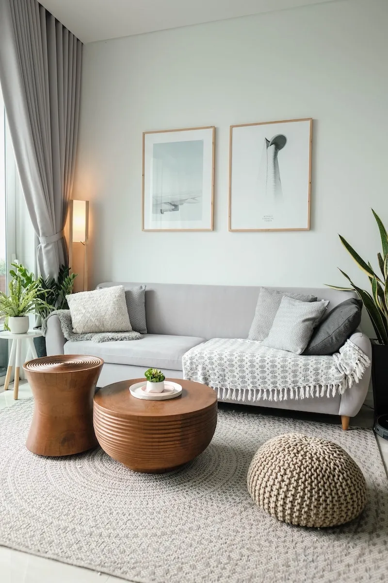
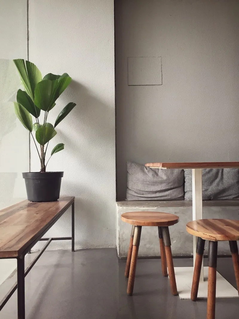
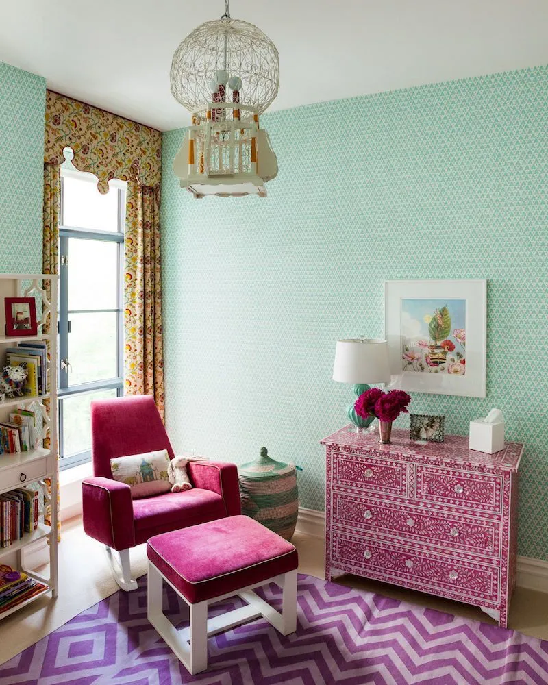
Beyond just placing furniture, consider the dialogue between textures. A room filled only with smooth, hard surfaces (glass, metal, polished wood) can feel cold and echoey. The secret to that cozy, layered look you see in magazines is a rich mix of materials.
- Combine a sleek leather sofa with a chunky knit throw.
- Place a rough-hewn wooden bowl on a smooth marble coffee table.
- Pair crisp linen curtains with a plush velvet armchair.
It’s this tactile conversation that gives a room depth and soul.
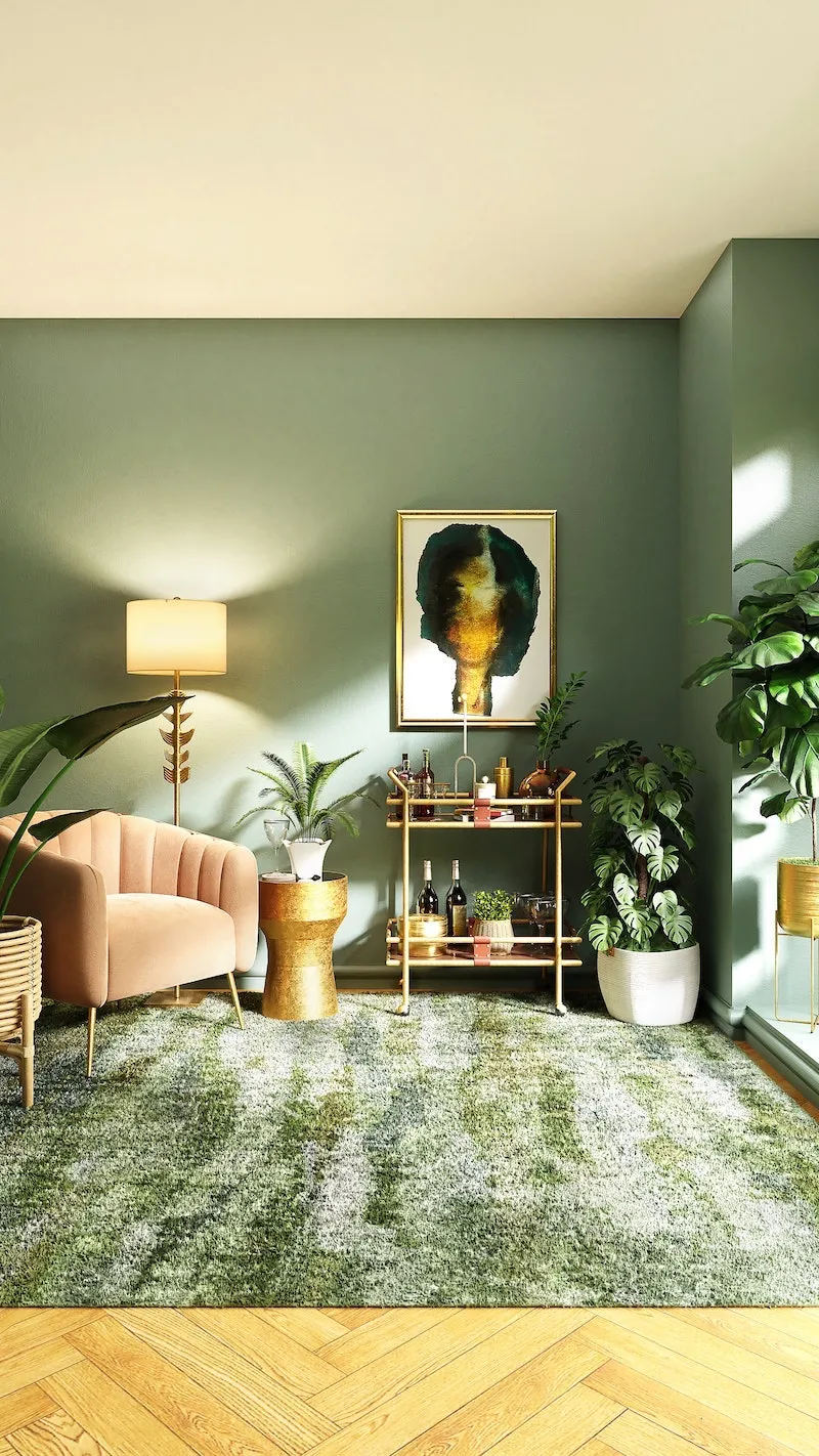
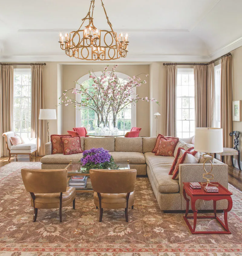
The average home has three light sources per room. But professional designers aim for five to seven.
This isn’t about making the room brighter; it’s about creating mood and function. Instead of relying solely on a central ceiling light, layer your lighting. Add a floor lamp for ambient glow, a table lamp beside a chair for reading (task lighting), and a small, directional spotlight to highlight a piece of art (accent lighting). This gives you options to transform the room’s atmosphere with the flip of a few switches.
Does your room feel a bit… flat?
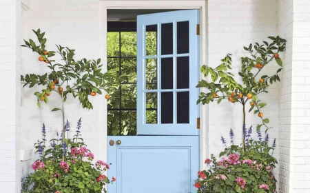
Look up. The ceiling is the most neglected surface in design, often called the ‘fifth wall’. Painting it a color other than stark white can be transformative. A soft, pale blue can evoke a sense of sky and openness. A dark, moody charcoal in a room with high ceilings can create a dramatic, intimate cocoon. For a truly bold statement, a paint like Farrow & Ball’s ‘Setting Plaster’ on the ceiling adds a warm, unexpected glow that envelops the entire space.
The 60-30-10 Rule: A timeless guideline for a balanced color palette. Your main color (walls, large furniture) should make up 60% of the space. Your secondary color (curtains, smaller furniture, rugs) takes up 30%. The final 10% is your accent (cushions, art, accessories), where you can be bold with a pop of vibrant color or a striking metallic.