Choosing a Bedroom Paint Color? Here’s What the Pros Know That You Don’t
I’ll never forget this one client. They came to me absolutely crushed. They’d spent weeks flipping through magazines, dreaming of a serene bedroom, and finally picked this beautiful, crisp light blue. On the tiny paint chip from the store, it looked perfect—like a clear summer sky.
In this article
But their bedroom faced north. It only got that cool, indirect light all day long. So, the moment I finished that second coat, we both saw it. The color wasn’t serene sky blue anymore. It was cold, stark, and honestly felt more like a sterile hospital room than a cozy sanctuary. We had to repaint the whole thing.
That experience, early in my career, taught me the most important lesson in painting: choosing a color isn’t just about what you like. It’s about understanding how that color will actually live in your space. It’s a dance between the paint, the light, and the room itself. This guide is everything I’ve learned over the years, so you can pick a color with confidence and get a result you’ll love waking up to.
First Things First: It’s All About the Light
Before you even think about grabbing a paint swatch, you need to become a student of your room’s light. It is, without a doubt, the number one factor that will change how a color looks on your walls. The color you see under the harsh fluorescent lights of a hardware store is a lie. Okay, maybe not a lie, but it’s not the truth! There’s a technical term for this—metamerism—but all it means is that a color can look totally different depending on the light source. This is why testing paint in the actual room is non-negotiable.
What Kind of Natural Light Are You Working With?
The direction your windows face sets the entire mood. Seriously, this isn’t a small detail; it’s the foundation of a great paint job.
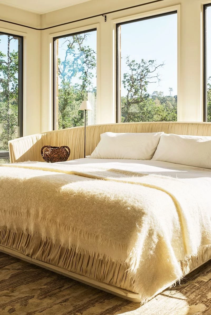
- North-Facing Rooms: These rooms get a soft, cool, blue-tinted light all day. If you put a cool color in here—like a pure gray or a stark blue—it can feel pretty chilly and unwelcoming. To counteract that, I almost always suggest colors with warm undertones. Think creamy whites, a warm gray (often called ‘greige’), or even a soft, buttery yellow.
- South-Facing Rooms: Ah, the easy ones! These rooms are flooded with bright, warm light for most of the day. You can get away with almost any color here. Cool tones won’t feel icy, and warm tones will feel extra cozy. Heads up, though: really bright light can wash out pale colors, so sometimes going for a shade with a bit more depth and saturation works better.
- East-Facing Rooms: You get the best of both worlds here—bright, warm light in the morning, and cooler, shadier light in the afternoon. So, the question is, when do you use the room most? If it’s your morning sanctuary, pick a color that sings in the sunrise. If you’re mostly in there in the evening, the morning color might feel a bit flat later on.
- West-Facing Rooms: This is the opposite of an east-facing room. The light is cooler in the morning but gets intensely warm and almost orange-hued in the late afternoon. This evening glow can dramatically change your walls. A simple beige can suddenly look like a pumpkin spice latte. A pretty light blue can morph into a dull, muddy green. You absolutely have to see your paint sample in the evening before you commit.
Your turn: Stop reading for a second. Seriously. Go look at your bedroom window and figure out which way it faces. This one little piece of info is your new decorating superpower.
Don’t Forget Your Light Bulbs
You’re not just in your bedroom during the day, right? The type of light bulbs you use is a huge deal. It’s all about color temperature, measured in Kelvins (K).
- Warm White (2700K-3000K): This is that classic, cozy, yellowish light we all know. It’s super flattering for bedrooms. It brings out the richness in warm colors and softens the edge on cool colors. This is my default recommendation for a restful space.
- Cool White (3500K-4100K): This light is more neutral and slightly blue. It can feel a bit stark and is more suited for a kitchen or an office. I’d steer clear unless you’re going for a very crisp, modern, almost clinical vibe.
- Daylight (5000K-6500K): This is a very intense blue-white light that mimics bright daylight. While it shows a color’s “true” hue, it can feel harsh and institutional in a bedroom. It tends to make warm paint colors look washed out or just plain weird.
Beyond the Color: Two Numbers You Need to Know
On the back of every paint chip, there are two little details that pros never ignore: Light Reflectance Value (LRV) and sheen. Getting these right is the secret to a high-end result.
LRV: Your Secret Weapon for Brightness
Light Reflectance Value (LRV) is a simple scale from 0 (pure black) to 100 (pure white). It just tells you how much light a color will reflect. This is so useful!
If you want a small or dark room to feel brighter and more spacious, you’ll want a color with a high LRV, usually something 60 or above. These colors literally bounce more light around the space.
But what if you want your bedroom to feel like a cozy, intimate den? Go for a color with a lower LRV (under 50). These colors absorb light, creating an enveloping, comforting vibe. This is exactly why a dark navy or charcoal bedroom can feel like a warm hug, not a cave, when it’s done right.
Sheen: Setting the Mood and the Durability
Sheen is just a fancy word for how shiny the paint finish is. This choice impacts the room’s atmosphere and how easy it is to clean. For bedrooms, you’re usually deciding between these three:
- Flat or Matte: This finish has zero shine, which gives it a deep, velvety, and luxurious look. Its biggest advantage is that it’s amazing at hiding small imperfections on your walls, like little bumps or waves. The downside? It’s the least durable. It scuffs easily and is tough to clean, so I usually reserve it for ceilings or low-traffic adult bedrooms.
- Eggshell: This is my go-to for most bedroom walls. It has a tiny bit of luster, just like a chicken’s egg—hence the name. It’s the perfect compromise. You still get a soft, elegant look, but it’s far more durable and wipeable than matte paint. It’s the workhorse of bedroom paints.
- Satin: A step up in shine from eggshell, a satin finish has a noticeable soft glow. It’s even easier to clean, which makes it a great choice for a kid’s bedroom or for trim and doors. But be warned: that extra shine will highlight any and every flaw on your wall surface.
By the way, I almost never use semi-gloss or high-gloss on bedroom walls. The glare is distracting and it’s completely unforgiving on any wall that isn’t perfectly smooth. Save it for the trim.
My Go-To Color Palettes for Bedrooms
Forget trendy color-of-the-year lists. Let’s talk about the color families that consistently create amazing bedroom spaces. The secret is finding the right version—the one with the right undertones for your room.
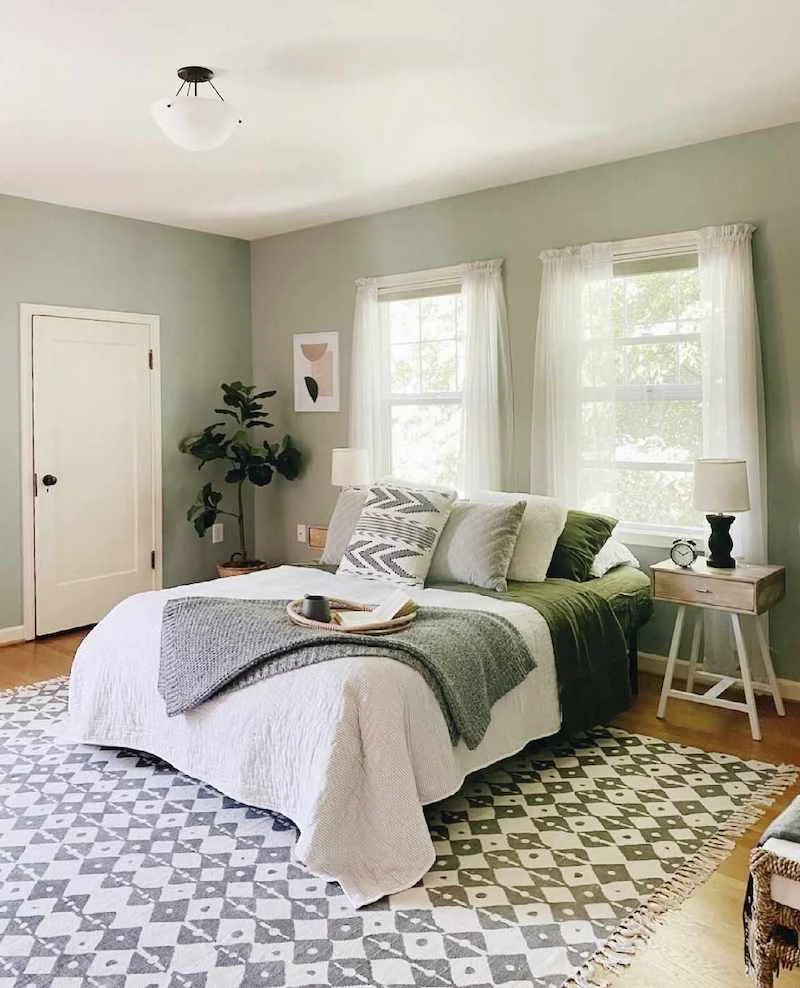
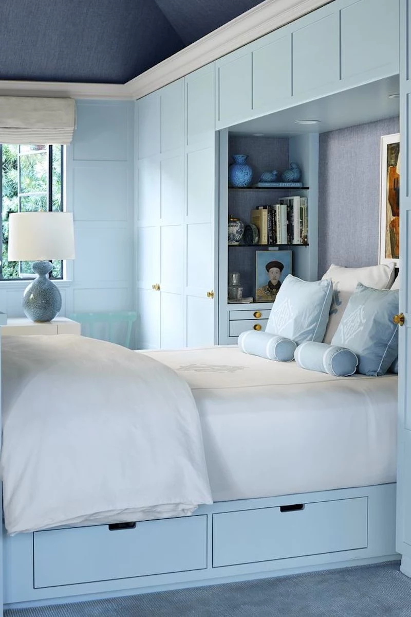
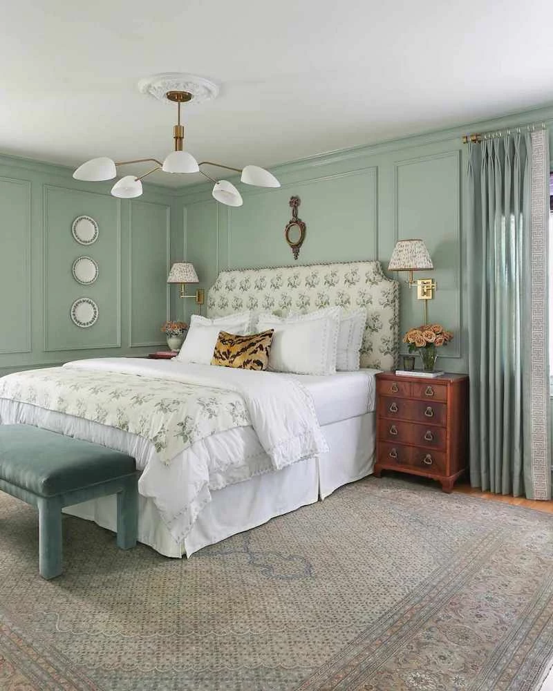
The Restful Group: Blues and Greens
These are classics for a reason. They remind us of nature—sky, water, plants—and are proven to have a calming effect. The big mistake here is choosing a blue or green that’s too bright. A primary-school blue can feel juvenile, and a lime green is more energizing than restful.
Instead, look for muted, complex versions. For a blue, I love something with a hint of gray, like a dusty slate or a deep teal. For greens, think soft sage, muted olive, or mossy tones. These colors have depth and feel sophisticated.
The Foundation Group: Complex Neutrals
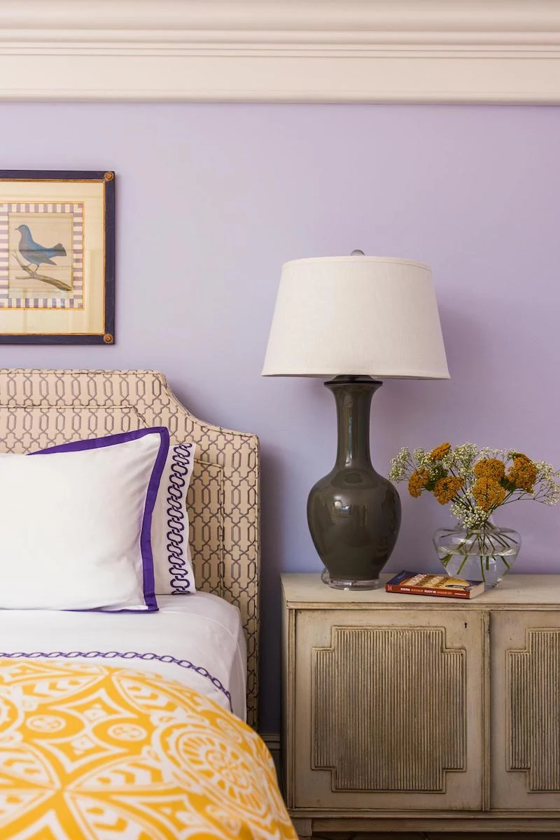
This includes off-whites, creams, and those amazing warm grays (greiges). People hear “neutral” and think “boring,” but a well-chosen neutral is the perfect, flexible backdrop. The absolute key here is the undertone. A white with a pink undertone can look beautiful, but if your carpet has a yellow undertone, the walls will suddenly look pepto-pink and your carpet will look dingy.
To see the undertone, hold your paint chip against a plain white piece of printer paper. Your eye will immediately pick up the subtle hint of yellow, green, or pink. For the client whose gray paint turned lavender in her bright room? We fixed it by repainting with a true greige, a gray with a warm beige undertone that completely neutralized the unwanted purple and gave her the calm space she wanted all along.
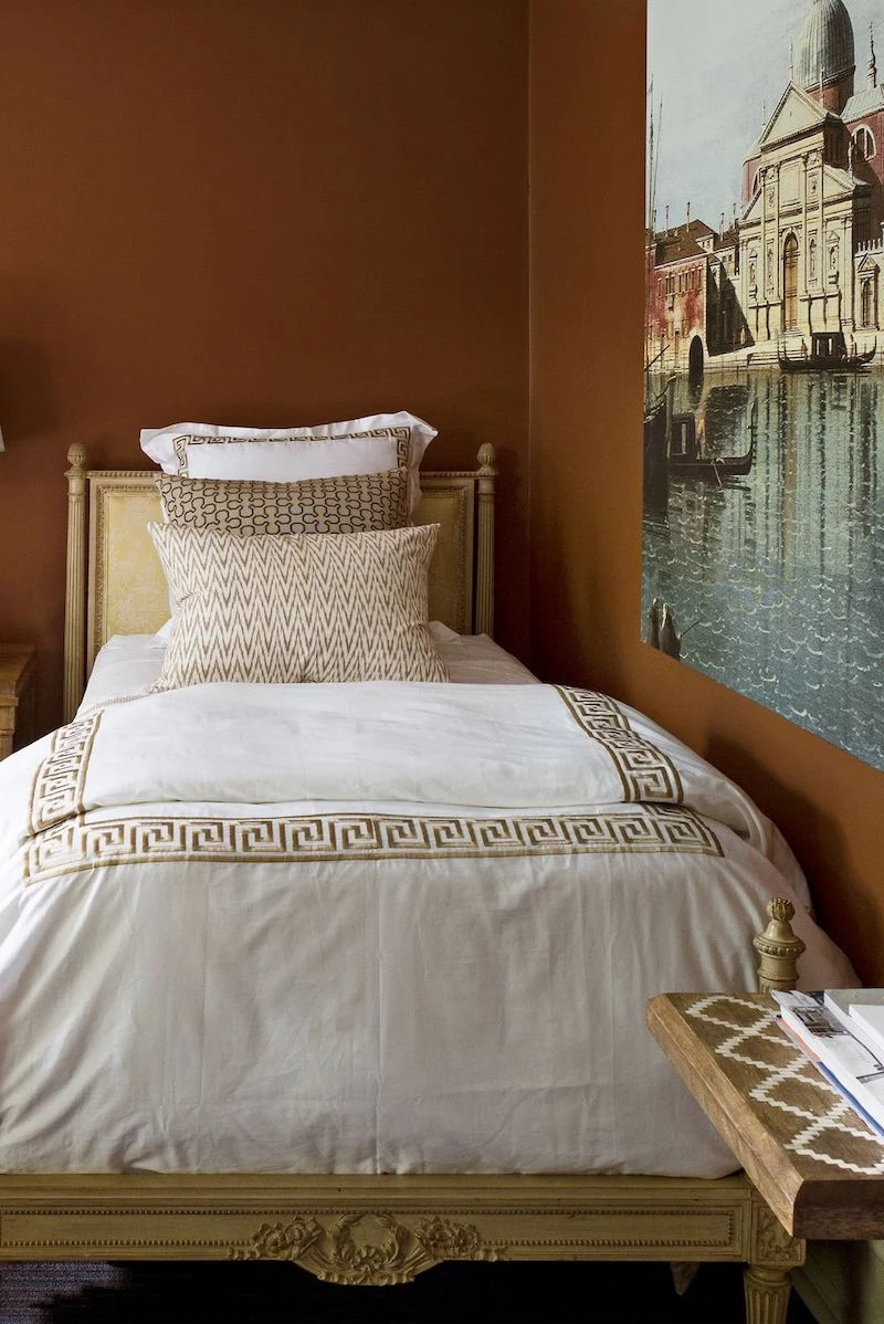
The Grounding Group: Earth Tones
I’m talking about colors like terracotta, muted blush, and soft ochre. These colors feel warm, inviting, and very rooted. The challenge is that they can be intense. A whole room in a strong terracotta can feel heavy without enough light. I often use these as an accent wall behind the bed to create a powerful focal point without overwhelming the space.
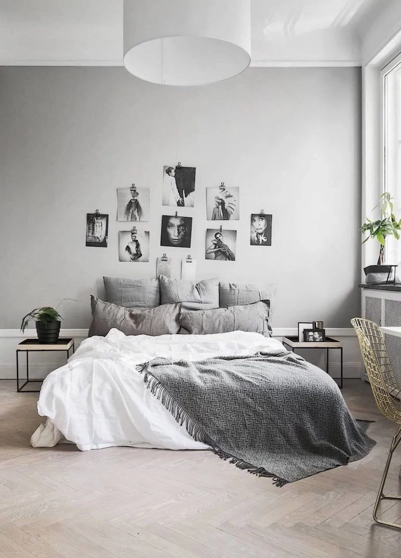
The Enveloping Group: Deep, Moody Hues
This is a bold move, but oh, it can be stunning. Think charcoal gray, deep navy, or a dark forest green. People worry that dark colors will make a room feel tiny, but from my experience, the opposite can be true. A dark color can actually blur the edges and corners of a room, creating a sense of infinite depth that makes it feel more expansive. The trick is you MUST use a flat or matte finish. A shiny dark wall just looks cheap. It’s a look that feels like a cozy, sophisticated haven.
The Real Work: A Pro’s Painting Process
Here’s a secret from the trade: a fantastic paint job is about 80% prep work. This is where amateurs cut corners and where pros make their money. And speaking of money…
Let’s Talk Budget & Time: For a standard 12×12 bedroom, a DIY paint job will probably run you between $150 and $300 for high-quality paint, primer, and all the necessary supplies. Plan for it to be a full weekend project: a few hours for prep and priming on Saturday, then two coats of paint on Sunday with drying time in between. Hiring a pro for the same room? You can expect to pay somewhere in the $500 to $1,000 range, depending on your location and how much wall repair is needed. They’ll likely get it done in a day or two.
Your Shopping List: What to Actually Buy
Before you go, here’s a quick checklist of what you’ll need from the hardware store, like Home Depot or Lowe’s:
- High-quality interior paint (Eggshell is a safe bet)
- A good primer (get it tinted gray if you’re making a big color change)
- A 2.5-inch angled brush for cutting in edges
- A 9-inch roller frame and several roller covers (3/8-inch nap for smooth walls)
- A roller tray and plastic liners for easy cleanup
- Good quality painter’s tape (at least 1.5 inches wide)
- Spackle and a putty knife for filling nail holes
- Fine-grit sandpaper
- Drop cloths (canvas is better than plastic)
- A 5-in-1 painter’s tool (you’ll thank me later)
- A sturdy step ladder
Step 1: Test, Test, and Test Again!
I cannot stress this enough: never, ever choose a color from a tiny 2-inch chip. Buy sample pots of your top 2-3 colors. Paint a large square (at least 2×2 feet) on a piece of foam board for each color. Don’t paint directly on the wall yet! Move these boards around the room for a couple of days. Look at them in the morning, at noon, in the evening, and at night with your lamps on. This is the only way to know for sure.
Step 2: Prep the Surface
Fill every nail hole with spackle, let it dry, and sand it smooth. Then, wash your walls. They collect way more dust and grime than you think. A quick wipe-down with a TSP substitute or just mild soap and water is fine. You need a clean, dry surface for the paint to stick properly.
Step 3: Masking and Priming
Use a good quality painter’s tape to tape off your trim, windows, and ceiling line. Quick tip: Splurge on the $10 roll of the good stuff. The cheap tape often bleeds or leaves a sticky residue. Trust me, it’s not worth the five bucks you save. Once taped, it’s time to prime. Primer ensures your topcoat looks even and sticks for the long haul.
Step 4: Application Technique
If you’re using more than one gallon of paint, mix them together in a larger 5-gallon bucket first. This is called ‘boxing’ and it guarantees your color is perfectly consistent across the whole room.
First, use your brush to ‘cut in’ a 2-3 inch band of paint around the edges. Then, while that paint is still wet, start rolling. Roll in a big ‘W’ or ‘N’ pattern, then go back over it with light, straight strokes from top to bottom. This gives you a beautiful, even finish without roller marks.
And yes, you almost always need two coats. The first coat often looks streaky. That’s normal! Let it dry completely before applying the second.
Lesser-known trick: If you’re stopping for a lunch break or for the night, you don’t have to wash everything. Tightly wrap your wet roller and brush in a plastic grocery bag, squeeze the air out, and stick it in the fridge. It’ll be ready to go when you are.
A Quick Word on Safety (And When to Call for Help)
Painting seems simple, but please be careful. Always keep a window open for ventilation, even with low-VOC paints. And be smart with your ladder—never overreach!
A critical warning: In older homes, there’s a risk of lead-based paint. If you’re sanding or scraping walls in a house built several decades ago, you could be creating toxic dust. This is extremely dangerous. If you have any suspicion, please do not DIY this part. Hire a certified professional to test and handle it safely.
And to be frank, sometimes hiring a pro is just the right call. If you have crazy high ceilings, need major wall repairs, or simply don’t have the time or patience, their fee covers expertise, efficiency, and peace of mind. Sometimes, that’s the best investment you can make.
At the end of the day, this is your personal sanctuary. The advice here is a framework to help you make a great technical choice, but the final decision should be the color that makes you feel rested, happy, and at home. Take your time, do the prep work, and you’ll create a space you can truly be proud of.