How to Paint an Accent Wall That Actually Looks Amazing
I’ve been slinging paint for a good long while, and I’ve seen a ton of design trends come and go. But the accent wall? It’s one of those things that just… sticks around. And for good reason.
In this article
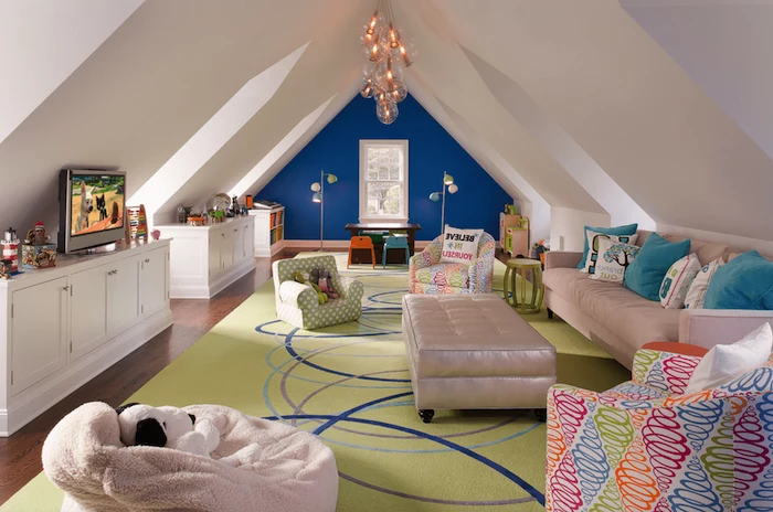
I still remember this one client with a beautiful old home. The ceilings were incredibly high, but the living room itself was just a long, narrow box. It felt off. She was really hesitant to use any bold color, but we finally settled on a deep, rich blue for the shortest wall at the very end of the room. The second that final coat dried, the entire space transformed. Seriously. The long walls suddenly felt cozier, the room seemed more balanced, and that blue wall just pulled you right in. It gave the room a soul.
That’s the magic of doing an accent wall the right way. It’s not just about splashing a loud color on a random surface. It’s a smart design move that can fix weird room shapes, create a killer focal point, and inject some serious personality into your space. So, let’s get into how you can pull this off, based on years of doing it, teaching it, and, yeah, fixing a few mistakes along the way.
First, Why Does This Even Work?
Before you even think about cracking open a can of paint, it helps to know the ‘why’ behind it. Understanding a bit of the science makes all your other choices way easier. It’s all about tricking the eye, something designers have been doing forever.
It boils down to two things: color and light.
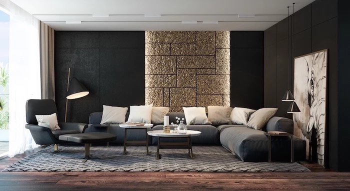
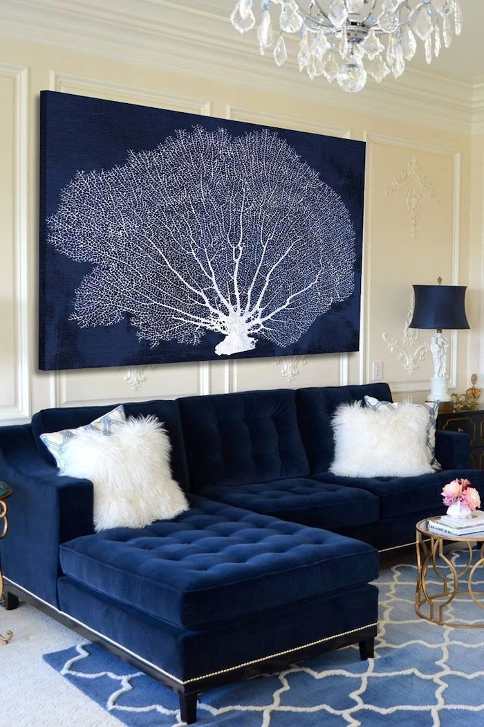
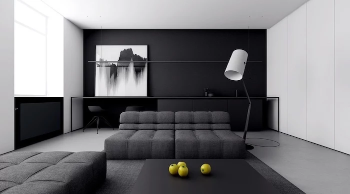
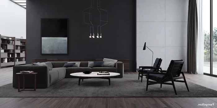
- Dark and Cool Colors Feel Farther Away: A wall painted in a dark shade like charcoal, navy, or a deep forest green will seem to recede. This is exactly what happened in that long, boxy room I mentioned. By painting the far wall a deep blue, we visually “pushed” it back, making the room feel more proportional and inviting.
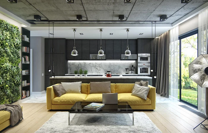
- Warm and Bright Colors Feel Closer: On the flip side, colors with red, orange, or yellow undertones feel like they’re stepping toward you. A warm accent wall is perfect for making a huge, cavernous room feel more intimate and cozy. Heads up, though: using a warm color on a wall in an already small room can make it feel a bit cramped.
And then there’s light. Oh, man, let’s talk about light. The same gray paint can look steely blue in the morning sun and almost purple under a warm lamp at night. Before you commit, please do this one thing: paint a big sample (at least 2×2 feet on a poster board) and stick it on the wall. Watch it for a full day as the light changes. It’s the only way to know for sure.
Quick action item: Feeling overwhelmed? Grab a piece of colored construction paper or even a t-shirt in a color you’re considering. Tape it up on the wall you’re thinking about accenting. Just live with it for a day. It’s a zero-commitment way to start visualizing!
Choosing the Right Wall (This Is Where Most People Go Wrong)
Honestly, the most common mistake is picking the wrong wall. The old advice to “just paint the first wall you see when you walk in” is often terrible. A great accent wall needs to feel intentional. It should be highlighting something that’s already cool about your room.
Here’s what to look for:
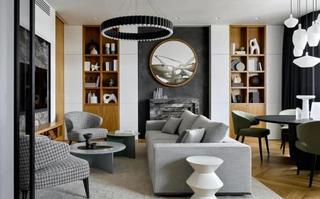
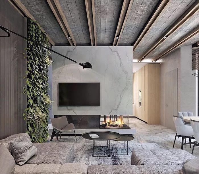
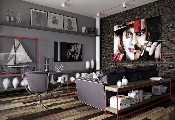
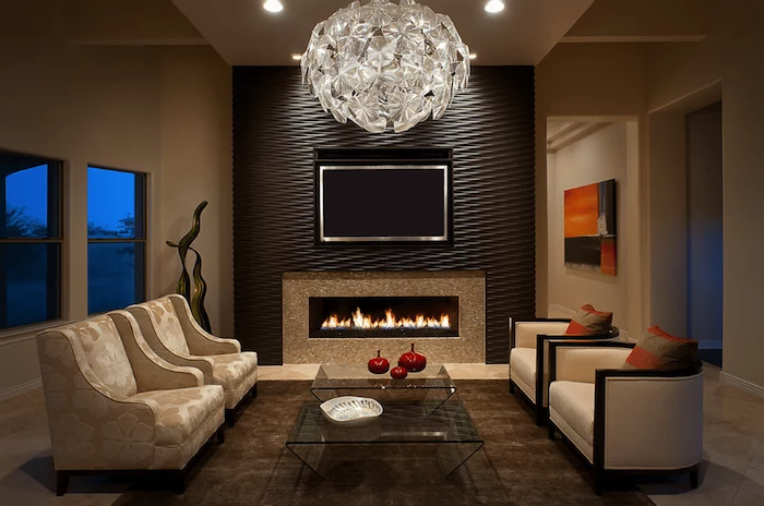
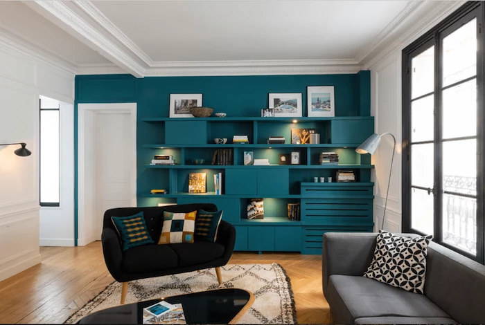
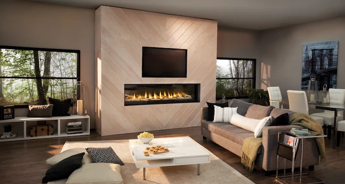
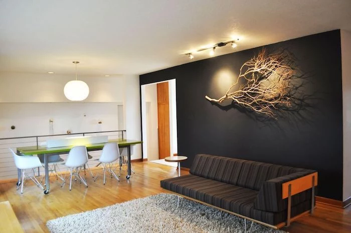
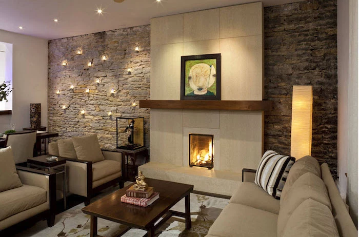
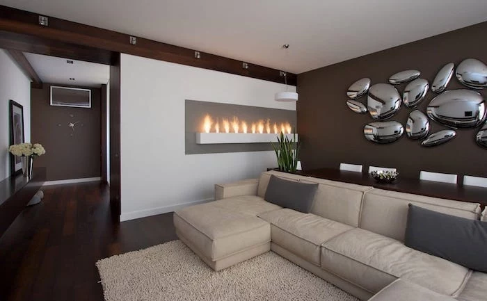
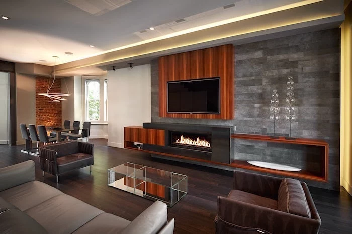
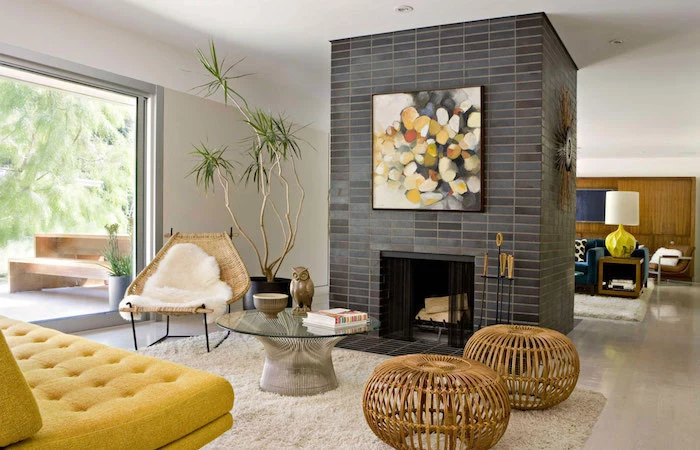
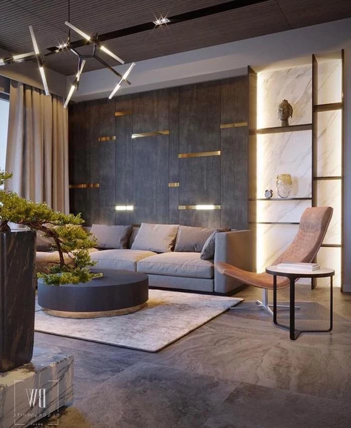
- An Architectural Feature: Does your room have a fireplace? A wall with built-in bookshelves? A cool little alcove or nook? BINGO. These are almost always your best bet. Accenting the fireplace wall, for instance, solidifies it as the room’s main event. Painting the wall behind bookshelves makes all your stuff on them pop.
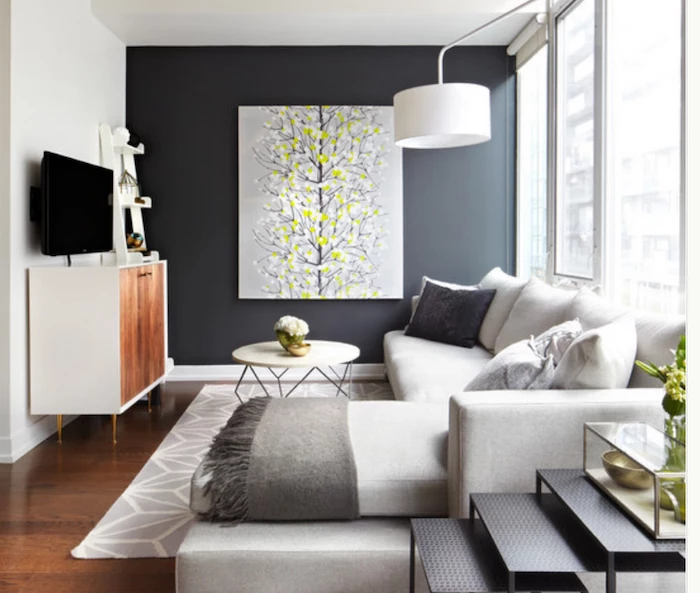
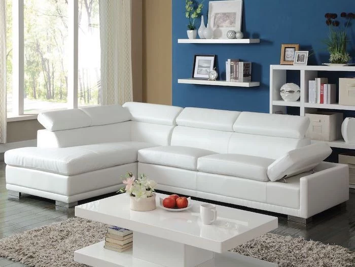
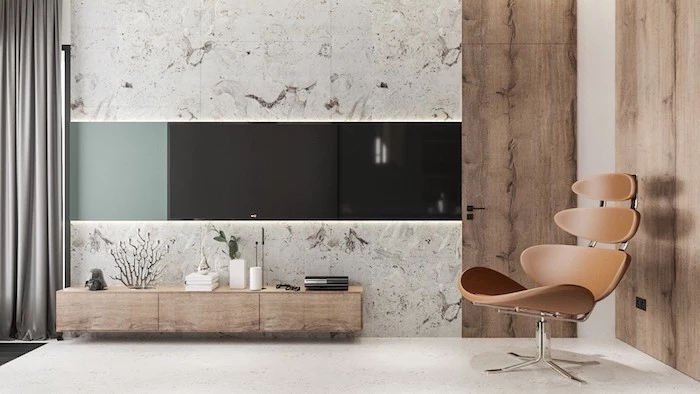
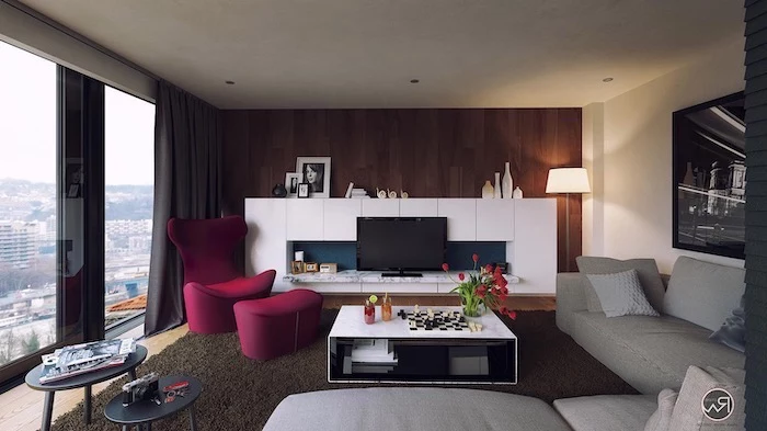
- The Main Furniture Wall: Where does the action happen? In the living room, it’s usually the wall behind your sofa. In the bedroom, it’s the wall your headboard is on. Highlighting this wall anchors your most important piece of furniture and gives the room a clear sense of purpose.
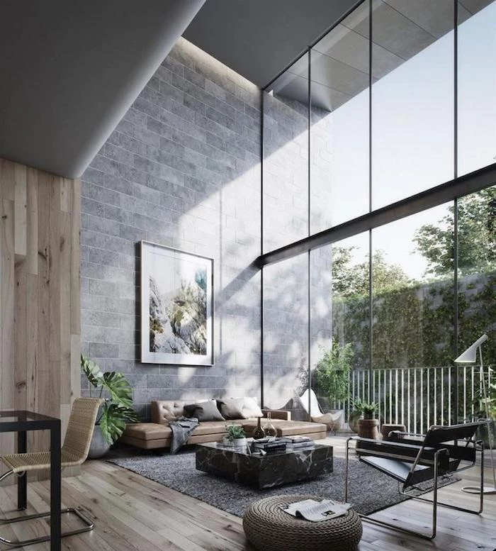
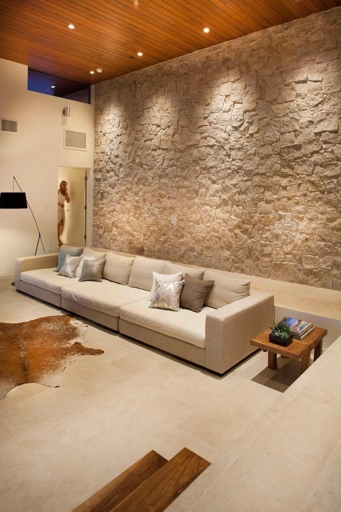
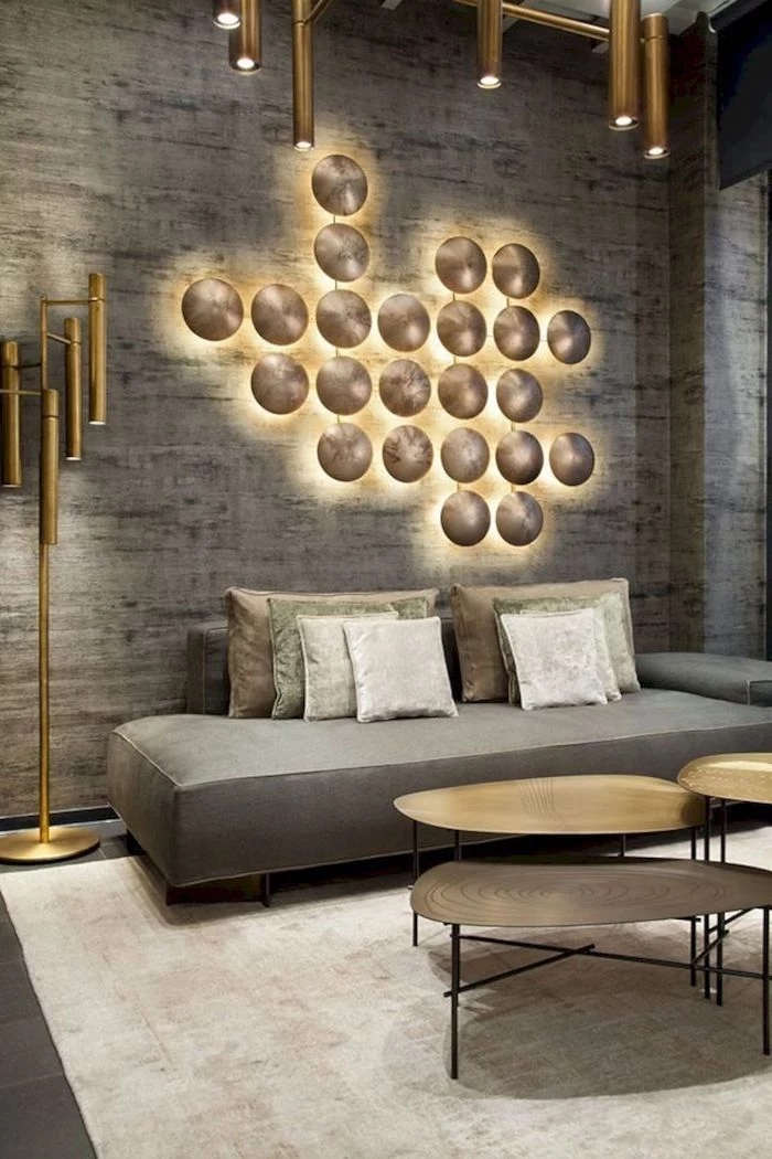
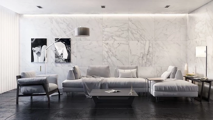
- A Solid, Unbroken Wall: A wall with no windows or doors is like a perfect blank canvas. It lets your color or texture be the star without any interruptions. This is often the safest and most dramatic choice.
I learned this lesson the hard way. Early in my career, a client insisted we paint a long, featureless wall bright red. It was the first thing you saw, sure, but it didn’t anchor anything. The result? It just looked… weird. Like a giant, angry rectangle floating in the room. We ended up repainting it and putting that red on the smaller fireplace wall instead. The room instantly felt right. The lesson: your accent wall needs a reason to exist.
Your Material Options: Beyond Just Paint
Okay, you’ve picked your wall. Now for the fun part. You’ve got more options than just a can of paint, and each one has its own vibe, cost, and difficulty level.
Paint: The Classic Go-To
This is the most accessible and affordable choice. A quality job here is 100% about the prep and technique. For a dramatic, deep color, I almost always push for a high-quality matte or flat finish. It soaks up light and does a fantastic job of hiding little bumps and dings in the wall. Eggshell is your next best bet if you need a little more washability.
DIY Cost: $100 – $250
Skill Level: Beginner-friendly (2 out of 5)
Time: A solid weekend project.
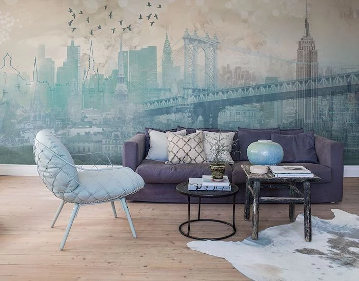
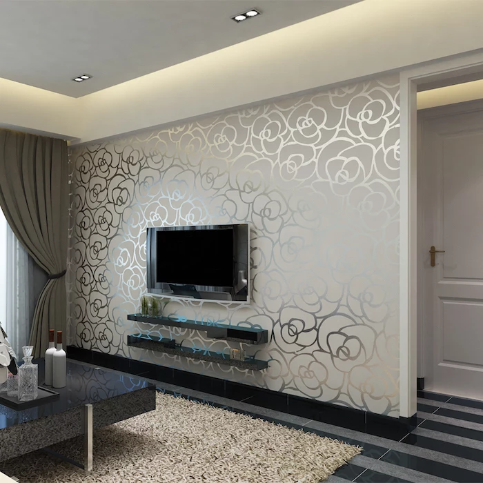
Wallpaper: For Pattern and Texture
Wallpaper can bring in patterns and textures that paint just can’t touch. But be warned, it’s much less forgiving. If you’re going the DIY route, look for ‘non-woven’ types where you apply the paste to the wall, not the paper. It’s way easier. And a word on peel-and-stick: while it sounds easy, the cheap stuff can rip the paper face right off your drywall when you remove it, leading to a nasty repair job. If you go this route, use a reputable brand like Spoonflower or Chasing Paper and test it somewhere hidden first.
DIY Cost: $200 – $700+ (good paper isn’t cheap)
Skill Level: Intermediate (4 out of 5)
Time: A full, focused weekend.
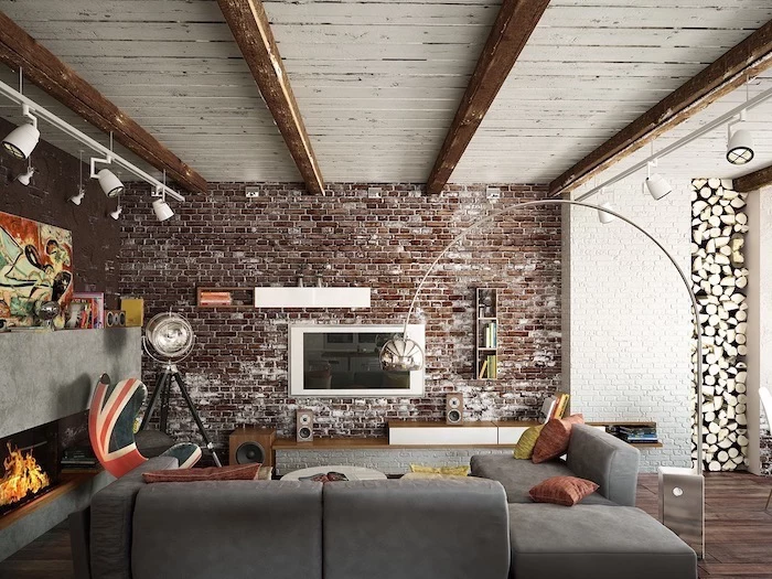
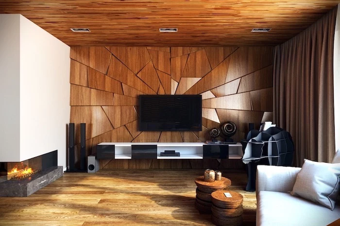
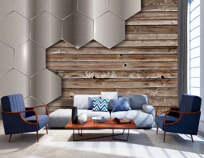
Wood Paneling, Shiplap, or Slats
Wood adds incredible warmth and structure. This is more of a light carpentry project. You can go with traditional shiplap, modern vertical slats, or even reclaimed wood. The key is to start with a perfectly level line (use a 4-foot level, don’t trust your floor or ceiling!) and make sure you’re nailing into the studs.
DIY Cost: $500 – $2,000+ depending heavily on the wood.
Skill Level: Advanced (4.5 out of 5)
Time: A multi-day project for sure.
The Pro’s Game Plan: From Prep to Perfection
I tell every new person I train the same thing: 75% of a beautiful paint job is the prep work. Rushing this guarantees a lousy finish. Here’s how we do it on every single job.
Step 1: Your Shopping List
Don’t just grab the cheapest kit. Getting the right tools makes a world of difference. Here’s what you actually need:
- High-Quality Paint: Expect to pay $50-$80 for a gallon of good stuff like Benjamin Moore or Sherwin-Williams. It’s worth it.
- A Good Primer: About $30-$50 a gallon.
- An Angled Brush: A 2.5-inch angled brush is your best friend for cutting in edges. A quality one from Purdy or Wooster will run you $20-$25 and will last for years if you clean it well.
- Roller Frame & Covers: Get a sturdy 9-inch roller frame. For the roller cover (the fuzzy part), get a 1/2-inch nap for most walls. If your wall has a heavy texture like knockdown or orange peel, go for a 3/4-inch nap to get into all the crevices. A 3-pack of good roller covers is about $15.
- Painter’s Tape: The green FrogTape or blue ScotchBlue tape are my go-tos. About $8 a roll.
- Drop Cloths: Canvas, not plastic. Plastic is slippery and doesn’t absorb spills. A good canvas one is about $25.
- Basic Supplies: A 5-in-1 tool, spackle, a sanding sponge, and a paint tray. Maybe $30 for all of it.
Step 2: The Actual Prep Work (The Boring but Crucial Part)
- Clear & Cover: Move furniture to the center of the room and cover it. Lay down your canvas drop cloth. Tape off all your trim, baseboards, and the ceiling line. Pro tip: Press down the edge of the tape with a putty knife to create a tight seal.
- Clean the Wall: Wipe down the wall with a damp cloth and a bit of mild detergent to get rid of dust and grime. Let it dry completely.
- Repair: Fill nail holes with spackle. Sand them smooth when dry. You shouldn’t be able to feel the patch when you run your hand over it.
- Wipe Again: After sanding, wipe the whole wall down one more time with a damp cloth to remove all the fine dust.
Step 3: Prime for Success
When you’re making a big color change (like from beige to navy), primer is non-negotiable. Here’s the trick: ask the person at the paint counter to tint your primer. The magic phrase is, “Hi, can you tint this primer to 50% of my topcoat color, [insert your color name here]?” This helps your expensive topcoat cover in fewer coats, saving you time and money.
Step 4: The Application (Finally!)
Before you start, here’s some simple painter’s math to make sure you bought enough paint: (Wall Width in feet x Wall Height in feet) / 350 = Gallons needed per coat. Most walls need two coats!
Alright, let’s paint. A good timeline for a weekend project looks like this:
- Saturday Morning (3-4 hours): All your prep and priming.
- Saturday Afternoon (1 hour + dry time): Apply the first coat of paint. Let it dry for at least 4 hours, or whatever the can says.
- Sunday Morning (2 hours): Apply the second coat and do your cleanup.
When you paint, use your angled brush to “cut in” a 3-inch border around all the edges first. Then, while that edge is still wet, use your roller to fill in the middle. Roll in a big ‘W’ or ‘M’ pattern to spread the paint, then go back over it in straight lines to even it out. This avoids ugly roller marks.
QUICK PRO HACK: Done for the day but have another coat to do tomorrow? Don’t bother washing your brush and roller. Scrape off the excess paint, then wrap them tightly in a plastic grocery bag or plastic wrap. Stick them in the fridge. They’ll be perfectly fresh and ready to go in the morning. It’s a massive time-saver.
Step 5: The Cleanup
Pull off your painter’s tape while the paint is still a little wet. Pull it slowly, at a 45-degree angle away from the wall, for the cleanest line possible. And remember, while paint might feel dry in a few hours, it takes up to a month to fully cure. Be gentle with it—don’t scrub it or slam furniture against it during that time.
Quick Troubleshooting: What If…
…my painter’s tape bled and the line is messy?
Ah, the classic problem. Next time, after you put the tape on, paint over the edge of the tape with your original wall color first. Let that dry. This seals the edge. Then, when you paint with your new accent color, it can’t sneak under the tape. It’s a game-changing trick.
…I see ugly roller marks when the paint dries?
This is called ‘flashing’. It usually happens if you didn’t keep a wet edge or if you used a cheap roller cover. A second coat, applied carefully, usually fixes it. Make sure your roller is always loaded with a good amount of paint—not dripping, but not dry.
Safety and When to Just Hire Someone
A few quick but serious safety notes. Always open a window for ventilation. When you’re working around outlets, turn off the power at the breaker box first. And if your house was built before the late 70s, you need to be aware of the possibility of lead paint. Don’t scrape or sand anything without testing for it first. If it’s positive, that’s a job for a certified pro, period.
So, when should you call for help? Honestly, a patient person can totally handle a painted accent wall. But I’d strongly suggest hiring a professional painter (who might charge between $400 and $800 for this kind of job) if you’re looking at complex wallpaper, a super tall wall that needs scaffolding, or if you just don’t have the time or patience for all that prep work. Sometimes, paying an expert is cheaper than paying to fix a DIY job gone wrong.
At the end of the day, creating an accent wall is one of the most rewarding home projects you can do. It’s a chance to be bold and really make a space your own. Follow the steps, take your time with the prep, and you’ll create a feature that doesn’t just look good—it’ll make the whole room feel complete.
So, what wall are you thinking of accenting, and what’s holding you back? Drop it in the comments below, and I’ll do my best to help out!
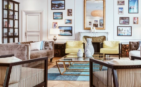
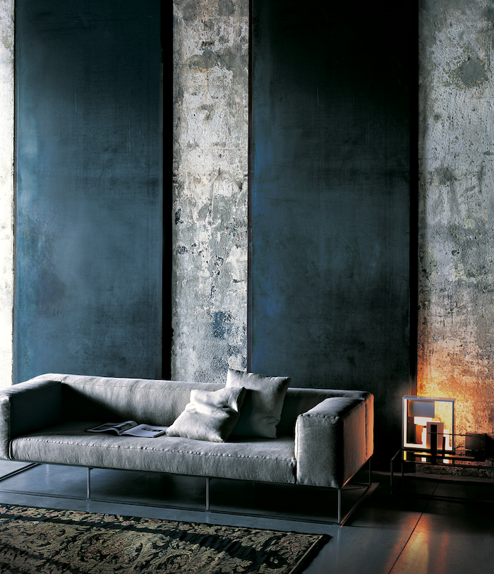
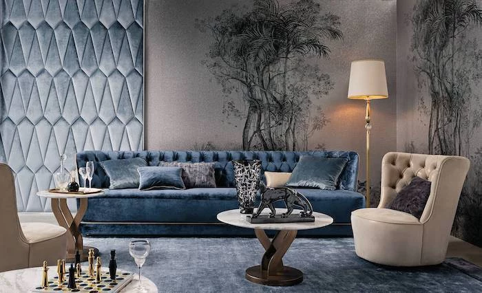
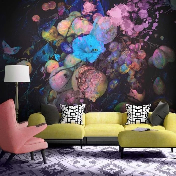
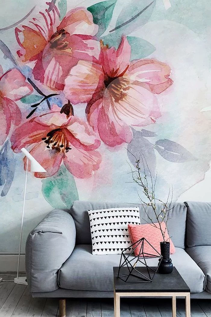
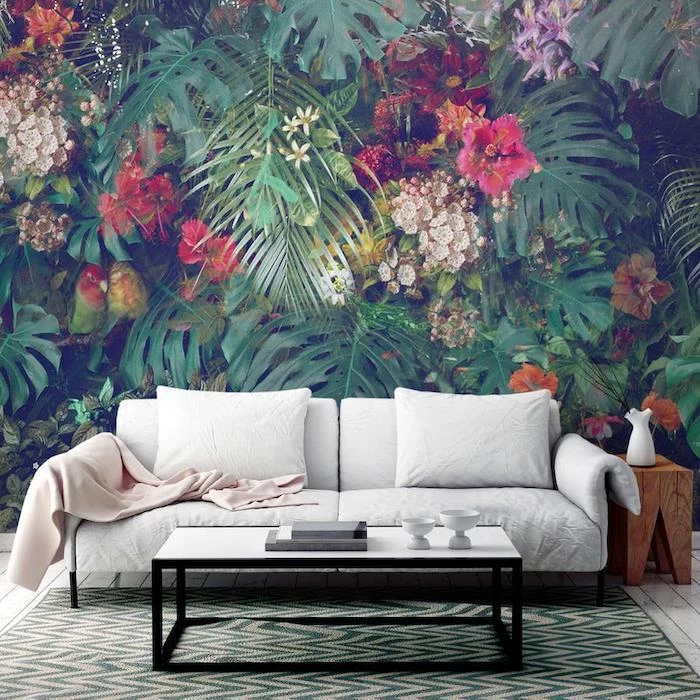
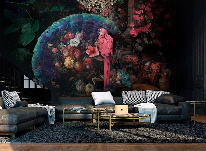
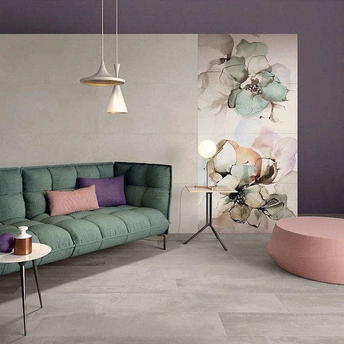
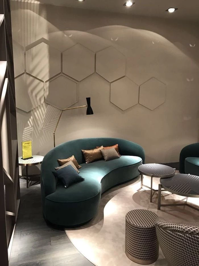
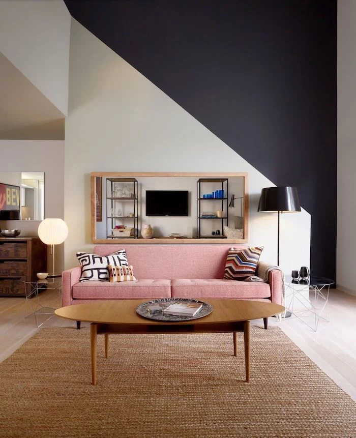
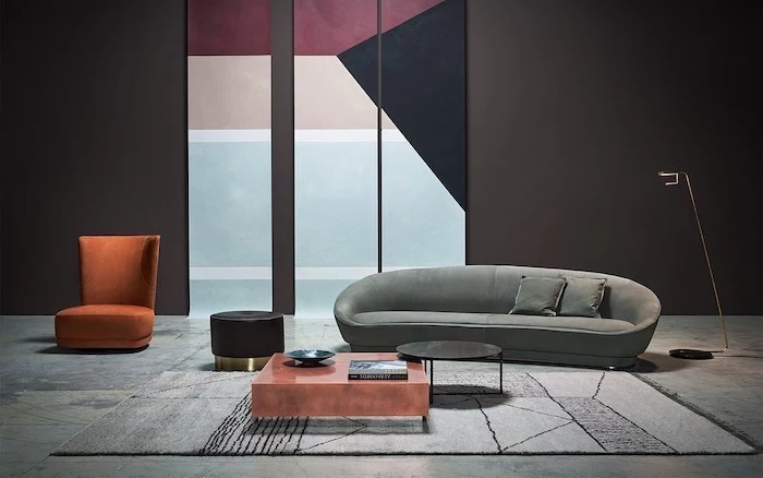
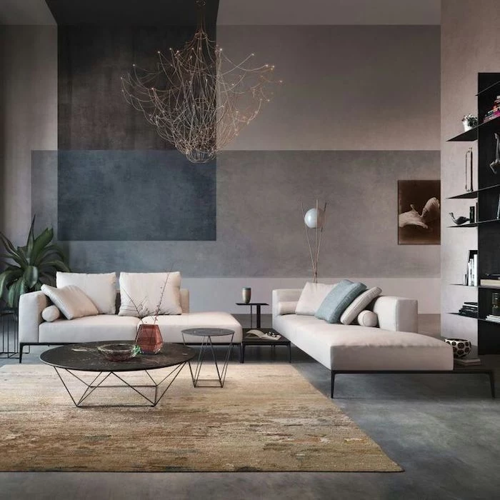
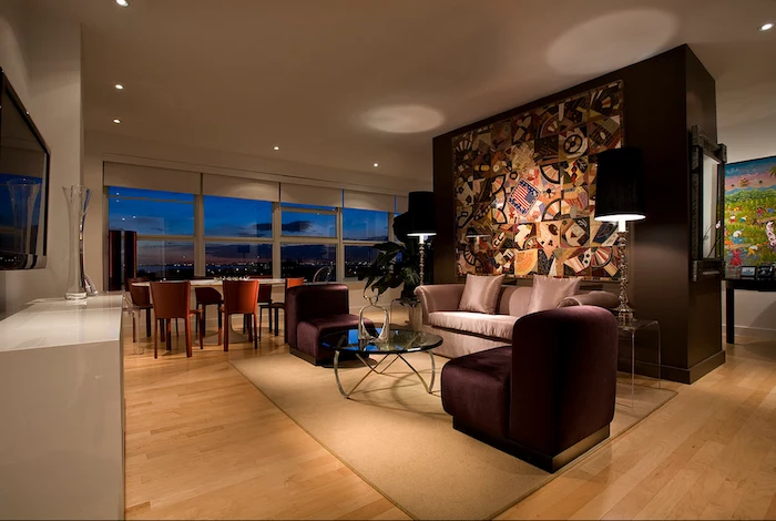
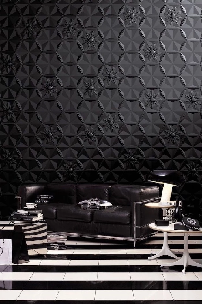
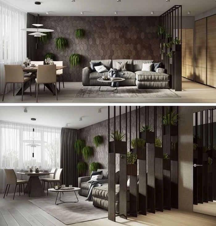
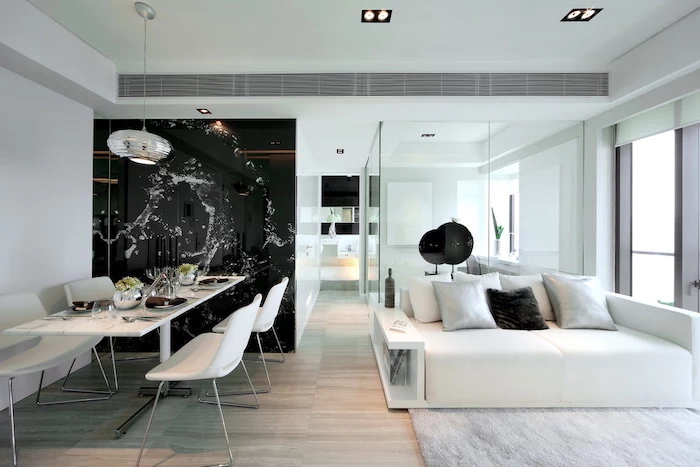
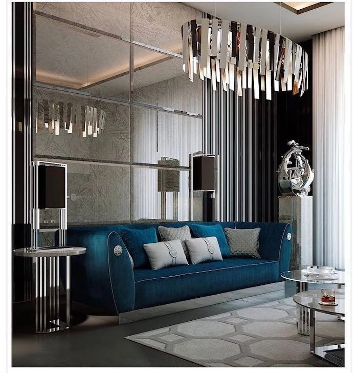
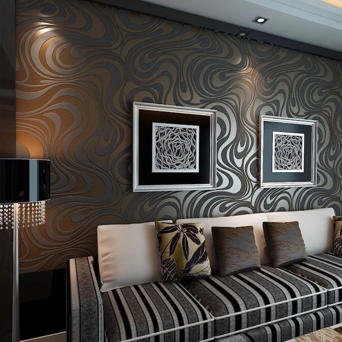
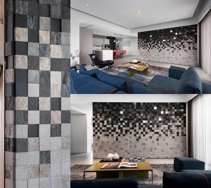
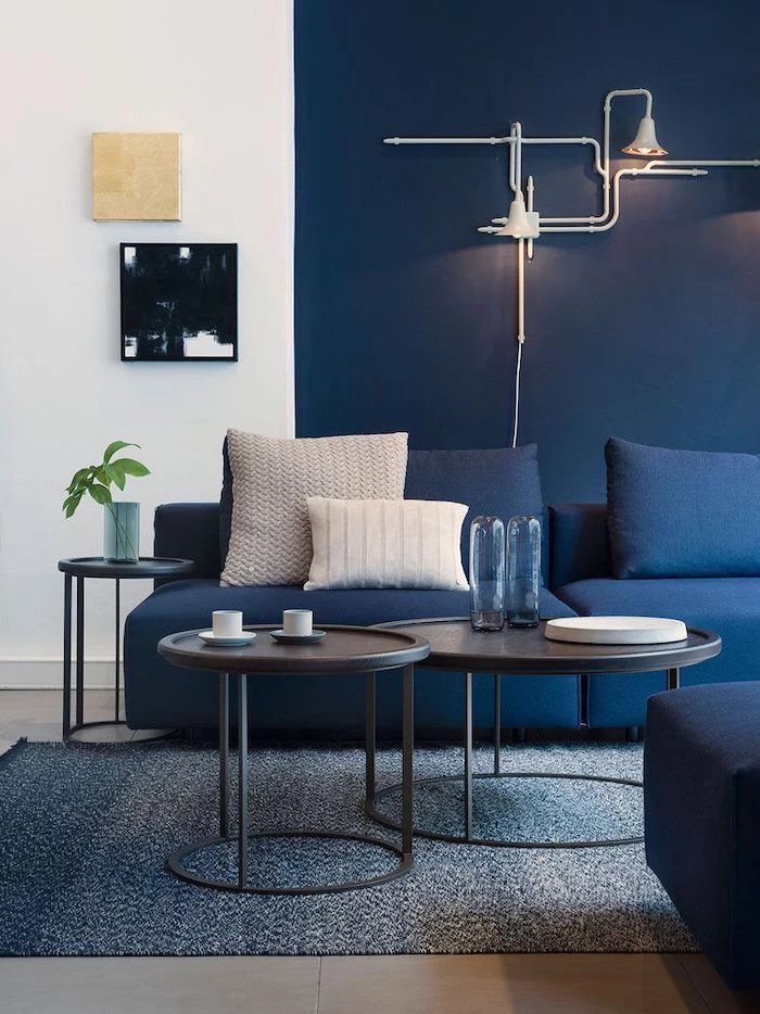
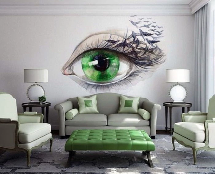
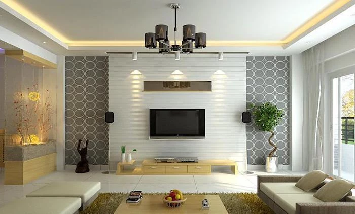
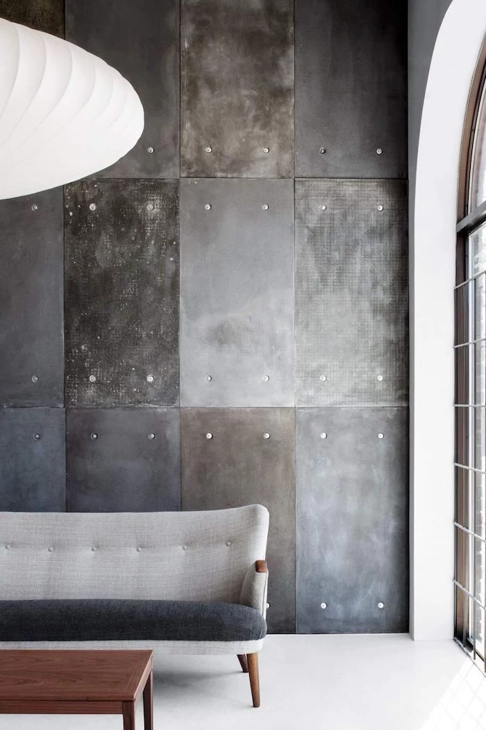
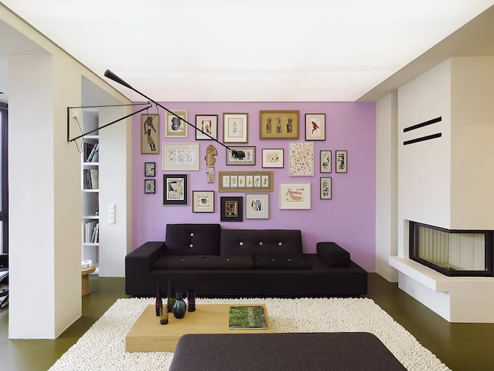
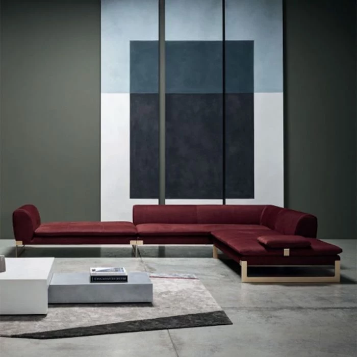
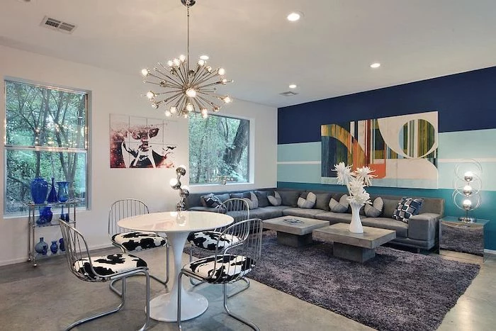
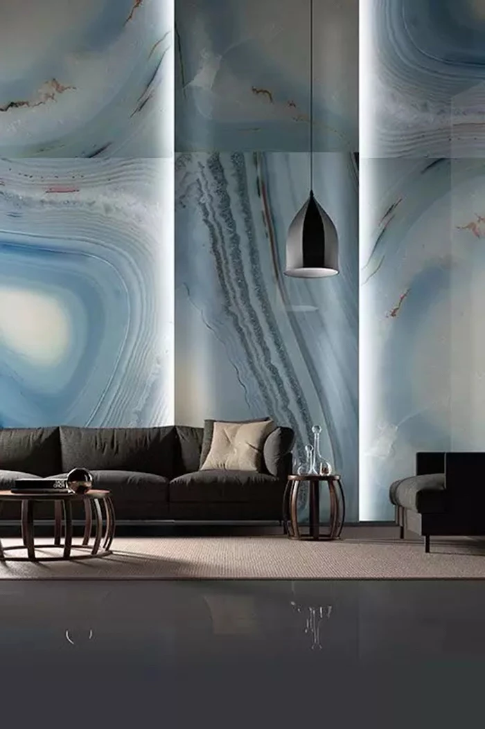
Inspiration Gallery
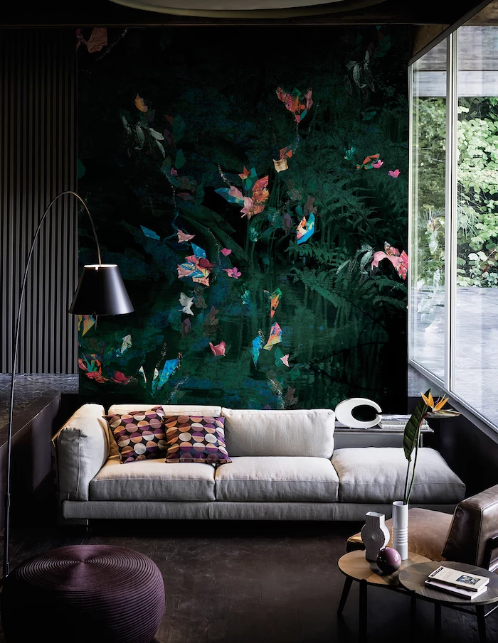
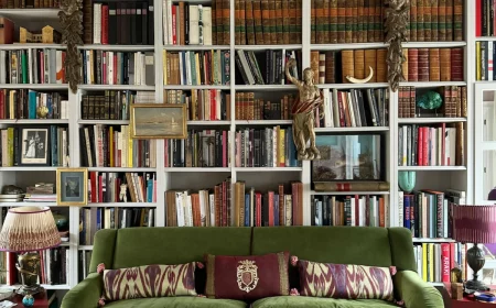
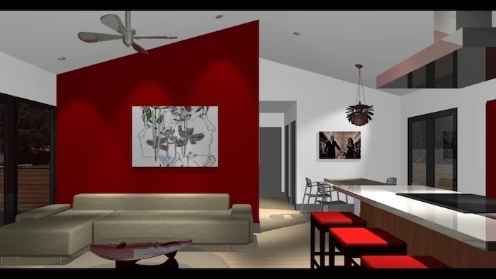
For a truly deep, velvety color that absorbs light and creates an immersive feel, you need high pigmentation. Brands like Farrow & Ball (try ‘Hague Blue’) or Benjamin Moore’s ‘Aura’ line are formulated with more pigment and less filler, which is why they deliver that signature rich, complex color that cheap paints just can’t replicate.
A razor-sharp edge is what separates a DIY job from a professional one. Your toolkit should include:
- High-quality painter’s tape, like FrogTape, which has a polymer that reacts with latex paint to create a micro-barrier.
- A flexible putty knife to press the tape down firmly and seal the edge.
- A damp cloth to immediately wipe away any tiny bleeds.
What if the wall I want to accent has a window or a door in the middle?
Embrace it! Don’t let architectural features deter you. Painting a wall with a window can actually frame the view, making the outdoors feel like a piece of art. If there’s a door, painting the wall, trim, and door all in the same bold color is a sophisticated designer trick that creates a seamless, monolithic look, minimizing visual clutter and maximizing impact.
The Fifth Wall: Don’t forget to look up! Painting the ceiling can be a game-changing move. In a room with high ceilings, a dark color can make the space feel more intimate and cozy. In a small room, a soft, glossy color can bounce light around, creating a sense of spaciousness. It’s an unexpected and incredibly chic choice.
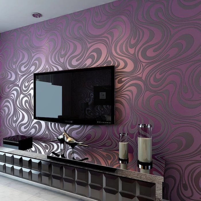
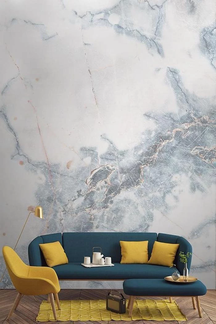
Tired of flat color? Texture is the new frontier for accent walls. Consider limewash or Roman clay finishes, like those from Portola Paints. These ancient techniques use plaster-based materials to create a soft, mottled, stone-like surface with subtle movement and depth. The result is an organic, earthy feel that changes beautifully with the light throughout the day.
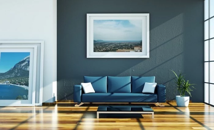
According to a study by the University of Sussex, participants’ heart rates were lowest when viewing the color blue, which is often associated with feelings of calm and serenity.
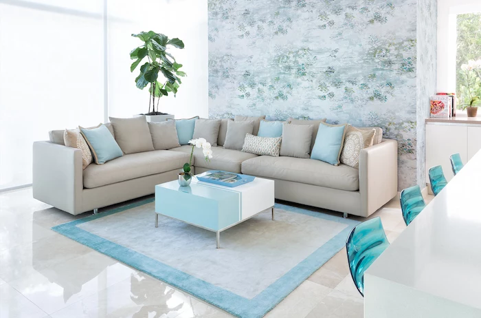
This is why deep blues and muted aquas are such a popular and effective choice for accent walls in bedrooms and living rooms. They don’t just look good; they can subtly influence the atmosphere of the entire space, fostering a sense of tranquility.
- Creates a soft, diffused glow rather than a harsh shine.
- Hides minor imperfections on the wall surface.
- Lends an air of sophistication and coziness.
The secret? Choosing the right paint sheen. While satin is a safe bet, an eggshell or even a matte finish (like Benjamin Moore’s ‘Regal Select Matte’) on your accent wall will absorb more light, making deep colors appear richer and preventing distracting glare.
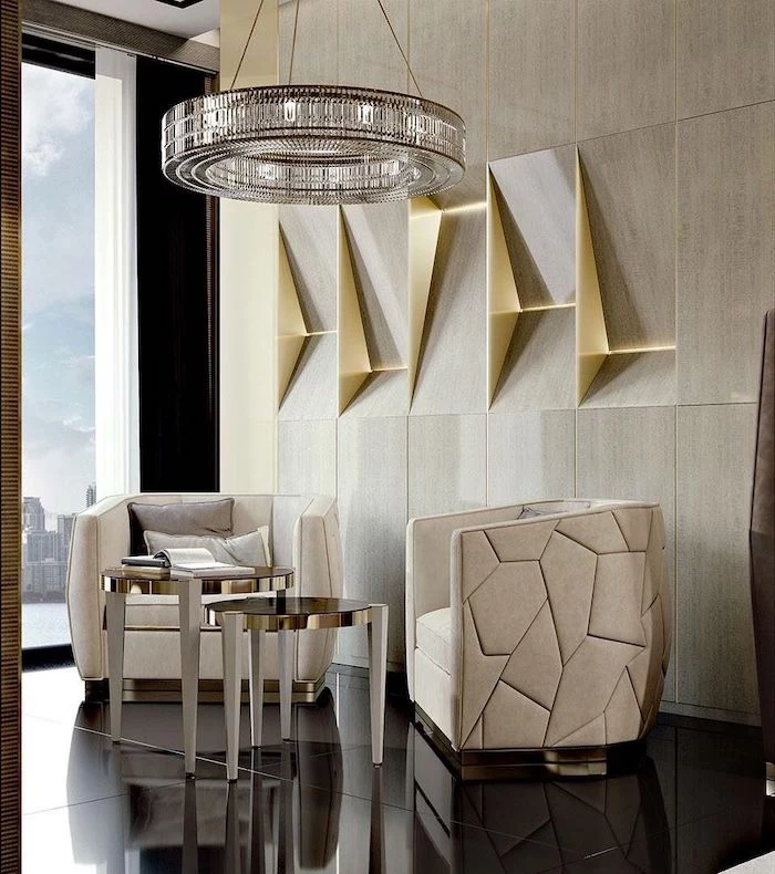
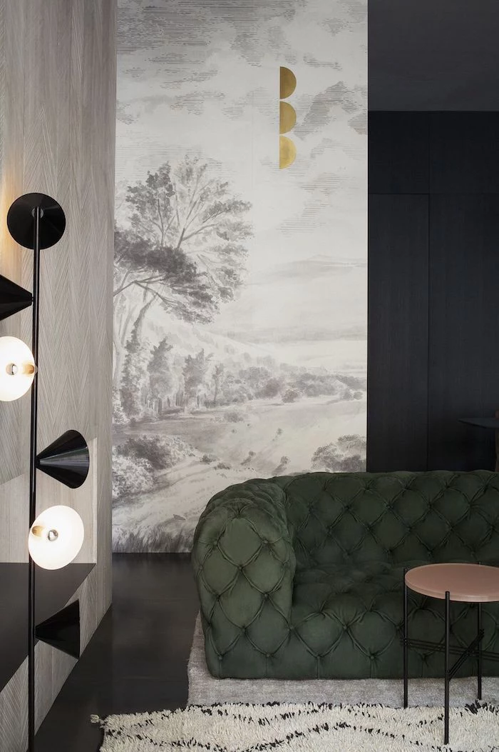
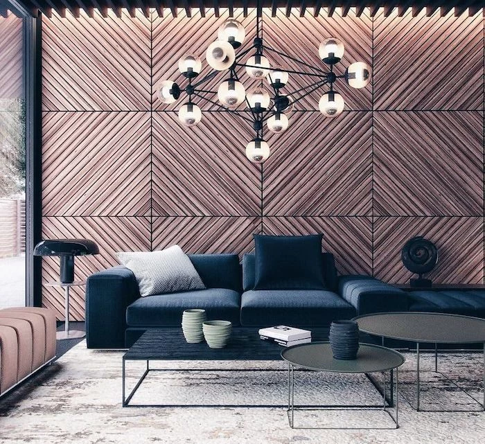
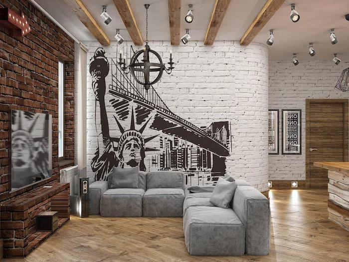
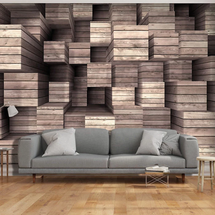
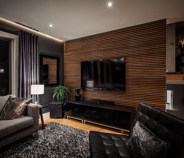
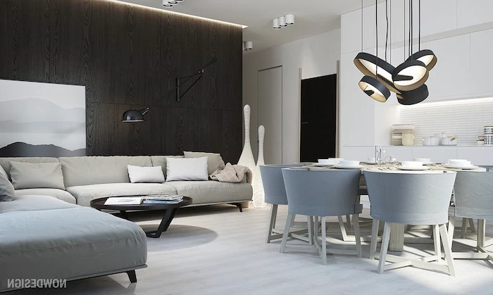
For an accent wall that truly feels like a part of the home’s architecture, look beyond paint. Wood slat walls, often made from oak or walnut, add linear rhythm and natural warmth. They’re particularly effective behind a bed or a media console, providing both visual interest and acoustical benefits by dampening sound.
Paint: A quick, affordable, and versatile option. The color can be changed relatively easily, but the effect is limited to two dimensions.
Wallpaper: Instantly introduces pattern, texture, and complex imagery. High-quality brands like Graham & Brown or Cole & Son offer durable, artistic options, but it’s a bigger commitment in both budget and installation.
For renters or the indecisive, removable peel-and-stick wallpaper is the perfect compromise.
How do I tie the accent color into the rest of the room without it feeling forced?
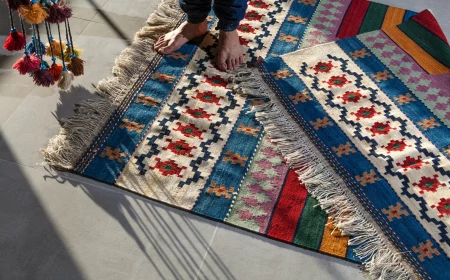
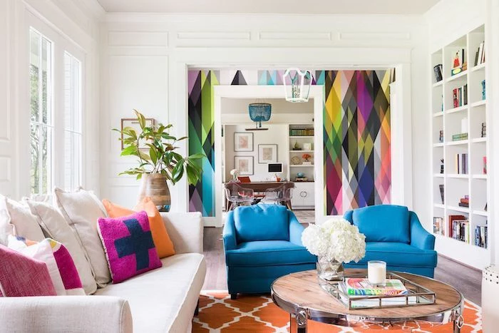
The key is repetition, but in small doses. Pull your accent color into the space through two or three smaller items. For a navy blue wall, this could be a single cushion on the sofa, a pattern in the area rug, or a piece of art on an adjacent wall that contains a splash of that same blue. This creates a cohesive, intentional design.
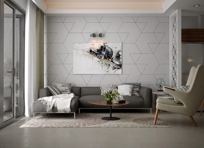
A common mistake is choosing the largest, most dominant wall. This can often overwhelm the space rather than enhance it.
Before you even pick up a brush, consider the room’s natural focal point. Often, the best wall to accent is the one your eyes are drawn to when you first enter—typically the wall behind the sofa in a living room or the headboard in a bedroom. Highlighting an existing focal point gives the accent wall purpose.
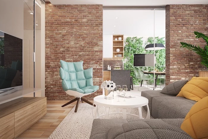
Think beyond the living room. Accent walls can have a huge impact in smaller, transitional spaces:
- The Entryway: A bold color or dramatic wallpaper on the wall facing the front door makes an unforgettable first impression.
- The Powder Room: Since it’s a small, enclosed space, you can go wild with a pattern or a dark, moody color you might hesitate to use elsewhere.
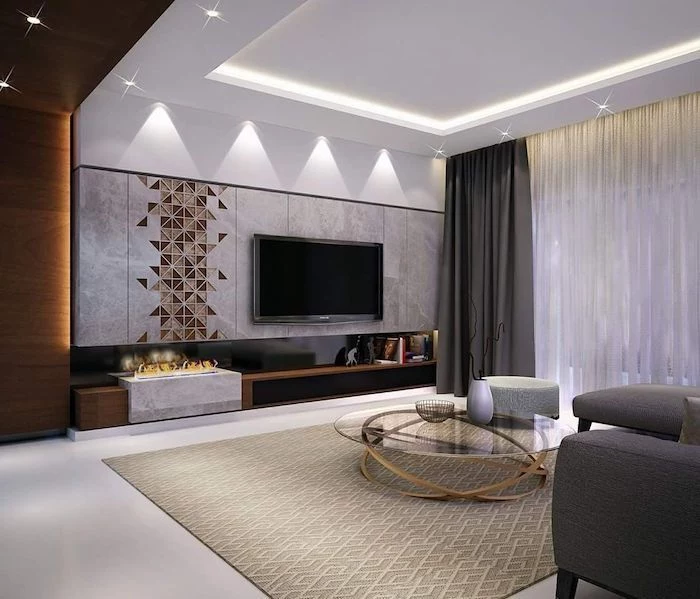
Crucial detail: Don’t ignore your trim and outlet covers. For a modern, seamless look, paint outlet and switch plates the same color as your new accent wall. If you’re using a dark, dramatic color, standard white trim can look jarring. Consider painting the baseboards and crown molding on that wall the same color for a truly integrated, high-design feel.
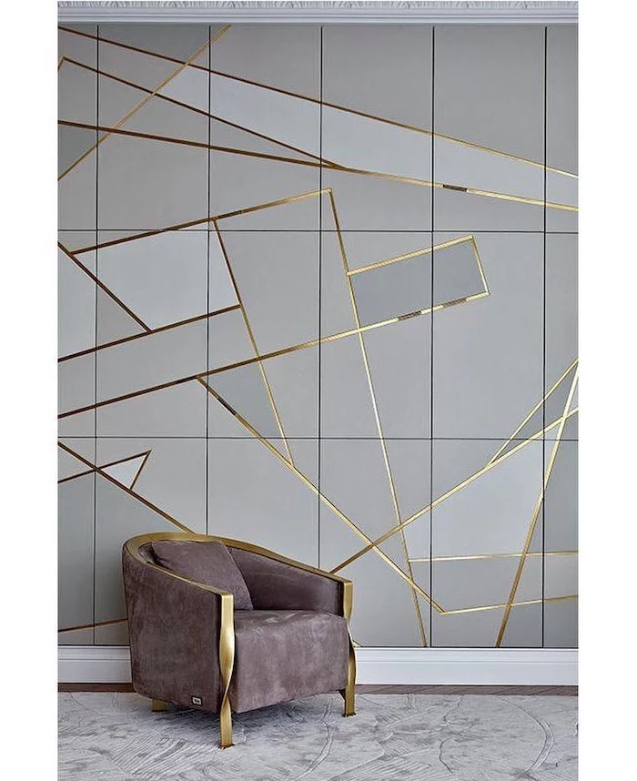
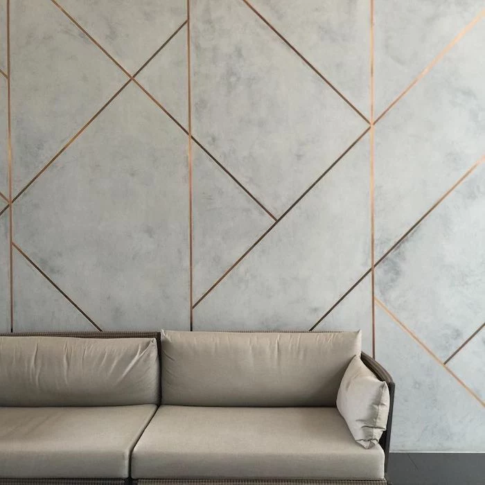
Love the look of geometric patterns but not the price of wallpaper? Create your own with painter’s tape. After painting your base color, use thin tape like FrogTape’s ‘Delicate Surface’ to create triangles, chevrons, or a random asymmetrical design. Paint over it with a slightly lighter or darker shade from the same color family for a subtle, sophisticated effect.
Did you know that the iconic ‘International Klein Blue’ was developed by French artist Yves Klein in the 1950s because he believed this specific shade of ultramarine represented the immateriality of the sky and sea?
This highlights how a single, powerful color can be an artistic statement in itself. When you choose a bold, saturated hue for your accent wall, you’re not just decorating; you’re curating an experience.
Can I put an accent wall in a room that’s already small?
Absolutely, but be strategic. Avoid using a warm, advancing color like red or orange on a long wall, as it can make the space feel cramped. Instead, try a deep, cool color (like charcoal or navy) on the wall at the far end of the room. This visual trick makes the wall appear to recede, adding a sense of depth and making the room feel larger than it is.
For an ultra-durable and scrubbable accent wall in a high-traffic area like a hallway or behind a dining table, consider paint typically reserved for trim. A semi-gloss or even a high-gloss finish in a deep color can create a stunning, lacquered effect. It’s bold, light-reflective, and incredibly easy to wipe clean.
- It adds instant character and a hand-crafted feel.
- It’s a budget-friendly way to achieve a wallpaper-like effect.
- The pattern can be perfectly customized to your space.
The secret? Stenciling. Companies like Royal Design Studio Stencils offer thousands of patterns, from Moroccan tiles to modern botanicals. Using a dense foam roller and a minimal amount of paint, you can transform a plain wall into a work of art in an afternoon.
The Murphy’s Law of Paint: The moment you finish painting is the moment you’ll spot a flaw in the wall’s surface you never noticed before. Before applying your feature color, inspect the wall closely under a bright, angled light. Fill any nicks or holes with spackle, sand smooth, and then prime the entire wall. This ensures a flawless, professional-grade canvas for your new color.
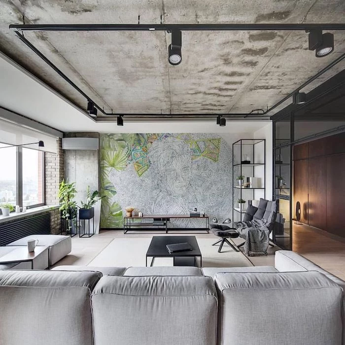
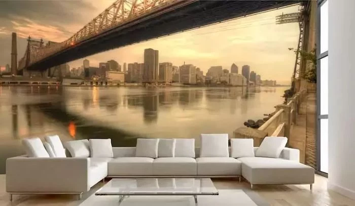
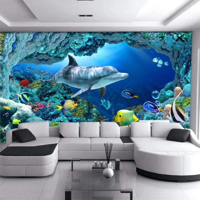
DIY Mural: High-impact and completely unique. Use a projector to trace a design onto the wall for a foolproof method. Requires artistic confidence and time, but the cost is minimal—just a few sample pots of paint.
Large Art Print: Offers immediate gratification and can be moved. Less commitment than painting a mural. Can be costly for very large, high-quality framed pieces.
For a personal touch without the pressure, a DIY mural is unbeatable. For flexibility, invest in art.
The ‘golden mean’ or ‘golden ratio’ (approximately 1.618) is a principle of design that suggests asymmetrical balance is often more visually appealing than perfect symmetry.
Don’t feel like your accent wall has to be a perfectly centered rectangle. Consider painting an asymmetrical block of color that wraps around a corner or stops two-thirds of the way up a wall. This unexpected application feels dynamic and modern.
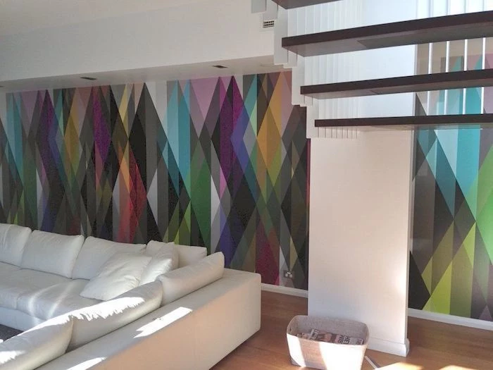
When choosing wallpaper, pay attention to the pattern’s ‘repeat’. A large-scale repeat, where the full pattern only reappears every 24 inches or more, creates a bold, mural-like effect that feels modern and uncluttered. A small, busy repeat is more traditional and can sometimes overwhelm a space if the colors are too high-contrast. Brands like Mindthegap are known for their spectacular large-scale designs.
A word on lighting: The color you loved in the store can look completely different under your home’s lighting. Install your final light bulbs (e.g., warm white, cool white, dimmable LEDs) *before* you make a final paint choice. Test your large paint sample board under your artificial light at night, not just in the daytime, to see its true character.
If your room is filled with neutral furniture (think beige sofa, wood tables), the accent wall is your chance to establish a clear color story. But if you already have a statement piece, like a green velvet sofa or a patterned rug, your job is easier. Pull a secondary, less obvious color from that piece for your wall. For instance, with a floral rug, pick out the subtle terracotta or deep blue from one of the leaves instead of the main background color. This creates a sophisticated, layered look.