The Real Talk on Winter Wedding Colors (And How Not to Mess It Up)
I’ve been in the wedding world for a long time, and I’ve seen it all. Every season has its charm, but winter… winter is different. There’s a quiet, crisp magic to it that asks for a really thoughtful touch with color. So many couples scroll through Pinterest and find these gorgeous, trendy palettes, but a truly successful design is so much more than that. It’s a dance between light, texture, the venue itself, and who you are as a couple.
In this article
So, let’s set aside words like “dreamy” and “enchanting” for a second and get real about what actually works. A winter color palette isn’t just about picking shades you like. It’s about understanding how those colors will behave on a cold, often grey day and, more importantly, how to create warmth and emotion when the world outside is doing the opposite. This is the stuff I teach newer planners—how to move past just picking colors and start building an atmosphere.
The
1 Thing Everyone Gets Wrong: Winter Light
Before you even think about a color swatch, you have to understand the light. Honestly, this is the biggest factor that separates a pro-level winter wedding from one that just feels… off. Winter light is cool and has a blue-ish tint to it. The sun is lower in the sky, the days are shorter, and that means you’ll be relying heavily on artificial light for a huge chunk of your celebration.
What does this mean for your colors? Well, a lot.
- Cool Colors Get Colder: That crisp, icy blue you loved online? In person, it can feel sterile and unwelcoming. A pure white can look almost clinical under that cool, natural light.
- Warm Colors Can Get Washed Out: A delicate blush pink can completely disappear or look dingy. A soft, buttery yellow might look dull or even a little bit green.
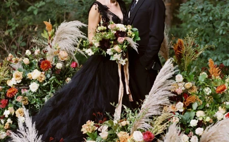
- Dark Colors Get Devoured: Deep navies, rich burgundies, and forest greens can turn into black holes without the right lighting. You lose all their beautiful depth in the shadows.
This is why your lighting plan isn’t a separate to-do item; it’s a core part of your color palette. I learned this the hard way at an event in a historic ballroom. We had a gorgeous slate blue and silver theme. The venue, without warning, had just switched their classic warm bulbs to stark, cool-white LEDs. The elegant slate blue turned into a flat, depressing grey, and the silver lost all its shimmer. It was a mad scramble to fix. Now, I always talk about lighting first.
Quick Tip: For a warm, inviting glow that makes colors (and people!) look their best, you want light bulbs in the 2700K to 3000K range. Check with your venue about what they use!
A Pro’s Process for Building a Palette That Works
I never start with trends. I start with a story. A palette should feel like it belongs in the space and to the people getting married. Here’s the process that leads to a cohesive and meaningful result every time.
1. Find Your Anchor Point
Every strong design has a starting point, and it isn’t always a color. It’s a texture, a pattern, an object—something that grounds every other decision.
I’ve built entire weddings around things like:
- The deep, rich green of a family tartan.
- The aged leather and dark wood of a cozy private club.
- The intricate, hand-painted pattern on a set of antique china.
- The soft, grey-blue of the local stone on the venue’s fireplace.
But what if you don’t have an obvious anchor? No problem. Ask yourselves a few questions: What’s our favorite painting or piece of art? What’s the vibe of the coziest room in our house? What does the cover of a book we both love look like? Pull your inspiration from there!
2. Use the 60-30-10 Rule
This is a classic design principle that keeps things from feeling chaotic. It’s all about balance.
- 60% Main Color: Your dominant, background shade. Think linens, large floral installations, or even the walls of your venue. It’s often a neutral like ivory, charcoal, or a soft taupe.
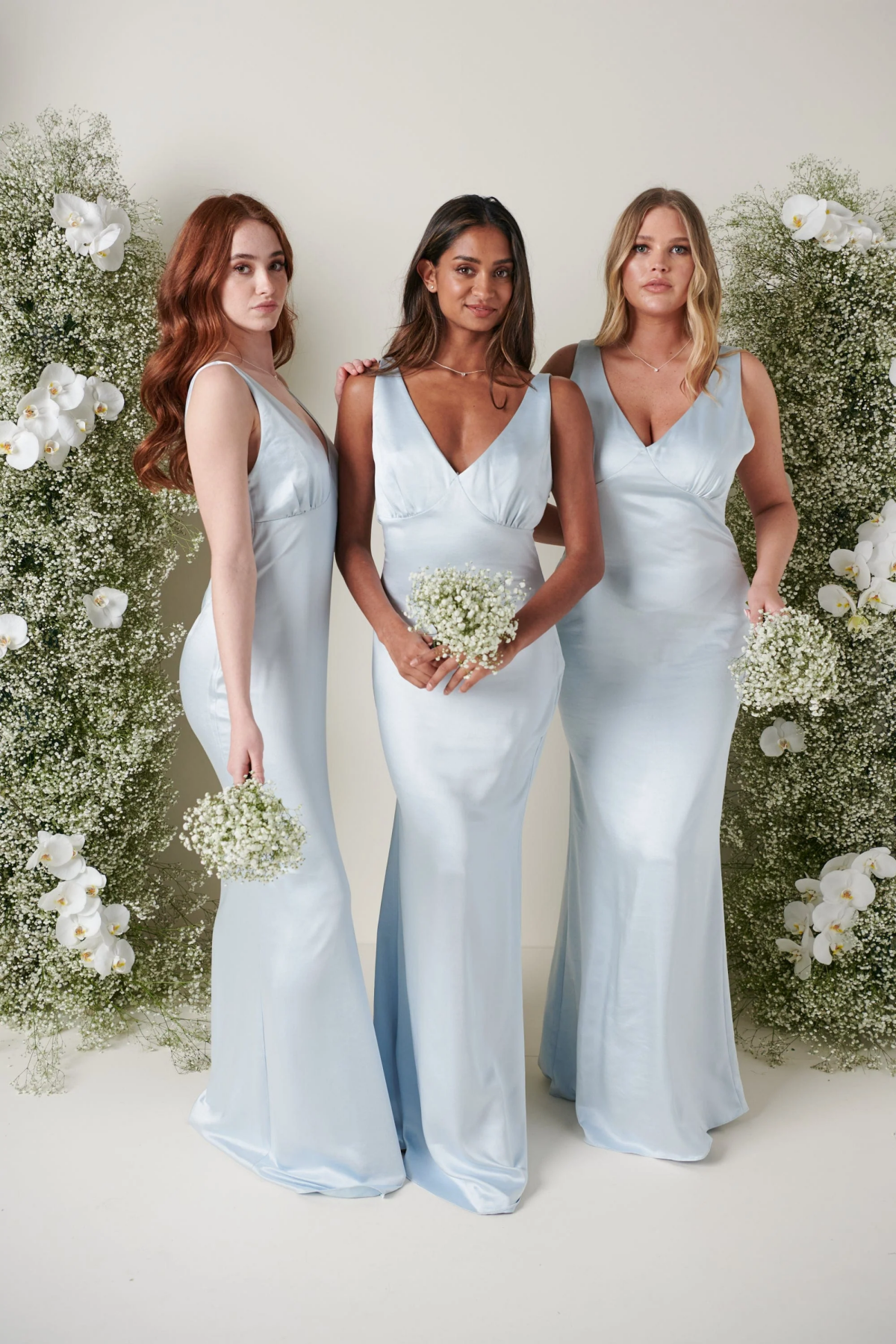
- 30% Secondary Color: This adds interest and supports the main color. This is where you might see the bridesmaid dresses, napkins, or significant floral moments.
- 10% Accent Color: Your pop of personality! Use it sparingly to draw the eye. Think a metallic flash, a bright berry in the bouquets, or the ink on the menus.
Instead of just a list, let’s look at how this plays out in a few different styles:
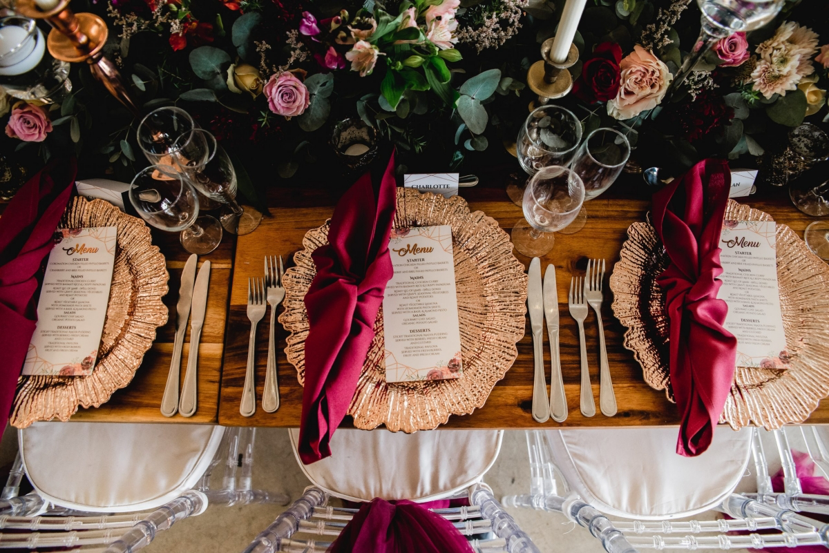
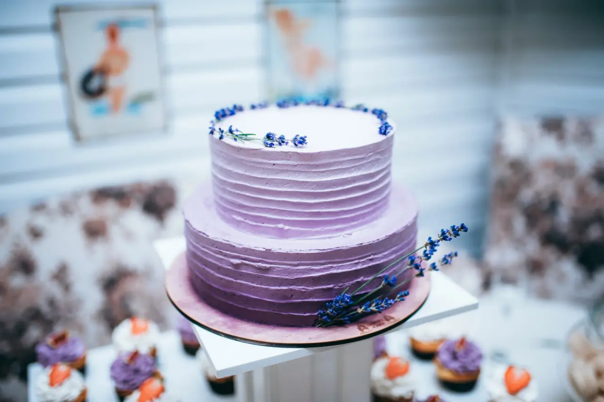
For a Moody & Modern vibe, you could do 60% charcoal grey (on the tables and stationery), 30% deep burgundy (in the florals and velvet napkins), and 10% shimmering copper (for the flatware and candle holders). The textures of velvet and metal keep the dark palette from feeling flat.
Or, for an Organic & Natural feel, try 60% warm taupe (linen tablecloths), 30% dusty blue (bridesmaid dresses and water goblets), and 10% silver-green (from eucalyptus and other foliage). It feels earthy and calm.
3. Weave in Texture and Sheen
In winter, texture does just as much work as color. A flat design is a boring design. But when you start layering materials, it comes to life. Think about the physical feel of things: rough wool blankets on the back of chairs, smooth cool marble, translucent vellum menus over opaque ceramic plates. The contrast is everything.
Pro Tip on a Budget: Love the idea of velvet but can’t afford velvet tablecloths for every table? No one can! Instead, buy a few spools of high-quality velvet ribbon for under $50. Use it to tie your bouquets, wrap your napkins, or hang your escort cards. You get that luxe texture and a pop of color for a fraction of the price.
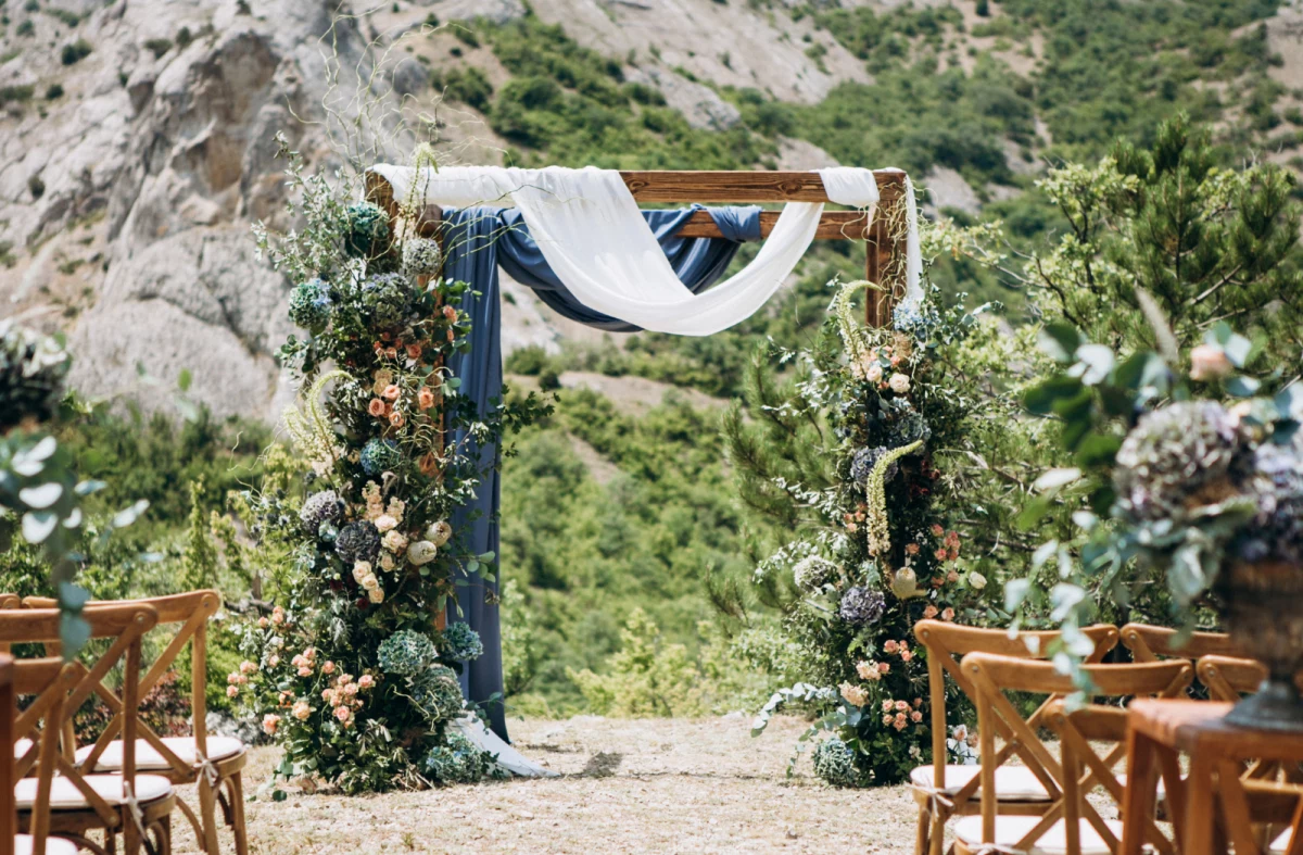
Location-Specific Palettes: A Wedding in Vermont vs. Texas
A winter wedding in a snowy landscape is a completely different beast from a winter wedding in a warmer climate. Forcing an icy-blue palette in a place with no snow is going to feel weird. Always work with your surroundings!
For Snowy, Cold Climates (Think Colorado, New England)
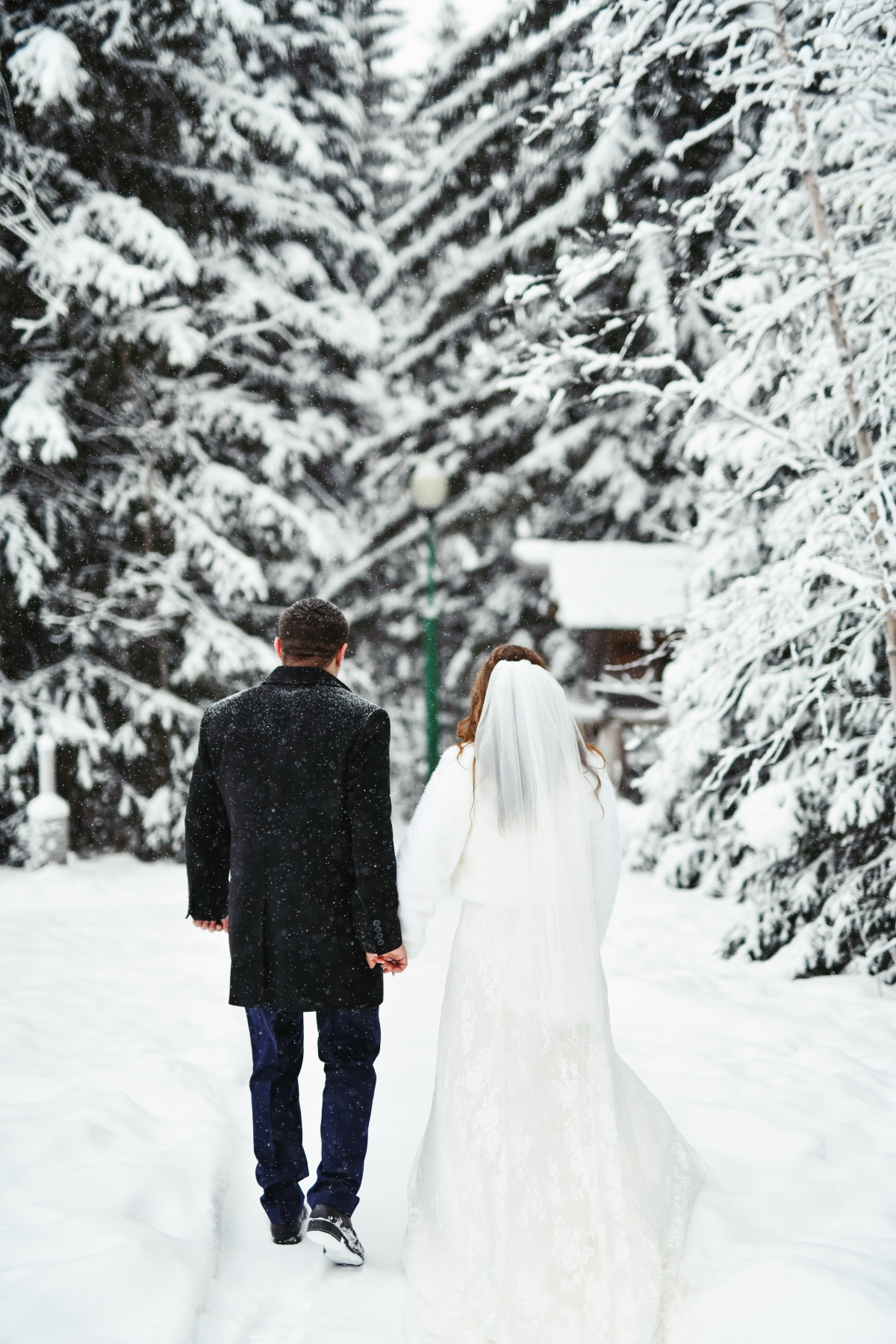
Here, you can lean into that classic winter wonderland vibe since the snow provides a bright, clean canvas. Deep jewel tones like emerald, sapphire, and ruby are stunning against a white backdrop. For florals and greenery, ask for pine boughs, cedar, and juniper with its little blue berries. And a word to the wise: avoid a pure, stark white wedding dress if you’re taking photos in the snow. An ivory, cream, or champagne gown will create a subtle, beautiful contrast and keep you from disappearing into the background.
For Moody, Overcast Climates (Hello, Pacific Northwest!)
The light here is often soft and grey, and the landscape is all about deep greens and dark, damp earth. Don’t fight it—embrace the mood. Palettes of forest green, moss, charcoal, and even black are incredible. Bring in warmth with accents of copper, rust, or deep persimmon. For flowers, this is where you can get really creative. Ask your florist for anemones with dramatic dark centers, dusty and complex hellebores, dark privet berries, and trailing smilax greenery. Lots and lots of candlelight is non-negotiable here; it creates a cozy shelter from the chill outside.
For Warm Winter Climates (Looking at you, Florida & SoCal)
Here, you’re evoking the season of winter, not the weather. Your palette has to do all the heavy lifting. This is a great opportunity for a timeless, formal black-tie theme: black, white, and gold is always a showstopper. You can also use colors that feel seasonal but not necessarily cold, like deep plum, dusty slate blue, or the grey-green of eucalyptus. Fabric choice is key—heavy, luxurious materials like velvet, satin, or brocade will instantly signal “winter” and richness, even if it’s 70 degrees outside. For foliage, think magnolia leaves (with their velvety brown undersides), olive branches, and rosemary.
Heads Up! Two Common Mistakes I See All the Time
Okay, lean in. If you only remember two things, make it these.
Mistake
1: Ignoring the Venue’s Built-In Features.
Mistake #2: The Bridesmaid Dress Photo Fiasco. You pick a gorgeous ‘deep burgundy,’ but in the photos, the dresses look like a flat, muddy brown. Here’s the fix: Give your photographer a physical fabric swatch of the dress material on the wedding day. This isn’t being a diva; it’s being smart. They can use that swatch as a reference point to color-correct your photos accurately, ensuring the color you paid for is the color you see in your album.
The Final, Crucial Step
Once you’ve locked in your palette, do this one last thing. Create a simple, one-page PDF. Put your 3-4 main color swatches on it, along with 2-3 photos that capture the textures you want. Title it “[Your Names] Wedding Vision” and send it to ALL of your vendors—the baker, the florist, the stationer, the rental company. This simple document is the key to ensuring everyone is on the same page and working toward the same cohesive, beautiful vision. It’s the ultimate pro move.
Inspirational Gallery
Velvet Linens: They absorb light, creating deep, saturated colors that feel incredibly warm and luxe. A dark emerald or ruby velvet runner will look rich and plush even in low light.
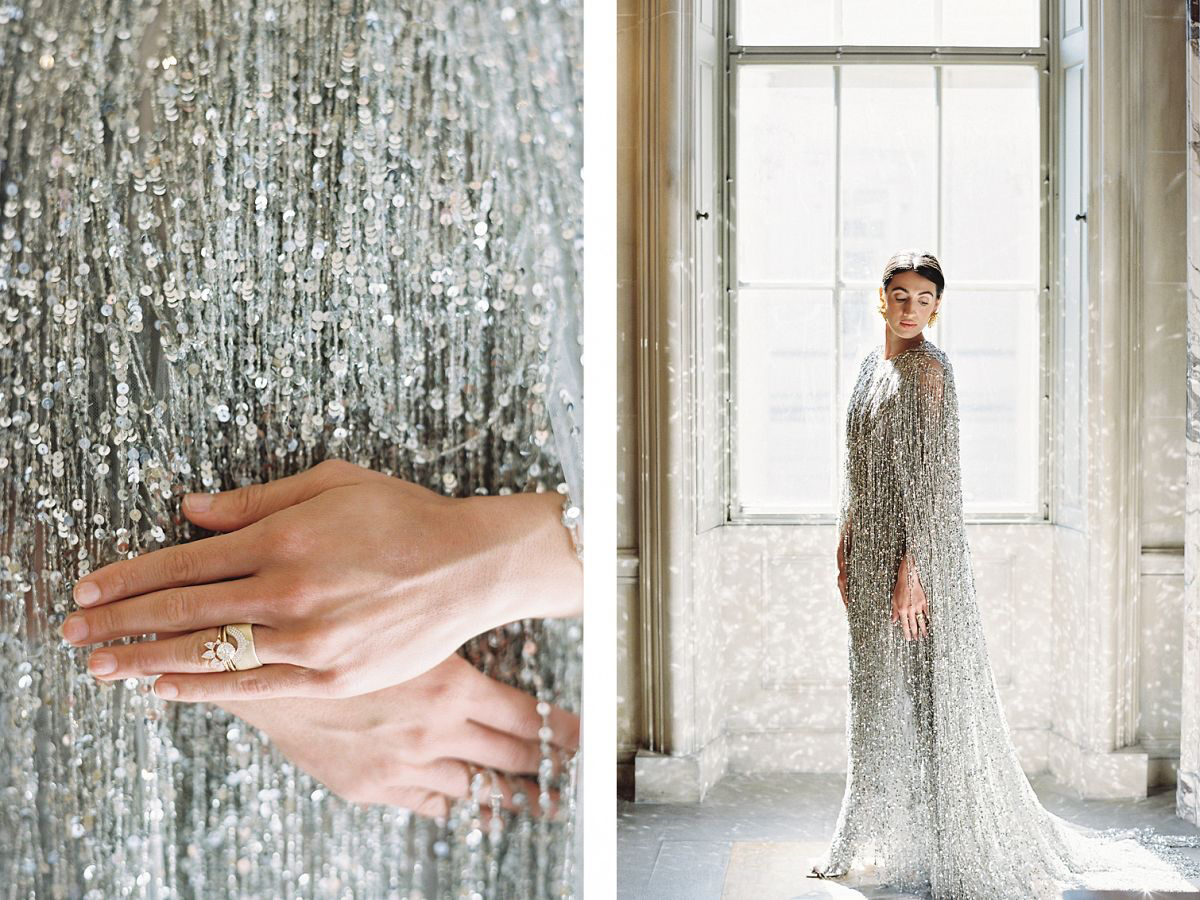
Satin Linens: They reflect light, offering a high-sheen, glamorous effect. Best for palettes with silver, gold, or champagne, as they need light to truly sparkle and can look dull without it.
The choice hinges on your desired mood: intimate and plush, or sleek and celebratory.
For a masterclass in moody palettes, look to the Dutch Masters. Artists like Rembrandt were experts at capturing glowing subjects against dark, rich backgrounds.
This translates beautifully to a winter wedding. Think of a tablescape with deep burgundy and navy, accented by the soft glow of gold cutlery and amber-hued glassware. The key is using candlelight and focused spotlights to pick out these lustrous details from the shadows, creating pockets of warmth and intimacy.
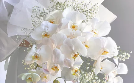
The secret to a stunning all-white wedding: It’s not about finding one perfect shade of white; it’s about layering textures. Imagine a creamy cashmere wrap over a silk gown, tables set with raw-edged linen napkins, and arrangements of fluffy baby’s breath and white hellebores. The interplay of light on these different surfaces creates depth and warmth, preventing the monochromatic look from feeling sterile.
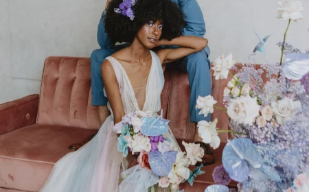
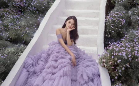
Can you use soft pastels in winter without them looking frosty?
Absolutely. The key is to ground them with an anchor color. A dusty blue looks ethereal rather than icy when paired with a deep charcoal grey in the stationery font or groomsmen’s suits. A pale blush shines when accented with rich burgundy velvet ribbons from a supplier like May Arts or deep red ranunculus blooms. These darker tones add sophistication and prevent the pastels from disappearing in the cool winter light.
Don’t underestimate the power of your paper suite in setting the color story. For a truly tactile winter experience, consider handmade cotton paper with deckled edges from an artisan on Etsy. Its substantial feel adds a layer of luxury. Paired with a custom-colored wax seal from a specialist like Artisaire, it transforms a simple invitation into a multi-sensory preview of the event’s atmosphere.
- It creates an instant sense of warmth and intimacy.
- It enhances the richness of your floral and linen colors.
- It casts a flattering, romantic glow on every single guest.
The most impactful design element for a winter wedding? A well-planned candlelight strategy. Go beyond a few votives; think elegant tapers in varying heights, pillar candles grouped at the base of arrangements, and floating candles in glass cylinders.
According to Pantone, the color authority, a touch of black adds a ‘dramatic and sophisticated’ feel. For weddings, it’s a timeless anchor.
A sliver of black can elevate any winter palette. Think matte black cutlery against a crisp white plate, elegant black taper candles, or a simple black silk ribbon tied around menus. It provides a point of contrast that makes every other color, from deep jewel tones to soft neutrals, feel more intentional and vibrant.
When budget is a concern, let seasonal greenery do the heavy lifting. It’s not just filler; it’s a color story in itself, full of texture and life.
- Silver Dollar Eucalyptus: Offers a muted, silvery-green that feels perfectly frosted for winter.
- Cedar or Pine Boughs: Provide a deep, forest green and an unmistakable winter scent.
- Italian Ruscus: Adds a pop of vibrant, classic green for elegant, trailing arrangements on tables or signage.
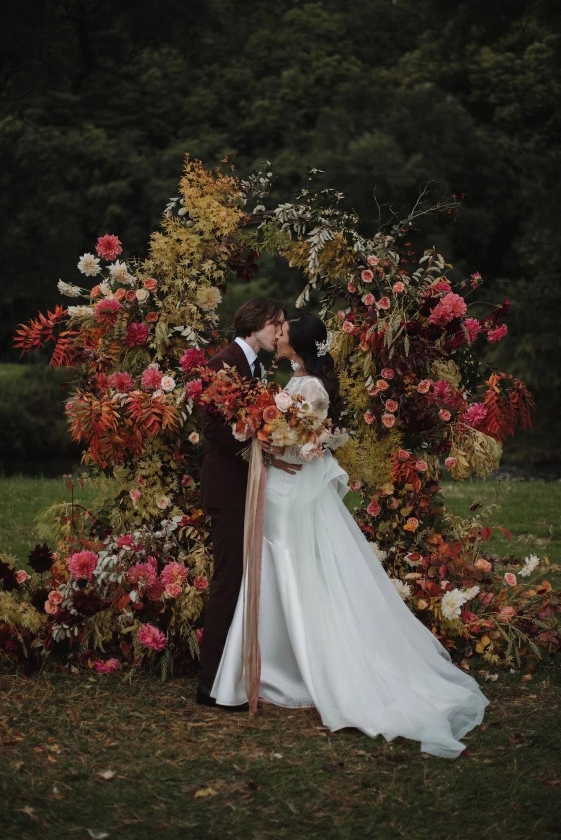
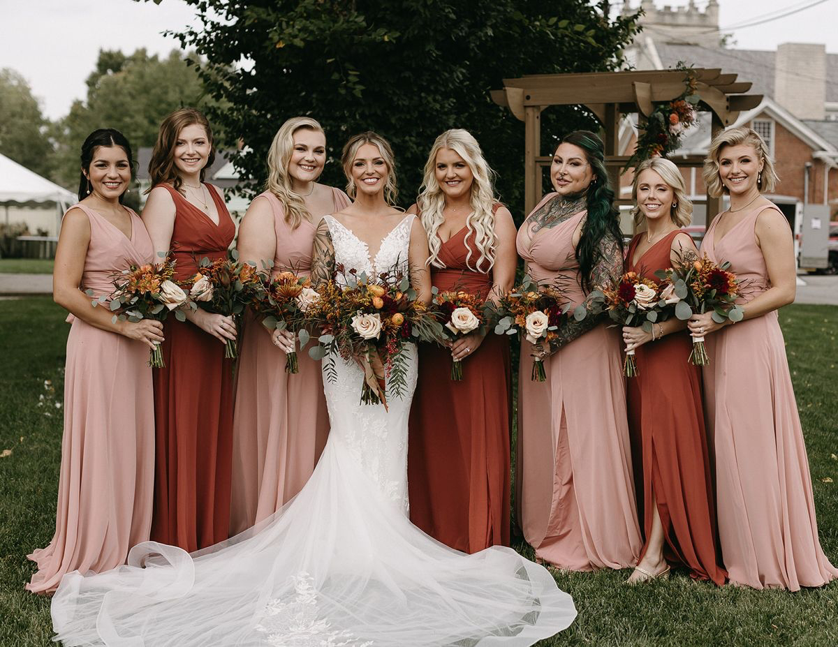
One emerging trend for winter is using warm, earthy tones. Think terracotta, rust, and deep ochre, often seen in dried floral arrangements.