Your Guide to Nailing Autumn Colors (Without Just Wearing Black and Gray)
I’ve been a personal stylist and textile consultant for years, and every single autumn, it’s the same story. A client opens their closet, and it’s just a sea of black, gray, and maybe one tired-looking beige sweater. There’s this feeling that fall means giving up the fun of color. But honestly, the exact opposite is true. Autumn isn’t about restriction; it’s about richness.
In this article
- So, Why Do Autumn Colors Just Work?
- First Things First: Find Your Undertone
- The Foundation: Your Essential Autumn Neutrals
- Time for the Fun Part: Adding Accent Colors
- Pro-Level Color Combos
- What About Patterns?
- Don’t Ruin Your Investment: A Word on Care
- Okay, Where Do I Even Start? Your First 5 Autumn Buys
- Inspiration:
And I didn’t learn this from magazines. I learned it from handling thousands of garments and spending time with textile experts to see how different dyes and fabrics work together. So this guide isn’t about chasing fleeting trends. It’s about sharing the core principles I use to build a lasting, beautiful autumn wardrobe that you’ll actually love to wear.
So, Why Do Autumn Colors Just Work?
Before we pick a single color, let’s get into the ‘why’. Why do certain colors feel so perfect in the fall? It really boils down to two simple things: the light and our own psychology.
In the autumn, the sun sits lower in the sky, casting this warm, golden light that’s completely different from the bright, almost blue light of summer. This golden glow makes warm, saturated colors look richer and more alive. It’s the same reason a field of pumpkins looks so ridiculously perfect at sunset. Those colors are literally made for that light.
But here’s something most people miss: color isn’t just a visual thing. It’s completely tied to the fabric it’s on. A deep rust color, for example, looks wildly different depending on the material. Put it on a chunky wool sweater, and the texture will absorb light, making the color feel soft, deep, and incredibly cozy. But use that same rust dye on a silk blouse? The silk will reflect light, making it appear brighter, with a beautiful shine and movement. Understanding this is the secret to creating outfits that have depth and interest, even if you’re only using a few colors.
First Things First: Find Your Undertone
The number one rule of color is that it has to work for you. The reason a color can look amazing on your friend but ‘off’ on you often comes down to your skin’s undertone. This is the permanent, underlying hue your skin casts. It’s not about how light or dark your skin is, but the color underneath.
Here’s a simple test I teach everyone. In natural daylight, look at the veins on the inside of your wrist. If they look mostly blue or purple, you likely have a cool undertone. If they seem more green or olive, you probably have a warm undertone. And if you genuinely can’t tell, or you see a mix, you might be neutral (lucky you!).
By the way, if the vein test leaves you stumped, try the jewelry trick. Which looks better against your skin, silver or gold? People who pop in silver often have cool undertones, while those who glow in gold usually have warm undertones.
- Cool undertones are flattered by colors with a blue base, like rich jewel tones, deep blues, and true reds.
- Warm undertones absolutely shine in colors with a yellow or golden base, like olive green, burnt orange, and creamy whites.
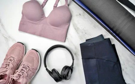
The Foundation: Your Essential Autumn Neutrals
Every great wardrobe is built on a solid foundation of neutrals. These are the workhorse colors that tie everything else together. For fall, we can do so much better than basic black. Investing in a few high-quality neutrals is probably the smartest financial choice you can make for your closet.
Think about cost-per-wear. A well-made camel coat you wear 100 times is a way better value than a cheap, trendy top you wear twice. For a classic wool camel coat, you can expect to pay anywhere from $150 for a great version from a store like J.Crew or Banana Republic, up to $500+ for a designer piece. But if that’s too steep, a camel-colored shacket or a chunky cardigan can give you the same vibe for under $100.
Let’s break down the best neutral families for fall:
The Browns: Brown is the quintessential autumn neutral, but it’s a huge category. Chocolate Brown is a deep, rich choice that’s a fantastic, softer alternative to black, especially for those with cool undertones. Then you have the warmer, yellow-based browns like Cognac and Camel. These look incredibly luxe in materials like leather, suede, and cashmere. A pair of cognac leather boots or a simple belt can instantly warm up an entire outfit. And don’t forget Taupe—a sophisticated mix of brown and gray that’s perfect for trousers or a classic trench coat.
The Grays: Gray feels modern and clean. Charcoal Gray is a deep, serious shade, and a pair of charcoal wool trousers is one of the most versatile items you can own. Heather Gray, often found in sweatshirts and knitwear, is softer and more relaxed because the mixed fibers give it more texture and depth.
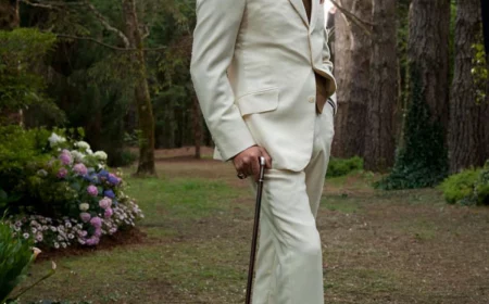
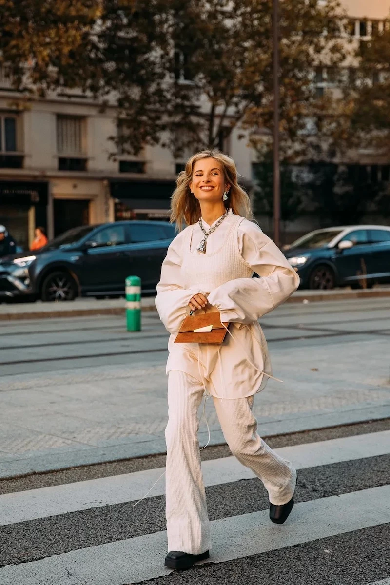
The Off-Whites: Pure, stark white can look a little harsh in the soft autumn light. I always steer people towards warmer, softer off-whites instead. Think Ivory and Cream for blouses and sweaters—they provide a beautiful contrast against deeper colors like burgundy or forest green. A pair of winter white corduroys or a wool skirt can also be a stunning, unexpected choice for a fall look.
Time for the Fun Part: Adding Accent Colors
Once your neutral base is solid, you can start bringing in the personality. I usually suggest picking two or three accent color families per season to make sure everything can be mixed and matched easily. Here are some timeless choices.
For Warm Undertones, try these families:
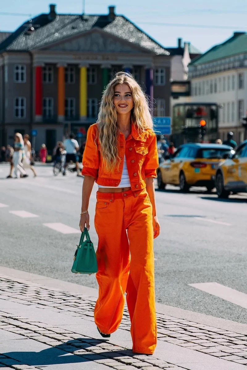
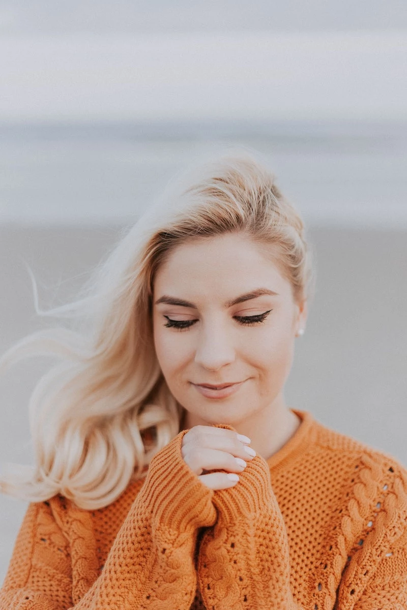
- Earthy Reds & Oranges: We’re talking about Terracotta, Rust, and Burnt Orange. These are like fired clay or autumn leaves and look incredible in textured fabrics like corduroy and tweed. They bring a grounded, fiery energy.
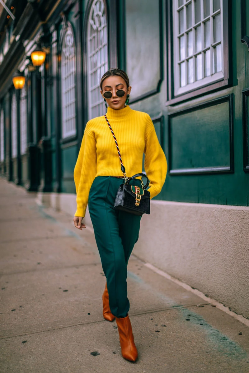
- Earthy Greens & Yellows: Olive Green is my top recommendation—it’s a yellow-based green that acts almost like a neutral and flatters nearly everyone. An olive utility jacket is a modern must-have. And for a pop of sunshine, look to Mustard and Ochre. They are muted, earthy yellows that are much easier to wear than bright primary yellow, especially in accessories.
For Cool Undertones, you’ll love these:
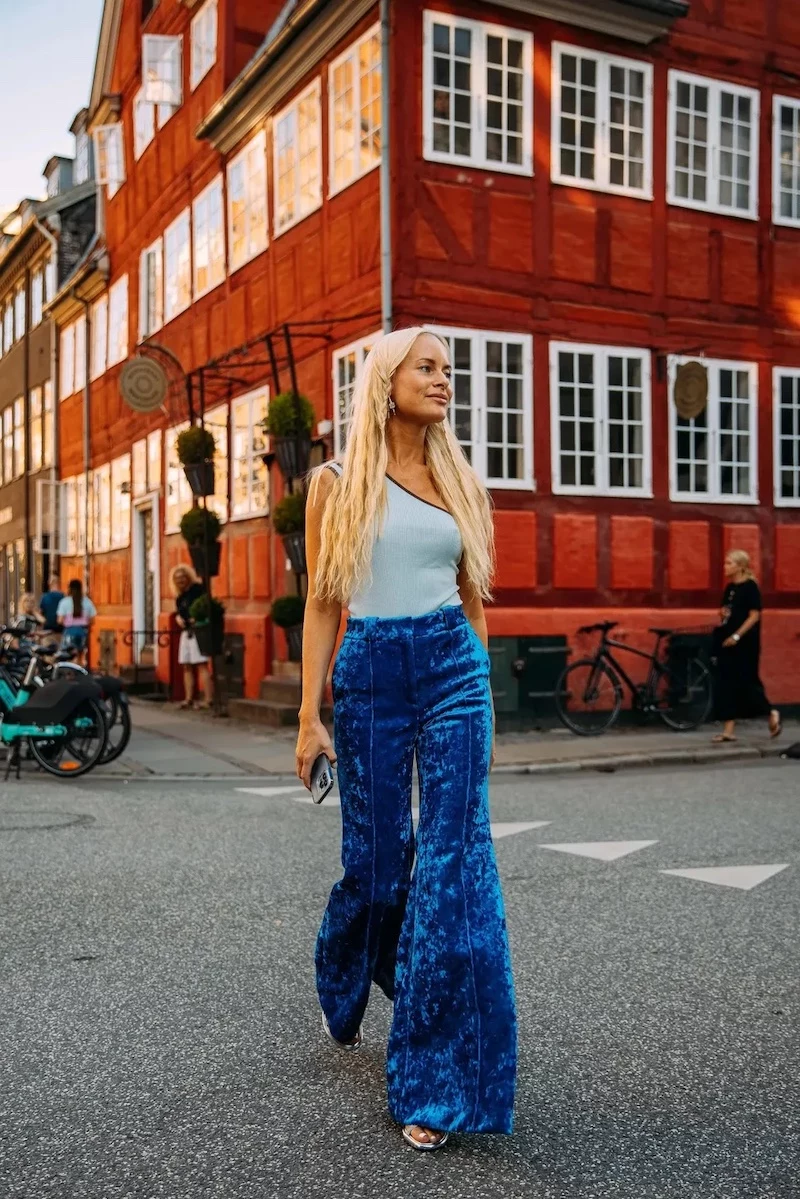
- Deep Reds & Purples: Think Burgundy and Wine. These blue-based reds feel luxurious and sophisticated. They work beautifully in smoother fabrics like silk, velvet, or merino wool, and they pair perfectly with charcoal gray and navy.
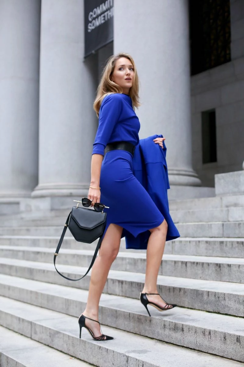
- Deep Greens & Blues: Forest Green is a strong, stable color that reminds you of pine trees. It looks best in substantial fabrics like heavy wool. And don’t forget the blues! Navy is a softer, more sophisticated alternative to black, while a pop of vibrant Cobalt Blue in a sweater or scarf can make a huge statement. Teal, a mix of blue and green, is another fantastic choice that bridges the gap.
Quick tip: Want to see how it works? Try this exact outfit recipe. Take a chunky rust-colored turtleneck sweater, pair it with some slim-fit chocolate brown corduroys, and finish with a pair of cognac leather ankle boots. See? The textures and rich, related colors do all the work for you.
Pro-Level Color Combos
Ready to go beyond the basics? Wearing one color from head to toe—monochromatic dressing—can be incredibly chic, but the secret is texture. If you don’t vary the materials, it can look flat. Imagine an all-charcoal-gray outfit: fine-wool trousers, a silk-blend blouse, a chunky-knit cardigan, and a leather belt. It’s all gray, but the play of light on the different surfaces makes it look intentional and so sophisticated.
Another great tool is the 60-30-10 Rule, which I borrowed from interior design. It’s a simple formula for a balanced outfit. 60% is your main color (like a navy coat and pants), 30% is a secondary color (like an ivory sweater), and 10% is your pop of accent color (like a mustard scarf). Go ahead, try it! Pull some pieces from your closet right now and see how it feels. It’s a foolproof way to build a look.
What About Patterns?
Oh yeah, we can’t forget patterns! Autumn is the perfect season for classics like plaid, herringbone, and houndstooth. The easiest way to work them in is to let the pattern be your guide.
Think of your patterned piece—say, a plaid blazer—as your “10% accent” in the 60-30-10 rule, even though it takes up more space. Look at the colors within the plaid. Is there a thin line of cream? A fleck of forest green? Pull those colors out and use them for the rest of your outfit. A plaid blazer with a cream sweater and olive pants? Perfect. You’ve created a cohesive look where the pattern is the star, but everything else supports it beautifully.
Don’t Ruin Your Investment: A Word on Care
Okay, let’s be real. Buying beautiful, colored clothing is only the first step. You have to take care of it. I’ve seen too many people ruin expensive pieces with simple, avoidable mistakes.
Heat and friction are the enemies of color. Always wash your colored items in cold water, turned inside out, with a gentle detergent made for colors. For wool and cashmere, you absolutely must hand wash in cool water with a special wool soap (like Woolite or something from The Laundress), gently squeeze out the water (never wring it!), and lay it flat to dry on a towel. For suede and leather, don’t even try to DIY it—find a professional cleaner. A good suede protector spray, which you can find at any shoe repair shop or online, can help prevent disaster in the first place.
And if a tag says ‘Dry Clean Only,’ please believe it. The people who made the garment know what will ruin it. Find a good local dry cleaner and think of them as a doctor for your clothes.
Okay, Where Do I Even Start? Your First 5 Autumn Buys
Feeling overwhelmed? Don’t be. If you’re building from scratch, here’s a simple roadmap:
- A Quality Neutral Sweater: Choose a versatile color like cream, heather gray, or camel in a natural fiber like merino wool or cashmere if you can.
- Dark, Textured Trousers: Skip the basic black and go for chocolate brown cords, charcoal wool pants, or olive chinos.
- A Versatile Third Piece: This could be your camel shacket, a navy blazer, or an olive utility jacket. It’s the piece that pulls your look together.
- An Accent Accessory: This is the low-commitment way to play with color. Try a burgundy scarf, a mustard beanie, or a forest green bag. A decent one will run you $20-$60.
- A Great Leather Piece: A pair of cognac boots or a deep brown belt. It adds that essential warm, natural texture.
Building a thoughtful autumn wardrobe is a genuinely rewarding process. It’s your chance to connect with the season and express yourself with a palette that feels personal, practical, and a true joy to wear every day.
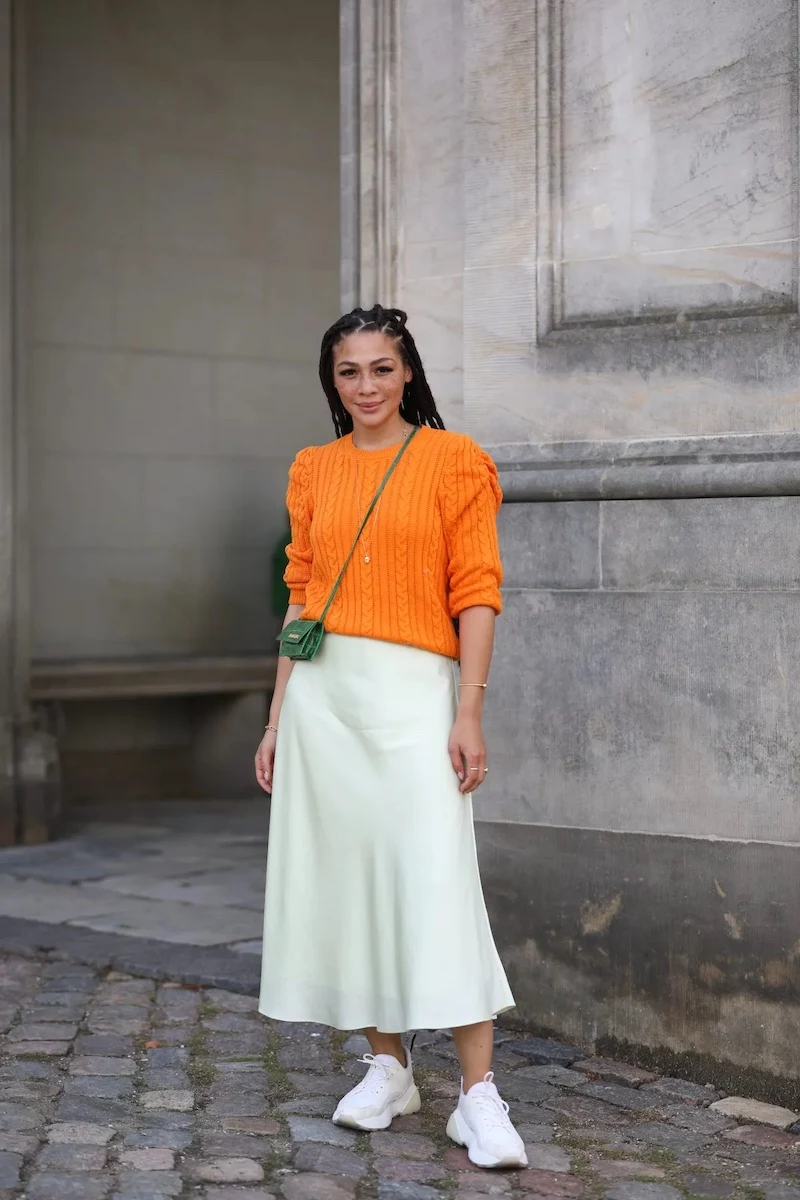
Inspiration:
Beyond the Obvious Pairings: While monochrome is chic, the real magic happens when you pair unexpected autumn colors. Instead of just brown and cream, try combining:
- Chocolate Brown & Powder Blue: This duo feels sophisticated and modern. A rich brown corduroy trouser with a pale blue cashmere knit is effortlessly elegant.
- Olive Green & Soft Lilac: The earthy, utilitarian feel of olive is beautifully lifted by the gentle, romantic touch of lilac. Think an olive jacket over a lavender silk blouse.
- Burnt Orange & Deep Teal: A classic for a reason. This high-contrast pairing is energetic and confident, perfect for a statement piece.
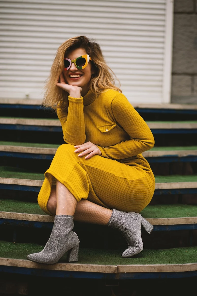
The color Marigold, a rich golden-yellow, was named Pantone’s Color of the Year for Spring/Summer 2021, but its warm, optimistic glow has secured its place as an autumn staple.
This isn’t your childhood yellow. Marigold has an earthy depth that keeps it from feeling summery. It captures the golden hour light perfectly and pairs stunningly with denim, cream, and even deep navy. It’s a dose of sunshine for cooler days.
How do I add color without overwhelming my neutral-heavy wardrobe?
The secret is in the ‘third piece’. Keep your base simple—say, black jeans and a grey t-shirt—and add a single, powerful splash of color with your outerwear or a key accessory. A vibrant rust-colored trench from a brand like COS or a rich bottle-green leather bag from Polène instantly elevates the entire look from safe to styled. It’s a low-commitment, high-impact strategy.
Texture is Your Secret Weapon: A single color can express two completely different moods depending on the material.
For Cozy Depth: Choose fabrics that absorb light. A chunky wool or alpaca sweater in a deep cranberry shade will feel soft, rich, and inviting. The texture mutes the color slightly, making it feel grounded.
For a Touch of Glamour: Opt for fabrics that reflect light. That same cranberry color in a satin or silk-blend fabric, like a slip skirt from Vince, becomes luminous and dynamic, catching the light as you move. Perfect for transitioning from day to night.
Don’t neglect your footwear! Swapping out your standard black boots is one of the easiest ways to inject autumnal richness into an outfit. A pair of boots in a deep burgundy, forest green, or even a warm cognac leather can act as a sophisticated anchor for your entire look, tying together other colorful elements or providing a solitary pop against a neutral canvas. Brands like Thursday Boot Company or Blundstone often feature these rich, earthy tones in their seasonal collections.