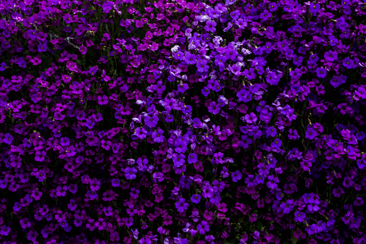
Tired of Muddy Purple? Here’s the Real Secret to Mixing It Right
I’ve been slinging paint for a long, long time, and I’ve taught countless workshops over the years. And you know what? Almost every single painter, from nervous beginners to seasoned pros, hits the exact same wall. They can mix a decent green, and their oranges are okay. But the second they try to mix purple, they get this sad, murky gray-brown, like weak coffee with too much milk.
In this article
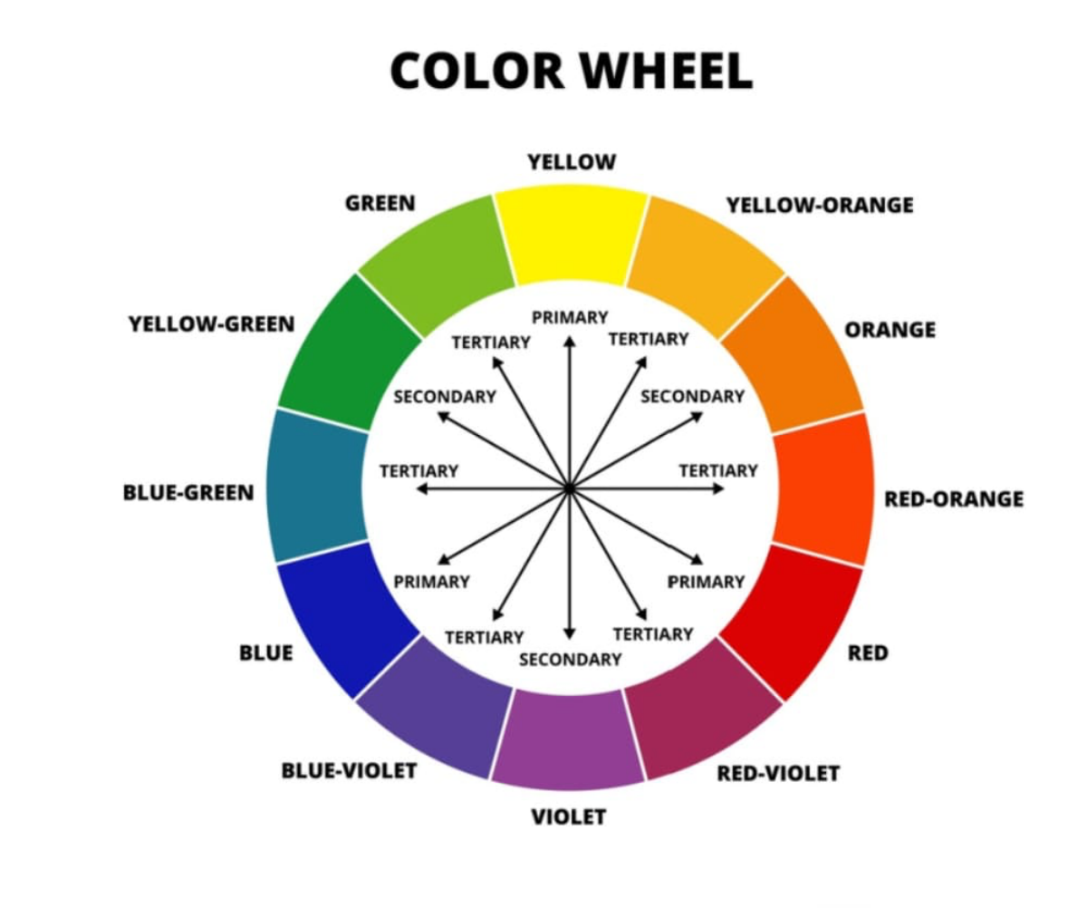
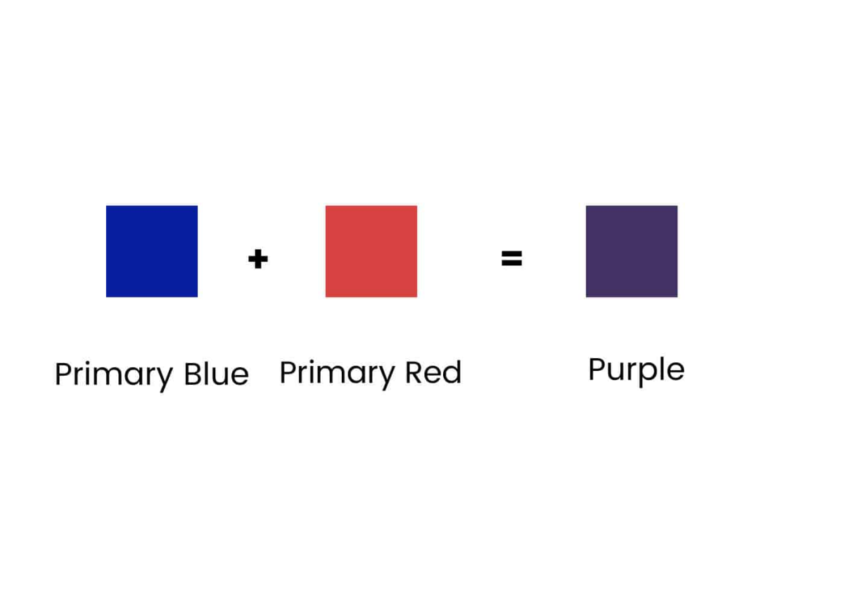
The frustration is real. You follow the one rule everyone learns in kindergarten—red + blue = purple—and it just doesn’t work. It’s easy to think you’re missing some secret talent, but I promise you, that’s not it. The truth is much simpler and, honestly, way more interesting. Mixing a clean, vibrant purple that almost buzzes with energy isn’t about a magic formula. It’s about really understanding the paint you’re using.
By the way, these principles are pretty universal. Whether you’re working with oils or acrylics, the pigments are often the same, so this advice applies across the board.
Why Your Red and Blue Are Making Mud
Let’s get into the weeds a little bit, because this is the foundation for everything. The color theory we learn as kids is a massive oversimplification. When light hits your canvas, the paint on the surface absorbs certain light waves and reflects others. What you see is whatever gets reflected back. Red paint looks red because it soaks up most of the blue and green light and bounces the red light back to your eyes.
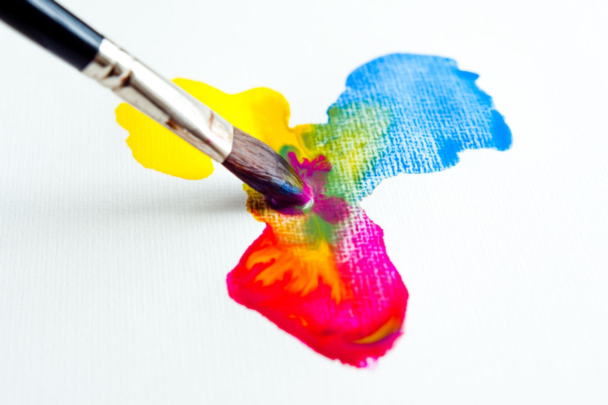
This is called subtractive mixing, and every pigment you add to a pile of paint subtracts more light. So when you mix red and blue, you’re creating a new color that absorbs some red light (thanks to the blue paint) and some blue light (thanks to the red paint). What’s left over should be purple. The problem? No pigment is perfectly pure.
Every red and every blue you can buy has a hidden bias; it leans a little towards another color. A “warm” red, like a Cadmium Red, has a little bit of yellow in it. A greenish-blue, like Cerulean Blue, also has a bit of hidden yellow. So when you mix those two, you aren’t just mixing red and blue. You’re mixing red, blue, and their secret ingredient: yellow. And what’s the one color that kills purple? Its direct opposite on the color wheel—yellow. You’ve accidentally added the one color guaranteed to neutralize your mix into a dull, lifeless mess.
The Most Important Tool You’re Not Using
Before we even talk about which paints to buy, let’s talk about how you mix. I see this all the time: painters mixing color with their brush. It feels fast and efficient, but it’s a recipe for contaminated color. The bristles of a brush are like a sponge; they never let go of all the old paint. A tiny bit of yellow from a mix you made ten minutes ago can hide out in the metal part (the ferrule), just waiting to leak out and dull your beautiful purple.
I can’t recommend this enough: use a palette knife. A simple, flexible metal knife will be one of the best investments you make, and you can get a good one for under $10 at any art supply store like Blick or Michaels, or even online. When you mix with a knife, you can scrape, fold, and blend the paint until it’s perfectly uniform. No bristles, no hidden contaminants. When you’re done, one good wipe with a paper towel or rag, and it’s perfectly clean for the next mix. This one change will do more for your color clarity than almost anything else. Plus, it saves your expensive brushes from getting mangled on the palette.
Your Shopping List for Vibrant Purples
The secret to those clean, electric purples is choosing reds and blues that are already friends. You want a red that leans towards blue (a cool red) and a blue that leans towards red (also a cool blue). This way, there’s no hidden yellow to sabotage your mix.
Here are the pigments I swear by. I’m including their standard Colour Index Names (like PB29), because that name tells you the actual pigment inside, no matter what fancy marketing name a brand puts on the tube.
For a Beginner’s Starter Kit: If you’re on a budget and can only buy two tubes to get started, make them Quinacridone Magenta (PR122) and Ultramarine Blue (PB29). A 37ml tube of student-grade paint for each will run you about $8-$15, and they’ll last you a while.
Here’s a more complete breakdown of great choices:
Cool Reds (Leaning Toward Purple)
- Quinacridone Magenta (PR122): This is my absolute favorite. It’s a brilliant, transparent, and intense red that’s already halfway to purple. It makes the cleanest, most vibrant purples imaginable. Because it’s transparent, it’s also incredible for glazing. A professional tube can cost between $15 and $25, but it’s worth every penny.
- Alizarin Crimson Permanent (PR177, etc.): The original version of this color was known for fading over time, but modern
Galerie d’inspiration
Ready to banish mud for good? When you’re at the art store, ignore the generic names and look for these specific pigments on your paint tubes. They have a clear color bias that works for you, not against you.
- Quinacridone Magenta: This is a perfect cool red. It has virtually no hidden yellow, making it the ideal base for clean, brilliant purples and violets.
- Phthalo Blue (Green Shade): A transparent and intensely powerful cool blue. It mixes with Magenta to create electric, high-chroma purples.
- Ultramarine Blue: A classic warm blue that leans slightly towards red, perfect for creating deeper, more traditional purples.

For centuries, the formula for Tyrian purple was one of the ancient world’s most closely guarded secrets, its value exceeding that of gold.
It required crushing thousands of Murex sea snails to produce a single gram of dye, reserving the color exclusively for emperors and royalty. Today, you can capture that same sense of luxury with a single tube of Dioxazine Purple or by mixing your own, connecting a modern canvas to an ancient legacy of power and prestige.
What about the purples I don’t want? The dull ones?
Don’t think of them as ‘mud,’ think of them as ‘chromatic neutrals.’ A dull, grayish purple is a painter’s secret weapon for creating sophisticated shadows. While black can deaden a color, a neutral purple will darken a yellow to a beautiful olive, or create a far more natural shadow on a red apple than a flat gray ever could. The ‘mistake’ is actually a key to realism.
Ultramarine Blue: A semi-transparent pigment that leans towards red. It creates gorgeous, deep, and warm purples. Think of the rich color in a twilight sky. It’s a classic for a reason and a staple on most palettes.
Phthalo Blue: A modern, transparent, and incredibly high-tinting pigment that leans towards green. It creates sharp, vibrant, almost electric purples. Be careful—a tiny speck of a brand like Golden or Winsor & Newton’s Phthalo can easily overpower your red.
For maximum versatility, having both on your palette is a true game-changer.
- Vibrant, un-muddied color transitions.
- A lively, energetic feel in your brushstrokes.
The secret? Stop over-mixing. When you blend your red and blue, don’t stir them into a perfectly uniform, flat color on the palette. Allow them to mingle imperfectly on the brush, so when you apply the stroke, tiny streaks of the original red and blue create a more dynamic, visually interesting purple on the canvas itself.
A word on white: Adding Titanium White to your purple will cool it down and shift it towards lavender, but it can also make it look chalky. To create a warmer, more subtle tint, try adding a touch of Zinc White or a Naples Yellow instead. This will lighten your purple while maintaining its warmth and vibrancy.