Think Coloring is Just for Kids? Here’s How to Get Started Like a Pro.
For years, my world has been a mix of paper, wax, and watercolors. I’ve spent my days as both a professional illustrator and an art teacher, guiding everyone from kids discovering their first crayon to adults looking for a way to unwind and get creative. And through it all, I’ve learned one crucial thing: coloring is so much more than just a way to pass the time. It’s a real craft, blending skill, the right tools, and even a little bit of science.
In this article
It’s easy to dismiss coloring as child’s play, but honestly, the techniques the pros use are just advanced versions of the basics. When I’m working on a detailed botanical drawing, I’m using the same core skills I teach in my beginner workshops. The mission is always the same: to take a flat, black-and-white drawing and breathe life into it with color, light, and texture. This all comes down to knowing your tools and how they play with the paper. I want to share some of that hard-won knowledge with you.
So, Why Does Coloring Feel So Good?
Before we even think about picking up a pencil, it helps to understand what’s going on—both in our heads and on the page. Knowing the “why” makes the whole process more rewarding and, frankly, makes your art better.
The Magic of Color and Mood
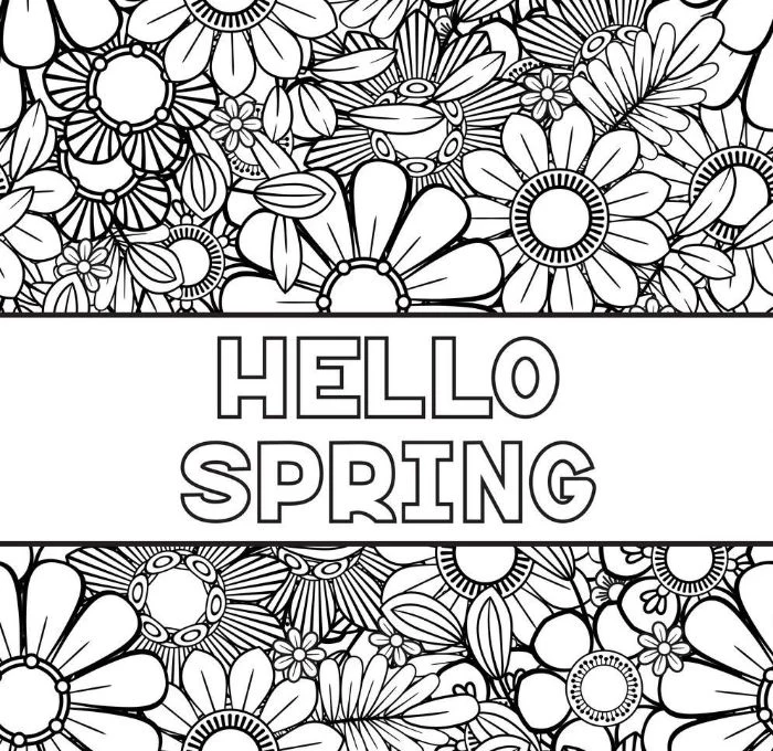
Ever notice how certain colors just make you feel something? That’s not an accident; it’s a whole field of study. The soft pastels and lively greens you see everywhere in spring tap into feelings of new growth, calm, and energy. A pale, buttery yellow can feel optimistic, while a vibrant new-leaf green just screams life and renewal. When you choose your palette, you’re not just picking colors; you’re setting an emotional tone.
Professionals take this a step further with something called color harmony, often using a color wheel as a guide. Colors opposite each other, called complementary colors, create a powerful visual pop. Think of a bright red flower against its green leaves—bam! On the other hand, colors that sit next to each other, known as analogous colors, create a much more serene and unified feeling, like a patch of purple and blue flowers. Understanding this helps you make deliberate choices instead of just grabbing random pencils.
Finding Your Focus (and Chilling Out)
Coloring isn’t just creative; it’s a powerful mental exercise. When you concentrate on a small task, like blending two shades or carefully staying inside the lines, you’re firing up the planning and focus centers of your brain. This intense focus can actually help quiet down the part of your brain that manages stress and fear. You might have heard this called a “flow state,” where you get so absorbed that time just melts away. It’s basically active meditation. I’ve seen it time and time again in my workshops—people walk in looking stressed and leave looking noticeably calmer. The repetitive, focused motion is just incredibly soothing.
Let’s Talk Tools: What You Actually Need
The tools you choose will have the biggest impact on your final piece. I’ve tried more products than I can count, and trust me, the most expensive isn’t always the best. What matters is knowing what to look for.
Your First $50 Starter Kit
Okay, before we get into the weeds, you might be thinking, “This sounds great, but what do I actually buy?” It’s a great question. You can get a fantastic starter kit for around $50 that will set you up for success. Here’s my go-to shopping list for beginners:
- A big set of budget-friendly alcohol markers: These are a game-changer. You can find massive sets with 70+ colors online for about $25-$30. They give you that smooth, professional look without the high-end price tag.
- A decent paper pad: Don’t use printer paper! Head to a craft store like Michael’s or Hobby Lobby and grab a pad of heavy cardstock or Bristol paper. It’ll cost you about $10-$15 and will stop your markers from bleeding through.
- A white gel pen: This is a secret weapon for adding those tiny, bright highlights that make your work pop. You can get a good one for about $3.
- A small set of fine-liner pens: Perfect for adding outlines or details back in. A basic set with different tip sizes will run you about $12.
Paper is Everything
Seriously, paper is the foundation. Using the wrong kind can make even the best pencils feel cheap. Here’s what you need to know:
First is weight. Standard copy paper is thin and flimsy (around 20 lb). It tears easily, and markers will bleed right through. For colored pencils, you want something sturdier, at least 60-80 lb. For markers, a smooth cardstock or Bristol board (around 80-100 lb) is ideal. And if you ever dabble in watercolors, you need special watercolor paper that’s 140 lb or heavier to prevent the paper from buckling into a wrinkly mess.
Second is tooth, which is just a fancy word for the paper’s texture. A paper with more tooth feels a bit rough and grabs pigment from colored pencils, which is great for layering. A smooth paper is better for markers, as it lets the ink flow evenly. For general coloring, a medium-tooth sketch or Bristol paper is a fantastic, versatile choice.
Quick tip: Upgrading your paper is the single best thing a beginner can do. It instantly solves so many common frustrations.
A Closer Look at Your Coloring Arsenal
There are three main families of coloring tools, and each one has its own personality.
Colored Pencils: Wax vs. Oil
This is where most people start, but there’s a surprising amount of variety. The two main types are wax-based and oil-based.
Wax-based pencils are the most common. They have soft, creamy cores that lay down rich color with very little effort. They are an absolute dream for blending. The only real downside is something called “wax bloom,” a cloudy film that can sometimes appear over dark areas. It’s just the wax rising to the surface, and you can gently wipe it away with a soft cloth. You can find high-quality student sets for between $20 and $40.
Oil-based pencils have harder cores. This means they hold a sharp point for much longer, making them perfect for tiny details. They don’t create wax bloom and have a slightly harder, more refined feel on the paper. Blending with them often requires a bit more patience and layering, but the results are beautiful. They tend to be a bit pricier, but are well worth it if you get serious about your craft.
My Go-To Trick for Blending Pencils:
- Light Base Layer: Pick your lightest color and gently color the entire area. Don’t press hard! Think of it as a whisper of color.
- Add Your Shadows: Now, take your darker color and apply it only where you want the shadows to be, right on top of that light base.
- Burnish to Blend: This is the magic step. Go back over the entire area with a white or very light cream-colored pencil, but this time, press hard. This smooshes the pigment into the paper’s tooth and blends the colors into a seamless, almost paint-like finish.
Markers: Alcohol vs. Water-Based
Markers give you bold, vibrant, and even color—perfect for a clean, graphic style.
Alcohol-based markers are the industry standard for a reason. The ink dries fast and blends beautifully without leaving streaks. They will bleed through almost any paper, so always slip a spare sheet behind your work. The pro-level brands are refillable and can be quite an investment, sometimes running $5-$8 per marker. But here’s the secret: there are now amazing, budget-friendly sets online. For the price of a handful of pro markers, you can get a giant set of 100+ colors. This has completely changed the game for hobbyists.
Water-based markers are awesome for beginners and kids since they are typically odor-free and washable. However, they can streak more easily and can even start to tear up the paper’s surface if you color over the same spot too many times while it’s wet.
Watercolors: A Gentle Introduction
Watercolors can create gorgeous, transparent looks that are perfect for dreamy landscapes. If that sounds intimidating, watercolor pencils are the perfect gateway. You use them just like regular colored pencils, and then you go over your drawing with a wet paintbrush. The water activates the pigment and turns it into paint right on the page! The key, as always, is to use thick watercolor paper (140 lb) to prevent warping. A common mistake is using too much water; your brush should be damp, not dripping wet. It’s always better to build up color in light layers, letting each one dry in between.
Going Deeper: Advanced Techniques
Once you’re comfortable with your tools, you can start combining them to get some truly unique results.
Playing with Mixed Media
One of my favorite advanced tricks is combining watercolor and colored pencils. I’ll start with a light wash of watercolor to set the basic colors of a scene—say, a pale blue for the sky and a light green for a field. I let it dry COMPLETELY. This is non-negotiable. Then, I go in with my colored pencils to add all the details, shadows, and crisp edges. The pencil glides beautifully over the dried paint, creating incredible depth.
Protecting Your Masterpiece
After spending hours on a piece, you’ll want to protect it. A spray fixative is your best friend here. A “workable” fixative provides a light coating that prevents smudging and lets you add more layers on top. A “final” fixative gives a permanent, protective seal against smudges, moisture, and even UV light.
But a word of warning from personal experience: I once ruined a piece I loved by spraying final fixative too close—it created dark, ugly splotches! It was a hard lesson. Now, I always test the spray on a scrap piece of paper with the same colors first to see how it reacts.
A Quick, Important Note on Safety
Art supplies are tools, and some need to be handled with care. Please keep these things in mind:
- Ventilation is your friend: Alcohol markers, solvents, and especially spray fixatives release fumes. Always use them in a room with good airflow. Just crack a window or turn on a fan. It’s a simple step that prevents headaches.
- Look for non-toxic labels: When buying supplies, especially if you have kids or pets around, look for the “AP” or “Non-Toxic” seal. It just means the product has been certified safe for general use.
- Handle solvents carefully: If you get into advanced blending with odorless mineral spirits, use them sparingly. A little goes a long way. Keep the container sealed and store it away from heat.
And one last thing… while so many people find coloring incredibly therapeutic (myself included!), it’s not a replacement for professional mental health care. If you’re dealing with serious stress or anxiety, please reach out to a licensed professional.

At the end of the day, making art should be a joyful process. Understanding your tools removes the frustration and lets you focus on the simple, powerful act of creating something beautiful. Now go make something cool!
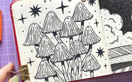
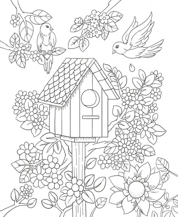
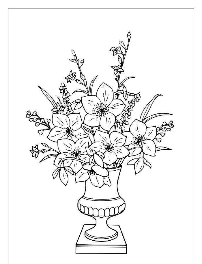
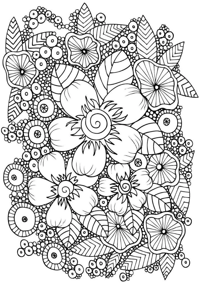
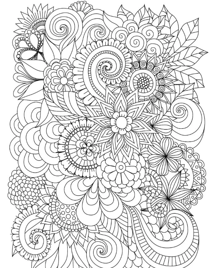
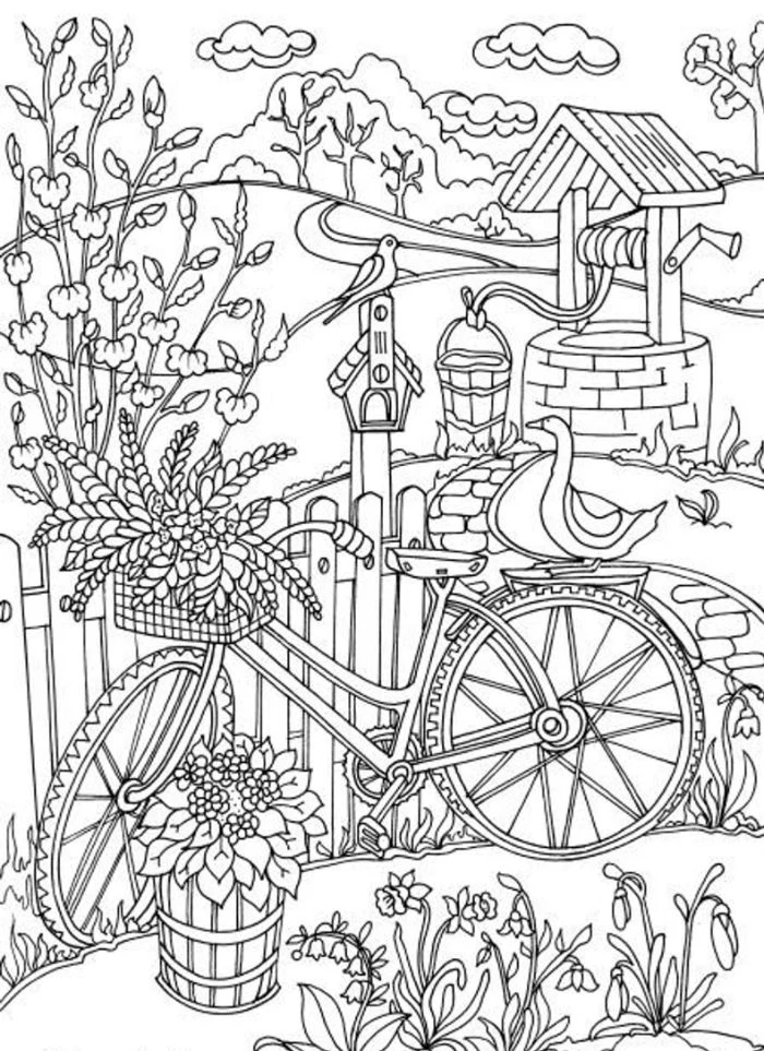
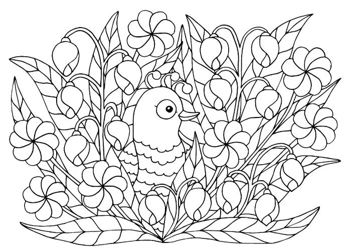
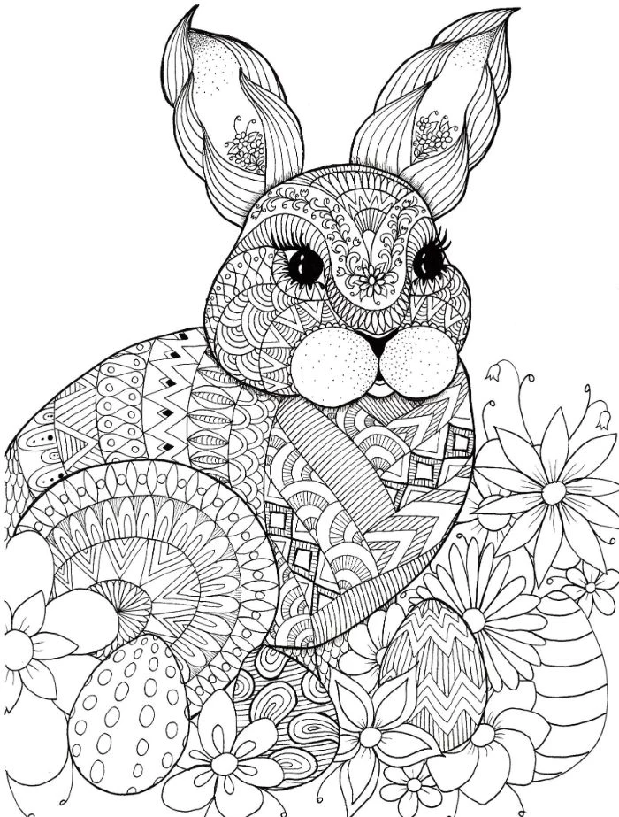
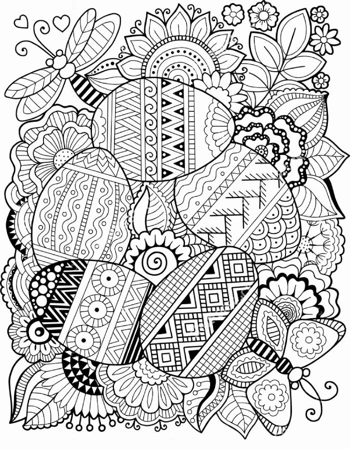
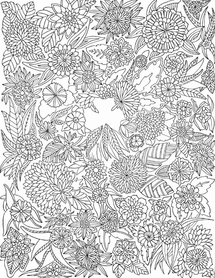
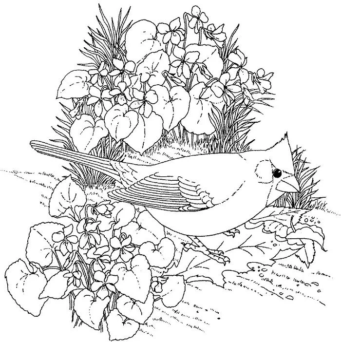
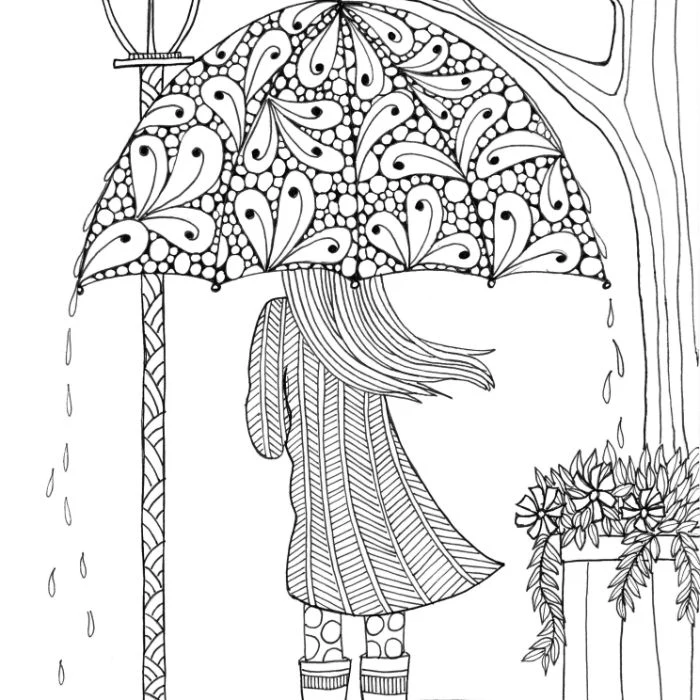
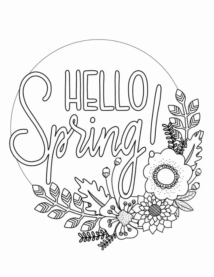
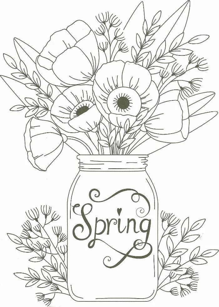
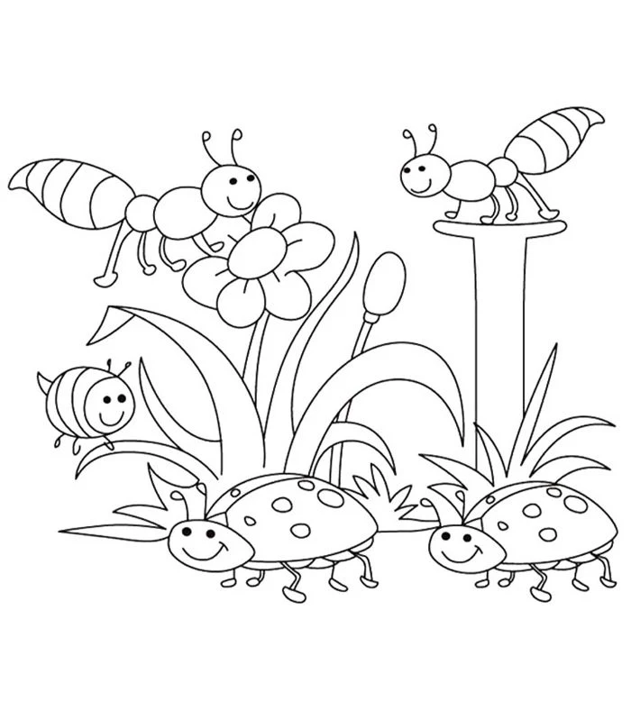
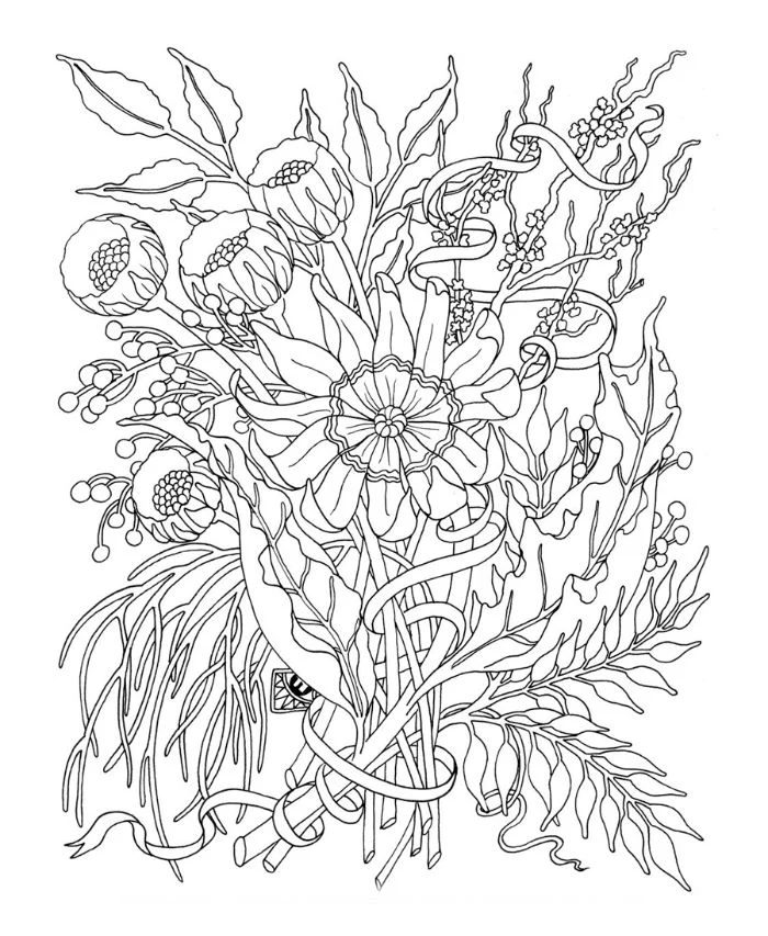
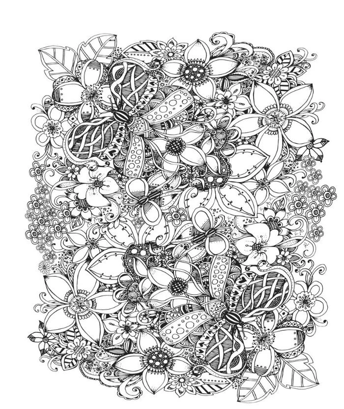
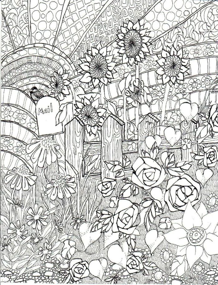
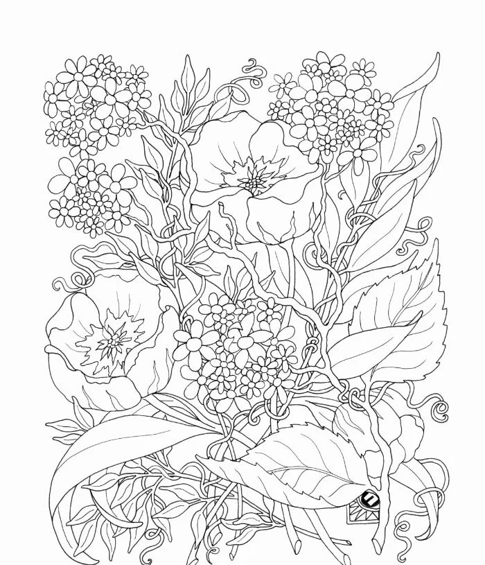
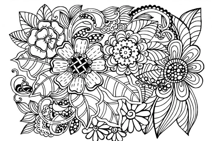
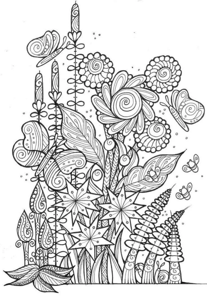
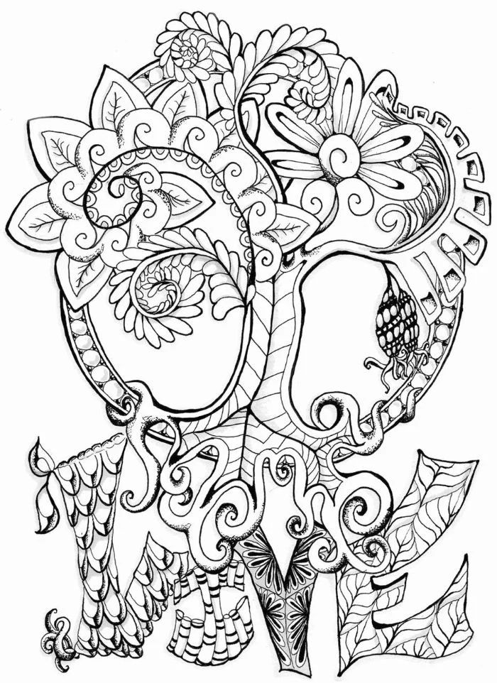
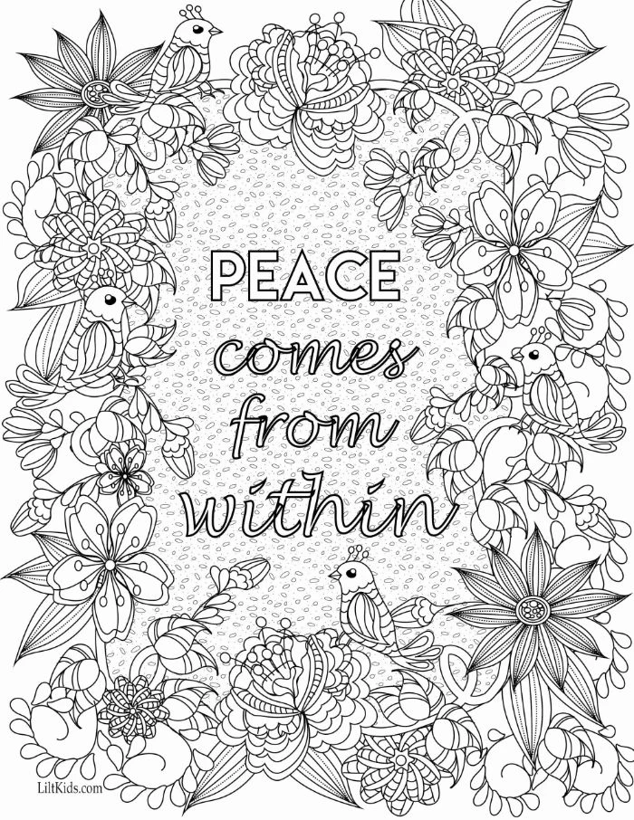
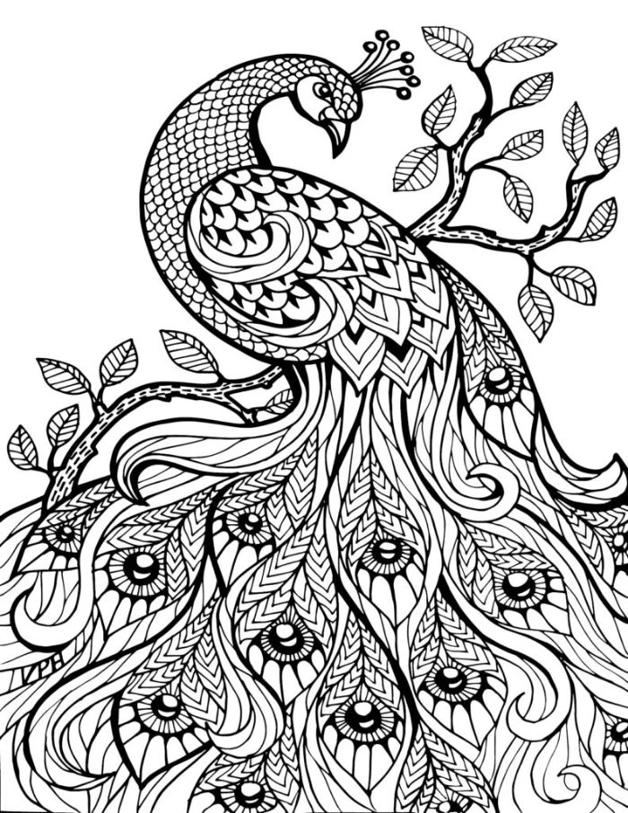
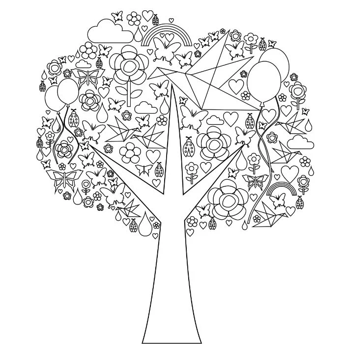
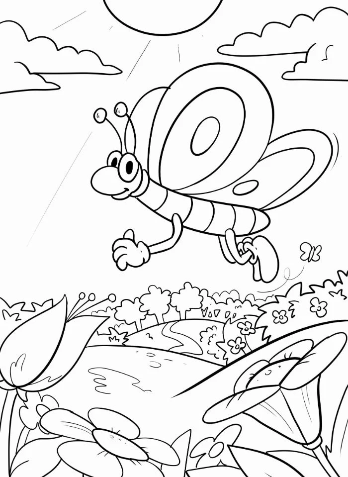
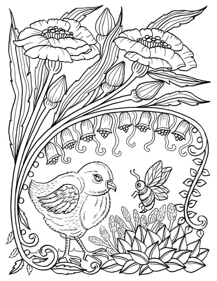
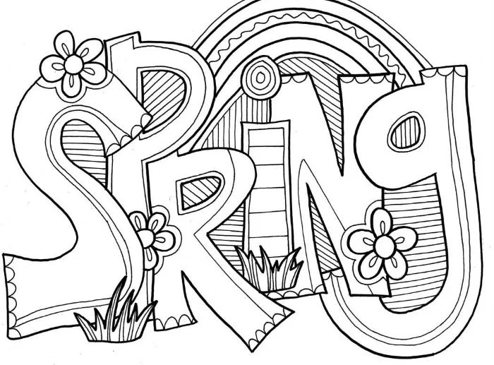
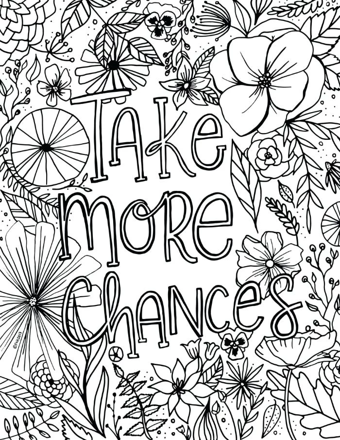
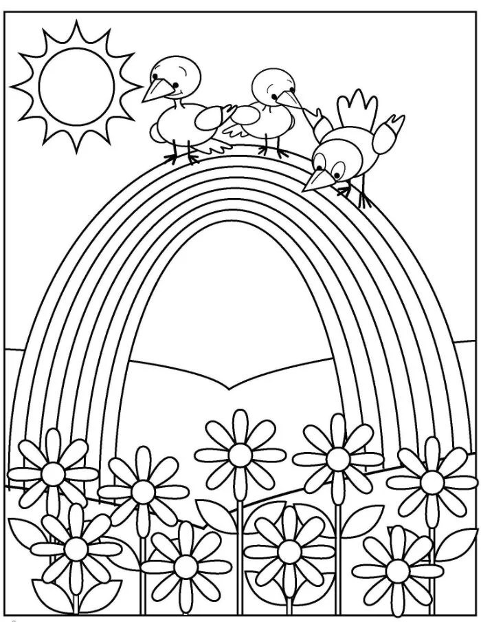
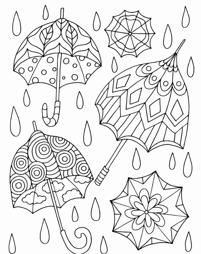
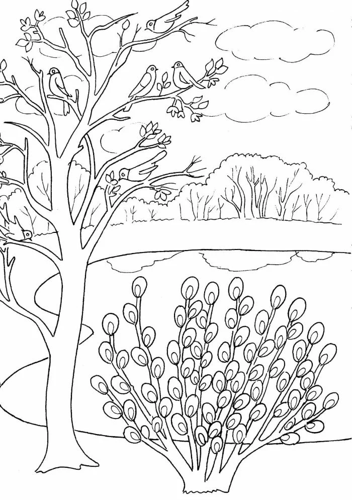
Inspirational Gallery
Wax-based Pencils (like Prismacolor Premier): Known for their soft, creamy core, they are fantastic for blending and layering, creating rich, buttery textures. They can, however, be prone to breakage and ‘wax bloom’—a light, waxy film that can appear over time.
Oil-based Pencils (like Faber-Castell Polychromos): These have a harder core, which holds a sharp point longer, making them ideal for fine details. They are less prone to breaking and produce no wax bloom, though blending can require more effort or a solvent.
For beginners, Prismacolors offer an easier blending experience, while Polychromos provide more control and durability.
- Start with your lightest color, applying a gentle, even layer across the entire area.
- Gradually introduce your mid-tone, overlapping with the first color and extending further into the shape.
- Finally, add your darkest shade in the shadow areas, pressing a bit harder to deepen the color and blend it into the mid-tone.
The secret? Circular or light back-and-forth strokes, never heavy lines, to avoid streaks and build color seamlessly.
A 2012 study found that creative activities like coloring can significantly reduce stress-related symptoms. Participants’ cortisol levels (the primary stress hormone) were lower after just 45 minutes of art making.
Don’t underestimate the power of a colorless blender pencil. This is essentially a wax or oil-based pencil without any pigment. When applied over layered colors, it burnishes the pigments together, smoothing out graininess and intensifying the colors for a polished, almost paint-like finish. Brands like Prismacolor and Caran d’Ache offer excellent options that can elevate your work from good to great.
My markers bleed through the paper! How can I stop it?
This is a common issue, especially with alcohol markers like Copics or Ohuhus. First, always use a thicker, smoother paper designed for markers—cardstock or Bristol board (like Strathmore 300 Series) works well. Second, always place a spare sheet of paper, called a ‘blotter sheet’, underneath your coloring page. This will absorb any excess ink and protect the surface below and any pages underneath.
Your best friend for details: a high-quality white gel pen. It’s not for erasing mistakes, but for adding them back in! After you’ve finished coloring, use a pen like the Sakura Gelly Roll 08 to add brilliant highlights to eyes, dewdrops on flower petals, or a glint on a metallic surface. It sits right on top of the colored pencil, creating a sharp, opaque pop of light.
The global market for coloring books for adults skyrocketed from 1 million units sold in 2014 to 12 million in 2015.
This explosion wasn’t just a fleeting trend; it signaled a collective desire for ‘analog’, screen-free activities that engage our creativity and provide a meditative escape. The craft continues to evolve with more sophisticated books, tools, and techniques, proving it has lasting appeal.
Before starting any piece, decide where your imaginary light source is coming from—the top left? The center? Every decision about color and shadow will flow from this. The surfaces facing the light should be your lightest, perhaps even left white. The surfaces facing away will be the darkest. This single choice will instantly give your 2D drawing a sense of volume and realism.
- It saves you from discovering a color isn’t what you expected midway through a project.
- It provides a quick reference for how colors blend and layer with each other.
- It helps you create harmonious palettes before you even touch your coloring page.
The trick is creating your own swatch chart for every set of pencils or markers you own. The color on the barrel is rarely the exact shade it produces on paper.
Tired of the same old floral patterns? Look to Art Nouveau for inspiration. Artists like Alphonse Mucha used flowing, organic lines and unique color palettes—think muted ochres, soft olives, pale lilacs, and rich burgundies. Try applying these sophisticated, turn-of-the-century color schemes to your botanical pages for a truly elegant and unexpected result.
Don’t neglect the background. A common beginner mistake is to meticulously color a subject and leave the background completely white. This can make the image feel unfinished and flat. You don’t need to render a full scene; even a simple, soft gradient of one or two colors, or a subtle halo effect around the subject, can make your central image pop and feel grounded in its space.
For incredibly smooth, painterly blends without expensive solvents, look no further than your bathroom cabinet. Use a cotton swab dipped in a tiny amount of baby oil or mineral spirits. Gently rub it over your layered colored pencil work. The oil will dissolve the pencil binders just enough to merge the colors beautifully. Be sure to test on a scrap piece of paper first, as it can make the paper translucent.
What exactly are ‘grayscale’ coloring pages?
Instead of just black lines, a grayscale coloring page has a full black-and-white image with all the shading already done for you. Your job is to apply color directly over the gray tones. The existing shadows and highlights guide your work, making it incredibly easy to create a piece with depth and dimension. It’s like coloring with a built-in guide to light and shadow.
Important point: Paper matters as much as your pencils. Standard printer paper (around 80 gsm) is too thin and fibrous; it won’t hold multiple layers of color and can tear easily. Look for paper with a bit of ‘tooth’ (a fine texture) and a heavier weight, ideally 160 gsm or more. Vellum-surface Bristol board is a fantastic, smooth option for professionals, while a good quality cardstock is an excellent, accessible choice for beginners.
To keep a sharp point for detail work, use a high-quality manual sharpener like the Kum Long Point sharpener. For laying down broad layers of color, expose more of the core by gently whittling the wood away with a craft knife (for advanced users) or using the wider hole on a two-stage sharpener.
Pencil Extenders: These simple metal or wood tools are a game-changer for sustainability and value. When your favorite Prismacolor or Polychromos pencil becomes a tiny, hard-to-hold stub, don’t throw it away! Just slide it into an extender, tighten the collar, and you’ve got a full-length tool again, allowing you to use every last bit of that precious pigment.
Want to create the illusion of texture? It’s all in the strokes you use.
- Fur or Grass: Use short, quick, directional flicks of your pencil. Layer different shades to create depth.
- Wood Grain: Use long, slightly wavy parallel lines. Add darker knots and imperfections.
- Water Droplets: Color the area behind the droplet, then use gray to add a small shadow underneath it and a white gel pen for a bright highlight on top.
The repetitive, focused nature of coloring can induce a state similar to meditation. The simple motor skills involved, combined with the creative choices of color and pattern, help to quiet the ‘monkey mind’ and focus your attention on the present moment. It’s a simple, accessible form of mindfulness.
Alcohol Markers (like Copic or Winsor & Newton ProMarker): They provide vibrant, streak-free coverage and blend seamlessly. The alcohol-based ink dries instantly but will bleed through most papers.
Water-based Markers (like Tombow ABT or Crayola SuperTips): These are generally odorless, more affordable, and won’t bleed through as aggressively. However, they can pill or tear the paper if you layer them too heavily while wet.
For professional, smooth blending, alcohol markers are king. For journaling, lettering, and budget-friendly practice, water-based are perfect.
Don’t be afraid to leave some areas white! Your brain will interpret these blank spaces on the page as the brightest highlights. This is especially effective on shiny objects, wet surfaces, or anything directly hit by a strong light source. Resisting the urge to color everything is a hallmark of more advanced work.
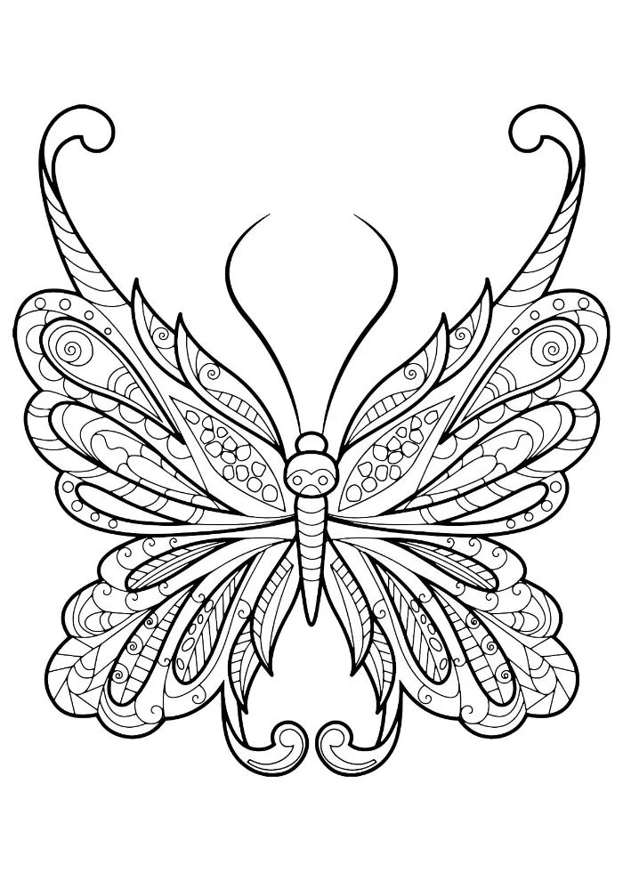
- A shimmering, metallic glint on a butterfly’s wing.
- A perfect, dewy highlight on a rose petal.
- Smooth, white whiskers on an animal that pop against a dark background.
The secret? Not a pencil, but a fine-tipped gel pen. After your coloring is done, use a Sakura Gelly Roll in white, silver, or gold to add those final, brilliant details that sit right on top of the color.
Create a dedicated ‘creative corner’ to make your coloring time feel like a true ritual. It doesn’t need to be large. A comfortable chair, good lighting (a daylight lamp is ideal), a small table for your supplies, and maybe some calming music or a favorite scented candle can transform the simple act of coloring into a deeply restorative and immersive experience.
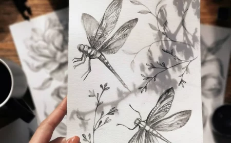
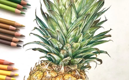
To make your leaves and stems look truly alive, always use more than just one green. Real foliage is a tapestry of color. Start with a base of a light, yellowish-green (like Prismacolor’s Chartreuse), add depth with a true green (like Grass Green), and then tuck in shadows with a dark blue or even a deep indigo. This touch of blue is the professional’s secret to creating natural, vibrant greens that don’t look flat.
A simple challenge to boost your skills: the three-color limit. Choose just three pencils—a light, a medium, and a dark shade—and complete an entire picture using only them. This forces you to focus intently on layering, pressure, and blending to create a full range of values. It’s a powerful exercise in making the most of a limited palette.