How to Draw Pizza That Looks Incredibly Real: An Artist’s Guide
I’ve been a commercial illustrator for what feels like forever, spending a lot of that time drawing food for menus, packaging, and magazines. Early on, a client asked for a big, beautiful shot of a single pizza slice. Easy, right? It’s just a triangle with some circles. Well, my first attempt was a complete disaster. The drawing was flat, totally lifeless, and looked more like a cartoon prop than something you’d actually want to eat.
In this article
That project taught me something huge: the simplest subjects are often the hardest to get right. A pizza slice isn’t about simple geometry. It’s a masterclass in texture, light, and making something look delicious.
Over the years, I’ve drawn hundreds of them, from classic thin-crust slices to hefty deep-dish pies. I’ve figured out the little tricks that make them look hot, cheesy, and irresistible on paper. So this isn’t just a step-by-step guide to copy. My real goal is to share the pro-level thinking behind it. We’ll get into how to really see the subject, understand its structure, and use specific techniques to bring it to life. This is the stuff that separates a quick sketch from a convincing piece of art.
First Things First: See Pizza Like an Artist
Before you even think about drawing, you have to learn to see properly. A great drawing is all about understanding an object’s real shape, how light hits it, and how to translate all that onto a page. Pizza is honestly a perfect practice subject because it’s got so many different textures packed into one thing.
The Basic Physics of a Great Drawing
Every object you draw can be broken down into simple shapes. A pizza slice is basically a wedge—a triangle with depth. The puffy end crust? That’s just a lumpy cylinder. The pepperoni slices are shallow little discs. Seeing these basic forms is the key to figuring out how light and shadow will work.
Light is what gives your drawing that 3D pop. Imagine a lamp shining on your pizza from the top left. The parts facing the lamp will be the brightest. The parts angled away will be in shadow. The melted cheese will cast tiny shadows on the crust underneath, and each pepperoni slice will cast its own little shadow, making it look like it’s actually sitting on the cheese, not just printed there. This whole play of light and shadow is fundamental to creating realism.

Color Choices That Make You Hungry
Your color palette can make or break a food illustration. For food, you almost always want to lean into a warm color palette. Think about the rich, inviting reds of tomato sauce, the warm yellows and oranges of melted cheese, and the earthy, toasty browns of the crust. These colors just feel delicious and inviting.
A little pro-tip: use complementary colors (like green) very sparingly to make your warm colors pop even more. A tiny sprinkle of green basil against all that red and yellow creates a fantastic visual contrast that pulls the eye in. And that ‘greasy’ sheen on the cheese? It isn’t a color. It’s a bright, sharp highlight—often pure white or a very light yellow—placed exactly where the light would reflect most strongly. Without that little detail, the cheese looks dry and plastic.
Let’s Talk Tools: What You Actually Need
Your choice of medium will have a huge impact on your final piece. I’ve used everything from cheap pencils to expensive digital setups. One isn’t better than the other; they just offer different experiences.
For the Traditional Artist
There’s something special about working on real paper. You can feel the texture of the surface and the drag of the pencil. It makes you more intentional with your marks.
Okay, let’s talk budget. You can honestly start with a regular #2 pencil and some printer paper just to practice the shapes. No need to spend a dime.
But if you’re ready for a small step up, here’s a great, affordable starter kit:
Budget Starter Kit (around $25-$30):
- A beginner set of alcohol markers. These are fantastic for laying down smooth base colors for the sauce and cheese. You can find decent sets online for about $15-$20.
- One or two individual pro-grade colored pencils. Instead of a whole set, just buy a dark brown and a white pencil individually. This will cost you about $4-$5 and will be a game-changer for your shadows and highlights.
- A pad of toned paper. I highly recommend tan or grey paper. It makes your highlights and shadows pop like crazy. A decent pad runs about $8-$12 at any art or craft store.
When you’re ready to get more serious, look into professional oil-based colored pencils. They layer beautifully without building up that waxy film you sometimes get with cheaper, wax-based pencils. Both are great, but the oil-based ones are a bit more forgiving for blending.
For the Digital Artist
Working digitally is all about flexibility. You’ve got endless colors, an undo button (a lifesaver!), and the power of layers. Most of my work is digital these days, using a tablet and stylus.
The big three software options are Photoshop, Procreate, and Clip Studio Paint, but honestly, any modern drawing app will do the trick. The real question is always about the brushes. The good news? You don’t need to buy fancy brush packs to start! The default brushes are more than enough. For the pizza crust, try using a standard ‘6B Pencil’ brush or something from the ‘Charcoal’ set to get that slightly rough, bread-like texture. For the soft glow on the cheese, a simple ‘Soft Airbrush’ is perfect.
The Pro Method: Let’s Draw a Classic Slice
Alright, let’s put all this together. We’ll draw a classic pepperoni slice, step by step. I’ll explain the ‘why’ behind each move, describing it as if we’re using colored pencils on toned paper, but the principles are identical for digital.
Heads up! For your first serious attempt, give yourself a good 2-3 hours. The texture part takes patience, and that’s where the magic really happens. Don’t rush it.
Step 1: The Rough Structural Sketch
Do not start by drawing a perfect, ruler-straight triangle. Real pizza is never perfect. Using a basic graphite pencil with a very light touch, sketch out a long, thin wedge for the main body. Then, at the wide end, add a curved, slightly puffy shape for the crust. This is just your construction guide. Make sure the perspective feels right—if you’re viewing it from an angle, the far edge should be a bit smaller than the near one.
Step 2: Map Out Your Textures
Before you even think about color, lightly map out your different zones. Sketch a wavy, uneven line where the cheese meets the crust. This is the ‘cheese pull’ line, and it’s a critical detail. Never draw it straight; melted cheese is wonderfully organic. Lightly circle where your pepperoni will go and mark out any spots where the sauce might be peeking through. This simple map will keep you from getting lost later.
Step 3: Laying Down Base Color & Form
Now we start building depth, but remember to work in light layers. Don’t go for your darkest darks or brightest brights yet.
- The Crust: Use a light tan pencil (think the color of a manila folder) to color the entire crust area. Then, with a slightly darker brown, gently shade the underside and the parts that curve away from your light source. This starts to make the crust look round.
- The Cheese & Sauce: With a pale yellow or cream color, lay down the base for the cheese, leaving the sauce areas blank. Fill those in with a basic light red.
- The Pepperoni: Use a reddish-brown for the pepperoni. At this point, your drawing should look pale and a bit flat. That’s perfect. We’ve established our base colors without committing to any heavy details.
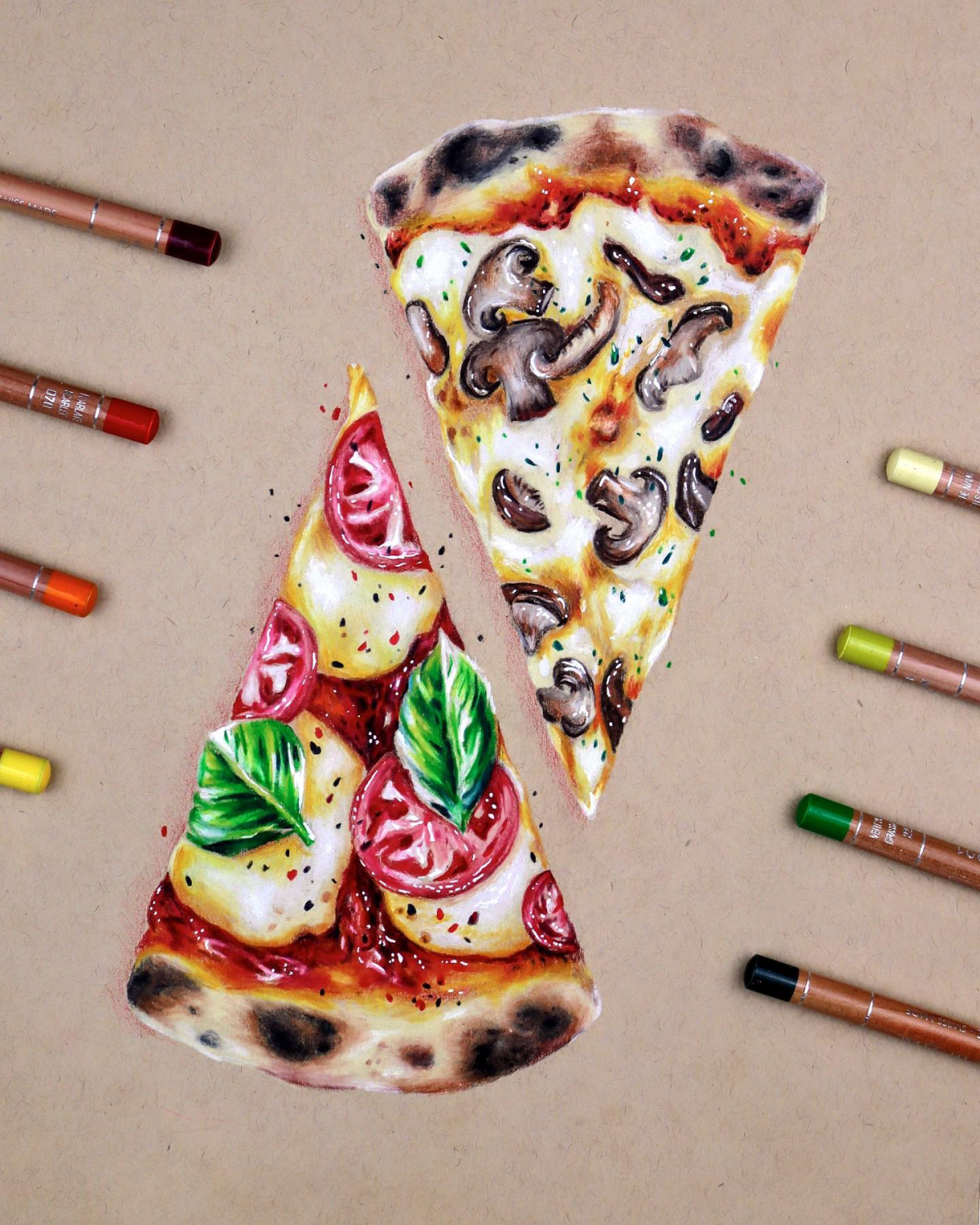
Step 4: Rendering—This is Where It Gets Real
This is the most time-consuming part, but it’s also the most fun. We’re adding the details that trick the brain into seeing realism. Tackle one texture at a time.
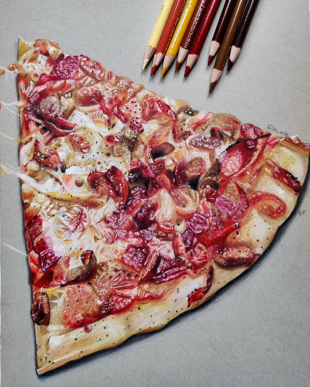
The Cheese: The star of the show! To make it look melted, you need smooth blending and those signature hot spots. With an orange or light brown pencil, add soft shadows under the drips and around the pepperoni. Then, with a darker brown, add the toasty, browned spots using small, circular motions. Finally, the magic touch: take a sharp white pencil or a white gel pen and add a few very bright, sharp little dots and lines on the crests of the cheese drips. This is that ‘greasy shine,’ and it’s the single most effective trick for making cheese look hot and delicious.
By the way, want to see this trick in two minutes? Just draw a yellow circle. Add a small blob of orange on one side. Now take your whitest white and put ONE sharp dot right on top of the orange. See? You just made a glistening cheese bubble. That’s the whole principle in a nutshell.
The Crust: The crust needs to look like baked bread, not a plastic tube. I once had an art director tell me, “I can’t smell the yeast,” on a bread illustration. He was right. My drawing was technically fine but had no soul. The secret is texture. Using a mid-tone brown, make tiny dots (stippling) or small, scribbly circles (scumbling) to build up a porous, bread-like surface. Use a dark brown to deepen the shadows in the crevices. A few random dark spots suggest a nice, authentic bake.
The Pepperoni: Color the pepperoni with a rich red. Use a darker red or brown to shade the bottom edge of each slice to give it that slight ‘cupped’ look from cooking. Add a few small, dark, crispy-looking edges. For rendered fat, you can stipple tiny pools of orange or yellow inside the pepperoni cups. And don’t forget to add a short, soft shadow on the cheese right underneath each slice.
Step 5: The Final Polish
Step back and look at your drawing from a distance. Does any part of it look flat? It probably needs more contrast. Don’t be afraid to go back in with your darkest brown (or even black, used very sparingly) to deepen the absolute darkest shadows. This will make your highlights pop even more. Use your sharp white pencil to add one or two more tiny, super-sharp highlights. Check your edges—if they look too sharp and unnatural, you can soften them with a colorless blender pencil. If you’re working traditionally, a light mist of workable fixative will protect your work and even out the pencil sheen.
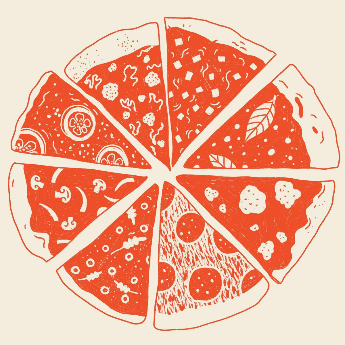
Beyond the Classic: Drawing Different Pizza Styles
Knowing how to draw different styles of pizza really shows you know your stuff. It’s all about observing the unique characteristics of each one.
- Chicago Deep Dish: The challenge here is showing height and weight. This is a fortress of pizza. Your drawing should emphasize its verticality. The light will catch the tall, biscuit-like crust edge. The sauce is on top, so its texture is key—it’s chunky and pulpy, not smooth.
- Neapolitan Pizza: This one is all about the crust. It’s famously puffy and covered in charred blisters. To draw this, you’d render a soft, airy crust and then use a sharp dark brown or black pencil to stipple in those iconic leopard spots. The toppings are minimal, so it’s an exercise in texture contrast.
- Sicilian Slice: This is a thick, rectangular slice, almost like focaccia bread. The key is capturing the airy, open crumb on the cut side of the slice. You’d use careful shading and even leave little white specks of paper showing through to create that bread-like texture.

Troubleshooting: When Things Go Wrong
Even pros run into problems. Here are a few common ones and how to fix them.
Problem: “My cheese looks like a flat, yellow pancake.”
Solution: You need more value range. Your cheese needs shadows (light browns, oranges) and bright, sharp highlights (pure white). The secret is putting them right next to each other. Think of it like a recipe for 3D gloss: you have your dark shadow, your main yellow color, and your bright white highlight. When that dark shadow touches the bright highlight, the surface immediately looks wet and lumpy.
Problem: “My colors are turning to mud.”
Solution: This usually happens from over-blending or layering in the wrong order. Always work from light to dark. Get your light base colors down first, then gradually build up your shadows. And be careful mixing complementary colors (like red and green) directly on the paper; they’ll cancel each other out and create a dull brown.

A Few Pro Habits for the Road
Being a good artist is also about having good habits that let you do this for a long time.
First, take care of your body. Drawing for hours can lead to wrist and neck pain. I’ve seen it sideline amazing artists. Take breaks, stretch your hands, and make sure your workspace has good light and you’re not hunched over.
Second, on using reference photos: they’re essential, but you can’t just grab a photo from Google and copy it for any work you plan to sell or display. That’s a big no-no. For practice, it’s fine. But for professional work, you need to use your own photos or images from a royalty-free stock site. Learning to take your own reference photos is a hugely valuable skill.
Finally, don’t be afraid to ask for feedback. Sometimes you’re just too close to a piece to see its flaws. A fresh pair of eyes from a friend or fellow artist can be a huge help. It’s the fastest way to grow.

Drawing a slice of pizza is a fantastic project. It’s fun, it’s accessible, and it teaches you skills that apply to everything you’ll ever draw. The real secret is to stop thinking about lines and start thinking about textures. The gooey cheese, the crispy pepperoni, the airy crust… that’s the story. I encourage you to get a real slice, put it under a lamp, and just look at it for a while. Notice everything. That’s where great art really begins. Now go for it, and have fun!
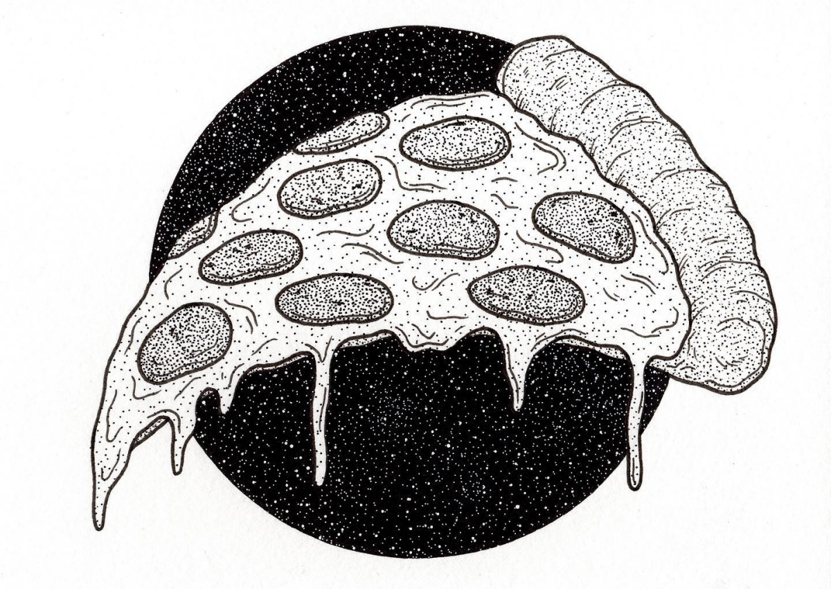
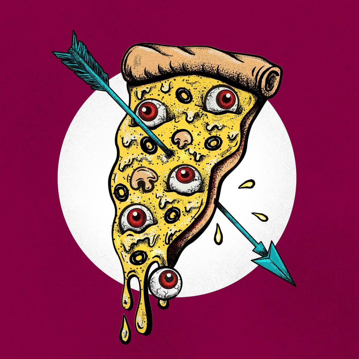
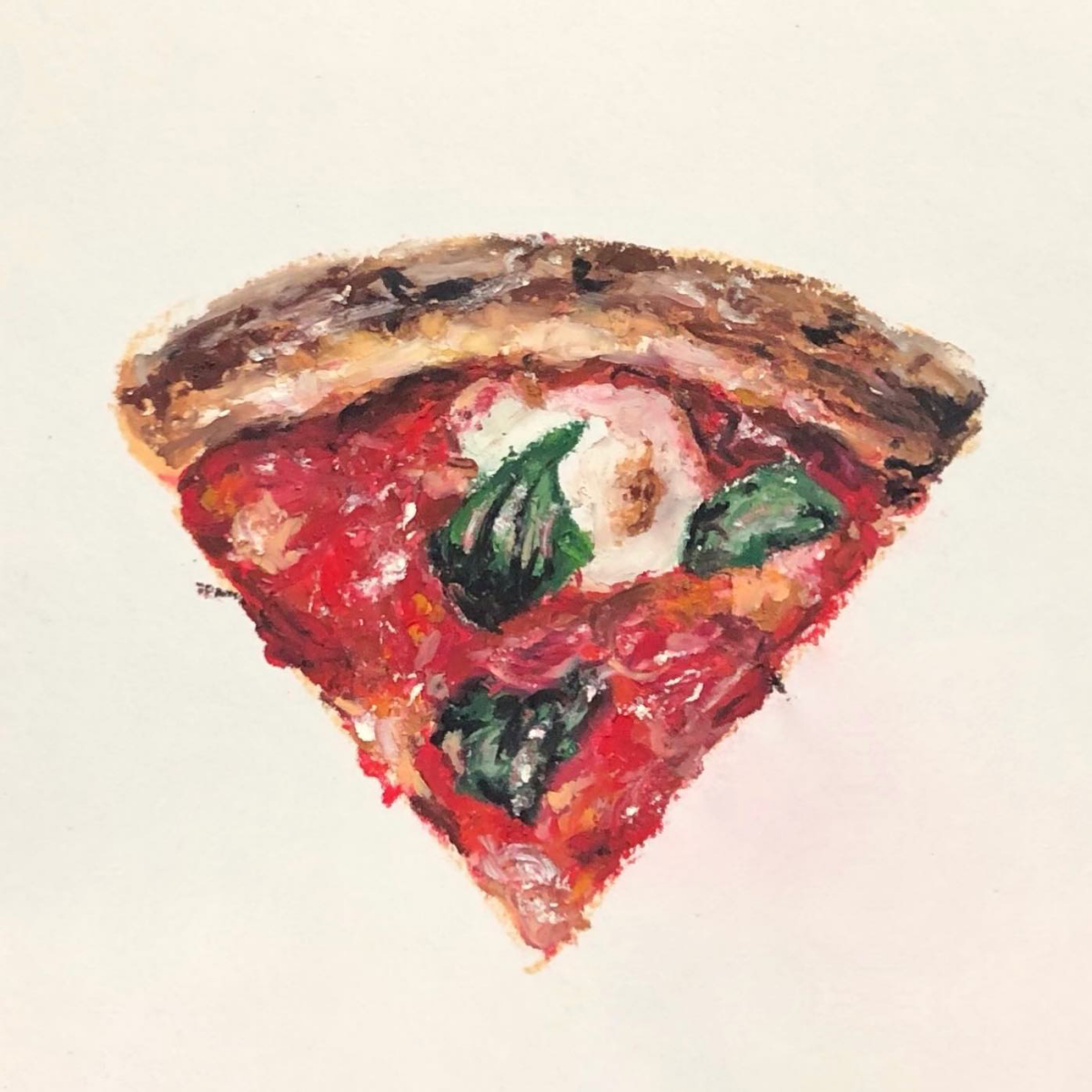
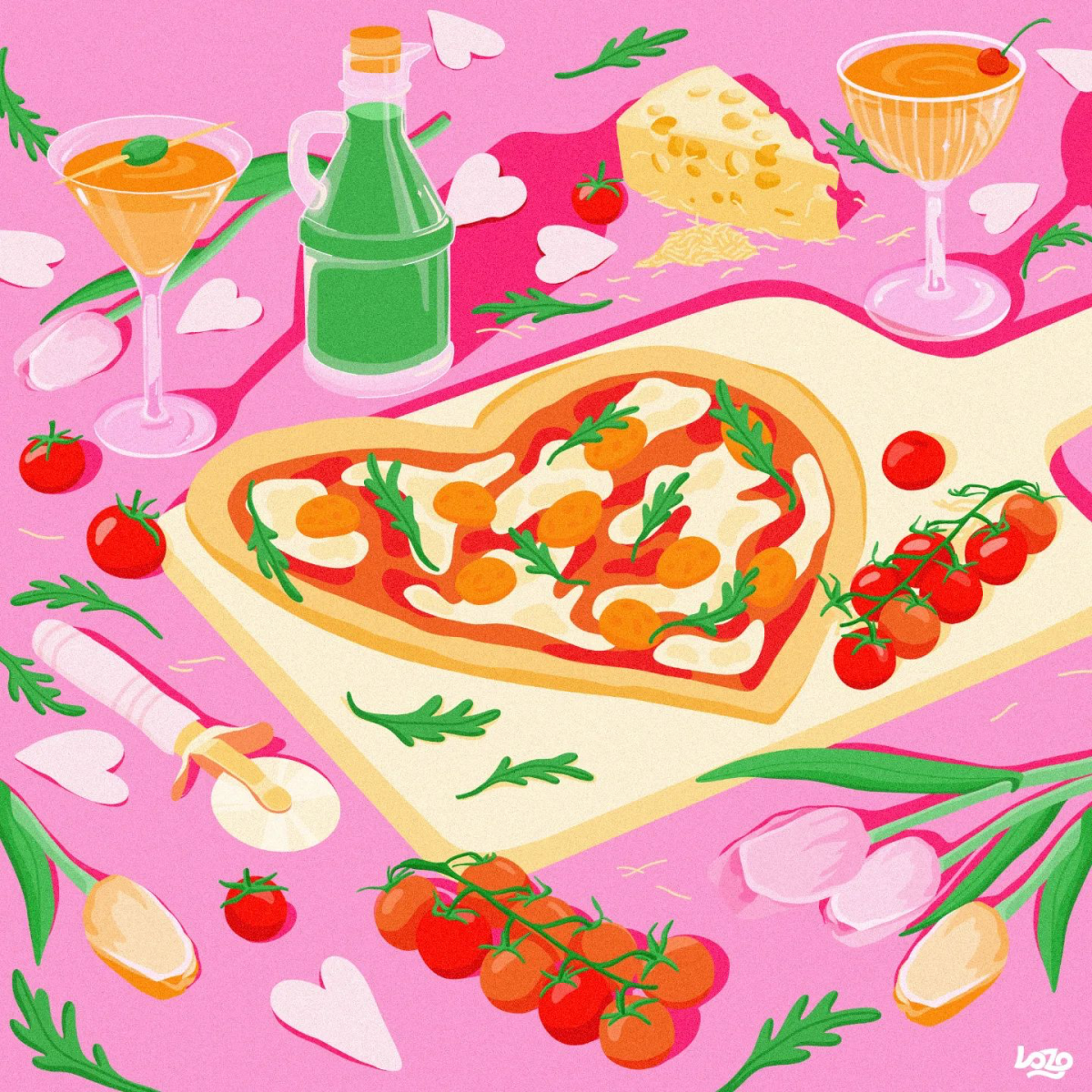
Galerie d’inspiration

For ultimate texture: Use colored pencils like Prismacolor Premier. Their waxy core is perfect for building up layers, letting you create the porous, airy look of the crust and the subtle color shifts in browned cheese.
For smooth, vibrant color: Alcohol markers like Copic are ideal. They create a flawless, non-streaky base for the tomato sauce and can be used to add that signature greasy sheen to pepperoni.
Pro illustrators often combine both, using markers for the base and pencils for the final texture.
A key difference between an amateur and a pro food drawing is the highlights. It’s not just about leaving white spots.
To make cheese look truly melted and greasy, you need to render the highlights correctly. Use a white gel pen, like a Uni-ball Signo, or a sharp sliver of a white colored pencil to add sharp, glistening specks and wet-looking streaks on top of your colored layers. This final touch is what sells the ‘hot and fresh’ illusion.
How do you make the cheese look stringy and gooey?
It’s all about creating ‘bridges’ and ‘shadows.’ Draw thin, stretching strands of cheese connecting the main slice to a piece of pepperoni or lifting off the plate. The secret is to add a dark, thin shadow directly underneath each strand. This tiny detail creates the illusion of depth, making the cheese appear as if it’s truly lifting off the surface in three-dimensional space.