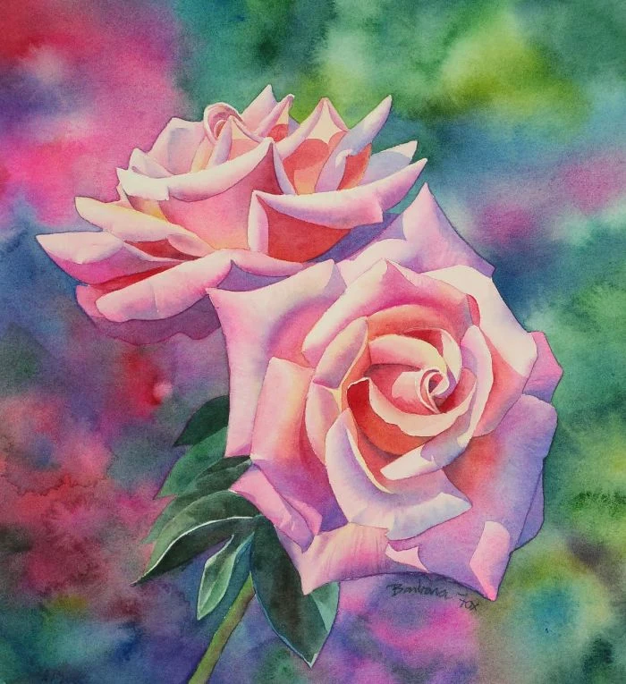
Tired of Drawing ‘Cabbage’ Roses? Here’s How to Draw One That Actually Looks Real
I’ll never forget the first rose I tried to draw. It was for a high school art project, and I ended up with this flat, wobbly circle filled with clumsy swirls. Honestly, it looked more like a sad cabbage than a flower. My teacher was kind, but his feedback was simple: “You aren’t looking at the rose.”
In this article
- What Are We Even Looking At? The Real Structure of a Rose
- Your Toolkit: Getting the Right Gear Without Breaking the Bank
- The Structural Method: Building a Rose from the Inside Out
- An Alternative: The Layering Method
- Breathing Life into Your Drawing: The Magic of Shading
- Where to Go From Here
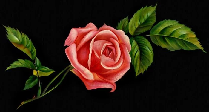
- Inspirational Gallery
He was so right. I was drawing the idea of a rose, not the beautiful, complex thing sitting right in front of me. That little piece of advice has stuck with me throughout my entire career as a professional illustrator and teacher.
Drawing a rose is a classic challenge for a reason. It teaches you everything you need to know about form, light, and structure. So many people get intimidated by all those overlapping petals, seeing nothing but chaos. But here’s the secret: a rose has a hidden order, a beautiful logic to how it grows. Once you see that logic, drawing it becomes a whole lot easier. This guide is all about learning to see the rose, understand its shape, and finally capture its character on paper.
First Things First: Get a Good Reference
Before we even talk about pencils, let’s get you something to look at. If you don’t have a real rose handy, don’t worry! Jump on a free stock photo site like Pexels or Unsplash and search for things like “single rose side view” or “rose close up.” The photos are incredible quality and totally free to use for practice.
What Are We Even Looking At? The Real Structure of a Rose
Okay, a little bit of botany goes a long way here. You don’t need to be a scientist, but knowing the basic blueprint makes a huge difference. A rose isn’t just a random bunch of petals; it’s a highly organized structure that unfurls in a spiral pattern. It’s the same kind of pattern you see in pinecones and sunflowers, and it’s why they look so naturally balanced.
To make it simple, think of the rose in three main zones:
- The Inner Bud: This is the tight, central core. These are the youngest petals, all packed together.
- The Main Body: These are the petals that are actively unfurling, giving the rose its volume and classic shape. They overlap and curve, catching the light in really interesting ways.
- The Outer “Guard” Petals: These are the oldest, largest petals at the base. They often droop or curl at the edges, and they act like a frame for the rest of the flower.
Knowing these three zones helps you break down a really complex subject into manageable chunks. For this guide, we’ll focus on a classic florist’s rose—the kind with a high, pointed center—because its form has all the key elements you need to learn.
Your Toolkit: Getting the Right Gear Without Breaking the Bank
You can technically start drawing with any old pencil and printer paper, but having the right tools gives you so much more control. And they don’t have to be expensive! It’s all about getting the right tool for the job.
Here’s a great beginner’s kit you can probably pull together for under $30.
Pencils: Graphite pencils are graded by how hard or soft they are. ‘H’ pencils are hard (light lines), and ‘B’ pencils are soft (dark lines). A standard office pencil is an HB, right in the middle. I’d recommend grabbing at least three:
- A 2H Pencil: Perfect for your first light sketches. The lines are super easy to erase and won’t scar the paper. You can find one for about $1-$2.
- An HB Pencil: This is your workhorse for refining the petal shapes and adding medium tones. Another dollar or two.
- A 2B or 4B Pencil: These are for your deep, rich shadows. Getting that good range of light-to-dark is what makes a drawing pop. A single soft pencil is also just a couple of bucks. Or, you can just buy a basic graphite set from a popular art supply brand for between $8 and $15.
Paper: The paper you use makes a surprising difference. Super smooth paper can make shading look streaky. I much prefer drawing paper with a little bit of texture, or “tooth,” because it grabs the graphite and makes blending a dream. A good, affordable pad of student-grade drawing paper will run you about $10-$15 at any big box craft store or online art supplier.
Erasers: An eraser isn’t just for fixing mistakes; it’s a drawing tool! I use two main types:
- Kneaded Eraser: This is the gray, putty-like one. You can mold it into any shape to lift graphite off the paper without leaving crumbs. It’s perfect for creating soft highlights. A must-have, and only about $2.
- Pen-Style Eraser: This is a hard, white eraser in a clickable pen body. The tiny tip is amazing for getting into tight corners and erasing precise lines. It’s a game-changer and costs around $5-$7.
Blending Tools: You can use your finger, but the oils from your skin can create smudges. A better option is a blending stump (a roll of compressed paper with a point). They give you incredible precision for smoothing out your shading. A small pack is usually just a few dollars. In a pinch, a Q-tip works too!
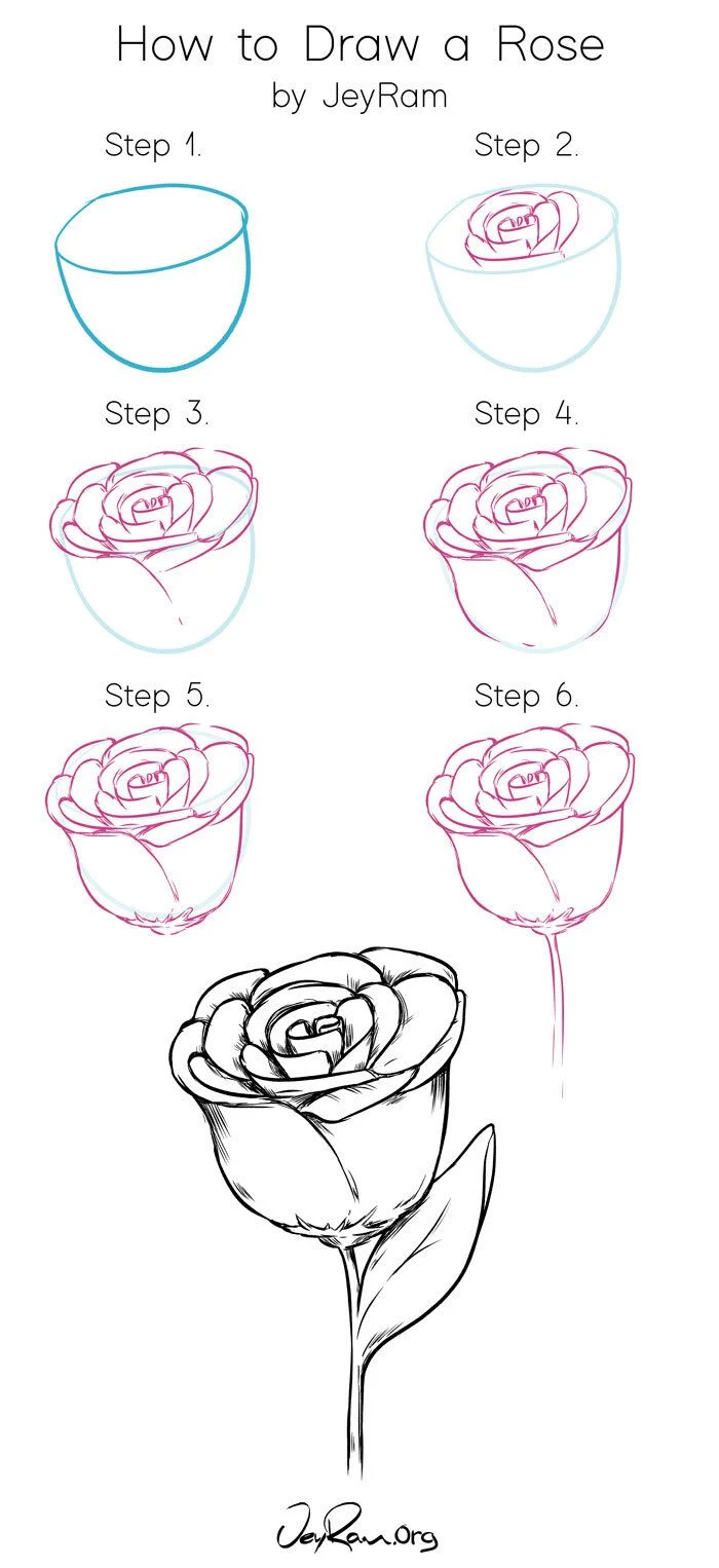
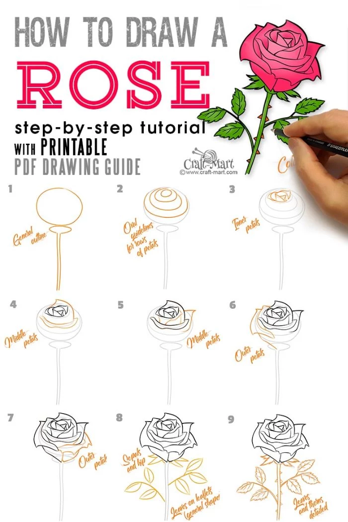
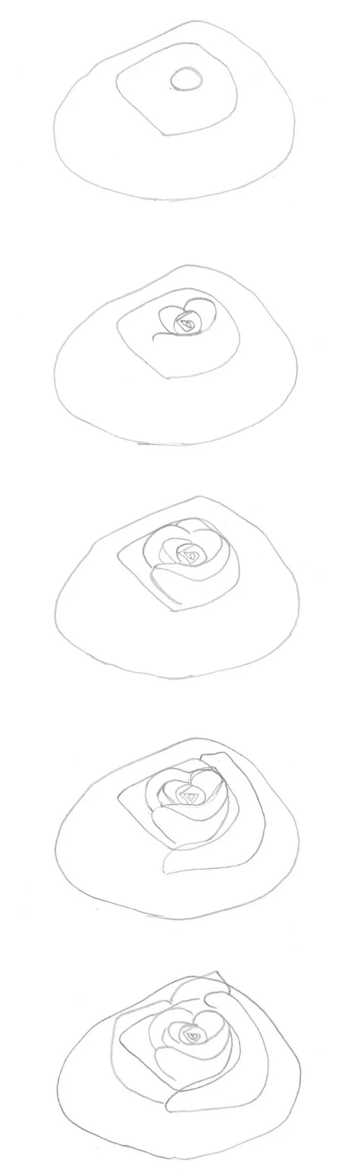
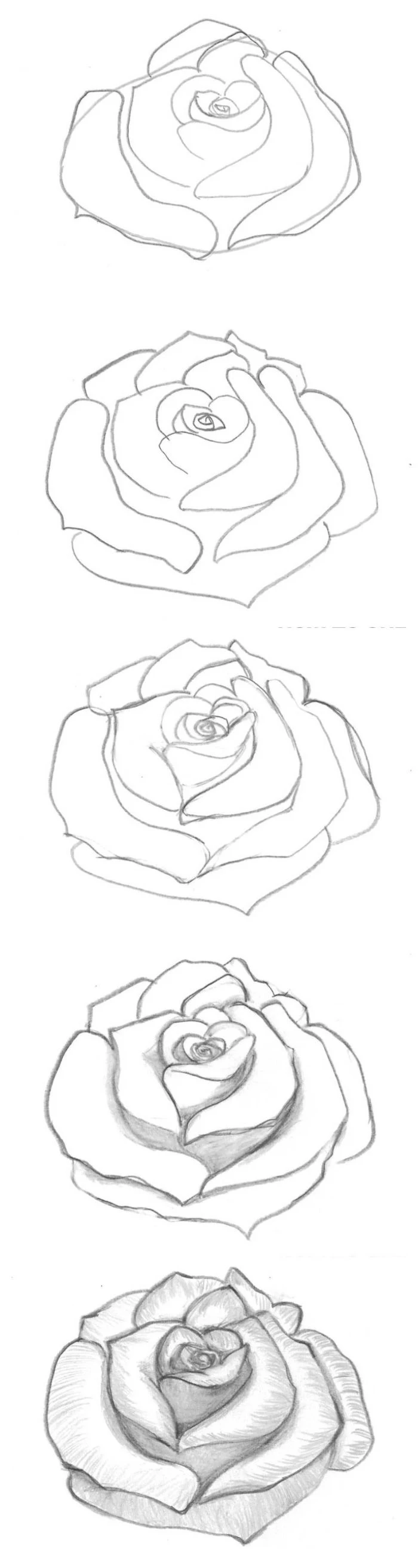
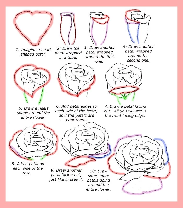
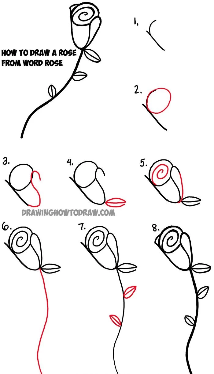
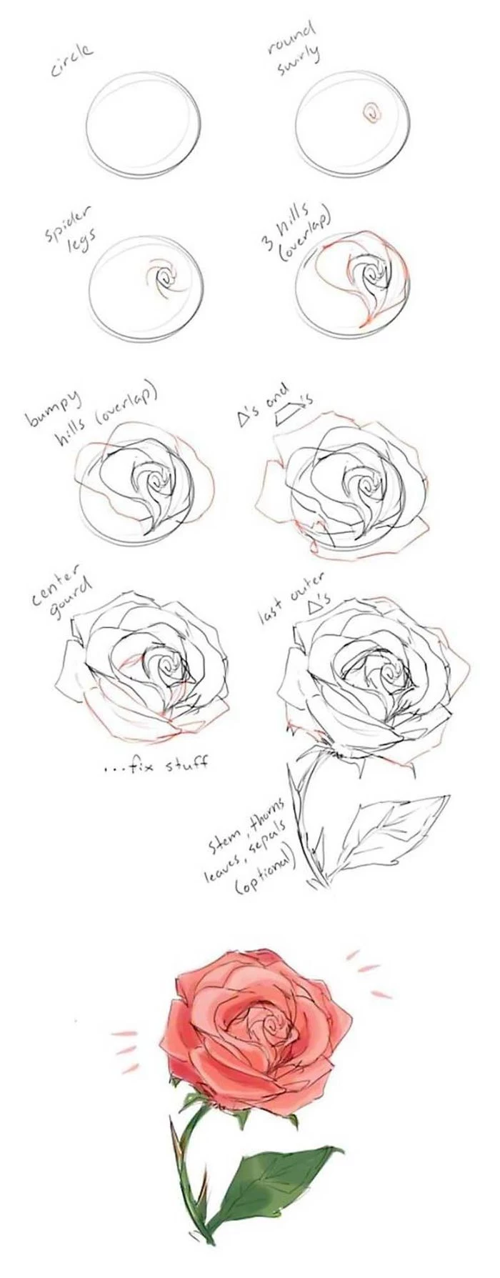
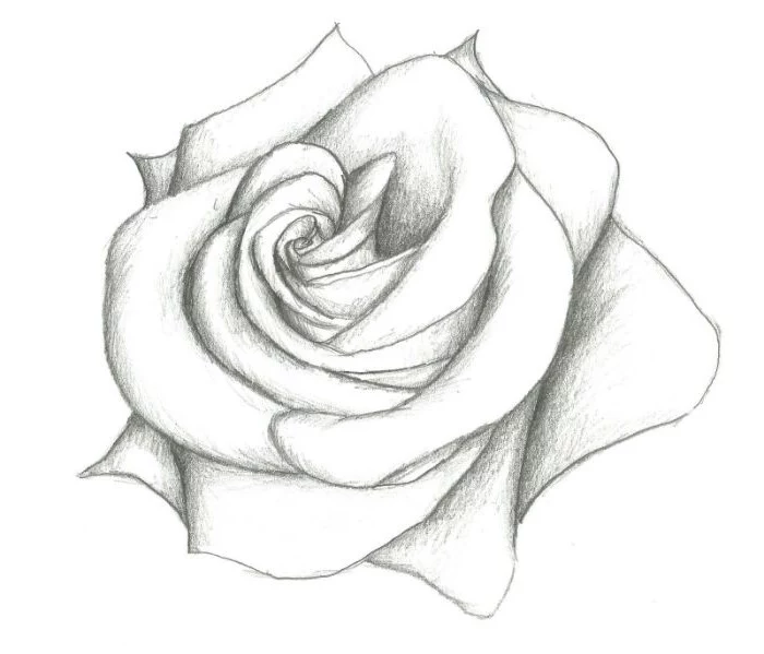
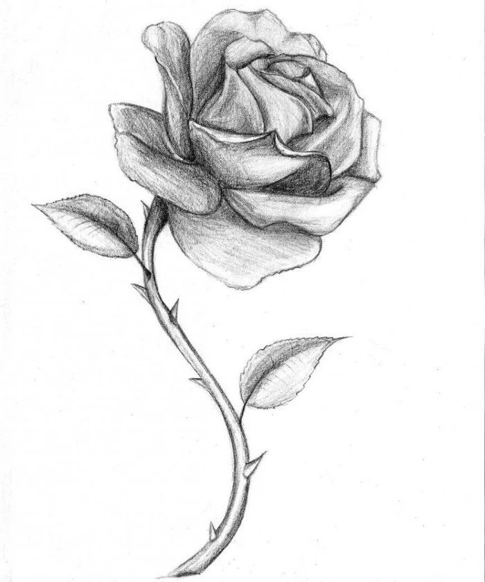
The Structural Method: Building a Rose from the Inside Out
This is the approach I always teach beginners because it forces you to build a solid foundation first. This method prevents your drawing from becoming that flat, swirly mess we talked about. Grab your 2H pencil—we’re keeping it light!
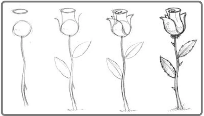
Step 1: The Core Form
Don’t start with a circle! Look at a rose from the side. The main body is more like a small cup or an egg shape. Below that, where the stem attaches, is a shallow bowl. So, lightly sketch a cup shape sitting in a shallow bowl. From my experience, making this initial shape about the size of your palm is a good starting point—big enough for detail but not so large it’s intimidating to fill. (Plan to spend about 10 minutes on this, tops!)
Step 2: The Center and the Spiral
Inside the top of your cup, make a small mark for the very center of the rose. From that point, lightly draw a gentle spiral moving outwards. This is the secret road map for the inner petals. It dictates the flow of the entire flower.
Step 3: Block in the Petal Groups
Remember our three zones? Let’s block them in with big, simple shapes. Draw a small teardrop around the central spiral for the bud. Then, use larger, C-shaped curves that follow the cup’s form for the main body. Finally, sketch some wide, U-shaped lines for the big outer petals. Right now, it should look really abstract and geometric. That’s a good thing! We’re building the scaffolding.
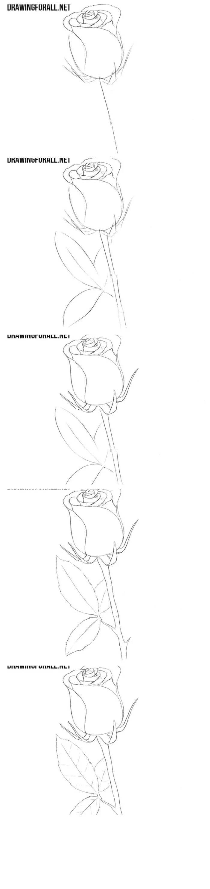
Step 4: From Blocks to Petals
Okay, here’s where a lot of people get stuck. Before you switch to your darker pencil, let’s lightly ‘slice’ into those big C-shapes. Think of it like cutting a pie into petal-sized wedges. This breaks down the big, scary blocks before you commit to final lines.
Now, switch to your HB pencil and start defining the actual petals, starting from the center. The key is overlapping. A common mistake is to draw petals side-by-side like a fan, which makes the rose look flat. A rose’s beauty is in its depth, and overlapping is how you create it. Let the top edges be a little irregular—a small dip here, a slight curl there.
A lesser-known trick: If you find yourself drawing a “bullseye rose” where all the petals are too perfect and symmetrical, turn your reference photo upside down! This tricks your brain into seeing abstract shapes instead of “petals,” helping you draw what you actually see.
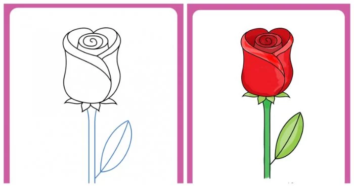
Step 5: Refine and Finalize
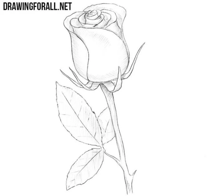
Go over your final lines, varying the thickness. Use a heavier line for petals that are in front or in shadow and a lighter line for edges farther away. This simple trick adds an immediate sense of dimension. Erase any leftover light construction lines. Lastly, draw the stem with a gentle curve—they’re rarely perfectly straight.
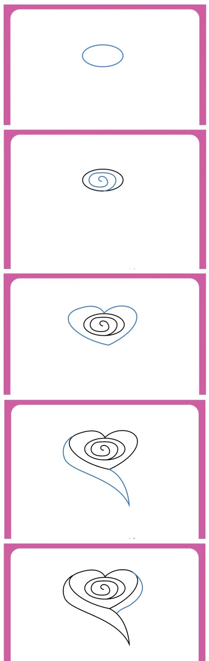
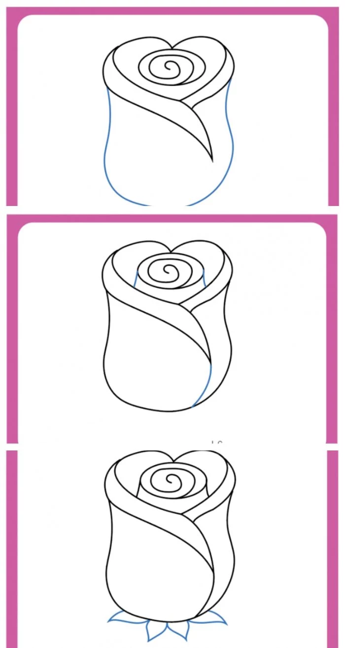
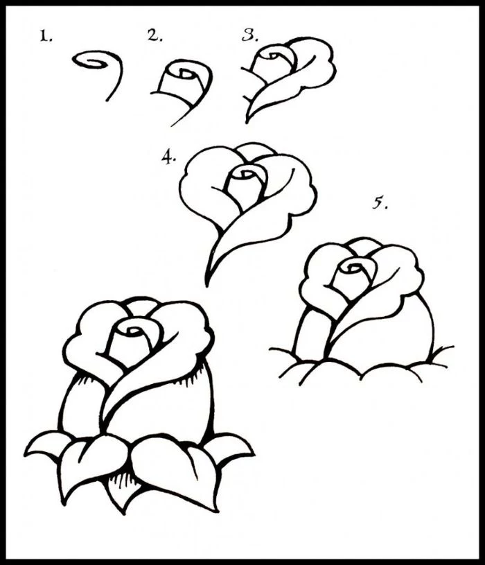
An Alternative: The Layering Method
Some people find the structural method a bit too rigid. If you’re more of an intuitive artist, you might prefer the layering method. It’s more organic, but it requires a very careful eye to keep the overall shape from getting wonky.
This approach is best for folks who are great at observation but get bogged down by planning. You still start with a light cup shape as a guide, but instead of blocking things in, you begin by drawing the single innermost petal. Then you draw the next one wrapping around it, then the next, building the rose outward layer by layer.
The main challenge? It’s incredibly easy to make a flat, symmetrical flower. You have to constantly check your reference and focus on how the petals tilt and turn to avoid it. Honestly, trying both methods is the best way to see which one clicks with your brain.
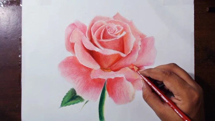
Breathing Life into Your Drawing: The Magic of Shading
An outline is just a symbol. Shading is what makes it look real. But before we shade the rose, let’s try something.
Quick Challenge: Try This Right Now
Grab an apple or an egg. Sit it on your desk and shine your phone’s flashlight on it from one side. See that bright spot where the light hits directly? That’s your highlight. See how the surface gets gradually darker as it curves away? Those are your mid-tones. And see that dark shadow the apple casts on the desk? That’s a cast shadow. You just identified all the core parts of shading! It’s the exact same principle on a curvier rose petal.
Here’s a straightforward process for shading your rose:
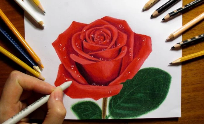
- Lay in Your Base Tones: With your soft 2B or 4B pencil held on its side, apply a light, even layer of graphite over every part of the rose that isn’t a bright white highlight.
- Build the Mid-Tones: Add a bit more pressure in the areas curving away from your light source. This is where you start to really define the 3D form of each petal.
- Commit to the Darks: Now, use the point of your soft pencil for the core shadows and cast shadows. Get into those deep crevices between petals and the undersides of curls. Don’t be afraid to go dark! Strong contrast is what makes a drawing pop. Most beginners are way too timid here.
- Blend Carefully: Use your blending stump to soften the transitions. Use small, circular motions. The goal is a smooth gradient, not a blurry mess. Over-blending can make a drawing look muddy and lifeless.
- Lift Your Highlights: Take your kneaded eraser and mold it into a sharp point. Gently dab or “draw” with it on the top edges of petals where the light would hit most directly. This is what creates that beautiful, luminous glow.
Where to Go From Here
Once you’re comfortable with the basics, you can start playing with more advanced ideas, like adding the texture of soft, velvety petals with fine, curved lines. Or you could try drawing a tiny water droplet—it’s a fantastic mini-lesson in how light works.
A quick heads up: If you want to protect your finished drawings from smudging, you can use a spray fixative. From my own headache-inducing experience, always use this stuff in a well-ventilated area, preferably outside. The fumes are no joke.
But the most important advice I can give you is to just be patient with yourself. Your first ten roses might still look like cabbages, and that’s perfectly fine. Mine did! Drawing is a skill you build through looking, trying, and then looking again even more closely. So grab your pencils, find a reference, and really look.
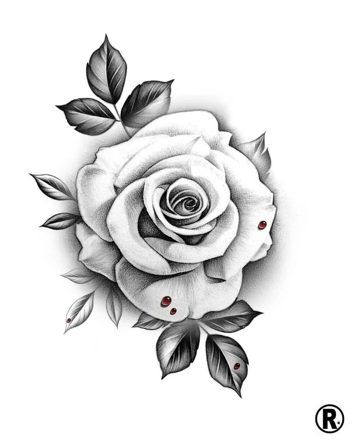
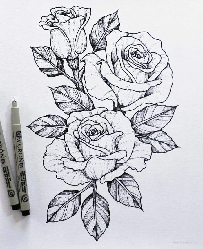
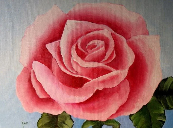
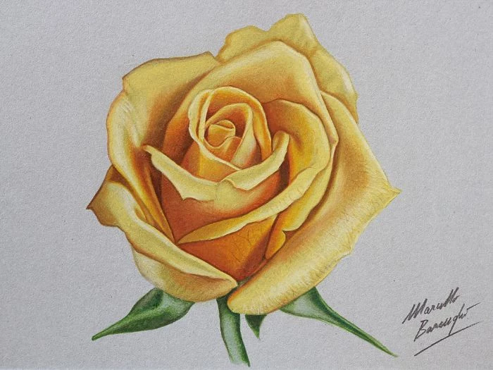
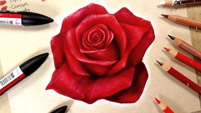
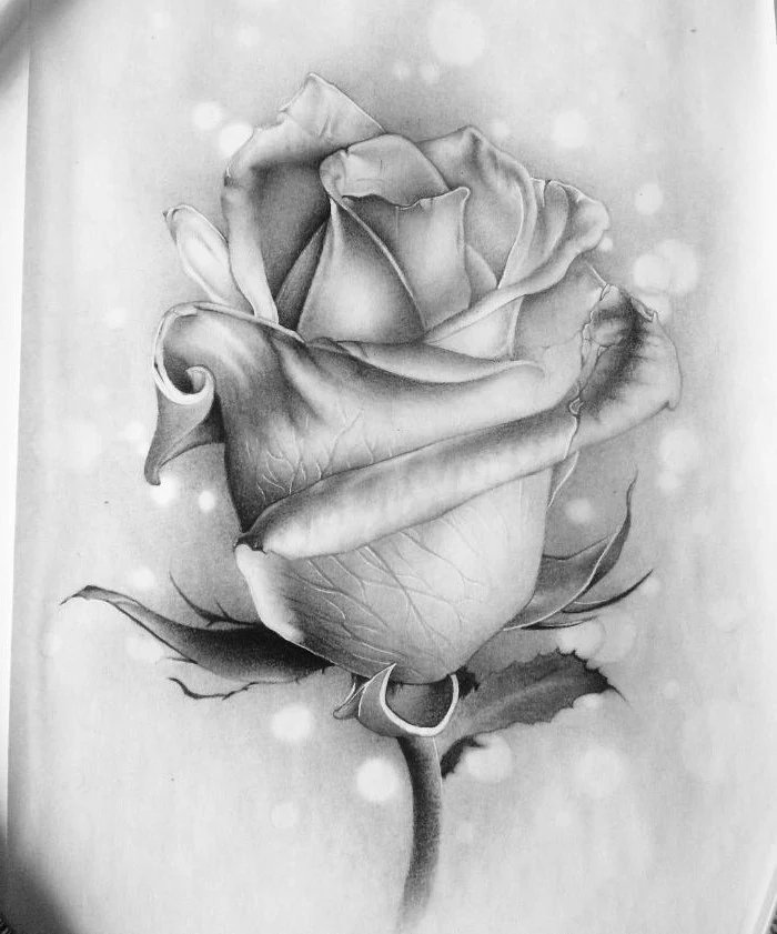
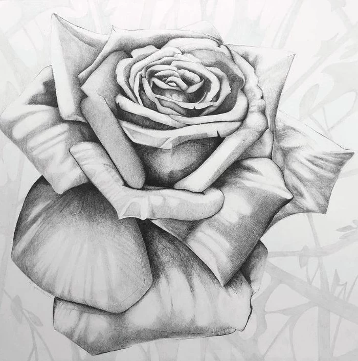
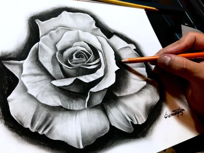
Inspirational Gallery
Struggling to make your petals look soft and not like lines on a page?
The secret is often in the blending. Instead of using your finger, which can transfer oils and create blotches, invest in a couple of simple tools. A paper stump (or tortillon) allows you to gently smudge graphite into the paper, creating smooth, gradual transitions. For tiny areas, like the deep folds between petals, a cotton swab or a felt blending tip works wonders. This technique is what separates a good drawing from a great one.
- Create a sense of drama with a single, strong light source from the side.
- Achieve a soft, romantic feel with diffused light, as if from an overcast day.
- Add a touch of life by including a dewdrop, which acts as a tiny, distorted mirror of the light.
The way you light your rose can completely change its emotional impact.
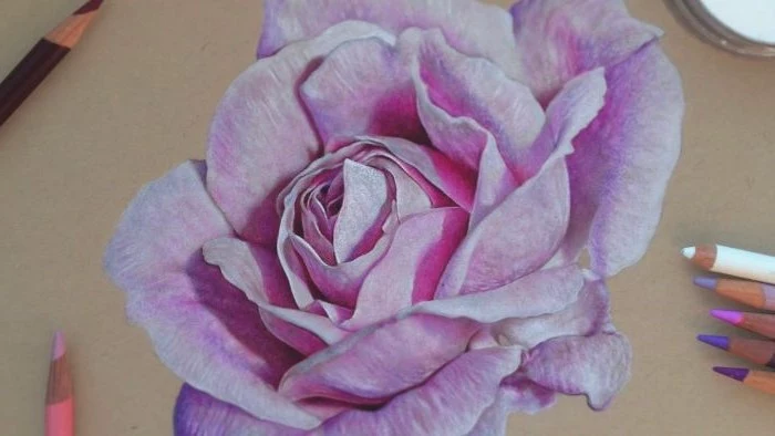
Not all pencils are created equal. For the initial, light sketch, a hard pencil like a 2H is perfect; its lines are faint and easy to erase. For building up shadows and adding dark, rich tones in the rose’s center, switch to softer pencils like a 2B or even a 6B. A high-quality set like the Faber-Castell 9000 gives you the full range to create incredible depth.
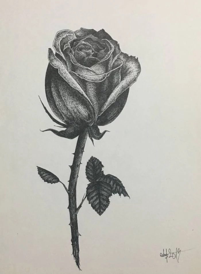
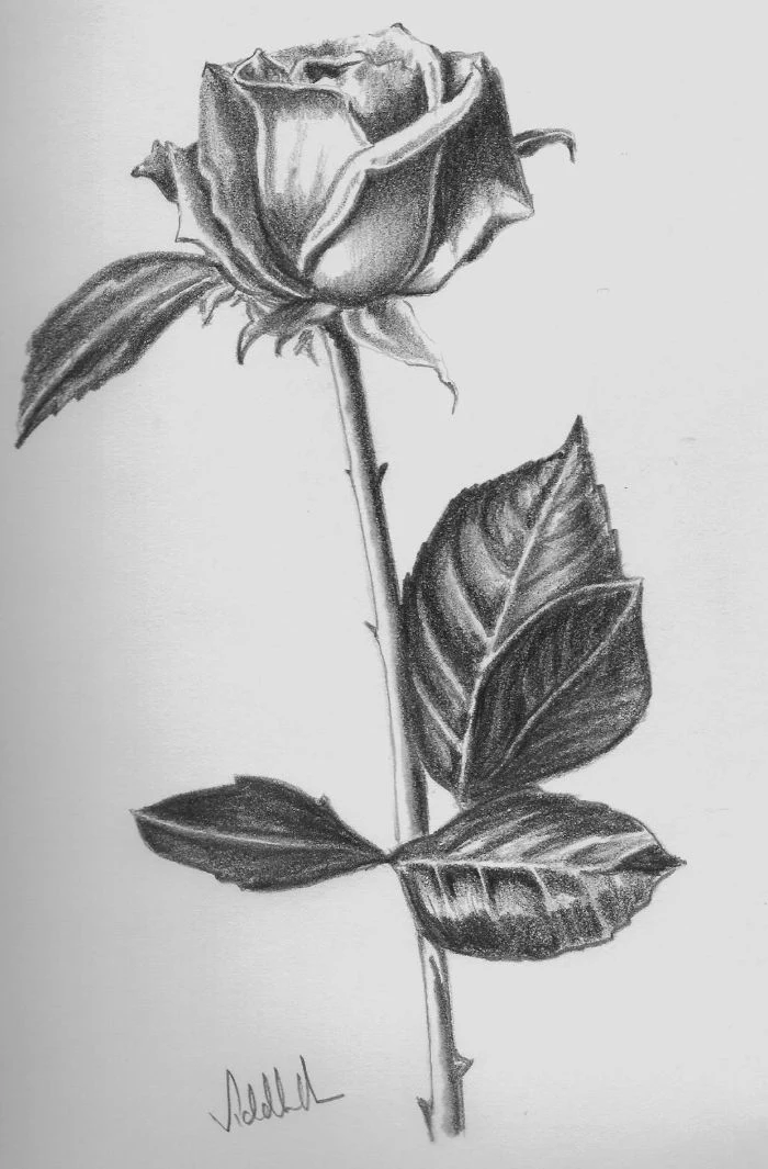
Once you’ve mastered the basic rose, challenge yourself with its lifecycle. A tightly wound bud offers a study in elegant spirals. A fully bloomed rose is an exercise in complex, overlapping forms. And a wilting rose, with its curled, drying edges, tells a beautiful story of time and fragility.
Graphite Pencils: Excellent for precision, fine lines, and creating a smooth, silvery finish. They allow for incredible detail, perfect for botanical illustration.
Charcoal Pencils: Offer deep, velvety blacks and are much easier to blend for soft, dramatic shadows. They are messier but provide a rich, expressive quality.
For a beginner focused on realism, start with graphite. For artists seeking mood and drama, charcoal is a fantastic next step.
The paper you choose has a huge impact on your final piece. For detailed pencil work, a smooth Bristol board, like the Strathmore 300 Series, is ideal. It has very little ‘tooth’ (texture), so your pencil glides effortlessly, allowing for fine lines and seamless blending. If you plan to add a watercolor wash later, opt for a hot-press watercolor paper which has a similarly smooth surface but is designed to handle water.
Did you know the arrangement of petals in a rose often follows the Fibonacci sequence, creating a perfect spiral?
This is nature’s secret to packing petals efficiently while ensuring each one gets access to sunlight. When you’re drawing, you don’t need to count them, but recognizing this underlying spiral pattern in the core of the rose will help you place your initial swirls and shapes more naturally, avoiding the dreaded ‘cabbage’ look.
- Kneaded Eraser: This soft, pliable eraser can be molded to a fine point to lift out tiny highlights, or used to gently dab the graphite to lighten an area without fully erasing. It’s an artist’s best friend.
- Tombow Mono Zero Eraser: A pen-style eraser with a tiny, precise tip. It’s a game-changer for erasing sharp edges or creating fine details like veins on a leaf.
- Standard Block Eraser: Good for cleaning up large areas and stray marks around your finished drawing.
Do you find your finished roses lack a certain ‘pop’?
Try focusing on the ‘lost and found’ edges. Not every outline should be a hard, continuous line. Where a petal turns into bright light, let the line almost disappear (‘lost’). Where it casts a shadow, make the line sharp and dark (‘found’). This simple trick adds a massive amount of realism and visual interest to your work.
It’s easy to get so focused on the rose itself that you forget about its surroundings. The empty space around the flower, known as negative space, is just as important. By carefully shaping the background, you help define the rose’s silhouette. Try lightly shading the area immediately around the petals to make the flower stand out from the page.
Think beyond the flower. A truly realistic rose drawing includes its companions. The leaves, with their serrated edges and distinct vein patterns, provide a beautiful textural contrast to the soft petals. Don’t forget the thorns on the stem—they add character and a hint of wildness. Capturing these details grounds your drawing in reality.
Before tackling a full rose, warm up your hand and eye with these quick drills:
- Draw a series of simple ‘cup’ shapes from different angles.
- Practice drawing ribbons and folded fabric to understand how forms turn and cast shadows.
- Sketch simple spirals, starting tight and getting looser, to mimic the rose’s growth pattern.
For centuries, botanical illustrators have blended art and science. Look up the work of Pierre-Joseph Redouté (1759-1840), whose detailed watercolors of roses for Empress Joséphine of France are still considered masterpieces. His ability to capture both scientific accuracy and delicate beauty is an eternal source of inspiration.
A common pitfall: The ‘floating rose’. If you don’t anchor your rose with proper shading, it can look like it’s pasted onto the page. Always consider where the rose is sitting. It should cast a shadow on the surface beneath it. This ‘cast shadow’ is what will give your drawing weight and a sense of place.
- It makes colors pop with incredible vibrancy.
- It allows for beautiful, transparent layers.
- It captures the delicate, fragile nature of the petals perfectly.
The secret? Trying watercolor pencils. Brands like Derwent Inktense or Faber-Castell Albrecht Dürer let you draw with the precision of a pencil, then activate the pigment with a wet brush to transform your drawing into a painting.
My pencil lines are too dark and hard to erase. What am I doing wrong?
You’re likely pressing too hard too soon. Start your initial sketch with an extremely light touch, holding the pencil further back from the tip. Think of it as gently ‘suggesting’ the lines rather than carving them in. Use a 2H or F pencil for this stage. You should only apply heavy pressure and darker pencils (like a 4B) at the very end, for the deepest shadows.
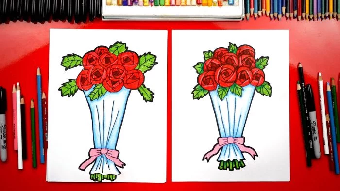
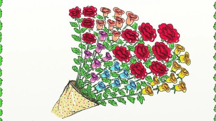
Don’t just draw one rose. Create a composition. A simple way to make your artwork more dynamic is to use the ‘rule of odds’—drawings with three or five roses are often more visually appealing than those with an even number. Vary their sizes and stages of bloom to create a natural-looking bouquet on the page.
Over 100 million roses are sold annually for Valentine’s Day in the US alone.
This flower’s universal appeal is rooted in its complex symbolism. A red rose signifies deep love, yellow means friendship, and pink conveys admiration. When you choose the color for a watercolor rose or even just the mood for a pencil drawing, you’re tapping into a rich cultural language.
Finished your masterpiece? Protect it! Graphite and charcoal can smudge over time. A light coat of workable fixative spray, like Krylon Workable Fixatif, will lock the particles in place. It creates a clear, non-yellowing layer of protection while still allowing you to go back and add more details later if you wish.
Feeling adventurous? Try a different medium. Drawing a rose with white charcoal or a chalk pencil on black or toned paper is a fantastic exercise. It forces you to think in reverse—instead of adding shadows, you’re adding the highlights. This process, called chiaroscuro, dramatically improves your understanding of light.
You don’t need to spend a fortune to start. A great budget-friendly kit would include a set of Staedtler Mars Lumograph pencils, a simple sketchbook from a brand like Canson, and a kneaded eraser. These core tools are high quality and will serve you well through hundreds of drawings.
Take your art off the page. Scan your favorite rose drawing at a high resolution. You can then use it to print a set of personalized thank-you cards, a custom phone case, or even a small art print for a friend. It’s a wonderful way to give your practice a purpose beyond the sketchbook.
If you’re drawing digitally on an iPad, explore different brushes. The default ‘6B Pencil’ brush in Procreate is great, but many artists sell custom brush packs specifically for botanical drawing. Look for brushes that have a slight paper texture and are sensitive to pressure to mimic the feel of a real pencil. It’s a new way to explore an old subject.