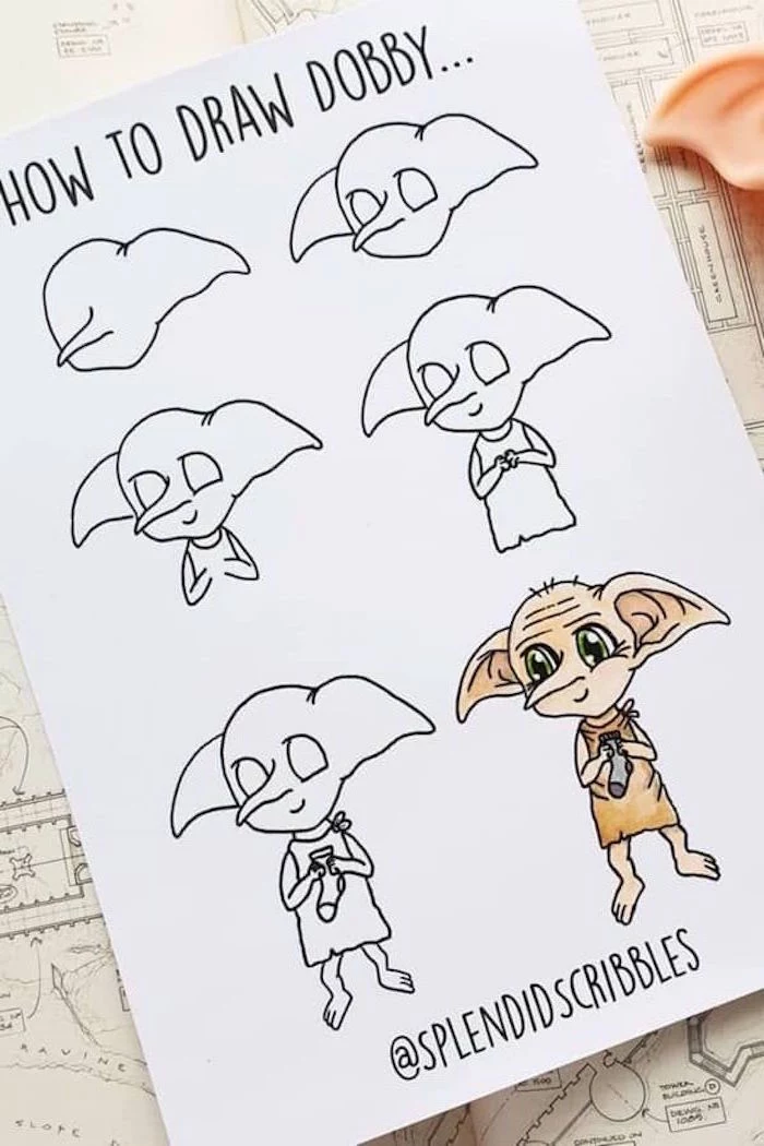
From Stick Figures to Sorcerers: Drawing Fantasy Characters with Soul
I’ve been a portrait artist for a long time, drawing everything from corporate headshots to beloved family pets. But honestly, nothing gets quite the same reaction as characters from a certain magical world that so many of us grew up with. It all started for me at a local art fair a while back. A young girl asked if I could draw the brilliant, bushy-haired witch from her favorite books—not the movie version, but how she saw her in her mind. That one request totally rekindled my love for those stories and kickstarted a journey to figure out how to truly capture their magic on paper.
In this article
- First Things First: It’s All About the ‘Why’
- Your Artist Toolkit: Pencils, Paper, and Magic Wands (Almost)
- Your First Challenge: A 30-Minute Win
- Okay, Let’s Draw: Bringing a Character to Life
- Hitting a Snag? Common Problems and Quick Fixes
- Finishing and Protecting Your Art
- A Quick Word on Selling Fan Art
- Conclusion
- Inspirational Gallery
So many of us, whether we’re just starting out or have been drawing for years, want to bring these characters to life. It’s a powerful way to connect with a universe that fired up our imaginations. But let’s be real, sometimes the final drawing just falls flat. The face doesn’t look quite right, there’s no depth, or the character just feels… empty. This guide isn’t about tracing a photo. It’s about sharing the core techniques I use in my professional work, the same stuff I teach in my workshops. We’ll go over the tools you actually need (without breaking the bank), the basics of light and form, and how to pour a character’s personality right through the tip of your pencil.
First Things First: It’s All About the ‘Why’
Before you even think about sketching, a little bit of theory will take you a long, long way. Pro artists don’t just have a “good eye”; they have a solid grasp of how things actually work in the real world. When you understand the ‘why’ behind a technique, you can solve problems on the fly and make creative choices instead of just mindlessly copying something.
How Light and Shadow REALLY Work
Everything you see, and everything you draw, is defined by light. Your pencil is basically a shadow-making tool. Without shadows, a sphere is just a flat circle. To make something look 3D, you need to get these five key elements of light right:
- Highlight: The single brightest spot, where the light source smacks right into the object. Think of the glint on a pair of glasses or the tip of a nose.
- Mid-tone: This is the object’s true, base value. It’s lit, but not directly.
- Core Shadow: The darkest part of the shadow that’s actually on the object itself. This is what really shows that an object is round and turning away from the light.
- Reflected Light: This is the secret sauce for realism! It’s a subtle, slightly lighter area tucked inside the core shadow. It’s caused by light bouncing off other surfaces (like a collar or a nearby wall) back onto the object. It’s a tiny detail that makes a huge difference.
- Cast Shadow: The shadow the object throws onto another surface, like a table or a person’s face. It’s always darkest and sharpest right next to the object and gets softer as it moves away.
Try this right now: Grab a coffee mug and shine your phone’s flashlight on it from one side. See if you can spot all five elements. Can you see the bright highlight, the dark core shadow, and the shadow it casts on the table? Seeing it in real life makes it click instantly.
Your Artist Toolkit: Pencils, Paper, and Magic Wands (Almost)
Your tools are your best friends, so it pays to get the right ones. You don’t need the most expensive gear on the market, but using quality supplies makes the whole process smoother and way more fun.
A Quick Shopping List for Beginners:
Heads up, you can get a fantastic starter kit for around $35-$40. Look for these items at your local art supply store like Michaels, or online.
- A Drawing Paper Pad: A good all-purpose pad (like a Strathmore 400 series or similar) will run you about $15. Make sure it’s at least 130 gsm, which just means it’s thick enough to handle erasing.
- A Set of Graphite Pencils: A quality beginner’s set with a range of hardnesses costs about $12-$15. Look for professional-grade brands, as they have less grit and won’t scratch your paper.
- A Kneaded Eraser: This is a must-have. It’s a soft, putty-like eraser that won’t leave residue. Costs about $2-$3.
- Blending Stumps: A small pack of these rolled paper tools is about $4-$5 and gives you much better blending control than your finger.
Your Pencils: More Than Just a #2
Pencils are graded from H (Hard) for light lines to B (Black/Soft) for dark shading. An HB is right in the middle. For portraits, I really only use four:
- 2H: For the first, super-light sketch. The lines are a breeze to erase.
- HB: For locking in the main lines and shapes.
- 2B: My workhorse. This is for building up medium tones and starting on the shadows.
- 4B or 6B: For the absolute darkest parts. Use these last because they are super soft and love to smudge.
Paper and Other Essentials
Paper has a texture called “tooth.” A rougher tooth grabs more graphite and is great for things like a giant’s beard. A smooth paper, like Bristol board, is perfect for super fine details. For general use, a medium-tooth drawing paper is your best bet.
You’ll also want a couple of specific tools for erasing and blending. A kneaded eraser is amazing because you can shape it to a point and gently lift graphite off the paper. For tiny details, like a glint in an eye or a single hair highlight, a pen-style detail eraser is a total game-changer.
And please, don’t use your finger to blend! Your skin has oils that can create ugly, blotchy spots on your drawing that you can’t erase. Use blending stumps or tortillons instead. They’re just tightly rolled paper, but they give you incredible control.
Your First Challenge: A 30-Minute Win
Jumping into a full 12-hour portrait is… a lot. It can feel overwhelming. So before we tackle a whole face, let’s go for a quick win to build some confidence. We’re going to draw a magical, winged golden sphere.
Find a reference picture of one. Grab your HB pencil. Start by sketching a circle. Now, think about those five elements of light we talked about. Decide where your light is coming from. Use your 2B to gently shade the side of the sphere opposite the light, creating the mid-tone and core shadow. Use your 4B to deepen the darkest part of that core shadow. Then, take your kneaded eraser and lift out a sharp, bright highlight on the side facing the light. Add a soft cast shadow underneath it. In less than 30 minutes, you’ve just created a realistic, three-dimensional object. Feels good, right?
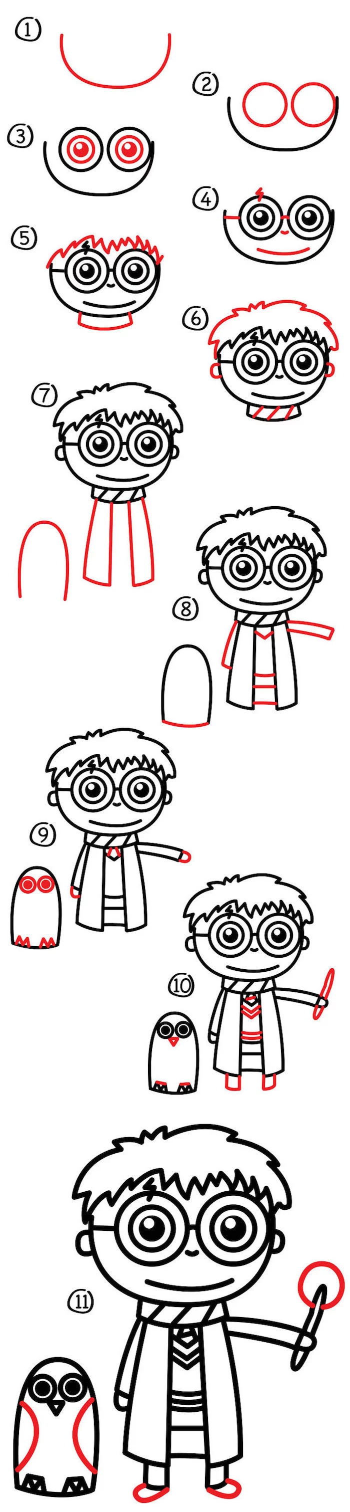
Okay, Let’s Draw: Bringing a Character to Life
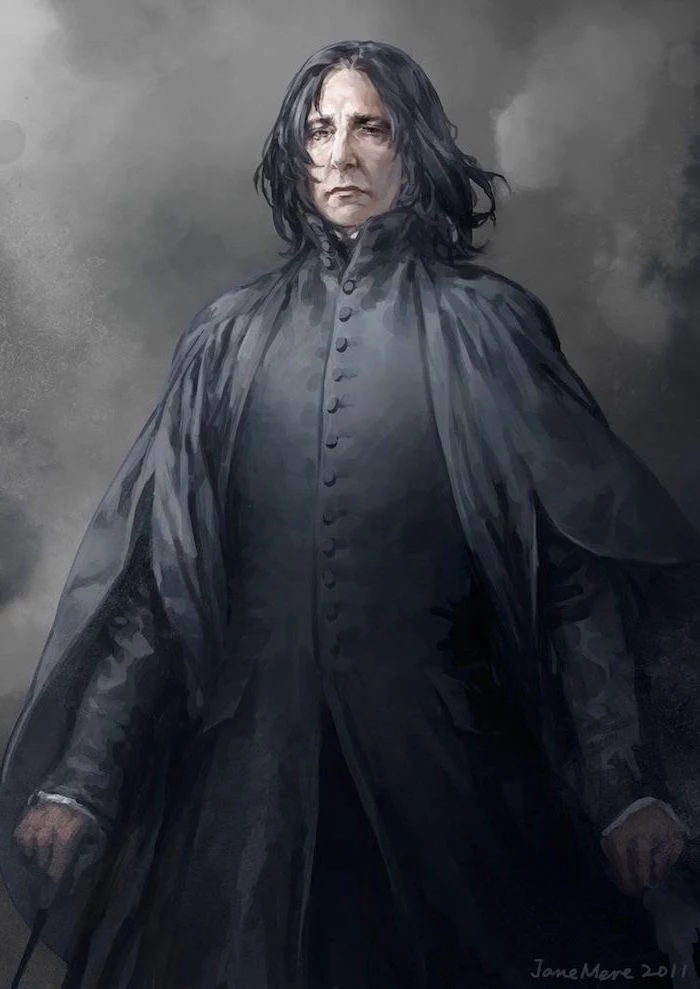
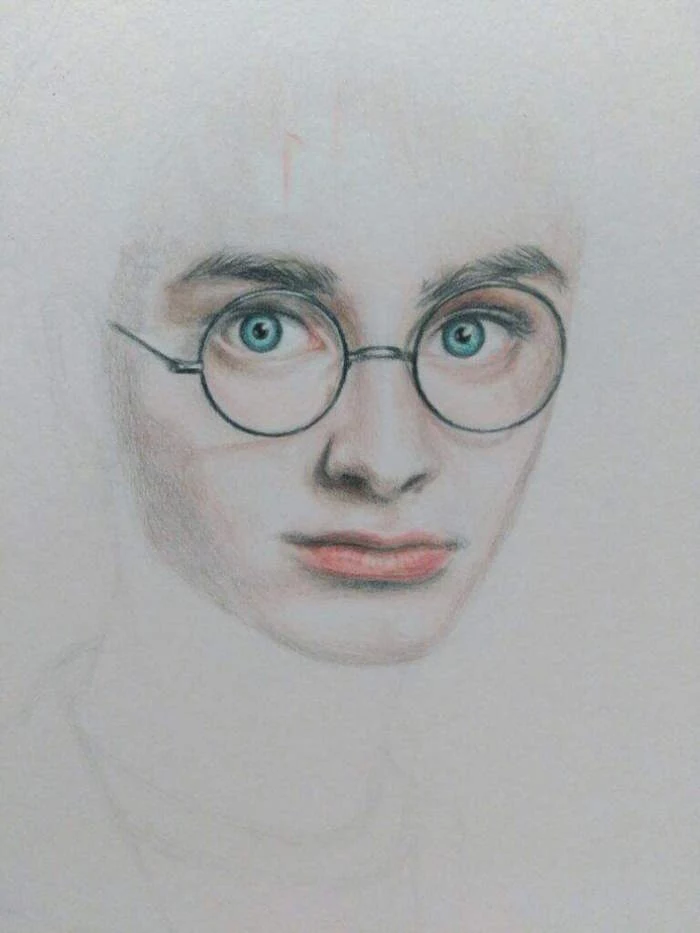
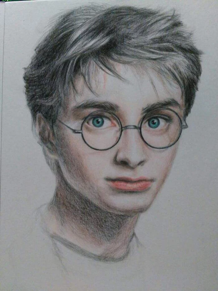
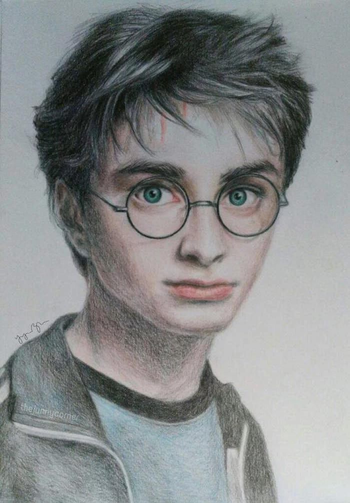
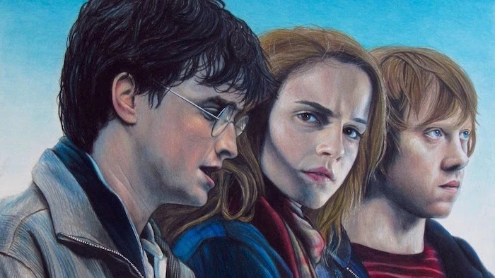
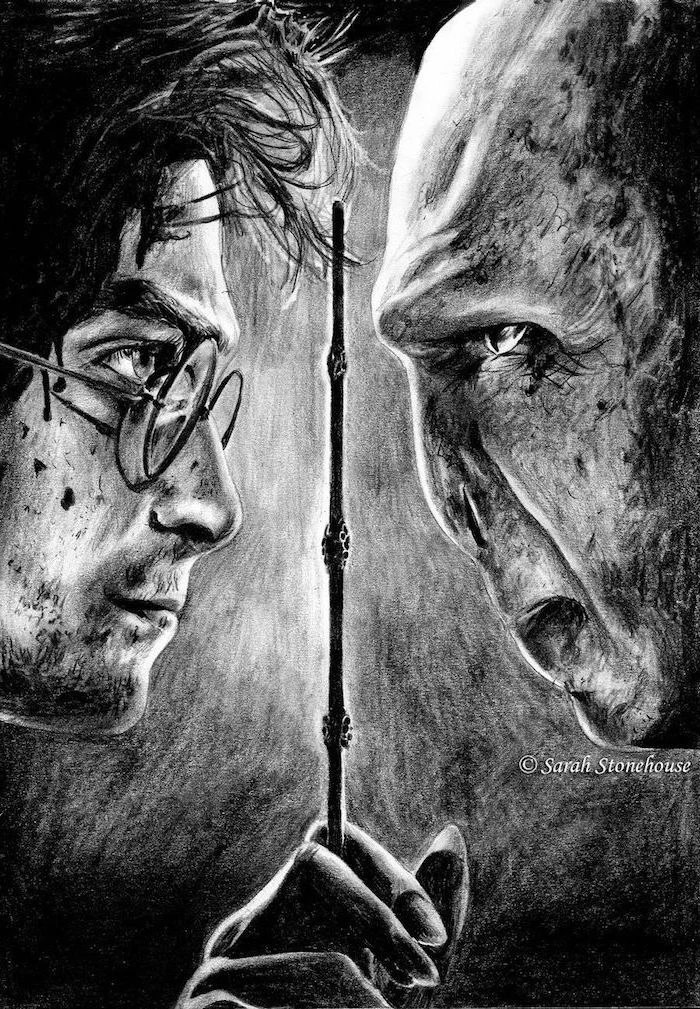
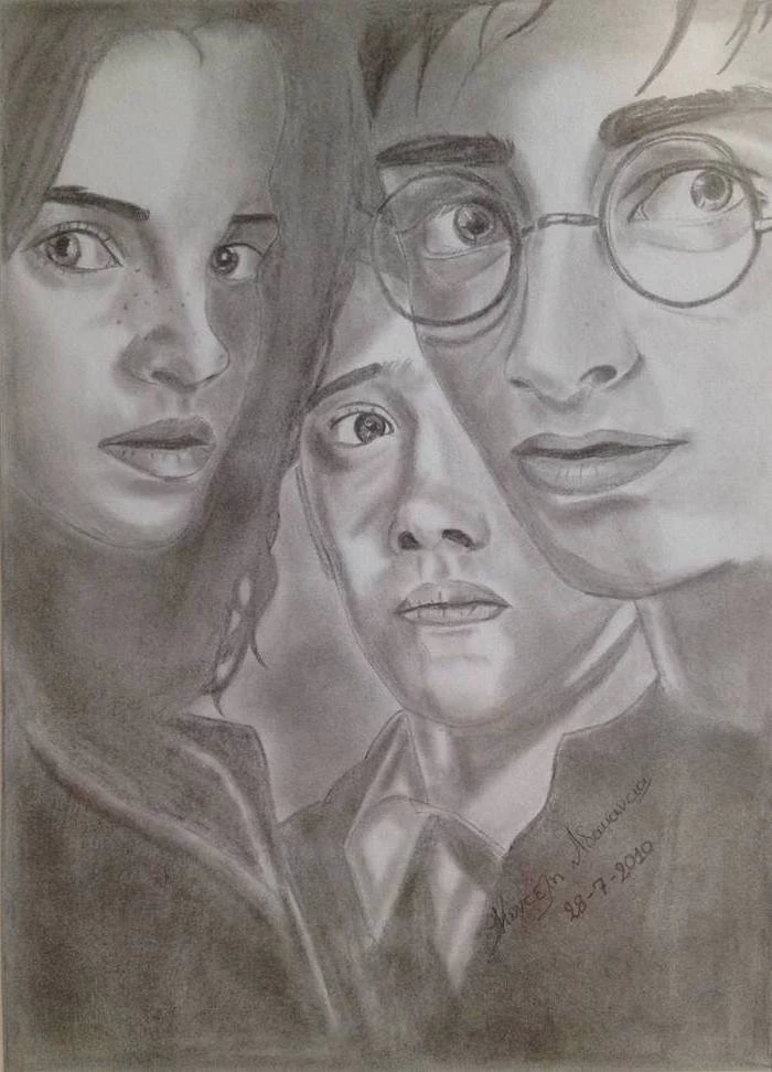
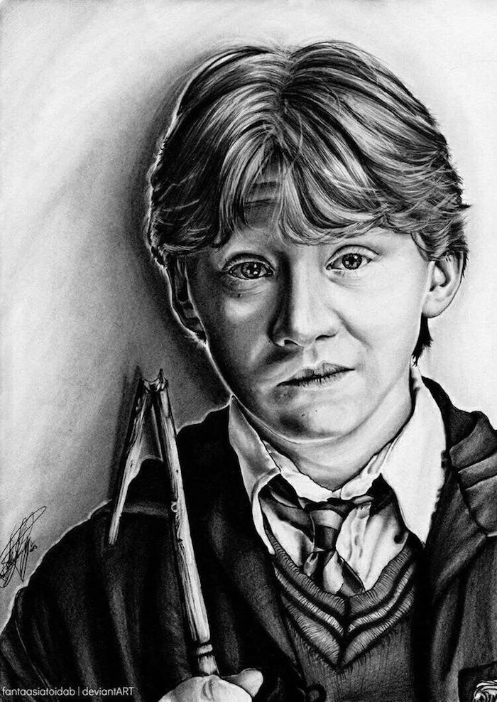
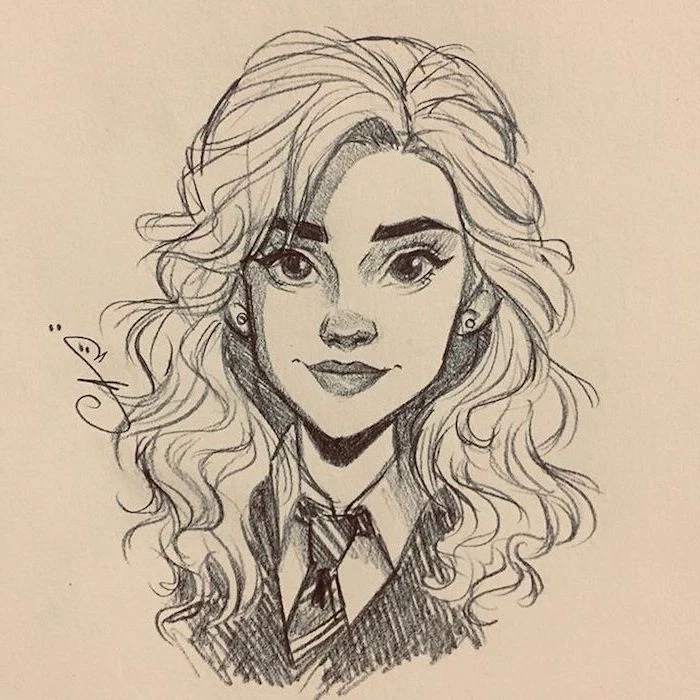
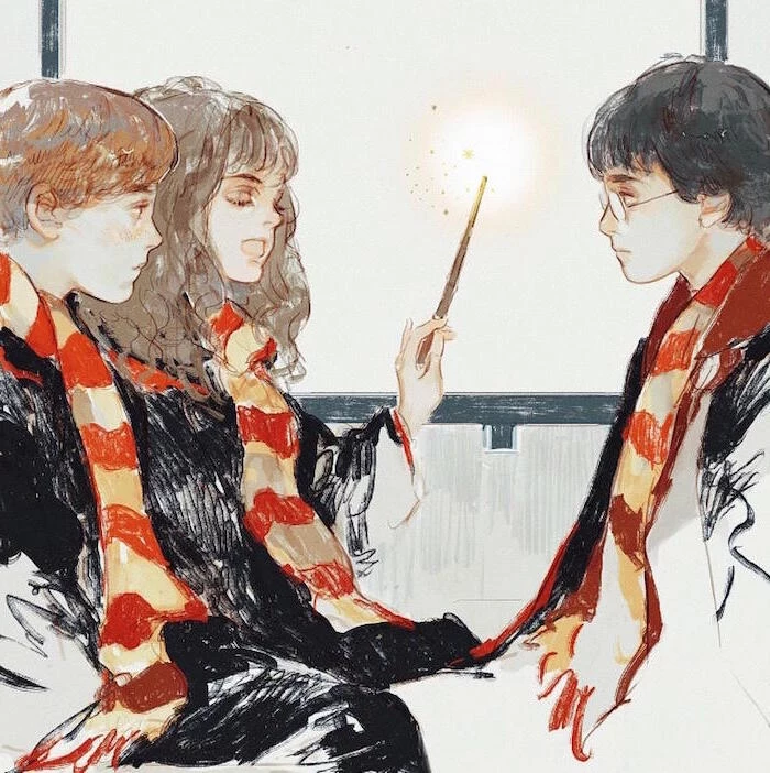
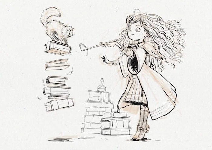
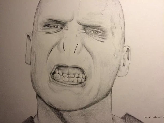
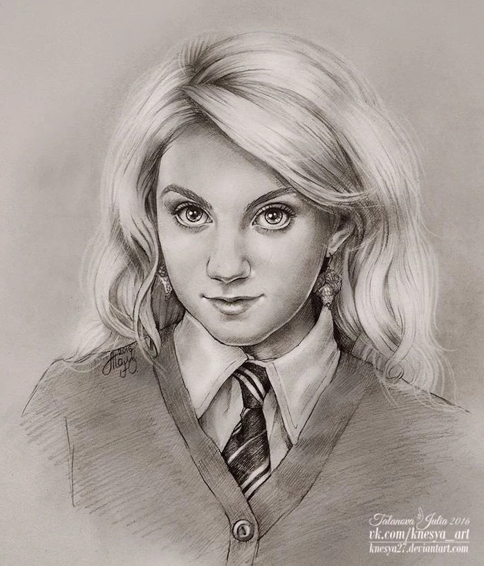
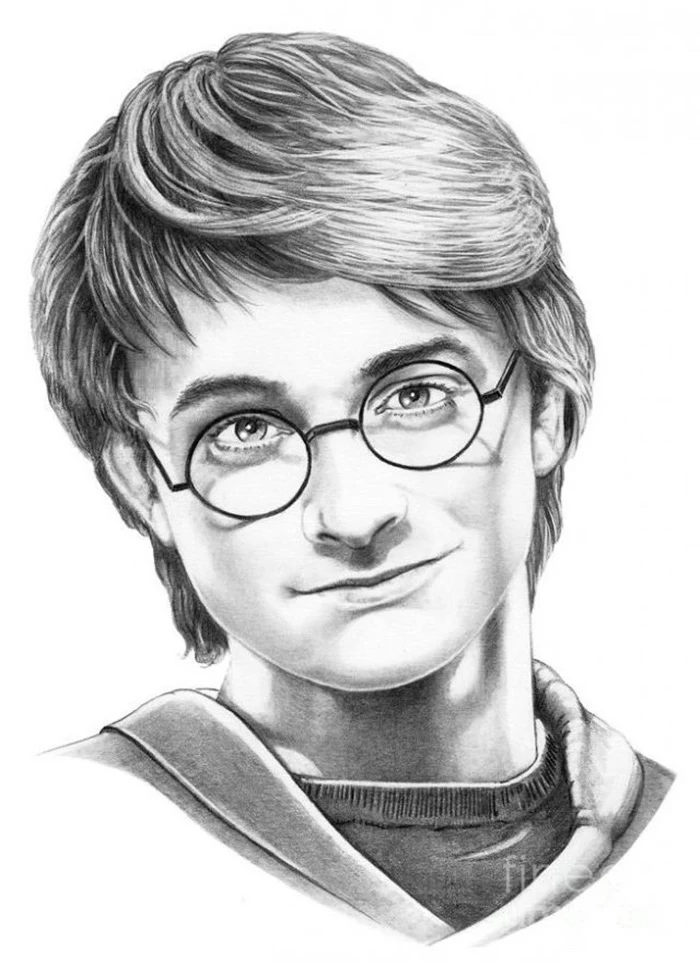
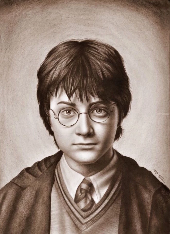
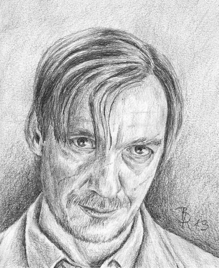
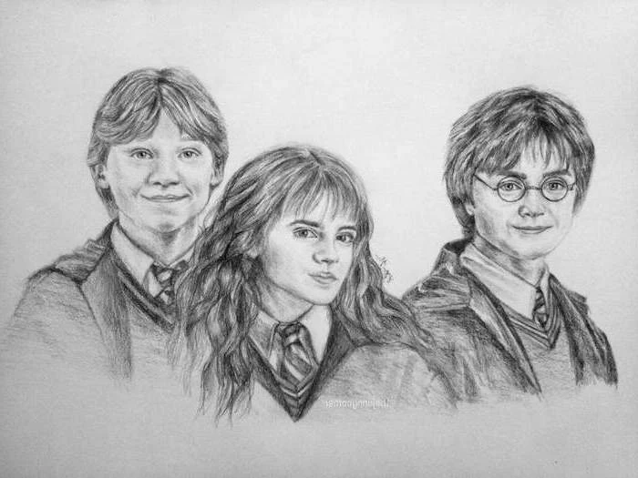
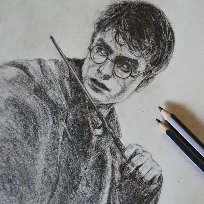
Now for the main event. We’ll use the clever, bushy-haired witch as our example since her expressions and famous hair are perfect for practice. A quick heads-up: a detailed portrait like this can take anywhere from 8 to 12 hours. Be patient with yourself. The goal is a great drawing, not a fast one.
Pro Tip: To avoid smudging your work as you go, place a clean sheet of computer paper under your drawing hand. It’ll glide over the graphite without smearing it all over the place. A simple trick that saves a lot of headaches!
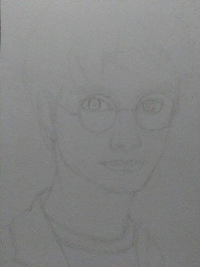
Step 1: The Foundation (30-45 mins)
With your 2H pencil, sketch as lightly as you possibly can. We’re just mapping out where things go. A popular method is to start with a sphere for the main part of the skull, then slice off the sides and add a jawline. Then, draw a cross—a vertical line for the center of the face and a horizontal line for the eyebrows. (If that sounds too technical, don’t worry. Just start with a simple egg shape for the head and draw your cross. You can find tons of great videos on “head construction drawing methods” that show this in action!)
Step 2: Building the Features (1-2 hours)
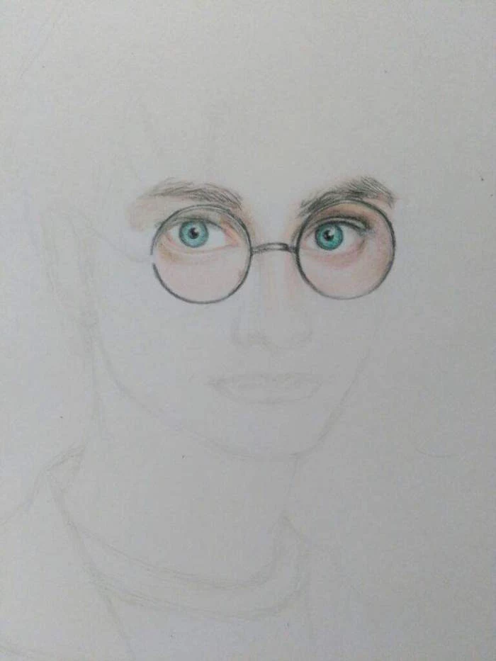
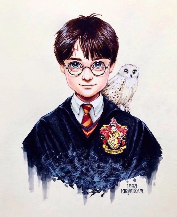
Switch to your HB pencil and start with the eyes—they carry all the emotion. Remember, an eye is a ball in a socket, so the eyelids need to wrap around it. The iris is a circle, but the lids will usually cover the top and bottom. The most common mistake I see? Forgetting the catchlight. It’s that tiny dot of pure white reflection that makes an eye look wet and alive. Just leave a small spot un-shaded.
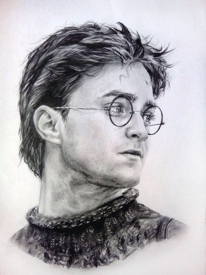
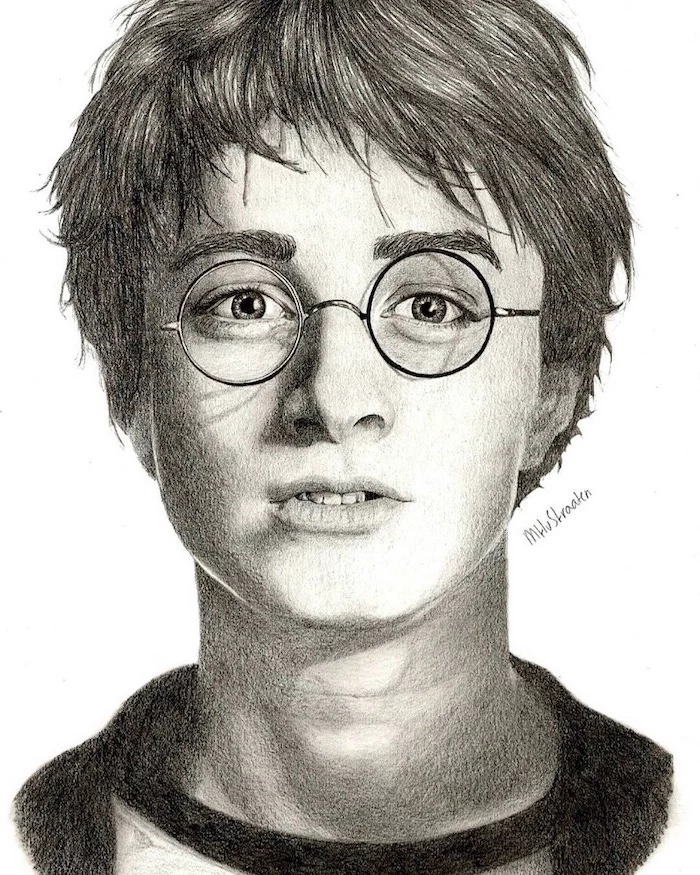
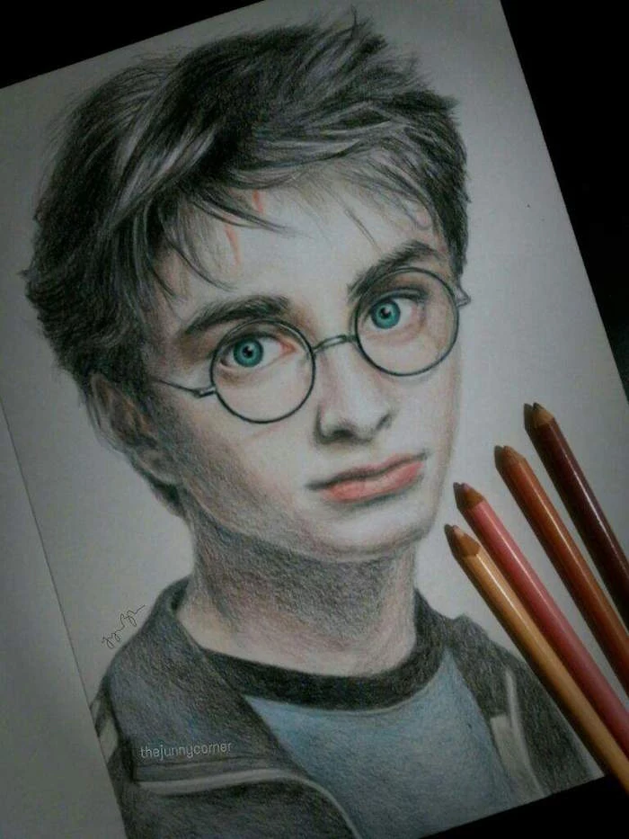
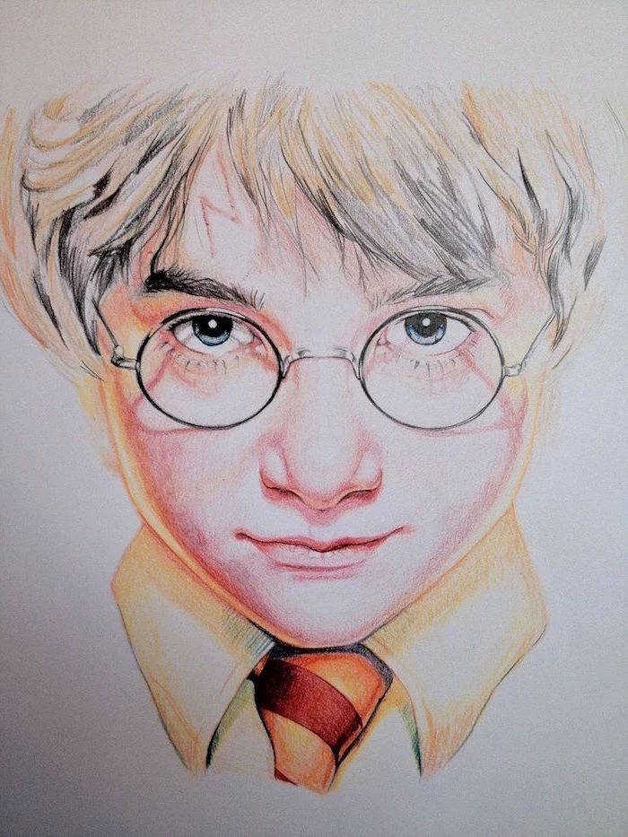
By the way, if you’re drawing a character with glasses, like the famous boy wizard, don’t just draw two circles on his face. The frames will cast their own tiny, subtle shadows on the cheeks and nose. And for the lenses, just suggest them with a slight highlight or glare. This makes them look much more realistic.
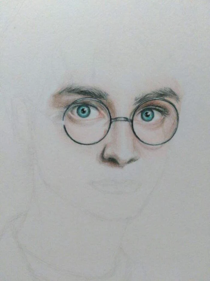
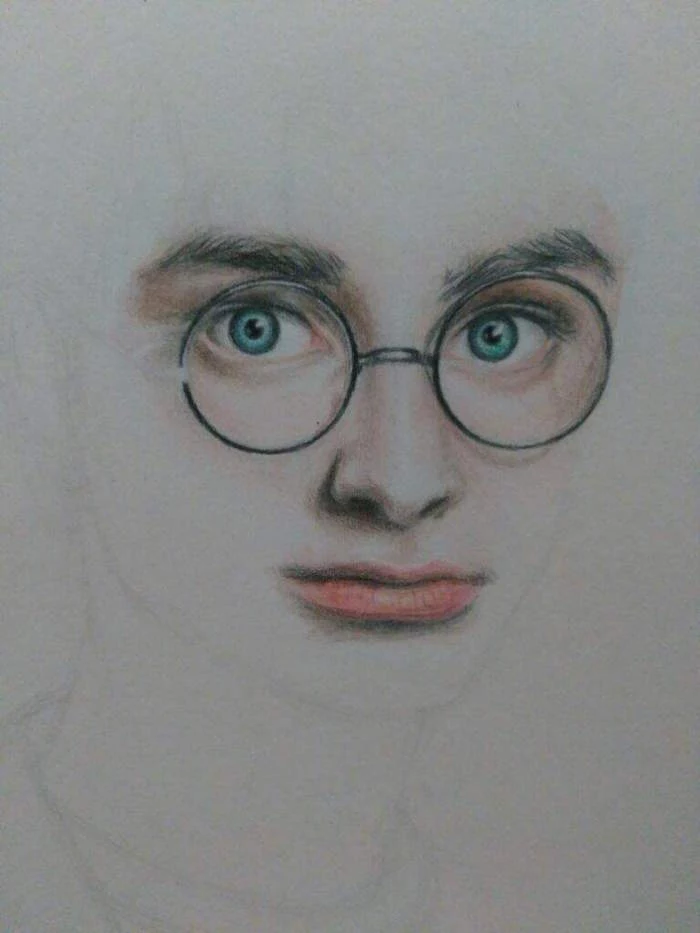
Step 3: Creating Form with Shading (3-5 hours)
Here’s where the magic happens. Using your 2B and 4B pencils, start layering in your shadows, working from light to dark. It’s always easier to make an area darker than it is to make it lighter. For skin, use soft, circular motions with your pencil and a blending stump. Your pencil strokes should always follow the contours of the face, like lines on a map.
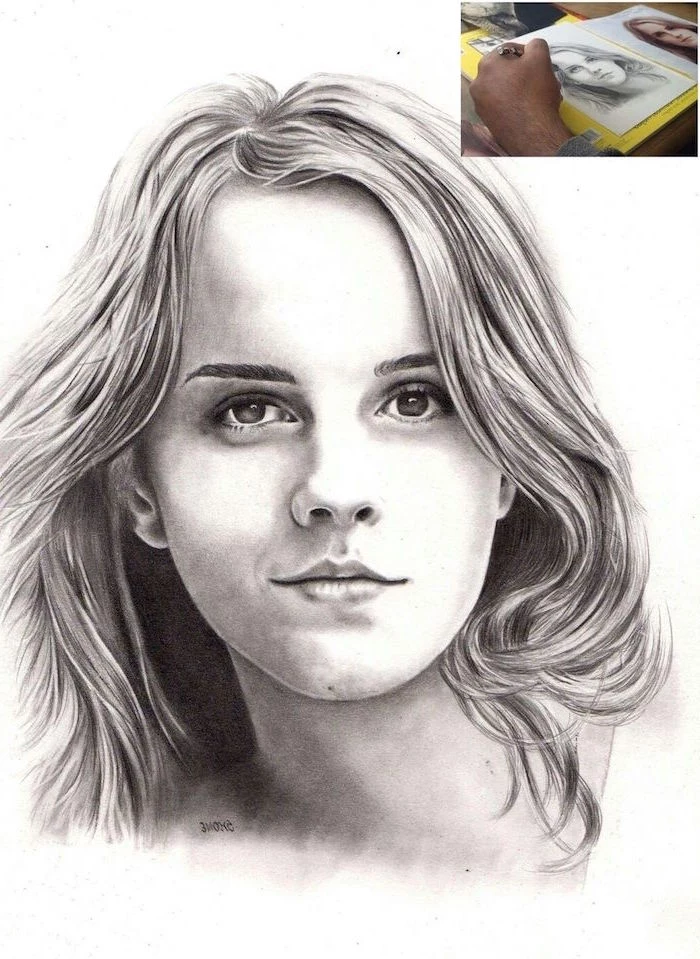
Step 4: The Challenge of Hair (2-3 hours)
Listen closely, because this is the most important tip for drawing hair: Do NOT draw individual strands. I repeat, do not draw individual strands from the start! It’s the fastest way to make hair look like a stringy mess.
Instead, think of hair as big shapes of light and shadow. Squint your eyes at your reference, and you’ll see what I mean. Here’s how to tackle it:
- First, lightly shade the entire hair area with your HB to establish the base color.
- Next, use your 4B to block in the darkest shadow shapes you see. Don’t be shy here.
- Now for the fun part. Pinch your kneaded eraser to a sharp edge and literally erase the highlights. You are lifting the light-colored streaks out of the darker mass. This is a technique called subtractive drawing.
- Finally, once the big shapes are done, you can go in with a sharp pencil and add just a few individual strands at the edges and in the highlights to suggest texture.
Hitting a Snag? Common Problems and Quick Fixes
Even pros run into trouble. Here are some common frustrations and how to deal with them.
- “My shadows are way too dark!” Don’t panic. Take your kneaded eraser and gently dab or blot the area. Don’t rub. This will lift the graphite layer by layer. If it’s a small spot, shape the eraser to a point for precision work.
- “My paper looks gritty and weird after erasing.” This usually means you pressed too hard with your initial sketch, especially with a hard (H) pencil. This creates grooves in the paper that are impossible to get rid of. The lesson? Always, always start with a feather-light touch.
- “My drawing looks flat.” This is almost always a value problem. You’re probably being too timid with your darks. A drawing needs a full range, from the white of the paper to the deep black of a 6B pencil. Push your shadows darker!
Finishing and Protecting Your Art
Graphite smudges. It’s a fact of life. To protect your finished piece, you need a can of workable fixative spray, which you can get at any art store for about $10-$15. This clear sealant locks the graphite in place.
SAFETY FIRST: The fumes from fixative are no joke. Seriously. Always spray it in a well-ventilated area—outside is best. Hold the can about a foot away from your drawing and use light, even sweeps. Two light coats are much better than one heavy one. I’ve seen people ruin hours of work by spraying too close and creating splotches.
A Quick Word on Selling Fan Art
As you get better, you might think about selling your work. This is a legal gray area, so it’s important to be careful. Creating art of characters from your favorite books and movies for your own enjoyment is usually fine. But selling it for profit can be tricky, since the characters and names are someone else’s intellectual property.
My best advice is to do your research on derivative works and copyright. For my own professional work, I keep my passion projects separate from my commercial commissions to avoid any issues. It’s just the safer path.
Conclusion
Drawing these characters is such a rewarding way to connect with the stories you love while seriously leveling up your art skills. It’s the perfect blend of technical challenge and creative freedom. Master the basics of light, choose your tools with care, and above all, be patient. The real magic isn’t a spell; it’s the passion and practice you pour onto the page. It’s all in the hand that holds the pencil.
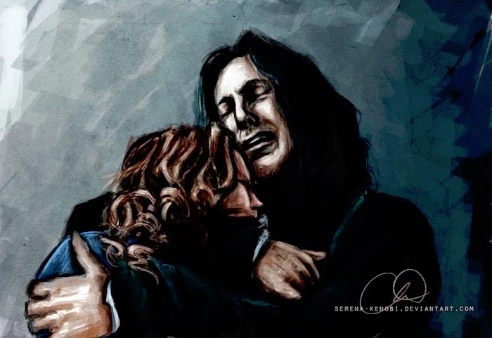
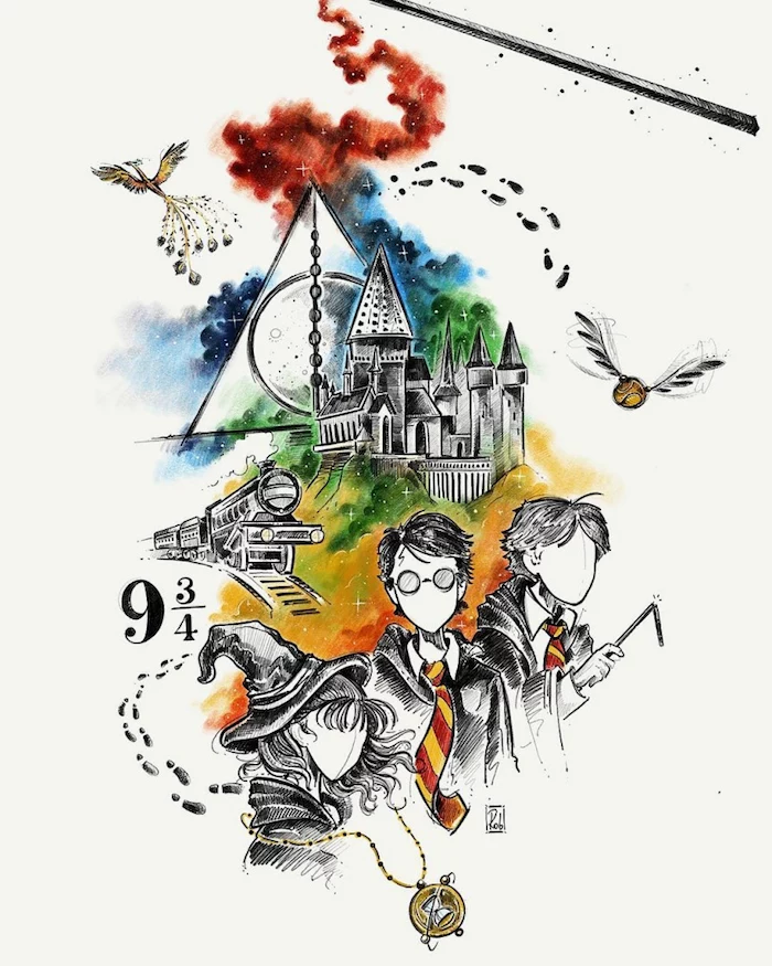
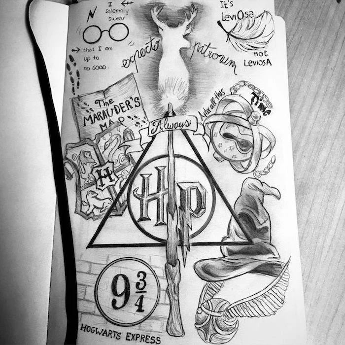
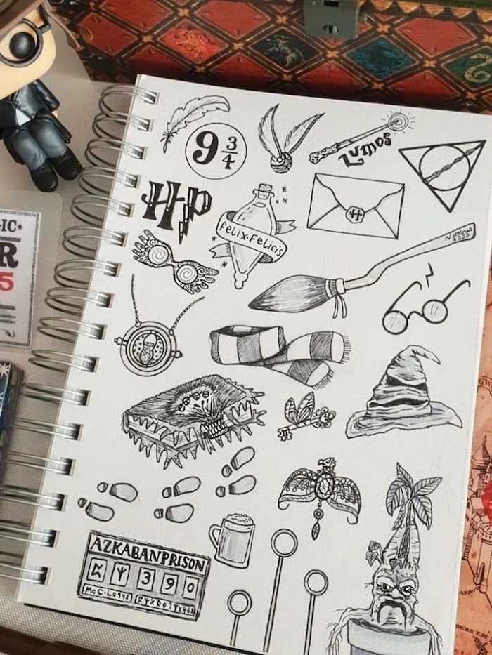
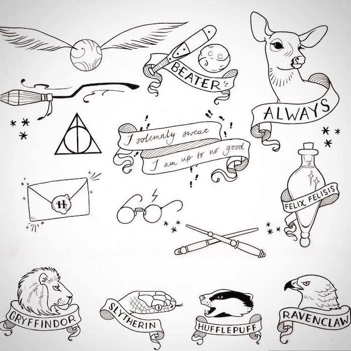
Inspirational Gallery
Don’t underestimate the power of your eraser. A kneaded eraser isn’t for mistakes; it’s a drawing tool. Instead of rubbing, press and lift it to gently pull graphite from the paper. This technique is perfect for creating soft highlights on skin, suggesting the faint glimmer of a ghost, or softening the edges of a Patronus’s glow without leaving harsh lines.
- Start with light, overlapping circles for the iris, not a single dark ring.
- Place the pupil slightly off-center and leave a tiny, pure white dot for the specular highlight—this is the key to life.
- Add faint, radiating lines from the pupil and subtly shade the top of the iris to suggest the shadow cast by the eyelid.
The result? Eyes that don’t just stare, but truly see.
The secret to believable fabric: Don’t draw the robe, draw the body underneath. Fabric only folds, stretches, and drapes because of the form it’s covering. Lightly sketch the character’s pose first, then imagine the heavy wool of a Hogwarts robe hanging from their shoulders and bunching at their elbows. The folds will instantly look more natural and weighty.
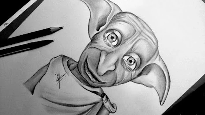
I saw that in a sketch, Jim Kay, the illustrator of the new editions, had drawn a mandrake with the face of a particularly grumpy-looking baby he’d seen on the Tube.
This little fact is a great reminder: magic is rooted in reality. The best fantasy artists are keen observers of the everyday world, infusing their creations with details that make them feel tangible and strangely familiar.
Tired of stark white backgrounds? Drawing on toned paper—like a Canson Mi-Teintes in grey or tan—can revolutionize your portraits. It offers several advantages:
- The paper’s color provides an instant mid-tone, saving you time.
- You can use both darker pencils for shadows and white pencils, like a Derwent Drawing Chinese White, for brilliant highlights that truly pop.
- It immediately gives your work a classic, timeless feel, perfect for a world of parchment and old spells.
My colored pencils get waxy and I can’t add more layers. What am I doing wrong?
This is a common issue, often related to the pencil’s core. Softer, wax-based pencils like Prismacolor Premier are brilliant for smooth blending but can build up a waxy layer (burnishing) that resists more color. To combat this, work with very light pressure, building up thin layers. Alternatively, try oil-based pencils like Faber-Castell Polychromos, which allow for many more layers and keep a sharper point for fine details like hair and fabric textures.
Graphite Pencils: Your go-to for control and detail. A set ranging from a hard 2H to a soft 6B (like the Staedtler Mars Lumograph series) covers everything from faint construction lines to deep shadows.
Charcoal Pencils: For drama and darkness. Charcoal provides a rich, matte black that graphite can’t match. It’s perfect for the oppressive shadows of the Forbidden Forest or the deep folds of a Death Eater’s cloak, but be warned—it’s much smudgier!
For most character work, stick with graphite, but bring in the charcoal when you need pure, uncompromising black.
Nearly 80% of film posters prominently feature the colors blue and orange.
This isn’t an accident; it’s color theory at work. Blue and orange are complementary, creating a powerful visual contrast. You can use this in your drawings. Pit the warm, orange glow of a wand’s spell (like Expelliarmus) against the cool, blue-lit stones of a Hogwarts corridor at night for an image that is instantly more dynamic and magical.
- Luminous highlights that sit on top of even the darkest pencil work.
- The unmistakable glint in an eye or on a pair of glasses.
- The sharp, crackling energy of a spell emanating from a wand tip.
The tool for the job? A white gel pen. A Sakura Gelly Roll is an essential piece of kit for adding those final, brilliant pops of light that make a drawing come alive.
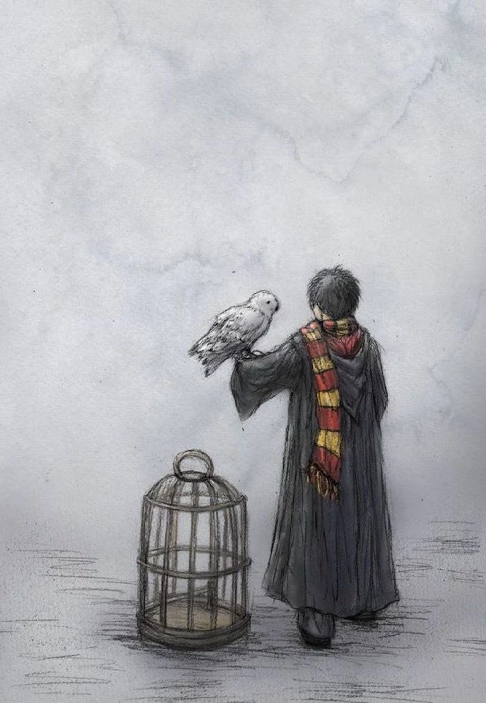
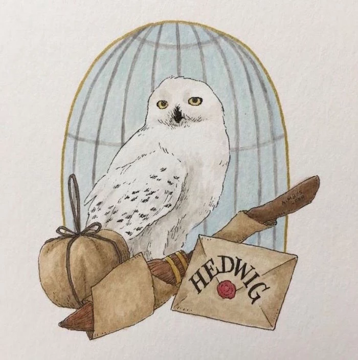
Capturing the texture of a character’s clothing or an animal’s fur adds a layer of realism. For Hedwig, for instance, avoid drawing every single feather. Instead, use a combination of soft, directional strokes with a 2B pencil and subtle blending with a tortillon to suggest the overall softness. Then, use a sharp, hard H pencil or a precision eraser like the Tombow Mono Zero to pick out the fine, sharp edges of a few key feathers. The contrast between soft and sharp is what creates the illusion.

A wand is an extension of the wizard. Before drawing it, think about its owner. Is it elegant and refined like Fleur Delacour’s, made of rosewood? Or is it gnarled and powerful, like Mad-Eye Moody’s? The wood grain, length, and design should tell a story. A few nicks and scratches on Ron’s Spellotaped wand say more about his character than a whole paragraph of text.
How do you draw something that’s supposed to be invisible, like the Demiguise’s coat or the Invisibility Cloak?
This is a fantastic creative challenge! The trick is to draw the effect of the invisibility, not the thing itself. For the cloak, show the character’s feet and ankles, then have the rest of their body disappear into a faint, shimmering outline that slightly distorts the background behind it—like a heat haze. It’s about suggestion, not depiction.
Prismacolor Premier: These are soft, wax-based pencils known for their incredible vibrancy and buttery-smooth blending. They are perfect for rich, saturated areas like house-colored robes or fiery spell effects.
Faber-Castell Polychromos: These are harder, oil-based pencils. They hold a very sharp point, making them the superior choice for fine details like eyelashes, scars, or the intricate patterns on a time-turner.
Many artists use both, starting with Polychromos for the detailed underdrawing and adding rich layers of Prismacolor on top.
- Create an instant aged-parchment effect for maps or letters.
- Add realistic dirt and grime to a character’s face or clothes.
- Give depth and a uniform undertone to a drawing before adding color.
The secret is a simple wash of diluted instant coffee or black tea. Apply it to your paper with a large brush and let it dry completely before drawing. Test it on a scrap piece first to get the color just right!
The common pitfall: Making Harry’s scar look like a freshly drawn pink line. Remember, it’s an old curse scar. It should be faint, silvery, and sit subtly on the skin. Use a very sharp, hard pencil (like a 2H) and apply minimal pressure. It shouldn’t be a deep groove, but rather a slight discoloration of the skin that only catches the light at certain angles.
Want to draw a location like Hogwarts or Diagon Alley? A basic understanding of perspective is essential. Here’s a quick primer:
- One-Point Perspective: Use this when you’re looking straight down a road or corridor. All lines (tops of windows, edges of the street) converge at a single ‘vanishing point’ on the horizon.
- Two-Point Perspective: Use this when you’re looking at the corner of a building. Lines recede to two different vanishing points on the left and right. This adds much more depth and dynamism.
- Crisp, permanent lines that won’t smudge.
- The ability to draw linework first, then paint or use markers over it without the ink bleeding.
- A consistent flow of ink for perfectly uniform details.
The secret is an archival ink pen. The Sakura Pigma Micron series is the industry standard for a reason. A 01 or 03 size is perfect for outlining characters before you add color or shading.
Let’s talk about magical light sources. A Patronus shouldn’t be drawn like a lamp; it should feel ethereal. Use very soft, broad strokes with the side of your pencil. Lift out the brightest areas with a kneaded eraser, and keep the edges soft and indistinct. In contrast, the ‘Lumos’ spell is a concentrated point of light. Make its center almost pure white and have the light fall off sharply, casting hard-edged shadows on the character’s face.
How do I protect my finished drawing from smudging?
You need a fixative spray. But choose wisely. A ‘workable’ fixative allows you to spray a light coat to prevent smudging, but you can still draw or erase on top of it. A ‘final’ fixative provides a permanent, protective coating that seals the drawing completely. For graphite and charcoal, a matte final fixative from a brand like Krylon or Winsor & Newton will preserve your work without adding unwanted shine.
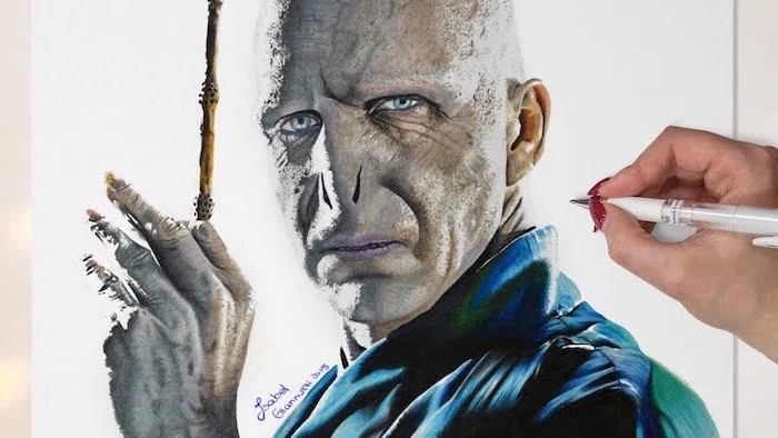
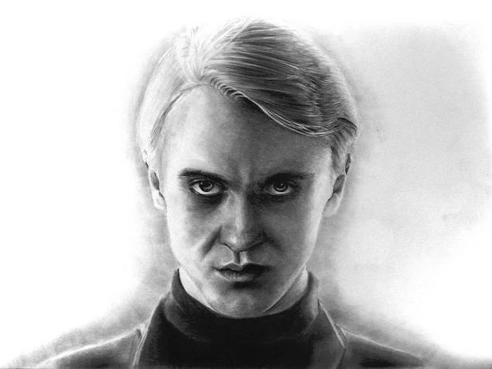
Drawing a character is one thing; drawing their mood is another. The difference between Dumbledore’s knowing twinkle and Bellatrix’s crazed glare isn’t in the overall structure of the face, but in the tiny details. Pay close attention to the arch of the eyebrows, the tightness around the mouth, and the slight crinkles beside the eyes. These micro-expressions are what breathe soul into your drawing.
Don’t be afraid to mix your media. A fantastic technique for magical effects is to use colored pencils over a watercolor wash. Lay down a light, transparent wash of blue or purple watercolor for a ghostly aura. Once it’s completely dry, you can draw your character on top with colored pencils. The pencils will glide over the paper, and the colored background will give your work incredible depth.
The original illustrations for the first Harry Potter book were done by Thomas Taylor, who was 23 at the time and it was his first professional commission.
A great piece of trivia that proves you don’t need decades of experience to create something iconic. Passion for the subject and a solid grasp of the fundamentals, like the ones discussed in this article, are what truly matter.
The beginner’s trap: Over-blending. Rubbing graphite around with a finger or blending stump can seem like an easy way to get smooth shading, but it often leads to a flat, lifeless, and muddy-looking drawing. Professionals build up tone with controlled hatching and cross-hatching, using the pencil itself to create form. Use a blending stump sparingly, only to soften specific transitions, not as your primary shading tool.
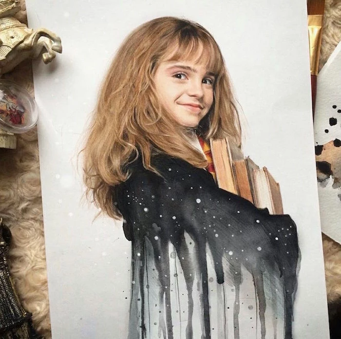
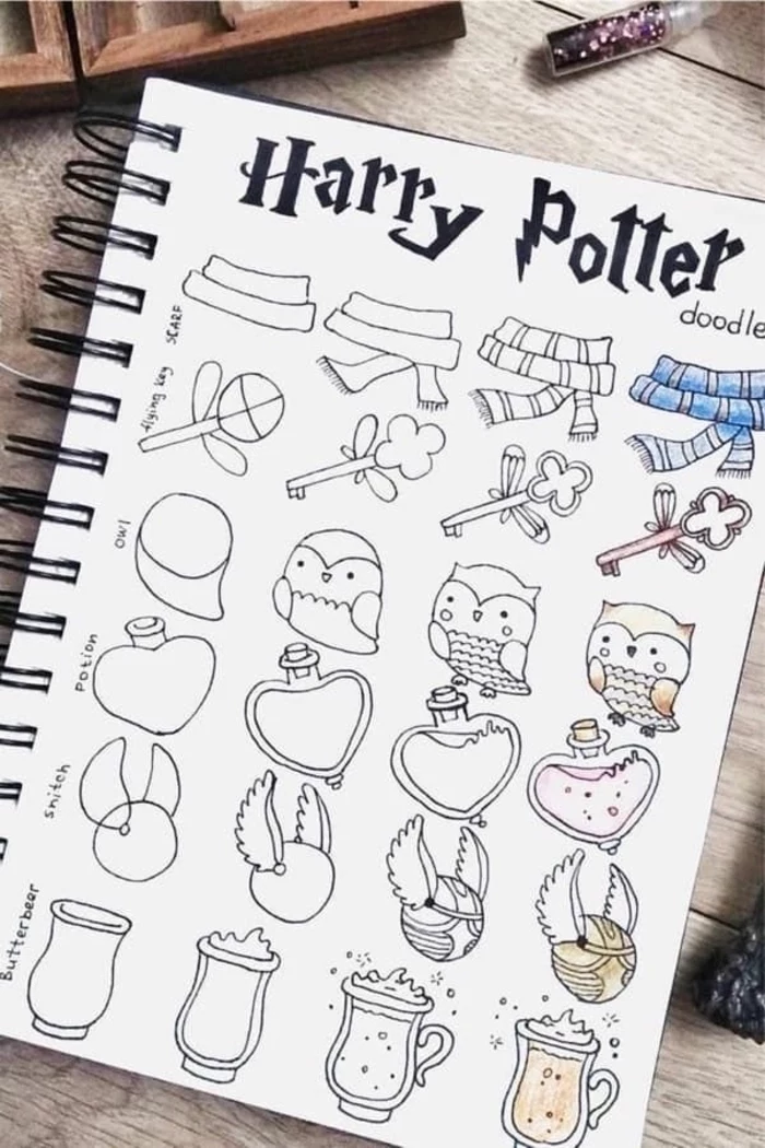
Think beyond portraits. The wizarding world is filled with iconic objects that tell their own stories. Try a still life study of a cluttered table in the Gryffindor common room: a half-finished essay on parchment, a dropped Chocolate Frog card, and a copy of ‘Quidditch Through the Ages’. Drawing these objects is fantastic practice for texture, form, and composition.