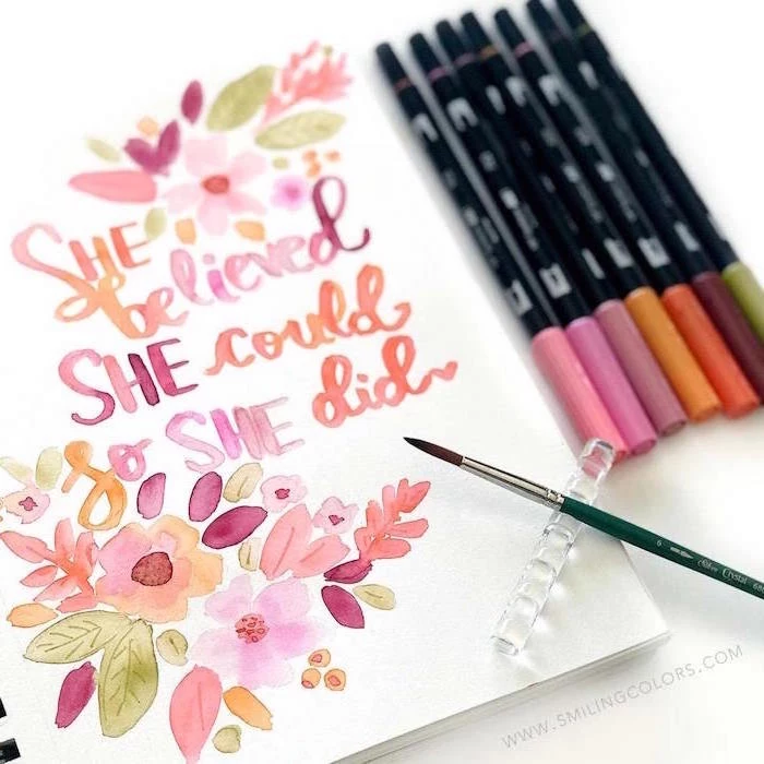
A Real-Talk Guide to Watercolor: Skip the Frustration, Find the Fun
I’m going to be honest with you. My first couple of years with watercolors were a total mess. I ended up with murky, brown puddles and paper that buckled into a tiny mountain range. I was so frustrated that I shoved all my brand-new paints and brushes into a box and didn’t touch them for months.
In this article
What pulled me back? A little piece of advice from an old pro. He said, “You’re trying to boss the paint around. You need to learn how to dance with it.” That completely changed my perspective. Watercolor isn’t like other paints where you’re in total command. It’s a partnership between you, the pigment, the water, and the paper. Getting that relationship right is the secret.
So this guide isn’t a list of cute things to paint. It’s a deep dive into the fundamentals—the stuff I wish I’d known from day one. We’re going to look at the gear, why it matters, and how to avoid the most common traps. My goal is to give you the confidence to really start creating.
Your Gear Matters (More Than You Think)
Before you even think about painting, your success is already being shaped by the materials you choose. The pros aren’t just being snobby when they talk about paper and paint; they understand that the science behind it all is what turns a happy accident into a deliberate technique.
Paper: The Real MVP of Your Kit
Here’s the biggest mistake beginners make: they splurge on fancy paints and skimp on the paper. Please don’t do this! Your paper is the stage for your entire painting. Its ability to handle water is everything.
Let’s talk about what makes paper good.
First up is the weight or thickness. You’ll see this measured in pounds (lb) or grams per square meter (gsm). The two most common weights you’ll find are:
- 140 lb (300 gsm): This is the workhorse of the watercolor world. It’s sturdy enough to handle a fair amount of water, but it will definitely buckle or warp if you get it super wet. To use this for any serious painting, you really need to stretch it.
- 300 lb (640 gsm): This stuff is more like a board than a piece of paper. It’s incredibly thick and can take a beating with water without buckling at all. The downside? The price. A single large sheet can cost you $10-$15, while a similar sheet of 140 lb paper might be $4-$7. I save the thick stuff for final pieces.
Heads up! How to Actually Stretch Paper
So, you heard you need to stretch your 140 lb paper, but what does that even mean? It’s way easier than it sounds and saves a ton of headaches. My go-to method: soak the sheet in a clean bathtub or sink for about 5-10 minutes until it’s totally limp. Carefully lay it flat on a waterproof board (gatorboard is amazing for this). Then, use either gummed paper tape or a heavy-duty staple gun to secure all four edges to the board. Let it dry completely flat, which usually takes a few hours or overnight. When it dries, it’ll be tight as a drum and ready for anything.
Next is the paper’s texture, often called its “press.”
- Cold Press: This is your best friend and what I recommend for 90% of painters. It has a slight texture, or “tooth,” that’s incredibly forgiving and helps pigment settle in beautiful ways. It’s the perfect all-rounder.
- Hot Press: This paper is pressed with hot, smooth rollers, so its surface is almost slick. It’s a dream for super fine detail, like in botanical art or pen and ink work. But be warned, it’s less forgiving with big, flowing washes of color.
- Rough: Just like it sounds, this paper has a very deep, bumpy texture. It’s fantastic for expressive paintings where you want that texture to be part of the art itself.
Finally, the best watercolor paper is 100% cotton. Cotton fibers are long and tough, meaning they can handle getting wet, being scrubbed, or having paint lifted off without falling apart. Cheaper paper made from wood pulp (cellulose) is fine for quick sketches, but it just can’t take the abuse.
Paint: What’s the Difference, Really?
Not all paints are created equal. The main difference comes down to the amount of pigment versus the amount of filler.
Student Grade vs. Artist Grade: Student paints are more affordable because they have less pure pigment and more binder or fillers. They’re great for practicing and mixing colors without feeling like you’re burning through cash. Artist-grade paints, on the other hand, are packed with finely-milled, pure pigment. The colors are way more vibrant and, most importantly, more lightfast.
Lightfastness is a rating of how well a color resists fading from light exposure. I once had a client return a painting because the gorgeous pinks in a sunset I’d painted had faded to a sad, dull beige after a year hanging near a window. I’d used a student-grade color without checking its rating. A painful lesson! Now, I only use paints with an official lightfastness rating of I (Excellent) or II (Very Good). You can find this info right on the paint tube.
And what about tubes versus pans? Pans are those little dried cakes of paint, perfect for travel. Tubes contain moist paint, which is better for mixing up big puddles of color for large washes. I use both! I have a travel set of pans, but in my studio, I just squeeze tube paints onto a cheap ceramic dinner plate. It works perfectly.
Good to know: Every color has a personality. Some are transparent (letting the paper shine through), while others are opaque (covering what’s underneath). Some are staining (soaking into the paper permanently), while others are non-staining (easy to lift off). Getting to know these traits is part of the fun.
Brushes and Water: Your Supporting Cast
You really only need a few good brushes, not a whole jar of bad ones. A high-quality synthetic brush today is fantastic and much more affordable than traditional animal hair brushes. A real Kolinsky sable brush can cost a fortune, but a good synthetic or synthetic-blend will only set you back $10-$25 and will perform beautifully.
To start, just get these two:
- A Round Brush: A size 8 or 10 is the ultimate workhorse. You can use its tip for fine lines and the belly for broader strokes.
- A Flat Brush: A 1-inch flat is perfect for laying down big, even washes of color.
The Easiest Way to Brighter Colors
This is my number one tip for anyone starting out: use two jars of water. One jar is for rinsing your brushes, and it’s going to get dirty. The second jar is your “clean water” source, used only for mixing with your paints. If you try to use one jar for everything, you’ll be mixing your beautiful, bright yellows with gray, muddy water. This simple habit will keep your colors pure and vibrant. Trust me on this.
Let’s Paint: Controlling the Water
Technique in watercolor is all about water control. Every single effect, from a soft, blurry background to a crisp, sharp line, is just a result of how much water is on your brush versus how much is on your paper. That’s it.
Wet-on-Wet: Embracing the Chaos
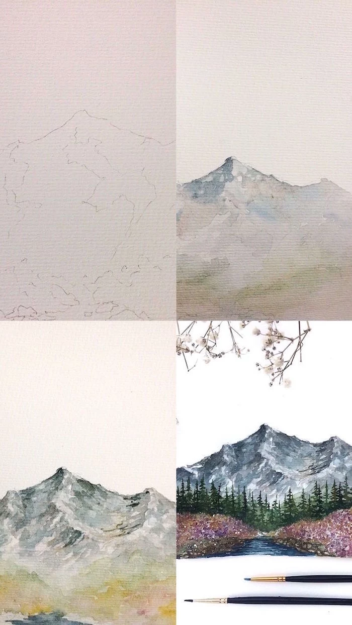
This is that classic, dreamy watercolor look. You apply wet paint to already wet paper, creating soft, diffused shapes. It’s perfect for skies and misty landscapes. The trick is timing. You want the paper to have a nice, even sheen—not a giant puddle. Then, you just touch your loaded brush to the paper and watch the color bloom. The challenge is knowing when to walk away. Overworking it is the fastest way to make mud.
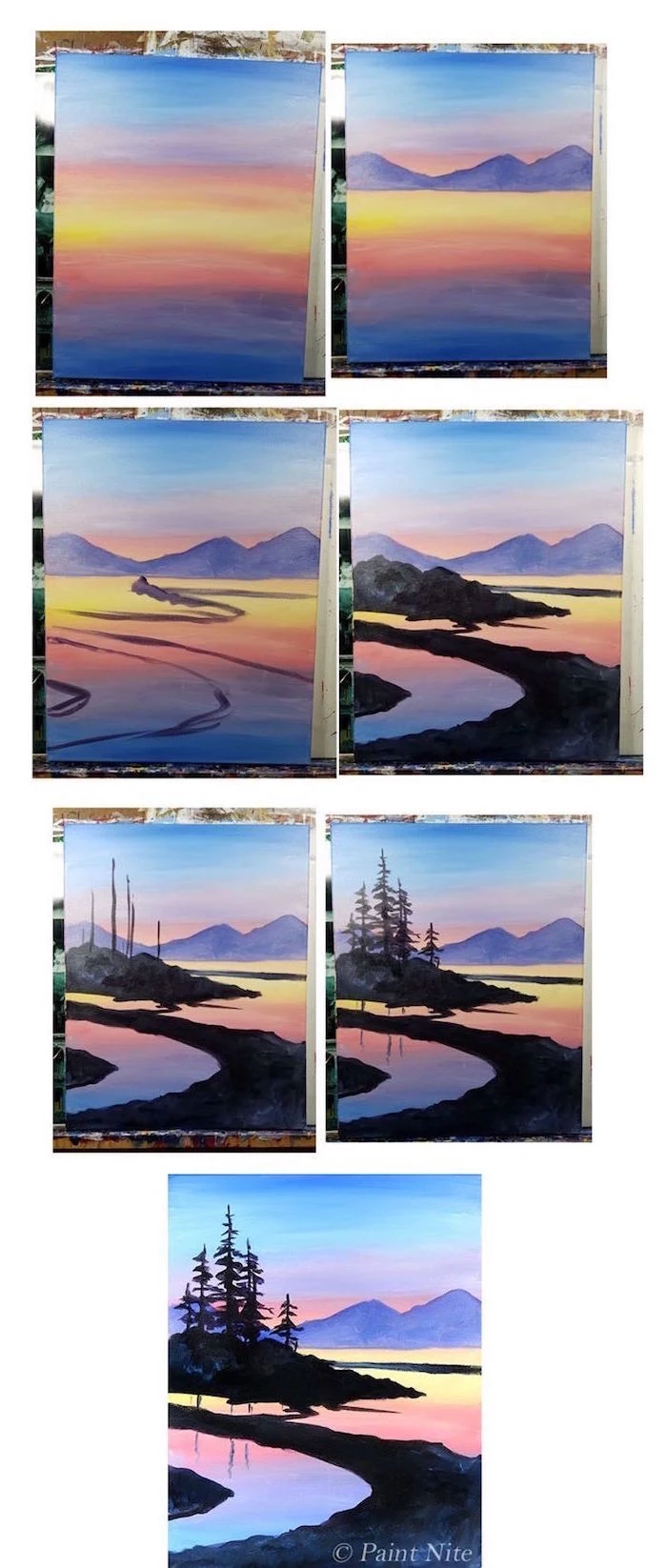
Wet-on-Dry: Creating Definition
This is as straightforward as it gets: wet paint on dry paper. This gives you a crisp, hard edge. Almost every painting uses a combination of both techniques. For instance, I might paint a soft, wet-on-wet sky, let it dry completely, and then use wet-on-dry to paint the sharp silhouette of a building against it.
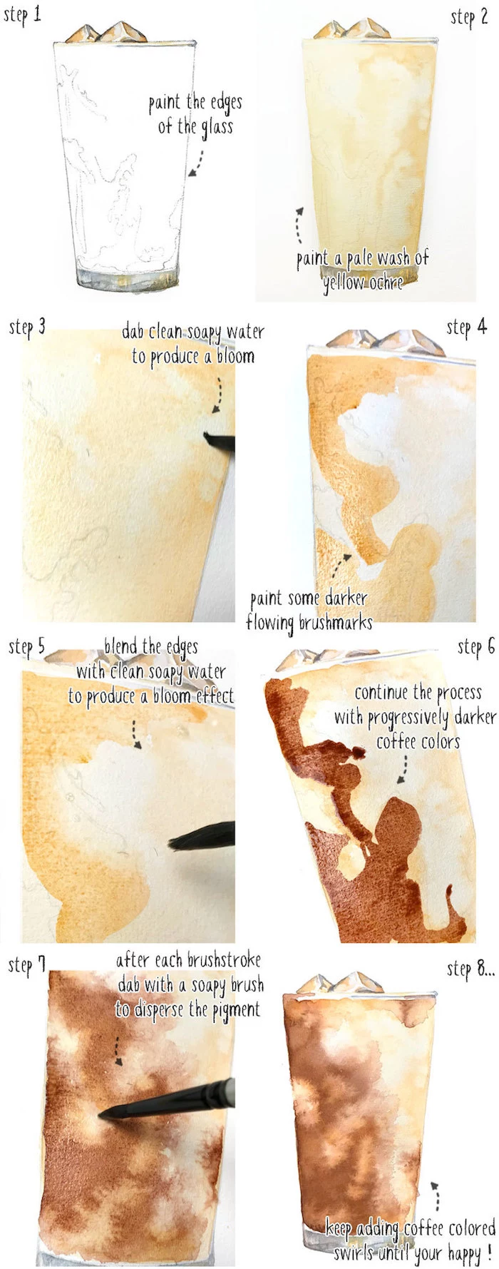
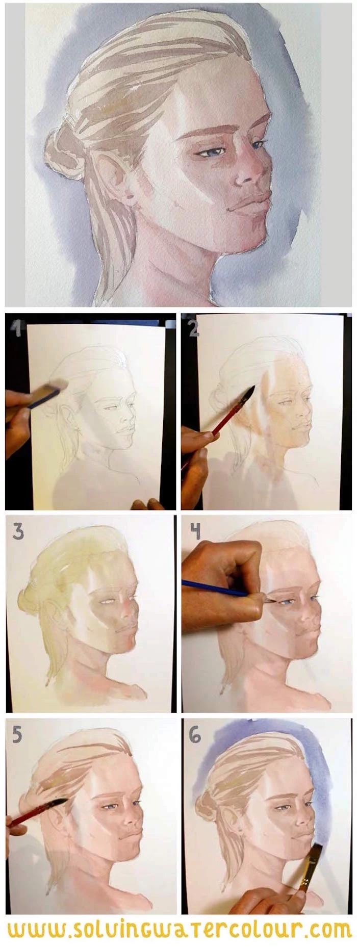
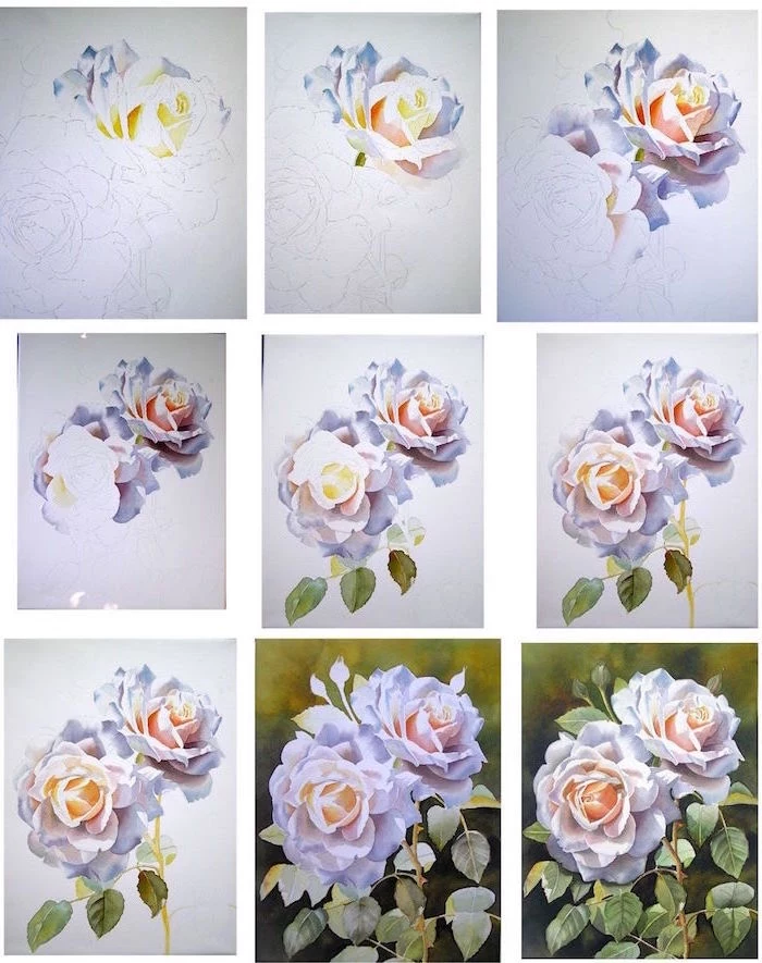
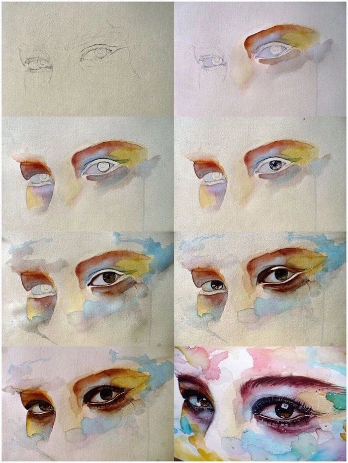
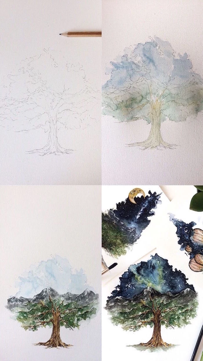
Glazing: Building Up Color and Light
Glazing is simply applying a thin, transparent layer of color over a layer that is completely dry. This is how you get incredible depth and luminosity. The key is to use transparent colors and… patience. Each layer has to be BONE dry before you apply the next. By bone dry, I mean wait at least an hour, maybe more if it’s humid. If you’re impatient like me, you can use a hairdryer on its lowest, coolest setting. Never use hot air, as it can mess with the paint itself.
Lifting: Your Watercolor Eraser
Yes, you can fix some mistakes! Lifting is the technique of removing dried pigment. You take a clean, damp (not soaking wet!) brush and gently scrub an area, then blot it with a paper towel. How well this works depends on your paper (100% cotton is tough enough) and your paint (staining pigments won’t lift much). I use this all the time to soften hard edges or create highlights, like little clouds in a blue sky.
Getting Started Without Breaking the Bank
Okay, let’s talk brass tacks. What do you actually need, and what’s it going to cost?
Your Starter Kit:
- Paper: A block of 140 lb (300 gsm), cold press, 100% cotton paper. This is your single most important purchase. Look for established brands known for quality. A good 9×12 inch block will run you about $25-$40.
- Paint: A small set of artist-grade tube paints. You don’t need a million colors! A warm and cool version of each primary color (red, yellow, blue) plus a couple of earth tones is plenty.
- Brushes: A size 8 round and a 1-inch flat. Get the best quality synthetic you can afford. This should be about $20-$40 for the pair.
- Palette: A simple ceramic dinner plate from a thrift store is perfect. It’s heavy, white, and easy to clean. Costs you a buck or two.
- Other Stuff: Two water containers (old yogurt cups work great), a roll of paper towels, and a basic graphite pencil.
So, what’s the damage? Be prepared for a bit of an investment. For a really solid start with materials that won’t fight you, you’re looking at around $100 to $150. But here’s the good news: these supplies will last you a good long while.
Super-Budget Tip: If you can only afford three tubes of paint to start, make them French Ultramarine (a versatile blue), Lemon Yellow (a cool yellow), and Quinacridone Rose or Alizarin Crimson (a cool red). You can mix a surprisingly huge range of colors with just those three!
Putting in the Practice
Theory is great, but progress only comes from painting. Start with exercises that build muscle memory.
My favorite is the color chart. Draw a grid and put all your colors along the top and side. Then, methodically mix every color with every other color. You’ll not only learn what your palette can do, but you’ll also discover which mixes are gorgeous and which ones just make brown sludge.
A Few Final Words of Advice
As you get more comfortable, you can explore things like masking fluid (a liquid that saves the white of your paper) and negative painting (painting the space around an object). But a quick warning on masking fluid: it will absolutely ruin a good brush, so only use a cheap one or a special tool for it. And never leave it on your paper for more than a day or it can become permanent.
Also, please be safe. Some professional pigments, like cadmiums and cobalts, are toxic if you ingest them. Just be smart: don’t eat or drink while painting, and for goodness’ sake, don’t use your mouth to point your brushes.
This guide is a starting point, but the real learning happens at your desk. There’s always a new technique to try or a new color to understand. And that’s the real joy of it. It’s a lifelong conversation with your materials. Now go have some fun.
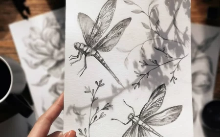
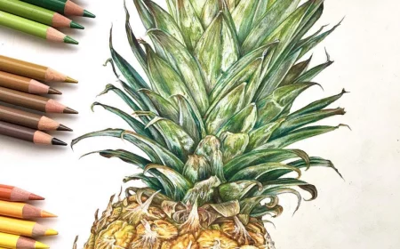
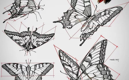
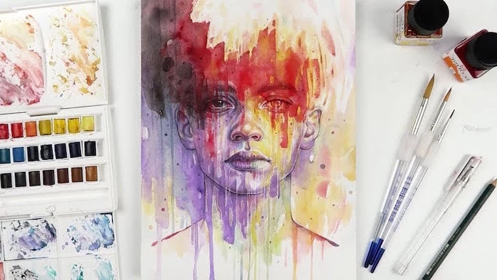
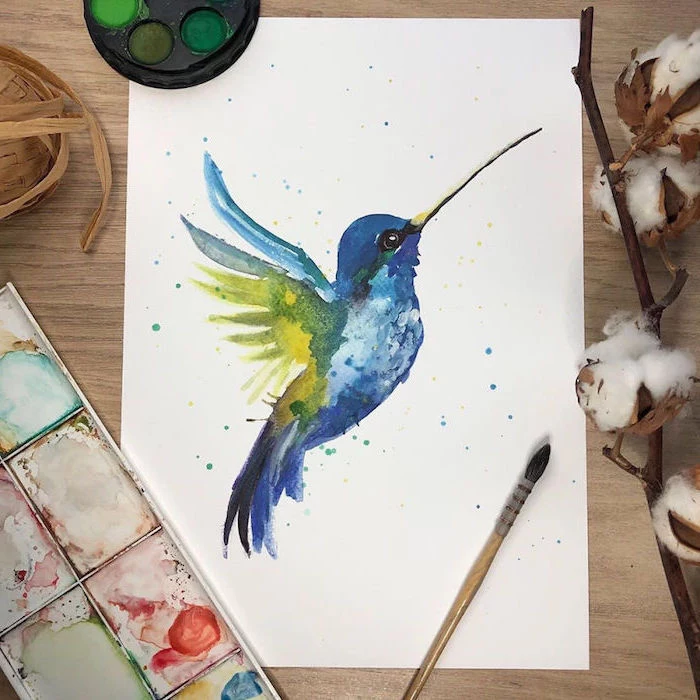
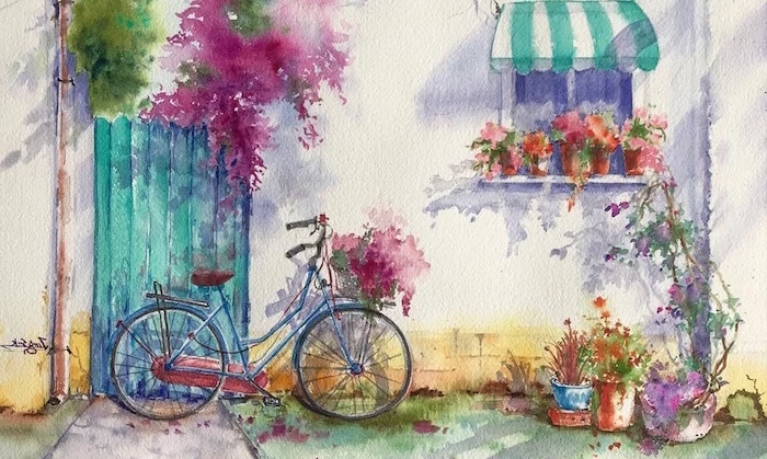
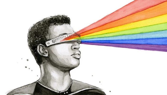
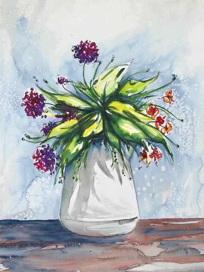
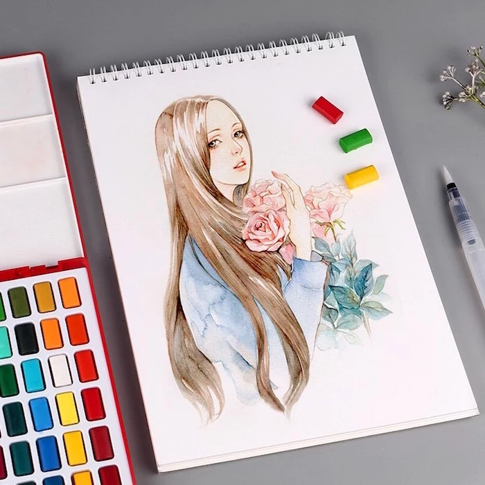
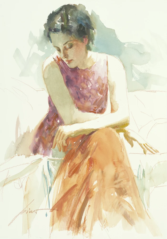
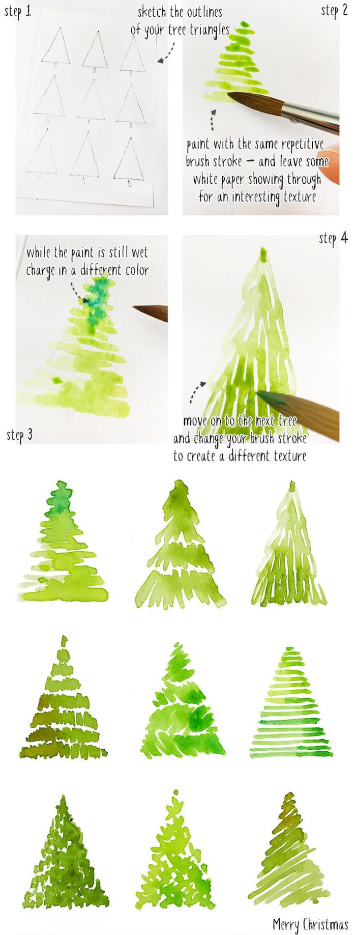
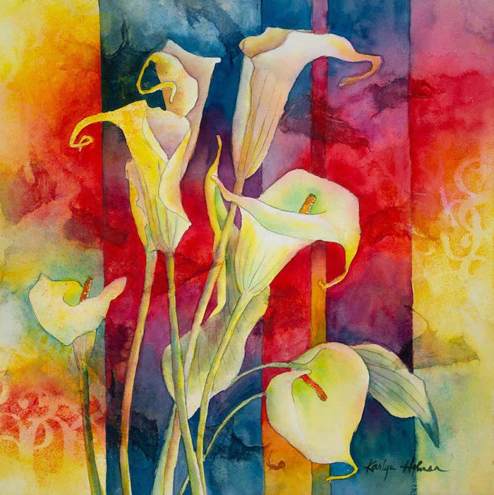
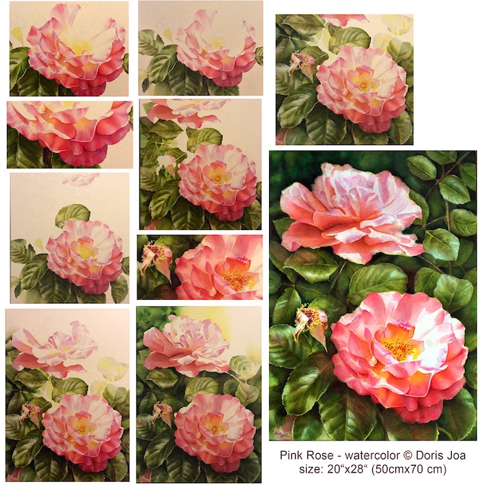
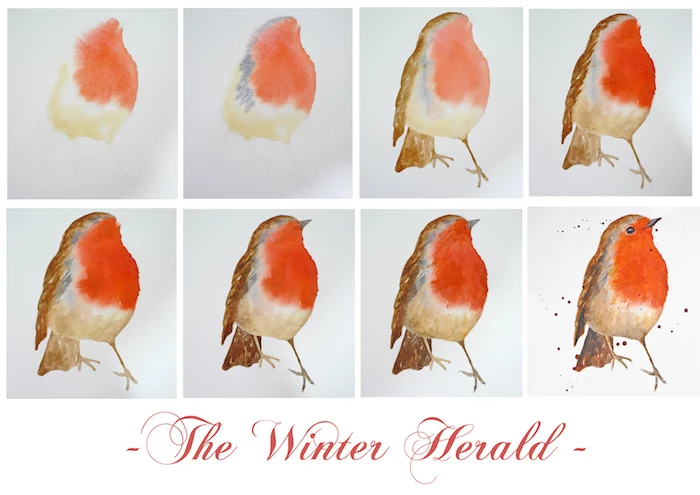
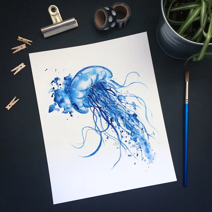
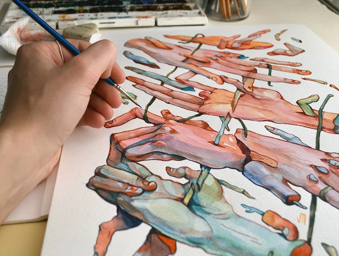
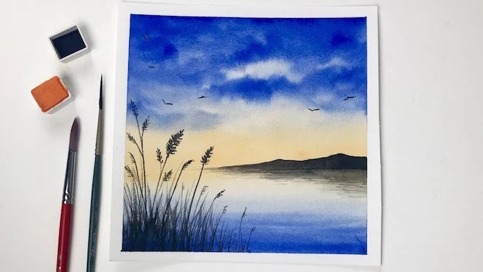
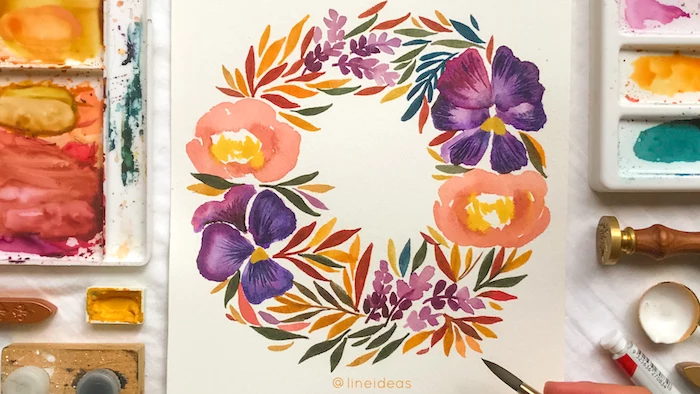
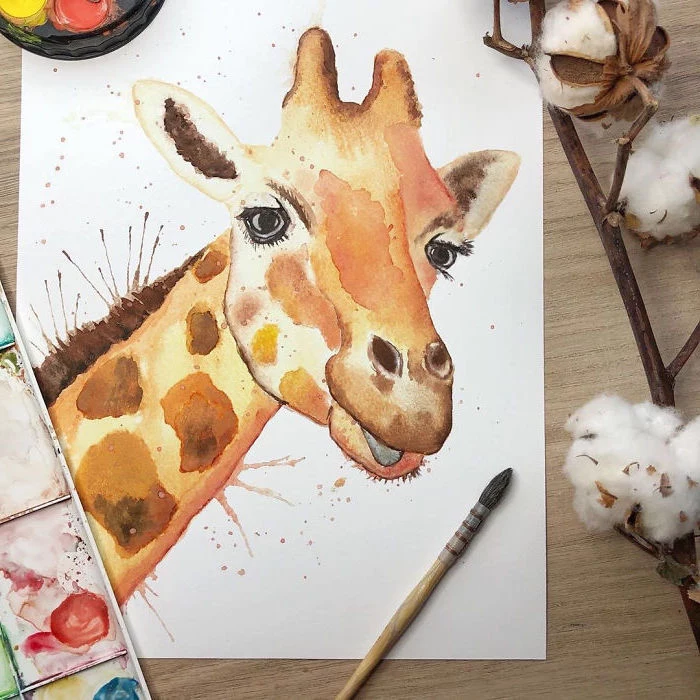
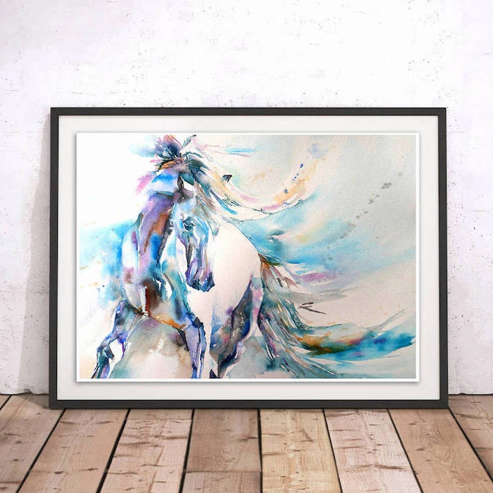
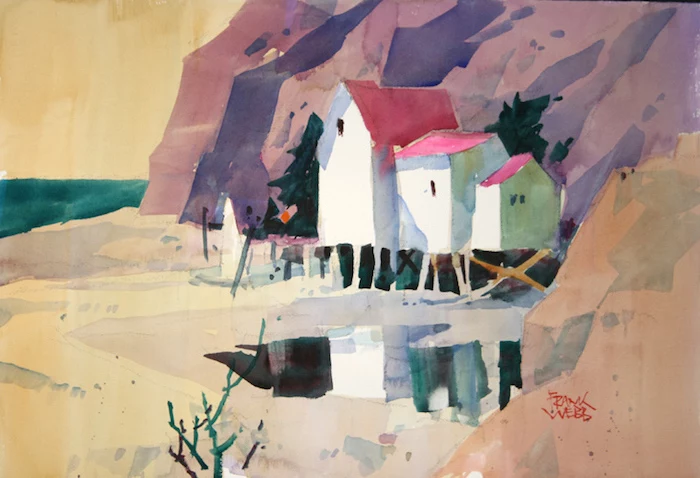
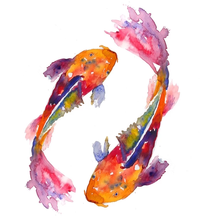
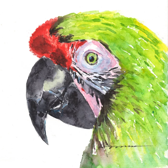
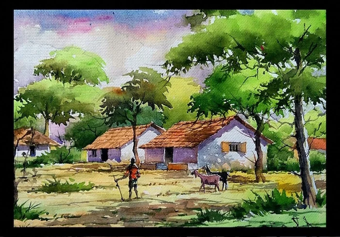
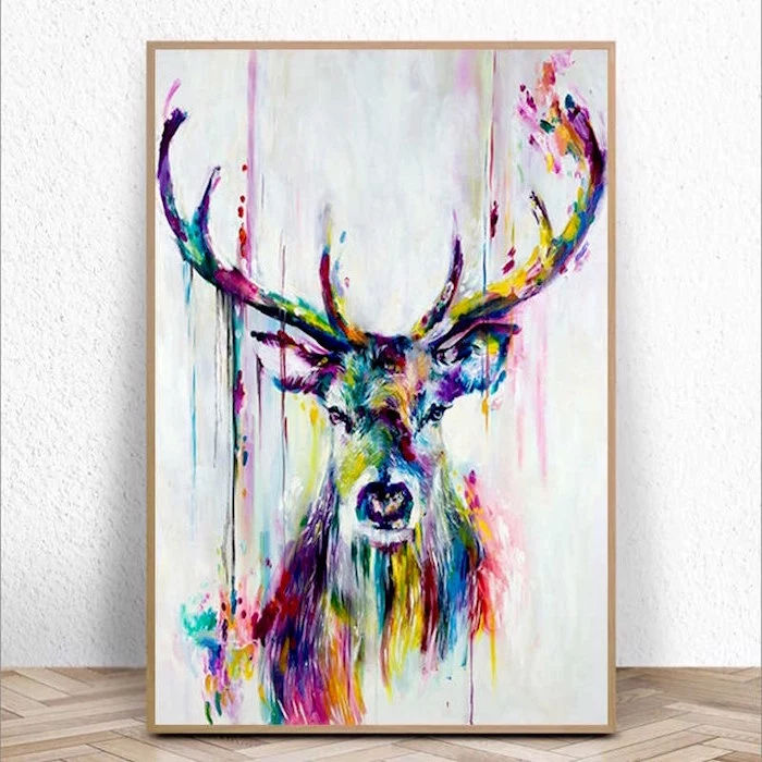
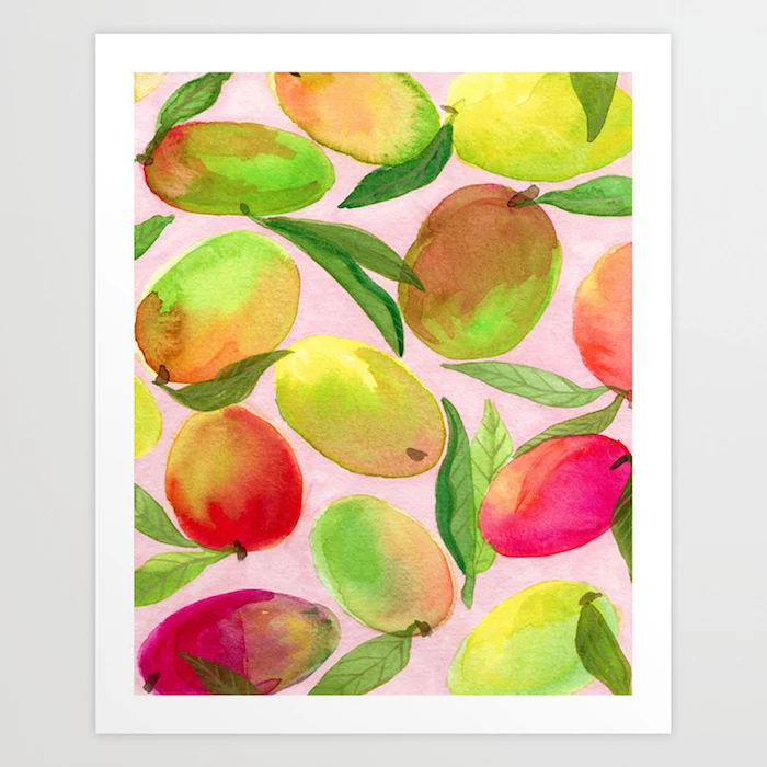
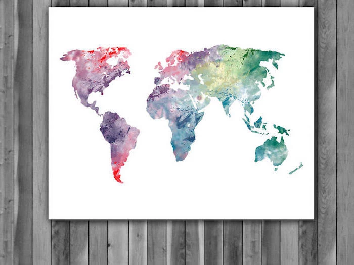
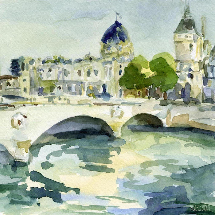
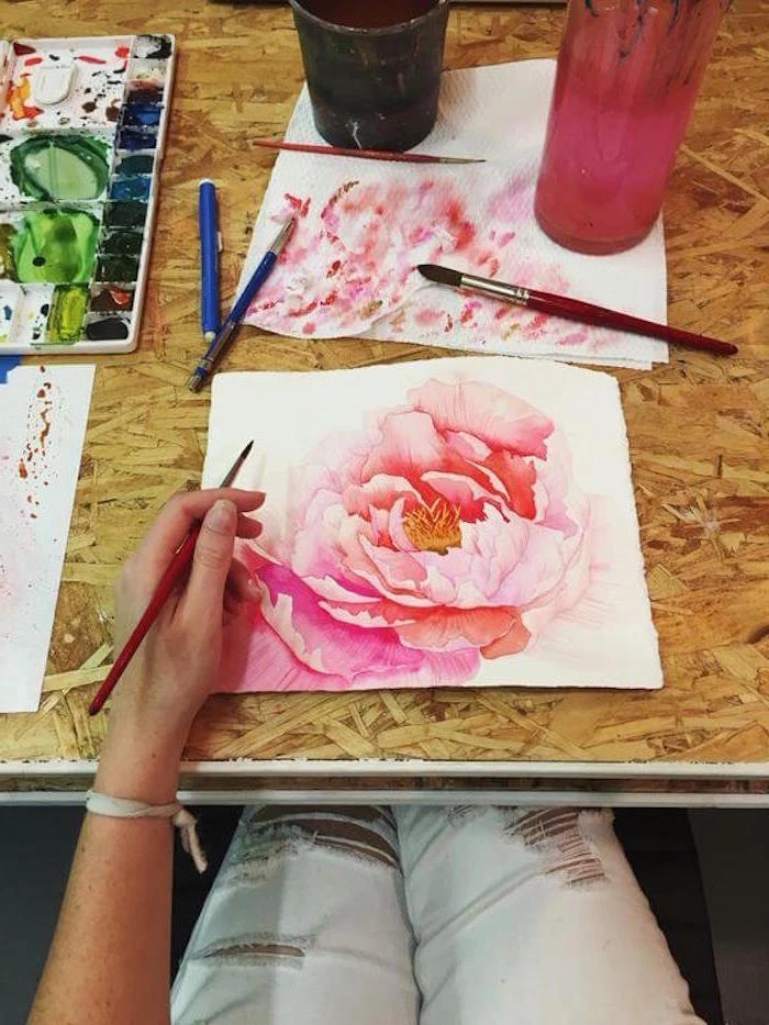
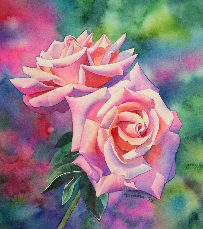
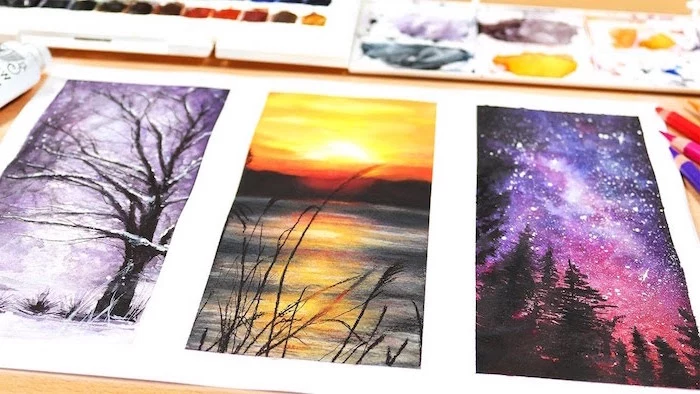
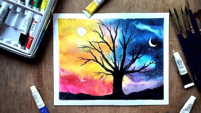
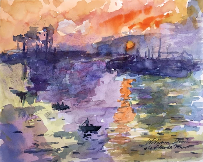
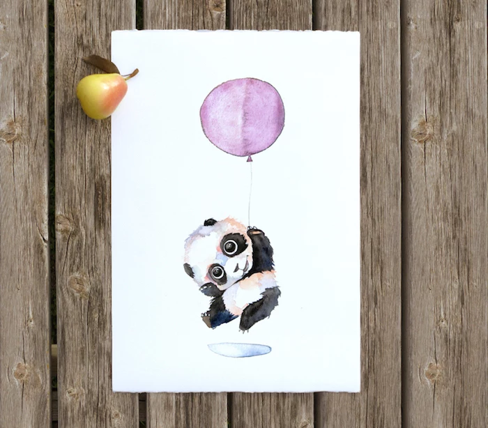
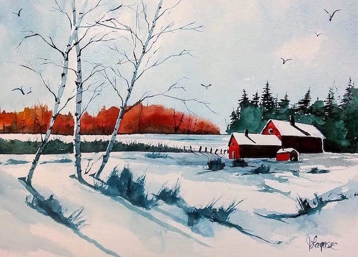
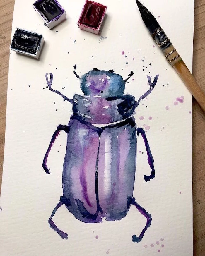
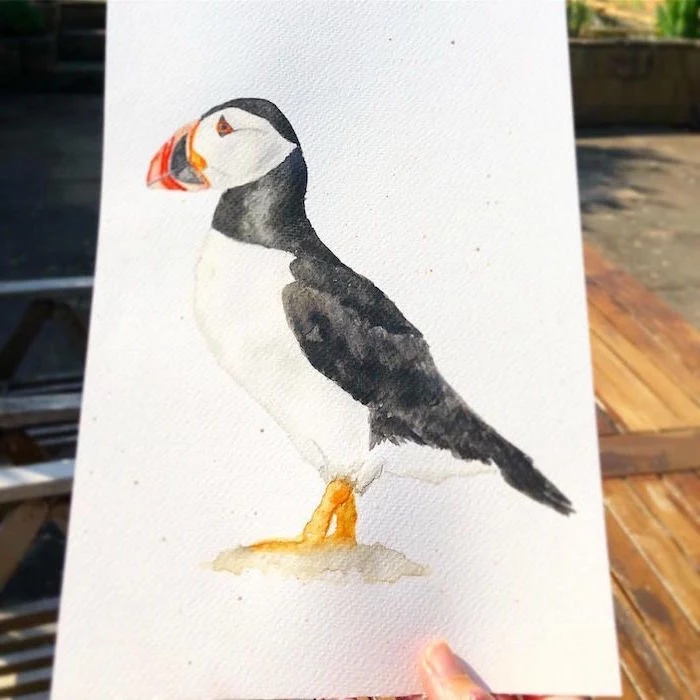
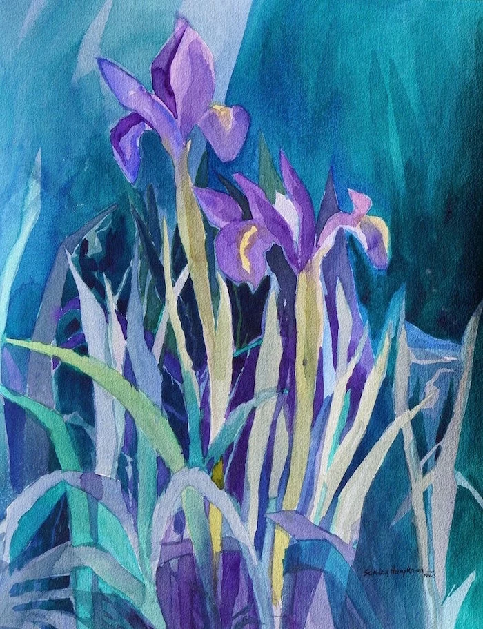
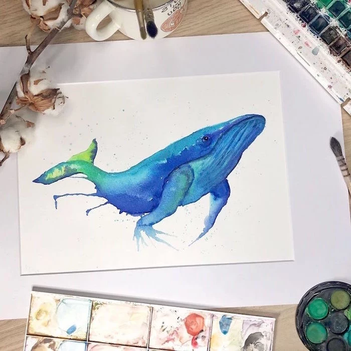
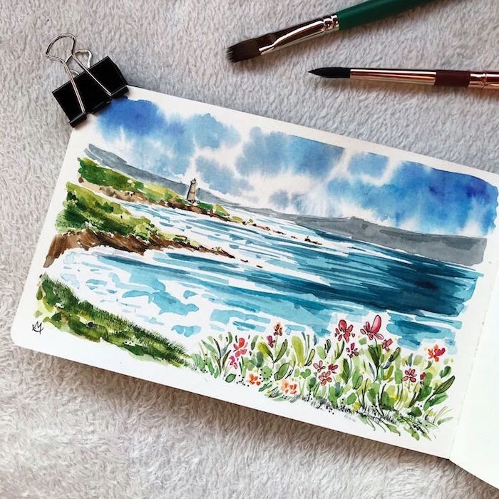
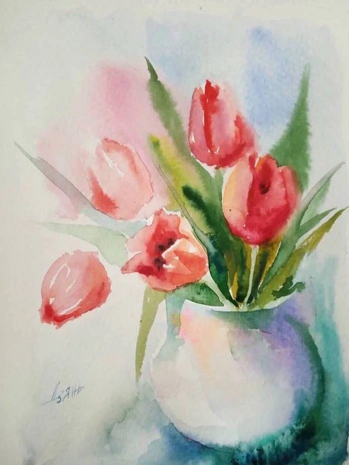
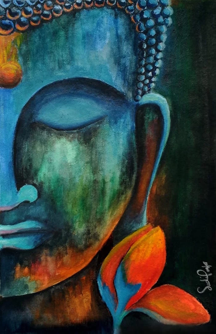
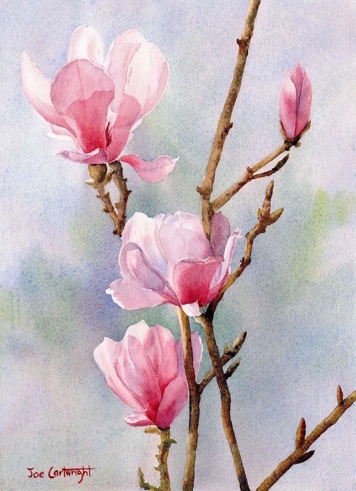
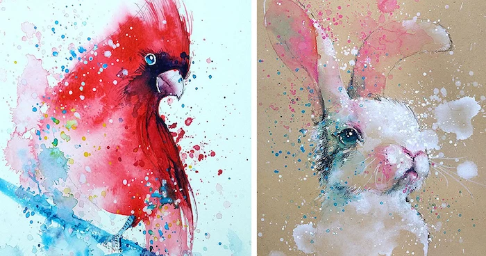
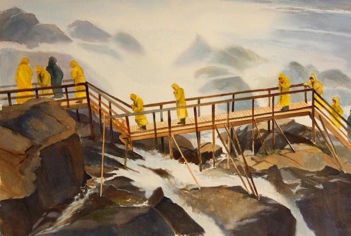
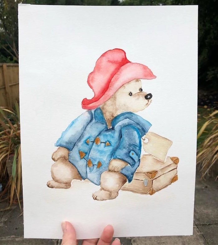
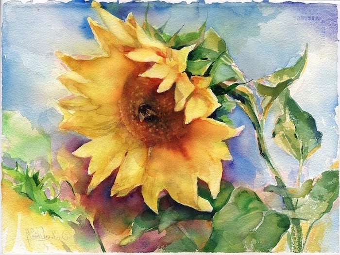
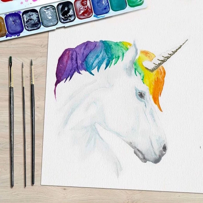
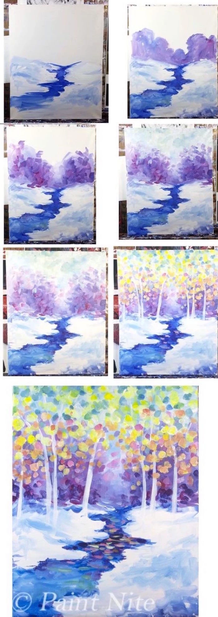
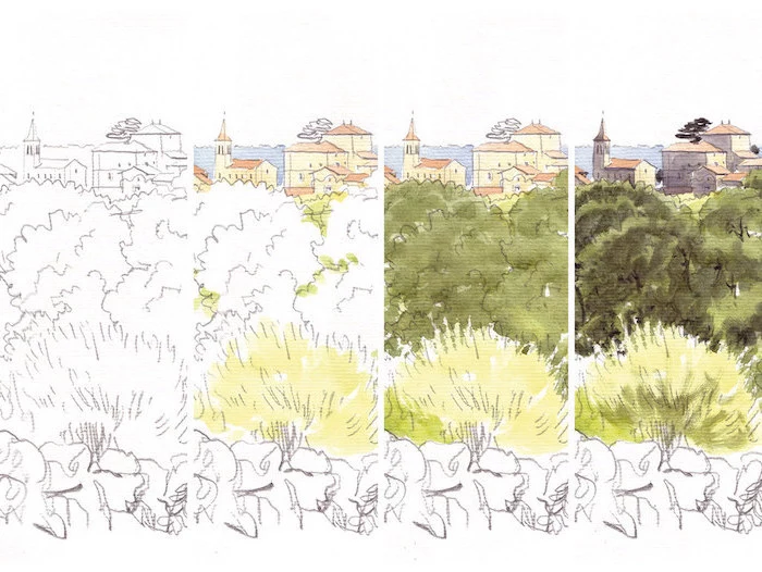
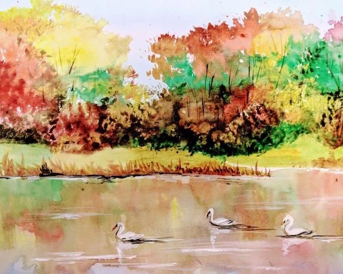
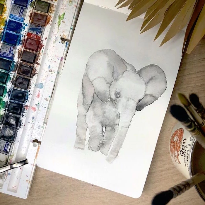
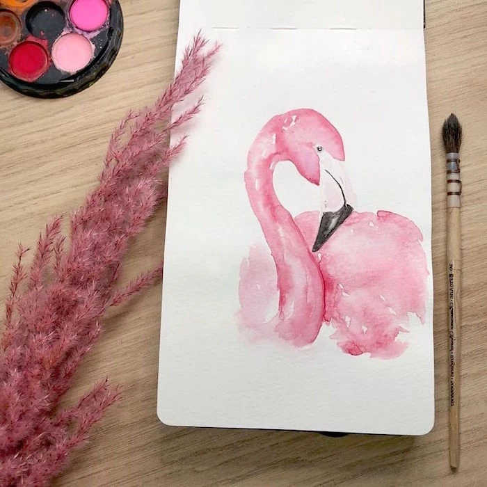
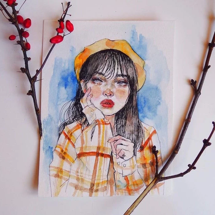
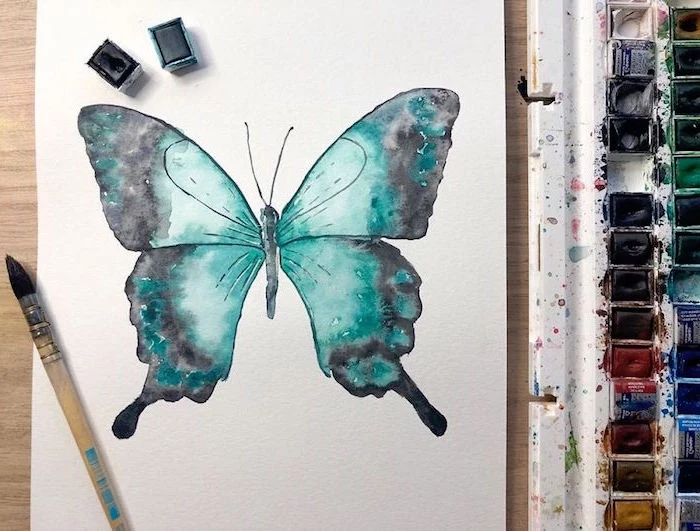
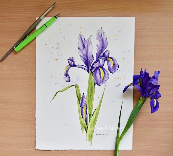
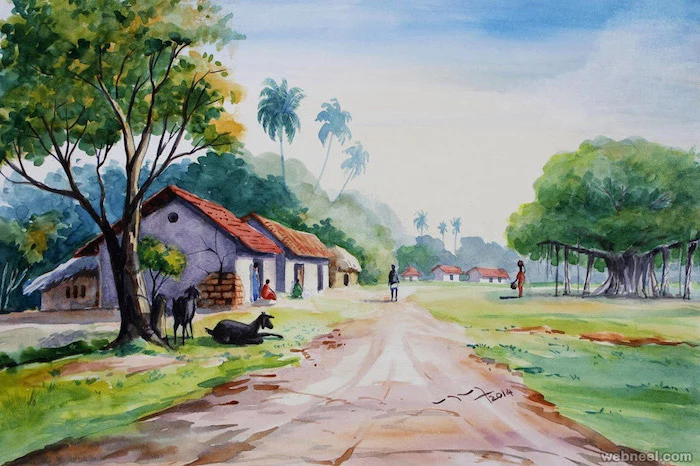
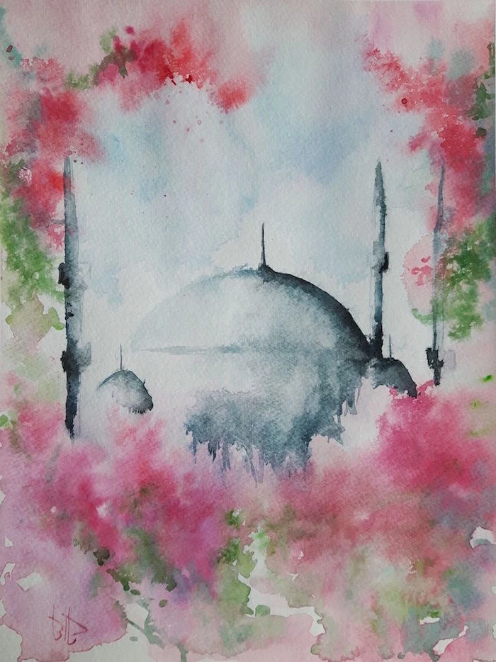
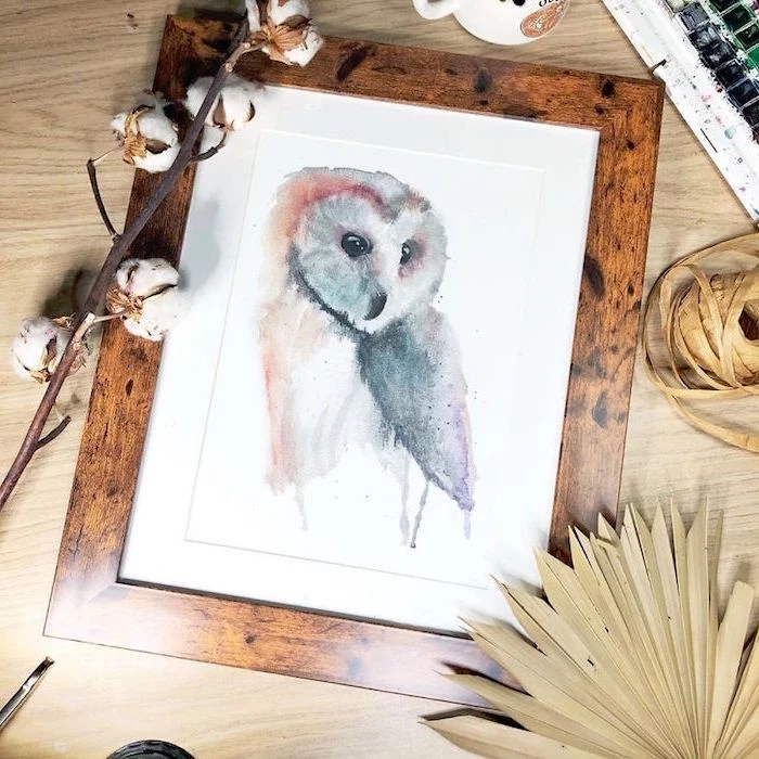
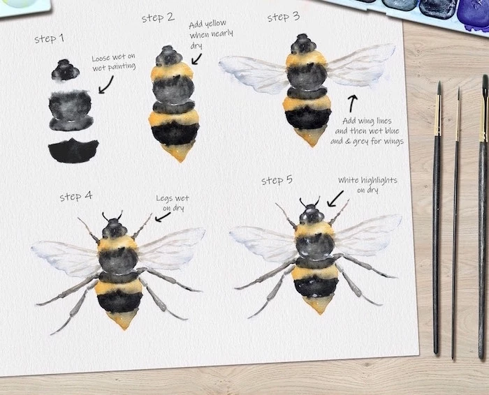
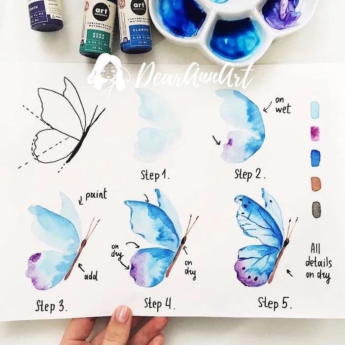
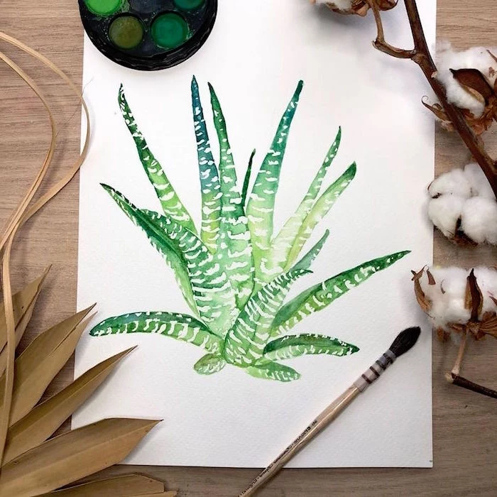
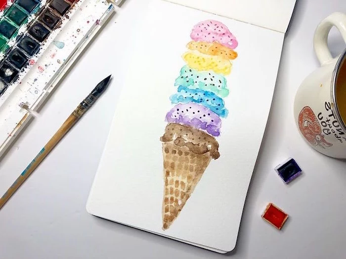
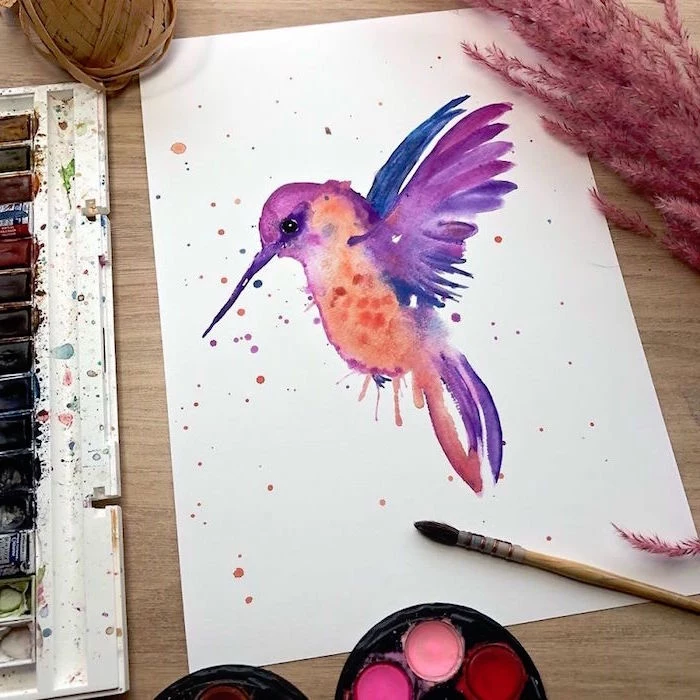
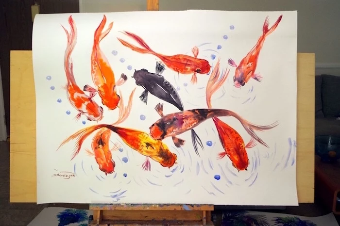
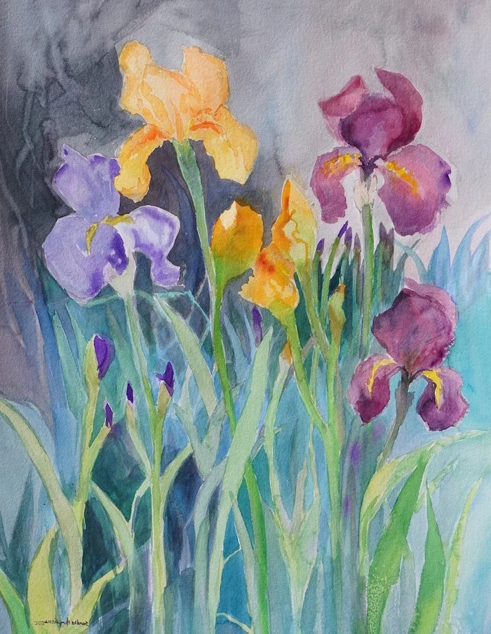
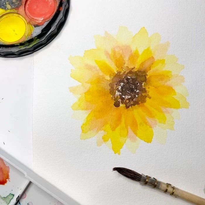
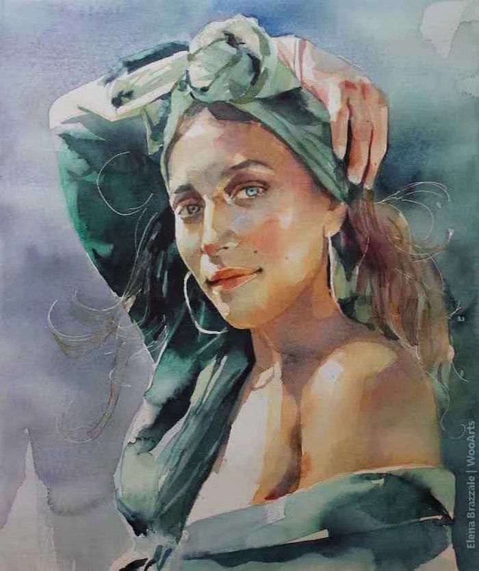
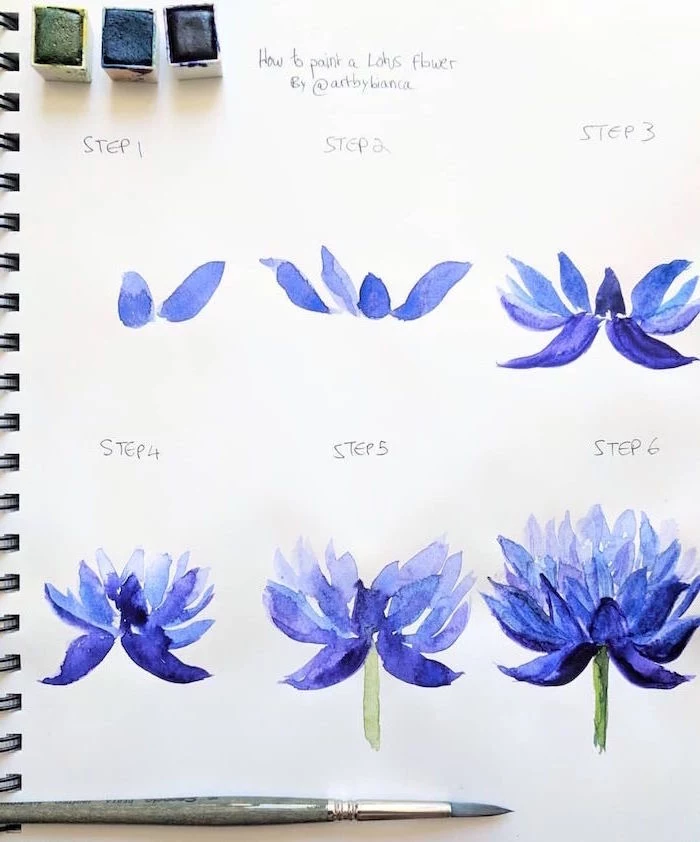
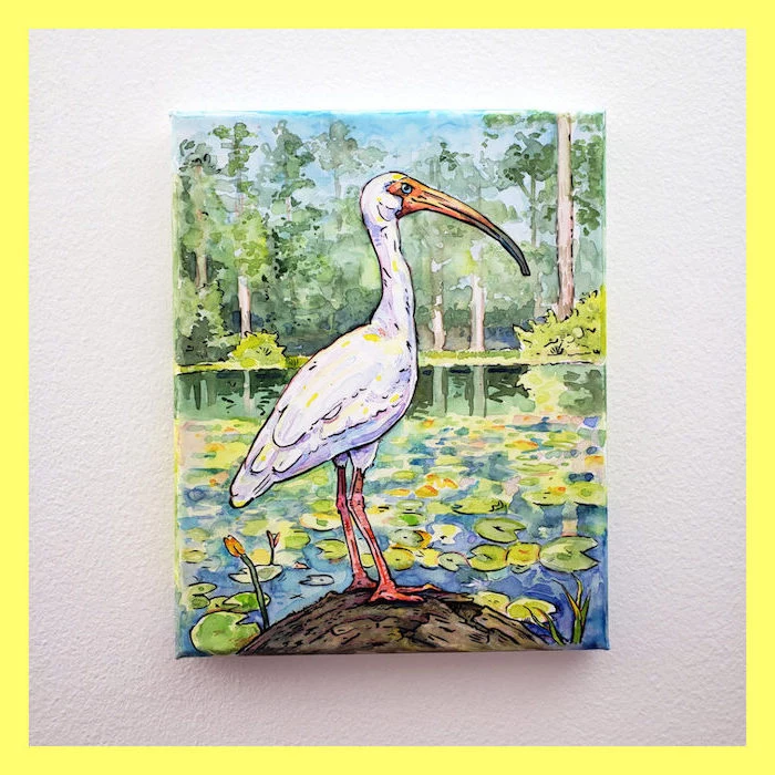
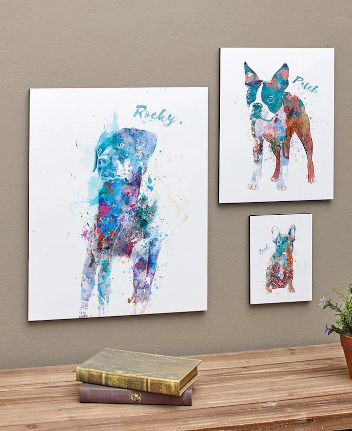
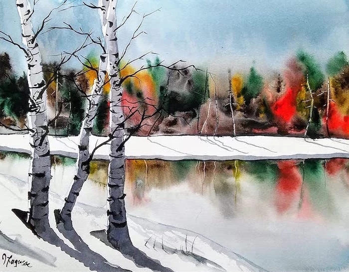
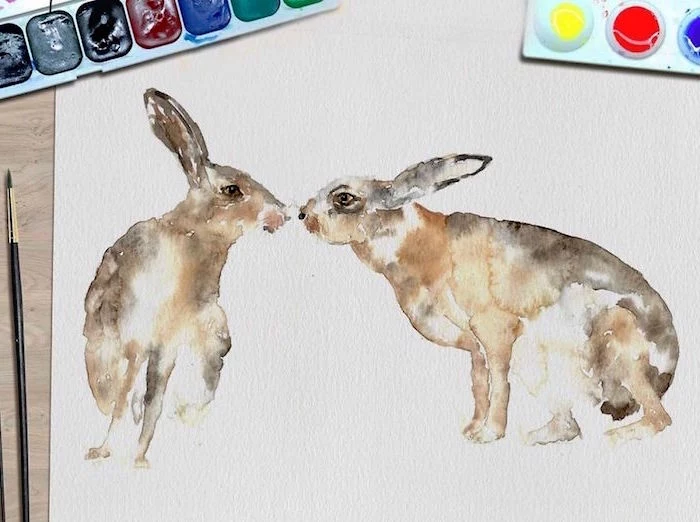
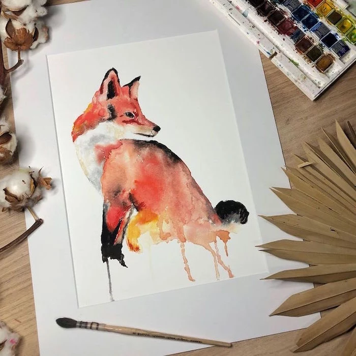
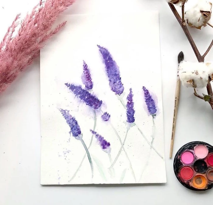
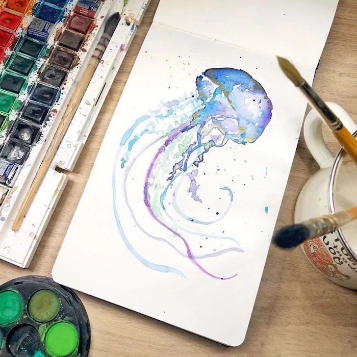
Inspirational Gallery
Don’t get overwhelmed by brush choices. Start with one good, versatile brush: a round brush, size 8 or 10. It will become your best friend. Its pointed tip allows for fine lines and details, while the belly holds enough water and pigment to lay down broad washes. A quality synthetic, like a Princeton Neptune or Silver Black Velvet, offers a fantastic experience without the price tag of pure sable.
- Create vibrant, glowing colors by layering thin, transparent washes—a technique called glazing.
- Allow each layer to dry completely before adding the next to prevent muddying.
The secret? Patience. It’s how you build depth and light, turning flat color into something that feels alive.
What’s the deal with granulating watercolors?
You may have seen paints labeled as “granulating,” and they’re a blast to use. These special pigments, like Daniel Smith’s Lunar Blue or Ultramarine, contain heavier particles that settle into the texture of the paper as they dry. This creates a wonderful, mottled effect automatically. It’s perfect for adding instant texture to landscapes, stones, or abstract pieces. It’s the paint doing half the work for you!
Did you know that the original Ultramarine blue pigment was once more expensive than gold? It was ground from the semi-precious stone lapis lazuli.
Today, the synthetic version we use, called French Ultramarine, is a staple on most artists’ palettes. It’s a warm, vibrant blue that mixes beautifully to create clean purples and muted greens, all without breaking the bank.

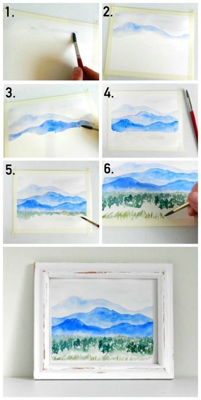
Hot-Press Paper: Has a smooth, hard surface. It’s fantastic for fine detail, pen and ink work, and botanical illustrations. Colors appear very bright but can be harder to blend softly.
Cold-Press Paper: This is the most common watercolor paper, with a noticeable texture or “tooth.” It’s more forgiving, great for beginners, and allows for beautiful granulated washes and soft blends. Most artists start here for good reason.
The single biggest cause of “muddy” paintings: overworking the paper. When you keep brushing over a semi-damp area, you’re lifting the layers of pigment underneath and stirring them all together into a dull, lifeless grey. Learn to place a brushstroke and then leave it alone. Trust the process and let the water and pigment do their magic.
Creating your own textures is where the real play begins. Don’t just rely on the brush!
- Sprinkle a little table salt onto a wet wash and watch it create tiny, star-like patterns as it dries.
- Dab a damp area with a crumpled paper towel or a natural sponge to lift color and create soft, cloud-like textures.
- Press a piece of plastic wrap into a wet wash and leave it to dry for unpredictable, sharp-edged patterns.
“In watercolor, you can’t cover up your mistakes. But you can learn to make them beautiful.” – Unknown watercolorist
- You’ll develop a better understanding of color theory.
- Your paintings will have a more natural, harmonious feel.
- You’ll learn to mix any color you need instead of just reaching for a new tube.
The trick? Start with a limited palette. Try building a whole painting with just three primary colors, like Quinacridone Rose, Phthalo Blue (GS), and Hansa Yellow Medium. It’s a game-changer.
My colors look dull and chalky. What am I doing wrong?
This often comes down to one thing: not using enough pigment. It’s tempting to use a lot of water and just a tiny bit of paint, but this starves the color. Aim for a consistency of whole milk for a rich wash, and heavy cream for more saturated, bold color. Don’t be afraid to load your brush with a good amount of pigment from your palette!
Tubes: Offer fresh, moist paint perfect for mixing large, rich quantities of color. They are ideal for studio work. A little goes a long way, but it’s easy to squeeze out too much and waste paint.
Pans: These are dried cakes of watercolor, perfect for travel, urban sketching, and quick studies. You activate them with a wet brush. Great for control and portability, but less ideal for mixing large, uniform washes.
Many artists use both—tubes to fill empty pans for a custom travel set, giving them the best of both worlds.
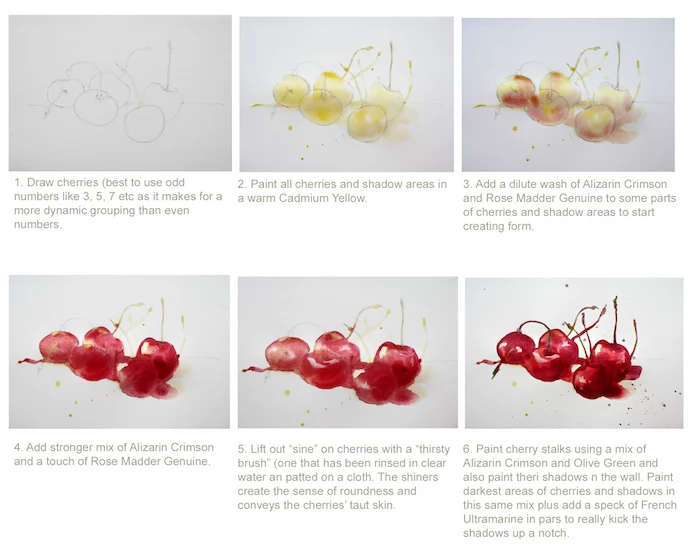
Ever heard of a “thirsty brush”? It’s your secret weapon for fixing small mistakes. Take a clean, damp (not soaking wet!) brush and simply touch it to the edge of a puddle of paint you want to remove. The brush will wick the excess water and pigment right off the page like a tiny straw. It’s a gentle way to control blooms and lift small areas without smearing.
“The first rule of brush care is: never, ever let paint dry in the bristles, especially near the ferrule (the metal part).” – Joseph Zbukvic, Master Watercolor Artist
This simple habit will make your brushes last for years. Acrylics can ruin a brush in minutes, but dried watercolor can also make bristles stiff and brittle. Always rinse your brushes thoroughly in clean water and reshape the tips before letting them dry horizontally or tip-down.
Masking fluid is a liquid latex that protects the white of your paper while you paint over it. It’s a lifesaver for preserving tiny highlights, like the sparkle in an eye or the veins on a leaf. Apply it with an old brush or a silicone tool (it can ruin good brushes!), let it dry completely, paint over it, and then gently rub it off with your finger or a rubber cement pickup once your paint is bone dry. A bottle of Winsor & Newton Art Masking Fluid is a great addition to your kit.
A Common Trap: Trying to paint on dry paper all the time. This is called the “dry brush” technique and it’s great for texture, but the real soul of watercolor is found in the “wet-on-wet” technique. This means applying wet paint onto paper that is already wet with clean water. It’s how you get those beautiful, soft-edged blends and dreamy, atmospheric backgrounds. Don’t be afraid to get your paper wet!
- You can reactivate them indefinitely with water.
- It prevents waste, saving you money.
- It lets you create a convenient, custom palette.
The secret? Absolutely nothing! Unlike acrylics, professional watercolors are designed to be re-wet. So don’t clean that dried paint off your ceramic palette. Just spritz it with a little water next time you paint, and you’re ready to go.
Is it really worth paying more for 100% cotton paper?
In a word: yes. Paper made from wood pulp (often called “student grade”) doesn’t absorb water evenly and can get damaged quickly when you try to lift or blend color. 100% cotton paper, like the industry-standard Arches or Fabriano Artistico, acts more like a sponge. It allows paint to sink into the fibers, giving you more time to work and resulting in much more vibrant, luminous colors. If you can only upgrade one thing, make it your paper.
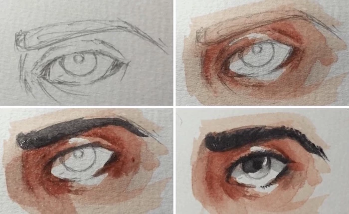
Explore the works of John Singer Sargent. While known for his oil portraits, he was a master of expressive, fluid watercolor. Notice how he used bold, direct strokes and left large areas of white paper untouched to represent the brightest light. He didn’t draw everything; he suggested it with confident splashes of color. It’s a great lesson in being bold and letting the paint speak.
Artist-Grade Paints: Use a higher concentration of pure, fine-milled pigments and a better binder (like gum arabic). This means more vibrant, transparent colors that won’t fade over time. Brands like Schmincke Horadam or Daniel Smith are top-tier.
Student-Grade Paints: Have a lower pigment load and often use cheaper look-alike pigments or fillers. They can be more opaque or streaky and may fade. Winsor & Newton’s Cotman line is a very popular and high-quality student option.
For starting out, a good student set like Cotman is perfect. But a few tubes of your favorite colors in artist-grade can make a world of difference.
A simple white ceramic plate or a butcher’s tray from a kitchen supply store makes a fantastic, inexpensive palette. The surface is smooth, won’t stain like plastic, and gives you a true sense of your colors before they hit the paper. Plus, there’s plenty of room for mixing those big, juicy washes.
“Water is the soul of watercolor.” – Jean-Louis Morelle
Important tip for layering: Test your colors on a scrap piece of the same paper you’re using. A color that looks perfect on the palette can change dramatically when it interacts with the paper and the color layer underneath. A little swatch test saves a lot of heartache on your main piece.
Want that perfect travel palette? It’s easy to make your own.
- Buy an empty metal watercolor tin (they come in various sizes).
- Purchase empty half-pans or full-pans.
- Fill the pans with your favorite tube colors. Let them dry for a day or two.
- Arrange them in the tin however you like!
This is far cheaper than buying pre-filled sets and allows you to build a palette with only the colors you truly love and use.
That dreaded “cauliflower” or “bloom” happens when a drop of very wet paint spreads into a damp (but not soaking wet) area. The excess water pushes the pigment away, creating a fractal-like pattern. While sometimes it’s a happy accident, you can control it. If you need to add more color to a damp area, make sure your brush is loaded with more pigment and less water than the area you’re painting into.
Why do my greens look so unnatural?
Straight out of the tube, greens like Sap Green or Viridian can look artificial. The secret to beautiful, natural greens is to mix them yourself. Try mixing your favorite blue (like Ultramarine or Cobalt) with different yellows (like Lemon Yellow or Raw Sienna). You’ll discover a whole range of earthy, vibrant greens that bring your landscapes and botanicals to life.