Tired of Drawing ‘Cabbage’ Roses? Here’s How to Actually See and Draw Flowers
I’ll never forget my first real attempt at drawing a rose. I had a gorgeous photo, all the confidence in the world, and about an hour to kill. The result? A crumpled piece of paper and a scribbled mess that looked way more like a head of cabbage than a flower. It was a total failure, and honestly, one of the best lessons I ever learned.
In this article
It taught me that you can’t just copy what you see. You have to actually understand it. After years of botanical illustration and teaching workshops, I’ve seen countless people make that exact same mistake. They jump straight to the tiny, complicated petal edges before they’ve even built a solid foundation. This guide is all about building that foundation, minus the gimmicks. We’re going to learn how to see flowers like an artist and draw them with confidence.
First Things First: It’s All About the Blueprint
Before your pencil even hits the paper, the real work begins in your head. You don’t need a botany degree, but knowing the basic parts of a flower is the difference between guessing and drawing with purpose. Think of it like a simple blueprint that holds everything together.
- The Stem (and its personality): This is more than just a line. Does it curve? Is it thick or thin? The gesture of the stem brings the whole drawing to life.
- The Receptacle: This is just a fancy word for that slightly swollen part of the stem right where the flower sits. Getting this little detail right really helps anchor the flower.
- The Sepals: Those little green, leaf-like bits that protect the bud. On a rose, they’re super obvious. On a lily, you might not even see them. Just noticing if they’re there adds a touch of realism.
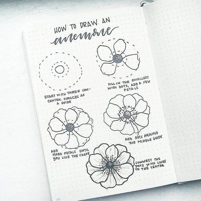
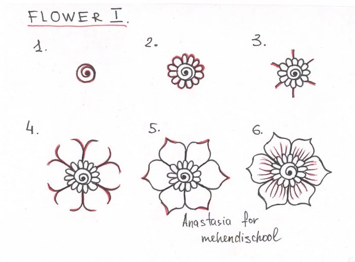
- The Petals: Okay, this is the main event. The key is to stop seeing them as 5, 10, or 50 individual things. Instead, see the overall shape they create together—is it a cup, a bell, or a star?
- The Center Stuff (Stamen & Pistil): These are the bits in the middle. You don’t need to draw them perfectly, but suggesting them with a few dots and lines gives your flower a focal point and a sense of depth.
Geometry Is Your Secret Weapon
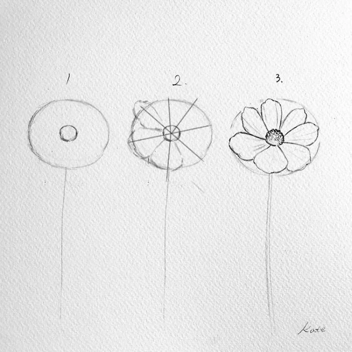
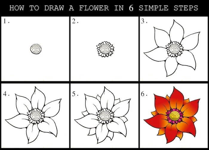
I swear, this is the most valuable trick in the book. Every single flower can be broken down into simple shapes. When you first look at your subject, force yourself to see the big, dumb shape first.
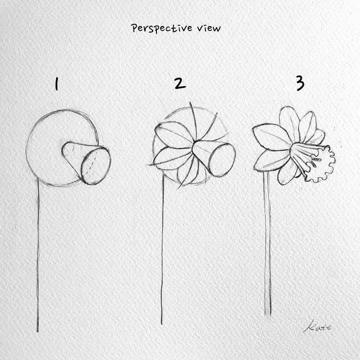
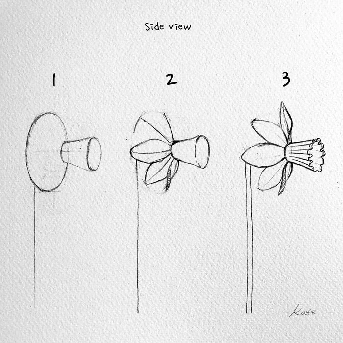
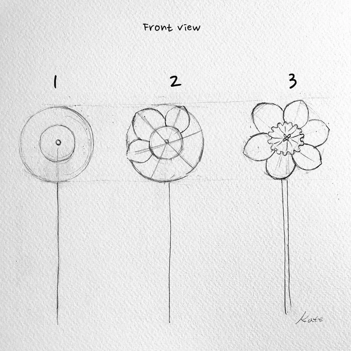
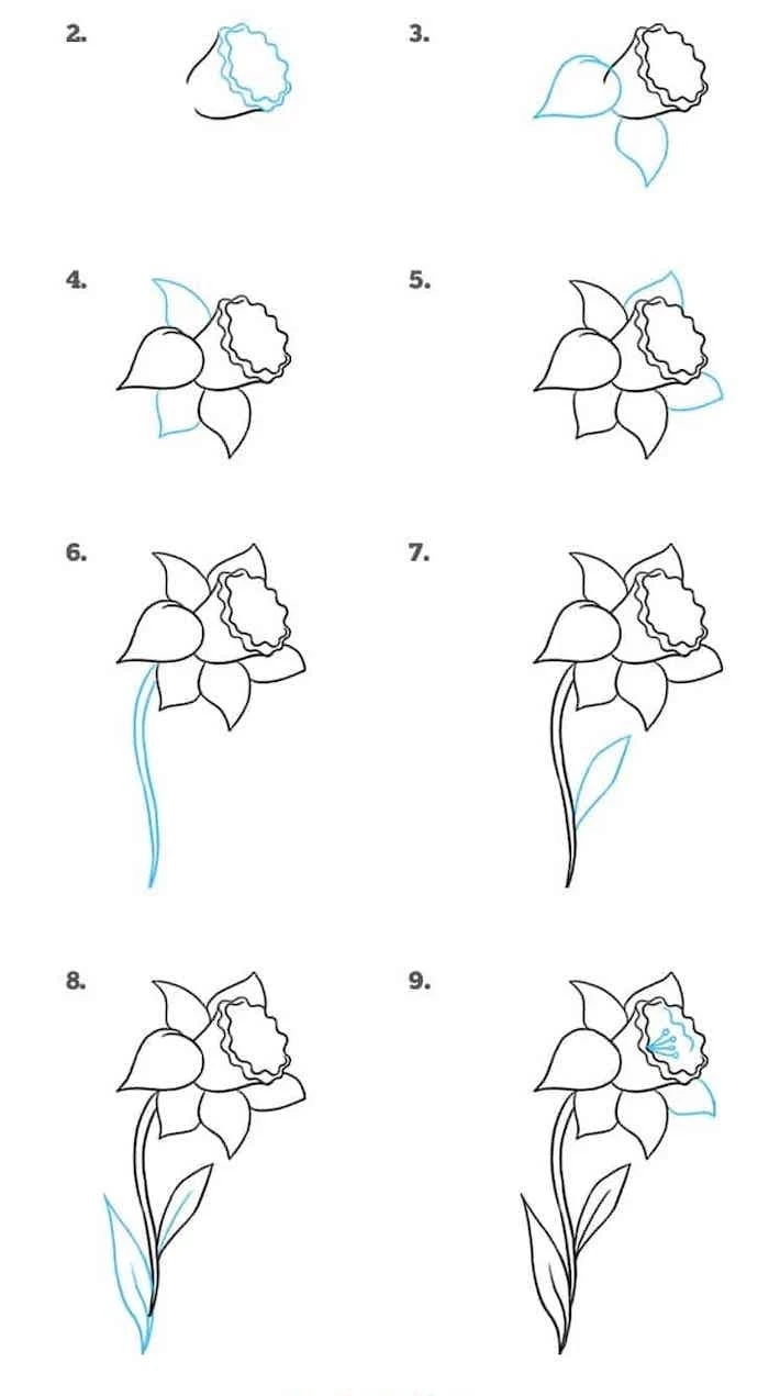
Is it a daisy or sunflower? That’s basically a flat cylinder (the center) with petals radiating out. A tulip? That’s an egg or a cup. A daffodil is just a cone sticking out of a star shape. See? Simple.
I never, ever start a drawing by outlining a petal. My first marks are always super light construction lines that map out these basic forms. If I’m drawing a sunflower at an angle, I’ll start with a squashed oval (an ellipse), not a perfect circle. This one step is what separates a flat, cartoony drawing from one that feels three-dimensional.
The Right Tools (and How to Use Them)
You really don’t need a huge, expensive art set to get started. To be frank, you can get everything you need for practice for under $25. It’s all about how you use the tools.
Your Starter Kit (~$20-25)
- Graphite Pencils: Please, step away from the office pencil. You can grab a small set of drawing pencils at any art supply store like Michaels or online at Blick Art Materials. You just need three to start: a 2H for light construction lines (the ‘H’ means hard, so it makes light marks), an HB (it’s just like a standard #2 pencil, good for general lines), and a 2B or 4B for shadows (the ‘B’ means black, so it’s soft and dark). Prismacolor and Staedtler are great, reliable brands.
- Paper: For finished work, I love a smooth paper like Bristol board (around 90-100 lb weight) because it lets you get all those juicy details. For just practicing, any simple sketchbook will do the trick.
- Erasers (Yes, Plural): You need two. A regular white plastic eraser is for getting rid of clean lines. But the magic is in the kneaded eraser. It looks like a gray square of putty and costs maybe $2. You can pull and shape it to a point to lift off graphite gently, which is perfect for creating soft highlights on petals. It feels like you’re ‘drawing’ with an eraser.
Your First Assignment: The 5-Minute Value Scale
Before you even think about drawing a flower, do this. Draw a small rectangle and divide it into five boxes. Leave the first one white. In the last box, use your soft 4B pencil to create the darkest black you can. Now, fill in the three middle boxes to create an even gradient from light to dark. This little warm-up teaches you pencil control and reminds you that shading is all about a range of tones. Trust me, it helps.
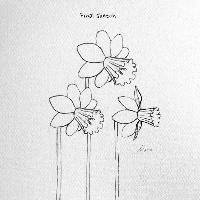
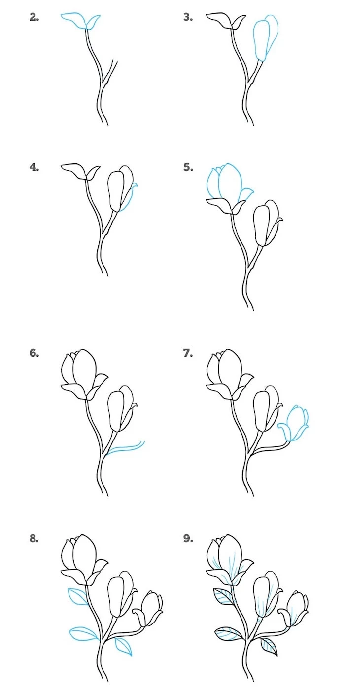
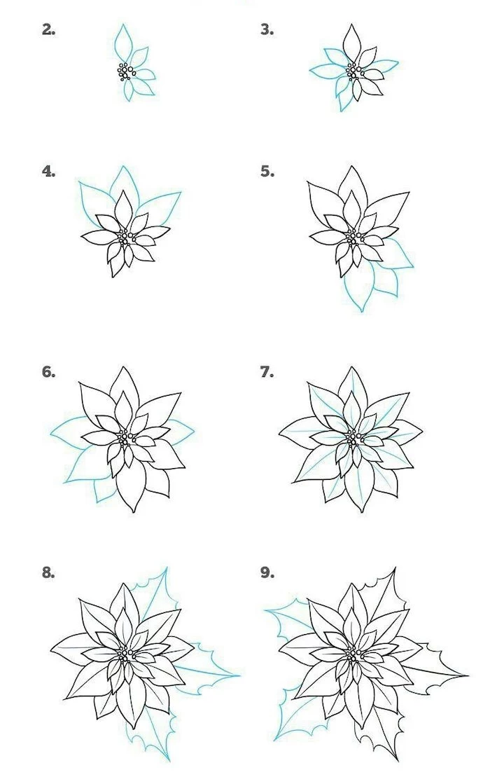
The Drawing Process, Step-by-Step
Okay, let’s put it all together. This is the basic workflow for pretty much any flower.
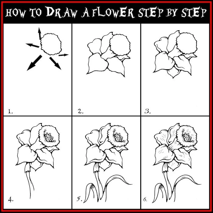
- Gesture & Placement: Grab your light 2H pencil. Loosely sketch the main curve of the stem and the general shape and angle of the flower head. This is quick and energetic, just to get the feel of the plant.
- Construction: Now, block in those big geometric shapes we talked about. An oval for the daisy’s center, a cup for the tulip. Keep these lines so light you can barely see them. You’re just building a scaffold.
- Refining Contours: Switch to your HB pencil. Start drawing the real outlines of the petals, using your construction lines as a guide. Look for overlaps—which petal is in front? Drawing those overlaps is the easiest way to create depth. Pro tip: to vary your line weight and make your drawing more dynamic, hold the pencil closer to the tip for dark, confident lines and further back for lighter, sketchier ones.
- Adding Value (Shading): This is where the magic happens. First, decide where your light is coming from. The parts of the flower opposite the light will be in shadow. Using your soft 2B or 4B, gently build up the shading in layers. Don’t press hard! The biggest mistake I see is people going too dark, too fast, leaving scratchy marks that are impossible to fix. I can’t tell you how many of my own drawings I’ve made look muddy because I was too scared to add real, deep shadows!
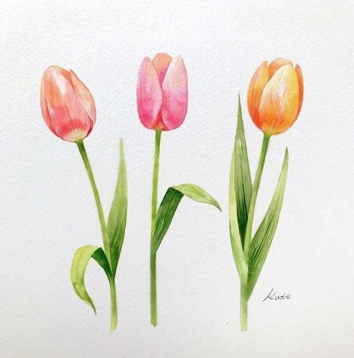
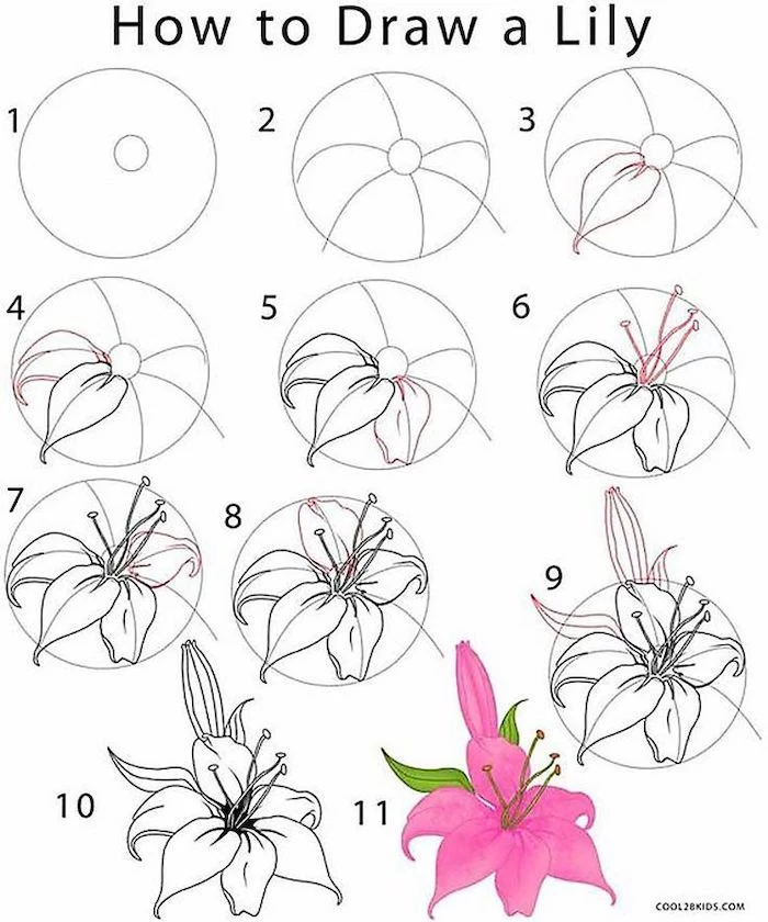
Let’s Try It: Three Common Flowers
Theory is great, but practice is everything. Let’s apply these ideas. A beginner sketch of one of these might take you 20-40 minutes, and that’s a perfectly good pace. Don’t rush it.
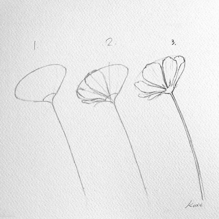
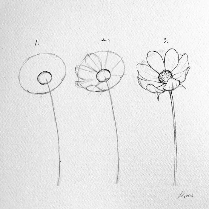
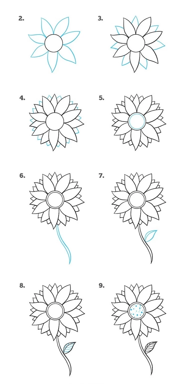
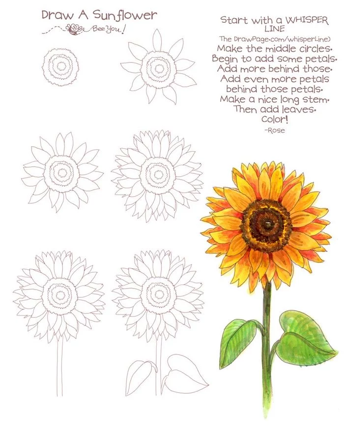
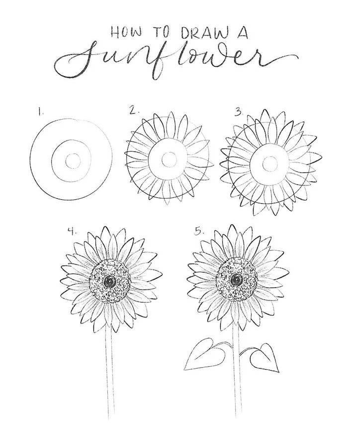
1. The Daisy: Simple but Deceptive
The daisy is a great starting point. The challenge is making it look 3D, not like a kid’s drawing of the sun. The key is perspective. If the flower is facing you at an angle, its center will be an ellipse, not a circle. Draw that ellipse first! Then, to place the petals evenly, draw the ones at the 12, 6, 3, and 9 o’clock positions first, and then fill in the gaps. Finally, make sure some petals overlap and twist a bit. They aren’t perfect cookie-cutter shapes in real life.
Your Turn: Find a photo of a daisy. Spend just five minutes trying to draw ONLY the center as an ellipse and a larger ellipse for the petal tips. Don’t draw a single petal. Just get that foundation right.
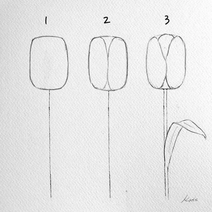
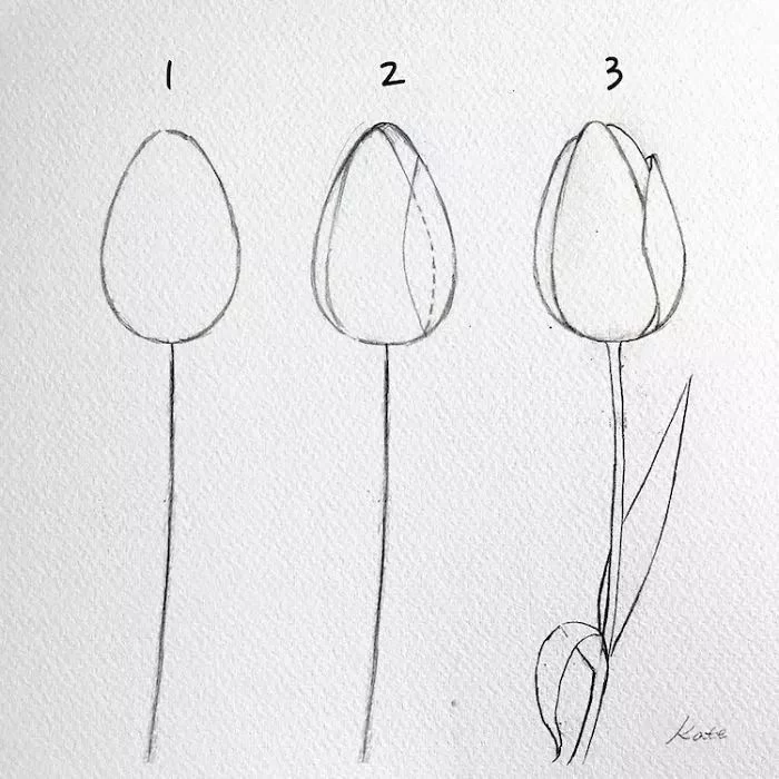
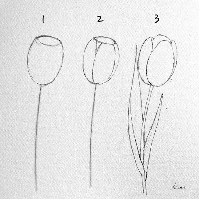
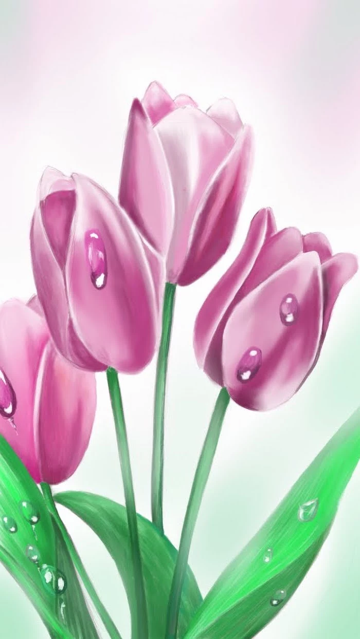
2. The Tulip: A Masterclass in Volume
A tulip is perfect for practicing volume. Start with a basic cup or egg shape. Seriously. Then, think about how the petals wrap around that shape. The front-most petal will overlap the ones on the side. When you draw that overlap with a clear line, you instantly create an illusion of depth. If the tulip is slightly open, the top of your cup shape becomes an ellipse, and the petals emerge from it. Shading the inside of that opening much darker than the outside gives it that deep, hollow look right away.
Your Turn: Grab a tulip reference. For 10 minutes, just sketch the main cup shape. That’s it. Focus on making it feel rounded and solid, like a real object.
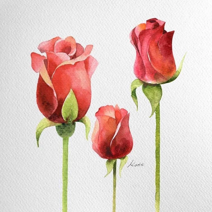
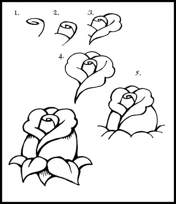
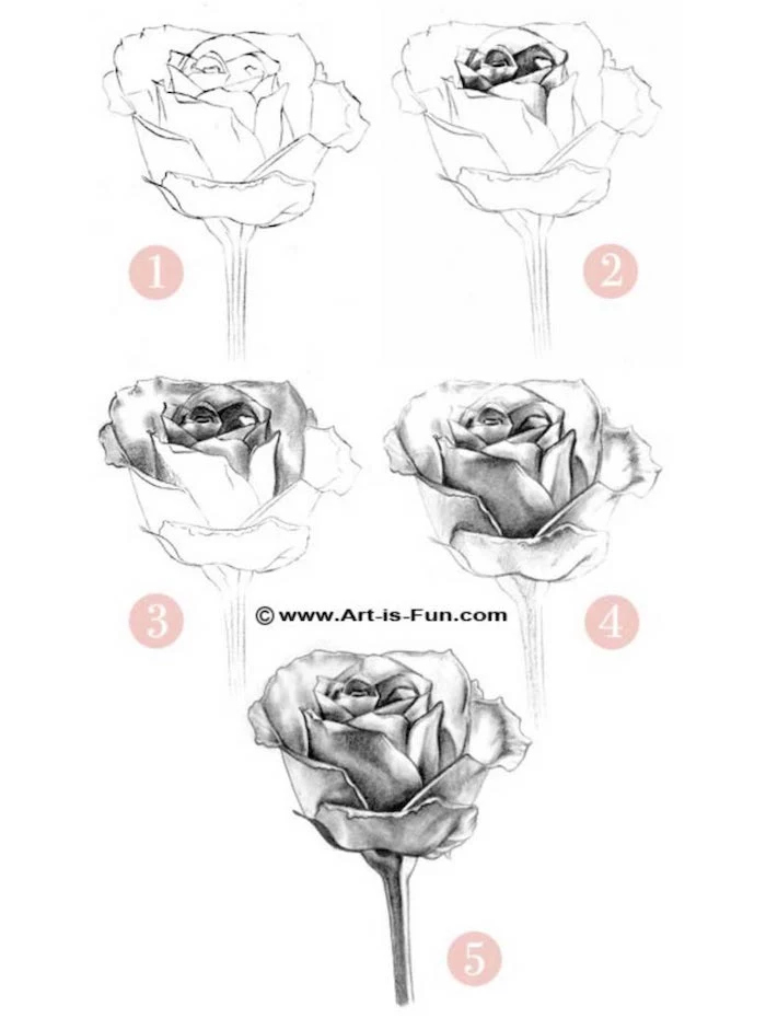
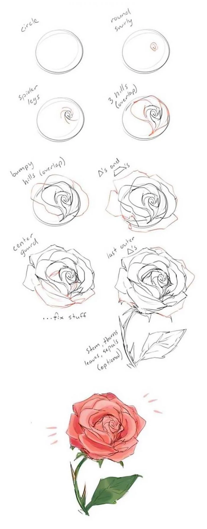
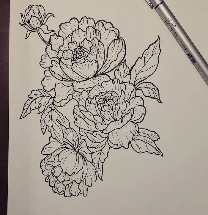
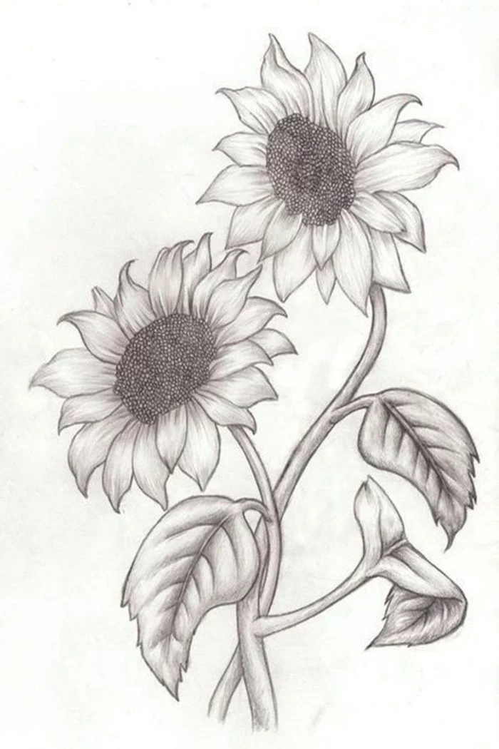
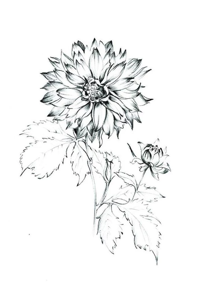
3. The Rose: Taming the Beast
Ah, the rose. The flower that frustrates everyone. Here’s the secret: stop trying to draw every petal. Start from the inside and work your way out. Lightly sketch a small, tight cone shape for the very center. Then, build around it with larger, C-shaped or crescent forms. Think of it as nested bowls. You don’t need to draw the full outline of every petal, especially in the dense center. Just suggest the edges with short, curved lines and shadows. Your brain will fill in the rest. Trying to define everything is what leads to that cabbage look.
Your Turn: Find a photo of a rose. For the next 10 minutes, I want you to draw ONLY the central bud as a small cone, and then add just two or three C-shaped forms wrapping around it. Ignore all the other petals. Feel how it builds from the center.
A Quick Word on Observation
A photo is fine, but nothing beats drawing from a real flower. A photo has already flattened the world for you. A real flower teaches you how light shines through a translucent petal in a way a picture never can. I often buy a cheap bouquet and just spend a day looking at it from different angles before I even start sketching.
By the way, it’s wild how a plant’s environment changes it. A poppy from a manicured garden is a totally different beast than one growing wild on a windy hillside. The wild one will have a tougher, more determined posture. Noticing these little things will breathe so much more life and authenticity into your work.
Troubleshooting and Pro-Level Details
If your drawing feels ‘off,’ it’s almost always one of two things. First, the basic construction is wrong (is that daisy center a circle when it should be an ellipse?). Second, and this is the big one, there isn’t enough value contrast. People are afraid to go dark! A drawing without strong, dark shadows will always look flat. Go back to your value scale warm-up. Be brave with that 4B pencil in the deepest shadows.
A lesser-known trick for creating super fine, realistic veins on a leaf is indentation. Before you shade, take a hard pencil (like your 2H) or even an empty ballpoint pen and lightly ‘draw’ the veins. Then, when you shade over the area with a soft pencil, the indented lines will stay white. It looks amazing.
Final Tips for a Happy Drawing Life
Just a few parting thoughts from someone who’s learned the hard way…
Heads up! Long hours hunched over a desk will wreck your back and neck. Make sure your chair is comfy and your space is well-lit. Get up and stretch every hour. Also, this is a big one: if you bring plants inside to draw, make sure you know what they are. Many common plants like foxglove and oleander are toxic. Just be smart, and wash your hands after you’re done.
And finally, while it’s fine to use online photos for practice, if you ever want to sell your art, you need to use your own photos or draw from life to avoid copyright issues. It makes you a better artist anyway.
The journey of learning to draw is really a journey of learning to see. Be patient with yourself, embrace the process, and stay curious. You’ll soon move beyond just copying flowers and start capturing their real spirit on the page. And that’s a skill that’s pure joy.
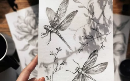
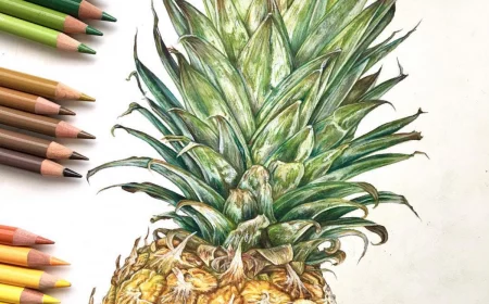
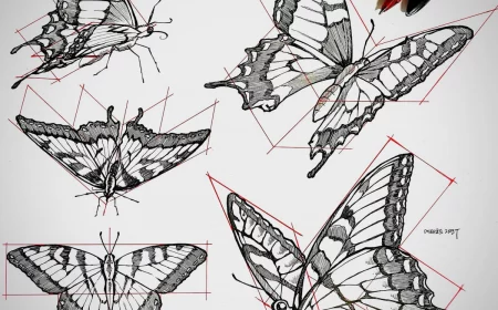
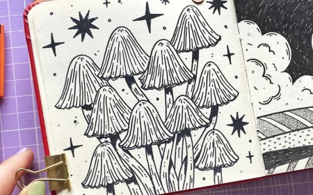
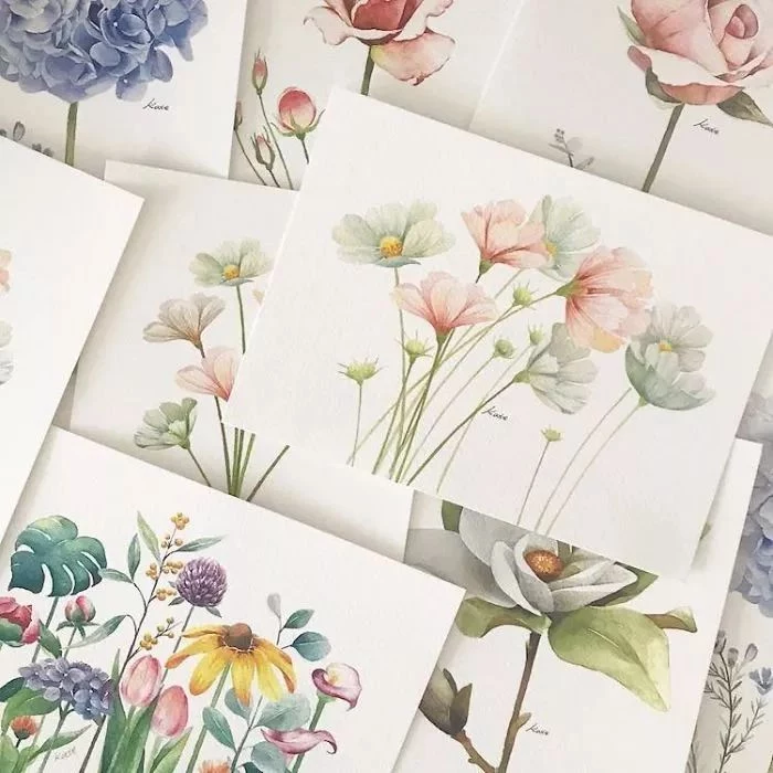
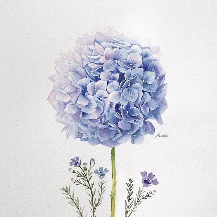
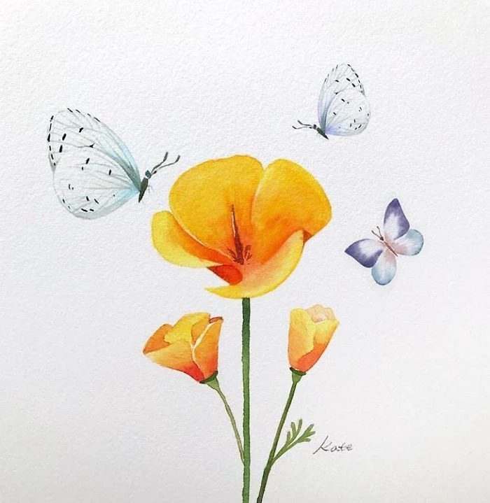
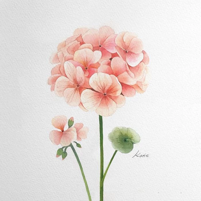
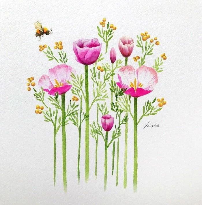
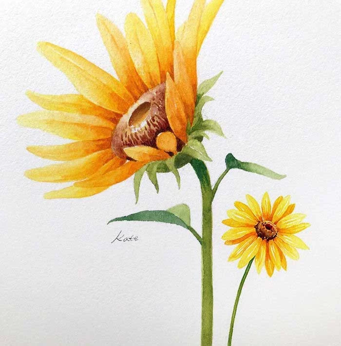
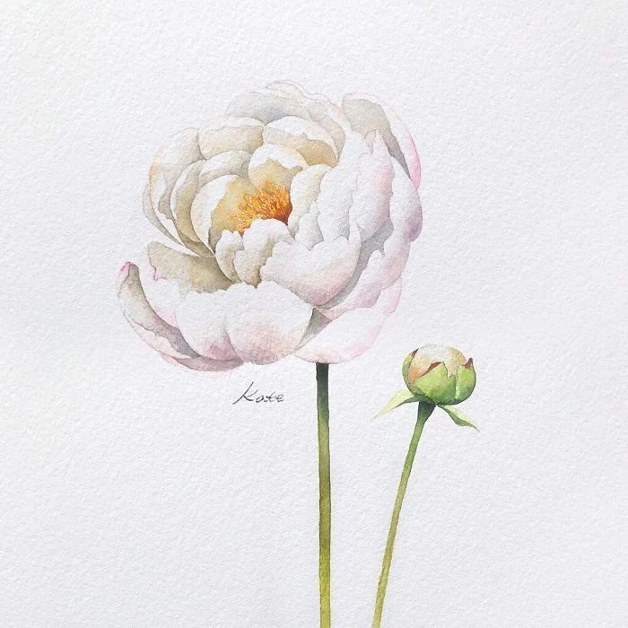
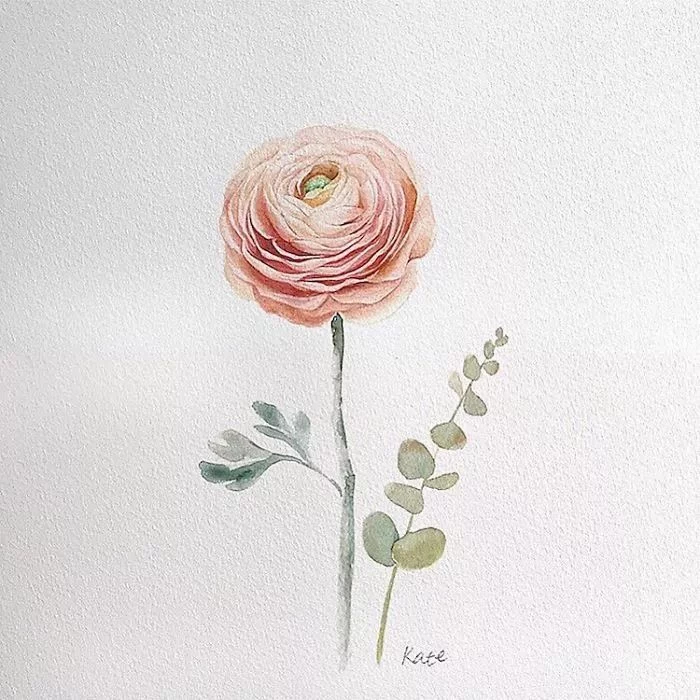
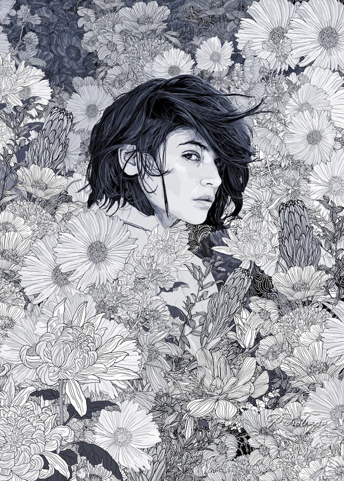
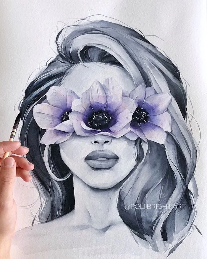
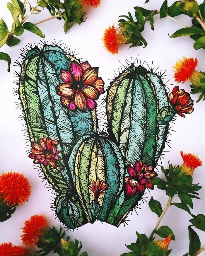
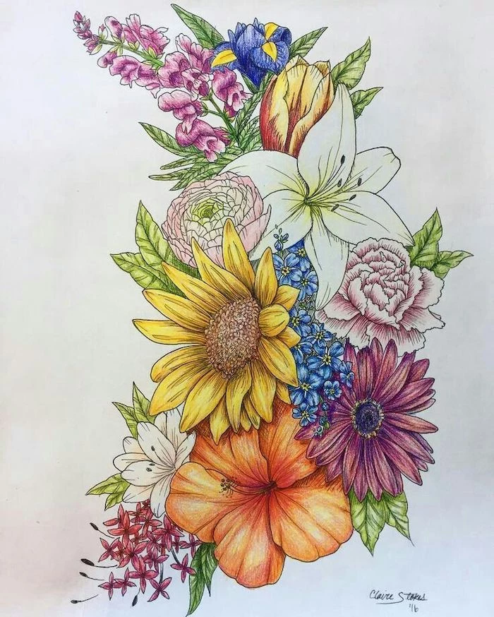
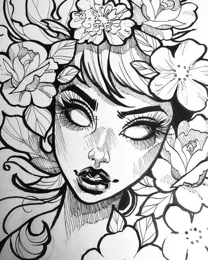
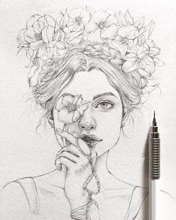
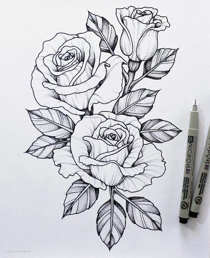
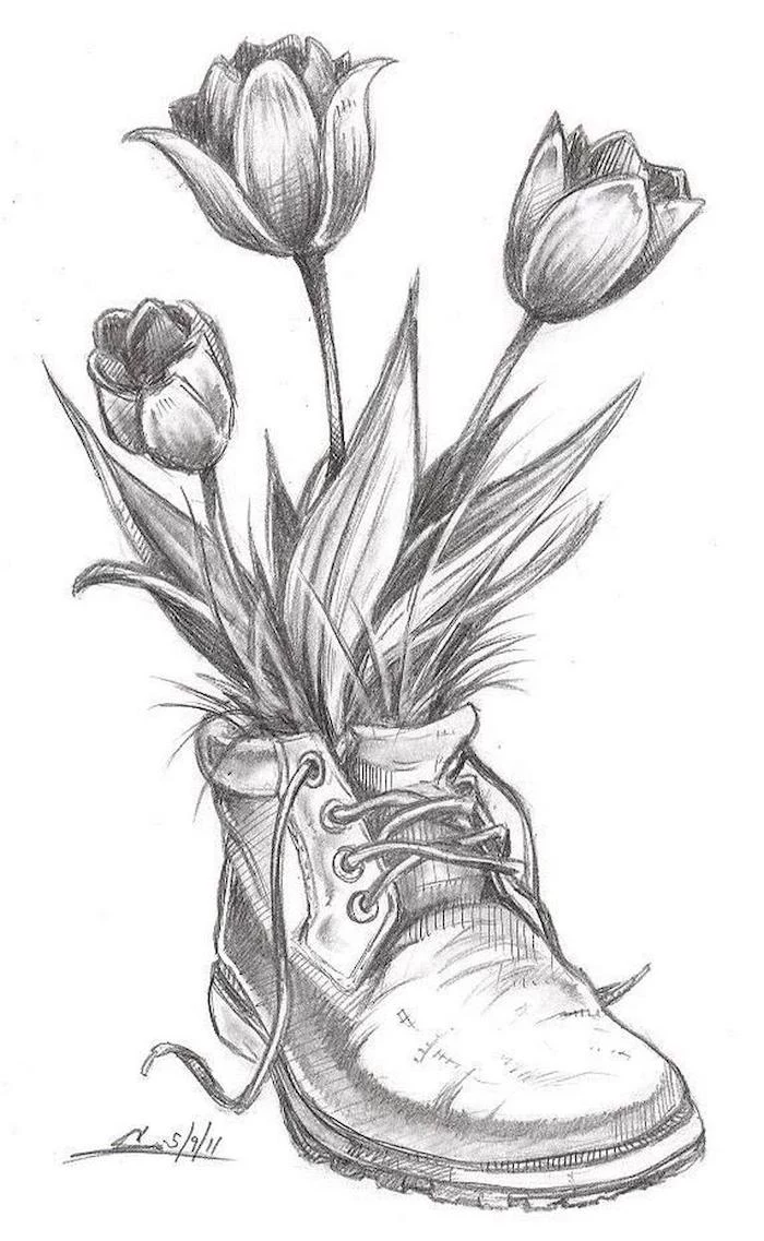
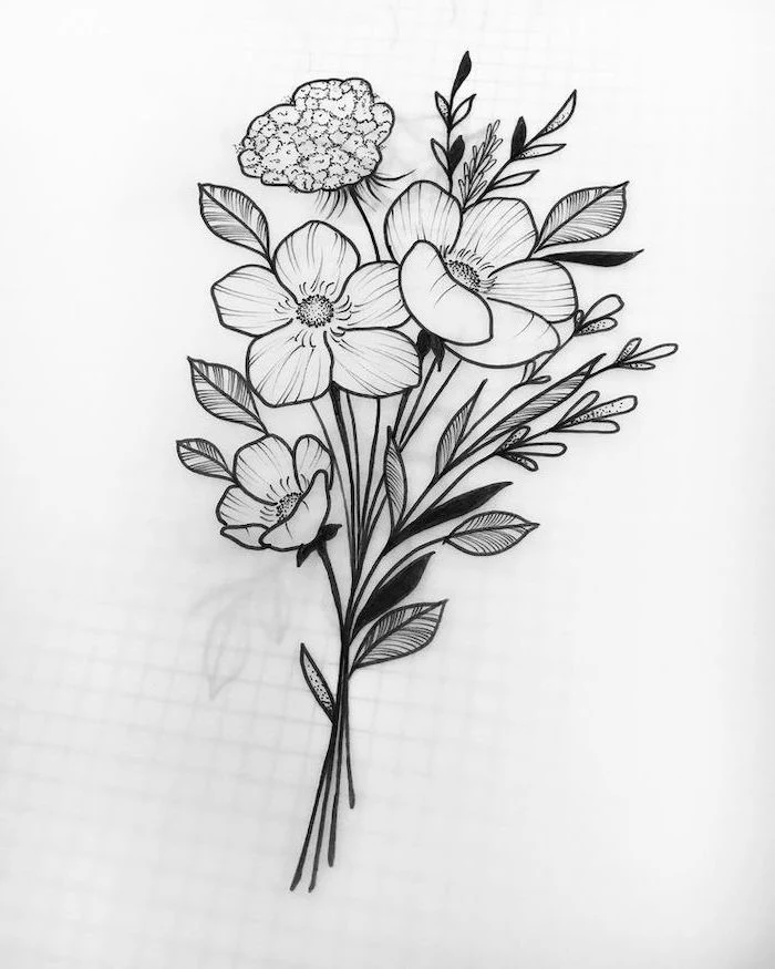
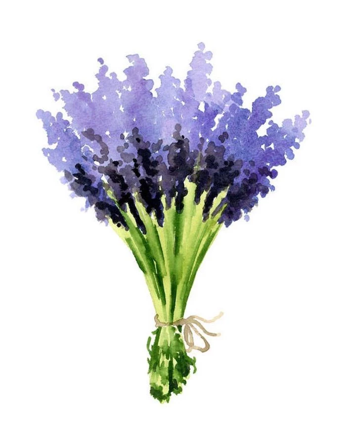
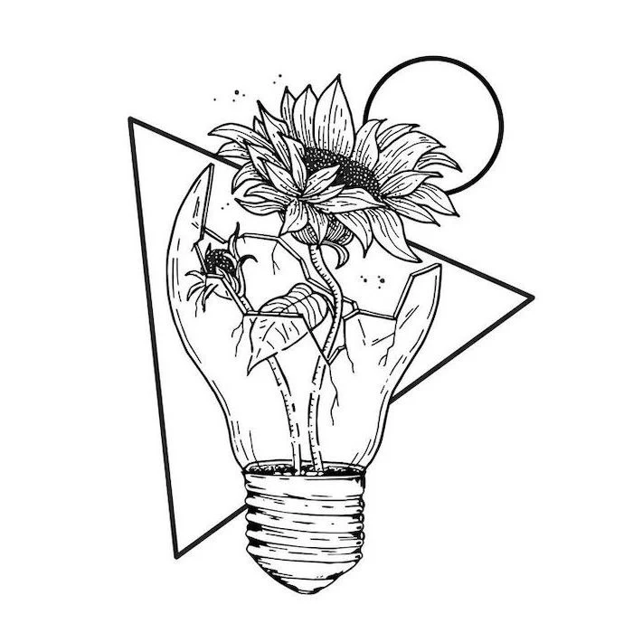
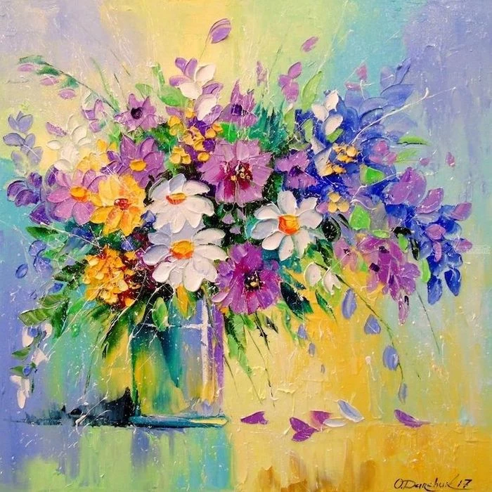
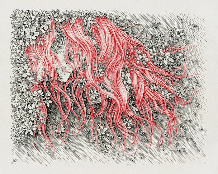
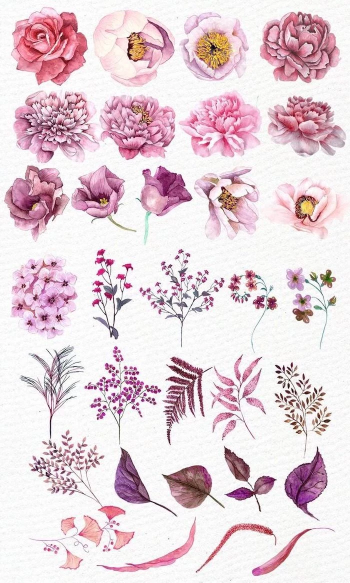
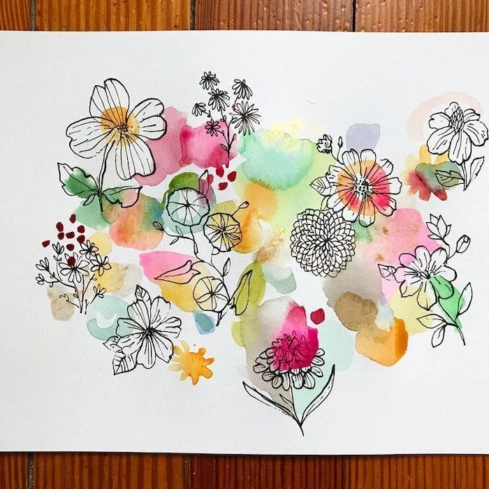
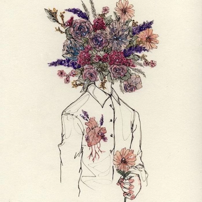
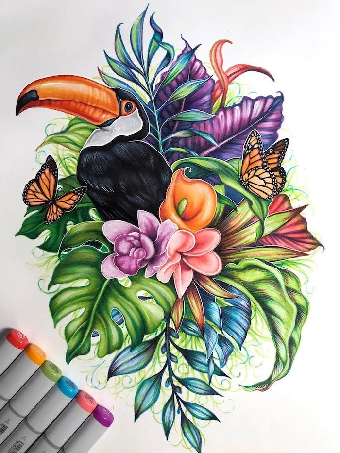
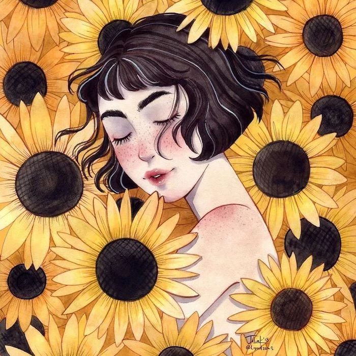
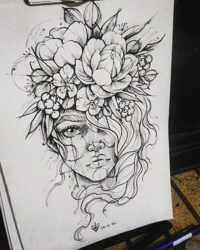
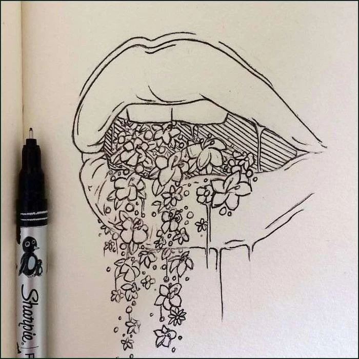
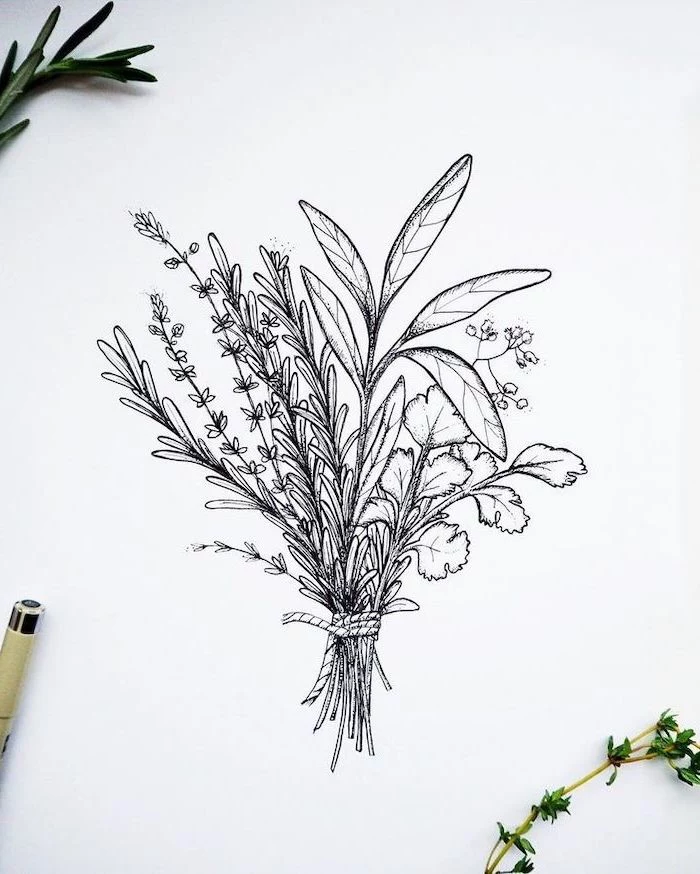
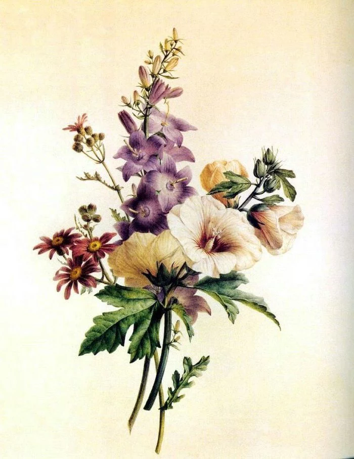
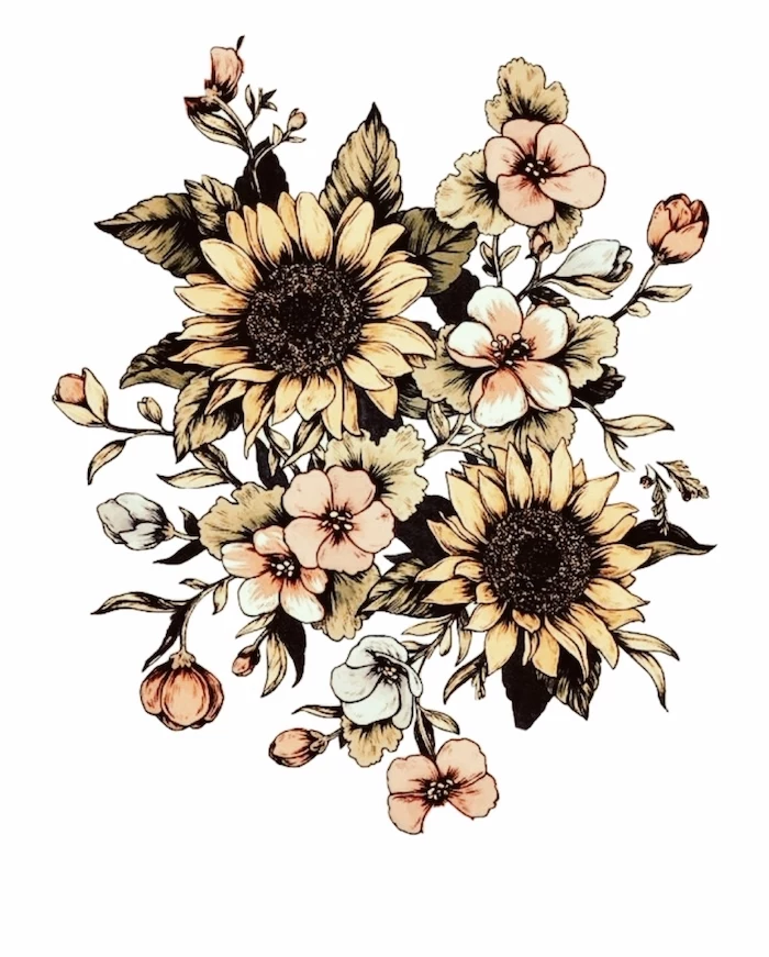
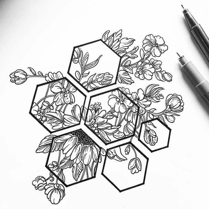
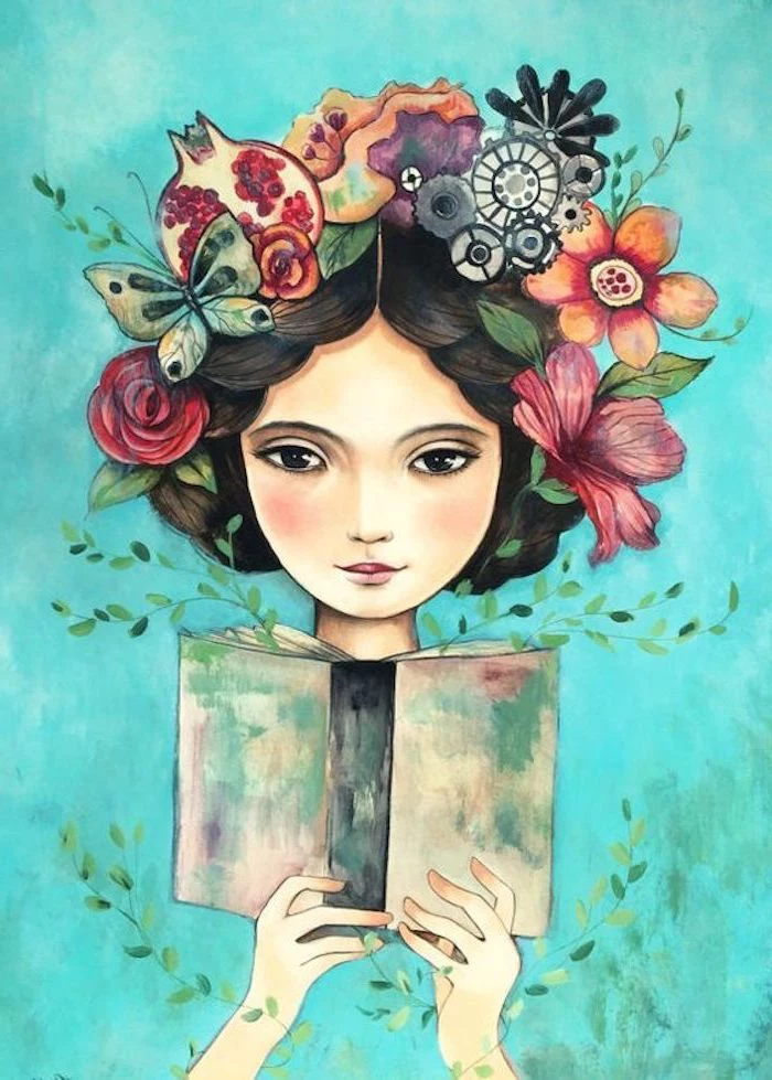
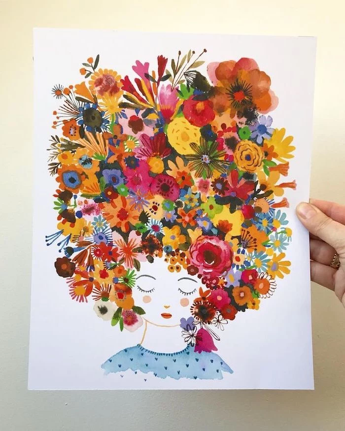
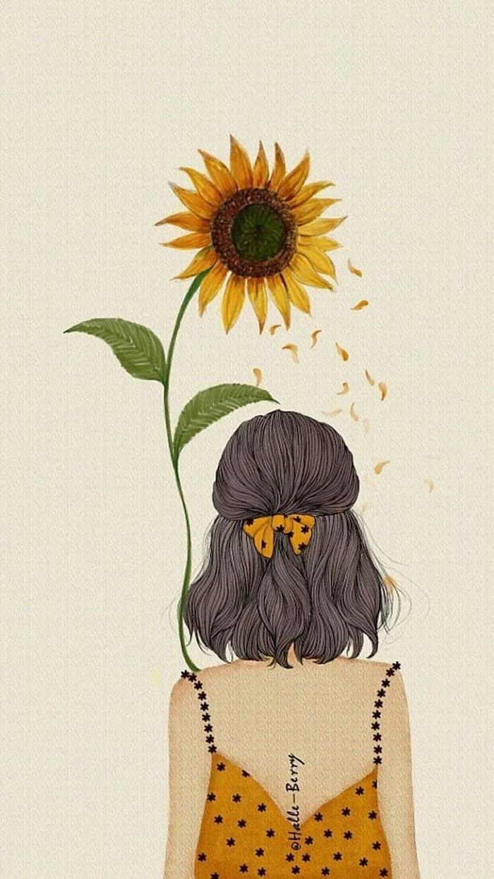
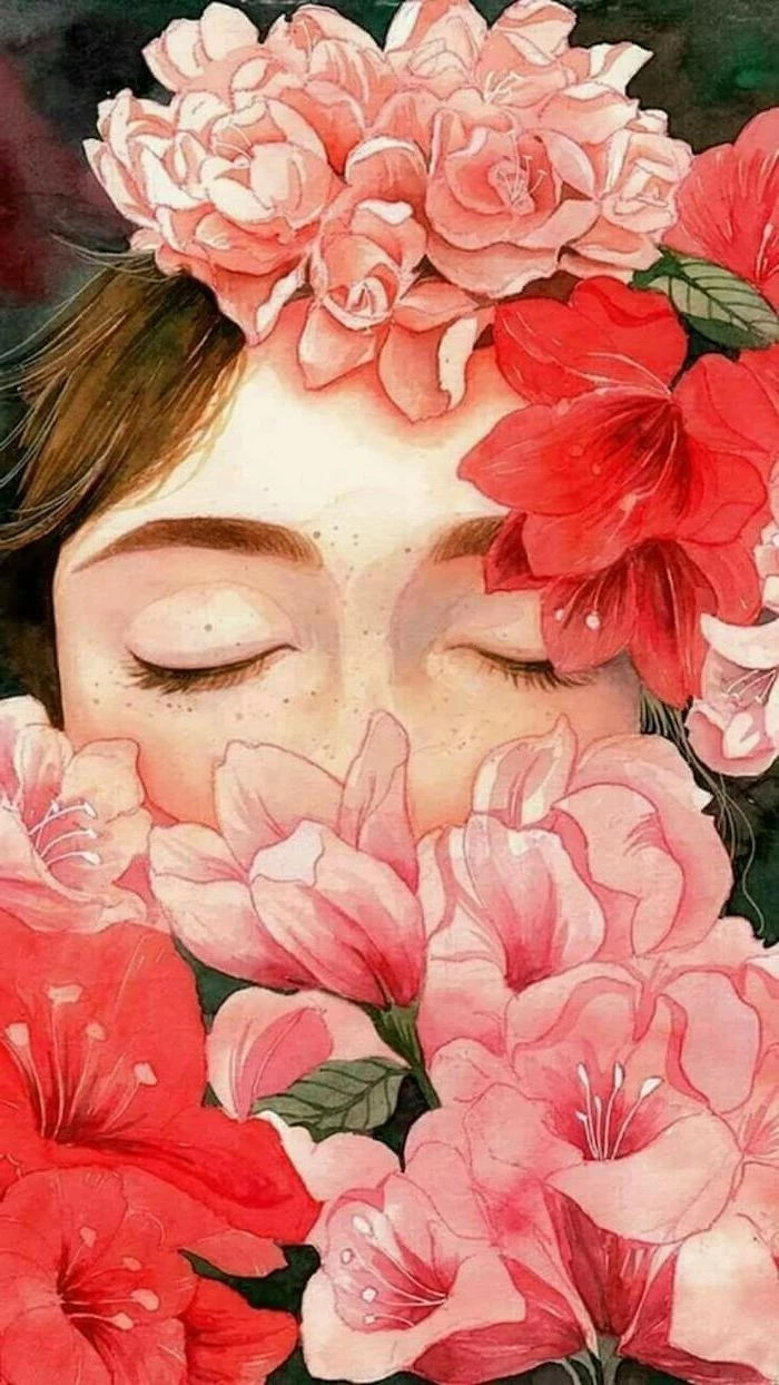
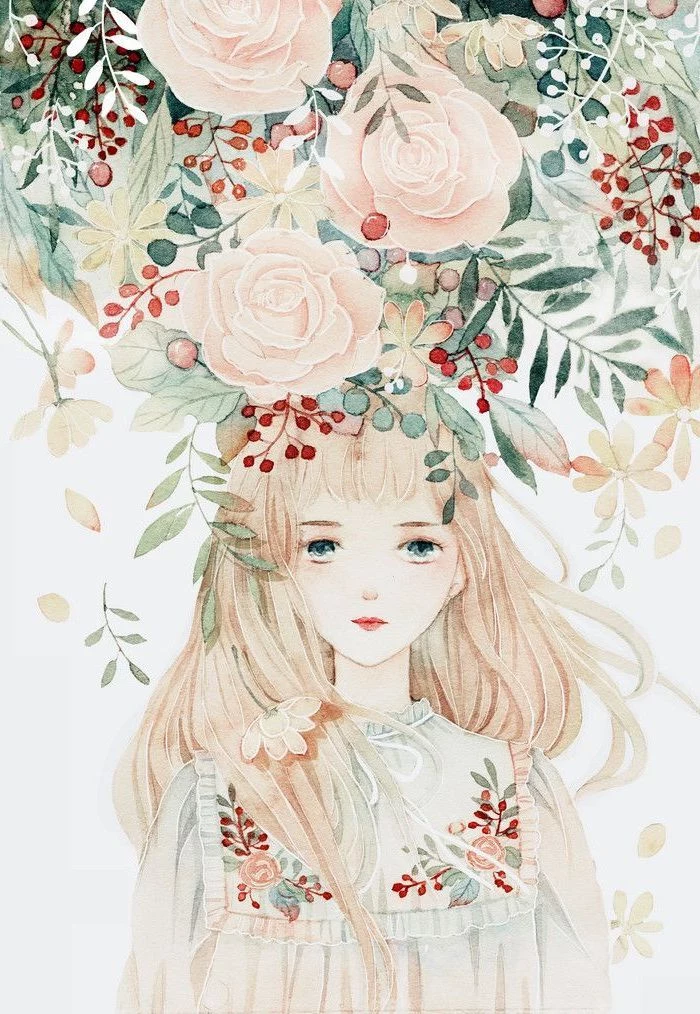
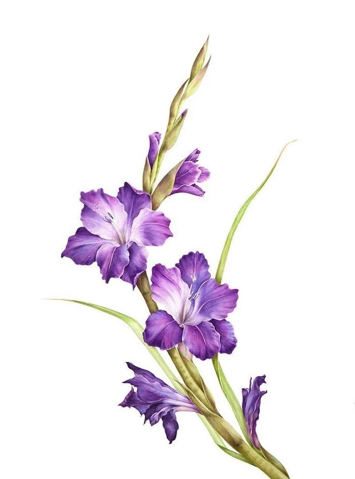
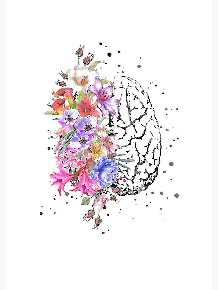
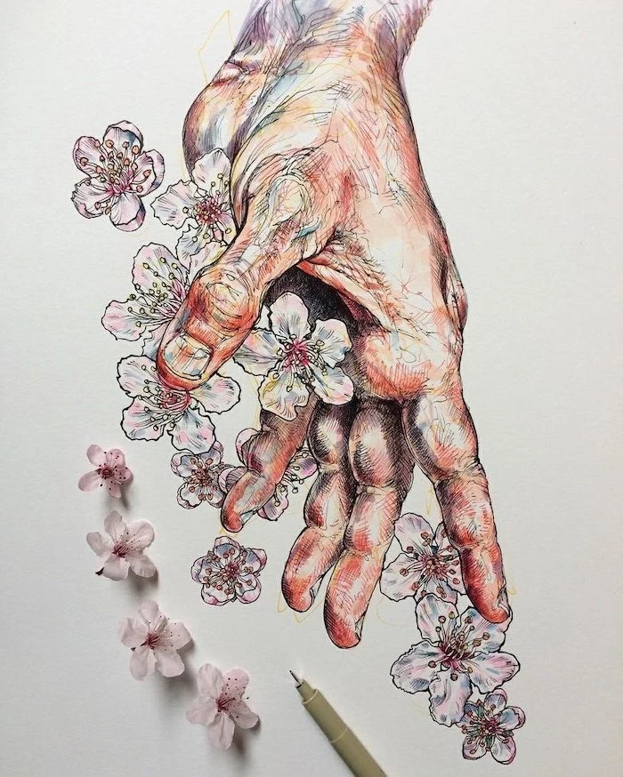
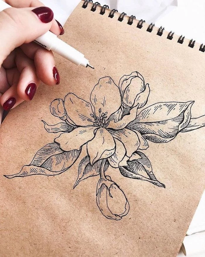
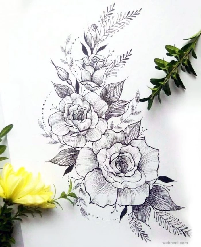
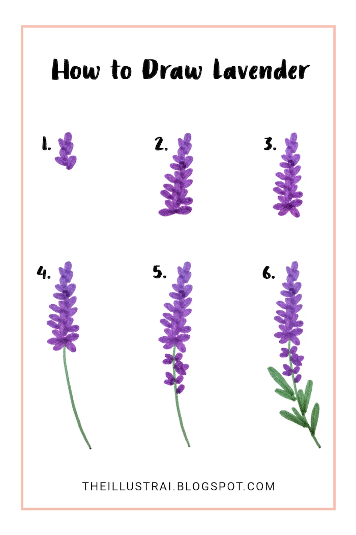
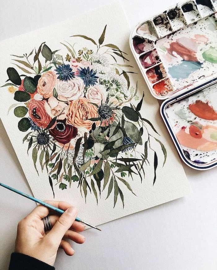
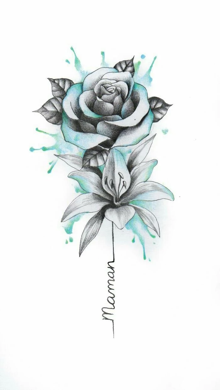
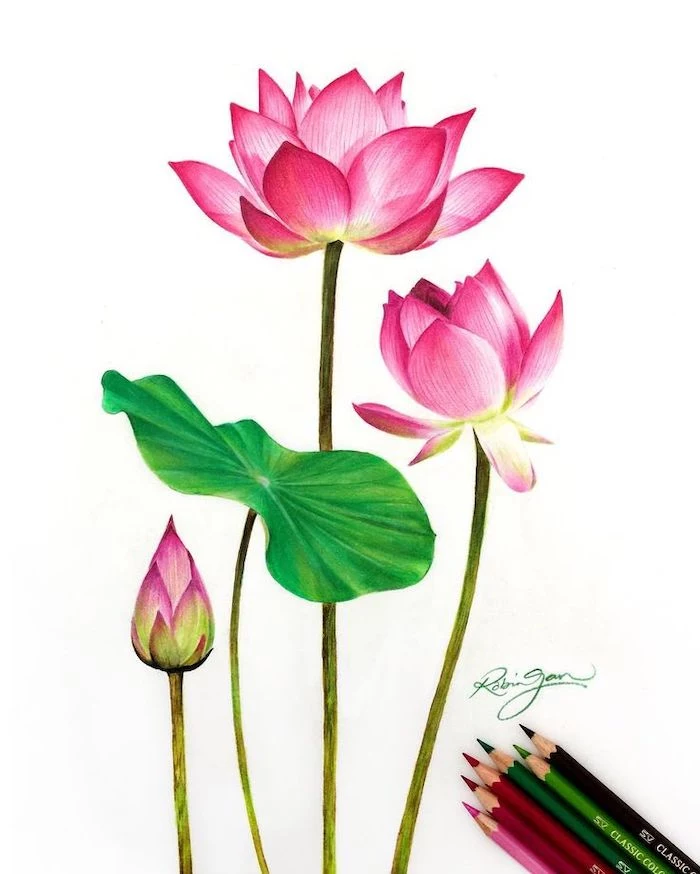
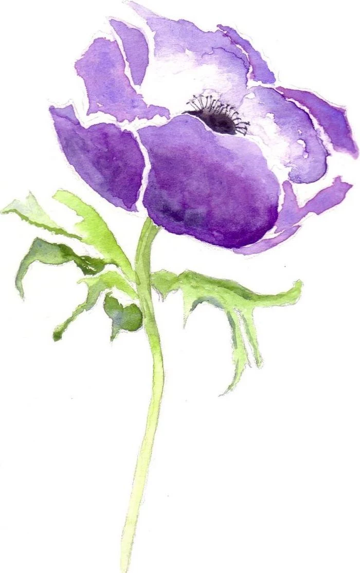
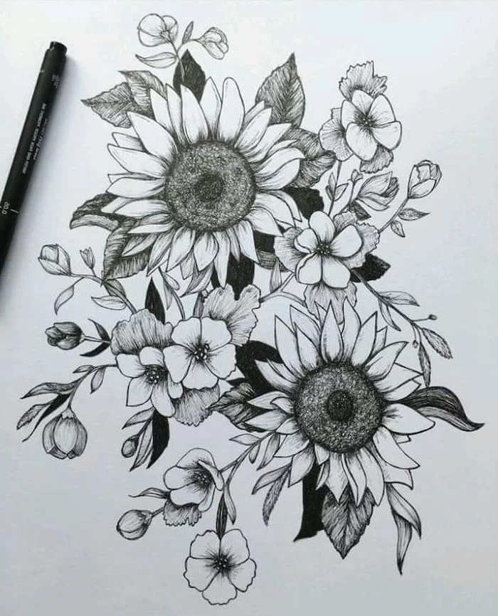
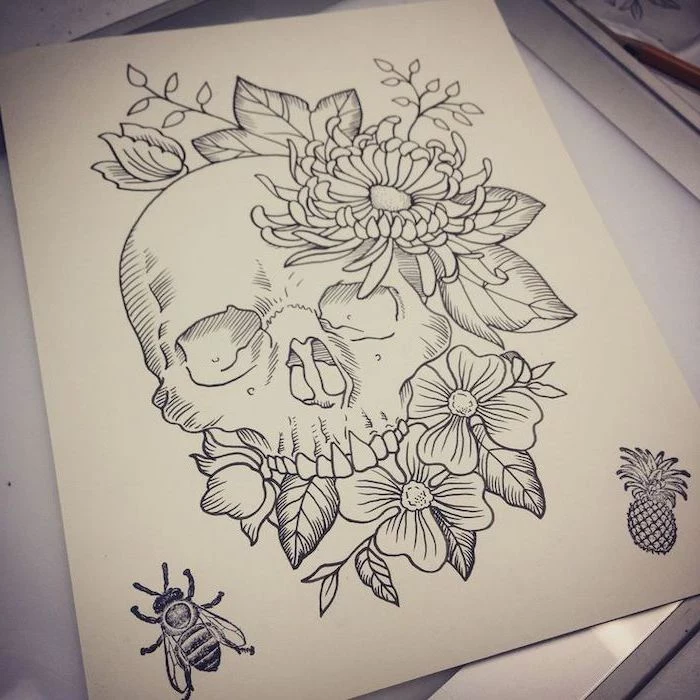
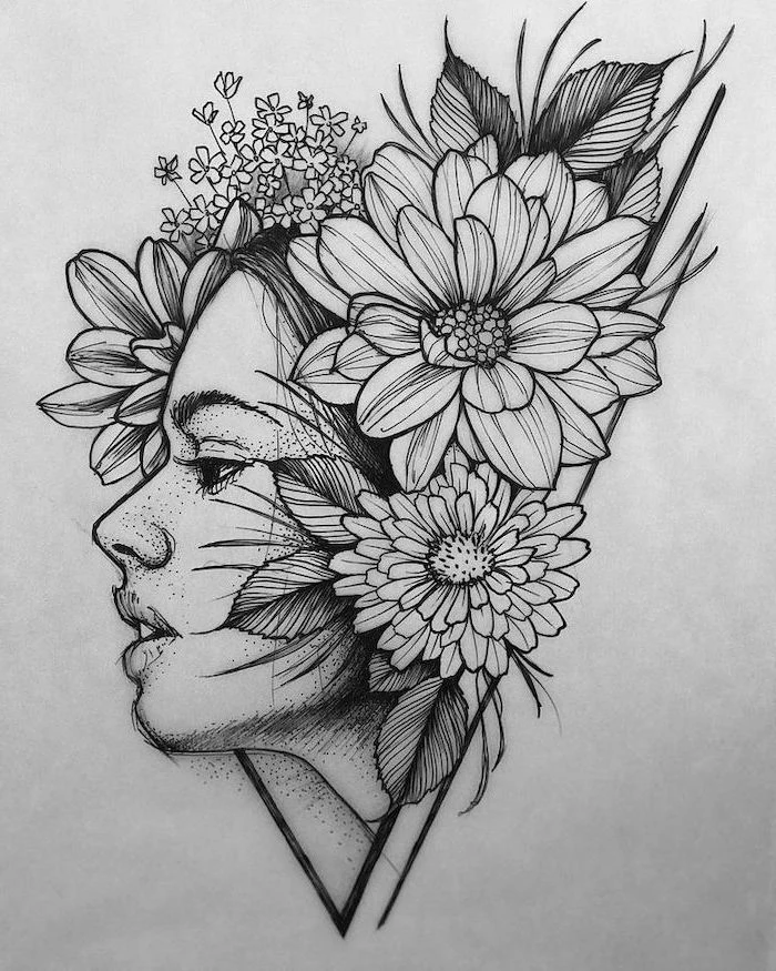
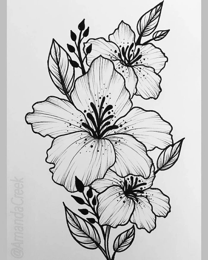
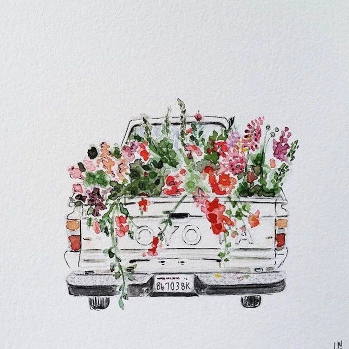
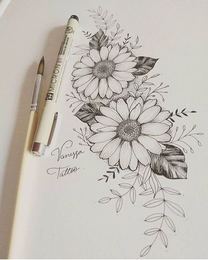
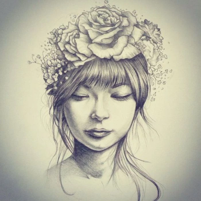
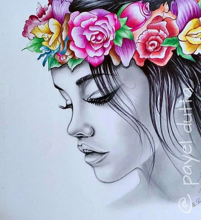
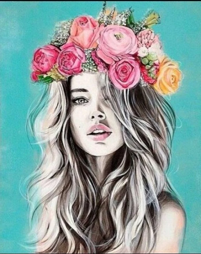
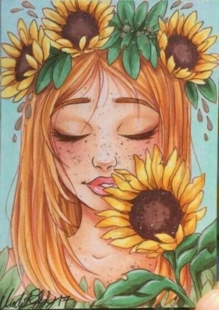
Inspiration Gallery
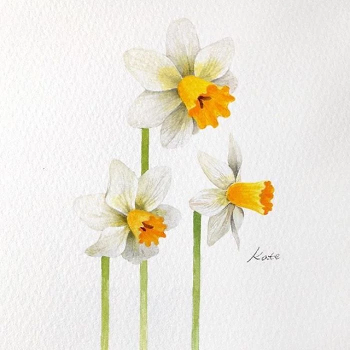
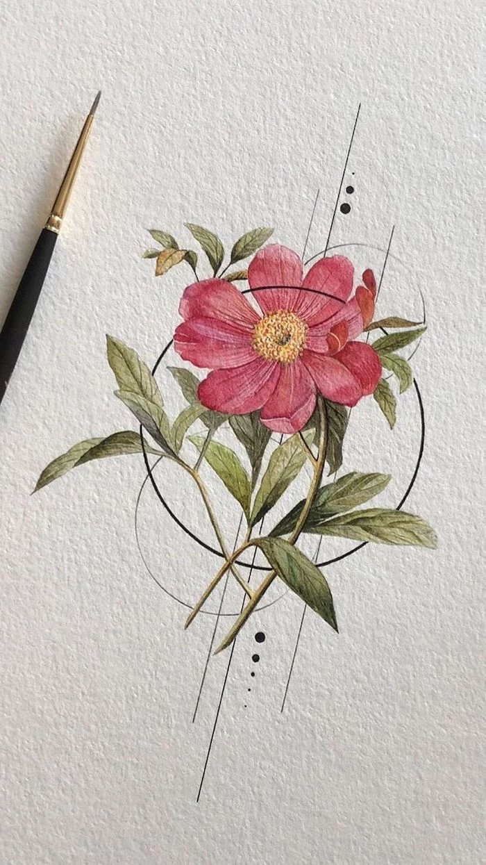
The Paper Matters: The surface you draw on can dramatically change your result. For pencil work, a smooth-bristled paper like Strathmore 300 Series Bristol allows for fine detail and easy erasing. If you’re venturing into watercolors, as seen in many of the examples, the choice is crucial. Hot-press paper is smooth and ideal for detailed, precise lines. Cold-press paper has a texture (or ‘tooth’) that grabs the pigment, creating beautiful, soft washes perfect for capturing the gentle texture of petals.
- Create vibrant, non-muddy greens by mixing your own instead of using a tube green. Try mixing a lemon yellow (like Hansa Yellow Light) with a touch of blue (like Ultramarine or Phthalo Blue).
- Add a tiny speck of red or magenta to your green mix to instantly make it look more natural and less artificial.
- For shadowy leaf areas, mix in a bit of burnt sienna instead of black to create a deep, rich, and organic-looking dark green.
The secret to realistic foliage? Never use just one green.
My pencil lines are too harsh and show through my watercolor. What can I do?
This is a classic challenge! Instead of a standard HB graphite pencil for your initial sketch, try a non-photo blue pencil or a very light-grade graphite pencil like a 2H. Better yet, use a waterproof, fine-point pen in a light sepia ink, like a 01 Pigma Micron. The sepia line will blend beautifully with your colors, adding warmth and a professional touch, rather than competing with them.
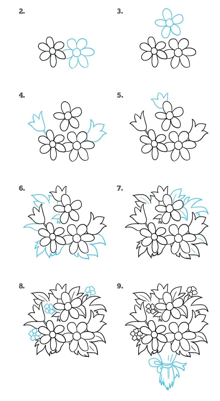
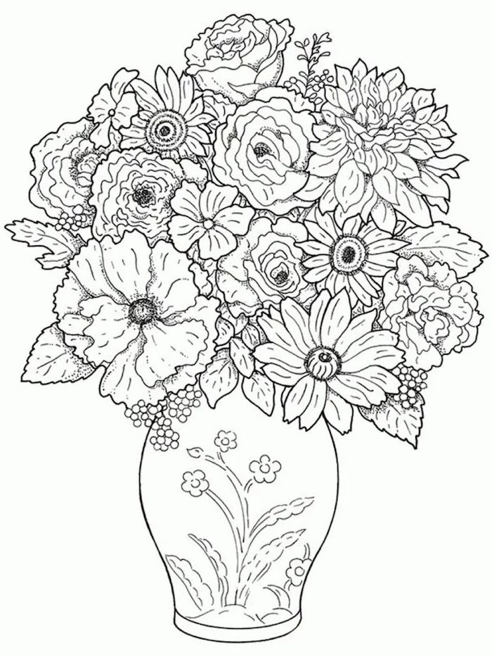
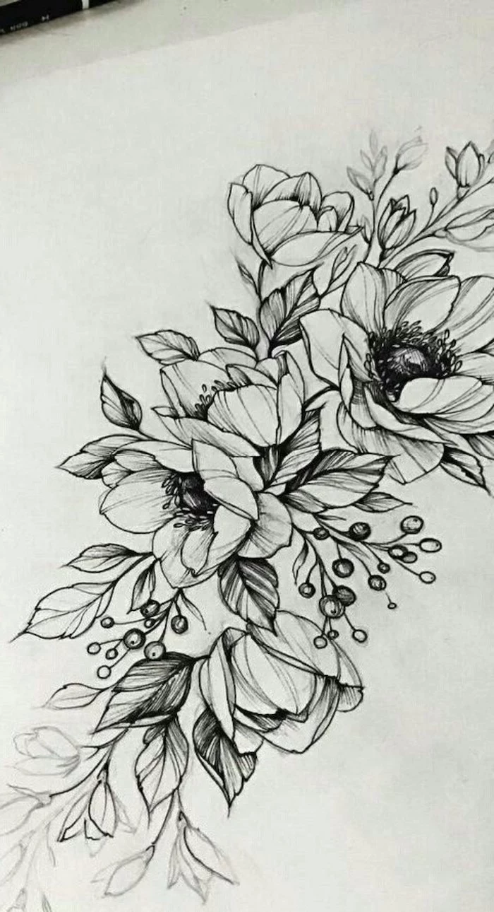
One of the biggest leaps in skill comes from moving beyond a single flower. When composing a small bouquet on the page, think like a floral arranger. Use the ‘thriller, filler, spiller’ principle: one main, dramatic flower (the thriller), smaller supporting flowers (the filler), and foliage or stems that create movement and flow out of the central arrangement (the spiller).
The 5-Minute Warm-Up: Before tackling a full flower, get your hand and eye coordinated with these quick drills.
- Gesture Lines: Quickly sketch the curve and energy of just the stems. Don’t draw the flower, just the ‘S’ or ‘C’ curve of its support.
- Blind Contours: Without looking at your paper, trace the outline of a single petal with your eyes, letting your pencil follow. The result will be weird, but it trains you to truly *see* the shape.
- Shape Blocking: Squint at your flower until it becomes a simple shape—a circle, a cone, a star—and quickly sketch that basic form.
Don’t Fear the Dark: Many beginners are afraid to add deep shadows, resulting in flat-looking drawings. To create depth, identify your light source and be bold with your darks. For graphite, a soft 6B pencil can create rich, velvety shadows in the flower’s center or under a curled petal. In watercolor, a mix of your flower’s main color with a touch of its complementary color (e.g., violet for a yellow flower) will create a more vibrant shadow than just adding black.
The Fibonacci sequence, where each number is the sum of the two preceding ones (1, 1, 2, 3, 5, 8…), frequently appears in the arrangement of petals and seeds. The seed head of a sunflower, for example, contains spirals in these numbers.
You don’t need to count every seed, but recognizing this underlying mathematical order can help you draw more natural-looking patterns. Instead of placing seeds or small petals randomly, think in terms of these dynamic, curving spirals originating from the center.
Graphite Sketch: Ideal for study and understanding form. A set like the Faber-Castell 9000 provides a great range from hard (2H) for light layout to soft (6B) for deep shadows.
Watercolor Pencils: A fantastic bridge between drawing and painting. Draw your flower with pencils like Derwent Inktense, then activate the lines with a wet brush to transform them into vibrant color. Perfect for control with a painterly finish.
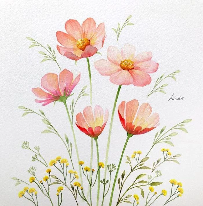
To capture the delicate, almost translucent quality of petals, like those on a poppy or cosmos, think in thin layers of watercolor. Apply a very light wash of color (what painters call a ‘glaze’) and let it dry completely. Then, add another. This layering technique, rather than using one thick, opaque coat, allows light to bounce off the white of the paper and through the pigment, mimicking the way light passes through a real petal.
- A vibrant, transparent petal effect.
- Rich, luminous color depth.
- Soft, seamless transitions between hues.
The technique? It’s called wet-on-wet watercolor. Lightly dampen the petal’s area on your paper with clean water first, then touch your pigment-loaded brush to the wet area and watch the color bloom and spread beautifully.
A Common Pitfall: Drawing every petal with a hard, continuous outline. Real flowers rarely have these. To create softer, more realistic edges, use implied lines—small, broken marks that suggest the edge rather than rigidly defining it. Let the shadows and highlights define the form, not a fence-like outline.
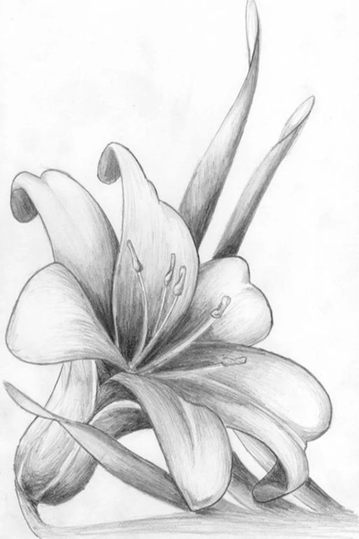
How do I draw convincing white flowers, like a gardenia or lily?
The secret to drawing white is that you don’t actually draw the white parts. You draw the shadows around them. Use very light grays, pale blues, or faint lavenders to sculpt the form of the petals. The ‘white’ of the flower is simply the untouched white of your paper. Focus on the subtle shadows to make the white areas pop.
Get a small magnifying glass or a jeweler’s loupe. Spending just a few minutes examining a real flower up close will reveal details you’d never notice otherwise: the fine hairs on a stem, the intricate texture of the pollen on the anthers, the subtle veins running through a petal. This deep observation is the foundation of all great botanical art.
Kneaded Eraser: This soft, pliable eraser (looks like putty) is an artist’s best friend. It can be shaped to a fine point to lift out tiny highlights in a graphite drawing, or gently dabbed to lighten an area without damaging the paper’s surface. A must-have for subtle corrections.
Vinyl/Plastic Eraser: A harder eraser, like the Staedtler Mars Plastic, is best for completely removing lines. Use it for cleaning up your initial construction lines before adding color, but be gentle to avoid roughing up the paper.
- Pierre-Joseph Redouté (1759-1840): Known as the ‘Raphael of flowers’, his watercolors of roses and lilies are masterpieces of elegance and accuracy.
- Maria Sibylla Merian (1647-1717): A pioneering naturalist and artist who beautifully documented the life cycles of insects along with their host plants.
- Ernst Haeckel (1834-1919): His ‘Art Forms in Nature’ revealed the stunning, often symmetrical, geometric structures of even the tiniest organisms.
Instead of drawing a flower isolated in the middle of the page, try a more dynamic composition. Let the flower run off the edge of the paper. This creates a ‘snapshot’ effect, making the viewer feel like they are getting a close-up, intimate look at a larger scene. It’s a simple trick that adds instant professionalism and visual interest.
Important tip for realism: Not all petals are perfect. Drawing a small tear, a slight wilt, a few holes from an insect, or a curled, dry edge can make your flower look infinitely more believable and alive than a perfectly symmetrical, idealized version. Perfection is often less interesting than character.
Did you know that the intense blue of some poppies, like the Himalayan Blue Poppy (Meconopsis betonicifolia), is one of the rarest colors in the plant world? Many ‘blue’ flowers are actually closer to violet or purple.
When painting them, avoid using a single blue pigment. Mix a touch of magenta or even a tiny bit of black into your blue to capture the color’s true depth and complexity.
Create a dedicated field sketchbook. It doesn’t need to be a fancy leather-bound journal; a simple Canson or Moleskine sketchbook will do. The goal isn’t to create finished masterpieces, but to collect observations. Quick sketches, color notes (e.g.,

My watercolors look flat and chalky. What’s happening?
This often happens when using student-grade paints that have more fillers, or when overworking an area. For luminous color, invest in a few tubes of artist-grade watercolor. You don’t need many! A basic palette of Daniel Smith or Schmincke Horadam paints—like a cool yellow, a warm red, and an ultramarine blue—will give you cleaner mixes and far more vibrant results than a 24-color student set.
The power of negative space: Instead of focusing on drawing the flower itself, try drawing the shapes of the empty spaces *around* and *between* the petals and leaves. This trick forces your brain to see the true proportions and relationships of the parts, bypassing the mental symbol of ‘flower’ that often leads to generic drawings.
For preserving the crisp white of a flower’s stamen or a bright highlight on a petal in a watercolor painting, masking fluid is your secret weapon. You paint this liquid rubber onto the areas you want to keep white. Once it’s dry, you can paint your washes right over it. After your paint dries, simply rub off the masking fluid to reveal the pristine white paper underneath. A brand like Winsor & Newton Art Masking Fluid is a studio staple.
Don’t forget the stem’s joints and nodes—the little bumps where leaves or new stems emerge. These are points of structural change and energy. Adding just a slightly darker line or a subtle swelling at these nodes will make your stem look less like a simple tube and more like a living, growing plant structure.
- Get that ‘just rained on’ look.
- Create perfect, tiny white veins on a dark leaf.
- Add sparkle to the center of a daisy.
The tool? A white gel pen. After your drawing or painting is completely dry, a few carefully placed dots or lines with a Uni-ball Signo or Sakura Gelly Roll pen can add that final pop of bright, opaque highlight that’s difficult to achieve otherwise.