I’ve had a brush in my hand for what feels like a lifetime, starting out just like anyone else in a chilly garage with a cheap set of paints. Since then, I’ve seen so many people pick up acrylics, totally jazzed by the bold colors and quick-drying nature. But I’ve also seen that excitement turn into frustration.
Here’s the thing: it’s almost never about a lack of talent. The real hurdle is just not understanding how this particular paint works. People try to treat it like watercolor or oil paint, and that’s where things go sideways. So, this isn’t just a list of steps to copy. It’s about really getting to know the medium so you have the freedom to paint whatever you can dream up. Let’s get this foundation built right.
What’s Actually in the Tube?
To get acrylics to do what you want, you need to know what they are. Honestly, it’s pretty simple. Acrylic paint is just color (pigment) floating in an acrylic polymer emulsion. Think of it like microscopic plastic bits of color suspended in water. When you brush it onto a canvas, the water evaporates, and those little polymer particles fuse together into a tough, flexible, and waterproof skin.
This drying process is what makes acrylics… well, acrylics. It happens in minutes, not days or weeks like oil paint. This is both a blessing and a curse. It’s fantastic for layering colors without making a muddy mess. But it also means you have a super short window to blend colors smoothly on your canvas. This is the
1 complaint I hear from beginners.
Good to know: If you understand why it’s drying so fast (evaporation), you can take control. And the single best tool for that is a wet palette. You can buy one, but it’s just as easy to make your own. Seriously, this is a game-changer. Just grab a shallow Tupperware or a similar container, lay a few folded paper towels in the bottom, and soak them with water. Place a sheet of parchment paper (the kind you use for baking) on top of the wet towels. Squeeze your paints onto the parchment paper, and they’ll stay usable for days. Problem solved.
Student vs. Professional Paint: What’s the Difference?
You’ll see paints labeled as either student-grade or professional-grade. The main difference is the “pigment load.” Professional paints are packed with pure, high-quality pigment, which makes the colors incredibly rich and vibrant. Student paints have less pigment and more filler, so the colors can sometimes look a bit weaker or even change shade slightly as they dry.
My advice? For a total beginner, a good student set is perfect for learning techniques without breaking the bank. As you get more serious, you can start replacing your most-used colors with professional tubes. You’ll really notice the difference in intensity.
Creating a Space to Paint
Just plopping down at the kitchen table with your supplies can lead to a real headache. A little prep for your painting zone goes a long way.
First, ventilation. Modern acrylics are pretty low-odor, but they do release some stuff as they dry. An open window is usually all you need for good airflow. This is extra important if you start using mediums or varnishes, which can be a bit more potent.
Lighting is another big one. I’ve seen it a thousand times: someone mixes a perfect color, but then in daylight, it looks completely different. The goal is neutral, consistent light. A big window that doesn’t get direct sun is ideal. If you don’t have that, a simple daylight bulb (look for a color temperature of 5000-6500K) in a desk lamp works wonders. Try to avoid painting under those warm, yellowy household lights; they will absolutely fool your eyes.
And please, protect your surfaces! I’ve seen newspaper backfire when wet paint soaks through and glues it to the floor. A cheap plastic drop cloth from a hardware store is a much better bet. For my own table, I use a big silicone craft mat. Dried acrylic peels right off, making cleanup a breeze.
Oh yeah, and the water situation. A classic rookie mistake is using just one jar of water. It quickly turns into a muddy soup that dirties all your colors. Use the two-jar system! Jar one is for the first, dirty rinse to get the bulk of the paint off. Jar two is for the final, clean rinse. Quick tip: I use old salsa or pickle jars. They’re free, a great size, and the lids are a nice bonus.
Your Acrylic Starter Kit: What to Actually Buy
Walking into an art supply store can feel overwhelming. Walls of color, aisles of brushes… you don’t need it all. In fact, a few quality items are way better than a mountain of cheap stuff. You can get a solid starting setup for under $60.
Your First Shopping List (~$50-$60 total)
A Starter Paint Set: Look for a student-grade set. Expect to pay around $20-$30. You don’t need 24 colors. If you’re buying individual tubes, start with these five: Titanium White, Mars Black, Cadmium Yellow (or similar primary yellow), Ultramarine Blue, and a primary red like Naphthol or Cadmium Red. With these, you can mix almost any color you need.
Brushes: A small synthetic set will run you about $15.
Canvases: A multi-pack of 8×10 or 9×12 inch canvases is usually around $15.
Palette: You can get a pad of disposable palette paper for about $10, or just use a ceramic plate from a thrift store for a couple of bucks.
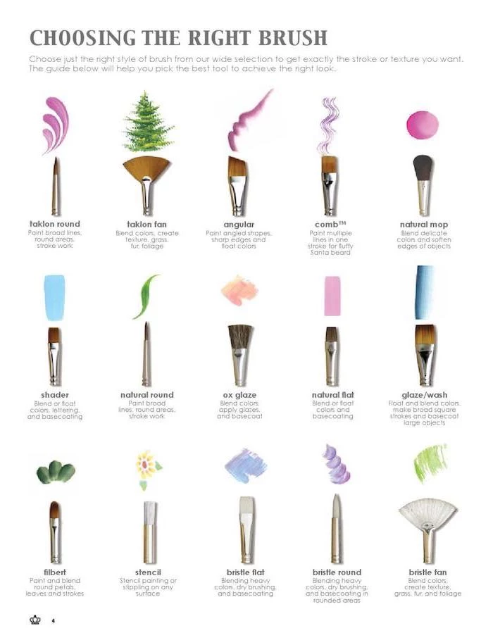
Brushes: Your Most Important Tools
For acrylics, you want synthetic brushes. They’re tough and can handle the paint and the constant rinsing. Natural hair brushes (like sable) are meant for watercolors and can get ruined by acrylics.
You don’t need a ton of brushes. I recommend starting with a core set of four:
A
8 or
10 Flat brush: This is your workhorse for filling in large areas and making crisp edges.
A
6 Filbert brush: It’s like a flat brush but with a rounded tip. It’s my personal favorite because it’s amazing for blending and doesn’t leave hard lines.
A
2 or
4 Round brush:
The pointed tip is for details, lines, and controlled strokes.
A Rigger or Liner brush: A super-thin brush with long bristles that’s perfect for painting fine lines like tree branches or whiskers.
Heads up! Brush care is non-negotiable. I learned the hard way after letting paint dry deep down in the metal part of a favorite brush (that’s called the ferrule). It hardened like cement and the brush was toast. ALWAYS keep your brushes wet while you work. When you’re done for the day, wash them gently but thoroughly with brush soap or even just mild dish soap and cool water. Reshape the bristles with your fingers and let them dry lying flat or hanging upside down.
Surfaces: What to Paint On
Stretched canvas is the most common surface, and for good reason. But not all canvases are created equal. The super cheap ones often have a very thin coat of primer, called gesso, and can feel flimsy or have warped frames. For a much better experience, look for canvases that are labeled “triple-primed with acrylic gesso.” This gives you a smoother, more durable surface that the paint will stick to beautifully.
Your First Exercise: Master the Mix
Ready to put paint on the canvas? Try this. Take out only your black and white paint. Your challenge is to mix five distinct, evenly-spaced shades of gray, from a very light gray to a very dark gray. This simple exercise teaches you a ton about how the paint feels, how it mixes, and how quickly it dries. It’s the perfect first step.
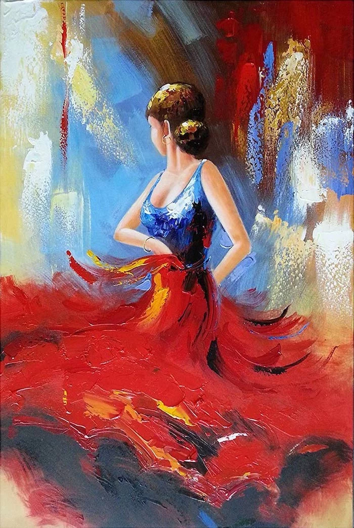
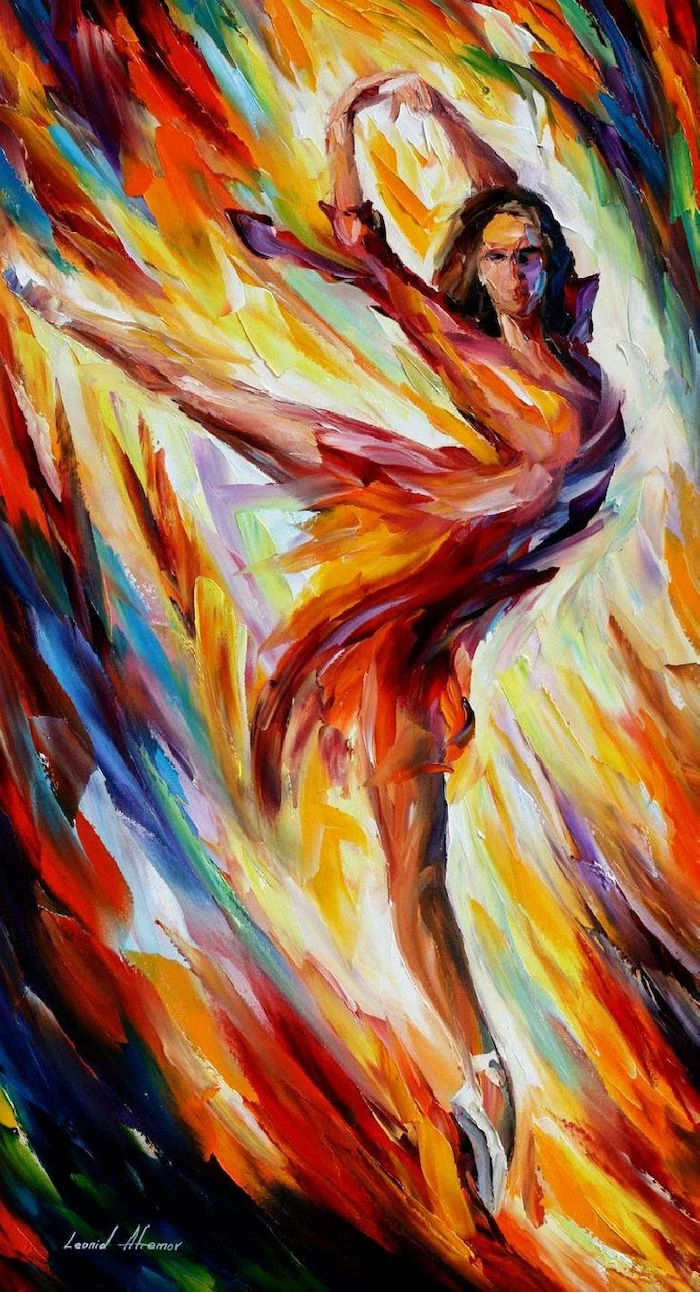
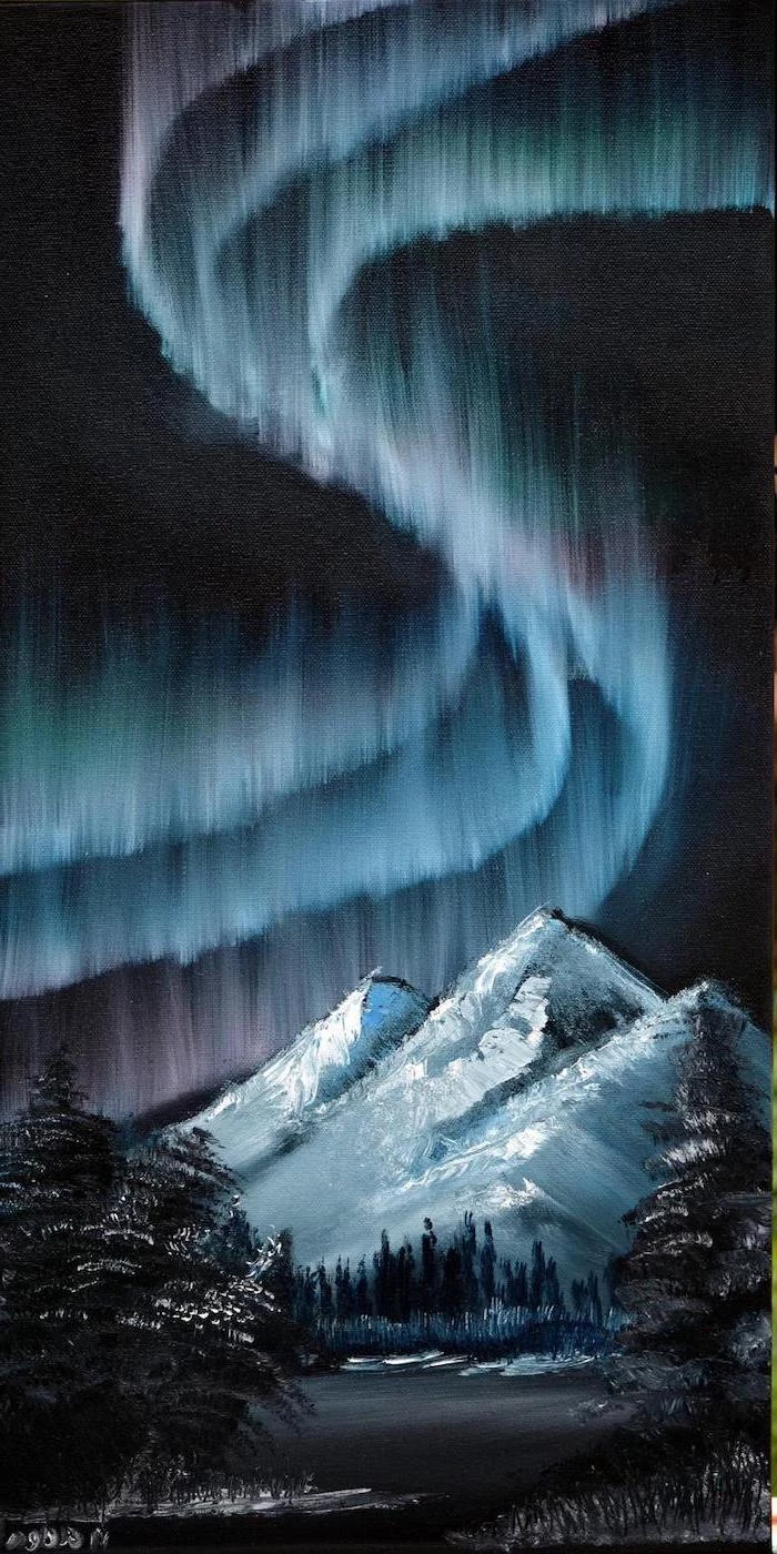
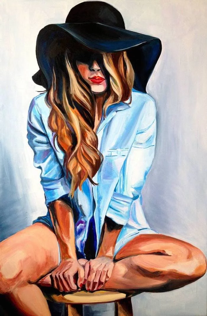
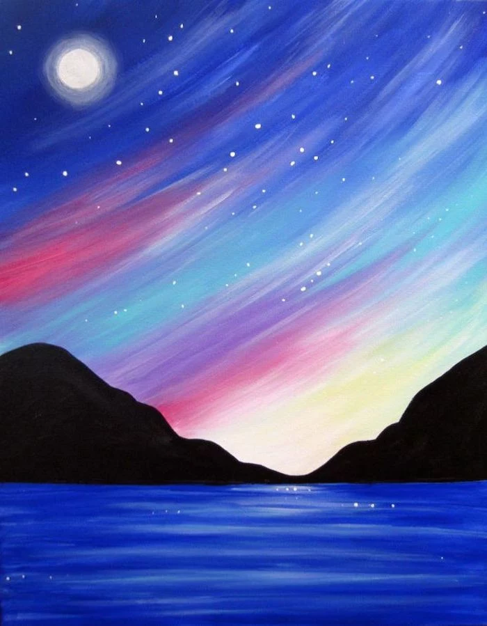
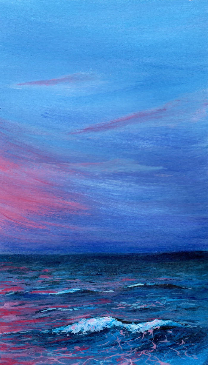
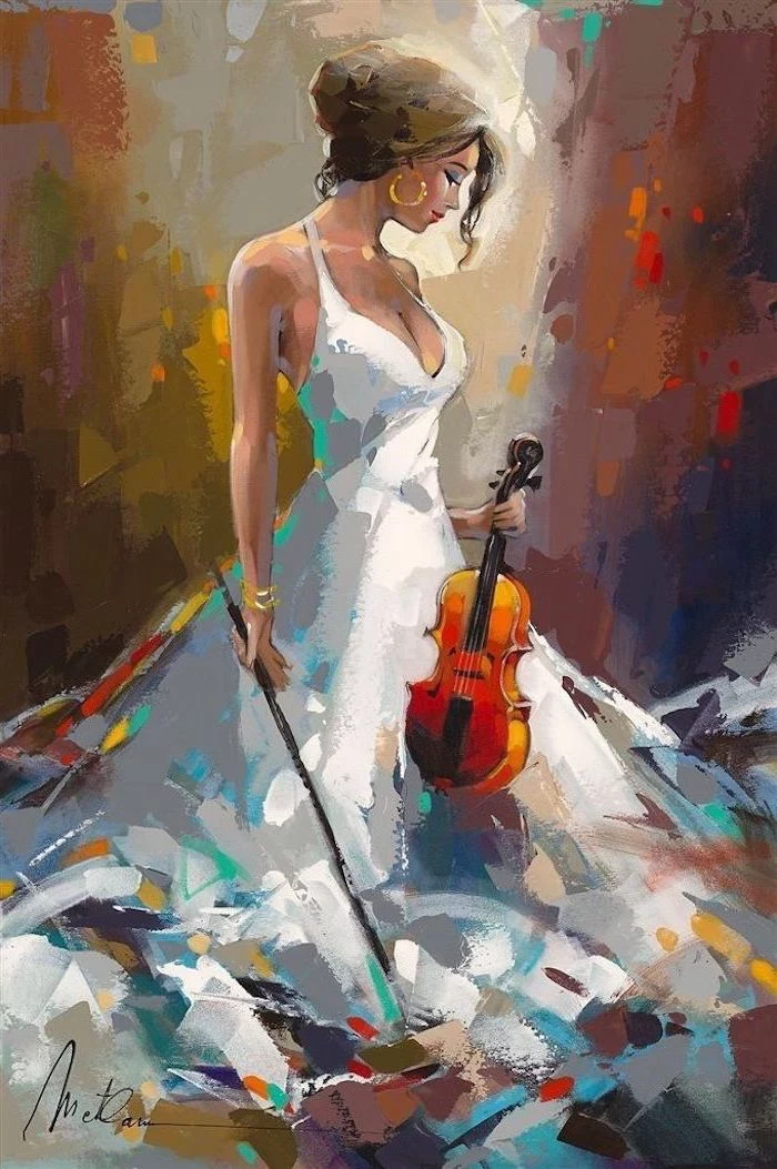
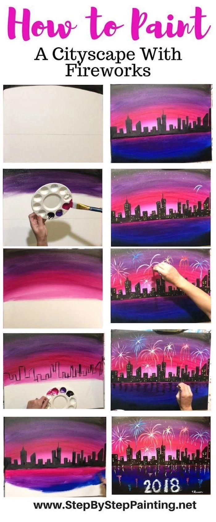
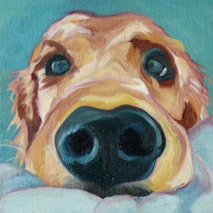
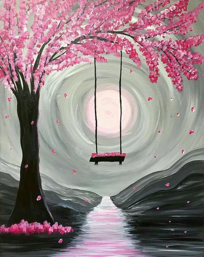
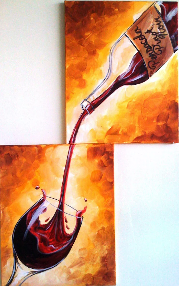
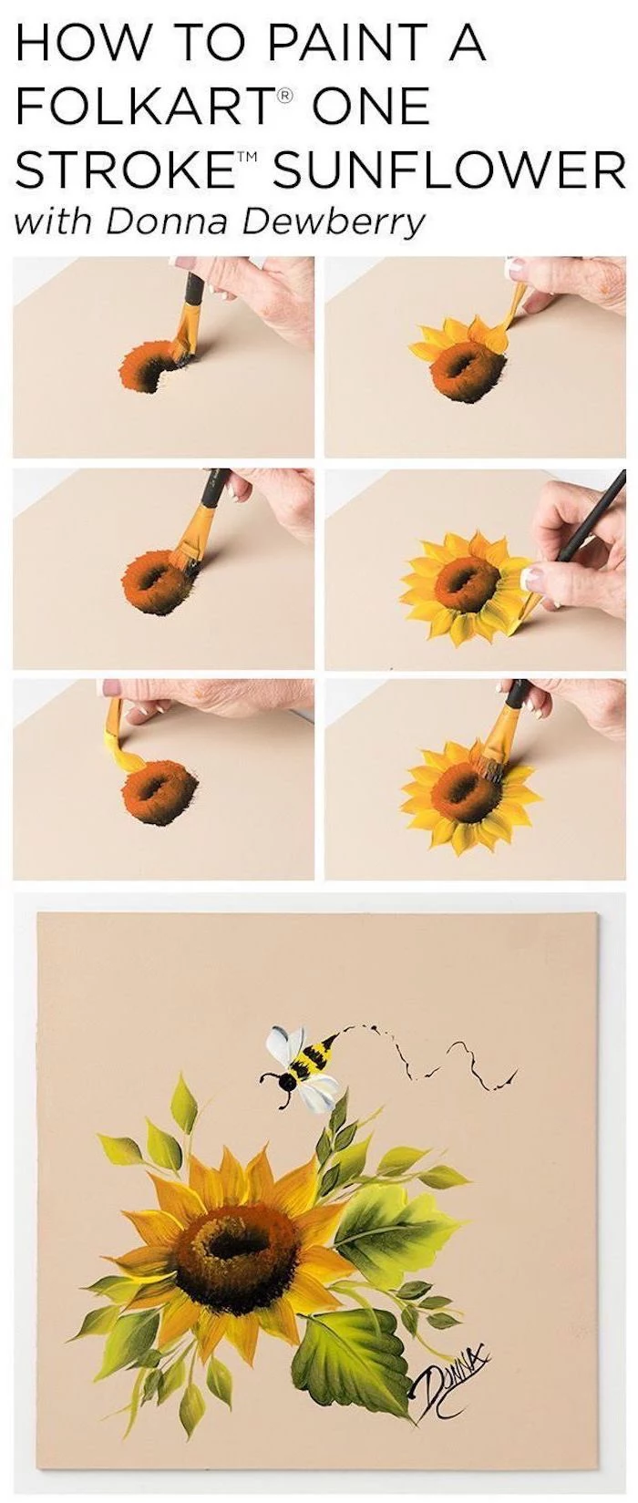
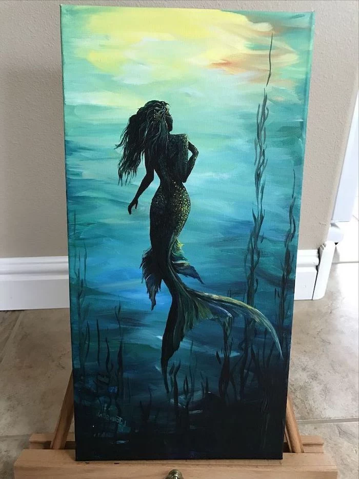
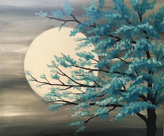
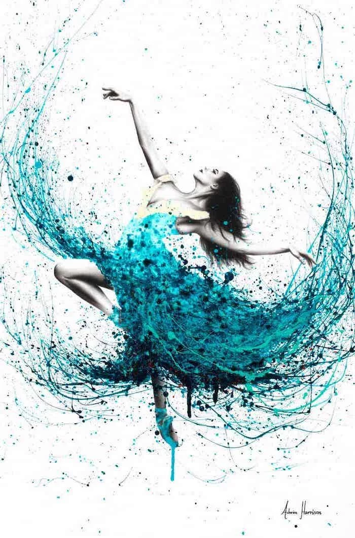
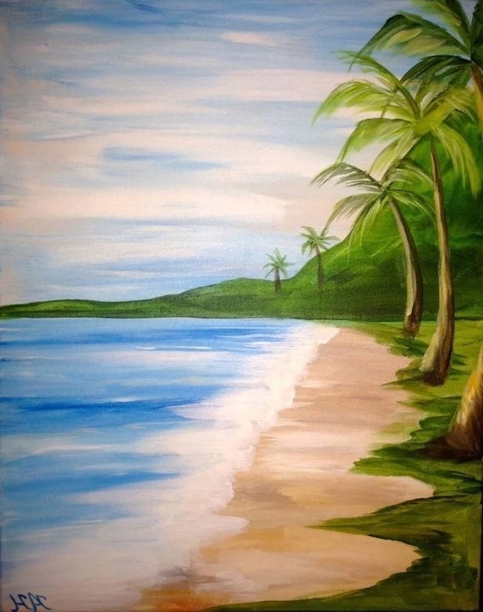
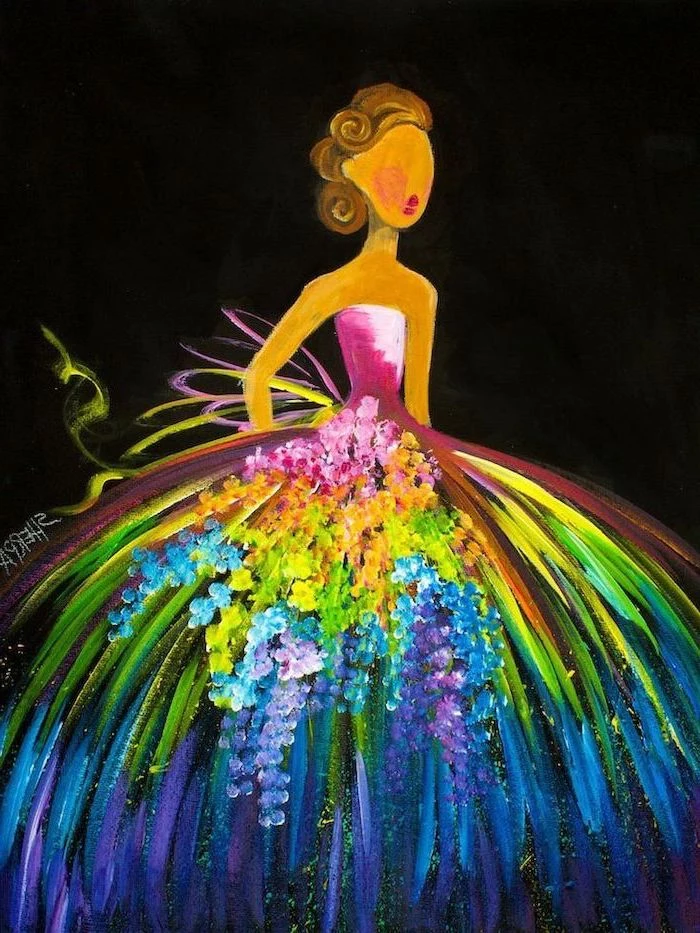
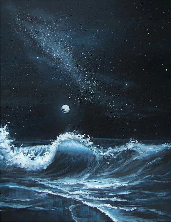
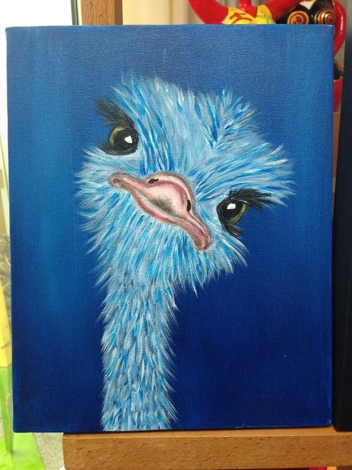
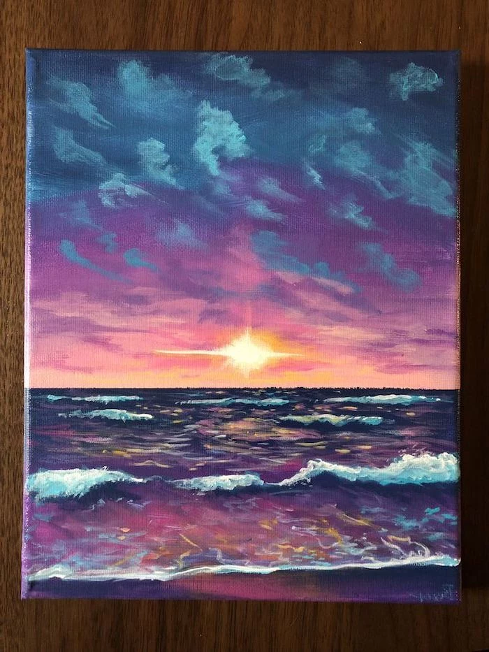
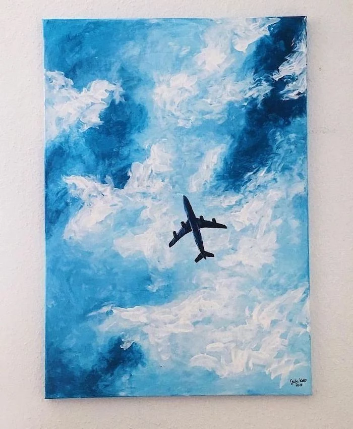
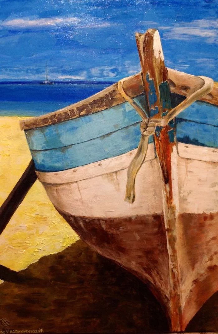
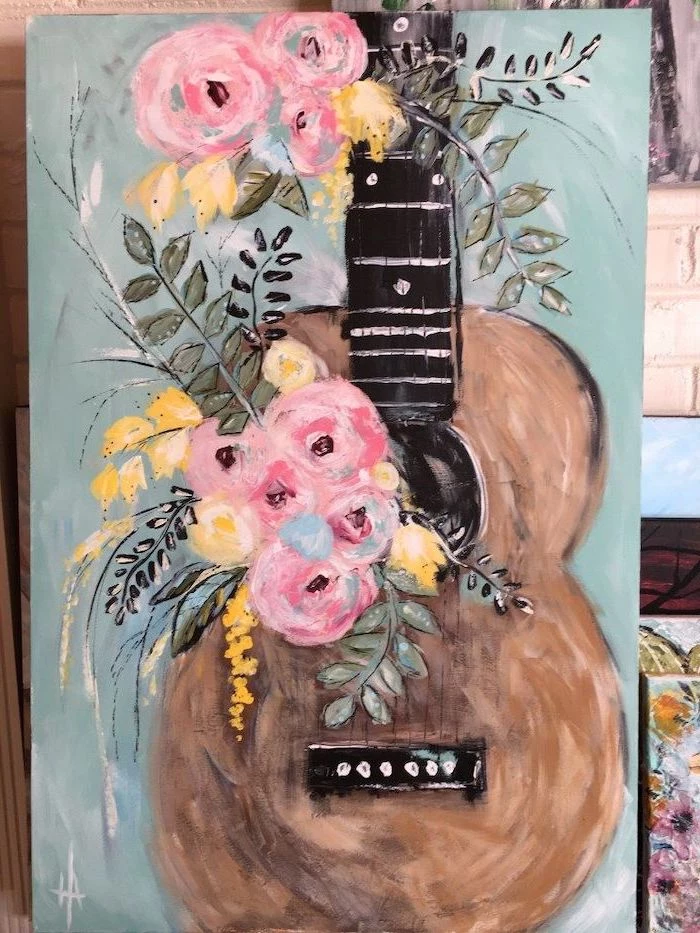
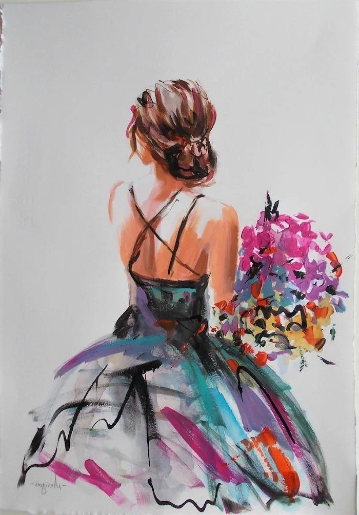
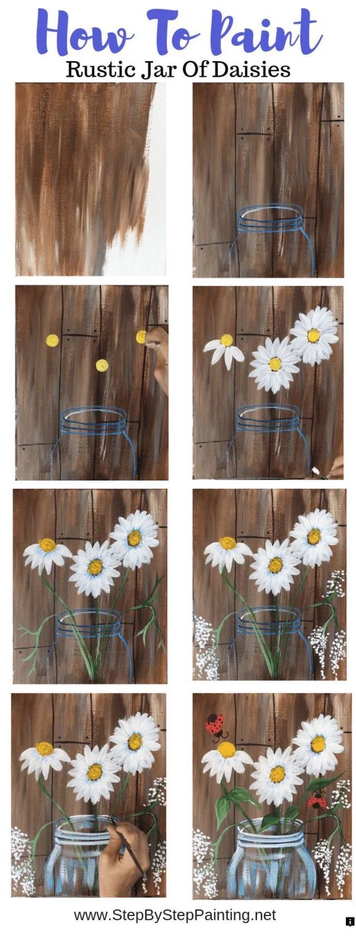
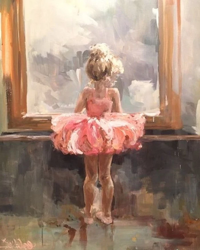
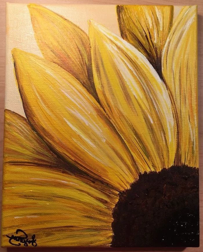
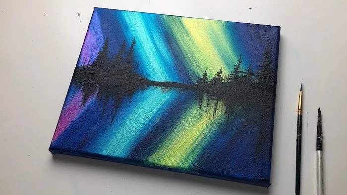
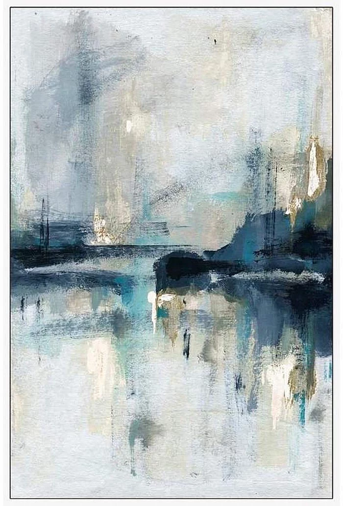
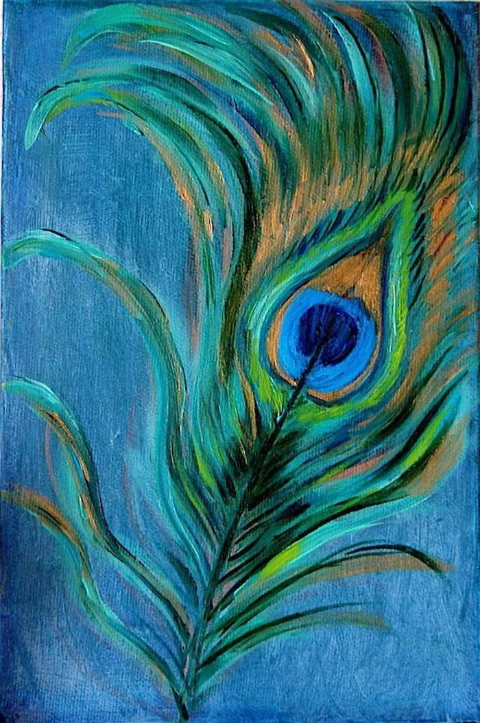
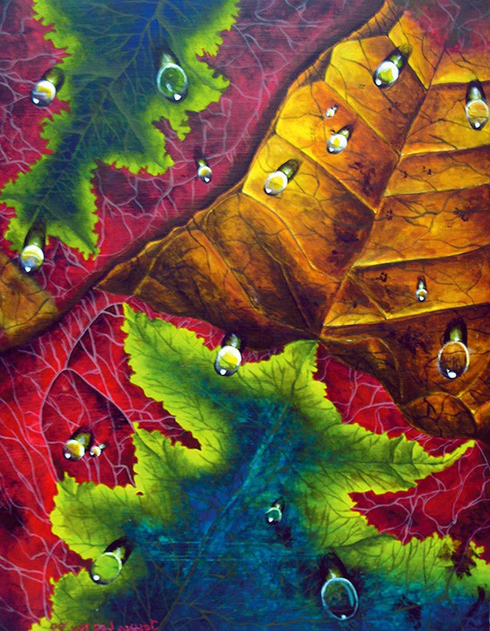
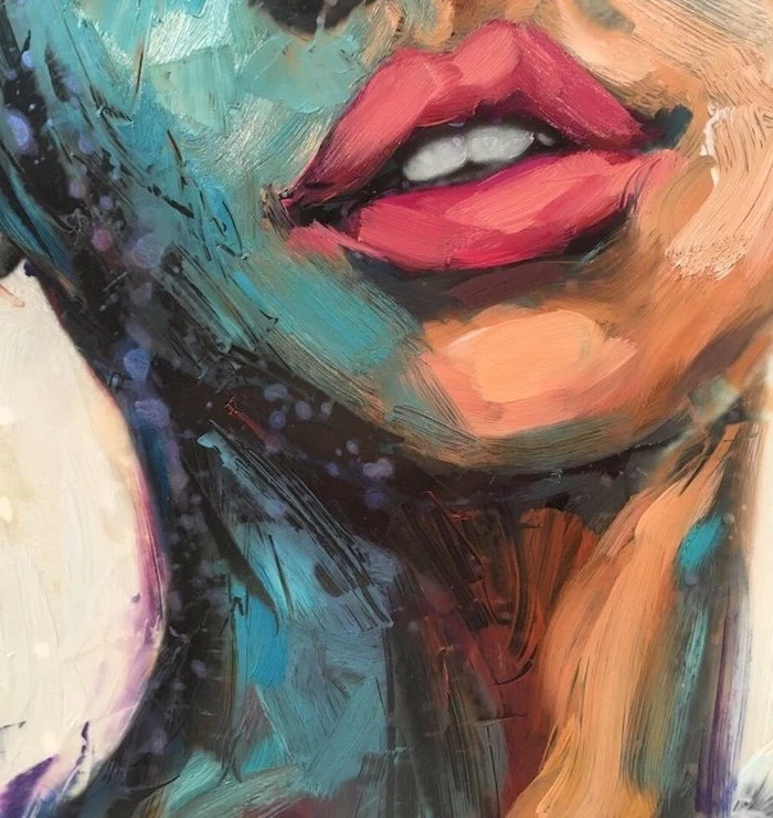
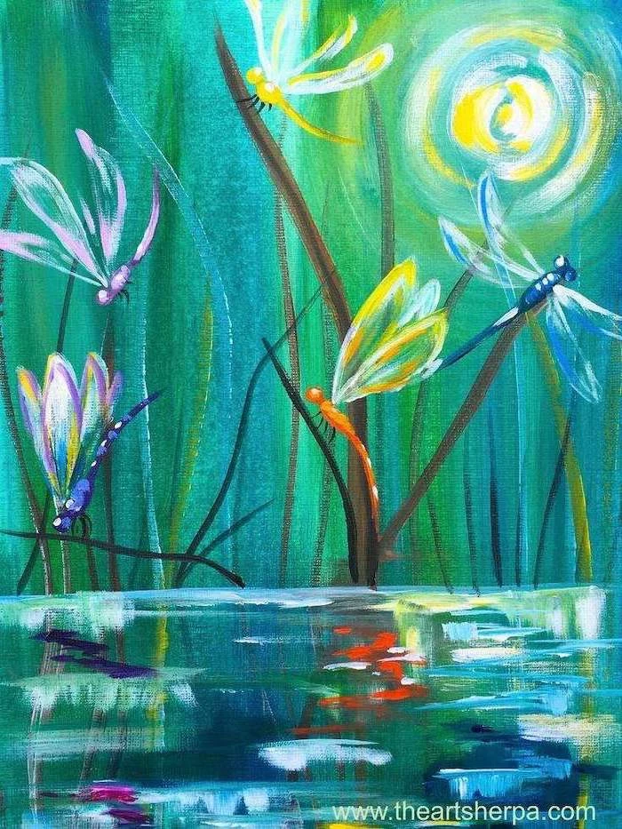
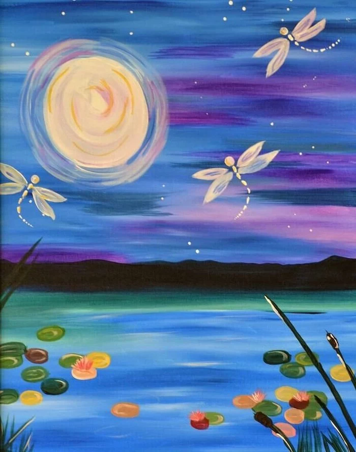
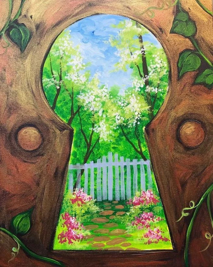
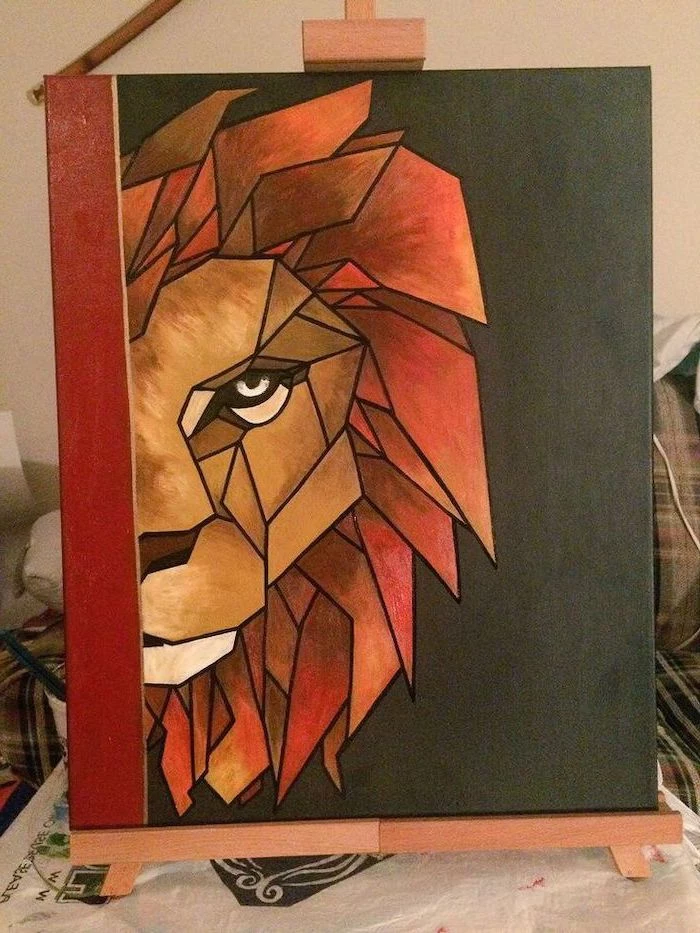
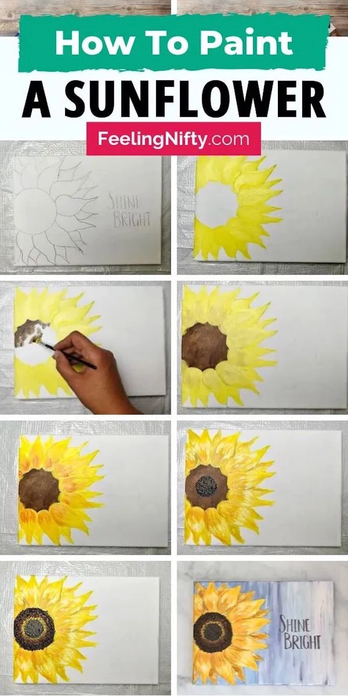
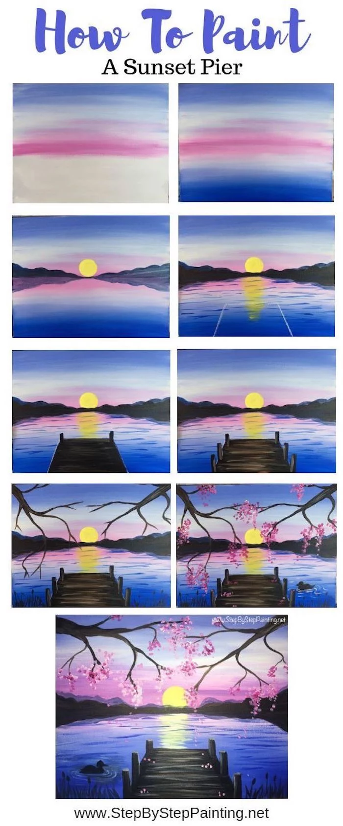
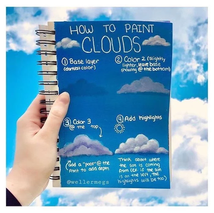
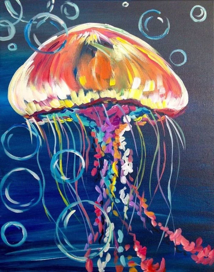
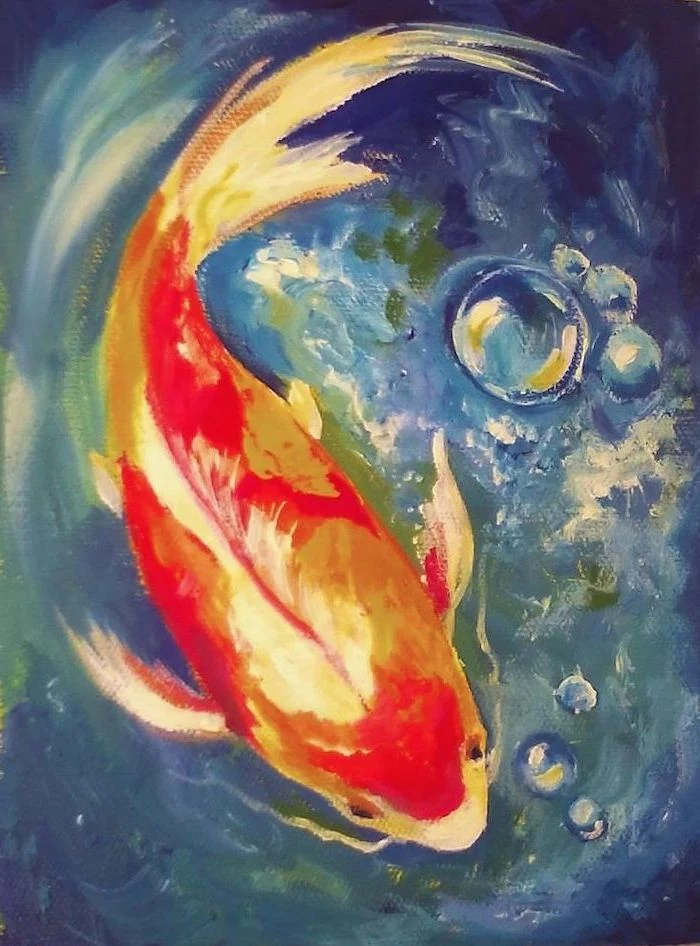
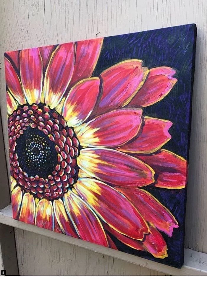
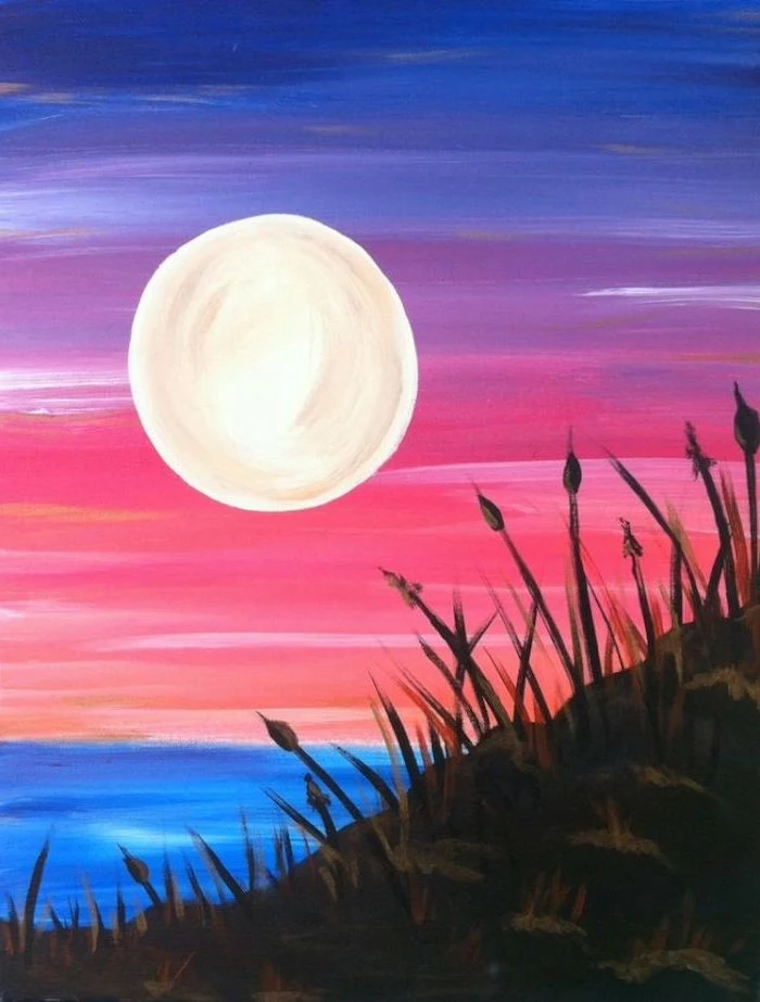
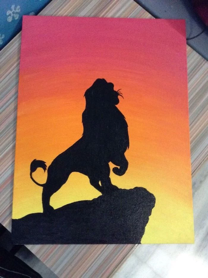
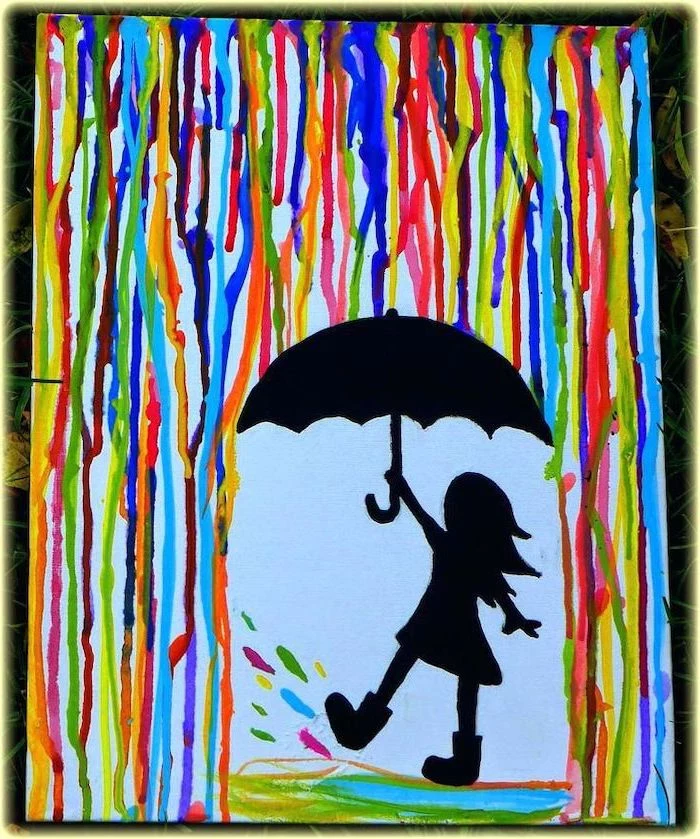
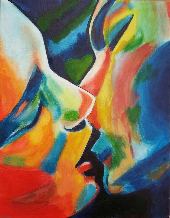
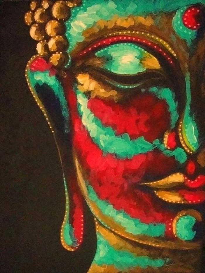
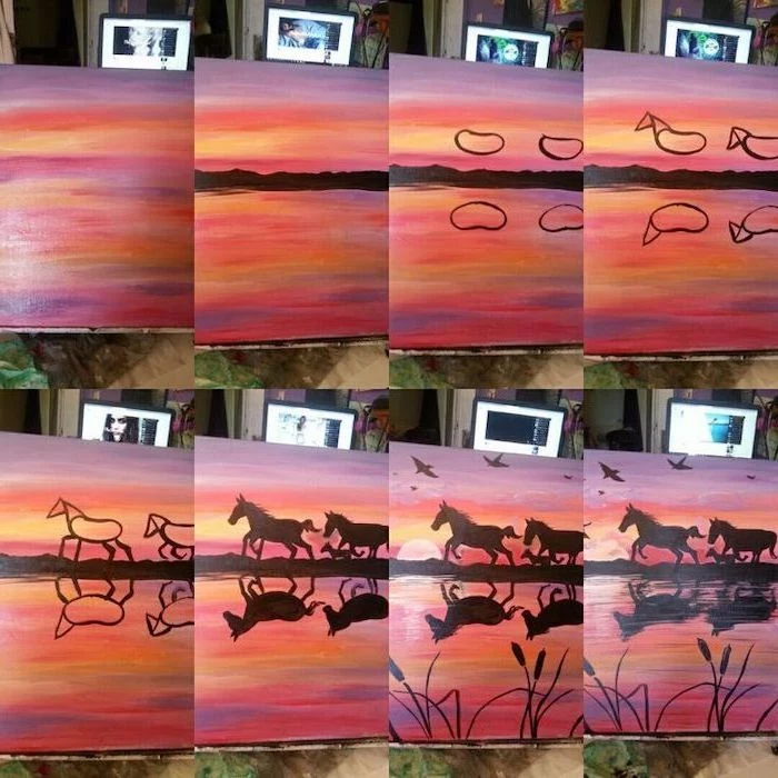
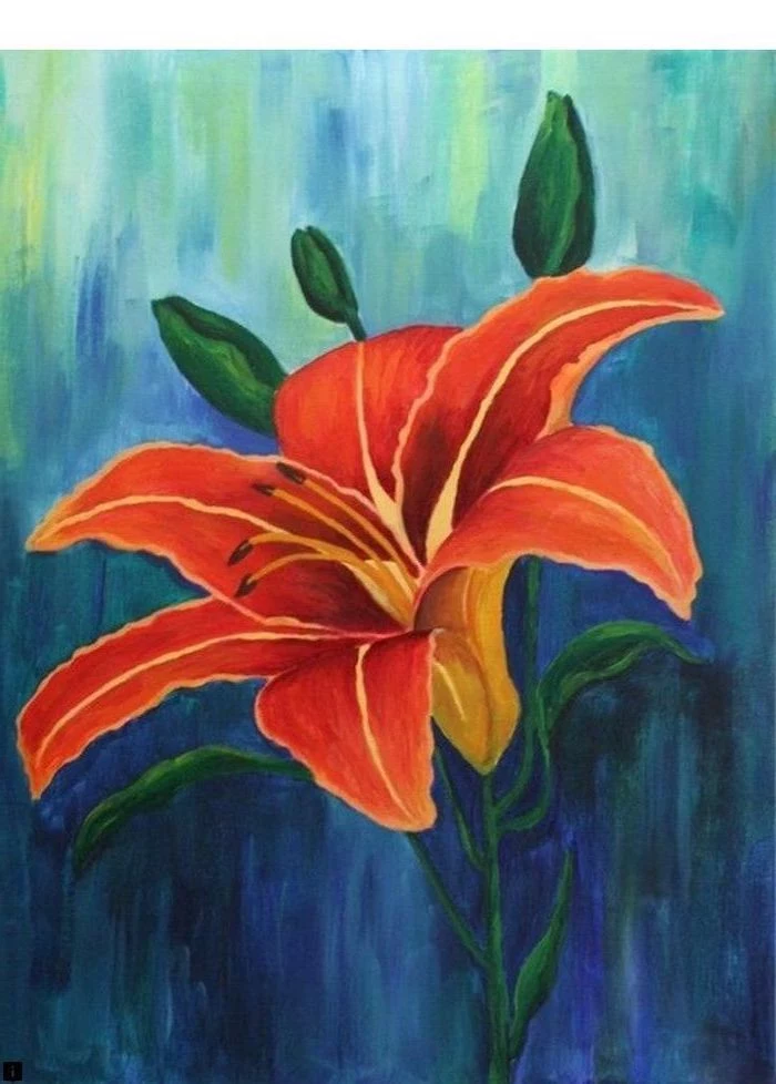
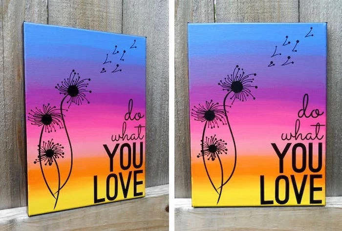
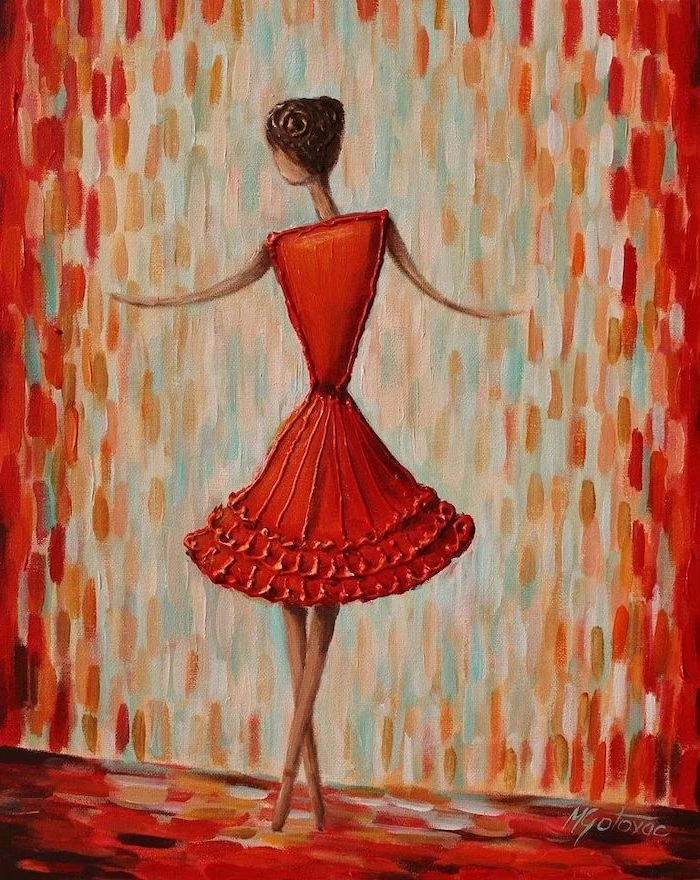
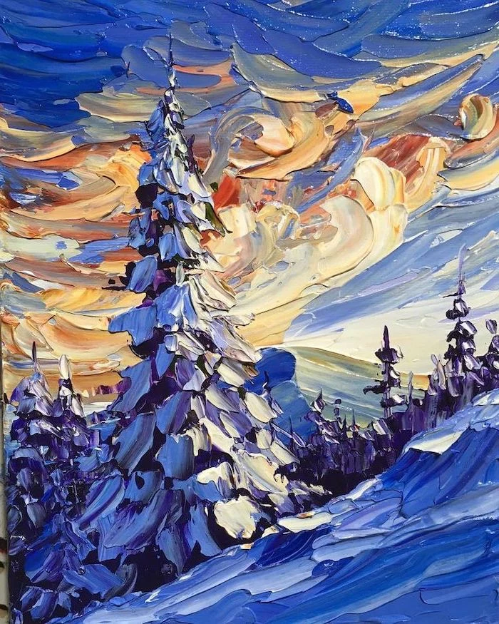
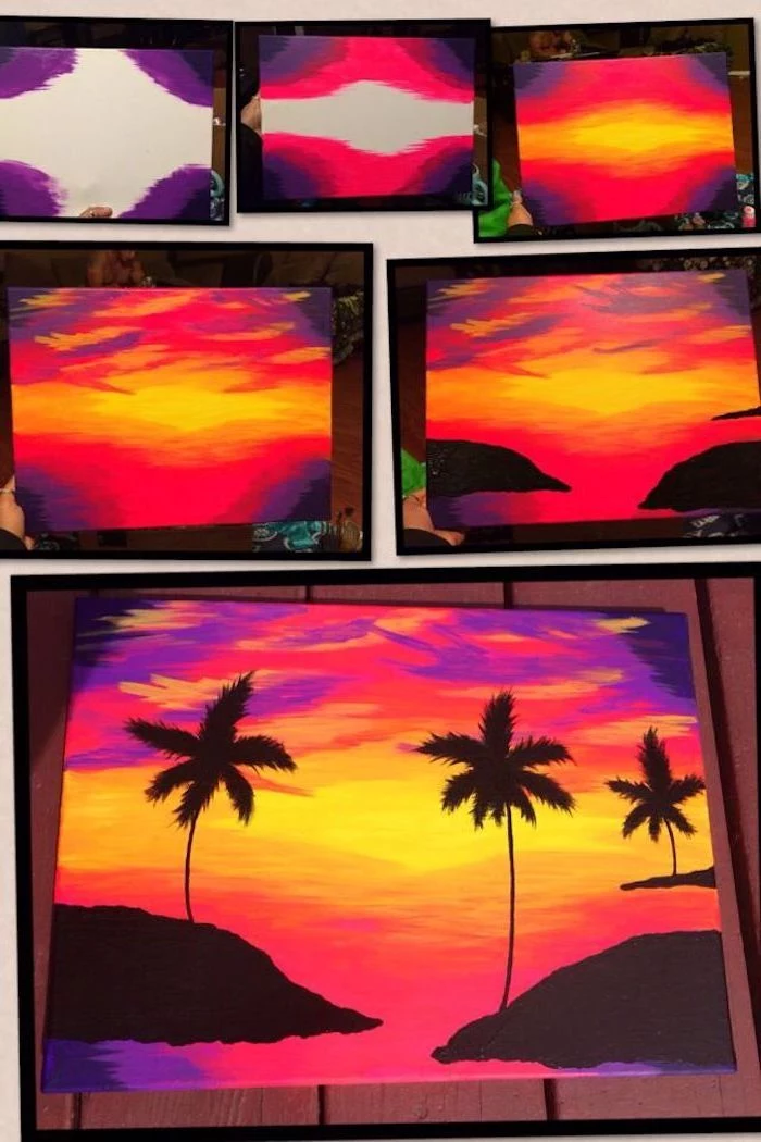
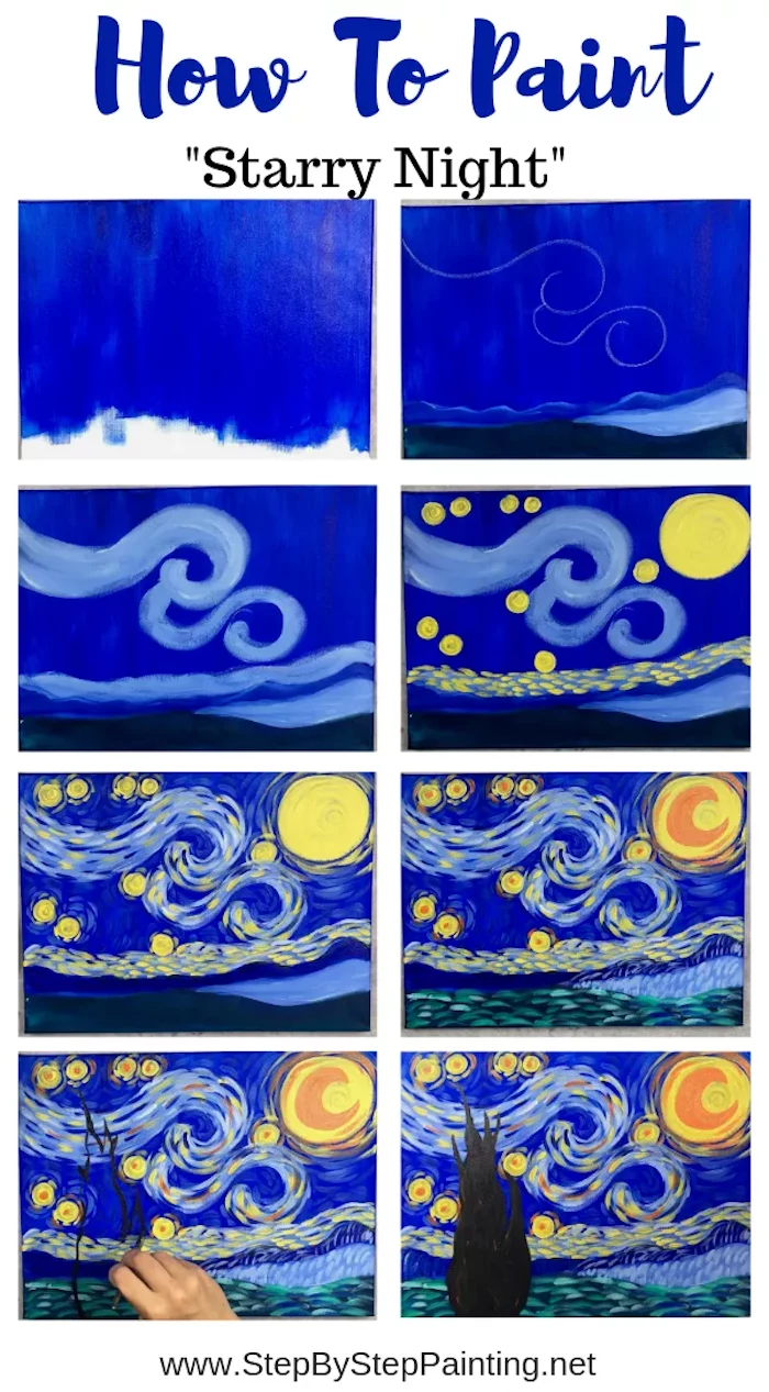
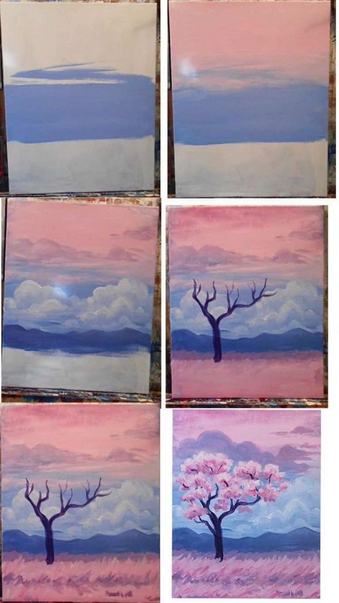
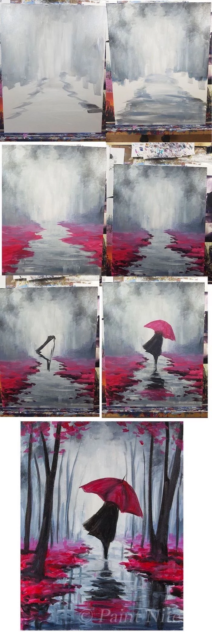
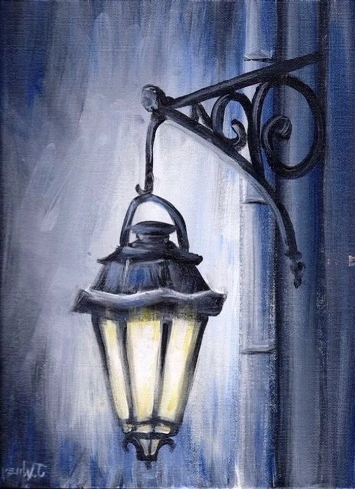
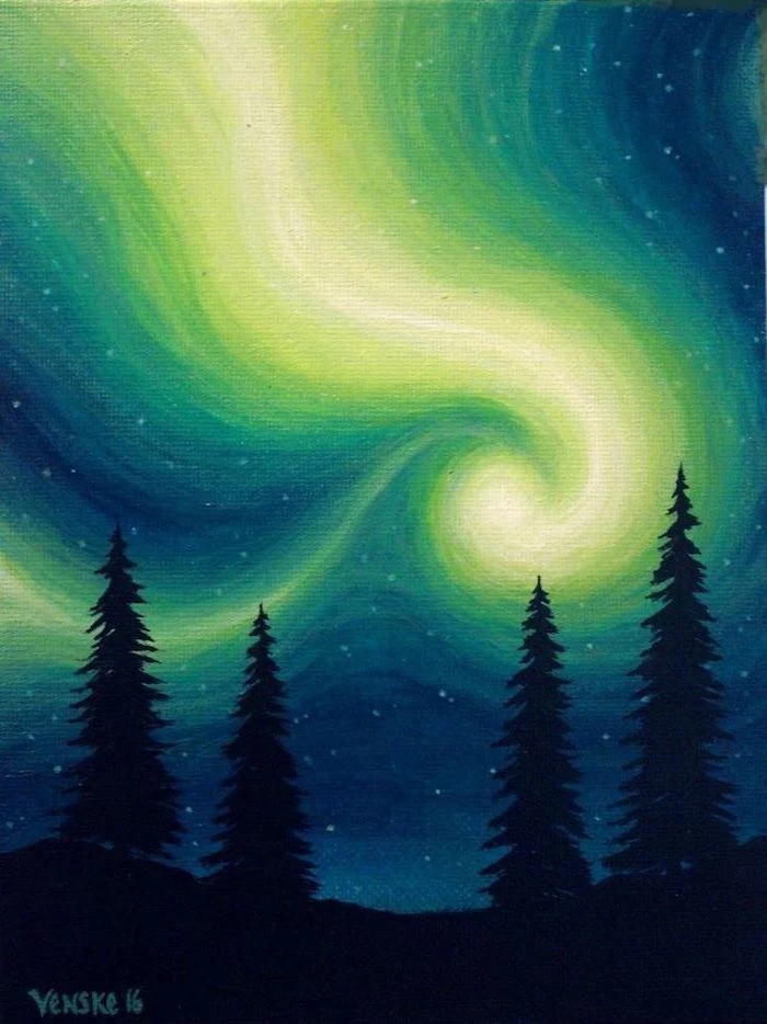
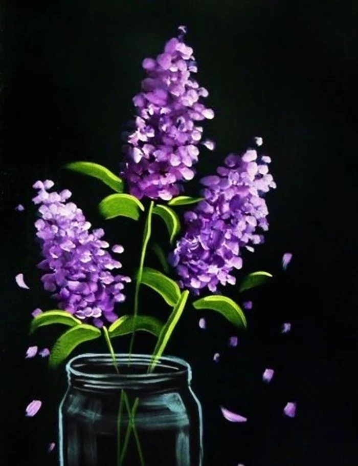
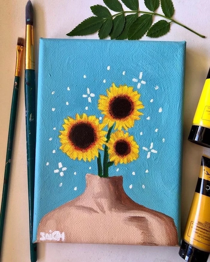
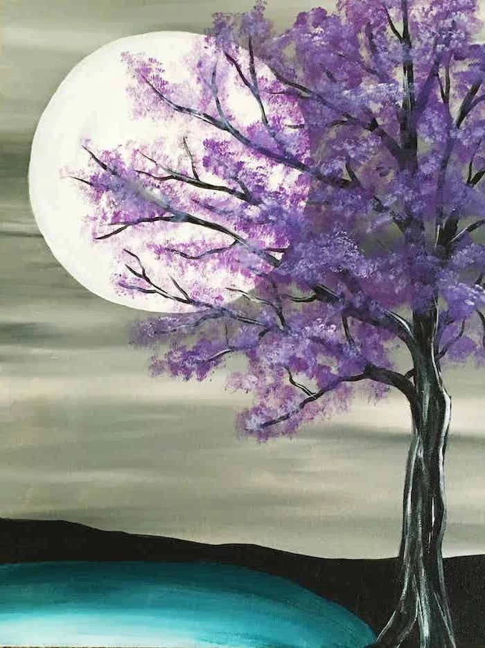
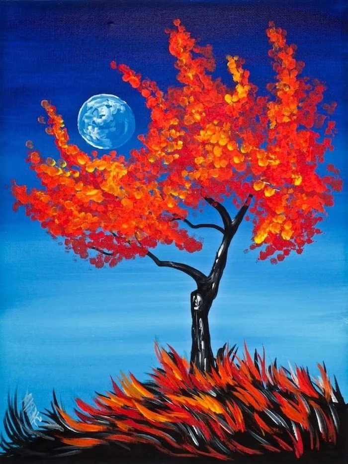
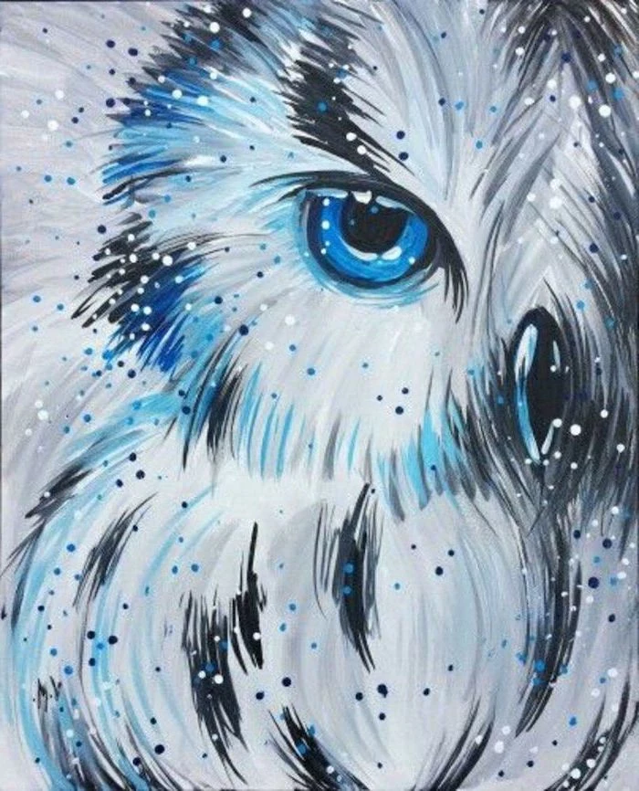
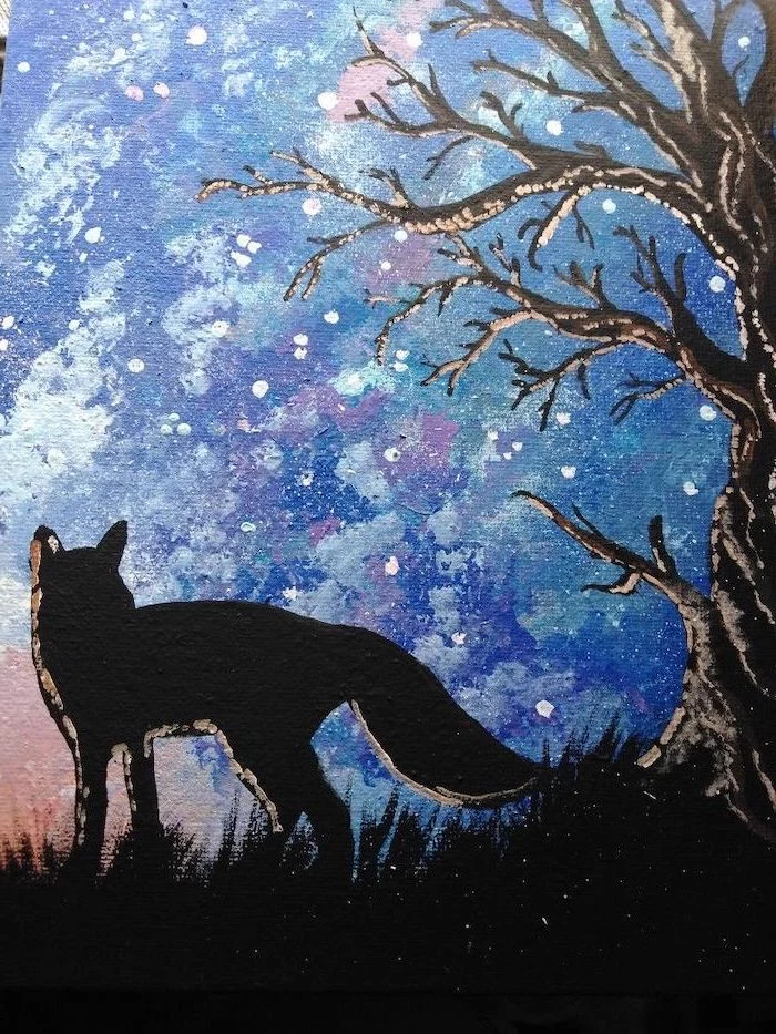
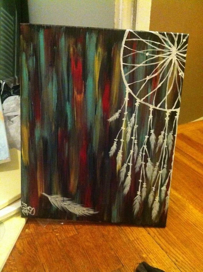
Inspiration Gallery
Your First Paint Set: Don’t feel pressured to buy a giant, expensive set. Start with a quality student-grade set like Liquitex BASICS or Winsor & Newton Galeria. Focus on getting a few core colors: a warm and cool version of each primary (red, yellow, blue), plus Titanium White and Mars Black. You can mix almost anything from these.
Ever wonder why paintings in galleries look so vibrant? The secret often lies in the prep work. A layer or two of gesso on your canvas creates a smooth, slightly absorbent surface that prevents the paint from sinking in. This makes your colors pop and your brush glide. Most store-bought canvases are pre-primed, but an extra coat never hurts!
Create rich, transparent layers of color.
Achieve a beautiful, luminous depth.
Subtly adjust hues without making them muddy.
The secret? Glazing. It’s a classic technique where you mix a tiny bit of color with a larger amount of acrylic glazing medium. You then apply this thin, transparent layer over dried paint.
“The first commercially available acrylic paints were developed in the 1950s by a company called Permanent Pigments.”
This makes them a relatively modern medium compared to oils, which have been around for centuries. Artists like Andy Warhol and David Hockney were quick to adopt them, drawn to their flat, bold, and fast-drying properties, perfectly suited for the Pop Art movement.
Why do my colors turn to mud when I try to blend?
This usually happens for one of two reasons: you’re either overworking the paint as it dries, or you’re mixing complementary colors (like red and green, or blue and orange) directly on the canvas. To avoid this, blend quickly while the paint is very wet, or better yet, pre-mix your transitional color on your palette before applying it.
Don’t just stick to canvas! Acrylics are incredibly versatile and will adhere to almost any non-greasy surface. Try painting on wood panels for a rigid, smooth experience, or use heavyweight acrylic paper (like Canson Montval) for studies and practice. Each surface offers a different feel and texture.
Heavy Body Acrylics: Thick, buttery, and holds brushstrokes and palette knife marks beautifully. Perfect for impasto techniques. Think Golden Heavy Body or Liquitex Professional.
Fluid Acrylics: The consistency of heavy cream. They level out smoothly, making them ideal for detailed work, staining, or pouring techniques. They have the same pigment load as heavy body, just a different viscosity.
Start with heavy body for general use, and explore fluids when you want to experiment with different applications.
A simple list for your studio sink to keep your brushes happy:
Never let paint dry in the bristles. Keep brushes you’re using submerged in a water pot (but don’t let them rest on their tips!).
Gently wash with a specialized soap like The Masters Brush Cleaner and Preserver, or even a mild dish soap.
Reshape the bristles with your fingers and lay them flat or hang them bristle-down to dry. Storing them upright allows water to seep into the ferrule (the metal part), dissolving the glue over time.
“Creativity takes courage.” – Henri Matisse
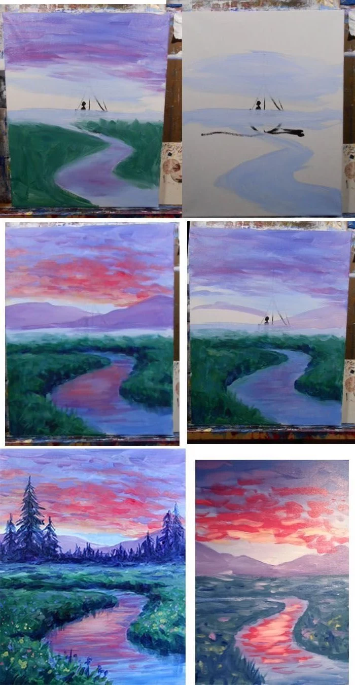
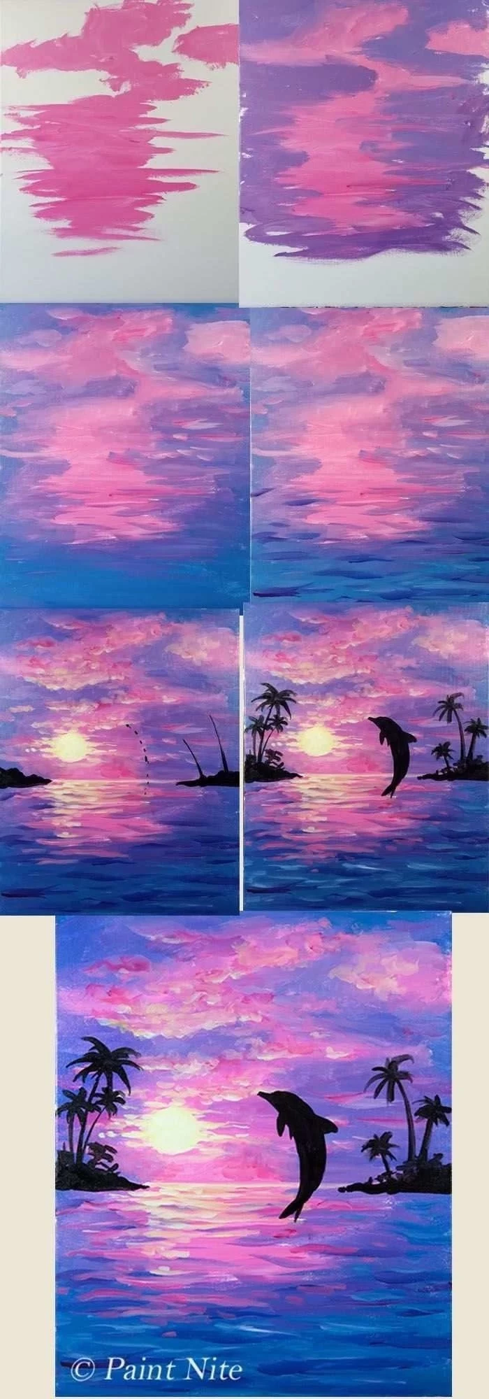
That moment of panic when your painting looks like a chaotic mess? Artists call it the ‘ugly stage,’ and it’s a normal part of the process! It’s the awkward middle phase after you’ve blocked in basic colors but before you’ve added details and refinements. Push through it. Trust your vision and keep layering. This is where the magic really starts to take shape.
Synthetic Brushes: These are the workhorses for acrylics. They’re durable, easier to clean, and stand up well to the slightly corrosive nature of acrylic paint. Brands like Princeton offer excellent synthetic options for every budget.
Natural Hair Brushes: Traditionally used for oils or watercolors, they are often too soft and can be damaged by acrylics. Stick with synthetics for a frustration-free experience.
Use a palette knife to scrape, drag, or press paint for sharp, geological textures.
An old credit card makes a fantastic tool for creating straight lines or broad sweeps of color.
Dab a natural sea sponge into the paint for organic, mottled effects perfect for foliage or abstract backgrounds.
Mix in a bit of sand or coffee grounds with a gel medium for a genuinely gritty surface.
Important: Don’t add too much water to your acrylics. While a little water helps with flow, adding more than 30% can break down the acrylic binder. This means the pigment won’t adhere properly to the canvas and can flake off or look chalky and weak once dry. If you need a thinner consistency, use a specific ‘Airbrush Medium’ or ‘Flow Improver’ instead.
Ready to protect your masterpiece? Varnish is the key. It not only provides a layer of UV and dust protection but also unifies the sheen of your painting. You can choose from gloss, satin, or matte finishes. Apply a non-removable ‘isolation coat’ first (a mix of soft gel gloss and water), let it dry for 72 hours, then apply two thin coats of a removable polymer varnish like a product from Gamvar or Golden.
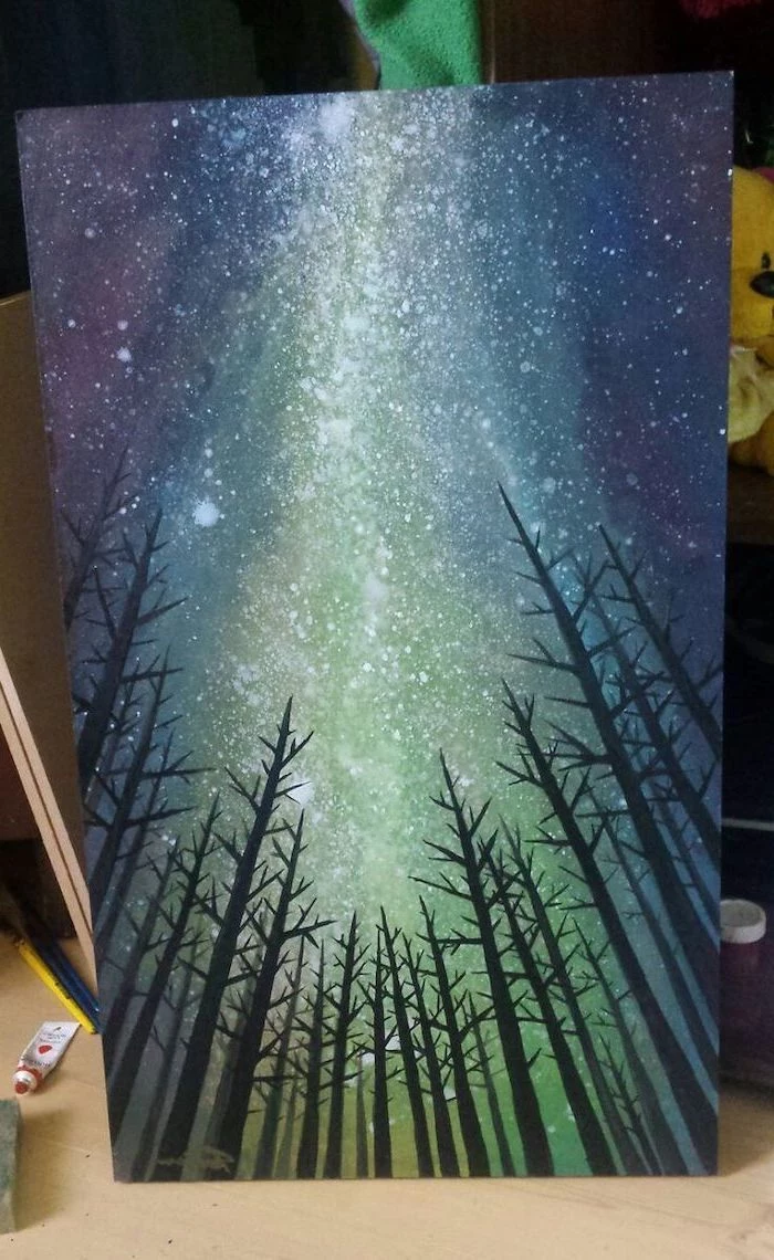
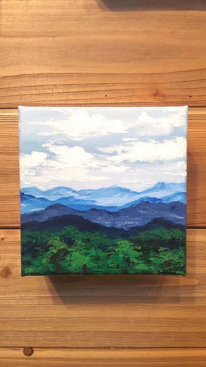
Feeling uninspired? Look around!
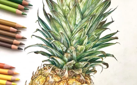
The way light hits the fruit in your kitchen bowl.
The graphic pattern on a piece of clothing.
The dramatic clouds from a window.
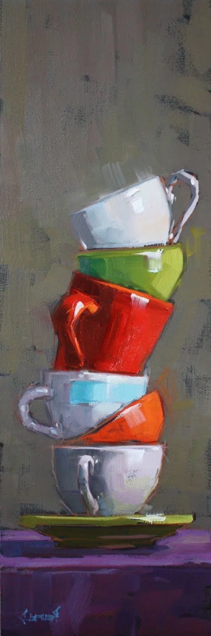
A colorful stack of books on a shelf.
The most compelling subjects are often hiding in plain sight. Keep a small sketchbook to quickly capture ideas when they strike.
A single gram of the pigment Phthalo Blue can cover an entire tennis court with a solid layer of paint.
This is why a tiny dab of Phthalo Blue or Green can quickly overpower your entire palette! Use these powerful, transparent colors sparingly. It’s always easier to add more than to take it away. When mixing, start with your other colors and add the Phthalo bit by tiny bit.
What’s the difference between Titanium White and Zinc White?
Think of them as two different tools. Titanium White is highly opaque and has strong covering power; it’s your go-to for highlights and making colors lighter without making them transparent. Zinc White is more transparent and has a weaker tinting strength, making it perfect for subtle glazes or softening colors without overpowering them.
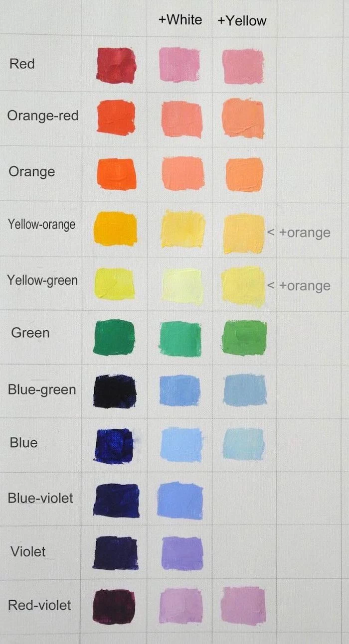
A great way to truly understand your paints is to create a color mixing chart. It might seem tedious, but it’s an invaluable reference.
Make a grid on a sheet of acrylic paper.
List your primary colors along the top and side.
Systematically mix each color with every other color, filling in the corresponding square.
You’ll discover a huge range of secondary and tertiary colors and have a personal roadmap for all your future paintings.
Painting with acrylics is a sensory experience. It’s the satisfying
Artist Grade: Features a high ‘pigment load,’ meaning more pure color and less binder. The colors are more vibrant, intense, and require less paint to achieve rich coverage. Examples include Golden Professional or Schmincke PRIMAcryl.
Student Grade: Contains less pigment and more binder or fillers, making it more affordable. The colors might be slightly less intense and may shift in color as they dry. A great starting point for practicing techniques.
“I have always been fascinated by the colors and the flat surfaces of things. Acrylics are perfect for that.” – David Hockney
Don’t pour your paint water down the drain! Acrylics contain microplastics. To dispose of it responsibly, let your rinse water sit in a dedicated jar or bucket. The solid paint particles will settle to the bottom over a day or two. You can then pour the clear water off the top and scrape the solid sludge into the trash once it’s dry.
You’ve probably seen mesmerizing videos of ‘acrylic pouring’ or ‘fluid art.’ This is an incredibly fun and accessible technique for beginners. You simply thin your acrylic paints with a pouring medium (like Floetrol or a Liquitex Pouring Medium), pour them onto a canvas, and tilt it to let the colors flow and interact. It’s a fantastic way to create stunning abstract art without needing any drawing skills.
Achieve incredible color harmony.
Learn to mix nuanced shades effortlessly.
Develop a signature, cohesive style.
The trick? Use a limited palette. Instead of using every color in the box, try completing a painting with just three or four tubes (plus white). You’ll be amazed at the sophisticated results.
Acrylic mediums are the secret to unlocking the full potential of your paints. Think of them as paint without pigment. A Gloss Medium will increase transparency and give a shiny finish, while a Matte Medium does the same but with a non-reflective finish. A Gel Medium adds body and thickness to the paint, perfect for creating texture. Start with a simple gloss medium to see how it extends your colors and adds depth.
John combines 12 years of experience in event planning, interior styling, and lifestyle curation. With a degree in Visual Arts from California Institute of the Arts and certifications in event design, he has styled luxury weddings, corporate events, and celebrity celebrations. John believes in creating memorable experiences through innovative design and attention to detail.
To provide the best experiences, we use technologies like cookies to store and/or access device information. Consenting to these technologies will allow us to process data such as browsing behavior or unique IDs on this site. Not consenting or withdrawing consent, may adversely affect certain features and functions.
Functional
Always active
The technical storage or access is strictly necessary for the legitimate purpose of enabling the use of a specific service explicitly requested by the subscriber or user, or for the sole purpose of carrying out the transmission of a communication over an electronic communications network.
Preferences
The technical storage or access is necessary for the legitimate purpose of storing preferences that are not requested by the subscriber or user.
Statistics
The technical storage or access that is used exclusively for statistical purposes.The technical storage or access that is used exclusively for anonymous statistical purposes. Without a subpoena, voluntary compliance on the part of your Internet Service Provider, or additional records from a third party, information stored or retrieved for this purpose alone cannot usually be used to identify you.
Marketing
The technical storage or access is required to create user profiles to send advertising, or to track the user on a website or across several websites for similar marketing purposes.