I’ve seen it happen more times than I can count. A simple can of paint can completely transform a home, but that change is felt most deeply in the bedroom. I remember working with a client, a lawyer with a crazy schedule, who was just perpetually exhausted. His bedroom was this brilliant, stark white that he thought would feel ‘clean and minimalist.’ In reality? It felt more like a hospital room—agitating and sterile. He just couldn’t wind down at night.
After we talked it over, we decided to repaint the room in a deep, muted blue-gray. About two weeks later, he called me, and the change in his voice was incredible. ‘It’s like sleeping in a cocoon,’ he said. ‘I haven’t slept this well in years.’
And that wasn’t just a lucky guess. It’s something I’ve learned from years in the field and from collaborating with sleep experts. The color on your bedroom walls is so much more than a style choice. It’s a powerful tool that works with your brain and body to either help or hurt your sleep. This isn’t about chasing trends; it’s about crafting a genuine sanctuary for yourself.
So, let’s walk through how the pros approach this. We’ll get into the ‘why’ behind it all, look at the palettes that consistently work, and cover the practical steps to make sure you get it right in your own space.
Why Wall Color Actually Affects Your Brain
Before we even think about picking up a paintbrush, it helps to understand why this is such a big deal. It all boils down to light, your internal body clock, and a little bit of psychology. Your body runs on a natural schedule called the circadian rhythm, which is basically what tells you when to be awake and when to rest. And the number one signal for that clock is light.
Light, Melatonin, and Winding Down
Think about it: bright, cool-toned light (like the midday sun) tells your brain it’s time to be alert. This kind of light actually slows down the production of melatonin, the hormone that makes you feel sleepy. On the flip side, dim, warm light (like a sunset) signals that it’s time to chill out, letting your melatonin levels rise naturally.
Here’s where your walls come in. They are the biggest surfaces in the room, and they reflect light. A wall painted in a bright, intense color will bounce that ‘awake’ light all over the place, even if your lamp is dim. It can subtly mess with your body’s ability to get ready for sleep. That’s why we almost always lean towards colors that absorb light or reflect it in a much softer, gentler way.
The Only Three Color Terms You Need to Know
When designers talk about color, we’re not just saying “blue.” We break it down. Understanding these three things will make you see those little paint swatches completely differently:
Hue: This is just the basic color name we all know, like blue, green, or red. Simple enough.
Value: This is how light or dark the color is. A pastel blue is a high-value color, while a deep navy is a low-value one. For sleeping, we’re usually looking for colors in the mid-to-low value range.
Chroma: This is the big one. It’s the color’s intensity or purity. Think fire engine red (super high chroma) versus a dusty, muted rose (very low chroma). Low-chroma colors are the secret sauce for a restful bedroom. They’re often described as ‘muted,’ ‘dusty,’ or ‘grayed-out’ for a reason—they’re just less ‘loud’ to our brains.
The Most Important Number on a Paint Swatch
Okay, if you really want to geek out for a second, look at the back of a paint swatch from a good quality brand. You’ll probably see a number for ‘LRV,’ which stands for Light Reflectance Value. It’s on a scale from 0 (jet black) to 100 (pure white) and tells you exactly how much light a color reflects.
Honestly, this is a game-changer. A color with a high LRV (like 80+) is going to bounce a ton of light, which can be amazing for a living room but a nightmare in a bedroom where it amplifies streetlights or early morning sun. A very low LRV (say, under 15) will absorb most of the light, giving you that dark, cozy cave feeling. For most bedrooms, the sweet spot is an LRV somewhere between 15 and 60.
Tried-and-True Palettes for a Dreamy Bedroom
Based on all that science and plenty of real-world experience, some color families just work better than others for creating a tranquil space. Here are the ones I always come back to.
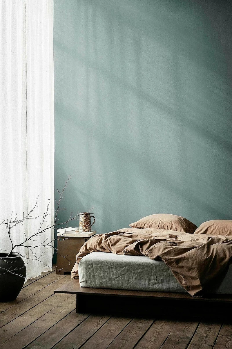
The Blues: The All-Time Champion of Calm
There’s a good reason blue is the classic choice for relaxation. Our brains link it to peaceful, expansive things like a clear sky or a calm sea. Some research even suggests that just looking at the color blue can help lower your heart rate and blood pressure.
How to get it right: The key is to steer clear of bright, high-energy blues (like a vivid turquoise or royal blue) which can feel more invigorating than calming. The real magic is in complex, muted blues—the ones that have a healthy dose of gray or maybe even a touch of green in them. These shades feel sophisticated and deeply soothing. For a client in a noisy city apartment, we once used a deep, inky navy that absorbed both light and sound, creating this incredibly quiet, womb-like space that completely changed his sleep.
Good to know: Dark blues look incredible when balanced with warm textures. Think of a chunky wool blanket, a warm oak headboard, or linen curtains in a creamy oatmeal color. These shades pair beautifully with both light and dark wood tones.
Paint suggestions: Look for shades described as ‘smoky blue,’ ‘gray-blue,’ or ‘deep navy.’ You can find beautiful options from premium brands (around $100-$130 a gallon) or get a very similar vibe from big-box store paints (which run closer to $40-$65 a gallon).
The Greens: Your Connection to Nature
Green taps into our primal connection to nature, which our brains are hardwired to find restorative. It’s a concept called biophilia. Being surrounded by the colors of the natural world can genuinely reduce stress. In a bedroom, that translates to a feeling of safety and peace.
How to get it right: The best greens for sleep are the ones you’d find in a quiet landscape: sage, moss, and soft olive tones are fantastic. I once worked on a bedroom that stared right at a brick wall. The owner felt totally boxed in. We painted the room a soft, grayed-out green, and the effect was instant. It felt like a peaceful garden alcove, giving her that calming view she was missing.
Heads up! Green is a bit of a chameleon and can change a lot depending on the light. A lovely sage in the morning can look like a sad, flat gray at night under the wrong lightbulb. This is why testing is so important (more on that in a bit!). Greens pair wonderfully with natural wood tones of all kinds, as well as cream, beige, and even muted terracotta for an earthy vibe.
Paint suggestions: Seek out colors like ‘sea salt,’ ‘eucalyptus,’ or ‘smoked green.’ The price range is similar to blues, with both high-end and budget-friendly versions available everywhere.
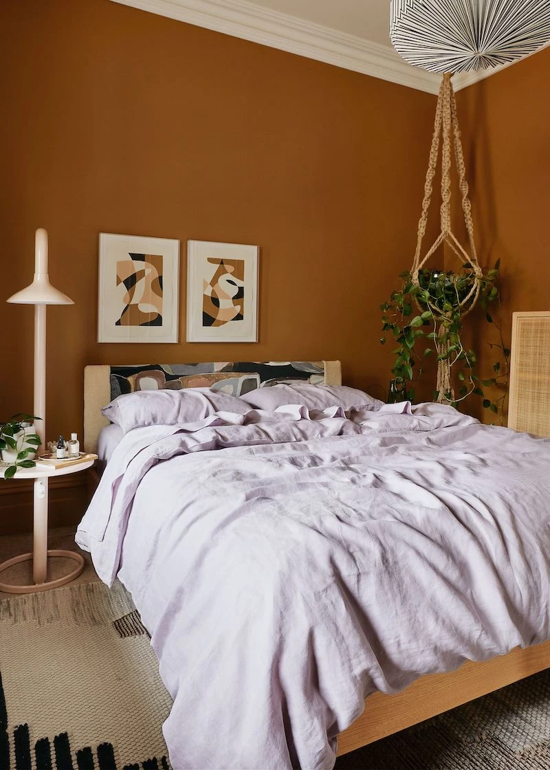
The Grounding Earth Tones: Like a Warm Hug
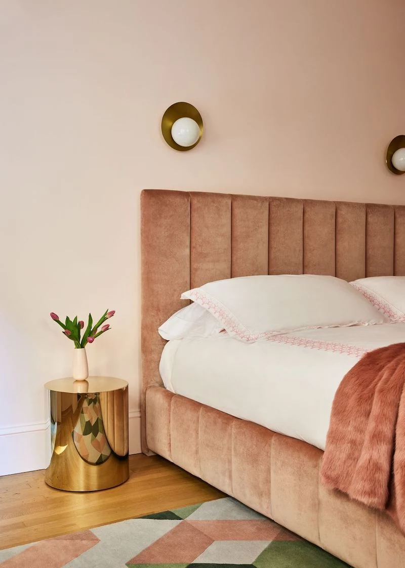
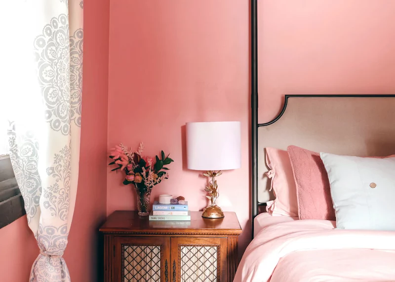
This is my favorite category for people who feel anxious at night. It includes colors that feel like they were dug right out of the earth: muted terracotta, dusky pinks, warm taupes, and deep beige. They are inherently warm and create a feeling of being grounded and secure.
How to get it right: One of my favorite projects used a dusty pink that had a lot of brown in it—not a kid’s pink, but a mature, nurturing color that felt incredibly cozy. We used it in a north-facing room that always felt a bit chilly, and it completely transformed the space into something warm and inviting. The key is to keep the intensity low. You want a sun-baked terracotta, not a bright orange. A soft, blush nude, not bubblegum pink.
Good to know: These colors are amazing for creating a layered, tonal look. You can use several shades of beige, cream, and brown together for a super sophisticated effect. They are a perfect backdrop for rich textures like velvet, bouclé, and even leather.
Paint suggestions: Look for names like ‘setting plaster,’ ‘dusky rose,’ or ‘warm taupe.’ You’ll find gorgeous, complex versions in specialty paint lines and solid, beautiful options at your local hardware store.
Colors to Be Careful With in the Bedroom
Part of getting it right is knowing what to avoid. Some colors, while great in other parts of the house, are just not your friend when you’re trying to get some rest.
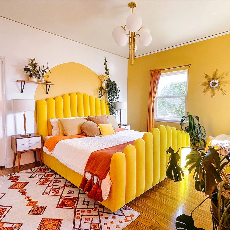
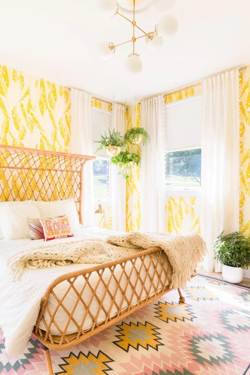
Vibrant Reds, Oranges, and Yellows: These are high-energy, attention-grabbing colors. They literally can increase your heart rate. Think about it: stop signs are red, and warning signs are yellow for a reason. Painting your bedroom walls these colors is like trying to sleep in a room that’s yelling at you. If you love them, use them as a tiny accent—a single pillow or a small piece of art.
Pure, Stark White: This one is controversial because all-white rooms are all over design blogs. But a brilliant, clinical white has a super high LRV, meaning it reflects a ton of light. This creates glare during the day and can amplify ambient light at night from streetlights or your phone, making true darkness impossible. If you want a white room, please choose a soft off-white with warm, creamy undertones or gentle gray ones. It will feel just as clean but way more soothing.
Saturated Purples: Purple is tricky. It’s a mix of calming blue and energetic red. A really vibrant, saturated purple can be very mentally stimulating, sparking creativity and racing thoughts—exactly what you don’t want when your head hits the pillow. A very muted, dusty lavender with a lot of gray in it can work, but it’s a fine line to walk.
Your DIY Game Plan for Choosing the Perfect Color
Alright, theory is one thing, but let’s get practical. Following these steps will save you from making a costly mistake.
Step 1: Figure Out Your Light
Before you do anything else, just watch the light in your bedroom for a full day. North-facing rooms get cool, blue-ish light and can make colors feel darker. South-facing rooms get bright, warm light all day. East-facing rooms are bright in the morning and shady in the afternoon, and west-facing rooms are the opposite. A color will look different in all of them. Also, check how it looks with your lamps on at night!
Step 2: Always, ALWAYS Test Your Paint
This is the golden rule. Never, ever pick a color from that tiny paper chip at the store. Here’s the right way to do it:
Get sample pots of your top 2-3 choices. They’re usually only $5-$10 each.
Don’t paint them directly on your wall! The old color will mess with your perception.
Paint big swatches (at least 2 feet by 2 feet) on white poster boards. Give them two full coats.
Once they’re dry, move the boards around the room. Tape them to different walls. Look at them in the morning, at noon, and at night with the lights on. This is the only way to see how a color will truly live in your space.
Quick tip: When you’re done with the first coat, you don’t have to wash your brushes and rollers. Just wrap them tightly in a plastic grocery bag (or plastic wrap) and stick them in the fridge. They’ll be ready to go for the second coat tomorrow, no cleanup needed!
Step 3: Don’t Forget the ‘Fifth Wall’ (Your Ceiling!)
Most people just default to stark white for the ceiling, but this can create a jarring contrast, especially with darker walls. For a much more cohesive, high-end look, try painting the ceiling the same color as the walls. It creates an incredibly immersive and calming feeling. If that’s too bold, ask the paint store to mix your wall color at 50% strength for a softer transition.
The Practical Stuff: Budget, Tools, and Time
Let’s talk logistics. How much is this actually going to cost and how long will it take?
How Much Paint Do I Need?
A gallon of paint typically covers about 350-400 square feet with one coat, and you’ll almost always need two. Here’s a quick formula: add the lengths of all your walls together, then multiply by your ceiling height. For a 10×12 foot room with 8-foot ceilings, that’s (10+12+10+12) x 8 = 352 square feet. So, for two coats, you’ll need two gallons. It’s always better to have a little extra than to run out mid-wall.
Your Basic DIY Shopping List
Assuming you have nothing, here’s what you’ll need to grab from a place like Home Depot or Lowe’s. You can get a solid starter kit for under $75.
Paint: Two gallons for an average room ($80-$250, depending on quality).
Tools: A good 2-2.5 inch angled brush for cutting in edges ($10-$15), a roller frame, a couple of roller covers with the right nap for your wall texture (usually 3/8″), a paint tray, and some tray liners for easy cleanup ($25 for the set).
Prep Supplies: Painter’s tape ($8), a canvas or plastic drop cloth ($10-$20), and maybe some spackle and a putty knife for filling nail holes ($15).
How Long Will This Take?
For a standard-sized bedroom, plan on this being a weekend project. You could realistically spend 2-3 hours on Saturday doing all the prep—moving furniture, taping edges, and patching holes. Then another 2-3 hours putting on the first coat. On Sunday, the second coat will be much faster, maybe 1-2 hours. Then you have cleanup and moving furniture back. Don’t rush it! A good paint job is all in the prep.
Don’t Forget About Paint Finish
The sheen of your paint makes a huge difference. For a bedroom, you’re usually choosing between these two:
A Matte or Flat finish has no shine at all. It’s fantastic at hiding imperfections on the wall and gives color a rich, velvety depth. The downside? It’s the hardest to clean. A scuff mark can be tough to get off without rubbing the paint away. It’s best for low-traffic adult bedrooms.
An Eggshell or Satin finish has a very slight, soft sheen. It’s the most popular choice for bedrooms because it’s much more durable and wipeable than matte, but it doesn’t look shiny. It reflects a tiny bit more light, but it’s a great, practical compromise.
The Easiest Fix of All (No Painting Required!)
Feeling overwhelmed? Don’t have the time or money to paint right now? Here’s a 5-minute, $15 fix you can do tonight. Go to the hardware store and buy new lightbulbs for your bedside lamps. Look for bulbs labeled ‘warm white’ or that have a color temperature of 2700K. Swapping out your cool, blue-toned bulbs for these warm, sunset-hued ones will instantly make your entire room feel calmer and more relaxing. Seriously, it’s the best bang for your buck.
A Final Thought
I have to end with this: color is incredibly personal. While all these guidelines are based on science and years of experience, you are the only expert on what makes you feel comfortable. If a bright, sunny yellow genuinely makes you feel relaxed and happy, then that’s the right color for you. The goal isn’t to create a bedroom that a designer would put in a magazine; it’s to create a space where you can get deep, restorative sleep. Trust your gut and listen to how your body responds. The perfect color is simply the one that makes you exhale and feel, finally, at peace.
Inspirational Gallery
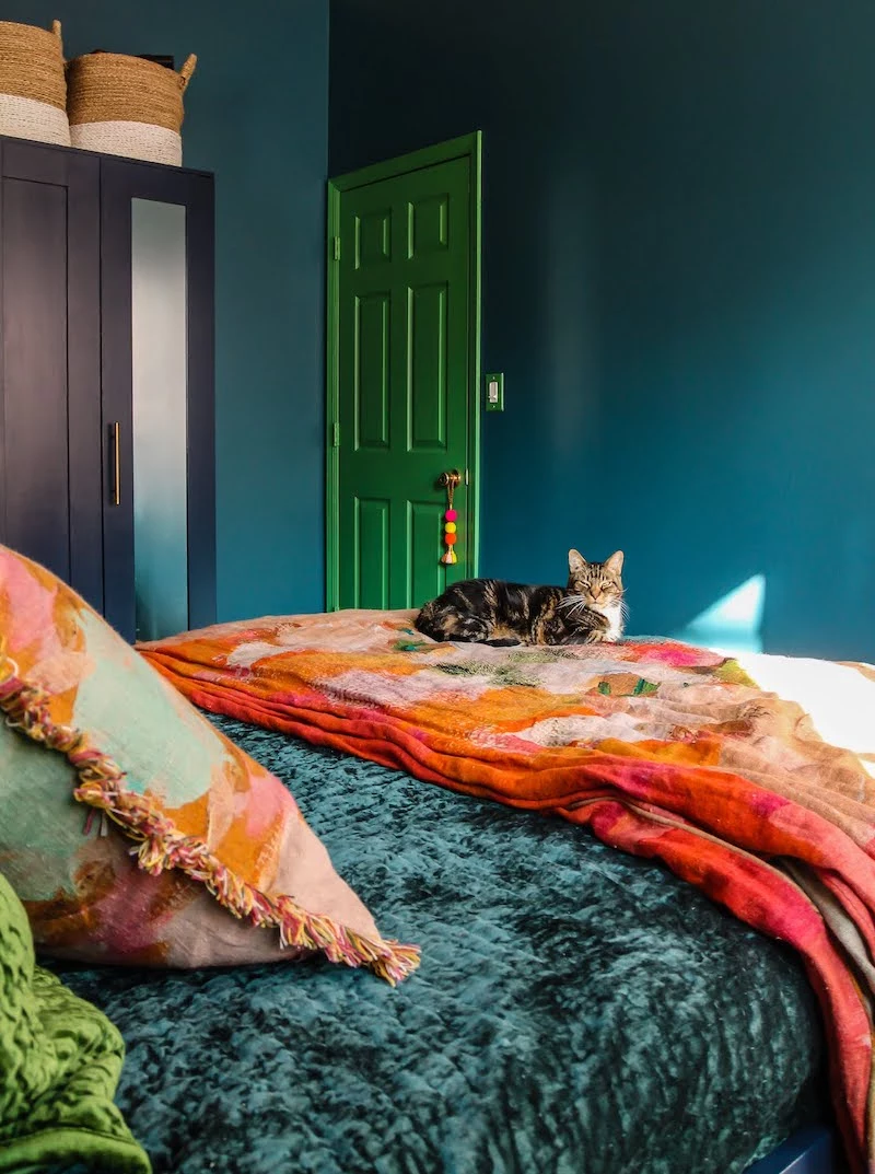
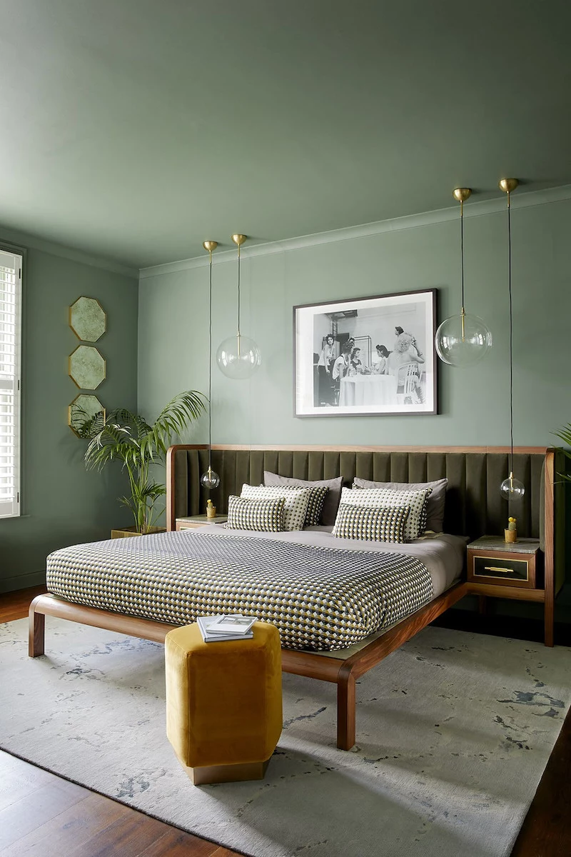
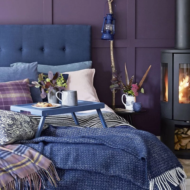
A UK study of 2,000 homes found that people with blue bedrooms get, on average, seven hours and 52 minutes of sleep per night.
This isn’t just a coincidence. The receptors in our eyes that help regulate our internal clock, known as ganglion cells, are most sensitive to blue light. A soft, muted blue on the walls—think more ‘sky at dusk’ than ‘electric blue’—is perceived as calming and serene, helping to lower heart rate and blood pressure before you even get under the covers.
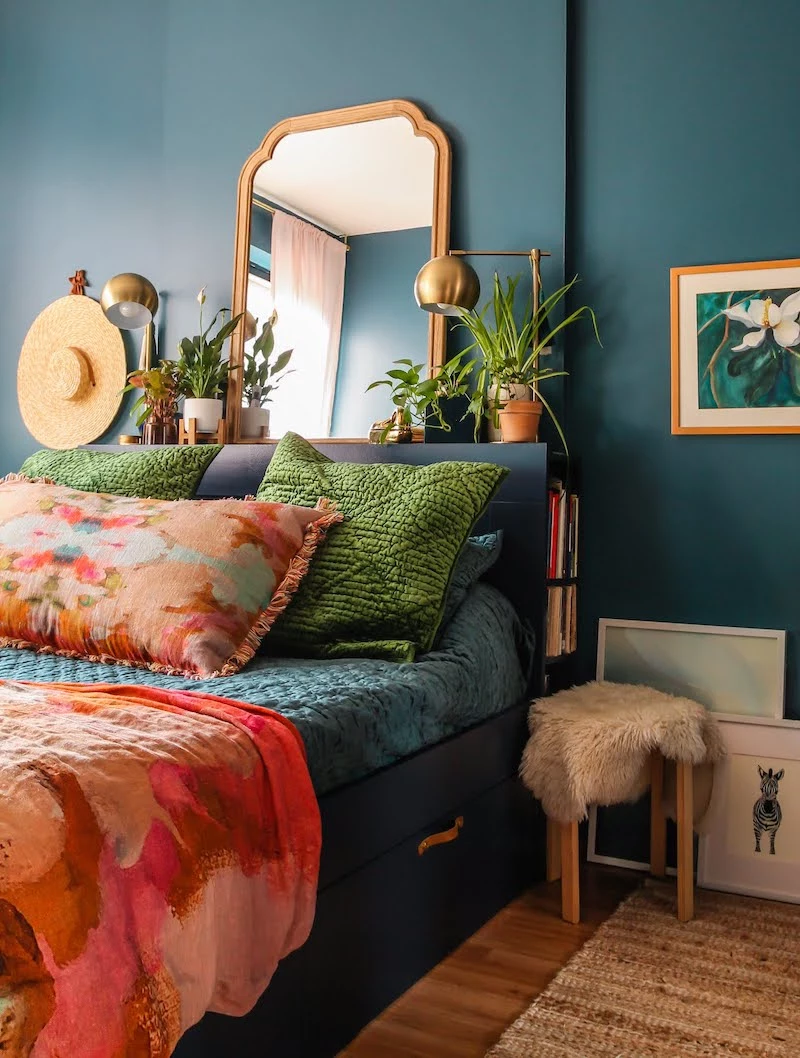
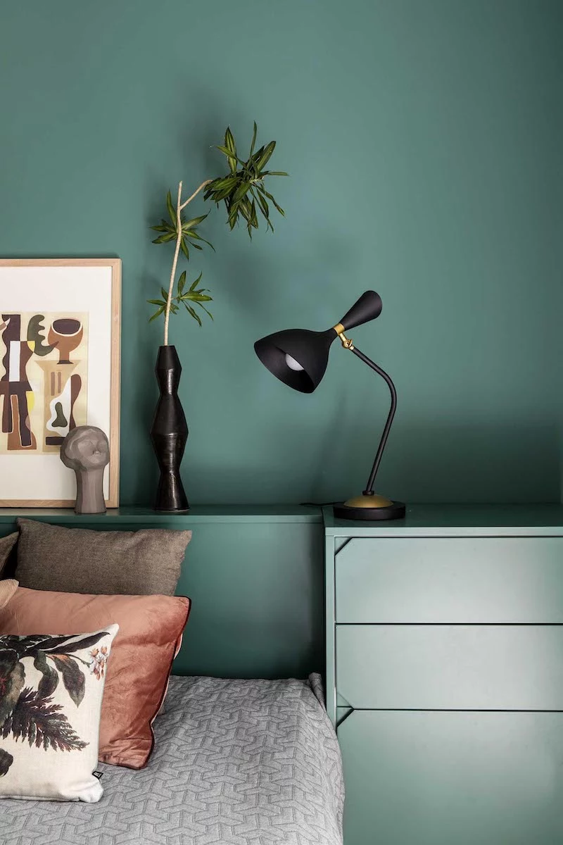
Want the cocooning effect of a dark color without the room feeling too heavy?
Consider painting an accent wall. The ideal choice is the wall your bed is against. This creates a powerful visual anchor and a soothing backdrop when you’re sitting up to read, but you won’t be staring directly at the darkest surface as you try to fall asleep. It’s a design-forward compromise that delivers most of the sleep benefits without the full commitment.
The finish matters as much as the hue. A high-gloss or satin paint reflects more light, even from a dim lamp or moonlight, which can be subtly stimulating to the brain. For the ultimate sleep sanctuary, always opt for a flat or matte finish. Benjamin Moore’s ‘Aura Matte’ or Farrow & Ball’s ‘Estate Emulsion’ are excellent choices as they absorb light, creating a soft, velvety depth that minimizes disruptive reflections and enhances the feeling of tranquility.
A deeper, more restorative sleep.
Less irritation for sensitive noses and throats.
No lingering chemical smells that disrupt your peace.
The secret? Choosing a low-VOC or zero-VOC paint. These healthier formulations, available from brands like Clare or ECOS Paints, release far fewer volatile organic compounds into the air, ensuring the atmosphere in your bedroom is as clean and non-toxic as it is calming.
Soft Black: A charcoal or off-black shade like ‘Witching Hour’ by Clare creates a dramatic, enveloping feel that mimics the darkness of night, making it easier to disconnect from the day. It’s surprisingly cozy and makes other textures in the room pop.
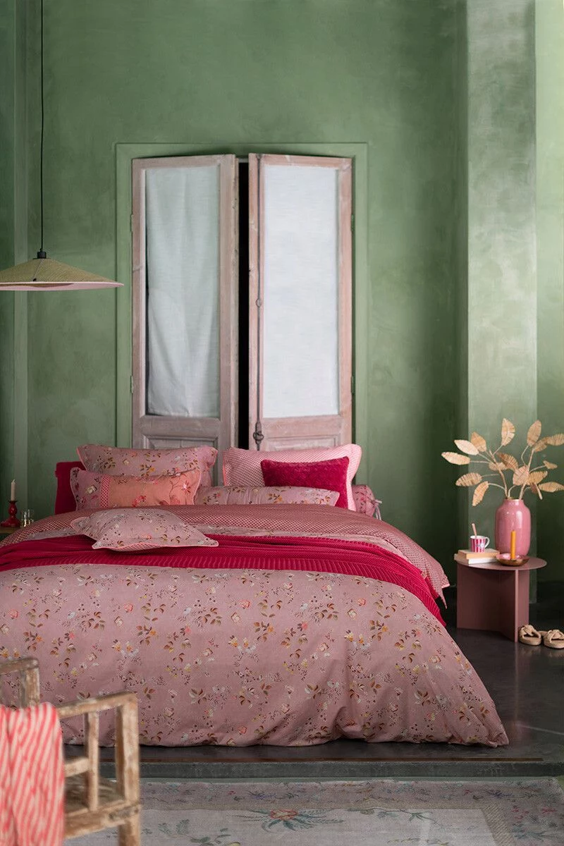
Dusty Rose: A muted, earthy pink such as Farrow & Ball’s ‘Setting Plaster’ offers a gentle warmth and a feeling of security. It’s a nurturing color that feels less like a design statement and more like a soft, reassuring hug.
Both defy convention but work by wrapping the room in a color that feels protective and subdued, rather than stimulating.
One common mistake: a beautifully painted room with a stark, brilliant white ceiling. This can create a ‘lid’ effect that reflects ambient light downwards, subtly counteracting the calming atmosphere you’ve worked to create on the walls. For a truly immersive experience, paint the ceiling the same color as the walls or a shade just a few tones lighter. This blurs the edges of the room, making it feel boundless and serene.
Maria Konou combines her fine arts degree from Parsons School of Design with 15 years of hands-on crafting experience. She has taught workshops across the country and authored two bestselling DIY books. Maria believes in the transformative power of creating with your own hands and loves helping others discover their creative potential.
To provide the best experiences, we use technologies like cookies to store and/or access device information. Consenting to these technologies will allow us to process data such as browsing behavior or unique IDs on this site. Not consenting or withdrawing consent, may adversely affect certain features and functions.
Functional
Always active
The technical storage or access is strictly necessary for the legitimate purpose of enabling the use of a specific service explicitly requested by the subscriber or user, or for the sole purpose of carrying out the transmission of a communication over an electronic communications network.
Preferences
The technical storage or access is necessary for the legitimate purpose of storing preferences that are not requested by the subscriber or user.
Statistics
The technical storage or access that is used exclusively for statistical purposes.The technical storage or access that is used exclusively for anonymous statistical purposes. Without a subpoena, voluntary compliance on the part of your Internet Service Provider, or additional records from a third party, information stored or retrieved for this purpose alone cannot usually be used to identify you.
Marketing
The technical storage or access is required to create user profiles to send advertising, or to track the user on a website or across several websites for similar marketing purposes.