Beyond the Showroom: How to Create a Home That Actually Feels Like You
I’ve walked through more houses than I can count. Some were packed with expensive, trendy furniture, looking like they were ripped right out of a catalog. But honestly? They felt cold, like nobody actually lived there. The homes that really stick with me are the ones that tell a story. You can just feel the personality radiating from the walls. Every single object seems to have a history and a reason for being there. And that, right there, is the huge difference between just decorating a house and truly creating a home.
In this article
My job isn’t to stamp my own style onto someone else’s space. It’s about helping people find their own voice and translate it into a place that feels right. Forget the fast-fashion décor that everyone else has. We’re talking about building a space with soul, using things that mean something to you and are built to last. It definitely takes more thought than a quick weekend shopping spree, but the payoff is a home that feels like a genuine extension of you.
First Things First: Your Story and Your Space
Before you even think about buying a single pillow, the real work begins. So many people skip this part, grabbing things they like one by one, and then wonder why their home feels cluttered and disconnected. A home with real character is built on a solid foundation of knowing who you are and what you want.
The ‘Why’ Comes Before the ‘What’
Your home is your sanctuary, right? It’s where you recharge. So, the first question you should ask yourself is: How do I want to feel here? Do you want your living room to feel social and buzzing with energy, or do you need it to be a calm, quiet retreat? Should the bedroom be a serene escape or a cozy, intimate den?
Go ahead and actually write those words down. ‘Calm,’ ‘Creative,’ ‘Secure,’ ‘Joyful.’ These feelings will be your compass, guiding every decision you make later on. It’s a simple trick, but it’s incredibly effective.
Quick exercise to get you started:
- Grab a notebook. First, write down three words that describe how you want your main living area to feel. No wrong answers here.
- Think of a favorite place. It could be a beach from a childhood vacation or a cozy mountain cabin you once visited. Now, what three colors or textures come to mind from that place? That’s your starting point for a personal color palette.
These little sensory memories are powerful. They connect your home to your own history, creating a sense of belonging you just can’t buy off a shelf.
Understanding Light (It’s a Game-Changer)
Every single design choice you make is impacted by light. This isn’t just for the pros; it’s fundamental. You’re working with two kinds of light: natural and artificial. Pay attention to how the sun moves through your rooms during the day. A north-facing room will have cool, indirect light that can sometimes make colors feel a bit muted. A south-facing room gets that bright, warm light that makes rich tones absolutely glow but can wash out paler shades.
By the way, people often forget about east and west. East-facing rooms get that beautiful, crisp morning light, perfect for a kitchen or breakfast nook. West-facing rooms get a really warm, golden glow in the afternoon and evening, which can make colors look incredibly rich and inviting.
When it comes to artificial light, you need to know about the Kelvin scale—it just measures the color temperature of a light bulb. A bulb around 2700K gives off a warm, cozy, yellowish light that’s perfect for living rooms and bedrooms. It signals your brain to relax. For kitchens and bathrooms where you need to see what you’re doing, something between 3000K and 4000K provides a cleaner, brighter white light. You can find these bulbs at any hardware store like Home Depot or Lowe’s, and they usually only cost a few dollars each. Swapping them out is one of the cheapest, most impactful changes you can make. I once had a client whose living room felt like a doctor’s office. We just switched their 5000K ‘daylight’ bulbs to 2700K warm ones, and the entire atmosphere changed instantly.
Making Your Walls Talk
Your walls are the biggest blank canvas in any room. What you put on them sets the tone for everything else. Instead of defaulting to generic prints, let’s turn your walls into a meaningful gallery that reflects your journey.
How to Pull Off a Killer Gallery Wall
A gallery wall is more than just a random jumble of pictures; it needs a plan. There are two main ways to go about it:
- The Grid: This is a very clean, formal look using frames of the same size and color, all arranged in a perfect grid. Think a series of black-and-white photos or botanical prints. The key here is precision. The space between each frame should be identical, usually around 2 to 3 inches.
- The Salon-Style: This is my favorite because it’s so personal. It’s a more organic, collected-over-time vibe with a mix of frame sizes, shapes, and materials. You can mix art with family photos, kids’ drawings, and even small objects.
Heads up! To create a salon-style wall without turning your wall into swiss cheese, trace your frames on kraft paper. You can get a whole roll for about $5. Cut out the templates, arrange them on the floor until you love the composition, and then use painter’s tape ($5) to stick the paper on the wall. This lets you see exactly how it will look and mark your nail holes before you commit. You’ll just need a hammer, a small level (around $10), and a picture hanging kit with assorted hardware ($15) to make it happen.
Oh, and here’s a rule the pros live by: the 57-inch rule. The vertical center of your artwork (or the center of the entire gallery wall) should be 57 inches from the floor. This is average human eye level, and it’s the standard used in galleries. It just looks right. A common question I get is, “What about over a sofa?” Great question. In that case, hang the art so the bottom of the frame is about 6-8 inches above the back of the sofa. It connects the two pieces instead of leaving the art floating randomly.
Don’t Underestimate the Frame
A frame isn’t just a border; it’s part of the art. A simple black or natural wood frame is timeless, while metal can give a clean, modern edge. But the two most overlooked components are the mat and the glass.
- The Mat: That paper border inside the frame is called a mat. It gives the art visual breathing room and, more importantly, keeps the glass from touching the surface of your artwork, which is crucial for preventing damage.
- The Glazing (the glass): Standard glass is cheap but has a ton of glare. For a few bucks more, anti-reflective glass makes a huge difference. If you’re framing something irreplaceable, like an original drawing or a precious old photograph, you should absolutely spring for UV-protective glass. Sunlight will fade your memories over time, and this stops it. Sure, a basic frame from a store might cost you $30, but professional custom framing with all the good stuff could run between $200 and $400 for a medium piece. Think of it as an investment to protect something you love.
A Quick Word on Safety
I can’t say this enough: please, please know what your walls are made of. A small nail is fine for a little 5-pound frame. But for anything heavy, like a large mirror or a big piece of art, you need a proper anchor in the wall. You can get a stud finder for about $20—use it. If you can drill into a wooden stud, you’re golden. If not, you MUST use a wall anchor designed for drywall, like a toggle bolt, which expands behind the wall to distribute the weight. Years ago, a client hung a gorgeous antique mirror with just a single nail. It came crashing down in the middle of the night, shattering the mirror and gouging the floor. It was a very expensive lesson in basic physics.
Textiles: The Secret to a Cozy Home
Fabric is what makes a house feel soft, comfortable, and quiet. Textiles add color and texture, but choosing the right material for the job is key.
- Wool: This is my top pick for things that get a lot of wear, like rugs. It’s durable, naturally stain-resistant, and feels incredible underfoot. Heads up: It’s an investment upfront, but a good wool rug will last for decades.
- Cotton: Soft, breathable, and easy to clean. It’s perfect for things like cushion covers and casual curtains. Its main downside is that it can wrinkle and doesn’t stand up to heavy-duty use as well as other fibers.
- Linen: I love the look of linen. It’s strong and has this beautiful, effortlessly chic texture. It’s fantastic for bedding and light-filtering curtains. Heads up: It wrinkles like crazy. Some people love that relaxed look; others can’t stand it.
- Synthetics (Polyester, Nylon, etc.): Don’t be afraid of man-made fibers! For a family sofa that’s going to see spills, pets, and movie nights, a durable performance fabric is your best friend. They are built to resist stains and fading.
From my experience, when choosing a fabric for furniture, you should always check its durability rating. The pros use something called the Martindale test—it’s basically a ‘rub test’ that measures how much abrasion a fabric can take before it shows wear. For a family sofa, I wouldn’t even consider a fabric with less than 25,000 rubs. For a decorative accent chair that doesn’t get used every day, 15,000 is perfectly fine. It’s a little piece of technical info that can save you a lot of money and heartache down the road.
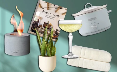
Inspirational Gallery
Your home’s signature scent is as personal as your perfume. It’s the invisible layer that creates an immediate feeling upon entering. Instead of a generic plug-in, consider what story you want to tell. Is it the comforting aroma of cedar and vanilla from a P.F. Candle Co. soy candle, reminiscent of cozy cabins? Or perhaps a sophisticated diffuser with notes of fig and sandalwood from brands like Jo Malone, evoking memories of a Mediterranean holiday? This sensory signature makes a space unmistakably yours.
The Gallery Wall Dilemma: A collection of prints and photos is a fantastic way to inject personality, but a mismatched approach can look chaotic. The secret is to find a single unifying element. This doesn’t have to be the frame color!
- Try a consistent color palette across all the images.
- Use only black and white photography.
- Maintain a uniform spacing between every frame, regardless of its size or shape.
- Choose a common theme, like botanical illustrations or architectural sketches.
How do I build a color palette that’s truly personal?
Look beyond paint swatches and trend reports; your personal palette is hiding in your memories and favorite objects. Unpack a box of old photos. What colors dominate your favorite travel pictures? Pull out your most-loved piece of clothing. What shade is it? Maybe it’s the deep forest green of a treasured ceramic mug or the sun-bleached terracotta of a pot from your first apartment. Use these emotionally resonant hues as your foundation for a home that feels like a biography in color.
- It tells a story of use and love.
- It adds irreplaceable character.
- It proves the object is made from authentic, quality materials.
The secret? Embracing patina. The gentle wear on a leather armchair, the subtle darkening of a brass lamp, or the soft sheen on a well-used wooden table are marks of a life lived. Resisting the urge to polish, sand, and restore everything to a ‘like-new’ state allows your home’s most-loved pieces to age gracefully and reflect your personal history.
Objects we’ve physically handled and lived with are perceived as more valuable—a psychological phenomenon known as the endowment effect.
This explains why the slightly chipped mug from a flea market often feels more precious than a brand-new, expensive set. It’s not about monetary worth; it’s about embedded experience. The memories and routines associated with an object infuse it with a value that can’t be bought. Your home becomes richer when it’s filled with these emotionally-weighted pieces.
Pro-Custom Framing: Offers a polished, cohesive look and uses archival materials (like UV-protective glass) to preserve your art. Services like Framebridge make the process easy by letting you upload art digitally or mail it in.
Eclectic Thrifted Frames: Perfect for a bohemian, collected-over-time vibe. Mixing styles, materials, and eras adds instant character and is incredibly budget-friendly. A quick coat of spray paint can unify disparate finds.
The best choice depends on the art and the room’s mood. A significant piece may deserve professional treatment, while a casual gallery wall thrives on an eclectic mix.
Go beyond the obvious spots for your treasures. Think about creating small, unexpected moments of personal connection throughout your home.
- Inside a bookshelf, tucked between volumes.
- On a small tray on your nightstand.
- Lining a windowsill in the bathroom.
- Grouped together on a dedicated picture ledge in a hallway.
A common pitfall: The overly literal ‘theme room’. Want a coastal vibe? Resist the urge to fill the space with anchors, ship wheels, and seashell-print everything. A more authentic approach captures the *feeling* of the coast. Think about light linen curtains that billow in the breeze, colors drawn from sea glass and sand, natural textures like jute and weathered wood, and a single, beautifully framed photo you took on your favorite beach. It’s suggestion, not declaration.
The soul of imperfection: In Japan, the art of Kintsugi repairs broken pottery with gold lacquer, highlighting the cracks as part of the object’s history. Apply this philosophy to your home. That scratch on the dining table from a joyful family dinner? The water ring on a side table from a guest’s forgotten glass? These aren’t flaws to be hidden; they are the golden seams of a life well-lived within your walls.