The No-Nonsense Guide to Hand Lettering: Your First Steps to Drawing Beautiful Words
I still remember the feeling of my first decent brush pen. The way the tip flexed under pressure and then snapped right back. Honestly, it felt less like writing and more like sculpting a word. For years, I’d seen the work of amazing sign painters and graphic artists and just wondered… how did they make letters dance like that? That curiosity sent me down a long road of practice, a fair bit of frustration, and finally, understanding. And here’s the secret: hand lettering isn’t some mystical talent you’re born with. It’s a skill, and it’s built on a foundation of simple, repeatable strokes. It’s the art of drawing letters.
In this article
- Your First Hand Lettering Kit for Under $25
- A Quick Win: Let’s Letter Your First Word
- Programming Your Hand: The 8 Basic Strokes
- From Strokes to Words: Building the Alphabet
- Layout and Composition: The Blueprint for Awesome Art
- Finding Your Style: Flourishes, Shadows, and Pop
- A Few Last Words of Advice
- Inspirational Gallery
Before we go any further, let’s get one thing straight. A lot of people mix up hand lettering, calligraphy, and typography. They’re all cousins, but they aren’t twins. Thinking about it this way helps:
- Calligraphy is the art of beautiful writing. It’s all about rhythm and discipline, forming letters in a single, fluid pass with specific rules.
- Typography is arranging pre-made letters, like fonts on a computer. You’re picking the right typeface and arranging it to look good.
- Hand Lettering is what we’re here for—the art of drawing letters. Each word is a unique illustration. You get to sketch, erase, refine, and build your letters, giving you total creative freedom.
This guide is built on the stuff I learned over thousands of hours at my desk and from helping others get started. We’re not doing quick tricks here. We’re building a real foundation that will actually stick. So be patient with yourself! This takes time, but the reward is an amazing connection between your hand, your mind, and the words you bring to life.

Your First Hand Lettering Kit for Under $25
Let’s talk tools. Getting the right pen and paper isn’t about dropping a ton of cash. It’s about understanding how they work together. I promise you, a cheap pen on the right paper will always, always beat an expensive pen on the wrong one. This is the stuff that separates the newbies from people who know what they’re doing.
The Most Important Tools: Pens and Pencils
You really don’t need a giant, intimidating case full of pens. You just need a few reliable workhorses. Here’s what you actually need to get going.
For Sketching: A Good Pencil
This is your skeleton crew. I personally use a mechanical pencil (a 0.5mm with 2H lead is my go-to) because the lead is hard and light, so it erases cleanly without smudging your paper to death. It’s perfect for laying down your initial ideas and guidelines. A regular wooden pencil works too, just make sure you keep it super sharp for a clean line.
For Outlining: A Fineliner Pen
Once your sketch is ready, you’ll want a fineliner to create crisp, solid outlines. The most important thing here is to look for ‘archival’ or ‘pigment’ ink. This stuff is waterproof and won’t smudge when you go back to erase your pencil lines. My favorites are the Sakura Pigma Micron or the Staedtler Pigment Liner. They cost about $3 a pop. Good to know: the number on the pen (like 01, 03, or 05) tells you the line width. A 05 is a great, sturdy starting point, while a 01 is much finer for tiny details.
For the Magic: A Brush Pen
This is where the classic hand-lettering look comes from. The flexible tip creates thick lines when you press down and thin lines when you use a light touch. For beginners, I can’t recommend the Tombow Fudenosuke (Hard Tip) enough. It costs around $3-$4 and its firm tip gives you way more control while you’re learning. As you get more confident, you can explore its sibling, the Soft Tip Fudenosuke, which gives you bouncier, more expressive lines but requires a lighter hand.
The Unsung Hero: Paper
Okay, listen up, because this is the part everyone messes up. Using the wrong paper is the #1 reason people get frustrated and ruin their brand-new pens. I learned this the hard way after shredding the tips of several brush pens on cheap, scratchy copy paper. The rough fibers act like sandpaper. For brush pens, you need exceptionally smooth paper. My everyday practice paper is HP Premium32 Laserjet paper. It’s incredibly smooth, and a whole ream of 500 sheets is only about $15 at office supply stores or online. For finished pieces, Rhodia or Clairefontaine pads are beautiful, but start with the HP paper. It’s a game-changer.
How to Actually Hold the Pen
By the way, you don’t hold a brush pen the same way you hold a regular pen for writing. Hold it at a roughly 45-degree angle to the paper, not straight up and down. Keep your grip relaxed—no white knuckles! The real key is to use your whole arm to make the stroke, not just your wrist. Plant your forearm on the table for stability and pull the pen from your elbow and shoulder. It feels weird at first, but it’s the secret to smooth, confident lines.
A Quick Win: Let’s Letter Your First Word
Before we dive into intense drills, let’s get a win on the board. It’ll show you how the pieces fit together. We’re going to letter the word “hello.” We’ll talk about these strokes in a minute, but just follow along for now.
- h: Start with a long, thin upstroke that loops at the top, then come straight down with a thick, heavy stroke. Finish with a little arch, like an ‘n’ shape.
- e: Just a small, angled loop. Thin up, thick down.
- l: Two big ascending loops, just like the start of your ‘h’. Keep them parallel!
- o: This is an oval. Start at about 2 o’clock, go up and left with a thin line, then come down the left side with a thick line. Curve back up the right side with a thin line to close it.
See? You just combined a few simple movements to create a whole word. That’s all lettering is!
Programming Your Hand: The 8 Basic Strokes
Amazing lettering isn’t about drawing a perfect ‘A’ right away. It’s about mastering the handful of strokes that make up every single letter. The fundamental rule is simple: press hard on downstrokes, use a light touch on upstrokes.
Grab your smooth paper and beginner brush pen and fill pages with these drills. Slow is smooth, and smooth is fast. You can find printable practice sheets for these online, or just grab a ruler and draw your own guidelines.
- Upstroke: A thin line moving up. Use the lightest pressure possible.
- Downstroke: A thick line moving down. Don’t be shy, apply firm, even pressure.
- Overturn: A thin upstroke that curves over into a thick downstroke (think: the letter ‘n’).
- Underturn: A thick downstroke that curves up into a thin upstroke (think: the letter ‘u’).
- Compound Curve: An overturn and an underturn connected. Thin up, thick down, thin up again.
- Oval: The hardest stroke, but foundational for ‘o’, ‘a’, ‘d’, ‘g’. Start slightly to the right, move up-left (thin), then down the left side (thick), and curve back up-right (thin).
- Ascending Loop: Forms the top of letters like ‘l’, ‘h’, ‘b’.
- Descending Loop: Forms the bottom of letters like ‘g’, ‘j’, ‘y’.
Troubleshooting the Wobbles
Your first tries will be shaky. Everyone’s are. Here’s how to fix common issues:
- Shaky Lines? You’re going too fast or just using your wrist. Remember to use your whole arm. And slow… way… down. Quick tip: try exhaling slowly as you draw a downstroke. It really helps stabilize your body and smooth out the line.
- Inconsistent Thickness? This is all about pressure control. As you drill, literally think “press” on the downstrokes and “lift” on the upstrokes.
- Blobs at the Top or Bottom? You’re pausing too long with the pen pressed down. Try to make your transitions from thick to thin one continuous, flowing motion.
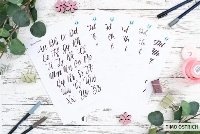
From Strokes to Words: Building the Alphabet
Once you’re feeling good about the drills, you can build the alphabet. The trick is to see letters as combinations of the strokes you just practiced. You already know the components!
- The letter ‘a’ is just an oval plus an underturn.
- The letter ‘n’ is an overturn plus a compound curve.
- The letter ‘g’ is an oval plus a descending loop.
When you start connecting letters, you’ll run into spacing (or kerning). The goal is to make the space between letters look visually consistent, which is a skill you develop by eye. I once spent two full days on a commission, only to realize the spacing in the main word was off. The ‘W’ was miles away from the ‘a’, creating a visual hole that ruined the whole piece. I had to start over. It was a painful lesson: pay as much attention to the empty space as you do to the letters.
Layout and Composition: The Blueprint for Awesome Art
Never, ever start a final piece without a plan. Thumbnail sketching is your best friend. Grab a piece of scrap paper and draw several small rectangles. Inside them, quickly sketch out different layout ideas for your phrase.
Don’t draw perfect letters; just use scribbles and shapes. You’re trying to figure out:
- Hierarchy: What’s the most important word? Make it bigger or bolder.
- Flow: Where does the eye go? Guide the viewer through the piece.
- Shape: Does the whole design fit into a circle, a wave, or a banner?
Once you pick a favorite thumbnail, use your pencil and ruler to draw guidelines on your final paper. You’ll want a baseline (where letters sit), an x-height (top of lowercase letters), and ascender/descender lines. This invisible skeleton is what gives a piece that polished, professional look.
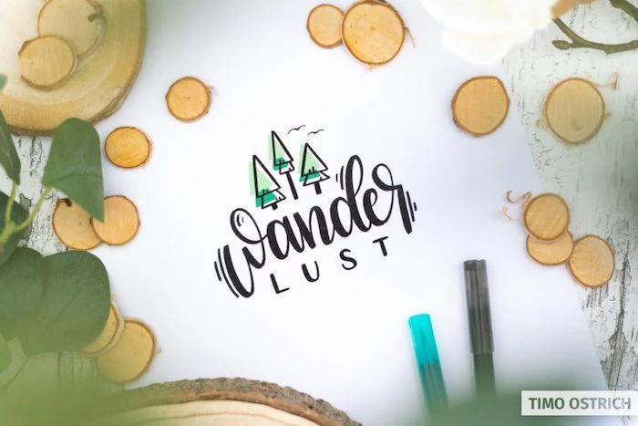
Finding Your Style: Flourishes, Shadows, and Pop
Once the fundamentals are solid, you can start developing your own style. Adding flourishes (decorative swirls) is a great way to do this, but the key is restraint. They should feel like a natural extension of a letter, not just something glued on. Try extending the crossbar of a ‘t’ or the tail of a ‘y’.
Want to make your letters pop off the page? Add a drop shadow. Decide where your light source is (I usually pretend it’s the top left). This means all shadows go to the bottom and right of your letters. Take a light grey brush pen (like a Tombow N75) and trace those edges. Consistency is everything here!
Oh yeah, for that extra bit of magic? Grab a white gel pen. A Sakura Gelly Roll or Uni-ball Signo is perfect. Add a tiny highlight on the opposite side of your shadow (so, on the top and left edges). It’s a simple trick that makes a huge difference.
A Few Last Words of Advice
This is a super rewarding craft, but you’ve got to be smart about it. First off, take care of your body. Seriously. Hunching over a desk for hours will wreck your neck and back. Work in a well-lit space, sit in a good chair, and take breaks every 30-45 minutes to stand and stretch. Your body is your most important tool.
And a heads-up for anyone thinking of selling their work or giving it as a gift: not all inks are permanent. Many colored brush pens use dye-based inks that will fade badly in sunlight. If you’re making something to be framed and hung on a wall, you MUST use archival, pigment-based inks. Check the pen’s packaging. A client will not be happy if the piece they bought from you is a faded yellow blur in six months. This is a mark of professionalism.
Hand lettering is a journey. Start with the basics, be patient, and practice your strokes. The joy isn’t just in the finished piece, but in those quiet, focused moments of watching a word take shape, knowing that you built it, one stroke at a time.
Inspirational Gallery
Tombow Fudenosuke Hard Tip: Known for its firm, small nib, this pen offers incredible control, making it a favorite for beginners mastering thin upstrokes and consistent downstrokes. Ideal for smaller lettering.
Pentel Sign Pen with Brush Tip: This one has a more flexible, expressive felt tip that feels juicier and creates bolder lines. It’s fantastic for developing a more fluid, bouncy style once you have the basics down.
For absolute beginners, the Tombow often provides a gentler learning curve.
The beauty of lettering is that it’s a slow art in a fast world. Each stroke is deliberate. It forces you to pause, to breathe, and to create with intention.
Ready to give your letters a 3D pop? Adding a simple drop shadow is easier than it looks. It’s all about consistency:
- First, complete your word in your primary color.
- Imagine a light source (e.g., from the top left). Your shadows will be on the opposite side (bottom right).
- Using a lighter gray pen, like a Tombow N75, trace along the bottom and right edges of every single stroke.
- That’s it! The key is to add the shadow to the same side of every stroke for a believable effect.
Thinking about moving your lettering to a screen?
Digital lettering, especially on an iPad with an Apple Pencil, is a game-changer for many artists. Using apps like Procreate, you gain the superpower of the “undo” button, the ability to work in layers, and access to infinite colors and textures. While you lose some of the tactile feedback of pen on paper, you gain immense flexibility for experimentation and professional client work. Many artists sketch on paper first and refine their work digitally.
You’ll hear instructors talk about ‘muscle memory’ and drills. It sounds tedious, but it’s the absolute core of good lettering. By repeatedly practicing the basic strokes—thin upstrokes, thick downstrokes, ovals, and loops—you’re not just warming up. You are training your hand and arm to perform these movements without conscious thought. It’s this ingrained knowledge that transforms shaky, hesitant lines into confident, graceful curves.
- Achieve that classic thick-and-thin look with any pen you own.
- It’s the perfect way to understand the anatomy of letters.
The secret? It’s a technique called “Faux Calligraphy.” Simply write your word in a simple script or cursive. Then, go back and identify all the downstrokes (any part of the letter where your pen was moving down the page) and draw a second line to thicken them. Fill in the space, and voilà!
Crucial tip for pen care: Your biggest enemy isn’t running out of ink; it’s a frayed brush tip. Standard copy paper has a rough texture that acts like sandpaper on delicate felt nibs, causing them to pill and lose their sharp point. To make your pens last, always practice on ultra-smooth paper. Rhodia dot pads and HP Premium32 laserjet paper are two affordable and widely loved options that will keep your brush pens happy.
Don’t have a brush pen yet? No problem. Grab a pack of Crayola Broad Line markers. Their conical tip is surprisingly versatile. Use the very point for thin upstrokes, and then apply pressure and use the side of the tip for thick downstrokes. It’s an incredibly cheap and effective way to practice pressure control before you even buy your first ‘real’ lettering pen.
A single brush pen contains enough ink to draw a continuous line over 300 meters long.
To get the most out of every drop, always store your dual-tip pens, like the popular Tombow Dual Brush Pens, horizontally. This ensures the ink remains evenly distributed between both the fine tip and the brush tip, preventing one from drying out prematurely.
A great composition often relies on contrast. Instead of using one style for an entire phrase, try creating a visual hierarchy by mixing and matching different letterforms. This technique adds rhythm and emphasizes key words.
- For your main word: Use a strong, bold, sans-serif style.
- For connecting words: A lighter, flowing script works beautifully.
- For secondary info: A simple, clean, all-caps print adds clarity without competing for attention.