Your Home’s True Colors: A Fun Guide to Picking Paint with Personality
Let’s be honest, standing in front of a giant wall of paint chips at the hardware store can feel like a special kind of nightmare. You’re faced with a thousand shades of white, and the fear of picking the “wrong” one is real. I’ve seen it stop people dead in their tracks for months.
In this article
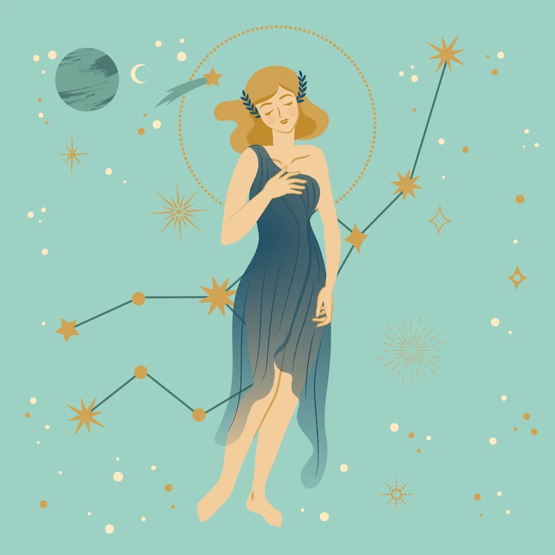
After years in the design world, I realized the secret wasn’t about finding the trendiest color, but about helping people connect with their own instincts. I needed a way to cut through the noise and find a palette that felt like them. So, I started using a framework based on personality archetypes, and one of the most familiar systems for this is the zodiac. Now, hang on—this isn’t about horoscopes or predicting the future. It’s about using these well-known personality traits as a launchpad for a conversation about color and how you want your home to feel.
By the way, don’t worry if you’re on the cusp or don’t totally vibe with your sun sign’s colors. Just read the descriptions and see which archetype you feel a connection to. This is a tool, not a rulebook. The goal is to give you permission to choose that bold red or quiet green because it feels right in your gut, not because a magazine told you to.
Before You Even Think About a Color…
Okay, before we get to the fun stuff, we need to cover a few basics. The pros don’t just pick pretty colors; we work with light and emotion. Getting this right is the difference between a room that looks fine and one that feels incredible.
The Pro’s Secret Weapon: The 60-30-10 Rule
Here’s a trick we use all the time to create balance. It’s super simple. Think of your room’s color in three parts:
- 60% is your main color. This is usually your walls. It’s the dominant shade that sets the overall tone.
- 30% is your secondary color. Think of your larger furniture pieces, curtains, or maybe even an accent wall. This color supports the main one.
- 10% is your accent color. These are the fun pops of color from pillows, art, and small decor items. This is where you can get bold!
Keeping this ratio in mind helps ensure a room feels balanced and intentional, not chaotic.

How to Test Paint Like You Mean It
This is probably the biggest mistake I see people make. A color you love under the fluorescent lights of Home Depot can look totally different in your living room. The light in your space is everything!
North-facing rooms have cool, indirect light that can make colors look a bit bluer. South-facing rooms, on the other hand, get bright, warm light all day. Always, always test paint in the room where you plan to use it.
But here’s a lesser-known trick: Don’t paint swatches directly on your wall! You’ll end up with a weird patchwork quilt that’s hard to cover up. Instead, grab a couple of white poster boards from a craft store (they cost like a buck each). Paint two coats of your sample color onto the board. Now you have a giant, movable swatch! You can tape it to different walls, see how it looks next to your sofa at different times of day, and you won’t mess up your current walls. It’s a game-changer, I promise.
Don’t Forget About the Finish!
The shininess—or finish—of your paint matters a lot. Here’s a quick rundown:
- Matte: Has no shine. It’s great for hiding imperfections on walls and gives a rich, velvety look. But, it’s the hardest to clean, so save it for low-traffic areas like ceilings or adult bedrooms.
- Eggshell & Satin: These have a slight sheen and are my go-to for most living spaces. They’re way more durable and easier to wipe down than matte. A gallon of quality paint in these finishes will usually run you between $50 and $80.
- Semi-Gloss & High-Gloss: Very shiny and very durable. Perfect for trim, doors, and cabinets. Heads up, though: that shine will highlight every single bump and flaw on a wall, so make sure your surface is perfectly smooth.
Finding Your Vibe: Using Personality Archetypes as a Guide
Alright, let’s dive in. Think of your sign’s archetype as a set of keywords to describe your ideal environment. For each one, I’ll throw in a quick, easy win and a budget-friendly tip.

Aries: The Pioneer
Archetype: You’re energetic, direct, and courageous. You’re a natural leader who loves to start things and dive in headfirst. Your space needs to feel active and motivating.
Palette & Vibe: Think bold, stimulating colors. A clear, true red is the classic power color here, but vibrant oranges and corals also fit the bill. The key is to avoid anything too passive or muddy. You want energy!
Putting It to Work: An entire room in fire-engine red can be a bit much, trust me. I had a client who loved the idea but found he couldn’t relax in his all-red living room. A better approach? Use it as a power accent. Paint a single wall in your home office a stunning, fiery red. Or, in a living room, use a strong neutral on the walls and bring in that fire through a bold piece of art or crimson velvet pillows. Your textures are often clean and modern—steel, glass, and smooth surfaces.
- Quick Win: Get a single, bold red throw pillow for your sofa. It’s a small dose of that powerful energy.
- Budget Tip: Instead of expensive metal furniture, look for simple pieces you can update with a can of metallic spray paint for a sleek, modern finish.
Taurus: The Grounded Sensualist
Archetype: You’re all about comfort, security, and natural beauty. You’re grounded, patient, and you love life’s simple luxuries. Your home is your sanctuary.
Palette & Vibe: Your palette is pulled straight from nature. Rich greens, from sage to deep forest, are your best friends. Earthy tones like terracotta, soft browns, and creamy whites create a stable, serene foundation. A touch of soft pink or copper adds a layer of gentle warmth and beauty.
Putting It to Work: To create a cozy, enveloping bedroom, try a deep but soft color like a green smoke on all the walls. It’s incredibly restful. Pair this with natural wood furniture and linen bedding. Texture is everything for you! Think of things that feel amazing to touch: plush velvet, soft cashmere, worn leather, and handmade pottery. A premium, earthy green paint can cost over $120 a gallon, but a similar vibe can be found in more budget-friendly lines for around $60.
- Quick Win: Grab a few small terracotta pots for your houseplants. It’s an instant touch of earthy, natural color.
- Budget Tip: Scour thrift stores for real wood furniture. A little sanding and a natural oil finish can bring out its beauty for a fraction of the cost of new pieces.
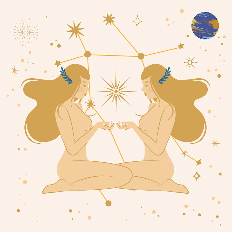
Gemini: The Communicator
Archetype: You’re curious, witty, and social. You need a space that feels light, bright, and ready for conversation. No heavy, static vibes allowed!
Palette & Vibe: Yellow is your quintessential color—it’s optimistic and intellectual. Light blues and greens also work, suggesting clarity and airiness. Your space needs to feel stimulating and full of variety.
Putting It to Work: A whole room of bright yellow can feel like living inside a highlighter. Instead, use it as a playful accent. I once had a client paint the inside of his bookshelves a brilliant yellow. When the books were in place, you just got these exciting, smart flashes of color. For walls, a crisp white or a very pale gray is a great canvas for your eclectic mix of art and furniture.
- Quick Win: Find a fun, quirky lamp with a pop of yellow for your side table.
- Budget Tip: Create your own eclectic gallery wall with a mix of cheap frames from craft stores and your own photos or prints you find online.
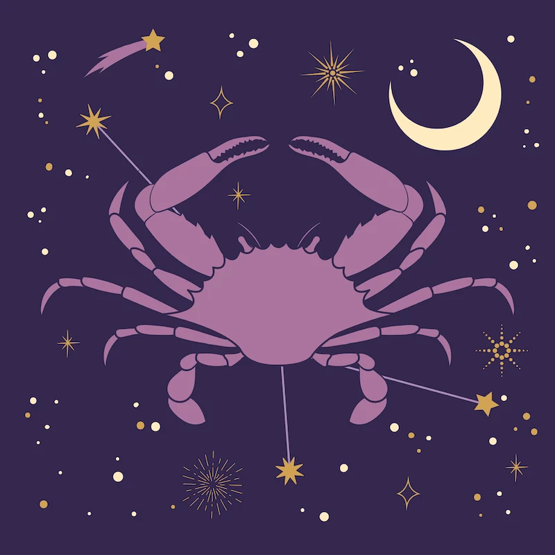
Cancer: The Nurturer
Archetype: You’re nurturing, sensitive, and deeply connected to home. You need a space that feels like a safe, cozy retreat from the world—a soft place to land.
Palette & Vibe: Your colors are soft and soothing, like moonlight on water. Silvery grays, pearly whites, and soft blues are foundational. These create a calm, protective atmosphere. The feeling should be gentle and welcoming.
Putting It to Work: The goal is to build layers of comfort. For a living room that feels like a hug, choose a soft, mutable gray-blue for the walls that changes with the light. Then, layer in a plush sofa, tons of soft pillows in creams and pale pinks, and family photos in silver frames. Avoid harsh contrasts; everything should flow together gently.
- Quick Win: Buy a super-soft, chunky knit blanket and drape it over your favorite chair.
- Budget Tip: Softness is key. Look for secondhand overstuffed furniture that has good bones. A good cleaning or a simple slipcover can make it a perfect, cozy centerpiece.
Leo: The Royal
Archetype: Confident, charismatic, and a little bit dramatic. You’re ruled by the Sun, and your energy is radiant, warm, and loves to be the center of attention.
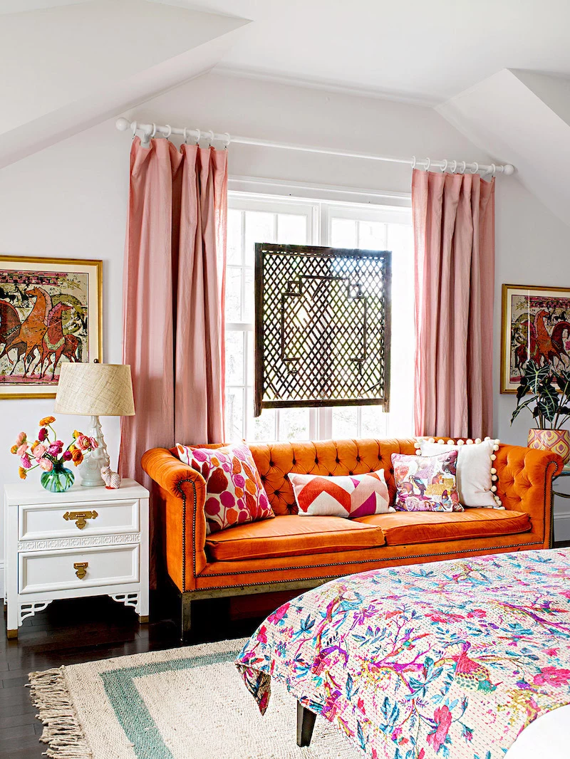
Palette & Vibe: Your palette is all about drama and luxury. Deep golds, sunny yellows, and burnt oranges are at the core. Royal purples and rich reds add a touch of regal splendor. This is not a timid look!
Putting It to Work: A room drenched in gold can look tacky if not handled correctly. The secret is to balance the opulence. A deep, dramatic purple on a dining room wall creates an incredible backdrop for a large, gilded mirror and a modern brass chandelier. The effect is pure luxury. Or, keep the walls neutral and make a statement with a burnt orange velvet sofa.
- Quick Win: Not ready for a gold wall? Find a big, wonderfully gaudy gold-framed mirror at a thrift store. It adds instant drama.
- Budget Tip: Velvet feels luxurious but doesn’t have to be expensive. Look for velvet pillow covers online; you can often get them for $10-$15 apiece to add that regal touch.
Virgo: The Purist
Archetype: You’re meticulous, practical, and drawn to order and cleanliness. You need a space that feels organized, peaceful, and uncluttered. Chaos is your enemy.
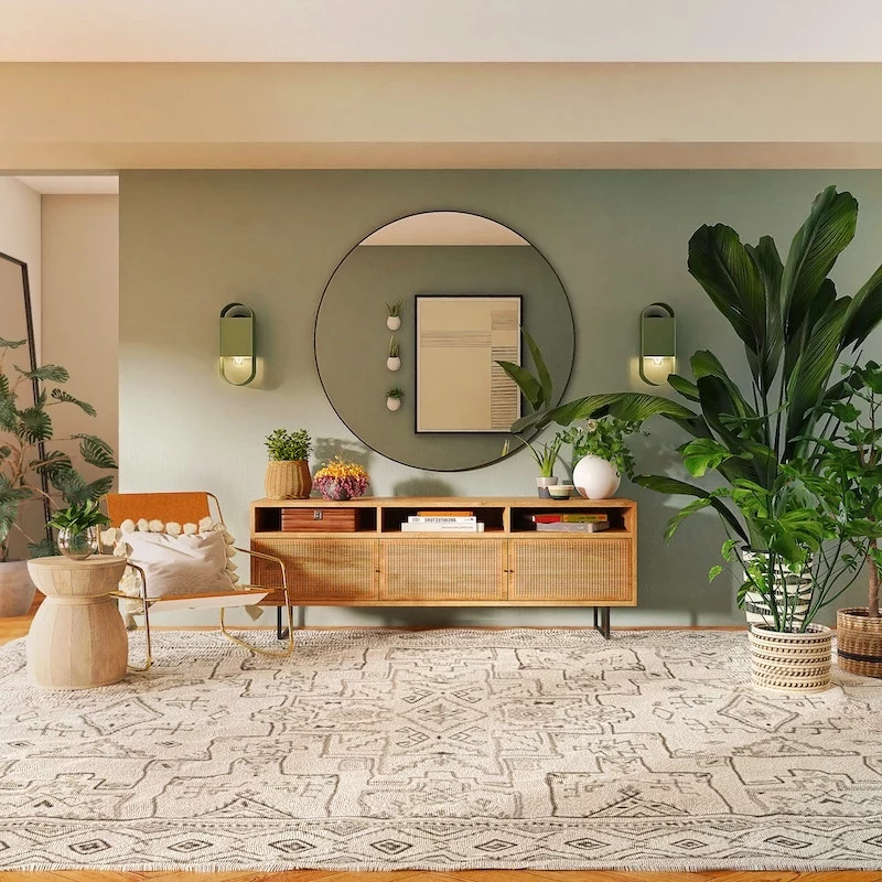
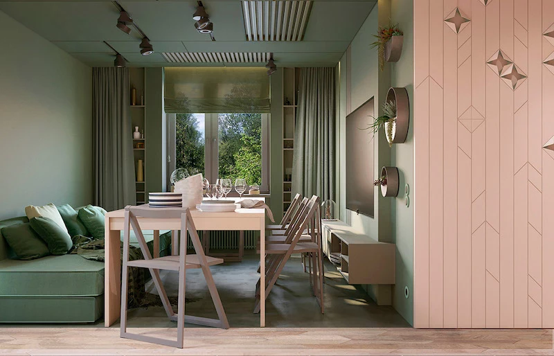
Palette & Vibe: Clean, calm, and drawn from nature. Think of earthy neutrals: creams, beiges, and shades of brown and gray. Natural greens, from moss to olive, bring in an element of health. The goal is a serene and orderly environment.
Putting It to Work: I often build a Virgo palette around layers of neutrals. A warm off-white on the walls, then bring in texture through natural materials: a light brown leather chair, oatmeal-colored linen curtains, and a jute rug. A touch of deep green through plants adds life without disrupting the calm. Good storage is non-negotiable for you; it’s essential for your peace of mind.

- Quick Win: Get some matching, minimalist-style containers or baskets to organize a messy shelf. The sense of order will be deeply satisfying.
- Budget Tip: Natural materials are key. Look for simple, unadorned wooden crates or woven baskets at craft or home goods stores to use for stylish, organized storage.
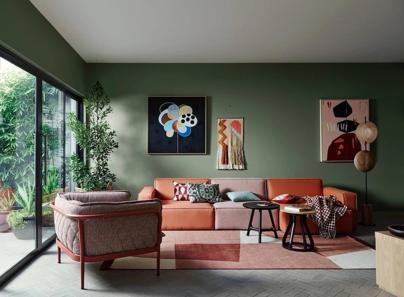
Libra: The Harmonizer
Archetype: Diplomatic, artistic, and a seeker of balance and beauty. You have a refined eye and your space needs to feel harmonious, elegant, and pleasing.
Palette & Vibe: Your palette is all about sophisticated pairings. Think of a deep indigo blue balanced with a soft pink or creamy white. Charcoal gray can provide a grounding element, while olive green adds organic sophistication. The goal is a palette that feels symmetrical and never jarring.
Putting It to Work: You have a great natural eye for style, but can sometimes struggle to commit. For a balanced living room, try a classic, calming navy on a feature wall, with the other walls in a soft, warm gray. Blush pink accents in the art or pillows add a touch of romance. Symmetry is often your best friend—think pairs of lamps, matching end tables, or a balanced gallery wall.
- Quick Win: Create a small, symmetrical vignette on a console table with a pair of matching candle holders or small vases.
- Budget Tip: To get that sophisticated marble look without the price, use high-quality marble-patterned contact paper on a tray or a small tabletop.
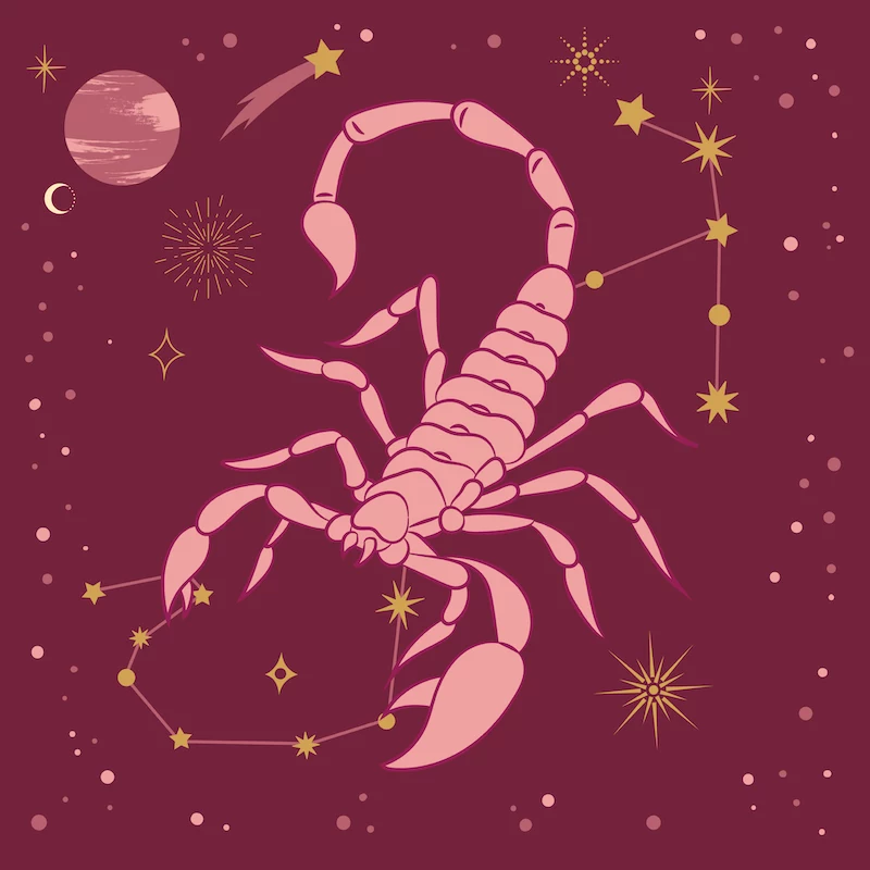
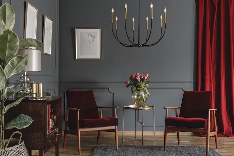
Scorpio: The Intensifier
Archetype: Intense, passionate, and private. You’re drawn to mystery and transformation. You want a space that feels like your own deep, private world.
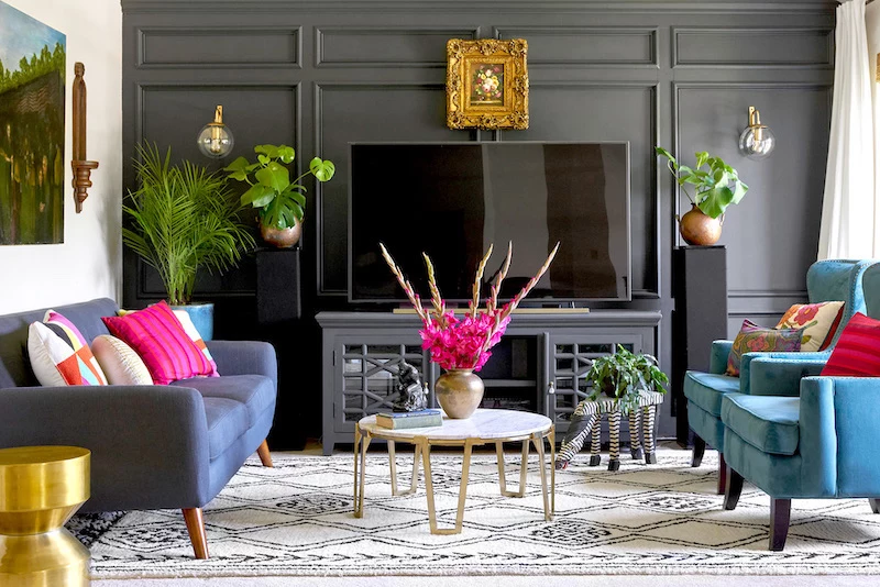
Palette & Vibe: Don’t be afraid of the dark. Your palette is deep, dramatic, and moody. Rich blacks, charcoal grays, and deep burgundies are your go-to’s. These colors create a space that feels private, protective, and intimate—like a cozy cocoon.
Putting It to Work: I once designed a study for a writer with this archetype where we painted the walls and ceiling in a deep charcoal, almost black. It sounds extreme, but with warm, layered lighting and rich wood, the room became an incredibly focused sanctuary. If you’re not ready for black walls, a deep maroon or blood-red accent wall can bring in that intensity. The key is to commit to the depth.
- Quick Win: Swap out your standard light switch plates for dark, moody ones in matte black or oil-rubbed bronze.
- Budget Tip: Get that rich, layered look with dark-stained wood. You can often find secondhand pieces and refinish them yourself with a dark gel stain, which is very beginner-friendly.
Sagittarius: The Explorer
Archetype: You’re an optimistic adventurer who loves freedom and travel. Your home should feel like a collection of stories and artifacts from your explorations, not a cookie-cutter box.
Palette & Vibe: Your colors are inspired by global cultures. Rich purples (the color of wisdom), deep ocean blues, and earthy, rustic tones that speak of adventure. The palette should feel open, worldly, and inspiring.
Putting It to Work: Your home should be a backdrop for your eclectic finds. A rich, earthy orange or a deep teal can make a great accent wall. The goal is to create a space that feels expansive, not confining. Think woven textiles from different countries, maps as art, and shelves full of interesting objects.
- Quick Win: Frame a cool piece of fabric or a scarf you picked up on a trip (or from a unique shop). Instant personal art.
- Budget Tip: Worldly decor doesn’t have to mean a trip around the globe. World Market, HomeGoods, and even thrift stores are treasure troves for eclectic, globally-inspired pieces.
Capricorn: The Architect
Archetype: You’re disciplined, ambitious, and you appreciate tradition and quality. You’re focused on building things that last, and your home should reflect that solid, timeless nature.
Palette & Vibe: Timeless and strong. Your palette is built on a foundation of rich neutrals: forest green, navy blue, and deep grays like charcoal and slate. Black and white is a classic combination that speaks to your love of structure. This isn’t a trendy palette; it’s meant to endure.
Putting It to Work: Quality is key. You’d rather have one great piece than a room full of cheap stuff. The color palette reflects this. For an office, a deep navy blue or forest green on the walls, paired with dark wood and classic leather, feels substantial. Good craftsmanship is important, so you appreciate details like nice trim and millwork.

- Quick Win: Upgrade the hardware on a dresser or cabinet to something heavy and classic, like solid brass knobs.
- Budget Tip: Look for secondhand solid wood pieces you can refinish with a dark stain. The quality of older furniture is often far superior to new, cheaper alternatives.
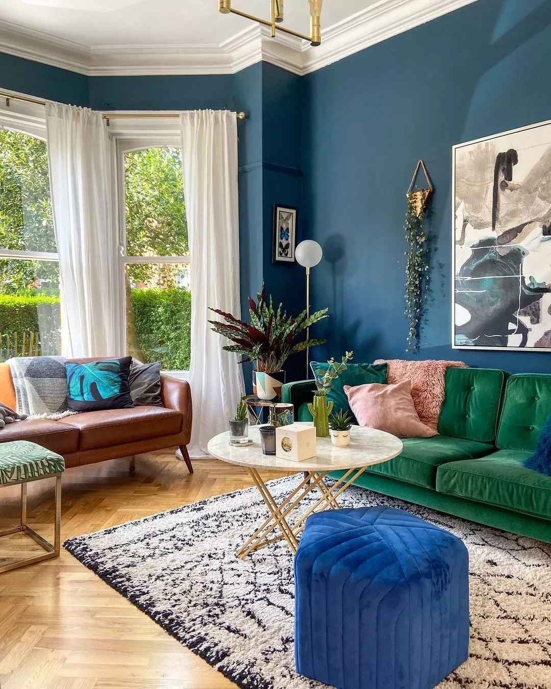
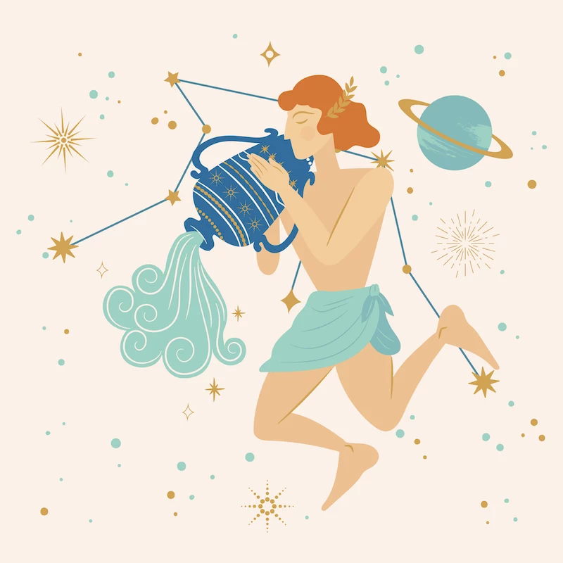
Aquarius: The Innovator
Archetype: Innovative, unconventional, and focused on the future. You march to the beat of your own drum, and your home should feel unique and forward-thinking.
Palette & Vibe: Often unexpected and modern. Bright, electric blues and turquoise are key colors, reflecting sky and electricity. Silver and gray provide a cool, futuristic base. You’re not afraid of unusual color combos, like pairing bright blue with a pop of fuchsia.
Putting It to Work: You get bored easily with traditional decor. For one client, we used a cool, industrial gray as a base, then brought in a custom-made sofa in a vibrant turquoise. The real fun was in the details: acrylic furniture, modern art with shocking color pops, and high-tech lighting. It’s about creating a space that feels like a laboratory for new ideas.
- Quick Win: Find a cool, futuristic-looking plant pot, maybe something in chrome or a geometric shape.
- Budget Tip: Get that modern, industrial vibe with DIY projects. Think simple shelves made from pipes and wood, or abstract art you paint yourself on a big canvas.
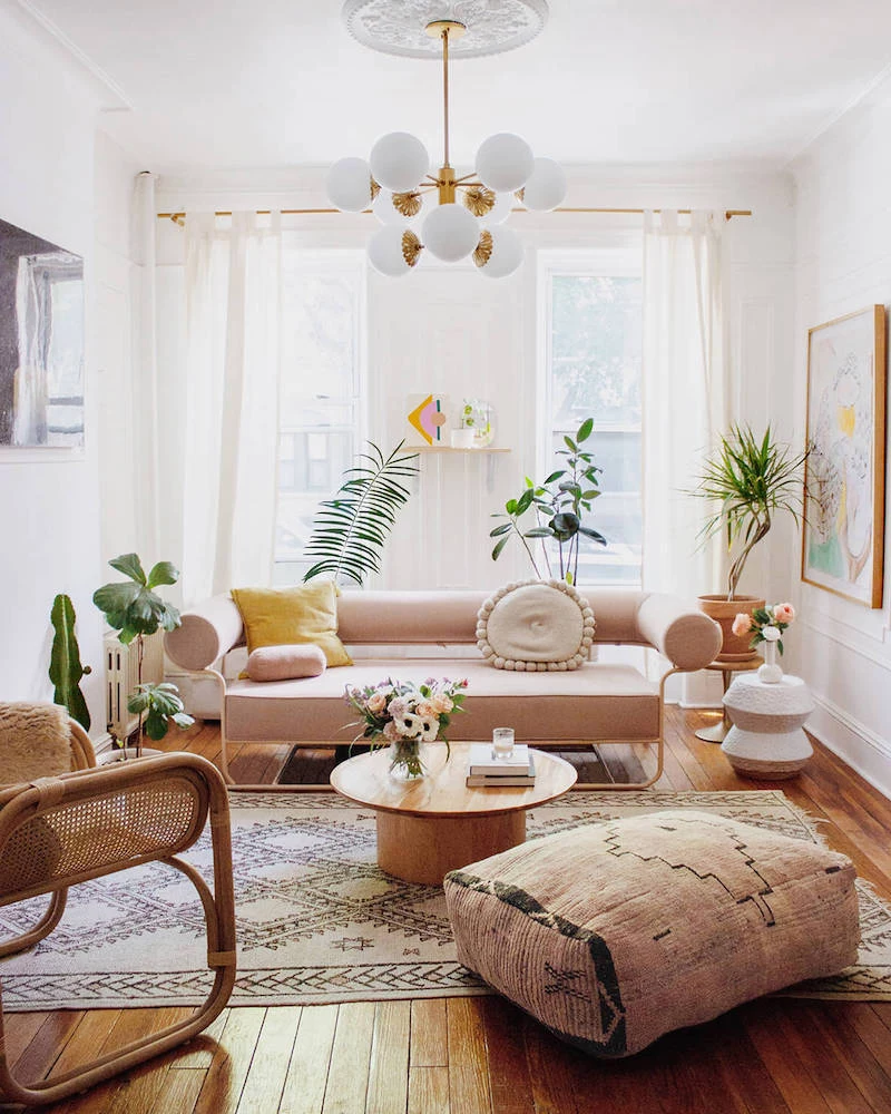
Pisces: The Dreamer
Archetype: You’re intuitive, compassionate, and deeply imaginative. Your home should be a soft, magical retreat from the harshness of the world, a place where your imagination can roam free.
Palette & Vibe: Soft, dreamy, and ethereal, inspired by the ocean and mist. Seafoam greens, soft lavenders, and a range of blues are perfect. The colors should feel blended and mutable, like a watercolor painting.
Putting It to Work: For a Pisces bedroom, I’d choose a soft, watery color that’s a beautiful mix of green-blue-gray and shifts with the light. Layer this with soft, flowing curtains, tons of comfy pillows, and art that has a dreamy, abstract quality. Avoid anything too structured or rigid. The space should feel fluid and peaceful.
- Quick Win: Add some battery-powered fairy lights in a glass jar or draped over your headboard for an instant touch of magic.
- Budget Tip: Sheer, flowy curtains create that dreamy vibe and are often very inexpensive. Check places like IKEA or online retailers for budget-friendly options.
What Happens When Two Worlds Collide?
So, what do you do if you’re a fiery Aries living with a calm-and-cozy Cancer? This is the number one question I get. The key is balance, and the 60-30-10 rule is your best friend here.
- If you’re combining Fire + Earth (like Aries & Taurus): This is a great combo! Use the grounded, earthy palette (creams, browns, sage green) as your 60% wall color and 30% main furniture. Then, let the fiery personality pop with the 10% accents—bold red pillows, a vibrant piece of art, or an orange throw blanket.
- If you’re mixing Air + Water (like Gemini & Pisces): This can be tricky, as one wants light and bright and the other wants dreamy and moody. A great compromise is to paint the walls in the Water sign’s soft, muted color (like a seafoam green or soft lavender). This creates the cozy shell they crave. Then, keep the Air sign happy with light-colored furniture, glass or acrylic pieces, and bright, playful art and accessories.
The goal is to find a dominant theme for the room’s shell and let the other personality shine through in the furniture and decor.
A Quick Safety Chat & Final Thoughts
Okay, a quick but important note. Always make sure you have good ventilation when you’re painting. I highly recommend using low-VOC or zero-VOC paints, especially in bedrooms and kids’ rooms—it’s just a healthier choice. Oh, and this is critical: if your home is much older, there’s a chance the old paint layers contain lead. Before you do any sanding or scraping, get a simple lead test kit from the hardware store. If it’s positive, do not handle it yourself. You need to hire a certified pro for removal. It’s a serious health hazard.
Remember, this whole framework is just a creative exercise to help you find your own authentic style. If you’re a Capricorn who adores bright pink, then that is absolutely the right choice for you! Use these ideas as a starting point, play with the colors, test them in your space, and most importantly, trust your gut. Your home should be the one place in the world that feels 100% like you.

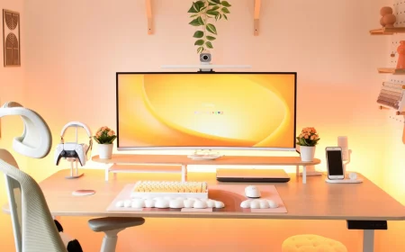
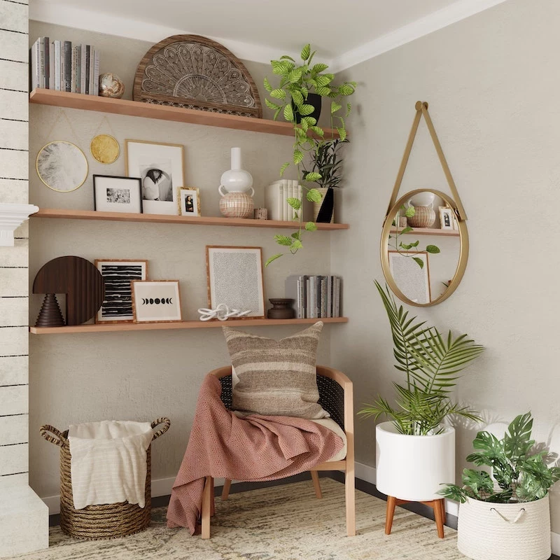
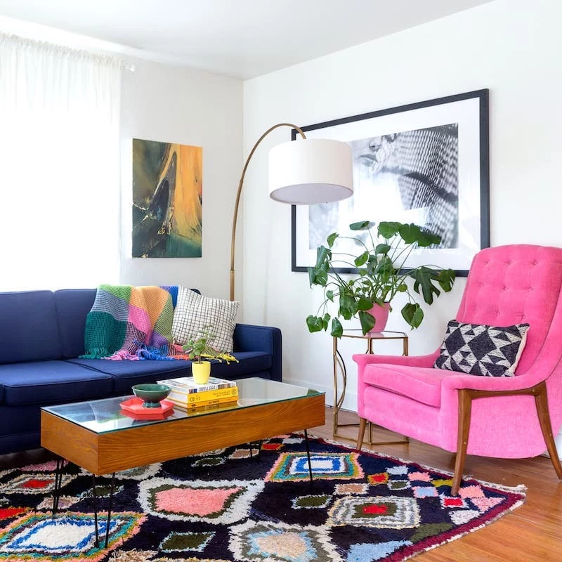
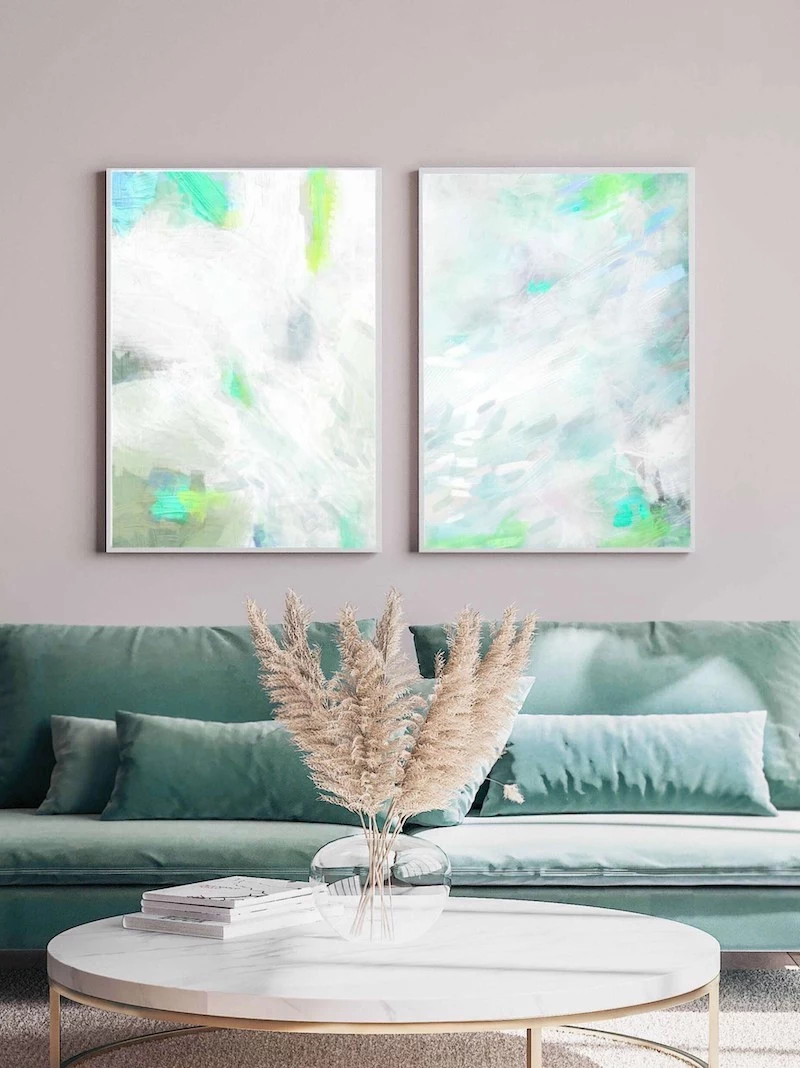
Inspirational Gallery

The secret saboteur of your perfect zodiac-inspired color?
Ignoring undertones. That perfect “Virgo” greige can look muddy if your floors have strong yellow undertones. Before you commit, hold your paint swatches next to your largest fixed elements—your sofa, flooring, or kitchen cabinets. A cool gray has blue undertones, while a warm gray leans yellow or brown. Matching these is the key to a cohesive, professional-looking space.
The human eye can distinguish about 10 million different colors, but the names we give them profoundly affect how we perceive them.
This is why the evocative names on paint chips—like “Taurus” inspired ‘Deep Forest Pine’ from Behr versus a simple ‘dark green’—matter so much. They help connect the color to the feeling you want. Your zodiac sign is just a fun shortcut to finding the name and shade that truly resonates with your inner self.
Don’t skimp on the paint itself. To truly capture the complex, soulful colors your personality calls for, consider investing in a premium paint. Brands like Farrow & Ball are famous for their rich, chalky finishes and pigments that shift with the light, while Benjamin Moore’s Aura line offers unparalleled color depth. A cheaper paint may match the chip, but it won’t capture the mood.
- Matte Finish: Has a velvety, non-reflective look that hides imperfections. Perfect for the deep, moody shades of a “Scorpio” or “Capricorn”-inspired bedroom.
- Eggshell/Satin Finish: The versatile all-rounder. With a slight sheen, it’s durable enough for living rooms and hallways, and it’s wipeable. It beautifully reflects light for an airy “Gemini” or “Libra” palette.
- Semi-Gloss Finish: Best for trim, doors, and humid spaces like bathrooms due to its high durability.

Feeling a strong pull to more than one sign’s palette? Perfect. For a truly nuanced home, look to your full astrological chart. Use your Sun sign for the main living area, your comforting Moon sign for the bedroom, and your expressive Rising sign for that bold 10% accent color in your pillows and art. It creates a story that’s uniquely yours.
Standard White Primer: It covers the old color and gives you a neutral base to work from. It’s the standard for a reason.
Tinted Primer: This is the pro move. Ask your paint store to add a small amount of your final color to the primer. For rich, saturated hues like an “Aries” red or a royal “Leo” gold, a tinted primer helps you achieve the truest color with fewer coats.
- It creates an incredibly chic, immersive jewel-box effect.
- It visually expands a small room by blurring the boundaries.
- It makes a space feel instantly intentional and high-design.
The secret? A technique called “color drenching.” Try painting your walls, baseboards, trim, and even the ceiling in the same signature shade. It’s a daring move that works wonders with the boldest zodiac palettes.