Let’s Talk About Yellow: The Painter’s Guide to the Color You Can’t Mix
I’ve been teaching painting workshops for a long time, and without fail, one of the first questions that always pops up is, “So, what colors do I mix to get yellow?” It’s a totally logical question. We learn from a young age that blue and yellow make green, and red and yellow make orange. So, it only seems fair that yellow itself should be mixable, right?
In this article
Well, here’s the simple, and slightly mind-bending, answer: in the world of paint and pigments, you can’t mix yellow. It’s a primary color.
This is where so many artists get stuck, and honestly, it’s not your fault. The confusion comes from the huge difference between how color works with physical paint versus how it works with digital light. For us painters, that tube of yellow paint is a starting point. It’s a foundational building block, just as essential as red and blue. My job isn’t to show you how to create yellow from thin air—because you can’t—but to show you how to understand it, choose the right one for the job, and tweak it to create every shade you could ever imagine.
Grasping this one concept is a huge leap forward. It’s the kind of know-how that takes your work from feeling amateur to looking professional. Once you get it, your whole relationship with your palette is going to change for the better.
So, Why Is My Screen Different? Pigment vs. Light
To really get a handle on yellow, we need a quick, painless dive into the physics of it all. This isn’t just boring theory; it directly affects the choices you make at your easel.
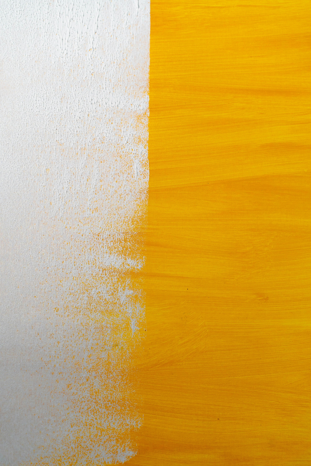
When you’re painting, you’re working with subtractive color. Think of your white canvas. We see it as white because it’s reflecting all the colors of the rainbow back at us. When you lay down some yellow paint, that pigment gets to work by absorbing—or “subtracting”—the blue wavelengths of light. It reflects the red and green light waves back to your eye. Your brain processes that combination of red and green light and says, “Hey, that’s yellow!”
Because no other pigment combination can do that specific job of only absorbing blue light, you simply can’t mix it. This is why professional printers use the CMYK model: Cyan, Magenta, Yellow, and Key (black). Yellow is an untouchable primary in this system.
Your phone, TV, and computer monitor, on the other hand, use additive color. They start with a black screen (the absence of light) and add light to create colors. The primary colors here are Red, Green, and Blue (RGB). In this digital world, you absolutely can make yellow by combining red and green light. This is why we’re all so conditioned to think of yellow as a secondary color!
I once worked on a gallery show where the lighting was absolutely critical. The lighting pro and I spent hours tweaking the spotlights. Just a tiny bit more green light made my beautiful ochre paintings look sickly, while a touch more red turned a soft lemon yellow into a deep, garish gold. It was a frustrating but powerful lesson: the color on the canvas and the color we see are two different beasts.
Choosing Your Go-To Yellows: The Painter’s Palette
Since you can’t mix it, selecting the right yellow from the get-go is the most important skill you can learn. They all have different personalities—some are warm, some are cool, some are see-through, and some are totally opaque.
A Quick Tip for Beginners: If you’re on a budget and feeling paralyzed by choice, just start with one versatile tube. My recommendation? Get a Hansa Yellow Light. It’s a clean, cool, lemony yellow that’s fantastic for mixing vibrant greens and it won’t break the bank, usually running about $8-$12 for a good student-grade tube.
When you’re ready to build out your palette, here are the essentials I always have on hand:
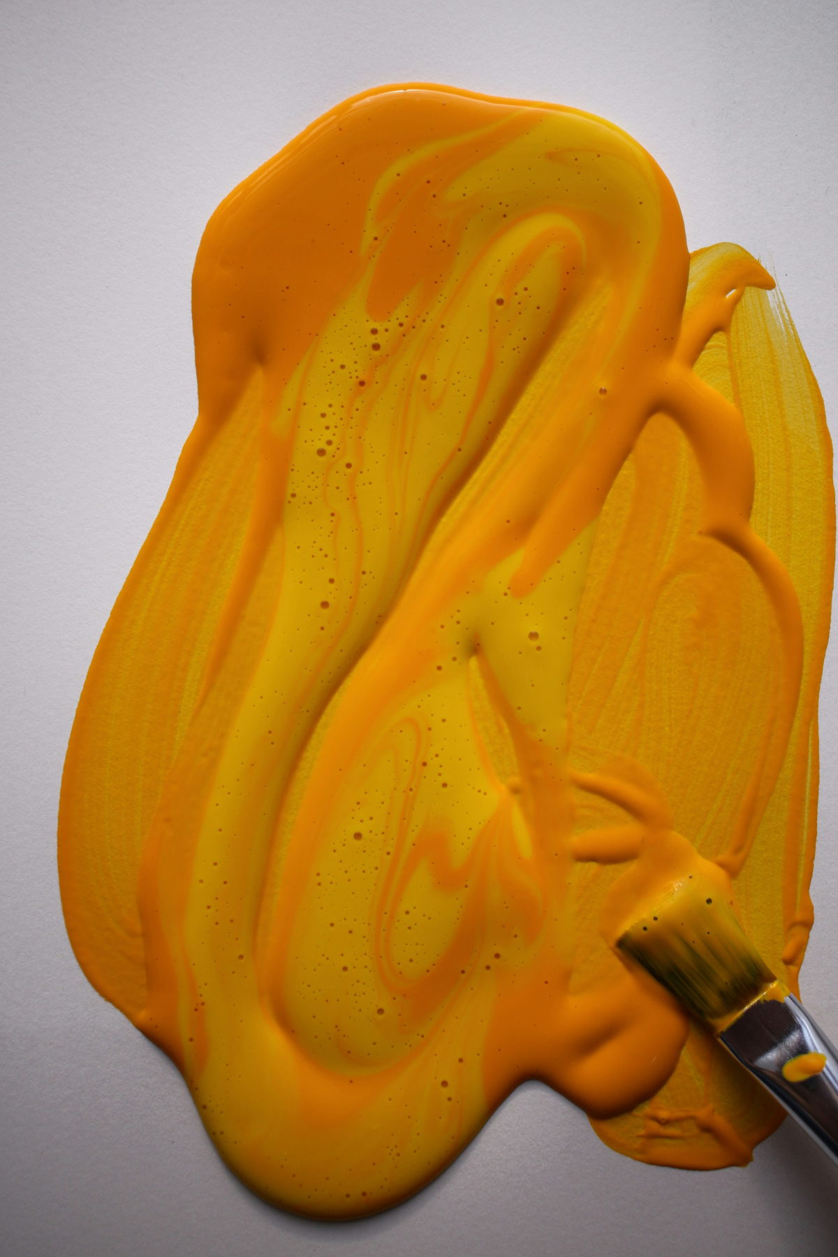
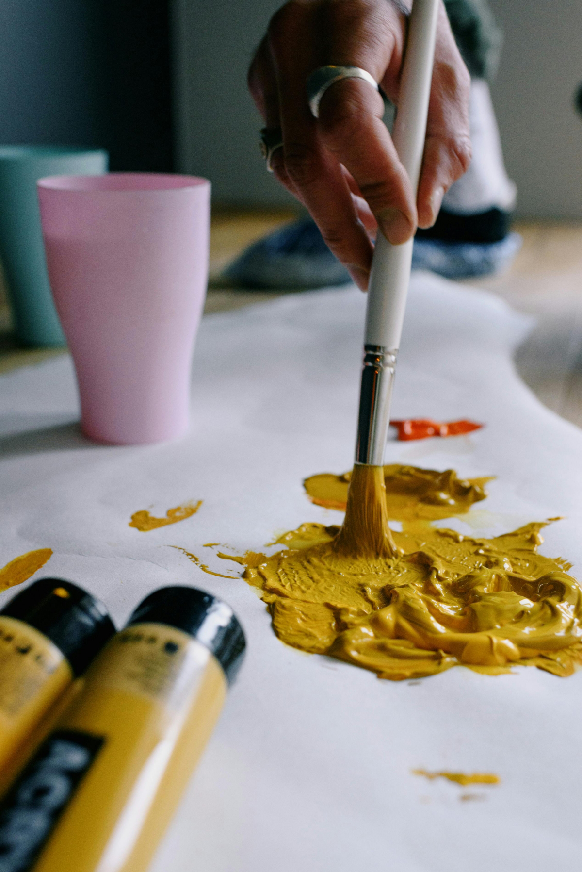
- Cadmium Yellow (Light or Medium): This is the powerhouse of yellows. It’s opaque, bright, and has incredible covering power, meaning it can easily hide whatever is underneath it. A Cadmium Yellow Light leans a bit towards green (cool), while the Medium is a very neutral, classic yellow. The downside? The real stuff is made with a heavy metal, so it’s a bit toxic (more on that later!) and pricier. A professional tube can cost you $20 or more, but student-grade versions like Gamblin’s 1980 line offer a great alternative for under $10.
- Lemon Yellow (or Hansa Yellow Light): This is your quintessential cool, zesty yellow with that greenish bias. It’s the secret to mixing bright, clean, electric greens. If you mix a cool yellow like this with a cool blue, you get pure magic. Hansa Yellow is the modern, non-toxic version, and it’s often more transparent, which makes it perfect for glazing.
- Yellow Ochre: An absolute must-have. This is an earthy, natural pigment that’s opaque, subtle, and incredibly useful. It’s far less intense than a cadmium, giving you beautiful, muted yellows that look like they belong in nature. I use it constantly for landscapes and it’s a key ingredient for mixing believable skin tones. You can grab a tube of this for as little as $7 at stores like Blick or Jerry’s Artarama.
- Naples Yellow: This is a soft, creamy, opaque yellow that I just love. Think of it as a convenience color—a sort of pre-mixed, pale, sunny highlight. It’s perfect for adding subtle warmth to portraits and landscapes without the jarring brightness of pure white. Historically it was super toxic, but today’s versions are perfectly safe and a joy to use.
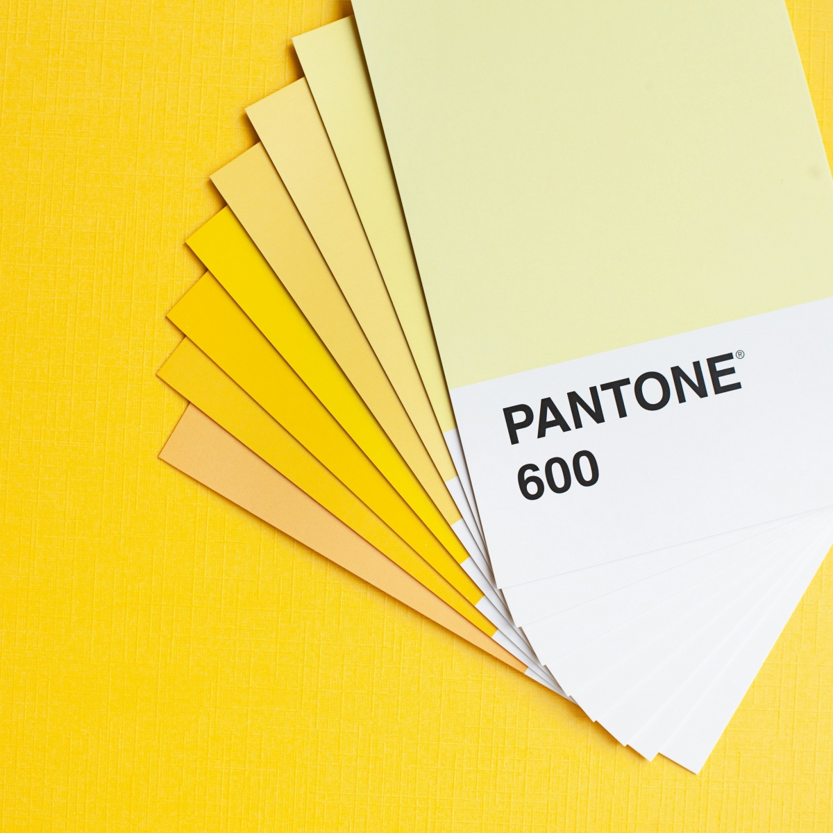
What to Look for on the Tube
When you buy artist-grade paint, ignore the fancy marketing name and look at the fine print on the label. That’s where the real info is.
Look for the Pigment Code (e.g., PY35). This tells you what’s actually in the tube, ensuring you’re getting a true single pigment, not a mix called a “hue.” Also, check the Lightfastness Rating. This tells you how well the color resists fading. You want a rating of I (Excellent) or II (Very Good). There’s no point painting something beautiful if it fades in a few years!
How to Actually Mix With Yellow
The real artistry is in the modification. You’re not making yellow, you’re making a specific yellow. Here’s how.
Making Tints (Adding White)
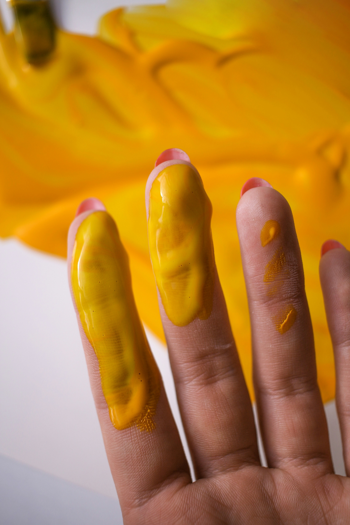
Adding white makes a color lighter and more pastel. But a common mistake is adding too much stark Titanium White, which can make your yellows look chalky and dull. A little goes a long, long way.
Try This Right Now: Put a big dab of yellow paint on your palette. Now, take the tiniest speck of white on your knife and mix it in. See how dramatically that little bit of white overpowered your yellow? Now you know! Always start with your white and slowly add the color to it.
Making Shades (Darkening Yellow)
This is the big one. This is where everyone messes up. The instinct is to add black to make yellow darker.
NEVER add black to yellow. I mean it.
Most black paints have a blueish undertone. When you mix blue and yellow, you get green. Adding black to yellow will result in a disgusting, sludgy, olive green. It’s the fastest way to kill the life in your painting.
So how do the pros do it? You have two great options:
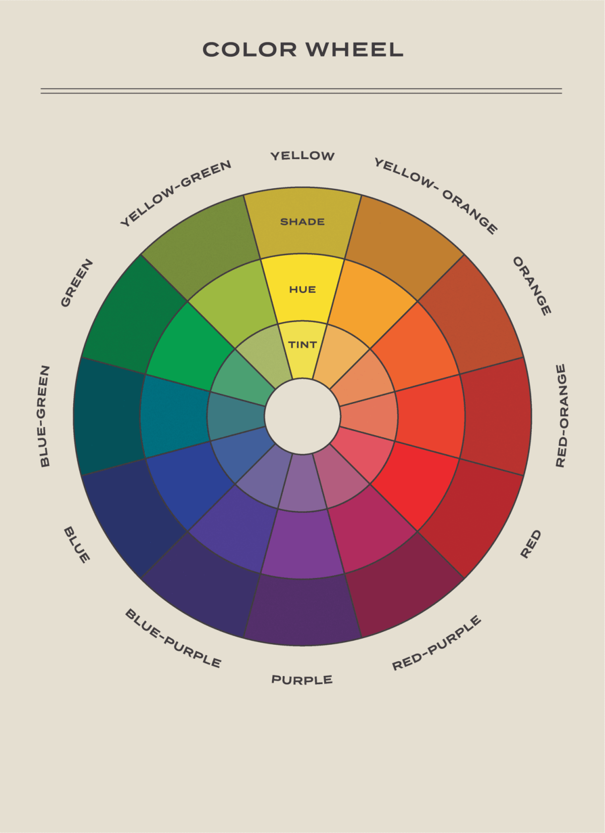
- Use Its Complementary Color: The opposite of yellow on the color wheel is purple. Adding the absolute tiniest speck of a deep purple (like Dioxazine Purple) to your yellow will neutralize and darken it beautifully into a rich, believable shadow color. Go slow—too much will turn it grey.
- Use Earth Tones: This is my go-to method. Adding a dark brown like Burnt Umber or Raw Umber to yellow is perfect. It creates gorgeous, warm, dark yellows that look like deep mustard, antique gold, or shadowy fields of wheat.
Let’s Talk About Those Famous Yellows
Some of the colors on our modern palette have some pretty wild backstories. For example, the original Indian Yellow was a fluorescent, golden color made from a now-discontinued and ethically questionable traditional process in India. The modern versions we use, called “hues,” are lightfast, safe, and capture that beautiful, warm transparency perfectly. They’re fantastic for glazing.
And then you have the Ochres and Siennas. These are literally dirt—earth pigments that are among the oldest art materials used by humanity, found in ancient rock art around the world. The specific minerals in the soil where they’re dug up give each one its unique character. It’s pretty amazing to be painting with something so timeless.
Tips for Using Yellow in Your Paintings
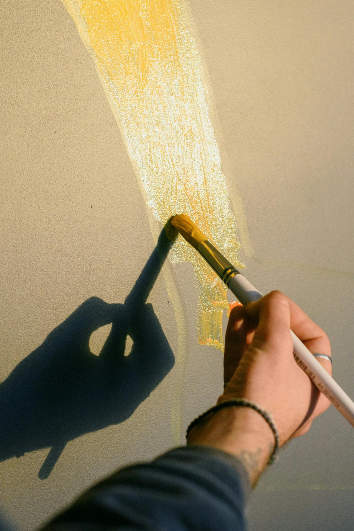
Making Yellow Glow: Yellow is the most luminous color we have. To make it feel like it’s actually emitting light, the secret is thin layers. I’ll often build up transparent glazes of a warm yellow over a smooth, white surface. Light passes through the layers, hits the white, and bounces back, creating an inner radiance that one thick coat could never achieve.
Yellow in Skin Tones: Getting skin right is all about understanding yellow. Skin isn’t just pink and white! For a basic sunlit skin tone, a starting mix I often use is about 5 parts Naples Yellow, 2 parts Cadmium Red Light, and 1 part Yellow Ochre. It’s just a starting point, of course, but it gives you a warm, believable base to work from. Without that yellow, skin looks raw and unnatural.
Heads Up! A Quick Word on Safety
Being a painter for the long haul means being a safe painter. Some of our most beautiful pigments are made from heavy metals, so you just need to be smart.
- Rule
1: No food or drinks in the studio.
This is the easiest way to avoid accidentally ingesting something you shouldn’t. - Rule
2: Wash your hands!
After every session, wash thoroughly with soap and water. - Rule
3: Never sand dry paint.
Especially with cadmiums, sanding creates dust that you can inhale. If you must sand, do it wet to keep the dust down and wear a proper respirator. - Rule
4: Deal with your rags.
Rags soaked in oil and solvent can actually catch fire on their own as they dry! Never leave them in a pile. Either lay them flat outside to dry or store them in a covered, water-filled metal can.
In the end, yellow is such a fascinating color. It forces you to unlearn what you thought you knew and approach your palette with more intention. The journey isn’t about trying to create it from nothing, but about learning to choose it, respect it, and modify it with skill. Once you do that, a whole new world of light and warmth will open up on your canvas.
Galerie d’inspiration
How do I darken yellow without making it look like mud?
It’s the classic painter’s dilemma. Your first instinct might be to reach for black, but that will almost always result in a dull, lifeless olive green. The secret is to think in terms of color temperature and complements. For a warm, glowing shadow, try mixing in a tiny amount of Burnt Sienna or Raw Umber. This maintains the earthiness. For a more dramatic, vibrant shadow that really pops, add the tiniest speck of its complementary color: purple. A touch of Dioxazine Purple into a Cadmium Yellow will create a surprisingly rich, deep, and believable shadow color that still reads as yellow.
Vincent van Gogh once wrote, “Oh, yes, he’s a painter who loves yellow, this wretched painter who has a soul of fire.” He was one of the first artists to extensively use new, vibrant synthetic yellow pigments like Chrome Yellow, which allowed him to capture the intense light of Arles.
Choosing the right tube of yellow is your first critical decision. Not all yellows are created equal, and your choice will dramatically affect your mixes.
- Cadmium Yellow: A warm, opaque, and powerful yellow. It’s perfect for creating rich oranges and warm, sunlit greens. A staple for its sheer mixing strength.
- Lemon Yellow (or Cadmium Lemon): A cool, sharp, and often semi-transparent yellow. This is your go-to for mixing bright, electric, and cool greens. Trying to mix a vibrant green with a warm yellow is a common source of frustration!
For earthy, muted tones: Yellow Ochre is your best friend. It’s a naturally-occurring pigment that’s less saturated than modern yellows. It’s fantastic for creating realistic skin tones, sandy landscapes, and subtle, sophisticated color harmonies.
For ultimate transparency: Consider an Indian Yellow or a Hansa Yellow. These are brilliant for glazing, allowing you to tint an underpainting with a sheer layer of luminous color, a technique used by masters to create an inner glow.
Ultimately, having both an opaque warm yellow and a transparent cool yellow on your palette gives you the most versatility.


