Tired of Muddy Orange? A Pro Painter’s Guide to Mixing the Perfect Glow
I’ve spent more time than I can count with a palette knife in my hand, and let me tell you, if one color teaches you humility, it’s orange. It seems so simple, right? Just splash some red and yellow together. But the first time you try to capture that warm, late-afternoon glow on a brick wall, you get a rude awakening. Your orange comes out looking like chalky mud or a screaming, artificial traffic cone. The color you see in your head just refuses to show up on the canvas.
In this article
That frustration? It’s a rite of passage for every artist. It’s the point where the real craft of color mixing truly begins.
It forces you to stop thinking about “red” and “yellow” as simple ideas and start seeing them as pigments, each with its own personality and, believe it or not, hidden biases. This isn’t just a guide on what colors make orange. This is a deep dive into how a painter thinks about orange, from the way light works to the actual feel of the paint on the knife. We’re going way beyond the basic recipe to explore what really gives you control: pigment choice, color temperature, and how you apply it.
The Real Science of Mixing Paint (The Quick Version)
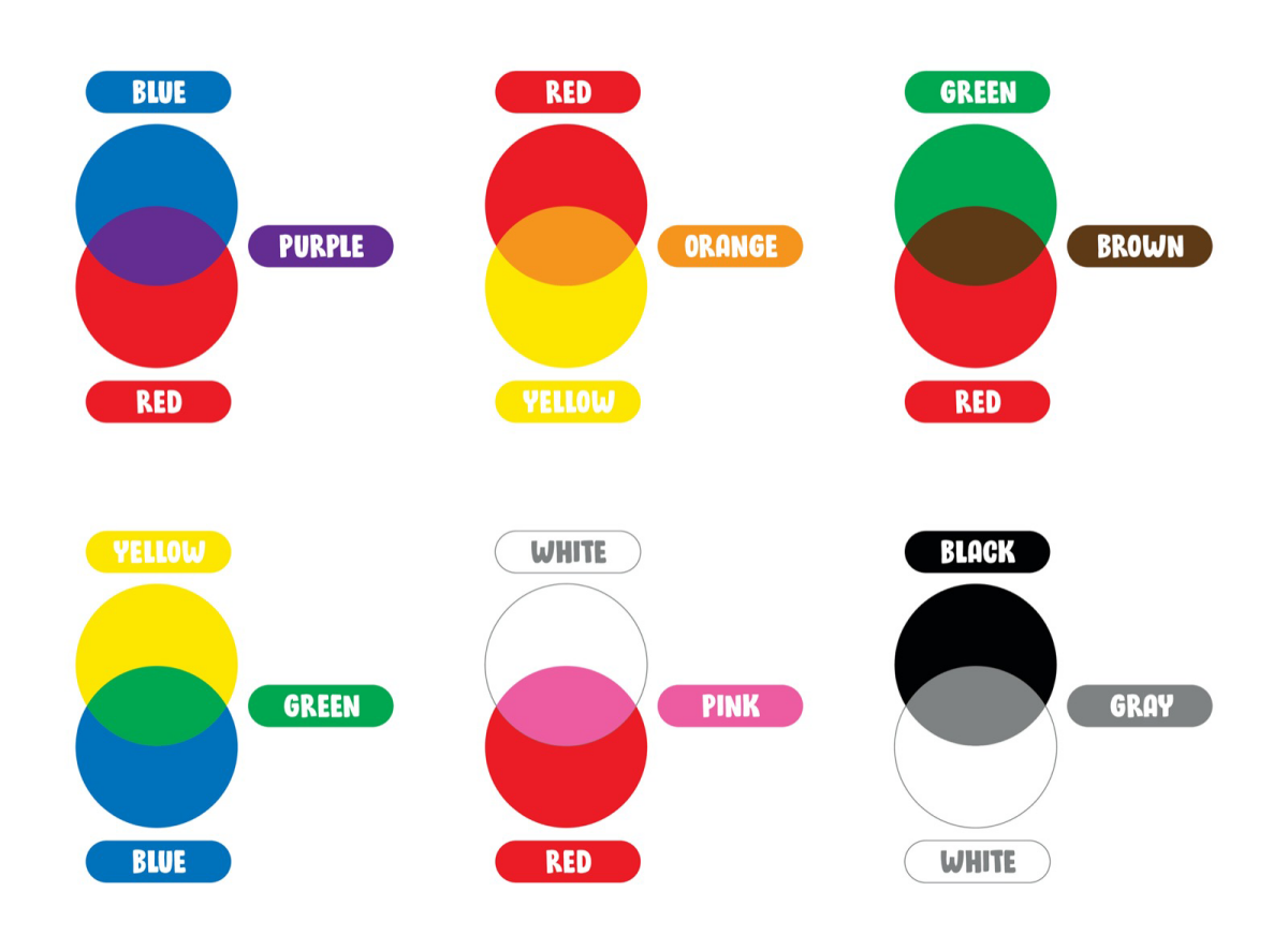
Before we even uncap a tube of paint, we need to get one thing straight. Mixing paint is the complete opposite of mixing light on a screen. Your computer uses an additive model—it adds Red, Green, and Blue light together to create white. It’s a world of pure, projected light.
Paint, on the other hand, lives in a subtractive world. Every pigment on your palette is a physical substance that absorbs some light and reflects the rest. A yellow pigment looks yellow because it soaks up most of the other colors and bounces the yellow light back to your eye. When you mix two pigments, you’re basically combining their light-absorbing powers. The new color absorbs all the light that either of the original pigments did. This is why mixing too many colors together almost always gives you a dull, dark color, eventually leading to mud. You’re subtracting more and more light with every new color you add.
The Most Important Concept: Color Bias
Here it is. The single most important lesson I can share: no tube of paint is a truly pure color. Every single red, yellow, and blue has a “color bias,” or what we call a “temperature.” It leans just a little bit towards another color.
- A warm red (like a Cadmium Red) already has a bit of yellow in it. It’s leaning toward orange.
- A cool red (like a Quinacridone Magenta) has a hint of blue in it. It’s leaning toward purple.
- A warm yellow (like a Cadmium Yellow Deep) has a touch of red in it. It’s also leaning toward orange.
- A cool yellow (like a Lemon Yellow) has a touch of blue in it. It’s leaning toward green.
So why does this matter so much? Because when you mix two colors, you’re also mixing their hidden biases. To get a bright, clean, vibrant orange, you have to mix a warm red with a warm yellow. Both pigments are already leaning toward each other on the color wheel. You’re mixing a yellowish-red with a reddish-yellow. The result is pure, high-intensity orange.
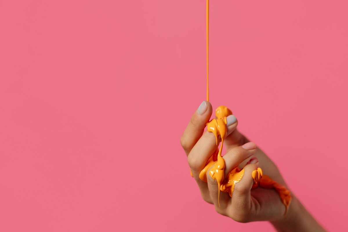
But what happens if you mix a cool red (with its blue bias) and a cool yellow (with its blue bias)? You’re accidentally mixing red, yellow, and blue. That little bit of blue from both tubes will instantly kill the orange’s intensity, turning it into a sad, dull, brownish color. Honestly, it often looks like weak, milky coffee. The vibrant mix, by contrast, looks like a liquid sunset.
Quick Challenge for You: Go try it right now. Squeeze out a little of your warm yellow and mix it with your warm red. Right next to it, mix that same yellow with your cool red. Seeing that vibrant orange next to that muddy one will teach you more than my words ever could. It’s a real lightbulb moment!
My Go-To Techniques for the Studio
In a working studio, getting the right color quickly and reliably is everything. We don’t have time to guess. These methods are born from years of practice and are all about giving you maximum control over your paint.
The Golden Rule: Start with Yellow
Always, always, always start with your lightest color and add the darker color to it. In this case, that means putting your yellow down first.
Here’s a mini-tutorial for your first perfect mix:
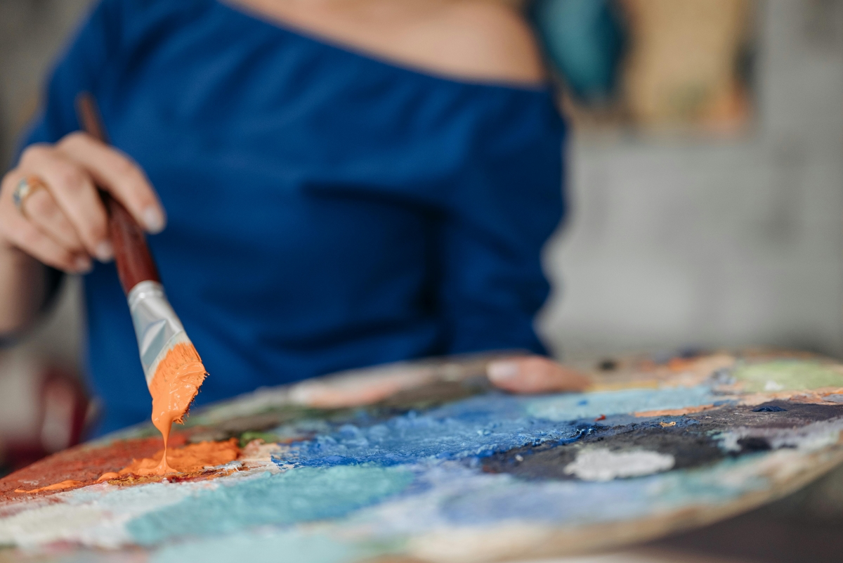
- Squeeze out a quarter-sized pile of your warm yellow paint onto your palette.
- Get a tiny bit of your warm red on just the very corner of your palette knife. Seriously, think the size of a match head. No more!
- Mix that tiny bit of red into the edge of the yellow pile. Watch how dramatically that little speck of red changes the yellow.
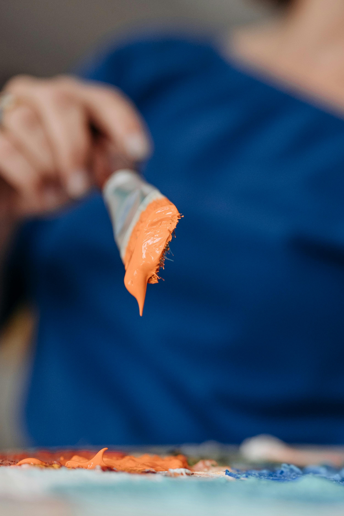
Yellow pigments have much weaker tinting strength than most reds. A tiny dab of red will overpower a huge pile of yellow. If you do it the other way around, you’ll end up with a mountain of orange paint before you ever get the light shade you wanted. This trick saves a ton of paint and money.
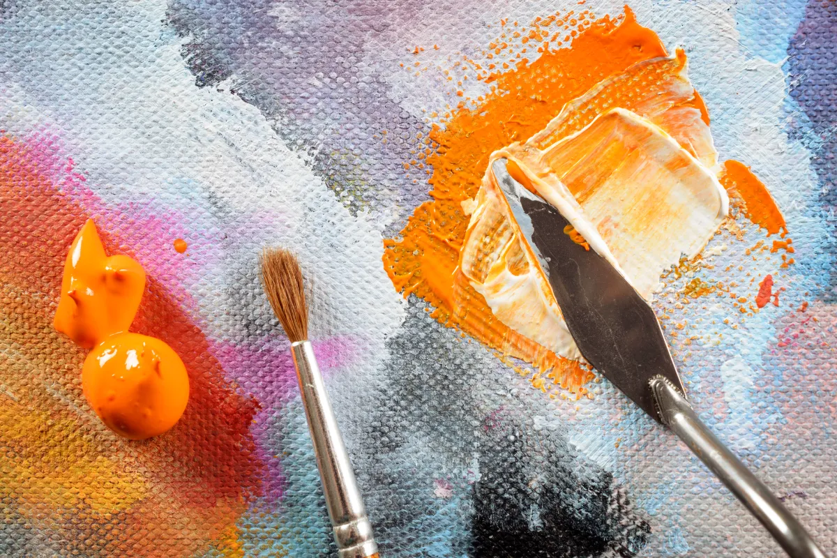
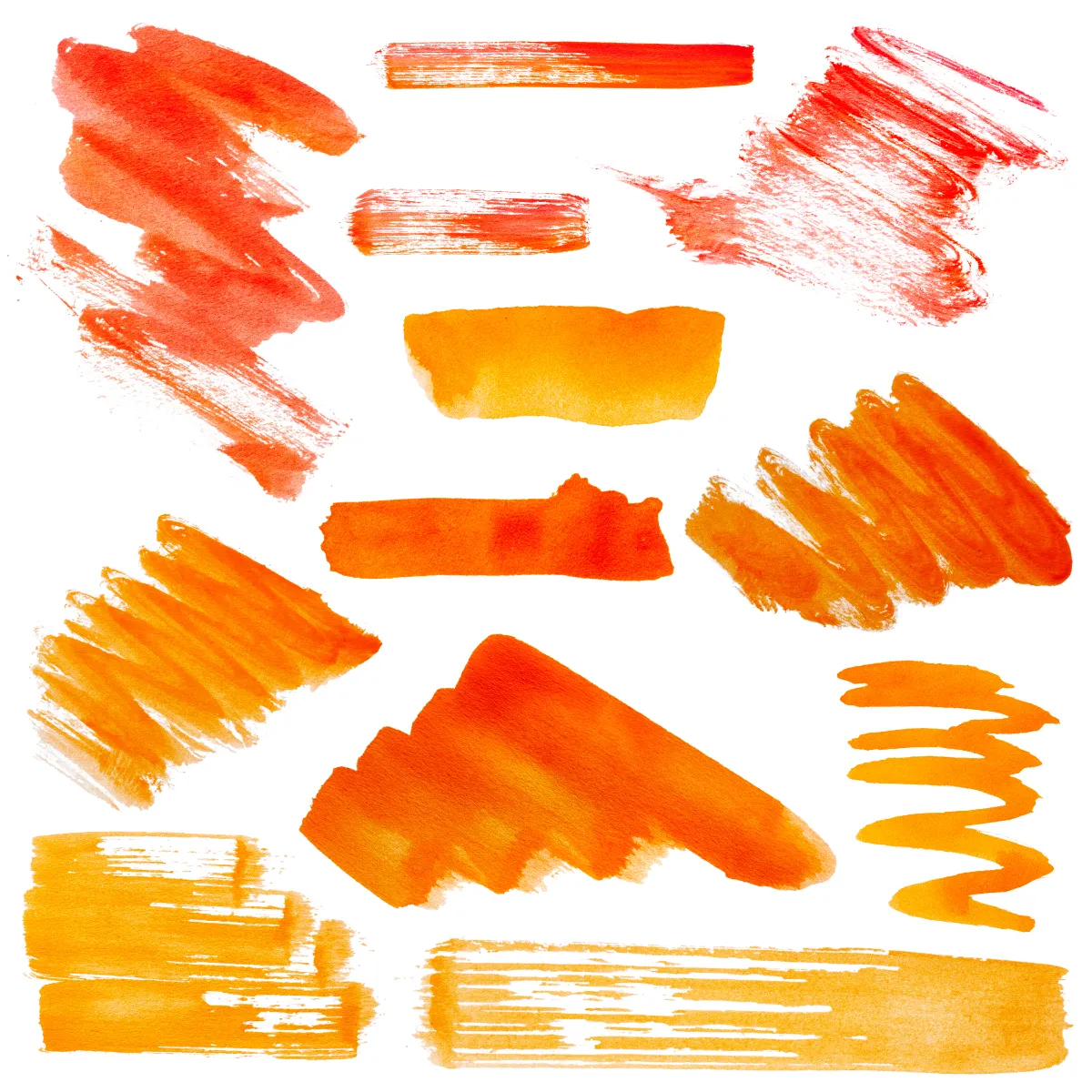
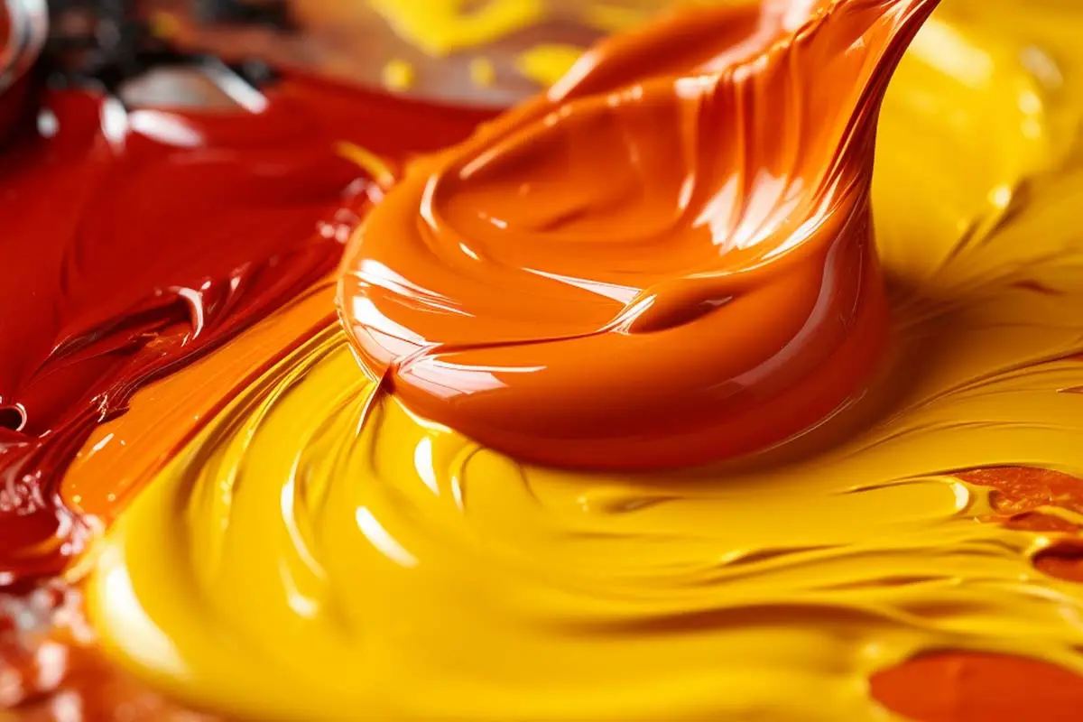
Essential Orange Recipes for Your Palette
Let’s talk about specific paint combinations. You can’t make every kind of orange from just one red and one yellow. Different pairings create entirely different moods.
-
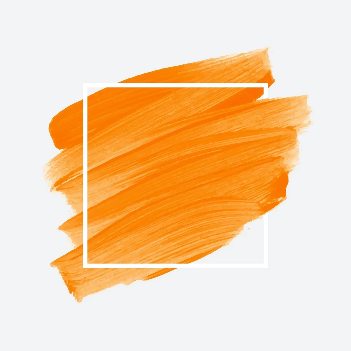
For a Classic, High-Intensity Orange
- The Vibe: This is your classic, punchy sunset or ripe clementine orange. It’s bold, opaque, and makes a statement.
- The Recipe: Mix a Cadmium Yellow Medium with a Cadmium Red Light. Both are warm, opaque, and buttery, so they cover underlying layers really well.
- Best For: Creating strong, opaque layers and being the hero color in a painting.
-
For a Transparent, Glowing Orange
- The Vibe: Think of light shining through a piece of orange sea glass. It feels luminous and full of light.
- The Recipe: Mix a transparent yellow (like a Hansa Yellow) with a transparent red (like a Quinacridone Red).
- Best For: Glazing. A thin layer of this over a white or light-yellow background will literally seem to glow. It’s not great for covering things up, but it’s magic for creating depth.
-
For a Natural, Earthy Orange
- The Vibe: The subtle, sophisticated orange you see in terracotta pots, sandstone cliffs, and old-world frescoes.
- The Recipe: Mix Yellow Ochre with Burnt Sienna. These are natural earth pigments and are already beautifully muted.
- Best For: Landscapes, portraits, and any time you need an orange that feels like it came from the natural world, not a factory.
- Warm Red: A Cadmium Red Light is the classic choice. A professional-grade tube can cost between $25 and $40. For a budget-friendly (and less toxic) option, Naphthol Red is fantastic and usually runs about $12-$15.
- Cool Red: Quinacridone Magenta is my top pick. It’s vibrant and clean.
- Warm Yellow: Cadmium Yellow Medium is the workhorse. Expect to pay between $20 and $35 for a good tube. A great alternative is Hansa Yellow Deep.
- Cool Yellow: A Lemon Yellow or Cadmium Yellow Light.
- Help! My orange is muddy. This is the #1 complaint. It’s almost always because some blue got in there, either from using cool-biased pigments or a dirty brush. The fix? Don’t try to save it. Honestly, you’ll waste more time and good paint trying to ‘fix’ a muddy mix. Scrape it off your palette, wipe your knife, and start over fresh. It’s faster and less frustrating.
- My orange is too harsh and electric. It needs to be neutralized. As we covered, add that pinprick of blue. Or, for a different effect, mix in a bit of an earth tone like Raw Umber or Burnt Sienna. This will calm the orange down beautifully.
- My paint color changes when it dries! Yep, that’s called ‘color shift.’ Acrylics are notorious for drying darker. Some oils can lose a bit of gloss, which makes the color seem less intense. The only real solution is experience. A quick tip: create a reference chart. On a piece of canvas paper, paint a swatch of your common mixes and label them. Once they’re dry, you’ll have a perfect reference for how your mixes will actually look in the final piece.

How to Tone Down an Orange That’s Too Loud
Sometimes you mix an orange that’s just too… much. It’s so bright it feels fake. A beginner’s first instinct is to add black or white. Don’t do it! Adding white just gives you a chalky, pastel peach. Adding black often creates a dirty, lifeless brown.
The pro move is to use its complementary color: blue.
Heads up! Use the very tip of your palette knife to pick up an amount of blue NO BIGGER than a pinhead. You can always add more, but you can’t take it out. For a bright cadmium orange, a speck of a reddish-blue (like Ultramarine) works wonders. Gently mix that pinhead of blue into the edge of your orange pile. You’ll see it instantly lose that electric quality and settle into a more natural, believable hue without looking muddy.

Practical Advice for Every Artist
Look, not everyone has a giant studio stocked with every color imaginable. Whether you’re on a tight budget or just want a simple travel kit, making smart choices is key.
My Recommended ‘Limited Palette’ Shopping List
If I had to start over with a minimal set of paints, I’d get a warm and a cool version of both red and yellow. This small collection is a powerhouse for color mixing.
With just these four tubes (plus a blue and a white), you can mix stunningly clean oranges, greens, and purples. It’s all the color theory you need, right there on your palette.

Is It Cheating to Use a Pre-Mixed Tube of Orange?
I’ve heard some folks say you should never use pre-mixed colors. I think that’s silly. While you absolutely need to know how to mix your own colors, a tube of pre-mixed orange has its place.
If I’m painting a large, flat area that needs to be a perfectly consistent color, using a tube of Cadmium Orange is a lifesaver. Trying to mix a huge batch of orange by hand and keep the color perfectly uniform is incredibly difficult. A tube from a reputable brand is a reliable tool. I use it when consistency matters more than a uniquely mixed shade.
Troubleshooting and Pro-Tips
Okay, let’s tackle the common problems that drive painters crazy.

A Quick Word on Safety
A professional studio is a safe studio. It’s not about being scared of your materials; it’s about respecting them.
Many traditional pigments, especially the cadmiums, are heavy metals and are toxic if you eat them or breathe in the dust. So, no eating or drinking while you paint! I always wear nitrile gloves—it keeps my hands clean and prevents pigments from absorbing through the skin. If you’re using oil-based solvents, make sure your room has good airflow. And for the love of all that is holy, don’t just toss your oily rags in the trash can. They can actually spontaneously combust as the oil cures. Lay them flat to dry outside or store them in a special air-tight metal can with water.
(Disclaimer: I’m an artist, not a safety expert. Always read the warnings on your paint tubes and material safety sheets. When in doubt, be extra cautious. Your health is way more important than any painting.)
Galerie d’inspiration


For a Fiery, Opaque Orange: Start with a Cadmium Red Light. This is your workhorse pigment—a warm, powerful red with a strong bias towards yellow. Mixed with a Cadmium Yellow from a brand like Gamblin or Michael Harding, it produces a dense, brilliant orange that’s perfect for capturing the direct heat of a sunset or the solid color of a poppy.
For a Transparent, Glowing Orange: Choose a cool red like Quinacridone Rose. Its blue bias will neutralize the yellow slightly, creating more subtle, earthy, or peachy oranges. When glazed in thin layers, these mixes create a sense of light shining through the color, ideal for skin tones or atmospheric effects.
The choice depends entirely on whether you want the light to reflect off the surface or emerge from within.
The Impressionists shattered color norms, and their oranges were revolutionary. Instead of mixing a smooth orange on the palette, painters like Monet placed dabs of pure red and pure yellow side-by-side on the canvas.
From a distance, the human eye optically blends these distinct strokes into a vibrant, shimmering orange that feels more alive than any pre-mixed color ever could. This technique, known as ‘broken color’, is a powerful way to create the illusion of light and movement. Try it yourself: create an orange not with your knife, but with your brushwork directly on the canvas.