The Painter’s Guide to Blue: From Muddy Messes to Masterful Mixes
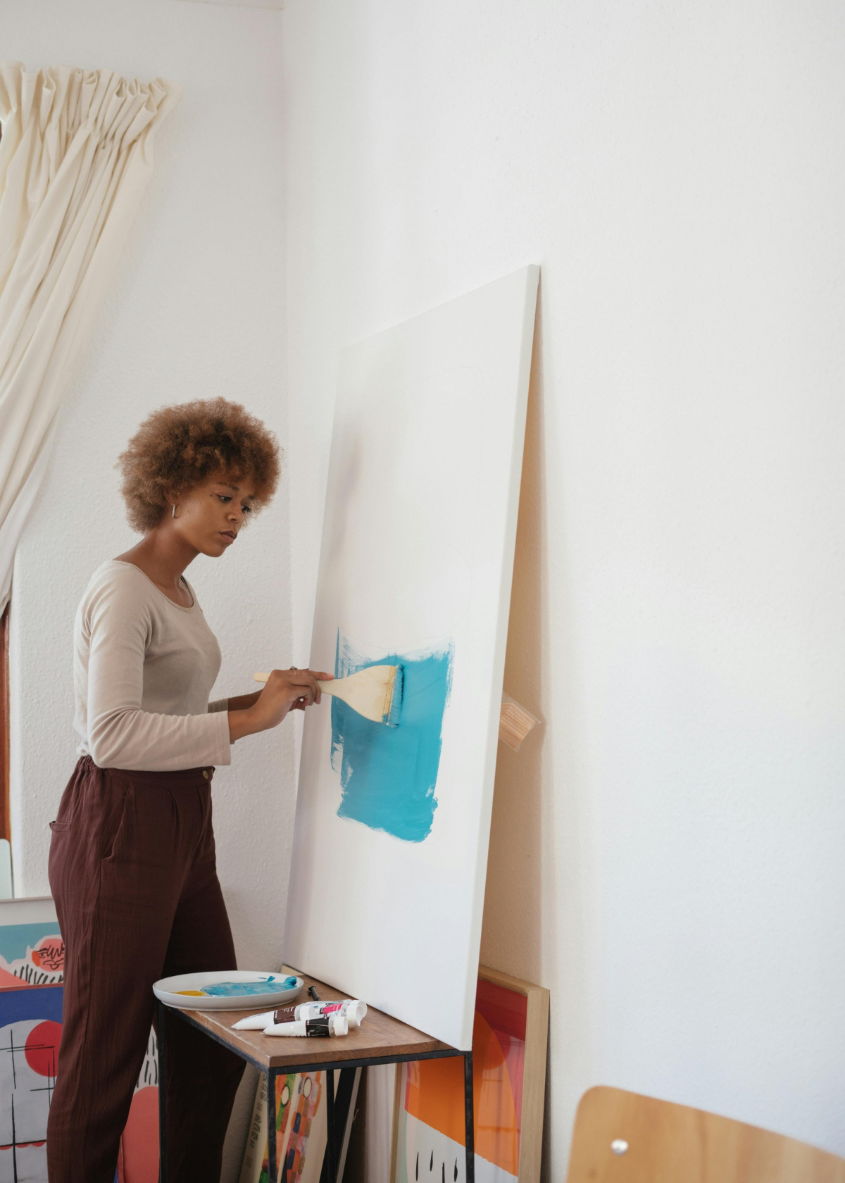
After decades with a brush in my hand, I can tell you that one color has taught me more than all the others combined: blue. One of the first questions I always get from aspiring artists is, “What colors make blue?” It’s a perfectly logical question, but it starts from a place of misunderstanding. In the world of physical paint, blue is a primary color. You don’t make it. You start with it.
In this article
The real art isn’t about creating blue from scratch. It’s about learning the personality of each blue pigment on your palette and knowing how to coax out the exact shade you need. It’s the difference between mixing a vibrant, clean green and a disappointing mud-puddle brown. It’s how you get a blue that looks like a distant mountain at dawn versus one that feels like the deep, crushing sea.
Honestly, this isn’t about following a paint-by-numbers recipe. It’s about building a relationship with your tools. I learned these lessons through trial, a whole lot of error, and frankly, gallons of wasted paint. So, I want to share what I’ve figured out in the studio, not just what you might read in a textbook.

The Big Secret: Why Your Blues Get Muddy
To really get a handle on mixing colors, you need to understand a tiny bit of physics. Don’t worry, it’s painless, and knowing this will save you from making a ton of muddy messes. We see color in two ways: with light (like on your phone screen) and with pigment (like paint on a canvas).
On a screen, you’re using additive color. You start with black (no light) and add red, green, and blue light together to make all the other colors. Mix them all, and you get pure white. On a screen, blue can be a pure, perfect thing with no hidden agenda.
But as painters, we live in the world of subtractive color. We start with a white canvas that reflects all light. The pigments we add work by absorbing—or subtracting—parts of that light. The color that’s reflected back is what we see. And here’s the critical piece of information that most beginner guides just gloss over: no paint pigment is perfectly pure.
Every tube of blue paint you can buy has a secret, a “color bias.” It’s not just ‘blue’; it’s a blue that leans a tiny bit toward green or a little bit toward red. This bias is the single most important thing to understand for mixing clean, vibrant colors. If you mix a blue that has a green bias with a red, you’re secretly adding red + blue + green. Since red and green are opposites, they cancel each other out and create… you guessed it, mud. Understanding this is everything.
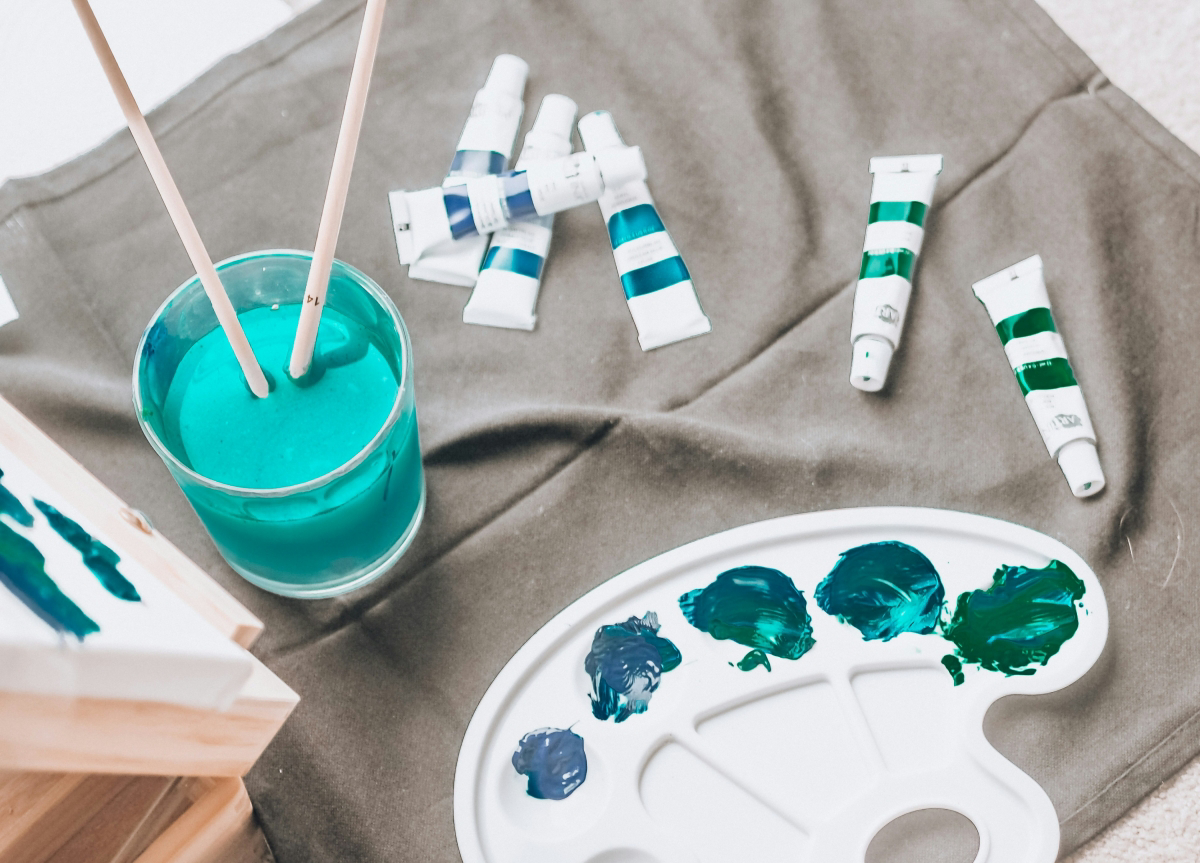
Your First Blue Palette: A Pro’s Shopping List
A good artist knows their tools inside and out. You don’t need dozens of blues. You just need a couple of essential ones and a deep understanding of how they behave. By the way, these principles and pigments apply to both oil and acrylic paints, though my own muscle memory comes from a lifetime of working with oils.
If you’re on a budget and just starting out, here’s my advice: get just two blues. An Ultramarine Blue (your warm, red-biased blue) and a Phthalo Blue (your cool, green-biased blue). With those two, a good white, a primary yellow, and a primary red, you can mix nearly any color you’ll ever need. It’s the perfect learning setup.
The Workhorse: Ultramarine Blue
This is my go-to blue. Historically, it was insanely expensive, but today’s synthetic versions are affordable and just as beautiful. Ultramarine has a distinct red bias. This makes it your absolute best friend for mixing clean, rich purples and violets. A touch of a cool red (like a Quinacridone Magenta) mixed with Ultramarine will create an electric purple. But because of that hidden red, trying to mix a bright green with it is a recipe for dull, olive-toned greens. It’s also fairly transparent, which makes it a dream for glazing to build up deep, rich shadows.
Good to know: For a beginner, a student-grade line like Winsor & Newton’s Winton (for oils) or Liquitex Basics (for acrylics) is a fantastic place to start. A tube of Ultramarine will run you about $6 to $9.
The Powerhouse: Phthalo Blue (Green Shade)
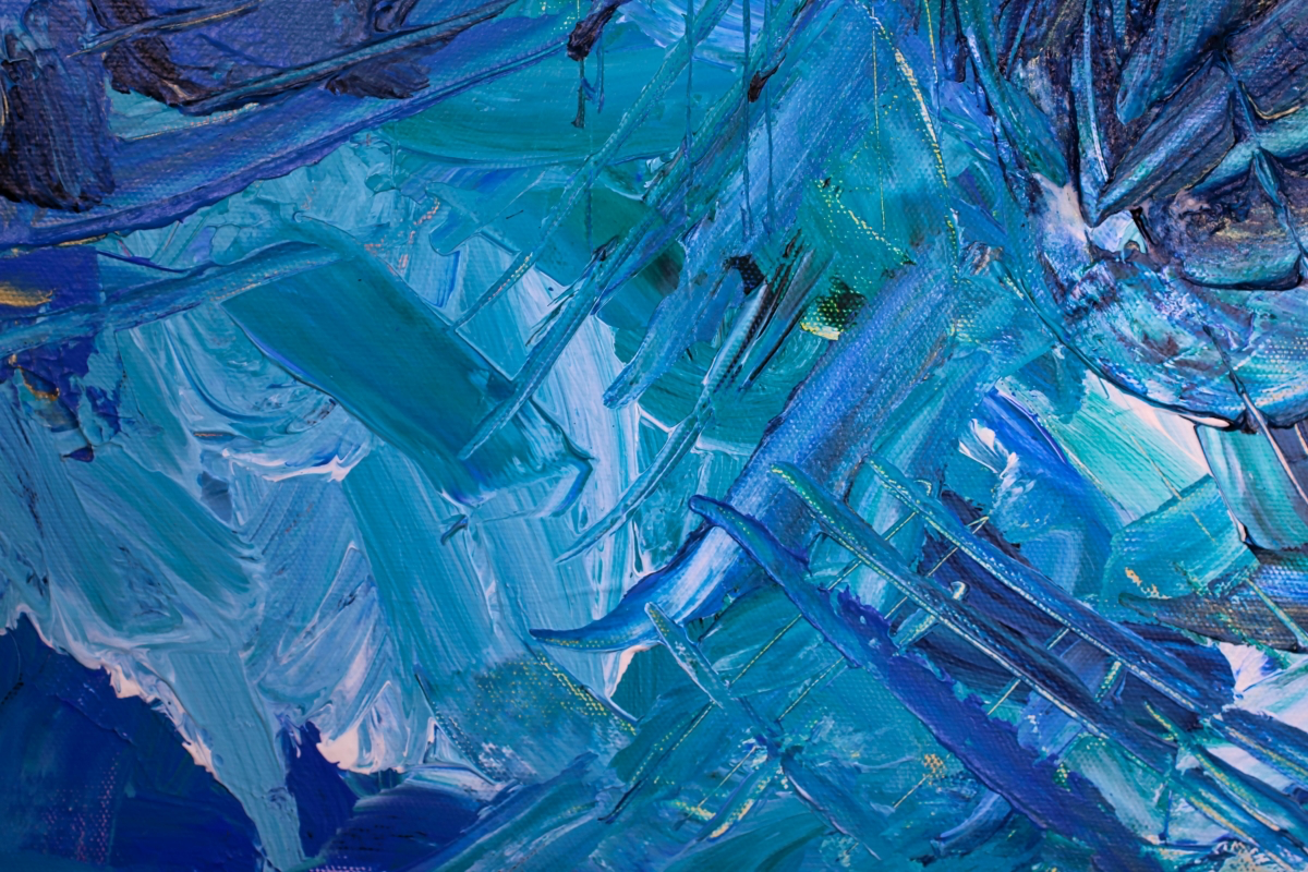
Heads up! This pigment demands respect. I always tell new painters to treat it like a potent spice—a tiny bit goes a ridiculously long way. Phthalo Blue has immense tinting strength and a strong green bias. This makes it the undisputed champion for mixing bright, lively greens. Mix it with a lemon yellow (which also has a green bias), and you can create a whole spectrum of stunning turquoises, teals, and vibrant leaf greens. Of course, that green bias makes it terrible for mixing purples; you’ll get a muted, grayish violet at best.
Quick Tip: To see what I mean by tinting strength, try this. Mix a pea-sized amount of Titanium White with just the tiniest pinhead speck of Phthalo Blue. See how much that little speck transformed the white? That’s power. A tube of Phthalo is usually in the same $6-$9 price range.
Expanding Your Palette: Two More Blues Worth Knowing
Once you’ve mastered the two workhorses, you might find you need something with a bit more subtlety.
Cerulean Blue is a calmer, more opaque blue with a gentle green bias. Its tinting strength is much lower, so it won’t bully your other colors. This makes it my absolute favorite for painting skies. You can mix it with white and a tiny dab of yellow ochre to get that believable atmospheric haze. The real stuff is pricey, often $20-$30 or more for a small tube, because it’s made with a cobalt compound. Many brands offer a “Cerulean Hue,” which is a mix of other pigments (usually Phthalo and white). The hue is a great budget-friendly option, but it just doesn’t handle with the same delicate touch as the real pigment.
Cobalt Blue is what I consider a true middle blue. It doesn’t lean too heavily toward red or green, making it a versatile, though also expensive, option. It’s semi-transparent and has a classic, clean feeling. Its neutrality means it can mix decent greens and decent purples, though neither will be as pure as what you can get from your biased blues. Its real strength is as a pure, standalone blue that doesn’t push a mix too far in either direction. (Just a heads-up, we’ll talk about safety with cobalt pigments in a bit!)
Mixing Like a Pro: Practical Techniques
Okay, let’s put these tubes to work. The goal is always to control a color’s three properties: its hue (the color itself), its value (lightness/darkness), and its saturation (intensity).
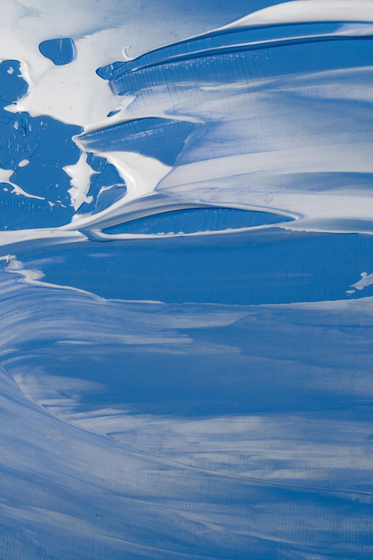
Making Blue Lighter
The first instinct is to just add white. That works, but the type of white you use really matters. I keep two on my palette:
- Titanium White: This is opaque and powerful. It’s great for making flat, pastel tints and for creating solid, opaque sky colors. It can sometimes make colors feel a little chalky, though.
- Zinc White: This is a transparent white with much weaker tinting strength. It lightens a color without making it opaque or chalky. Mixing Zinc White with Ultramarine creates a luminous, glowing light blue that you could never get with Titanium.
Making Blue Darker
Whatever you do, please don’t just add black. Adding black pigment is the fastest way to kill your color, leaving you with a dull, lifeless dark. I haven’t had a tube of pure black on my main palette in twenty years. Professionals create rich, complex darks by mixing blue with its complementary color (orange) or with dark earth tones.
My go-to method: Mix Ultramarine Blue with Burnt Sienna. Burnt Sienna is a reddish-brown that acts like a dark, low-intensity orange. This mix creates a stunning range of neutral grays and deep, dark blues that look like authentic shadows.
Try This Now: On your palette, mix your blue with a touch of black. In a separate pile, mix your blue with some Burnt Sienna. Put the two darks side-by-side. See how one is flat and dead, and the other feels rich and alive? That’s the secret to believable shadows.
Getting the Exact Hue You Want
- For Turquoise or Teal: Start with a green-biased blue like Phthalo. Add a tiny bit of a green-biased yellow (like a Lemon Yellow). The result will be exceptionally bright and clean.
- For Indigo or Violet-Blue: Start with a red-biased blue like Ultramarine. Add a small amount of a cool, red-violet pigment like Quinacridone Magenta. This mix will be clean and vibrant.
- For a Believable Sky: Start with Cerulean or Cobalt. Add Titanium White for an opaque sky. But here’s the pro tip: add a tiny, almost invisible touch of Yellow Ochre or a light red to the mix. Real skies are rarely just blue and white; they have subtle temperature shifts that make them feel real.
Blue Beyond the Canvas: A Quick Look at Screens and Safety
Understanding a color’s context is huge. For centuries, a good blue pigment was a symbol of power and wealth, often worth more than gold and reserved for the most important parts of a painting in traditional European art. In other parts of the world, plant-based blues like Indigo became central to culture and textiles, eventually giving us the iconic color of denim.
Today, a new challenge has emerged: the difference between screen and print. Your computer screen uses the RGB (Red, Green, Blue) light system. But a printer uses CMYK (Cyan, Magenta, Yellow, Black) ink. That brilliant, electric blue you created on your screen is often ‘out of gamut,’ meaning a standard printer simply can’t reproduce it with ink. It will come out looking duller and sometimes purplish. To avoid this, pros working digitally will often design in CMYK mode from the start or use a specific pre-mixed ink system (like Pantone) for critical jobs like logos.
Studio Safety Isn’t Boring, It’s Essential
A professional’s workshop is a safe workshop. Paint is made of chemicals, and you’ve got to respect them.
- Pigment Safety: Some traditional pigments, like genuine Cobalt and Cerulean, contain heavy metals. They are toxic if ingested or inhaled as dust. My rules are simple: no eating or drinking in the studio, and always have good ventilation.
- A lesser-known trick: Look for the “AP” (Approved Product) seal on your paints. It means the material is certified non-toxic in its liquid form by toxicologists. For colors like Cadmiums and Cobalts, choosing a “hue” version that has the AP seal is a great, safer choice for a home studio.
- Disposal: If you work with oils, you’ll use solvents. Never, ever bunch up rags soaked in oils and solvents; they can spontaneously combust as they dry. Lay them flat to dry in a safe spot or store them in a sealed metal container with water. And never wash paint or solvents down the drain—collect them and take them to your local hazardous waste disposal facility. It’s just part of being a responsible artist.
Blue is so much more than a spot on the color wheel. It’s a collection of unique materials, each with its own story and personality. You won’t master it in a day. You learn it over a lifetime of paying attention to how it behaves. The real secret to making any blue you want is to stop trying to create it from nothing, and instead, start listening to the beautiful, imperfect blues you already have.
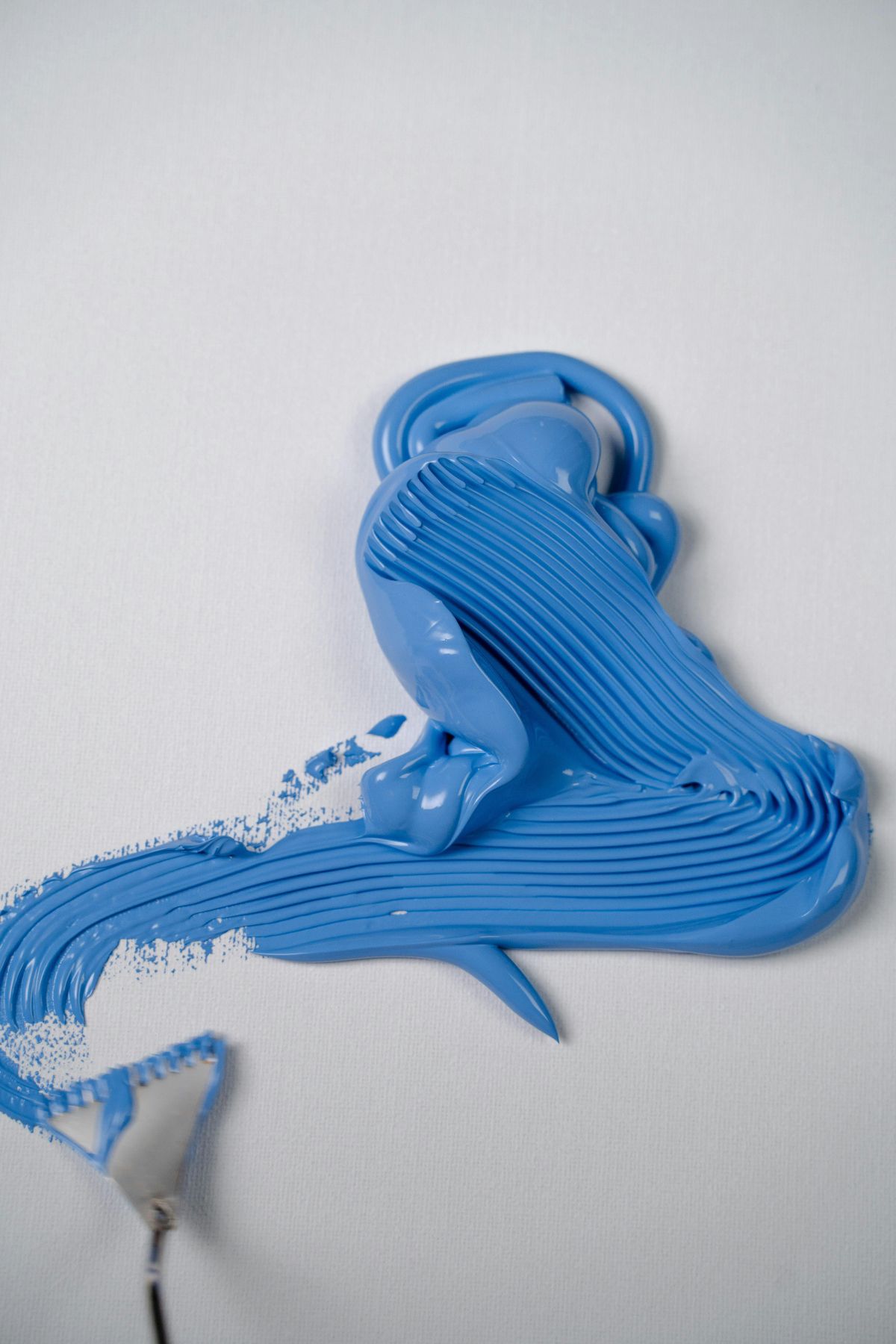
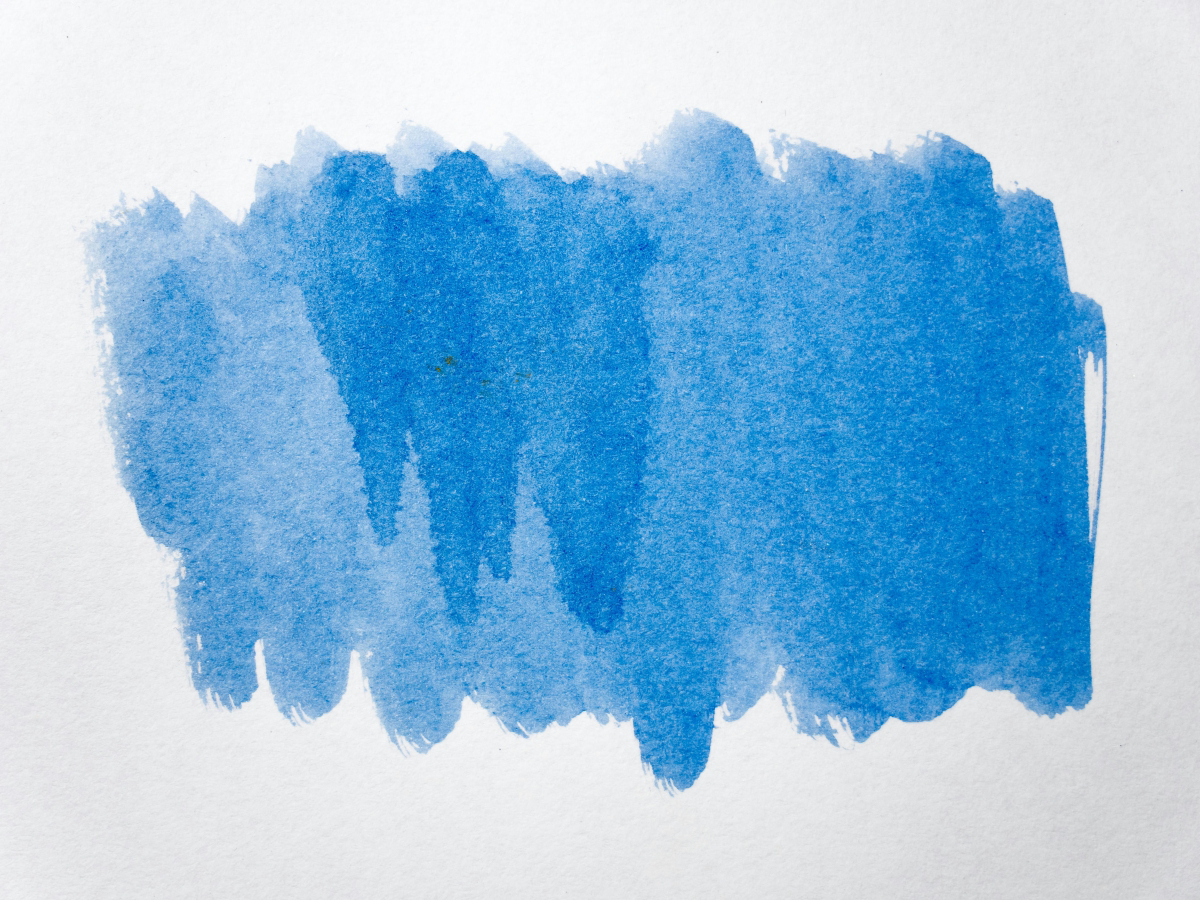
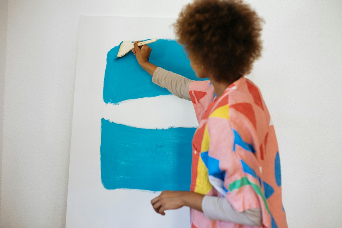
Galerie d’inspiration
Ultramarine Blue: Think of it as the classic, romantic blue. With a distinct red bias, it’s the secret to creating rich, warm violets when mixed with a cool red like Alizarin Crimson. Its granulating properties, especially in watercolor, create beautiful, subtle textures perfect for atmospheric skies and moody shadows. A staple from brands like Winsor & Newton.
Phthalo Blue (Green Shade): This is the modern powerhouse. A cool, green-biased blue with ferocious tinting strength—a tiny dab goes a very long way! It’s non-granulating and transparent, creating clean, electric greens and turquoises when mixed with a lemon yellow. Be warned: its staining power is legendary, as anyone using Golden or Liquitex brands knows.
The choice depends on your goal: Ultramarine for depth and texture, Phthalo for clean, high-impact vibrancy.


