Stop Using Boring Wallpapers: A Pro’s Guide to Finding and Creating the Perfect Background
I’ve made a career out of pixels. As a digital designer, my day job is all about obsessing over the tiny details—logos, color schemes, website flows—that shape how people experience a brand online. But you know the one digital space we often completely ignore? The wallpaper on our own phones and computers.
In this article
Think about it. It’s the first thing you see when you unlock your phone and the last thing you see before you close your laptop. It can set your mood for the whole day, either calming you down or revving you up. After years of designing for others, I’ve realized that choosing a great wallpaper is a small but really meaningful act of personalizing your own space.
So many of us just grab the first pretty picture we find online and call it a day. But the pros learn to look deeper. We think about technical quality, how the image works with all your icons, and even the subtle story it tells. It’s not just about finding a nice photo; it’s about picking an image that genuinely works for you. Let’s go beyond a basic image search and get into the good stuff.
1. The Techy Stuff: Why Image Quality Isn’t Up for Debate
Before we get into the fun, artistic part, we have to cover the boring-but-essential technical details. Honestly, this is where 90% of bad wallpapers come from. A stunning photograph can turn into a blurry, pixelated nightmare if it’s not the right spec for your screen. Understanding this will save you a ton of frustration.
Resolution is Everything
Your screen is made of millions of tiny dots of light called pixels. The resolution is just the total number of those dots, written as width x height (like 1920 x 1080). Here’s the golden rule: your wallpaper image must have at least the same resolution as your screen. If the image is smaller, your device has to stretch it to fit, and that’s what causes that ugly, fuzzy look we call pixelation. You can always make a big image smaller without losing quality, but you can never successfully make a small image bigger.
Not sure what your resolution is? It’s easy to find.
- On Windows: Just right-click your desktop and choose ‘Display settings’. You’ll see ‘Display resolution’ listed right there.
- On Mac: Go to the Apple menu> System Settings> Displays. Your resolution will be listed.
- On a Phone (iPhone or Android): Honestly, the fastest way is to just Google “[Your Phone Model] screen resolution”. You’ll have the answer in seconds.
By the way, you might see the term PPI (Pixels Per Inch). Modern phones have incredibly high PPI, making their screens look super sharp. The downside? They are ruthless at exposing low-quality images. A photo that looked fine on an old monitor will show all its flaws on a new phone screen.
Getting the Shape (Aspect Ratio) Right
Aspect ratio is just the relationship between an image’s width and height. A desktop monitor is wide (typically 16:9), while a smartphone is tall (more like 19.5:9). If you slap a wide desktop wallpaper on a tall phone, your phone has to crop the heck out of it, and you’ll probably lose the best part of the picture. The reverse is also true—a tall phone photo will have giant black bars on the sides of a computer monitor.
When you’re hunting for a wallpaper, look for one that already matches the general shape of your device. Many great wallpaper sites offer downloads for both desktop and mobile for this very reason.
A Quick Word on File Types
You’ll mostly see two main file types: JPEG and PNG. For photos, a high-quality JPEG is usually your best bet. It uses clever compression to keep the file size down, which is great. The catch is that this compression is ‘lossy,’ meaning it throws away a tiny bit of data. At high quality, you won’t notice, but a low-quality JPEG will look blocky and awful.
PNG, on the other hand, is ‘lossless,’ so no quality is sacrificed. This makes it perfect for graphics, logos, or illustrations with sharp lines and flat colors—they’ll look incredibly crisp. The trade-off is that the file sizes are usually much bigger. So, for that epic landscape photo, a good JPEG is fine. For a minimalist graphic wallpaper, go with PNG.
2. The Art of a Great Background: Thinking Like a Designer
Okay, now that your image is technically sound, let’s talk art. A wallpaper has a job: it needs to look amazing behind all your apps, widgets, and notifications. It shouldn’t fight with them; it should support them.
The ‘Busy Background’ Problem
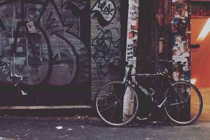
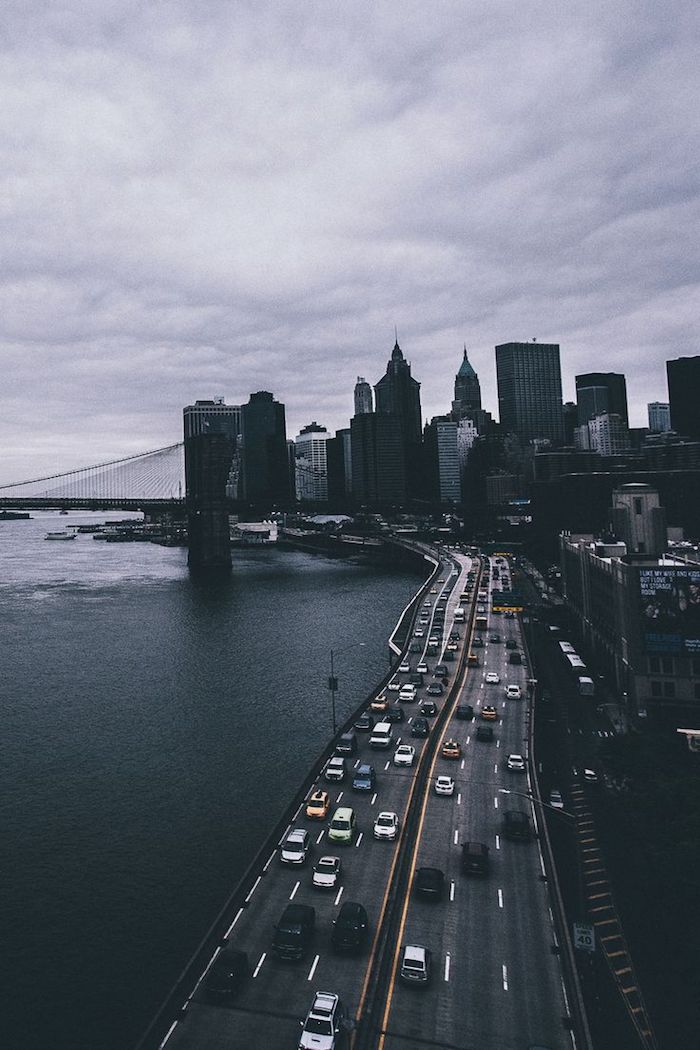
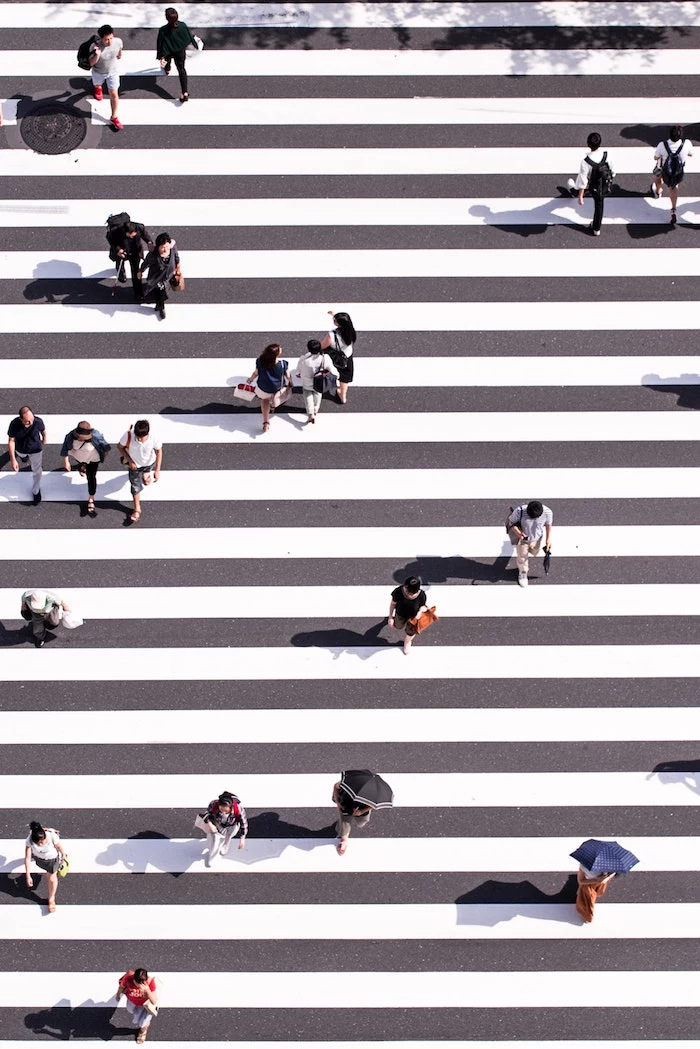
This is probably the most common mistake I see. An image with way too much detail, a dozen competing colors, or a crazy pattern just creates visual chaos. Your app icons get lost, text is impossible to read, and your brain doesn’t know where to look. I learned this the hard way. I once used this incredible, detailed photo of a New York City street scene. It looked fantastic… until I spent a full minute hunting for my green Messages app against a sea of green taxi cabs and street signs. Never again.
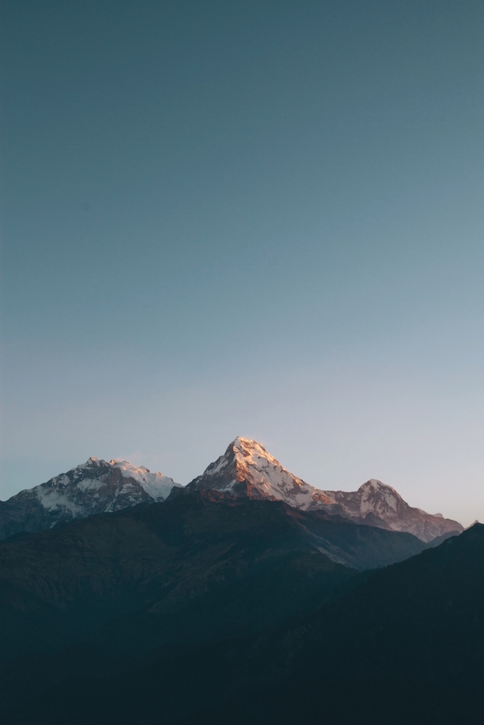
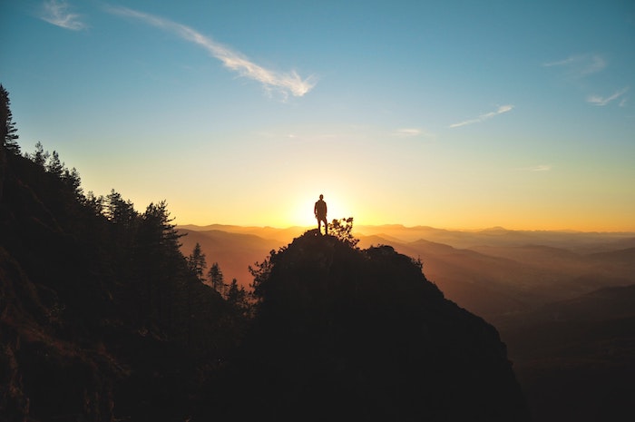
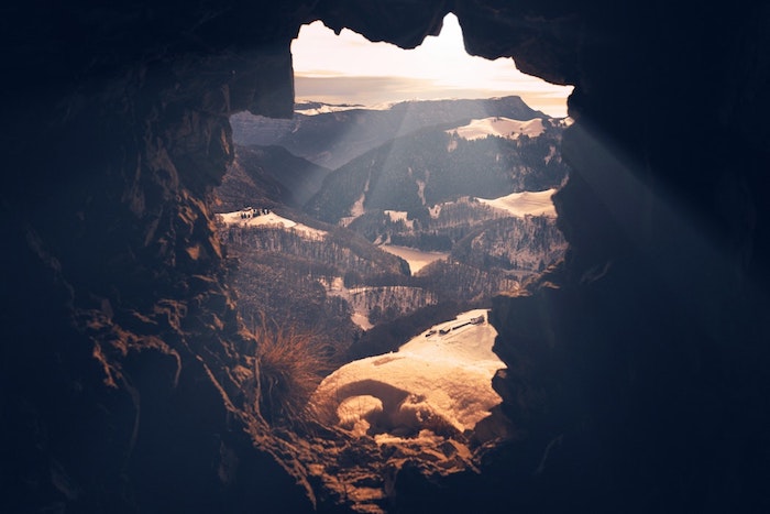
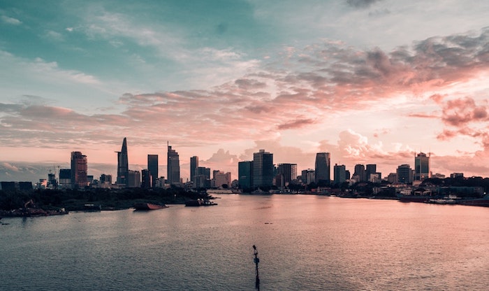
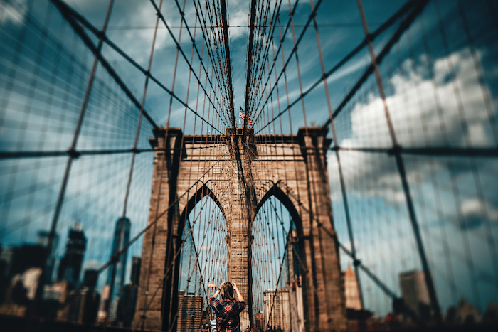
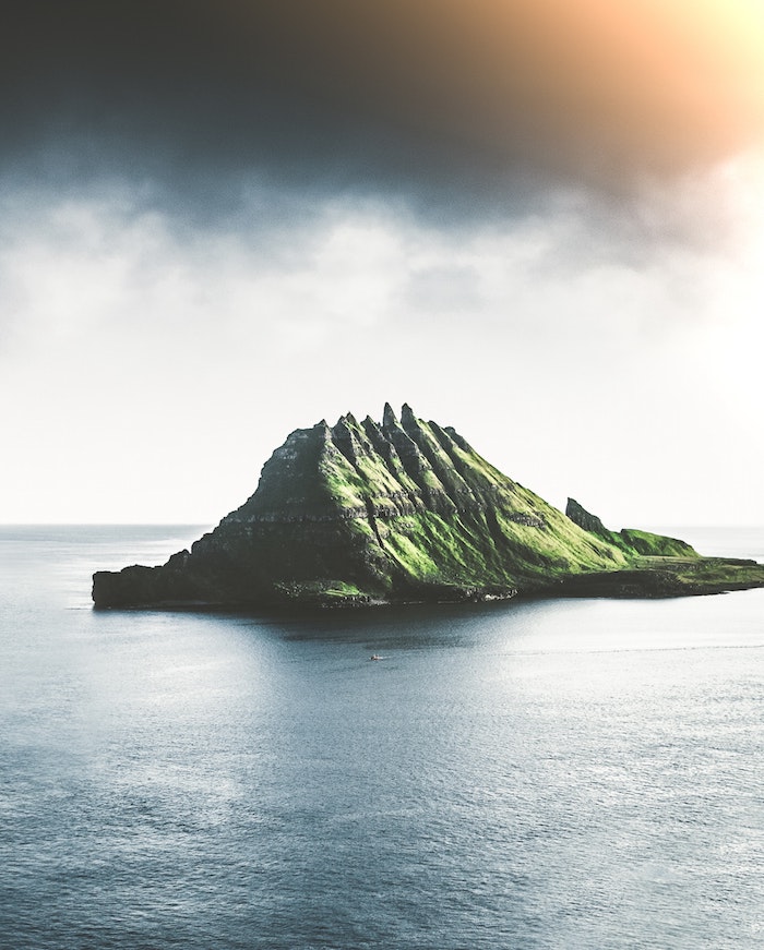
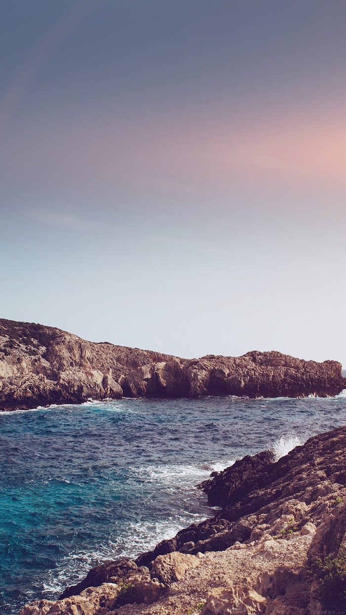
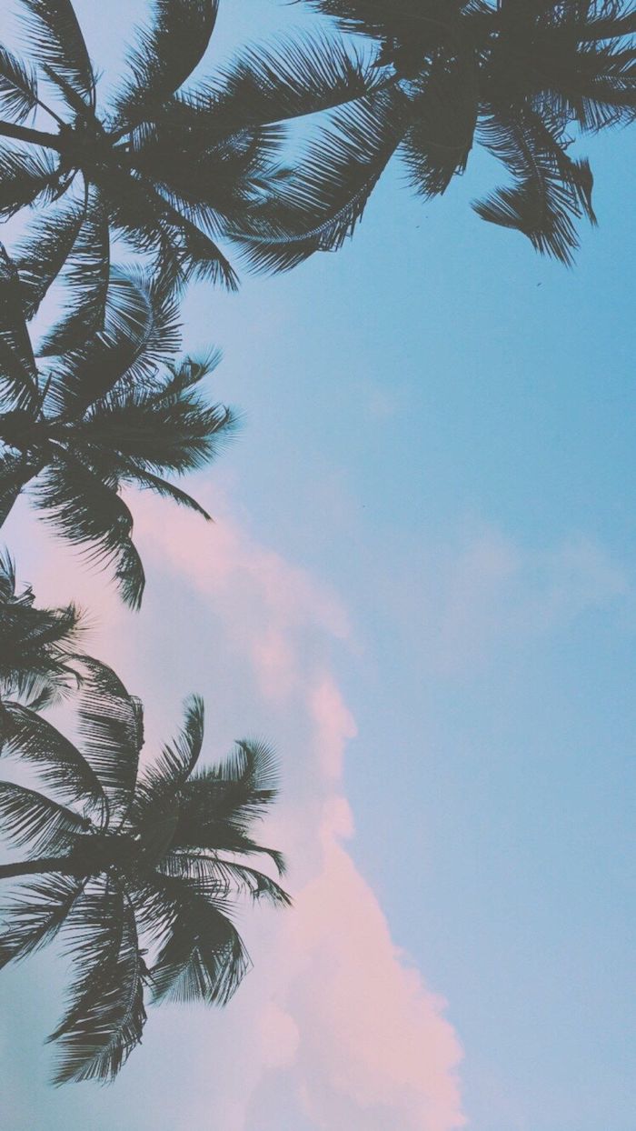
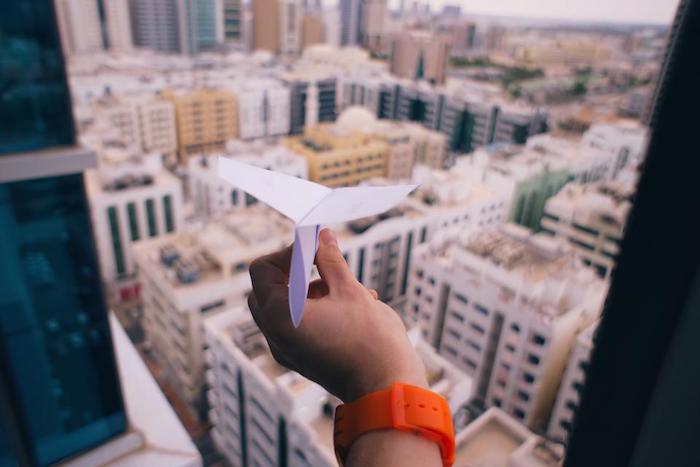
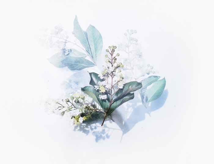
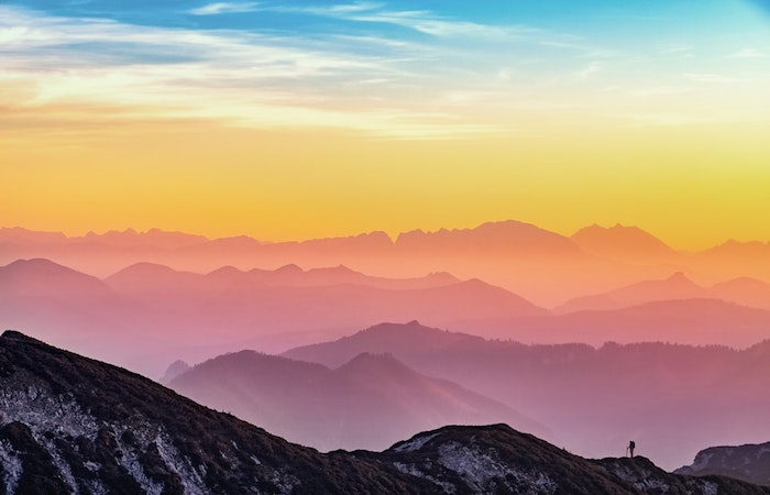
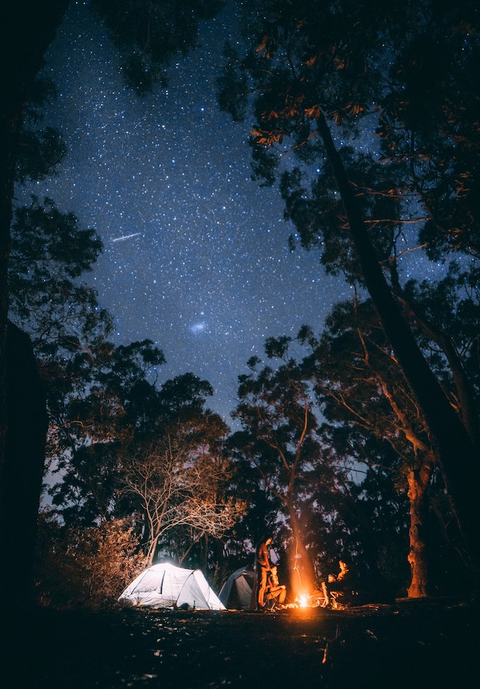
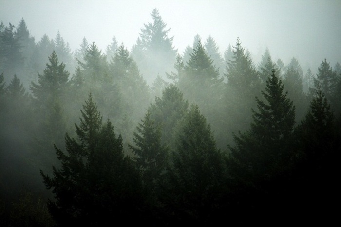
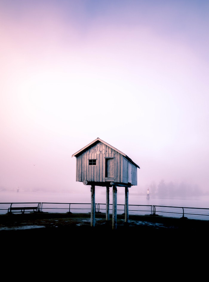
The solution? Look for images with ‘negative space’—a fancy term for the calm, uncluttered parts of a picture. A single boat on a glassy lake, a lone tree in a misty field, or an interesting architectural detail against a clear sky all make for brilliant wallpapers. They give your icons room to breathe.
Composition Tricks to Steal
You don’t need an art degree, but a few basic composition ideas can change everything.
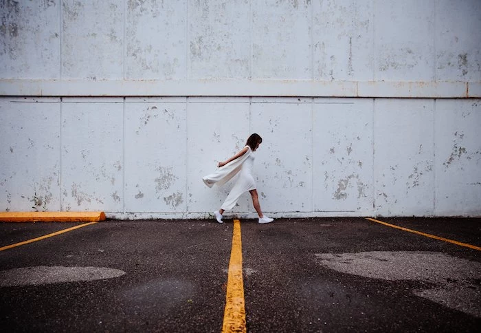
- Rule of Thirds: Imagine a 3×3 grid over your screen. The most visually pleasing photos often place the main subject along those lines, not dead center. Look for a wallpaper where the cool part is off to one side. This naturally leaves the other side open for all your stuff.
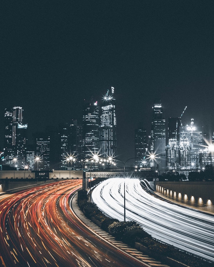
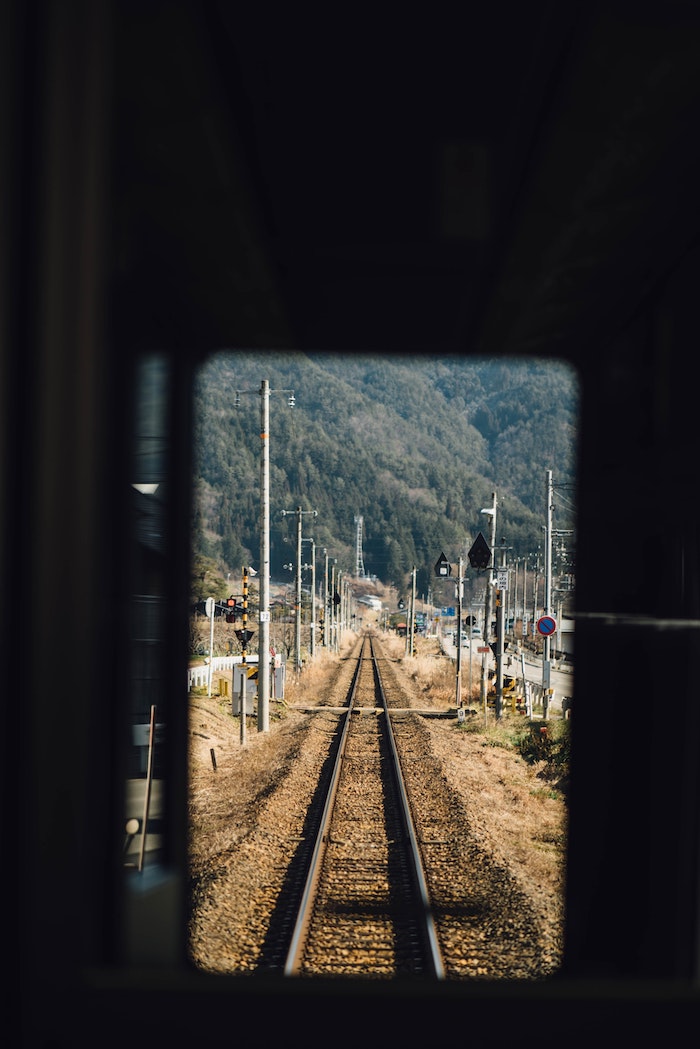
- Leading Lines: Photos with strong lines (a road, a fence, a coastline) are fantastic. They guide your eye through the image, and you can use them to draw attention away from your icons, making the whole layout feel more intentional.
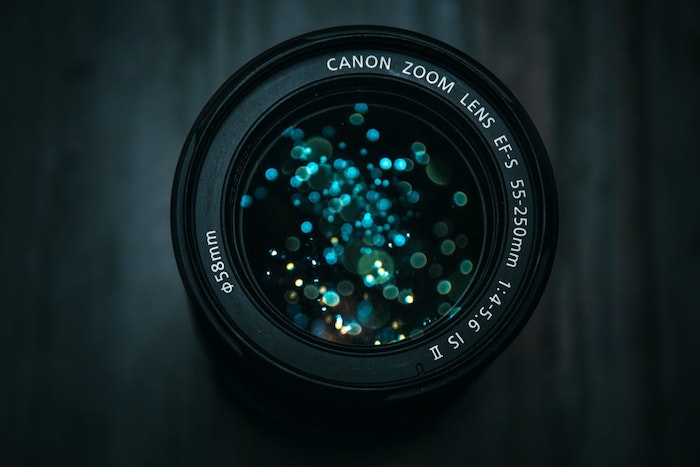
- Depth of Field: You know those photos where the subject is perfectly sharp and the background is beautifully blurry? They make for A+ wallpapers. The blurred background is interesting but not distracting, creating the perfect canvas.
Quick Challenge: Grab your phone. Open your camera roll and spend just 60 seconds looking for a photo with great negative space. Set it as your wallpaper. See how it feels. This is the fastest way to train your eye!
3. Where to Find Great Images (Legally!)
Alright, let’s have a frank conversation. You can’t just grab any image from a Google search. Most are protected by copyright, and as a creator, it’s a big deal. People pour their heart and soul into creating art, and just taking it devalues their work. But beyond the ethics, it’s a security risk. Random wallpaper sites are often loaded with sketchy ads and can even bundle malware with downloads. I’ve had to help friends clean their PCs after a “free” wallpaper installed some nasty extras.
The good news? There are amazing places to get high-quality, legal-to-use images.
- Unsplash and Pexels: These are my go-to’s. They have huge libraries of gorgeous photos from talented photographers all over the world, and their licenses are super generous, making them perfect for personal use.
- Museum and Library Archives: This is my secret weapon. Institutions like The Met, the Art Institute of Chicago, and the Rijksmuseum have put enormous parts of their collections in the public domain. You can download a stunning, ultra-high-resolution Japanese woodblock print or a classic painting for free. Just search for something like “The Met Open Access” to find their collection.
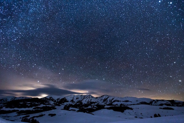
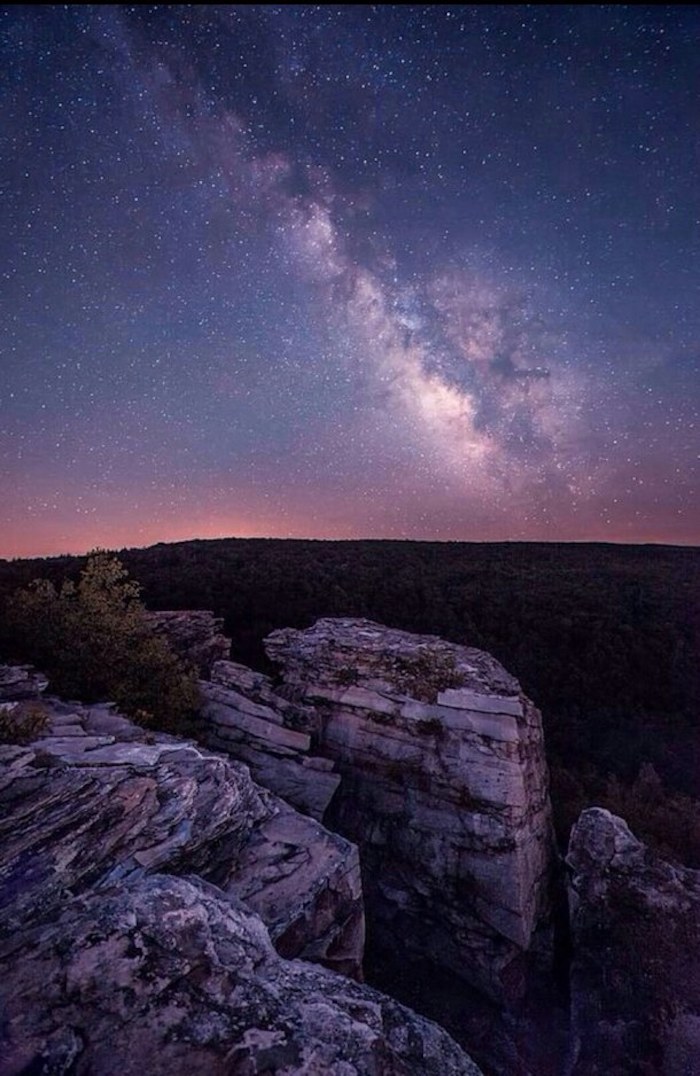
- NASA’s Image Libraries: Want mind-blowing pictures of galaxies, nebulae, and planets? Go straight to the source. NASA’s images are almost always public domain and the quality is, well, astronomical.
4. Prepping Your Image for the Perfect Fit
Found a great image? Awesome. Now, let’s spend five minutes making it perfect. You don’t need Photoshop; the free photo editor on your phone or computer is plenty powerful.
Crop and Frame It
First, crop the image to the correct aspect ratio for your screen. Then, slide the crop box around to frame the subject perfectly. This is your chance to apply the Rule of Thirds! Nudge that mountain peak or that cool building off-center. This one small tweak can make a photo look ten times more professional.
Simple Tweaks for Mood
Once it’s framed, play with these settings a little:
- Brightness: Is it a bit too dark or bright? A tiny adjustment here works wonders.
- Contrast: This is the difference between lights and darks. For a wallpaper, sometimes reducing the contrast slightly can make it softer and less distracting behind your icons.
- Saturation: This controls how punchy the colors are. If the colors are so vibrant they’re screaming at you, dial the saturation back just a bit.

Pro-Level Trick: The Widget-Friendly Wallpaper
With home screens full of widgets, finding a clean spot can be tough. Here’s a trick the pros use that anyone can do with a free tool like Canva.
- Upload your photo to a new Canva project.
- Select the image and duplicate it, so you have two identical copies layered perfectly on top of each other.
- Select the bottom layer. Go to ‘Edit Photo’ and use the ‘Blur’ tool. Crank it up until it’s nice and soft.
- Now, select the top, sharp layer. Find the ‘Eraser’ tool. Erase the part of the top image where your widgets will go.
Boom! You now have a wallpaper that’s sharp and beautiful but has a perfectly blurred, non-distracting area for your widgets. It looks incredibly slick.
5. Taking It a Step Further: Advanced Setups
Feeling adventurous? Your wallpaper doesn’t have to be a single static image.
Dynamic & Live Wallpapers
Most modern operating systems support dynamic wallpapers that change with the time of day or live wallpapers that are short, looping videos. They can be gorgeous, but heads up: they use more processing power and can be a real drain on your battery life. I use them, but sparingly.
Curating a Collection
My favorite technique is using a wallpaper rotator. On Windows, you can use the built-in ‘Slideshow’ background feature, or for more control, grab a free app like John’s Background Switcher. For Mac users, an app like Irvue is brilliant because it automatically pulls fresh, beautiful photos from Unsplash for you.
The key is to create a dedicated folder with 30-50 of your absolute favorite images, all pre-cropped and ready to go. It’s like having a personal art gallery that surprises you every day.
The Dual-Monitor Challenge
For my work setup with two monitors, you can either put the same image on both, or find two that complement each other. But the real pro move is to use a single, ultra-wide panoramic image that spans both screens. For this, you need a dedicated source. I usually head over to a site like wallhaven.cc. The key is to use their search filters to enter your combined resolution—for two standard 1080p monitors side-by-side, you’d search for 3840×1080.
Final Thoughts: It’s Your Space, Own It
Your wallpaper is more than just a pretty picture. It’s the visual foundation of your digital life. Choosing it with a bit of care can reduce clutter, give you a moment of calm, and make your tech feel more human. It’s a small detail, but in a world lived on screens, the small details are the ones that matter.
So my final piece of advice is this: trust your own eye, but use these principles to guide it. Look for quality, respect the artists, and think about how the image actually functions. Your screen is your canvas. Make it something you love looking at, every single day.
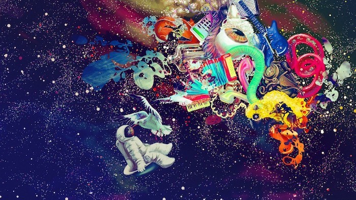
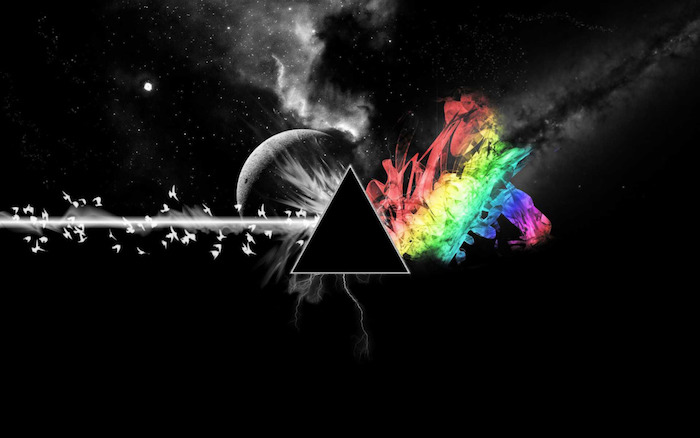
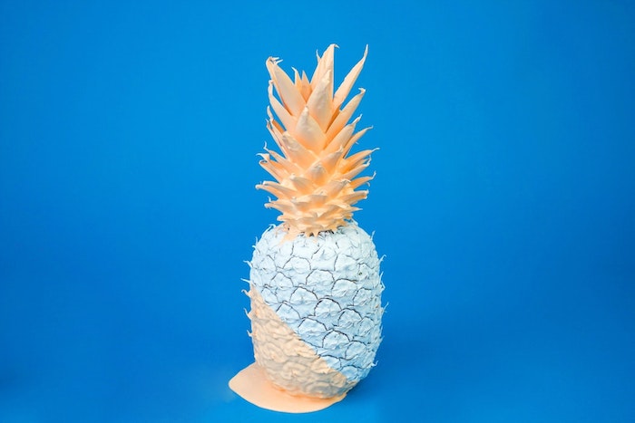
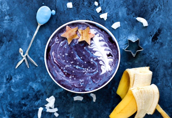
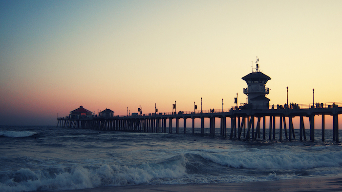
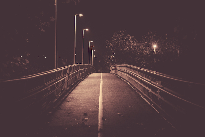
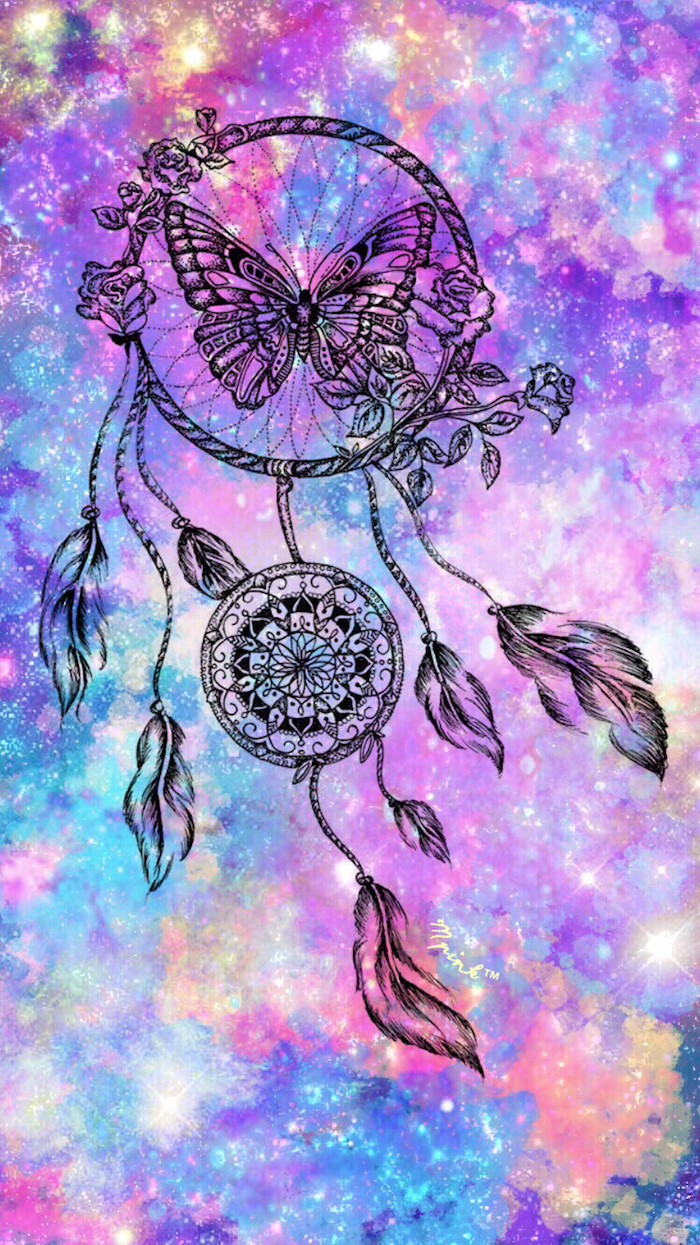
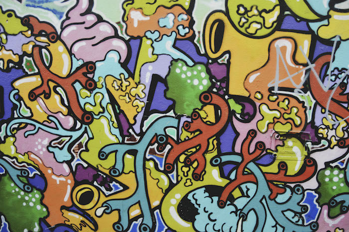
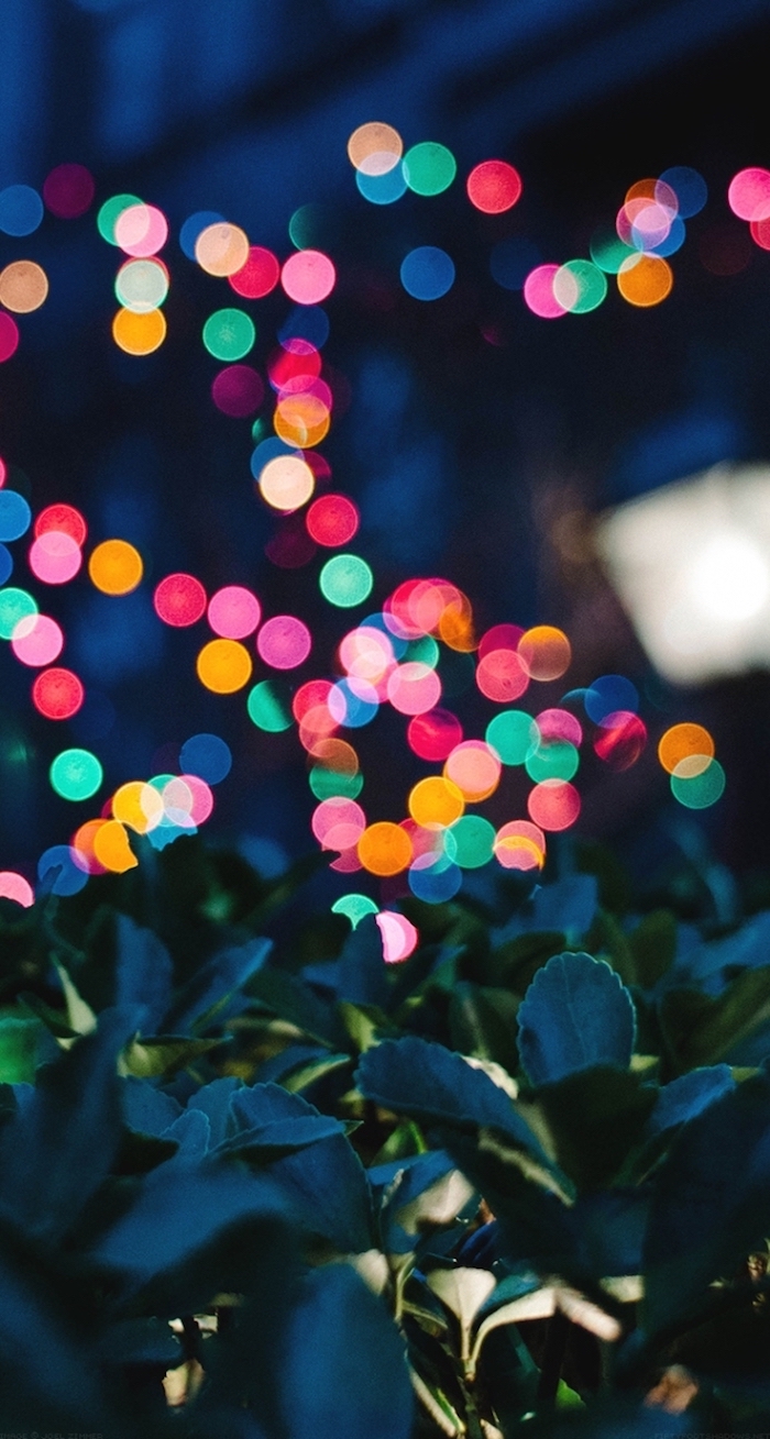
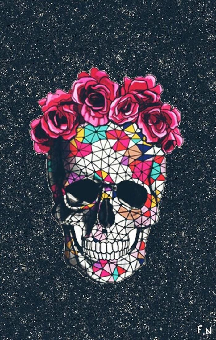
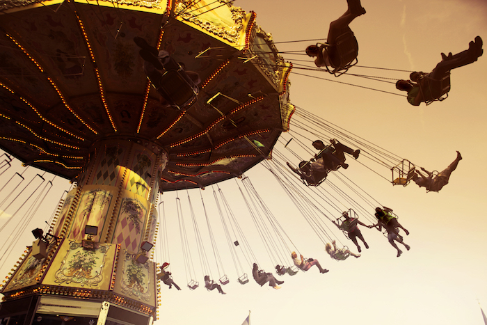
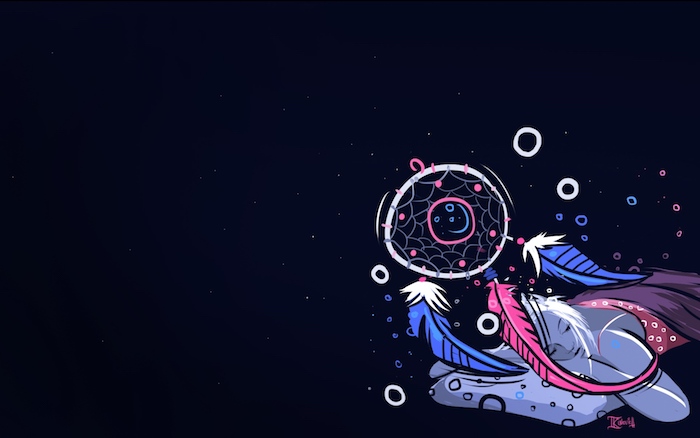
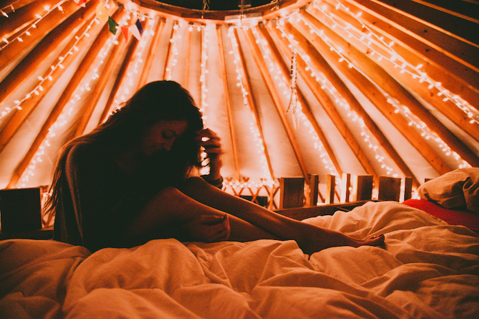
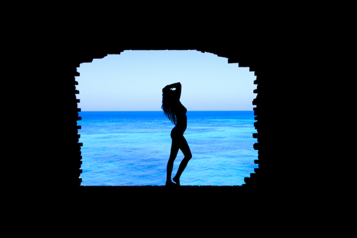
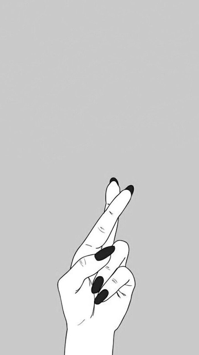
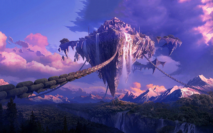
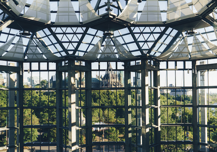
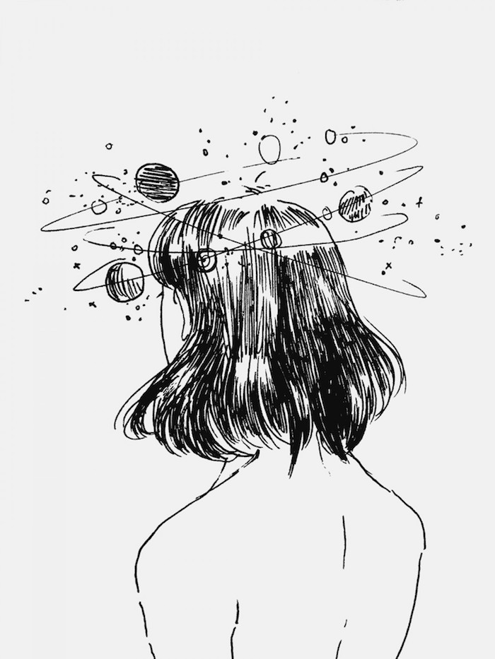
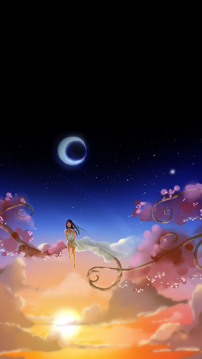
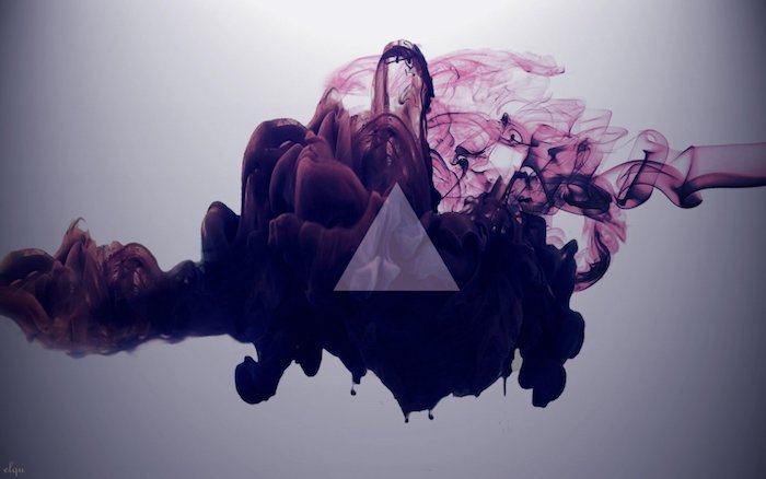
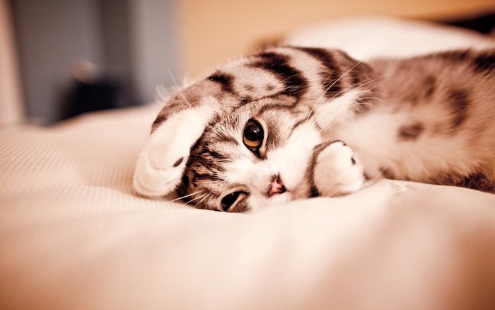
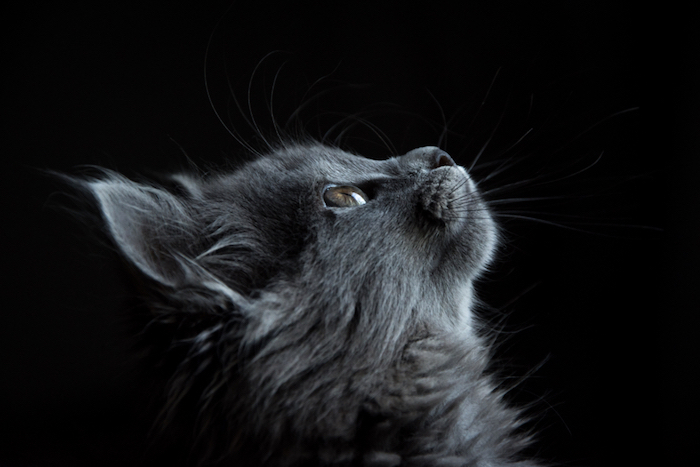
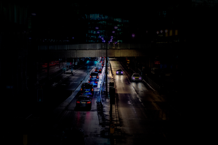
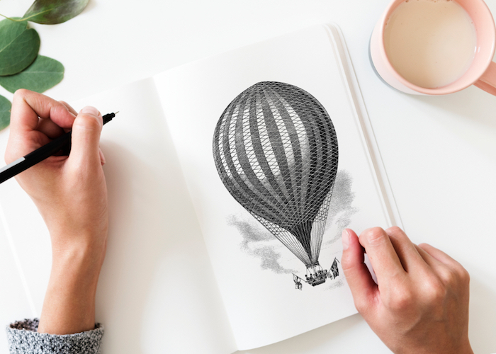
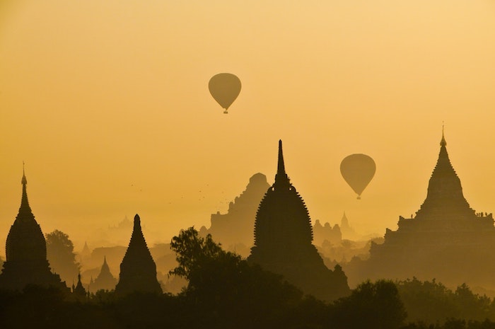
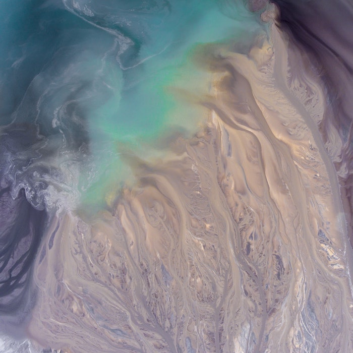
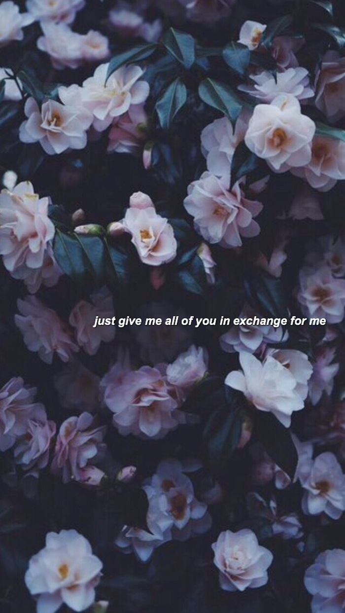
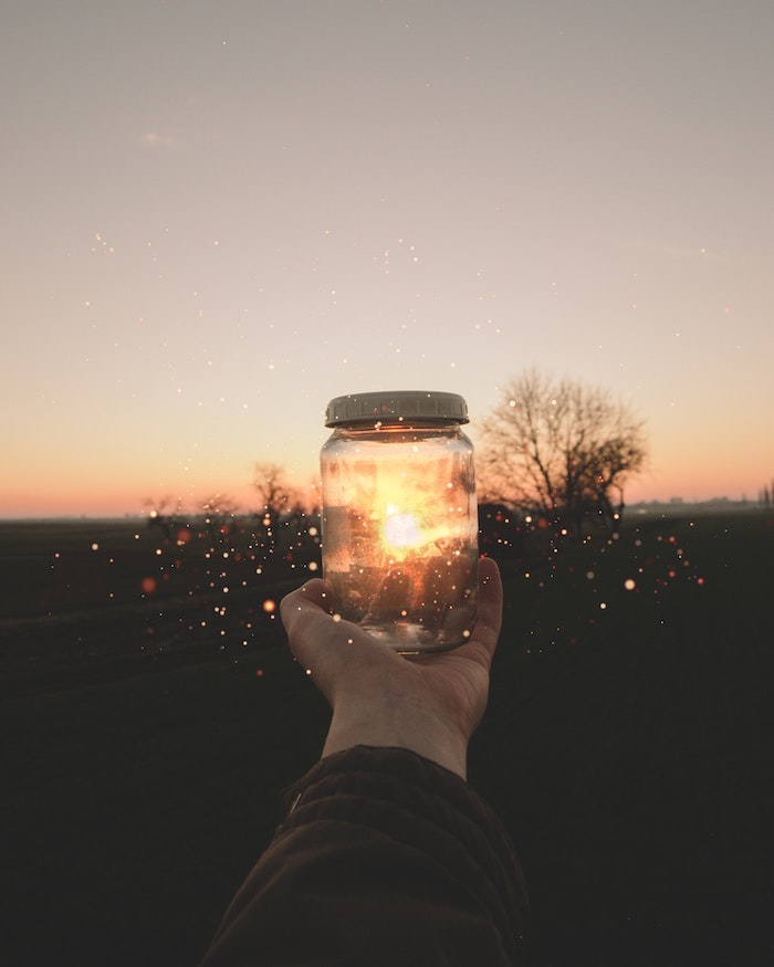
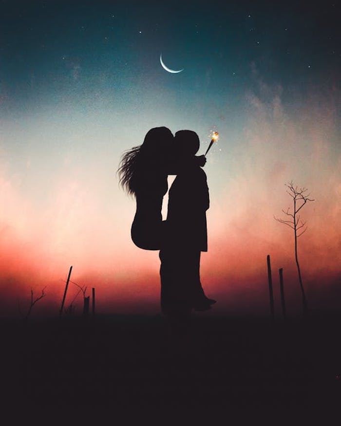
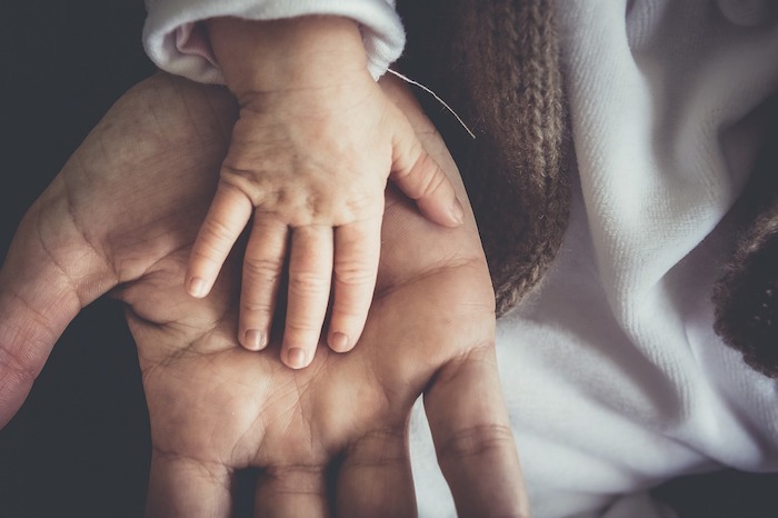
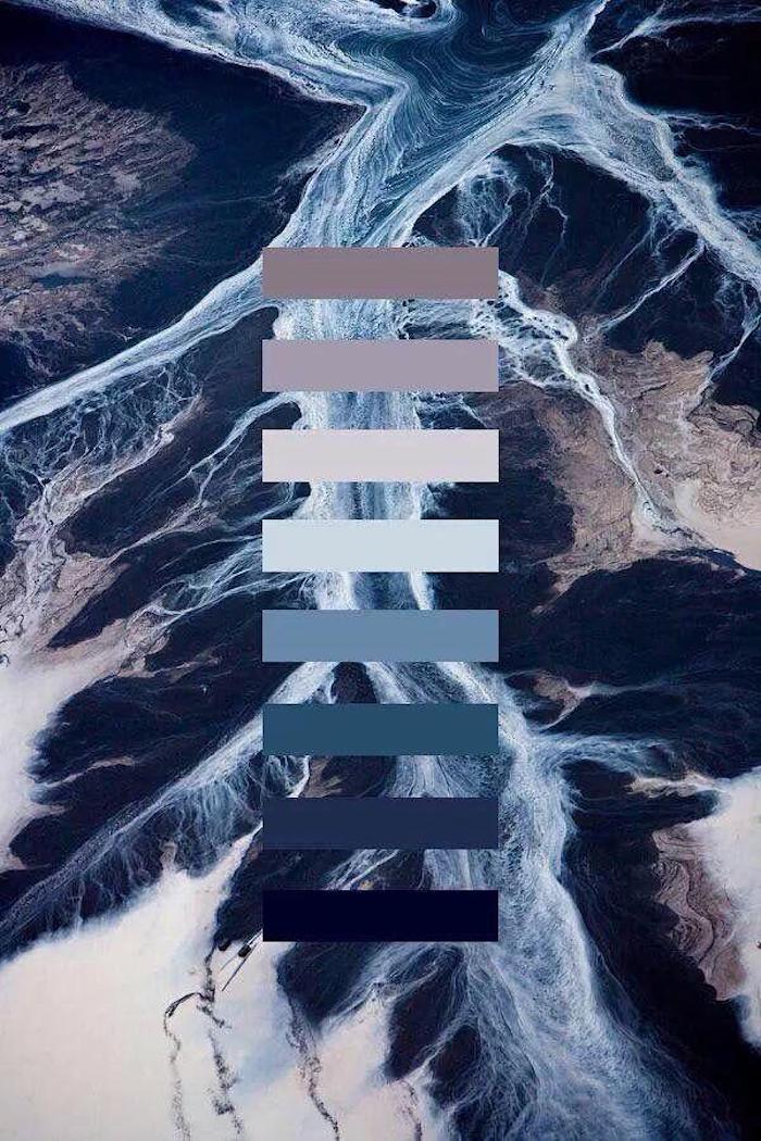
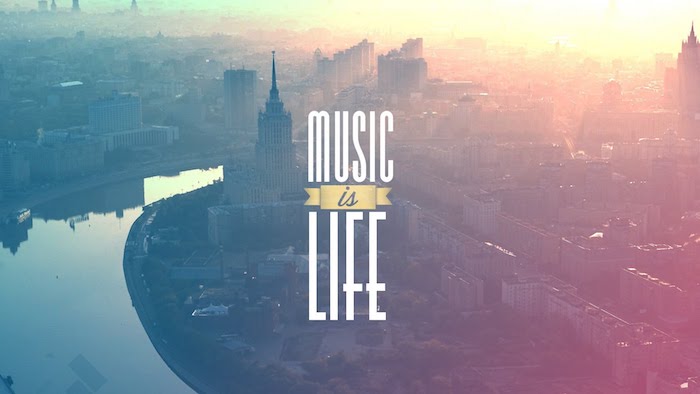
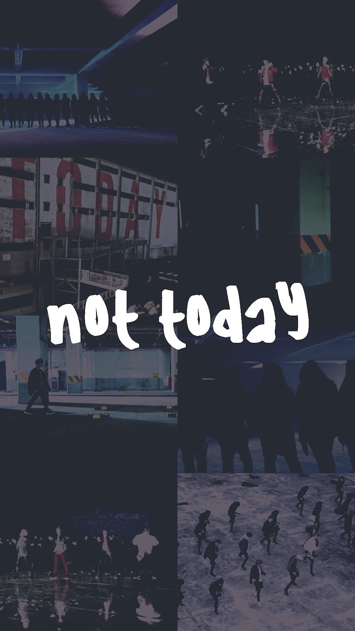
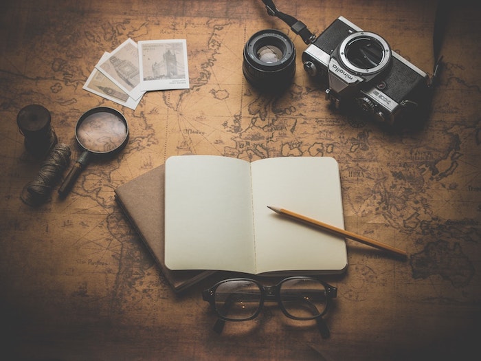
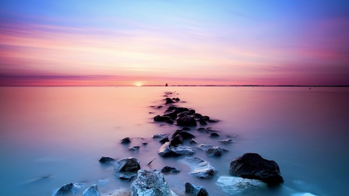
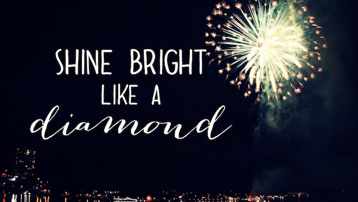
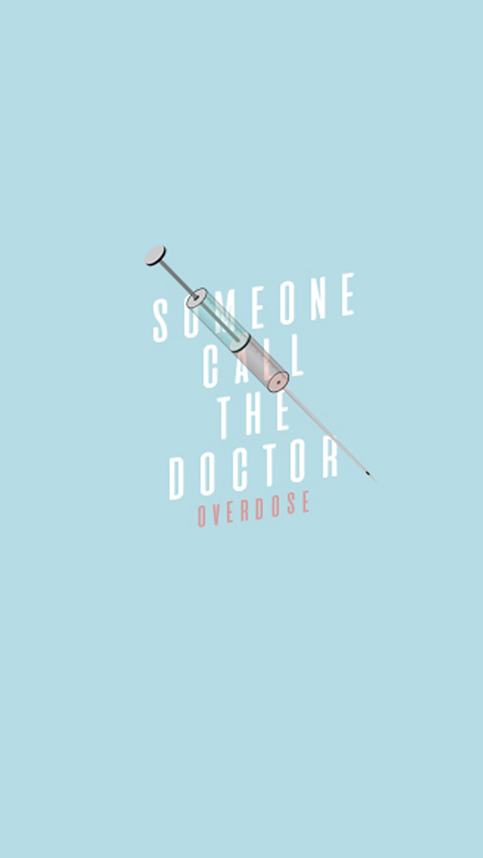
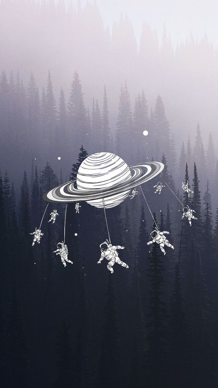
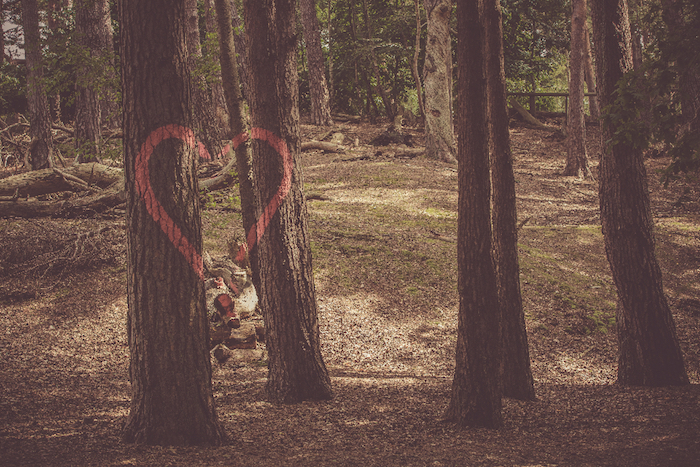
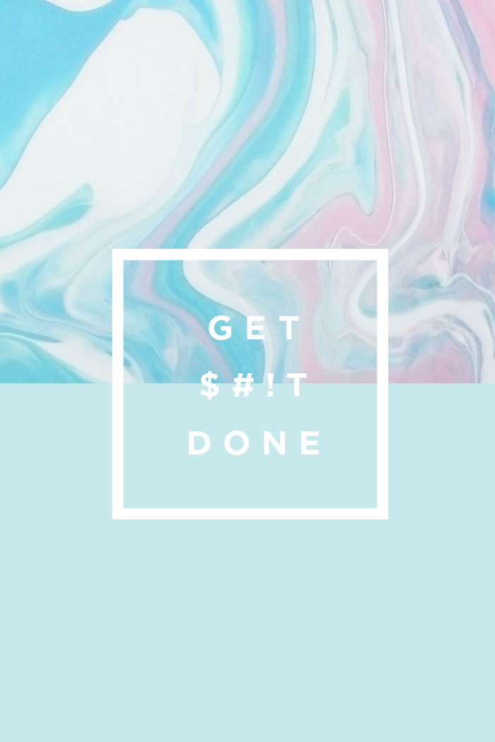
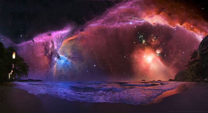
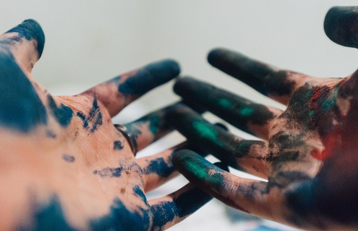
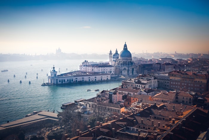
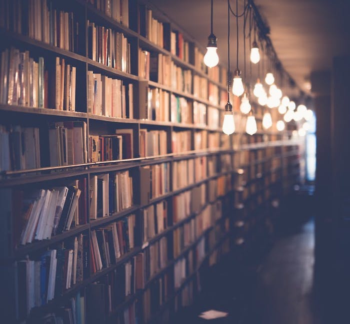
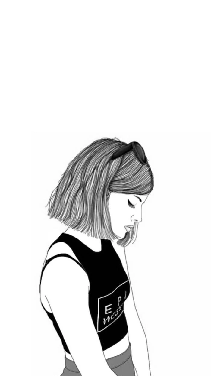
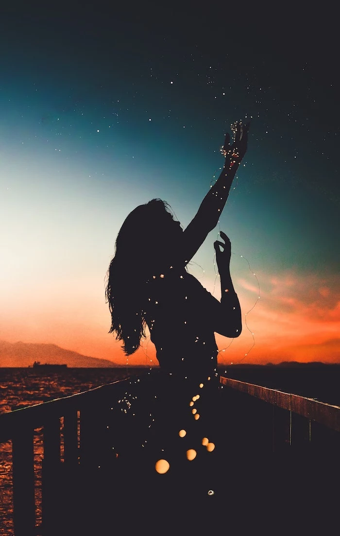
Inspiration Gallery
The average person unlocks their phone 80 times a day.
That’s 80 micro-moments to either feel a jolt of chaos or a sense of calm. Your wallpaper is the backdrop for every one of those interactions. Choosing an image that grounds you, whether it’s a serene landscape or a motivating quote, is a powerful form of digital self-care that works subconsciously throughout your day.
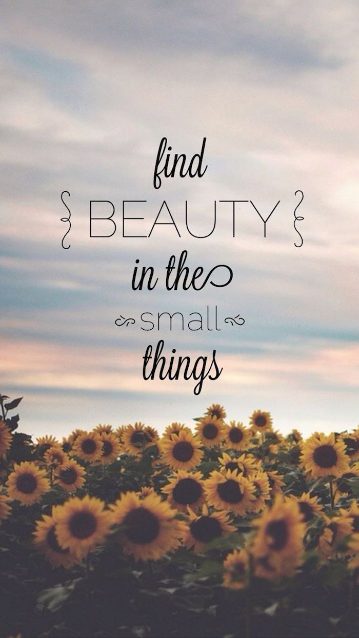
The Icon Test: Before you commit to a wallpaper, do a quick test. Set the image and look at how your app icons and widgets appear on top of it. A beautiful but busy photograph can quickly become visual clutter. The best wallpapers have areas of low detail or negative space, creating a perfect “parking spot” for your icons so they remain legible and easy to find.
Can a wallpaper actually improve my focus?
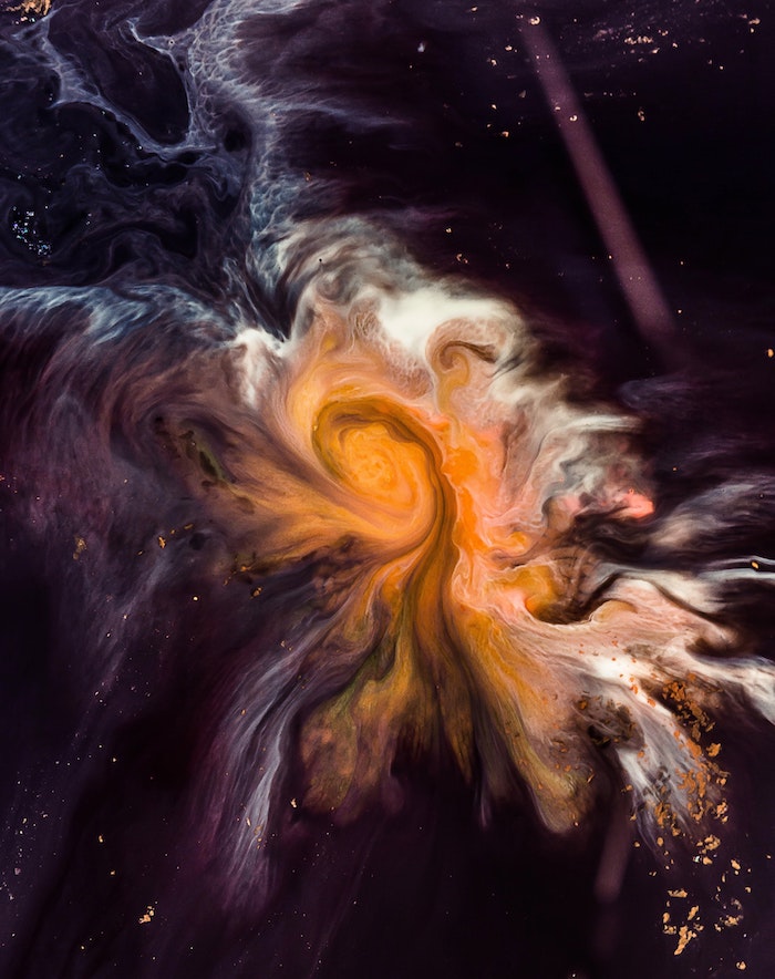
Absolutely. For work computers, ditch the distracting vacation photo. Instead, opt for minimalist or abstract designs with a muted color palette. Gradients in cool tones like deep blues or forest greens can reduce visual strain and promote concentration. The goal is to create a background that your brain can easily ignore, allowing your work windows to take center stage.
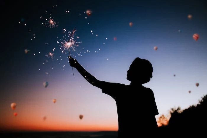
- Create a sense of depth and energy
- Add a personalized, dynamic touch
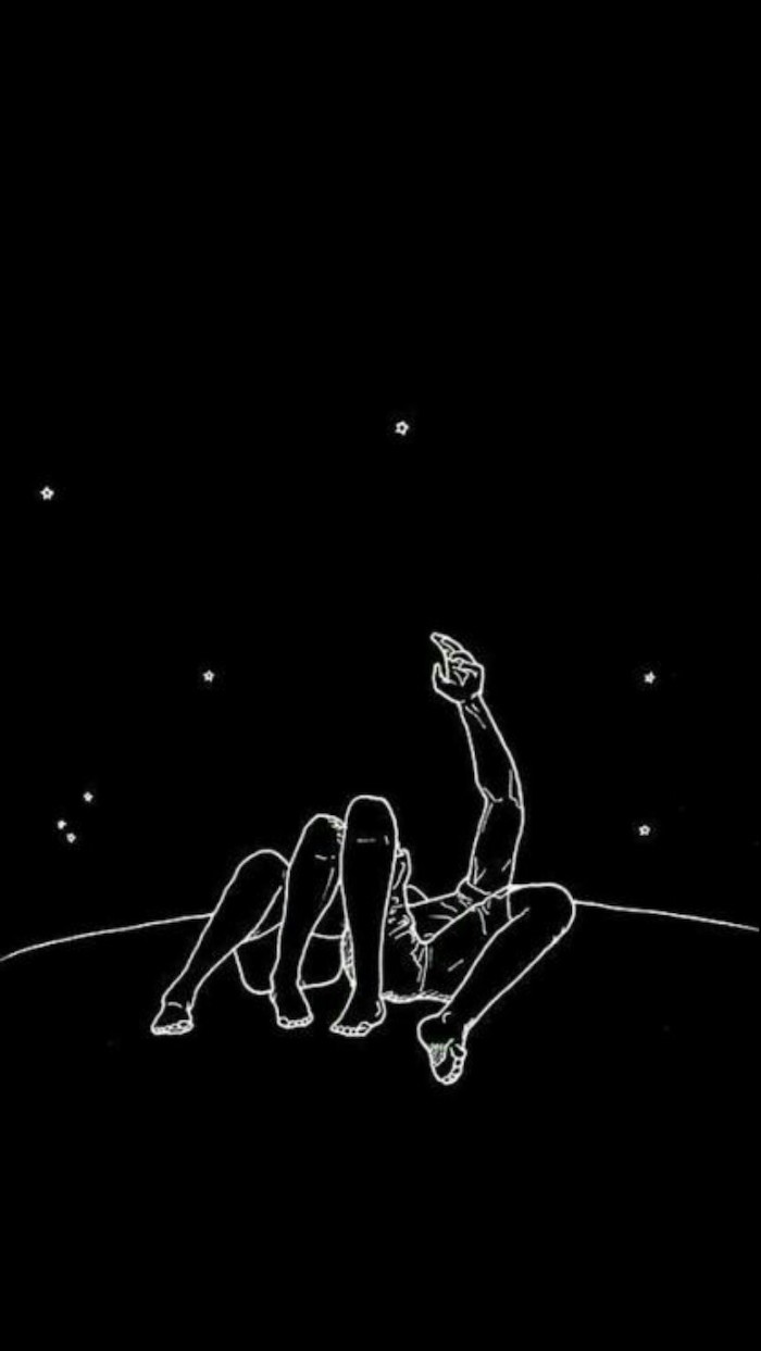
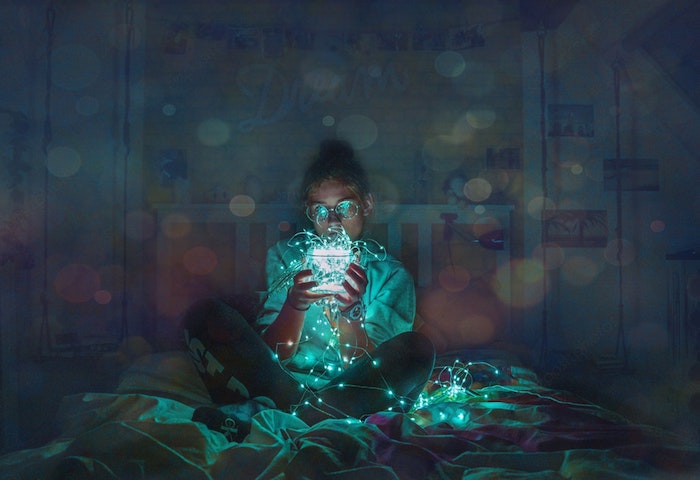
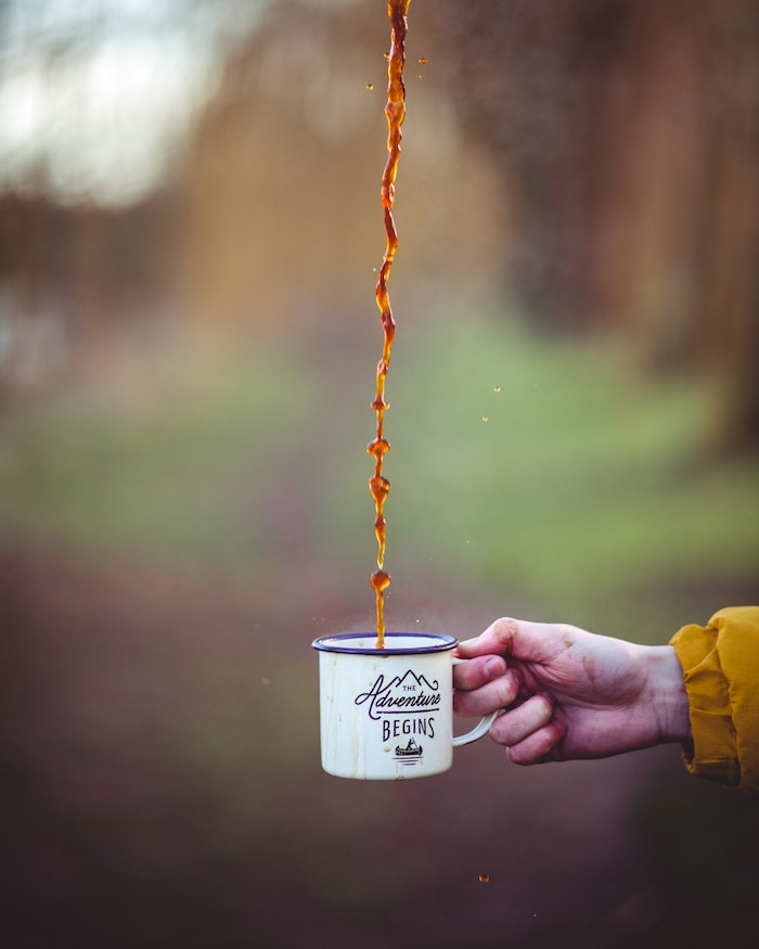
The secret? Live Photos on your iPhone. Hold down on your lock screen, and a still image comes to life. A simple shot of waves lapping the shore or steam rising from your coffee mug can transform your phone into something more interactive and personal. It’s a built-in feature that’s surprisingly underused.
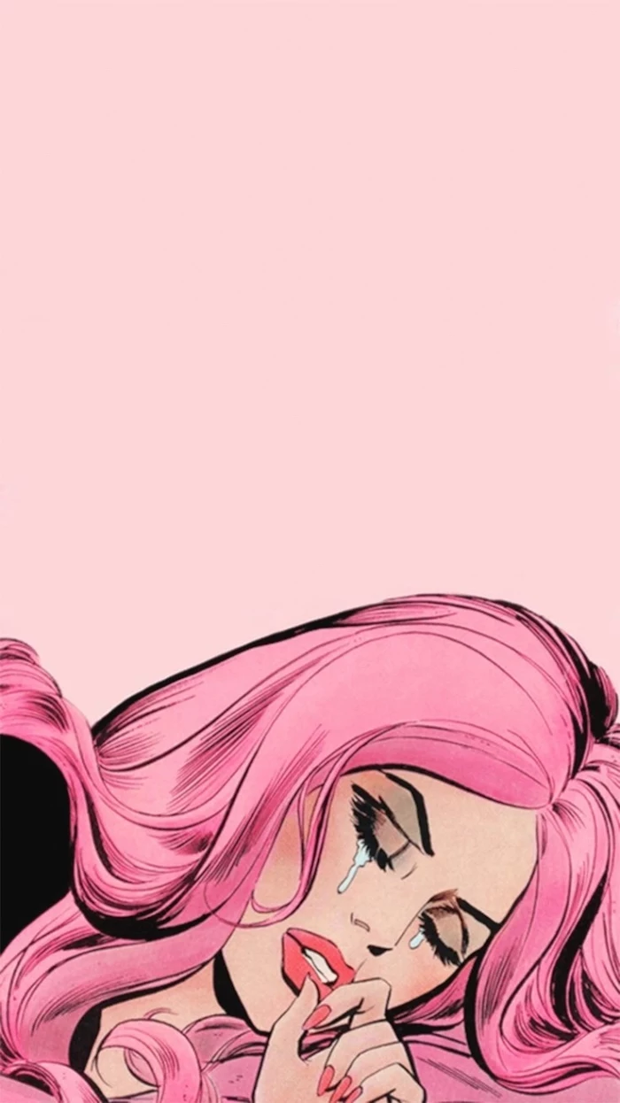
“Colors, like features, follow the changes of the emotions.” – Pablo Picasso
Go beyond a single image and create a personal mood board. A digital collage is a fantastic way to represent different facets of your life or goals.
- Start with a base: Use an app like Canva or Fotor and set a canvas to your screen’s resolution.
- Gather your elements: Pull in photos of loved ones, inspiring quotes, textures, and color swatches.
- Arrange and layer: Play with transparency and positioning. Overlap images and text to create a rich, layered look that tells a unique story.
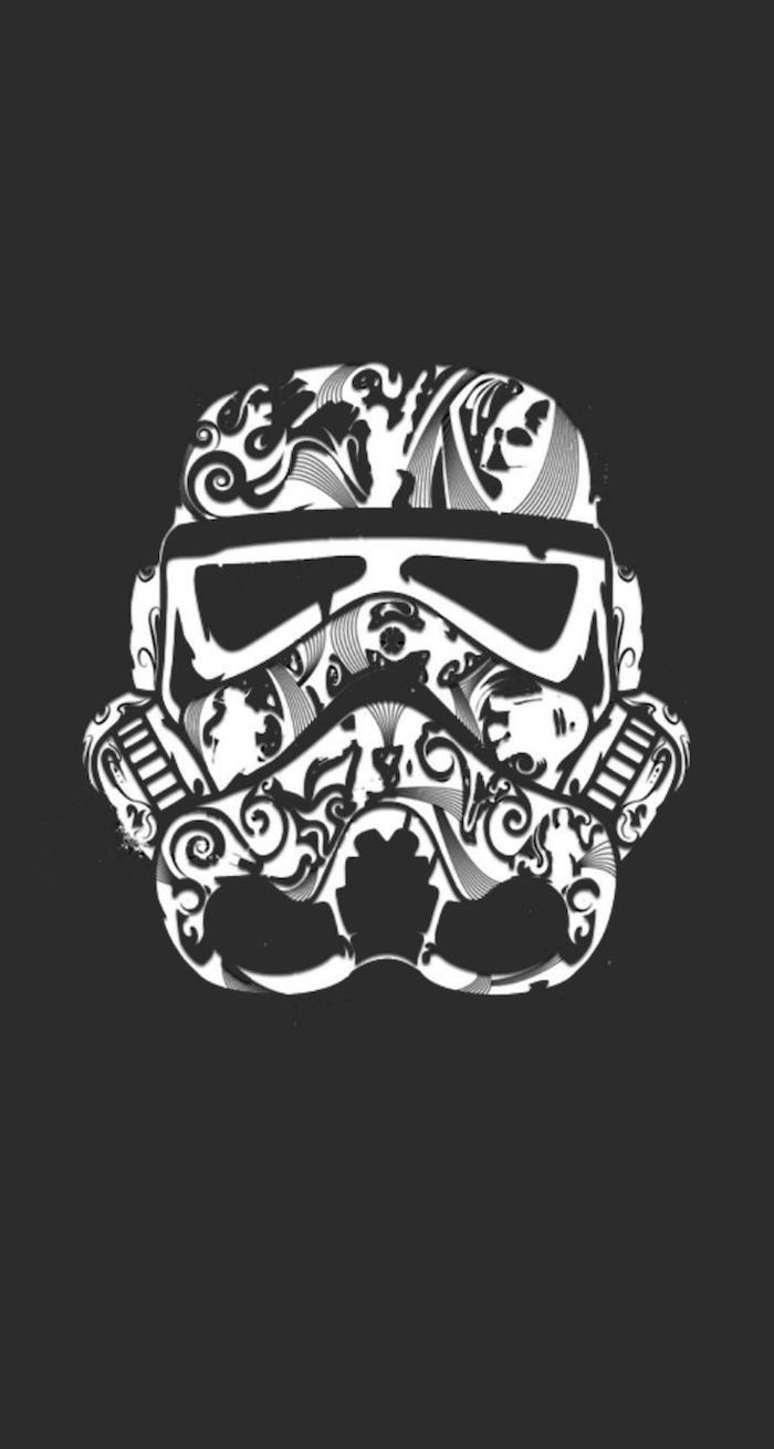
For the OLED Screen User: If your phone has an OLED or AMOLED screen (common in newer iPhones and Samsung Galaxy models), using a true black wallpaper (#000000) can actually save battery life. Unlike LCDs, OLED screens don’t use a backlight; each pixel lights up individually. A black pixel is simply turned off, consuming zero power.
Unsplash: Best for high-art, editorial-style photography. The images are often moody, professional, and feel like they’re straight from a magazine shoot.
Pexels: Great for more vibrant, candid, and diverse lifestyle content, including vertical videos you can use for live wallpapers.
Both offer incredible quality for free, but their ‘vibe’ is distinctly different. Browse both to find the one that matches your personal aesthetic.
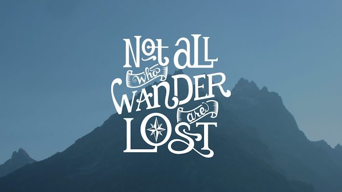
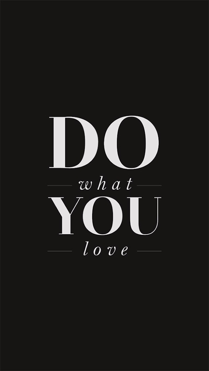
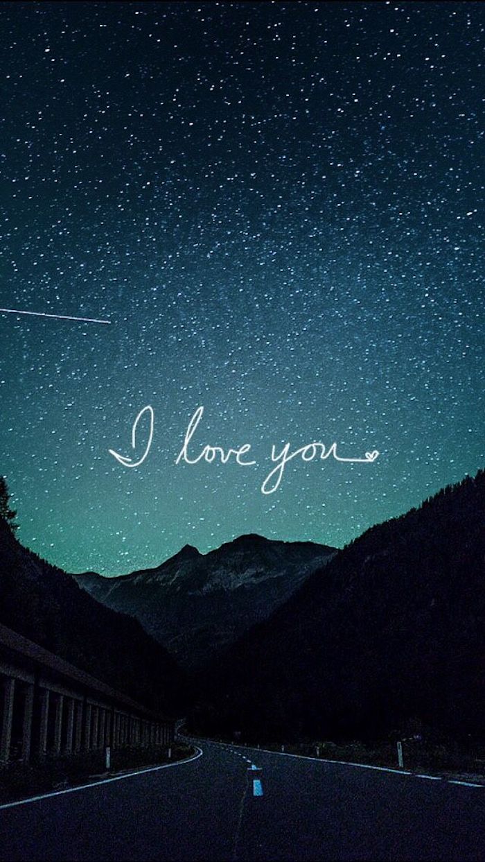
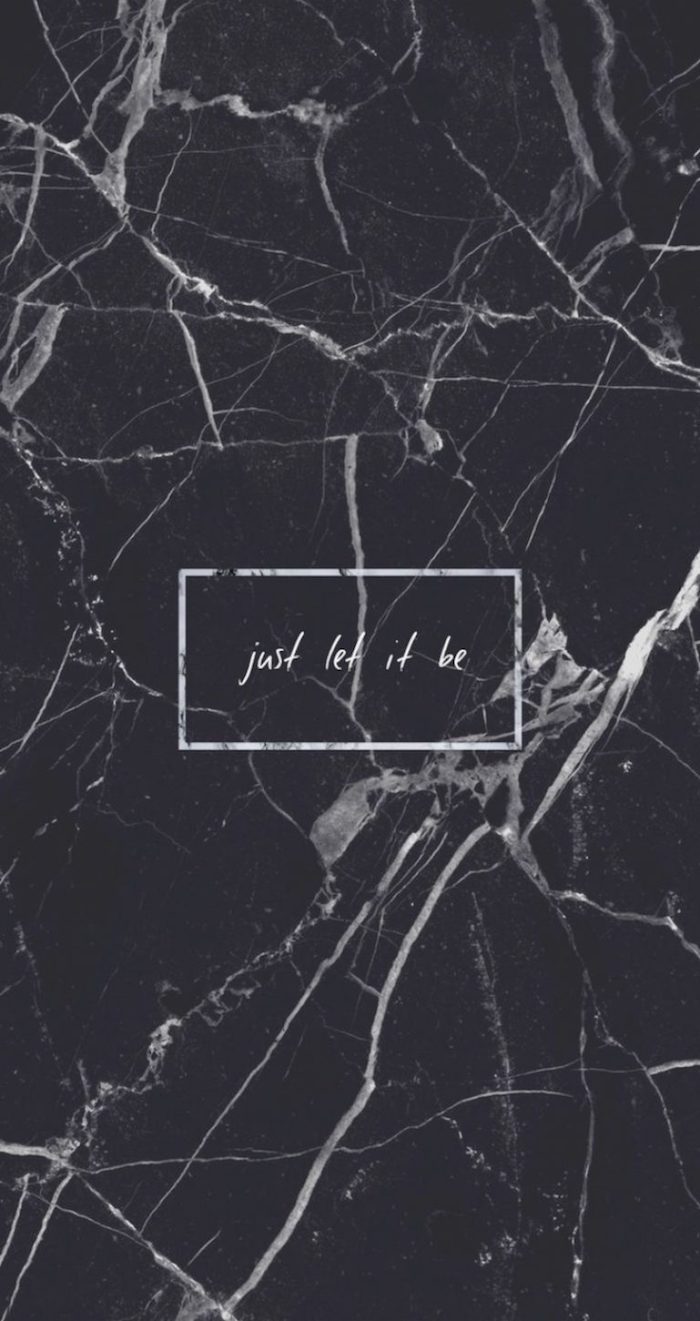
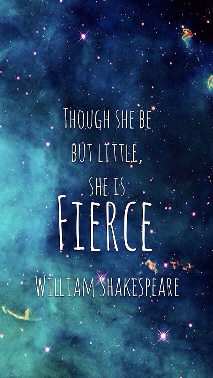
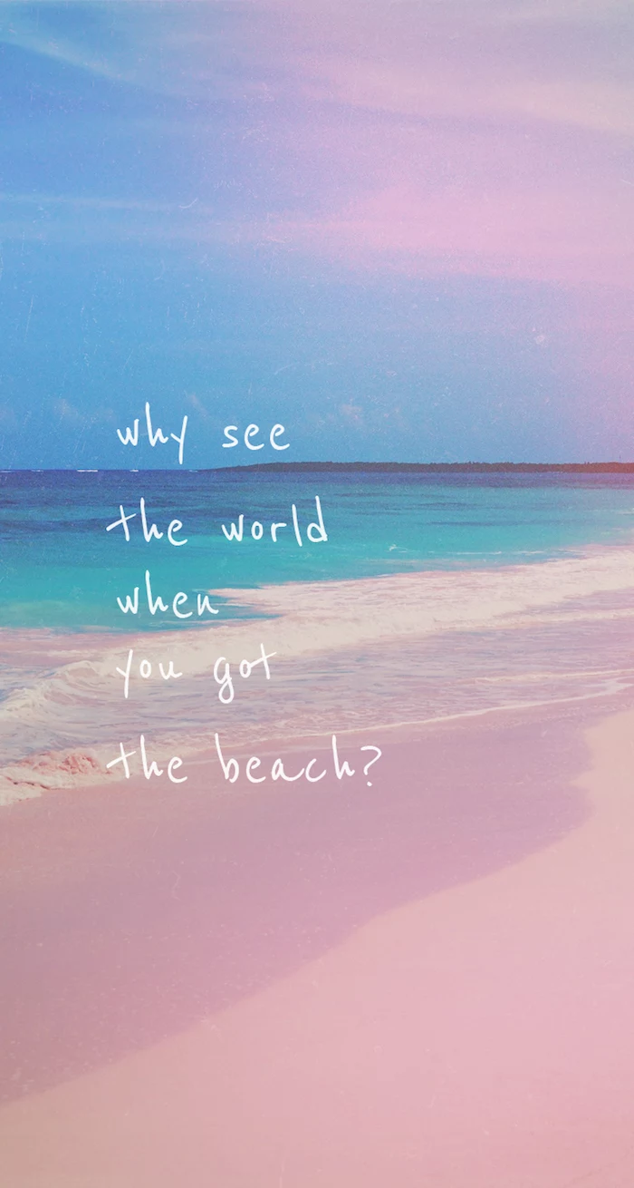
Love the idea of text but don’t want a generic quote? Try using a single, powerful word. ‘Breathe’, ‘Focus’, ‘Create’, or even just the initial of a loved one set in a beautiful font like Bodoni or Futura can be incredibly chic and serve as a subtle daily reminder. Place it off-center for a more dynamic and designer-approved composition.
What about matching my phone and desktop wallpapers?
Creating a cohesive digital environment can feel incredibly organized and intentional. You don’t need the exact same image. Instead, try a theme. Use two different photos from the same trip, a close-up texture on your phone and a wider shot on your desktop, or complementary colors. Apps like Backdrops often release ‘collections’ that make this easy.
- Download the free Procreate Pocket app for iPhone or Ibis Paint X for Android.
- Import a favorite photo.
- Use the ‘smudge’ or ‘liquify’ tools to drag colors and create an abstract, painterly effect.
- Adjust saturation and contrast until it feels right.
In five minutes, you can turn a standard photo into a unique piece of abstract art that’s perfectly sized for your screen.

Over 60% of smartphone screens now use OLED technology, where black pixels are ‘off’.
This technical detail has created an aesthetic trend. Wallpapers with deep, true black backgrounds are not only battery-friendly but also make colorful icons and widgets pop with incredible contrast. It’s a win for both functionality and modern design.

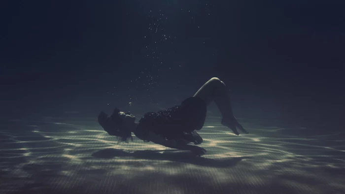
A Nod to Nostalgia: Create a wallpaper from a high-resolution scan of something meaningful. It could be a page from your favorite childhood book, a vintage postcard, the pattern from your grandmother’s fabric, or an old film photograph. These textures bring a tangible, analog warmth to your very digital device.
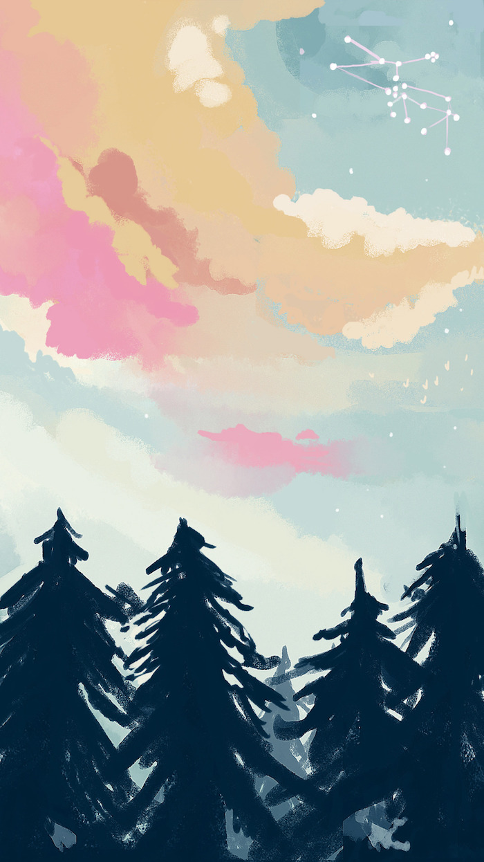
Don’t forget the power of the seasons. A simple, intentional wallpaper change can help you feel more connected to the world outside. Think crisp, golden leaves in autumn; stark, snowy branches in winter; vibrant florals in spring; and bright, sun-drenched beach scenes in summer. It’s a small ritual that can make your device feel fresh and current.
- Find high-resolution scans of classic paintings from museum sites like The Met or Rijksmuseum, which offer public domain collections.
- Use a detailed pattern from a William Morris textile design.
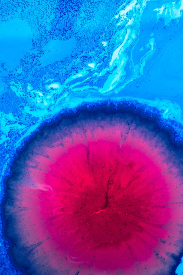
- Crop in on a small, abstract section of a Kandinsky or a Monet.
The result? A sophisticated, timeless background that adds a touch of art history to your day.
AI is your co-creator: Feeling uninspired? Use an AI image generator like Midjourney or DALL-E 3. Instead of just asking for a ‘forest wallpaper’, get specific. Try prompts like: ‘minimalist Japanese ink wash painting of a single bamboo stalk, on textured paper, 8K’ or ‘cinematic photo of a neon-lit ramen shop on a rainy Tokyo night, detailed reflections’. The results are often stunning and completely unique to you.

Should I blur my background?
If you love a photo but it’s too busy for your icons, a Gaussian blur is your best friend. Most basic photo editors, including the one built into your phone, have a blur or ‘focus’ tool. A subtle blur on your home screen wallpaper can retain the color and mood of the original image while turning it into a non-distracting, abstract gradient. Keep the original, sharp version for your lock screen!
Themed Sets: Why settle for one wallpaper? On iOS 16 and later, you can create multiple Lock Screen and Home Screen pairings and link them to Focus Modes. Have a minimalist, dark-mode wallpaper for your ‘Work’ focus, a vibrant family photo for ‘Personal’ time, and a calming night sky for ‘Sleep’. Your phone’s background will change automatically, adapting to your context.
A great wallpaper doesn’t scream for attention; it whispers.
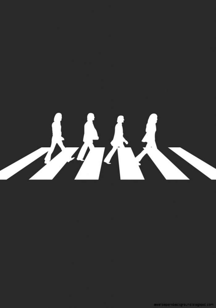
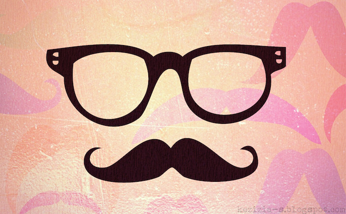
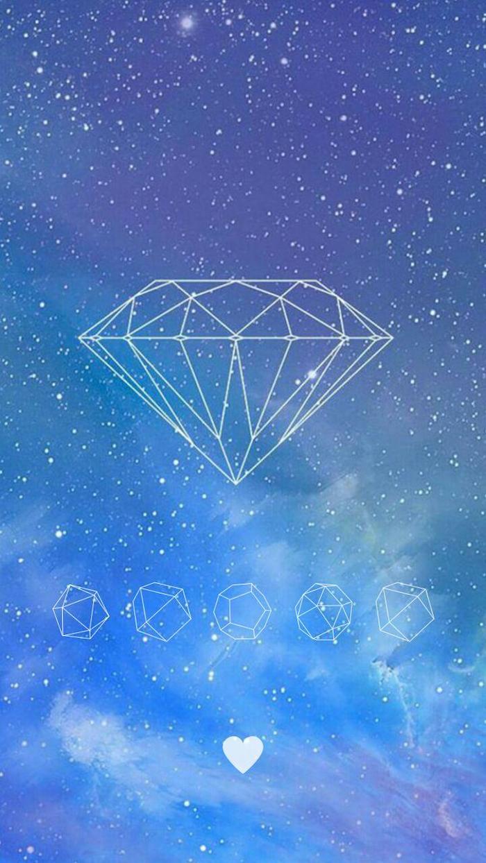
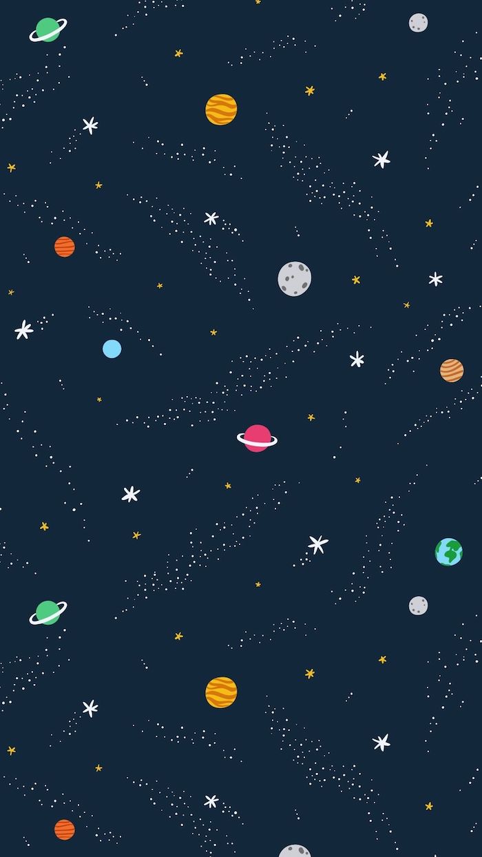
Vector vs. Raster: For sharp, clean graphics, especially with text or logos, vector-based wallpapers are king. Unlike photos (raster), which are made of pixels, vectors are based on mathematical equations. This means they can be scaled to any size without ever losing quality. Search for ‘vector art’ or ‘SVG wallpapers’ for ultra-crisp results, or create your own in a program like Adobe Illustrator or Figma.
- Lock Screen: This is your chance to be bold. Use a stunning, full-detail photograph, a favorite piece of art, or a picture of a loved one. Since there are no icons to compete with, clarity isn’t an issue.
- Home Screen: This space needs to be functional. Opt for a quieter, more textured, or blurred version of your lock screen image, or a completely different minimalist background that makes your app icons easy to read.
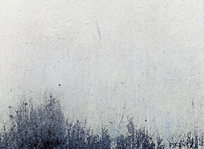
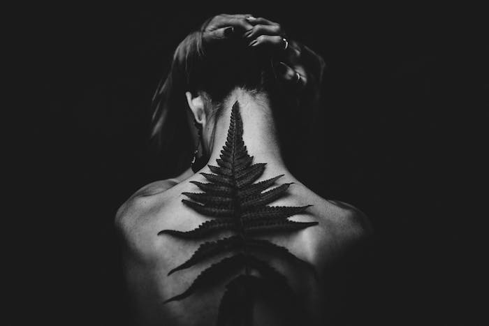
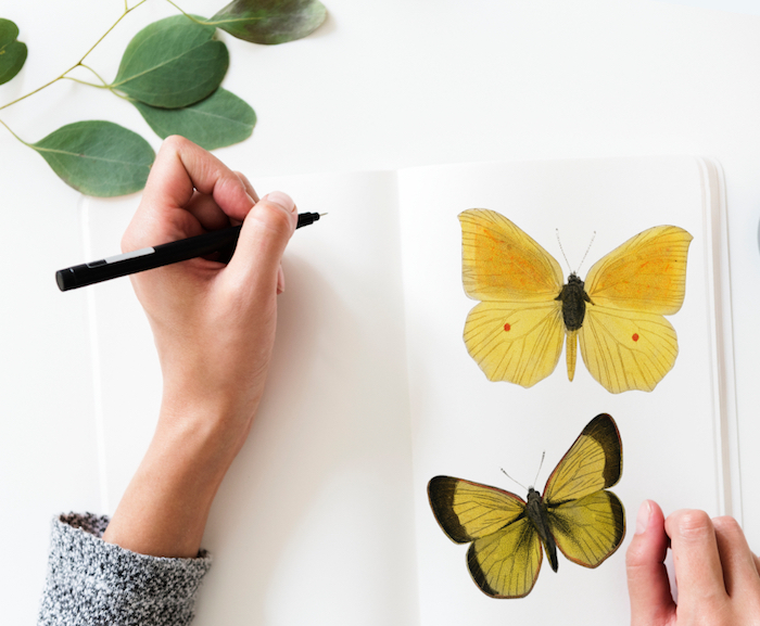
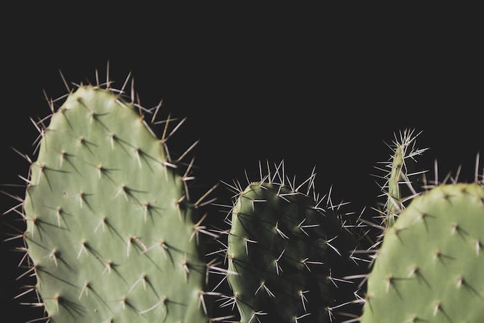
Capture the beauty of texture. Forget grand landscapes for a moment and focus on the small details. High-resolution photos of wood grain, wrinkled linen, brushed metal, a concrete wall, or even the foam on a latte make for incredibly sophisticated and non-distracting wallpapers. They add depth and a tactile feel to a flat glass screen.
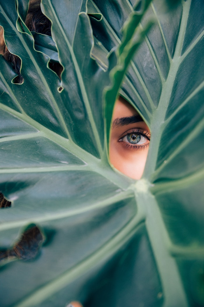
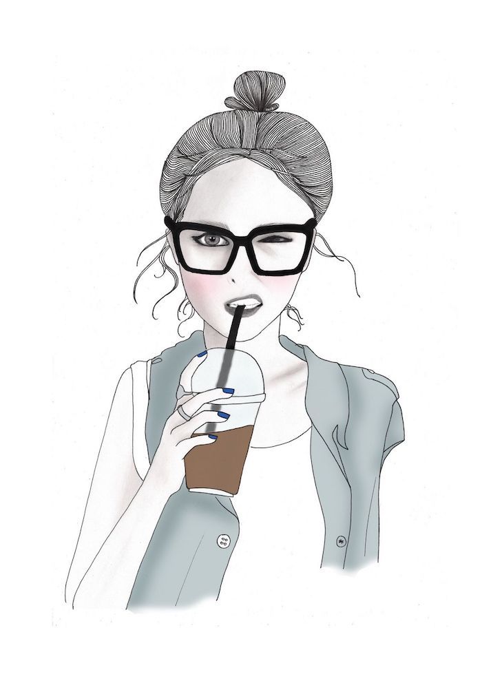
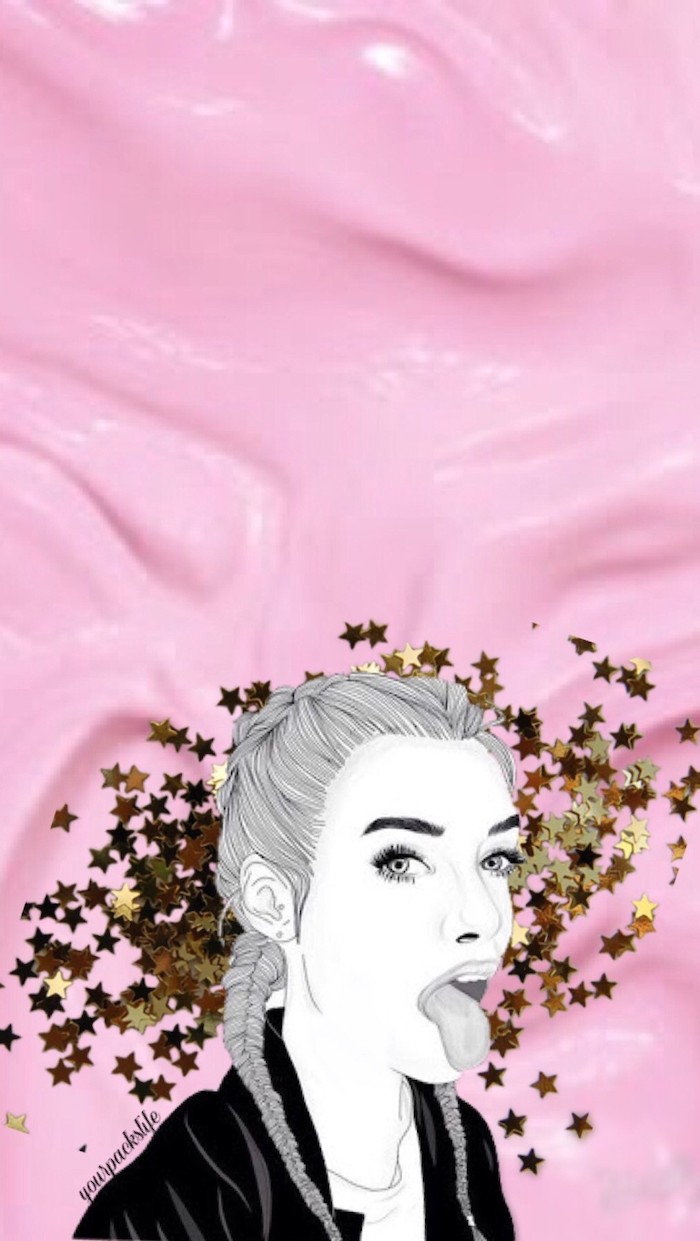
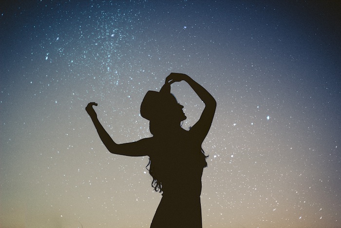
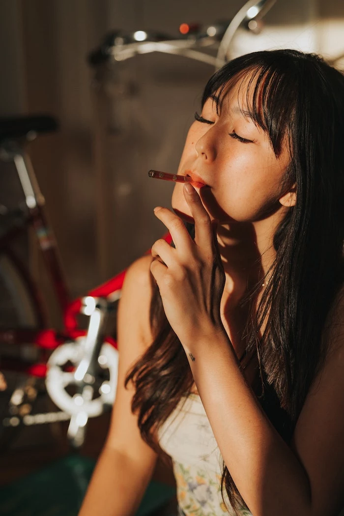
Thinking about a photo of a person? A great portrait can be a powerful wallpaper, but avoid placing their face directly in the center where app icons will cover it. Use the rule of thirds: position the subject off to one side. This creates a more dynamic composition and leaves open, functional space for your widgets and apps.
Create a ‘vision board’ wallpaper to keep your goals front and center. Instead of just a single inspiring image, use a free tool like Google Slides or Canva to combine images representing your aspirations: a dream travel destination, a fitness goal, a career milestone. Seeing these images multiple times a day is a powerful, passive form of motivation.
Light Mode vs. Dark Mode: A great wallpaper setup considers both. Many modern OS versions allow your wallpaper to shift with your system’s theme. A bright, airy photo for light mode and a deep, moody, or space-themed image for dark mode creates a seamless experience that feels perfectly integrated with your device’s UI.


