The Real Reason You Crave Lighter Colors in Spring (And How to Actually Use Them)
I’ve spent the better part of my life working with color. It started in the world of textiles, where I got to see firsthand how different dyes react to fibers under serious heat and pressure. Since then, I’ve worked with everyone from interior designers to fashion brands. And through all of it, one truth has become crystal clear: color isn’t just about pigment. It’s about light. And honestly, no season shows this off better than spring.
In this article
A lot of people think color trends are cooked up in some secret boardroom. The truth is a bit more organic. It’s a mix of tracking social moods, seeing new materials emerge, and yes, the economics of dyes. But the biggest reason we all start craving fresh colors is a physical change in our world. The sun is higher, the light is clearer, and it has more blue in it than the cozy, golden light of fall and winter. This new light makes us want colors that feel clean, crisp, and alive. So, this isn’t a list of ‘it’ colors. My goal is to show you how the pros think so you can learn to see color, not just look at it.
It All Starts with the Light
Before we even think about paint chips, we have to get this one thing straight: the quality of the light dictates the palette. In spring, the sun’s rays have a more direct path to us. This means less of the blue light gets scattered by the atmosphere, resulting in daylight that’s whiter and more intense. It’s a huge shift from the yellowish, low-angled light of winter.
Think of it this way: spring is like nature swapping out a warm, moody 2700K lightbulb for a bright, clean 4000K one. Suddenly, everything in the room looks different. Colors that seemed heavy or muddy a few months ago now feel vibrant and full of energy.
This is exactly why spring palettes almost always lean on colors that are:
- Clear, not muted. They have very little gray or brown mixed in. It’s the difference between a zesty lemon yellow (spring) and a deep mustard yellow (autumn).
- Cool or clean-warm. They either have blue undertones or a pure, un-muddied warmth. A classic spring green is that yellow-green of new leaves, while a winter green is a deep forest shade with heavy blue and black undertones.
- Bright, but not always heavy. They can be vibrant, for sure, but they rarely have the deep, heavy saturation of jewel tones we love around the holidays.
By the way, in the design world, we don’t just say ‘blue.’ We use standardized color systems so that a designer in one city can specify a precise color code, and a mill on the other side of the world knows the exact shade to produce. It’s all about precision. So when you’re trying to match colors, remember that a name like ‘sky blue’ is subjective, but a color code is a fact.

How to Build a Palette Like a Pro
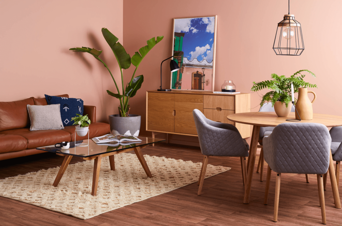
When I’m putting together a color scheme, whether it’s for a clothing line or a living room, I don’t start with the exciting colors. I start with the foundation: the neutral.
Spring neutrals aren’t the heavy charcoals or deep chocolates of winter. We’re talking lighter, airier shades that reflect light instead of soaking it up. Think of warm stone, a creamy off-white, or a pale, silvery gray. If you’re standing frozen in the paint aisle, look for tried-and-true options like Sherwin-Williams ‘Alabaster’ for that perfect creamy white, or Benjamin Moore ‘Revere Pewter’ for a versatile warm gray that designers love.
Once you have your base, you can use the classic 60-30-10 rule. It’s a trick that makes composing a room so much easier.
- 60% Dominant Color: This is your main neutral. It’s the wall color in a room, or the main piece of an outfit like a great coat.
- 30% Secondary Color: This is your key player from the spring palette. It could be a beautiful sage green sofa or the dress you wear under the coat. It makes a statement but doesn’t scream.
- 10% Accent Color: This is the fun part! It’s the pop of color from throw pillows, art, or a bright scarf. This is where you can be daring with a vibrant coral or electric yellow without any real risk.
Let’s make that real. Imagine a living room: The walls (60%) are that lovely ‘Alabaster’ white. The main sofa (30%) is a calming, medium-toned sage green. Then, for your accents (10%), you toss in a couple of vibrant coral throw pillows and a matching vase on the bookshelf. See? It’s a balanced, intentional room that feels fresh, not chaotic.
Oh, and a lesson I learned a long, long time ago: color is totally different depending on its texture. A soft lilac on a high-gloss surface will feel energetic. That same lilac on a matte velvet will feel way more soft and luxurious. When you’re planning, gather all the pieces—fabric swatches, wood samples, metal finishes. See how they talk to each other. That’s how you build character.
Your 5-Minute Spring Refresh
Feeling overwhelmed? I get it. If you want to dip your toe in without committing to paint, try a quick, low-cost refresh. It’s an instant-gratification trick to get you hooked on using color. Spend $20 this weekend on one of these:
- A new set of dish towels in a bright coral or lemon yellow.
- A colorful new soap dispenser for the kitchen or bathroom.
- A single, vibrant bouquet of tulips or daffodils for your table.
It’s amazing what a tiny splash of the right color can do for your mood.

Let’s Talk Specifics: The Key Spring Color Families
Instead of chasing trends, let’s look at the foundational color families that show up every spring. The exact shade might shift, but the vibe is timeless.
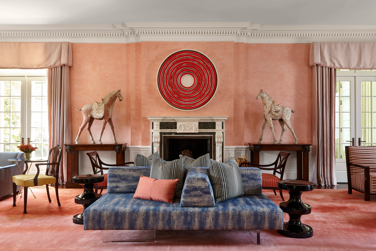
Pinks and Corals: Sophisticated Warmth
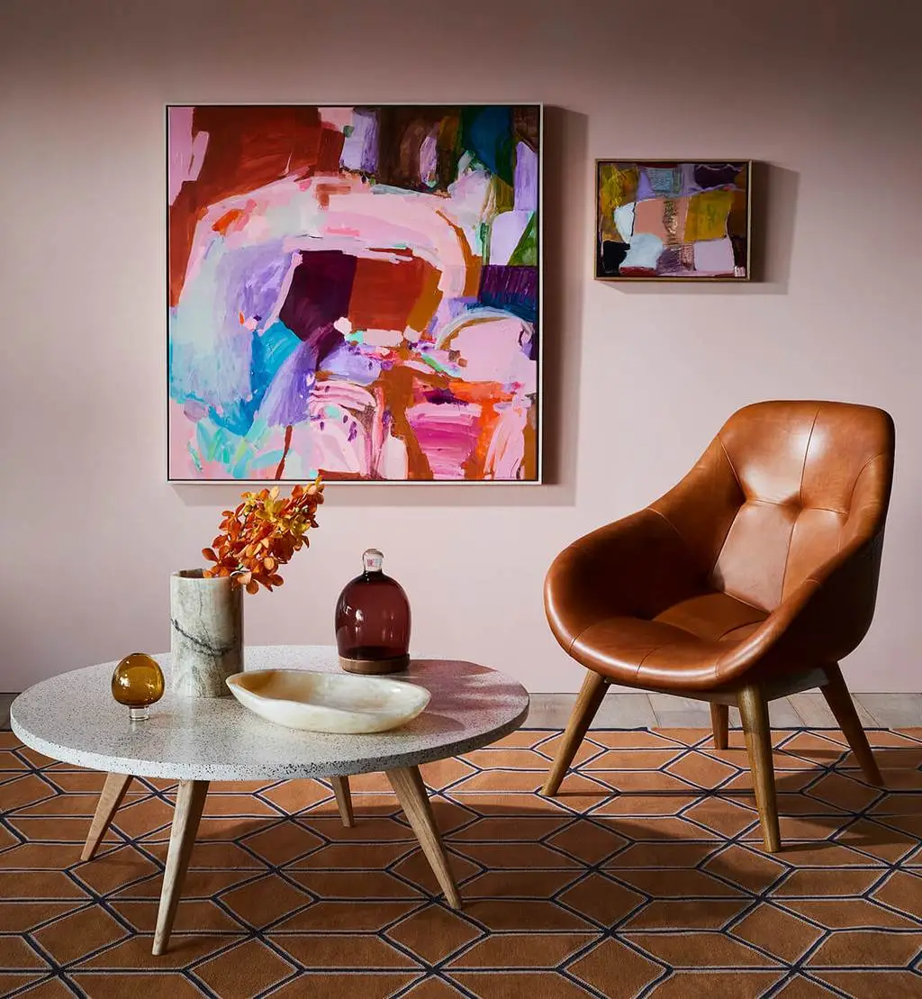
Spring pinks are not sugary sweet. They’re more complex, often with a hint of beige or yellow that makes them feel grown-up. Coral is the perfect example—a beautiful blend of pink and orange.
Heads up for interiors: A full coral wall can be intense. It’s fantastic in a small space where you want a punch of personality, like a powder room or entryway. It absolutely sings in rooms with warm, south-facing light. But in a cooler, north-facing room, it can look surprisingly drab. You have to test it!
And a quick warning: be careful with pinks and corals around a bathroom vanity. The reflection can cast a reddish hue on your skin in the mirror, making you look flushed. It’s a common mistake I’ve seen people regret. Use a more neutral color around the mirror and bring in that coral with towels and accessories instead.
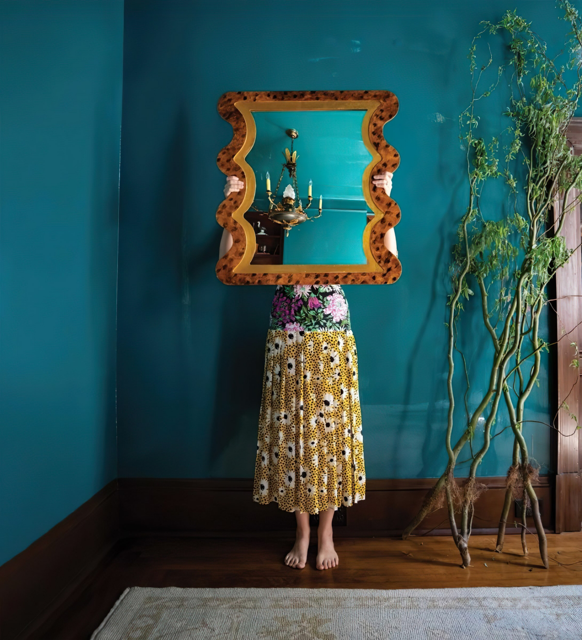
Blues and Greens: Colors of New Life
These are the colors of nature waking up—a clear sky, a new leaf. They are typically crisp, clean, and refreshing. An airy blue might have a hint of gray, like a hazy spring morning, while a teal expertly balances blue and green. The more green in a teal, the more calming it feels; the more blue, the more modern and electric.
For a really sophisticated look, try a monochromatic scheme. Pick one shade, like a medium sage green. Then, use it across different textures: matte paint on the walls, a slightly darker velvet on a chair, slubby linen curtains, and a high-gloss ceramic lamp. The single color unifies everything, while the different textures create a rich, layered look.
Yellows: Bottled Sunshine
Yellow is a tricky one. The wrong shade can feel aggressive or, worse, kind of sickly. A true spring yellow is clean and sharp, like a forsythia blossom. It often has a clean, almost greenish undertone, not a heavy, golden-ochre one.

In your home, yellow is a powerhouse for making a space feel bright and happy. It’s wonderful in kitchens and breakfast nooks. But use it with caution in bedrooms, as too much bright yellow can be overstimulating.
Good to know: High-quality yellow pigments are often more expensive to make, especially the ones that won’t fade. This is one area where spending more on paint really pays off. Expect to pay between $70 and $90 for a gallon of premium, lightfast yellow paint from a top brand, compared to maybe $40-$50 for a budget version. That extra $30 is buying you color that won’t turn into a sad, chalky mess in a couple of years.
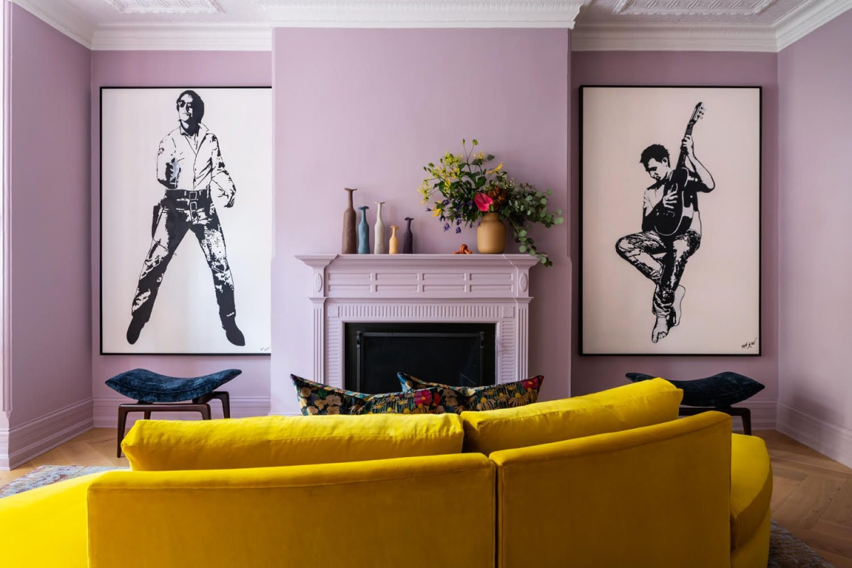
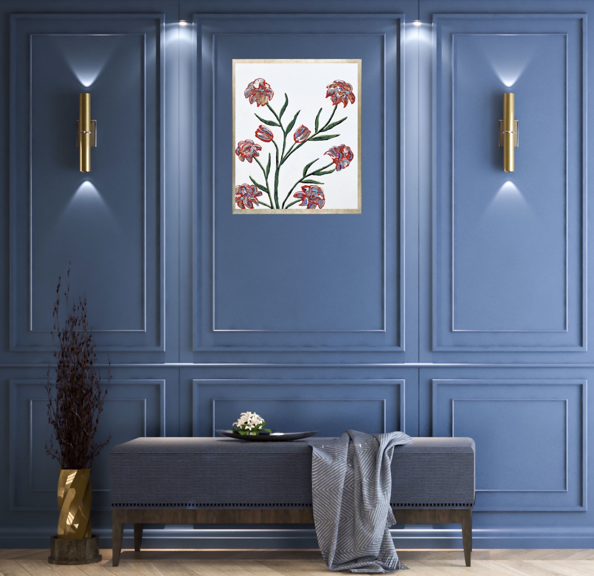
Purples: Lilac and Periwinkle
Spring purples almost always lean towards blue. Think lilac, lavender, and periwinkle—they avoid the heavy red content of a deep royal purple, which feels more formal and wintry.
Now, let me share a pro-fail story. I learned this one the hard way. A client insisted on a gorgeous lilac for their small, windowless powder room. It looked so chic on the swatch! But once it was on all four walls, the gray undertones took over and, without any natural light, the room looked like a sad, dusty bruise. We had to repaint with a crisp white and just use lilac for the towels and art. So, the lesson is: lilac needs bright light to truly shine. In a darker room, use it as an accent, not the main event.
How to Test Paint Like a Pro (And Avoid Repainting)
Never, ever trust a tiny paint chip. The color will look completely different on your wall. Here’s the right way to test:
- Buy a sample pot, not just a chip. They’re usually $5-10 at any Home Depot or paint store.
- Paint a big swatch on a poster board. Don’t paint directly on your wall, because the old color underneath will throw it off. You need at least a 2×2 foot square.
- Move it around. Use painter’s tape to move your poster board to different walls in the room over 48 hours. See how it looks in the bright morning light, the warm afternoon sun, and at night with your lamps on. You’ll be amazed how much it changes. This is the single best way to avoid a costly mistake.
Final Thoughts on Safety and When to Ask for Help
Working with these materials professionally means respecting them. When you’re painting indoors, please make sure you have good ventilation. Look for paints labeled ‘Low-VOC’ or ‘Zero-VOC’ to reduce the harmful chemicals you’re breathing in. This is a non-negotiable safety rule on professional job sites.

And know when to call for backup. Choosing a color for one room? You’ve got this. Planning a whole-home palette? Investing a few hundred dollars in a 2-hour consultation with a color expert can genuinely save you thousands by preventing a major mismatch. They have access to large samples and a trained eye that can see the big picture.
At the end of the day, color trends will come and go. But the principles of how light, texture, and balance work together are forever. I hope that by understanding the ‘why’ behind these palettes, you feel empowered to create a space that’s not just on-trend, but a beautiful, personal reflection of you.
Galerie d’inspiration


How do I use bright spring colors without my home looking like a children’s nursery?
The professional trick is to ground them with a sophisticated neutral. Instead of pairing pastels with stark white, which can look juvenile, anchor them with a complex, earthy tone. A deep mushroom, a warm charcoal, or even a rich olive green on a feature wall or a large sofa will make your lighter spring accents—like blush, mint, or buttercup yellow—feel intentional and chic, not chaotic.

Did you know? The human eye can distinguish more shades of green than any other color. This is an evolutionary trait from our ancestors needing to identify edible plants in a complex natural landscape.
This is why adding varied green tones to a room feels so naturally refreshing in spring. Don’t just stick to one shade. Mix the yellow-green of new leaves (try ‘Calke Green’ by Farrow & Ball) with the deeper tones of eucalyptus and the soft hue of sage for a layered, vibrant effect.

The fastest way to signal the season’s change is through textiles. It’s less about a specific color and more about the material’s interaction with light. Swap out winter’s heavy velvets and wools for fabrics that breathe and reflect the brighter days:
- Washed Linen: For its relaxed texture and airy feel on sofas and bedding.
- Block-Printed Cotton: For patterned cushions that add a touch of handcrafted charm.
- Sheer Curtains: To diffuse the strong spring sunlight, creating a soft, ethereal glow in the room.
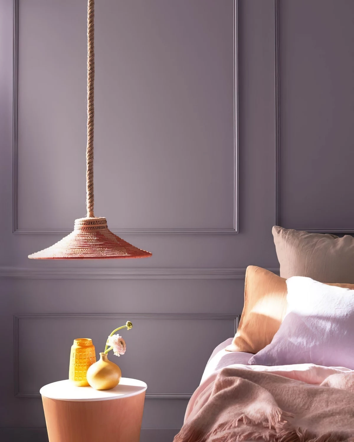
For an instant dose of spring, look to your lighting fixtures. A simple change of a lampshade can transform a room’s mood. Replace a heavy, opaque shade with one made of pleated pale-yellow paper or a light-blue linen drum. When switched on, it will cast a soft, colored light that mimics the gentle warmth of the new season, instantly lifting the atmosphere.

Common Pitfall: Going too cool. Spring’s blue-tinted light can make colors with cool undertones, like certain grays or lavenders, feel sterile and chilly, especially in north-facing rooms. The solution: Always choose a version of your desired color with a drop of yellow or red in it. For example, instead of a pure lilac, opt for a lavender with a pinkish base. Instead of a steely gray, choose a greige like Benjamin Moore’s ‘Revere Pewter’ to add necessary warmth.
- Creates a soft, immersive color experience.
- Minimizes visual clutter for a calming effect.
- Makes small spaces feel larger and more cohesive.
The secret? Color drenching. This designer technique involves painting the walls, trim, and even the ceiling in the same soft spring hue. Using a single shade, like a dusty rose or a pale sky blue, blurs the boundaries of the room, creating an elegant and surprisingly modern cocoon of color.

Matte Finish: Absorbs light, giving colors a soft, chalky, and deep appearance. Perfect for creating a serene, velvety backdrop that makes furniture and art pop. Think of the finish on a robin’s egg.
Satin/Eggshell Finish: Has a slight sheen that gently reflects light. This makes colors feel crisper and brighter, and the surface is more durable and easier to clean. Ideal for high-traffic areas that need to feel fresh and energetic.
For the truest expression of a soft spring pastel, a matte finish is unbeatable. For a family room that needs to withstand daily life, eggshell is the practical choice.
For a palette that feels both fresh and timeless, look to the Impressionist painters. Monet didn’t just paint waterlilies with green and pink; he used dashes of yellow, violet, and sky blue to capture the shimmering effect of light on water.

Don’t forget the power of scent and color working together. Pair your new spring palette with a corresponding home fragrance. A room with soft green and yellow accents is enhanced by a scent with notes of fresh-cut grass and lemon verbena. A space decorated in blush and cream tones comes alive with the fragrance of peony and rose. This sensory layering makes the experience of the room much more immersive.
Want to test a spring color combination before committing? Create a digital mood board using a tool like Canva or even Pinterest. Pull images of furniture you own, then add color swatches and inspirational photos. A popular combination right now is pairing a soft ‘Digital Lavender’ with a warm ochre and a creamy off-white. Seeing them together digitally will quickly tell you if the harmony is right for your space.
- Swap out dark, heavy ceramic bowls for ones made of colored glass.
- Replace your everyday water glasses with a set in a pale green or amber tint.
- Add a single, sculptural vase in a vibrant cobalt blue or daffodil yellow.
These small, translucent touches are perfect for capturing and refracting the crisp spring light on a dining table or open kitchen shelving, adding a jewel-like quality to your decor.
A note on white paint: Not all whites are created equal, and spring light will expose the wrong choice immediately. A white with a blue or stark gray undertone can feel cold and clinical. For a fail-safe white that complements spring’s clear light, look for one with a hint of cream or warm ivory, like ‘White Dove’ by Benjamin Moore. It provides crispness without the chill.


