Choosing a Paint Color You Won’t Regret: A Real-Talk Guide
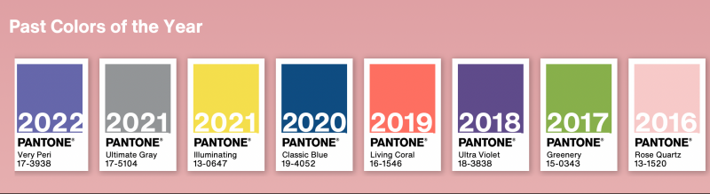
Every year, it’s the same story. A handful of major paint brands and color authorities announce their “Color of the Year,” and suddenly, my inbox is flooded. Friends, clients, even my cousin who’s just starting a DIY project—they all want to know if they should jump on the bandwagon.
In this article
And I get it. These announcements are exciting! But let’s be honest, they also cause a ton of anxiety. People see a trendy color and feel like they have to use it to be stylish, but they’re terrified of making a costly mistake. But here’s a little secret from the pros: we don’t see these colors as rules. We see them as conversation starters. They’re a reflection of the general mood, a new tool in our toolbox.
Using them well is about more than just picking up a gallon of paint. It’s about understanding how color really works in your space. So, forget the marketing hype. We’re going to walk through the same process I use with my own clients to choose colors with confidence. My goal is to help you create a home that feels amazing to you, long after the trend has passed.

First, Where Do These Colors Even Come From?
It’s easy to imagine a group of executives throwing darts at a color wheel, but the truth is a lot more interesting. The process is a mix of science, art, and a whole lot of research.
Color forecasting experts spend months traveling the world, looking for patterns. They’re at fashion shows, tech expos, art galleries, and even watching food trends. They’re asking, “What shades are people being drawn to? What emotions are popping up again and again?” The final color they choose is meant to capture that global feeling. It’s a snapshot of a moment in time.
It’s also good to know there’s a difference between the color systems used by designers and the paint you buy at the store. One group sets a universal standard—a reference color that manufacturers can use. The big paint companies then take that info, mix it with their own research, and select a specific paint from their line. Their choice is grounded in reality: what colors can they produce reliably, and what do they know people will actually put on their walls? That’s why you’ll see several different “Colors of the Year” each season.
And yes, of course, it’s a huge marketing push. These announcements are designed to get us thinking about color and, hopefully, buying new things. That doesn’t make the colors bad, but it’s a reality to keep in mind. Think of it as inspiration, not a directive.
The Pro’s Method for Testing Paint (and Avoiding Disaster)
This is where so many good intentions go wrong. You see a gorgeous color on a tiny paper chip in the hardware store, you spend your weekend painting, and… you hate it. It’s too dark, too bright, or that sophisticated gray you picked now looks lavender. I’ve seen it happen more times than I can count.
Professionals avoid this by following a strict testing process. Trust me on this.
Why That Tiny Paint Chip Is Lying to You
A small paper swatch is probably the most deceptive tool in home design. It can’t possibly show you how a color will behave in your home because of a little thing called metamerism. That’s just a fancy word for when a color seems to change under different light. The harsh fluorescent lights at the store are worlds away from the warm, golden light of your west-facing window or the cool, blue-ish light in a room that faces north.
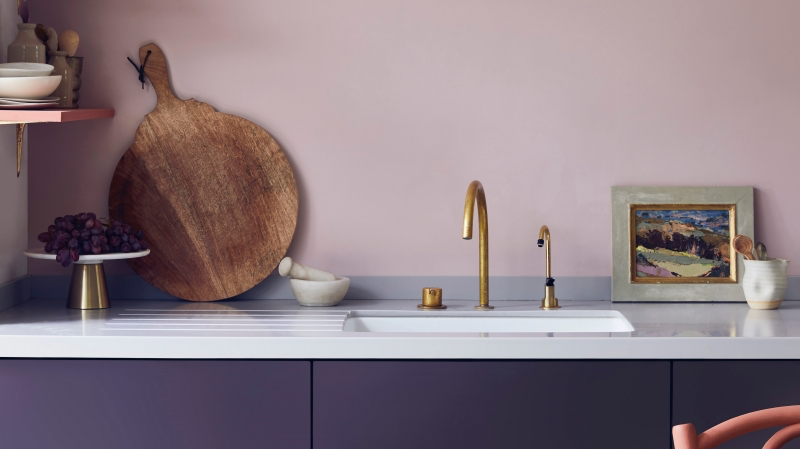
Oh, and let’s talk undertones. This is the number one secret to understanding color. Most complex colors (like beiges, grays, and whites) are made by mixing in other colors. That “warm gray” might have a yellow or red undertone, while a “cool gray” might have a blue or purple one. These undertones can pop out unexpectedly in your home’s lighting. A quick pro tip for spotting them? When you’re looking at a paint strip, look at the darkest color at the very bottom. That shade will usually reveal the color’s true undertone. If it’s a deep navy, you can bet your light gray has blue in it.
The Foolproof Sampling Method
Never, ever, EVER choose a color from a tiny swatch alone. Here’s the only way to do it right:
- Invest in a Sample Pot. Seriously, don’t skip this. Spending a few bucks on a sample is the best insurance you can buy against a huge mistake.
- Make BIG Samples. Don’t just paint a splotch on your wall! The current color will mess with your perception. Instead, grab a couple of large foam core boards—at least 2 feet by 2 feet.
- The Quick Shopping List: Head to a craft or hardware store. You’ll need two 2’x2′ foam boards (about $5), a cheap 2-inch paintbrush (around $3), and your sample pot of paint (usually $5-$10). That’s a less-than-$20 investment to prevent a $600 painting mistake!
- Paint Your Boards. Give each board two full coats, letting it dry completely between coats.
- Live With It. Now, for the next 24 to 48 hours, move those boards around the room. Put one next to the window. Put the other on a darker, interior wall. Look at them in the morning, at noon, in the late afternoon, and at night with all your lamps on. This is the only way to see how the color truly lives in your space.
Sheen Matters. A Lot.
The same paint color can look wildly different depending on its finish, or sheen. The more reflective the paint, the more intense the color will feel. Here’s a quick rundown:
- Matte or Flat: This finish has almost no shine. It’s amazing at hiding imperfections on a wall and gives color a soft, velvety depth. I love it for ceilings or formal living rooms. The downside? It’s the least durable and scuffs easily, so it’s not great for high-traffic areas or kids’ rooms.
- Eggshell or Satin: This is my go-to for most walls. It has just a hint of a glow, offering the perfect balance between a beautiful, low-reflection look and decent washability. It makes colors feel rich without being shiny.
- Semi-Gloss: Very reflective and super durable, this is what you want for trim, doors, and maybe kitchen cabinets. But be warned: the high shine will make any color seem much bolder and will highlight every single bump, nail pop, or flaw on a wall. Using a bright, trendy color in semi-gloss on all four walls is a BOLD move.
By the way, if you look at the back of a paint swatch, you’ll see a number for LRV, or Light Reflectance Value. It’s on a scale from 0 (black) to 100 (white). A high LRV (over 60) means the color reflects a lot of light, making a room feel brighter. A low LRV (below 40) means it absorbs light, creating a cozier, more dramatic vibe. It’s a handy number to know!
Where to Actually Use Trend Colors (and Where to Skip Them)
Okay, so you’ve tested a color and you love it. Now what? You don’t have to paint your entire living room with it. In fact, sometimes the smartest use of a bold, trendy color is in small, powerful doses.
The Classic 60-30-10 Guideline
This is a time-tested design framework that works wonders. It’s not a strict rule, just a great guide for balance.
- 60% is your dominant color: This is usually your walls. Often a neutral or a color you can easily live with.
- 30% is your secondary color: Think accent walls, curtains, or a major piece of furniture.
- 10% is your accent color: This is your pop! It’s for throw pillows, art, a vase, or other small decor.
That 10% accent role is the absolute perfect job for a trendy Color of the Year. It lets you bring that energy into your space without the massive commitment.

High-Impact, Low-Commitment Ideas
If you’re hesitant to put a bold color on the walls, here are some of my favorite ways to play with trends:
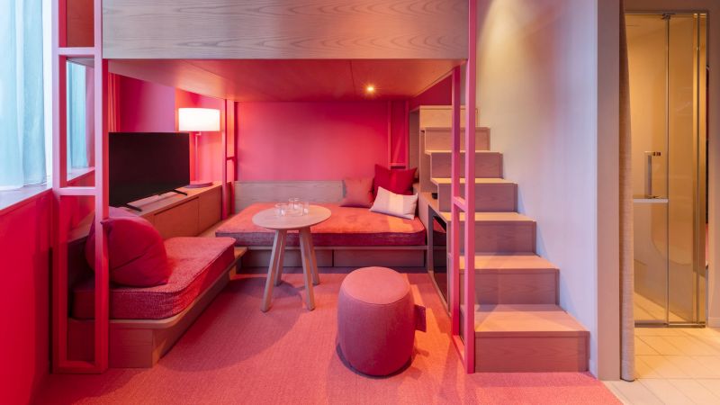
- The Front Door. Painting the exterior or even just the interior side of your front door is a fantastic way to add personality. Imagine a classic, neutral entryway. Now, paint the inside of the door a deep, leafy green. It instantly feels custom and thoughtful. Best part? It’s a small project you can knock out in a couple of hours and easily repaint if you get tired of it.
- A Powder Room. These tiny, enclosed spaces are begging for drama! Because you’re in and out quickly, a bold color won’t feel overwhelming.
- A Piece of Furniture. That old dresser from a flea market? A coat of a fun, trendy color can transform it into the star of the show.
- Textiles. This is the easiest, most affordable way, hands down. Pillows, a throw blanket, a rug, or even new kitchen towels. You can swap them out in minutes as your mood (or the trends) change.
Areas to Be Cautious
I always urge clients to think long-term before using a super-trendy color on expensive, hard-to-change items. Think twice about it for:
- Kitchen Cabinets: Having cabinets professionally painted is a big job and a big expense. A timeless white, gray, or wood tone is often a safer investment for resale value. You can always add the trendy color with your backsplash tiles or bar stools.
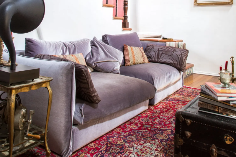
- Big Sofas or Sectionals: For most of us, a sofa is a decade-long commitment. A neutral sofa with trendy pillows is way more flexible.
- Exterior Siding: Your home’s exterior color impacts curb appeal and has to stand up to the elements. Deep, saturated colors are known to fade faster in the sun than lighter shades.
Final Checks: Light, Troubleshooting, and When to Call for Backup
Before you start, remember that color isn’t absolute. A gorgeous greige that looks sophisticated and soft in a cool, northern climate can look like a flat, sad beige under the intense sun of a southern region. You have to consider how your color will look next to your wood floors, your stone fireplace, and your furniture.
Try This Tonight: The 5-Minute Lightbulb Test
When a client calls me in a panic saying, “My new gray walls look purple at night!” my first question is always about their lightbulbs. This is a game-changer. Before you paint a single thing, try this experiment. In a room you want to paint, swap the current bulb for a ‘warm white’ bulb (around 2700K-3000K) and then for a ‘daylight’ bulb (4000K-5000K). Watch how your current wall color completely changes. A warm bulb will bring out yellows and reds, while a cool bulb will highlight blues and purples. This is the fastest way to understand the power of light in your home.
A Quick Word on Safety
A great paint job is also a safe one. Always opt for low-VOC or zero-VOC paints for interiors; they’re much healthier to breathe. And a heads-up: if your home was built before the early ’80s, it may have lead-based paint. Disturbing it by sanding or scraping creates toxic dust. If you suspect you have lead paint, get it tested. If it’s positive, hire a certified lead abatement professional. It’s not worth the risk.
When to Call a Pro
A weekend warrior can definitely handle painting a bedroom. But it might be time to call in an expert if you’re tackling a whole-house project, have soaring ceilings, or just feel paralyzed by the choices. A good painter might charge between $500 and $1,200 for an average-sized room, but their prep work and skill can save you from a costly do-over. Alternatively, hiring a color consultant for a few hours (typically $150-$500) can give you a concrete plan and save you a ton of stress.
At the end of the day, the Color of the Year is a fantastic source of inspiration. It can push you to try something new. But it’s an invitation, not a command. The most beautiful homes aren’t the trendiest ones; they’re the ones that truly reflect the people living inside. So take these insights, trust your gut, test your colors, and create a space that you’ll love for years to come.
Inspiration:
Matte Finish: Offers a modern, velvety look that hides minor wall imperfections beautifully. It’s a designer favorite for low-traffic areas like bedrooms or formal living rooms for its sophisticated, non-reflective quality.
Eggshell/Satin Finish: Has a subtle sheen that makes it far more durable and wipeable. This is the workhorse finish, perfect for high-traffic zones like hallways, kitchens, and kids’ rooms where scuffs and fingerprints are a reality.
Remember, the same color code can look dramatically different depending on its finish, so always test the exact one you plan to use.

- It reveals the color’s true undertones in your specific lighting.
- It helps you see how the shade interacts with your flooring and furniture.
- It prevents the expensive mistake of repainting an entire room.
The secret? Never paint a small test swatch directly on your old wall color. Instead, paint two coats onto a large poster board and move it around the room at different times of day.
Over 60% of color perception in a room is influenced by the quality and color temperature of its light source, both natural and artificial.
A paint color doesn’t exist in a vacuum. A chic gray like Benjamin Moore’s ‘Stonington Gray’ might look perfectly neutral under the store’s fluorescent lights but can reveal cool, blue undertones in a north-facing room. Conversely, the warm glow of an incandescent bulb in the evening can pull out its warmer, softer side. This is why the poster-board trick is so vital—it lets you see the color’s true personality as the light changes.
Can’t decide between two shades?
Try the 50/150 rule, a trick used by professional color consultants. Buy sample pots of both colors. Paint a large board with your primary choice (the one you’re leaning toward). Then, paint a smaller board with the second color. Place the large board on your main wall and the smaller one nearby. Live with it for a couple of days. The 50/150 refers to the paint cost (around $50 for samples) versus the potential cost of repainting (often $150 or more per gallon, plus labor). It’s a small investment for color confidence.


