Don’t Just Paint It White: A Pro’s Guide to Actually Fixing a Dark Room
Over the last couple of decades holding a paintbrush, I’ve walked into hundreds of homes, and the number one complaint is always the same: the dreaded dark room. It might be a north-facing living room that just never feels bright, a home office with one sad little window, or a basement that has serious cave-like vibes. The first thing people always say is, “I guess we have to paint it bright white, right?” I usually just smile, because I know a secret: we can do so much better than that.
In this article
Here’s the thing: painting a dark room isn’t about fighting the darkness with the brightest white you can find. It’s about working with the light you have. A can of stark, cold white paint in a room with poor, cool light can look surprisingly grim. It has a tendency to go shadowy and cold, feeling more like a hospital corridor than a cozy living space. My job isn’t just to slap paint on a wall; it’s to get how light, color, and space all play together.
I’ve learned that you have two main paths you can take with a dark room. You can choose a color that cleverly reflects and amplifies the limited light you have. Or, you can lean in, embrace the moodiness, and create a space that feels intentionally cozy, rich, and dramatic. Both approaches are fantastic, as long as you understand the why behind them.
The Real Secret to Choosing a Paint Color
Before we even think about looking at a single paint chip, we need to talk about three things that matter way more than the color’s catchy name: Light Reflectance Value (LRV), undertones, and paint sheen. Get these right, and you’ll choose your color with confidence. Get them wrong, and… well, you’ll be repainting sooner than you’d like.
Light Reflectance Value (LRV): Your New Best Friend
Every single paint color has a Light Reflectance Value, or LRV. It’s a simple number on a scale from 0 (think absolute black) to 100 (pure, brilliant white). This number tells you exactly how much light a color reflects back into the room. You can usually find the LRV on the back of the paint chip or by looking up the color on the paint company’s website. Honestly, it’s the most useful tool you have.
- If you want to brighten the room: Look for colors with an LRV of 60 or higher. These will bounce back over 60% of the light that hits them, which genuinely helps the space feel brighter and more open. This is your go-to range for an airy feel.
- If you want to embrace the dark: Look for colors with an LRV of 20 or lower. These colors soak up light, creating a deep, rich, and super-cozy atmosphere. This is the perfect strategy for a moody library, a media room, or a den where you want to feel enveloped.
A classic mistake is picking a color that looks light on a tiny chip but has an LRV of, say, 45. On the wall, that color will absorb more than half the light in the room, making it feel even dimmer. The LRV number doesn’t lie, so learn to trust it.
The Make-or-Break Role of Undertones
Two colors can have the same LRV but feel worlds apart in a room. Why? Undertones. The undertone is that subtle, background color that gives a paint its personality. They are either warm (with hints of yellow, red, or beige) or cool (with hints of blue, green, or purple-gray).
In a dark room, the undertone is everything. North-facing rooms, for example, get cool, blueish light all day. If you paint that room a color with a cool, gray undertone, the whole space can feel icy and sterile. But if you use a color with a warm, creamy undertone, it will balance out that cool light and make the room feel so much warmer and more inviting.
Good to know: The easiest way to spot an undertone is to hold your paint chip against a plain piece of white printer paper. Against the pure white, the undertone will pop right out. Is that “greige” leaning a little pink? Is that “off-white” actually a very pale yellow? This five-second trick can save you a world of hurt. I once had a client who chose a beautiful light gray for her north-facing bedroom. On the walls, the cool northern light grabbed onto its hidden blue undertone, and the room ended up looking like a pale blue nursery. We had to repaint with a warmer gray—one with distinct beige undertones—to get the sophisticated look she was after.
Quick Win: Check Your Lightbulbs!
Before you do anything else, look up. The type of light bulb you use can completely change your paint color at night. If you want to see a change today, try this. Many people use “Daylight” bulbs (5000K or higher), which give off a stark, bluish light that can make even the coziest room feel like a laboratory.
For a ten-dollar fix that makes a world of difference, swap them for “Warm White” or “Soft White” bulbs (around 2700K-3000K). The warmer, gentler glow they give off can instantly make a space feel more inviting.
How to Test Paint Like a Pro (and Avoid Regret)
You’d never buy a car without a test drive, right? So please, never commit to gallons of a paint color based on a tiny paper chip from the hardware store. It’s just not reliable.
This is the foolproof method I use, and it’s never failed me:
- Buy Sample Pots: Don’t be cheap here. Spend the $5-$10 per pot for your top two or three choices. It’s the best money you’ll spend on the whole project.
- Make HUGE Swatches: Paint a big square, at least 2 feet by 2 feet, for each color. Even better, paint them on a piece of white poster board. This lets you move the color around the room without marking up your walls.
- Test on Different Walls: A color will look totally different on the wall getting direct light versus the one in shadow. Move your poster board swatches around to see how the color behaves on different walls.
- Live With It for 48 Hours: This is the most important step. Look at the colors at all times of day—bright morning, midday, late afternoon, and especially at night with your lights on. A color you adore in the morning might look sickly or dull in the evening.
Don’t Forget About Paint Sheen
The sheen, or gloss level, of your paint has a massive impact on both light and durability. It’s not just a minor detail!
Think of it this way:
- Flat or Matte: This finish has a soft, velvety look because it absorbs light. It’s a champion at hiding wall imperfections like bumps and waves. This is my top pick for the “embrace the dark” strategy with rich, deep colors. Heads up, though: it’s the least durable and a real pain to clean.
- Eggshell: My go-to for most rooms. It has a very subtle luster, like an actual eggshell, and gives off a soft glow when light hits it. It’s the perfect middle-ground—more durable and washable than flat, but not shiny.
- Satin: A step up in shine from eggshell. It reflects more light and is very durable, which makes it great for high-traffic areas or even bathrooms. It can definitely help brighten a space, but it will also start to show more of those little wall flaws.
- Semi-Gloss & Gloss: These are very reflective and super tough. I almost exclusively use these for trim, doors, and cabinets. Using them on all the walls of a dark room would create a distracting glare and highlight every single imperfection on the surface. No, thank you.
Strategy 1: Amplify the Light
Okay, so your goal is to make a dark room feel brighter, bigger, and more open. We’re hunting for colors with an LRV of 60 or higher that have the right undertones to work with your room’s light.
- Complex Off-Whites: Instead of a sterile, builder-grade white, go for an off-white with warm, complex undertones. The most successful ones often have an LRV between 82 and 85. Look for popular colors from major brands, often with names that evoke softness like ‘dove’ or ‘alabaster’. They have just enough creamy pigment to feel inviting, not stark.
- Warm Grays (or “Greiges”): A cool, blue-based gray in a dim room can feel like a concrete bunker. The secret is to find a warm gray, often called a “greige” because it’s a perfect mix of gray and beige. That beige undertone adds the warmth you need to feel cozy and sophisticated. These are workhorses and look good in almost any light.
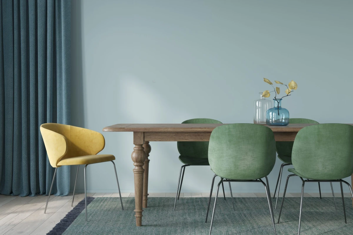
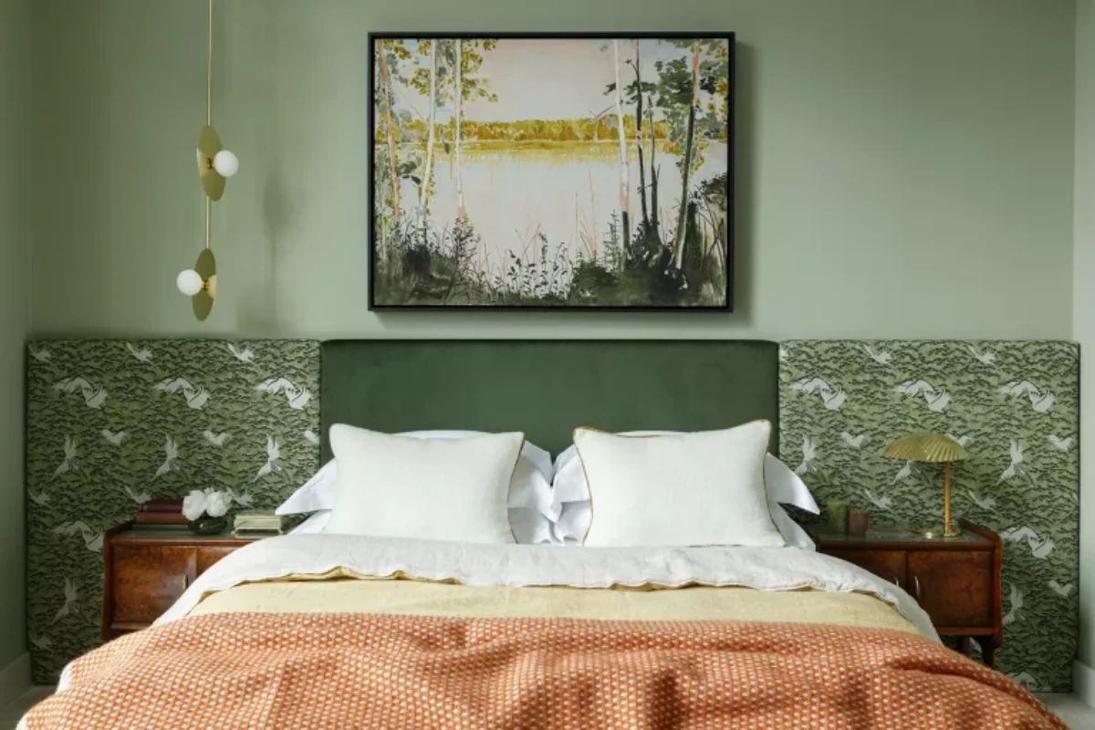
- Muted Blues and Greens: Tapping into the colors of nature can make a room feel more expansive. The key is to choose soft, muted shades—think of a pale sky blue with a hint of gray, or a soft sage green. You need just enough pigment for the color to hold its own without being so dark that it eats light.
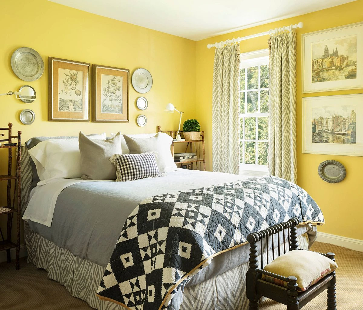
- Buttery Yellows or Soft Pinks: To actively inject some cheer, a soft yellow or a dusty pink is an amazing choice. A light, buttery yellow can mimic the feel of sunshine. A muted, dusty pink with earthy undertones can bring incredible warmth and sophistication.
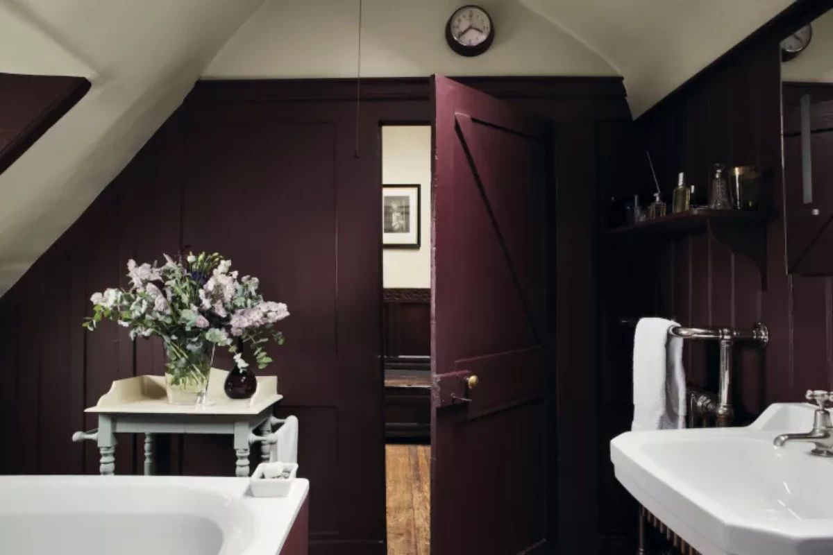
Strategy 2: Embrace the Cozy Drama
This is a more confident, advanced approach, and I absolutely love it. Instead of fighting a dark room, you lean into it. By using a dark, saturated color, you make the space feel intentional, intimate, and luxurious. It’s a game-changer for a den, study, powder room, or a bedroom where you want a cocoon-like feeling.
Dark colors absorb light and trick the eye by blurring the boundaries of a room, making it hard to tell where the walls end. This creates a sense of depth and mystery. A room painted a deep navy doesn’t feel small; it feels infinite.
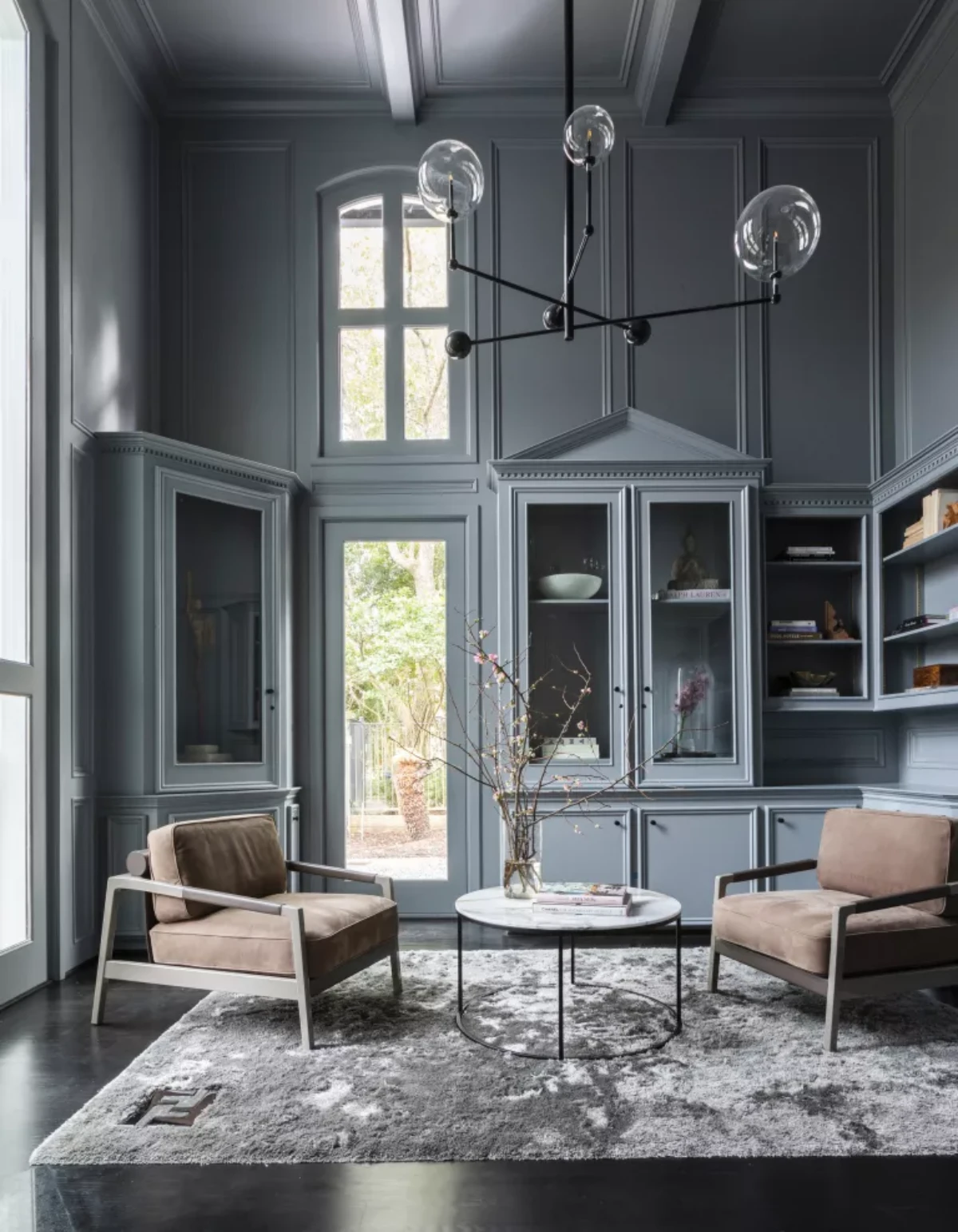
And yes, let’s talk about the ceiling. I know what you’re thinking: ‘Won’t a dark ceiling feel like it’s caving in on me?’ Honestly, it often does the opposite. In a technique called “color drenching”—where you paint the walls, trim, and ceiling the same dark color—it blurs the room’s edges and can make the space feel boundless, not small. It’s a bold move, but the payoff is huge.
For this strategy, you’re looking for deep, rich colors with a low LRV, typically under 20. Think deep navy or forest green, chic charcoal gray, or even a luxurious jewel tone like plum or burgundy.
The Real Work: A Weekend Project Plan
Choosing the color is the fun part. But a pro-level result comes from methodical prep. This is where most DIY projects fail. I tell every apprentice: preparation is 90% of the job.
Your Pro Painting Kit & The Real Cost
Investing in decent tools will save you so much frustration. Here’s what you need:
- A quality 2.5-inch angled sash brush (for cutting in edges)
- A sturdy 9-inch roller frame and a few quality roller covers (a 3/8-inch nap is perfect for smooth walls)
- A roller tray with disposable plastic liners (for easy cleanup)
- Good painter’s tape and a canvas or plastic drop cloth
The Budget: Expect to spend around $75 to $150 for a kit of tools that will last and won’t shed bristles into your paint. For the paint itself, a gallon of quality, high-pigment paint will run you $50 to $90. The cheap stuff is just watered down and requires more coats—it’s a false economy.
Your Weekend Timeline
For a typical 12×12 room, set aside a full weekend. Don’t rush it.
- Saturday (The Boring-But-Critical Prep): Move furniture, lay down drop cloths, and tape off your trim. Wash the walls with a mild detergent to get rid of dust and grime. Fill any nail holes with spackle, then sand them smooth once dry. Finally, prime your walls. Don’t skip primer! It ensures your expensive topcoat looks its best.
- Sunday (The Fun Part): Time to paint! Do your “cutting in” first—painting the edges along the ceiling, corners, and trim with your brush. Then, use your roller to fill in the main wall areas. Let the first coat dry completely (check the can, but usually 2-4 hours) before applying the second.
Pro Tip: Before you even buy the paint, use an online paint calculator to figure out how many gallons you need. Nothing is worse than running out of paint mid-wall.
A Quick But Critical Safety Warning
As a pro, safety is everything. First, make sure you have good ventilation. Open the windows and use a fan. Most major brands now offer excellent low-VOC and zero-VOC paints, which are much better for your indoor air quality. I recommend them to everyone.
MOST IMPORTANTLY: If your home was built before the late 1970s, there is a very real chance it contains lead-based paint. Sanding or scraping lead paint creates toxic dust that is incredibly dangerous, especially for children. You can get a lead test kit from any hardware store for about $10. If the test is positive, STOP. This is not a DIY job. Hire a professional who is certified in lead-safe work practices. Your family’s health is not worth the risk.
Ultimately, choosing a paint color for a dark room is an amazing opportunity. You can make it feel bright and expansive, or you can turn it into a cozy, protective retreat. There is no single “best” color—only the best color for your room and the feeling you want to create. Trust the numbers, test your colors, and don’t be afraid to go beyond plain old white.
Inspirational Gallery with Photos
What if I embrace the dark and go for a bold, saturated color?
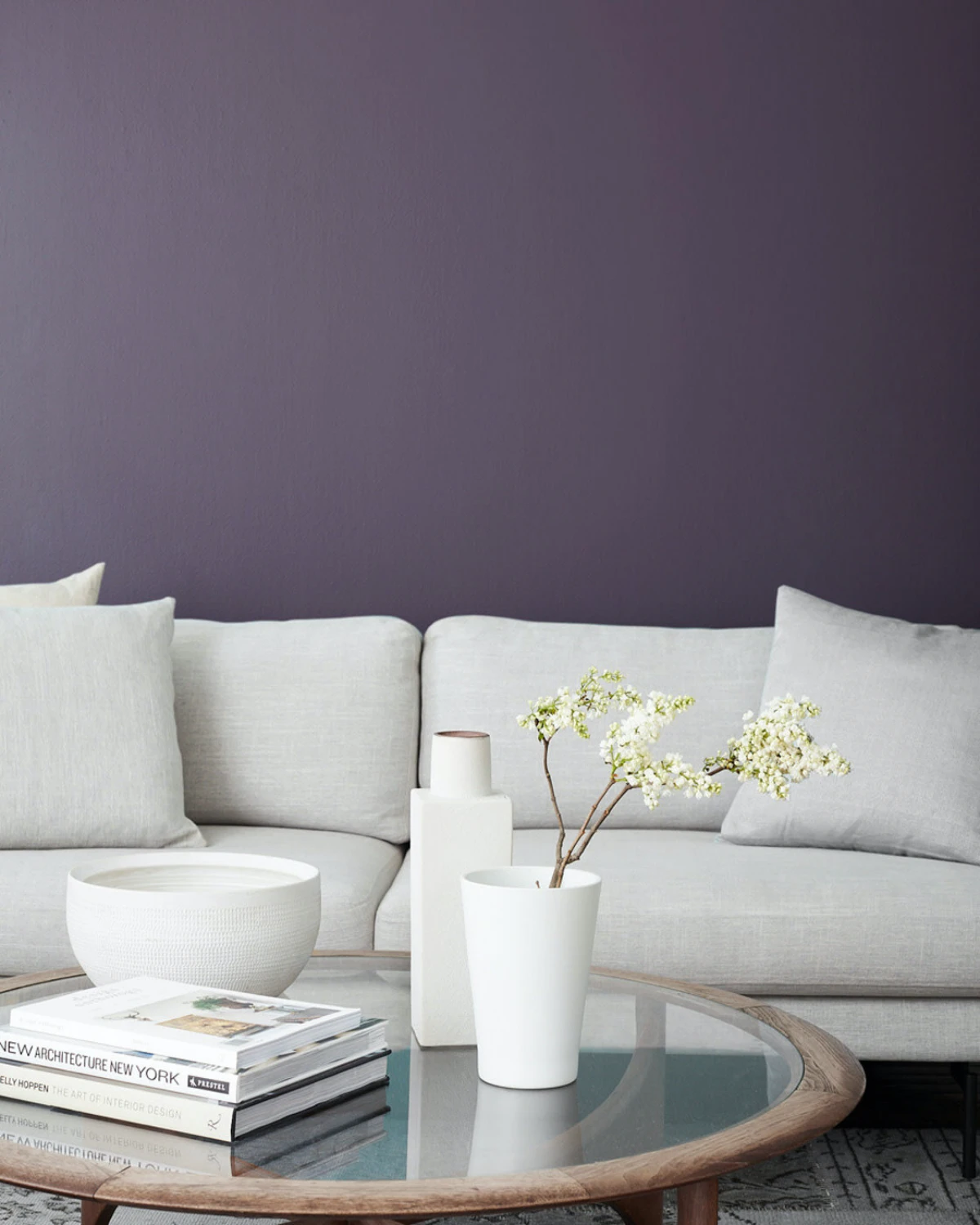
This is a wonderfully dramatic approach. Instead of fighting the lack of light, you lean into it to create a ‘jewel box’ effect. Deep teals, rich burgundies, or forest greens create an immersive, cozy, and sophisticated atmosphere, especially in a small space like a study or powder room. The key is to use a paint with a subtle sheen, like eggshell or satin, and add warm, layered lighting with metallic accents (think brass lamps and fixtures) to make the space glow from within.
- It bounces light deep into the room.
- It creates the illusion of a new window.
- It visually doubles the impact of your best decorative pieces.
The secret? A strategically placed, oversized mirror. Forget small, decorative mirrors. To truly transform a dark room, think big. Leaning a large, simple floor mirror, like the HOVET from IKEA, against a wall opposite your main light source can be more effective than repainting entirely.
The light in a north-facing room is consistently cool and blue-toned.
This is why that sample of ‘greige’ paint you loved in the store can suddenly look dreary and purplish on your wall. To counteract this, opt for colors with warm undertones. You don’t have to go full yellow; look for whites with a creamy or ivory base, or grays with a hint of beige or green. Benjamin Moore’s ‘Balboa Mist’ is a great example of a warmer gray that stays true in cool light.
The Wrong White: A stark, cool white (low in pigment, high LRV) in a room with poor natural light will often reflect the shadows, making the space feel cold, flat, and institutional.
The Right White: A complex, warm off-white (with yellow, pink, or beige undertones) will absorb the coolness and create a soft, welcoming glow. Try Farrow & Ball’s ‘Wimborne White’ or ‘School House White’ for a timeless, luminous effect.
Don’t neglect the fifth wall: The ceiling. Painting it in the same color as the walls, a technique known as ‘color drenching,’ can blur the room’s edges and make it feel more expansive and cohesive. If you’re using a lighter wall color, consider painting the ceiling a shade or two lighter than the walls to give a subtle lift without the jarring contrast of brilliant white.
“Light is the magical ingredient that makes or breaks a space; it’s one of the most important elements in all my interiors.” – Benjamin Noriega-Ortiz
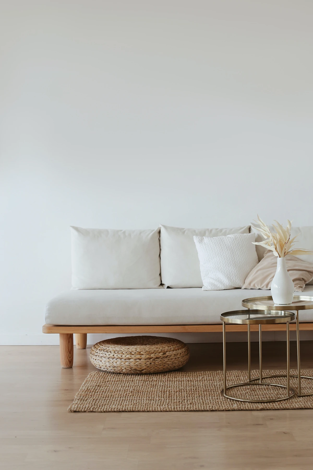
Before you choose a wall color, look down. Your flooring has a huge impact on the room’s overall light level. A dark wood or deep-colored carpet will absorb light. While replacing a floor is a major project, you can instantly lift a room with a large, light-colored area rug. A low-pile wool in a cream or a natural fiber rug like jute or sisal will reflect light upwards and make the entire space feel brighter.
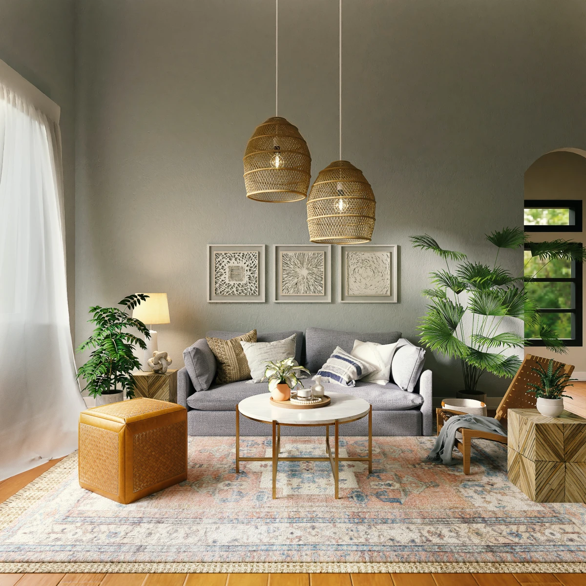
Think in layers when it comes to artificial light. A single overhead fixture creates harsh shadows. A well-lit room needs at least three sources:
- Ambient: General illumination, from a ceiling fixture or recessed lights.
- Task: Focused light for activities, like a reading lamp by a chair.
- Accent: Light that highlights features, like a picture light or an uplighter behind a plant.
Bonus tip: Use ‘warm white’ bulbs (around 2700K-3000K) to replicate the cozy feel of sunlight.
The power of sheen: People often default to a matte or flat finish, but in a dark room, this is a missed opportunity. A satin (or ‘eggshell’) finish has a soft, velvety luster that gently bounces light around the room. It’s far more effective at amplifying light than a flat finish, without the high shine of a semi-gloss. It’s the perfect compromise for living spaces and bedrooms.
Metallic finishes are your secret weapon for brightening a dark corner. They don’t just add glamour; they reflect light beautifully. Swap out dark or wooden hardware for brushed brass, polished nickel, or warm copper on cabinet pulls, curtain rods, and lamp bases. Even a large gold-framed picture or a silver tray on a coffee table can catch the available light and create a little sparkle.


