The Ultimate Guide to Choosing a Wallpaper That Doesn’t Suck
We’ve all been there. You find an image you love, slap it onto your phone’s background, and… yikes. It’s blurry, the clock covers the best part, and your app icons suddenly become impossible to read. It’s a super common problem.
In this article
For years, my job has been all about designing visual stuff for companies and people. And honestly, the most personal and important piece of digital real estate is that wallpaper on your phone or computer. It’s the welcome mat for your digital life. It sets the mood every single time you unlock your device. It’s way more than just a picture; it’s the canvas you paint your daily interactions on.
So, let’s skip the frustration. I’m going to walk you through the exact same process I use, breaking down the technical bits that make an image look crisp and the artistic tricks that make your screen feel calm and organized. This isn’t about chasing trends; it’s about crafting a space that just works.
First Things First: The Techy Stuff (Made Easy)
Before we get to the fun part, we have to talk about the technical foundation. A gorgeous photo can look absolutely terrible as a wallpaper if it doesn’t match your screen’s specs. Think of it like this: you can’t print a tiny thumbnail-sized image on a giant poster and expect it to look good. Same deal here.
Screen Resolution and Why It Matters
Every screen is a grid of tiny lights called pixels. Resolution is just the count of those pixels, like 1080 pixels wide by 1920 pixels tall. Modern phones have incredibly high pixel density, which is why they look so sharp. They cram a ton of pixels into a small space.
Here’s the catch: most images you find floating around the web are saved at a lower resolution that’s fine for a website but not for your screen. When you set a low-res image as your wallpaper, your phone has to stretch it to fit, basically guessing what pixels should fill the gaps. The result? A blurry, pixelated mess.
Quick Tip: Always, and I mean always, go for the highest resolution image you can find. For a desktop monitor, you want something at least as wide as your screen (e.g., 1920px for a standard HD screen). For a phone, you need to aim even higher. As a rule of thumb, look for images that are at least 3000 pixels tall. That’ll cover pretty much any modern phone and look fantastic.
By the way, if you want to find your phone’s exact resolution, it’s pretty easy. On Android, you can usually find it under Settings> About Phone> Display. For an iPhone, a quick search online for your specific model and “screen resolution” will give you the exact numbers in seconds.
Aspect Ratio and Cropping Woes
Aspect ratio is simply the shape of your screen. A computer monitor is a wide rectangle (like 16:9), while your phone is a tall one (more like 19.5:9). You can’t just squish a wide image into a tall space without something getting cut off.
And have you ever noticed how your wallpaper shifts a little when you tilt your phone? That’s the parallax effect. To make that work, your phone actually uses an image that’s slightly larger than your screen, giving it some extra room—or “bleed”—to move around in. If your image is the exact size of your screen, you might see weird black bars when it moves. The pros often add about 15% of extra image around the main subject to account for this.
File Formats in Plain English
The file type matters, too, but it’s not as complicated as it sounds. Here’s the breakdown:
- JPEG (or JPG): This is your best friend for any kind of photograph. It handles millions of colors and keeps file sizes manageable. Just make sure it’s saved at a high-quality setting (80% or higher) to avoid any weird blockiness.
- PNG: This is the go-to for graphics, logos, patterns, or anything with sharp lines and flat colors. PNG files don’t lose quality when they’re compressed, which keeps everything looking crisp. They’re also the only common format that supports transparency, which is a neat trick for more advanced designs.
- HEIC: If you have a modern iPhone, you’ve probably seen this one. It’s a super-efficient format that gives you high quality with a smaller file size than a JPEG. If you’re using a photo you took on your phone, it’ll work perfectly.
The Designer’s Eye: Making It Functional and Beautiful
Okay, with the technical stuff out of the way, let’s talk art. A wallpaper has to coexist with all your icons and widgets, so it needs to be a team player.
The Biggest Mistake: The “Busy” Wallpaper
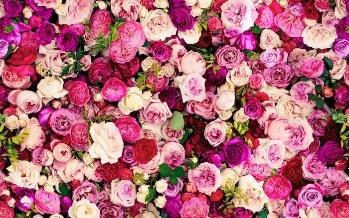
The number one sin of wallpapers is choosing an image that’s too busy. A picture with a ton of faces, text, or complex patterns creates a ton of visual noise. It fights for attention with your app icons, making your screen feel cluttered and stressful to look at.
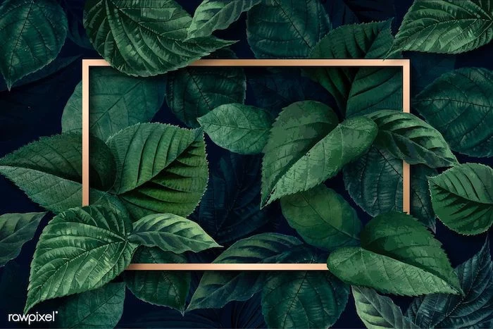
Imagine a photo of your favorite band on stage—lots of people, lights, and action. It’s a cool photo, but as a wallpaper? Your icons will get completely lost. Now, picture a serene photo of a misty forest path or a minimalist shot of a single leaf on a clean surface. See the difference? That clear, uncluttered area is what designers call “negative space.”
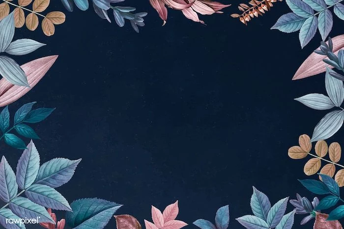
Look for images with lots of it. A calm sky, an empty beach, a simple textured wall—these are perfect. They give your icons a quiet place to live, making them easy to find and organize.
The Pro Legibility Test (You Can Do This in 2 Minutes)
Here’s a trick I swear by. Before you commit to a wallpaper, you need to test it. It’s super easy.
- Take a screenshot of your phone’s home screen, with all your normal icons and widgets.
- Download a free app like Canva or Snapseed. Open it and start a new project using their “Phone Wallpaper” template.
- Drop your potential wallpaper image onto the background.
- Now, add your home screen screenshot as a new layer on top. You can even make it slightly transparent to see the wallpaper behind it.
- Can you still easily read all your app names? Do any icons get lost? If everything is clear, you’ve got a winner. Boom. Test complete.
This simple check saves so much frustration. I once had a client who insisted on using a photo of a sun-drenched kitchen. It had bright white cabinets and deep black shadows. No matter what color the phone’s text was—white or black—it would disappear into part of the image. We switched to a photo with more even, mid-tone lighting, and suddenly, everything was perfectly legible.
Where to Find Great Wallpapers (and How to Make Your Own)
You don’t need to be a designer to get a pro-level wallpaper. You just need to know where to look.
Trusted Sources for High-Quality Images
A random internet search is a total gamble. Instead, head to places that specialize in high-quality, free-to-use images. Sites like Unsplash, Pexels, and Pixabay are treasure troves. They are full of stunning photography you can search by color, subject, and even orientation (search for “vertical” to get phone-friendly shots).
Try this right now: Go to Unsplash and search for “vertical abstract gradient.” I guarantee you’ll find a beautiful, minimalist background in less than 60 seconds. It’s a huge upgrade from the default, and it takes no effort at all.
For something more unique, check out the online archives of world-class museums. Many major art institutions have digitized their collections and offer ultra-high-resolution downloads of classic paintings and textiles for free. The NASA image library is another incredible resource for mind-blowing photos of space that make for perfect dark-mode wallpapers.
Making Your Own (It’s Easier Than You Think)
Sometimes, the best wallpaper is one you make. No, you don’t need fancy software. Just grab your phone.
Try photographing a texture. Get up close to some wood grain, the fabric on your sofa, a concrete wall, or even a piece of paper. These abstract, low-contrast images make fantastic backgrounds because they don’t distract from your icons at all.
Pro-Level Move: Pairing Your Lock and Home Screens
Want to take it a step further? Create a coordinated theme for your device. A classic pro technique is to pair your lock screen and home screen.
Think of it this way: the lock screen is for art, and the home screen is for work. The lock screen is seen for a moment, so it can be a beautiful, detailed photo you love. The home screen needs to be functional. So, you can use a simplified version of the lock screen image. Either use an editing app to pick a single dominant color from the photo for a solid color background, or zoom in on a small, abstract, out-of-focus part of the main photo. This creates a perfectly clean backdrop that still feels connected to your lock screen.
A Quick Word on Safety and Respect
This is a big one for me. Much of the art you find online was made by a real person. Using it without permission or payment isn’t just a legal issue; it’s disrespectful to the creator. If you find an artist you love, check their website or social media. Many sell digital wallpaper packs for very reasonable prices—think anywhere from $3 for a single design to $15 for a whole collection on sites like Etsy. It’s a fantastic way to get something truly unique while supporting an artist directly.
And a heads up! Be very careful with those third-party “free wallpaper” apps. At best, they’re loaded with ads. At worst, they can contain malware. My advice? Get your images from a trusted website and set them using your phone’s built-in settings. It’s just not worth the risk.
At the end of the day, your phone is your space. These are just tools to help you make it feel better. The goal is to find that sweet spot between a look you love and a layout you can actually use. Now go make your screen a little more awesome.
Inspiration Gallery
The #1 Mistake: Forgetting your icons. A stunning photo can become a chaotic mess once your apps are plastered over it. Before committing, take a screenshot of your home screen and layer it over your potential wallpaper in a photo editor. Can you still clearly read your app labels?
For curated, artistic options that are already perfectly sized, check out the Vellum app. It’s a goldmine of high-resolution photographic and graphic images, sorted into beautiful collections. The built-in blur tool is a game-changer for creating a soft-focus home screen background that complements a sharp lock screen image.
- Choose shots with plenty of ‘negative space’ (sky, walls, open fields).
- Apply a subtle filter, like VSCO’s A6 preset, to give it a cohesive, less ‘snapshot’ feel.
- Don’t place the main subject right in the center where the clock and widgets usually live.
On an OLED screen (used in most modern iPhones and high-end Androids), a true black pixel is a pixel that is turned off.
This means a predominantly black wallpaper can genuinely save a small amount of battery life throughout the day. It’s both a sleek aesthetic and a practical choice.
Should my Lock Screen and Home Screen match?
Think of them as a duo. A popular designer trick is to use a bold, captivating image for the Lock Screen (the ‘wow’ moment) and a simpler, textured, or blurred version of the same image for the Home Screen. This keeps your app icons legible while maintaining a cohesive theme. It’s like an album cover and its liner notes.
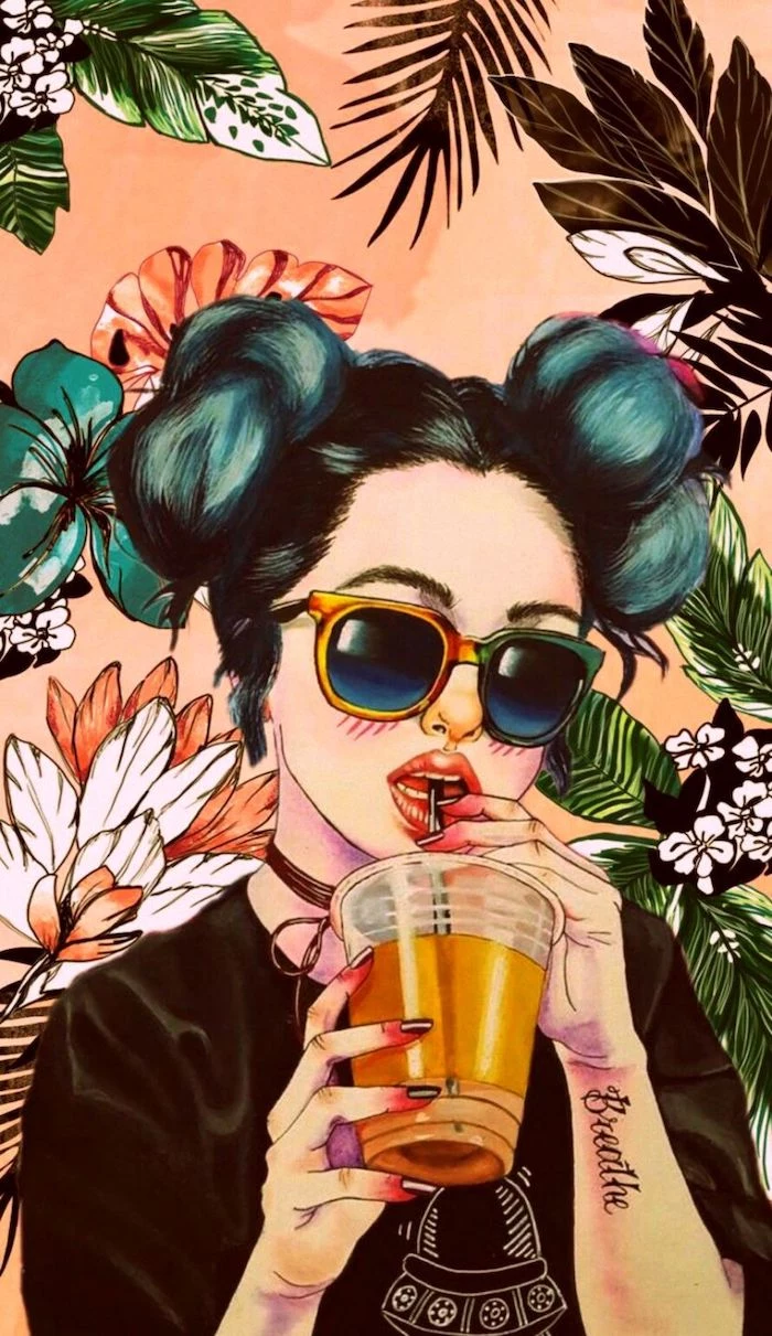
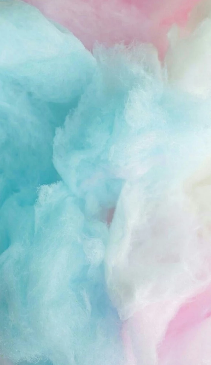
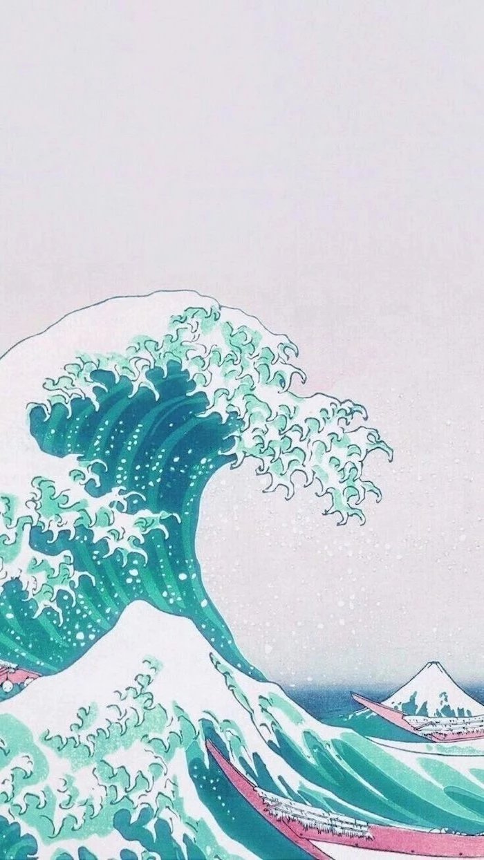
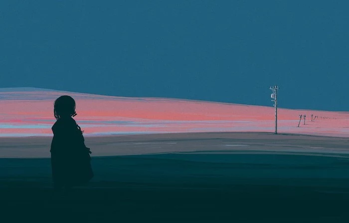
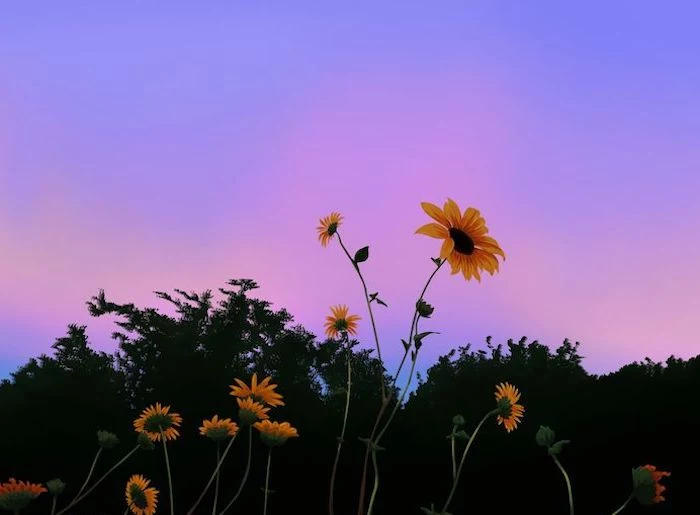
Photographic: Best for emotion and memories. A photo of a serene beach can be a mental escape. The challenge is finding one that isn’t too ‘busy’ for your icons.
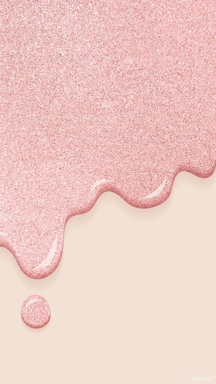
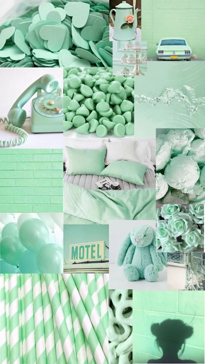
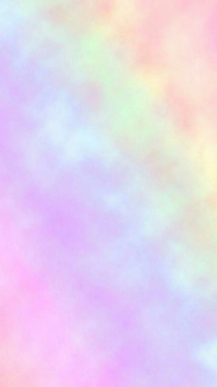
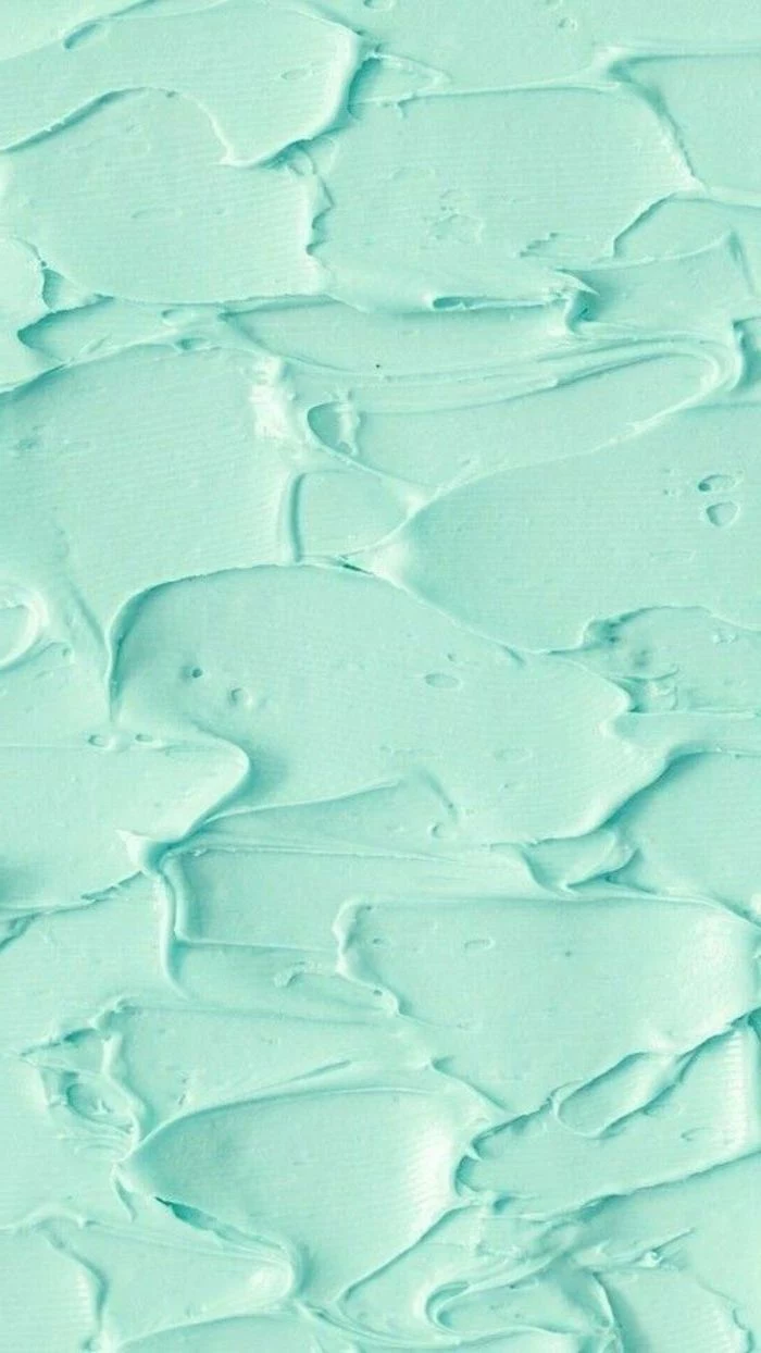
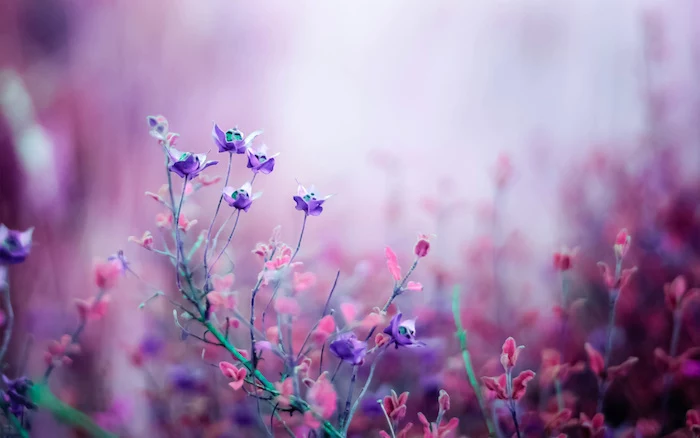
Abstract/Textured: Ideal for a clean, organized look. Think gradients, linen textures, or subtle geometric patterns. They provide a beautiful backdrop without competing with your icons.
For pure usability, abstract often wins. For personal connection, photography is king.
Studies in color psychology consistently show that the color blue can evoke feelings of calm and productivity.
This is why so many corporate logos and app interfaces use it. Choosing a wallpaper in shades of dusty blue, navy, or teal can subtly nudge your brain into a more focused state every time you unlock your phone. It’s a low-effort bio-hack for your digital life.
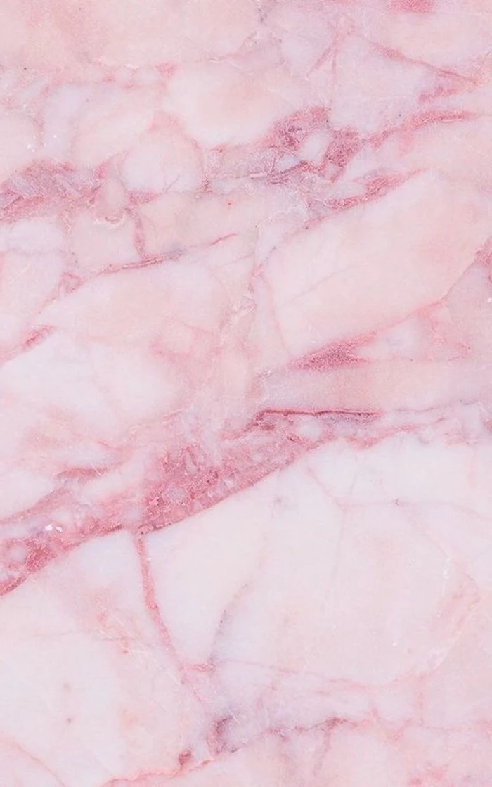
Embrace negative space. A great wallpaper isn’t just about what’s in the image, but what isn’t. An image with an open sky, a clean wall, or a minimalist composition gives your icons and widgets room to breathe, reducing visual clutter and making your phone feel instantly more organized.
Change your wallpaper with the seasons to keep your screen feeling fresh. It’s a simple way to mark the passage of time.
- Autumn: Rich, warm tones. Think detailed photos of amber leaves, cozy knits, or misty mornings.
- Winter: Cool blues and whites. Macro shots of snowflakes, stark snowy landscapes, or festive bokeh lights.
- Spring: Fresh pastels and greens. Cherry blossoms, dew-kissed leaves, or watercolor florals.
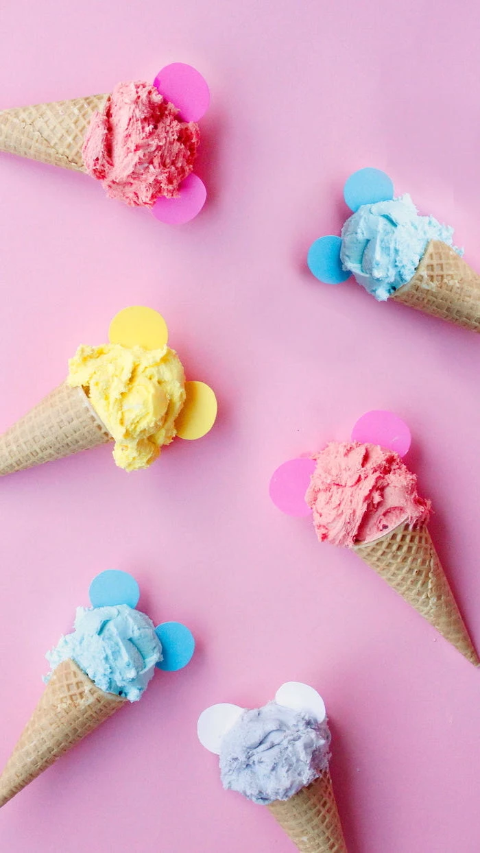
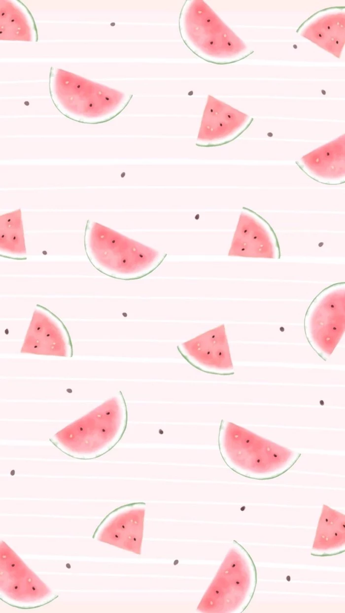
- Summer: Vibrant, saturated colors. Bright beach scenes, tropical fruit patterns, or sun-drenched fields.
- Your app icons will pop with clarity.
- It creates a sophisticated, modern look.
- You’ll never have a face or key detail hidden by the clock.
The secret? A simple gradient wallpaper. Use an app like ‘Gradient’ or Canva’s built-in tools to create a custom blend of two or three of your favorite colors for a look that’s uniquely you, and perfectly functional.
Tired of pixelated images from a basic web search? Level up your source game. Websites like Unsplash and Pexels offer vast libraries of professional-quality photos that are completely free to use. Search terms like ‘iPhone wallpaper’ or ‘abstract texture’ to find gems that are ready to go.
Try the Squint Test: Before you set an image, hold your phone at arm’s length and squint your eyes. Does the image dissolve into a messy blob of colors, or can you still make out the main shapes and overall mood? If it’s a jumbled mess, it’s likely too busy to be a good wallpaper.
Create a personal aesthetic collage using a free tool like Canva:
- Start a new ‘Instagram Story’ sized project.
- Import 4-6 photos that share a similar color palette or vibe.
- Arrange them in a grid or an overlapping, scrapbook style.
- Add a transparent shape over the top in a solid color and reduce its opacity to 5-10% to unify the tones.
- Save and set for a look that’s 100% you.
What’s the deal with Live Wallpapers?
A Live Wallpaper is a short, looping video or animation. While visually impressive, they are a significant battery drain compared to static images. Use them for a special occasion or if you’re rarely far from a charger, but for everyday use, a beautiful static image is far more practical.
A Princeton University study found that physical clutter can negatively impact your ability to focus. The same principle applies to your digital environment.
A cluttered, chaotic wallpaper with hard-to-read icons contributes to digital noise and can make you feel subtly stressed every time you look at your screen. A clean wallpaper is a form of digital decluttering.
The latest trend in bespoke wallpapers is AI-generated art. Using tools like Midjourney or DALL-E 3, you can type a descriptive prompt like ‘ethereal watercolor galaxy with rose gold constellations, minimalist, 8K’ and get a completely unique, high-resolution image in seconds. It’s the ultimate way to have a wallpaper that no one else in the world has.
Light Mode Wallpaper: Best with bright, airy, and colorful images. A crisp white background with a single botanical element, for example, feels clean and fresh. Works beautifully with pastel app icons.
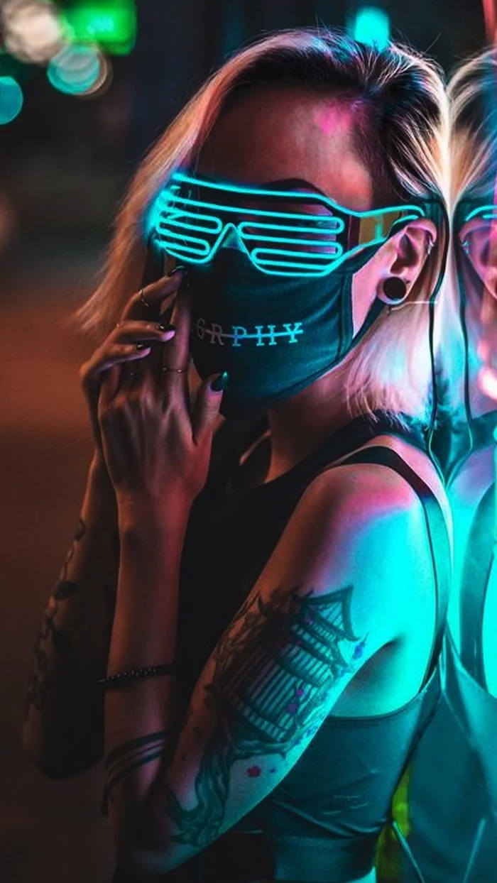
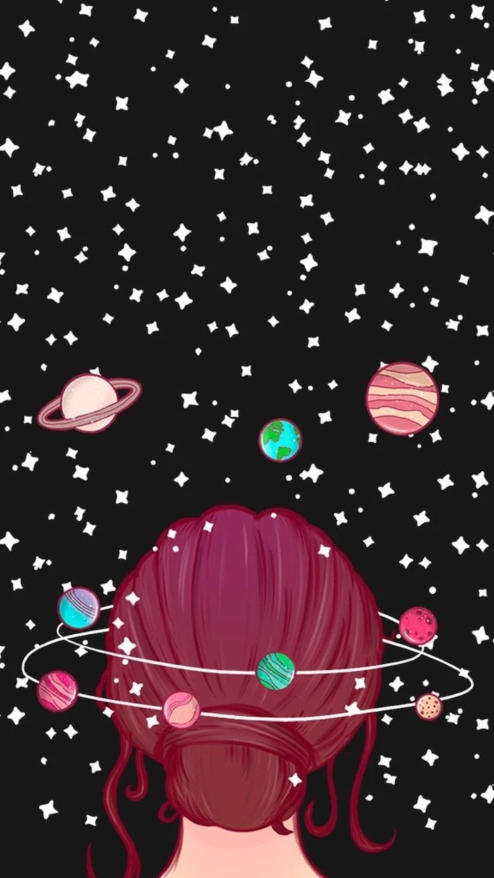
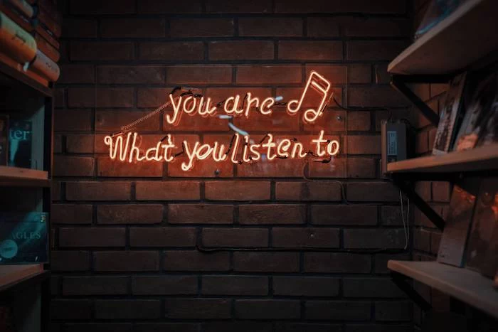
Dark Mode Wallpaper: Ideal for high-contrast and moody aesthetics. Think neon signs on a dark street, deep space nebulas, or sleek carbon fiber textures. It’s easier on the eyes at night.
Consider your most-used mode when choosing a background.

The ‘Rule of Thirds’ is a fundamental principle in photography. Imagine your screen is divided into a 3×3 grid. The most interesting images place key elements along these lines or at their intersections.
When choosing a wallpaper, look for photos that use this composition. This naturally leaves open space in the center, perfectly avoiding the clock and providing clear areas for widgets.
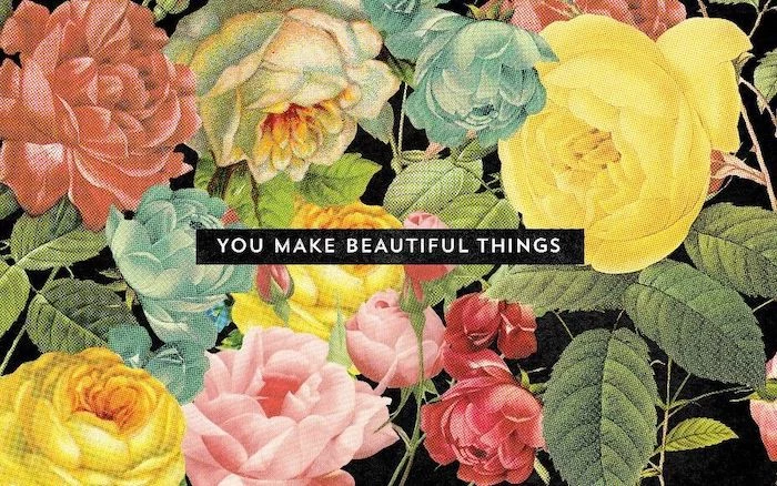
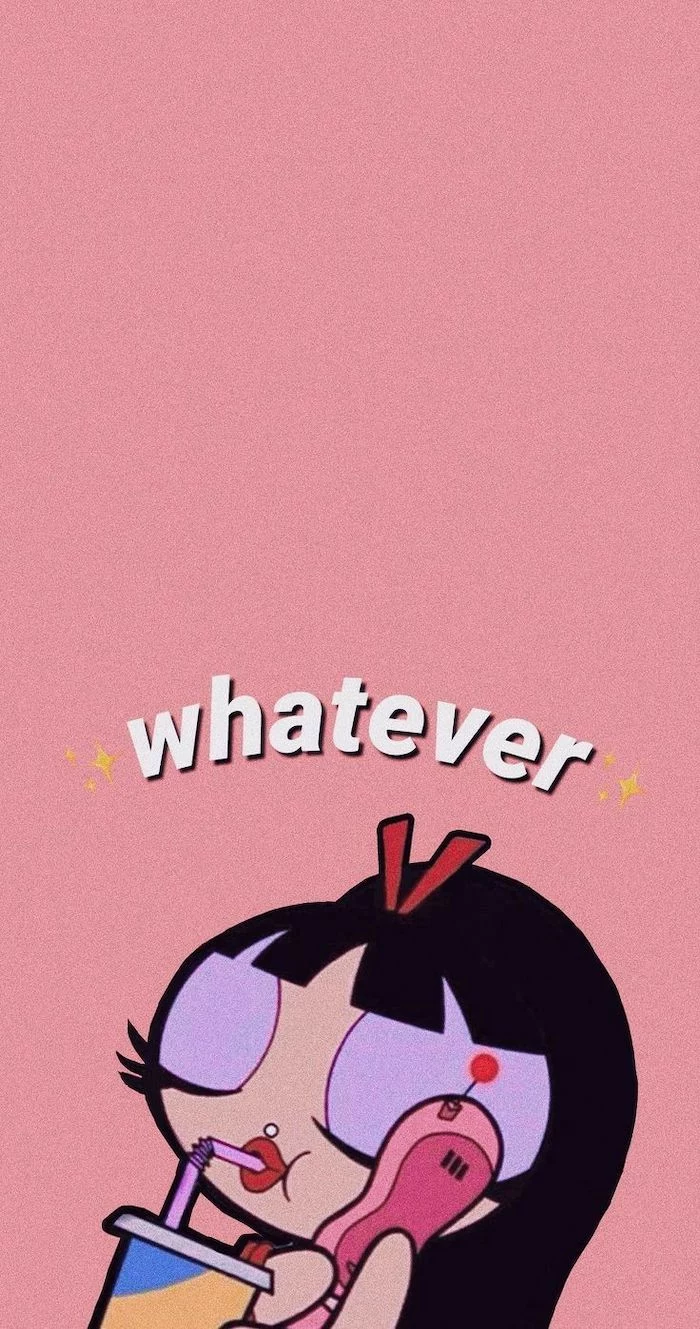
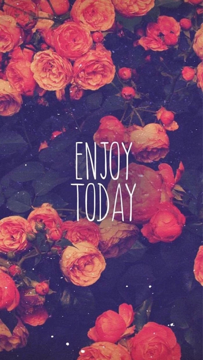
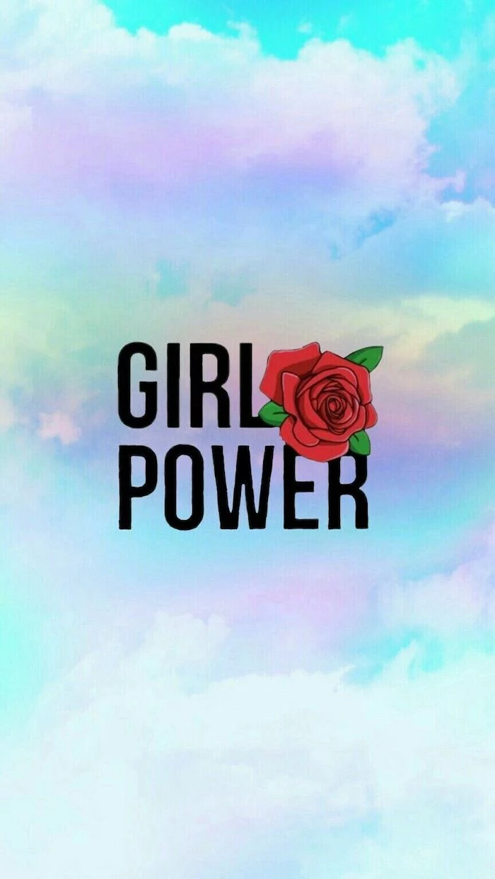
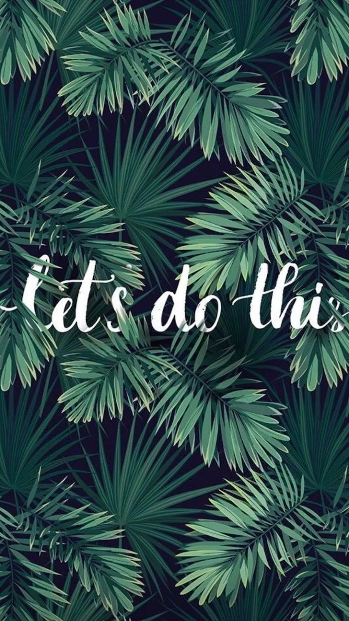
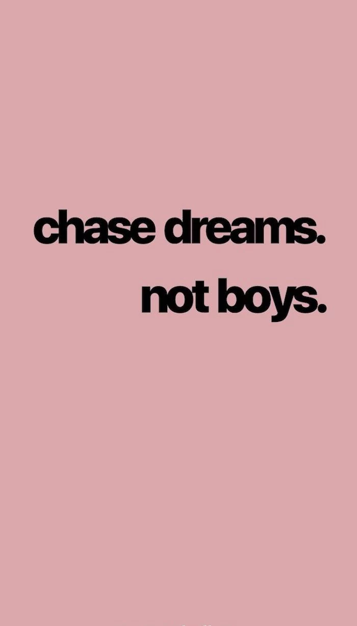
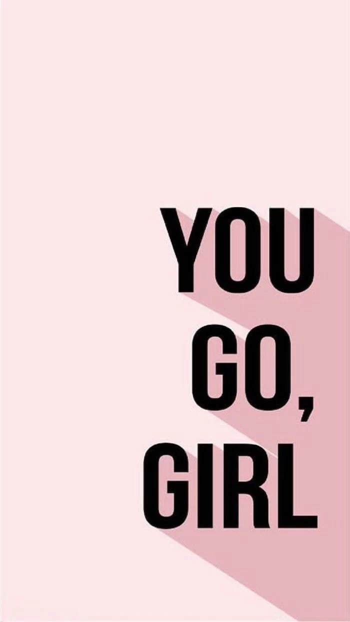
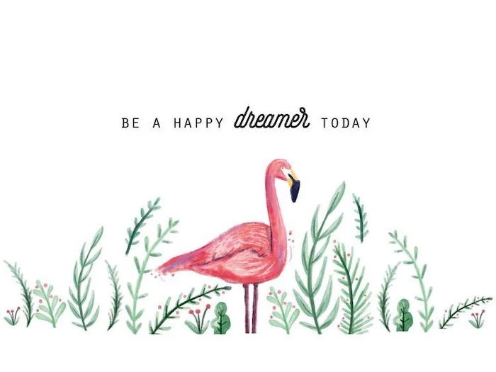
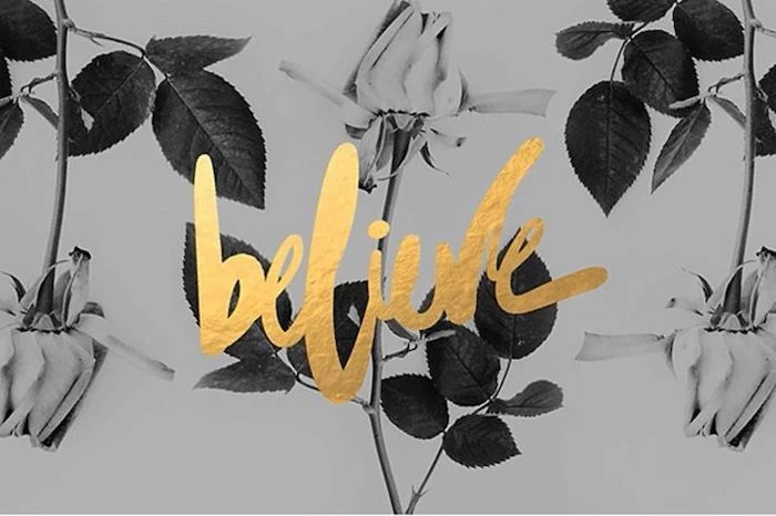
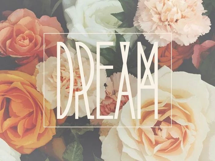
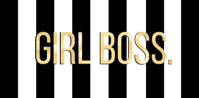
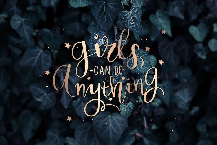
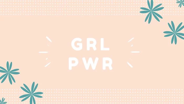
Let words be your art. A typography-focused wallpaper can be motivational, witty, or just aesthetically pleasing.
- Font is everything: A bold, sans-serif font like Helvetica Now feels modern. A script font like Playfair Display feels more classic.
- Keep it short: A single word or a short phrase has the most impact.
- Contrast is key: Ensure the text color is highly visible against the background. White on a dark color is always a safe bet.
For a truly polished look, coordinate your digital wallpaper with your physical phone case. This doesn’t mean they have to be identical. A phone case with a bold floral pattern from a brand like Casetify could be paired with a wallpaper that picks up on one of the secondary colors from the pattern, creating a subtle, designer-level connection.
- It can lower your heart rate.
- It reduces visual ‘noise’.
- It creates a sense of digital peace.
The key? A wallpaper inspired by the Japanese aesthetic of Wabi-Sabi. Look for images of imperfect, natural textures: weathered wood, cracked ceramic, handmade paper, or a single, simple ikebana-style flower.
Mind the Parallax Effect: This is the subtle motion effect where the wallpaper shifts slightly as you tilt your phone. For it to work, the OS slightly zooms in on your chosen image. Always pick an image that’s slightly larger than your screen resolution and ensure no crucial elements are right at the edge, or they might get cropped off.
- Busy Backgrounds: Avoid intricate patterns or photos with too much detail. They fight with your app icons for attention.
- Low Contrast: If the colors are all in the same mid-tone range, your icons and widgets will be hard to see.
- Wrong Orientation: Don’t try to force a wide, landscape-oriented photo into a tall, portrait-oriented phone screen. You’ll lose all the good stuff.
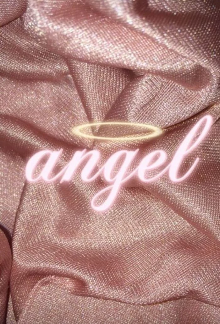
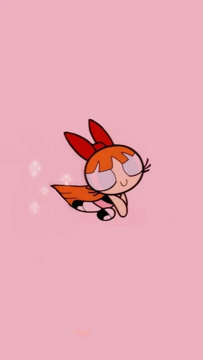
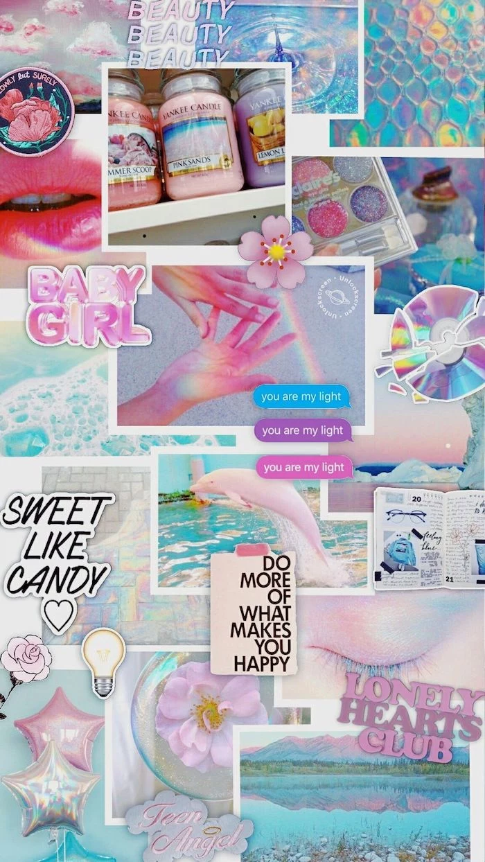
The Y2K aesthetic, with its mix of shiny metallics, bubbly fonts, and futuristic optimism, is a major trend among Gen Z.
Embrace the nostalgia! Search for wallpapers with ‘Y2K aesthetic’, ‘cybercore’, or ‘vaporwave’ to find backgrounds with iridescent gradients, early-2000s tech motifs, and playful, retro-futuristic vibes.
Look to the art world for endless inspiration. Instead of a full painting, use a high-resolution detail shot. The texture of Van Gogh’s brushstrokes, a sliver of Monet’s water lilies, or the geometric patterns from a Klimt masterpiece can make an incredibly sophisticated wallpaper. The Google Arts & Culture app is a fantastic resource for this.


