Your Phone Wallpaper Looks Blurry? Here’s the Pro’s Fix.
I’ve been a digital artist and print tech for over fifteen years, and if there’s one thing I see constantly, it’s beautiful art that looks like garbage on a screen. And let’s be honest, it’s rarely the art itself. The real culprit is almost always a technical fumble—bad resolution, wonky colors, or a file that’s been compressed to death. It’s a huge frustration, especially when you just want to show off something you love.
In this article
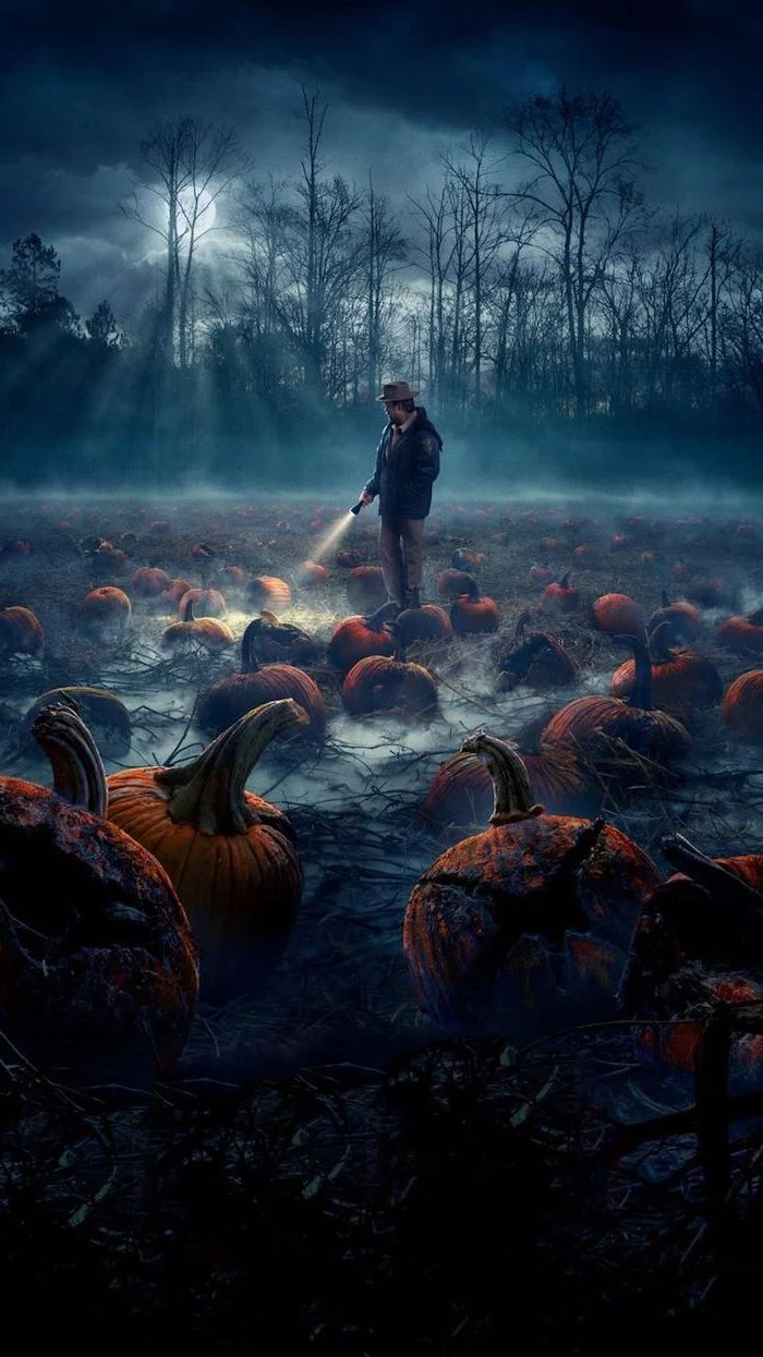
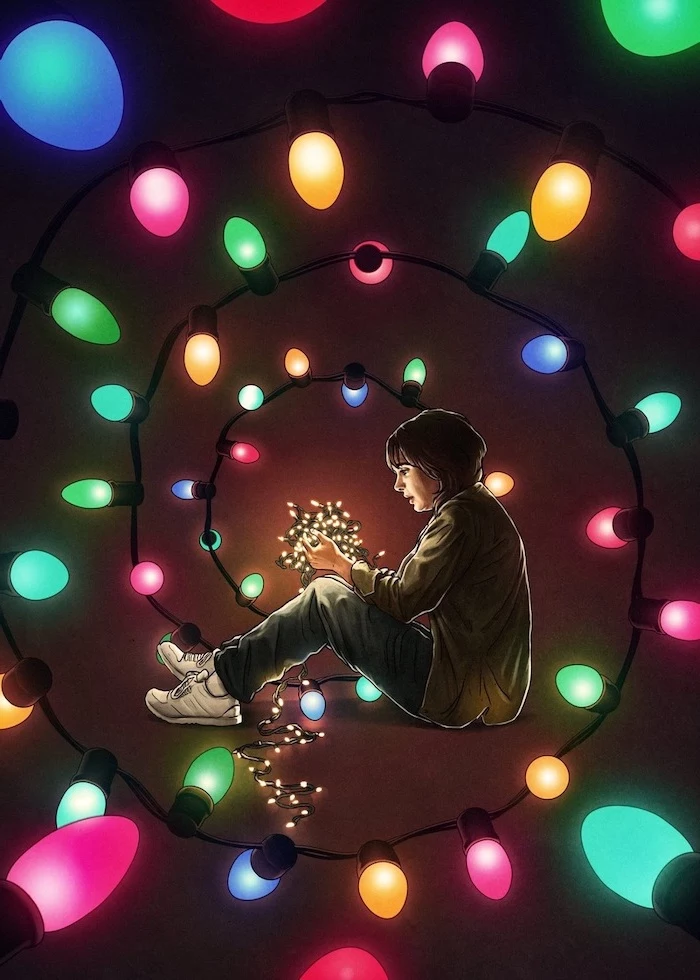
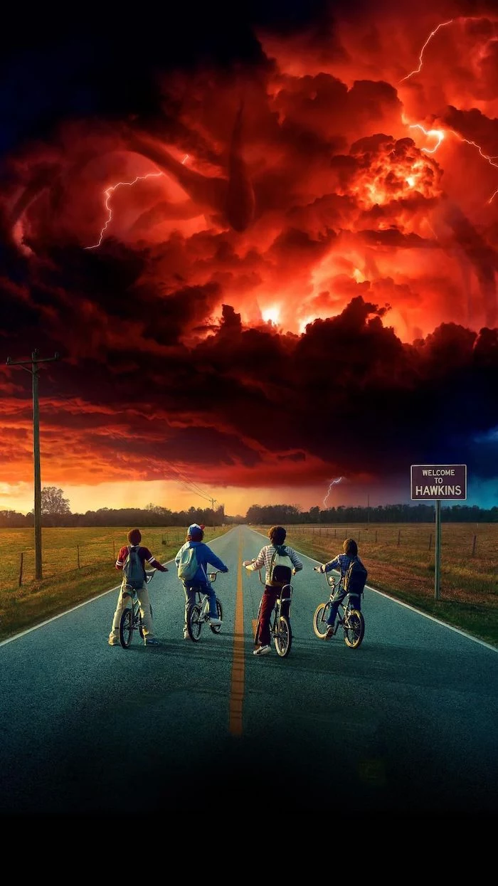
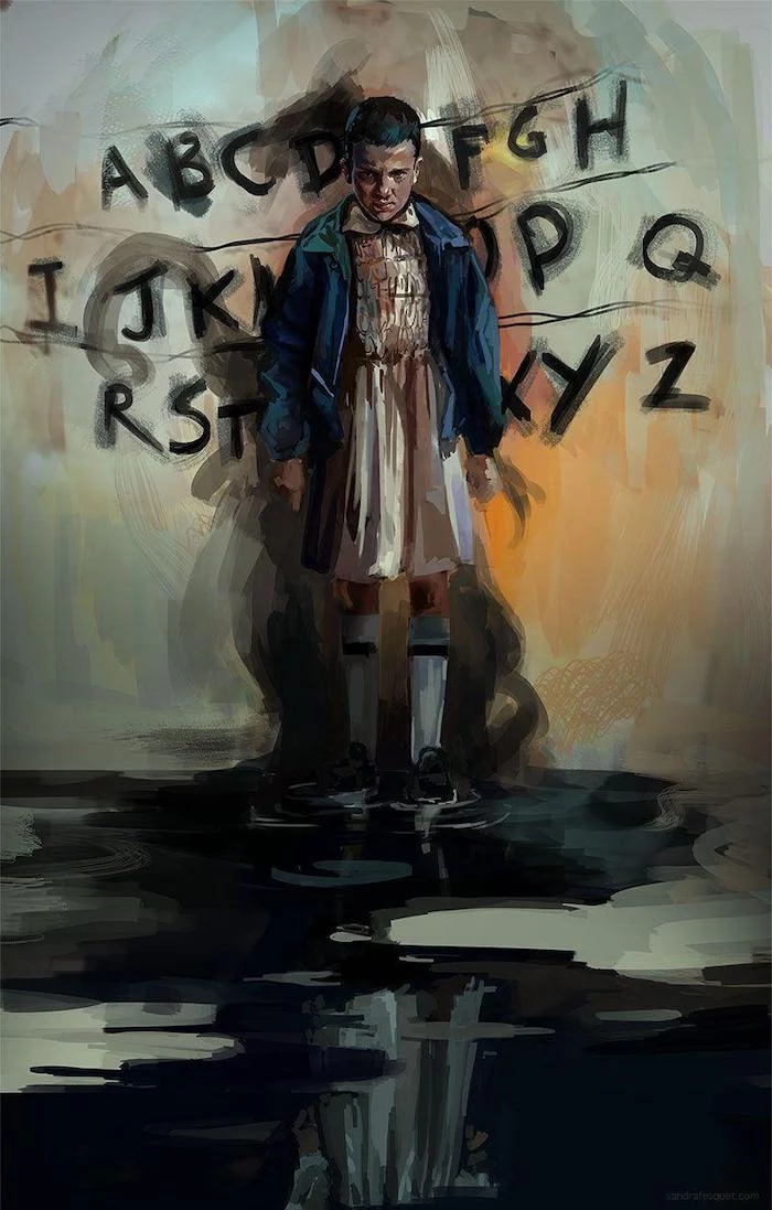
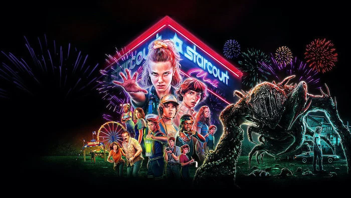
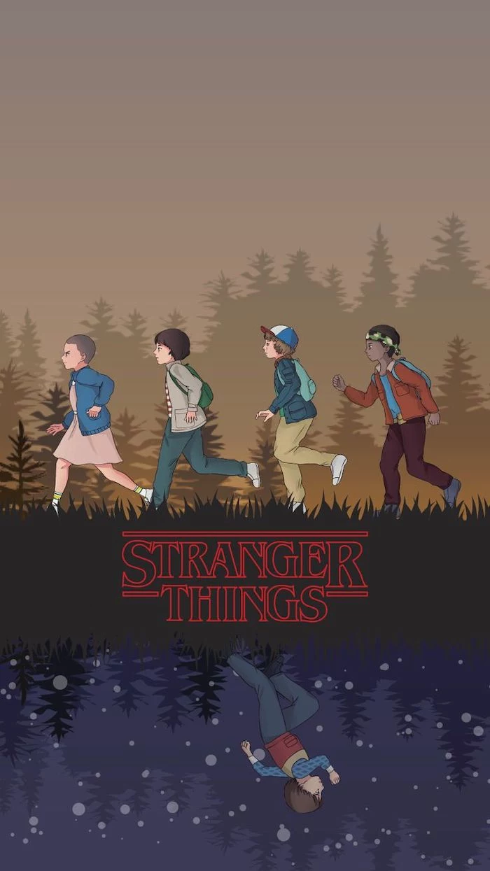
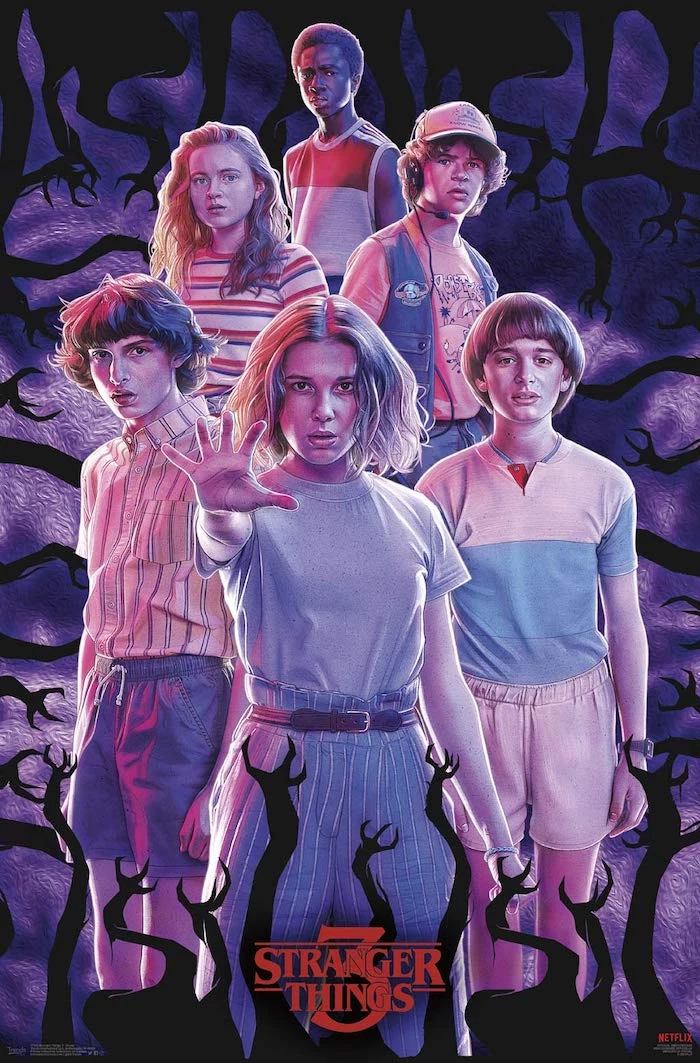
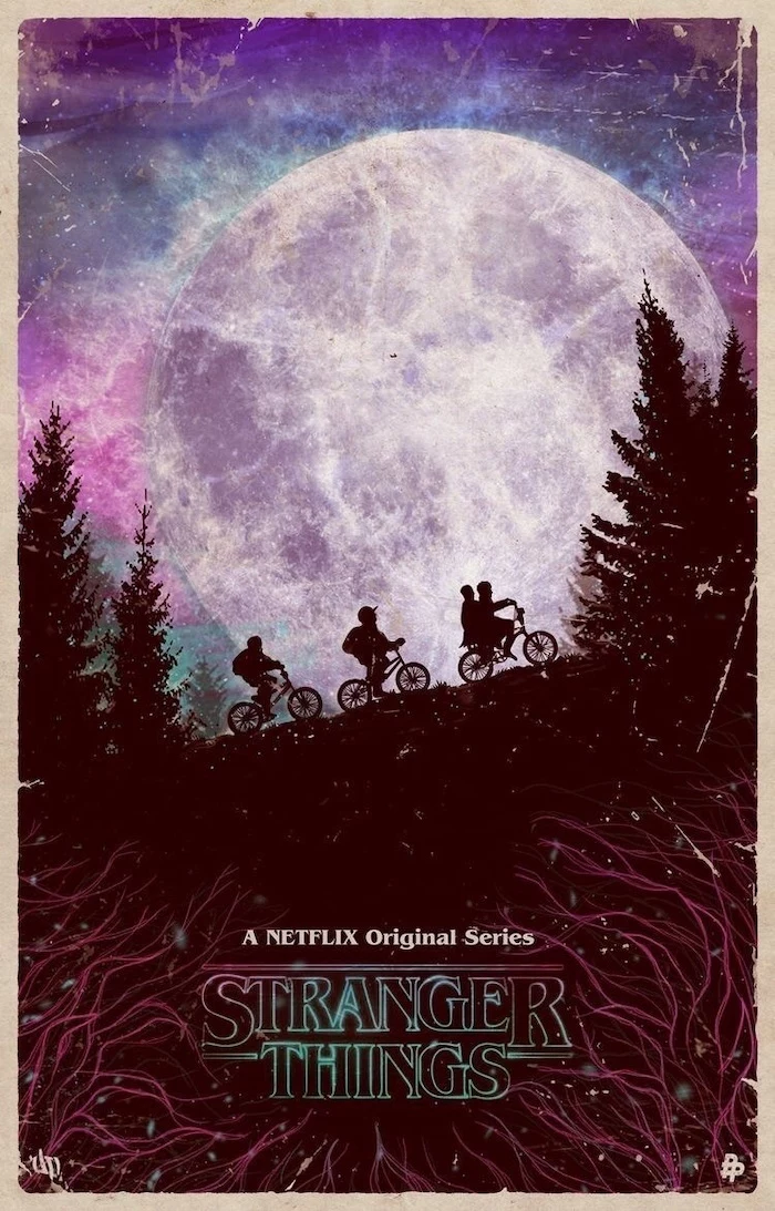
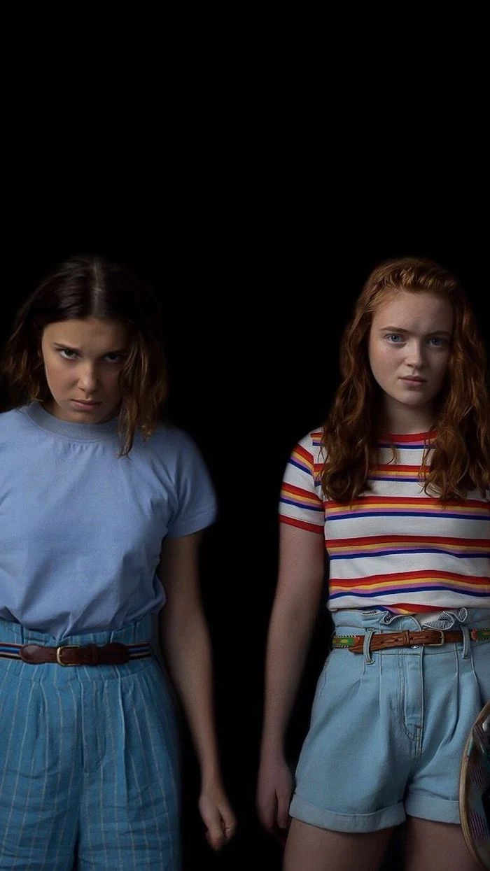
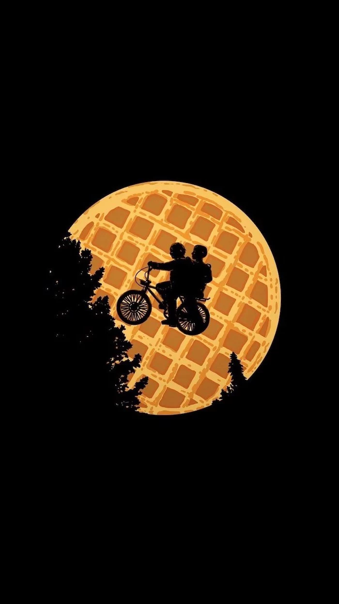
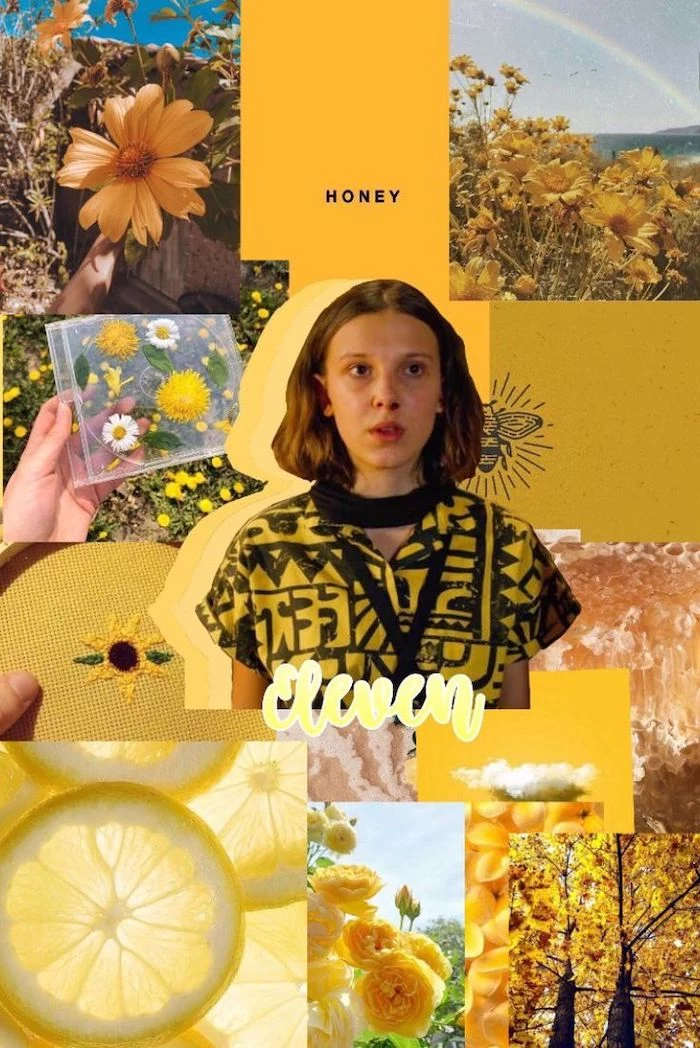
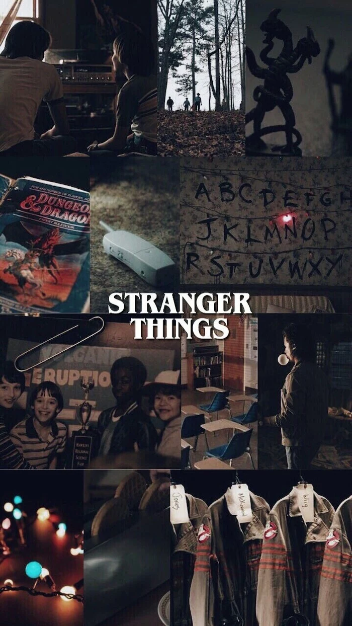
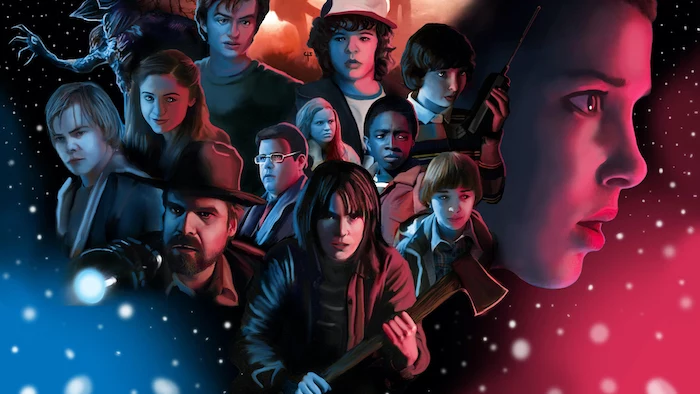
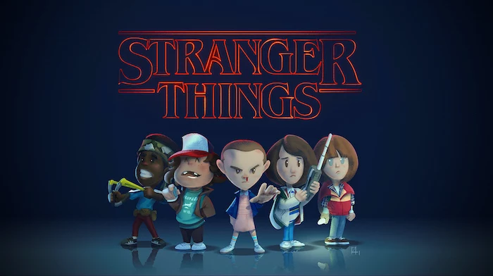
So many of us want to personalize our phones and computers, right? We use wallpapers to rep our favorite things, like that one super popular show about kids, bikes, and a creepy other dimension from the 80s. We’ll use that vibe as our working example. But we’re not just going to find some random images online. Oh no. We’re going to walk through the professional process of creating and prepping digital art so your final wallpaper looks absolutely crisp and vibrant on any device, from a tiny phone screen to a massive 4K monitor.
This is the kind of stuff I teach my apprentices. It’s the secret sauce that separates a blurry, disappointing image from a sharp, professional-grade wallpaper you’ll be genuinely proud of. We’ll get into the nitty-gritty of how screens work and the artistic tricks to capture a specific style. By the end, you’ll know exactly how to make your own custom art look incredible.
The Real Science Behind Your Screen
Before you can paint, you need to understand your canvas. For us, that canvas is a digital screen, and it’s built on pixels, color, and specific dimensions. Getting these basics right is the foundation for everything. Seriously, ignoring them is why most homemade wallpapers look, well, homemade.
Pixels, Resolution, and the PPI Myth
You’ve probably heard people throw around terms like DPI (Dots Per Inch) or PPI (Pixels Per Inch). For printing, those numbers are gospel. But for screens? They’re way less important than you’d think. A screen’s sharpness is all about its native pixel dimensions, not some abstract density number.
Heads up: That old rule about saving web images at 72 PPI is a total myth left over from ancient monitors. It has zero technical impact on how your image looks today. What actually matters are the hard numbers. If your 4K desktop monitor is 3840 pixels wide by 2160 pixels tall, you need an image that is at least that big. Simple as that. For a modern phone with a funky resolution like 2556 x 1179, your image needs to match.
Quick tip: Always create your art way bigger than your target. I usually work on a canvas that’s at least 6000 x 4000 pixels. This gives me a ton of flexibility to crop for any device imaginable without losing a shred of quality.
Color Spaces: The Key to Not Having Muddy Colors
Ever create something that looks amazing in your editor, but the second you put it on your phone, the colors look dull and washed out? I’ve been there. I once spent 20 hours on a piece for a client, only for them to see a sickly, pale version because I forgot one crucial step. That’s almost always a color space issue.
Think of a color space as a box of crayons. Some boxes have more colors than others. Here are the main ones you’ll run into:
- sRGB: This is the universal standard for the web and most screens. It’s the smallest box of crayons, but it’s the one EVERYONE has. For wallpapers, this is your safest bet for consistency.
- Adobe RGB: This one has a wider range of colors, especially in the greens and cyans. It’s great for pro photography, but if a device doesn’t support it, your colors will look desaturated. Avoid it for general wallpaper use.
- Display P3: A newer standard used by Apple devices and fancy monitors. It’s bigger than sRGB but still not as universally supported.
My professional rule is simple: I do all my creative work in a wide space like Adobe RGB to capture as much color data as possible. But the VERY last step before I export is to convert a copy to the sRGB color profile. This ensures the colors I chose are the colors everyone else sees.
Aspect Ratios and the ‘Safe Area’
An aspect ratio is just the shape of the screen—the relationship between its width and height. A typical desktop monitor is wide (16:9), while a modern phone is tall and skinny (around 19.5:9). This means one image can’t possibly fit both perfectly. Cropping is inevitable.
So, when I design a wallpaper, I always think about a “safe area.” This is the central part of the image where the most important stuff lives. I know the sides will get cut off on a phone, and the top and bottom will get chopped on a desktop. By keeping the main subject in the middle, the composition holds up no matter what. I often even deliver two separate files to clients, one cropped for mobile and one for desktop, just to give them the best look.
Choosing the Right File Format (JPEG vs. PNG)
The file format you pick is a trade-off between quality and file size. For wallpapers, we really only care about two.
For images with lots of smooth gradients and photographic detail, a JPEG (or JPG) is your best friend. It uses what’s called ‘lossy’ compression, meaning it cleverly throws away a little bit of data to make the file smaller. As long as you don’t overdo it, you won’t notice. When you save a JPEG, you’ll see a quality slider from 0-100. For a high-quality wallpaper, never go below 80. I usually stick to 90 for a perfect balance.
But for graphics with sharp lines, text, or big blocks of solid color, PNG is the clear winner. It uses ‘lossless’ compression, so zero quality is lost. It’s a perfect copy. The downside is that for photos, PNG files can be massive. So, use it when a clean, graphic style is the goal. PNGs also support transparency, which is a lifesaver for other design work, but not super relevant for a standard wallpaper.
Oh, and a lesser-known trick: Ever see ugly lines or “banding” in a smooth gradient, like a sunset? That’s because there aren’t enough color shades to make a smooth transition. To fix this, just add a tiny amount of noise (like 1-2%) over the gradient. It sounds weird, but this dithering effect tricks your eyes into blending the colors, making the transition look perfectly smooth. It’s a game-changer.
Nailing the Vibe: Pro Techniques for Themed Art
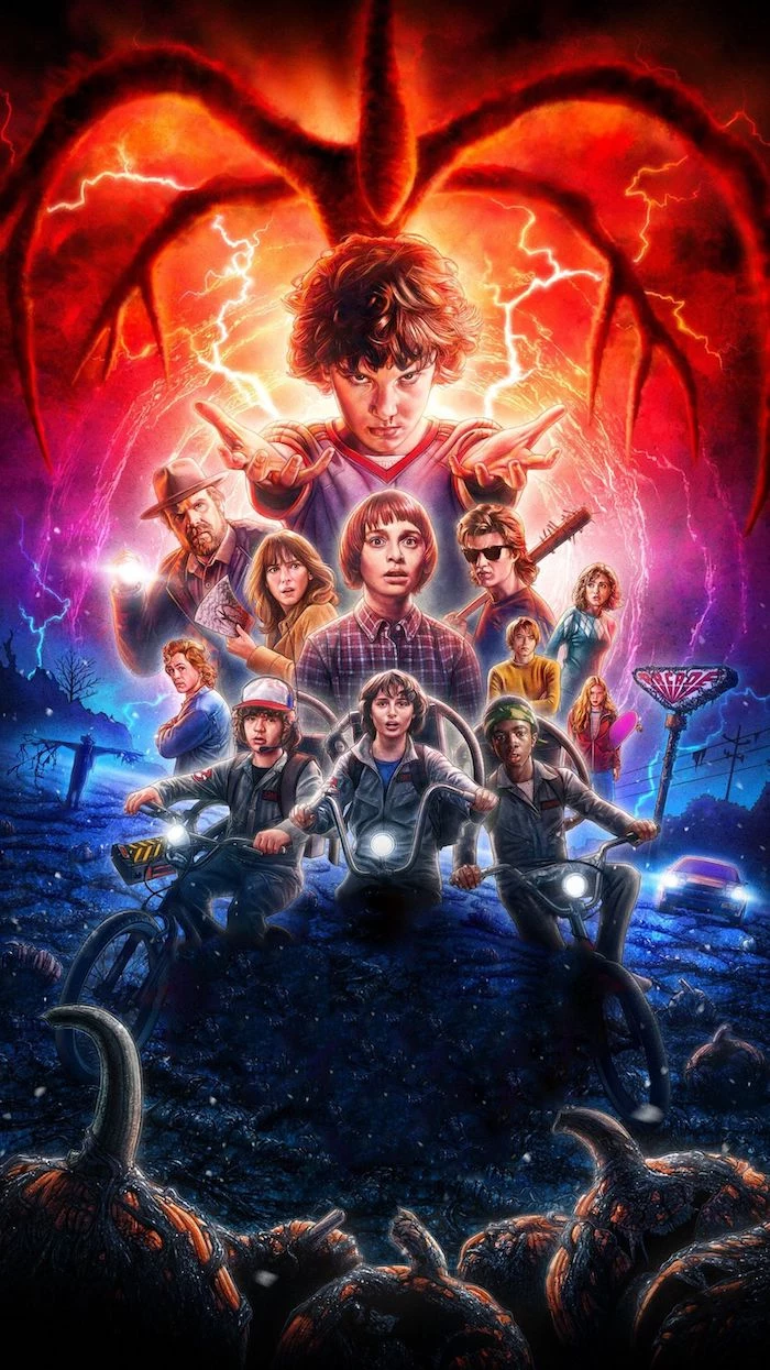
Okay, enough of the technical stuff. Let’s get to the fun part: the art. Using our 80s-inspired theme, we’ll break down how to capture a specific aesthetic. It’s all about deconstructing its visual language—the fonts, the colors, the textures—and then using pro tools to build it back up authentically.
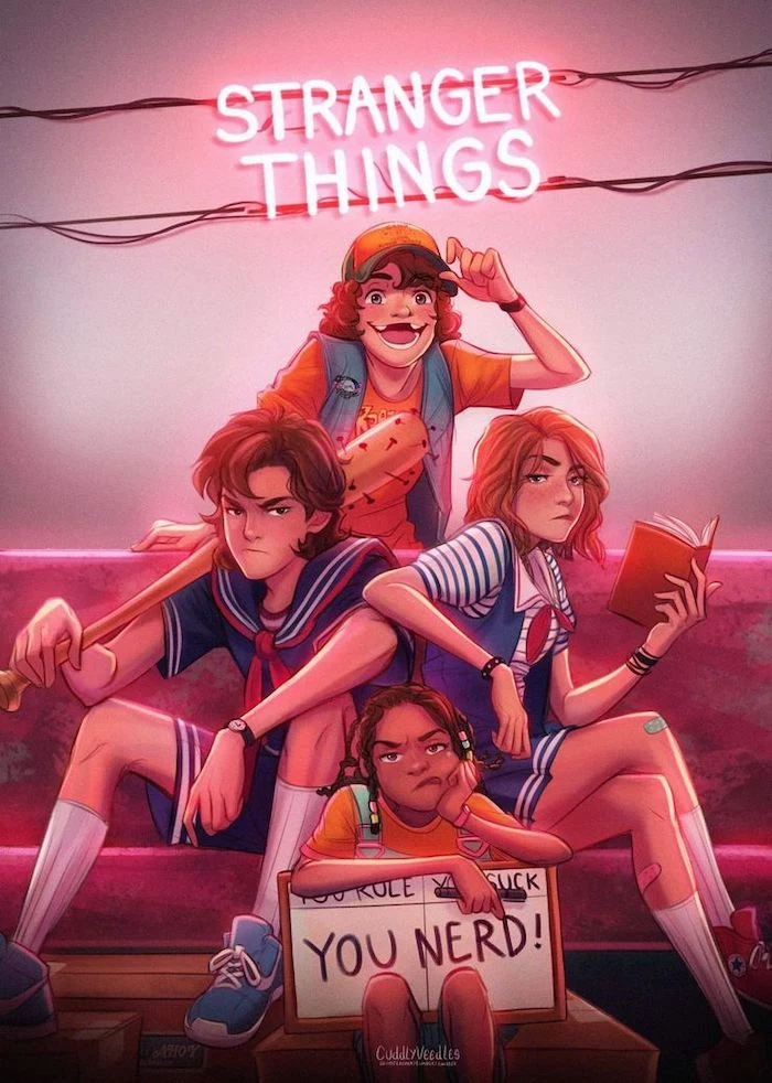
Deconstructing That Retro 80s Aesthetic
The look of that show is a masterclass in nostalgia. To get that same feel, you have to sweat the details.
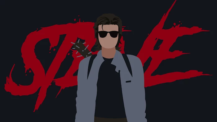
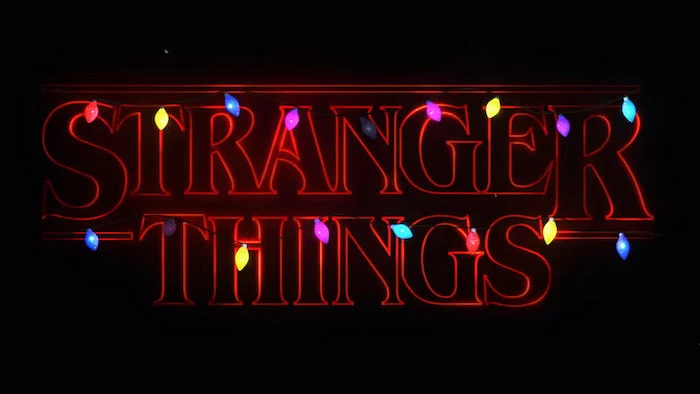
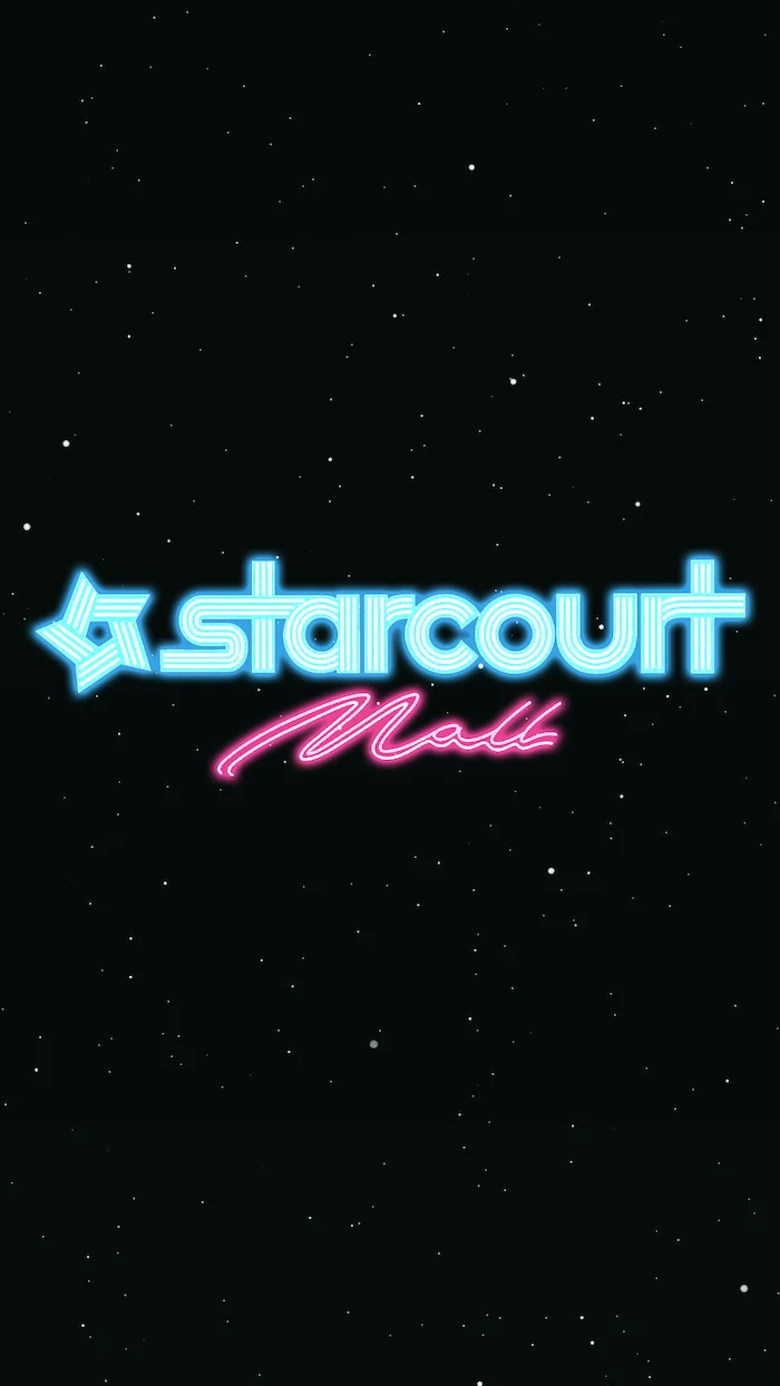
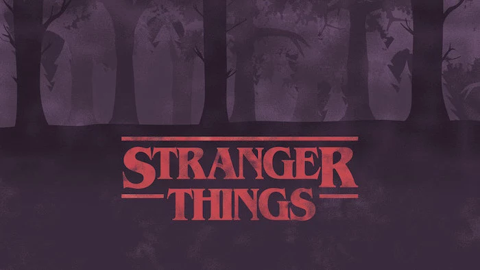
Typography: The title logo uses a very distinct, sharp serif font. While the original is a paid font that could run you $30-$40, you can get a very similar vibe for free. Head over to Google Fonts and search for a font like “Cinzel” or “Playfair Display.” They have that same classic, high-contrast feel. But just using the font isn’t enough. The pro touch is in the details, like the tight kerning (the space between letters). To replicate this, you’ll need to manually adjust the spacing so the letters are almost touching. And that iconic red glow? It’s not a simple, one-click effect. Here’s the multi-layer trick I use in programs like Photoshop or the free web-based alternative, Photopea:
- Layer 1: Your base text layer in white.
- Layer 2 (Duplicate of Layer 1): Place this below the original. Change the text color to that iconic red. Apply a wide, soft blur (a Gaussian Blur of around 40-50 pixels is a good start). This creates the hazy, atmospheric glow.
- Layer 3 (Another Duplicate): Place this one just above the blurred layer. Use a Layer Style like “Outer Glow.” Set the color to red, the Spread to about 5%, and the Size to around 25-30 pixels.
By combining multiple layers of glow, you create a depth and realism that a single effect just can’t match.
Color Palette: The show’s color grade is famous for its heavy teals and oranges, with deep, blood-reds for the spooky scenes. To build a working palette, I grab high-res screenshots and use the eyedropper tool to pull out the key colors—the main shadows, midtones, and highlights. Then, in my own art, I use adjustment layers like “Color Balance” or “Curves” to gently push my colors toward that palette. Working this way is non-destructive, meaning I can always go back and tweak things without ruining my original work.
Texture and Grain: Modern digital art is too clean. 80s movies were shot on film, which has a natural grain. The professional method isn’t to use a digital ‘noise’ filter, which often looks fake. Instead, we use film grain overlays. These are high-res scans of actual film stock. You can find professional packs online, but you can also find great free ones by searching for “film grain texture” on sites like Unsplash. Just place the texture image over your final artwork, set its layer blend mode to “Overlay” or “Soft Light,” and drop the opacity to around 15-25%. It adds a subtle, authentic texture that just feels right.
A Professional’s Workflow
Every project needs a process. Here’s the simple workflow I drill into my junior designers.
- Concept and Thumbnails: Start with tiny, rough sketches. Don’t worry about details; just focus on the big picture. For a wallpaper, think about where the phone or desktop icons will be. You don’t want your main subject covered by the clock!
- Building the Foundation: Once I have a composition I like, I create my huge document (6000 x 4000 pixels, remember?). I block in the main shapes and colors on separate layers. And trust me on this: name every single layer. It’s a simple habit that will save you hours of sanity later.
- Detailing and Refinement: This is where the magic happens. I add lighting, shadows, and textures, always trying to work non-destructively with layers and masks.
- Final Review: I zoom way out and look at the image as a whole. A great trick is to flip the canvas horizontally. It gives you a fresh perspective and instantly reveals any compositional or drawing mistakes.
Exporting Your Art for Every Device
Your masterpiece isn’t finished until it’s properly displayed. This final export process is a technical checklist that ensures all your hard work pays off.
The Pre-Export Checklist
Before you hit “Save As,” run through these steps. It’s the same process we use at my studio for every single digital delivery.
- Flatten a Copy: Save your layered master file! Then, save a separate copy and flatten all the layers. You’ll do the next steps on this flattened version.
- Convert Color Profile: In your software, go to Edit > Convert to Profile and choose sRGB. Make sure you convert, not just assign. It’s a crucial difference.
- Resize for Each Target: Now, resize the image for each device. For a 4K desktop, that’s 3840 x 2160 pixels. Make sure you’re using a high-quality resampling algorithm (look for something like “Bicubic Sharper”).
- Apply Final Sharpening: Always sharpen after you resize. A resized image can get a little soft. I use an “Unsharp Mask” filter. A little goes a long way here. A good starting point is an Amount of 75-100%, a Radius of 0.5-1.0 pixels, and a Threshold of 2-3 levels. Tweak from there until it looks crisp, not crunchy.
- Export to the Correct Format: Finally, save the file. Use PNG for sharp graphics or a high-quality JPEG (90%+) for photos. Give it a clear name like `Retro-SciFi-Wallpaper-Desktop-4K.jpg`.
Troubleshooting Common Headaches
- Problem: My wallpaper looks blurry or pixelated.
Solution: Your source image was too small. You can’t invent detail that wasn’t there. Always start with a massive master file and downscale from there. - Problem: The colors look wrong on my phone!
Solution: This is the classic color profile mistake. You almost certainly forgot to convert the image to sRGB before exporting. - Problem: My phone is making the image look bad.
Solution: You’re not crazy. Messaging apps and social media compress images horribly. To get the full-quality file onto your phone, use a cloud service like Google Drive or Dropbox, or just connect your phone to your computer with a USB cable and transfer it directly.
Going Further: Animated Wallpapers
If you really want to level up, static wallpapers are just the beginning. For Windows users, the best tool is Wallpaper Engine, which you can get on Steam for about $4. It lets you use video files or even interactive art as your background. On Android, the gold standard is Kustom Live Wallpaper (KLWP), but be warned: it’s incredibly powerful but has a very steep learning curve. For iOS, your main option is to create a 3-second video and convert it to a Live Photo, which animates when you press and hold the lock screen.
A Final Word on Staying Safe (and Legal)
Creating digital art for hours on end can take a toll on your body. I’ve seen talented colleagues forced to take time off for repetitive strain injuries. Please take this seriously. Get a good chair, keep your monitor at eye level, and take frequent breaks. I use the 20-20-20 rule: every 20 minutes, look at something 20 feet away for 20 seconds to prevent eye strain.
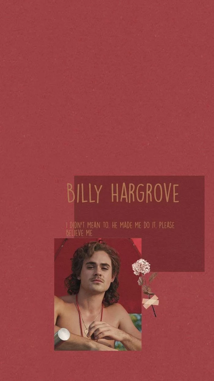
And, by the way, a quick note on copyright. We used a famous show as our inspiration, and its logos and characters belong to its creators. Making fan art for your own personal use—like a wallpaper for your own phone—is generally fine. But you can’t sell it or use it to promote a business. That’s copyright infringement. So be respectful, and keep your fan creations for personal enjoyment only.
Now it’s your turn! Pick your favorite movie, game, or show, follow these steps, and make your own high-quality wallpaper. It takes practice, but the satisfaction of creating something that looks truly professional is absolutely worth it.
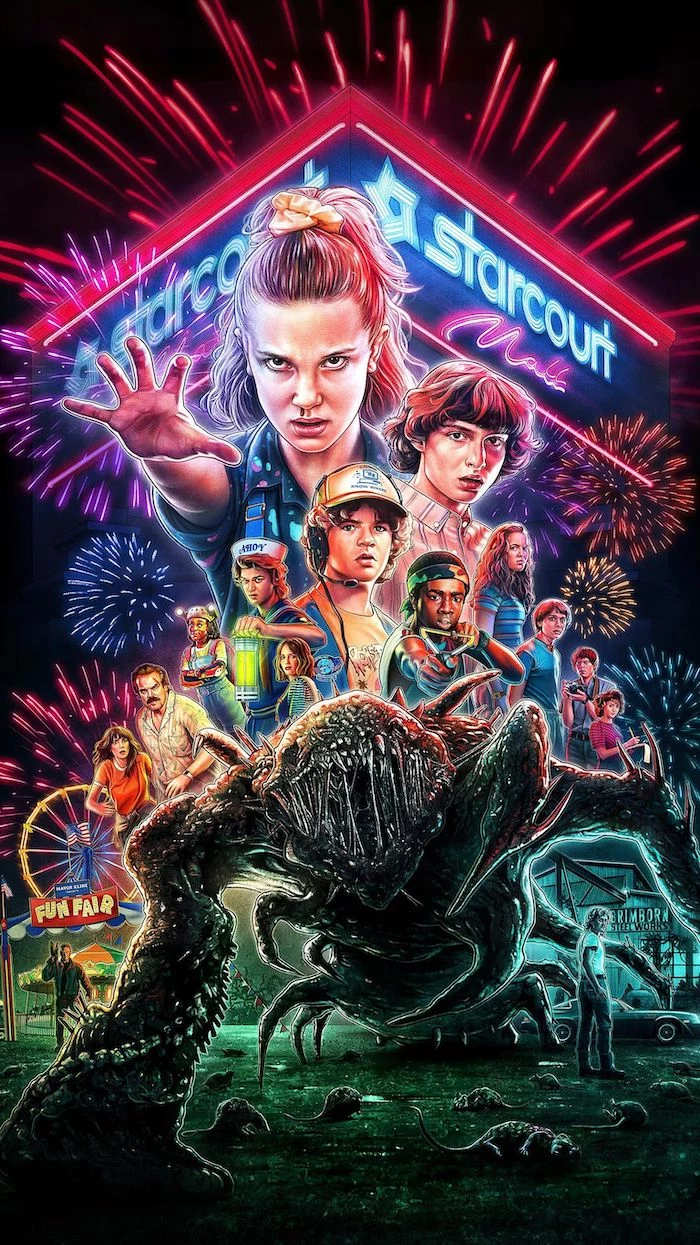
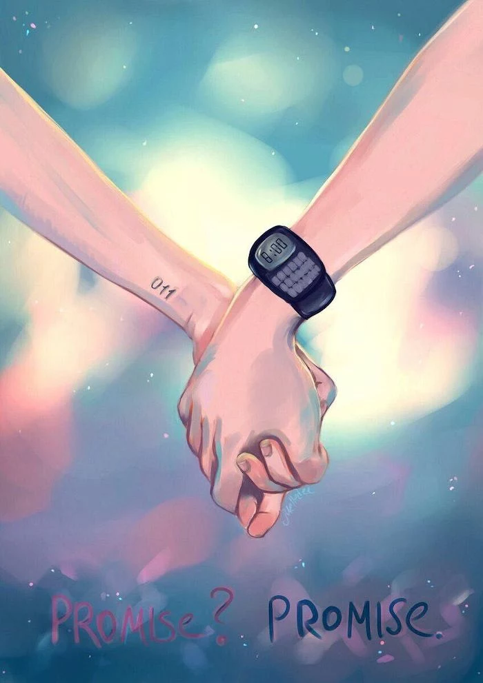
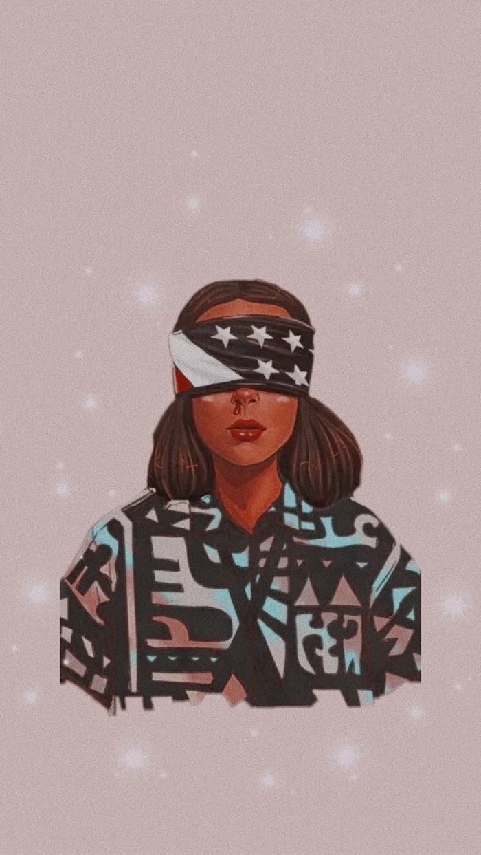
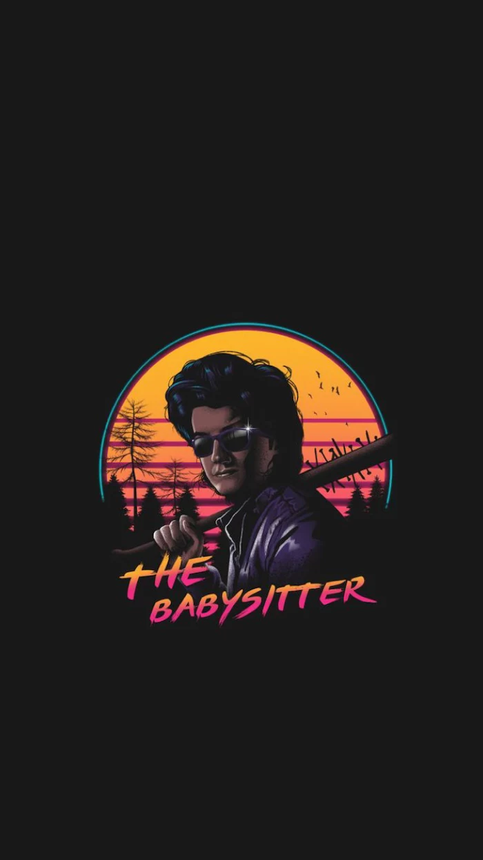
Inspiration Gallery
The average person unlocks their phone over 80 times per day.
That’s 80 opportunities for your wallpaper to either bring you a micro-dose of joy or a flash of frustration. It’s not just a background; it’s the most viewed piece of art you own. Investing a little effort to get it right pays off every single time you tap your screen.
Tired of your main subject being hidden by the clock or a widget? The pros use a “safe zone” strategy. Before you start designing, take a screenshot of your home screen and lock screen. In your editing app, like Adobe Photoshop or the free alternative Photopea, layer these screenshots over your canvas at a low opacity. This creates a clear guide, showing you exactly where to place your focal points to avoid being covered.
- Creates a stunning, dynamic 3D effect.
- Makes your phone feel more interactive and alive.
The secret? A parallax wallpaper. This effect requires a slightly oversized image where the background moves slower than the foreground elements (like your app icons). To design for it, create your wallpaper about 20% larger than your screen’s resolution and keep the main subject centered. iOS and many Android launchers handle the rest.
JPG for Photos: Ideal for photographic images with complex colors and gradients. It uses compression to keep file sizes small, which is perfect for memory, but can sometimes soften sharp edges.
PNG for Graphics: The champion for wallpapers with sharp lines, text, or transparent elements. It uses lossless compression, meaning your neon logos and crisp character art will look exactly as you designed them, with no fuzzy artifacts.
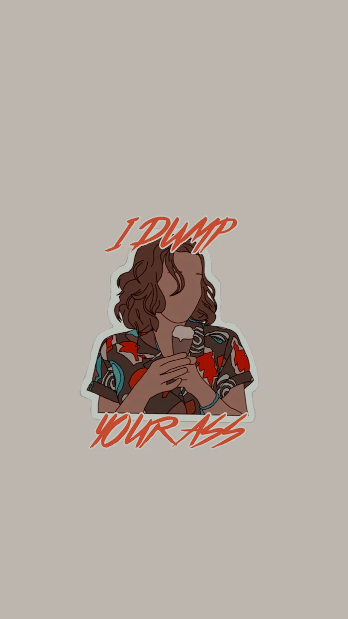
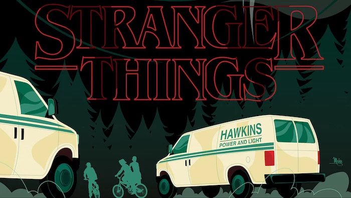
For a ‘Stranger Things’ logo wallpaper, PNG is the non-negotiable choice.
Why do the vibrant reds in my design look dull and brownish on my phone?
Your culprit is likely the color profile. Many design programs default to CMYK (for print) or wider gamuts like ProPhoto RGB. Screens, however, live in the sRGB world. To ensure your colors look as intended, always convert your final file to the sRGB color profile before exporting. In Photoshop, it’s under ‘Edit > Convert to Profile’. This step is the professional’s secret to predictable, punchy screen color.
True black pixels on an OLED screen are simply turned off. They consume no power.
This is a game-changer for battery life. If your phone has an OLED or AMOLED screen (like most modern iPhones and Samsung Galaxy devices), using a wallpaper with a true black (#000000) background is not just an aesthetic choice—it’s a functional one that actively saves energy every time your screen is on.
Replicating that ’80s arcade screen glow from the article’s example is easier than you think. In an app like Procreate or Photoshop, try this:
- Duplicate your text or graphic layer.
- Apply a Gaussian blur to the bottom layer.
- Duplicate the blurred layer a few times to intensify the glow.
- To sell the effect, create a new top layer, fill it with a dark color, and add a subtle ‘Scan Lines’ filter or pattern overlay.
Important consideration: Copyright. While it’s tempting to grab any cool fan art from Pinterest or Google Images, most are protected by copyright. For personal use, it’s a grey area, but for true peace of mind and to support creators, look for official art, use royalty-free sites like Unsplash for photos, or buy digital downloads from artists on platforms like Etsy or ArtStation.
For those who crave variety without the effort, dynamic wallpaper apps are a fantastic solution. Apps like Muzei Live Wallpaper for Android can automatically cycle through famous artworks or your own photos, even adding blur and dim effects to keep icons legible. On iOS, you can set up a Photo Shuffle for your lock screen that changes on a tap or on a schedule, giving you a fresh look throughout the day.
On-the-go Creation: You don’t need a powerful PC to make a stellar wallpaper. Mobile apps have become incredibly powerful.
- Canva: Perfect for beginners, offering templates and easy-to-use text and graphic tools.
- Adobe Express: A step up from Canva, with more powerful features and integration with the Adobe ecosystem.
- Fotor: A solid all-rounder with strong photo editing capabilities and collage features.
My icons and text just disappear into my wallpaper. Help!
This is a classic composition problem. The solution is to create visual contrast where it matters. Don’t place a white app icon over a white cloud. You can fix an overly busy wallpaper by adding a subtle dark overlay (a black layer at 20% opacity) or applying a slight blur to the entire image. This pushes the background back, allowing the user interface to pop forward.
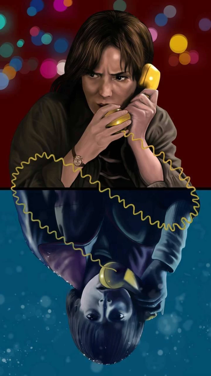
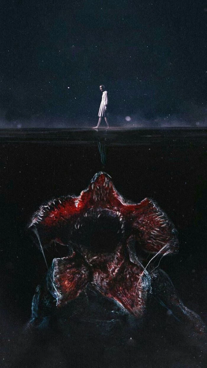
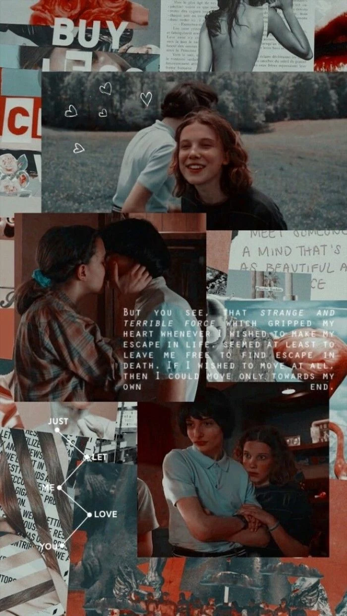
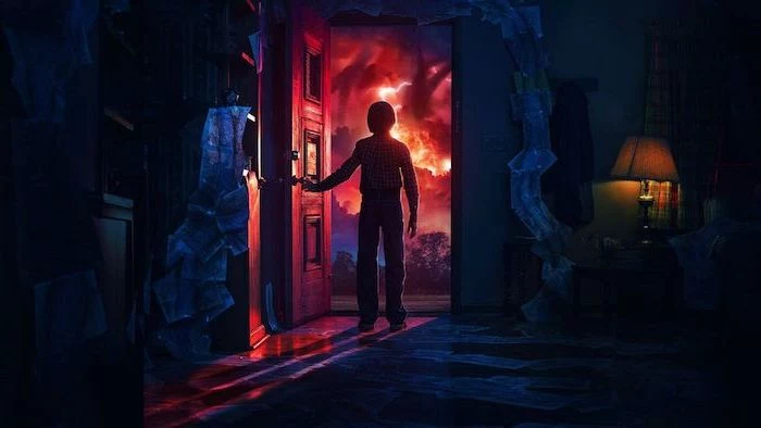
Don’t forget the power of a diptych. Create two related images: one for your lock screen and one for your home screen. For a ‘Stranger Things’ theme, try a locked gate to the Upside Down on the lock screen, which then opens to reveal the eerie world on your home screen. This simple storytelling trick makes unlocking your phone a more engaging experience.
Generative Apps (like Zedge or Vellum): These offer an endless stream of algorithmically created or curated wallpapers. It’s fast, easy, and you’ll find some stunning options.
Manual Creation (like Procreate or Photoshop): This offers total control. You can achieve your exact vision, ensure perfect resolution, and create something truly one-of-a-kind.
Generative is for discovery; manual is for expression.
The search for the perfect source image is critical. For truly high-resolution, professional-grade photos that are free to use, nothing beats Unsplash and Pexels. If you’re looking for high-quality digital art and illustrations, browse ArtStation—but remember to check the artist’s policy on using their work, or better yet, support them by purchasing a print or download.
- The subject is perfectly placed away from the clock.
- Colors are deep and don’t wash out.
- The file size isn’t massive.
The secret? A wallpaper template. Create a file in your favorite editor at the exact pixel resolution of your phone. Add guides for the clock and dock locations. Save this as
Want to lean into the vintage vibe of the article’s example? A ‘chromatic aberration’ effect is the secret sauce. This effect slightly separates the Red, Green, and Blue color channels, mimicking the look of old CRT screens and cheap lenses. Many photo apps, including Picsart and Afterlight, have this as a one-click filter. Used subtly, it adds an instant layer of analog authenticity to any digital image.
Don’t forget about typography! If your wallpaper includes a quote or text, legibility is key. Choose a clear, bold font. Avoid thin, wispy scripts that will be unreadable under your app icons. For a pro touch, use a tool like Adobe Color to pull a complementary color directly from the image for your text, ensuring the whole design feels cohesive.
A screen’s aspect ratio is the proportional relationship between its width and its height.
And they’re all different. An iPhone 14 Pro is 19.5:9, while a Sony Xperia 1 is a cinematic 21:9. Designing for just one means it will be cropped on the other. The best practice is to find the most common ratio (currently around 19.5:9) and keep your essential visual information in the center third of the image to ensure it’s visible on any device.
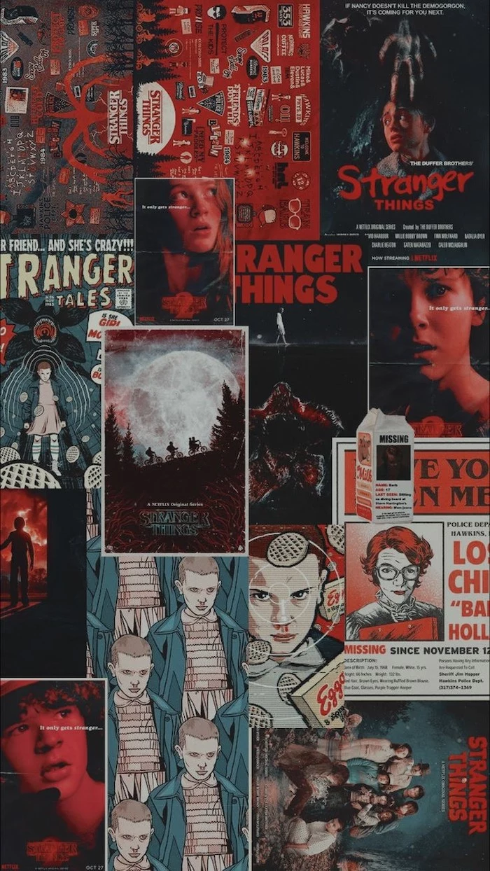
How do I create a photo collage wallpaper that looks cool, not chaotic?
The key is consistency. First, use a grid layout; freeform collages often look messy. You can find grid tools in apps like Canva or Layout from Instagram. Second, apply the same filter or color grading to all photos. This unifying step is what separates an amateur collage from a polished, magazine-style design.
A common pitfall: Ignoring the user interface. Remember that your home screen isn’t a blank canvas—it’s covered in app icons, names, and widgets. A maximalist, high-detail wallpaper with dozens of colors will almost always clash with the UI, creating a stressful, illegible mess. When in doubt, simplify.
- Use a limited, cohesive color palette.
- Focus on negative space to give icons room to breathe.
- Employ a subtle grain effect instead of a busy texture.
These are the core principles of minimalist wallpaper design. The goal is to create a calming, organized digital space that reduces visual noise and helps you focus on the task at hand.
Think about mood. Your wallpaper is an emotional anchor. A serene landscape from a past vacation can offer a moment of calm. A piece of high-energy fan art can provide a burst of motivation. An abstract gradient can be a neutral, meditative space. Before choosing an image, ask yourself: how do I want to feel when I unlock my phone?
Live wallpapers can increase battery consumption by 5% to 15% depending on their complexity and brightness.
While visually impressive, that constant motion comes at a cost. If you’re a heavy phone user or often find yourself running low on power by the end of the day, a beautiful static image is the more practical, battery-friendly choice.
The Notch & The Island: Modern phones have cutouts at the top of the screen for cameras and sensors. Don’t ignore them; embrace them! Creative wallpapers can incorporate the Dynamic Island on an iPhone as a perch for a character, or use the hole-punch camera cutout as a basketball for a player to dunk. It’s a clever way to make your design feel truly integrated with the hardware.


