Your Phone’s Wallpaper Is More Important Than You Think (A Designer’s Take)
I’ve spent a huge chunk of my career designing things for screens, and I’ll let you in on a little secret: most people pick their phone’s wallpaper all wrong. They see a pretty picture, set it, and call it a day. But to a designer, a wallpaper isn’t just decoration—it’s a core part of the user interface. It’s the foundation that everything else sits on. The right one can make your phone feel more organized and pleasant to use, while the wrong one can turn it into a cluttered, frustrating mess.
In this article
Honestly, I’ve seen it happen countless times. I once used this incredible photo of a crowded market in Southeast Asia. The colors, the energy—it was stunning. But when I set it as my wallpaper, I literally couldn’t find my Messages app for a full minute. The icons just vanished into the chaos. That’s when it really clicked for me: a wallpaper’s first job is to be a good background.
First, Let’s Get a Little Techy (I Promise It’s Worth It)
Before you even start looking for images, it helps to know what kind of screen you’re working with. Modern iPhones mostly use OLED screens, which are pretty magical. Each tiny pixel lights itself up, so when an image needs pure black, the pixels just… turn off. This gives you “true black,” not just a dark gray, and can even save a tiny bit of battery if your wallpaper has large black areas. It’s a small effect, but it adds up.
Older or standard iPhone models might have an LCD screen, which uses a single backlight for everything. It’s still a great screen, but it can’t achieve that perfect, inky black.
Next up is resolution. This is just the number of pixels on your screen, and it’s a big deal. Using a low-resolution image is like trying to stretch a passport photo to fit a movie poster—it’s going to get blurry and jagged. You always want an image that matches or, even better, exceeds your phone’s native resolution.
Good to know: You don’t have to guess these numbers! For example, an iPhone 15 Pro Max has a resolution of 2796 x 1290 pixels. A standard iPhone 14 is around 2532 x 1170, and an older model like the iPhone 12 is 2532 x 1170 as well. A quick search for “[Your iPhone Model] screen resolution” will give you the exact number you need to hunt for.
Finally, let’s talk about file types without making it a snoozefest. Here’s the simple breakdown:
- JPEG: This is your standard workhorse for photos. It compresses the image to save space, which is great. Just make sure you grab a high-quality version, otherwise you might see weird blocky spots.
- PNG: This is the top choice for graphics with sharp lines, text, or transparent areas. It doesn’t lose quality like a JPEG can, but the file sizes are usually bigger. Worth it for that clean look.
- HEIC: This is Apple’s preferred format. It offers even better quality than a JPEG in a smaller file size. Any photo you take on a modern iPhone is likely a HEIC file.
For a photographic wallpaper, a high-quality JPEG or HEIC is perfect. For a graphic design, stick with PNG.
Pro-Level Tricks for Picking the Perfect Background
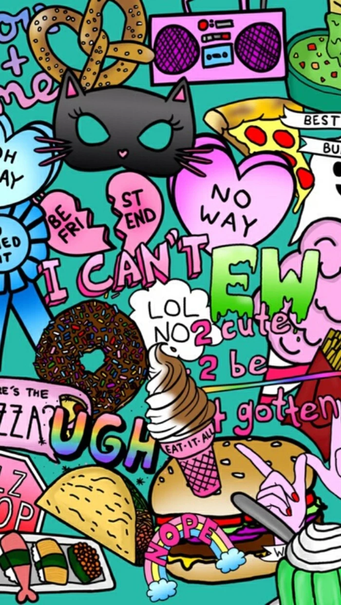
In the design world, function comes first. Your app icons and widgets are the stars of the show; the wallpaper is the supporting cast. The number one mistake I see is choosing an image that’s way too busy. Think of it this way:
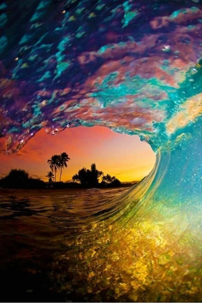
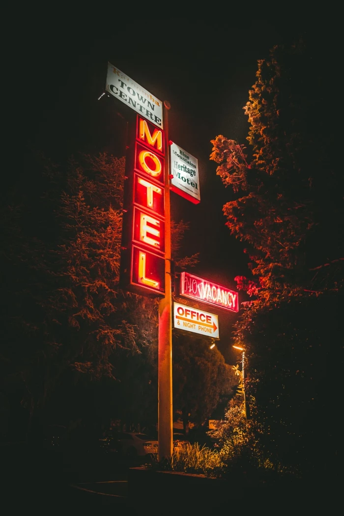
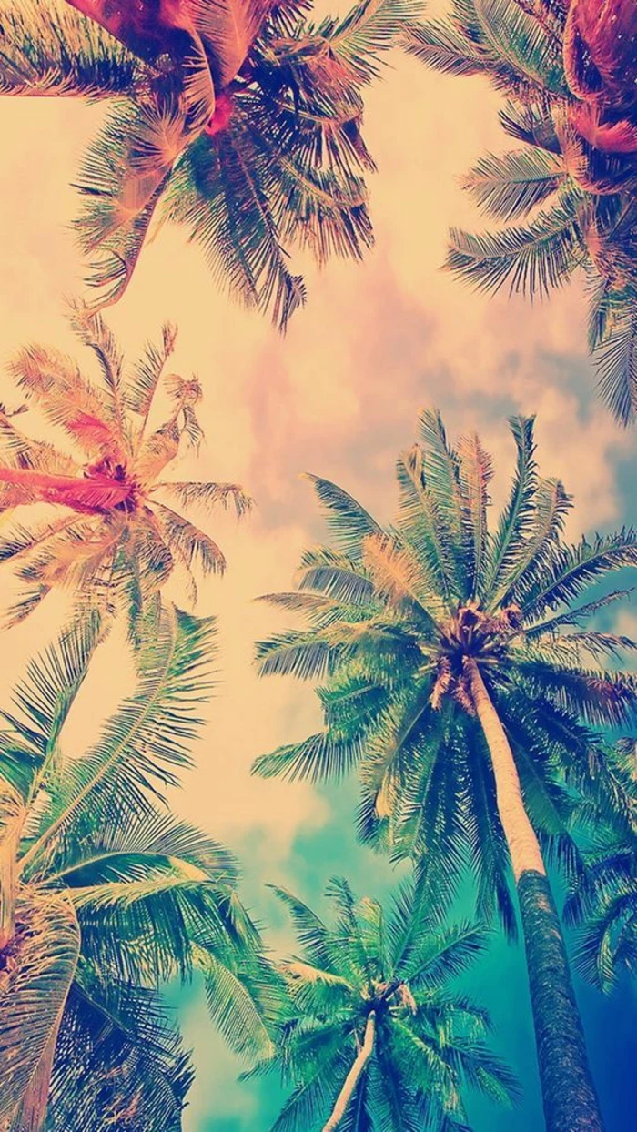
- The Bad Wallpaper: A photo of a dense forest with tons of leaves, branches, and speckled light. Your white icon labels are unreadable, and the colorful icons clash with the background. It’s visual noise.
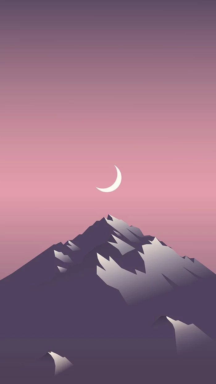
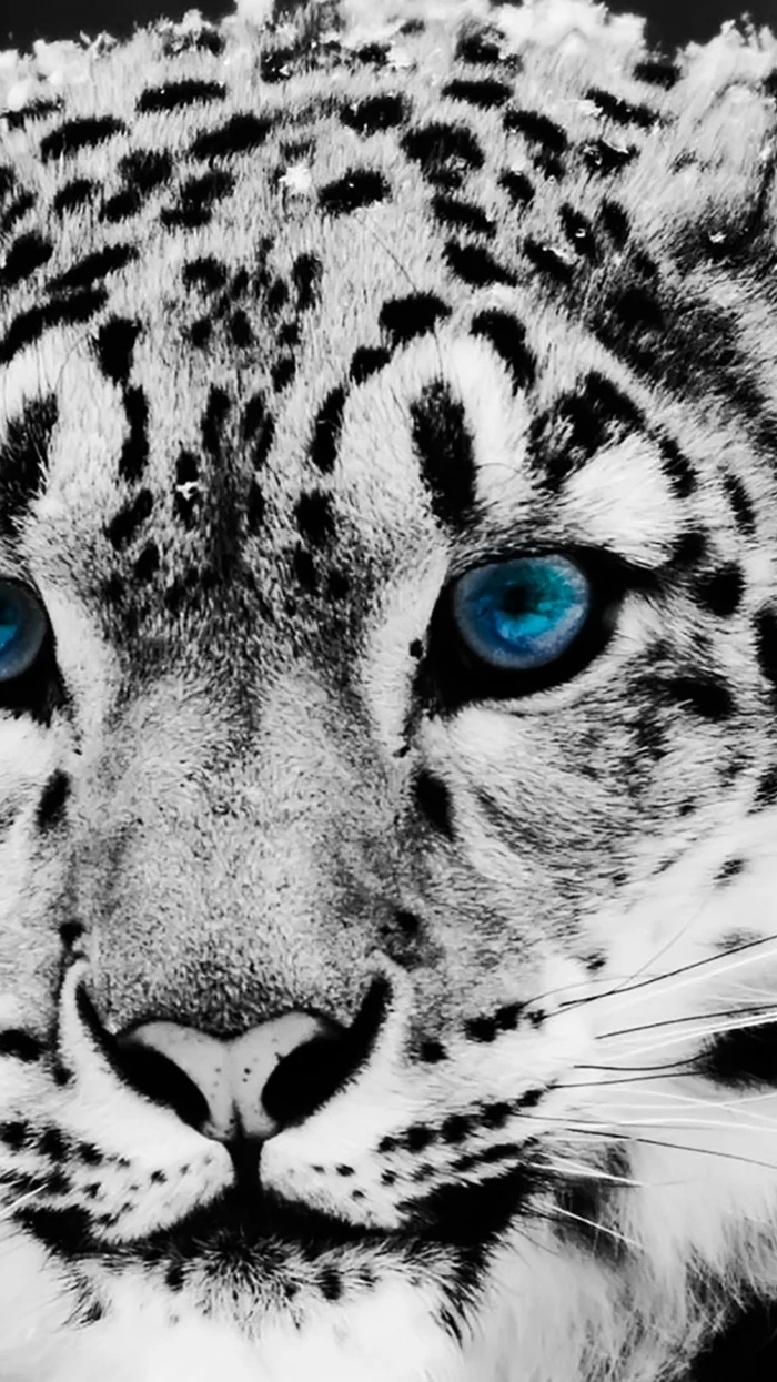
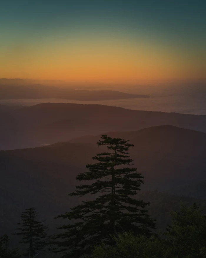
- The Good Wallpaper: A photo of a single tree in a foggy field. There are huge areas of soft, muted color (the fog and the grass) that give your icons a calm place to live. It has atmosphere without screaming for attention.
Here’s a technique I teach that I call the “Blur Test.” It’s a total game-changer. Before you commit to a wallpaper, open it in a photo editor. You can use a free app like Snapseed for this. Find the blur tool (in Snapseed, it’s under Tools> Lens Blur) and crank the blur strength way up, maybe to around 80 or 90. Now, look at the image. Is it just a beautiful smear of color and light? If you like the vibe of the blurred version, chances are it will make a fantastic, non-distracting wallpaper.
Also, think about how the phone’s layout interacts with your image. The Lock Screen has that big clock right in the upper-middle. A great wallpaper will have its main subject positioned lower down or off to the side, leaving that area clean. By the way, this is where the Depth Effect on the Lock Screen really shines. This feature cleverly places the clock behind the subject of your photo, creating a cool, layered look. It only works with images that have a clear foreground and background, which is another great reason to choose simple, well-composed shots!
Finding Wallpapers Without Falling into a Trap
Okay, let’s talk about where to find these amazing images. A quick Google search is tempting, but it’s often a minefield of low-quality, copyrighted pictures. You can do so much better.
For beautiful, high-resolution, and totally free photos, my go-to sites are Unsplash, Pexels, and Pixabay. They’re full of work from talented photographers who have shared their images for everyone to use. You’ll find incredible options there.
Want something a little more unique? Check out the public domain archives from major museums. Just search for something like “The Met Collection Public Domain” or “Rijksmuseum public domain.” You can download ultra-high-resolution images of classic paintings, textiles, and drawings for free. It’s an amazing resource.
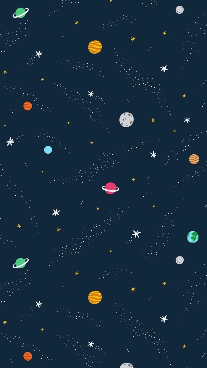
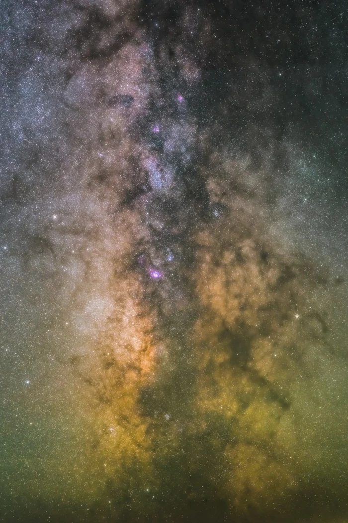
Quick Win: Try this right now. Go to the NASA Image Library website, search for a picture of your favorite planet or nebula, and download a high-res version. You’ll have a mind-blowing and perfectly functional wallpaper in less than five minutes.
Of course, the most personal option is using your own photos. A little editing can make them perfect. Open a photo in the built-in Photos app on your iPhone. Tap ‘Edit,’ and try dropping the Saturation and Contrast sliders by about 10-15%. This instantly softens the image, making it a better background. Photos taken in Portrait Mode are also fantastic candidates since they already have that natural background blur built right in.
Warning: Be Careful With Wallpaper Apps
A quick word of warning about the App Store. It is overflowing with “wallpaper apps,” and to be frank, you should avoid most of them. They seem convenient, but many are just vehicles for spammy ads, shady subscription models, or questionable data collection.
Here are some red flags to watch out for:
- It immediately pushes a pricey weekly or monthly subscription.
- The app is flooded with full-screen video ads.
- It asks for weird permissions that a wallpaper app shouldn’t need (like your contacts).
- Reviews complain about it being impossible to cancel.
It’s so much safer and better to just get your images directly from the reputable sources I mentioned and set them yourself in your phone’s Settings. It takes a few extra seconds and saves you a ton of potential headaches.
For the Adventurous: The Ultimate Customization
If you really want to geek out, you can use the Shortcuts app on your iPhone to create automations. It sounds complicated, but it’s not as scary as it looks. You could have your phone automatically switch to a dark wallpaper at sunset and a light one in the morning. How cool is that?
Here’s a super simple walkthrough to make that happen:
- First, find a light wallpaper and a dark wallpaper you love and save them to a specific photo album (e.g., create a new one called “My Wallpapers”).
- Open the Shortcuts app.
- Tap the Automation tab at the bottom, then New Automation.
- Choose a trigger. Let’s use Time of Day and set it to Sunset. Make sure it’s set to run Daily. Tap Next.
- Tap New Blank Automation. Tap Add Action and search for “Find Photos.” Add it.
- Tap the blue “Album” text and choose the “My Wallpapers” album you created. Tap “Add Filter” and set it to “Name is [your dark photo’s name]”.
- Now, tap the search bar at the bottom and find the Set Wallpaper action. Add it.
- The action will say “Set [Photo] wallpaper.” The word “Photo” should already be filled in from the previous step. If not, tap it and select the output from the Find Photos action. You can tap the little arrow to choose whether it applies to your Lock Screen, Home Screen, or both.
- Tap Done. When it asks, turn off “Ask Before Running” so it happens automatically.
And that’s it! You can repeat the process for Sunrise, choosing your light wallpaper instead. It might take 10-15 minutes to set up the first time, but after that, your phone will feel like it’s truly in sync with your day.
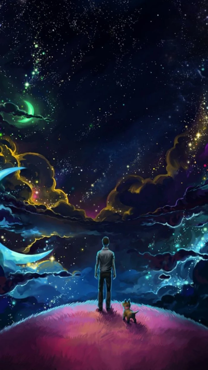
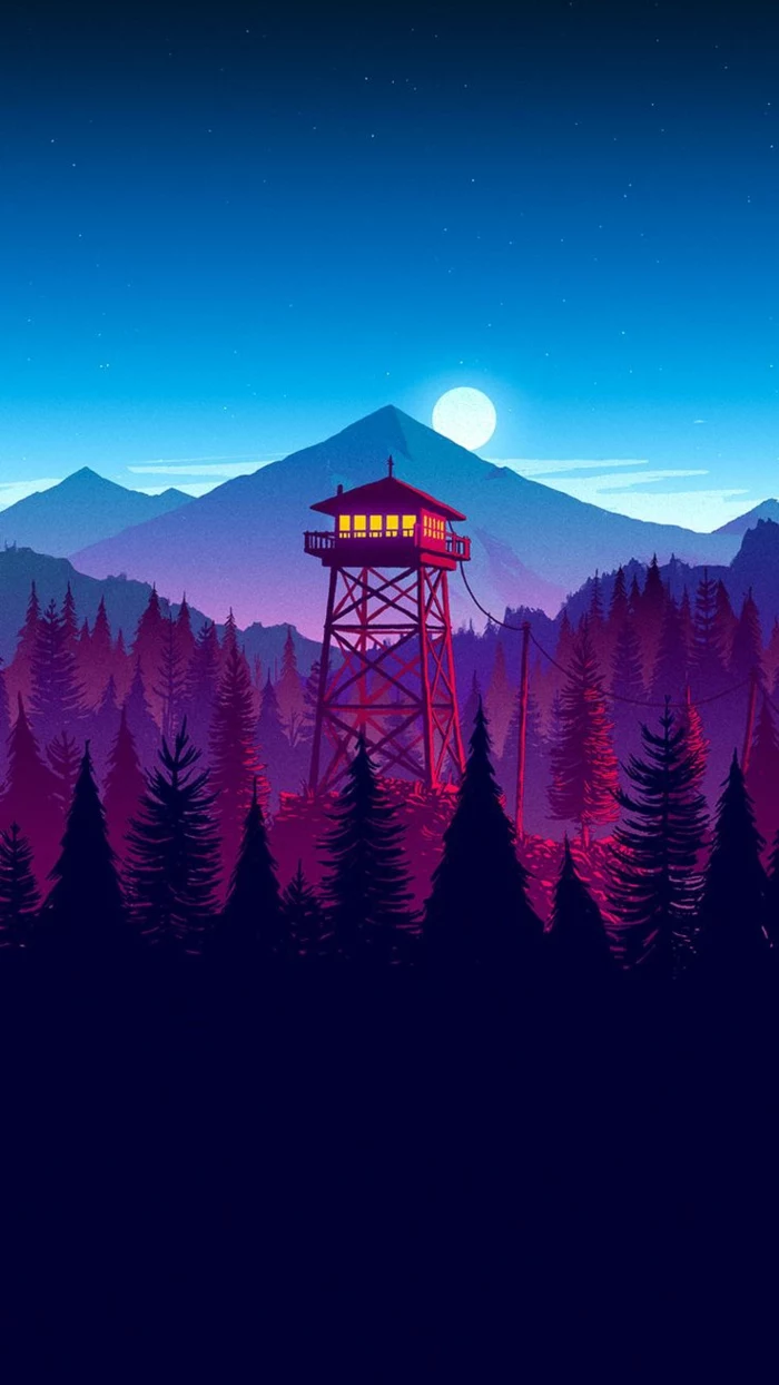
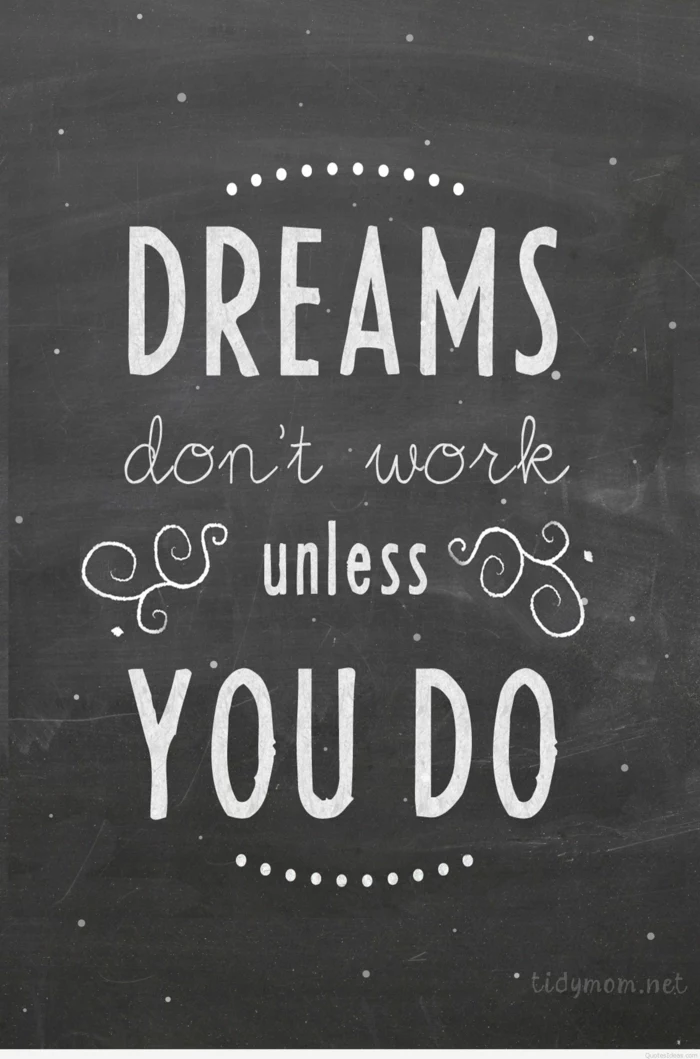
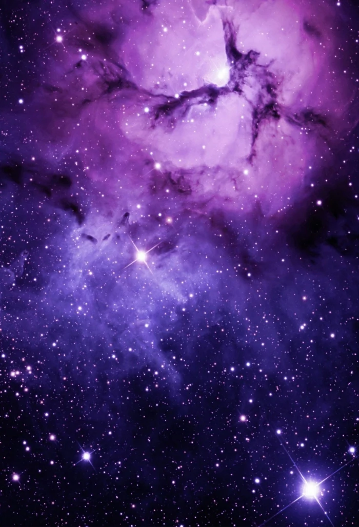
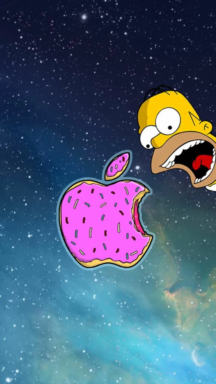
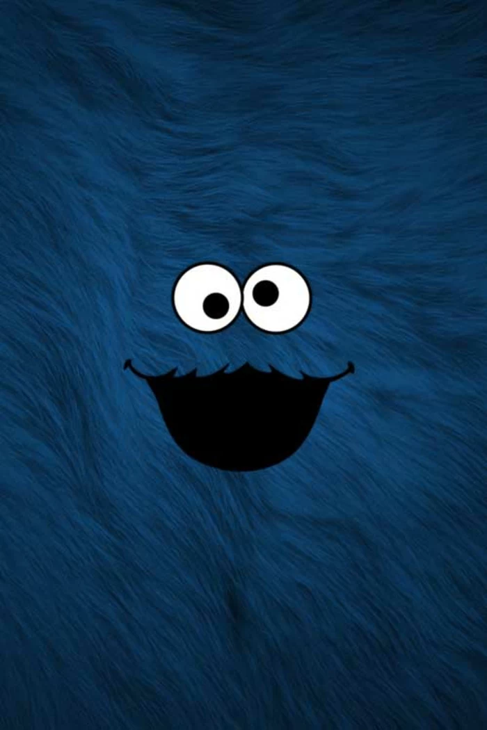
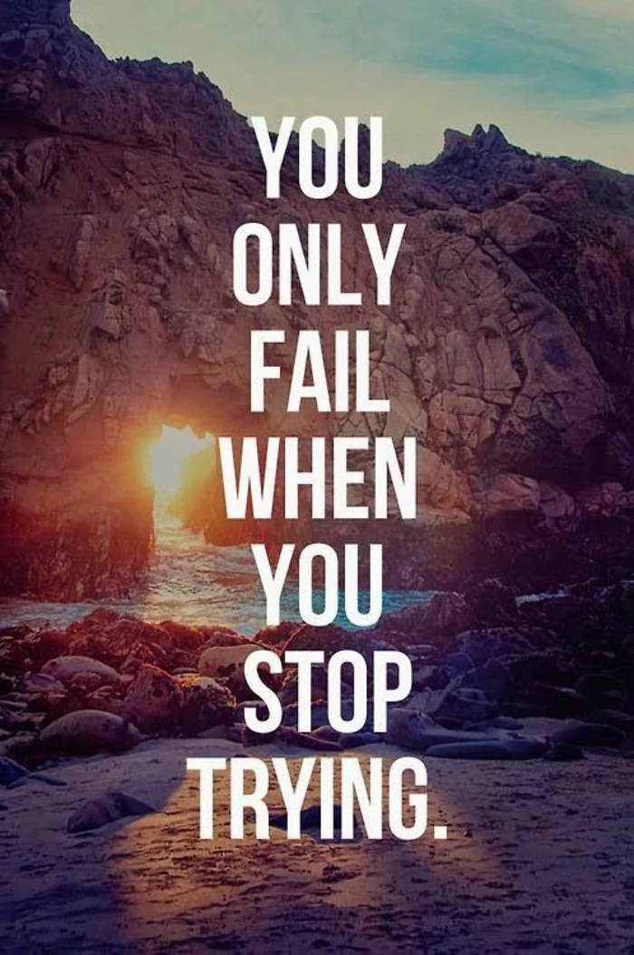
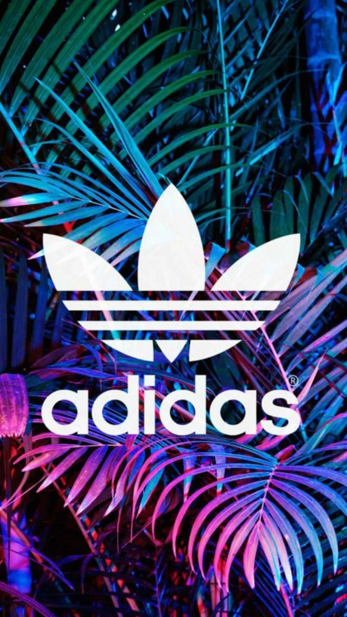
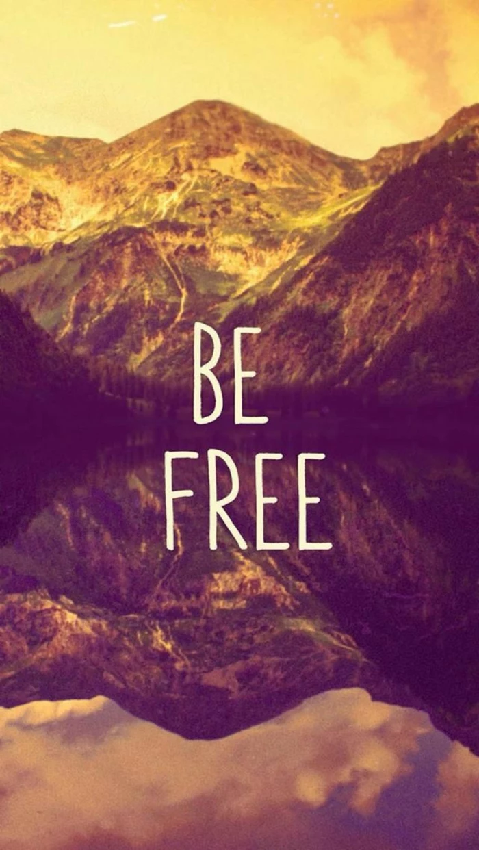
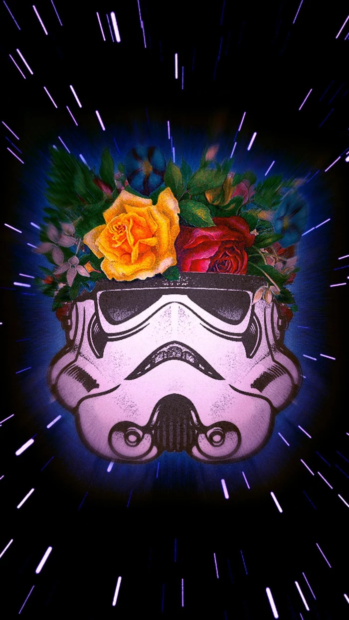
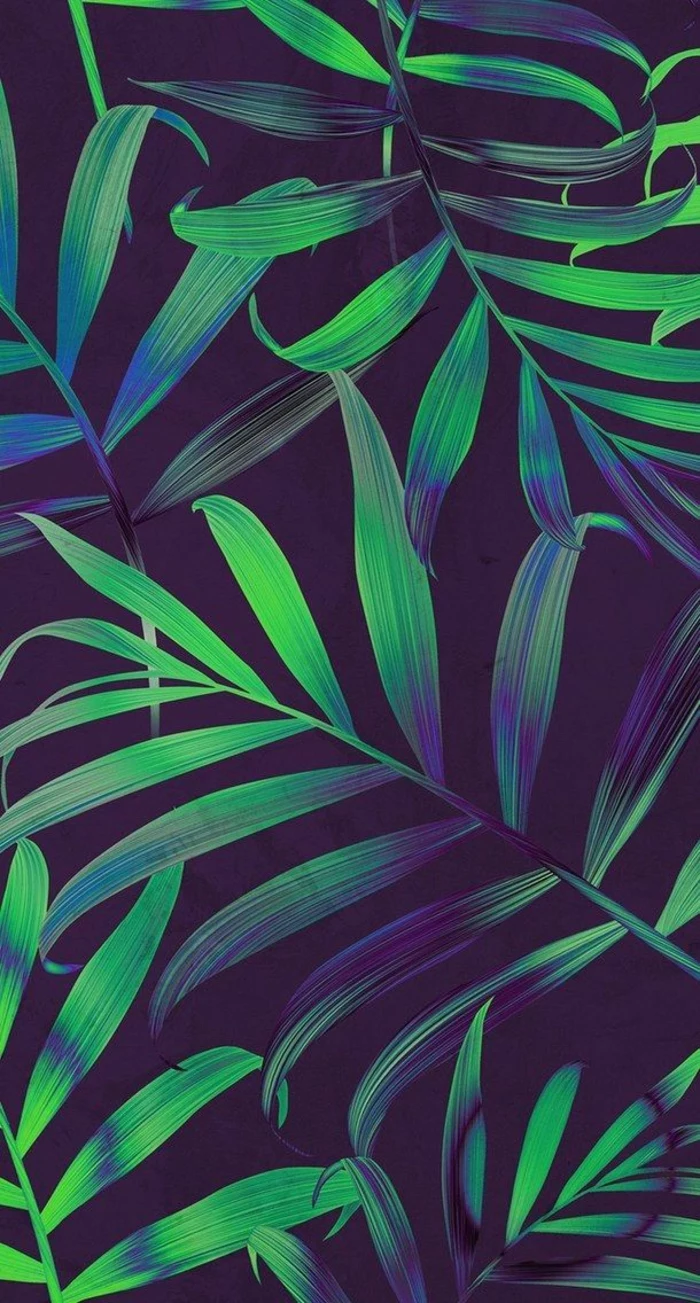
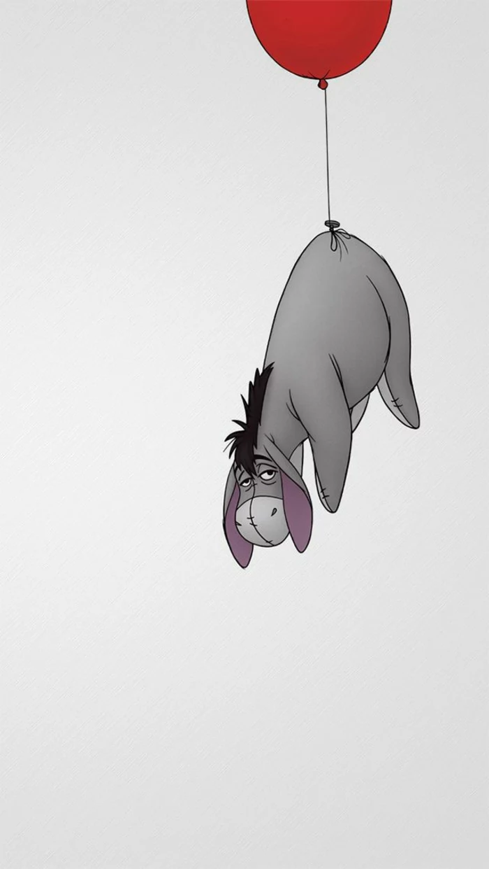
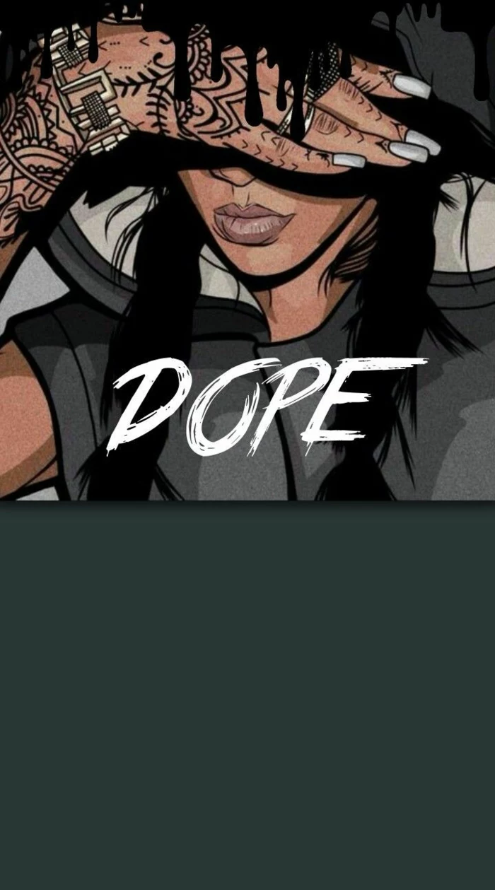
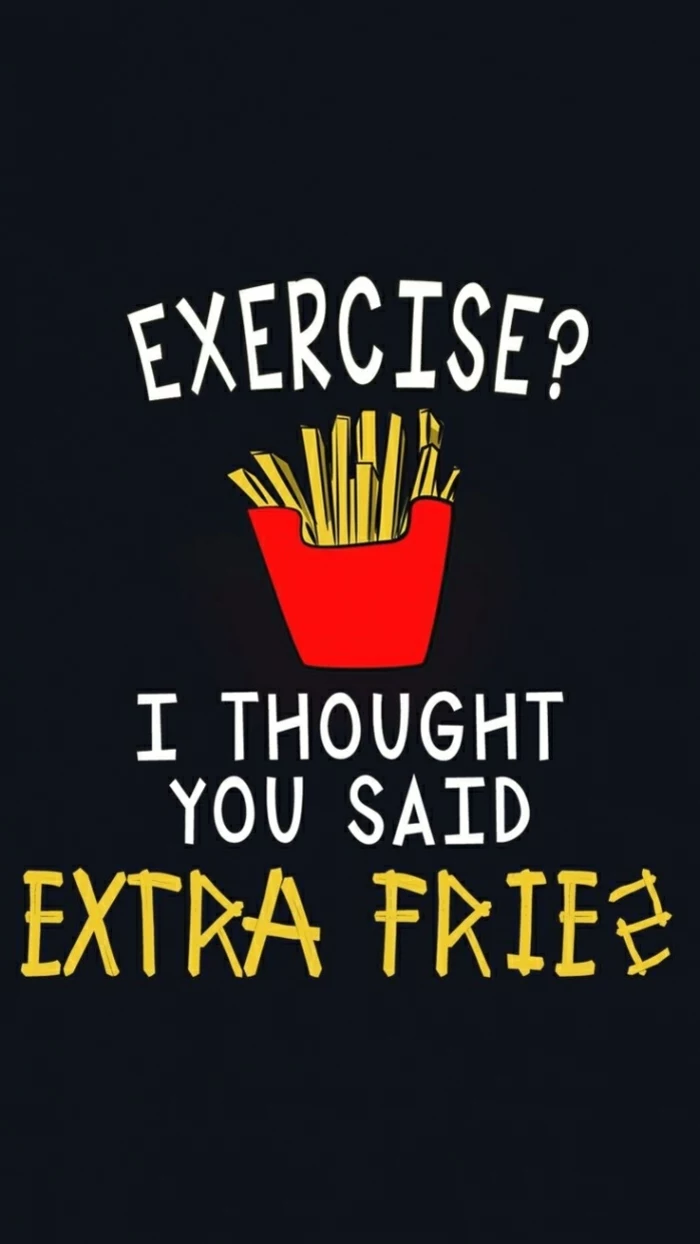
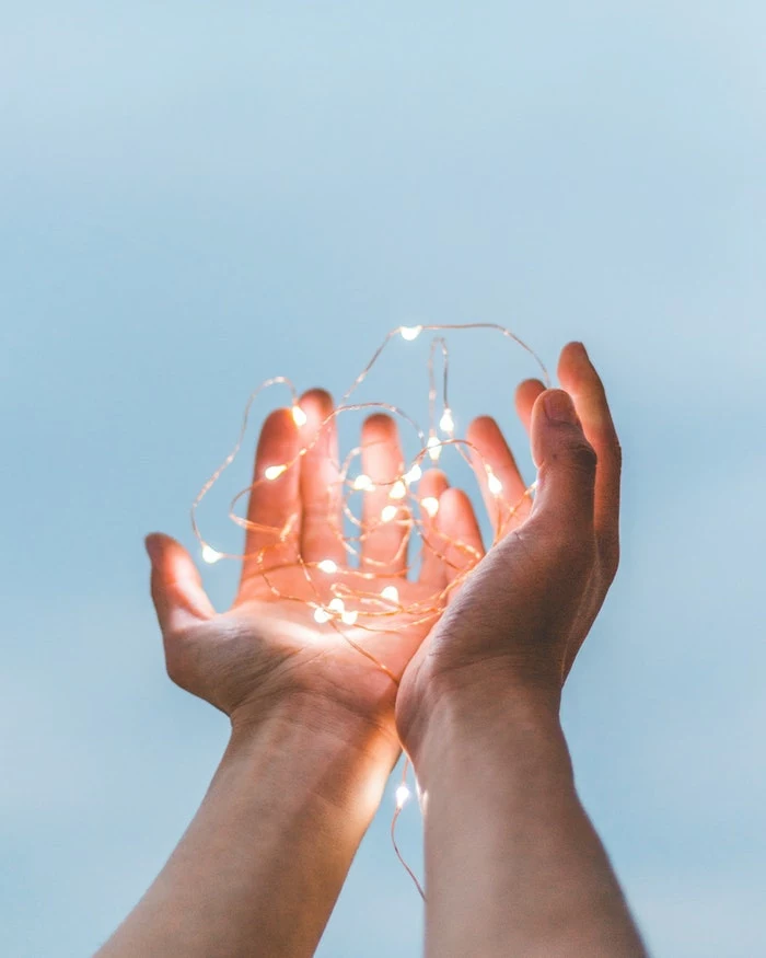
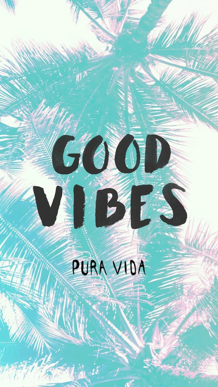
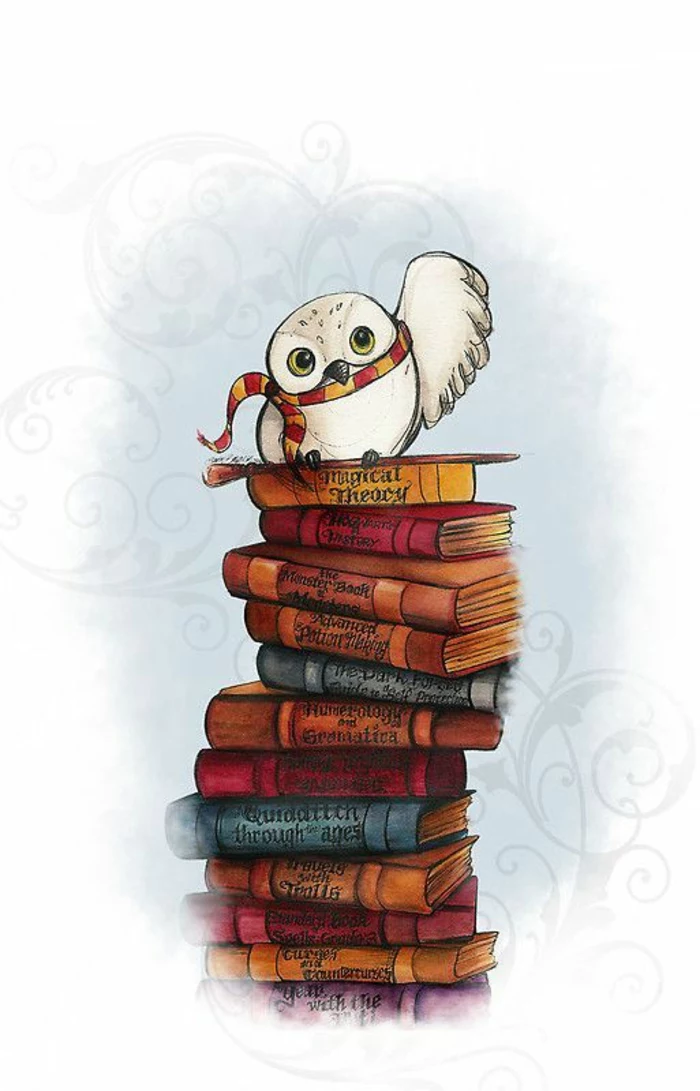
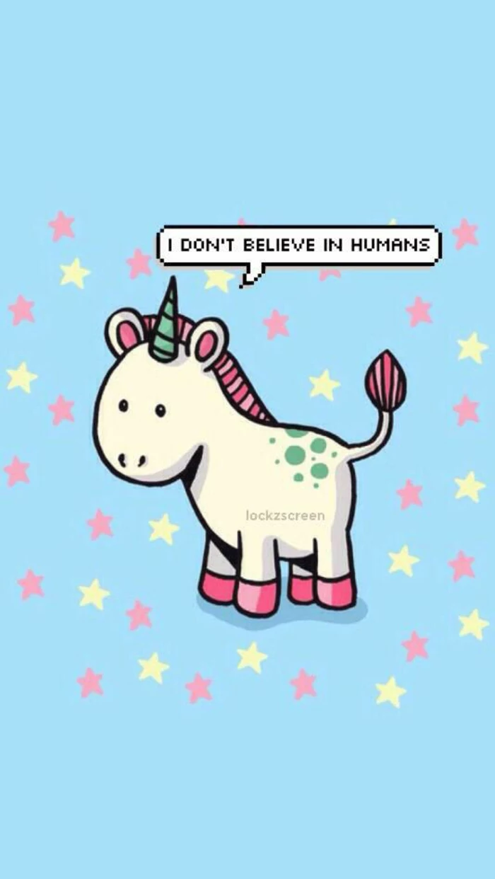
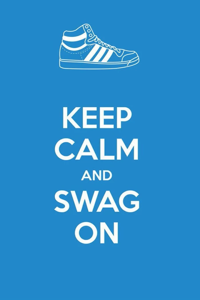
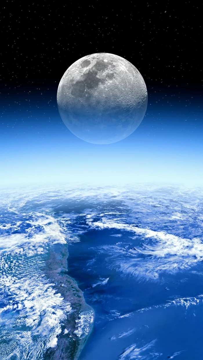
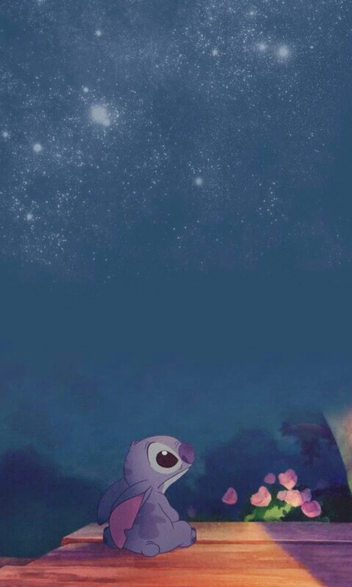
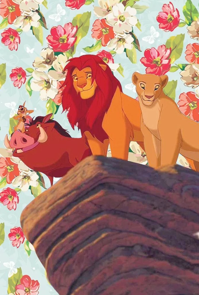
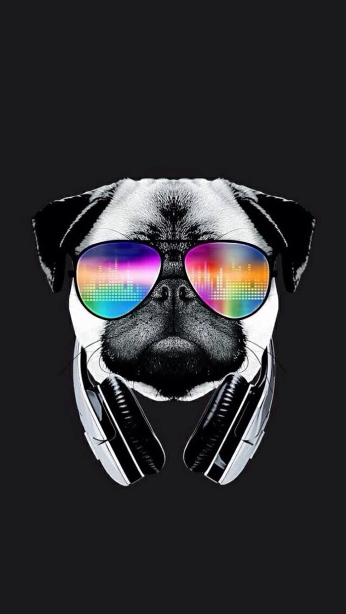
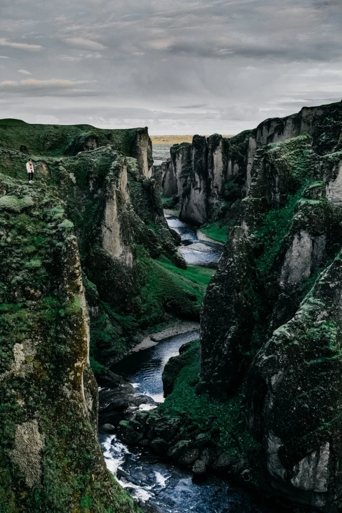
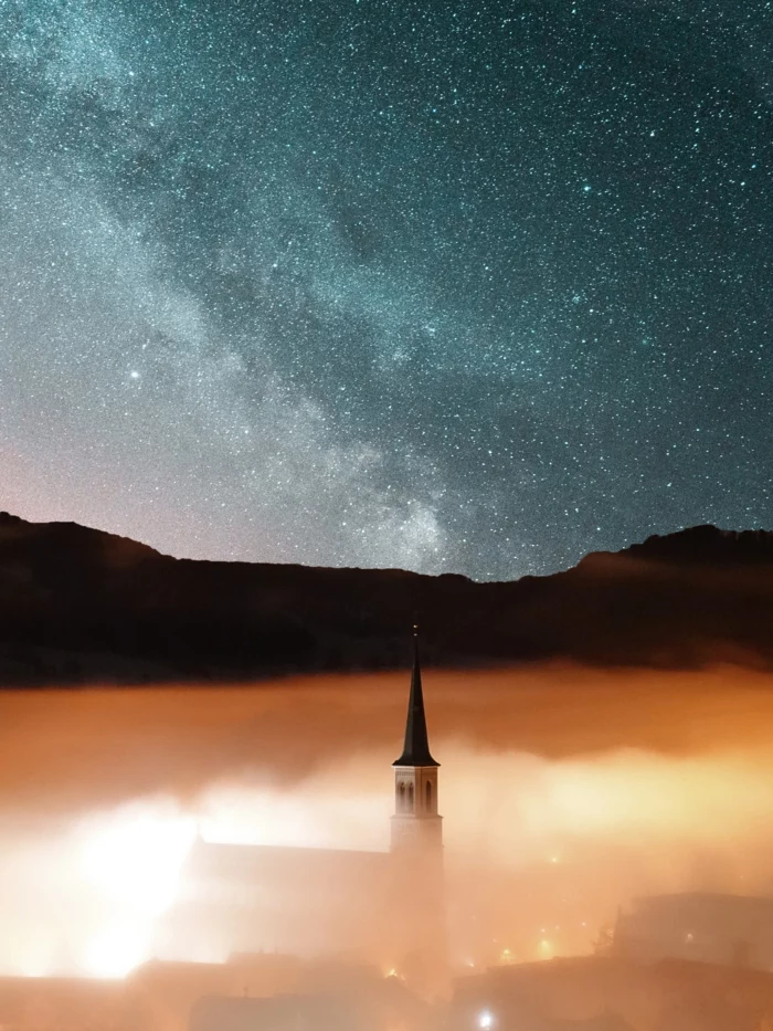
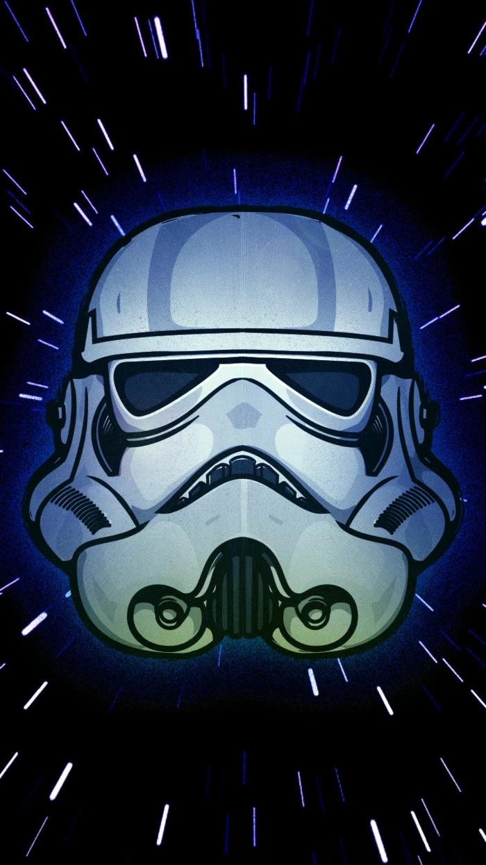
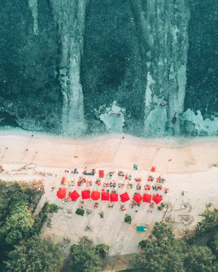
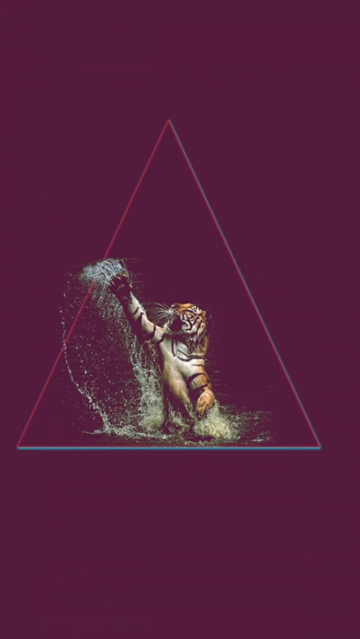
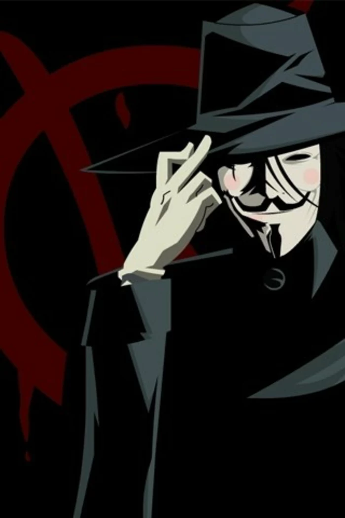
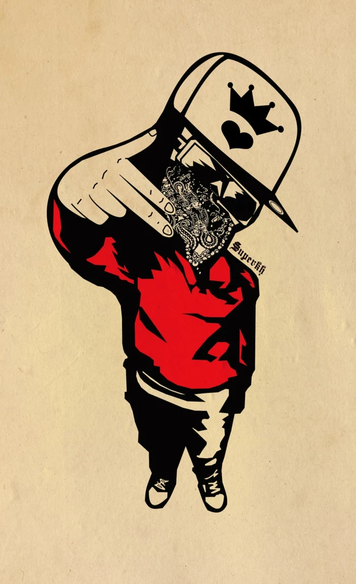
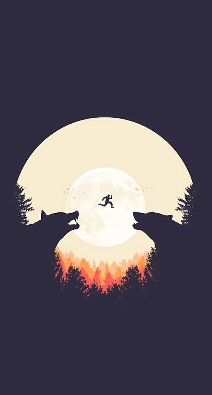
Inspiration Gallery
The average person unlocks their phone over 80 times a day.
Think about that. Your wallpaper isn’t just a static image; it’s the first thing you see dozens of times, setting the micro-mood for every interaction. Choosing an image that makes you feel calm, motivated, or happy can have a surprisingly powerful cumulative effect on your day.
Struggling with a beautiful but busy photo? Before giving up on it, check your phone’s settings. Most modern operating systems, both iOS and Android, offer a “blur” option when setting a home screen wallpaper. A slight blur can soften distracting details, making your app icons pop while preserving the color and feel of your original image.
- Vellum: Offers stunning, curated collections hand-picked by artists and designers.
- Backdrops: A huge community-driven library with unique, often exclusive, graphic designs and photos.
- Unsplash: The go-to for professional-grade, high-resolution photography that is completely free to use.
The secret to a great wallpaper is often just knowing where to look.
A pro tip for organization: Use your wallpaper to create visual zones. An image with a distinct horizon line, for instance, allows you to place work-related apps in the “sky” and personal apps on the “ground.” This kind of digital feng shui can make navigating your phone feel surprisingly intuitive.
Can my wallpaper drain my battery faster?
Yes, especially if you have an OLED screen, as the article mentions. Live wallpapers, which are essentially short, looping videos, require more processing power to run than a static image. While the effect is cool, you might notice a small but real decrease in battery life if you use one all day. For maximum battery conservation, a dark, static wallpaper is your best bet.
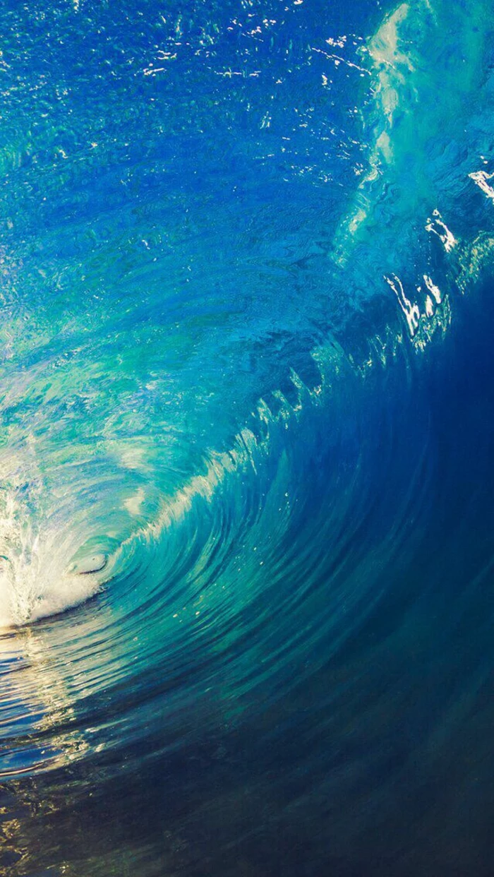
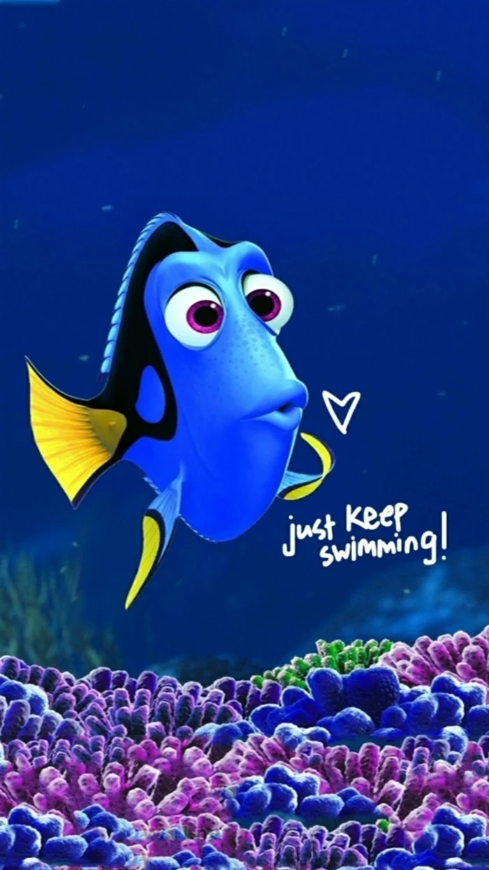
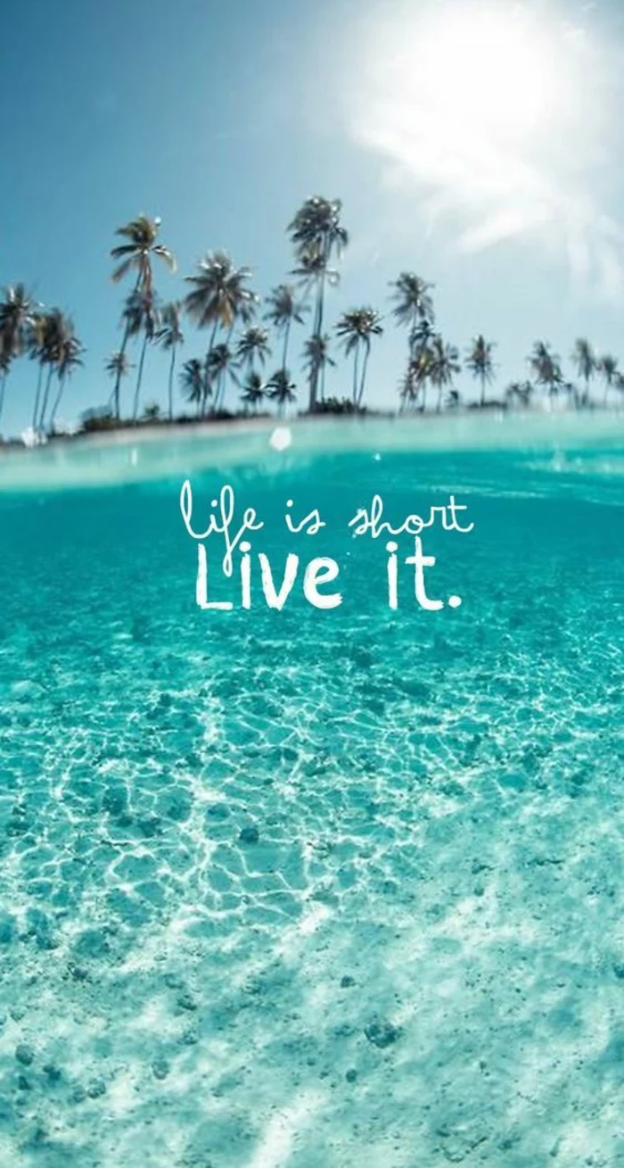
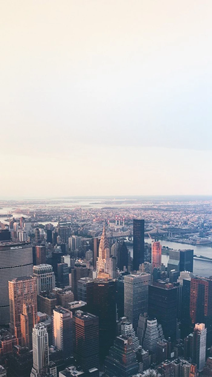
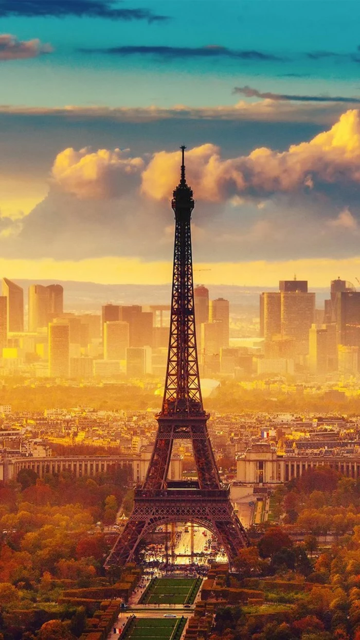
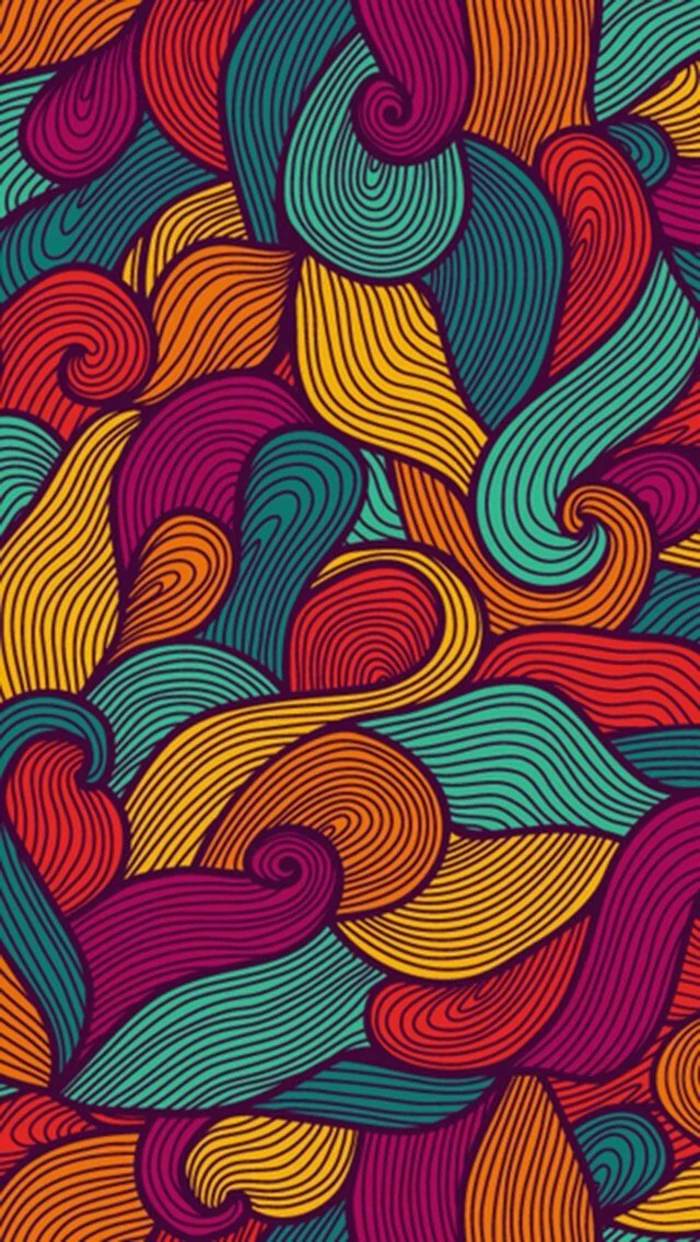
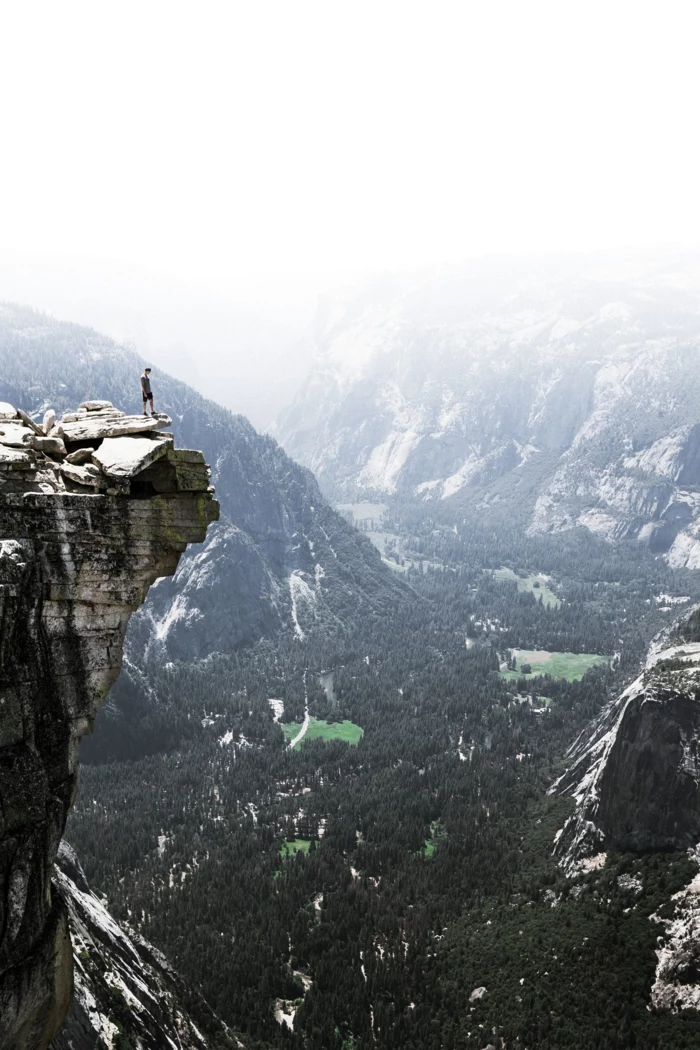
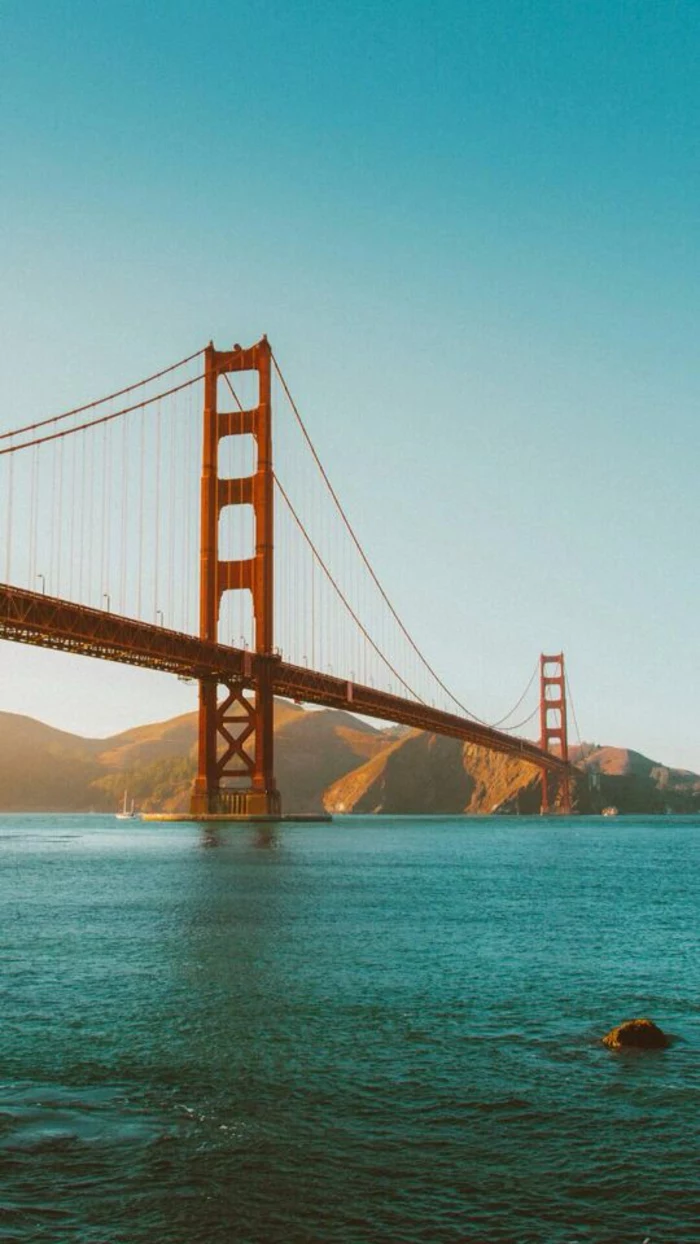
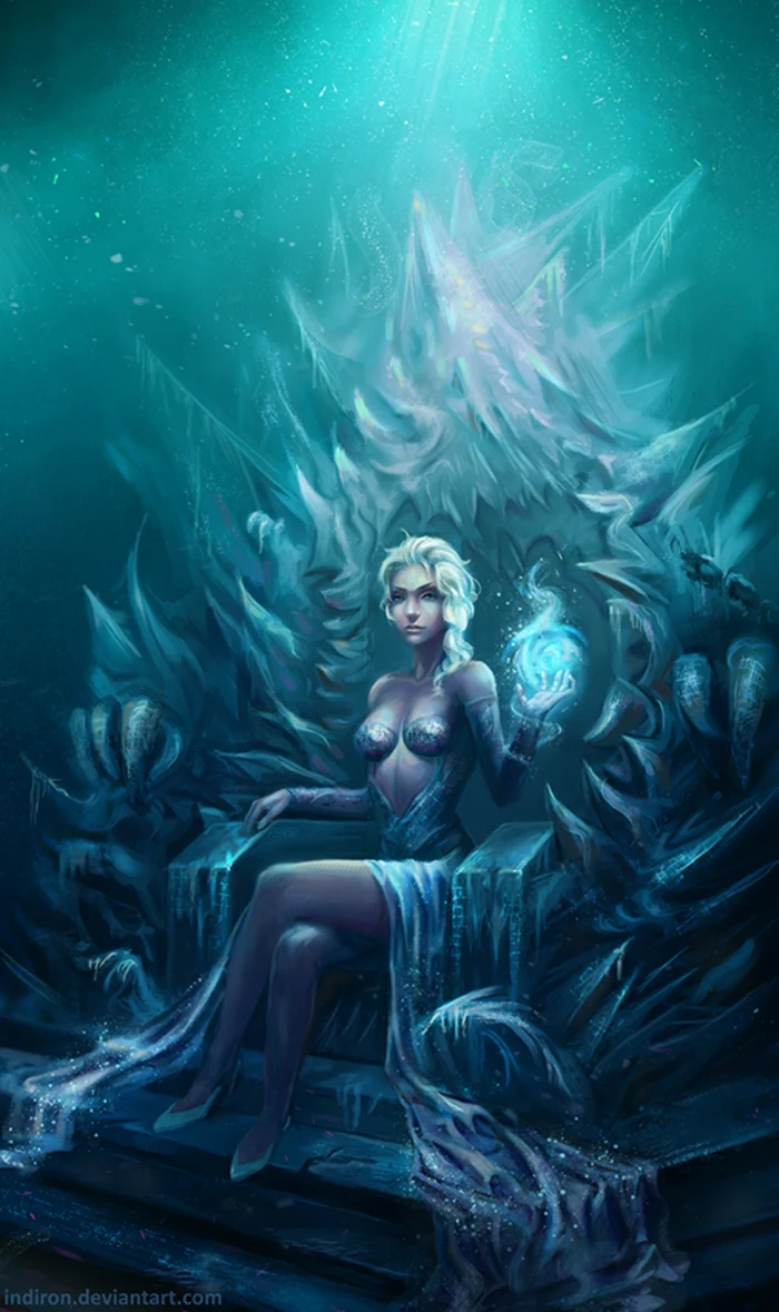
Photographic Wallpaper: Best for emotional connection. A picture of a loved one, a pet, or a favorite travel spot can be a powerful personal statement, especially on the Lock Screen.
Abstract/Gradient Wallpaper: Best for usability. These designs provide a clean, non-distracting canvas that makes app icons and widgets incredibly easy to read. Perfect for the Home Screen.
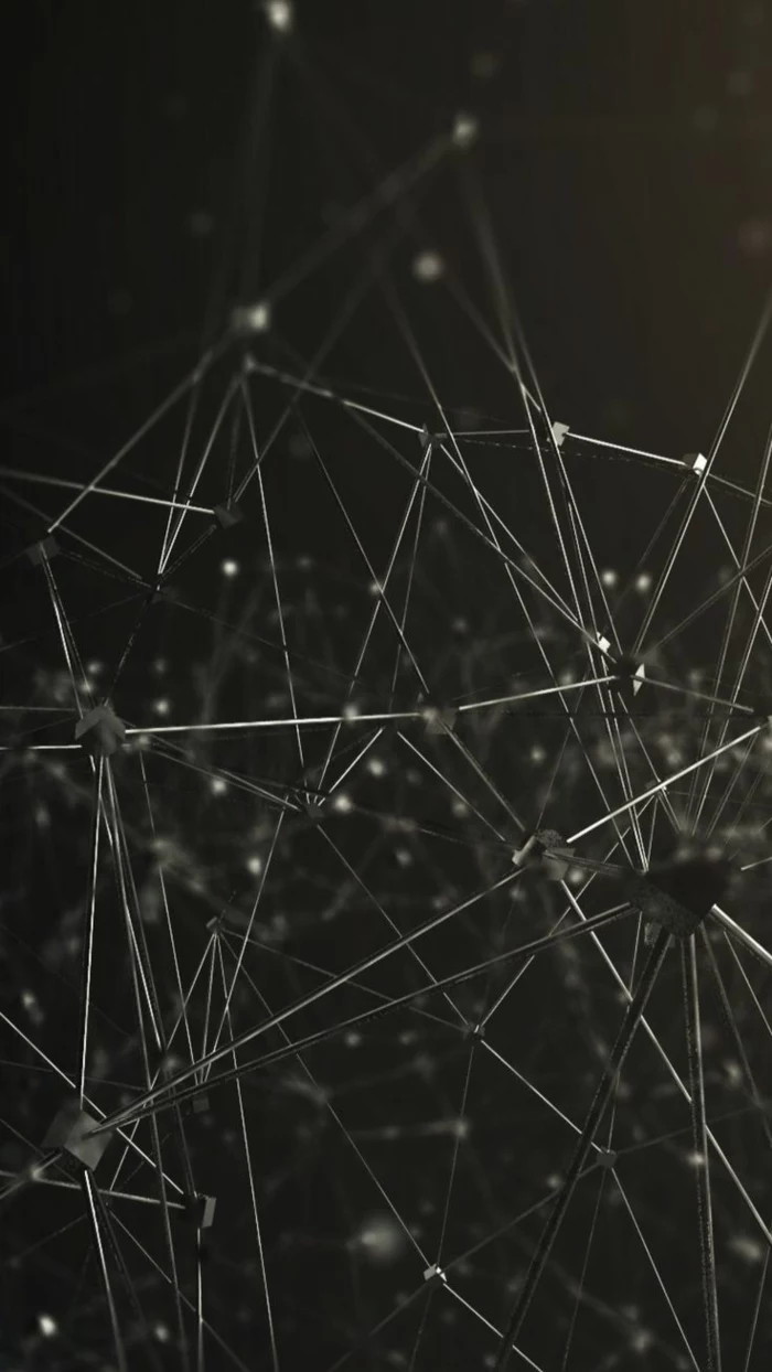
The Parallax Trap: That cool 3D effect where the wallpaper moves as you tilt your phone is called the parallax effect. For it to work well, you need an image with depth—a clear foreground and a distant background. A flat pattern or a close-up texture will look odd and can even cause slight cropping issues at the edges.
Want to take customization to the next level? Coordinate your app icons with your wallpaper. On iOS, you can use the Shortcuts app to create custom icons for your apps. On Android, dedicated launchers like Nova Launcher allow for full icon pack integration. Imagine a minimalist nature wallpaper paired with simple, leaf-green icons—it creates a truly unified aesthetic.
A 2021 study showed that 68% of people feel “phone anxiety” when their battery is low.
While a wallpaper won’t solve this, choosing a “true black” one for your OLED screen can help. Apps like ‘OLEDify’ specialize in creating wallpapers where a significant portion of the pixels are turned off, collectively saving a sliver of power with every unlock.
- It provides a clean, unobtrusive background.
- It makes text and icons perfectly legible.
- The subtle color shifts are visually interesting without being distracting.
The secret? A simple gradient wallpaper. You can find thousands on apps like ‘Backdrops’ or easily create your own with a tool like Canva.
What’s the difference between Lock Screen and Home Screen wallpapers?
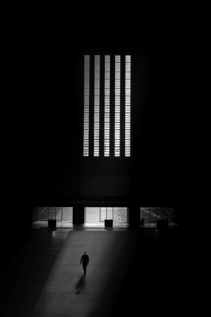
Think of them as the cover and the content of a book. Your Lock Screen is the cover: it can be bold, artistic, and deeply personal. It’s where that stunning but busy photo belongs. Your Home Screen is the content page: it needs to be functional and easy to read. A complementary, simpler version of your lock screen image—or a subtle texture—is ideal here.
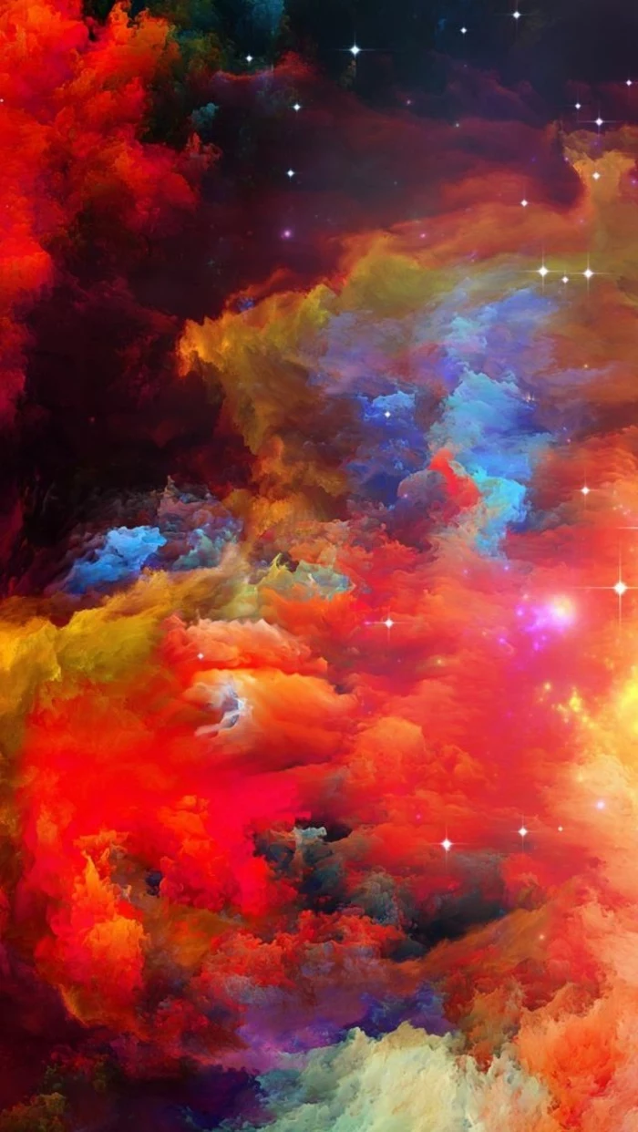
The rise of AI image generators like Midjourney or DALL-E 3 has opened a new frontier for wallpapers. You can now be the artist. Try prompting for something hyper-specific, like “A minimalist Japanese woodblock print of a cat looking at a neon city, 8K, phone wallpaper.” You’ll get a truly one-of-a-kind background tailored exactly to your taste.
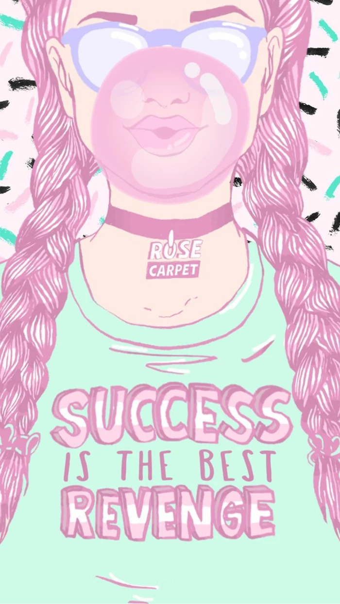
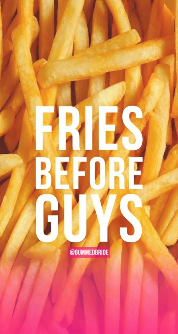
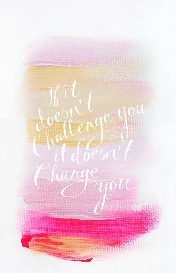
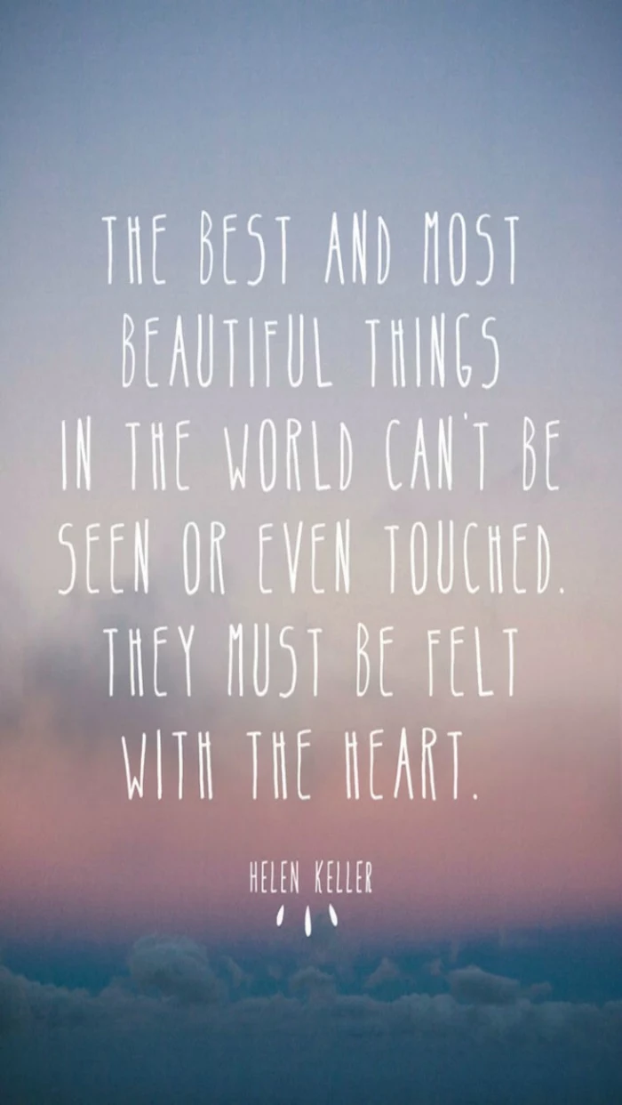
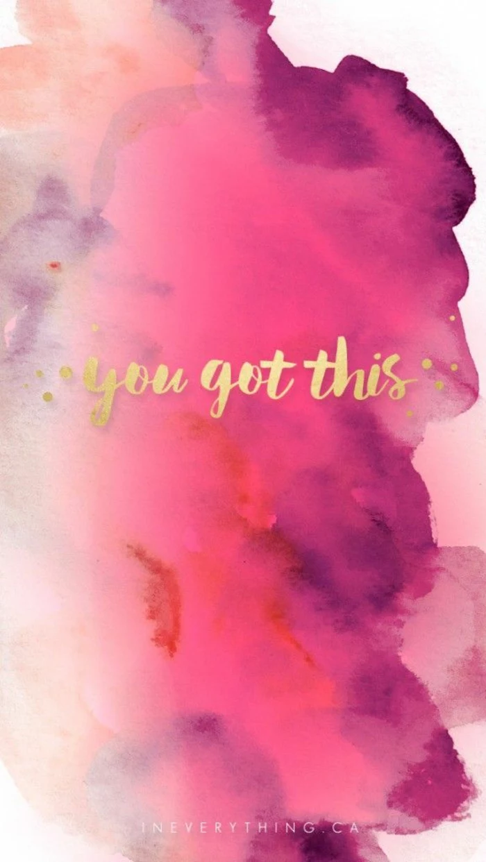
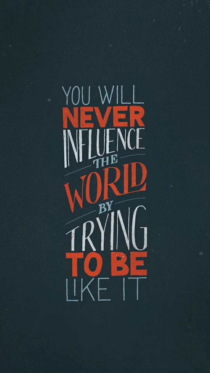
Don’t forget about text! A simple, elegant wallpaper with a motivational quote or a personal mantra can be incredibly effective. Use an app like ‘Word Swag’ or the text tool in Instagram Stories to create a high-resolution image with beautiful typography, save it to your phone, and set it as your wallpaper for a daily dose of inspiration.
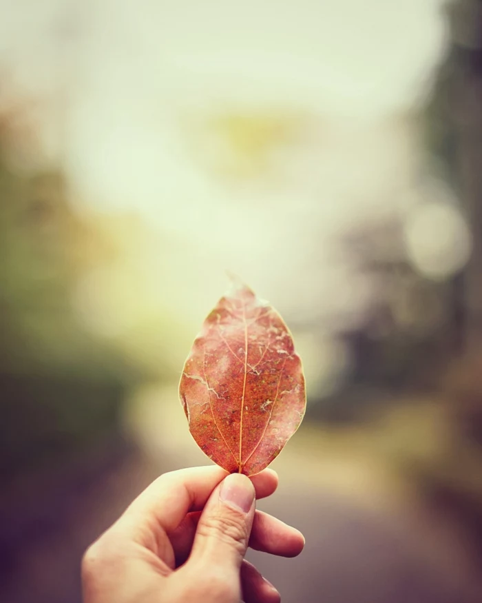
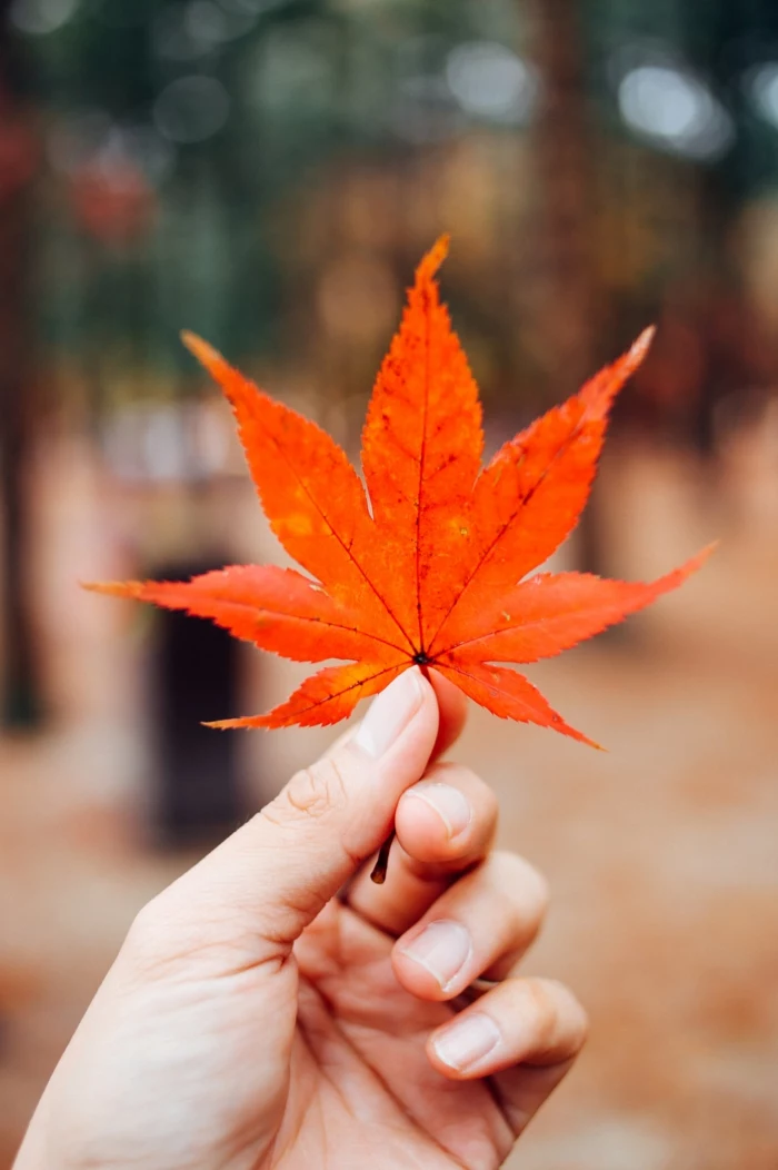
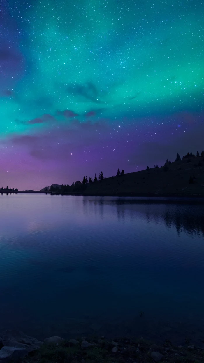
Consider a seasonal rotation for your wallpaper. A crisp, snowy landscape in winter, a vibrant floral macro in spring, a sunny beach in summer, and warm autumn leaves in the fall. This simple change helps keep your phone feeling fresh and connected to the world around you. You can even use apps on Android or Shortcuts on iOS to automate this change.
Cohesive Theme: Pick a dominant color from your wallpaper and find a solid-colored phone case to match. For instance, a deep blue space wallpaper pairs beautifully with a navy case from brands like Spigen or Apple’s own silicone line.
Bold Statement: Go for a perfectly matched set. Services like Casetify or Skinit let you upload your own wallpaper image and have it printed directly onto a protective case for the ultimate coordinated look.
An important detail for parents and pet owners: When using a photo of a loved one, avoid placing their face directly in the center of the screen. The clock on the lock screen and a grid of apps on the home screen will inevitably cover it. Opt for an off-center composition where your subject is on one side, leaving clear space for UI elements.
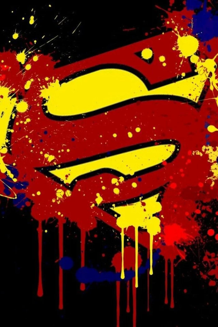
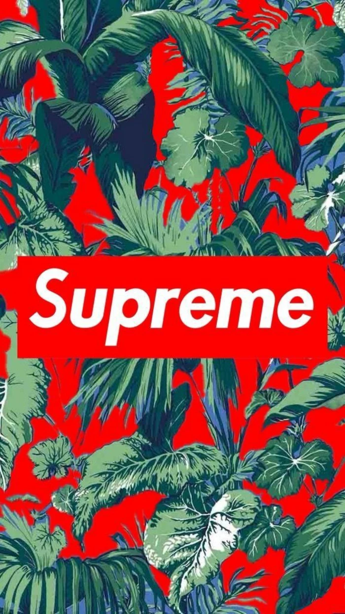
For graphic art and illustrations, a PNG file is often superior to a JPG.
If you’ve found the perfect graphic wallpaper but it looks blocky or has fuzzy edges, it might be due to JPG compression. PNG files handle sharp lines and solid blocks of color much better, resulting in a crisper, cleaner look on your high-resolution screen.
- Clarity for your widgets and clock.
- A more organized and intentional feel.
- A subtle, sophisticated aesthetic.
How? By choosing a textured wallpaper. Think of images that replicate linen, concrete, brushed metal, or fine-grained wood. They add depth without creating clutter.

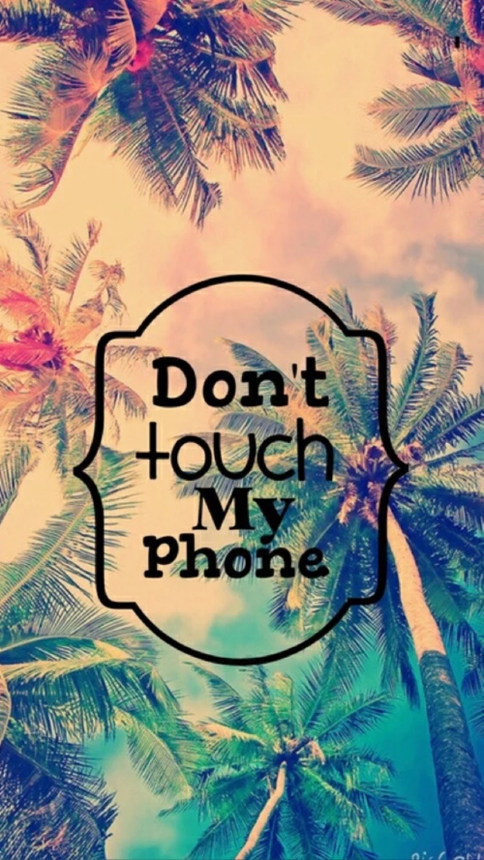
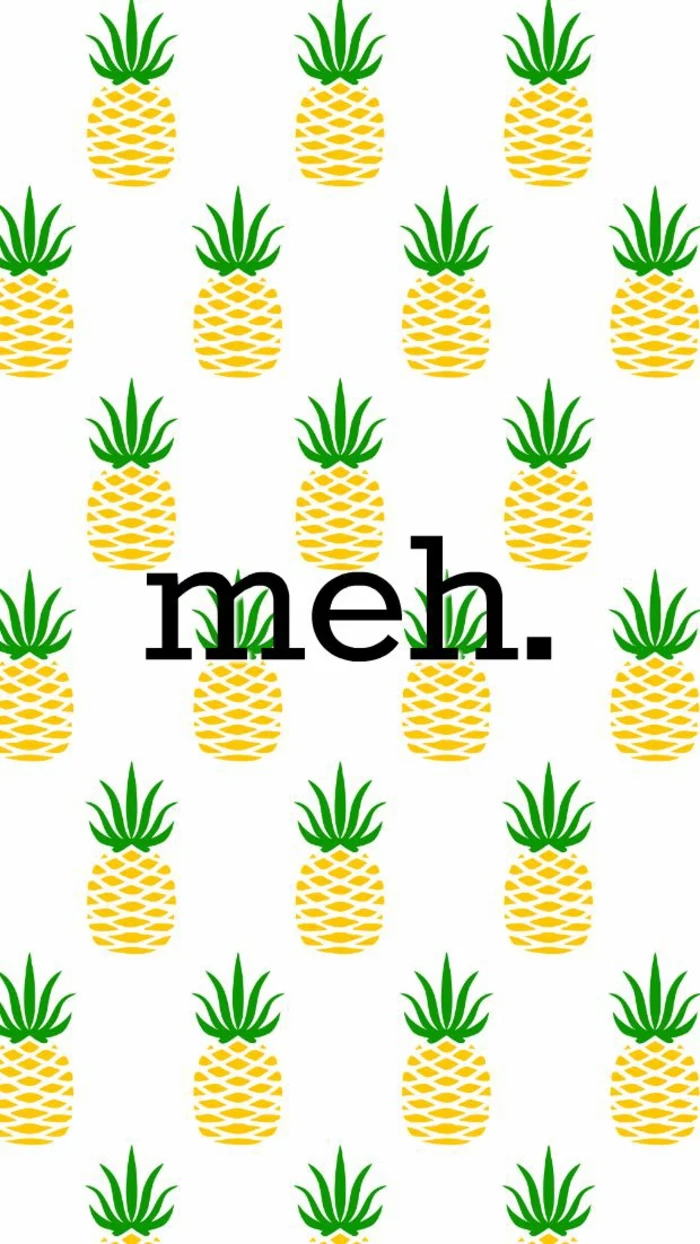
My phone has a
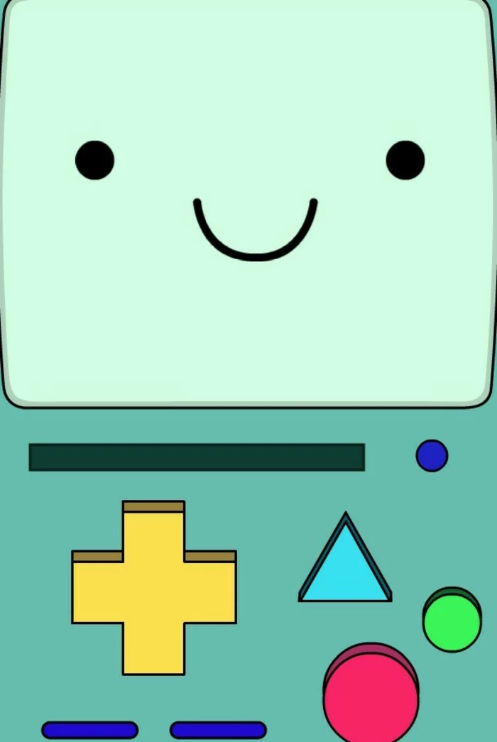
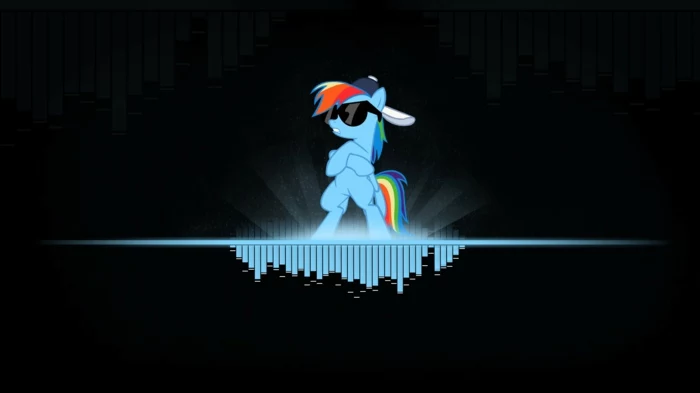
A Nod to Nostalgia: Pixel art makes for a fantastic wallpaper. Its inherently grid-based nature aligns perfectly with the pixel grid of your screen, creating an exceptionally sharp and clean look. Plus, it’s a great way to show off your love for classic video games or a retro aesthetic. The app ‘Retrowave Wallpapers’ is a great source for this style.
Light Mode vs. Dark Mode: A great wallpaper setup should work with both. Many modern OS versions allow you to set different wallpapers for Light and Dark modes. Choose a bright, airy image for your daytime Light Mode and a darker, less intense version—or a completely different moody image—for when Dark Mode kicks in at night.
Instead of a static image, why not a story? Some Android launchers and Samsung’s One UI let you set a


