Your Phone’s Wallpaper Sucks. Here’s the Pro’s Guide to Fixing It.
I’ve been in the graphic design world for a long, long time, working on everything from brand logos to digital art for musicians. And through it all, I’ve noticed something funny: the most personal piece of design we own is often the one we treat the worst. I’m talking about your phone’s wallpaper.
In this article
Think about it. It’s the first thing you see dozens, maybe hundreds, of times a day. It sets a mood. So why do so many of us settle for a blurry, awkwardly cropped picture we grabbed from a social media feed? You know the look—the main subject’s face is half-covered by the clock, and the whole thing looks fuzzy and, well, accidental.
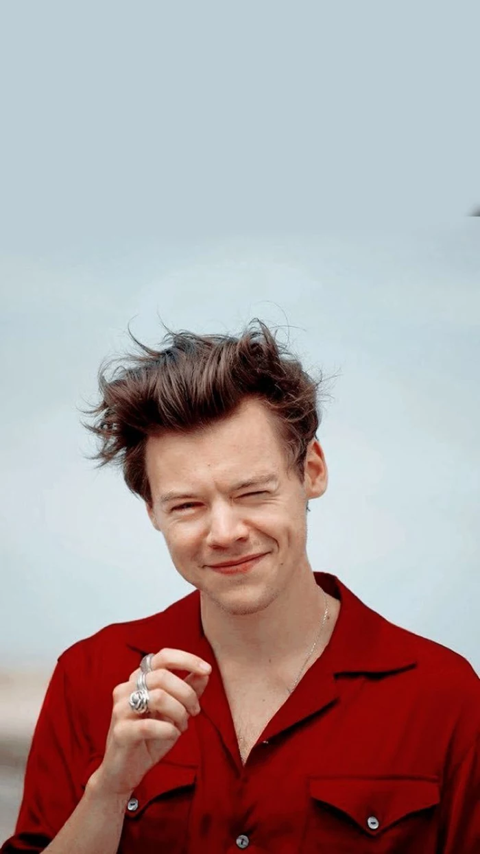
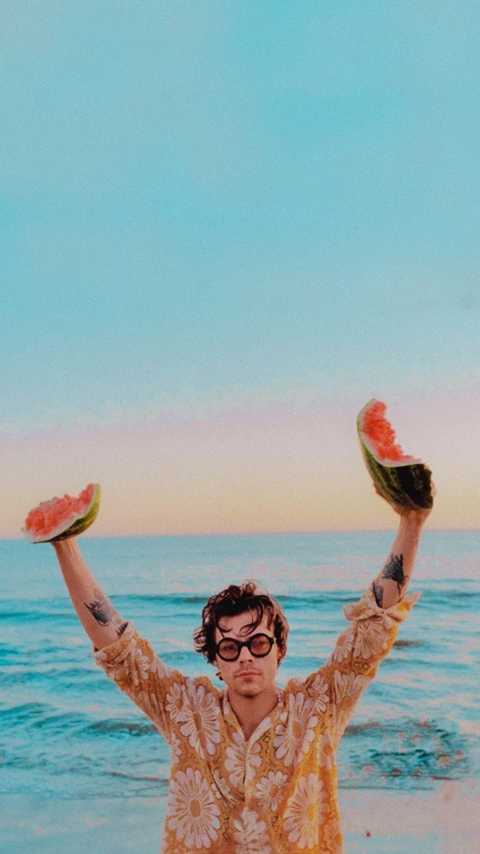
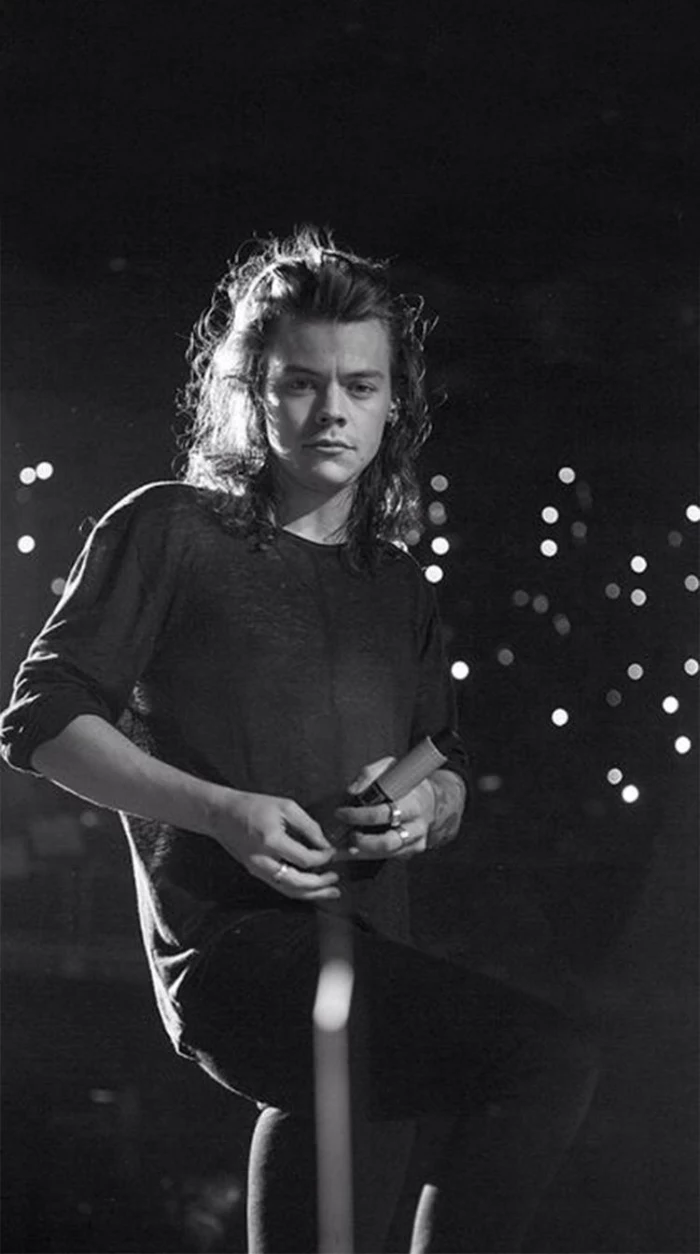
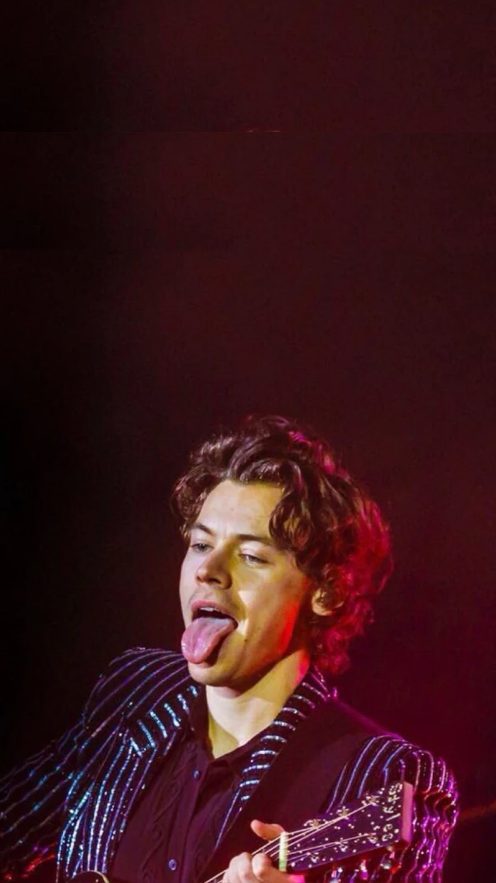
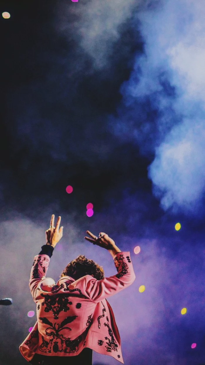
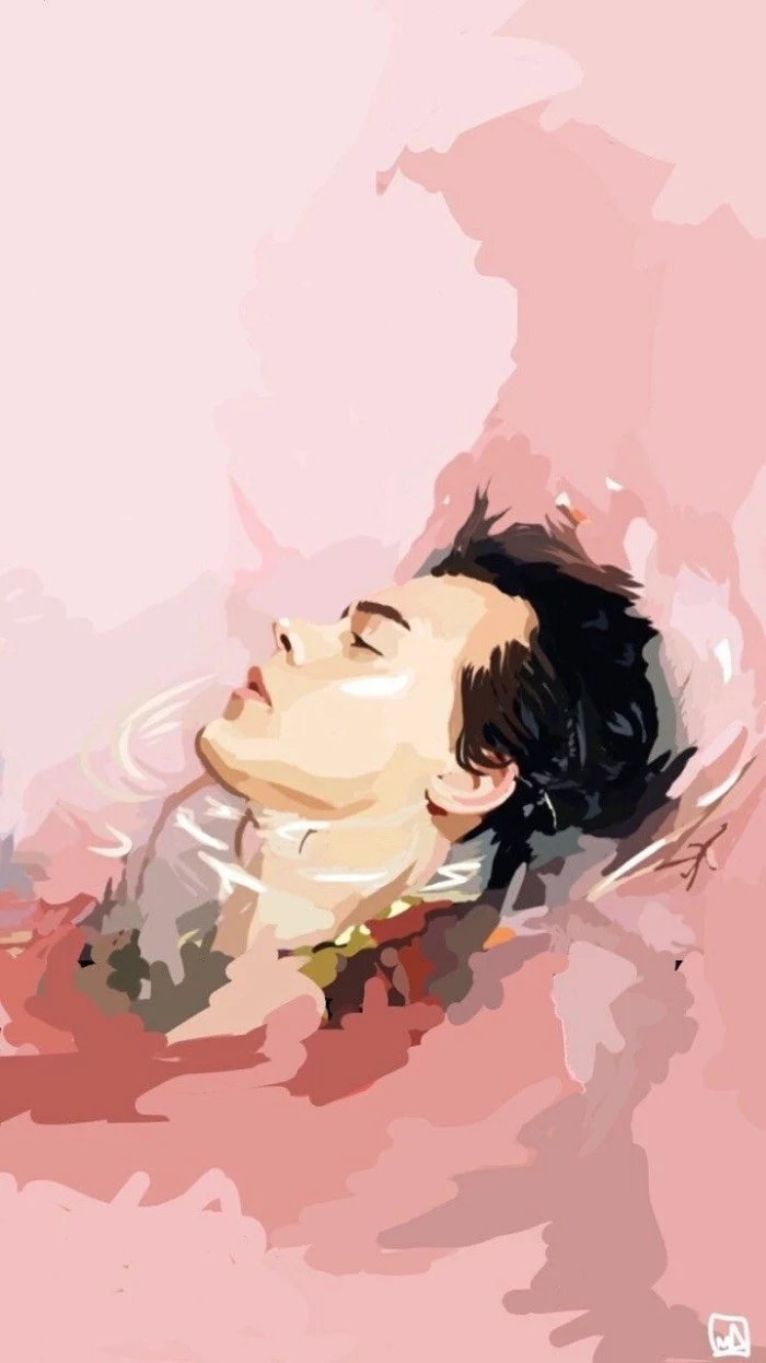
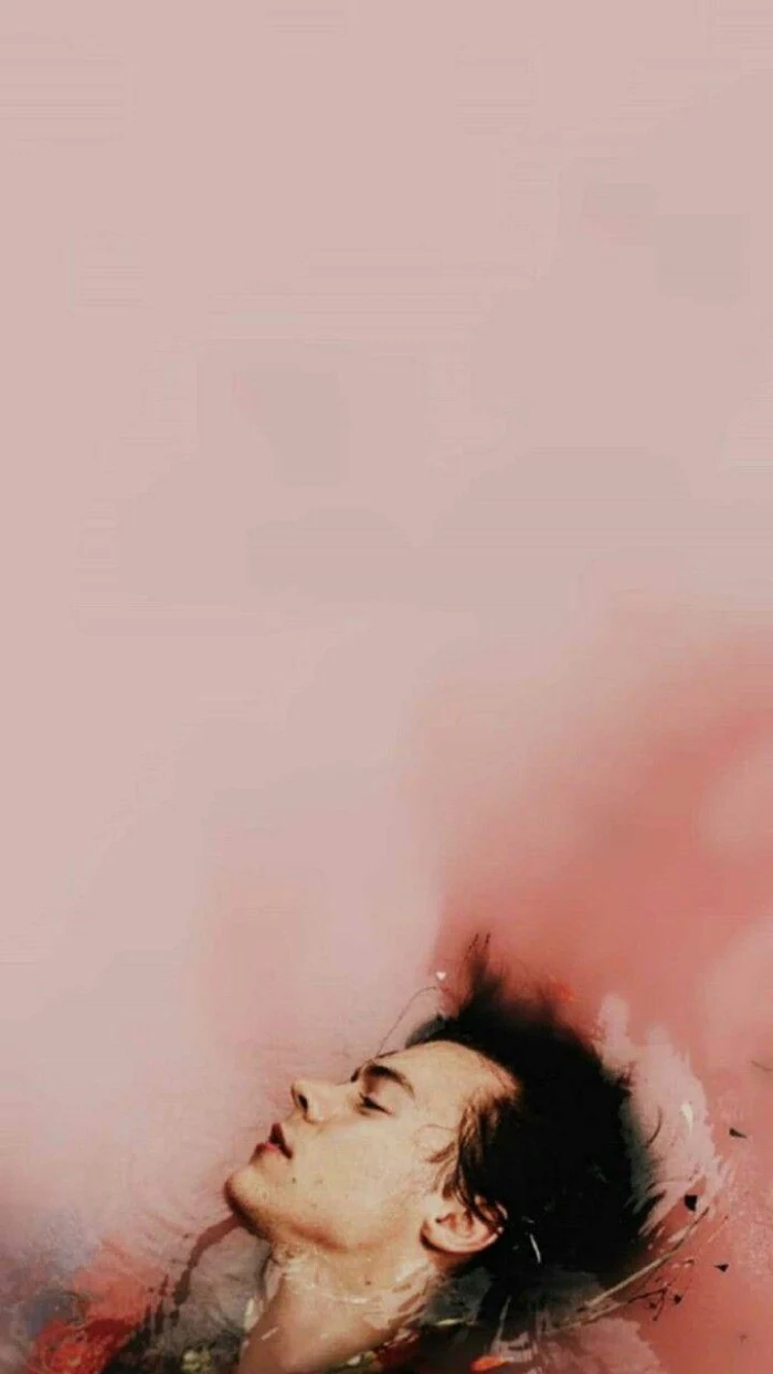
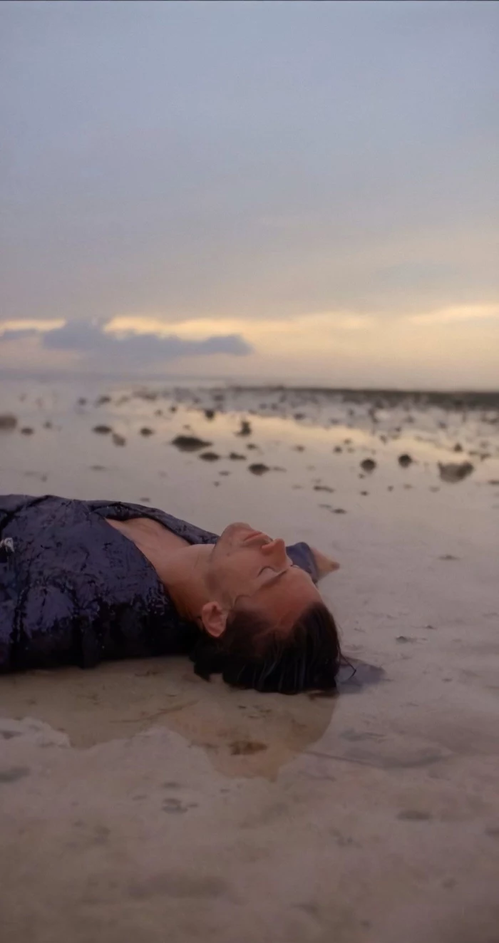
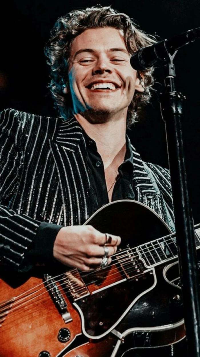
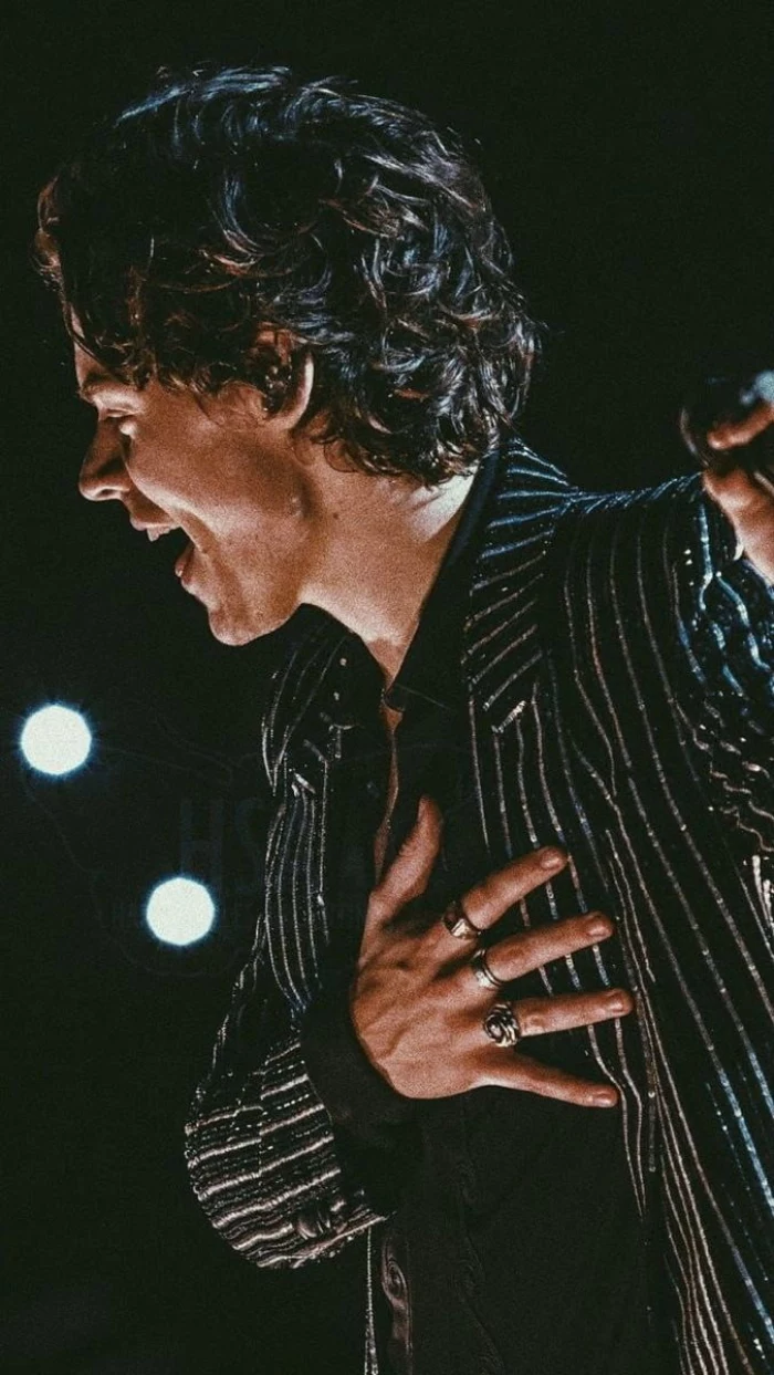
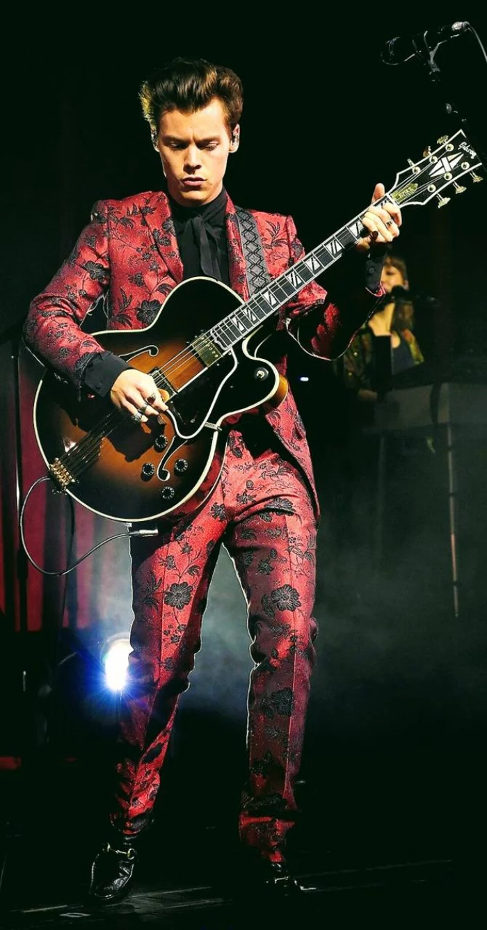
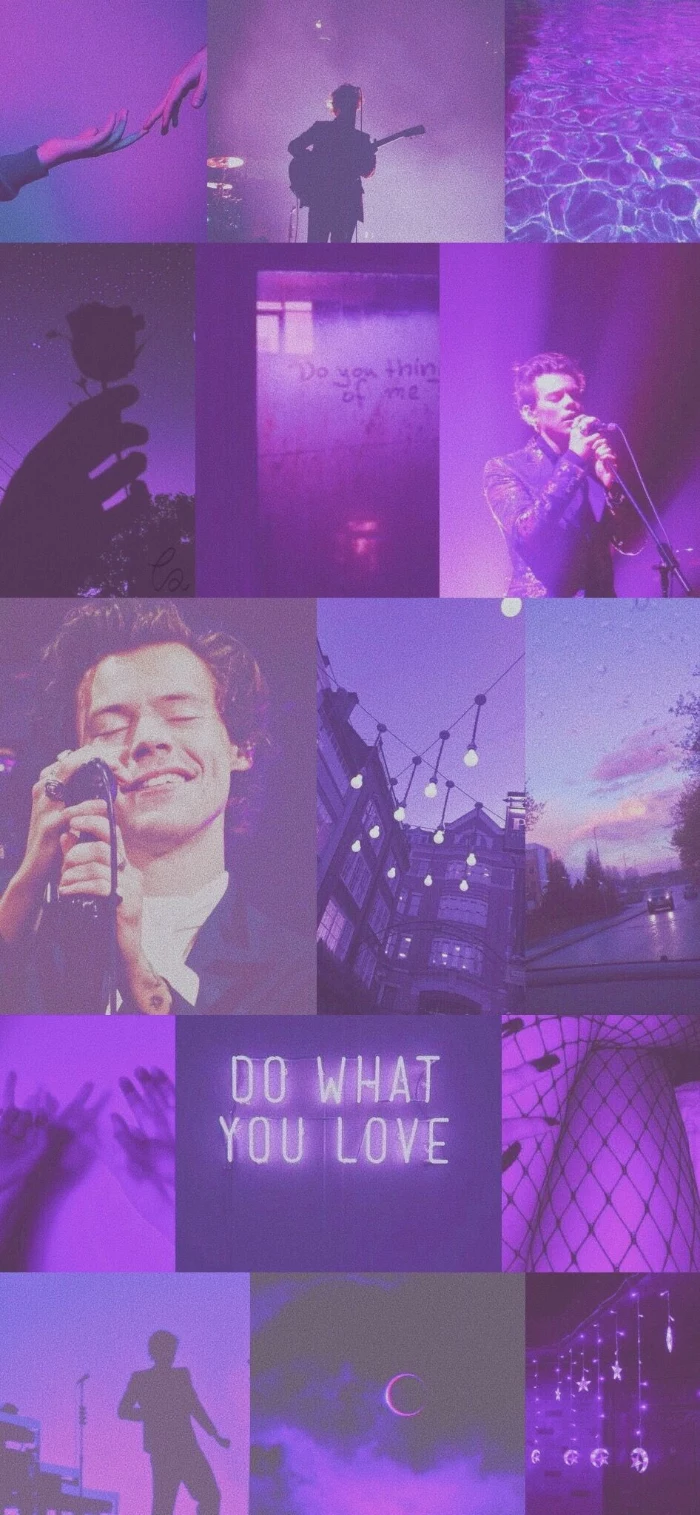
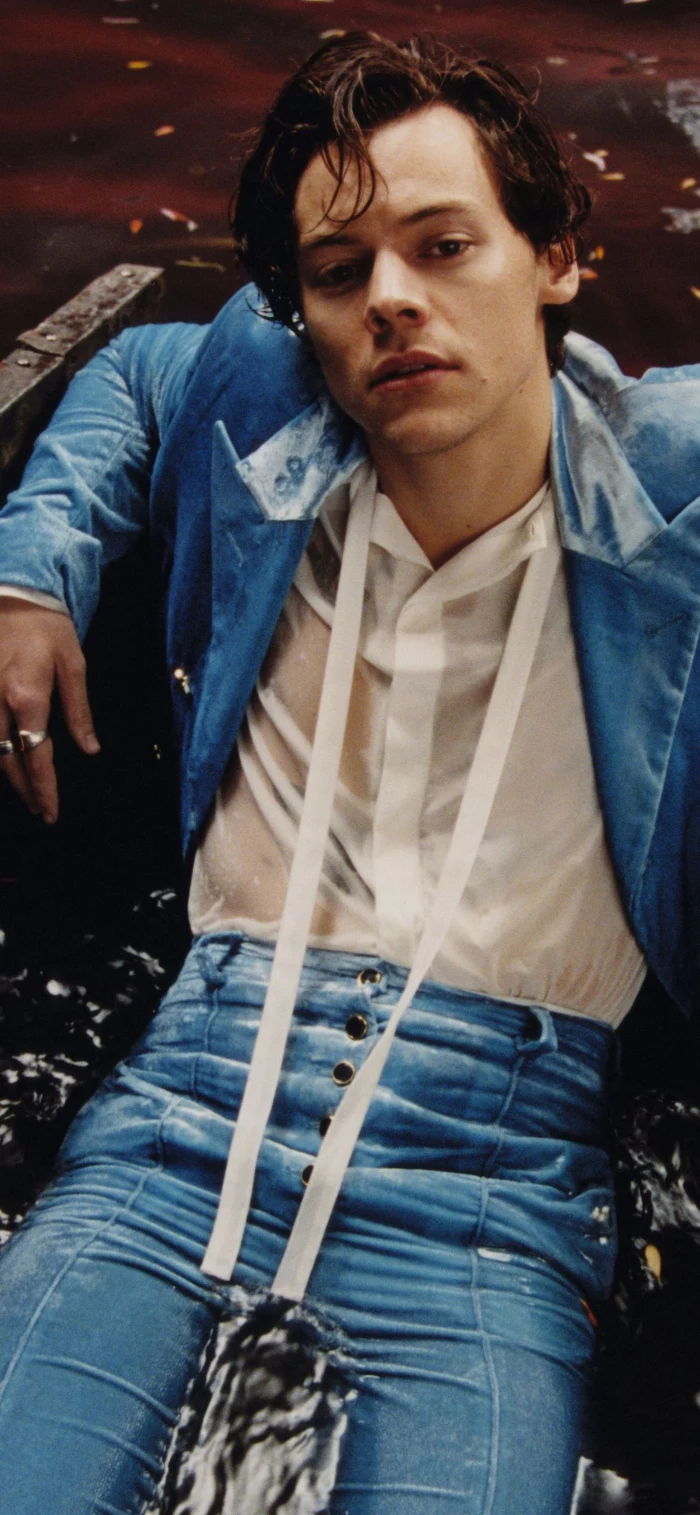
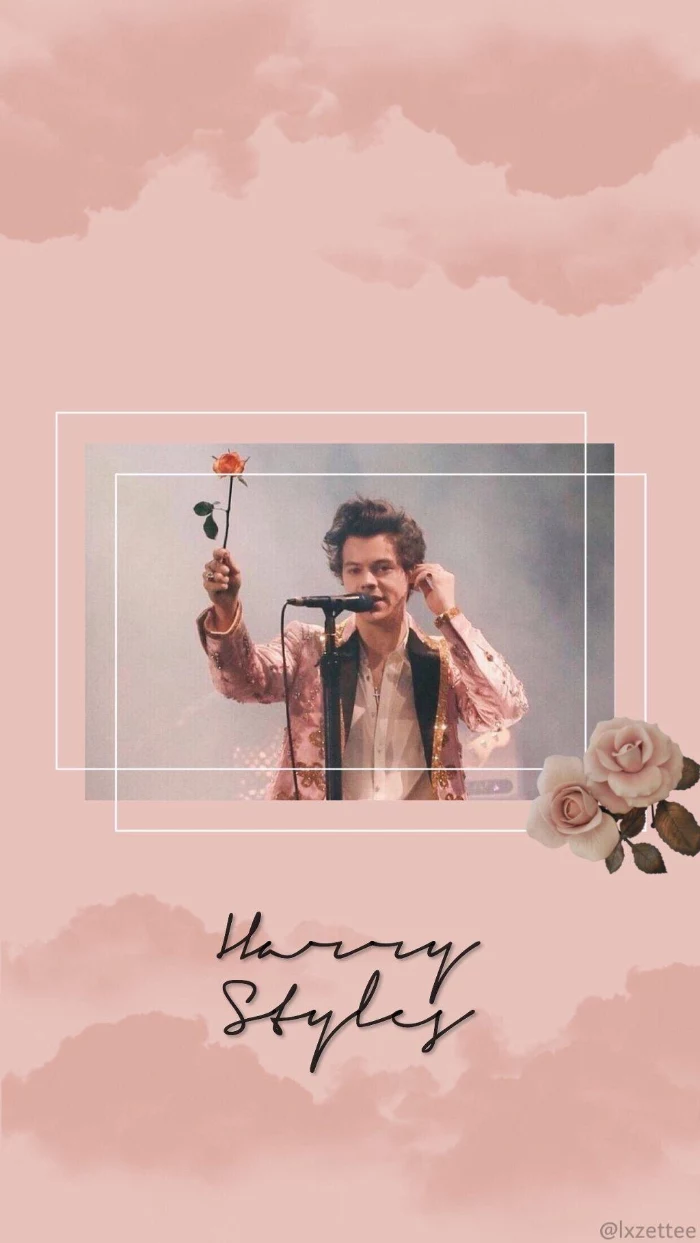
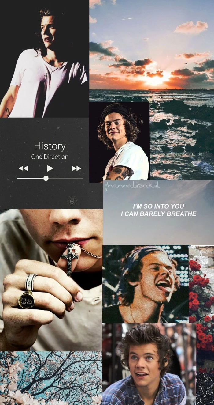
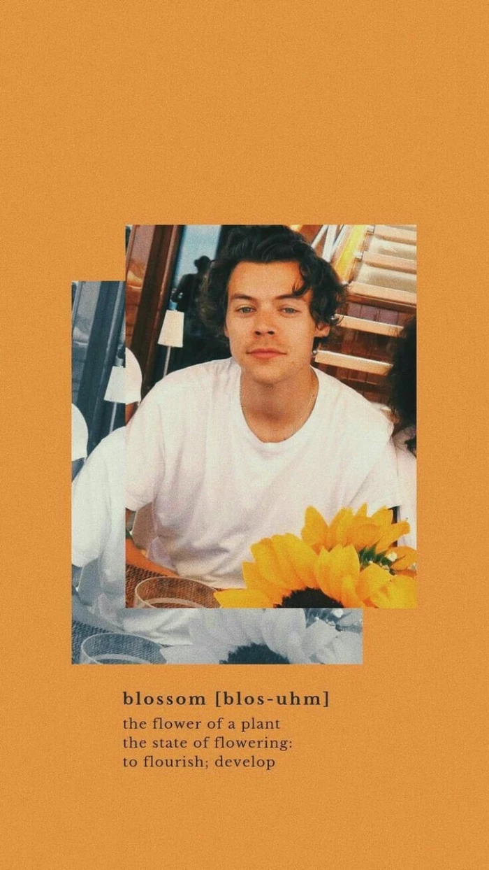
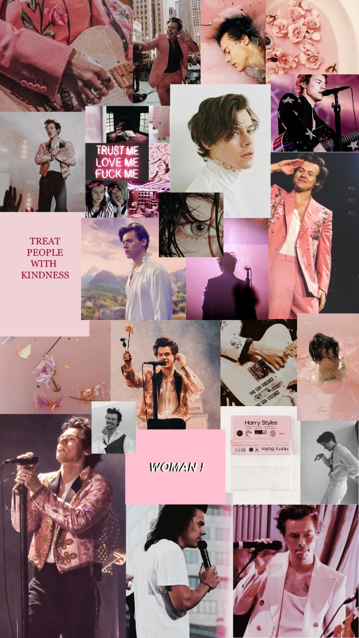
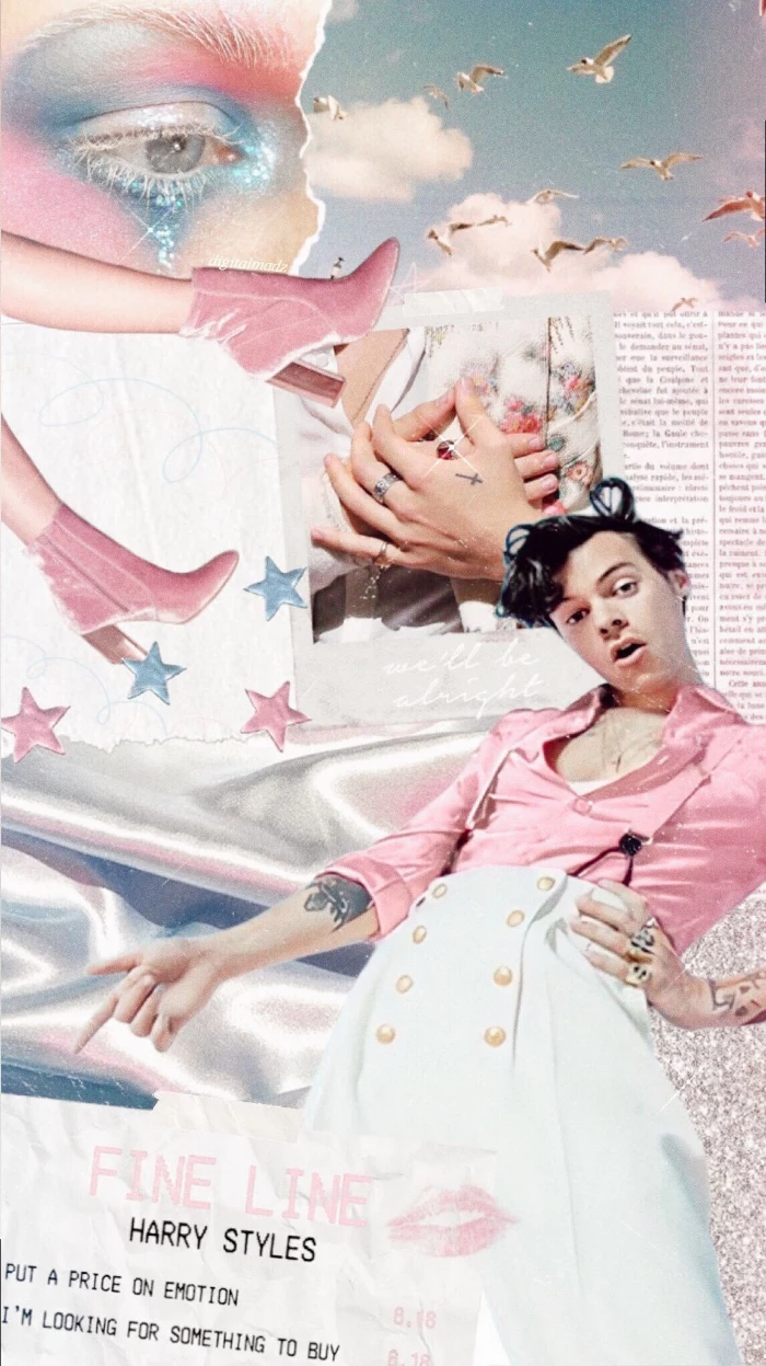
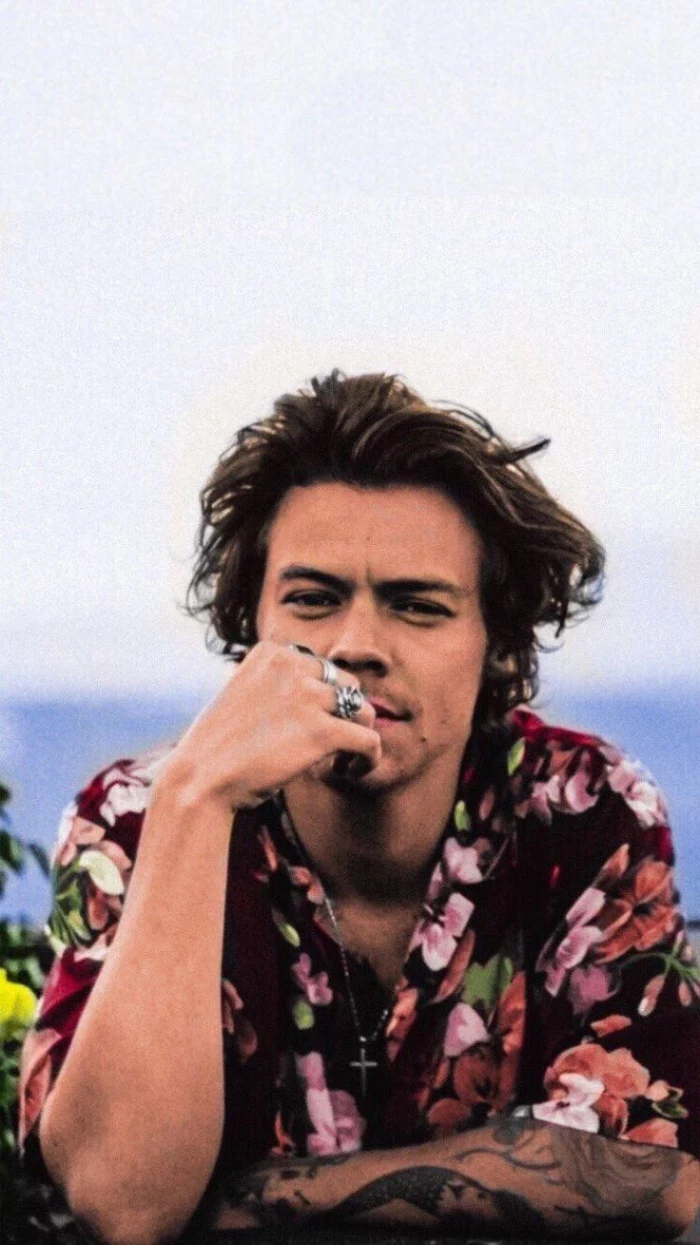
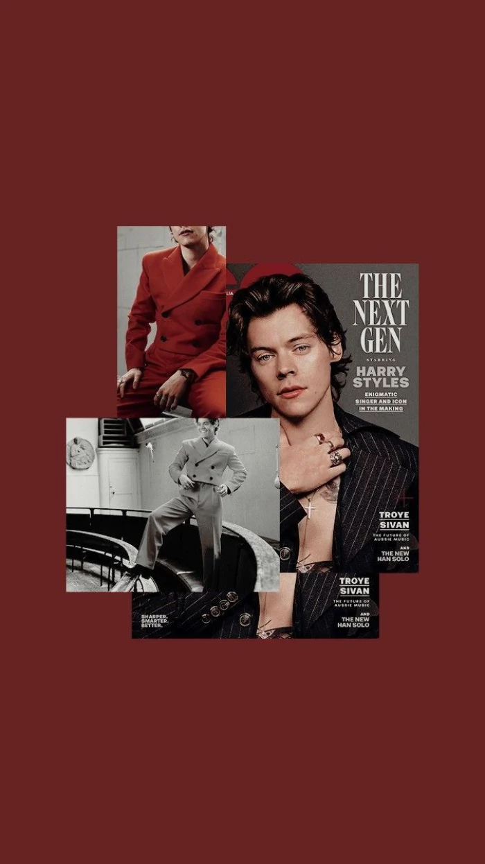
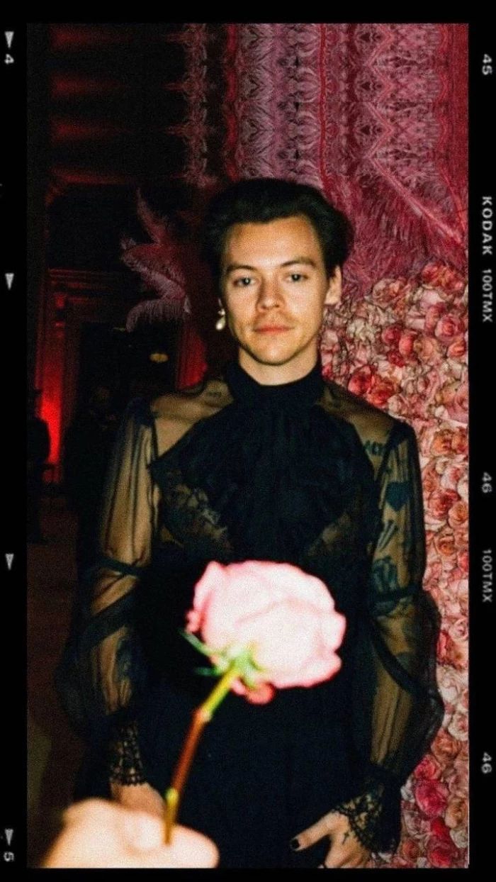
Crafting a wallpaper that looks sharp and intentional isn’t hard, but it does take a little more thought than just hitting “save image.” We’re going to walk through the exact same process the pros use, and to make it practical, we’ll think about it through the lens of something everyone loves: a favorite musician. Their photoshoots and stage presence give us a ton of great visual material to learn with—rich colors, interesting compositions, and a specific vibe.
The 60-Second Fix for a Better Wallpaper
Don’t have time for the full deep-dive? No worries. If you do only one thing from this guide, do this: stop saving photos from social media apps. Those apps crush the quality of images to save data. Instead, find a higher-quality source. A quick search on Pinterest for “[your favorite artist’s name] photoshoot high-res” will give you much better starting material. That alone will make a world of difference.
First, Let’s Get Technical (I Promise It’s Easy)
Before you even think about the fun creative stuff, you need to understand the canvas you’re working with: your phone screen. Ignoring this part is the #1 reason wallpapers look so amateurish.
Resolution and Why Your Pics Get Blurry
Your screen is made of tiny dots of light called pixels. Resolution is just the total number of those dots, written as width x height. For example, a new iPhone Pro has a resolution of 1179 x 2556 pixels, while a recent Samsung Galaxy might be 1080 x 2340. Phones today pack a ton of pixels into a small space, which is why they look so crisp.
When you use a small, low-resolution image, your phone has to stretch it to fill the screen, which causes that ugly, blurry, “pixelated” look. So, the golden rule is simple: your image’s resolution should be at least as big as your phone’s screen. Bigger is even better because it gives you more room to crop.
Good to know: Don’t know your phone’s resolution? Just pop over to a site like GSMArena, search for your specific model, and look under the “Display” section. You’ll find the exact numbers you need.
Oh, and here’s a lesser-known trick: If your phone has an OLED or AMOLED screen (most modern phones do), using a wallpaper that’s mostly black can actually save a tiny bit of battery life. On these screens, black pixels are simply turned off, so they don’t draw power. Cool, right?
Aspect Ratio: The Reason for Weird Cropping
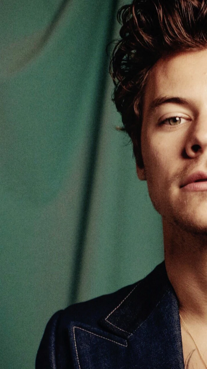
Aspect ratio is just a fancy term for an image’s shape. A square is 1:1, but modern phone screens are much taller and skinnier, with aspect ratios like 19.5:9 or 20:9. This mismatch is why your favorite wide-screen concert photo gets butchered. Your phone tries to fit a wide rectangle into a tall rectangle, and it has to chop off the sides or zoom in, often cutting out the best part of the picture.
To avoid this, always try to start with a vertical (portrait) image. If you fall in love with a horizontal one, you’ll need to crop it yourself to gain control over what stays and what goes.
Which File Type? JPEG vs. PNG
You’ll mostly see two file types: JPEG and PNG.
- JPEG (or JPG): This is your go-to for photographs. It’s great at handling millions of colors and gradients, and it keeps file sizes small. Perfect for a standard photo wallpaper.
- PNG: This format is king for graphics with sharp lines, text, or solid blocks of color. Its superpower is transparency. If you want a logo or graphic to float on your background without a white box around it, you absolutely need a PNG.
For a photo of your favorite pop star, a high-quality JPEG is all you need. If you’re adding text or a graphic on top, a PNG will keep it looking clean.
Okay, Let’s Get Creative: Designing a Wallpaper That Actually Works
Got the technical stuff down? Great. Now for the fun part. A truly great wallpaper doesn’t just sit there; it works with your phone’s interface.
Composition: Working Around Your Icons
Your home screen is a busy place—icons, widgets, the dock, the clock… it’s a lot. The biggest mistake I see is choosing a photo where the subject’s face is dead center, only to be completely covered by app icons. Ouch.
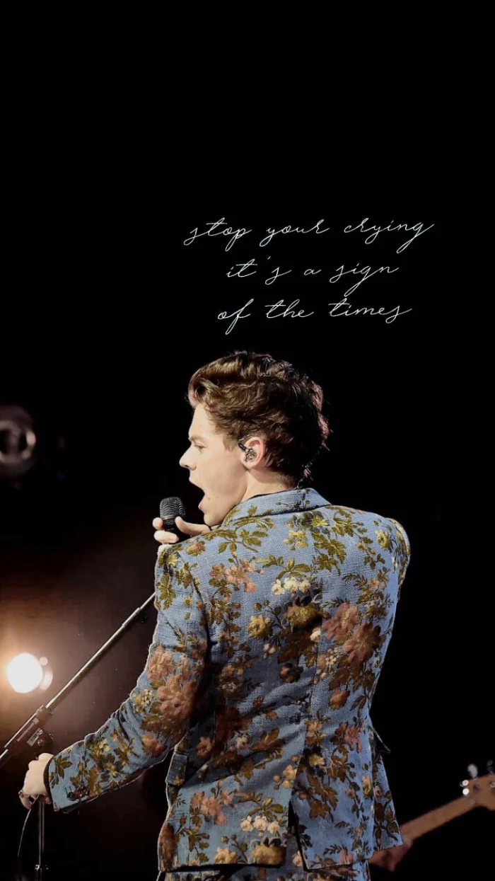
A simple design principle called the “rule of thirds” can solve this. Imagine your screen has a tic-tac-toe grid on it. Instead of centering your subject, try placing them along one of the lines or at a point where two lines intersect. This creates a more dynamic, balanced look and, more importantly, leaves clear space for your icons. For the lock screen, position the subject so they aren’t staring right into the giant clock.
Heads up! Here are the most common mistakes to watch out for:
- Using a blurry screenshot from Instagram or Twitter.
- Placing your subject’s face right where the lock screen clock goes.
- Choosing a background so busy you can’t even read your app names.
- Forgetting to account for the dock at the bottom of the screen.
Color, Mood, and Readability
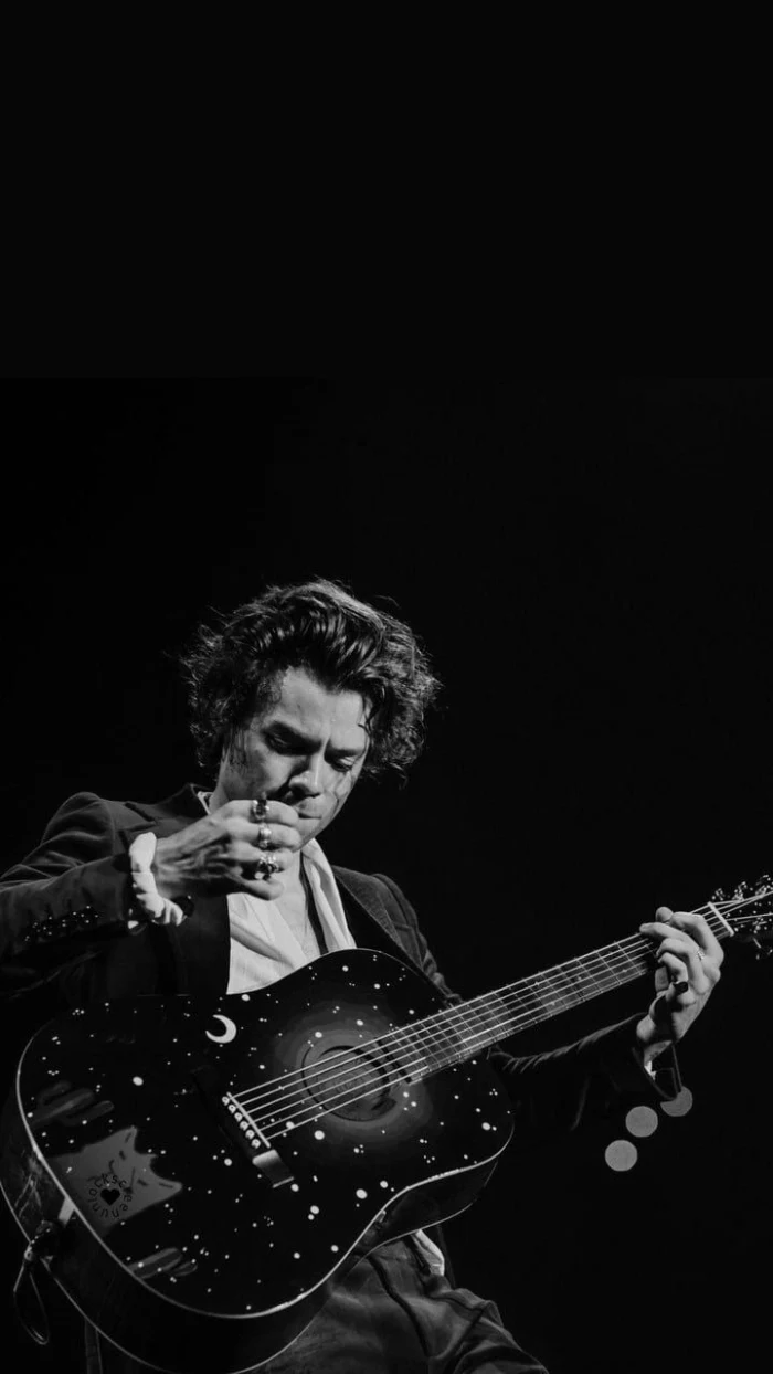
Color is everything. The vibrant, playful colors from one album era create a totally different mood than the moody, black-and-white aesthetic of another. A simple, monochromatic wallpaper can make your colorful app icons pop and create a super clean, organized feel.
If you love a colorful image, just make sure it’s not too chaotic. A photo of someone in a bright outfit against a simple background works great. But if the background is also a riot of color and pattern, your screen will feel cluttered, and you’ll struggle to find your apps.
Quick tip: In an editing app, try adding a subtle “vignette.” It’s a tool that darkens the very edges of the photo. This naturally draws your eye to the center and helps the icons at the top and bottom of your screen stand out more.
Your Step-by-Step Guide to a Perfect Wallpaper
Let’s put it all together. Here’s how you can make your own custom wallpaper in just a few minutes.
Before You Start: Your Toolbox
You don’t need expensive software. Here are some fantastic and mostly free tools that work on any device:
- On your phone: Snapseed (Free on iOS/Android) and Adobe Lightroom Mobile (Free with optional premium features) are powerful and easy to use.
- On your computer: Photopea is a free, web-based editor that’s like a simplified Photoshop that runs in your browser. Canva is another great free option.
- For advanced users: If you want to get serious with layers and graphics, Procreate Pocket (iOS, usually around $5.99) is amazing.
Step 1: Find a High-Quality Image
This is the most important step. Look for sources that provide high-resolution images. Try searching on Pinterest for phrases like “[Musician’s Name] photoshoot HSD” or checking out fan galleries on Tumblr that specialize in high-quality scans or screencaps. When you find one you like, download it and check the image details to make sure the pixel dimensions are big enough for your screen.
Step 2: Crop It Like a Pro
Open your image in an editor like Snapseed. The first thing you’ll do is crop it to the right shape.
Here’s how easy it is in Snapseed, for example:
- Open your image and tap TOOLS, then select CROP.
- Tap the little rectangle icon on the bottom toolbar (the one that looks like a box with arrows).
- Scroll through the preset aspect ratios until you find one that matches your phone (like 19.5:9).
That’s it! Now just slide the crop box around to frame your subject perfectly, keeping the rule of thirds in mind. You’re in control now.
Step 3: Make Final Adjustments
Once it’s cropped, you can do some final tweaks. A little brightness or contrast can make it pop. You can boost the color saturation for a more vibrant look or desaturate it for a muted, classic vibe. A touch of sharpening can make details crisper, but don’t overdo it. This is also where you can add that vignette I mentioned earlier.
Ready to Level Up? Advanced Tricks
Once you’ve mastered the basics, you can try some more advanced techniques for a truly custom feel.
- The Parallax Effect: Some phones have a feature where the wallpaper shifts slightly when you tilt the phone, creating a sense of depth. To make this work, you need an image that’s a bit larger than your screen. A good rule of thumb is to add about 200 pixels to both the width and height. So, if your screen is 1179 x 2556 pixels, you’d aim for an image around 1379 x 2756 pixels to give the effect room to breathe.
- Live Wallpapers: A short, looping video clip can make for a really cool lock screen. The key is to keep it subtle and short (under 10 seconds) to avoid killing your battery. A seamless loop from a music video can look amazing.
A Quick Word on Safety and Being Cool
As a professional, I have to mention this. When you’re downloading files and using other people’s art, it’s good to be mindful.
First, the photos you find online were taken by professional photographers who own the copyright. Using their photo for your own personal wallpaper is generally fine. But if you edit it and share it online, you’re now distributing their work. The cool thing to do is to give credit, like “Wallpaper edit by me, original photo by [Photographer’s Name/Handle].” And whatever you do, NEVER sell a wallpaper made from an image you don’t own the rights to. That’s a huge no-no.
Second, be careful where you download from. Some “free wallpaper” apps are loaded with aggressive ads or, even worse, malware. A wallpaper app should never need permission to access your contacts or microphone. Stick to reputable app stores or, even better, just make them yourself using the safe and easy methods we just covered.
And that’s really all there is to it. Taking a few minutes to create a custom wallpaper is a small but super rewarding act of creativity. It’s your personal space, so why not make it look awesome?
Inspirational Gallery
Tired of endlessly scrolling? For a curated, artistic experience, check out the app Vellum. It offers hand-picked collections of stunning images, from atmospheric landscapes to intricate geometric patterns, all perfectly formatted for your screen. The best part is its built-in blur tool, allowing you to instantly create a softer, more icon-friendly version of any wallpaper for your home screen.
The average person unlocks their phone 150 times a day.
That’s 150 opportunities to feel a small spark of joy, calm, or inspiration. Choosing a wallpaper that reflects your current mood or goals isn’t just decoration; it’s a subtle form of self-care and a constant, personal reminder of what matters to you in that moment.
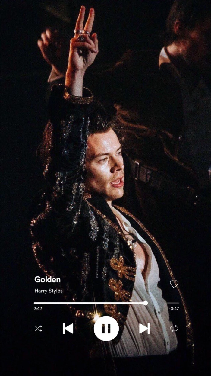
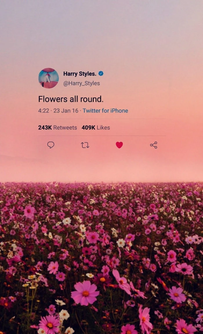
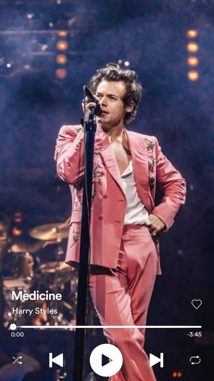
Think about the clock and widgets. A common mistake is choosing a beautiful photo where the main subject’s face is completely obscured by the time. Before setting a wallpaper, always preview it on your lock screen. A pro trick is to find images with built-in “negative space” at the top or to one side, creating a natural home for your interface elements.
Can a wallpaper really drain my battery?
Yes, but it depends on your screen and the wallpaper type. If you have an OLED or AMOLED screen (common on newer iPhones and Samsung Galaxy phones), a true black wallpaper can save significant power because the black pixels are literally turned off. Conversely, bright, complex live wallpapers are the biggest culprits, as they engage both the screen and the processor.
- It improves the readability of your app labels.
- It reduces visual stress every time you unlock your phone.
- It makes your icons and widgets the true focus.
The secret? A simple, uncluttered background. Consider textures, gradients, or minimalist patterns instead of a busy photo for your home screen. This creates a functional yet beautiful canvas.
For a truly unique look, go beyond photos and explore the world of digital art and illustration. Sites like ArtStation are a goldmine for fantasy and sci-fi art, while Behance is fantastic for graphic design and abstract pieces. Remember to check the artist’s policy on personal use, and if you can, support them by buying a print or digital download.
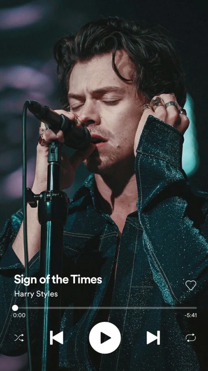
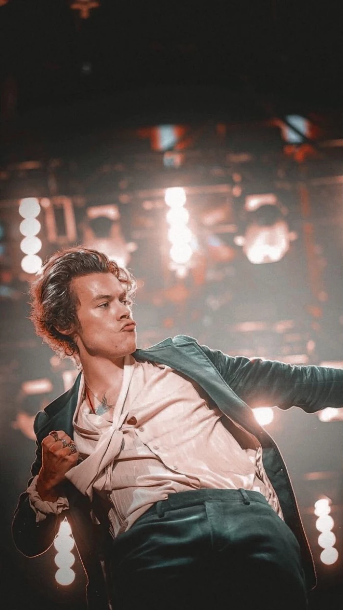
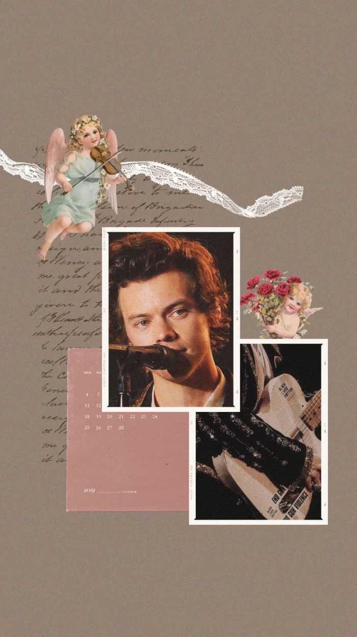
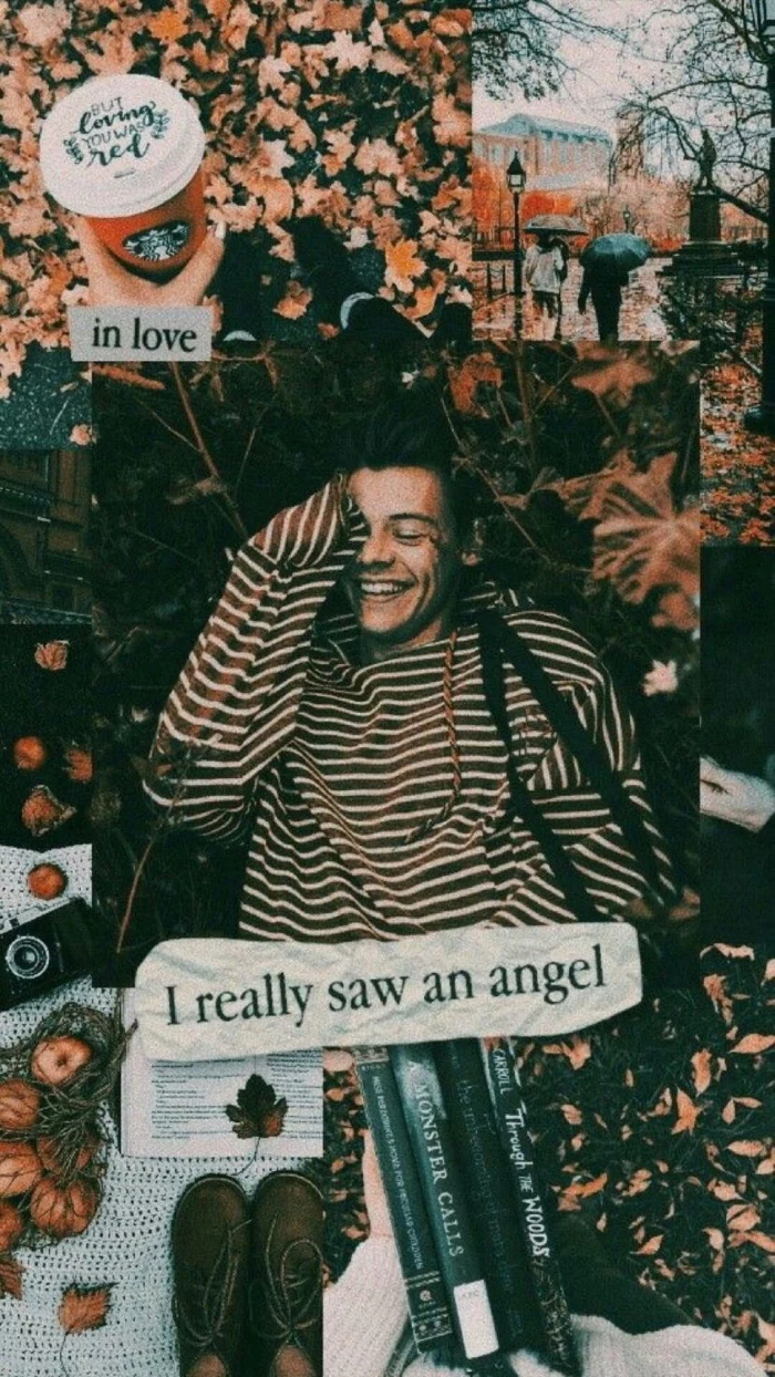
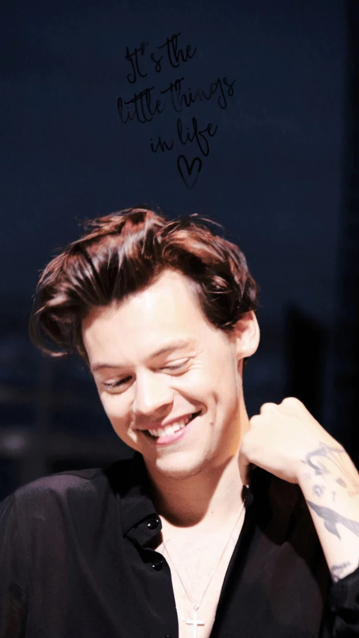
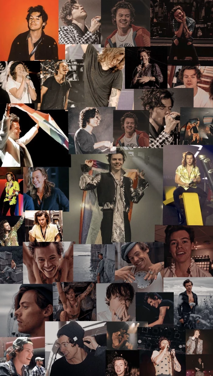
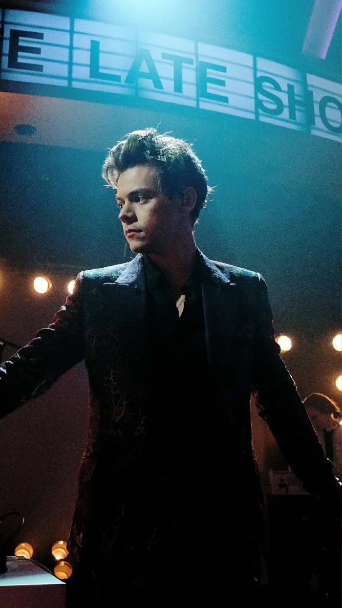
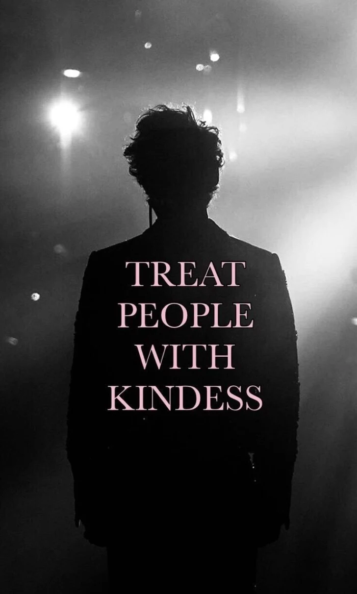
Lock Screen: This is your statement piece. Go bold. Use that stunning, high-impact portrait or that vibrant abstract piece. It’s meant to be seen for a moment and set a mood.
Home Screen: This is your workspace. Opt for a complementary but simpler version—a blurred version of the lock screen image, a solid color pulled from it, or a subtle texture. The goal is legibility.
This two-part approach creates a cohesive and professional-feeling experience every time you unlock your phone.
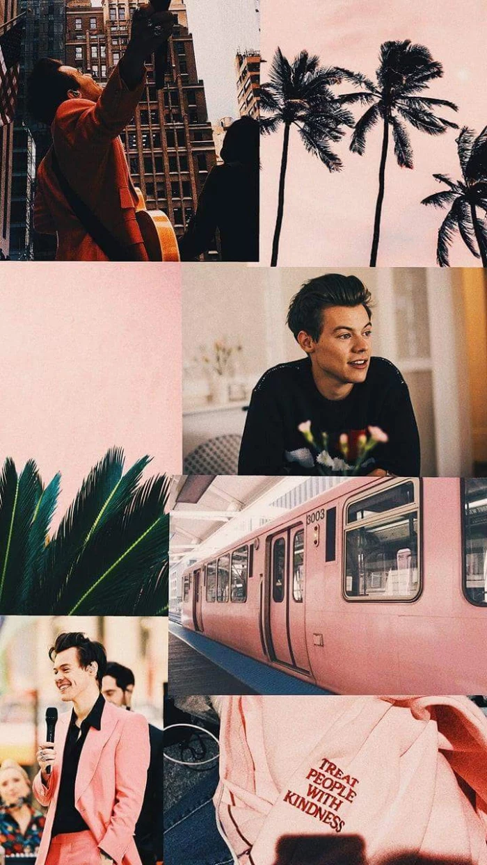
Pantone’s 2024 Color of the Year, “Peach Fuzz,” evokes a sense of gentle warmth and tenderness.
Using a color trend like this for your wallpaper is an easy way to make your phone feel current. A simple peach-toned gradient or a soft, fuzzy texture can completely change your device’s vibe, making it feel cozy and connected to the current design zeitgeist. It’s a small change that has a big psychological impact.
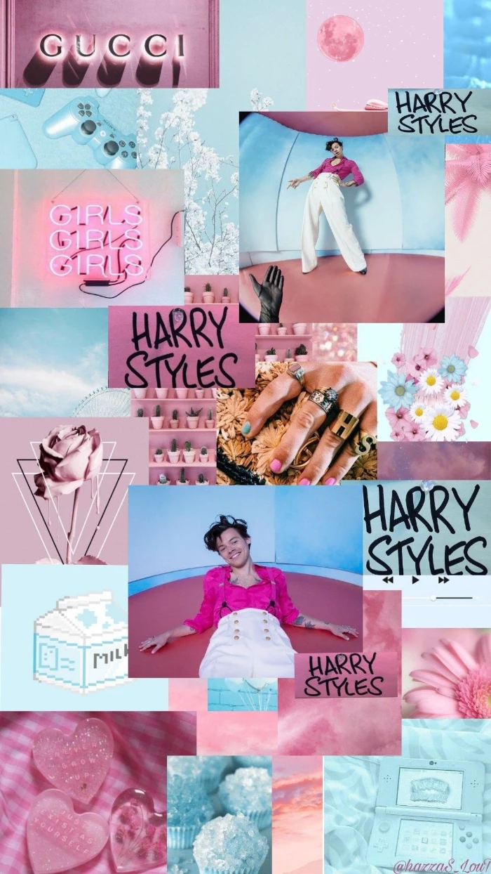
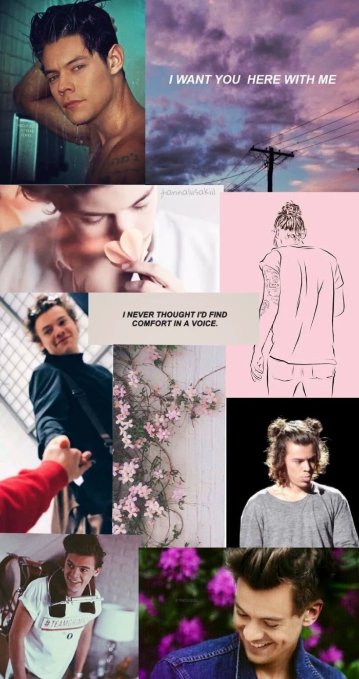
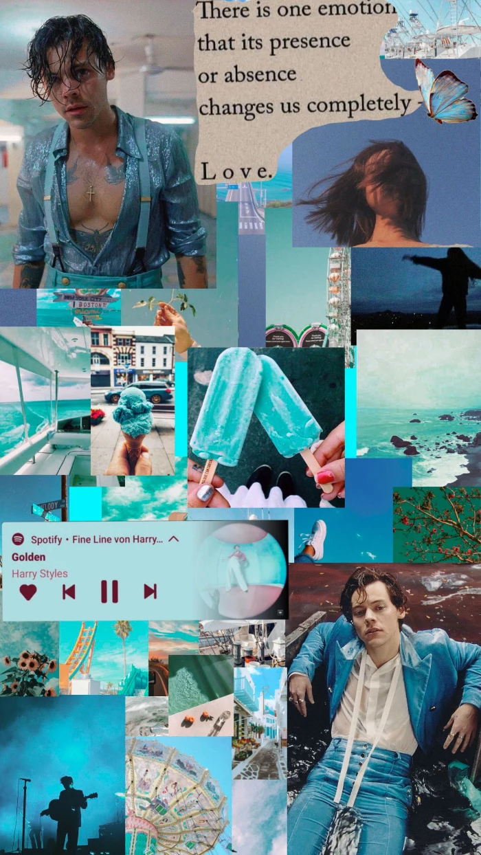
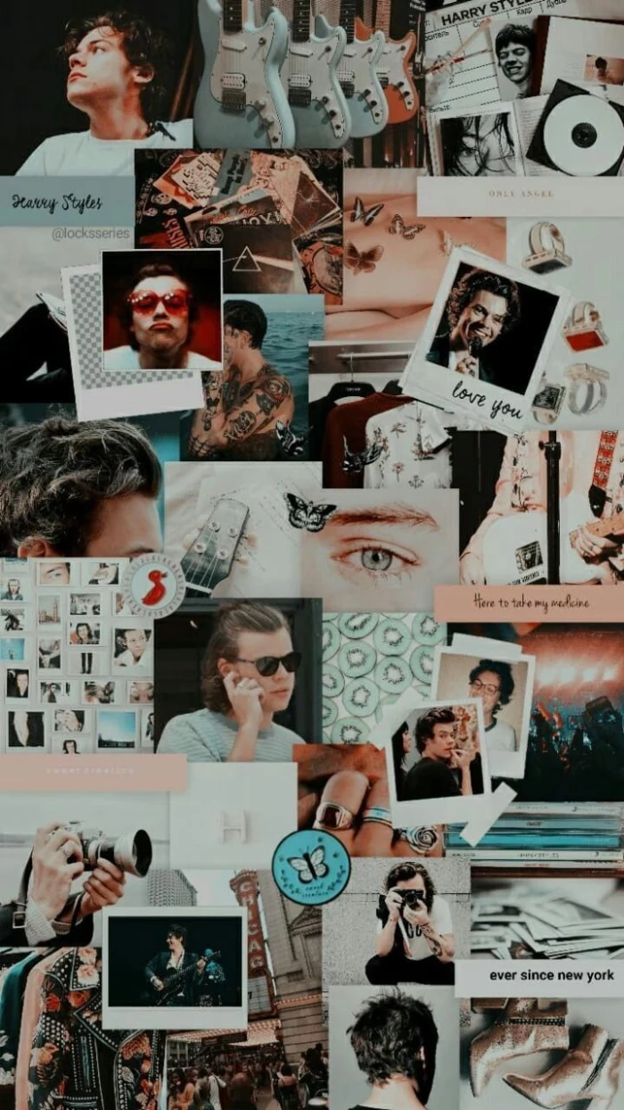
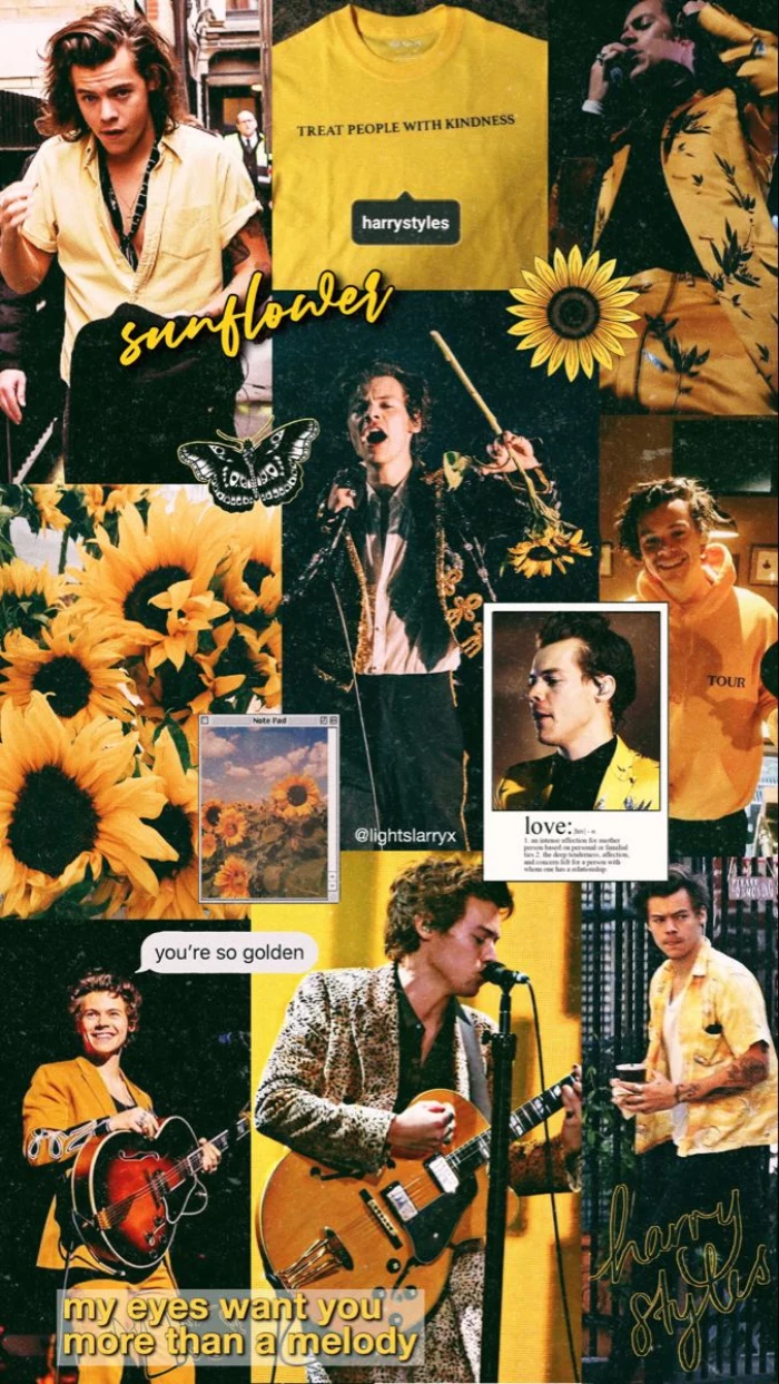
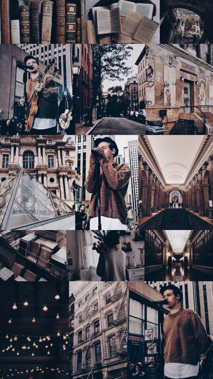
Create your own personal mood board right on your phone. Here’s how:
- Gather 4-6 images you love into a new album. Think textures, colors, and vibes, not just clear subjects.
- Use a free app like Canva or Adobe Express and choose a “Phone Wallpaper” template.
- Arrange your photos in a collage. Overlap them, tilt them, and don’t be afraid of empty space.
- Save the final image in the highest quality possible. Now you have a wallpaper that is 100% you.
Don’t forget the parallax effect: iOS and some Android launchers subtly move the wallpaper as you tilt your phone. This can crop your image in unexpected ways. To avoid this, either turn the feature off (often called Motion or Perspective Zoom) or choose an image that is slightly larger than your screen resolution to give it some
- Find a high-resolution photo of a texture you love: cracked paint, worn leather, brushed metal, or even a close-up of fabric.
- Use your phone’s built-in photo editor to increase the contrast and play with the saturation.
- Set it as your wallpaper. The result is an abstract, sophisticated background that won’t compete with your icons.
The beauty is in the details. This approach adds depth and a tactile feel to a digital screen.

What about live wallpapers?
They can be spectacular, but use them wisely. A live wallpaper is essentially a short, looping video, which consumes more battery and processing power than a static image. For the best effect, choose subtle animations—gently drifting clouds, slow-moving geometric shapes, or soft light flares—rather than jarring, fast-paced clips. Apps like Zedge and Live Wallpapers for Me offer a wide variety of options.
Many world-class museums, like The Art Institute of Chicago or the Rijksmuseum in Amsterdam, offer high-resolution, public domain images of their collections online.
This means you can have a Monet, a Van Gogh, or ancient Japanese woodblock prints as your wallpaper, for free and in stunning detail. Search their online collections for “open access” or “public domain” works to find your next masterpiece.
The next frontier is AI. Apps like Midjourney (via Discord) or Wombo Dream allow you to generate completely original artwork from a simple text prompt. Want “a synthwave sunset over a cyberpunk city in the style of a vintage anime”? You can create it in seconds. It’s the ultimate tool for a wallpaper that is guaranteed to be one-of-a-kind.
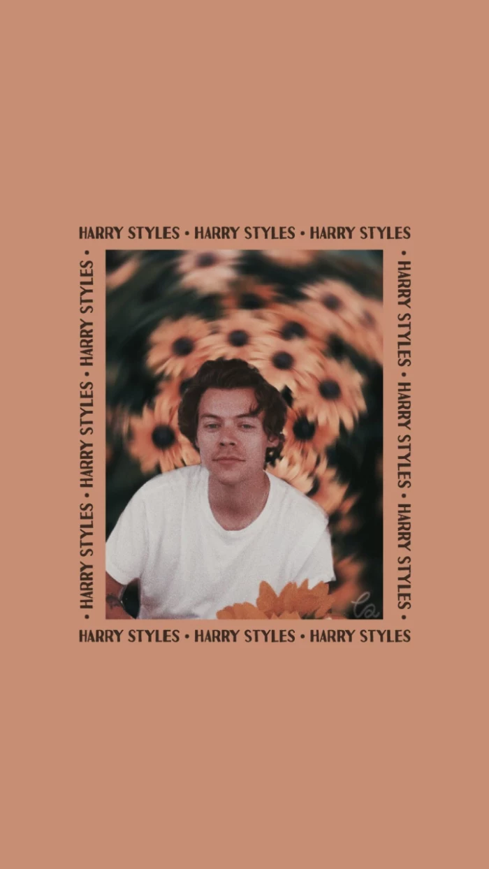
Figurative Wallpaper: A clear photo of a person, place, or thing. Best for the lock screen where it can be appreciated without icon clutter.
Abstract Wallpaper: A design based on color, shape, and texture. Ideal for the home screen because it provides a visually interesting background that doesn’t distract from app icons.
Matching the type of image to its location is key for both aesthetics and usability.
Want a cool, custom gradient? You don’t need Photoshop.
- Go to a site like cssgradient.io on your desktop browser.
- Use their visual tools to create the perfect color blend. You can add as many colors and adjust the angle as you like.
- Take a screenshot of the full-screen preview.
- Send it to your phone. Voila, a perfectly smooth, custom-made gradient wallpaper.
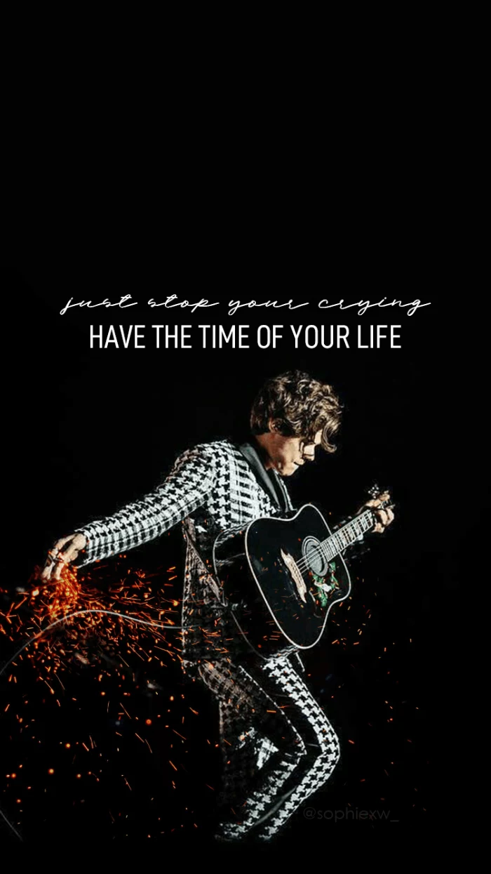
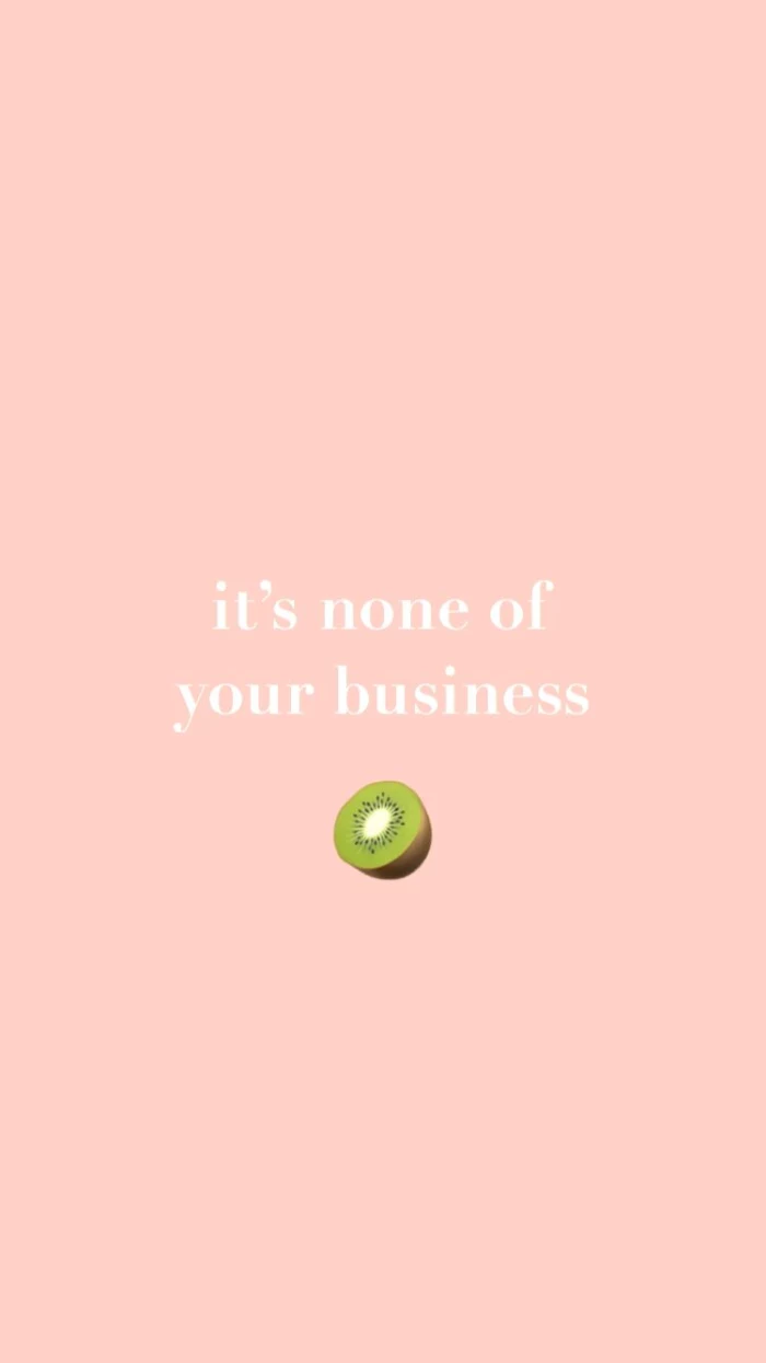
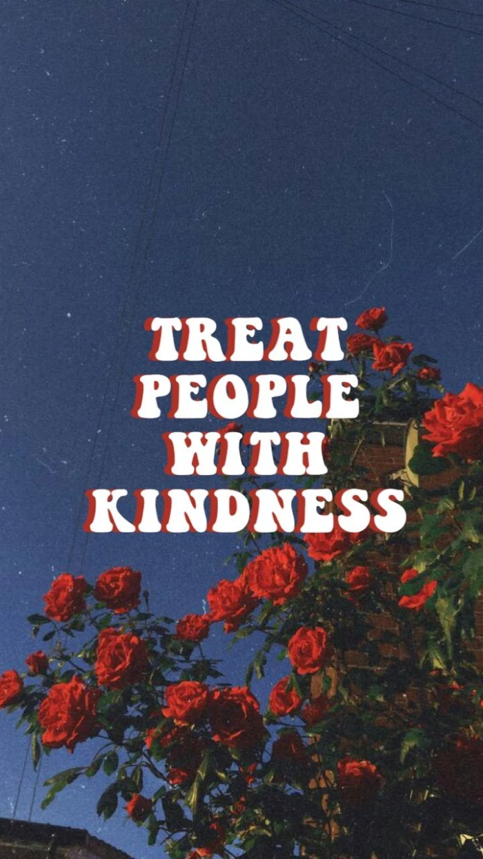
A simple typography-based wallpaper can be incredibly powerful. Use an editing app to write a single word, a meaningful quote, or just your initials in a beautiful font against a plain background. Consider fonts like Helvetica Now for a clean, modern feel, or a script font like Playfair Display for elegance. It’s personal, minimalist, and always looks intentional.
The ‘Digital Diderot Effect’ is the idea that getting one new, high-quality digital item (like a perfect wallpaper) can trigger a spiral of upgrading, like reorganizing your apps or finding matching icons.
Lean into it! Let a great new wallpaper inspire you to clean up your digital space. Create app folders that match its color scheme, or use iOS 17’s interactive widgets to create a truly cohesive and functional home screen that feels like a single, well-designed product.
A challenge for photographers: Instead of using someone else’s image, use your own! The secret is to not shoot *for* a wallpaper. Instead, look through your existing photos for interesting details—the texture of a leaf, the pattern of light on a wall, a reflection in a puddle. These “accidental abstracts” often make the most compelling and personal backgrounds.
- It creates a sense of calm and order.
- It makes your phone feel like a personal sanctuary, not a chaotic mess.
- It subtly nudges you to be more organized in other areas of your life.
The secret? A unified theme. Try coordinating your wallpaper, widget colors, and even your phone case. Pick a palette of 2-3 colors and stick to it for a look that feels incredibly put-together.
Love the aesthetic of a specific film? Find ultra-high-quality, color-graded movie stills at sites like shot.cafe or Flim.ai. These are perfect sources for capturing a specific mood, whether it’s the neon-drenched melancholy of *Blade Runner 2049* or the warm, whimsical pastels of a Wes Anderson film.
The Y2K and 90s nostalgia trend isn’t just for fashion; it’s huge in digital design.
Embrace the aesthetic with wallpapers featuring retro computer graphics, early internet iconography (like the Windows 95 clouds), pixel art, or even a grainy, disposable-camera look. It’s a fun, ironic way to make your cutting-edge smartphone feel a bit more old-school.
Is it legal to use any image I find online?
For personal use as a wallpaper, you’re generally fine. The legal issues arise if you start sharing or distributing it. However, to be safe and to support creators, always try to use images from sources that provide a clear license, like Unsplash (free to use), or purchase images from stock sites or directly from artists. It’s good digital etiquette.
A powerful seasonal ritual: Change your wallpaper with the seasons. A bright, floral image for spring, a sun-drenched beach for summer, warm and moody tones for autumn, and a crisp, cool landscape for winter. This simple act can help ground you in the present and make your most-used device feel fresh and aligned with the world outside.
One of the most elegant solutions is often the most overlooked: a textured gray. Not a flat, boring gray, but one with a subtle grain, like fine wool or textured paper. A neutral gray wallpaper, like the ones offered by the Backdrops app, makes every single app icon pop, ensures text is always readable, and gives your phone a sophisticated, understated look that never gets old.


