Your Wallpaper is a Tool, Not Just a Picture. Here’s How to Use It.
I’ve spent a long time as a digital designer, focusing on how people actually use the screens in front of them. My world revolves around user interfaces, branding for tech companies, and teaching the next generation the basics. And through all of it, one thing keeps popping up as a secret weapon for a better digital life: your wallpaper.
In this article
Seriously. It’s the first thing you see when you boot up and the last thing you see when you sign off. It’s the canvas for everything you do. Most of us just grab a family photo or a cool movie poster, and there’s nothing wrong with that! But honestly, with a little more intention, that background can become a powerful tool. It can sharpen your focus, make your desktop less of a mess, and even give you a tiny mood boost throughout the day. It’s a small detail, but the small details add up. This isn’t about just finding pretty pictures; it’s about understanding the craft of choosing one that truly works for you.

First, Let’s Talk About Your Canvas
Before we get to the fun part, we need to understand the screen itself. The pros always start here because it tells you exactly what kind of image will look sharp and perform well. It’s less complicated than it sounds, I promise.
Most screens today are either LCD or OLED. An LCD screen uses a backlight that’s always on, so even a “black” area is just a pixel trying to block that light. That’s why blacks can sometimes look a bit grayish. OLED screens are different—each tiny pixel makes its own light. To show black, a pixel just turns itself completely off. This gives you a true, deep, inky black.
So why should you care? Well, if you have an OLED screen (common on many newer smartphones), using a wallpaper with a lot of true black can actually save a little bit of battery. It’s a small win, but hey, a win is a win! Plus, high-contrast images look absolutely stunning on OLEDs because the blacks are so pure.
Next up is resolution. This is just the number of pixels on your screen, shown as width by height (like 1920 x 1080). If you use a tiny image on a high-resolution screen, your computer has to stretch it, making it look blurry and pixelated. The rule of thumb is simple: your wallpaper image should be at least the same resolution as your screen, or even a little bigger.
Okay, but how do you even find this magic number? It’s super easy.
- On Windows: Just right-click on your desktop, go to “Display settings,” and look for “Display resolution.” That’s it!
- On a Mac: Click the Apple menu in the corner, go to “System Settings,” and then click “Displays.” Your resolution will be right there.
Your turn! Go find your screen resolution right now and jot it down. That one number is your key to finding the perfect-fitting wallpaper.
Oh yeah, and don’t forget the aspect ratio—the shape of your screen. A wide desktop monitor (maybe 16:9) and a tall phone screen (more like 19.5:9) need different kinds of images. If you put a wide photo on a tall phone, it’s going to chop the sides off. So when you pick an image, make sure the most important part is somewhere in the middle.
Thinking Like a Designer: It’s All About Usability
Got the technical stuff down? Great. Now you can start thinking like a designer. A wallpaper isn’t just art; it’s the foundation of your user interface. Its main job is to not get in the way.
I’ve seen so many people use incredibly “busy” wallpapers. You know the type—filled with clutter, tons of different colors, and complex patterns. They look cool for a minute, but they are a nightmare for usability. The biggest issue is legibility. Your icons, folders, and widgets have to sit on top of this background. If it’s too chaotic, you can’t read the text and icons just disappear into the noise. Imagine a desktop with a photo of a crowded city street behind your icons. Now imagine that same desktop with a simple, high-res photo of a foggy morning sky. See? All of a sudden you can actually find your ‘Q3 Report’ folder.
I once worked with a team of coders who used screenshots of complex code as their wallpapers. It was a badge of honor for them. But they were constantly losing their mouse pointers and hunting for files. We ran a little experiment: half of them switched to simple, dark, minimalist backgrounds. A week later, they all said they felt less visual fatigue and were finding things on their screens way faster. The wallpaper was a source of friction they didn’t even know they had.
To avoid this, here are a few things I always look for:
- Lots of Negative Space: This is just a fancy term for the empty parts of an image. Look for big patches of open sky, a calm lake, or a clean wall. These areas are perfect spots for your icons to live without a fight.
- The Rule of Thirds in Action: If you imagine a 3×3 grid on your screen, this principle says to put your main subject along one of the lines, not dead center. For a wallpaper, this is incredibly practical. Put a cool mountain on the right two-thirds of the screen, and you’ve got a whole clean, open area on the left for your stuff.
- One Clear Focal Point: A good background has one main thing to look at—a single tree, an abstract shape, whatever. An image with ten things to look at just creates chaos.
- Smart Color and Contrast: Your on-screen text is usually white or black. If your wallpaper is a mix of super light and super dark areas, your text will be visible in one spot and vanish in another. It’s often best to pick something that’s either consistently dark or consistently light. Muted, desaturated colors are your friend here.
Quick tip: The best test is to apply a potential wallpaper and then toss a few new folders onto your desktop. Can you read their names instantly? If not, it’s a no-go.

Where to Find Great Wallpapers (Without Getting a Virus)
Finding the right image is a big deal, and it comes with a couple of serious warnings. I can’t stress this enough: get your images from safe, legal sources.
First, a heads-up on security. Be super careful downloading images from random sites you find in a search. A lot of “free wallpaper” sites are notorious for bundling malware or adware with their downloads. You’re so focused on getting the picture that you click “accept” on something nasty. I’ve seen small businesses get their systems compromised this way, and the fix is always way more expensive than just getting a legit image.
Second, let’s talk copyright. Most images online are owned by the creator. Grabbing a screenshot from a movie or a photo from someone’s blog is technically copyright infringement. While it’s unlikely you’ll get sued for personal use, it’s about respecting other creatives. For a business, using a copyrighted image without a license is a huge legal risk.
So, where should you look? There are fantastic, safe options:
- Reputable Free Sites: Places like Unsplash, Pexels, and Pixabay are the gold standard. The photos are high-quality and free to use under very generous licenses. This is the safest and most ethical way to go for free.
- Artist-Direct Platforms: You can find incredible and unique digital art on portfolio sites like Behance or ArtStation. Many artists sell digital downloads of their work for a small fee, often between $5 and $20. It’s an awesome way to get something unique while supporting a creator directly.
- Create Your Own: Your own photos are perfect! That amazing landscape shot from your last vacation or a nice, clear photo of your dog can make for a deeply personal and fantastic wallpaper. Just make sure it’s in focus and high-resolution.
Before you commit, check the image quality. Right-click the downloaded file and choose “Properties” (on Windows) or “Get Info” (on a Mac) to see the dimensions in pixels. Make sure that number matches or exceeds your screen resolution. A bigger file size usually means better quality, too.
Making It Yours: The Vibe of Your Wallpaper
The tech is the foundation, and the design principles give it structure. The final layer is all about you. What do you want your wallpaper to do for you?
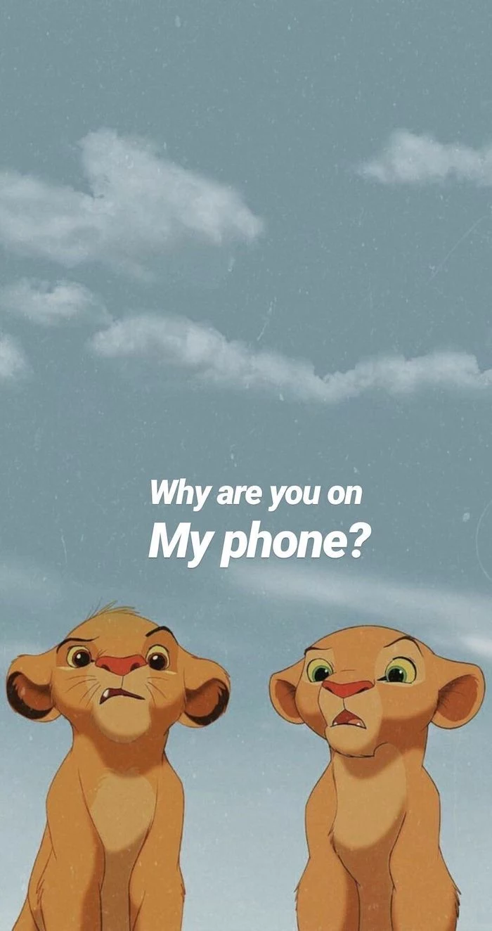
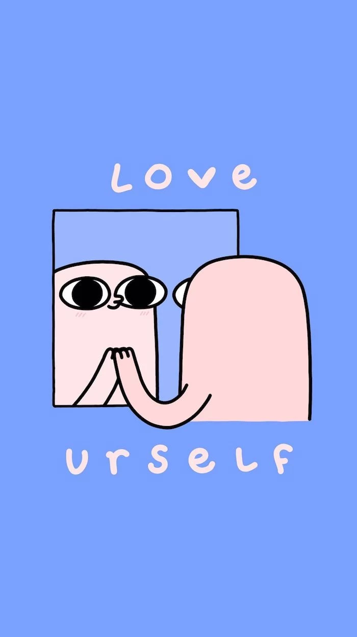
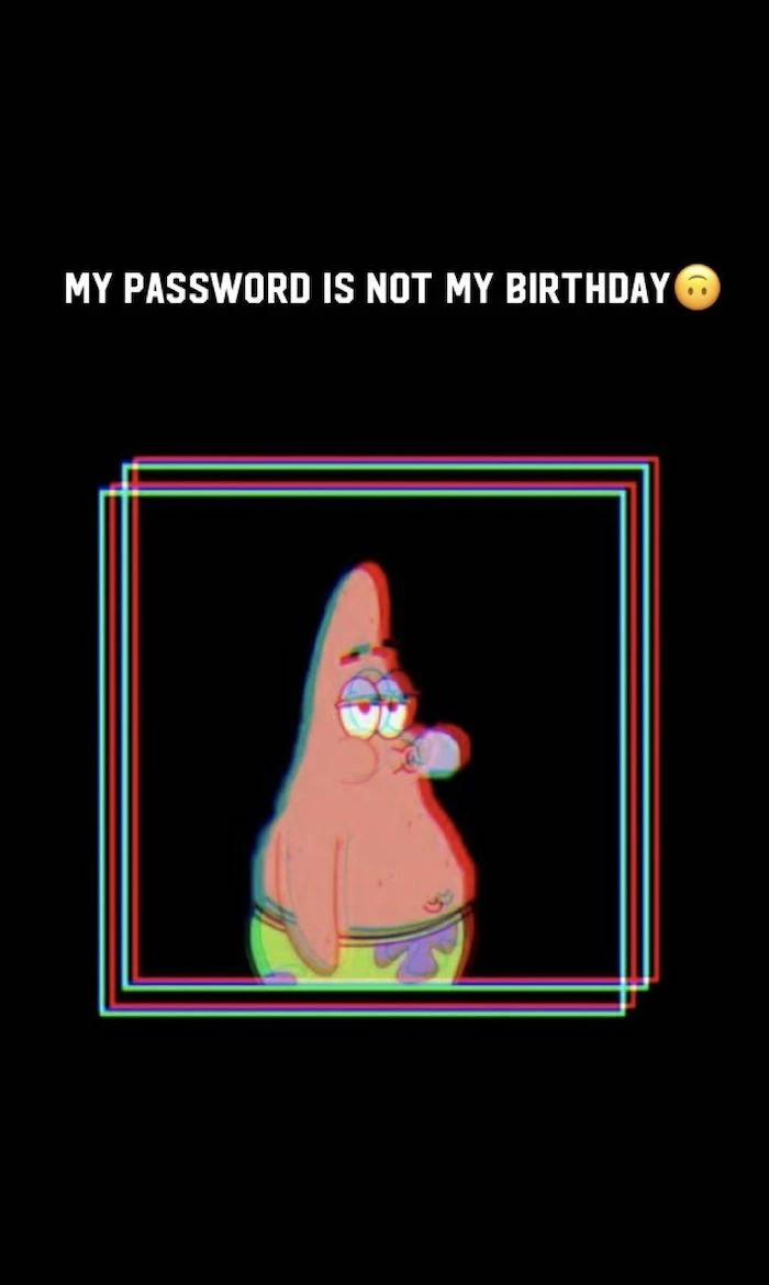
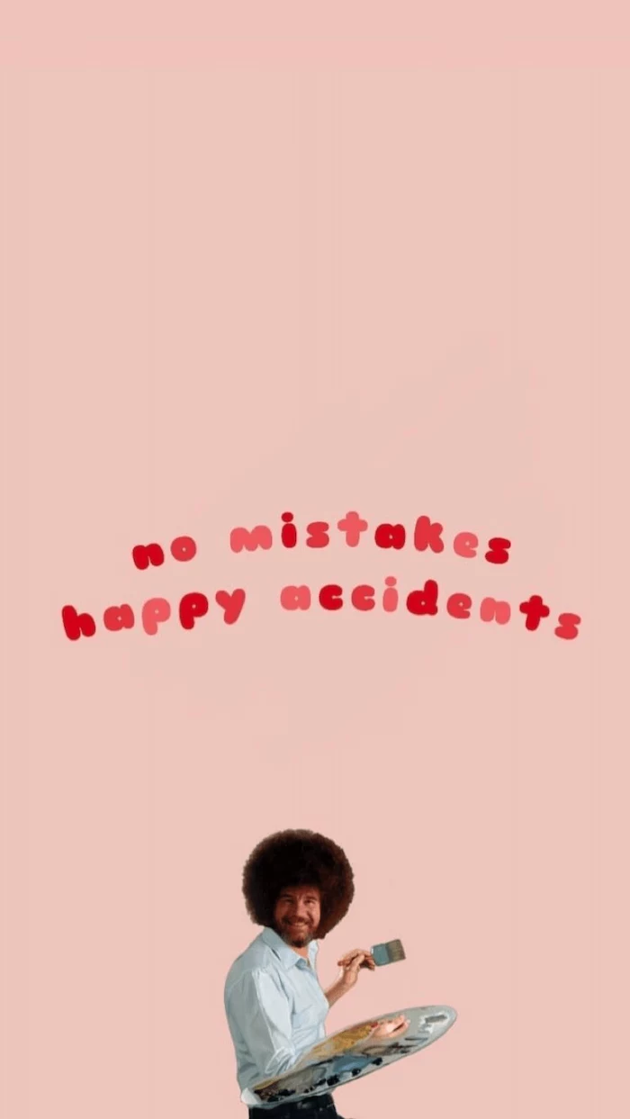
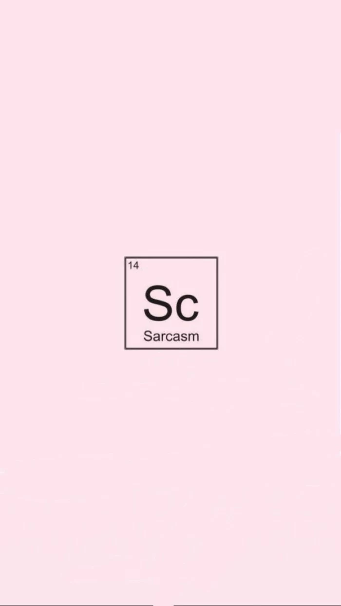
A funny wallpaper is a totally valid choice. A witty quote or a silly illustration can give you a little moment of relief on a stressful day. But jokes can get old. If you go for humor, it’s a good idea to have a folder of a few favorites you can rotate through.
By the way, you don’t have to do this manually. Both Windows and macOS have a built-in feature to automatically cycle through a folder of pictures as a slideshow. Just set it and forget it!
But you can aim for other feelings, too:
- Calm and Focus: This is my personal favorite for a work machine. Images of nature—misty forests, calm beaches, vast mountains—are proven to have a calming effect. Abstract images with soft color gradients work great, too. For years, my own desktop was a high-res photo of a minimalist Japanese sand garden. It was clean, balanced, and just made things feel orderly.
- Motivation and Inspiration: Some people use their wallpaper as a visual goal board. It could be a picture of a country you want to visit, art that inspires you, or a powerful quote. A little advice here: try to make it personal. Instead of a generic motivational poster, maybe it’s a photo of a real mountain you plan to climb. That kind of personal connection is way more powerful.
Inspirational Gallery

Tired of icons scattered everywhere? Try an organizational wallpaper. Search for backgrounds designed with built-in quadrants or sections labeled “Work,” “Personal,” and “In Progress.” By visually sorting your files and shortcuts into these zones, your desktop instantly transforms from a chaotic mess into a functional dashboard. It’s a simple visual trick that forces a habit of tidiness.



- Blue: Promotes focus and calmness. Ideal for work desktops.
- Green: Associated with balance and nature. Great for a refreshing, low-stress vibe.
- Orange/Yellow: Sparks energy and creativity. Use it for a brainstorming or side-project machine.
- Black/Dark Gray: Reduces eye strain and makes bright content pop. The go-to for coders and designers in “dark mode.”

The #1 Mistake: Choosing a “busy” wallpaper. That epic movie battle or intricate pattern seems cool, but it becomes visual noise that camouflages your icons and drains mental energy every time you glance at it. Your wallpaper is the stage, not the main actor. Opt for something with negative space where your icons can live peacefully.
Simplicity is the ultimate sophistication.
This quote, often attributed to Leonardo da Vinci, is the golden rule for functional wallpapers. A simple gradient, a soft texture, or a single, well-placed geometric shape can be more beautiful and effective than the most detailed photograph. It gives your eyes a place to rest.


You don’t need to pay for stunning, high-resolution photos. The best sources are often free, offering work from generous professional photographers:
- Unsplash: The king of high-quality, artistic photography. Perfect for atmospheric landscapes, abstract textures, and minimalist shots.
- Pexels: Another giant with a massive library of both photos and videos. Its search algorithm is excellent for finding specific moods or color palettes.
- Freepik: While known for vectors, it has a fantastic collection of photographic and illustrative wallpapers, often with a more graphic-design feel.

Can AI create a truly unique wallpaper for me?
Absolutely, and it’s getting incredibly good. Tools like Midjourney or DALL-E 3 can generate images from a simple text prompt like “serene Japanese garden in a synthwave style.” The key is being specific. Instead of “cool space background,” try “a photorealistic view of Saturn’s rings from a spaceship porthole, cinematic lighting.” You get a one-of-a-kind piece that’s perfectly tailored to your vibe.



Static Image: A classic choice. It’s reliable, uses minimal system resources, and what you see is what you get. Perfect for a clean, unchanging setup.
Dynamic Wallpaper: A background that changes over time, often tied to the clock (like Apple’s macOS dynamic desktops) or even the weather. It adds a subtle, living quality to your desktop but can use slightly more battery and CPU.
For peak performance, stick with static. For a touch of magic, go dynamic.


On average, office workers spend nearly 1,700 hours per year in front of a computer screen.
When you consider that figure, the space behind your icons and windows is more like your digital office wall than just a background. Choosing an image that inspires calm, like a misty forest from Unsplash, or one that motivates, like a subtle quote, can genuinely influence your mood over those thousands of hours. It’s a small tweak with a huge cumulative effect.



- Makes your icon labels perfectly readable.
- Reduces the visual chaos of a complex background.
- Draws focus to your work, not the wallpaper itself.
The secret? Use your photo editor’s blur tool.
Take any favorite photo, apply a gentle Gaussian blur, and save it as a new version. You get the colors and mood of the original image without the distracting details.

Give your cutting-edge tech a retro soul. Search for “8-bit pixel art” or “vintage Mac OS wallpaper” to find backgrounds that evoke a sense of nostalgia. This aesthetic isn’t just for gamers; the simple graphics and limited color palettes of retro UIs are inherently clean and non-distracting, making them surprisingly functional for a modern desktop.



Want a wallpaper that’s 100% you? Try a calendar or goal-tracker design.
Using a free tool like Canva, you can easily create one. Start with a custom dimension matching your screen resolution. Add a simple calendar grid for the current month, leaving space for your top 3 priorities. Export as a PNG and set it as your background. It’s your personal command center, visible every time you minimize a window.



Don’t forget the text: Your wallpaper might look great, but can you read the white text of your icon labels on top of it? Before committing, test it. A background with a busy, light-colored top-left corner (where icons often default) is a classic usability fail. If needed, you can even change your system’s icon label color from white to black in your OS settings.
For mobile phones with OLED screens, every pixel that is pure black (#000000) is literally turned off, consuming no power.



For phone users, specialized wallpaper apps offer a curated experience that a simple Google Image search can’t match. They provide perfectly cropped, high-resolution images tailored for mobile screens.
- Vellum (iOS): Known for its stunning, art-gallery-level curation and a neat blur tool to create a matching home screen.
- Backdrops (Android): Features unique, often illustrative, and graphic-design-heavy wallpapers created by its team, with a great community section.
How should I handle a dual-monitor setup?
You have two great options. For a cohesive look, use an ultra-wide panoramic wallpaper that spans both screens, creating a single, immersive canvas. Search for “dual screen” or “5120×1440” wallpapers. Alternatively, use the two screens for two different purposes: a calming, minimalist image on your primary monitor and a functional one (like a calendar or to-do list) on your secondary.

Windows/macOS Native: Your operating system can cycle through a folder of images or use a time-shifting dynamic background. It’s simple, free, and resource-efficient.
Wallpaper Engine (Steam): For a few dollars, this app unlocks a world of animated, interactive, and even audio-responsive wallpapers. It’s the ultimate in customization but uses more CPU/GPU.
For most, native options are sufficient. For enthusiasts who want their desktop to feel alive, Wallpaper Engine is the undisputed champion.



The texture in your wallpaper can trick your brain. A background showing soft wood grain, smooth concrete, or textured paper adds a tactile dimension to a flat screen. This can make your digital workspace feel more grounded and less sterile. It’s a technique used by UI designers to add warmth and character without using distracting pictures.

- Keeps your goals top-of-mind every single day.
- Creates a powerful, positive visual anchor for your ambitions.
- Turns your desktop from a distraction zone into an inspiration hub.
How? By creating a digital vision board.
In a tool like Figma or Canva, combine images, quotes, and keywords that represent what you want to achieve this year. Arrange them artfully, export the result as a high-res image, and set it as your wallpaper. It’s a constant, passive reminder of what you’re working towards.


For a truly seamless digital experience, match your phone and desktop wallpapers. It’s not about using the exact same image, which often crops awkwardly. Instead, use the same aesthetic. If your desktop has a dark, moody landscape, find a similar close-up shot for your phone. This creates a sense of continuity and calms the transition as you move between devices.

A fuzzy wallpaper ruins everything. Don’t just guess your screen’s resolution. Here’s how to be sure:
- On Windows: Right-click your desktop > Display settings. Your resolution will be listed under “Display resolution.”
- On macOS: Apple Menu > About This Mac > Displays. It will show your screen’s native resolution.
Always download a wallpaper that is at least this size, or larger, to ensure it looks crisp and professional.

A study from the University of London found that looking at art has a similar effect on the brain as falling in love.
While a stock photo of a beach is nice, choosing a wallpaper that is a piece of digital art you genuinely admire can provide micro-doses of pleasure throughout your day. Explore sites like ArtStation or Behance for inspiration from incredible digital artists, but always respect their copyrights. Many artists offer their work for personal use or sell prints and digital versions.


Think Seasonally: Just as you might change your home decor, rotating your wallpaper with the seasons keeps your digital space feeling fresh. A bright, floral macro in spring; a vibrant beach scene in summer; warm, moody autumn leaves in the fall; and a stark, snowy landscape in winter. It’s a small ritual that connects your digital life to the world outside your window.

My screen is ultra-wide. Won’t most wallpapers look stretched and awful?
Yes, standard 16:9 wallpapers will look terrible. Your best bet is to specifically search for your aspect ratio (e.g., “21:9 wallpaper” or “32:9 wallpaper”) or resolution (e.g., “3440×1440”). Abstract patterns, gradients, and expansive landscapes work best as they don’t have a single focal point that can get lost or awkwardly positioned on such a wide canvas.

- It can hold temporary files without cluttering your main desktop.
- It acts as a visual ‘inbox’ for screenshots and downloads.
- It keeps your primary wallpaper clean and inspiring.
This is the “digital shelf” trick.
Find a wallpaper that incorporates a visual shelf, tray, or box. Then, confine all your temporary desktop icons to that specific area. It’s an organizational game-changer that combines aesthetics with pure function.
To reduce eye strain during late-night work sessions, lean into dark mode aesthetics. This doesn’t just mean a pure black background. Look for wallpapers with deep, muted colors like navy blue, charcoal gray, or forest green. A great example is the “Noir” collection in the Vellum app, which features beautiful imagery that’s specifically optimized to be dark, stylish, and easy on the eyes.
