Your Phone’s Wallpaper Sucks. Here’s How to Make It Amazing.
I’ve lived with my hands in two completely different worlds for years. One smells like damp earth and is full of thorns and fresh soil. The other is all pixels, color profiles, and the low hum of a computer that’s been perfectly calibrated. It’s a weird mix, I know. I started out as a botanical photographer, the kind of person who’d wait for hours just for the perfect morning light to kiss a single flower petal. Now, I spend most of my time in the digital world, creating art and consulting on how to bring a touch of nature into our sterile, screen-filled lives.
In this article
- Why Your Brain Loves a Good Flower Pic (It’s Science!)
- Pro-Level Tricks for Capturing Flowers (Even with Your Phone)
- From Photo to Digital Pattern
- What Your Wallpaper Says About Your Corner of the World
- The Practical Stuff: Making Sure It Actually Looks Good
- Going Next-Level: Dynamic and Hyper-Sharp Backgrounds
- A Few Final Words of Warning
- Inspirational Gallery
Look, I get it. Most people just want a pretty picture for their phone. But here’s something I’ve learned: the quality and character of that image matter more than you’d think. A genuinely great floral background isn’t just a snapshot; it’s a carefully crafted piece of art. It can bring a small, real moment of calm to your otherwise hectic day. This guide is my attempt to pull back the curtain and share what I’ve learned, moving beyond just “pretty” and into the craft behind an image that actually works.
Why Your Brain Loves a Good Flower Pic (It’s Science!)
It’s easy to dismiss our love of flowers as simple appreciation for beauty. But honestly, it goes way deeper than that. For a long time, I’ve worked with designers who focus on biophilic design—a fancy term for our brain’s built-in need to connect with nature. Think of it as a biological craving we inherited from spending thousands of years in the wild.
While a phone wallpaper is no replacement for a real walk in the woods, a well-composed image can tickle some of the same happy parts of your brain. It all comes down to specific visual cues we’re hardwired to love.
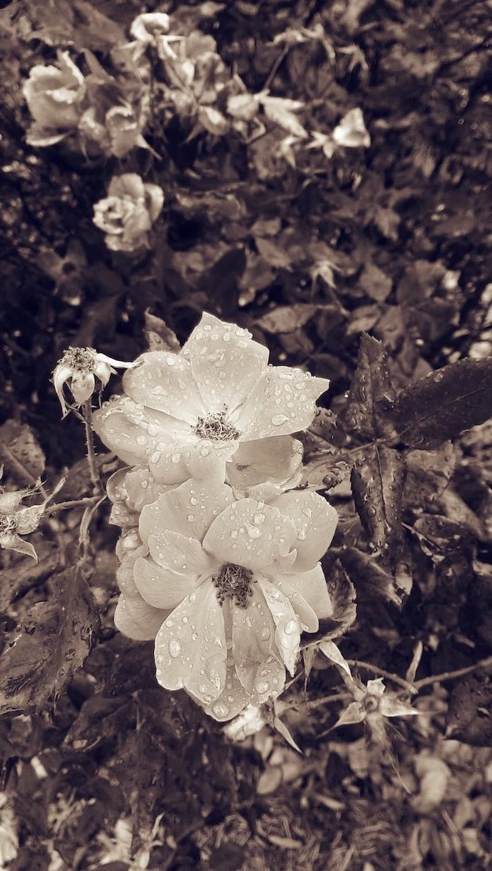
One of the biggest ones is something called fractal patterns. These are the complex, repeating patterns you see everywhere in nature—from the way a fern branches out to the perfect spiral of a sunflower’s seeds. Our brains are surprisingly good at processing these patterns; in fact, we find them deeply calming. Pioneering research in environmental psychology found that looking at these natural patterns, even in a picture, can give you a tiny mental break, restoring your ability to focus. A chaotic, busy image won’t cut it. But a photo that clearly shows the delicate, repeating veins in a leaf? That’s the good stuff.
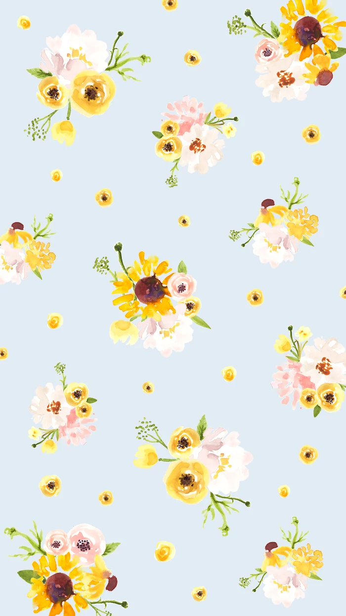
And then there’s color. Oh yeah, color is a huge deal. Greens and blues, the colors of leaves and sky, are famous for being calming. Their wavelengths are shorter, so our eyes don’t have to work as hard to see them. Bright, warm colors like reds and yellows can be energizing, but they can also scream at you from a backlit screen, causing eye fatigue. A pro understands this balance. They might take a photo of a vibrant red poppy and dial back the saturation just a tiny bit, making it beautiful without being exhausting to look at all day.
Pro-Level Tricks for Capturing Flowers (Even with Your Phone)
Anyone can snap a picture of a flower, but creating something that looks amazing on a high-res screen takes a bit of technique. It’s a craft built on a lot of trial and error.
Light is Everything
Seriously, this is the most important part. Harsh, direct noon sunlight creates ugly, sharp shadows and bleaches out all the delicate colors. The best light is almost always soft and diffused. That’s why I’m often out shooting right after sunrise or on a day with a light, even overcast. The clouds act like a giant, free softbox, scattering the sunlight perfectly.
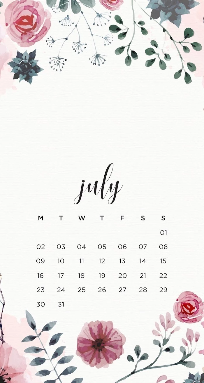
Quick Tip: Don’t have perfect natural light? You can fake it! For indoor shots, bounce a flash off a white ceiling or a piece of poster board. NEVER use the direct flash on your camera or phone—it makes things look flat and sterile. For a super budget-friendly hack, try taping a piece of parchment paper (yes, the kind from your kitchen) over a lamp to create a beautifully soft, diffused light source.
That Blurry Background Look
You know those professional photos where the flower is crystal clear and the background is just a gorgeous, soft wash of color? That’s called a shallow depth of field, and it’s the secret to making your subject pop. On a DSLR or mirrorless camera, you get this by using a wide aperture, like f/2.8 or f/4. A dedicated macro lens, like a 100mm f/2.8, is the ideal tool for this. Be prepared to spend a bit, though—a new one can run you over $1000, but you can often find great used ones for around $400. Don’t let the price scare you!
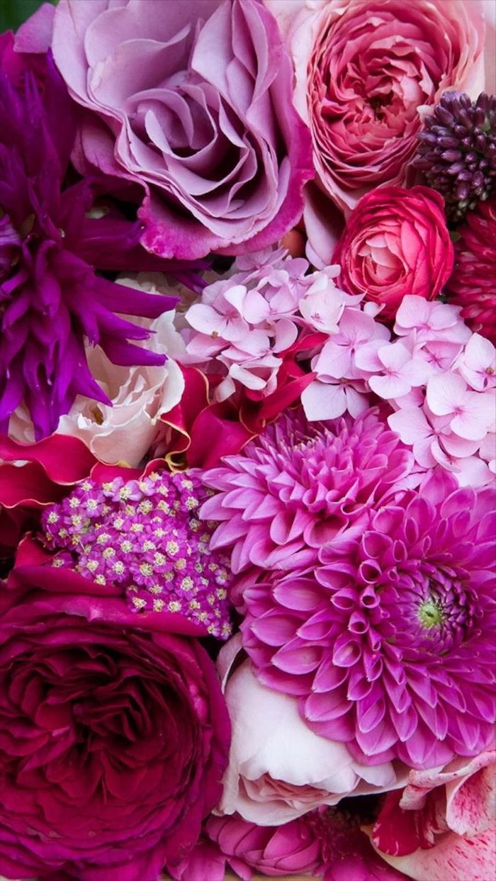
Budget-Friendly Alternative: You can get surprisingly good results with a set of macro extension tubes. They’re basically hollow rings that fit between your camera and your existing lens, letting it focus much closer. You can find a decent set online for $20 to $60.
For beginners: If you’re just using your phone, this is what “Portrait Mode” was made for! It uses software to intelligently blur the background, giving you a similar effect without any extra gear.
Give Your Apps Some Breathing Room
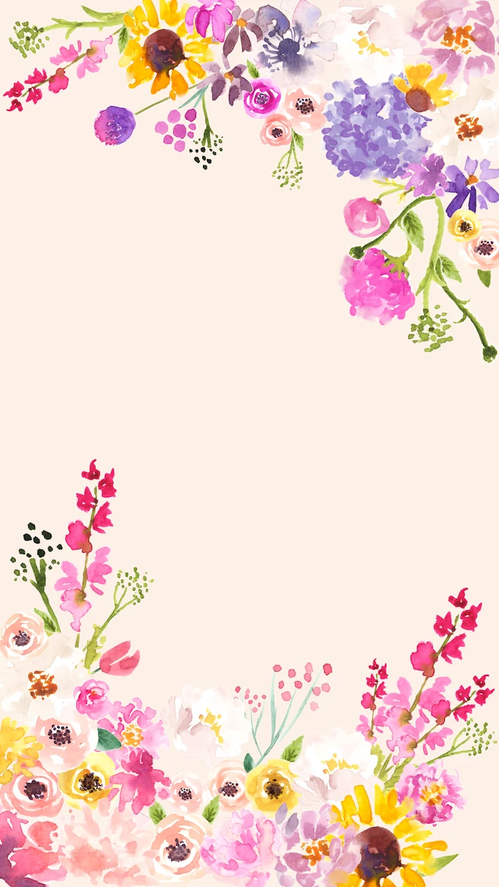
A background image has a very specific job: to look good behind all your stuff. This is where composition and negative space come in. A common mistake is filling the entire frame with the flower. It might be a stunning photo, but it’s a terrible wallpaper because your apps and widgets will get lost in the clutter.
Imagine two phone screens. On one, a giant rose is dead-center, with petals and leaves everywhere. Your app icons are a chaotic mess on top of it. On the other, the rose is placed elegantly in the lower-right third of the screen, leaving the rest of the space a clean, soft green blur. See? That’s the one you want. Always compose with the final use in mind, leaving plenty of that “negative space” for your icons to live.
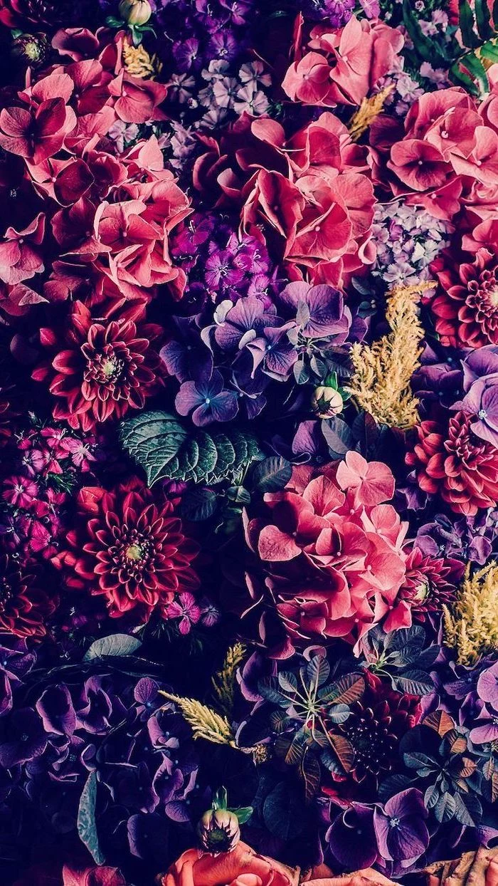
From Photo to Digital Pattern
Sometimes a single photo isn’t the vibe. For minimalist or patterned backgrounds, I’ll switch over to digital illustration on my computer or iPad. Vector illustrations are awesome because they’re made of math, not pixels, so you can scale them to any size—from a watch face to a billboard—with zero loss of quality.
For a more hand-painted feel, I’ll use a program like Procreate. It’s fantastic for creating those seamless, repeating patterns you see everywhere. It sounds super technical, but it’s easier than you think.
Lesser-known trick: A 3-step pattern hack in Procreate. 1. Start with a square canvas and draw your flower or leaf motifs. Don’t let them touch the edges yet! 2. Go to the Actions menu (the wrench icon), find the “Offset” filter, and move the image halfway across and halfway down. This splits your drawing perfectly and moves the edges to the middle. 3. Now, just fill in the empty space in the center with more drawings to connect everything. Boom! You’ve just made a perfectly seamless, repeatable tile.
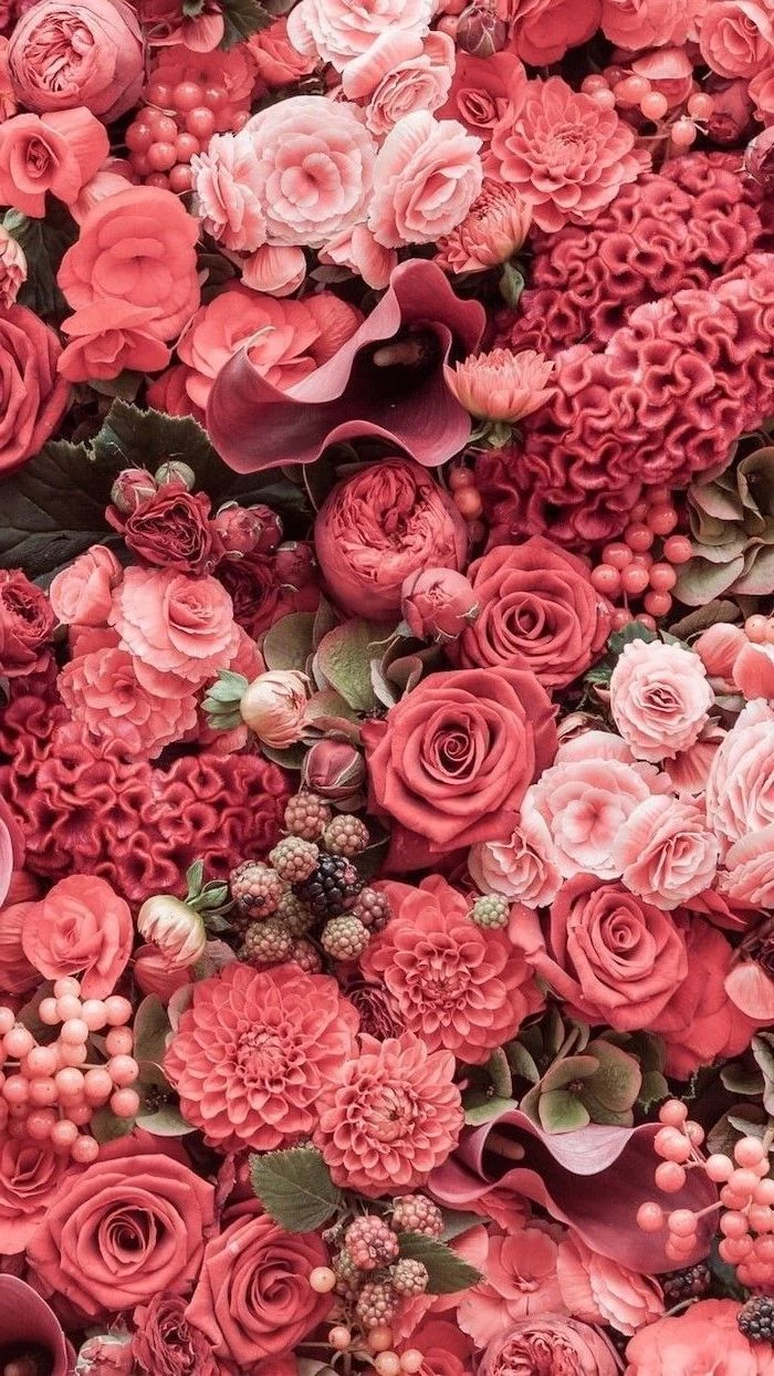
What Your Wallpaper Says About Your Corner of the World
The flowers you choose can tell a story. I once worked on a project for a hotel chain in the American Southwest. We exclusively used images of local plants: the waxy, pale blossoms of the saguaro cactus and the fiery reds of the ocotillo. It instantly grounded the digital experience in the physical location, creating a sense of place that a generic rose never could.
Think about it. In some cultures, cherry blossoms are deeply tied to concepts of beauty and fleeting time. A wallpaper of them evokes a specific feeling. In contrast, a background of Australian kangaroo paw, with its strange, sculptural shape, speaks to a totally different hemisphere and natural history.
When I teach workshops, I always push people to explore their own local plant life. It’s far more meaningful and original than defaulting to the same dozen flowers everyone else uses. What’s a flower that represents your hometown? I’d love to hear about it in the comments below!
The Practical Stuff: Making Sure It Actually Looks Good
Choosing a background is a technical decision, too. Here’s how to nail it.
Resolution and Shape Matter
The #1 reason a wallpaper looks bad is low resolution. If an image is too small for your screen, your device will stretch it, and you’ll get a blurry, pixelated mess. You need an image that’s at least the native resolution of your display. As a quick guide: Standard HD Desktop: 1920 x 1080 pixels 4K Desktop: 3840 x 2160 pixels * A newer smartphone: Something like 2556 x 1179 pixels Always go for an image that’s equal to or larger than your screen’s resolution. Also, pay attention to the aspect ratio (the shape). A wide desktop screen (16:9) needs a horizontal image. A tall phone screen needs a vertical one. Forcing one to fit the other just leads to weird, awkward cropping.
Try This Right Now: Head over to a site like Unsplash. Search for “minimalist leaf dark background.” Download an image that fits your screen’s orientation (vertical for phone, horizontal for desktop). Set it as your home screen wallpaper. Notice how much easier it is to read your app labels and find what you’re looking for. That’s the power of good negative space!
Where to Find Great, Legal Images
You can’t just grab any image off the internet. Most are copyrighted. Using them can get you in real trouble. Thankfully, there are amazing sites with photos that are free to use. Unsplash, Pexels, and Pixabay are my go-to’s. For incredible classic botanical illustrations, check out the digital archives of museums, like the New York Public Library Digital Collections or the Biodiversity Heritage Library. Just be sure to check the license terms—you’re usually looking for something that says “free for personal use.”
Going Next-Level: Dynamic and Hyper-Sharp Backgrounds
For the tech-inclined, a static background is just the beginning.
A really cool project is creating a dynamic wallpaper that changes with the time of day. You could photograph the same flower at different stages: a bud in the morning, fully open at noon, and closed at night. It’s a big commitment requiring a tripod and controlled lighting, but the result is a background that feels truly alive.
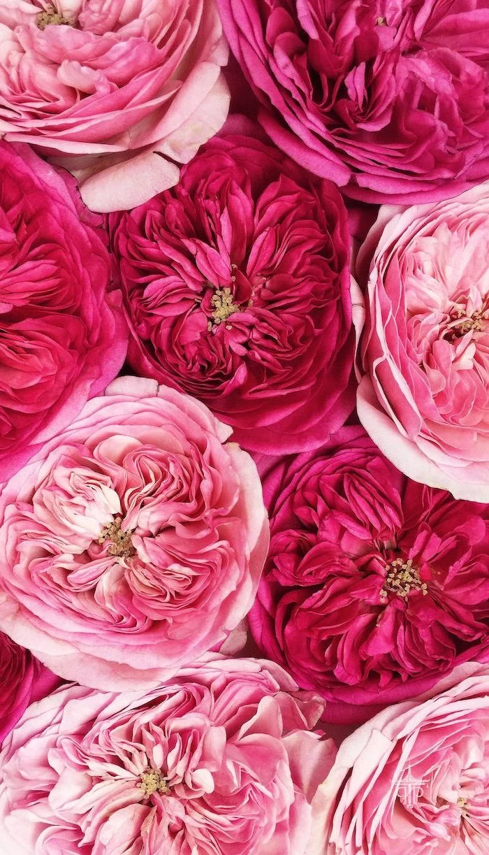
Another pro technique for ridiculously sharp images is called focus stacking. In close-up photography, it’s often impossible to get an entire flower sharp in one shot. So, I’ll take maybe 10 to 30 photos, slightly adjusting the focus in each one, from the very front to the very back. Then, special software merges only the sharpest parts of each photo into one hyper-realistic image. It sounds complicated, but it’s basically digital magic for ultimate sharpness.
By the way, if you get serious about creating your own images, a color calibrator is a must-have. It’s a little device that hangs over your screen and ensures the colors you see are accurate. They cost between $100 and $250 and are a game-changer for serious work. It guarantees that the perfect red you edited on your screen won’t look like a weird orange on someone else’s phone.
A Few Final Words of Warning
Let’s wrap up with some important, often-overlooked details.
Heads up! That Copyright Thing is Real.
I have to say this again because it’s the most expensive mistake you can make. I know a small business owner who grabbed a photo from a blog for her website. Six months later, she got a demand letter from a stock photo agency for over a thousand dollars. Stick to reputable free sites or pay a few bucks for a licensed image. It’s the only way to be safe.
Digital Eye Strain is No Joke
A busy, overly bright, or high-contrast background can physically tire your eyes out. They have to work harder to focus on the text and icons in front. If you spend hours on your device, do your eyes a favor and choose a background with muted tones and soft, open spaces.
And if you’re taking your own photos…
Please be careful! Many common garden flowers are toxic. Foxglove, oleander, and lily of the valley are beautiful but poisonous. I always wear gloves or wash my hands thoroughly after a shoot with unfamiliar plants. Also, be a good human: never pick wildflowers from protected areas and always get permission before going onto private property.
Ultimately, the image on your screen is a small but constant part of your daily life. Choosing it with a bit of care and an appreciation for the craft behind it can make your digital world a genuinely more beautiful and calming place. It’s a small detail, but sometimes, those are the ones that matter most.
Inspirational Gallery
Don’t fight the notch or the Dynamic Island—embrace it. Look for wallpapers where the main subject, like a single rosebud or a drooping willow branch, is positioned off-center. This creates a more dynamic, balanced composition that works with your phone’s hardware, not against it.
- Clarity for your icons and widgets.
- A restful, uncluttered feeling every time you unlock.
- The main floral element pops with more drama.
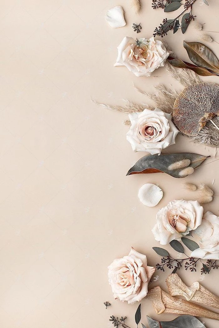
The secret? Look for wallpapers that embrace negative space. An image with a single, beautifully captured orchid against a plain background is often more powerful than a field full of flowers.
More than 1.5 million high-resolution images of public domain artworks are available for free from The Metropolitan Museum of Art’s online collection.
This is a goldmine for unique wallpapers. Search for terms like “botanical illustration,” “van Huysum,” or “Redouté roses” to find stunning vintage floral art that no one else will have on their screen.
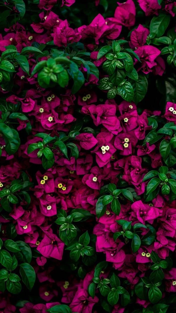
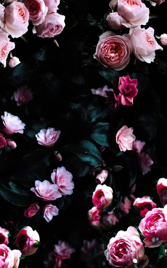
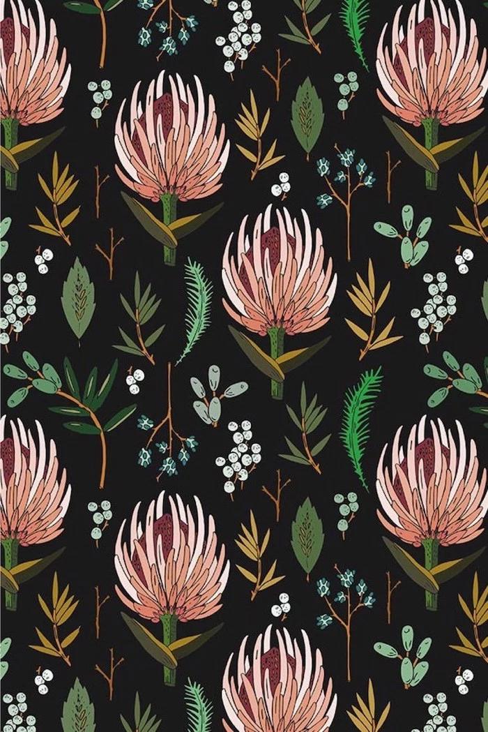
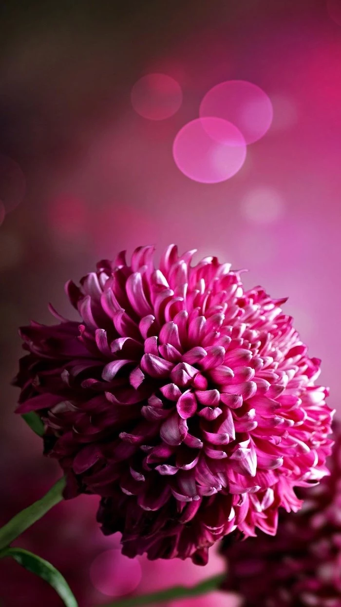
Dark Florals: Moody, dramatic, and perfect for OLED screens. A dark background with vibrant flowers, like the work of photographer Magda Wasiczek, makes colors pop and conserves a tiny bit of battery. It feels sophisticated and cozy.
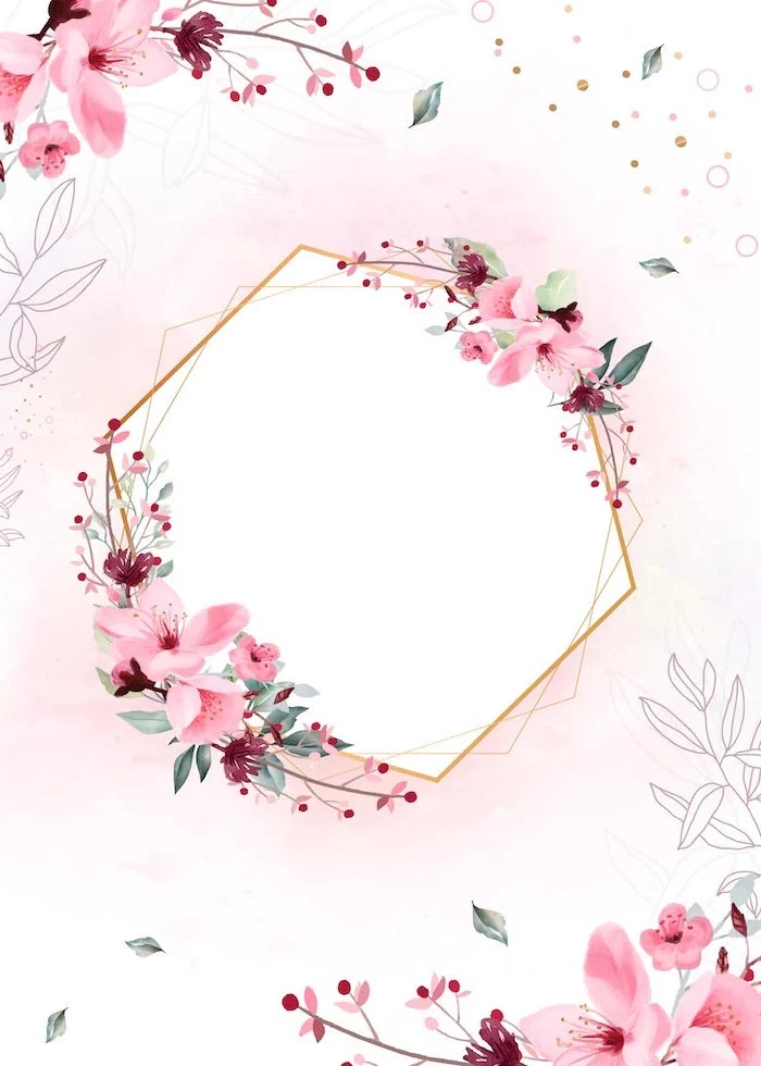
Light Florals: Airy, fresh, and clean. A watercolor peony on a white background feels optimistic and makes your screen look bigger. Ideal for a minimalist aesthetic and maximum readability in daylight.
Give your phone a seasonal wardrobe to keep things fresh. It’s a small ritual that connects you to the time of year.
- Spring: Think delicate cherry blossoms, crocuses, and fresh green shoots.
- Summer: Go bold with vibrant sunflowers, lush peonies, or tropical hibiscus.
- Autumn: Switch to the warm tones of chrysanthemums, dried hydrangeas, or rich, colorful leaves.
- Winter: Embrace minimalist beauty with frosted branches, hellebores (Christmas rose), or stark, snowy seed heads.
Can an illustrated floral wallpaper have the same calming effect as a photo?
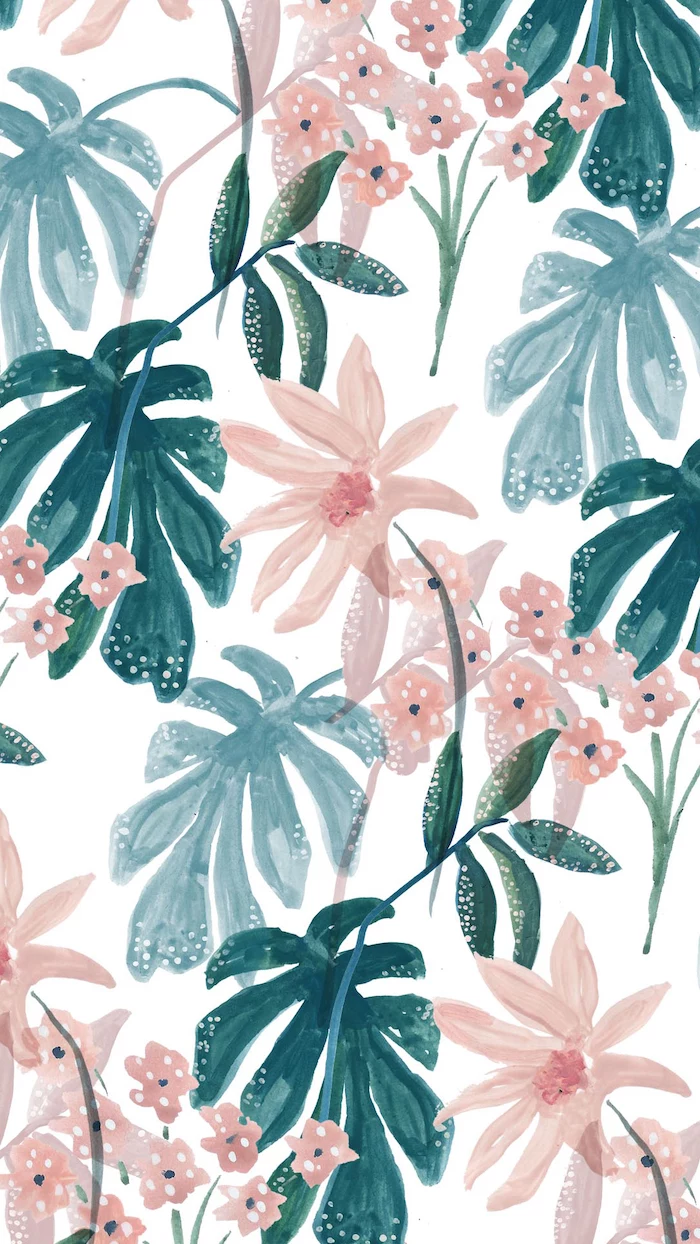
Yes, absolutely, but the style is key. While it might not have the photorealistic fractal patterns the article mentions, a well-drawn botanical illustration taps into a different part of our appreciation for nature: order and artistry. Look for drawings with clean lines and harmonious color palettes, like the digital botanicals found on apps like Procreate. They provide a sense of structured beauty, which can be just as soothing as a wild, natural scene.
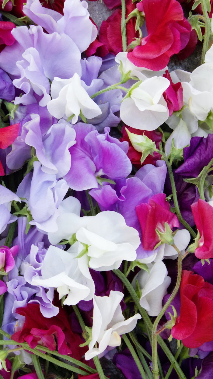
A note on resolution: Never settle for a pixelated image. Your phone screen has a higher pixel density than you think. For a crisp look on a modern iPhone or Android device, an image should be at least 1170 pixels wide and 2532 pixels tall. Anything less, and you’ll lose the delicate details that make a flower photo truly special.
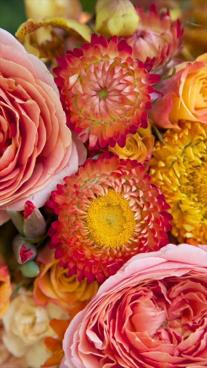
- Use Portrait Mode to create a beautiful depth-of-field effect, blurring the background.
- Shoot in the early morning or late afternoon. This “golden hour” light is soft and warm, preventing harsh shadows.
- Get low! Shooting a flower from below against the sky makes it look heroic.
- Tap your screen on the exact part of the flower you want in focus before you snap the picture.
One of the best-kept secrets for high-quality, artistic wallpapers is the app Vellum. It’s curated by designers, and its daily selection often features stunning, perfectly-composed floral and nature shots that are optimized for modern phone screens. It’s a shortcut to a better background.
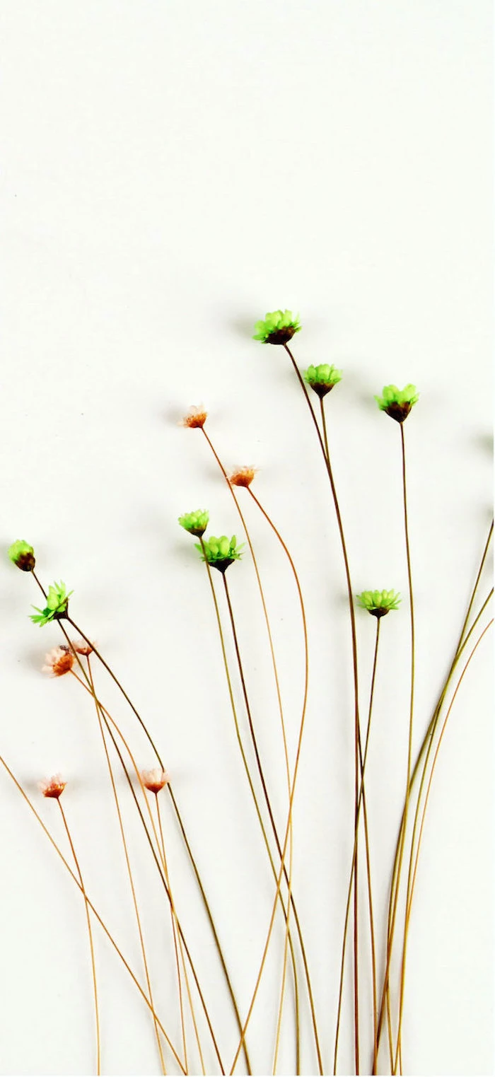
“Biophilic design is more than just a pretty plant. It’s about creating a habitat that connects us, on a deep and fundamental level, with the natural world.” – Stephen R. Kellert, Professor Emeritus, Yale University
While he spoke of physical spaces, the principle applies to our digital ones. Your phone is a micro-habitat you inhabit daily. A carefully chosen nature wallpaper is a tiny act of biophilic design for your digital life.
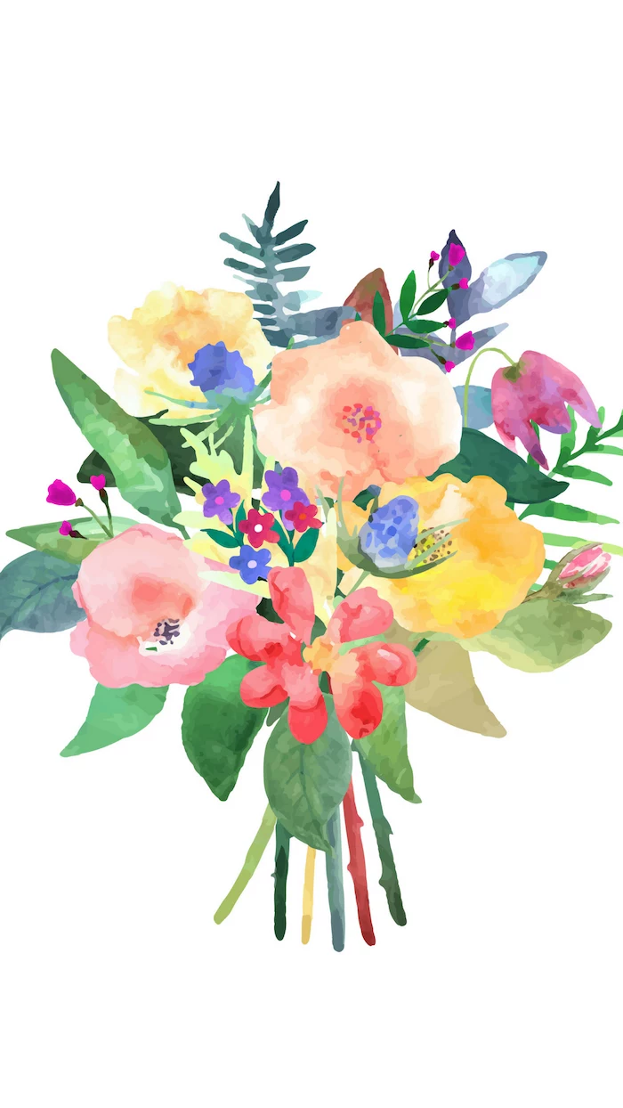
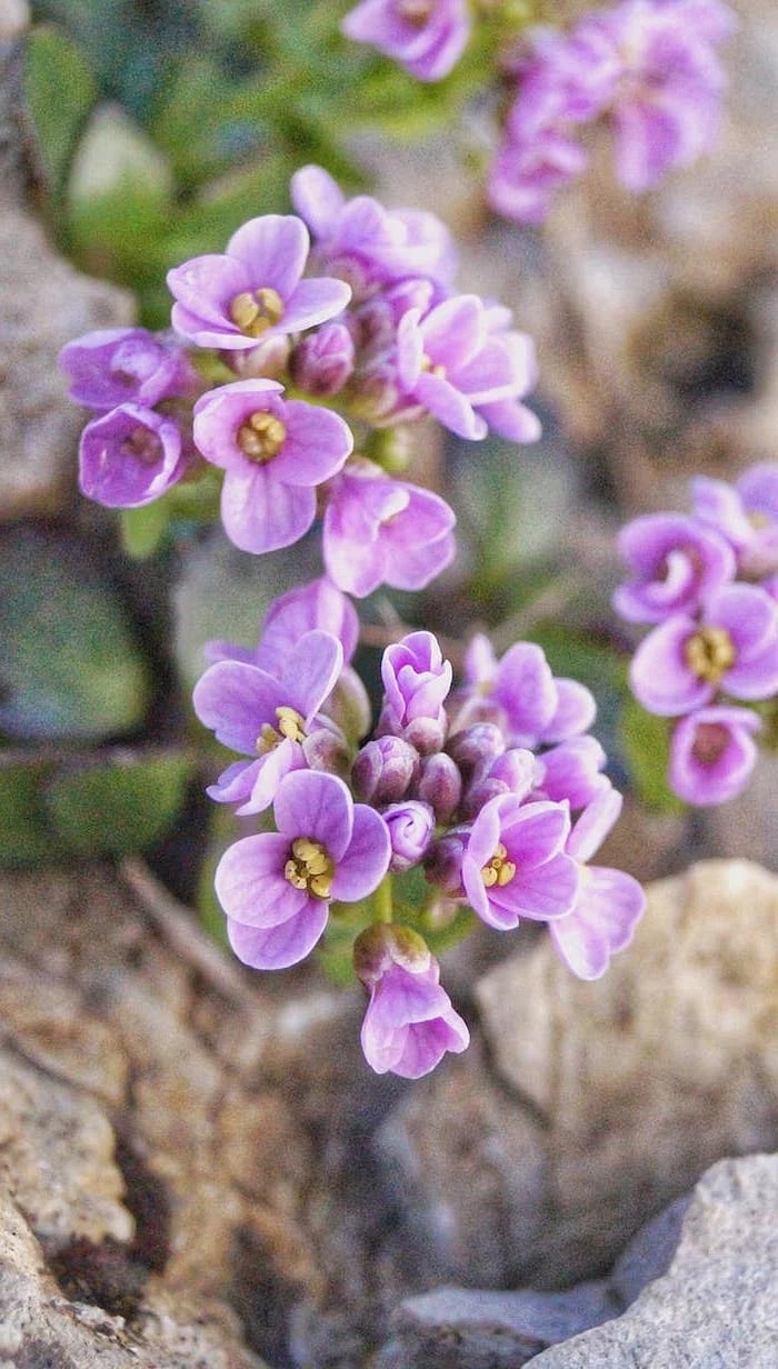
The secret to a great edit: Less is more. Instead of cranking up the saturation, use an app like VSCO or Snapseed to make subtle tweaks. Try slightly lowering the highlights to bring back detail in bright petals, and gently increasing the contrast to make the flower stand out from its background. The A6 or M5 presets in VSCO work wonders on botanical photos.
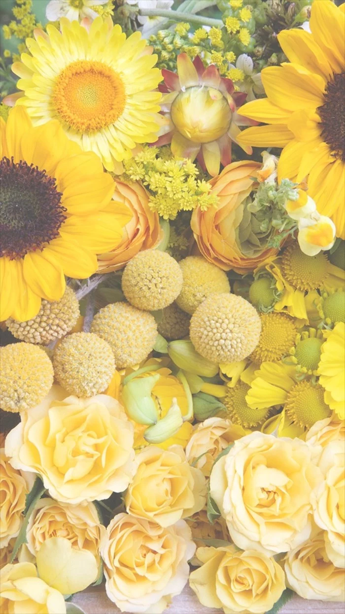
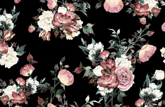
Feeling inspired by Japanese art? Search for “Ikebana” wallpapers. This traditional art of flower arrangement emphasizes minimalism, shape, and asymmetry. A wallpaper inspired by Ikebana won’t just be a picture of a flower; it will be a contemplative piece of art focused on line and form.
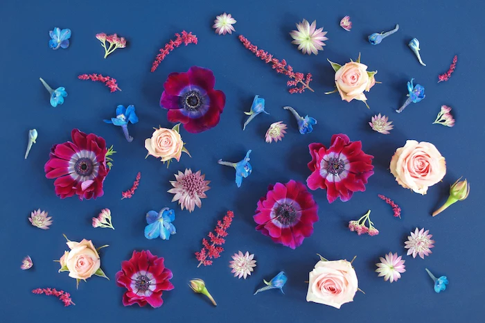
Lock Screen: This is your chance for drama. Choose a bold, captivating image—a macro shot of a dew-covered petal or a single, perfect tulip. It’s a statement piece you only see for a moment.
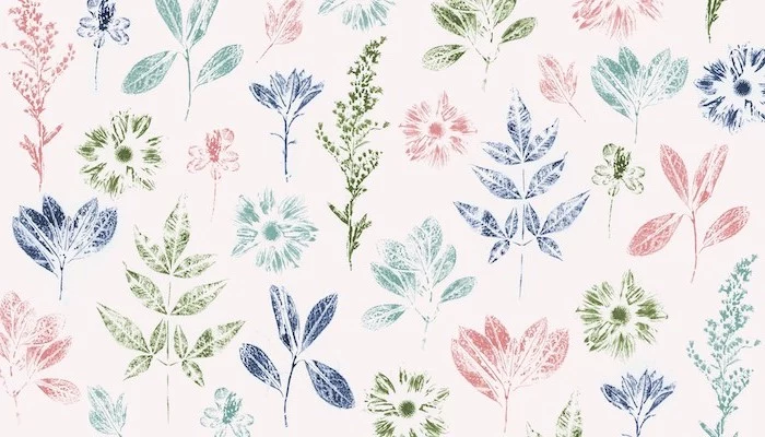
Home Screen: This one needs to be functional. Opt for a more subdued, textured, or patterned background that won’t visually compete with your app icons. A soft-focus field of lavender or a minimalist leaf pattern works perfectly.
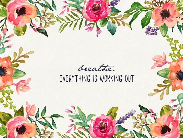
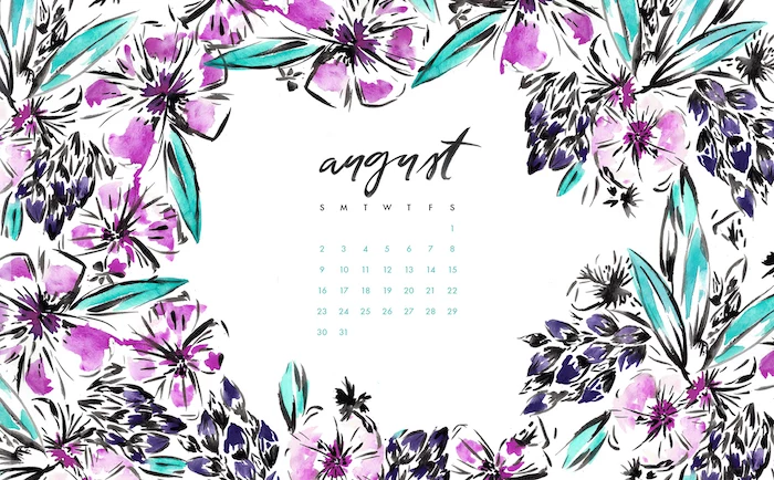
Should I try to match my wallpaper to my phone case?
Think of it as coordination, not matching. If you have a green phone case, a wallpaper with complementary pink or coral flowers will create a beautiful, energetic contrast. If your case is a neutral color, you have a blank canvas to go as bold or as minimalist as you like with your floral choice.
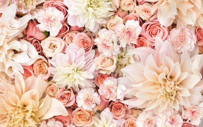
For Android users, the customization doesn’t stop at the wallpaper. Consider installing a custom icon pack to complete the look. The ‘Whicons’ (white) or ‘Zwart’ (black) icon packs offer a clean, minimalist look that makes any floral background feel like a curated art piece.
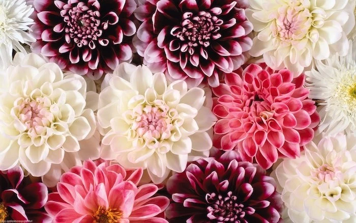
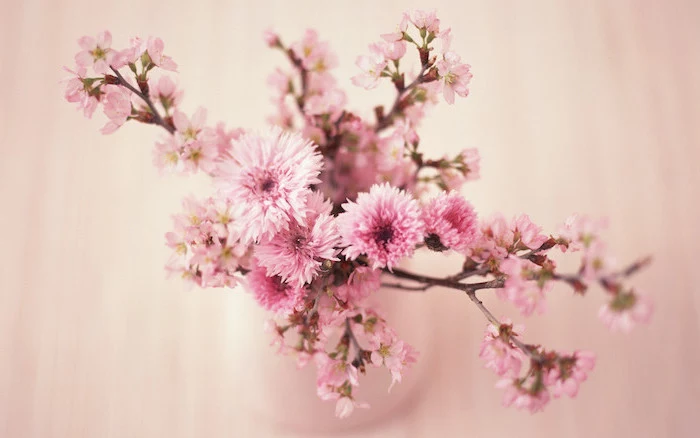
A 2017 study found that on an OLED screen, using a black wallpaper can use up to 6 times less power at full brightness than a white wallpaper.
While the effect is less dramatic with a colorful image, a wallpaper with a true black background (where pixels are literally turned off) will make a small but real difference in your battery life. This makes those moody, dark floral designs both beautiful and practical.
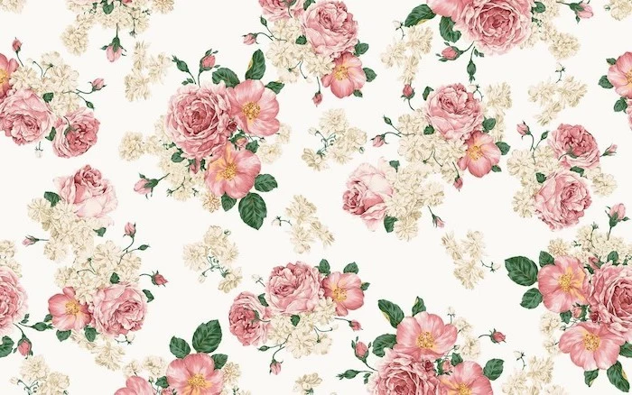
Explore the abstract side of flowers through macro photography. When you get incredibly close, a dahlia becomes a mesmerizing geometric pattern, and a sunflower’s center transforms into a perfect Fibonacci spiral. These images provide texture and complexity without creating a “busy” background.
Want to create your own unique floral collage or text-based design? You don’t need Photoshop.
- Download the Canva app.
- Start with a “Phone Wallpaper” template.
- Upload a photo of a flower you love, use their ‘background remover’ tool, and layer it over colored backgrounds or even other subtle patterns.
In minutes, you can have a completely personal and professional-looking wallpaper.
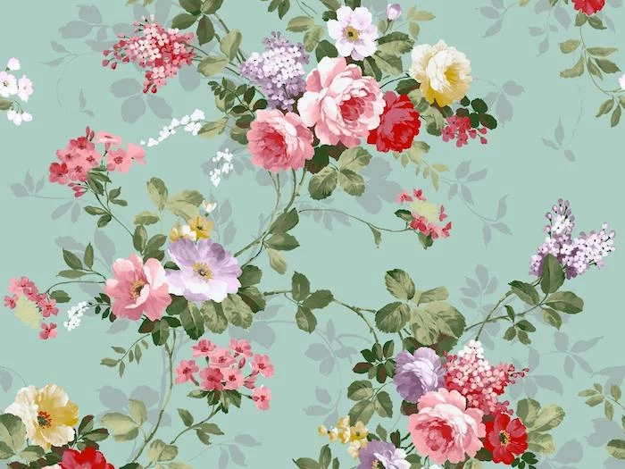
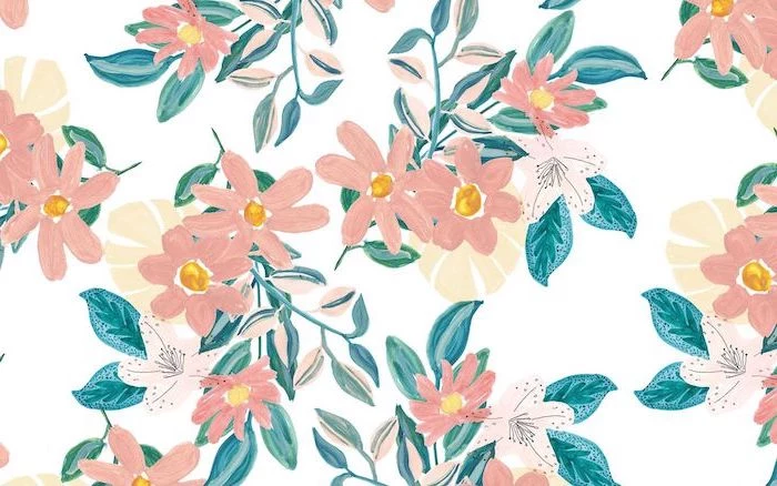
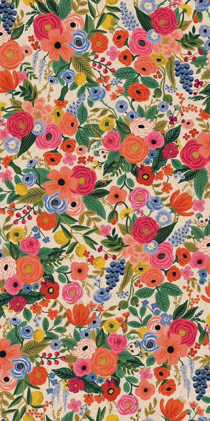
Common mistake: Choosing a wallpaper that’s too “busy.” A dense, repeating pattern of small flowers can make your app icons and widgets impossible to read. The best floral wallpapers have areas of rest, allowing your eyes—and your phone’s interface—to breathe.
Don’t forget about Live Photos on iOS or video wallpapers on Android. A short, looping clip of a flower gently swaying in the breeze or a bee visiting a blossom can turn your lock screen into a living moment of tranquility. Keep it subtle for the best effect.
- A sense of opulence and history.
- A rich, deep color palette that feels luxurious.
- Incredible, lifelike detail in every petal and leaf.
The inspiration? The Dutch Masters. Search for wallpapers inspired by the still-life paintings of artists like Rachel Ruysch or Jan van Huysum. This trend brings a dark, romantic, and gallery-worthy feel to your screen.
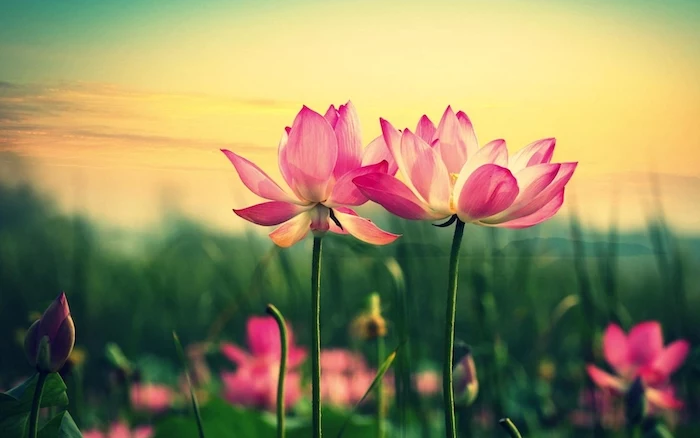
For a true artist’s touch: Discover the work of specific creators. The photos on Unsplash by artists like Annie Spratt capture florals with a soft, ethereal light, while Paul Hanaoka’s work often features bold, tropical botanicals. Finding a photographer whose style you love is like having a personal artist for your phone.
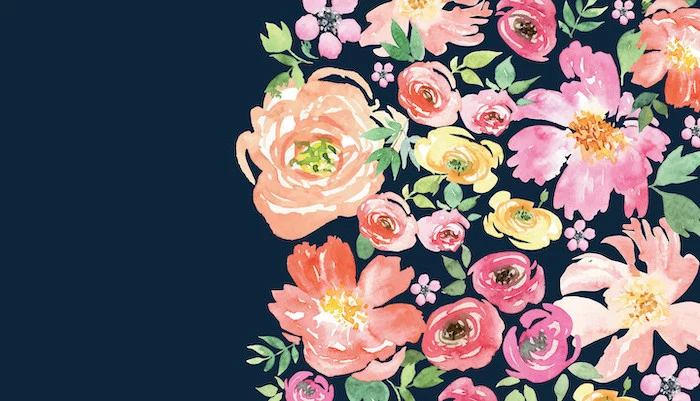
The latest gentle trend in digital design is the “floral gradient.” Instead of a static background, these wallpapers feature a soft blend of two or three colors with subtle, almost transparent floral silhouettes layered on top. It’s a modern, dreamy take that provides color without overwhelming the screen.
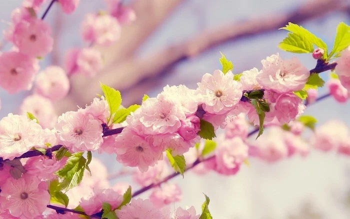
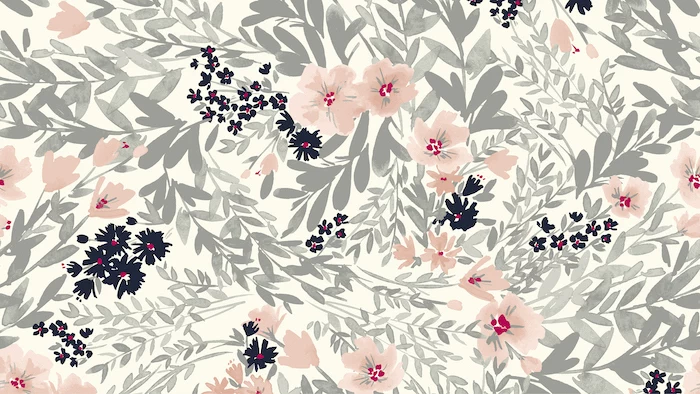
Color is a power which directly influences the soul. – Wassily Kandinsky
He was right. Choosing a green-dominant wallpaper with lush leaves can promote a feeling of calm and restoration. A background with splashes of yellow, like forsythia or daffodils, can evoke feelings of happiness and energy. Think about the mood you want to carry with you.
Photographic: Offers realism, texture, and the true fractal patterns found in nature. A great photo feels like a small window to the real world. Perfect for those who crave an authentic connection to nature.
Illustrated: Provides a more stylized, artistic interpretation. It can be minimalist, whimsical, or graphic. Ideal for those who want a curated aesthetic and love matching colors and themes.
Neither is better—they simply create different atmospheres.
