The Real Deal on Cerulean Blue: A Guide to Nailing This Tricky Color
I’ve been slinging paint for a long time, and I’ve seen color trends come and go. But some shades? They just stick around. Cerulean blue is one of those classics. It’s a fantastic color, but honestly, it’s not for the faint of heart.
In this article
I still remember my first dance with cerulean. A client wanted her master bedroom to feel like a perfect, cloudless sky. She handed me this tiny, one-inch paper swatch and my first thought was, “Oh boy.” I knew that turning that little square into 400 square feet of flawless wall would take more than just cracking open a can. It’s all about understanding light, surface, and the paint itself.
Cerulean has a complex personality. It can be brilliantly uplifting or deeply calming. But it can also be incredibly unforgiving. In one room, it’s a showstopper; in another, it can look cold, chalky, and just… off. This guide is basically two decades of my trial-and-error, boiled down to give you the practical know-how to get this color right, whether you’re doing it yourself or hiring someone.
So, What’s Actually in the Can?
Before you roll a single drop, it helps to know what you’re working with. A can of paint is basically a chemical soup, and the color you see comes from tiny particles called pigments. How those pigments play with light is everything.
Way back when, true cerulean blue came from a pricey mineral pigment. It was gorgeous, but you were more likely to find it in an artist’s studio than on a living room wall. Today’s cerulean from your local paint store is a high-tech blend. It’s usually made with a powerful synthetic blue, a whole lot of titanium dioxide (that’s the standard white pigment that gives paint its hiding power), and often a tiny touch of green to get that signature sky-blue vibe. This mix is precisely why the color is so sensitive to its surroundings.
The Magic Number: LRV
Okay, here’s a pro tip that will save you a ton of guesswork. Every paint color has a Light Reflectance Value, or LRV. It’s a number from 0 (think black hole) to 100 (blinding white) that tells you how much light a color will bounce back into the room. Most cerulean blues hang out in the 35 to 55 range, making them a solid mid-tone.
- An LRV closer to 55 will give you a lighter, airier cerulean. It’s great for making a space feel a bit bigger and brighter.
- An LRV down around 35 means a deeper, more saturated color. This creates a cozier, more dramatic feel but can make a dark room feel even smaller.
When you’re staring at two cerulean swatches that look almost identical, check the LRV. It’s the spec sheet that tells you how the color will actually behave on the wall.
The Color-Shifting Problem (aka Metamerism)
Have you ever painted a room, loved it during the day, and then hated it that night? That’s called metamerism, and cerulean blue is famous for it. Because it’s a mix of blue, white, and green pigments, different types of light make it look like a completely different color.
I learned this lesson the hard way. We painted a living room a beautiful cerulean. Looked perfect in the afternoon sun. The client was thrilled. Then she called me that night, totally frustrated. Under her warm, yellowish lamps, the color had gone murky and slightly greenish. It was a costly fix.
Your homework: Before you commit, I want you to try something. Grab three different cerulean paint chips from the store. Tape them to a wall that gets both natural sunlight and has your typical evening lamps. Watch how they change over a full 24 hours. You’ll see metamerism in action and understand why testing a large paint sample is a non-negotiable step!
Getting a Pro-Level Finish (Even If You’re a DIYer)
A mid-tone color like cerulean will highlight every single flaw. You can’t just slap it on and hope for the best. Here’s how to do it right.
First Things First: Prep, Prep, Prep!
You can use the most expensive paint in the world, but if your prep work is sloppy, the finish will be, too. For a color this clear, the wall needs to be smooth. We’re talking no bumps, no dings, no weird textures.
Here’s your checklist:

- Clean the walls. A quick wipe-down with a sponge and a mild cleaner (a TSP substitute works wonders) gets rid of the grime that paint hates. Let it dry completely.
- Patch and sand. Fill every nail hole and crack with spackle. Once it’s dry, sand it perfectly smooth with 220-grit sandpaper. Feather the edges so you can’t feel them.
- The Hand Test. Now, close your eyes and run your hand over the wall. Your sense of touch is more sensitive than your sight here. If you feel a bump, sand it down.
The Primer Trick That Saves You Time and Money
Never, ever apply cerulean directly over an old color or bare drywall. You need primer. But here’s the secret: don’t just use a standard white primer. A bright white base can make you fight for coverage, often requiring three or even four coats of your expensive cerulean paint to look right.
The solution? Gray-tinted primer. This is one of those insider tricks that makes a world of difference. When you buy your paint, ask them to tint your primer. Just walk up to the counter and say, “Could you please tint this primer to about 50% of the formula for my topcoat color?” They’ll know exactly what you mean. This neutral gray base helps the true cerulean color pop in just two coats. It saves paint, time, and your sanity.
Your Project Shopping List & Budget
To paint a standard 12×12 bedroom, here’s a rough idea of what you’ll need and what it might cost. Prices can vary, but this gives you a ballpark.
- Gray-Tinted Primer (1 gallon): $25 – $45
- Premium Cerulean Paint (1 gallon): $60 – $85 (Trust me, don’t cheap out here. Better paint means better coverage and durability.)
- Tools: A good 2.5-inch angled brush ($15), a quality 3/8-inch nap roller and frame ($15), paint tray and liners ($10), and painter’s tape ($8).
- Prep Supplies: Spackle ($8), sandpaper ($5), drop cloths ($10).
All in, you’re looking at around $150 to $200 for a single room. As for time, a beginner should plan for a full weekend. One day for all the cleaning, patching, and priming, and another day for the two coats of color, allowing for proper drying time in between.
Application: The Wet Edge is Your Best Friend
Okay, you’re prepped and primed. Now for the fun part. The key to avoiding ugly roller marks is to maintain a “wet edge.” This just means your brushed edges can’t dry before you roll up to them.
Work one wall at a time. Use your brush to “cut in” the color around the trim and corners. Then, immediately grab your roller and paint that wall, getting as close to your brushed lines as possible. This ensures the wet brushed paint blends seamlessly with the wet rolled paint.
When you roll, make a big “W” shape on the wall, then fill it in with even strokes without lifting the roller. This distributes the paint perfectly. Oh, and a quick tip: Don’t try to “stretch” your paint to make it go further. It’s better to use a bit more for an even coat than to end up with a patchy mess that needs a third coat anyway.
Where Does Cerulean Blue Really Work?
A color’s success is all about context. The light in your region and the style of your home matter a lot.
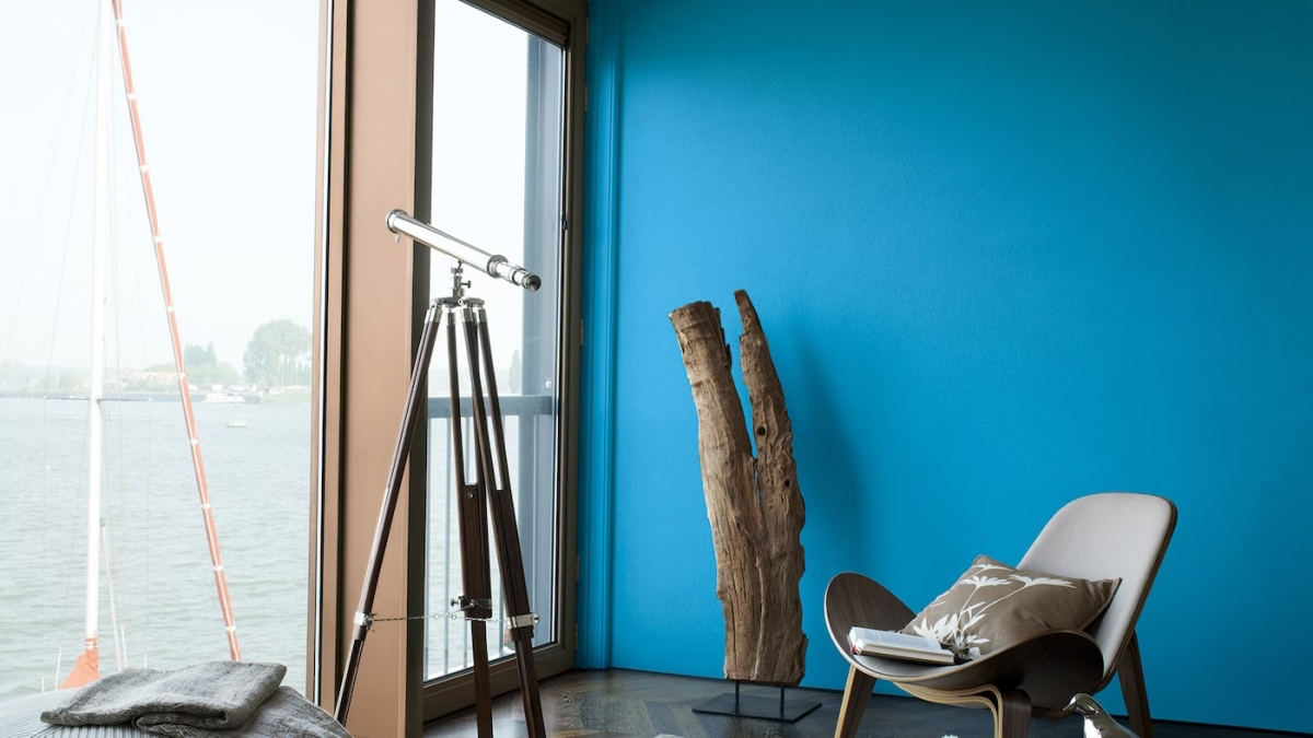
In sunny, coastal areas, cerulean feels right at home, echoing the sky and sea. The bright light keeps it from feeling cold. But in more overcast, northern climates, you have to be more careful. The gray, diffused light can make cerulean feel a bit chilly. If that’s your situation, I’d suggest pairing it with warm elements like hardwood floors, brass fixtures, and warm-toned light bulbs (look for 2700K to 3000K).
It’s a natural fit for Coastal, Mediterranean, and even some Mid-Century Modern homes. In a more traditional home, a whole room might feel a bit much, but it can be absolutely stunning in a smaller dose—think a powder room, a laundry room, or on the back of a built-in bookshelf. It’s a fantastic way to add a modern jolt of energy to a classic space.
Not Ready for a Whole Room? Quick Win Idea
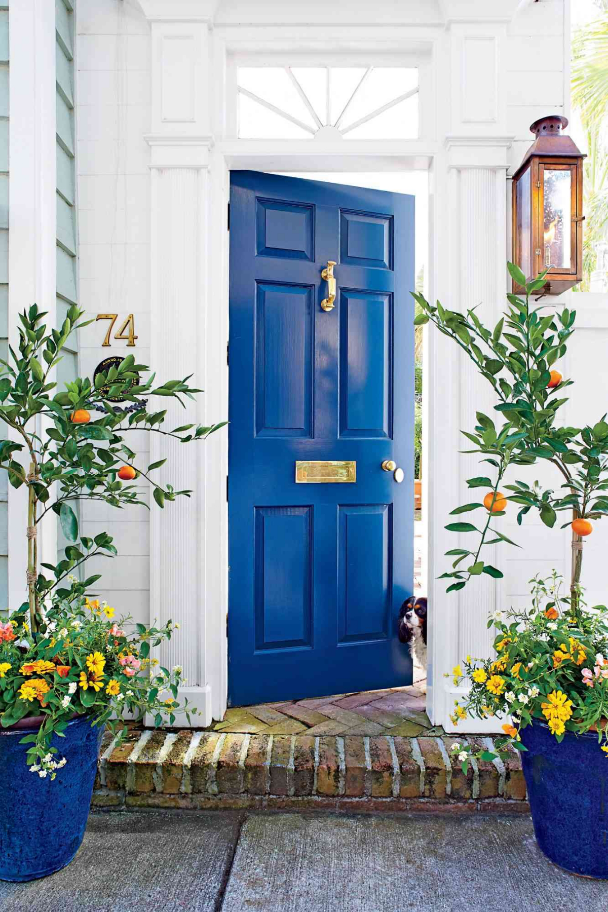
If you’re feeling a little hesitant to go all-in, no problem! A little bit of this color goes a long way. For a project you can knock out in a few hours, try painting the inside of your front door or the back panel of a bookcase. It gives you a powerful pop of color and personality with very little commitment.
Sheen, Palettes, and Final Decisions
You’re almost there! Just a few more choices to make.
Choosing the Right Paint Sheen
The gloss level, or sheen, of your paint seriously affects the final look and durability. A shinier finish will make the cerulean look richer and more vibrant, but it will also show every tiny flaw in your wall. A flatter finish is more forgiving but a pain to clean.
For most people, Eggshell or Satin is the sweet spot for a color like cerulean. They have a soft, subtle glow that brings the color to life and are durable enough for bedrooms, living rooms, and hallways. I’d save the super shiny Semi-Gloss for trim, doors, and maybe a bathroom where you need extreme moisture resistance and cleanability. And Flat or Matte? It’s great at hiding imperfections, but it scuffs if you so much as look at it wrong. I really only recommend it for ceilings or super low-traffic formal rooms.
Colors That Play Nicely with Cerulean
What should you pair it with? You’ve got options:
- Calm & Grounded: Think warm sandy beiges, soft taupes, and natural wood tones. The warmth provides a beautiful, organic contrast to the cool blue.
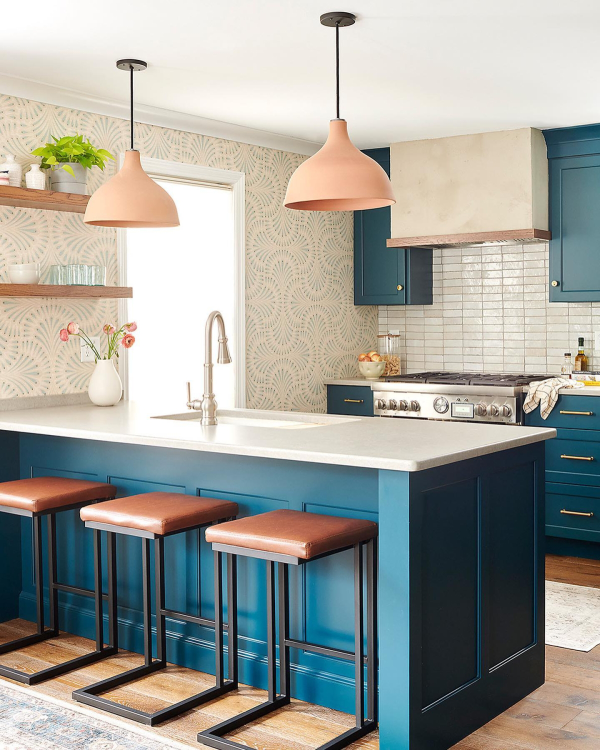
- Energetic & Bold: A muted terracotta, a soft coral, or even a deep mustard yellow can be stunning. These warm colors make the blue pop.
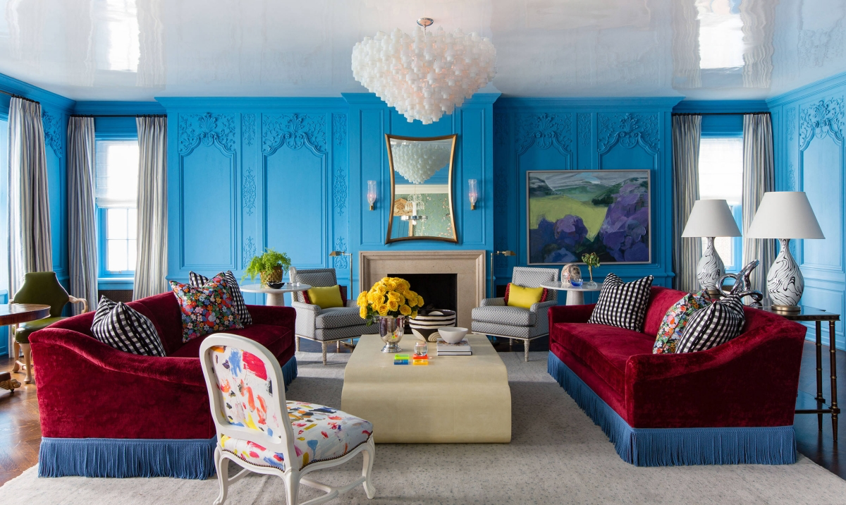
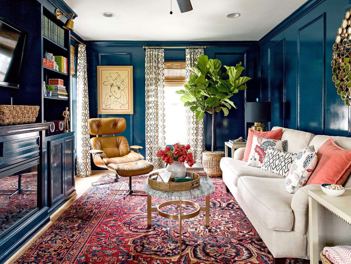
- Sophisticated & Layered: Go monochromatic. Pair your cerulean with a deep navy and a pale sky blue. Use the darkest shade for an accent, the cerulean for the main walls, and the lightest on the ceiling. It feels incredibly intentional and chic.
At the end of the day, cerulean blue is a gorgeous and rewarding color. It can transform a room, making it feel confident, calm, and full of life. But its success is never an accident. It comes from a little bit of science, a whole lot of prep work, and a dose of patience. It’s one of those colors that proves the little details really are everything.
Galerie d’inspiration

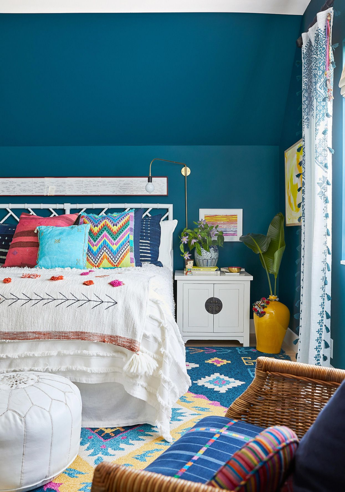
How do you prevent cerulean from feeling cold and sterile?
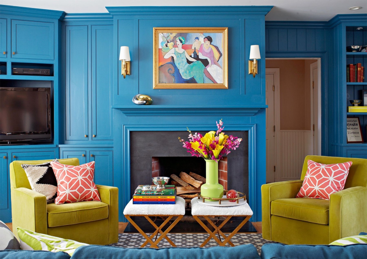
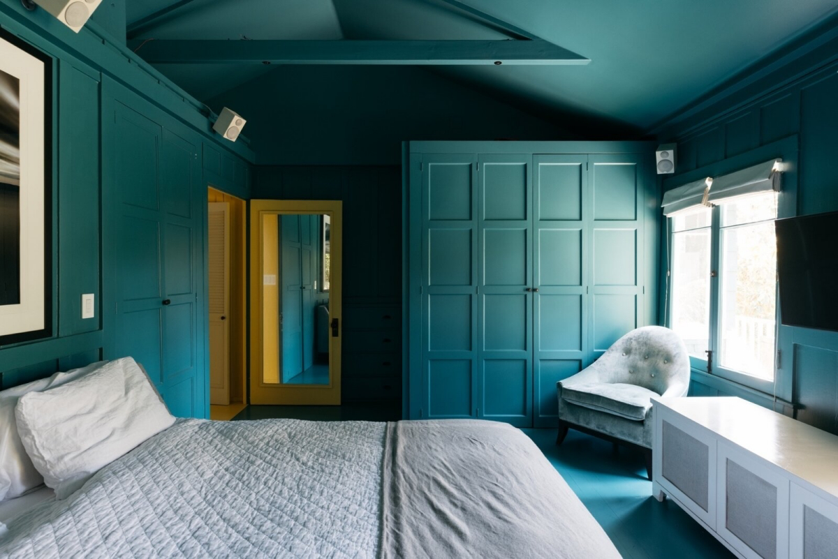
The secret is in the supporting cast. Cerulean blue loves warmth and texture. Pair it with natural woods like oak or walnut to ground the space. For textiles, think in opposites: a rich cognac leather armchair, velvet cushions in mustard yellow, or a plush wool rug in a warm cream tone. For trim, step away from stark, blue-toned whites. Opt for a creamier off-white like Benjamin Moore’s ‘White Dove’ (OC-17) to create a softer, more inviting transition.
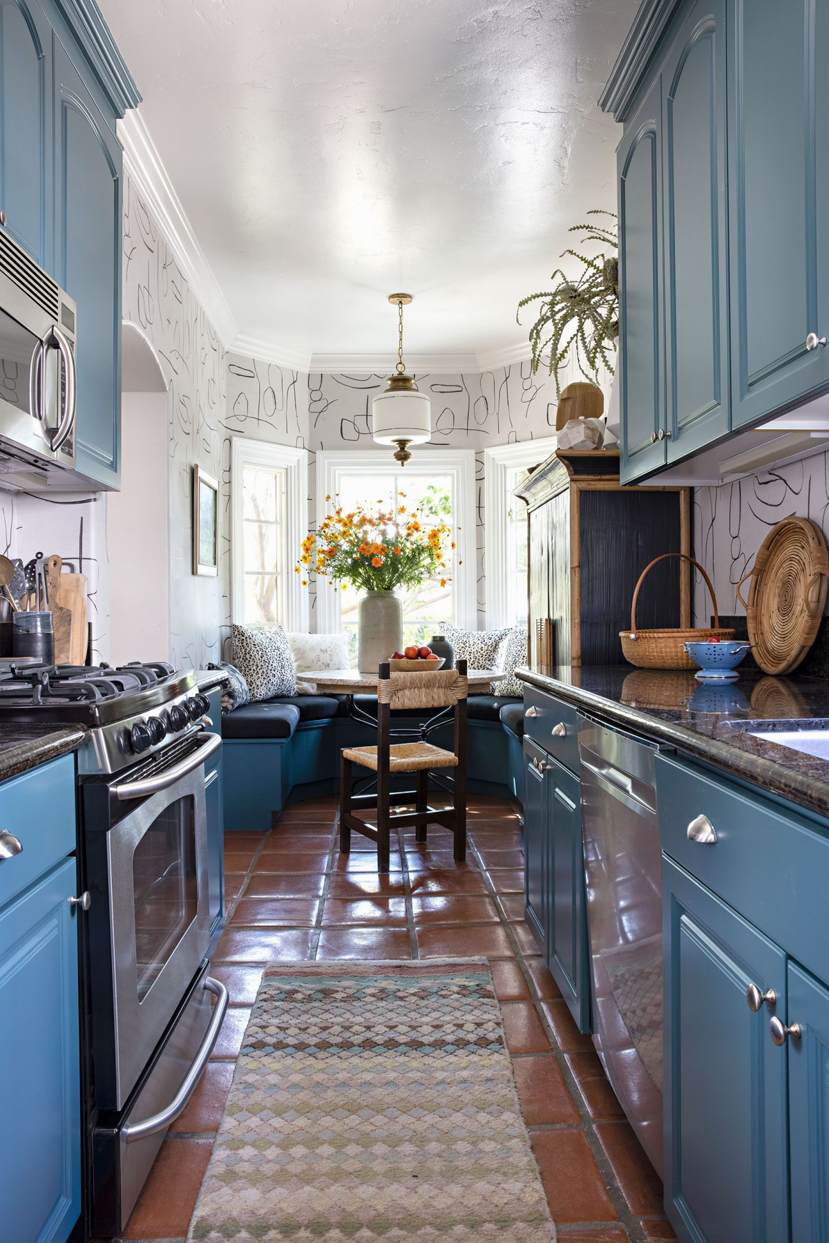
More than 75% of a paint’s final appearance is determined by its finish, not just its color.
With a color as dynamic as cerulean, the sheen you choose is critical. A flat or matte finish will absorb light, giving the walls a deep, velvety, and chalky appearance—perfect for a serene bedroom or study. An eggshell or satin finish has a subtle luster that reflects a little light, making the blue feel more vibrant and energetic. This also makes it more durable and easier to clean, a great choice for kitchens, bathrooms, or hallways.
Think beyond four walls. If painting an entire room feels too intimidating, use cerulean as a high-impact accent. It’s a fantastic color for breathing new life into a piece of furniture—an old dresser, a set of dining chairs, or even just the back of a bookcase. For a more architectural approach, consider painting the front door for a bold and welcoming statement. A cerulean ceiling in an otherwise white room can also create a stunning, sky-like effect without overwhelming the space.


