Your Desktop Wallpaper Is More Important Than You Think. Here’s How to Choose a Great One.
I’ve spent a huge chunk of my life working as a commercial photographer, and my job boils down to one thing: creating images that make you feel something. For a long time, I thought that work only mattered on billboards or in slick magazines. But honestly, the most impactful place an image can live is right on your screen.
In this article
Think about it. Your desktop wallpaper or phone lock screen is something you glance at dozens, maybe even hundreds, of times a day. It has this quiet, constant influence on your mood and focus. We’ve all seen that one coworker’s desktop, right? A chaotic mess of icons scattered over a blurry, low-quality photo of a sunset. It just feels… stressful.
One of the best pieces of advice I ever gave a budding designer was to swap her chaotic background for a clean, high-resolution image with plenty of empty space. A week later, she told me it was a game-changer for her sense of calm and organization. That’s what this is all about. A good wallpaper isn’t just a pretty picture; it’s a tool for a clearer mind.
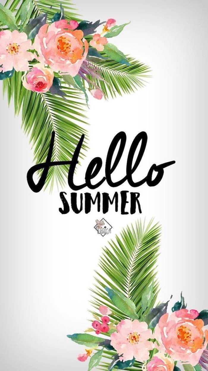
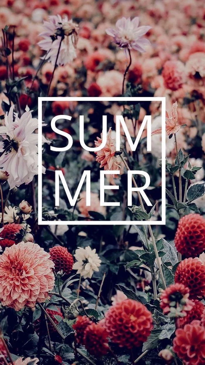
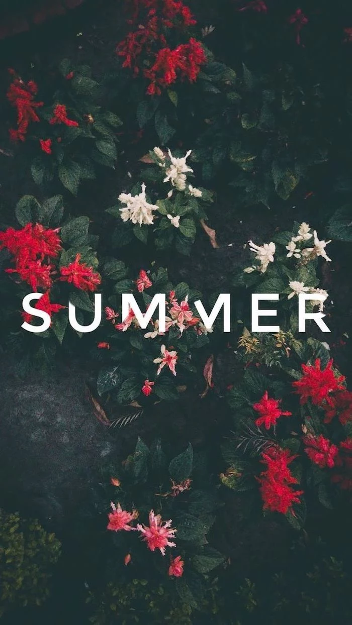
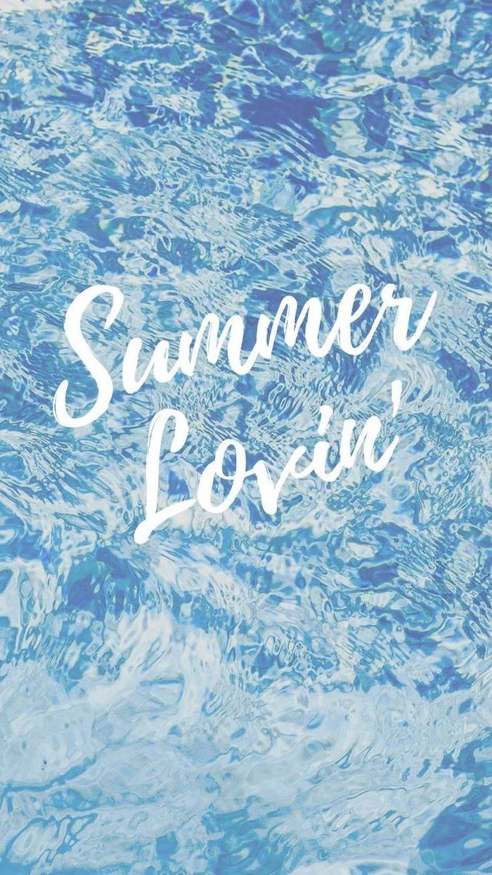
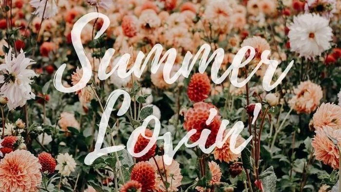
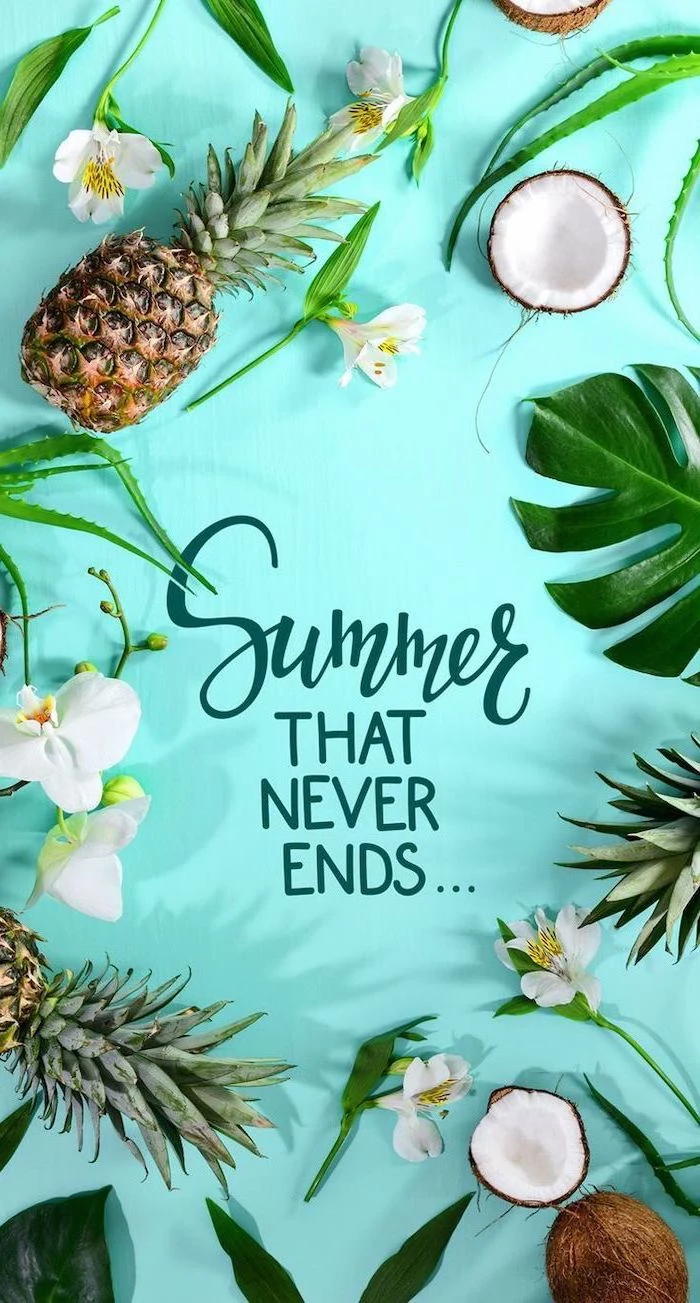
So, let’s go beyond just grabbing the first “cute” photo we find. We’re going to break down how to pick a wallpaper with a professional eye, covering the tech that separates a crisp image from a blurry mess, and the artistic tricks that make a picture genuinely satisfying to look at day after day. We’ll use “summer” as our theme because its vibrant light and simple subjects are perfect for learning.
The Unseen Tech: Why Your Screen Deserves a Better Image
Before we get into the fun, artsy stuff, we have to talk tech. An image that looks amazing on your tiny phone screen can completely fall apart on a big monitor. It all comes down to a few key ideas that, once you get them, will change how you see every image you download.
Resolution: The Only Number That Really Matters
Every screen is a grid of tiny lights called pixels. Resolution is just the total number of those pixels, written as width x height (like 1920×1080). For a wallpaper to look sharp, its own pixel dimensions should match or, even better, be larger than your screen’s. If you use a small image on a big screen, your computer has to guess how to fill in the missing bits, which leads to that ugly, jagged blurriness called pixelation.
Quick Tip: Not sure what your screen’s resolution is? It’s easy to find. On Windows, just right-click your desktop and choose “Display settings.” On a Mac, click the Apple icon in the corner, then go to “About This Mac” and click the “Displays” tab. That number you see is your target! Aim for a wallpaper with at least those dimensions.
As a rule of thumb, I always look for images that are at least 3000 pixels on their longest side. That covers most HD and even 4K monitors (which are 3840×2160). Trying to use a photo from an old phone on a brand new 4K monitor? Yeah, that’s almost always going to be a letdown.
Color Space and Mood
Digital color is surprisingly complex, but for wallpapers, you only need to know one thing: sRGB is the gold standard. It’s the color language that almost every monitor and website speaks. Stick with it, and your colors will look just right—not too dull, not weirdly neon.
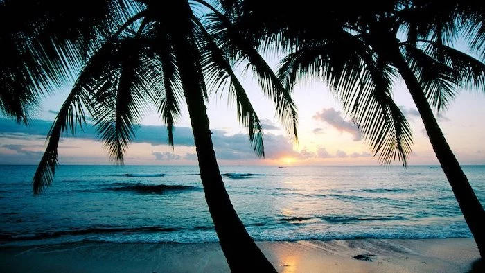
What’s more important for mood is color temperature. Think about the warm, golden light of a summer sunset versus the cool, blue-ish light of a bright, clear sky. That’s color temperature in action. The warm glow of “golden hour”—that magical time right after sunrise or before sunset—is what gives so many summer photos that classic, relaxed vibe.
File Formats and Why They Matter
Most images online are JPEGs. A JPEG file is compressed to save space, which means it throws away a little bit of image data. This is usually fine, but the problem is that every time a JPEG is saved, it gets compressed again. The quality degrades with each save, like making a photocopy of a photocopy. You’ll see this as blocky artifacts, especially in smooth areas like a clear sky.
The key is to find the original, high-quality source. A photo that’s been reposted across a dozen wallpaper sites is likely a washed-out copy of its former self. PNG is another common format, and it’s “lossless” (no data is thrown away), but the file sizes for photos can be huge. For a wallpaper, a high-quality JPEG from a reputable source is your best bet.
Pro-Level Tricks for an Amazing Wallpaper
A truly great photo is rarely an accident. It’s all about deliberate choices. Here’s how the pros approach common shots in a way that’s perfect for a digital background.
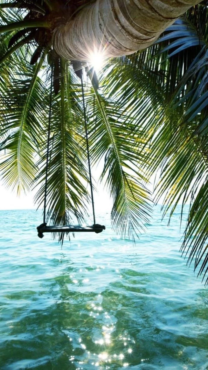
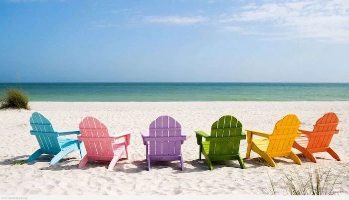
Compose for Your Icons: The Magic of Negative Space
This might be the most important tip for a functional wallpaper. Your screen isn’t a museum wall; it has to hold icons, folders, and widgets. A busy, cluttered photo makes it impossible to find anything. That’s where “negative space”—the empty or uncluttered parts of an image—comes in.
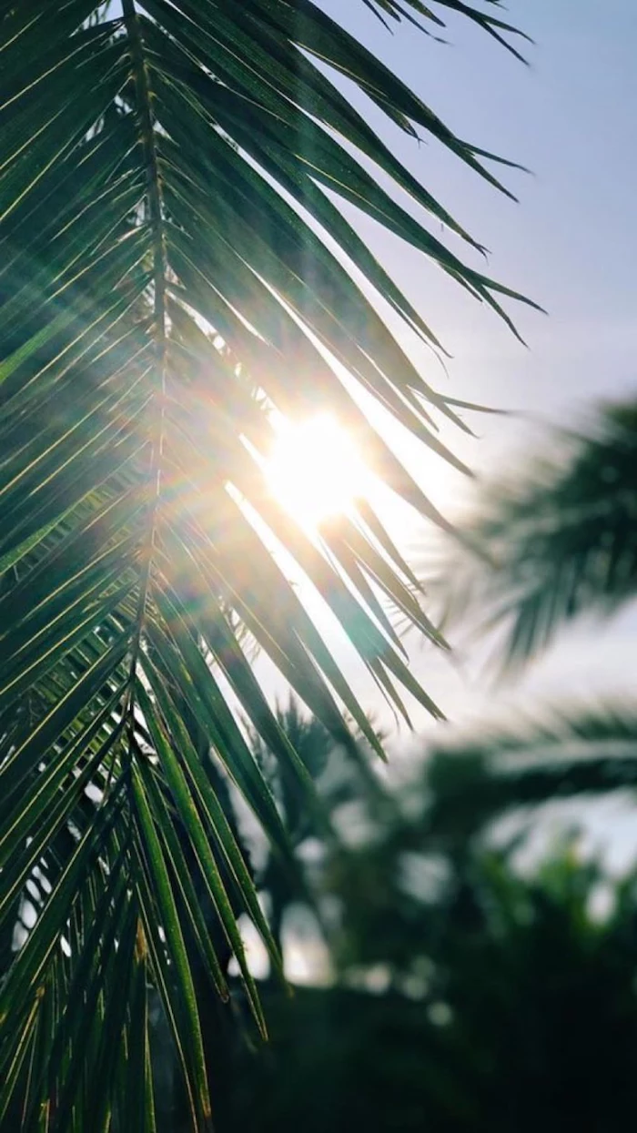
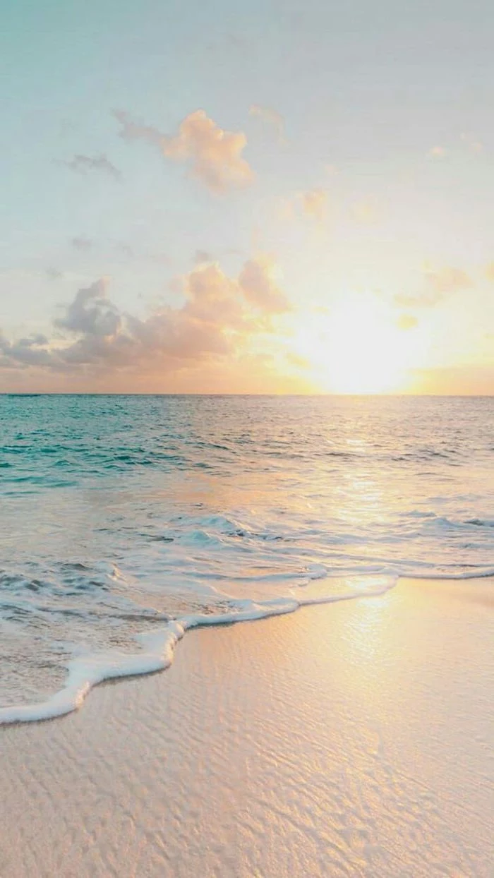
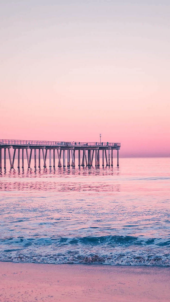
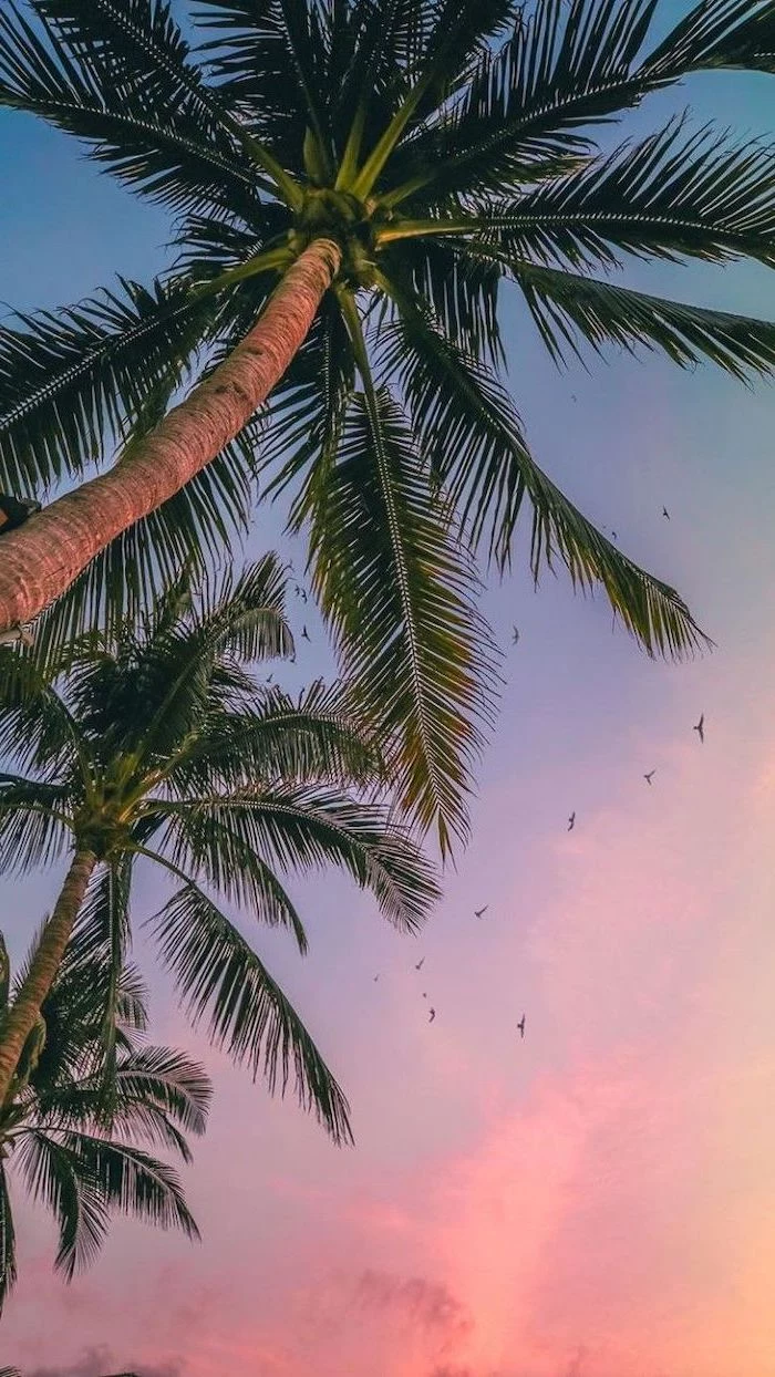
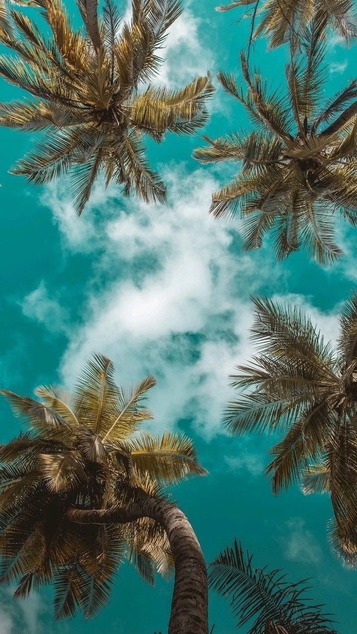
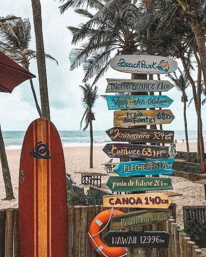
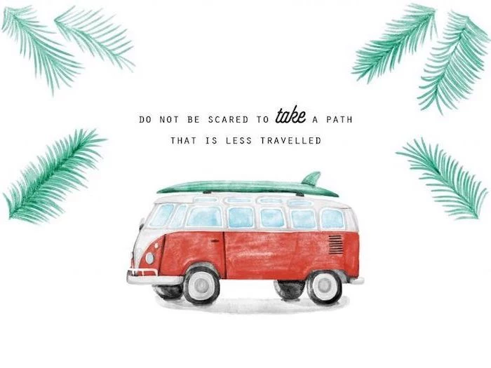
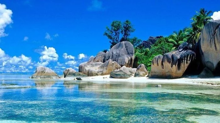
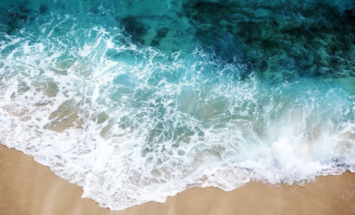
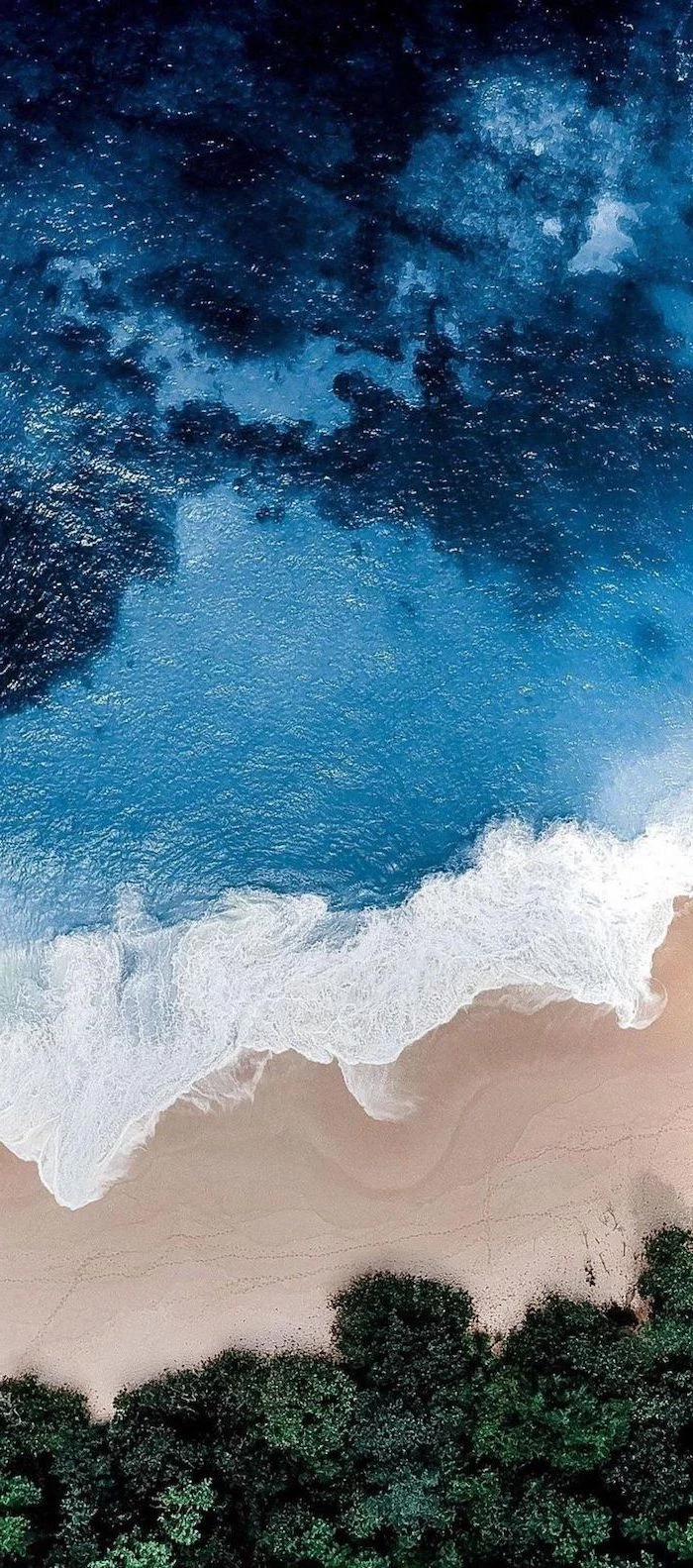
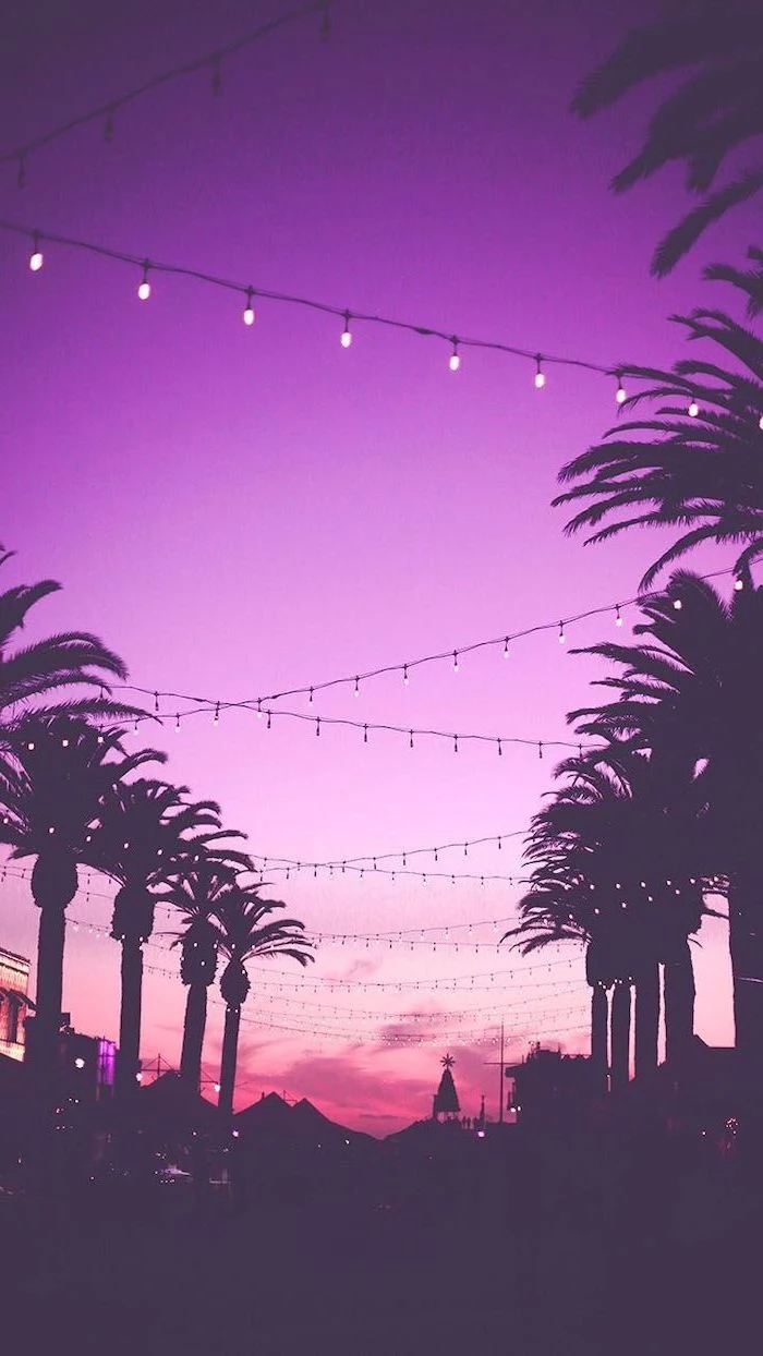
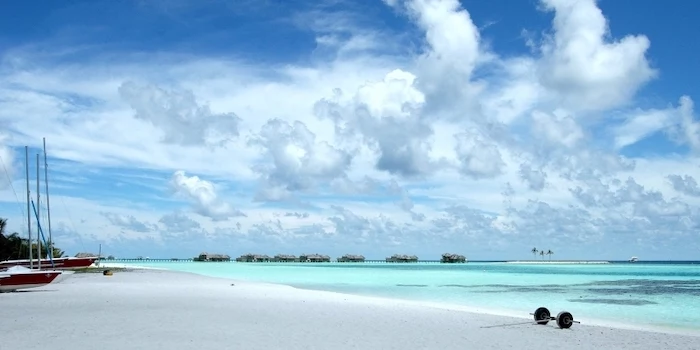
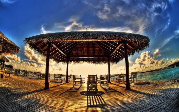
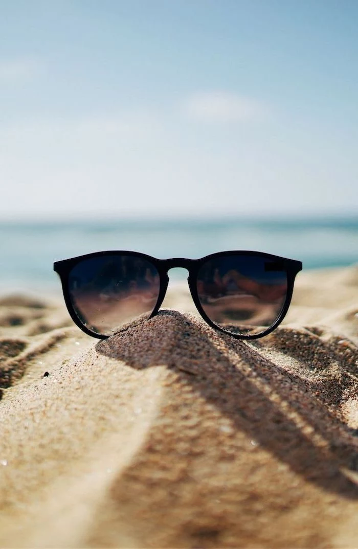
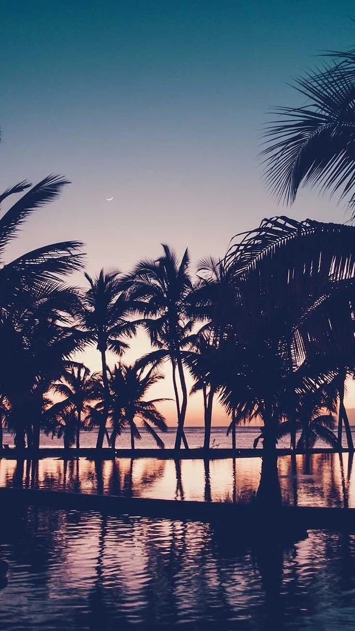
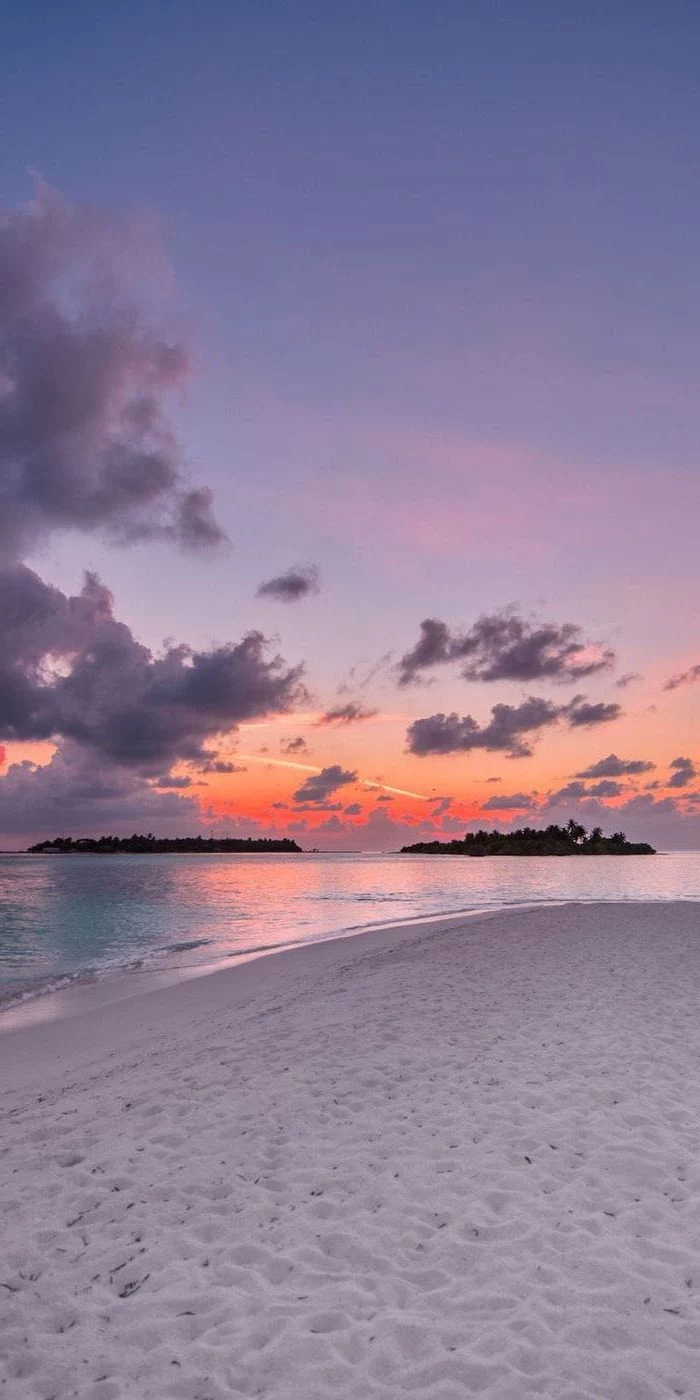
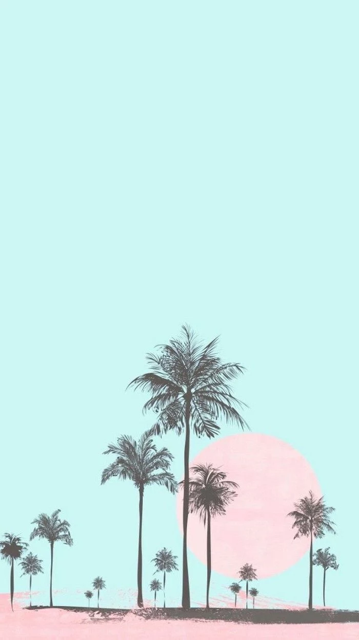
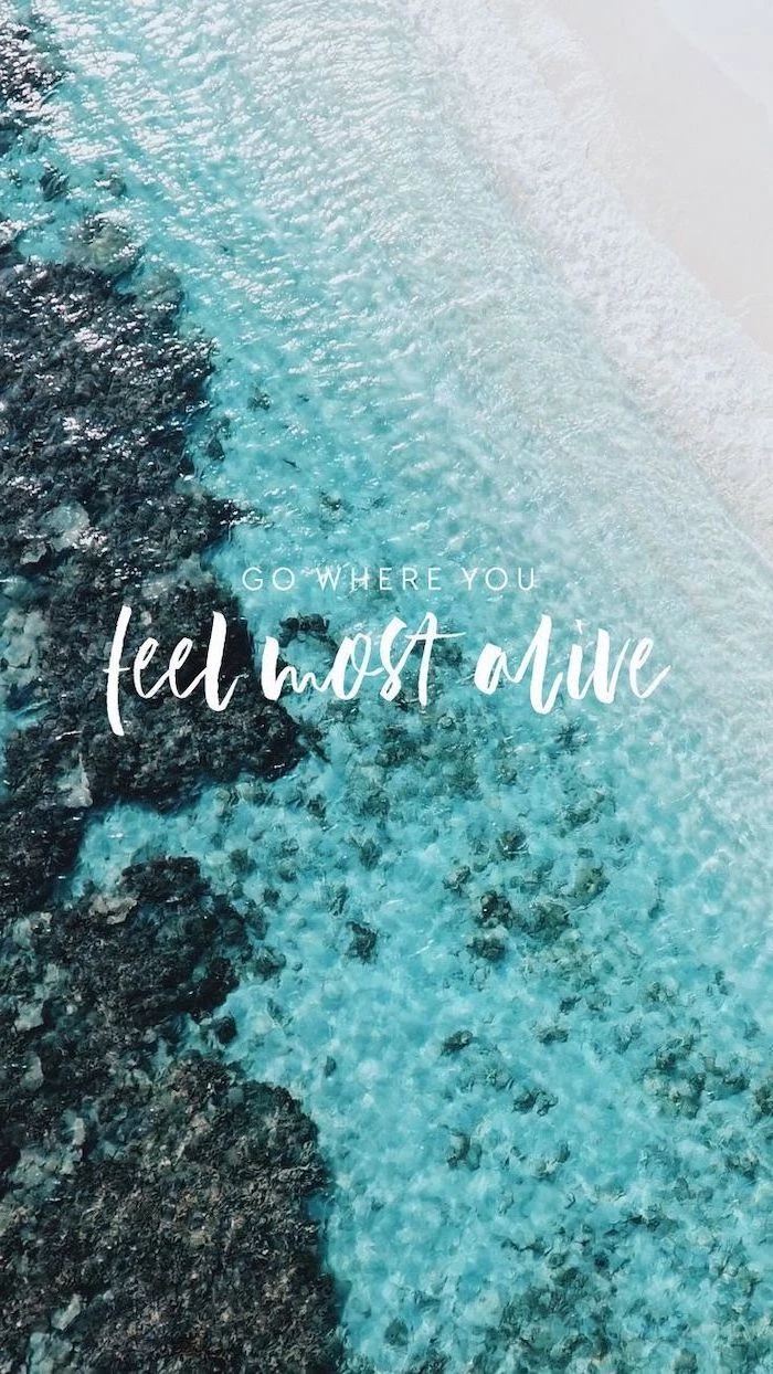
When I’m shooting a scene for a background, I intentionally place the subject off to one side. For example, I might frame a lone palm tree on the far right, leaving two-thirds of the image as a clean canvas of sand and sky. That open area is perfect for your desktop icons. A simple shot of the ocean horizon, placed on the top or bottom third of the frame, does the same thing. It gives your eyes a place to rest and your icons a place to live.
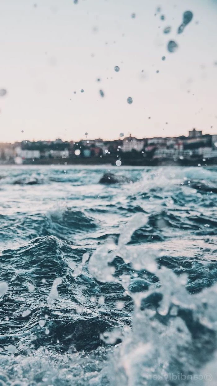
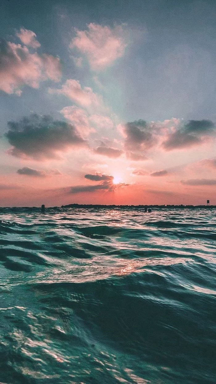
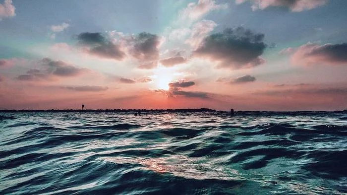
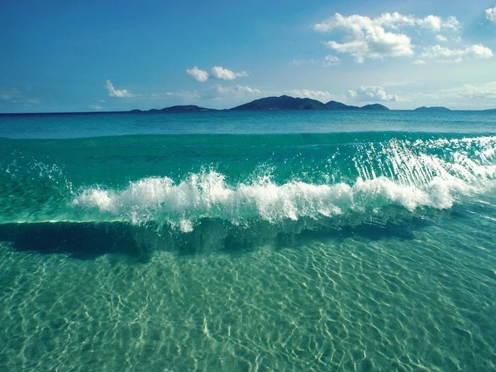
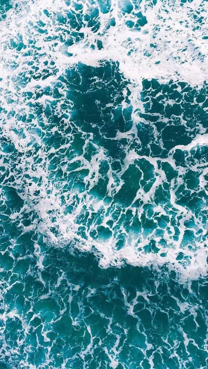
Taming the Light: Sunsets and Beaches
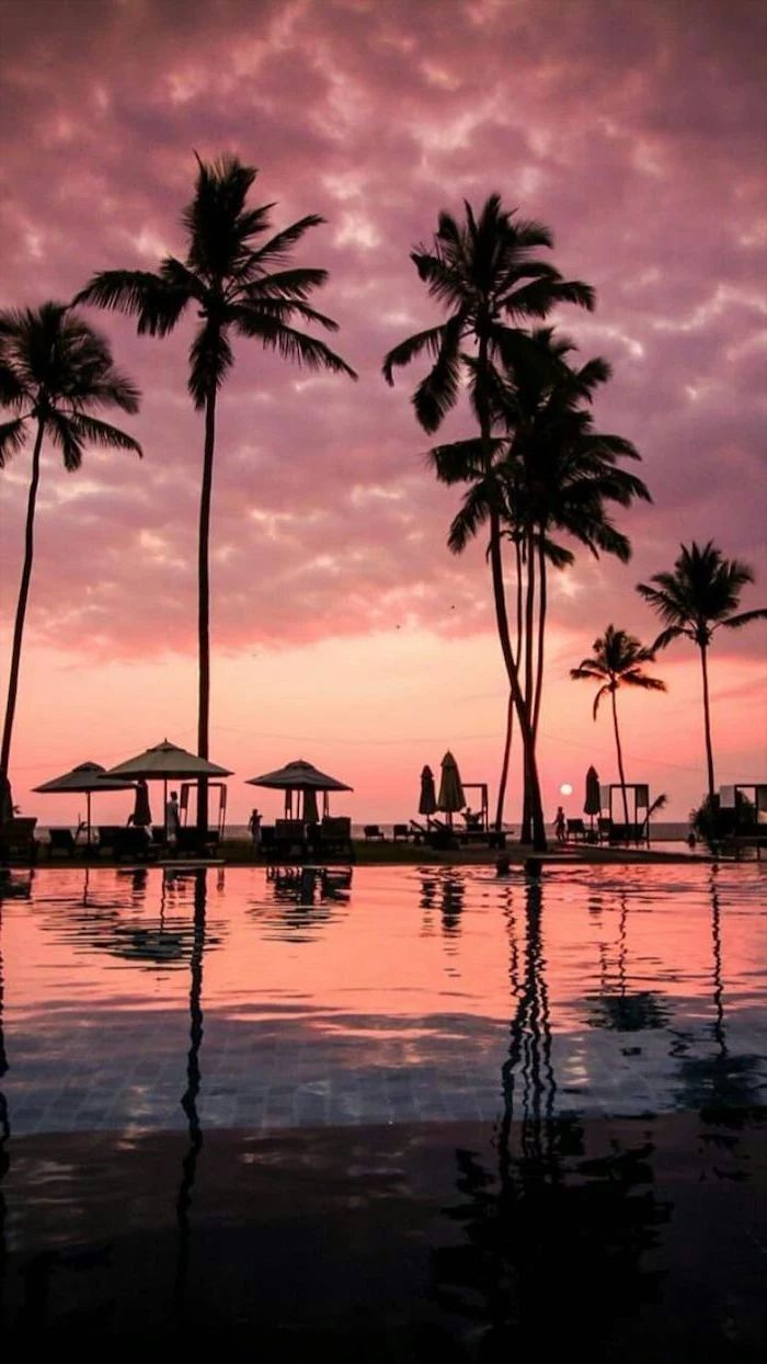
A sunset is tough to photograph. The sky is bright, but the ground is dark. An amateur photo often ends up with a beautiful sky and a black, featureless landscape, or a visible landscape with a totally white, “blown-out” sky. To fix this, pros use a technique called High Dynamic Range (HDR).
Basically, HDR combines multiple photos taken at different brightness levels into one perfectly exposed image. By the way, that “HDR” setting on your phone is doing a simplified version of this very thing! It’s why your phone’s sunset photos can sometimes look surprisingly great. The pro version just offers a lot more control, resulting in those incredibly rich and detailed sunset shots you see.
For bright, sunny beaches, the biggest enemies are glare and harsh shadows. A circular polarizing filter is a photographer’s secret weapon here. It’s like a pair of high-end sunglasses for the camera lens, cutting glare off the water and making the sky a deeper, richer blue. It’s a simple tool that makes a world of difference.
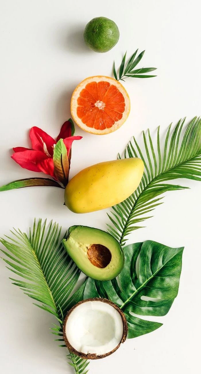
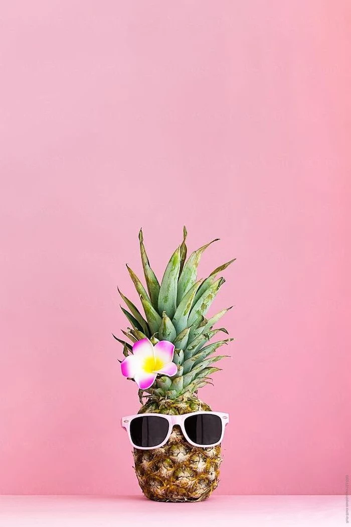
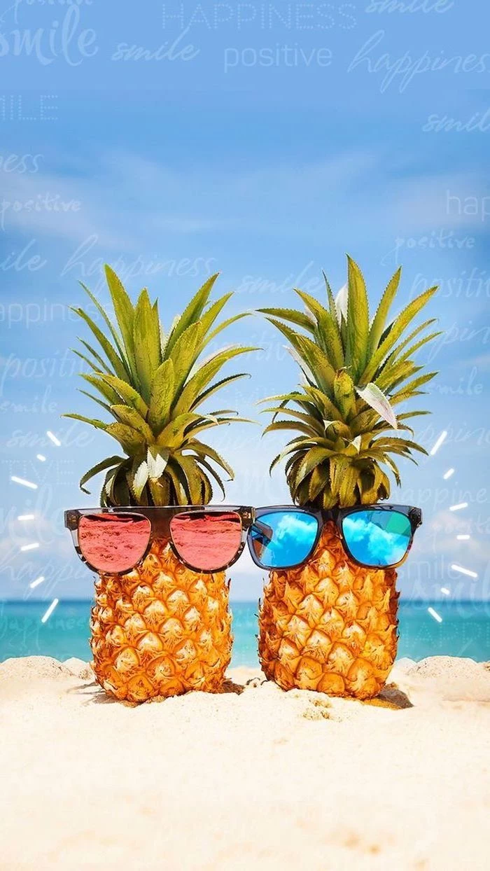
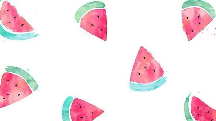
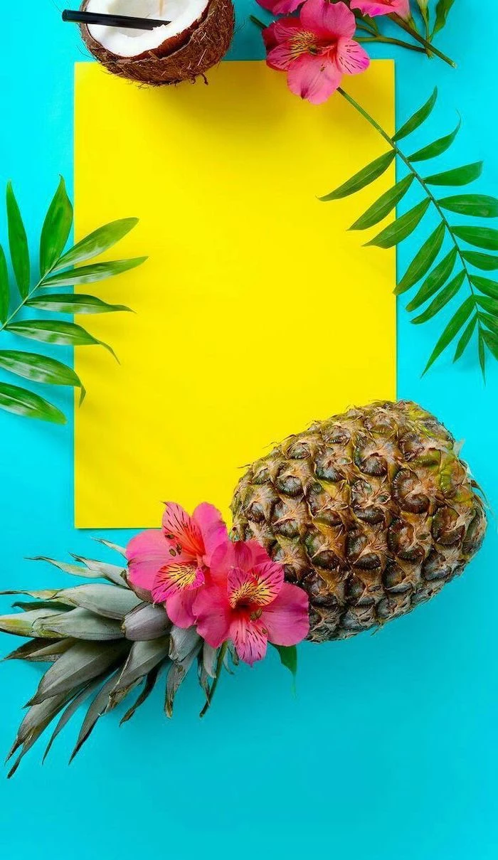
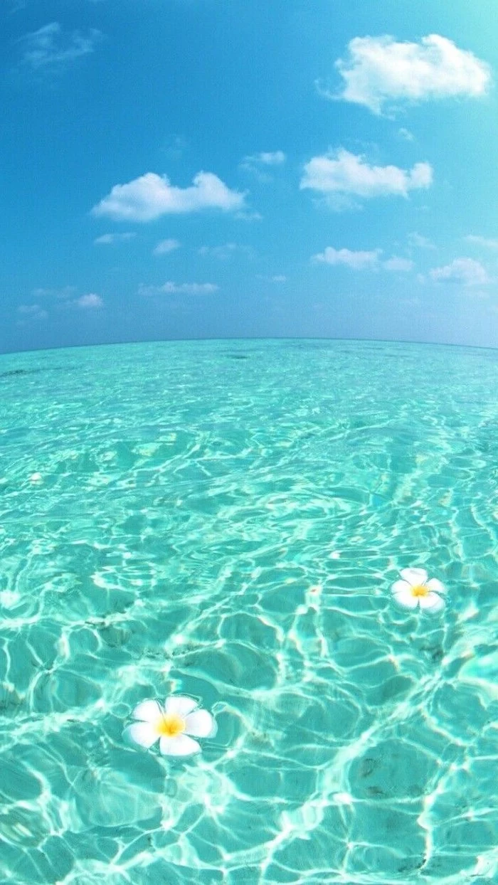
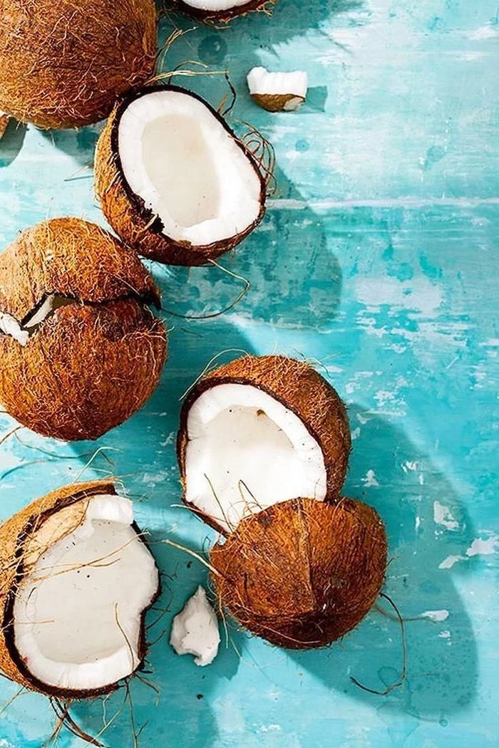
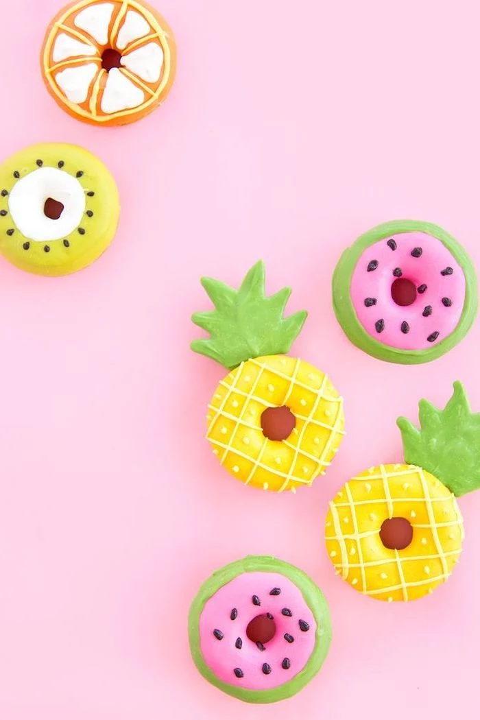
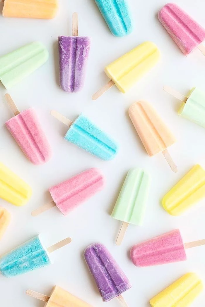
The Art of the Close-Up: Fruits and Flowers
Close-up shots of things like a slice of watermelon or a vibrant flower make for fantastic, simple wallpapers. The key technique is managing “depth of field,” which just means how much of the image is in focus. By using a shallow depth of field, you can keep your subject perfectly sharp while the background melts away into a soft, pleasing blur. Photographers call this beautiful blur “bokeh.” It naturally creates negative space and directs your eye right where it needs to go.
Where to Find a Great Wallpaper (and How to Tweak It)
You don’t need a fancy camera to get a beautiful wallpaper. You just need to know where to look and how to make a few quick adjustments.
First, the big no-no: Stop grabbing images from a generic web search. They’re often low-res, heavily compressed, and probably copyrighted. Here are much better options:
- Your Own Phone: Modern phone cameras are amazing. Use the gridlines feature to help you compose with negative space in mind. Go out during the golden hour for that beautiful, forgiving light.
- Free Stock Photo Sites: This is my top recommendation for most people. Websites like Unsplash, Pexels, and Pixabay are full of incredible photos shared by generous photographers. You can download high-resolution files for free. QUICK WIN: Don’t have time to read everything? Go to Unsplash.com, search for “minimalist landscape,” and filter the orientation to “landscape.” Download the largest size available. You’ll have a gorgeous, clean wallpaper in two minutes.
- Paid Stock Photo Sites: For my commercial work, I use paid services like Adobe Stock. The quality control is stricter and the selection is massive, but it’s overkill for personal use. A single image might cost you anywhere from $10 to $30.
- AI Image Generators: These tools can be fun for creating abstract or illustrative backgrounds. However, I find they often struggle with the authentic look of real light and texture. They’re a cool tool, but they’re not yet a replacement for real photography.
A Few Clicks to Perfection
Once you have a high-quality image, a few small edits can make it perfect. You don’t need Photoshop; a free online tool like Photopea or your computer’s built-in editor will do the trick.
- Crop It Right: This is essential. Your monitor is probably a 16:9 ratio, while your phone is much taller. Crop your image to match your screen’s aspect ratio. In a tool like Photopea, you can grab the crop tool and set a fixed ratio of 16:9, then position the box perfectly. This prevents stretching and distortion.
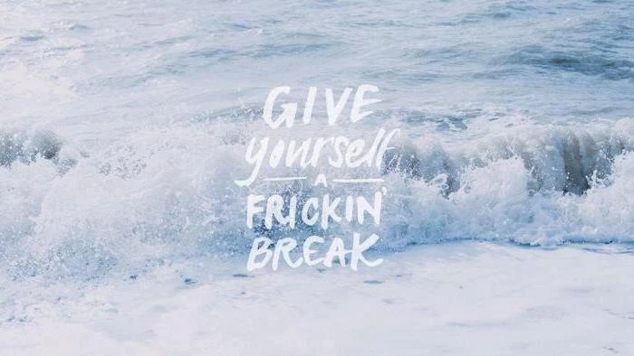
- Add a Little Pop: To enhance that “summer” feel, try bumping up the vibrance or saturation just a little. Vibrance is usually the better choice, as it smartly boosts muted colors without making skin tones look weird. A tiny boost in contrast can also help—try moving the slider just +5 or +10 to start. Less is more!
- Sharpen Gently: A final, light sharpening can add a touch of crispness. But be careful! Over-sharpening creates ugly halos around edges.
Some Common Wallpaper Mistakes to Avoid
I see these all the time, and they’re so easy to fix! Here are a few common pitfalls:
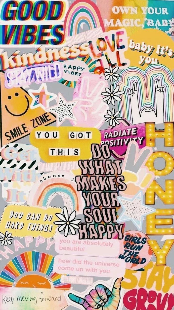
- The “Too Busy” Background: This is the classic mistake. If your wallpaper is a cluttered photo of a crowd or a complex pattern, your desktop icons will get lost. Look for that negative space!
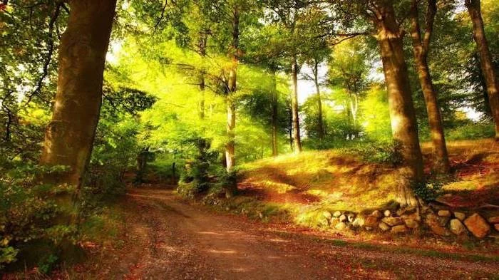
- Text is Impossible to Read: When your wallpaper has a mix of very light and very dark areas right where your icon text sits, it can become unreadable. A more uniform background—like a clear sky, a misty forest, or a sandy beach—is much more practical.
- The “Retina Burner”: A super bright, all-white, or neon wallpaper might look cool for a minute, but it can cause serious eye strain, especially at night. It’s often better to choose an image that’s a bit more mid-tone or has darker, calming elements.
Beyond a Static Image: Making Your Wallpaper Work for You
With modern computers, you can get creative and make your wallpaper a truly functional part of your workspace.
The Organizational Wallpaper
On my work machine, I use a wallpaper designed for productivity. It’s a simple, textured gray background divided into four quadrants with subtle labels: “To Do,” “In Progress,” “Waiting,” and “Done.” I literally drag my project files and folders across the screen as I work on them. It turns my desktop into a dead-simple project board. You can find templates for these online or make your own in minutes by adding text to a clean image.
Animated & Live Wallpapers
A looping video of gentle ocean waves can be incredibly calming. But here’s the trade-off: animated wallpapers eat up more processing power and battery life. I’d never use one on a laptop unless it was plugged in. For Windows users, a program called Wallpaper Engine (available on the Steam store) is a great, safe option with a massive library and good performance controls.
Heads up! Only download this kind of software from reputable places. Unofficial wallpaper installers are a classic way that people accidentally get malware on their computers.
Multi-Monitor Magic
Got two or more monitors? You have a huge canvas! You could use two complementary images, or you can use a single panoramic photo that stretches across both screens. To do this, you’ll need a very high-resolution panorama. In Windows, you can usually set this up in Settings> Personalization> Background. Look for the dropdown menu called “Choose a fit” and select “Span.” It can look absolutely epic.
A Final Word on Safety and Respect
As a pro, I have to be really careful about this stuff, and I think it’s important for everyone to know the basics.
Using a random image you found on the internet for your personal wallpaper is pretty low-risk, let’s be honest. But technically, it’s often copyright infringement. The moment you use that image for something public—a blog post, a social media banner, a presentation—you absolutely must have the legal right to use it. That’s why I recommend sites like Unsplash, which have clear licensing terms. It’s about respecting the person who created the work.
And please, never, ever download a wallpaper that comes as a program file (.exe). A wallpaper is an image (like a JPEG or PNG). Anything that asks you to “install” a static picture is deeply suspicious. Just save the image and set it as your background through your computer’s settings. It’s the safest way.
Your digital wallpaper is a small detail, but it’s a meaningful one. By putting a little intention into it, you can turn your screen from a chaotic mess into a space that’s beautiful, functional, and genuinely pleasant to look at. It’s a small change that can bring a surprising amount of clarity to your day.
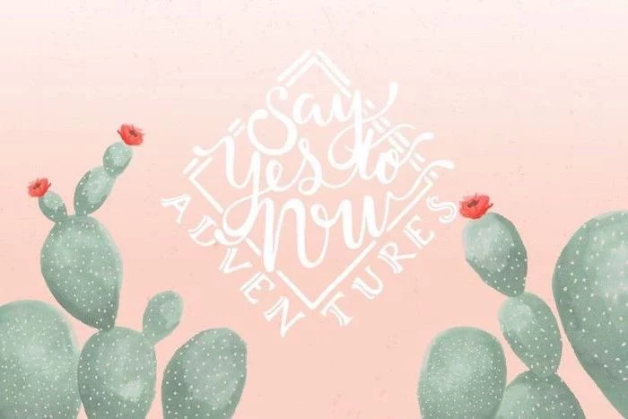
Inspiration Gallery
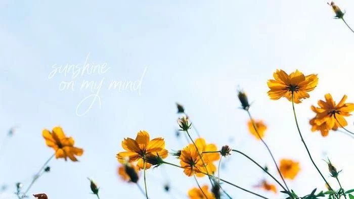
Consider rotating your wallpaper with the seasons. A sun-drenched beach from Unsplash feels perfect in July, but a crisp, moody photo of a misty forest might better suit the reflective mood of November. This simple change helps keep your digital space feeling current and aligned with your real-world environment, preventing visual fatigue.
- Clarity: Icons and text remain perfectly legible.
- Calm: Your mind isn’t fighting to process a visually noisy background.
- Focus: Key work windows stand out instead of blending in.
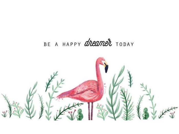
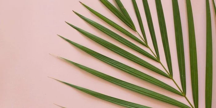
The secret? Choosing wallpapers with significant “negative space.” Look for minimalist compositions, open skies, or gentle gradients where you can comfortably place your desktop icons without a fight.
More than 1.7 billion devices run on Windows. A vast majority of them use the default wallpaper.
Choosing a custom wallpaper is one of the simplest and most effective ways to make your digital workspace truly your own. It’s a small act of personalization that separates your screen from the millions of identical defaults, instantly creating a more personal and less corporate feel.
Where can I find genuinely high-resolution wallpapers for free?
Go beyond a simple Google search. Curated platforms are your best bet for quality. Unsplash offers artistic, professional-grade photography perfect for aesthetic setups. Pexels is another fantastic source with a massive library of both photos and videos. For more niche, artistic, and abstract digital creations, check out Wallhaven.cc, a favorite among enthusiasts.
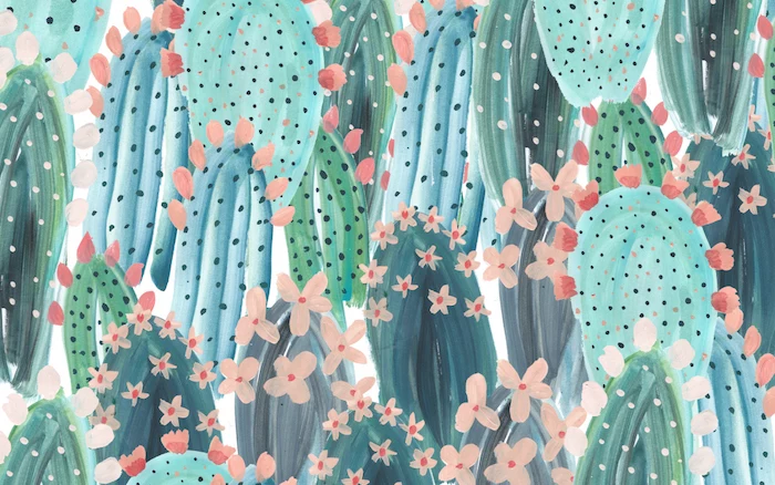
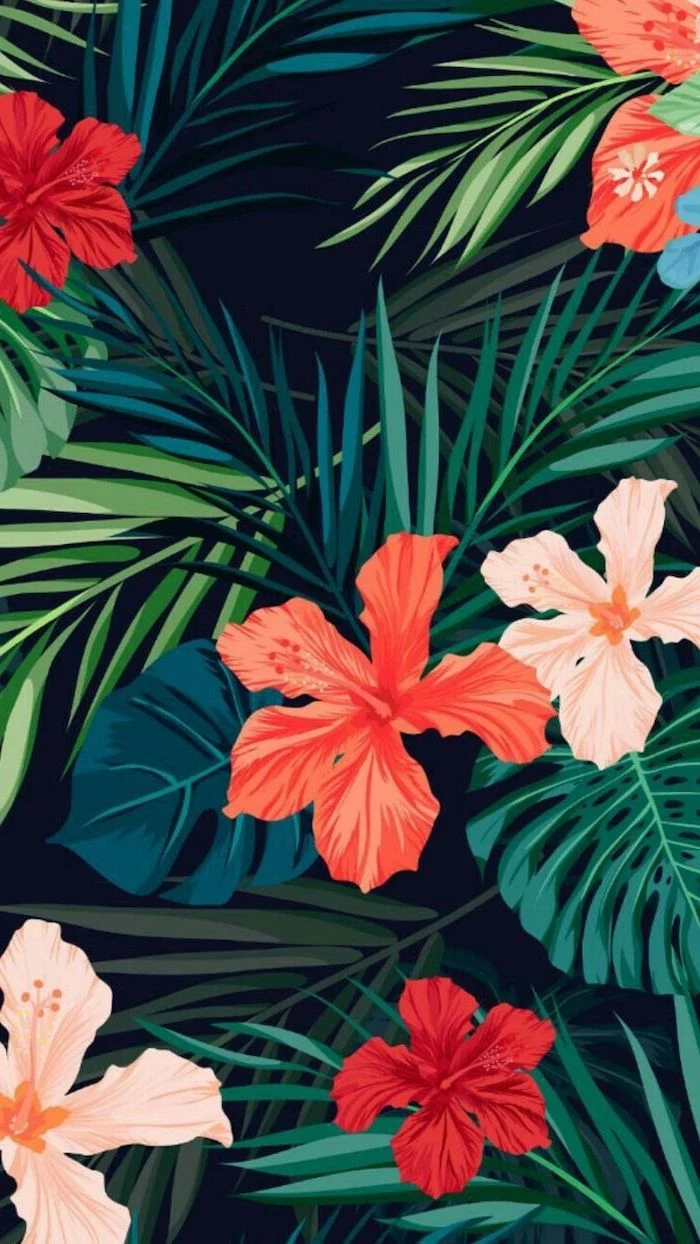
A busy photograph: A vibrant market scene or a detailed cityscape can feel inspiring at first, but quickly becomes a chaotic backdrop that visually swallows your icons and folders.
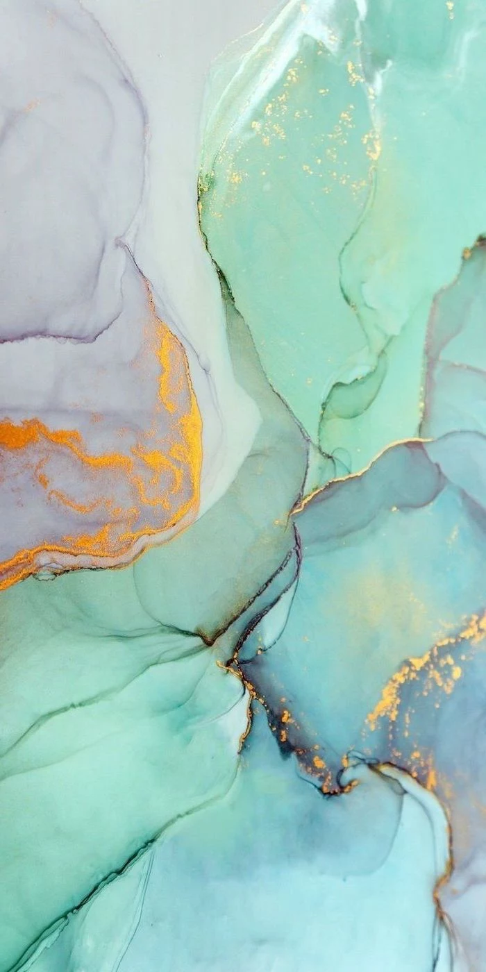
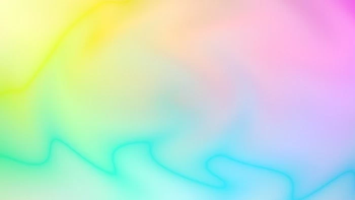
An abstract gradient: A simple, soft-focus blend of two or three colors provides a touch of personality and mood without competing for attention. It’s the perfect canvas for an organized desktop.
For daily work, the abstract gradient almost always wins for usability and long-term visual comfort.
Don’t neglect your phone! The principles of a good desktop background apply just as much to your lock screen—it’s the first digital image you see dozens of times a day. Choose something that makes you smile, calms you down, or reminds you of a goal. Apps like Vellum for iOS or Backdrops for Android offer daily curated selections that are perfectly formatted for mobile screens.
- Create a new design in Canva, setting the custom dimensions to match your screen’s resolution (e.g., 1920 x 1080).
- Choose a simple background color or a subtle photo.
- Use the text tool to add a favorite quote or a simple reminder like


According to color psychology, blue is often associated with productivity and focus, while green can evoke a sense of calm and balance.

Embrace the trend of ‘Aura Gradients.’ These are soft, out-of-focus fields of color that evoke a sense of calm energy. Unlike a sharp photograph, their blurry nature means desktop icons always stand out clearly. They add a sophisticated pop of color without creating visual clutter, making them ideal for anyone seeking a mindful and focused digital environment.


I have two monitors with different resolutions. How do I set a wallpaper that looks good on both?
The best approach is to find an ultra-high-resolution image (at least 4K, or 3840×2160) and set your desktop background setting to


One common mistake: Forgetting about Dark Mode. A wallpaper that looks stunning with your system in Light Mode might be jarringly bright or have poor contrast when you switch to Dark Mode. When choosing, toggle between modes to find an image that complements both, like a moody landscape or a black-and-white photo.

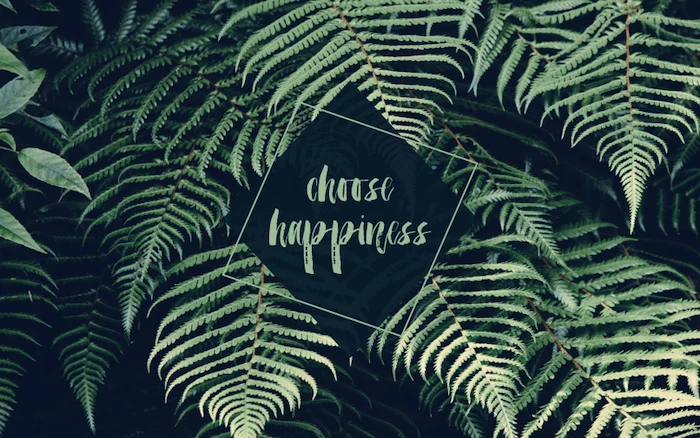
The Japanese aesthetic of Wabi-Sabi celebrates the beauty of imperfection and simplicity. Applied to your desktop, this means skipping the flawless, airbrushed stock photos. Instead, try a wallpaper of weathered wood texture, a crinkled piece of paper, a landscape on a cloudy day, or a simple, hand-drawn line. It creates a space that feels organic, calm, and grounded.
- For creative work: A bold, abstract, or inspiring image can spark ideas. Think gallery art or a still from a visually stunning film like those by Wes Anderson.
- For analytical work: A minimal, low-key background is best. A simple texture, a solid color, or a subtle gradient will help you focus on data and text without distraction.
A study on the

Static Wallpaper: A single, unchanging image. It’s memory-friendly and provides a stable, predictable backdrop for your work.
Dynamic Wallpaper: An image or scene that changes based on the time of day. macOS offers several beautiful options, subtly shifting from a sunlit desert at noon to a starry sky at night.
Dynamic wallpapers offer a beautiful, ambient experience that connects your screen to the passage of time without the performance drain of a full-on video loop.
Your own photos carry an emotional resonance that no stock image can replicate. Even if it’s not technically perfect, that photo from a favorite vacation or a candid shot of a pet can provide a genuine micro-lift every time you minimize a window. Pro tip: Use a simple photo editor like Google Photos or VSCO to crop it to your screen’s aspect ratio and give it a touch of polish.


Can I create a unique wallpaper with AI?
Absolutely. AI image generators are perfect for this. Using a tool like Midjourney or DALL-E, you can create something no one else has. Try a simple prompt like:

The ‘Rule of Thirds’ isn’t just for photography; it’s a powerful tool for desktop organization.
Imagine a 3×3 grid over your wallpaper. Choose an image where the main subject is off to one side, leaving two-thirds of the screen relatively open. Place your most-used icons and files in this empty space. This creates a balanced, professional-looking composition and makes everything easier to find.


Looking for an edgier aesthetic? Consider architectural photography. A high-contrast, black-and-white shot of a Brutalist building or a close-up of modern facade details can make for a sophisticated and powerful background. It projects a sense of structure and design without being overly personal or distracting.

- Unsplash: Best for high-art photography with a modern, clean aesthetic.
- Pexels: Great all-rounder with a huge variety of high-quality photos and videos.
- ArtStation: The go-to for fantasy, sci-fi, and concept art from professional digital artists.
- Simple Desktops: Offers a curated collection of beautiful, minimalist patterns and illustrations.


Important note on performance: While live wallpapers featuring moving video or complex animations look impressive, they consume more CPU and RAM resources than a static image. If you notice your computer slowing down, especially on an older machine, switching back to a high-quality static PNG or JPG is an easy first step in troubleshooting.

A great wallpaper can be the foundation of a complete desktop theme. Pair a moody, rain-swept Tokyo street photo with a custom Rainmeter skin that shows the time and weather in a neon font. Or, match a cozy cottage interior wallpaper with custom folder icons that look like little books. It’s a fun way to fully immerse yourself in a specific vibe.
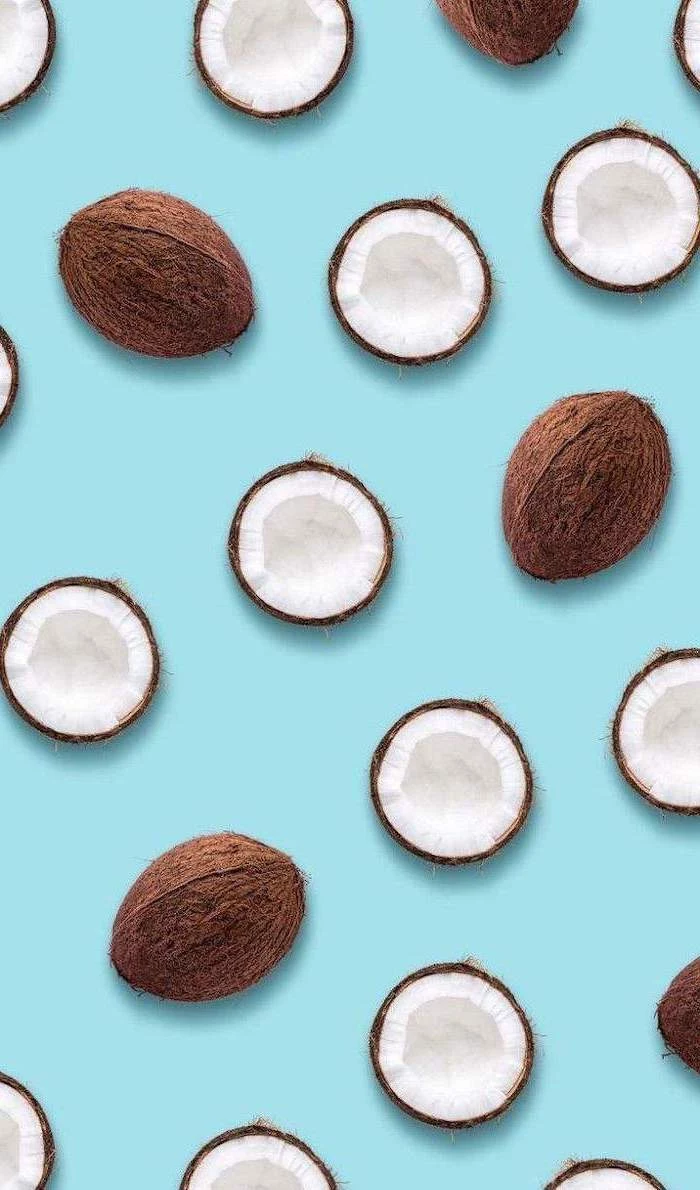
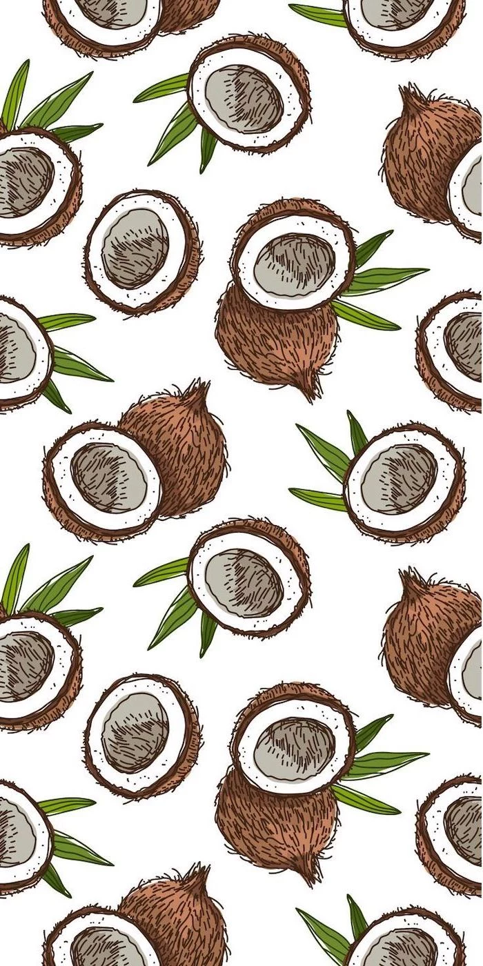
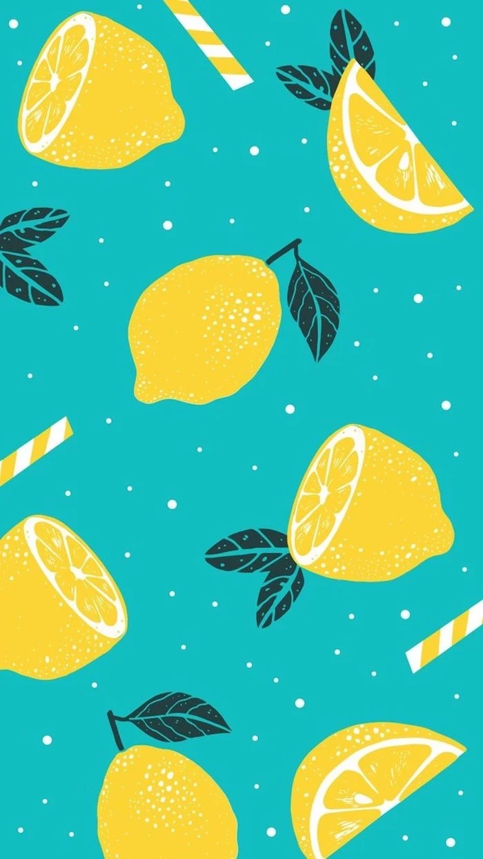
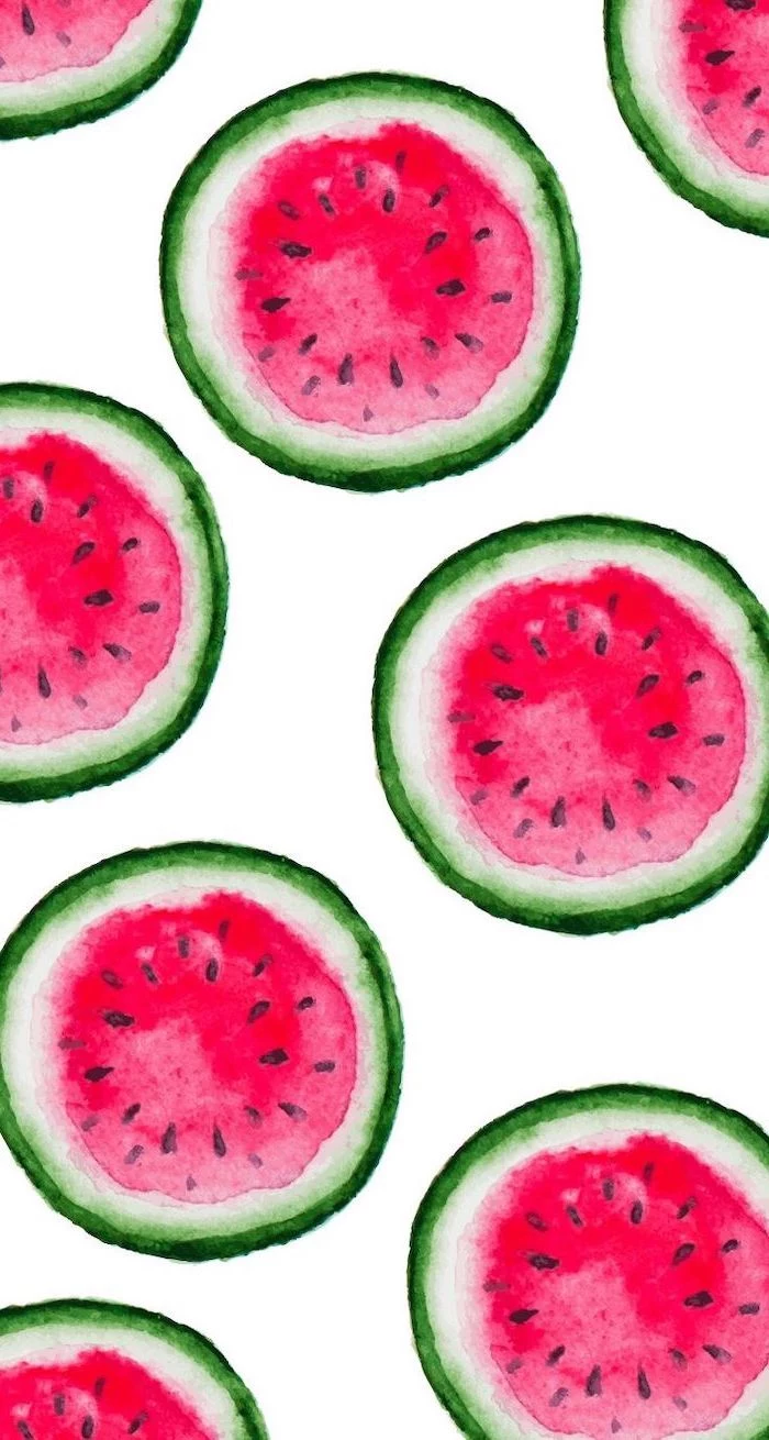
Think in patterns. A repeating pattern can be less distracting than a single, focal-point photograph.
Websites like Hero Patterns or even simple design tools allow you to create subtle, seamless patterns. A simple geometric design or a texture like linen or paper can add a touch of sophistication and depth to your screen without ever competing with your work.
What about a totally black or white wallpaper?
Don’t underestimate the power of monochrome. A pure black background (#000000) on an OLED screen is incredibly energy-efficient, as the pixels are simply turned off. It provides maximum contrast for icons and text. A pure white or light grey background offers a clean, airy, ‘blank slate’ feel that many minimalists prefer for ultimate focus.
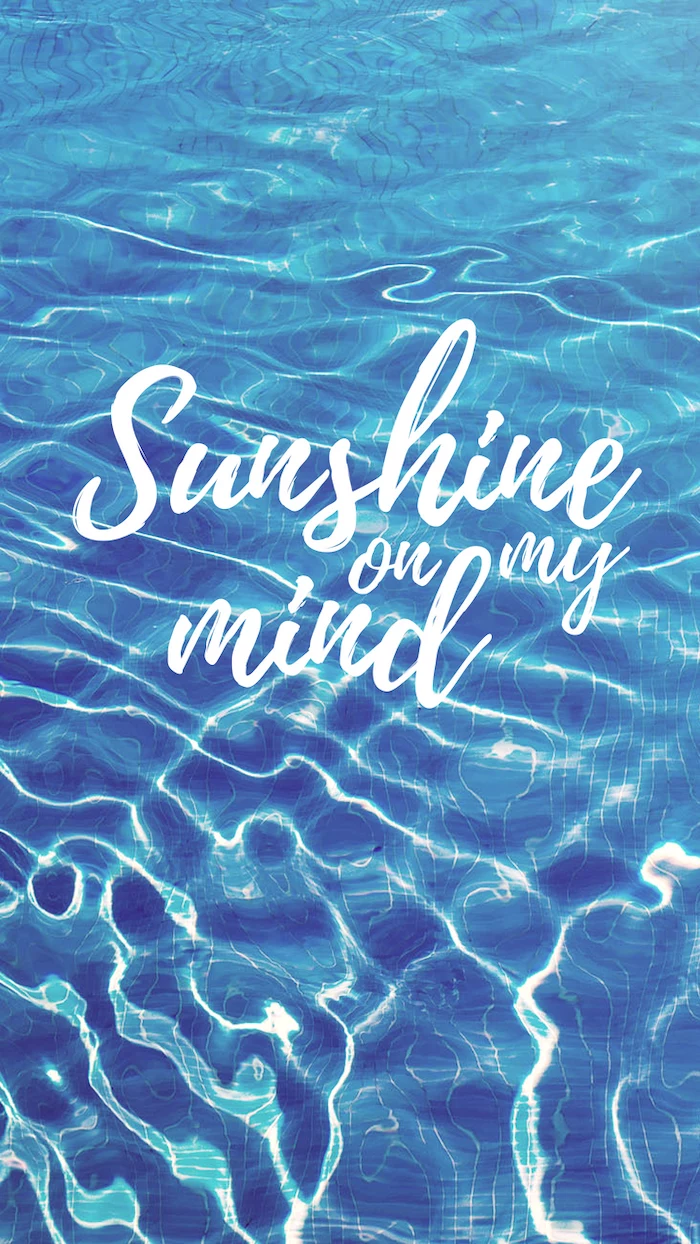
The typography on your wallpaper sends a message. A bold, sans-serif word like