Your Wallpaper Is More Important Than You Think—Here’s How to Fix It
I’ve been swimming in the world of digital design for what feels like a lifetime. I’ve gone from designing for chunky CRT monitors with their limited color palettes to the incredible high-resolution screens we have today. And you know what? After all this time, one thing hasn’t changed: most people choose wallpapers that actively work against them.
In this article
It sounds dramatic, I know. But it’s true. We just find a pretty picture online and slap it on our screen without a second thought. But that “pretty picture” can make your phone feel sluggish, hide your icons, and even contribute to eye strain. This isn’t just about decoration; it’s about setting up a digital workspace that’s a pleasure to use.
So, let’s go beyond just picking a photo. I’m going to walk you through how to choose and prepare a screen background with the eye of a pro, making your devices faster, cleaner, and way more enjoyable to look at.
First Things First: Understand Your Screen
Before you even think about an image, you have to understand the canvas it’s going on. Your screen is a technical piece of hardware, and ignoring its basic properties is the number one mistake people make. It’s the reason you get blurry, stretched-out images and, believe it or not, can even affect your battery life.
Resolution: The Key to a Crisp Image
Resolution is just a fancy word for the number of pixels on your screen, measured as width x height (like 1920 x 1080). If you use an image that’s smaller than your screen’s resolution, your device has to stretch it to fit. The result? A blurry, pixelated mess.
Here’s a quick rundown of common resolutions, from older to newer standards:
- HD: 1280 x 720 pixels
- FHD (Full HD): 1920 x 1080 pixels (Super common for laptops)
- QHD (Quad HD): 2560 x 1440 pixels (Often on gaming monitors and newer phones)
- 4K UHD (Ultra HD): 3840 x 2160 pixels (The standard for modern TVs and high-end monitors)
Quick Tip: Always, always, always use an image with a resolution that’s the same as, or bigger than, your screen’s. You can always shrink a big image without losing quality, but you can’t magically add detail to a small one.
How to find your resolution? On a Windows PC or Mac, just right-click your desktop and head to “Display Settings.” For your phone, it’s even easier: just Google your phone’s model name followed by “screen resolution” (e.g., “Pixel 8 Pro screen resolution”). You’ll get the exact numbers you need in seconds.
Aspect Ratio: Getting the Shape Right
Aspect ratio is simply the shape of your screen. A typical monitor is a 16:9 rectangle. Your phone, however, is a much taller and skinnier rectangle, maybe 19.5:9 or even 20:9. This is why that amazing landscape photo from your desktop looks so weird and cropped on your phone. To make it fit, your phone has to either chop off the sides or add ugly black bars.
When searching for a wallpaper, especially for your phone, try to find one that already matches this shape. It makes a huge difference.
Finding and Prepping Your Images Like a Pro
Okay, so you know your screen’s stats. Now for the fun part: finding the perfect image. Please, I’m begging you, step away from a generic image search. It’s a minefield of low-quality, copyrighted pictures that will only cause you headaches.
Where the Pros Actually Look
When I need an image, I have a few go-to spots that never let me down.
- High-Quality Free Sites: Websites like Unsplash, Pexels, and Pixabay are fantastic. They’re full of stunning, high-resolution photos from generous photographers, and they’re free for personal use.
- Digital Art Hubs: For illustrations and abstract art, I love browsing communities for digital artists. You can find some mind-blowing work there. Just be sure to check if the artist allows downloads, as many pieces are just for their portfolio.
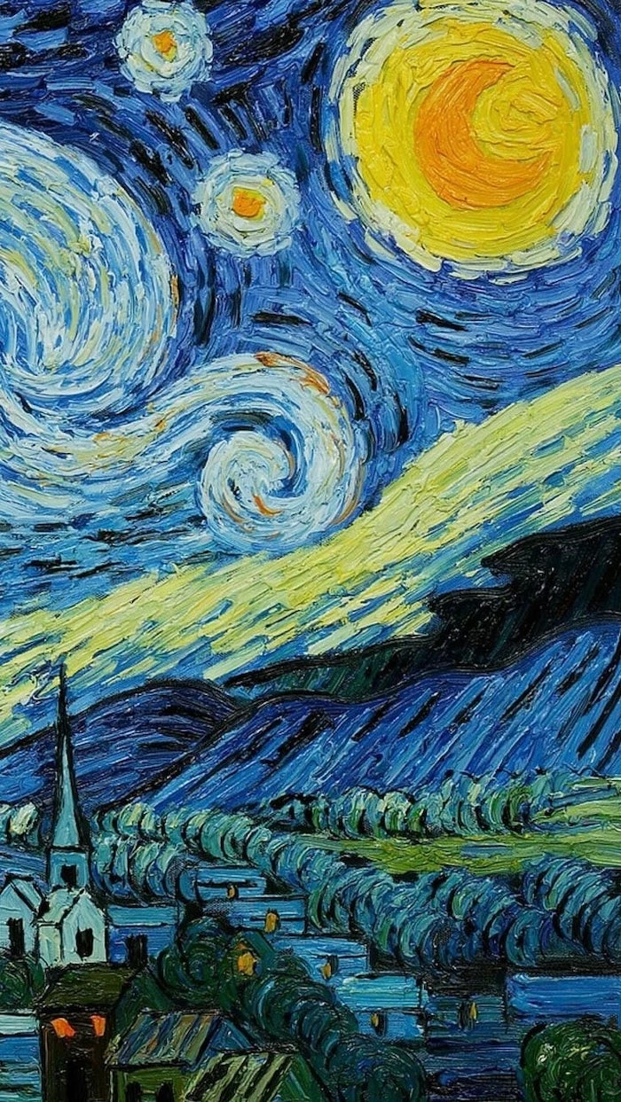
- Museum Collections: This is my favorite secret weapon. Many of the world’s top art museums have put their collections online. You can find incredible public domain artwork—from classic oil paintings to stunning Japanese woodblock prints—in ridiculously high resolution. It’s all perfectly legal to use.
A quick word on trust: I once had a client who grabbed a cool sci-fi image from some random blog for their website. A month later, a cease-and-desist letter arrived from the artist’s lawyer. It was a stressful and costly lesson. Stick to sources with clear licenses to save yourself the trouble.
The 5-Minute Pro Workflow
Don’t just download and set. Taking a few minutes to prep the image is the secret to a perfect fit. And don’t worry, this sounds technical, but it takes less than five minutes once you get the hang of it. You can use a free online tool like Photopea (it runs right in your browser) or a simple desktop program like GIMP.
Let’s do a quick one together. I found a great public domain photo I want to use for my phone, which has a resolution of 1179 x 2556 pixels.
- Start Big: The original photo is huge, over 6000 pixels wide. Perfect.
- Crop to Shape: I open it in Photopea. I grab the Crop Tool and, at the top, I enter my phone’s resolution (1179 x 2556) into the dimension boxes. Now I can drag the crop box around to frame the exact part of the image I want, ensuring nothing important gets cut off.
- Resize to Fit: After cropping, the image is the right shape but still massive. I go to Image> Image Size and change the dimensions to my exact screen resolution. This makes the file size much smaller.
- Save Smart: I export the final image as a JPEG, usually at around 80-90% quality. The goal is a crisp image that’s under 1-2 MB for a phone. It’ll load instantly and won’t waste system resources.
By the way, when you’re saving, what’s the deal with JPEG vs. PNG? Honestly, for a photographic wallpaper, a high-quality JPEG is almost always your best bet. It strikes a great balance between quality and small file size. PNG files are “lossless,” which is great for graphics with sharp lines or transparency, but they create much larger files that can use more memory on older devices.
The Art of a Truly Great Background
A great wallpaper isn’t just technically sound; it’s also easy on the eyes and, more importantly, easy on the brain. In UI design, we talk about “cognitive load”—the amount of mental effort it takes to use something. A busy, chaotic wallpaper increases that load every time you unlock your phone.
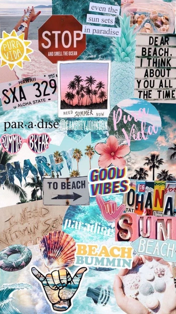
Picture this: a screen with a background photo of a dense, leafy forest. The icons are scattered all over it, and the white text labels for each app are almost impossible to read against the complex green and brown patterns. Your brain has to work overtime just to find the app you’re looking for.
Now, imagine another screen. The background is a soft, deep blue gradient with a subtle texture. The icons pop against it, and the labels are perfectly legible. It feels calm, organized, and effortless. That’s what we’re aiming for.
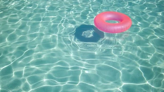
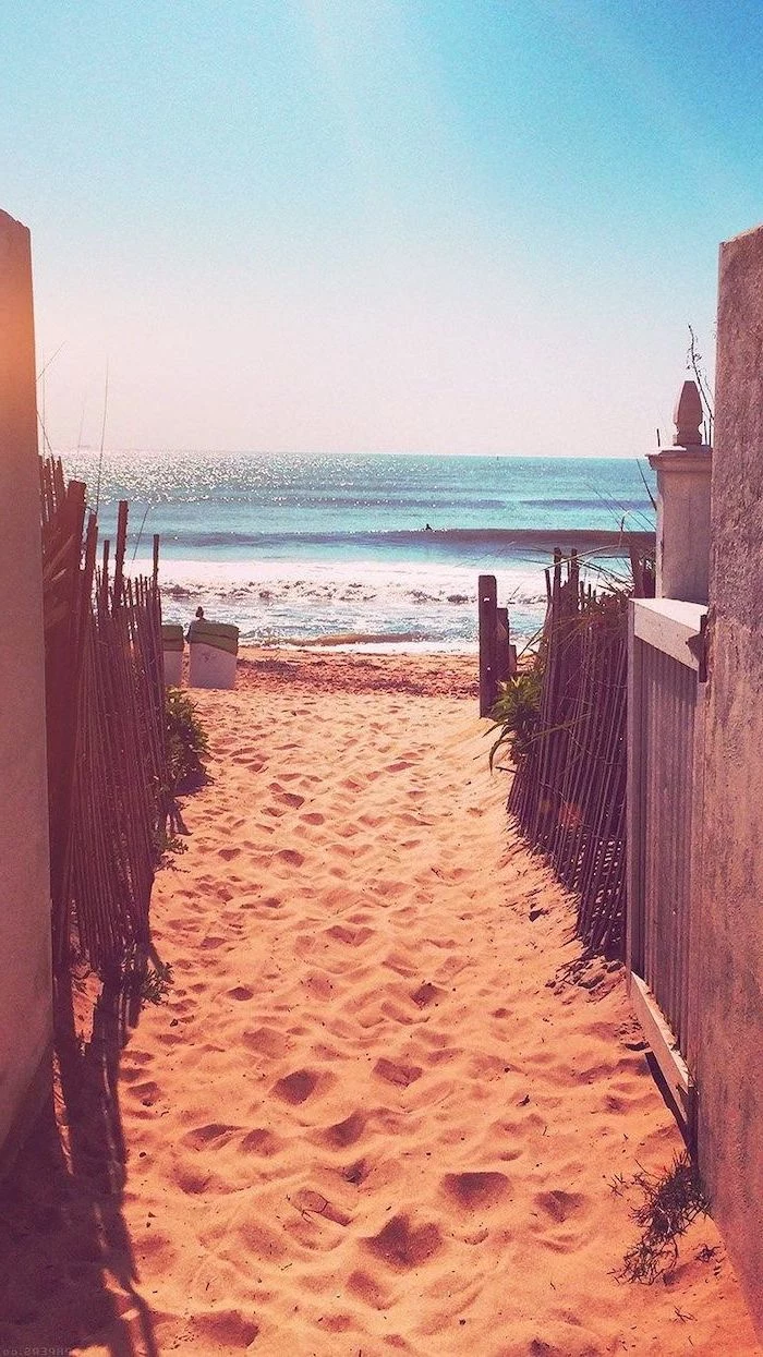
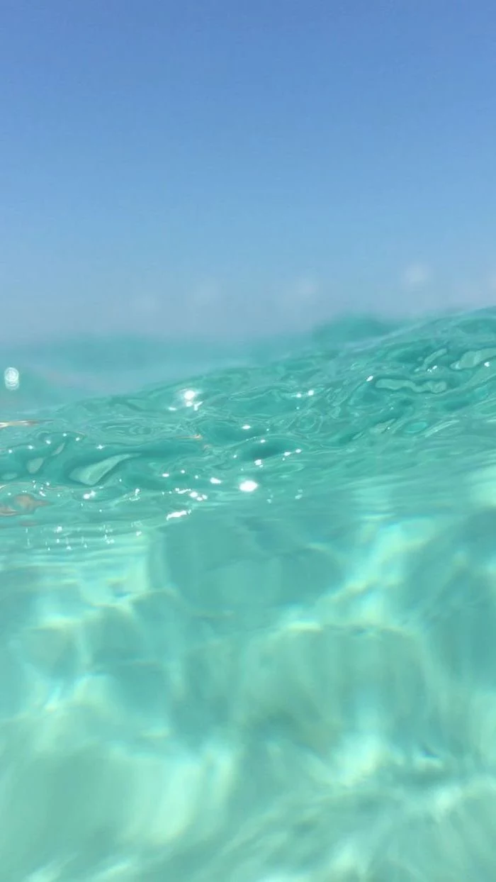
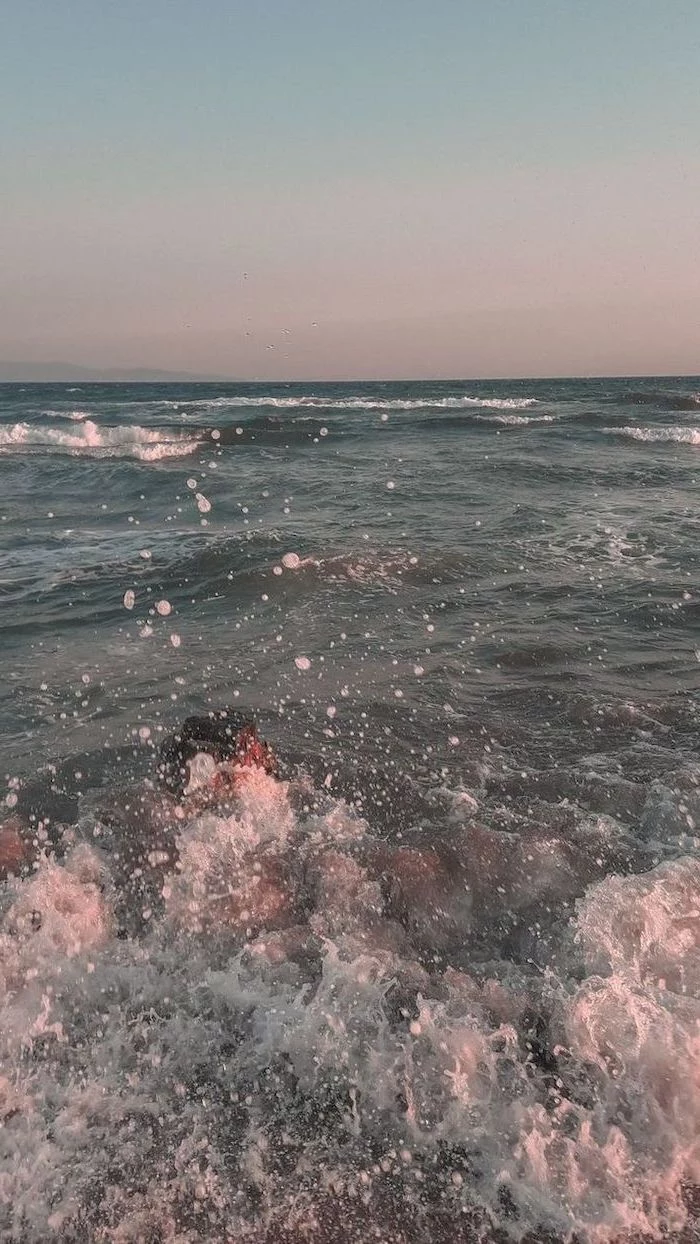
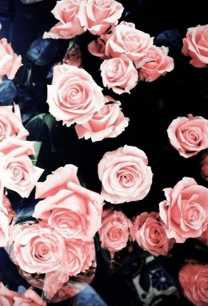
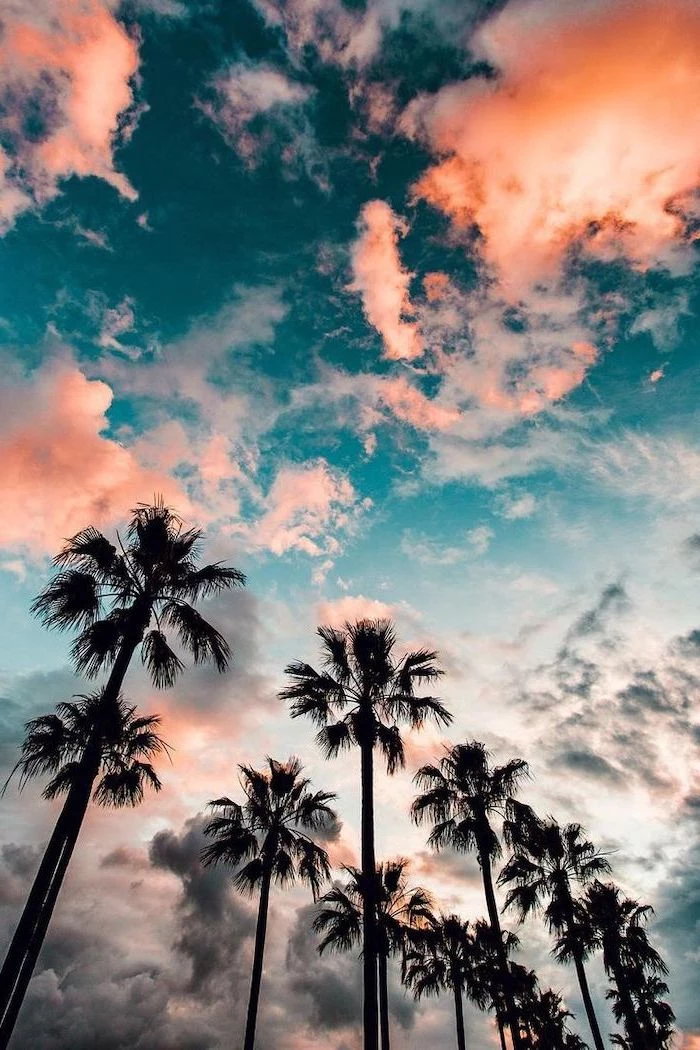
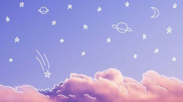
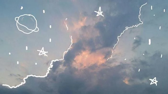
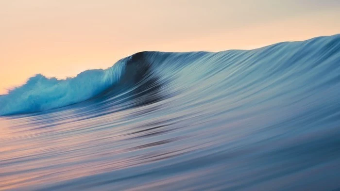
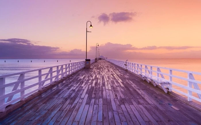
The best wallpapers have areas of “negative space”—open, uncluttered spots. Think of a beautiful beach photo with a huge expanse of clear sky. You can put all your icons in the sky, leaving the beach as a nice visual anchor. This makes your layout both beautiful and functional.
Instant Upgrade Challenge: Go to Unsplash right now and search for “subtle texture” or “gradient.” Pick one you like, set it as your wallpaper, and just look at your home screen. Notice how much clearer and calmer it feels? That’s the power of low cognitive load!
A Quick Tip for Dual Monitors
Got a multi-monitor setup? Awesome. You can find ultra-wide wallpapers designed to stretch across both screens, but personally, I find that a bit distracting. My preferred method is to use two different but complementary images—maybe two abstract pieces with a similar color palette. It feels more organized and less chaotic.
What About Live and Dynamic Wallpapers?
Live wallpapers with subtle animations can be beautiful, but they come at a cost. A live wallpaper is basically a little app that’s always running in the background, which means it uses your CPU, your RAM, and most importantly, your battery.
From my own testing, a fancy third-party live wallpaper can chew through an extra 15-20% of my phone’s battery over a day. If you love them, go for it! But if your device feels a bit slow or your battery life is poor, your live wallpaper is the very first thing you should try changing.
Heads up! For PC users, there’s an amazing program on Steam called Wallpaper Engine. It costs about $4 and gives you incredible control, even letting you pause the wallpaper when an app is full-screen to save resources. Totally worth it if you’re serious about animated backgrounds.
Final Word: Stay Safe Out There
This should go without saying, but never, ever download wallpaper packs from shady websites or pop-up ads. I once spent an afternoon cleaning up a family member’s PC after they installed a “free HD wallpaper” program that was just a front for adware. It hijacked their browser and slowed their computer to a crawl.
Your screen background is probably the most-viewed piece of art you own. By spending just a few minutes applying these principles, you can create a digital space that’s efficient, beautiful, and genuinely a joy to use.
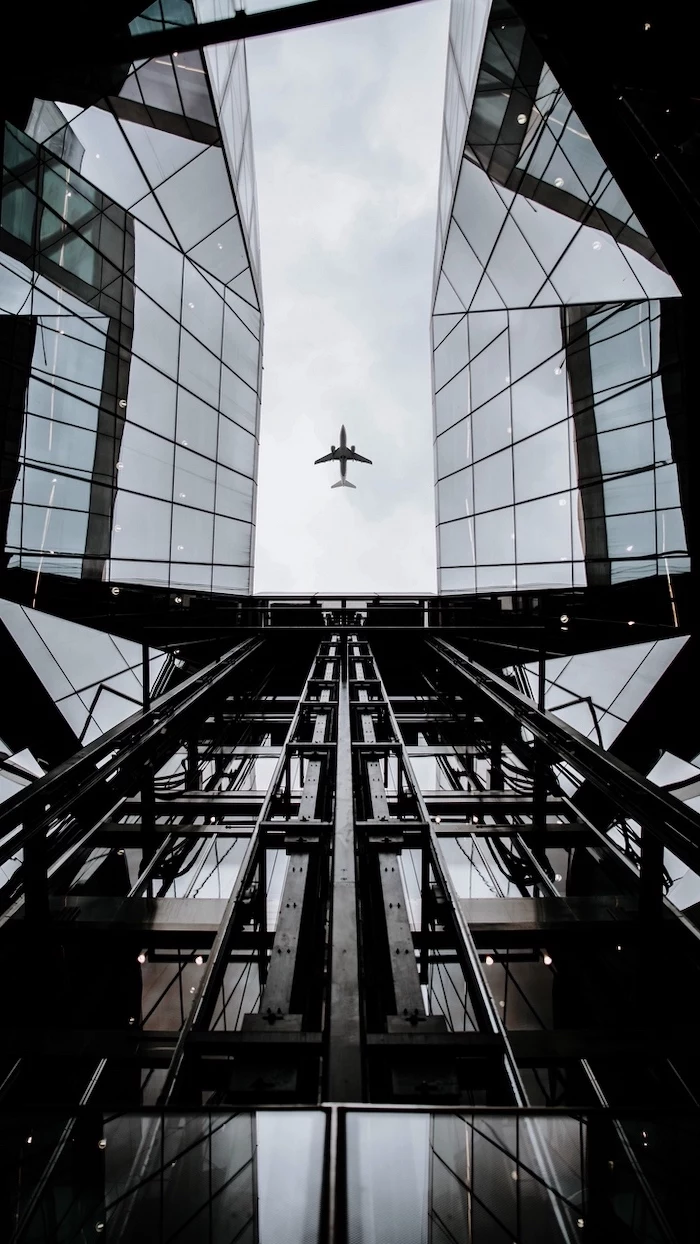
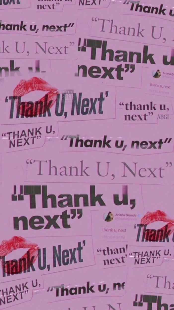
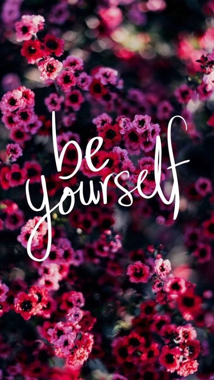
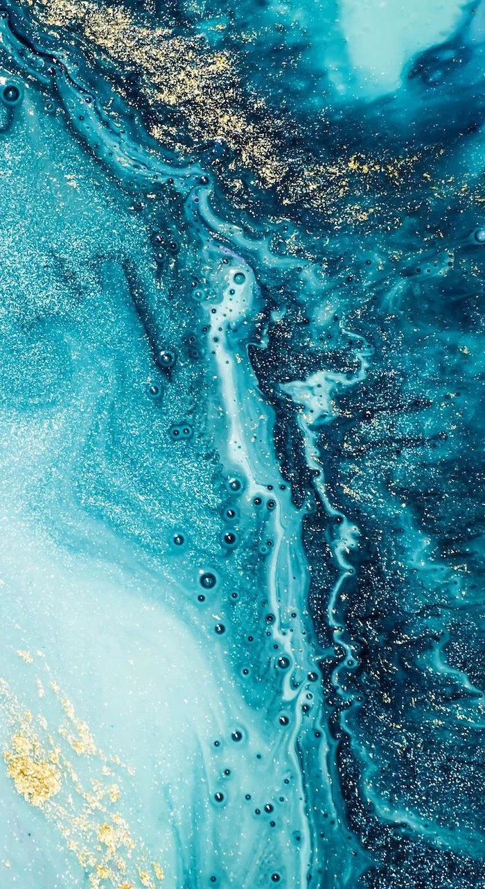
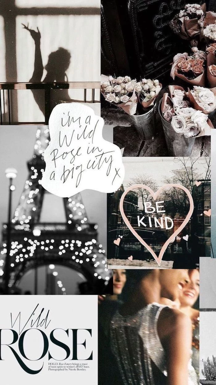
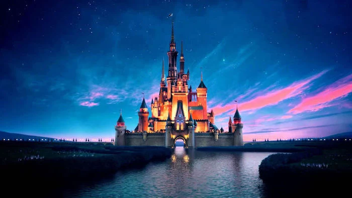
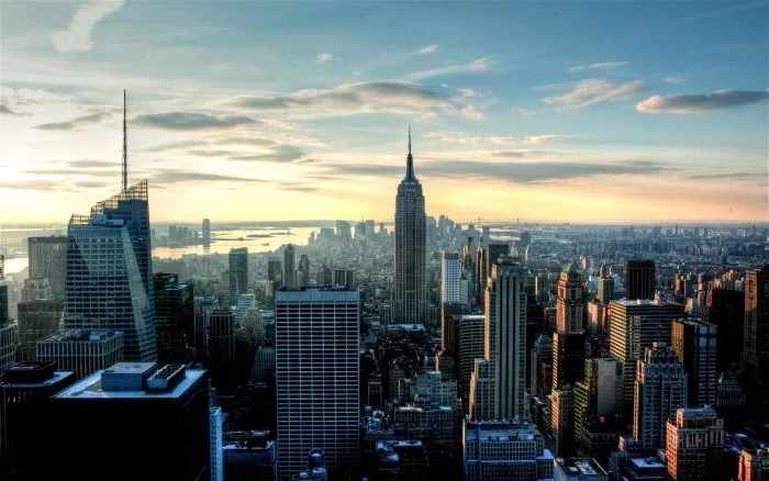
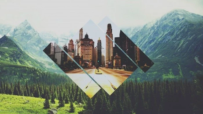
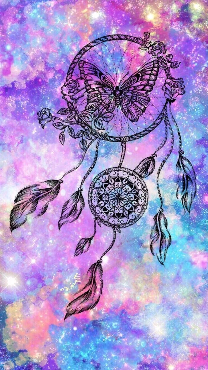
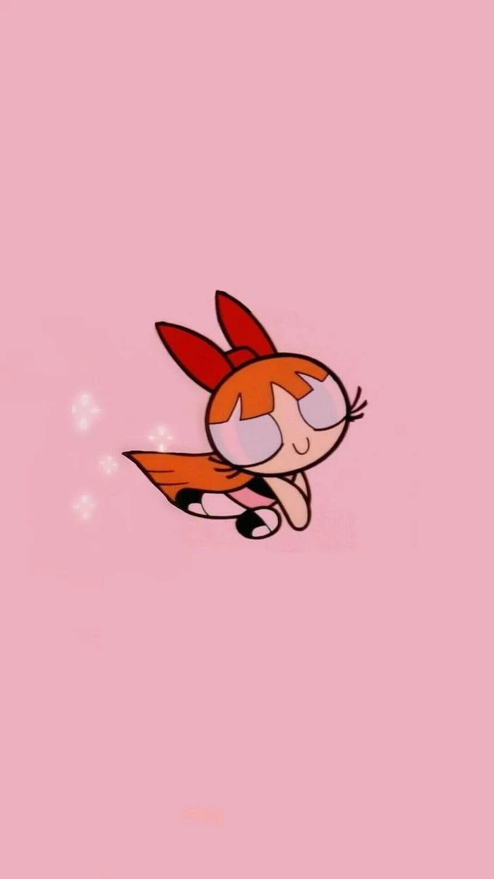
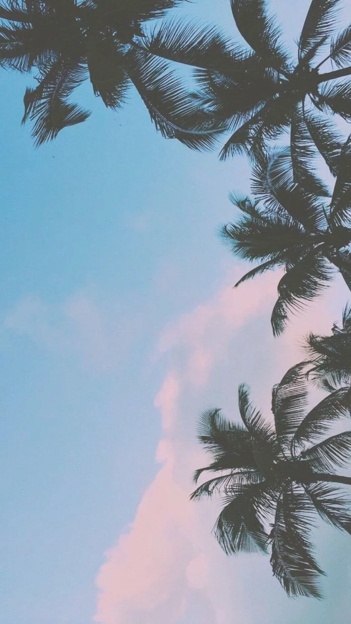
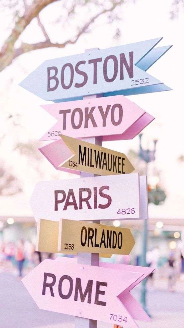
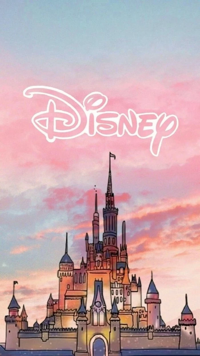
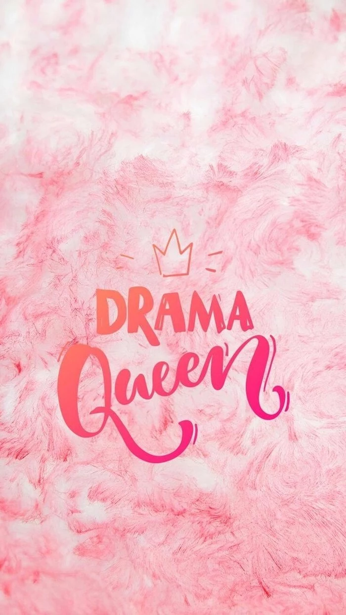
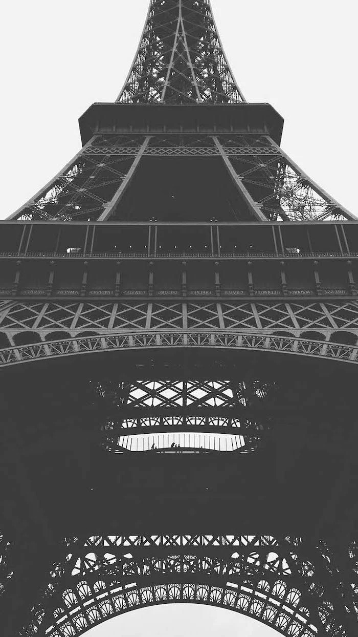
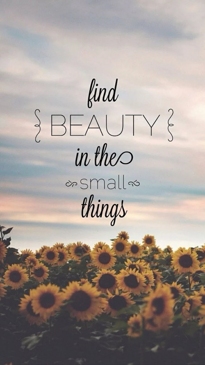
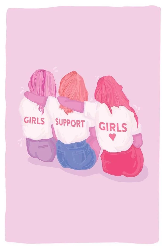
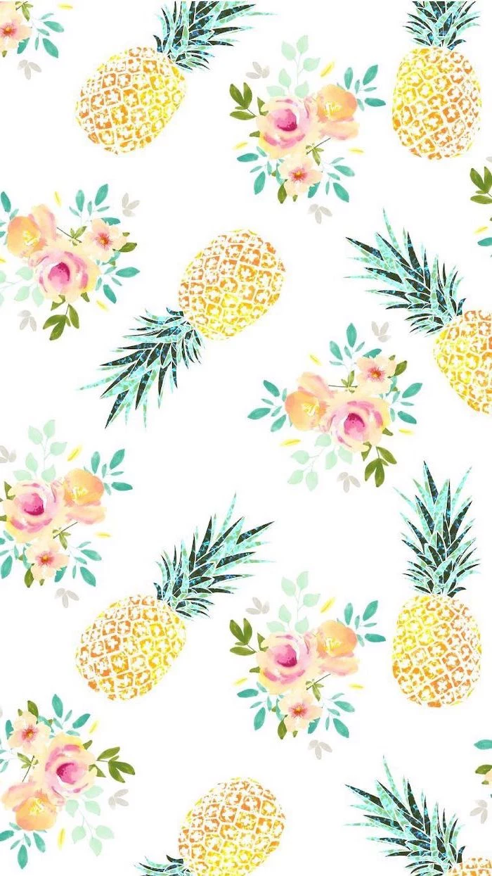
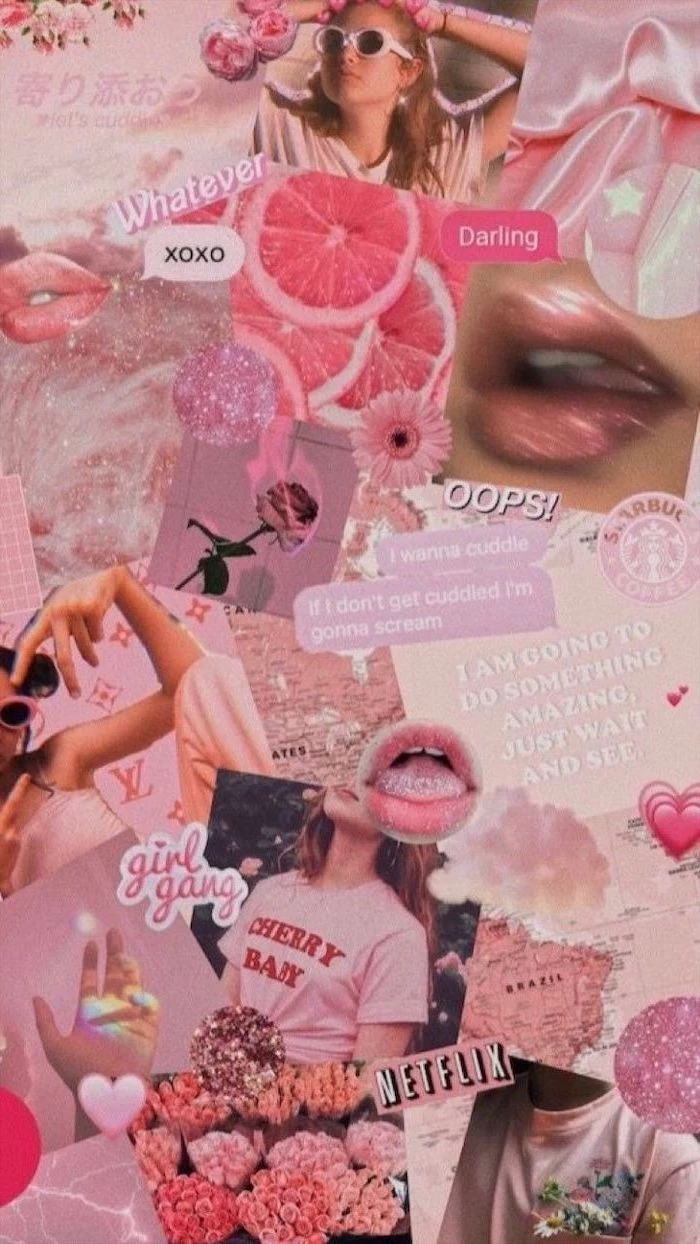
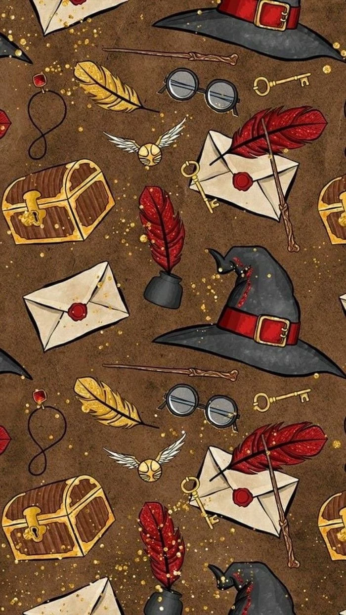
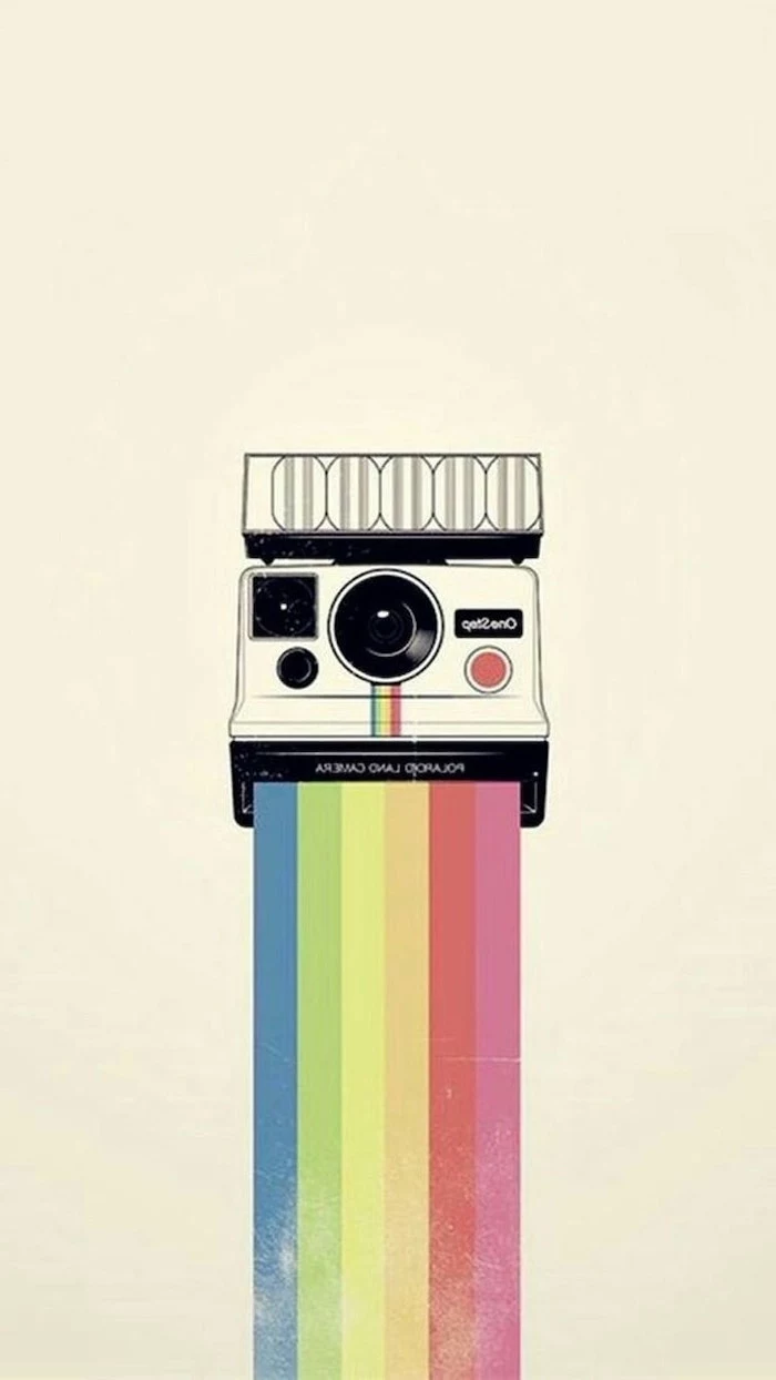
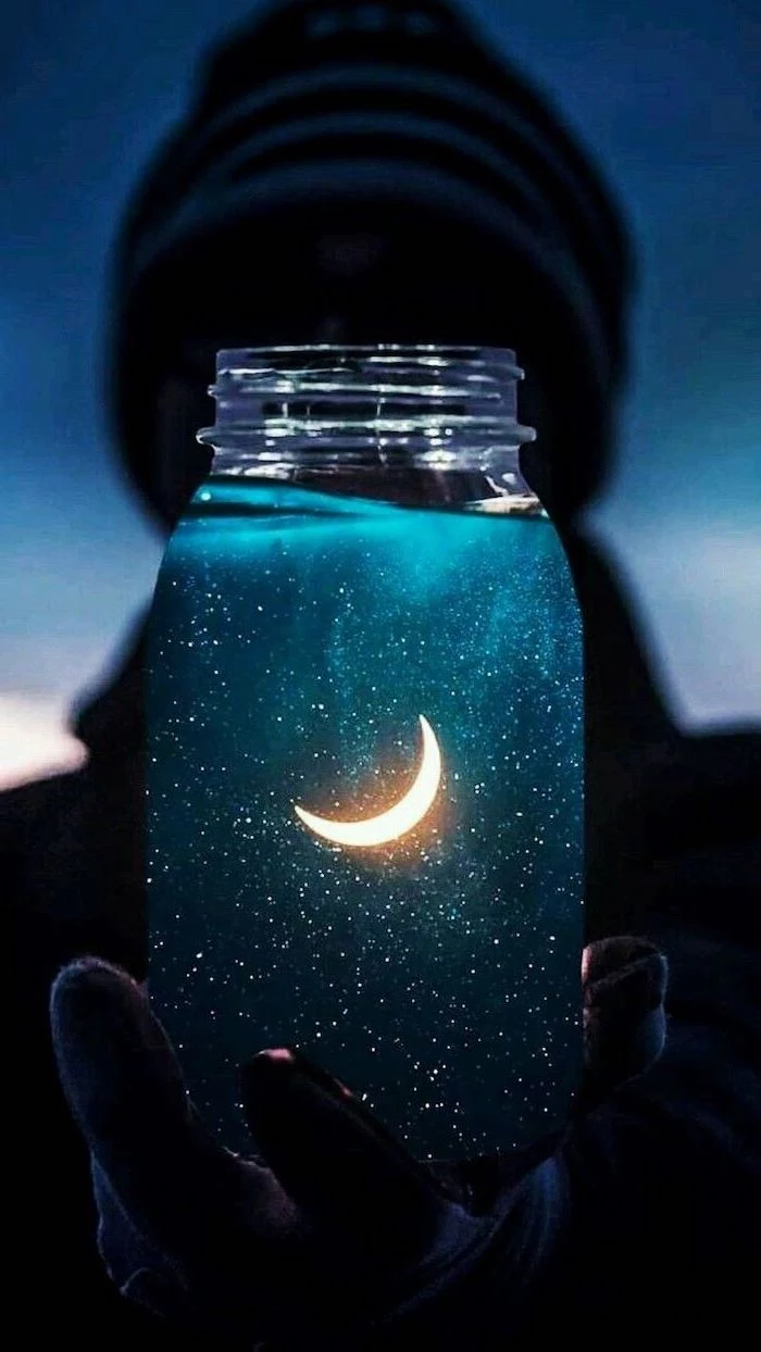
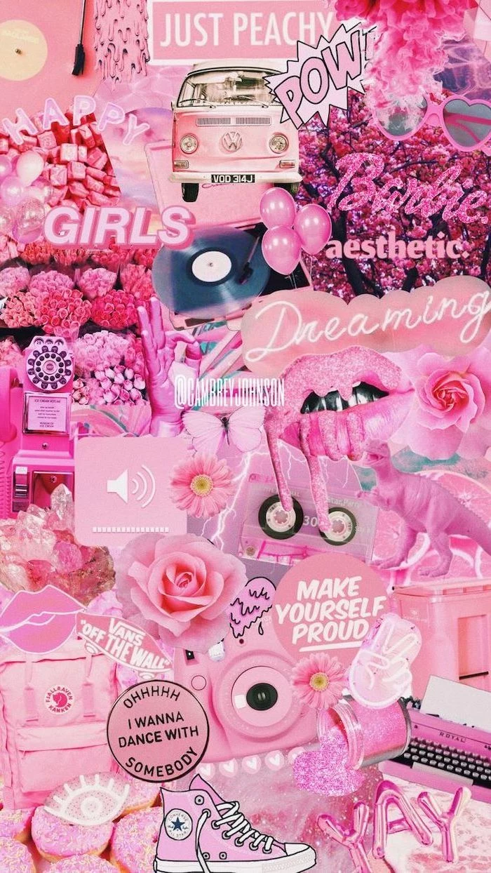
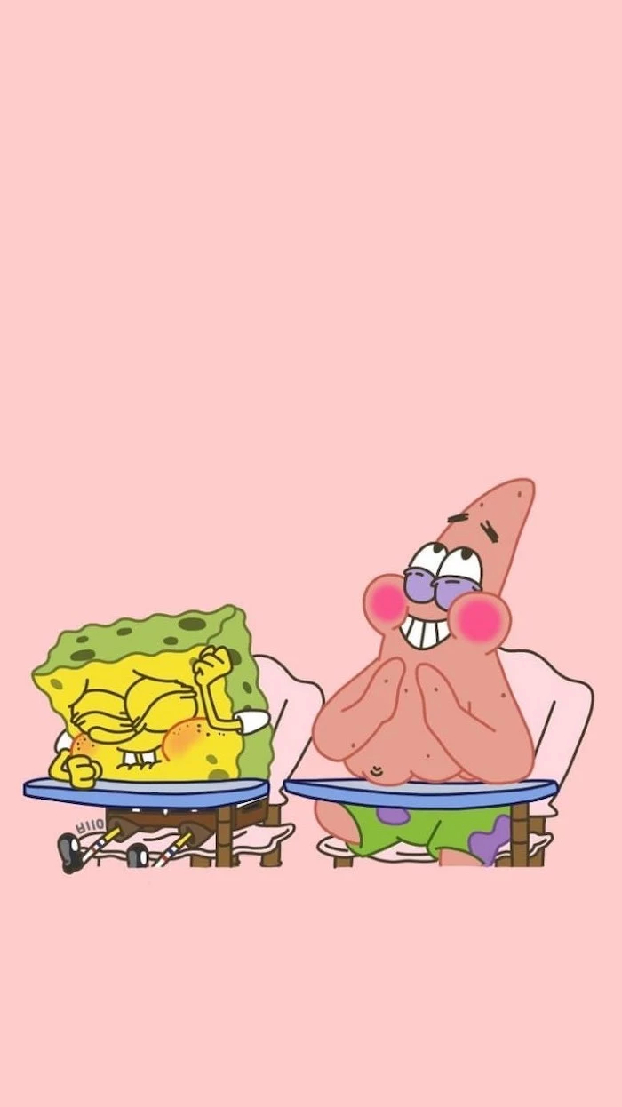
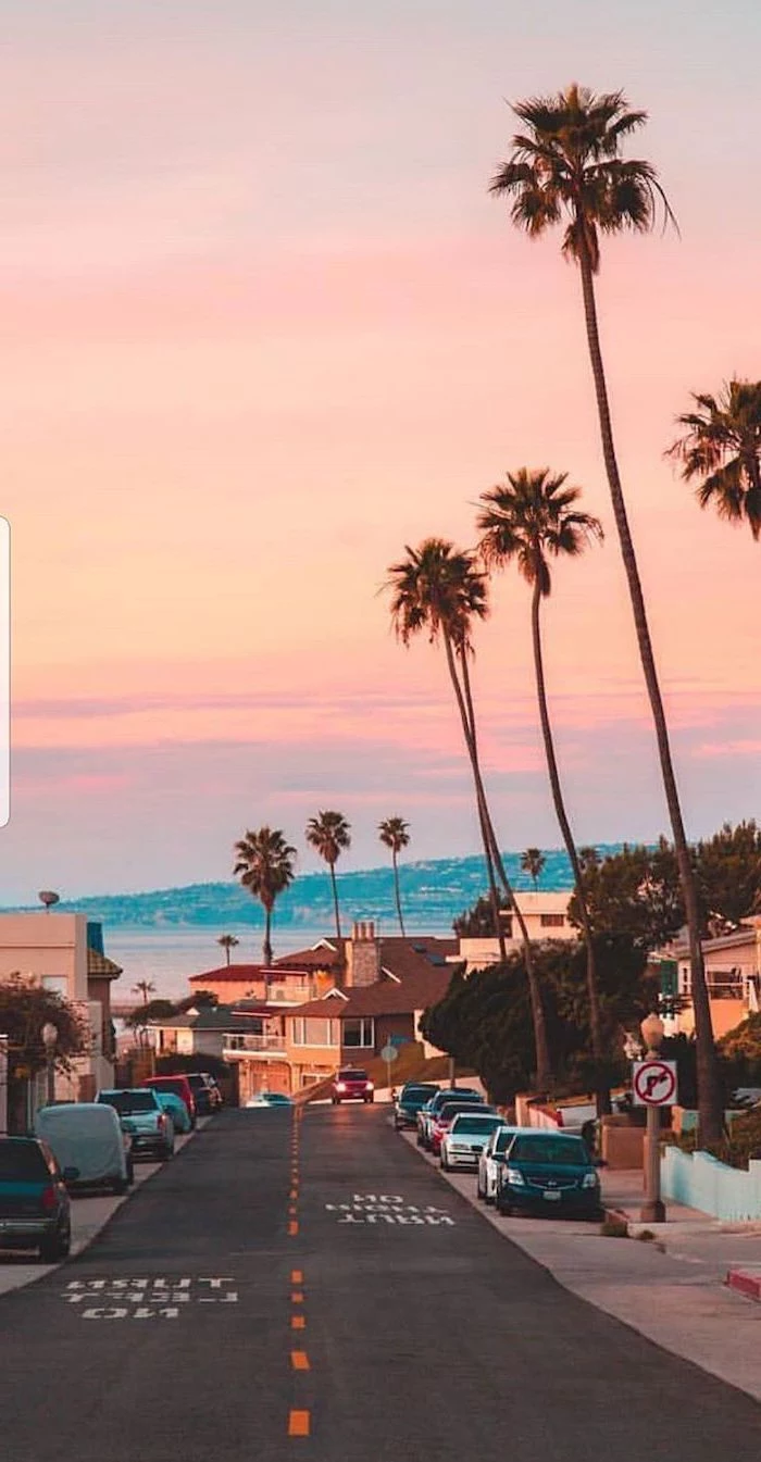
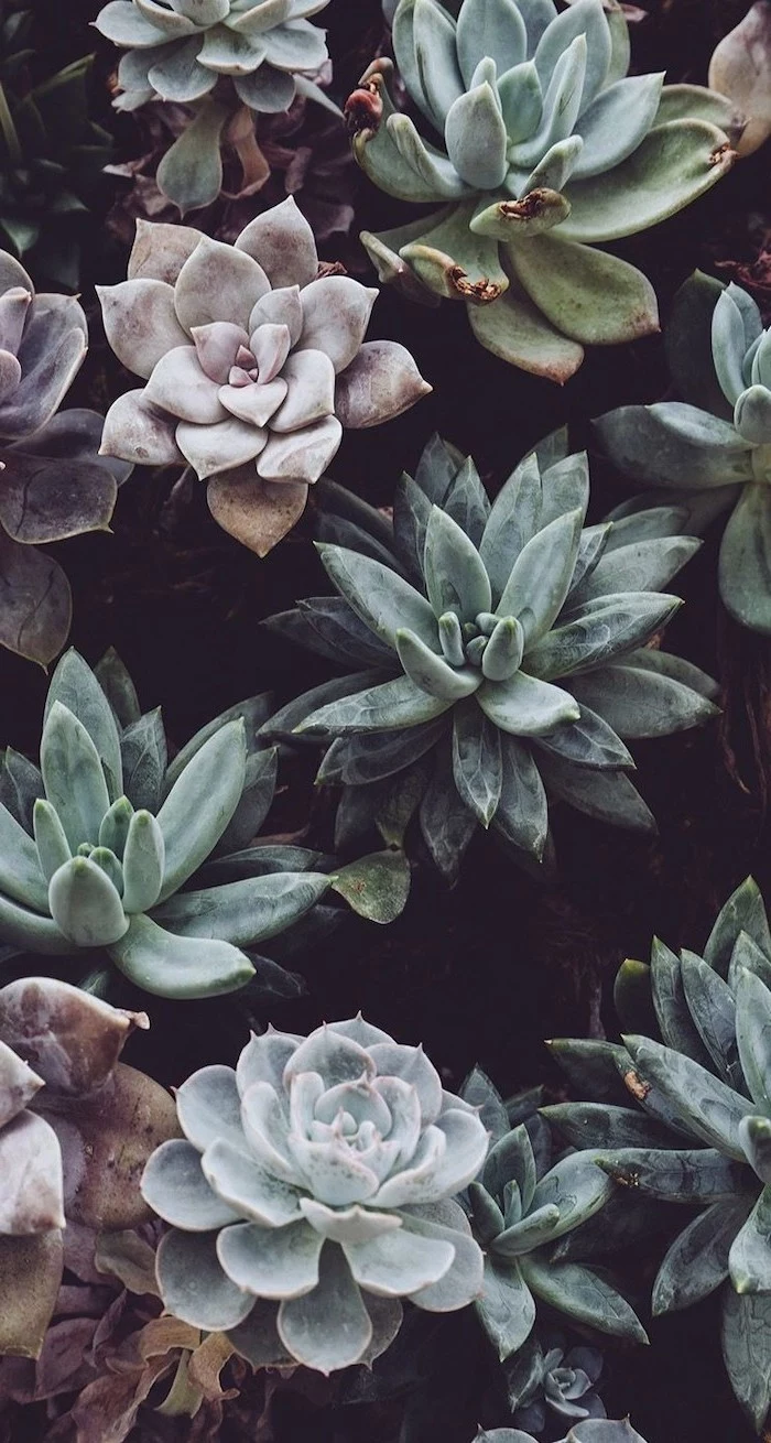
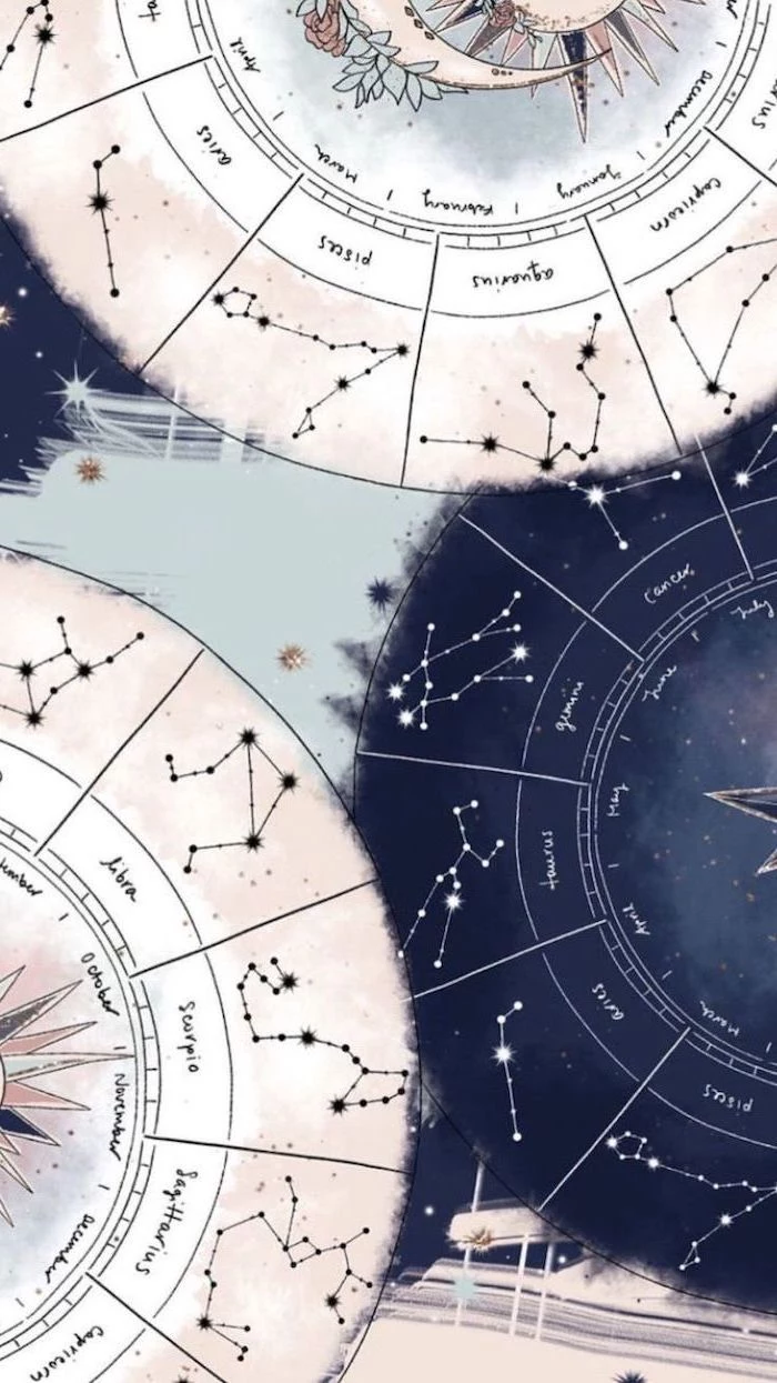
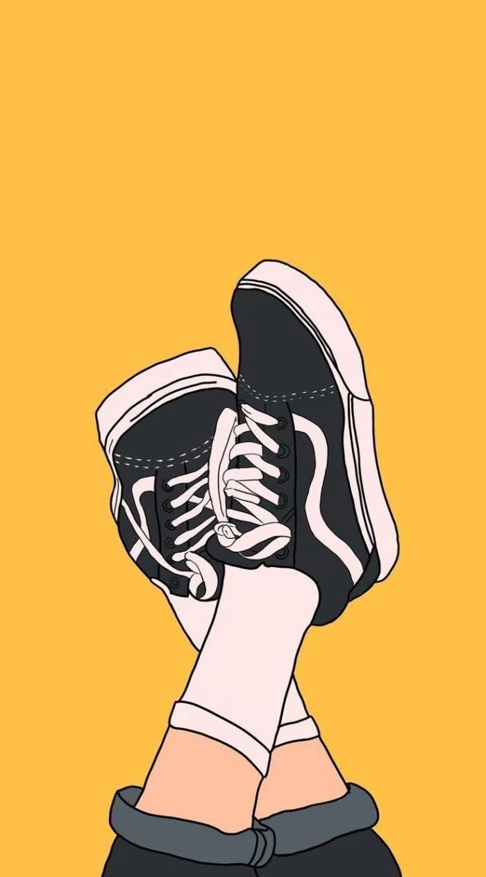
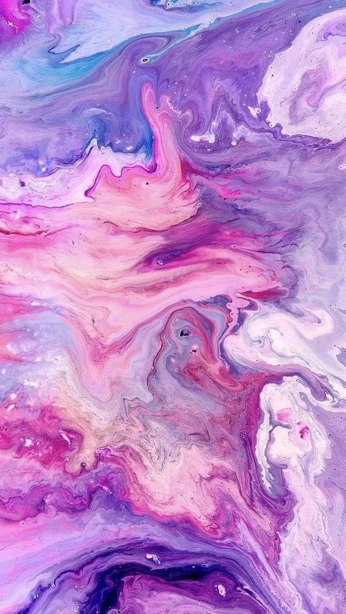
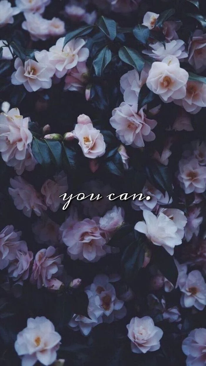
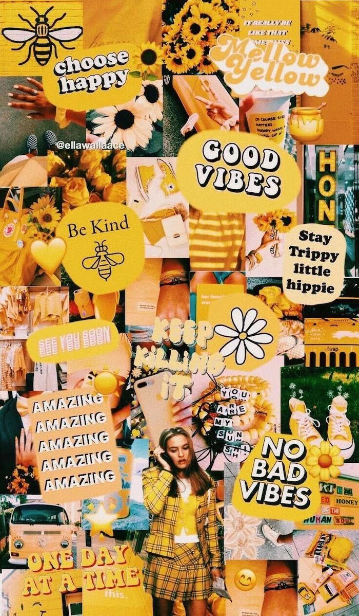
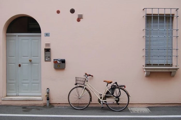
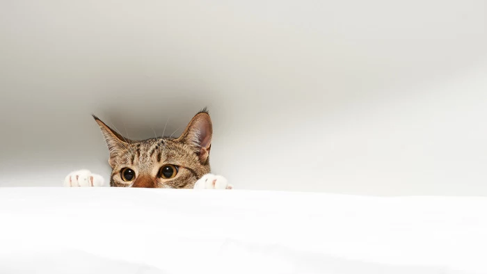
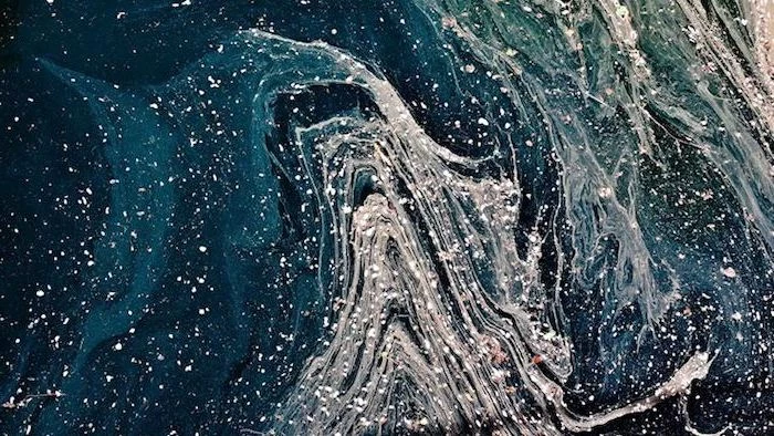
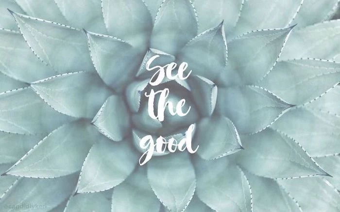
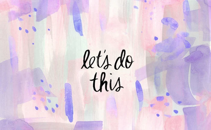
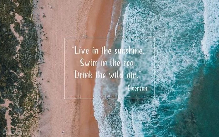
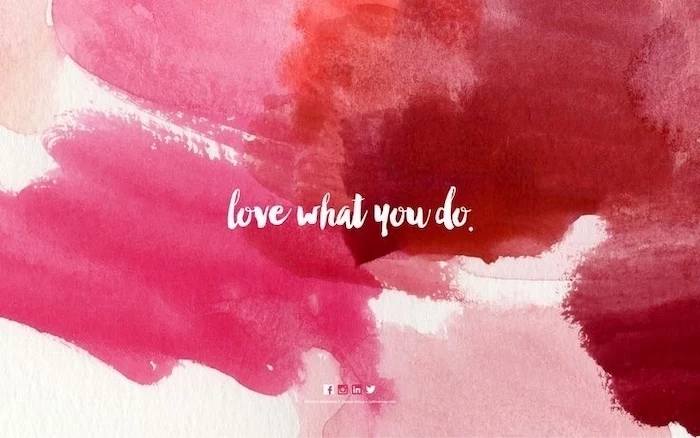
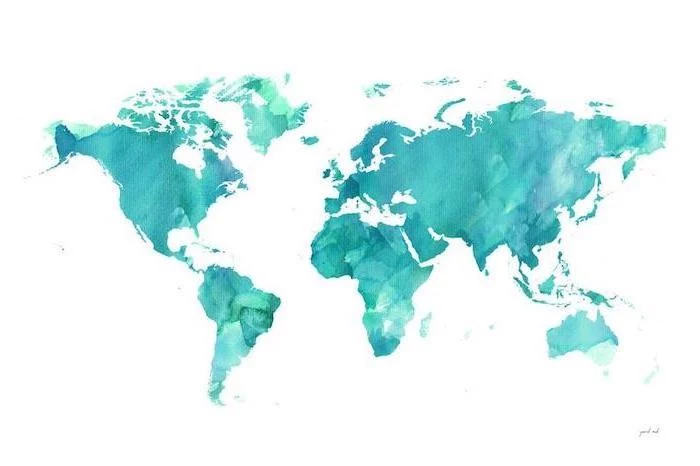
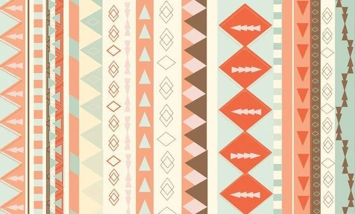
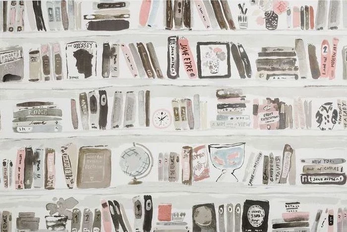
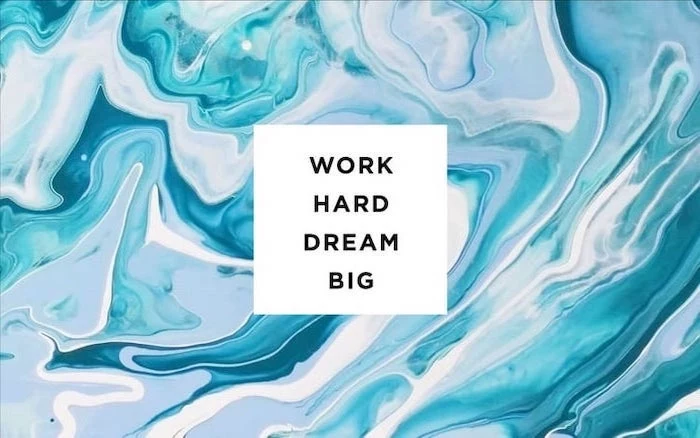
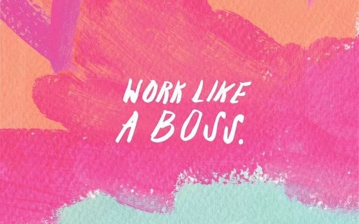
Inspiration Gallery
The OLED Advantage: If your phone has an OLED or AMOLED screen (like most modern Samsung Galaxy or iPhone models), choosing a wallpaper with true black areas can actually save battery life. Unlike LCDs, OLED screens turn pixels completely off to display black, consuming zero power for those parts of the image.
A study from the University of Missouri found that looking at symmetrical, organized visuals can reduce cognitive load and promote a sense of calm.
This is your sign to ditch that chaotic, cluttered wallpaper. A simple, balanced image isn’t just prettier; it literally gives your brain a break every time you unlock your phone.

- Keep your most-used apps easily accessible.
- Reduce visual noise and distractions.
- Create a more personal and motivating digital space.
The secret? A zoned wallpaper. Use an image with distinct areas of low detail—like a beach scene with a large, empty patch of sky—and place your icons and widgets in those ‘quiet zones’ for a perfectly organized screen.

Can’t find the perfect picture?
Create your own! You don’t need to be a Photoshop wizard. Apps like Canva and Bazaart offer easy-to-use templates specifically for phone backgrounds. Combine your own photos, add text with beautiful fonts, or mix in graphic elements to design a wallpaper that is 100% you.
For a truly professional look, think about your icons. A wallpaper with a dozen competing colors and shapes will make your app icons impossible to see. Before settling on an image, take a screenshot of your home screen and layer it over your potential wallpaper in a photo editor to see if your icons stand out or get lost.
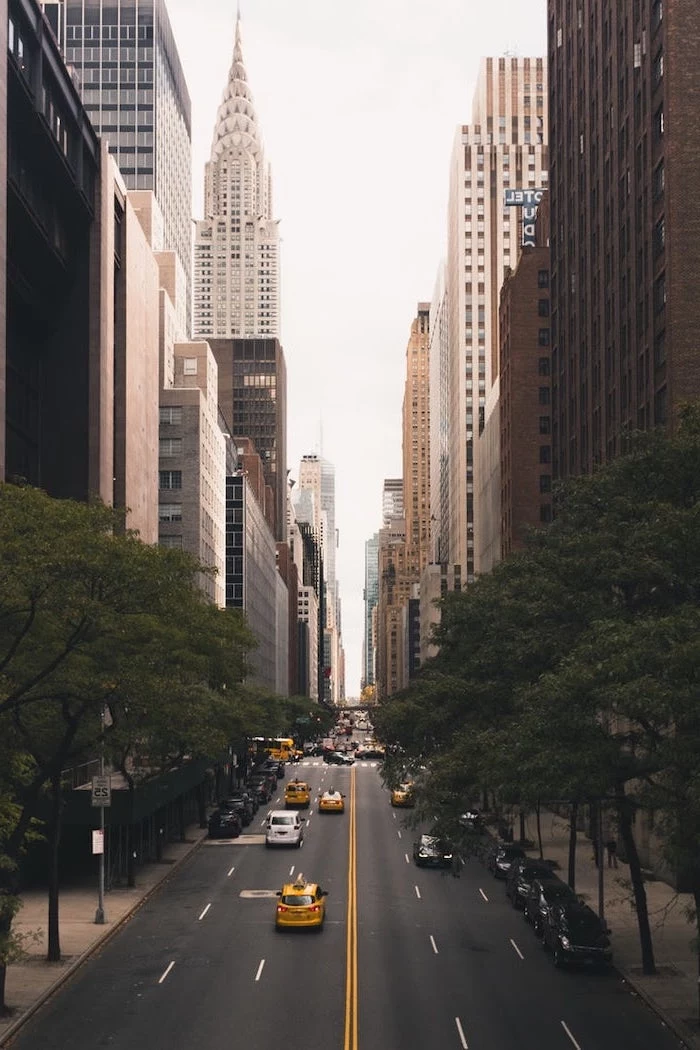
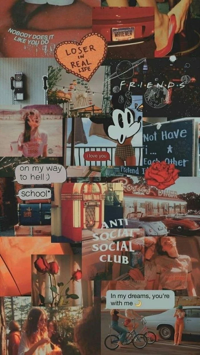
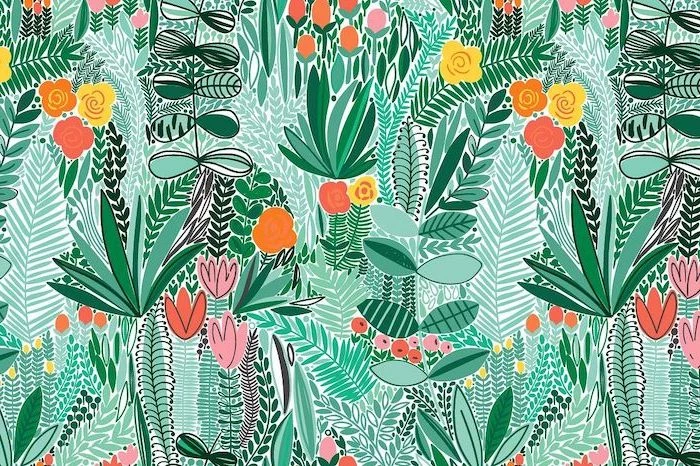
Busy Photograph: A detailed photo of a city or a group of friends can be beautiful, but it often makes icons and widgets disappear into the background noise.
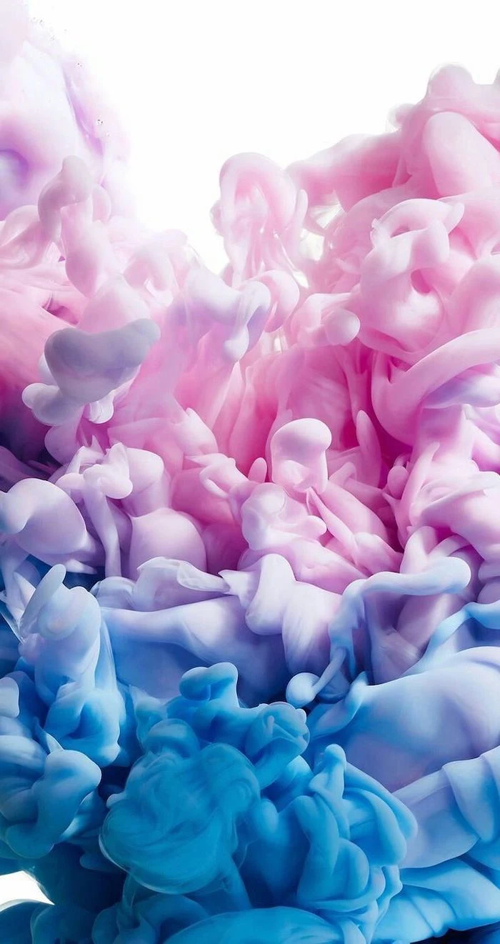
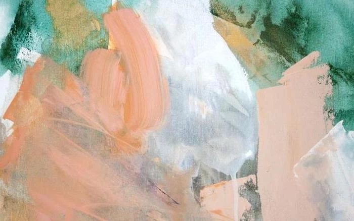
Subtle Gradient: A simple two- or three-color gradient provides visual interest without overwhelming the user interface. Icons remain crisp and legible.
For maximum usability without sacrificing style, a gradient or a minimalist pattern almost always wins.
Over 80% of smartphone users use Dark Mode at least some of the time.
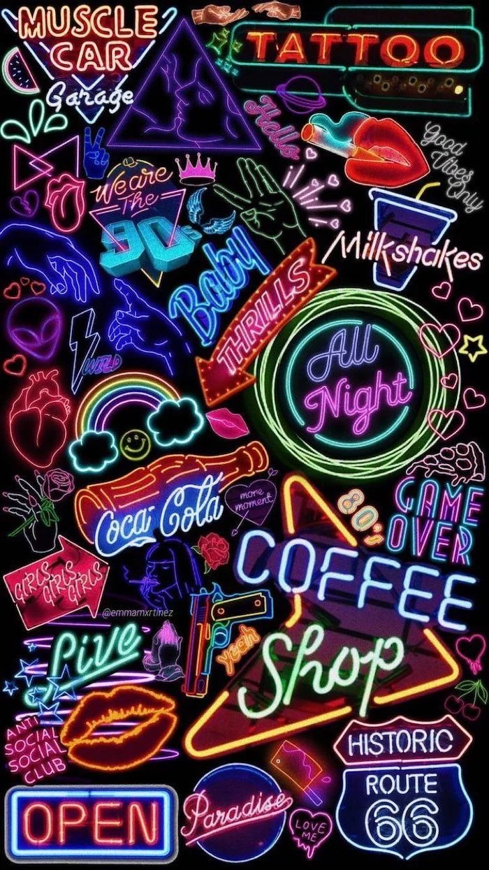
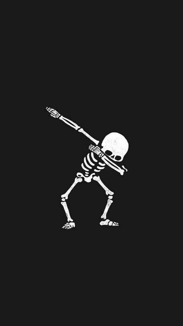
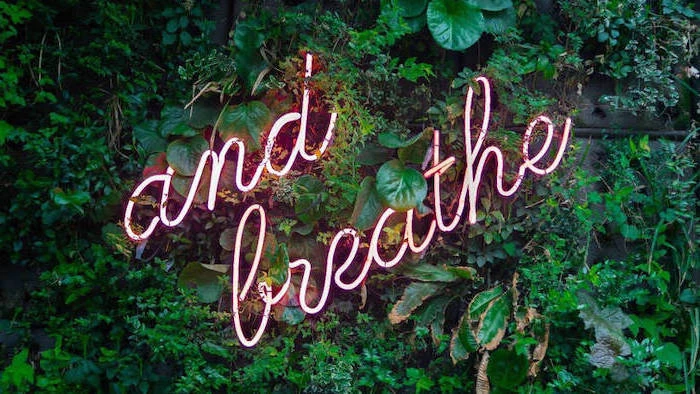
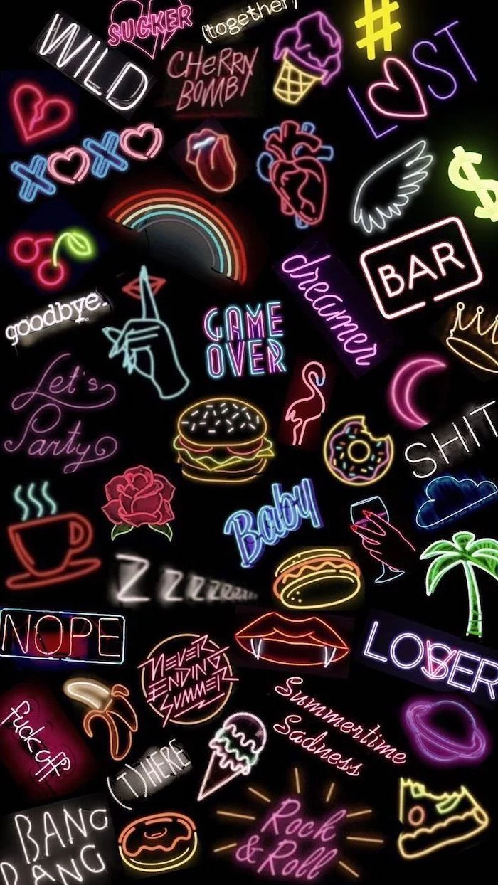
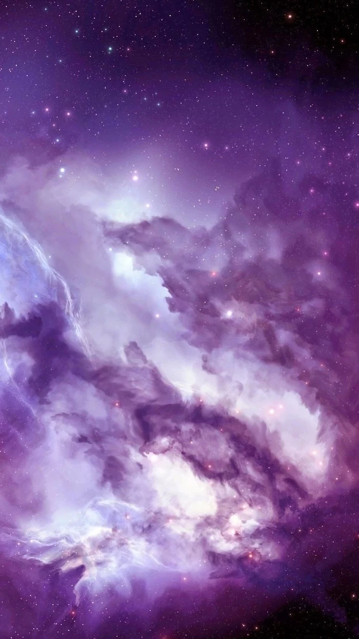
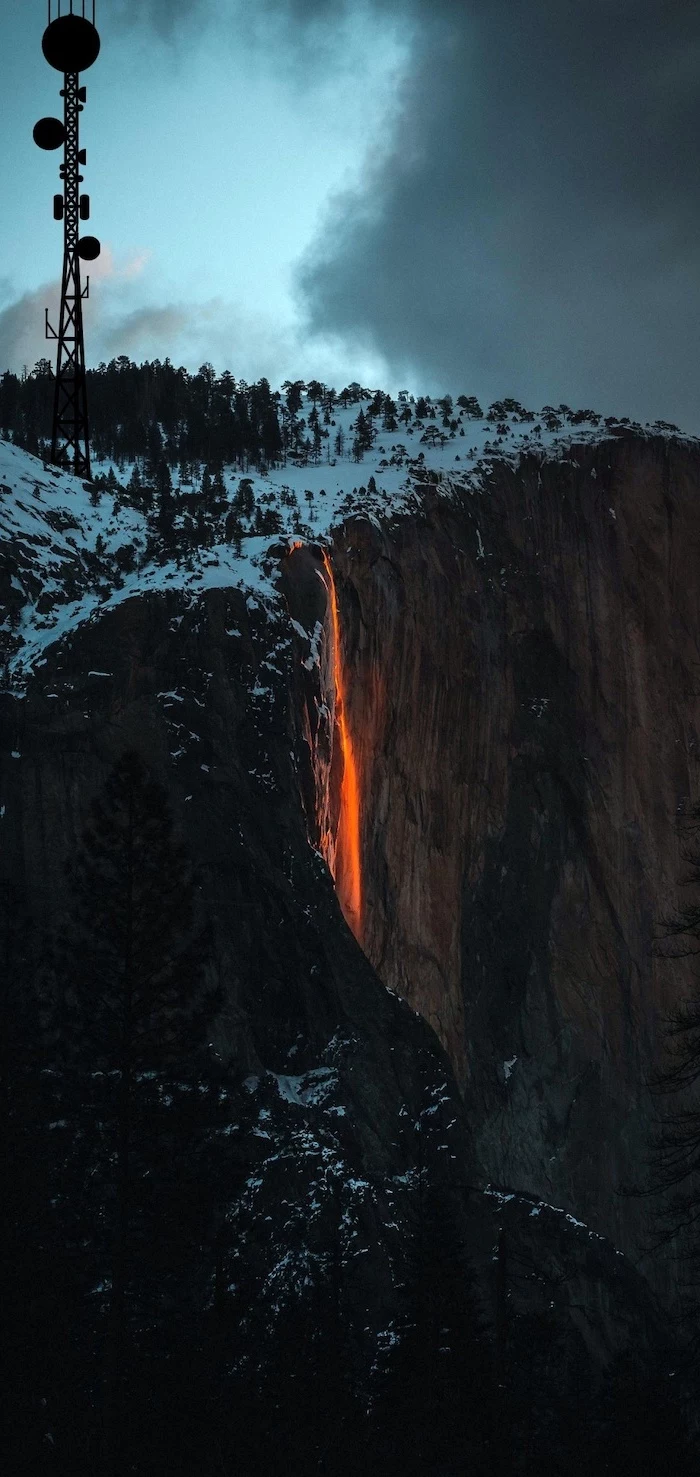
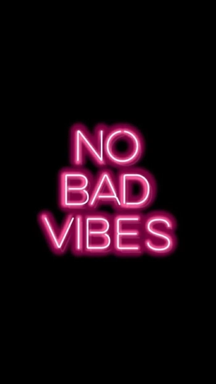
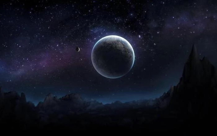
Lean into this trend with your wallpaper. Don’t just pick a dark image; find one that complements your system’s dark aesthetic. Think deep space nebulas, moody architectural shots, or neon signs on a black background. It creates a seamless, immersive experience, especially at night.
The next frontier in wallpapers is AI. With tools like Midjourney or DALL-E 3, you can generate a completely unique image from a simple text prompt. Want a “cyberpunk cat drinking coffee in a rainy Tokyo alley in the style of a Studio Ghibli film”? You can have it in seconds. It’s the ultimate form of digital personalization.
For your desktop, consider a Dynamic Wallpaper that changes with the time of day. Windows and macOS both support this natively or with third-party apps like Dynamic Theme. Your background will shift from a bright morning scene to a warm sunset and a dark, starry night, perfectly in sync with your own rhythm.
- Unsplash: The gold standard for high-resolution, artist-shot photographs. Completely free.
- Pexels: Another fantastic free stock photo site with a huge, easily searchable library.
- Backdrops (App): A curated collection of original and exclusive wallpapers made by a small design team.
- Zedge: A classic for a reason, offering millions of wallpapers, live wallpapers, and ringtones.
A common mistake: Using a low-contrast image. If your wallpaper is entirely made of mid-tone grays or muted pastels, the white text of your app names and widgets can become almost unreadable. Always look for images with areas of deep darks or bright lights to ensure text legibility.
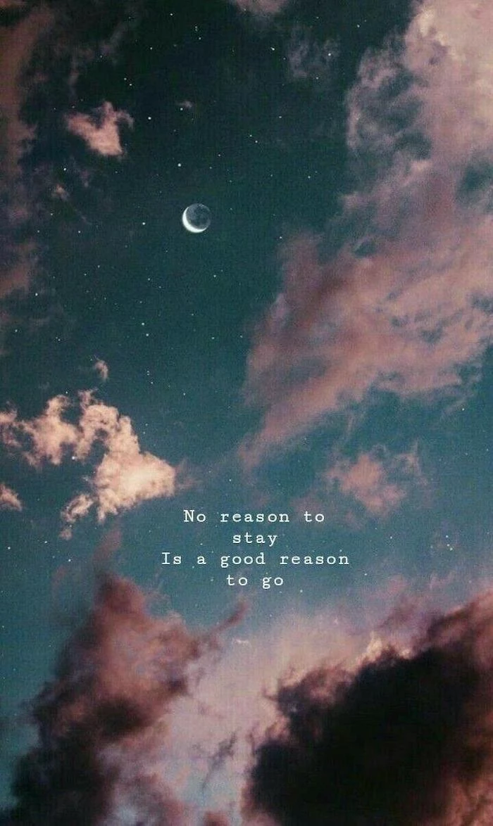
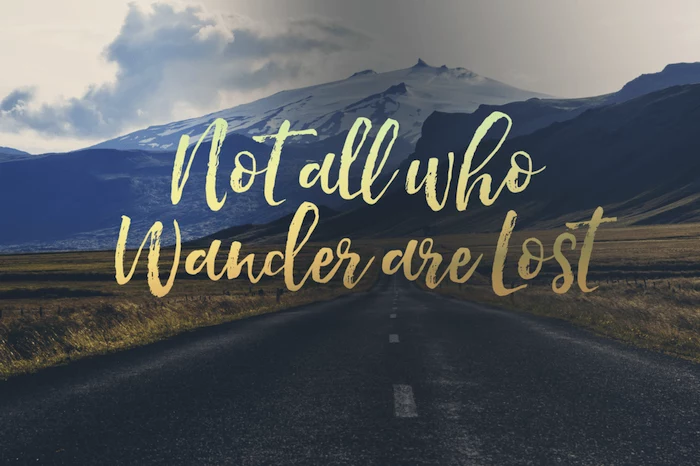
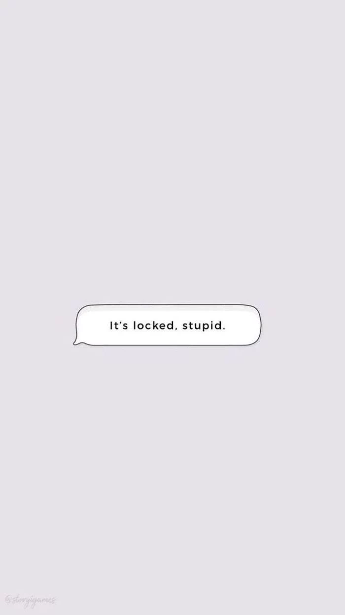
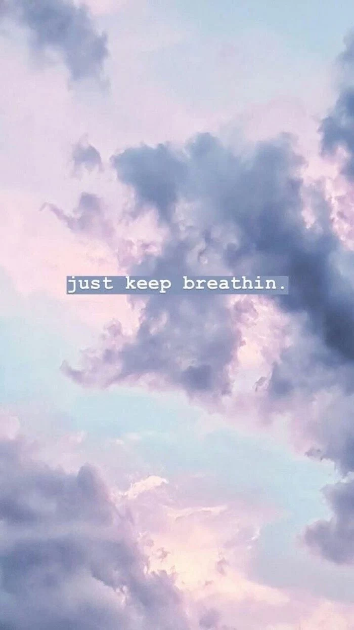
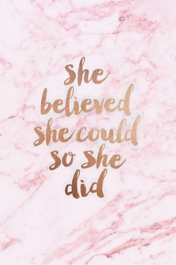
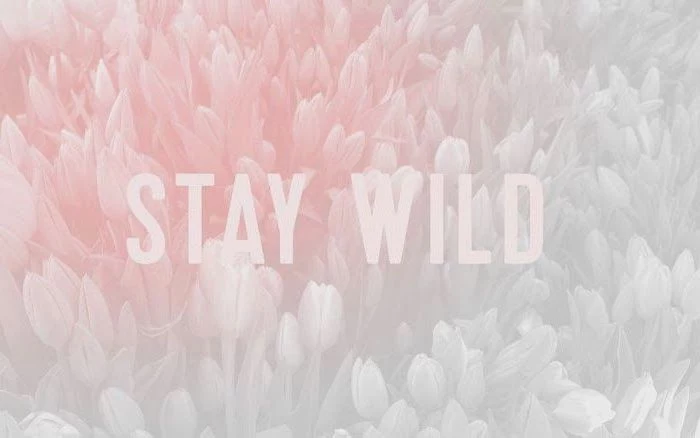
“Simplicity is the ultimate sophistication.” – Leonardo da Vinci
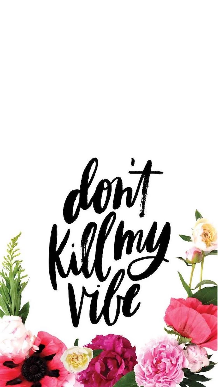
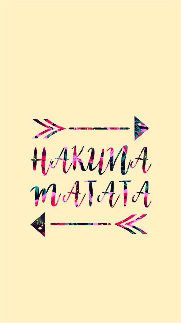
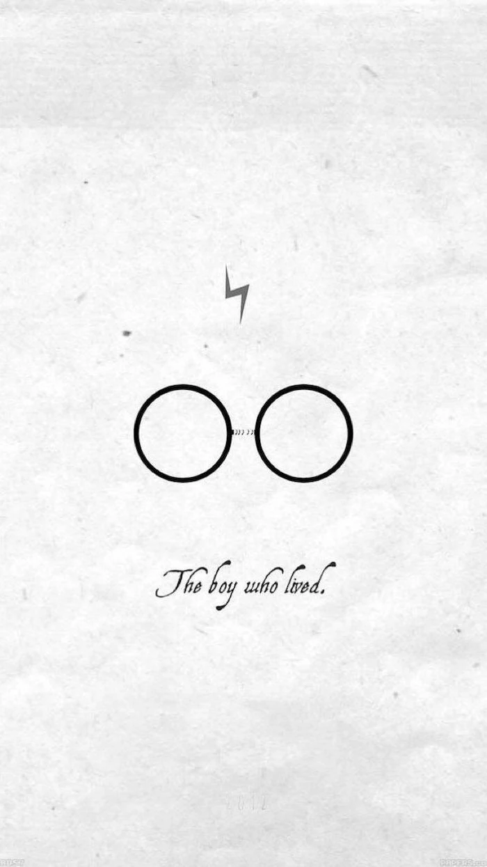
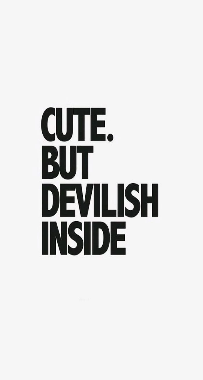
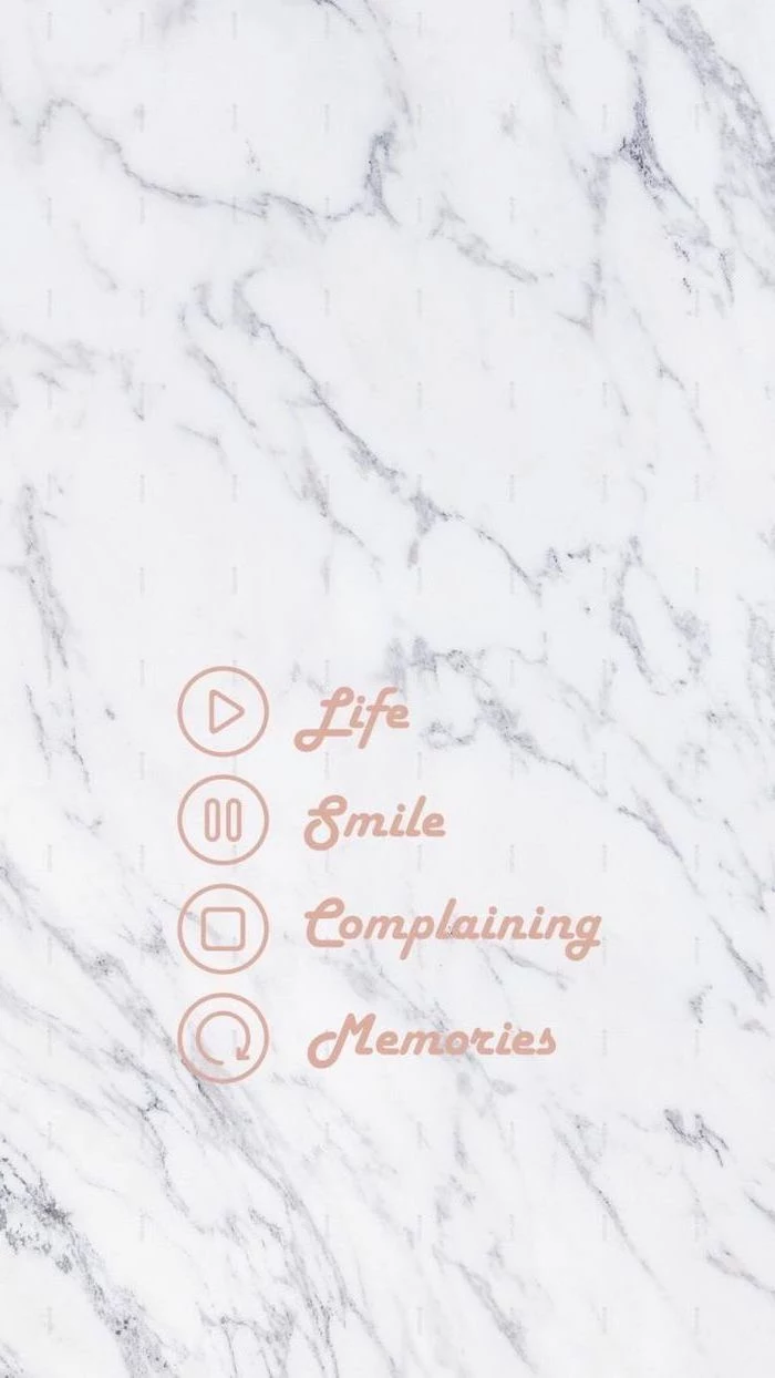
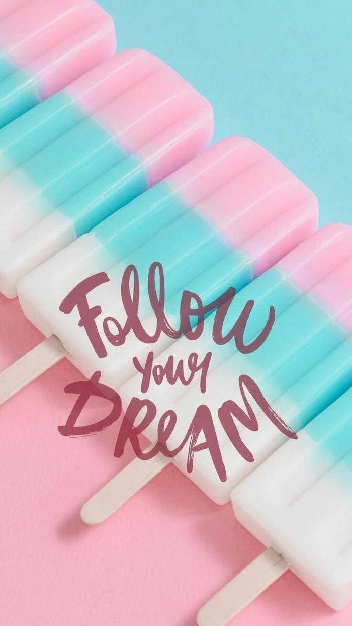
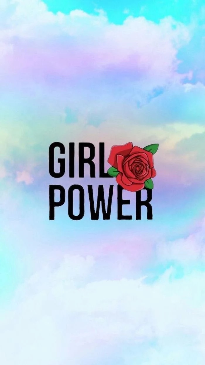
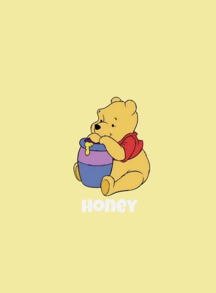
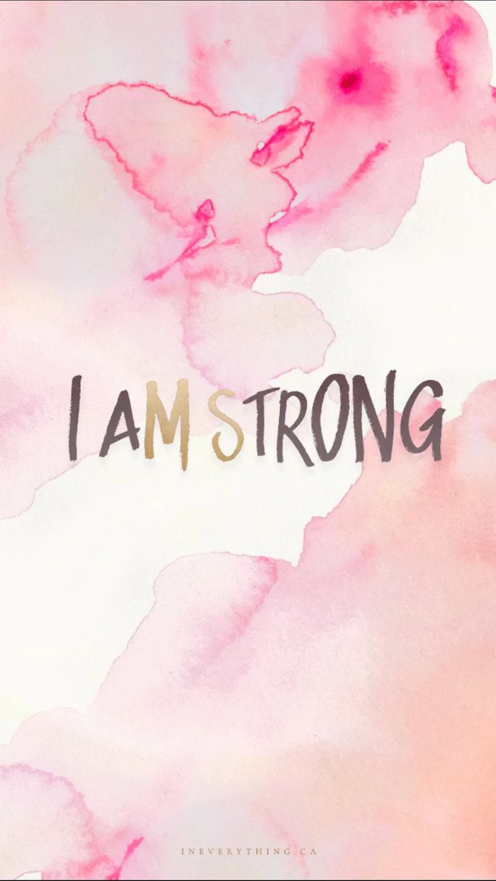
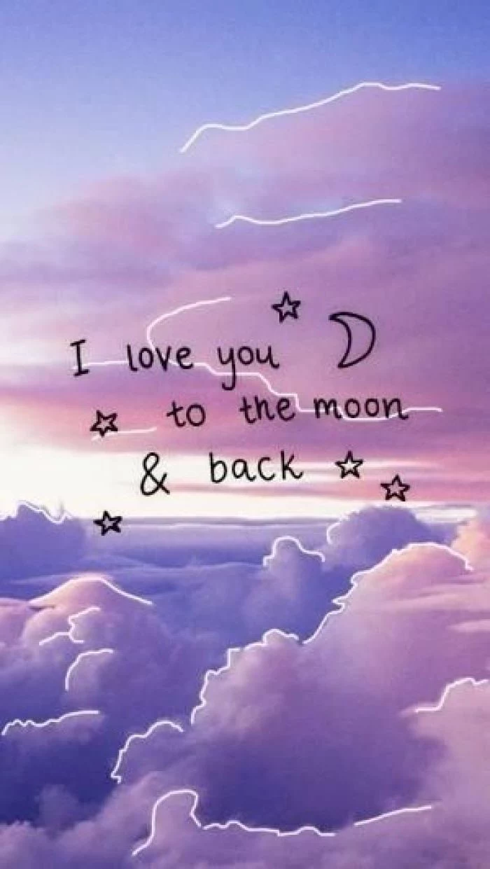
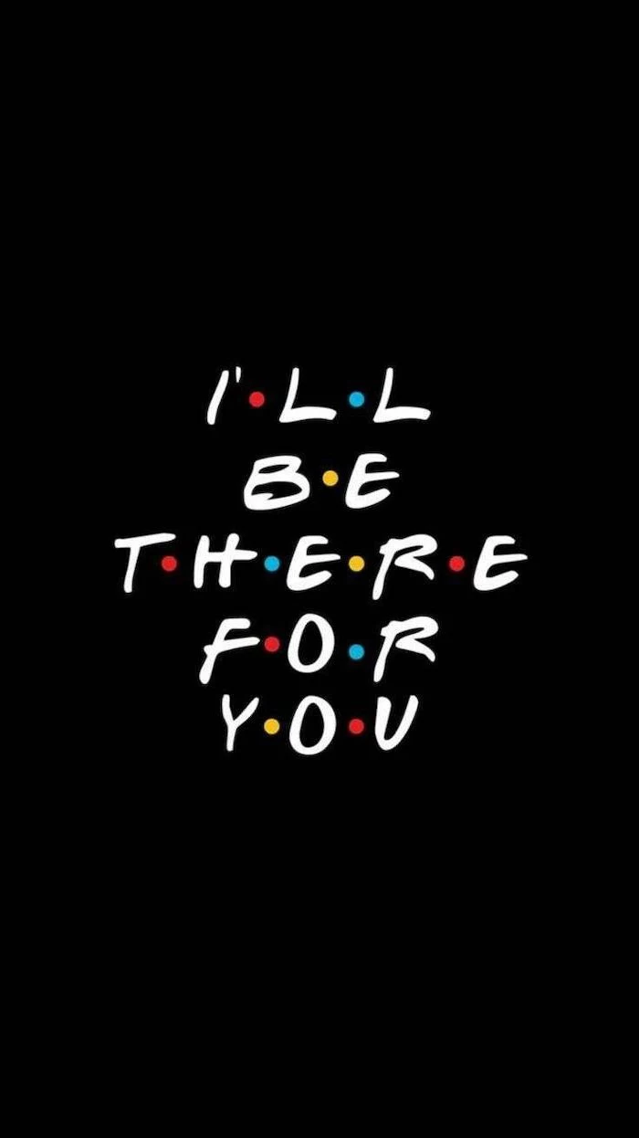
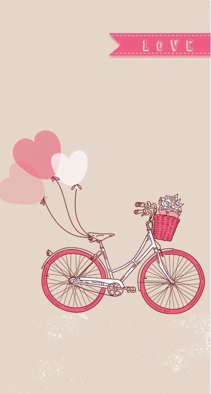
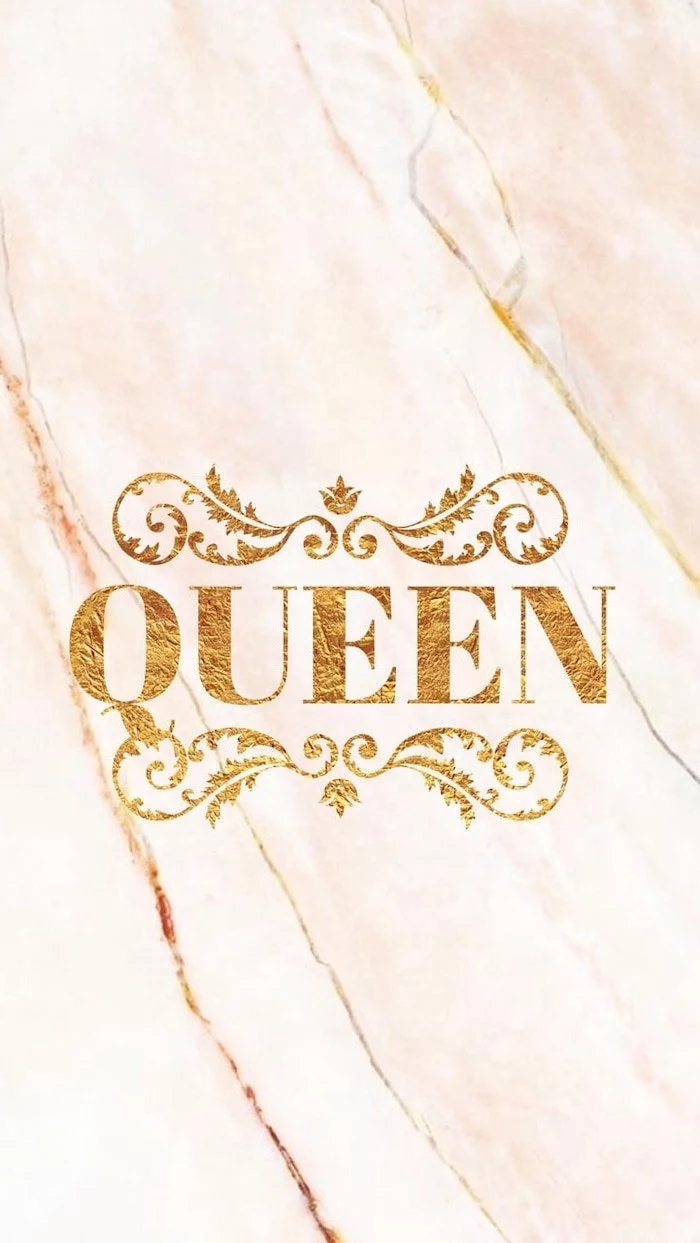
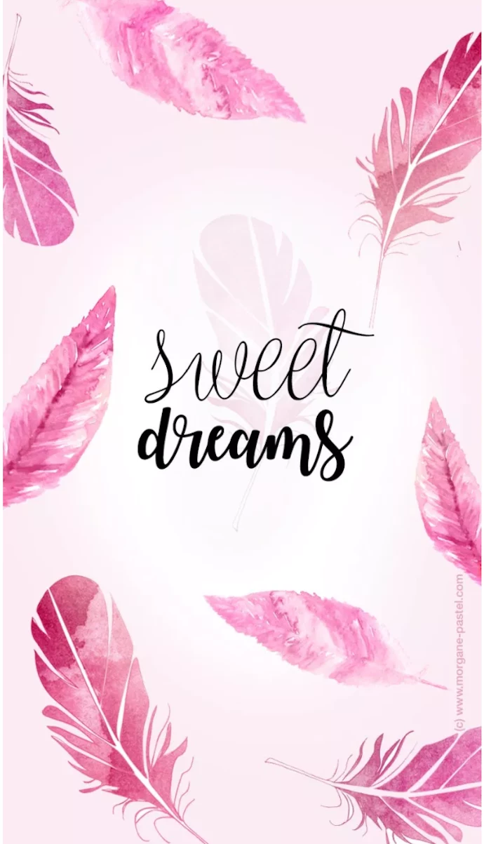
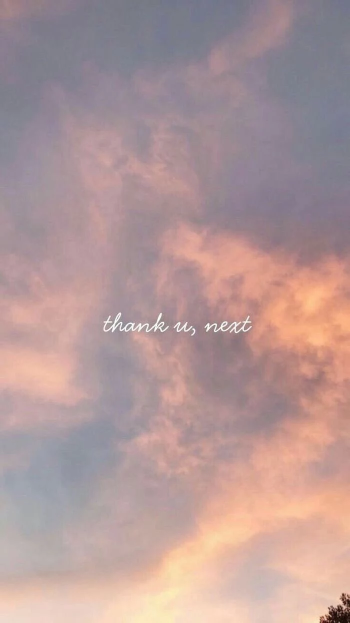
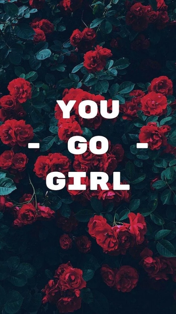
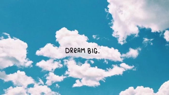
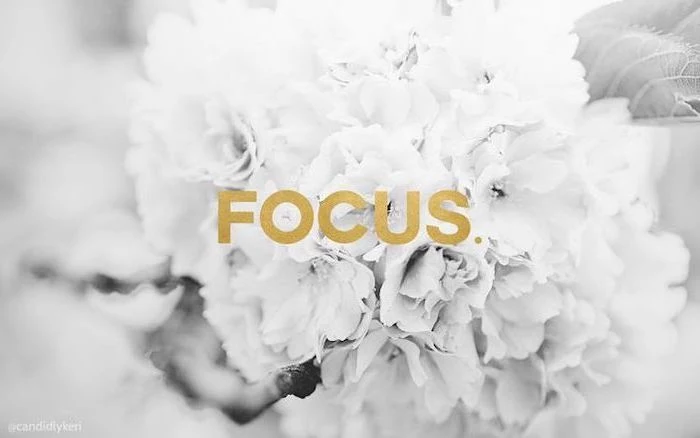
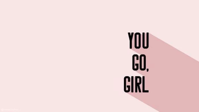
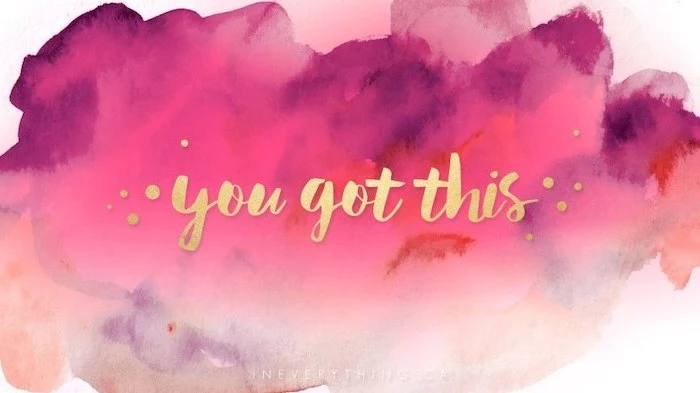
Don’t be afraid to use typography as your primary design element. A single, powerful word or a short, motivational quote in a stunning font can be more impactful than any photograph. Search for “minimalist typography wallpaper” on Pinterest to see incredible examples of this trend.
Are live wallpapers a gimmick that just drains your battery?
Not necessarily. Modern live wallpapers are more optimized than ever. While they do use slightly more power than a static image, the effect can be worth it. Consider a subtle one, like gently moving clouds or a live weather background that reflects current conditions. It adds a touch of magic to an otherwise static device.
For a multi-monitor setup, you have two great options. You can either stretch a single, ultra-wide panoramic image across both screens for an epic vista, or you can use a tool like DisplayFusion to set a different, complementary wallpaper on each monitor. For example, a forest on the left and a close-up of a leaf on the right.
- A fuzzy, pixelated mess.
- Important details are cut off.
- Text that is illegible.
You can avoid all these issues by simply checking an image’s dimensions before you download it. Never settle for a wallpaper that is smaller than your screen’s native resolution. A quick search for “[Your Phone Model] wallpaper resolution” will give you the exact numbers you need.
Blur is your best friend. Take a photo you love—a family portrait, a vacation spot—that is too “busy” to be a good wallpaper. Use a simple editing app like Snapseed or even the built-in iOS/Android editor to apply a Gaussian blur. You get to keep the colors and mood of your favorite memory, but in a soft, abstract form that makes your icons pop.
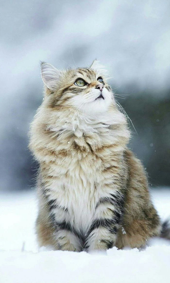
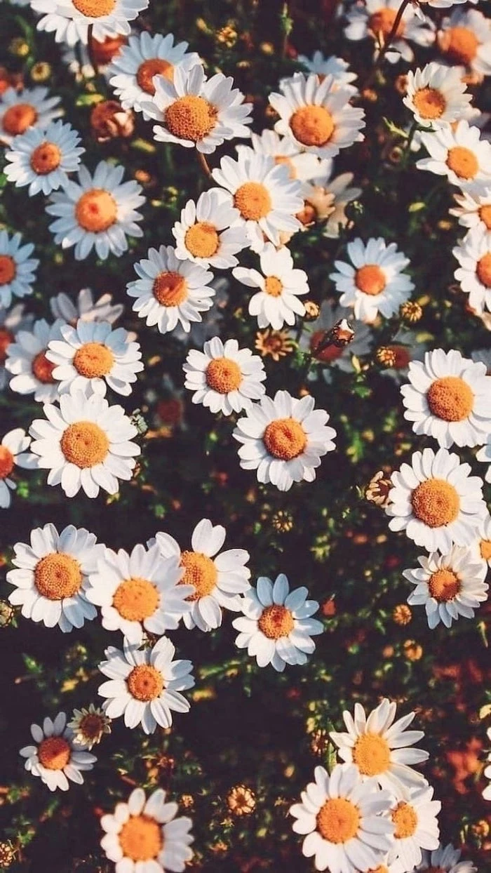
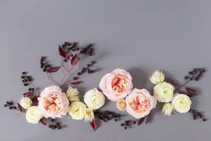
Think Seasonally: Don’t let your wallpaper get stale. A simple way to keep your phone feeling fresh is to change your background with the seasons. A bright floral for spring, a sunny beach for summer, warm autumn leaves for fall, and a snowy landscape or cozy interior for winter. It’s a small change that connects your digital life to the world around you.
How do you make a wallpaper that works for both portrait and landscape on a tablet?
The key is to choose an image with a central focal point or an abstract pattern. Avoid images where the main subject is on the far edge, as it will get cut off when you rotate the screen. A good choice is a photo where the most interesting part is in the middle third of the frame, leaving the outer edges less critical.
Humans can process an entire image in as little as 13 milliseconds.
Your wallpaper choice sets an instant mood every single time you glance at your device. This isn’t just decoration; it’s a constant, subconscious emotional cue. Choose an image that makes you feel the way you want to feel—calm, energized, inspired, or happy.
The Lock Screen is different. While your Home Screen needs to be functional, your Lock Screen is pure expression. This is the place for that beautiful, detailed photo, a favorite piece of art, or a picture of your pet. Since there are no icons to obscure, you can go all out. Pro tip: Use a black and white photo on the lock screen for a chic, dramatic effect.
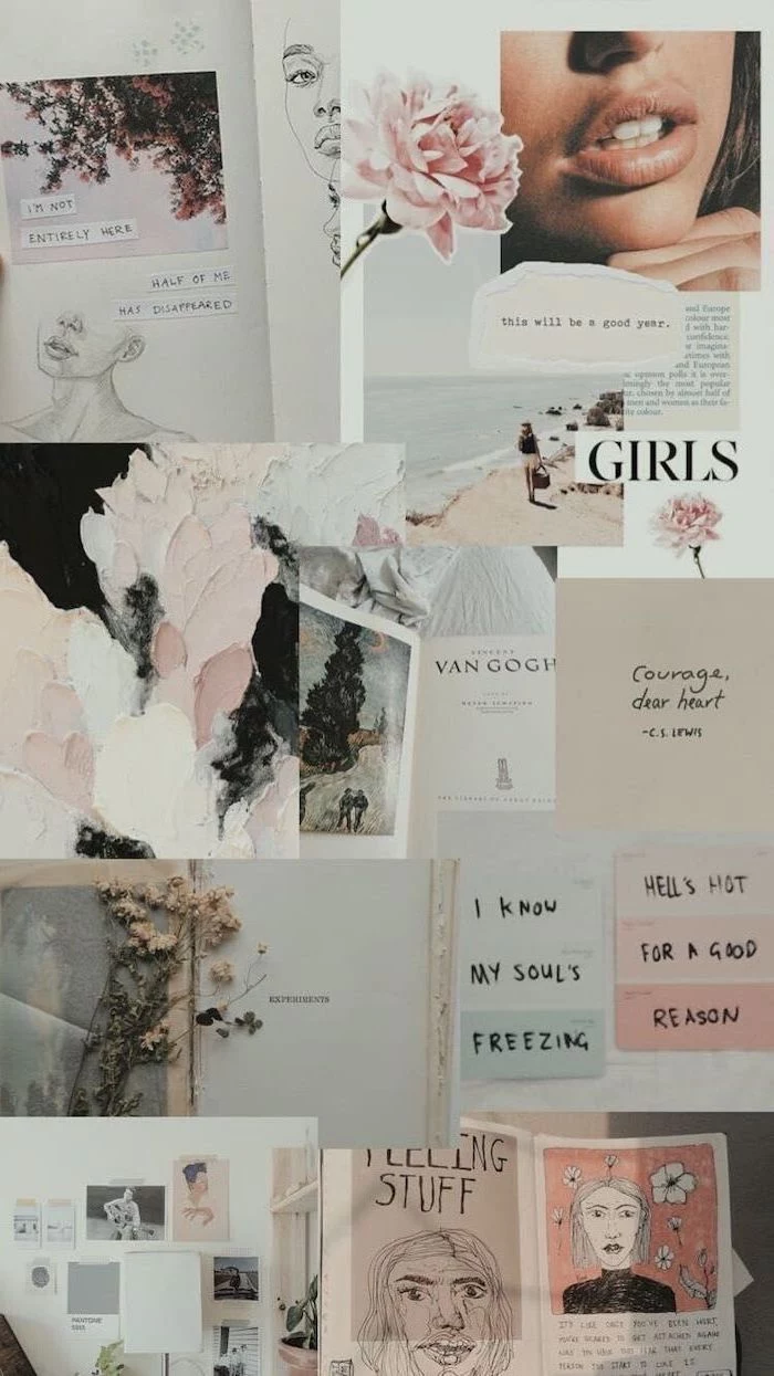
Create a digital photo collage of your favorite people or moments. Use an app like Fotor or PicCollage to arrange a few key pictures. This is far more effective than using a single group photo, as you can focus on the best smiles and memories, creating a background that delivers a guaranteed emotional boost.
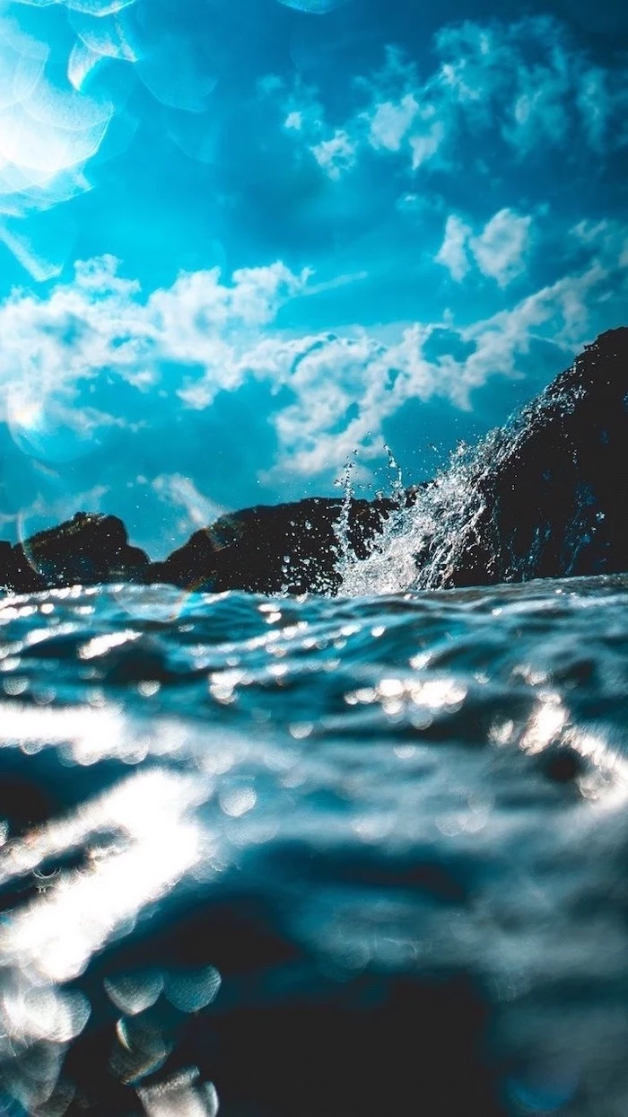
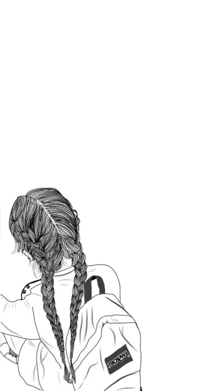
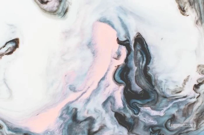
Negative Space is Your Ally: In design, negative space is the empty area around a subject. Wallpapers with lots of negative space—like a single object on a plain background or a vast, empty sky—are incredibly effective. They draw attention to your subject while providing a clean, uncluttered canvas for your icons.
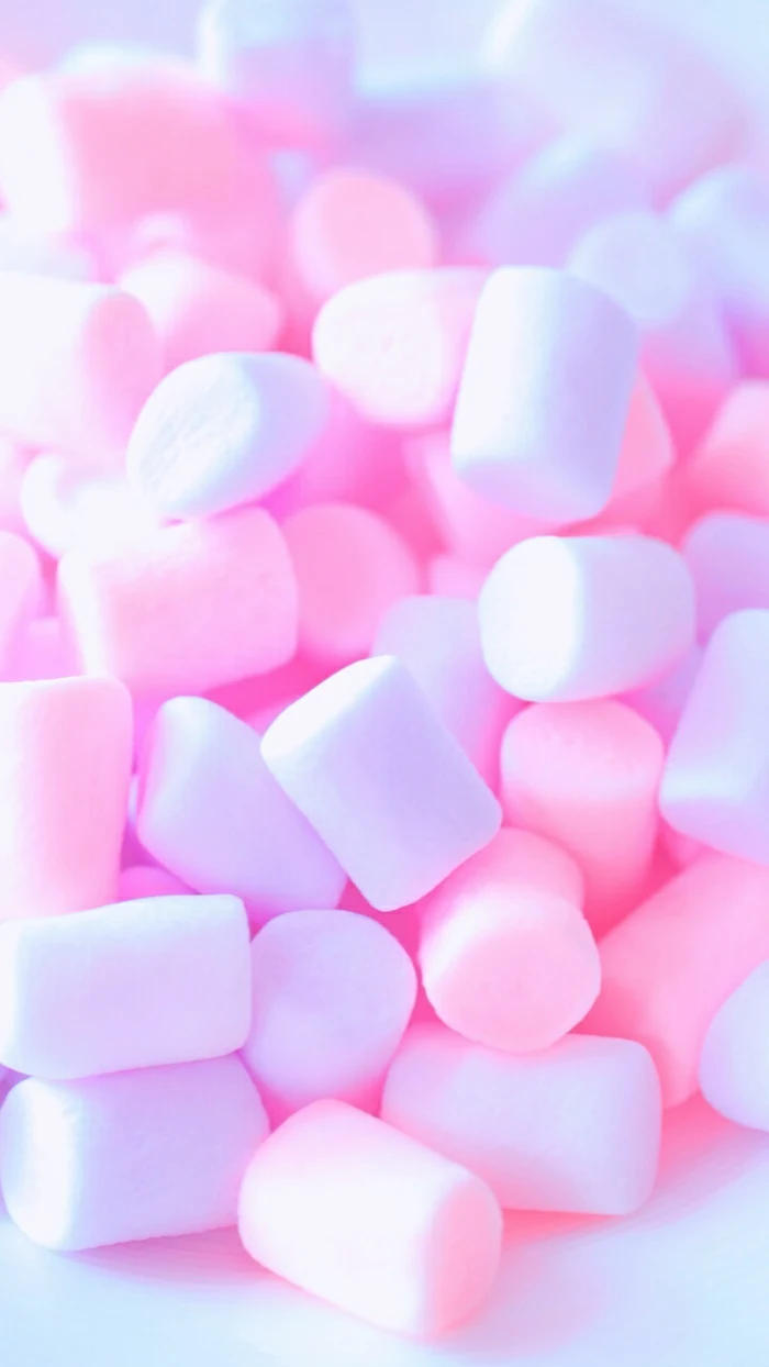
The 90s and Y2K aesthetic is a huge trend. Think grainy gradients, early CGI-style renders, and even classic icons from Windows 95. Search for terms like “vaporwave,” “aurora gradient,” or “frutiger aero” to find wallpapers that hit this specific nostalgic nerve. It’s a fun, retro way to customize your ultra-modern device.
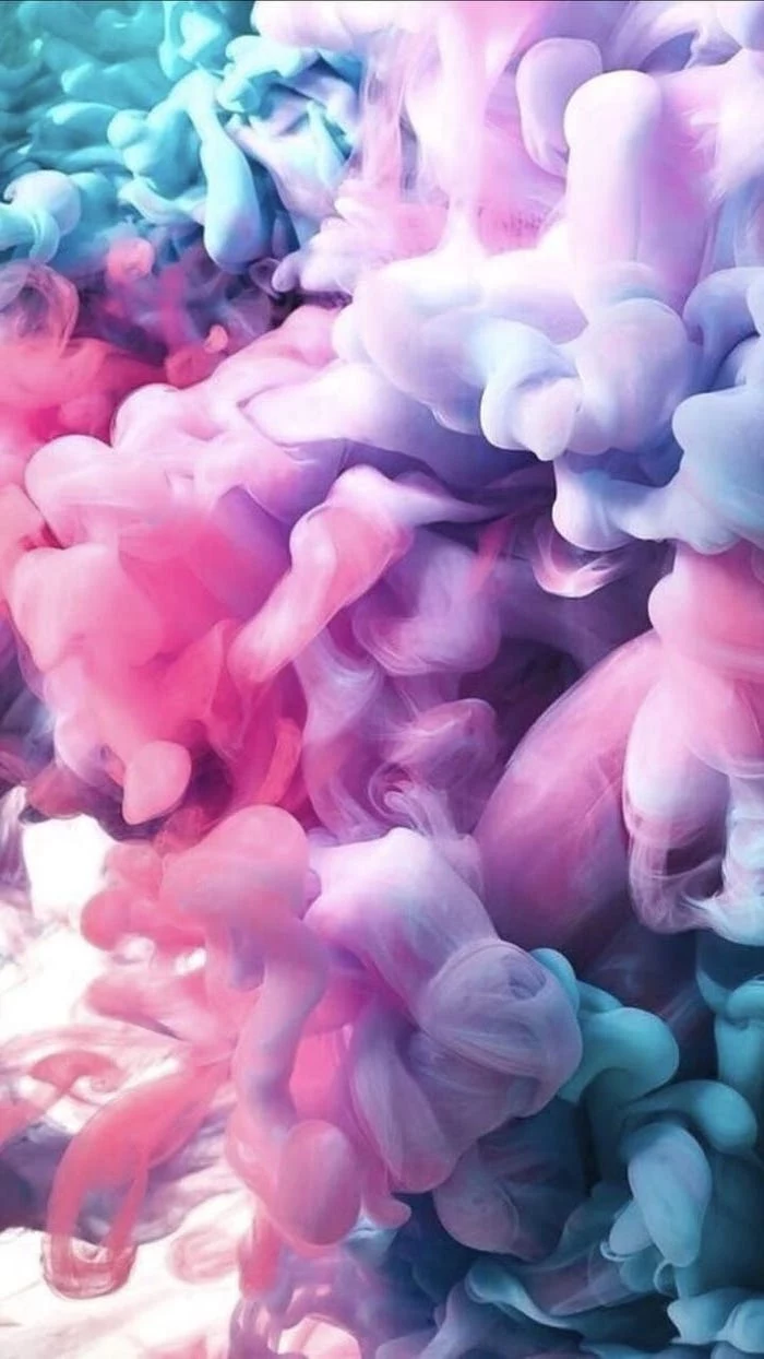
Go beyond simple colors and explore textures. A high-resolution photograph of a subtle texture can make your screen feel more tactile and premium. Consider:
- Brushed metal for a sleek, industrial feel.
- Dark wood grain for a warm, organic touch.
- Linen or fabric for a soft and cozy atmosphere.
- Marbled paper for a touch of classic elegance.


