I’ve been a graphic designer for what feels like a lifetime, and I’ve watched countless brands and trends fizzle out. It’s just the nature of the beast. But every now and then, a symbol comes along that just… sticks. It digs its claws into the culture and becomes something more.
You know the one I’m talking about—that simple red rectangle with the bold white word inside. For some, it’s just a logo. But for those in the know, it’s a whole vibe, a statement of independence that started in a tiny city skate shop.
I often use it as an example for young designers, not because of the hype, but because of its raw visual power and consistency. People want it on everything from a t-shirt to their phone screen. And that kind of loyalty isn’t bought with big ad budgets; it’s earned through a deep cultural connection.
So, this isn’t just a pretty picture gallery. We’re going to pop the hood and see what makes this thing tick. We’ll look at the design DNA, its cultural roots, and even how you can create your own version respectfully.
Breaking Down the Box: What’s the Secret Sauce?
At first glance, it looks almost deceptively simple, right? A red box with a word. But its power is hidden in those exact details.
The font is a specific version of Futura Bold Italic. It’s clean and geometric, but the italic slant gives it a sense of forward motion and urgency. It’s not just sitting there; it feels like it’s going somewhere. This is a subtle but absolutely critical choice.
And that red? It’s not just any red. It’s a loud, unapologetic, stop-sign red. For all the design nerds out there, the hex code is
FF0000. It’s pure, vibrant, and engineered to grab your attention from across the street.
By the way, here’s a little insider info. The whole look—the red box, the white Futura text—was heavily inspired by the work of a famous female conceptual artist. Her work often used this exact style for sharp social commentary. This adds a layer of ‘if you know, you know’ irony to the logo’s anti-establishment feel.
Your Turn: Make a Parody Box Logo in 5 Minutes
Want to try your hand at it? It’s actually a great little design exercise. Let’s do a quick run-through using a free tool like Canva, which you can use right in your browser.
Here’s how you can do it in just a few minutes:
Step 1: The Box. Create a new design and add a rectangle shape. The first thing you’ll do is set the color to that vibrant red we talked about:
FF0000. Easy enough.
Step 2: The Text. Add a text box over the rectangle and type your word. The key is finding the right font. Canva has some good alternatives if you don’t have Futura. Try searching for ‘Poppins Bold’ or ‘Montserrat Bold’ and then just click the ‘italic’ button. It gets you 90% of the way there for free.
Step 3: Get the Spacing Right. This is crucial and it’s what separates the good from the bad. Adjust the letter spacing (sometimes called ‘kerning’ or ‘tracking’) so the letters feel tight but still perfectly readable. You don’t want them crunched together or floating apart. Honestly, this detail makes all the difference.
Quick Tip: For 100% accuracy, you’d need to license the actual Futura Bold Italic font, which can run you about $35 for a single desktop license from a font foundry online. But for a personal project or a fun parody, a good free alternative works just fine.
Common Mistakes That Just Look ‘Off’
I’ve seen so many parodies and knock-offs that just miss the mark. If you’re making your own, a heads up: avoid these common mistakes that instantly cheapen the look.
The Wrong Red: Using a dark, muddy red or an orangey-red is a dead giveaway. It completely kills the energy and iconic look. Stick to that pure, bright red.
Font Flops: Using a font like Arial or Times New Roman and just slanting it. Please don’t. The clean, geometric lines of a sans-serif font like Futura are absolutely essential to the design’s DNA.
Awkward Sizing: This one’s common. The text is either way too small inside the box (leaving weird amounts of empty space) or it’s so big that it’s practically touching the edges. It’s all about finding that visual balance.
Quick Resources & Final Thoughts
So, there you have it. It’s more than a logo; it’s a masterclass in branding. It’s living proof that you don’t need insane complexity to make a massive impact. Sometimes, a strong idea, executed with confidence and consistency, is all it takes to become a legend.
Looking for a few things to get started on your own projects?
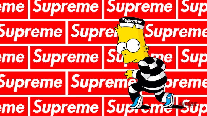
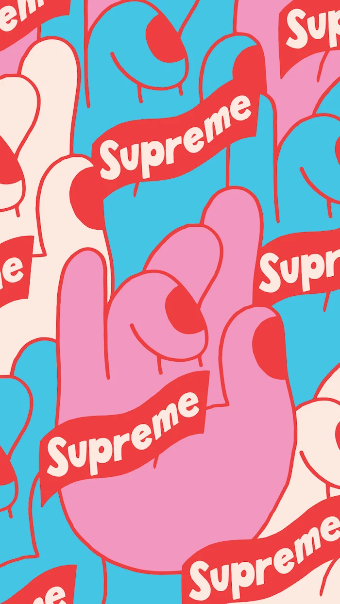
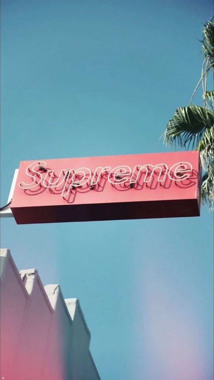
High-Res Wallpapers: You can find some great options for your phone or desktop by searching on community art sites or even Pinterest. Just search for ‘red box logo wallpaper’ and you’ll find plenty to choose from.
Free Font Alternatives: If you can’t spring for Futura, head over to Google Fonts and check out ‘Poppins’ or ‘Jost’. They’re fantastic, free-to-use fonts that capture a very similar modern, geometric feel.
The Artistic Inspiration: Curious about the art style that started it all? To go down that rabbit hole, search for terms like ‘feminist conceptual art’ or ‘bold text propaganda art.’ You’ll immediately see the original aesthetic and understand the connection.
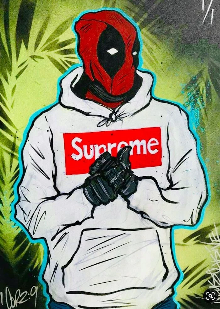
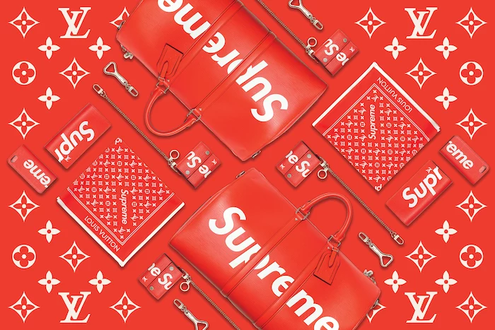
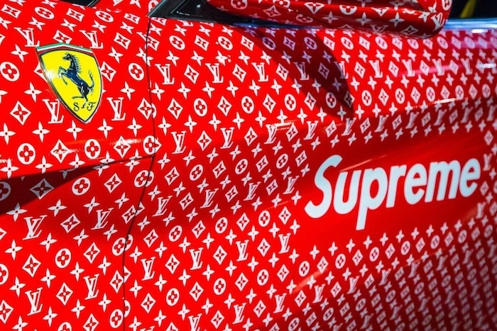
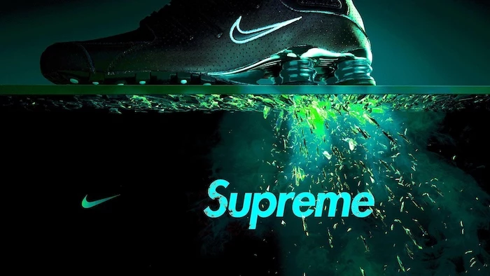
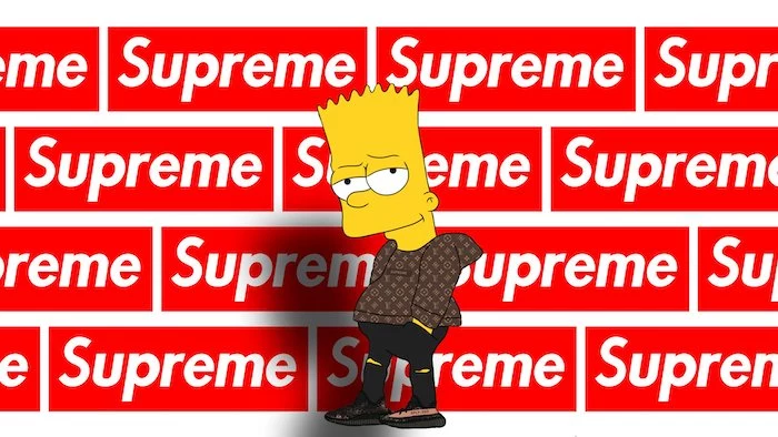
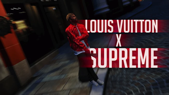
Inspirational Gallery
The article mentions the logo’s inspiration from a conceptual artist. That artist is Barbara Kruger. Her work from the 1980s uses the exact same Futura Bold Italic font on a red background to critique consumerism and power structures. The adoption of her style by a commercial brand is a layer of irony that adds to the logo’s cultural depth and ‘in-the-know’ appeal.
It improves recognition and recall.
It works at any size, from a tiny app icon to a massive billboard.
It feels confident and direct, with no visual clutter.
The secret? Reductive design. The art isn’t about what you add, but what you can take away until only the most powerful essence remains.
A study by the University of Loyola, Maryland, found that using a signature color can increase brand recognition by up to 80%.
That stop-sign red isn’t just a stylistic choice; it’s a psychological hack. It’s one of the first colors our brains process, hard-wiring the logo into memory far more effectively than a more muted or complex palette would.
Can I really just slap my name in a red box?
Legally, you’re entering the world of parody and fair use, which can be tricky. Parody, which comments on or critiques the original, often receives more protection than a simple copy. The key is transformation. If you’re creating a one-off art piece for your wall, you’re likely fine. If you’re building a commercial brand that directly mimics it, you might attract unwanted legal attention from the trademark holder. Always err on the side of creating something new inspired by the concept, rather than making a direct clone.
Important consideration: Negative space. With a box logo, the space around the letters is just as important as the letters themselves. Pay attention to the ‘kerning’ (space between letters) and the ‘margins’ (the empty red space between the text and the edge of the box). Too tight, and it feels cramped; too loose, and it loses its punch. The balance is what creates the iconic, solid look.
Looking for that bold, geometric vibe but want something other than Futura? There are great alternatives.
Montserrat: A free Google Font with a similar urban, geometric feel. Its versatility is a huge plus.
Poppins: Another excellent free option, slightly rounder and friendlier but still clean and modern.
Avenir Next: A paid alternative, but it’s a designer’s favorite for a reason. It’s exceptionally well-balanced and reads beautifully.
Adobe Illustrator: The industry standard for vector graphics. Offers ultimate control, precision, and outputs professional-grade files. It has a steep learning curve and a subscription fee.
Canva or Figma: Web-based tools that are much more user-friendly. Canva is great for quick, template-based designs, while Figma offers more robust vector capabilities for free. For a personal project, these are fantastic starting points.
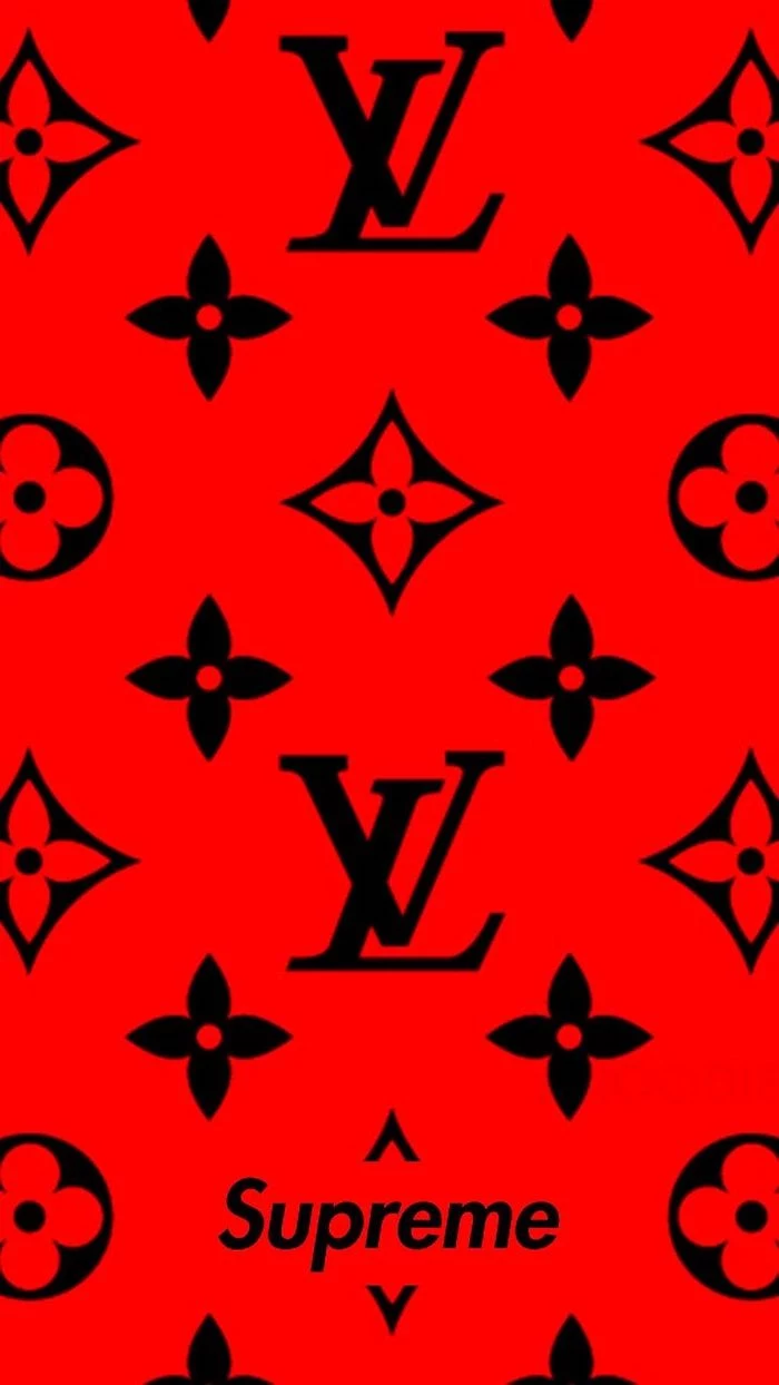
The power of the box logo isn’t just the logo itself, but its function as a ‘container.’ It’s a frame that can be placed on anything—a photo, a pattern, another brand’s logo—and instantly claim it. This is why collaborations like the ones with Louis Vuitton or Nike feel so natural; the red box acts as a stamp of approval, branding the entire visual it sits on.
What’s a vector file, and why do I need one for my logo?
A vector file (like an .AI, .EPS, or .SVG) is created using mathematical equations, not pixels. This means you can scale it to any size—from a tiny pin to a giant billboard—without it ever getting blurry or pixelated. A standard image file like a .JPG or .PNG will lose quality when enlarged. For a logo, a vector file is non-negotiable.
The choice of an italic font is a masterstroke in subtle messaging. Non-italic text feels stable and static. Futura Bold Italic leans forward, injecting a sense of motion, urgency, and rebellion. It’s not just stating a name; it feels like it’s on the move, leading a charge.
Too many ideas: A logo should communicate one core idea, not three.
Relying on trends: That cool glitch effect or neon glow will look dated in two years. Aim for timelessness.
Poor font choice: Avoid novelty fonts. A classic, well-crafted typeface gives your logo authority and longevity.
Designing in raster: Always create logos in a vector program to ensure they are scalable.
Before you even think about color, test your design in pure black and white. If it’s not recognizable and balanced in its simplest form, no amount of color will save it. A strong monochrome version proves the core concept is solid.
The original Supreme store opened in 1994 on Lafayette Street in New York City.
This context is crucial. It wasn’t born in a corporate boardroom; it emerged from the heart of ’90s downtown skate culture. That authenticity is the bedrock of its credibility. The logo doesn’t just represent a brand; it represents a specific time, place, and subculture.
The box logo’s aesthetic has deep roots in 20th-century art movements. The use of bold, sans-serif typography and primary colors echoes the principles of Russian Constructivism and the Bauhaus school, which championed clean, functional, and socially-minded design. It’s a classic look repackaged for a modern, counter-cultural audience.
Think beyond the logo. The most powerful brands have a full visual system. For your own project, consider:
A secondary color palette: What other colors work alongside your main ones?
A secondary typeface: A readable font for longer text that complements your logo font.
Graphic elements: Textures, patterns, or shapes that can be used to build out a full brand world.
Instantly communicates a mood, from playful to luxurious.
Sticks in the viewer’s memory long after they’ve looked away.
Creates a cohesive look across all your materials.
The key? Consistent color psychology. Choosing one or two primary brand colors and using them everywhere creates an immediate emotional shortcut for your audience.
How do I get my logo onto a real-life T-shirt or hoodie?
Once you have your design as a high-resolution file (preferably vector), you can use Print-on-Demand (POD) services. Sites like Printful, Redbubble, or Everpress let you upload your design, choose the garment, and they’ll handle the printing and shipping. Everpress is particularly good for limited-run campaigns, adding to that exclusive ‘drop’ culture feeling.
According to design experts, a person forms a first impression of a logo in as little as 10 seconds.
This is why simplicity wins. A complex, hard-to-read design will be dismissed before it’s even understood. The red box logo is processed and understood almost instantaneously, making its first impression both fast and forceful.
The ultimate test: The Favicon. Can your logo be simplified down to a 16×16 pixel square and still be recognizable? This is the tiny icon you see in a browser tab. If your design turns into an unreadable smudge at that size, it’s too complex. The red box, even without text, remains a distinct red square, passing the test with ease.
Parody: Mimics a work to comment on or make fun of it. Think of ‘Weird Al’ Yankovic’s songs. It’s transformative.
Pastiche: Imitates the style of a work or artist respectfully, as a form of tribute. Think of a modern film shot in the style of 1940s film noir.
Creating your own box logo falls somewhere in between, but understanding the difference is key to defining your creative intent.
A 2003 study on color and emotion confirmed that red is consistently associated with strength, excitement, and energy, but also with aggression and defiance.
This duality is exactly what makes it perfect for a brand rooted in skate culture. It’s both high-energy and anti-establishment, all conveyed in a single color choice.
Want to start designing your own logo but don’t want to pay for Adobe Illustrator? Figma is a powerful, browser-based design tool used by professionals at companies like Google and Microsoft, and its core features are completely free. It’s perfect for creating the vector graphics you need for a high-quality logo project.
Notice how the logo often appears on unexpected, high-luxury items, like in the gallery’s Louis Vuitton and Ferrari examples? This is a classic branding tactic known as ‘juxtaposition.’ By placing a symbol of gritty street culture onto an object of elite luxury, it creates a powerful sense of tension, irony, and desirability. It breaks rules and gets people talking.
A final check: Ask someone who knows nothing about your project to look at your finished logo for five seconds. Then, ask them to describe the feeling it gave them. Did they say ‘energetic,’ ‘calm,’ ‘corporate,’ ‘playful’? Their first impression is pure, unbiased feedback on whether your design is hitting its mark.
John combines 12 years of experience in event planning, interior styling, and lifestyle curation. With a degree in Visual Arts from California Institute of the Arts and certifications in event design, he has styled luxury weddings, corporate events, and celebrity celebrations. John believes in creating memorable experiences through innovative design and attention to detail.
To provide the best experiences, we use technologies like cookies to store and/or access device information. Consenting to these technologies will allow us to process data such as browsing behavior or unique IDs on this site. Not consenting or withdrawing consent, may adversely affect certain features and functions.
Functional
Always active
The technical storage or access is strictly necessary for the legitimate purpose of enabling the use of a specific service explicitly requested by the subscriber or user, or for the sole purpose of carrying out the transmission of a communication over an electronic communications network.
Preferences
The technical storage or access is necessary for the legitimate purpose of storing preferences that are not requested by the subscriber or user.
Statistics
The technical storage or access that is used exclusively for statistical purposes.The technical storage or access that is used exclusively for anonymous statistical purposes. Without a subpoena, voluntary compliance on the part of your Internet Service Provider, or additional records from a third party, information stored or retrieved for this purpose alone cannot usually be used to identify you.
Marketing
The technical storage or access is required to create user profiles to send advertising, or to track the user on a website or across several websites for similar marketing purposes.