Your Desktop Wallpaper Is More Important Than You Think—Here’s How to Get It Right
I’ve set up more digital workspaces than I can count. For myself, for clients, for fresh-faced designers just starting out. And you know the first thing I almost always change? It’s not the software or the toolbars. It’s the desktop wallpaper.
In this article
People usually laugh, but honestly, the image sitting behind all your icons is so much more than just a pretty picture. It’s the entire foundation of your digital office. It sets the tone for your mood, your focus, and believe it or not, can even impact your device’s performance.
A bad wallpaper can make your icons impossible to read, give you a low-key headache, or just create visual chaos. But a great one? It creates a calm, organized space that feels both personal and professional. It’s such a simple tweak with a massive payoff. Think about it—we spend hours a day staring at these screens. Making that view a pleasant and functional one is a huge quality-of-life upgrade.
So, this isn’t just a gallery of cool images. This is a deep dive into the practical side of choosing a digital wallpaper that actually works for you.
First, Let’s Get the Tech Stuff Right
Before we can even think about artistic vibes, we have to talk science. A stunning photograph can look like a blurry mess if the technical details are off. Getting these basics down is step one.
Resolution: The Secret to a Crisp, Clear Image
The single most common mistake I see is a resolution mismatch. You find a picture you love, set it as your background, and it’s suddenly stretched, blurry, or has those awful black bars on the sides. This happens when the wallpaper’s pixel dimensions don’t line up with your screen’s.
Think of it like this: your screen is a picture frame of a specific size. If you try to shove a tiny photo into a giant frame, it’s not going to look right. You can’t magically create detail that isn’t there in the first place.
Good to know: Here’s how to get it right:
- Find Your Screen’s Resolution: This is just its width and height in pixels. It’s super easy to find. On Windows, just right-click your desktop and choose ‘Display Settings’. On a Mac, it’s under the Apple Menu> About This Mac> Displays. For your phone, it’s usually in the Display section of your Settings app.
- Match the Wallpaper: Armed with that number (like 1920×1080 or 2560×1440), you can now hunt for wallpapers that are at least that big. Using a larger image is totally fine—your computer will just scale it down. But using a smaller one will always look fuzzy.
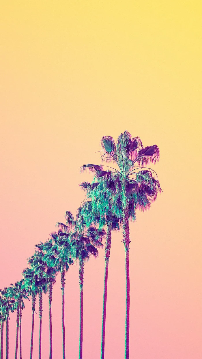
Oh yeah, and don’t forget the Aspect Ratio! That’s just the shape of the screen. Most computer monitors are a wide 16:9 shape. Phones, however, are tall and skinny. So if you try to use a wide desktop wallpaper on your phone, you’ll end up cropping out most of the image. For phones, always look for tall, vertical images.
File Formats: A Quick Guide to JPG vs. PNG
Not all image files are the same, and the format you choose can affect both quality and file size. You’ll mostly run into two types: JPG and PNG. Here’s the simple breakdown:
- JPG (or JPEG): This is your go-to for photographs. It uses a smart kind of compression that shrinks the file size by getting rid of a tiny bit of data your eyes would never notice anyway. For complex images like landscapes, portraits, or anything with lots of colors and gradients, JPG is perfect.
- PNG: This one is the champion for graphics, logos, text, or illustrations with sharp, clean lines. It uses “lossless” compression, meaning it keeps all the original data, which results in a larger file size. Its superstar feature is that it supports transparency, which JPGs don’t.
A little pro-tip: Windows has a weird habit of re-compressing any JPG you set as a wallpaper, which can sometimes make smooth skies or gradients look a little blocky. If you’ve got a super high-quality photo that looks perfect in the viewer but slightly worse on your desktop, try this: save it as a PNG first, then set it as your wallpaper. The larger file might sidestep that pesky OS compression and keep it looking pristine.
But Will It Slow My Computer Down?
This is a question I get all the time. Will a huge, 25MB high-resolution PNG file bring your laptop to its knees? The short answer is: almost certainly not.
Modern operating systems are incredibly efficient. When you set a static image (like a JPG or PNG) as your wallpaper, it’s loaded into memory once and then just… sits there. It has virtually zero impact on your computer’s day-to-day performance. So go ahead, use that gorgeous 8K image—your machine can handle it.
The real performance hogs are animated wallpapers. You know, the ones with moving clouds or subtle animations. They look cool, but they require constant CPU and RAM to run. If you’re into that, a great free tool for Windows is Lively Wallpaper. Just be realistic: it will use system resources. A simple animation might only use 1-2% of your CPU, but a complex 3D scene could use more. My advice? Try it out and keep an eye on your Task Manager to see if the performance hit is worth the visual flair for you.
A Designer’s Eye: Choosing a Wallpaper That Works
Okay, with the tech talk out of the way, let’s get to the fun part. A pro doesn’t just pick a picture they like; they think about composition, color, and how the background will actually function as a workspace.
Composition: Don’t Fight With Your Icons
A busy, centered image is your enemy. It creates visual clutter and makes it hard to find your files. Instead, think like a photographer:
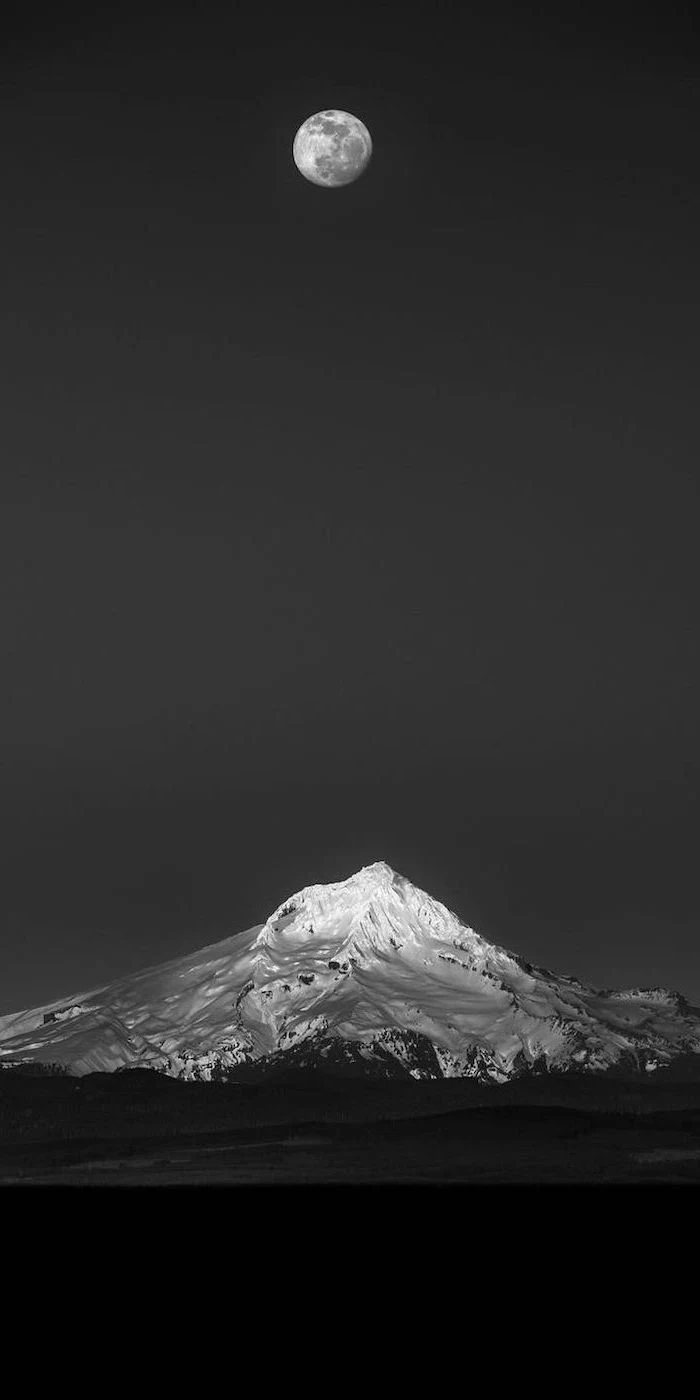
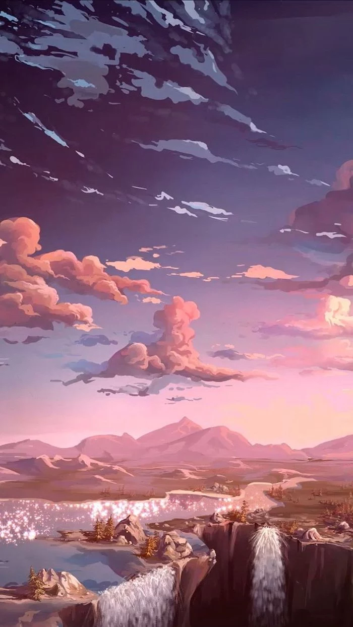
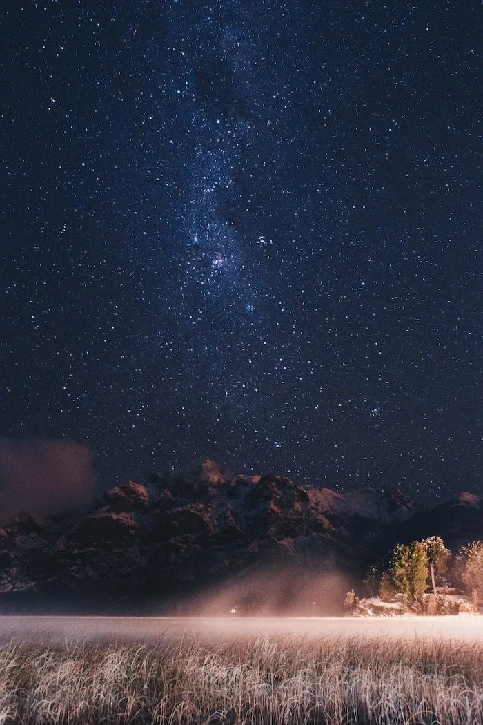
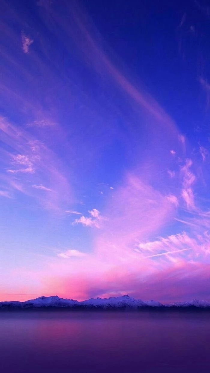
- The Rule of Thirds: Imagine a 3×3 grid over your screen. The most effective wallpapers place the interesting stuff—the subject—off to one side, along one of the lines. A mountain peak on the right third of the screen leaves the other two-thirds nice and clean for your icons.
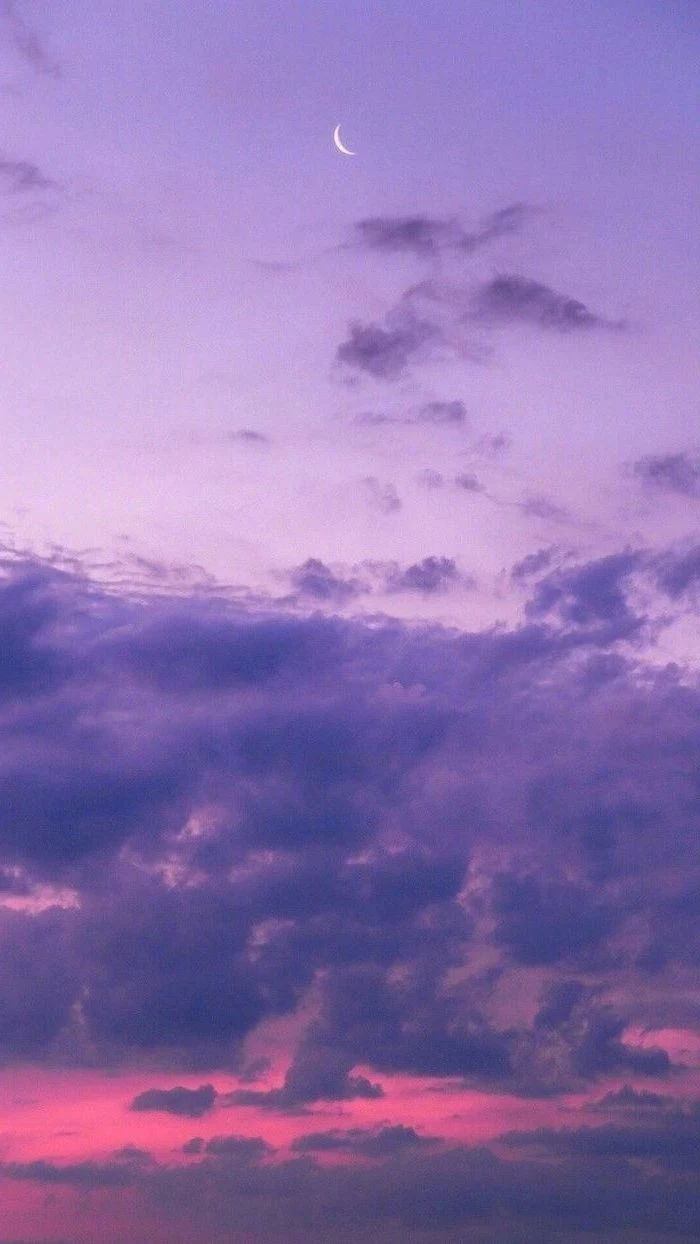
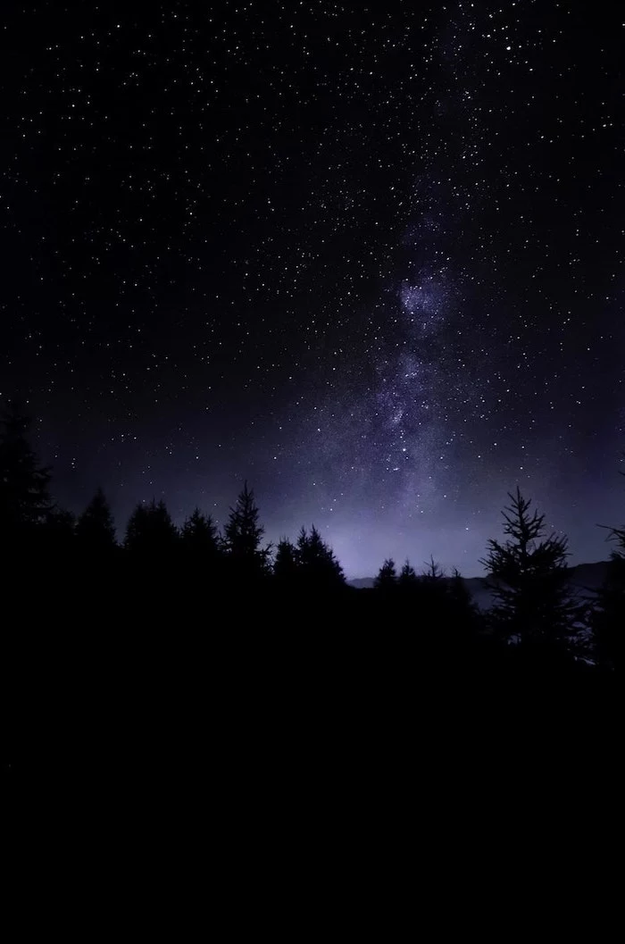
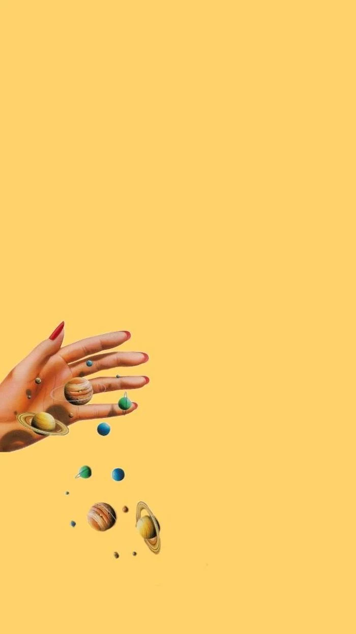
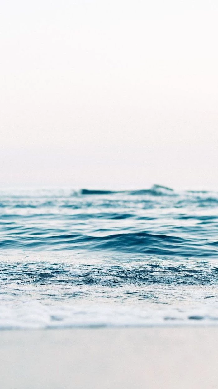
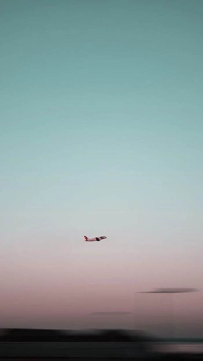
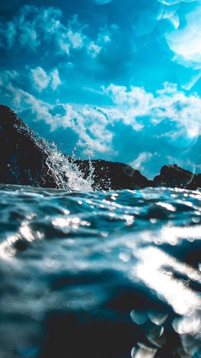
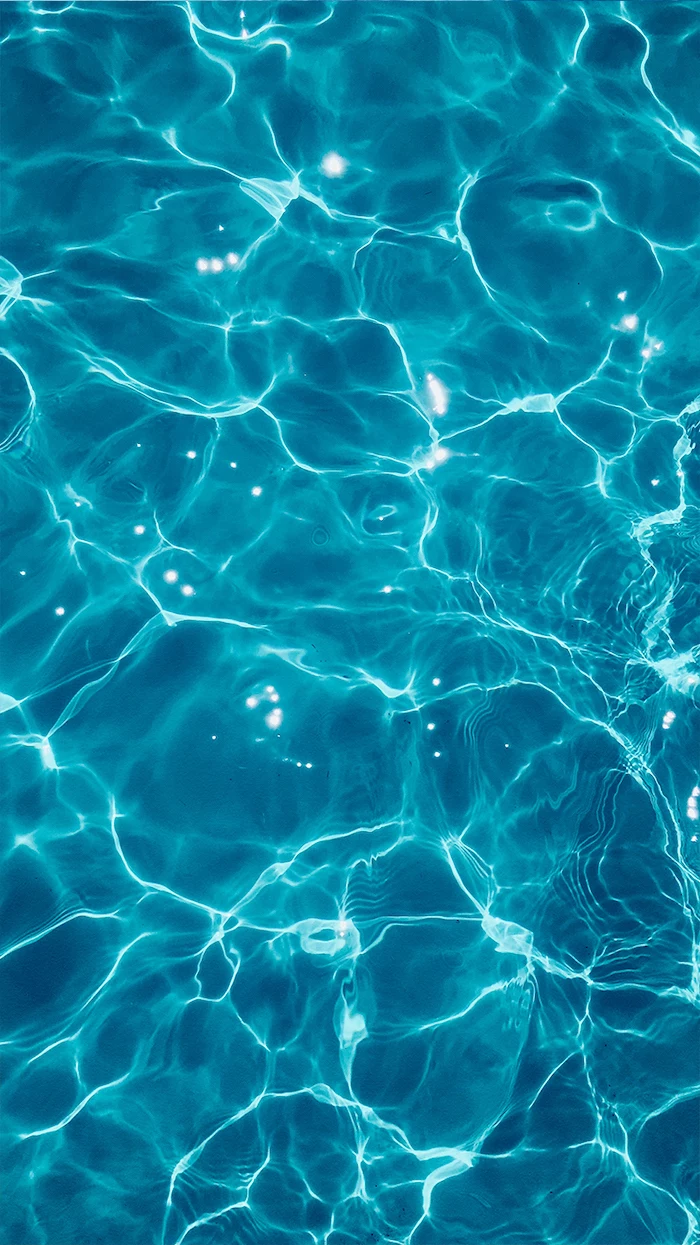
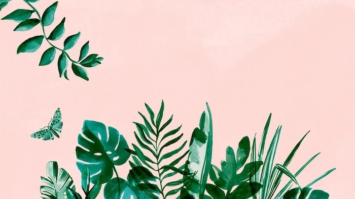
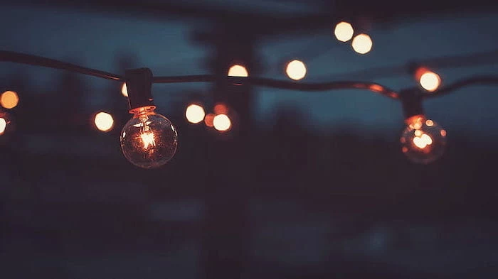
- Embrace Negative Space: This is just a fancy term for the empty parts of an image. A clear sky, a misty field, a simple concrete texture… these are your best friends. They give your eyes a place to rest and make your shortcuts pop.
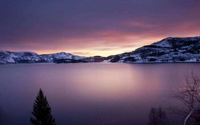
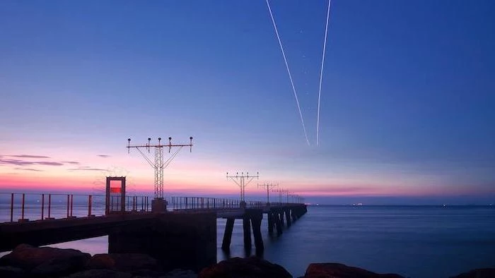
For my main work computer, I use a photo of a foggy coast. The calm ocean and sky fill the top-right portion, giving me a huge, soft, gray area for all my important folders. They’re super easy to see. The interesting, rocky part of the coast is tucked away in the bottom-left corner, where I keep my trash bin.
Color: It’s All About Mood and Focus
The colors you stare at all day have a real psychological impact. Choosing the right tones can genuinely boost your productivity and reduce eye strain.
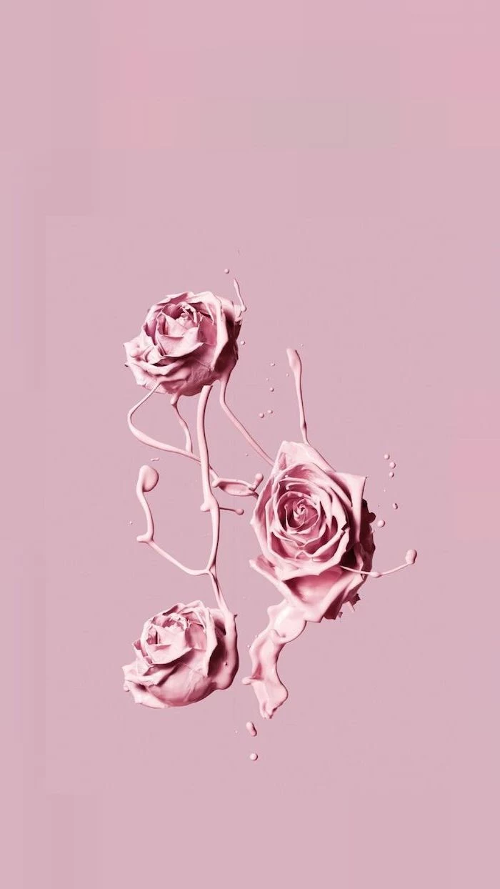
- For Calm & Focus: Cool colors are where it’s at. Think blues, greens, and muted grays. They are known to be calming and are fantastic for work environments. A soft, desaturated green is much less tiring than a bright, lime green.
- For Energy & Creativity: Warm colors like orange and yellow can feel more energetic, which is great for creative brainstorming. But, they can also be distracting. If you go for a warm wallpaper, try to find one that’s a bit abstract or soft-focus so it doesn’t scream for your attention.
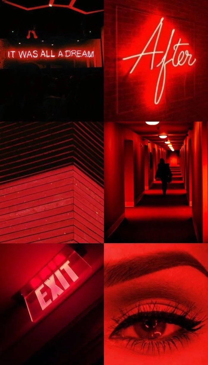
- A Note on Contrast: A super high-contrast image (with pure blacks and bright whites) can be tough on the eyes over an 8-hour day. A low-contrast image, where the colors are more similar in tone, is way more comfortable. This is why Dark Mode is so popular!
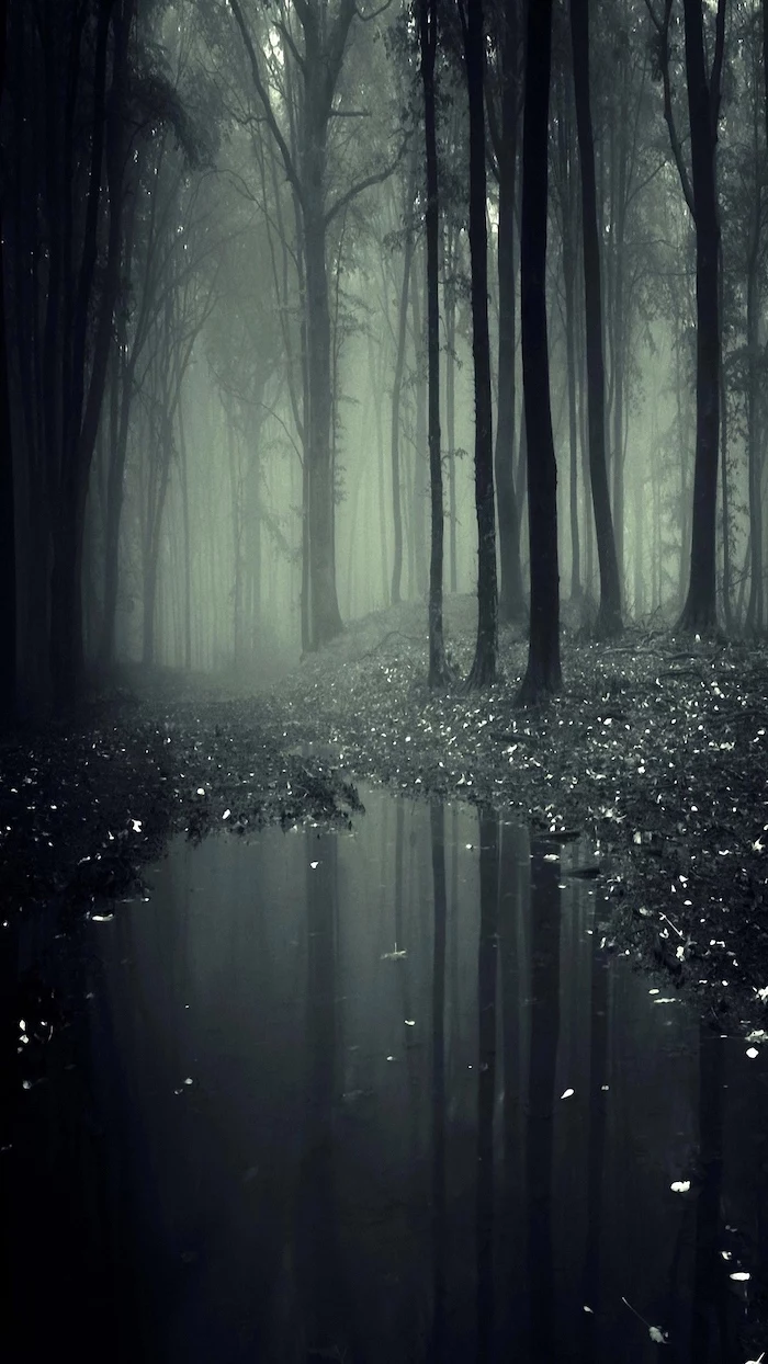
I once helped a writer who was getting headaches and felt distracted. Her wallpaper was a chaotic, super-saturated photo of a festival. We swapped it for a low-contrast shot of a misty forest. A week later, she said the difference was night and day. Her screen felt calmer, and focusing on her documents was so much easier.
Your Mission (If You Choose to Accept It): Go to Unsplash right now. Search for “[your resolution] negative space” (e.g., “1920×1080 negative space”). Pick one you like and use it for the rest of the day. Just notice how it feels. It might surprise you!
Where to Find Great Wallpapers (and How to Make Your Own)
Alright, you know what to look for. But where do you find the good stuff?
Great (and Safe) Places for Free Wallpapers
Stock photo sites can be hit-or-miss, but a few are consistently excellent for high-resolution, beautiful images.
- Unsplash: My personal favorite for artistic photography. Amazing for nature, textures, and architecture.
- Pexels: A huge library of great photos and even some videos (if you decide to try animated wallpapers).
- Museum Websites: This is a fantastic, lesser-known trick. Major museums like the Rijksmuseum and The Met offer public domain art for free. You can download stunning masterpieces in resolutions high enough for any screen.
Heads up! A quick word on safety. Please, never just search Google Images and download the first thing you see. Most of those images are copyrighted. Worse, many of those sketchy “free wallpaper” sites bundle their downloads with malware. Stick to reputable sources that clearly state the image license is “free to use.”
DIY: Making the Perfect Wallpaper
Sometimes, the only way to get exactly what you want is to make it yourself. It’s easier than you think with free tools like Canva.
Here’s a super simple workflow in Canva:
- Start with the Right Size: This is the most critical step. Create a new design using your screen’s exact pixel dimensions (e.g., a custom size of 3840 x 2160 pixels for a 4K monitor).
- Find Your Source Image: Upload a high-resolution photo you took or one you downloaded from Unsplash. Make sure it’s larger than your canvas.
- Compose the Scene: Here’s the magic trick. Just drag your uploaded photo to the very edge of the canvas until it snaps into place as the background. Now, you can double-click it to pan and zoom the photo around inside the frame until you get the perfect composition. Remember to leave that negative space for your icons!
- Tweak and Export: You can use Canva’s editing tools to lower the saturation or contrast. When you’re done, export it as a JPG for a photo or a PNG for a graphic.
Advanced Fixes for Common Problems
Even with a perfect plan, things can sometimes go wrong. Here are a few common issues and how to fix them.
Help! My Wallpaper Looks Blurry!
This is usually due to one of two things. Either the source image was too small (the only fix is to find a bigger one), or your operating system is compressing it too much. As I mentioned before, if you have a high-quality JPG that looks blurry, try resaving it as a PNG and see if that helps.
My Wallpaper Has Weird Lines or Blocks In It!
Ah, you’ve discovered color banding. This happens in smooth gradients (like a sunset) when there isn’t enough color information to make a seamless transition. The fix is surprisingly simple: add a tiny bit of noise.
It sounds counterintuitive, but adding grain breaks up those harsh lines and tricks your eye into seeing a smoother gradient. You don’t need fancy software for this. In a free online editor like Photopea.com, just open your image, go to Filter> Noise> Add Noise, and enter a tiny amount like 1% or 2%. Make sure it’s set to ‘Monochromatic’. Save it, and the banding should be gone.
What About My Multi-Monitor Setup?
If you’re running two or more screens, you’ve got options! Both Windows and macOS have built-in settings that let you set a different wallpaper for each monitor. Just look in your regular display personalization menu.
But what if you want more advanced control, like stretching one giant panoramic image across all your screens? For that, you might need a third-party tool. For Windows users, DisplayFusion is the undisputed king (it’s a one-time purchase, usually around $30, but well worth it). For Mac users, an app like Multi Monitor Wallpaper can give you similar, powerful controls.
So there you have it. Choosing a wallpaper is a small act, but when you approach it with a bit of intention, you can turn your desktop from a cluttered mess into a space that’s functional, beautiful, and uniquely yours. It’s proof that sometimes, the little details make all the difference.

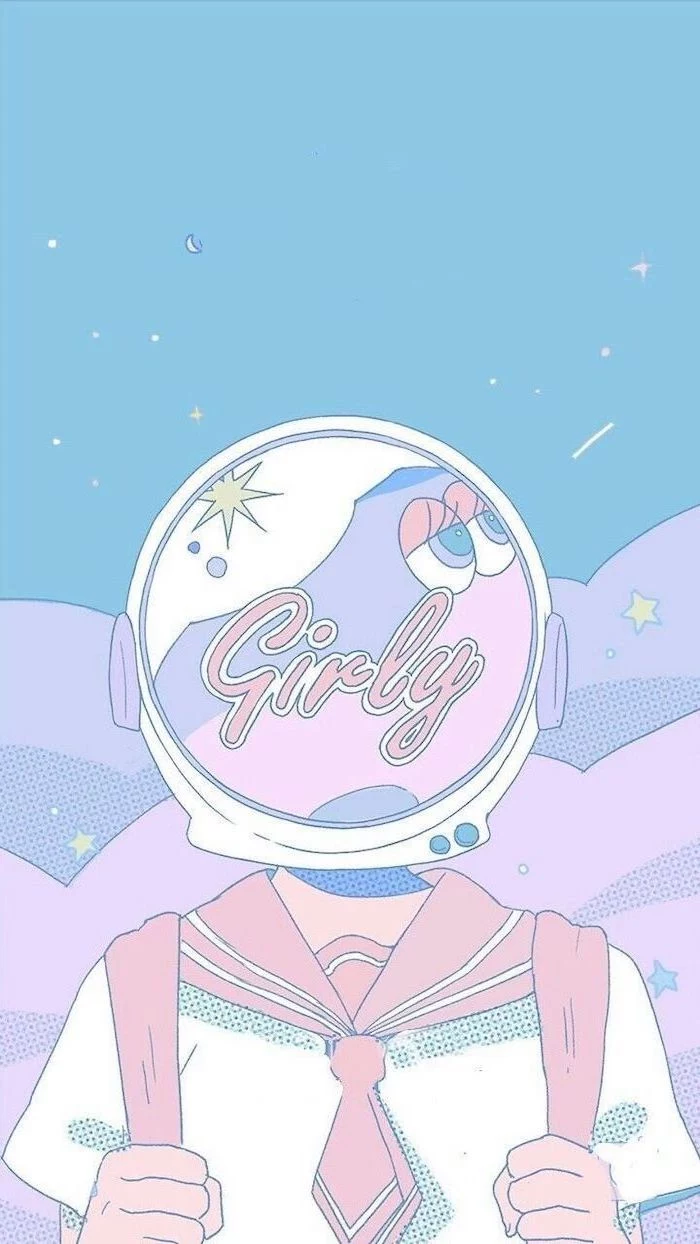
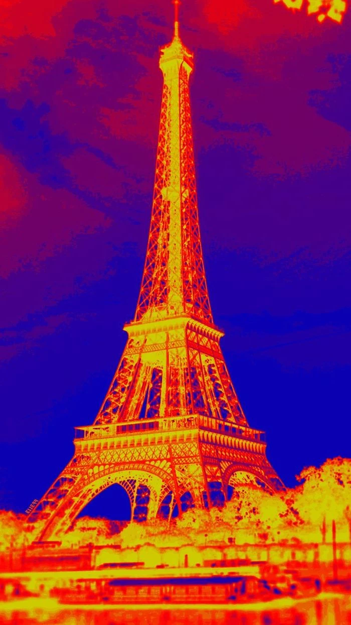
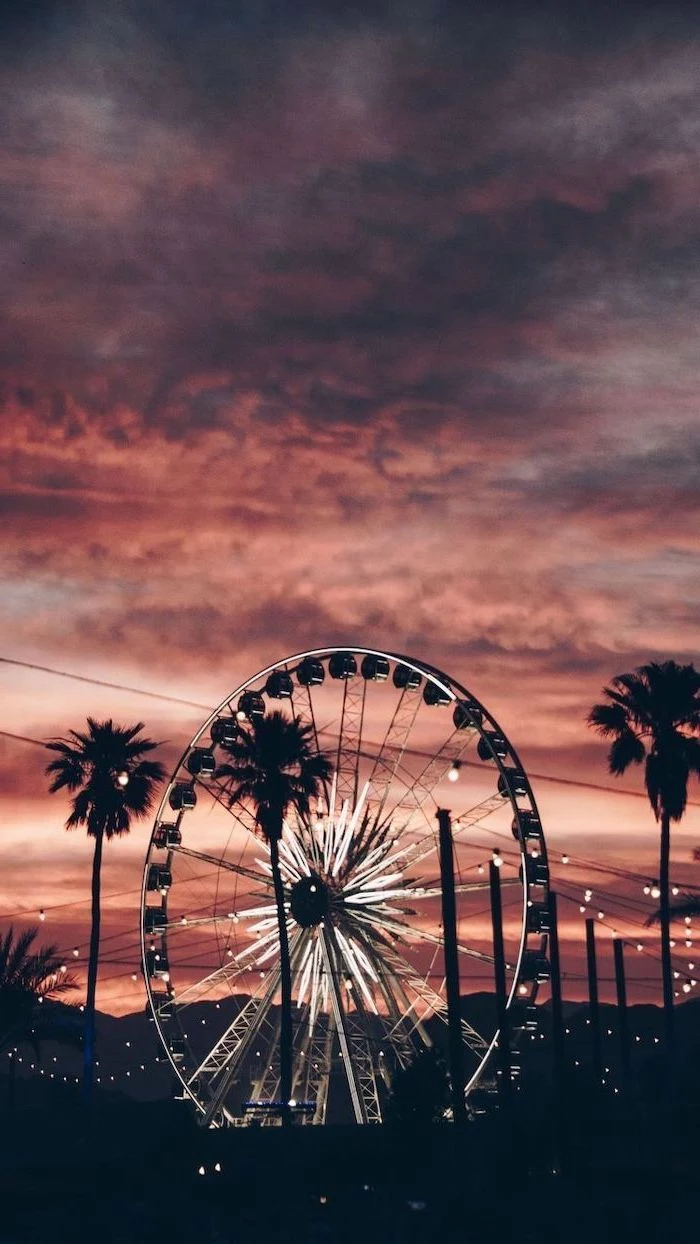
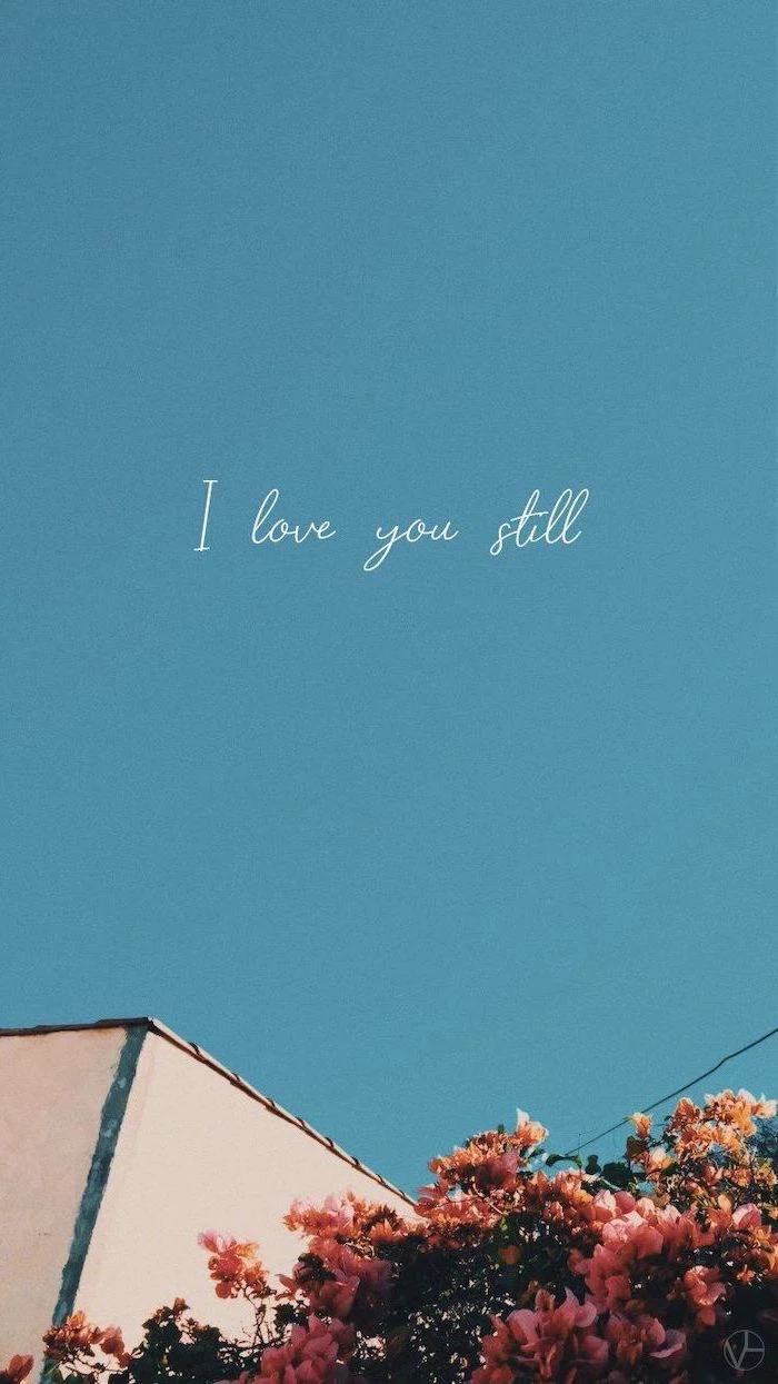
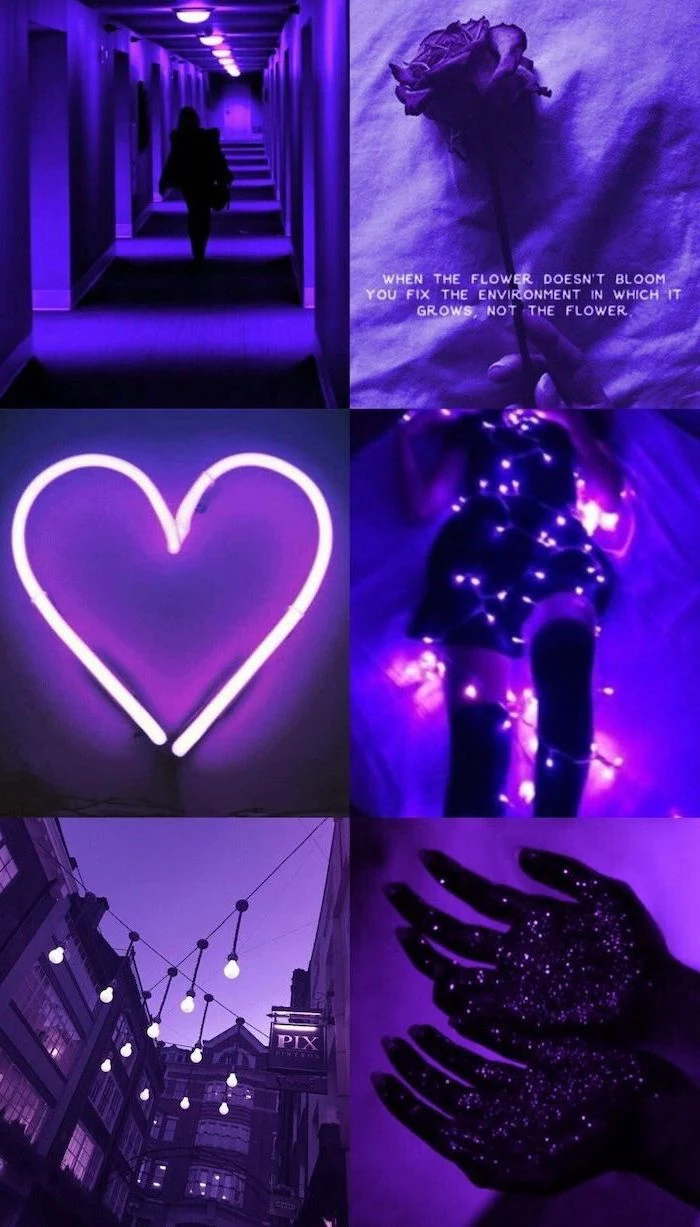
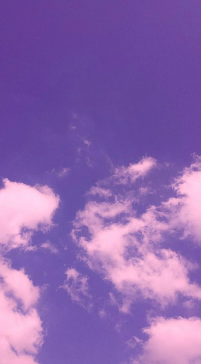
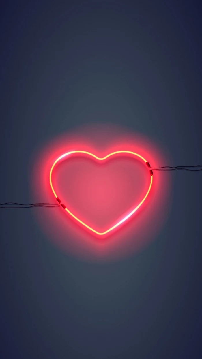
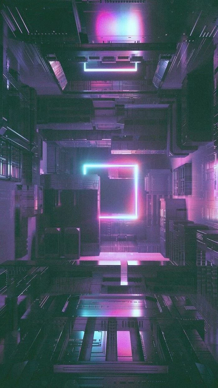
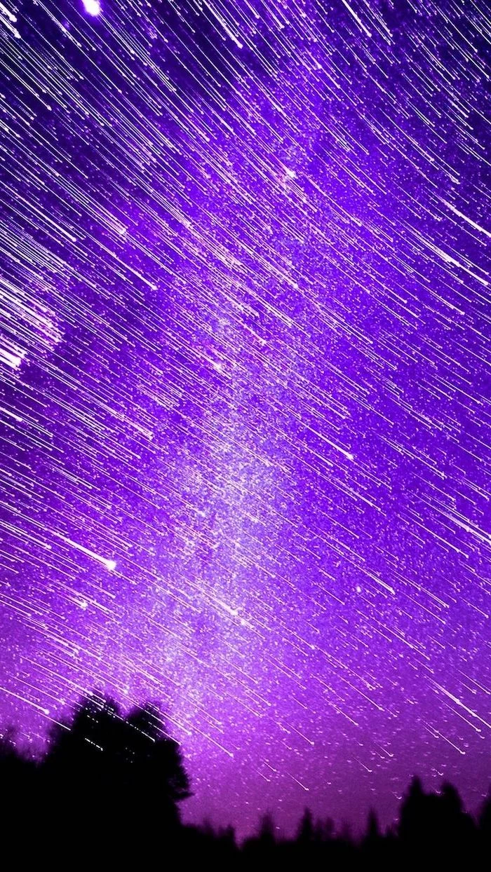
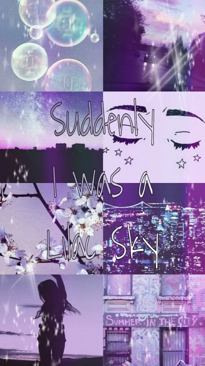
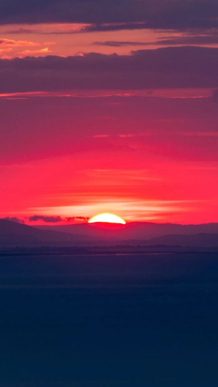
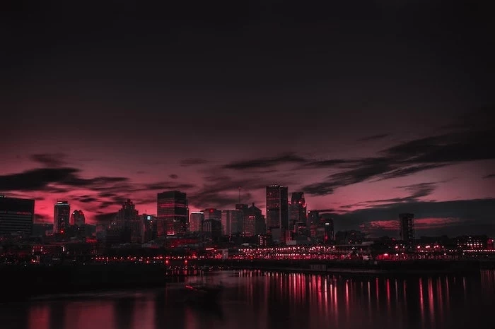
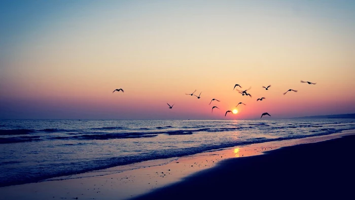
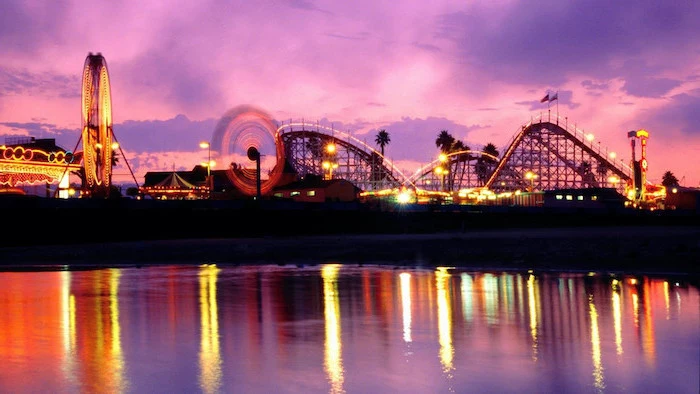
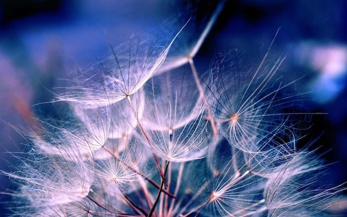
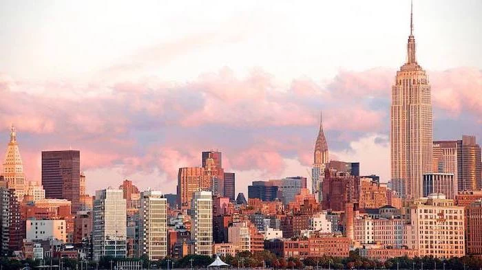
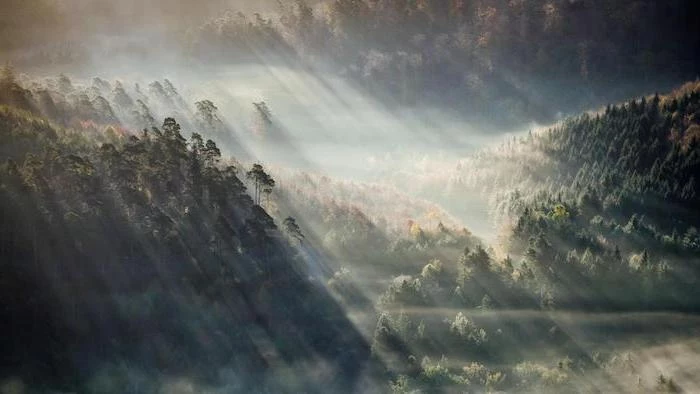
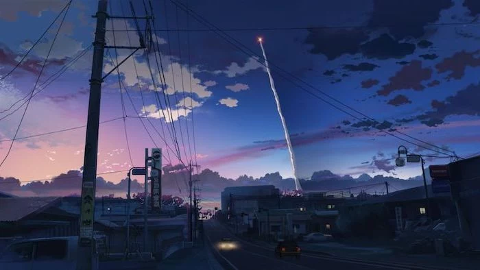
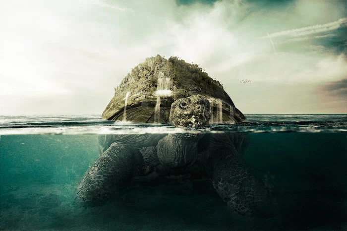
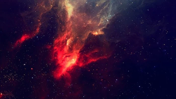
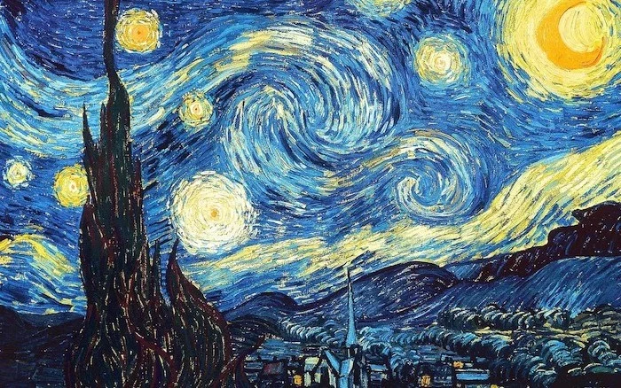
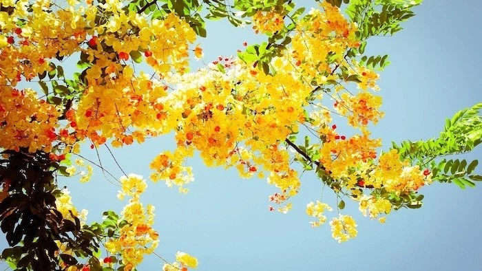
Inspiration Gallery
Static vs. Dynamic: A static wallpaper is a single, unchanging image—classic and light on resources. A dynamic wallpaper changes based on the time of day, weather, or other inputs. Apps like Wallpaper Engine on PC or the native dynamic options on macOS offer immersive experiences but use slightly more CPU and battery.
A study from the University of Exeter found that employees who have control over the design and layout of their workspace are happier, healthier, and up to 32% more productive. Your digital desktop is no exception.
Struggling to see your icons? Don’t blame your screen. Your wallpaper might be too ‘busy’. Look for images with ‘negative space’—large areas of calm, like a clear sky, a misty field, or a simple textured wall. This creates a natural, uncluttered area to place your most-used shortcuts for instant visibility.
- Boosts concentration with fewer distractions.
- Reduces visual stress and eye strain.
- Makes icons and files instantly identifiable.
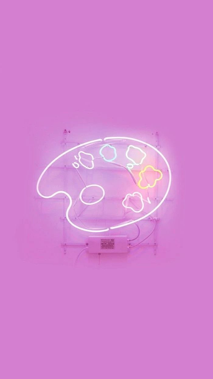
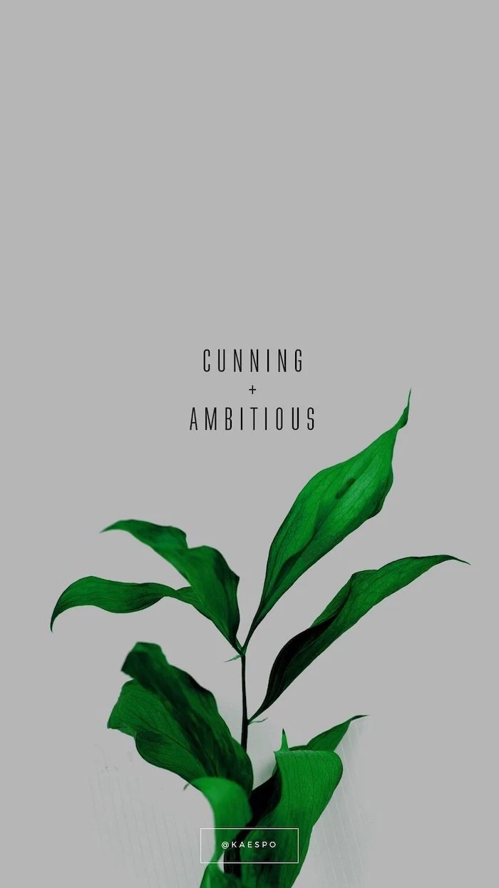
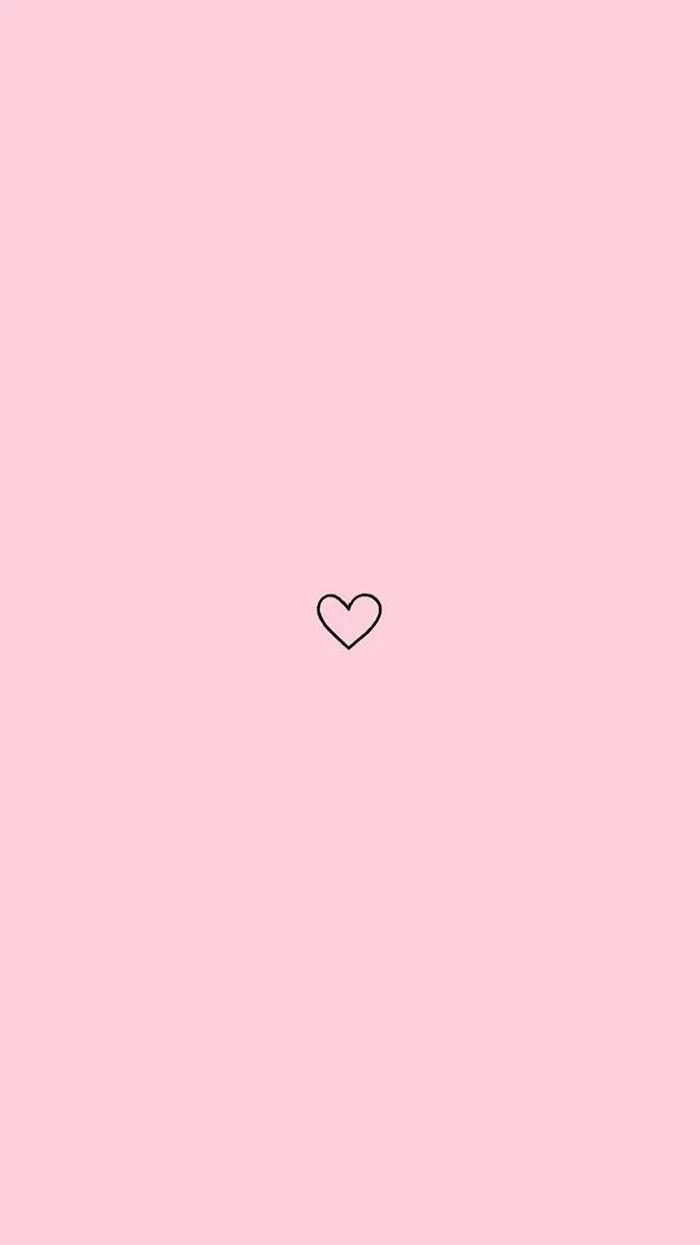
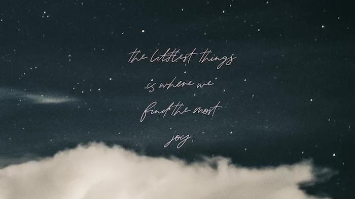
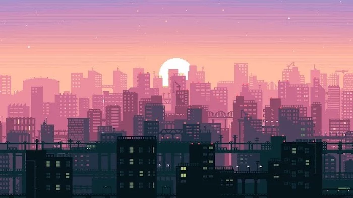
The secret? A minimalist wallpaper. Think single-line drawings, subtle gradients, or a simple geometric pattern on a solid background. It’s the digital equivalent of a clean, organized desk.
Can my wallpaper actually affect my mood?
Absolutely. It’s a core principle of color psychology. Blue tones are known to promote calmness and focus, making them ideal for work. Greens can reduce eye strain and evoke a sense of tranquility. Meanwhile, energetic colors like orange or yellow can provide a creative spark, perfect for brainstorming sessions.
Create a truly personal touch by turning your own photos into a stunning wallpaper. The key is choosing the right shot.
- Landscapes work best: They offer broad vistas that don’t clash with icons.
- Avoid busy portraits: Faces can be distracting and are often obscured by app windows.
- Use a simple editor: Apps like Fotor or even Instagram’s editor can add a filter that unifies the image and improves text contrast.
A key detail for multi-device users: Syncing your wallpaper across your phone and desktop creates a wonderfully seamless digital environment. For the best result, don’t use the exact same image file. Find a high-resolution version and crop it specifically for each device’s aspect ratio—vertical for your phone, horizontal for your monitor. This prevents awkward stretching or cropping.
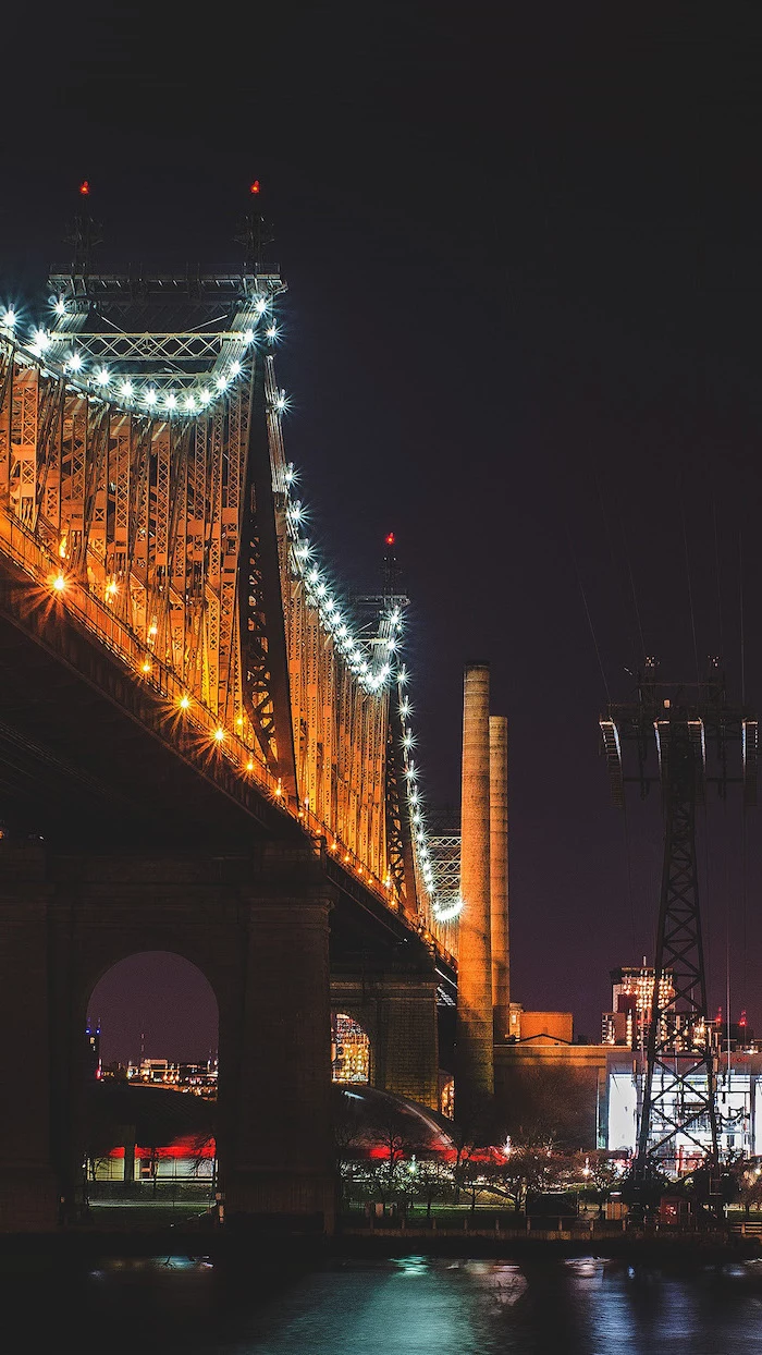
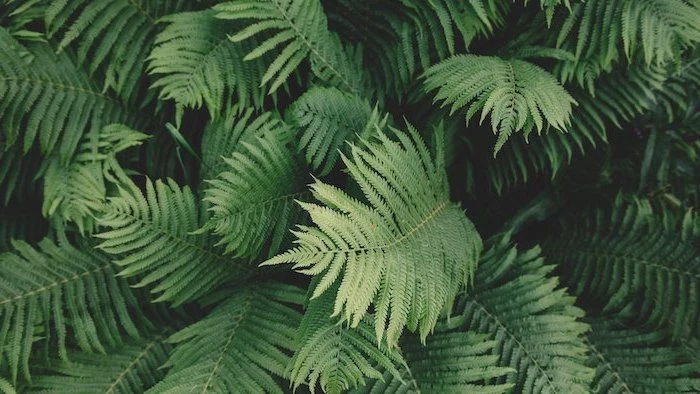
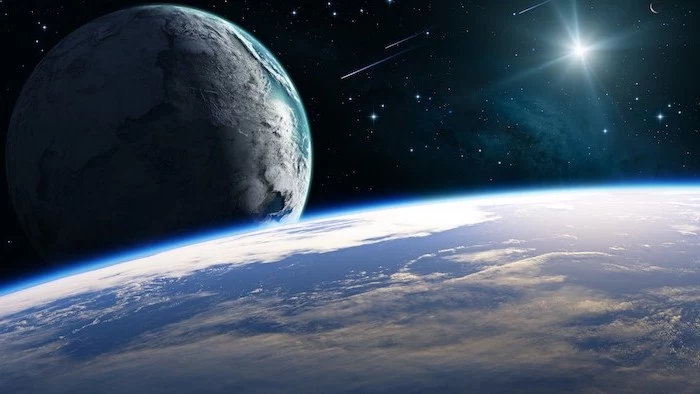
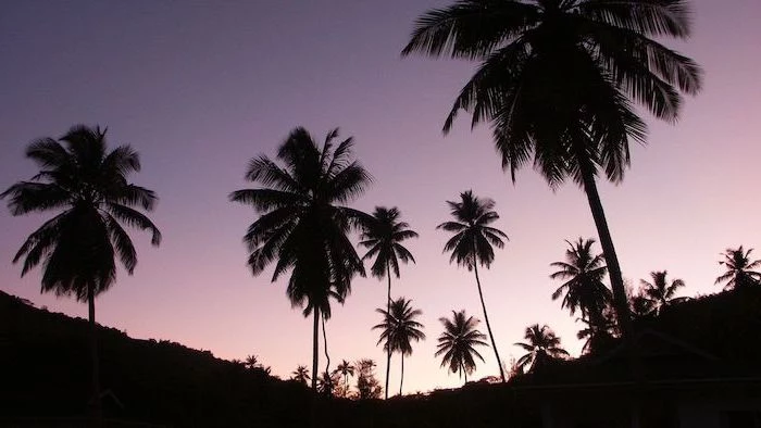
Over 70% of high-quality wallpapers on curated sites like Unsplash and Pexels are photographs of nature. Our innate ‘biophilia’—a connection to nature—means these images can subconsciously reduce stress.
This explains why epic mountain ranges, serene forests, and dramatic coastlines are perennial favorites. They provide a micro-dose of the great outdoors every time you minimize a window, offering a brief mental reset during a busy workday.
For ultimate sharpness, especially with graphic designs or text, choose a PNG file over a JPG. While JPGs are great for photos and have smaller file sizes, their compression can create subtle artifacts. PNGs preserve every pixel perfectly, ensuring your minimalist logo or favorite quote looks impeccably crisp.
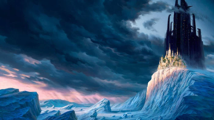
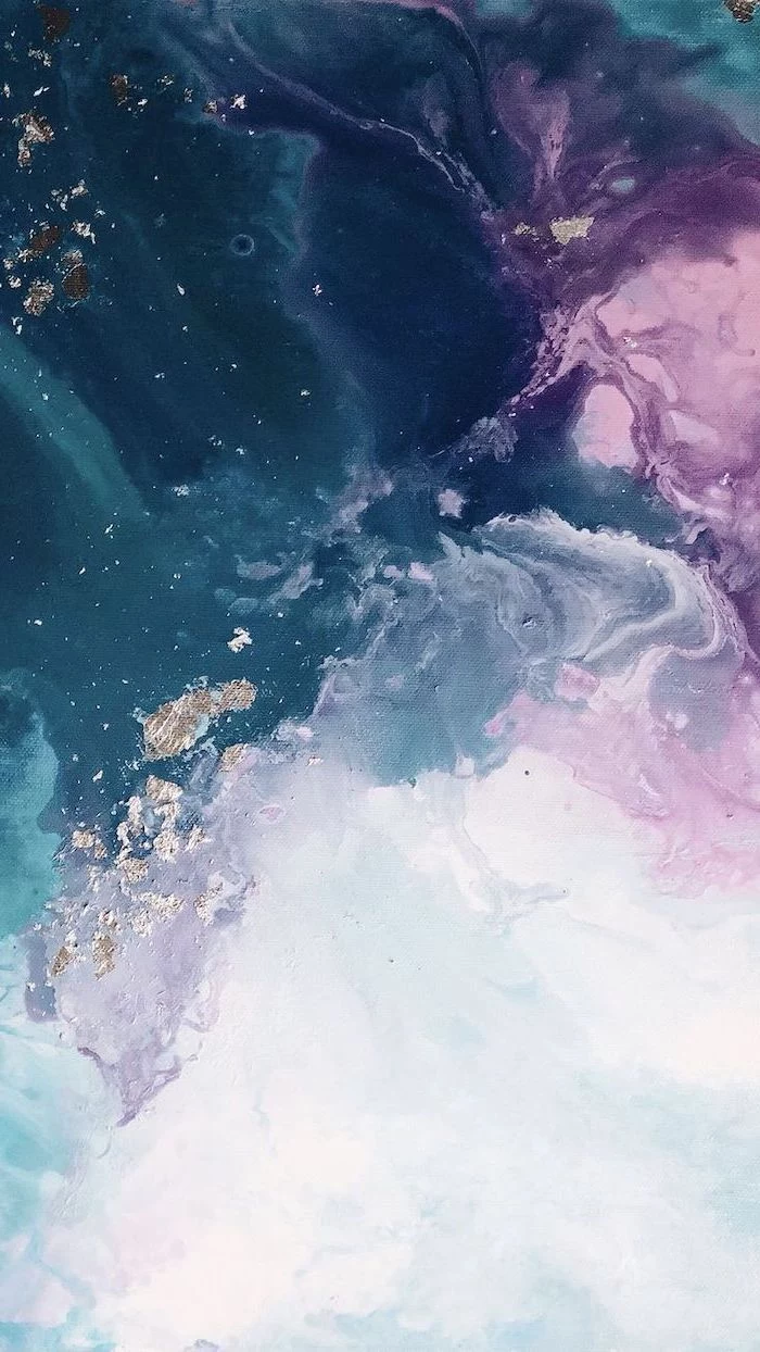
Where can I find wallpapers that aren’t just photos?
Explore the world of digital art! Websites like ArtStation are treasure troves for breathtaking fantasy landscapes and sci-fi concepts. For abstract and vector designs, try the specialized wallpaper app Backdrops on Android or Vellum on iOS. They offer curated collections you won’t find anywhere else.
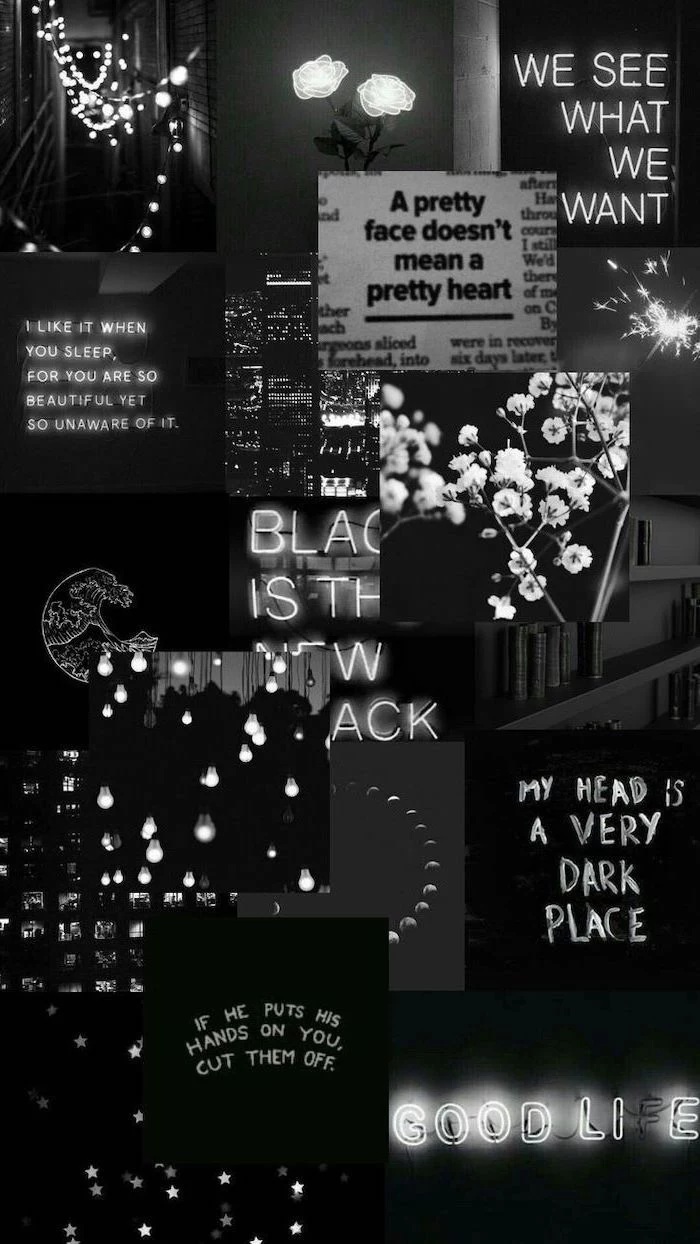
Light Aesthetic: Bright, airy, and energetic. Perfect for making your screen feel larger and more open. Works best with dark-themed icons and text for maximum contrast.
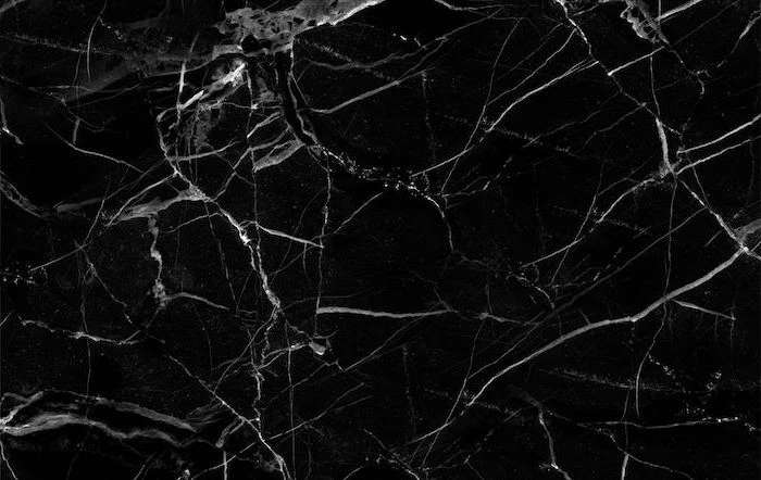
Dark Aesthetic: Moody, focused, and easier on the eyes in low-light conditions. It makes colorful icons pop and is a popular choice for developers and creatives using dark mode in their apps.
There’s no right answer; it’s about matching your screen’s vibe to your room’s lighting and your personal workflow.
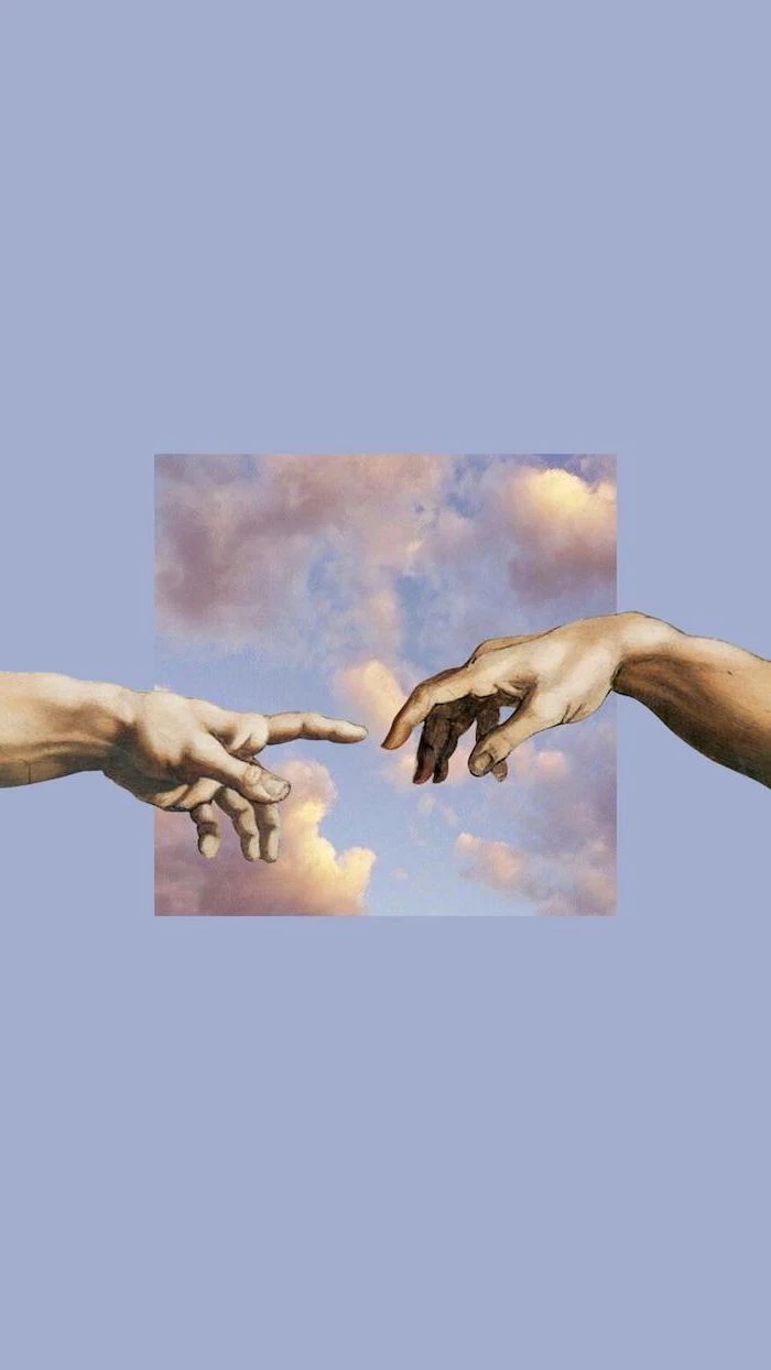
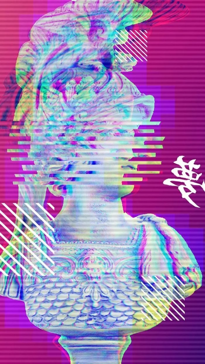
Bring a touch of class to your screen with masterpieces from art history. Many museums now offer their collections in high-resolution for free. The Met’s Open Access collection and the Rijksmuseum’s Rijksstudio are fantastic places to find stunning paintings, from Vermeer’s interiors to Hokusai’s waves, perfectly formatted for your digital frame.
- Organize your files by placing them on specific visual elements of the image.
- Use the wallpaper as a creative prompt or mood board.
- Enjoy a rich, detailed visual that tells a story.
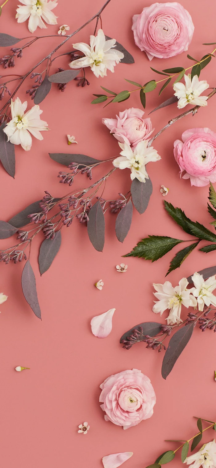
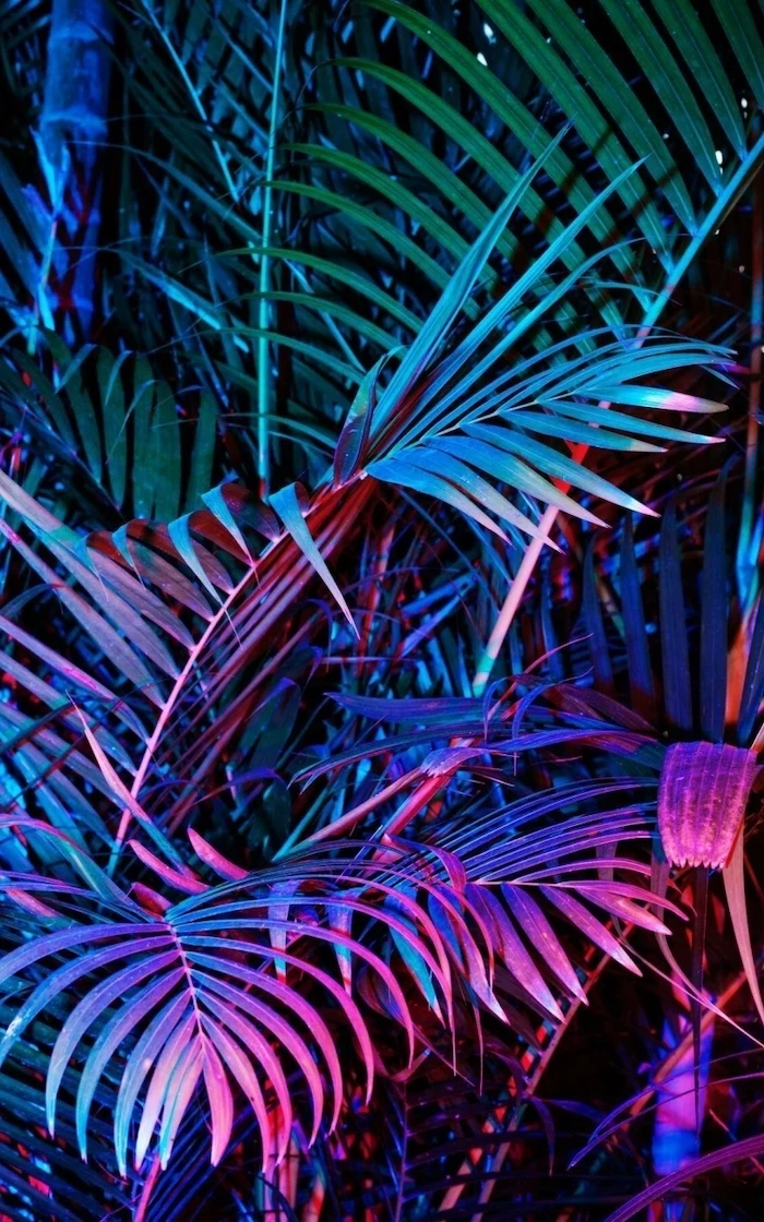
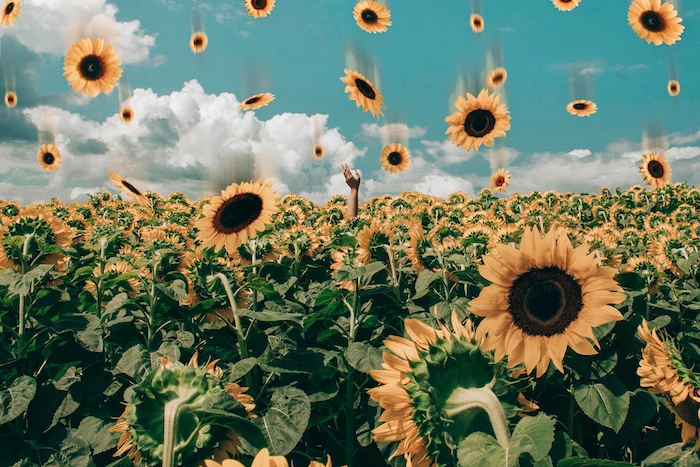
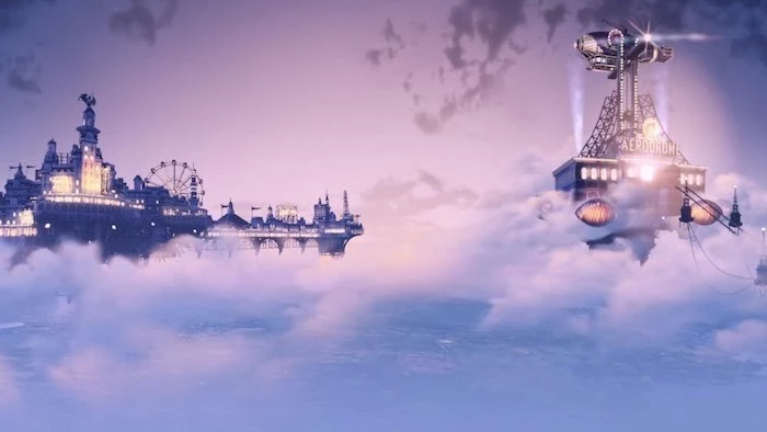
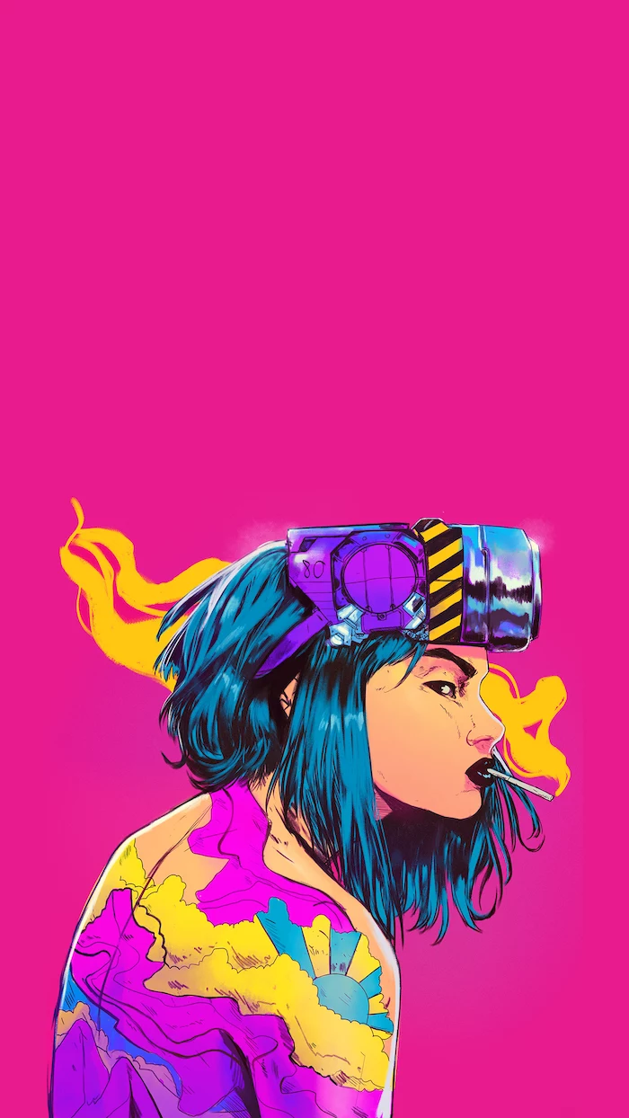
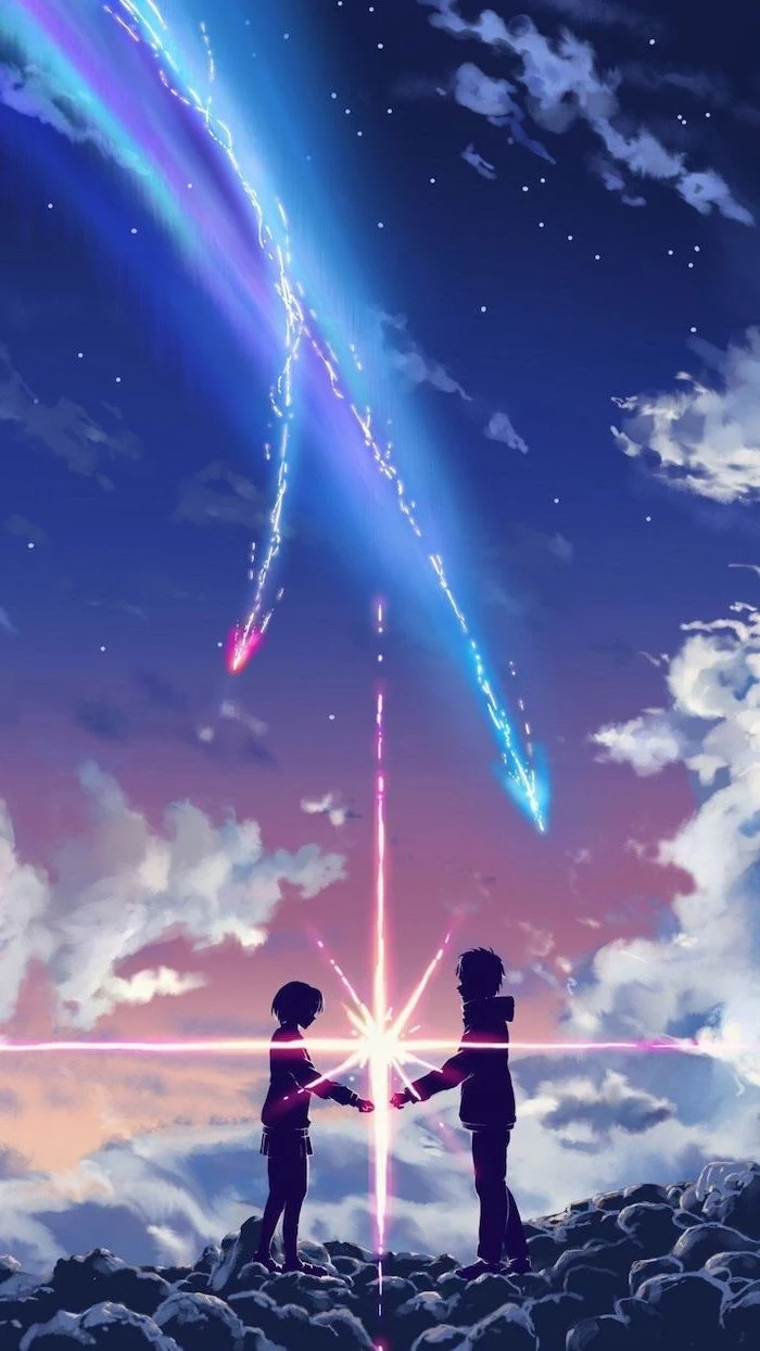
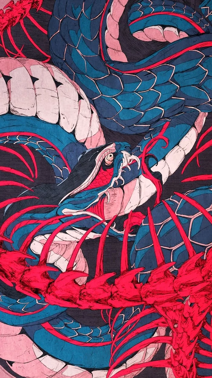
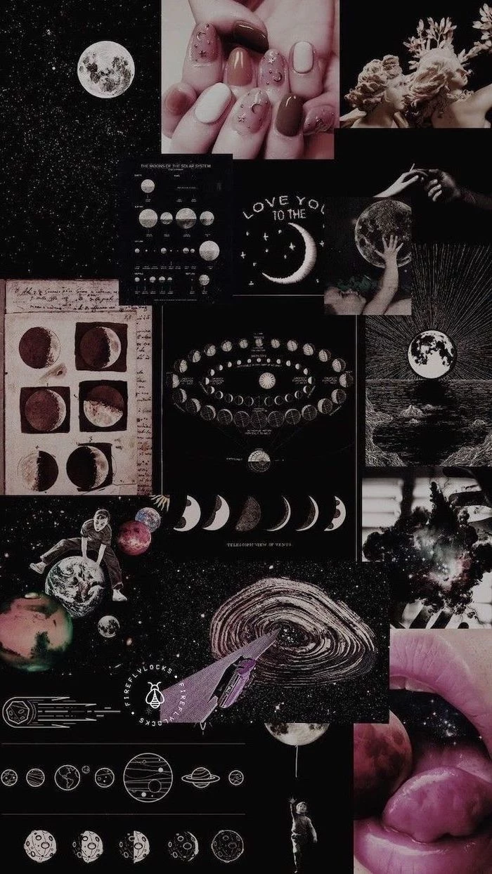
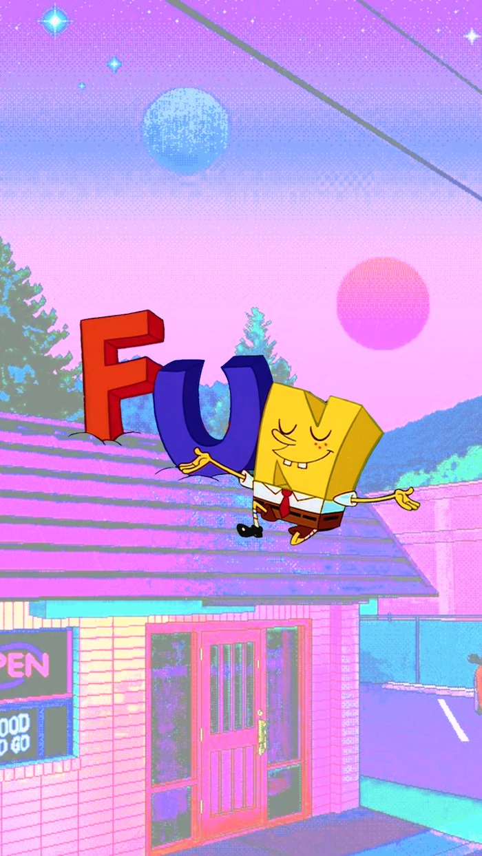
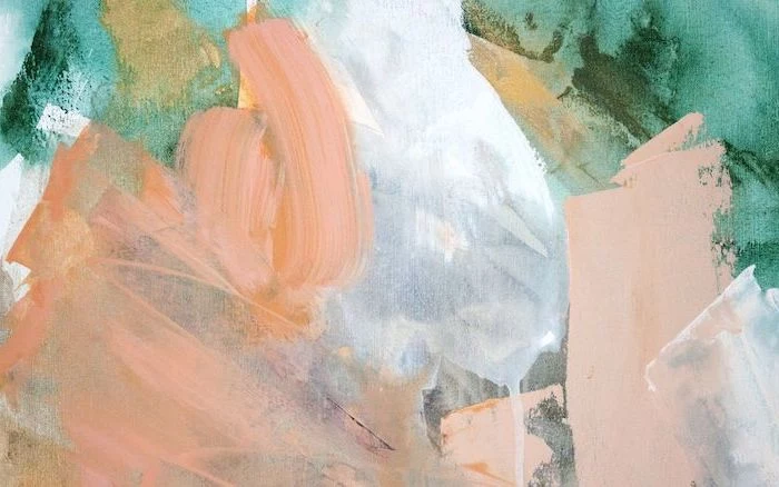
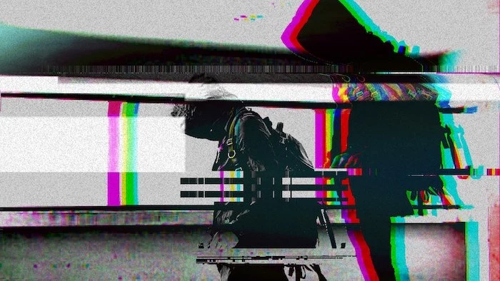
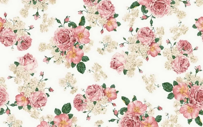
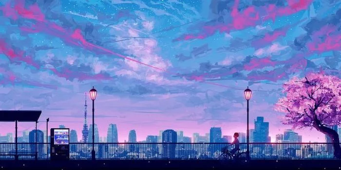
The trick to a ‘busy’ wallpaper is embracing organized chaos. A maximalist collage or a detailed illustration can be incredibly inspiring, turning your desktop into a piece of art rather than a sterile utility.
Pro-Tip for Organization: Use your wallpaper to create ‘zones’ for your icons. A picture with a distinct left, center, and right—like a triptych or a landscape with a central mountain—can be a natural guide. Place ‘Work’ files on the left, ‘Personal’ on the right, and temporary downloads in the center. Your muscle memory will thank you.
Did you know the iconic Windows XP wallpaper, ‘Bliss’, is a real, largely unedited photo of a hill in Sonoma County, California? It may be the most viewed photograph in history.
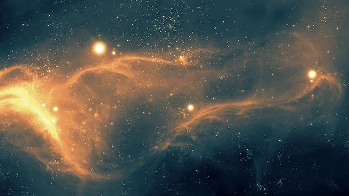
The next frontier in personalization is AI. With generative art tools like Midjourney or DALL-E 2, you can create a completely unique wallpaper from a simple text prompt. Describe your perfect scene—’a minimalist Japanese ink wash painting of a fox in a bamboo forest,’ for example—and the AI will generate a one-of-a-kind, high-resolution image that no one else has.
Do animated wallpapers hurt performance?
Yes, but the impact varies. A simple, looping animation might use only 1-2% of your CPU. However, a complex, interactive 3D scene from Wallpaper Engine could use more, impacting gaming performance or laptop battery life. Most modern PCs handle it fine, but it’s something to consider on older or less powerful machines.
Consider rotating your wallpaper seasonally. A snowy landscape in winter, blooming flowers in spring, a sunny beach in summer, and golden forests in autumn. This simple habit helps sync your digital space with the real world, preventing that sense of stale monotony and making your screen feel fresh and relevant all year round.
A common mistake: Choosing a wallpaper with the same dominant color as your icons or system interface. A blue background with blue folder icons is a recipe for visual confusion. Aim for contrast. A warm, earthy wallpaper will make the default blue folders of macOS or Windows stand out beautifully.
- Get your daily schedule at a glance.
- Keep track of important deadlines.
- Reduce the need to open a separate calendar app.
How? By using a calendar wallpaper. Sites like ‘The Everygirl’ or designers on Etsy offer beautiful, free monthly designs that merge aesthetics with functionality, turning your background into a productive dashboard.
If you have an OLED screen on your phone or laptop, using a wallpaper with true black (hex code #000000) can actually save a small amount of battery. Unlike LCDs, OLED pixels are individually lit, so a black pixel is simply turned off, consuming no power. It’s an efficient and sleek choice.
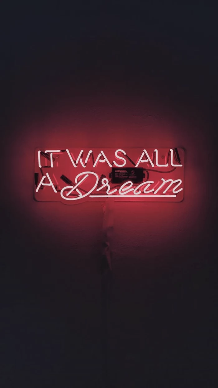
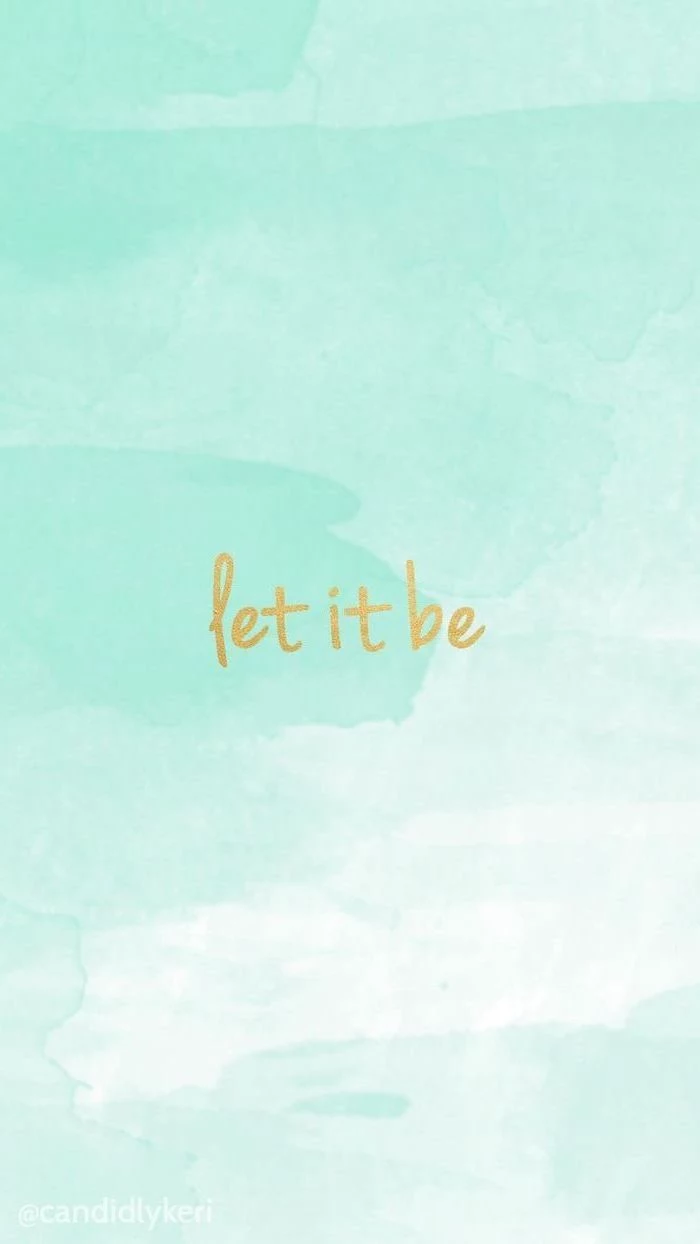
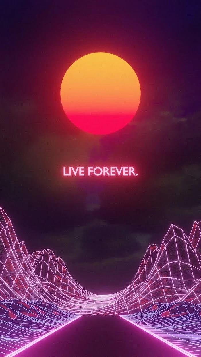
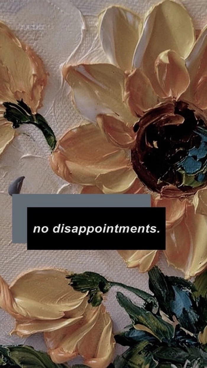
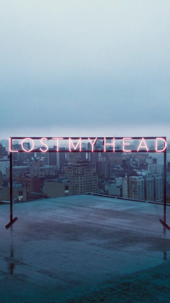
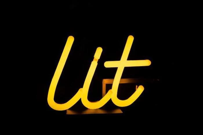
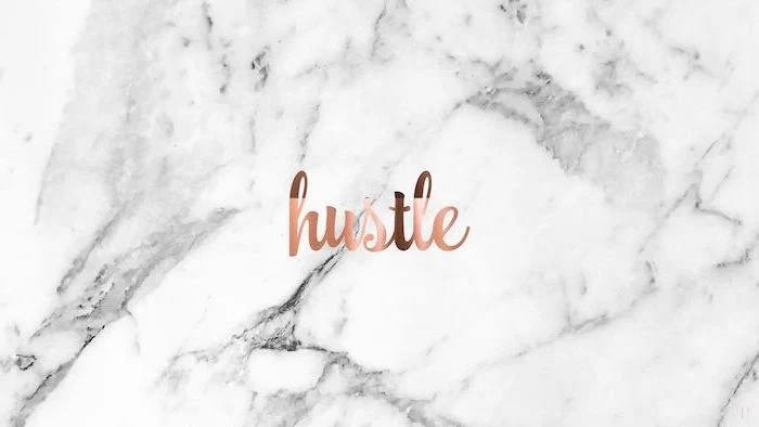
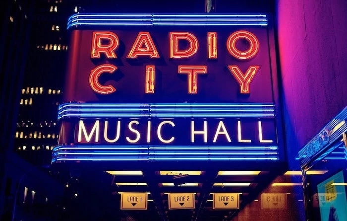
Typographic vs. Photographic: A bold typographic wallpaper featuring a motivational quote can serve as a constant, direct inspiration. A beautiful photographic landscape, however, offers a more subtle, atmospheric form of motivation. The first is a command; the second is a feeling. Choose based on whether you need a push or a pause.
Don’t forget the lock screen! This is your device’s first impression. Use it for something different than your home screen. A common strategy: use a clean, beautiful image for the lock screen and a more functional, subdued wallpaper for the home screen where your icons live. It’s like having a beautiful front door and a functional interior.
For a truly cohesive system feel, match your wallpaper to your computer’s physical color. A ‘Space Gray’ MacBook pairs perfectly with monochrome cityscapes or moody, gray-toned images. A colorful iMac, on the other hand, comes to life when its wallpaper picks up on its exterior hue, creating a holistic design statement.


