A Pro Painter’s Guide to Choosing a Bedroom Color You Won’t Regret
I’ve spent the better part of my life with a paintbrush in hand. Honestly, I’ve probably painted hundreds of bedrooms, from tiny city apartments to sprawling country homes. And if there’s one thing I’ve learned, it’s that the bedroom is a totally different beast. This isn’t the space where you need to impress guests or show off. It’s your personal sanctuary, the one room where the noise of the world is supposed to just… fall away. Getting the paint color right is the very first step to creating that sense of peace.
In this article
You can find tons of articles listing trendy colors, but I find that approach pretty useless. Your bedroom is way too personal for fleeting fads. Instead, I want to pull back the curtain and share what I’ve learned from years of practical, hands-on work. We’ll get into how light really works, why some super popular colors can feel surprisingly wrong, and the pro techniques that make for a beautiful, long-lasting finish.
Think of this as a conversation, not a rulebook. I’ve seen what works, what definitely doesn’t, and I’m here to tell you why.
First Things First: Let’s Talk Light (and a Little Science)
Before you even glance at a paint chip, you have to understand the most important feature in your room: its light. Both the sun streaming through your window and the lamp on your nightstand will completely change how a color looks on your walls. This isn’t just my opinion; it’s basic physics. Getting this right is the single biggest thing you can do to pick a color you’ll actually love living with.
LRV: The Magic Number on a Paint Chip
Flip over a paint swatch, and you’ll find a little number called the Light Reflectance Value, or LRV. It’s a scale from 0 to 100, and it tells you exactly how much light a color will bounce back into the room. It’s an incredibly useful tool.
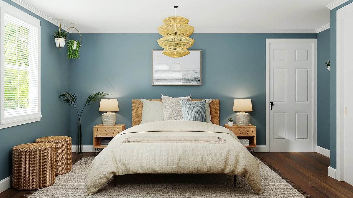
A color with an LRV of, say, 75 will reflect 75% of the light that hits it, making the whole room feel brighter and more spacious. On the other hand, a moody color with an LRV of 15 will absorb most of the light, creating a dark, cozy vibe. For a small bedroom with a single, north-facing window, I almost always suggest colors with an LRV of 60 or higher to make the most of that limited light. But in a big, airy room with tons of sun? You can go for a dark, den-like color with an LRV around 25 without it feeling like a cave. LRV takes the guesswork out of the equation.
Your Light Bulbs Are Lying to You
I once got a frantic call from a client. The warm, sandy beige she’d agonized over looked like a sickly, greenish-yellow on her walls. She was convinced I’d used the wrong can of paint. My first question? “What kind of light bulbs are you using?” Turns out, she had “cool white” LEDs, which cast a very blue light. We swapped them for “warm white” bulbs, and just like that, her perfect sandy beige was back. It’s a wild phenomenon.
Here’s a quick rundown of light bulb color, measured in Kelvins (K):
- Warm White (2700K – 3000K): This is the cozy, yellowish glow you want in a bedroom. It makes warm colors richer and cool colors feel less harsh.
- Bright White (3500K – 4100K): A more neutral, balanced light. It’s great for kitchens and bathrooms where you need to see clearly, but a bit much for a bedroom.
- Daylight (5000K+): This light has a strong blue tint and can feel sterile and almost corporate. It can make gorgeous warm paint colors look washed out and weird.
Quick Win: Before you even think about painting, try this. If your room feels off, go spend $15 on a pack of “Warm White” (2700K) bulbs. Swapping them out takes five minutes and might completely change the feel of your current paint color. It’s the cheapest room makeover you can do!
Pro tip: Never, ever trust a tiny paint chip in a hardware store. Buy a sample pot (usually around $5-$8), paint a big piece of poster board, and tape it to your wall. Move it around the room during the day and look at it with your lamps on at night. It’s the only way to know for sure.
Why Some “Perfect” Bedroom Colors Just Don’t Work
I don’t really believe in “bad” or “outdated” colors. But I know from experience that some are way harder to live with, especially in a room that’s supposed to be restful. Let’s look at a few common choices and their practical challenges.
The Problem with Flat, Boring Gray
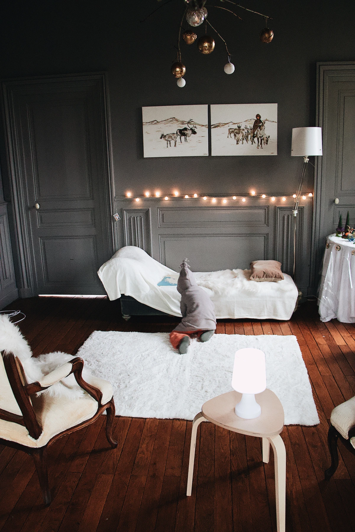
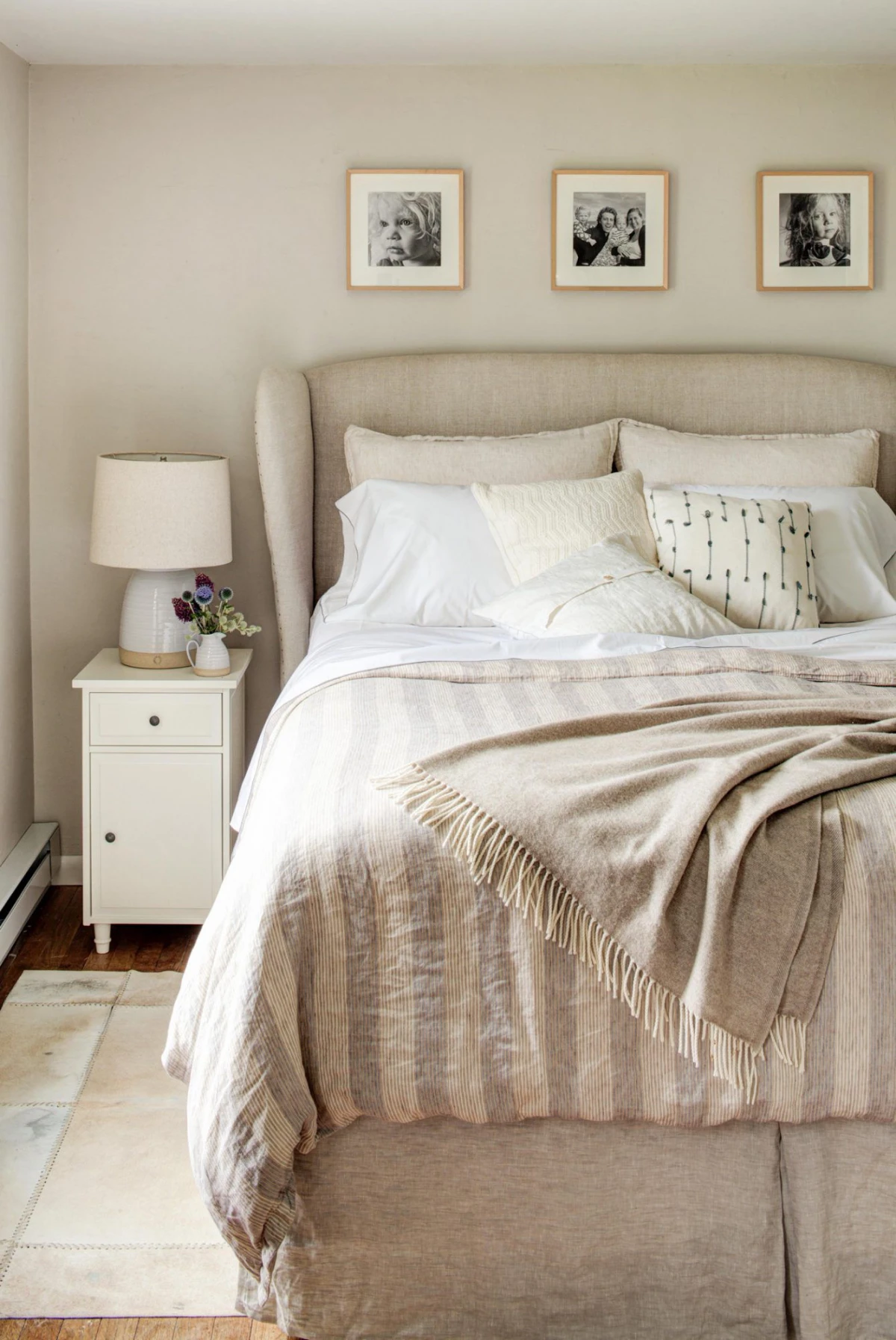
For a long time, gray was king. The issue is with those simple, mid-tone grays that have no interesting undertones. In a room that doesn’t get a ton of natural light, these grays can feel incredibly flat, cold, and honestly, a little depressing. A successful gray needs a little something extra in it—a hint of green, blue, or even a warm violet. These complex grays are beautiful because they shift with the light.
So, instead of a flat, concrete-like gray, check out a complex “greige” (that’s gray + beige). A couple of fantastic starting points are Benjamin Moore’s ‘Revere Pewter’ or Sherwin-Williams’ ‘Agreeable Gray’. They work in almost any light and feel sophisticated, not sad.
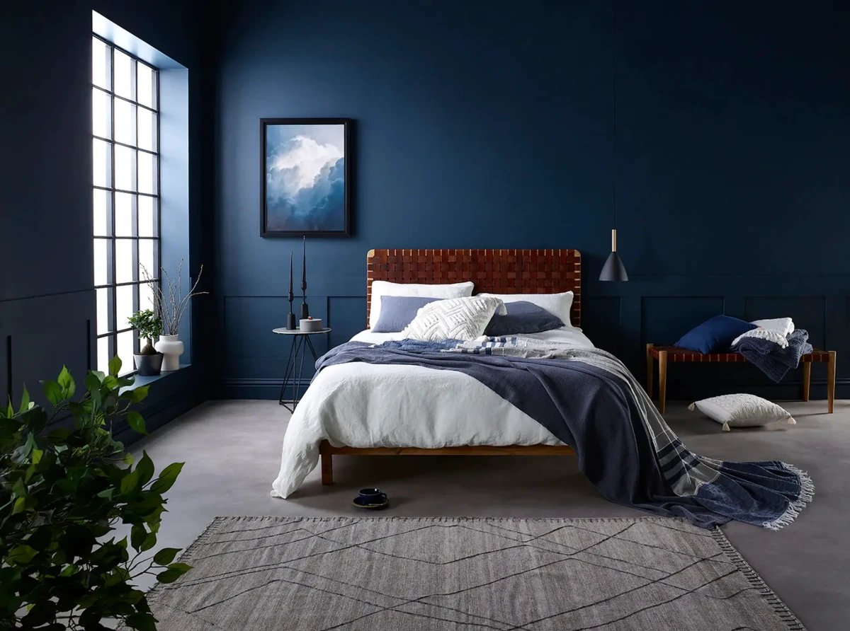
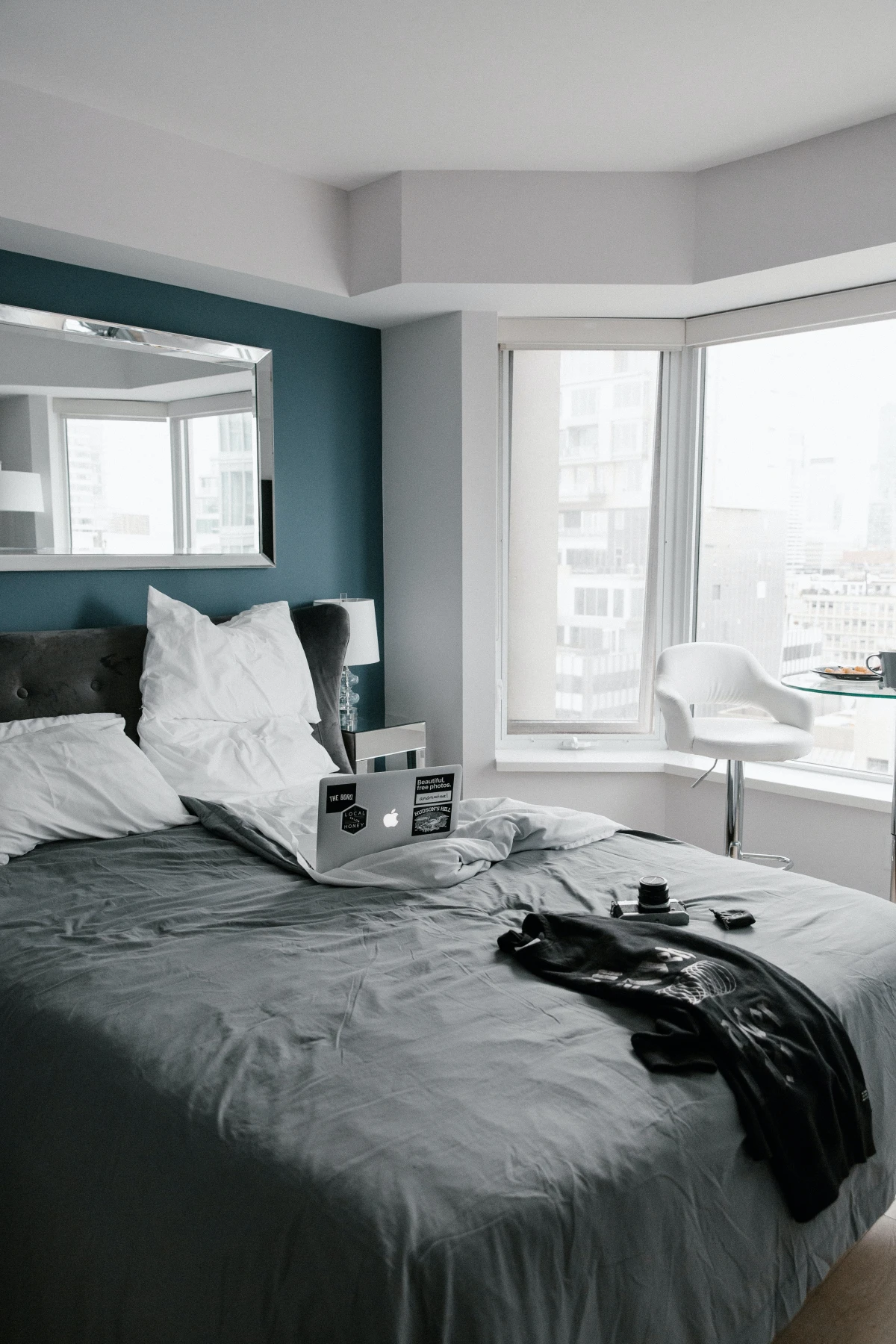
The Weight of Deep, Saturated Blues
A deep navy wall looks incredible in a magazine, right? But in real life, sleeping in a room with four dark blue walls can feel… heavy. Saturated colors have what we call “visual weight,” meaning they feel like they’re advancing toward you. This can make a room feel like it’s closing in.
Here’s how to use these powerful colors correctly: paint an accent wall. The best choice is almost always the wall your headboard is on. It creates a stunning focal point, but you aren’t staring right at it when you’re trying to drift off to sleep. For the other three walls, pick a soft, warm off-white. You get all the drama without the oppressive feeling.
The Clinical Feel of Pure, Stark White
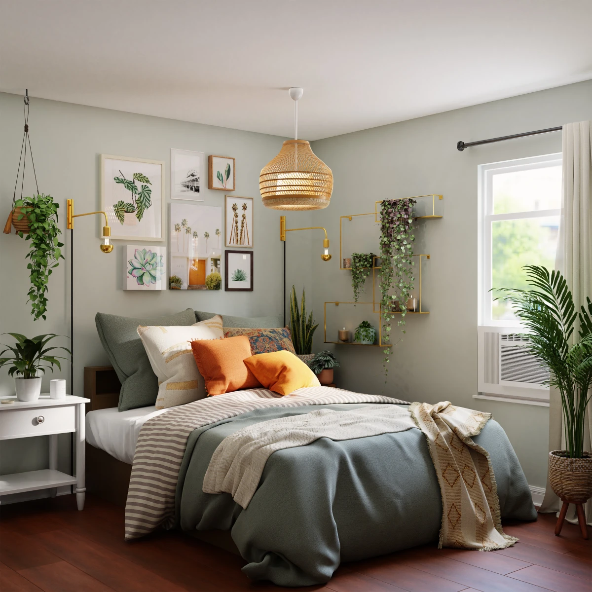
You’d think white is the safest choice, but it’s one of the hardest to get right. A pure, stark white with no undertones can feel sterile and cold, like a hospital room. It reflects light with a harsh glare and shows every single scuff mark.
The secret is to choose an off-white that has a drop of something else in it—a touch of cream, a hint of gray, a whisper of beige. These whites feel soft, warm, and lived-in. Always grab a few white samples and hold them up against your trim to see how the undertones play together.
A Pro’s Method for Getting That Perfect Finish
The difference between a DIY job and a pro job is almost never the actual rolling. It’s the prep. I tell every new painter I train: painting is 80% preparation and 20% application. Rushing the prep is the single biggest mistake people make.
First, Let’s Talk Money and Supplies
Before you start, you need a realistic budget. You can’t get a pro result with bargain-bin tools. Here’s a rough shopping list:
- Quality Paint: Expect to pay $50-$80 a gallon for good stuff like Benjamin Moore or Sherwin-Williams. It’s worth it—it covers better and lasts longer.
- Primer: A good primer costs about $30-$50 per gallon. You won’t always need a full gallon.
- Angled Brush: A high-quality 2.5-inch angled sash brush is a must. It’ll cost you $15-$25, and it’s the key to clean lines.
- Roller Frame, Covers, and Tray: Plan on about $25 for a decent setup. Get a 3/8-inch nap roller for smooth walls.
- Painter’s Tape: Good tape (like FrogTape) runs about $8-$12 a roll. Don’t get the cheap stuff.
- Spackle & Sandpaper: You can get a small tub of spackle and a pack of sandpaper for under $15.
All in, for an average bedroom, you’re looking at around $150-$250 for supplies. A small price for a room you’ll love!
The Prep Work That’s NOT Optional
Seriously, don’t skip this. First, wash your walls with mild soap and water. They’re dirtier than you think. Next, fill any nail holes or dings with spackle. Overfill it just a tiny bit, and once it’s dry, sand it perfectly smooth. If you can feel the patch with your fingertips, you will see it through the paint. Then, give the whole wall a quick scuff-sand with fine-grit sandpaper (220-grit is good). This gives the new paint something to grip. Finally, wipe all the dust off with a damp cloth. Painting over dust gives you a gritty, awful finish.
Cutting In, Rolling, and Fixing Mistakes
Before you open the paint, figure out how much you need. A quick formula is: (Total wall length x ceiling height) / 350 = gallons needed per coat. Always get a little extra!
“Cutting in” is painting the edges with your angled brush. For crisp lines, use good painter’s tape. Pro tip: after applying the tape, press down on the edge with a putty knife to create a tight seal. When rolling, load the roller and paint in a big “W” pattern to spread the paint out, then go back over it with light, straight strokes from ceiling to floor. Don’t press hard—let the roller do the work.
Heads up! Common DIY problems and fixes:
- Seeing ugly roller marks? You’re pressing too hard or trying to stretch the paint too far. Reload the roller more often and use a lighter touch.
- Tape pulled up your new paint? You probably pulled it off too soon while the paint was still gummy. Let the paint dry for at least 24 hours. If it still sticks, gently score the edge of the tape with a utility knife before pulling it off at a 45-degree angle.
Choosing the Right Sheen
Sheen is just a fancy word for shininess, and it matters. For bedrooms, you really only need to know about two. Eggshell is my standard recommendation for walls. It has a soft, low luster (like an actual eggshell) and is durable enough to be wiped down. It looks velvety and sophisticated. For ceilings, I always use a Flat or Matte finish because it has no shine at all and does an amazing job of hiding imperfections. I’d avoid anything shinier like Satin on bedroom walls; it can highlight flaws and feel a bit too reflective for a restful space. Save the high-shine stuff for trim and doors.
A Final Word on Safety
A beautiful room is never worth risking your health. For bedrooms, always use a paint labeled “Low-VOC” or “Zero-VOC.” It’s much better for your indoor air quality. And please, please listen to this next part.
LEAD PAINT WARNING: If your home was built before the late 1970s, you HAVE to assume there is lead paint on the walls. Do not scrape or sand anything. Creating lead dust is incredibly dangerous, especially for kids. You can buy a lead test kit, like the 3M LeadCheck swabs, at Home Depot or online for about $10. It is the best ten bucks you will ever spend on home safety. If it’s positive, you must hire a certified pro. This is not a DIY situation.
In the end, choosing a bedroom color is a personal journey. Forget the trends. Think about the light in your room, the feeling you want when you walk in, and take your time with the prep work. A well-painted room that truly feels like you is a gift that will bring you peace for years to come.


