Your Guide to Choosing a Paint Color That Actually Feels Calm
I’ve been in the painting world for a long time, and I can tell you, walking into a client’s home for the first time is always revealing. More often than not, the conversation starts the same way. People want a change, sure, but what they’re really after is a feeling. They use words like “calm,” “restful,” or “sanctuary.” Then they’ll gesture helplessly at a wall of a thousand paint swatches, completely overwhelmed.
In this article
They’ll pick up a tiny, two-inch square of color and ask, “Is this a calming color?”
And here’s the honest truth: a single color chip tells you almost nothing. Creating a genuinely calm space isn’t about finding one magic color. It’s about understanding how colors actually behave in a room. I’ve seen gorgeous blues turn jarring and simple beiges feel profoundly peaceful. The secret is always in the details. So, this is the good stuff, the same advice I give to my clients—a real look at the principles we use to build a foundation of quiet in a home.
First Things First: What Makes a Color ‘Quiet’?
Before you even think about specific colors like green or blue, we have to talk about the three elements that pros always consider. Most DIYers only focus on the first one, and that’s where things can go wrong. Getting these right is the key to a result that looks and feels professional.
Hue: The Color’s Name
This is the easy part. Hue is just the name of the color family: red, yellow, green, blue. It’s what you mean when you say, “I want a blue room.” But as we all know from staring at that paint wall, there are endless blues. The hue is just our starting point.
Value: How Light or Dark It Is
Value is simply how light or dark a color is. You’ll see this measured as the Light Reflectance Value, or LRV, on a scale from 0 (absolute black) to 100 (pure white). This number tells you exactly how much light a color will bounce back into the room.

Good to know: You can usually find the LRV on the back of a paint swatch. On a Sherwin-Williams fan deck, for instance, it’s right there. For other brands like Benjamin Moore, you might have to pop onto their website and look up the technical data sheet for the color. It’s worth the extra click!
For a calm vibe, we’re almost always working in the mid-to-high LRV range, usually between 60 and 85. These colors reflect plenty of light, making a space feel airy and open without being blinding. Once you dip below an LRV of 50, the color starts absorbing more light, which creates a cozier, more intimate mood… but it can also feel somber if you’re not careful.
Chroma: The Secret Ingredient
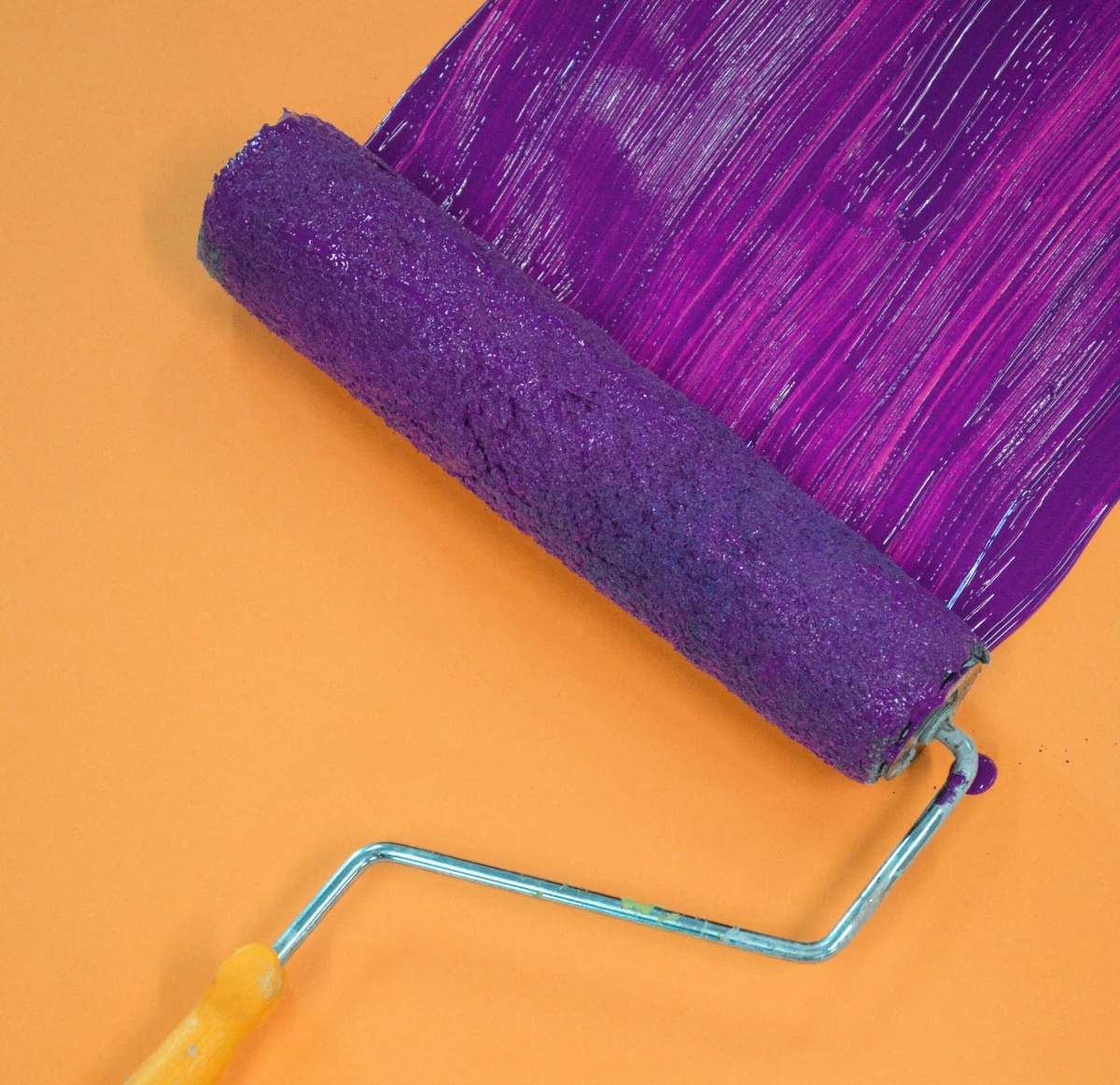
Okay, pay attention, because this is the most important—and most overlooked—element for creating a calm space. Chroma is the color’s intensity or saturation. High-chroma colors are bright and loud, like a traffic-cone orange. They scream for attention.
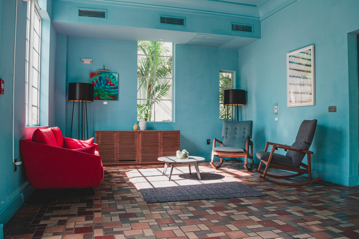
Calmness lives in the world of LOW chroma. Think about the colors you see in nature on a cloudy day: the grayish-green of sage, the dusty brown of a trail, the soft blue of a faraway hill. These colors are muted and complex. They don’t jolt your senses.
I once had a client who wanted a relaxing yellow bedroom. She chose a bright, sunny yellow from a chip. On the wall? It was electric. It felt anxious and buzzy, the total opposite of her goal. We repainted with a yellow that had much lower chroma—something closer to aged parchment. The difference was instant. The room just… breathed. That’s the power of dialing down the chroma.
A Pro’s Go-To Palette for a Restful Vibe
With those principles in mind, let’s talk about the color families that are reliable workhorses for creating tranquility. I’d never call them “the best” colors because every home is different, but they are fantastic starting points.
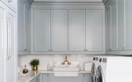
Complex Off-Whites & Neutrals
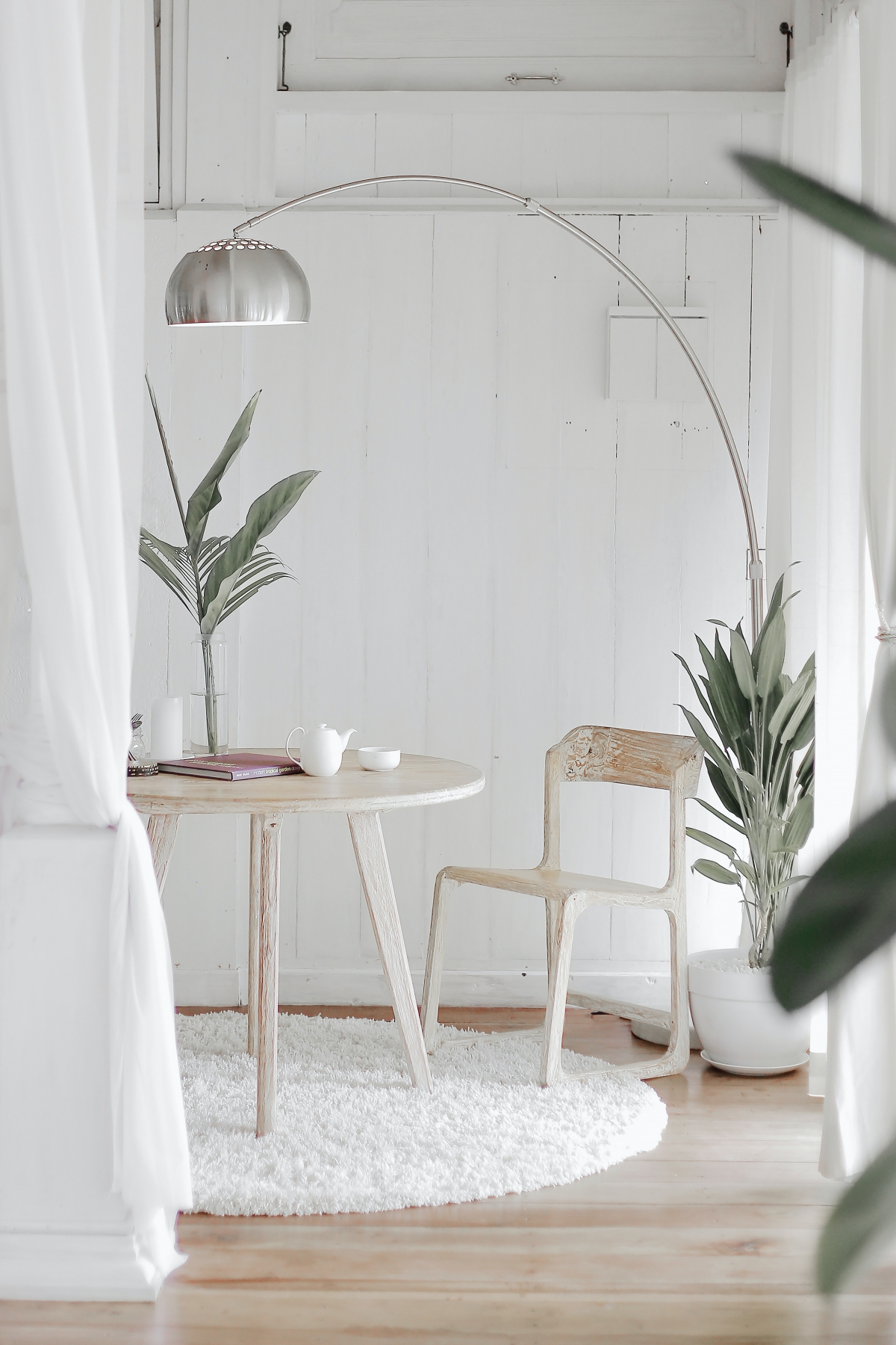
People think “white” is a safe and easy choice, but it’s one of the hardest to get right. A pure, stark white (LRV of 90+) can feel sterile and clinical. The glare can literally be hard on your eyes. The best whites for a calm interior are always complex off-whites with subtle undertones.
- Whites with a yellow/cream undertone feel warm and inviting. They’re beautiful in homes with natural wood floors and trim.
- Whites with a gray/beige (greige) undertone are incredibly versatile. They feel modern but timeless. A classic like Benjamin Moore’s ‘Revere Pewter’ is famous for a reason—it’s a soft, sophisticated backdrop that rarely feels cold.
- Whites with a green/blue undertone create a clean, airy feeling. But a heads up! Be careful using these in north-facing rooms. The cool natural light can amplify the undertone and make the space feel a bit chilly.
A quick trick: hold your white paint chip against a plain sheet of printer paper. The subtle undertone will pop right out.
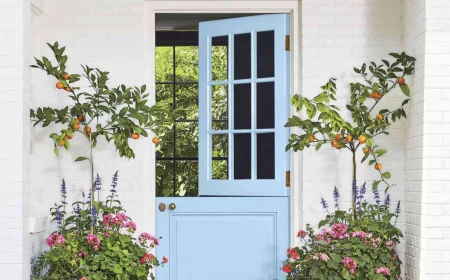
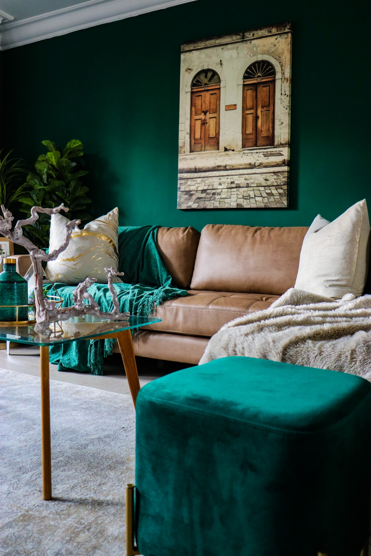
Nature-Inspired Greens and Blues
Our brains are wired to find nature relaxing. So, it’s no surprise that greens and blues are go-tos for peaceful spaces. The key, again, is to choose versions with low chroma that are softened with gray.
For Greens: Look for shades that remind you of sage, moss, or eucalyptus. These are grounding and soothing. A mid-tone sage green is one of the most successful colors I’ve ever used for bedrooms; it just promotes rest. A fantastic, widely loved example is Sherwin-Williams’ ‘Sea Salt,’ which is a soft green-blue-gray that changes with the light.
For Blues: Pure blue can feel cold, especially in a room without much warm sunlight. The solution is to find a blue with a healthy dose of gray, often called a slate blue, or a blue with a hint of green (like a soft teal) to add warmth. These muted blues give you that calming sky or ocean feeling without the chill.
Earthy, Grounding Tones
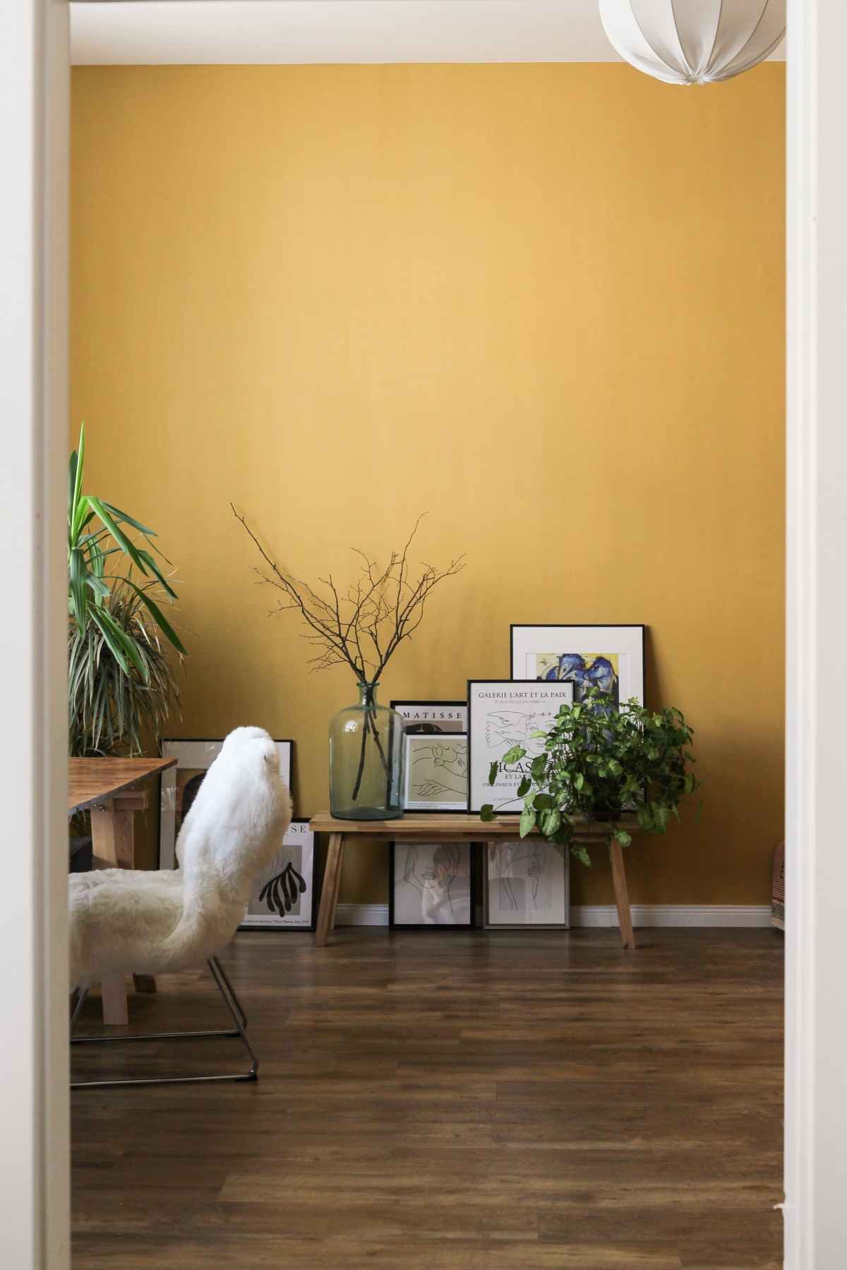
This goes way beyond boring beige. We’re talking about the rich, warm colors of the earth itself—think muted terracotta, mushroom, and taupe. These tones make a room feel like a warm hug.
Instead of a bright 70s orange, modern terracotta is dusty and chalky, like unfired pottery. Mushroom and taupe are sophisticated neutrals that sit between brown and gray—warmer than gray, but more complex than beige. For example, you could have a living room in a light greige that flows into an office painted with a deeper, cozier mushroom taupe like Sherwin-Williams’ ‘Accessible Beige.’
A little tip for these earthy colors: use a flat or matte paint sheen. The non-reflective finish makes the color feel deep and velvety, which really amps up the calming effect.
The Application: How to Get It Right
Picking the color is only half of it. How you test and apply it is what separates a frustrating weekend project from a beautiful result you’ll love for years.
Testing Is NOT Optional
I cannot say this enough: never, ever choose a final color from a tiny paper swatch under the harsh lights of a hardware store. The light in your home is unique, and it will completely change how a color looks. A color will look different in a north-facing room (cool light) versus a south-facing one (warm light), and it will change again at night under your lamps.
The Professional Way to Test:
First, assemble your testing kit. This is a small investment that can save you hundreds. Plan on spending about $50 for this. Your shopping list: 2-3 sample pots of your top choices ($7-$10 each), a few large white foam boards from a craft store ($5 each), and a mini roller set ($8). This is SO much cheaper than buying a gallon of the wrong color!
- Paint two full coats onto each foam board. Don’t paint swatches directly on your wall—the current color will mess with your perception.
- Prop the painted boards up in the room. Move them around. See how they look on different walls, at different times of day.
- Live with them for a few days! How does that green look in the morning sun? How does that greige feel at night with the lamps on? This process prevents costly mistakes.
Time-Saving Hack: If you’re in a hurry or hate messes, check out peel-and-stick sample companies online. They mail you large, pre-painted stickers of the actual paint color. No mess, no drying time, and you can move them around the room easily.
The Critical Role of Paint Sheen
The finish you choose has a huge impact. For serene spaces, we almost always lean toward low-sheen finishes for walls because they reduce distracting glare.
- Flat or Matte: This finish has almost zero reflection. It’s fantastic for hiding minor bumps and flaws on a wall and creates a soft, velvety look. The downside? It’s the least durable and can be tough to clean. Best for low-traffic areas like adult bedrooms or formal living rooms.
- Eggshell: This is my go-to for most residential walls. It has a tiny bit of luster—like an eggshell, believe it or not—which gives it better scrubbability than flat paint. It’s the perfect balance of a soft look and practical durability for living rooms and hallways.
- Satin or Semi-Gloss: These are more reflective and much more durable. We save these for the hard-working stuff: trim, doors, and sometimes kitchens or bathrooms where you need to wipe down surfaces constantly. Using satin on all the walls of a bedroom would create too much shine and visual noise.
A Few Advanced Tricks for a Cohesive Home
Want to take your project from just “painted” to “thoughtfully designed”? Here are a couple of techniques we use.
Color Drenching: The Ultimate Cocoon
This is a seriously cool technique where you paint the walls, the trim, the baseboards, and sometimes even the ceiling all in the same color. By getting rid of the sharp white lines of the trim, you remove visual clutter. The room suddenly feels bigger, more cohesive, and incredibly serene. It works best with soft, low-chroma colors. A room color-drenched in a muted sage green is the very definition of a sanctuary.
Creating Flow with a Whole-Home Palette
A home feels more peaceful when the colors flow from one room to the next. This doesn’t mean painting every room the same color! It means choosing colors that are related. For example, you could use a beautiful off-white like Sherwin-Williams’ ‘Alabaster’ in your main living areas and hallways. Then, for an adjoining bedroom, you could choose the slightly darker and warmer ‘Accessible Beige’ from the same family of tones. The colors are different, but they speak the same language, creating a harmonious journey through your home.
Reality Check: Safety, Budgets, and When to Call for Help
My job isn’t just about making things pretty; it’s about doing it right and doing it safely.
Health & Safety First
Modern paints are amazing, but I always recommend using low-VOC or zero-VOC (Volatile Organic Compounds) paints for interior projects. The cost difference is minimal these days (maybe $5-$10 more per gallon), and the peace of mind you get from better indoor air quality is huge.
A VERY Important Warning About Lead Paint: If your home was built before the late 1970s, there’s a good chance it has lead-based paint. Sanding or scraping this paint releases toxic dust that is incredibly dangerous, especially for kids. Do not try to tackle this yourself. You need to hire a professional who is certified in lead-safe work practices. You can find a local, EPA-certified firm by searching on the EPA’s website. Seriously, this is non-negotiable for your family’s health.
DIY vs. Hiring a Pro
Can you paint a room yourself? Of course! But it’s good to be realistic. Consider calling a pro if you have high ceilings, tons of detailed trim work, or major drywall repairs. A professional’s real value is often in the painstaking prep work that creates that flawless finish.
And let’s talk money. A DIY job for a standard 12×12 bedroom might cost you between $150 and $300 for quality paint and supplies. Hiring a professional crew for that same room could range from $500 to $1,000+, depending on your location and the amount of prep needed. You’re paying for their speed, skill, insurance, and a perfect result without you having to lift a finger.
Ultimately, creating a calm home with color is a thoughtful process. It’s about listening to what a room needs and understanding the language of color. By focusing on muted tones, testing properly, and picking the right finish, you can create a space that genuinely makes you feel better. And that’s one of the most powerful changes you can make to your home.