The Ultimate Guide to Sage Green: A Pro Painter Spills the Secrets
I’ve been a professional painter and color consultant for a long, long time—long enough to see color trends get hyped up and then fade away. But some colors just stick around, and it has nothing to do with trends. Sage green is one of those colors. It’s my secret weapon. For years, I’ve recommended it to clients not because it’s popular, but because it’s a problem-solver. It just works.
In this article
Sage has this incredible ability to make a room feel calmer, more connected to nature, and surprisingly sophisticated all at once. I’ll never forget my first real experience with its magic. We were working on an old farmhouse restoration out in the country, and the client wanted a color that felt timeless but not stuffy. We ended up with this perfect dusty, grayed-out sage. The second that first coat went up, the entire mood of the room shifted. It felt settled, peaceful, and just… honest. It didn’t scream for attention; it created the perfect, quiet backdrop for the family’s life.
So, this guide isn’t about what’s trendy. It’s about understanding this amazing color from someone who has gallons of it under their fingernails. We’ll get into how it plays with light, how to pick the perfect shade for your space, and the pro techniques I use to get a flawless finish. This is the stuff I teach my apprentices, and I hope it helps you paint with total confidence.
Why Sage Green Looks Different Everywhere
Picking a paint color is way more than just grabbing a chip at the hardware store. To get a result you’ll actually love, you have to understand how color and light dance together. This is especially true for a complex color like sage green, which can be a real chameleon, looking totally different from room to room.
The Most Important Number on the Paint Chip: LRV
Every paint color has a Light Reflectance Value, or LRV. It’s a number from 0 (jet black) to 100 (pure white) that tells you how much light a color reflects. Honestly, it’s the most critical piece of technical info on a paint swatch, yet almost everyone ignores it. For sage greens, it’s everything.
- Light & Breezy Sages (LRV 60-70): These are your pale, silvery greens that feel like a breath of fresh air. With a high LRV, they bounce a lot of light around. They’re fantastic for making smaller rooms or north-facing spaces feel brighter and more open.
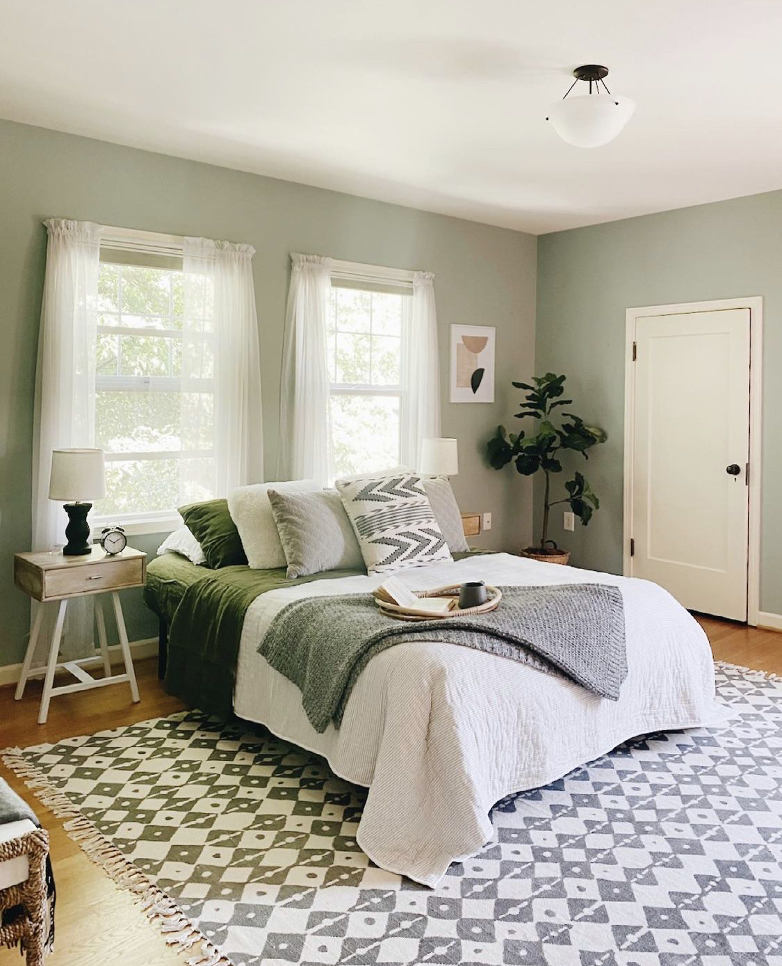
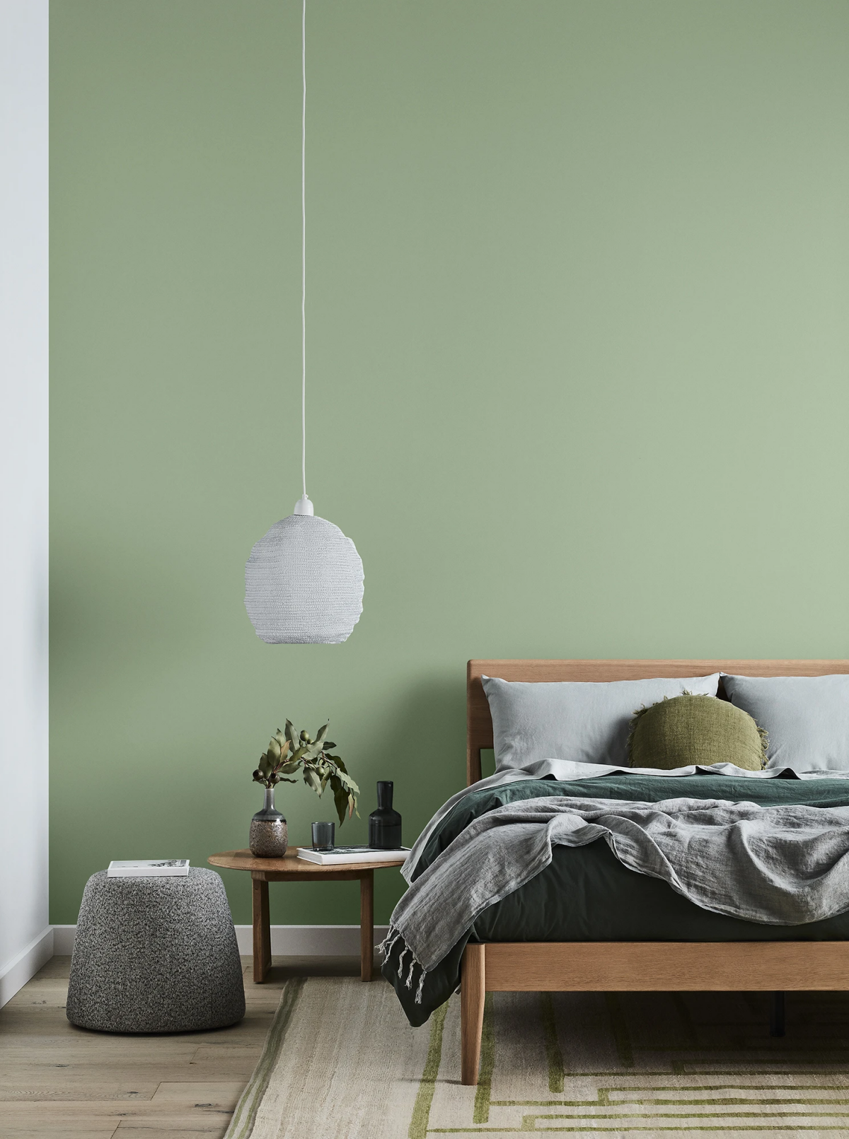
- Mid-Tone Classic Sages (LRV 35-55): This is the sweet spot, the quintessential sage. These shades have enough color to make a statement without sucking all the light out of a room. They are incredibly versatile and feel grounding and comfortable in just about any space—bedrooms, kitchens, you name it.
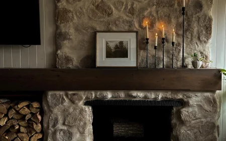
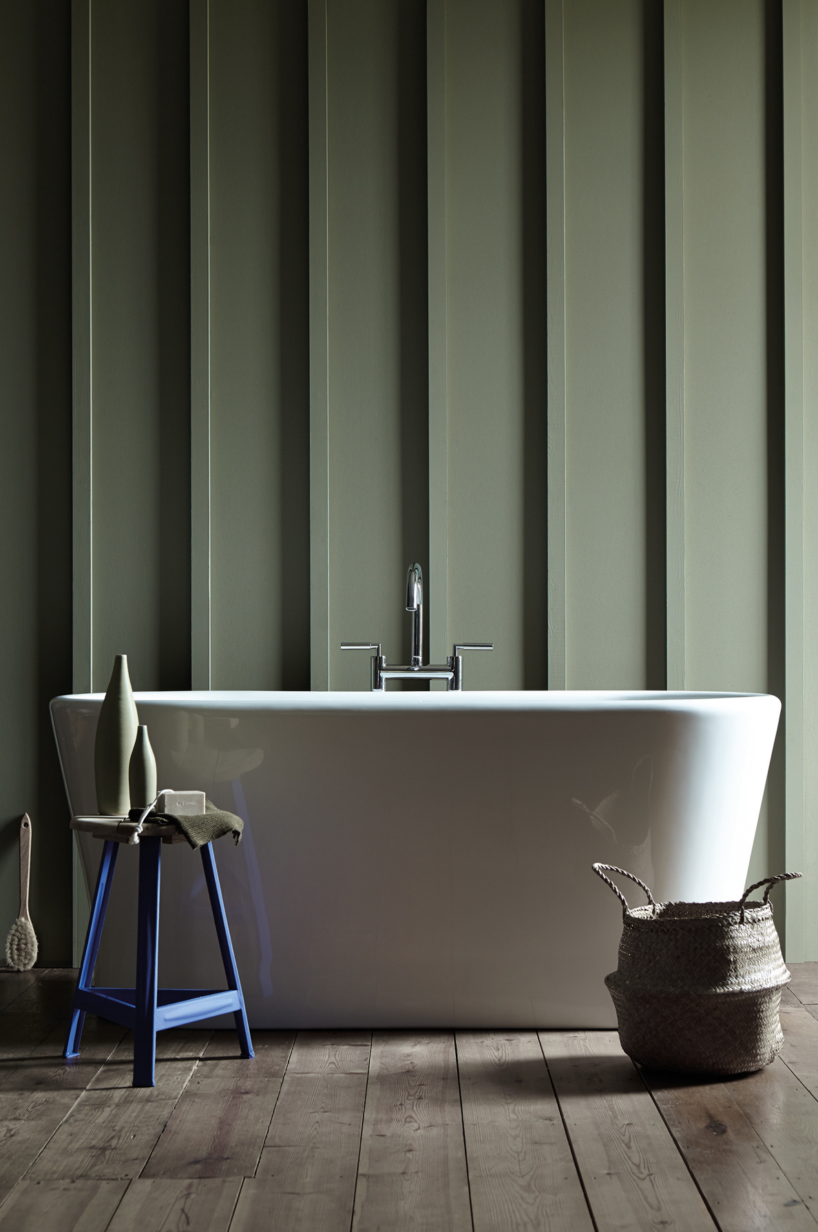
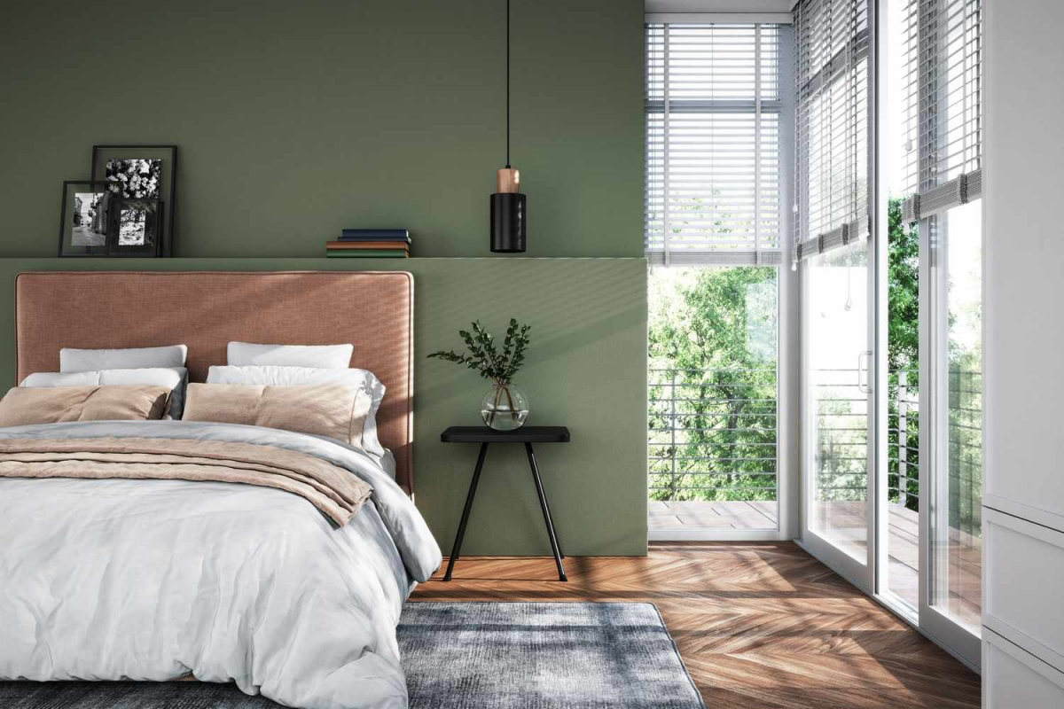
- Deep & Moody Sages (LRV 15-30): These are the dark, dramatic greens that lean toward olive or charcoal. With a low LRV, they absorb light, creating a cozy, enveloping, and dramatic vibe. They are absolutely stunning in a study, dining room, or a bedroom where you want to feel tucked in and safe.
When I first talk to a client, before we even look at colors, I ask about the room’s natural light. Answering that one question immediately helps us narrow down the LRV range we should be looking at.
The Secret Ingredient: Undertones
Sage green is never just green. It’s a careful mix of green, gray, and often a little bit of blue or yellow. That hidden color is the undertone, and it’s what will make or break the color in your home. This is where most DIY projects go sideways.
- Gray Undertones: This is your classic, sophisticated choice. The gray mutes the green, giving it that soft, dusty quality. It’s a timeless pick that plays nicely with both warm and cool-toned decor. It’s a very safe bet.
- Blue Undertones: A sage with a blue undertone will feel cooler and cleaner, almost spa-like. In rooms with cool northern light or under bright white LED bulbs (think 4000K and up), it can sometimes look a bit minty. It’s beautiful for creating a calm retreat in a bathroom or bedroom.
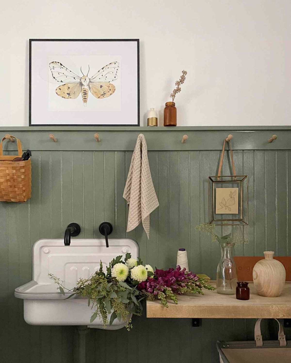
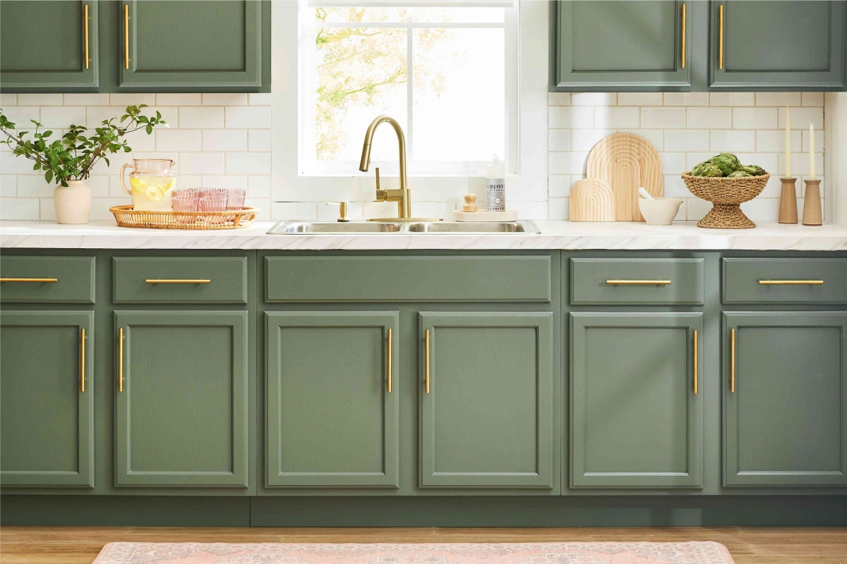
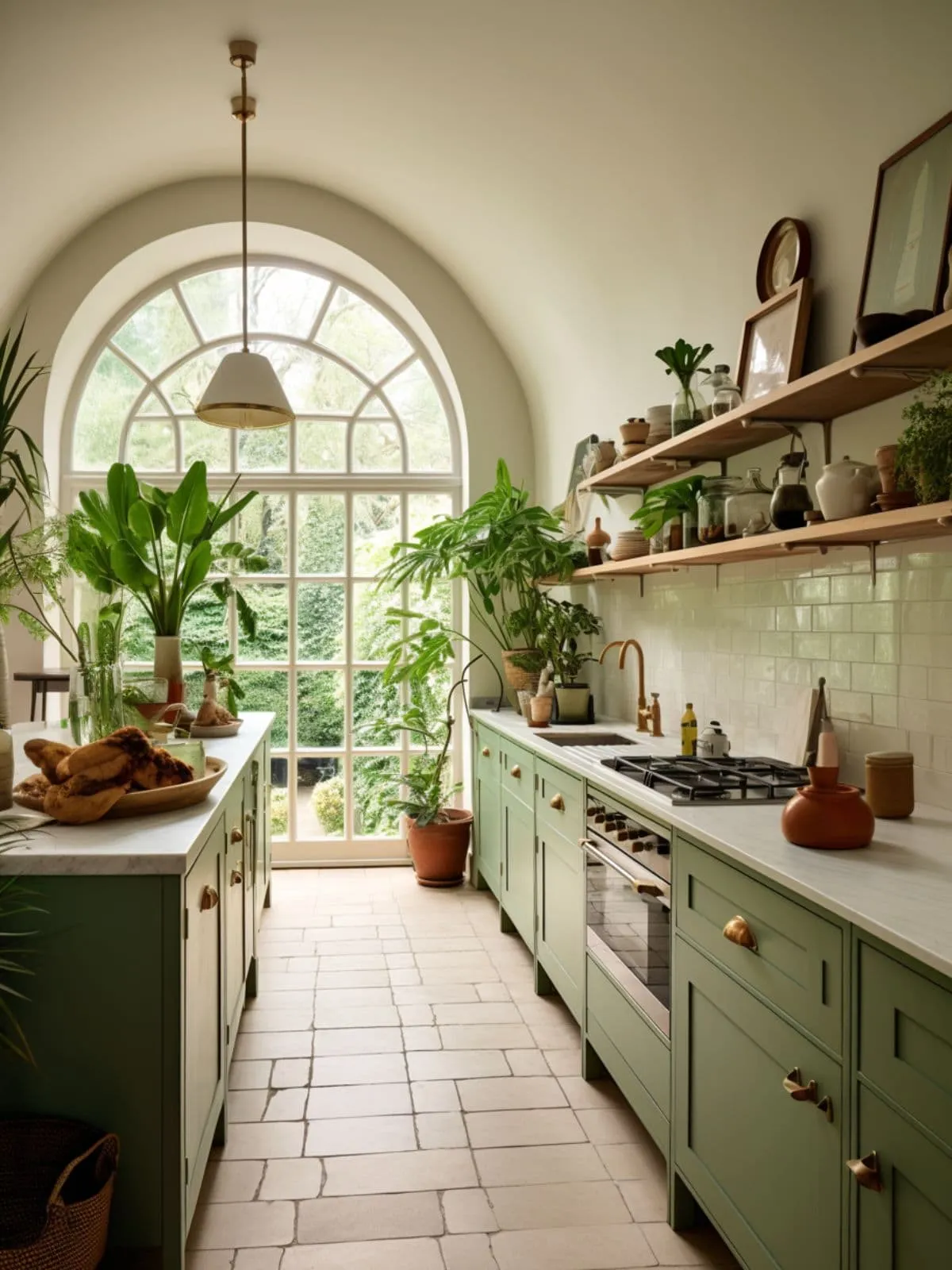
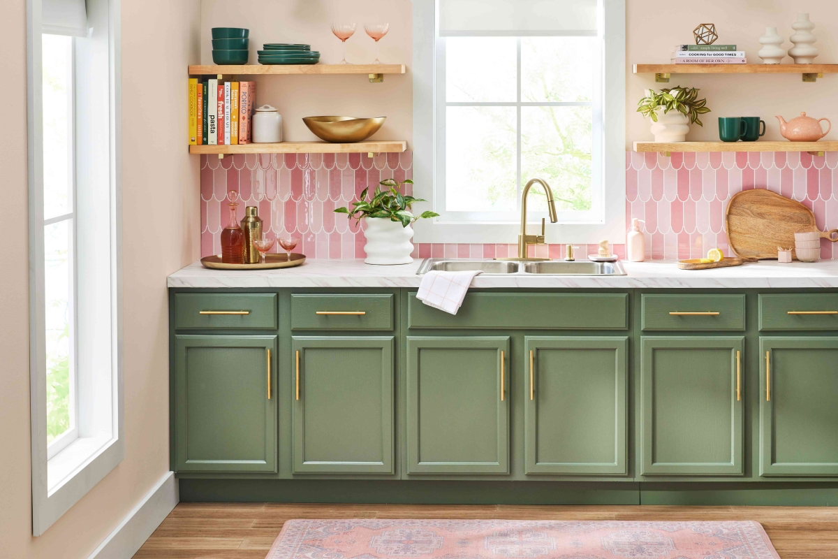
- Yellow Undertones: When sage has a yellow or beige undertone, it feels warmer and more earthy, like a dried herb. These shades are so welcoming and look gorgeous with natural wood, terracotta, and warm metals like brass. Perfect for a cozy kitchen.
Quick story: I once had a client who chose a beautiful blue-toned sage for a living room with warm, yellow-toned oak floors. During the day, it was fine. But at night, under their warm, yellowish lamps, the walls looked weirdly minty and the floors looked almost orange. The colors were fighting. We had to repaint with a warmer, yellow-undertoned sage to bring everything into harmony. A crucial lesson!
The Color-Shifting Trick of the Light
There’s a fancy word, metamerism, for when a color seems to change under different light sources. Sage greens are famous for this. A color that looks like the perfect soft green in the morning sun can turn into a flat, boring gray on a cloudy day or a strange mint green under kitchen lights.
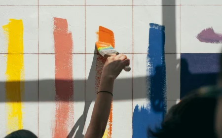
This is why you can NEVER, ever trust a tiny paint chip. I make my clients paint large, 2×2 foot sample boards. Put two full coats on the board, let it dry, and then move it around the room for a full 48 hours. Put it in a dark corner. Hold it next to your sofa. Look at it in the morning and again at night with the lamps on. It’s the only way to know for sure how the color will live in your house.
A Pro’s Shortlist of Go-To Sage Greens
Over the years, I’ve developed a mental Rolodex of sage types that work for different situations. Since I can’t give you specific paint codes (they vary by brand anyway!), here are the profiles to look for:
- The “Barely-There” Sage: Look for an LRV around 65-70 with a strong gray or blue undertone. It’s for when you want a hint of color that feels more sophisticated than off-white. It reads as a soft, calming neutral and is amazing in bathrooms and bedrooms.
- The “Classic Dusty” Sage: This is the workhorse, with an LRV in the 40-55 range and a balanced gray undertone. It’s not too light, not too dark. It’s the perfect, timeless sage that works almost anywhere and pairs well with everything.
- The “Earthy Herb” Sage: You’ll find this one with an LRV around 35-45 and noticeable yellow or beige undertones. It feels warm, organic, and grounding. If you have a lot of wood furniture or terracotta tile, this is your guy.
- The “Moody Forest” Sage: This is a bold choice, with a low LRV of 15-25. It’s a deep, rich green with a lot of gray or even a touch of black, making it feel almost like a charcoal-green. It’s incredible for creating a dramatic, cozy den, library, or accent wall.
Getting It Done: The Real-World Plan
Okay, let’s get practical. How do you actually get this paint on your walls without losing your mind? Here’s the breakdown.
First, a Reality Check: Timeline & Budget
Let’s be real, painting is not a one-day project if you do it right. For a standard 12×12 foot room, here’s a realistic weekend timeline:
- Friday Evening (1-2 hours): Move furniture, clean the walls, and do your taping.
- Saturday Morning (2-3 hours): Patch any holes, let them dry, sand them smooth, and then apply one coat of primer.
- Saturday Evening (1-2 hours): Apply the first coat of your sage green paint.
- Sunday Morning (1-2 hours): Apply the second coat. This is non-negotiable for a rich, even color.
- Sunday Afternoon: Let it dry, carefully remove the tape, and move your furniture back. Done!
Now, for the budget. The biggest mistake people make is skimping on the paint itself. A premium gallon of paint from a specialty paint store will run you $70-$90, while a budget can from a big-box store might be $30-$45. The expensive paint is worth every penny. It has better pigments and binders, meaning you’ll get much better coverage (fewer coats!) and a more durable, beautiful finish. Trust me on this.
Quick tip: To figure out how much paint you need, use this simple formula: (Wall Length 1 + Wall Length 2) x 2 x Ceiling Height, then divide that number by about 350 (the typical square footage a gallon covers). That’s how many gallons you’ll need per coat.
Your Shopping List (with Realistic Prices)
- High-Quality Paint: The star of the show. Plan for at least one gallon for a small-to-medium room. ($70-$90)
- Tinted Primer: Ask the paint store to tint it to 50% of your final color. It’s a game-changer for coverage. ($30-$50)
- Quality Angled Brush: A 2.5-inch angled sash brush is perfect for cutting in edges. A good one won’t shed bristles in your paint. ($15-$25)
- Roller Setup: You’ll need a 9-inch roller frame, an extension pole (to save your back), a paint tray with liners, and a few 3/8-inch nap roller sleeves for smooth walls. ($40 for the whole setup)
- Prep Tools: A 5-in-1 tool, spackle, putty knife, sandpaper, quality painter’s tape (the blue or green stuff), and canvas drop cloths (they’re much safer than slippery plastic). ($50 for all the bits and pieces)
Prep is 80% of the Job
We have a rule in the business: a great paint job is 80% prep, 20% painting. Skimp here, and your expensive paint will look awful. Clean the walls with a mild detergent and water. If it’s a kitchen, use a degreaser. Patch holes, sand them smooth, and tape off your trim for those satisfyingly crisp lines.
Pro Application Secrets
When it’s finally time to paint, we do two things amateurs often skip. First, we “box” the paint. If the room needs two gallons, we pour them both into a clean 5-gallon bucket and mix them together. This eliminates any tiny color variations between cans.
Second, we paint to a “wet edge.” We use the brush to “cut in” the edges—along the ceiling, corners, and trim. Then, while that paint is still wet, we immediately roll the main part of the wall, overlapping the brushed section. This prevents those ugly outlines or “hat banding” you see on so many DIY jobs. By the way, a properly loaded roller should make a soft hissing sound. If it sounds sticky or loud, you need more paint.
Choosing Your Finish & Pairing Your Sage
The final touches can make or break the look. Here’s how to nail them.
A Quick Guide to Paint Sheen
Sheen, or finish, affects durability and how the color looks. For a complex color like sage, it’s a big deal.
- Matte/Flat: This is the most luxurious, velvety finish. It’s a master at hiding minor wall imperfections and gives the truest color. I love it for deep, moody sages in low-traffic areas like a dining room or study. The big catch? It’s the least washable.
- Eggshell: This is my go-to for most homes. It has a soft, very subtle glow—like an actual eggshell—and is way more durable and wipeable than matte. It’s the perfect balance for living rooms, hallways, and bedrooms.
- Satin: A step up in sheen and durability. Satin is scrubbable, making it a great choice for kitchens, bathrooms, or kids’ rooms. Just know the shine will reflect more light and can slightly change how you perceive the color.
- Semi-Gloss: Super shiny and tough as nails. I only use this for trim, doors, and cabinets. Never, ever paint a whole wall in semi-gloss unless you want to see every single tiny flaw magnified by the glare.
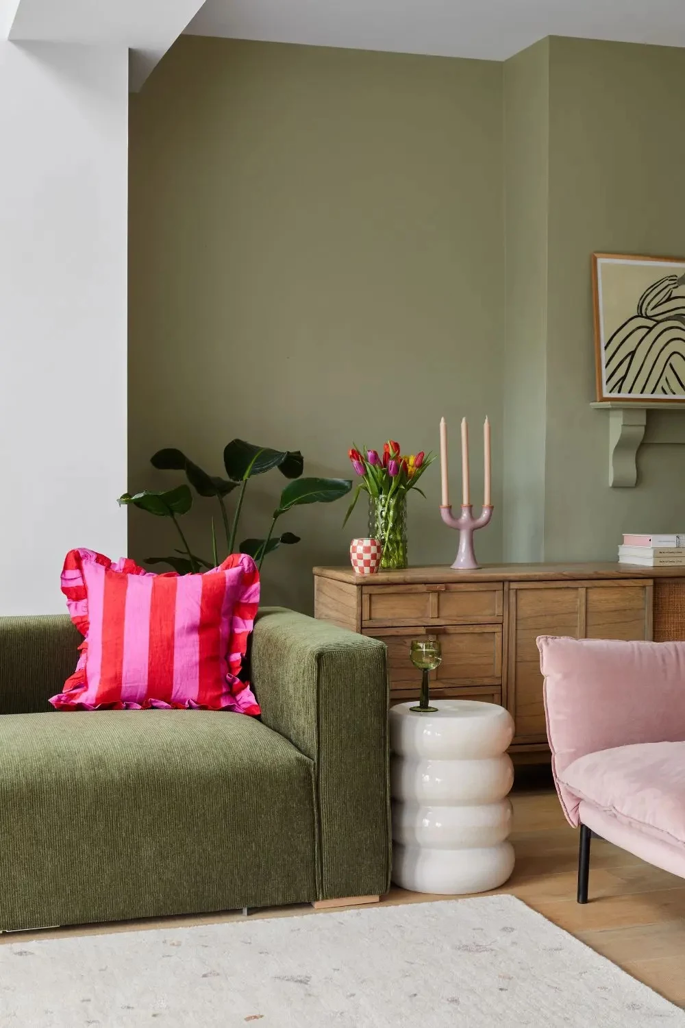
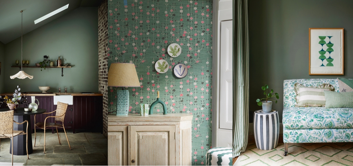
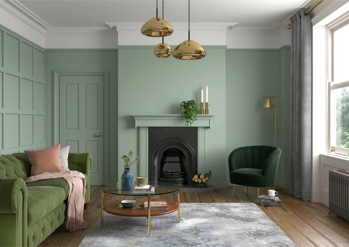
What Goes with Sage Green?
Sage is a fantastic team player. For pairing with wood, the rule is simple: warm woods like oak and cherry love warm, yellow-toned sages. Cooler woods like ash or dark espresso stains look sharp and modern with cooler, blue-or-gray-toned sages.
But don’t stop at wood! Sage looks incredible with other colors. Think about pairing it with:
- Deep charcoal grays for a sophisticated, moody look.
- Warm, rusty terracottas and ochre for an earthy, Southwestern vibe.
- Dusty blush pinks or muted mauves for a surprisingly chic and modern combination.
- Warm, creamy whites for a classic, calming farmhouse feel.
Quick Win Idea: Not ready to commit to a whole room? Buy a sample pot of a deep, moody sage and paint the back of a bookshelf or an old side table. It’s a low-effort project with a huge style payoff.
Troubleshooting: When Good Sage Goes Bad
Even with perfect planning, things can look a little… off. Here’s how to fix common problems.
- “Help, my sage looks too minty!” This is an undertone problem. Your sage has a blue undertone that’s being amplified by warm, yellow-toned lightbulbs. First, try swapping your bulbs to a more neutral or cool white (3000K-3500K). If that doesn’t fix it, you’ll need to repaint with a sage that has a gray or yellow undertone.
- “My sage looks muddy and dull.” This usually happens in a room with not enough natural light, or if you used a sage with a very heavy gray undertone. You can try adding more lamps to bring the color to life, or you might need to repaint with a brighter, cleaner sage with a higher LRV.
- “I have ugly roller marks on my wall!” If you see lines or a blotchy texture, you’re almost certainly pressing too hard on the roller. Let the tool do the work! Keep the roller evenly loaded with paint (remember that ‘soft hiss’ sound) and use light, consistent pressure.
A Serious Word on Safety
Okay, let’s get serious for a second. As a pro, safety is everything. It should be for you, too.
Proper ventilation is not optional. Even low-VOC paints release fumes. Open a window and stick a box fan in it, pointing out. This creates negative pressure and pulls the stale air out. Then crack a window elsewhere to let fresh air in. This constant flow is key for your health and helps the paint cure correctly.
Heads Up! This is important. If your home was built before the late 1970s, you MUST assume that there could be lead paint on the walls. Do not, under any circumstances, scrape or sand these surfaces without testing first. You can get a lead test kit at any hardware store. If it’s positive, you need to hire a contractor who is EPA-certified in lead-safe renovation. The health risks, especially to kids, are severe and not worth messing with.
Finally, be smart with ladders. Most DIY injuries come from falls. Always keep three points of contact on the ladder (two feet and one hand, for example). Don’t stand on the top rungs, and never overreach. It’s always safer to get down and move the ladder. A beautiful room isn’t worth an trip to the emergency room.
Galerie d’inspiration
How do I choose the right sage green paint from the store?
It’s about the undertone. For a tried-and-true painter’s favorite, look at Benjamin Moore’s
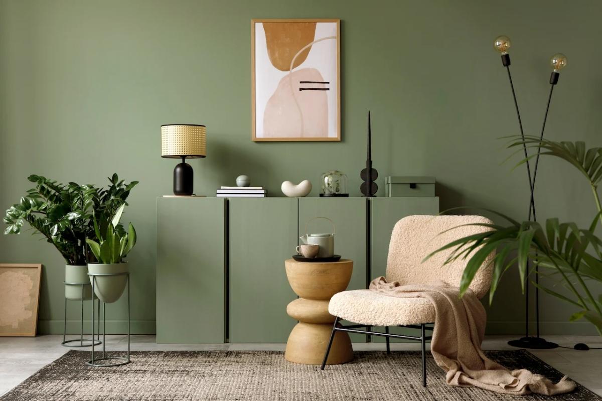
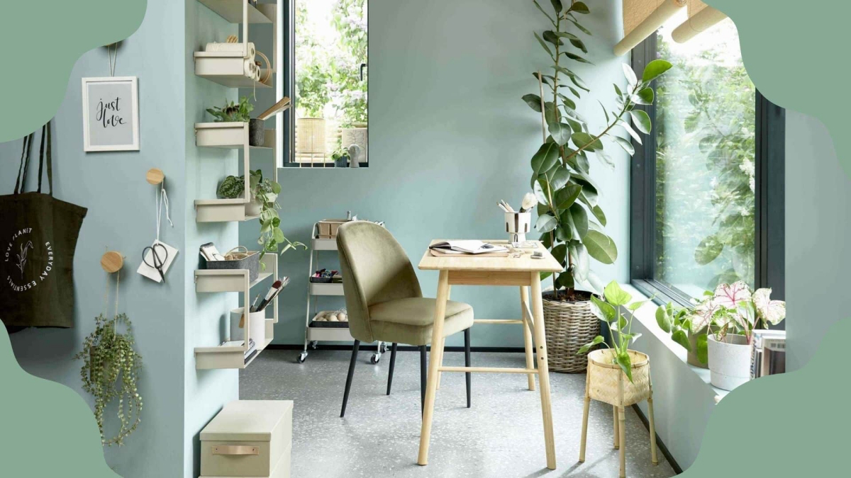
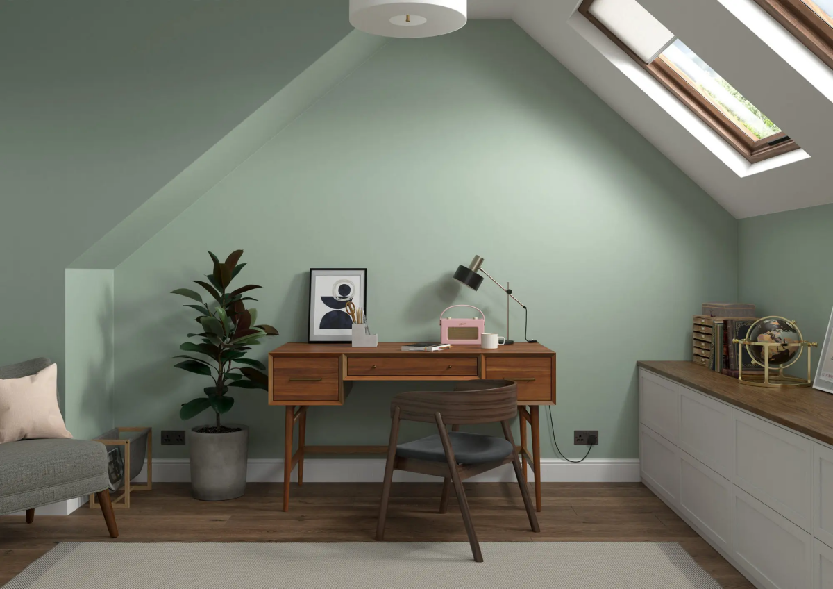
Sage green’s versatility comes from its mix of gray, green, and sometimes yellow, allowing it to act as a neutral while still adding color.
To enhance this quality, think beyond paint pairings and focus on texture. Combine sage walls with warm brass or copper fixtures to bring out its inherent warmth. For a more organic, calming aesthetic, pair it with natural materials like light oak, rattan furniture, and unbleached linen curtains. The contrast between the soft, cool green and these earthy textures creates a space that feels both sophisticated and deeply relaxing.