Confessions of a Painter: How to Choose a Paint Color You Won’t Regret
I’ve spent more of my life with a paintbrush in hand than not, and if there’s one thing I’ve learned walking through thousands of homes, it’s this: the perfect color in a magazine can look like a total disaster on your wall. It’s a classic story. You see a gorgeous, moody gray online, but in your living room, it suddenly looks like a sad, purple-ish blob. Oof.
In this article
The secret isn’t chasing the latest trend. Honestly, trends are fun, but they don’t matter if the color is fundamentally wrong for your space. Real success comes from understanding the relationship between color, light, and the actual stuff in your home. My job has become less about just slapping paint on walls and more about saving people from expensive color mistakes. So, let’s skip the fads and talk about how the pros really think about color.
First Things First: Light and Sheen Are Everything
Before you even glance at a paint chip, you have to wrap your head around two things: the light in your room and the paint’s finish (or sheen). Getting this wrong is the number one reason people end up hating their new color. A paint color isn’t a static thing; it’s a living surface that plays with light, and its sheen dictates the rules of the game.
Let There Be Light (The Right Kind)
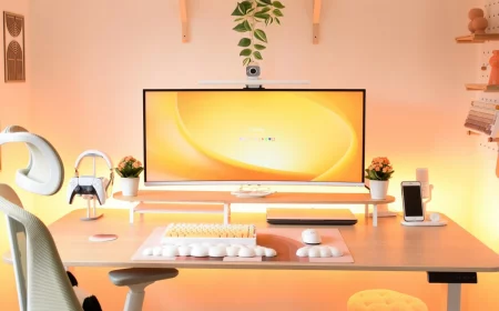
Light changes everything. I once had a client who picked a beautiful, soft gray for her open-concept living room. We put a test patch up, and in the sunny, south-facing part of the room, it was perfect. But when the sun went down and she flipped on her lamps, the north-facing wall looked… distinctly purple. Whoops. This is a real phenomenon called metamerism, where a color seems to change under different light sources.
You absolutely have to check your potential color in your own room at all times of day.
- Morning light often has a warm, yellowish cast.
- Midday light is usually brighter and more neutral, sometimes even a bit blue.
- Evening light gets warm and shadowy again as the sun goes down.
- Artificial light is the big one people forget. This is critical! Older incandescent bulbs throw off a very warm, yellow light. Modern LEDs, on the other hand, come in a whole range of temperatures, from a cozy “warm white” to a stark “daylight.” A cool gray under a warm bulb can look muddy, and a warm beige under a cool daylight bulb can look completely washed out.
Quick tip: Before you even start sampling paints, figure out what lightbulbs you’re using. If you plan to change them, do it now. It will save you so much grief later.
A Quick Guide to Paint Sheen
Sheen is just a fancy word for how shiny the paint is. It dramatically affects how a color looks and, just as importantly, how durable your wall will be. Here’s the breakdown I give all my clients, from least shiny to most.
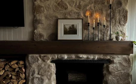
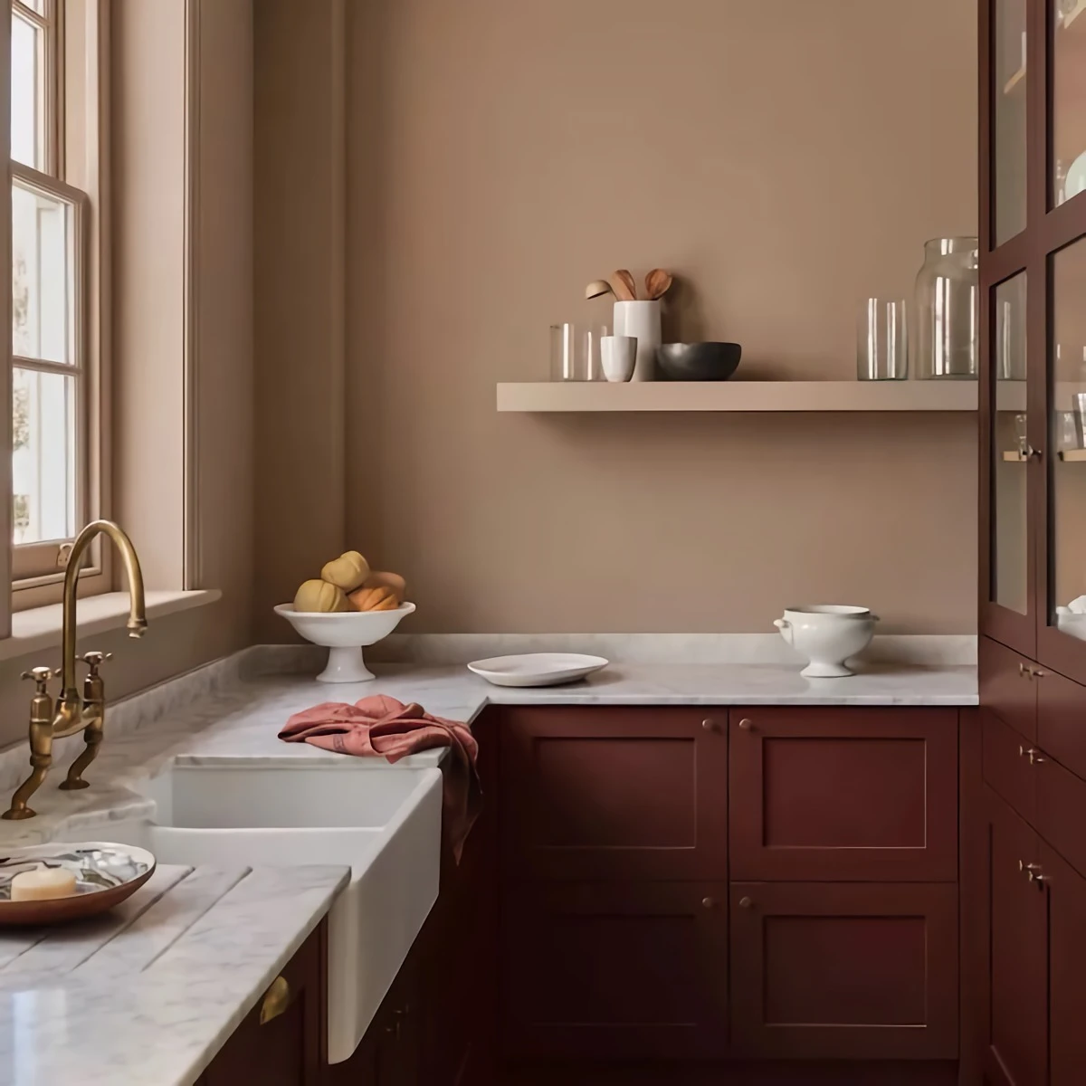
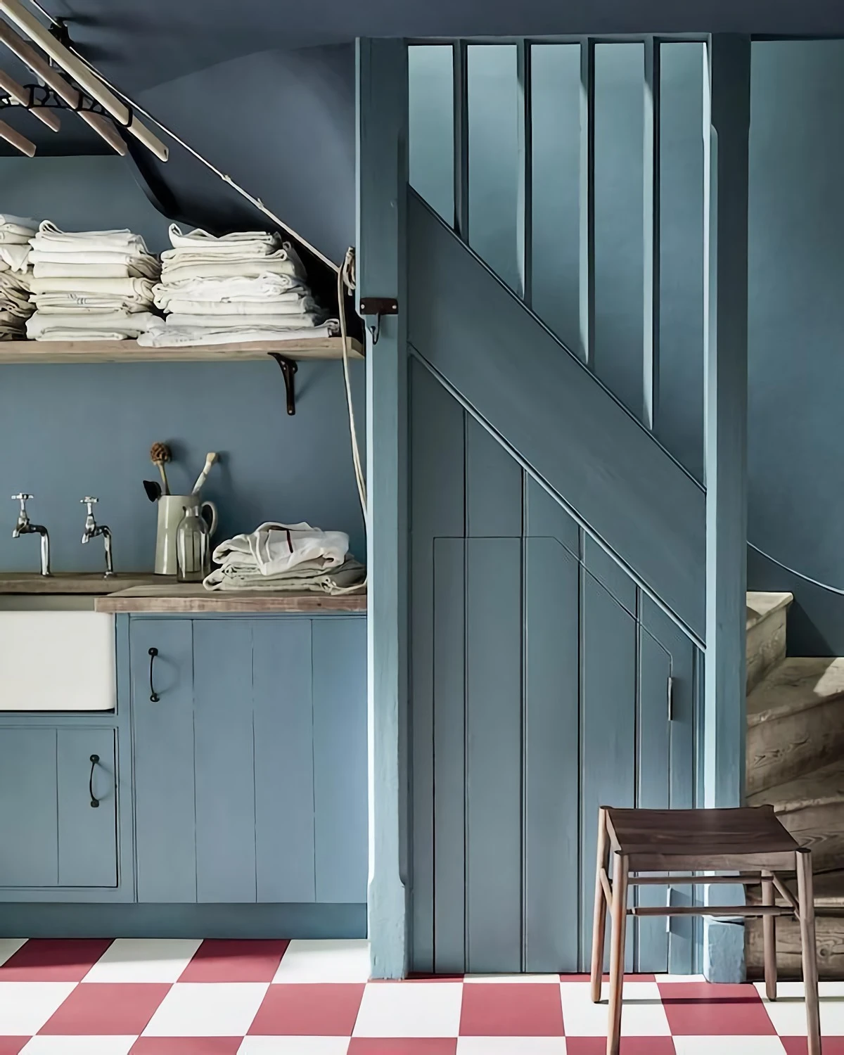
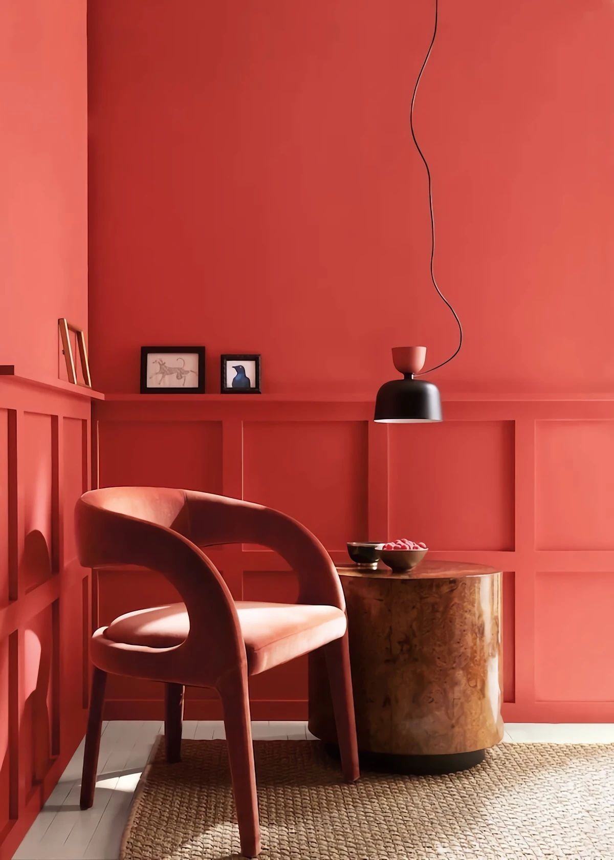
Flat or Matte: This is your go-to for hiding imperfections. It has zero shine because it scatters light, which makes it a lifesaver for older homes with slightly wavy plaster walls. I use it on almost every ceiling. The big downside? It’s the least durable and a pain to clean. Trying to wipe off a scuff can leave a shiny spot, a problem called ‘burnishing’. It’s best for ceilings and super low-traffic areas like a formal dining room.
Eggshell: This is the workhorse of interior paint. It has a tiny bit of luster, just like a real eggshell, and it hits the sweet spot between looking good and being practical. You can gently wipe it down without wrecking the finish. For most living rooms, hallways, and bedrooms, eggshell is almost always the right call.
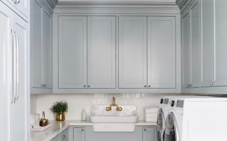
Satin: A step up in shine and toughness from eggshell, satin has a soft, velvety glow. It’s a fantastic choice for high-traffic areas or rooms that get a bit of moisture, like a laundry room or a kids’ playroom. It’s noticeably easier to clean than eggshell. But, and this is a big but, that extra shine will start to show off more of your wall’s dings and bumps. Good prep work becomes really important here.
Semi-Gloss: Now we’re getting shiny. This finish is tough, moisture-resistant, and super easy to scrub, which is why it’s the traditional choice for trim, doors, and cabinets. The drawback is that it highlights every single flaw. Every nail pop, every tiny ripple. If you use semi-gloss, the surface better be perfectly smooth.
High-Gloss: The most durable and reflective of them all. It creates an almost plastic-like, liquidy finish that can look incredibly chic and dramatic on furniture or doors. But it is completely unforgiving. It will magnify any imperfection, so the prep work has to be flawless. This is often a finish best left to a pro with a sprayer to get that glass-smooth look.
The Pro’s Method for Testing Color (So You Only Have to Paint Once)
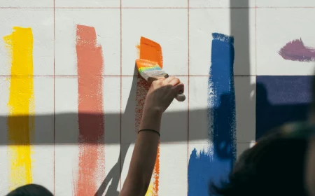
Please, I’m begging you, do not make your final decision based on one of those tiny 2-inch paper squares from the hardware store. They’re printed with ink, not paint, and they’re never 100% accurate. Plus, their size makes it impossible to see how a color will really feel on a big wall.
My Foolproof Testing System
I never, ever paint test swatches directly onto the wall. The old color will mess with your perception, and the texture difference is just distracting. Instead, do this:
- Get Sample Pots. Every major paint brand sells little 8-ounce sample pots. They’ll run you about $7 to $10 each, and it will be the best money you spend on the entire project.
- Use Big Sample Boards. Grab a couple of 2-foot by 2-foot pieces of foam core or even just some spare drywall from a home improvement store. They’re big enough to give you a real feel for the color.
- Apply Two Full Coats. Just like you would on a real wall, you need two coats for the color to show its true self. Let it dry completely between coats—usually about 2 to 4 hours.
- Live With It for 24 Hours. Now for the important part. Move that board all around the room. Prop it next to your sofa. Put it on a wall that gets hit with direct sun. Move it into a dark corner. Check it in the morning, at noon, and at night with your lamps on. This is the only way to see how the color really behaves in your space.
- Compare It to Everything. Place your sample board right up against your wood floors, your kitchen cabinets, and your window trim. This is where you’ll spot undertone problems. That lovely beige can suddenly look pink next to a golden oak floor, or a cool gray can feel sterile next to warm cherry cabinets.
Let’s Talk Undertones
Undertones are the sneaky little hints of color hiding inside another color. A gray is never just gray; it’s a gray with a hint of blue, green, or purple. This is what trips most people up. A good trick is to look at the darkest color on the same paint strip. It’s usually a much more intense version of the base color, making the undertone super obvious.
Okay, So How Much Paint Do I Need? (And What Does It Cost?)
So you’ve found your perfect color. Now what? You need to figure out how much to buy. The rule of thumb is that one gallon of paint will cover about 400 square feet of wall with one coat. To get your room’s square footage, just add up the length of all the walls and multiply that by the ceiling height. Don’t stress about subtracting for windows unless they’re massive. It’s always better to have a little extra for touch-ups anyway.
Heads up on cost: You get what you pay for with paint. A gallon of high-quality paint from a dedicated paint store will run you between $50 and $80. Yes, you can find paint at a big-box store for $25 a gallon, but trust me, you’ll end up needing three or four coats and hating your life. The good stuff has better pigments and binders, meaning it covers better and lasts longer. Buy the good stuff. It’s worth it.
The Right Way to Paint a Room
If you’re going the DIY route, you’re going to need a few things. Here’s a basic shopping list to get you started:
- A good brush: A 2.5-inch angled brush is the most versatile. Look for quality brands—they hold more paint and give you cleaner lines.
- A roller setup: You’ll need a 9-inch roller frame and a few roller covers. A 3/8-inch nap is perfect for most smooth interior walls.
- A real paint tray: Get a metal one and buy a few disposable plastic liners. It makes cleanup a breeze.
- Painter’s tape: Don’t cheap out here. The good stuff (like the green or blue tape) seals better and won’t pull up your paint.
- Drop cloths: Get canvas, not the flimsy plastic ones. Plastic is slippery, and paint spills on it stay wet, just waiting for you to step in them. Canvas absorbs drips.
By the way, there’s a timeless debate about what to paint first. Here’s the answer: always work from the top down. Ceiling first. Walls second. Trim and baseboards last. Any drips from the ceiling just get covered when you do the walls. Simple.
When to Call a Pro (And What to Expect)
I have huge respect for ambitious DIYers, but some jobs are just better left to the pros. You should seriously consider hiring a professional painter if:
- You have crazy high ceilings (over 10-12 feet). Working on tall ladders and scaffolding is dangerous if you don’t do it every day.
- The prep work is massive. If you have failing plaster, significant wall damage, or tons of wallpaper to remove, a pro can get it done faster and better.
- Your house was built before the late 1970s. If so, it might have lead-based paint. This is a serious health hazard, especially for kids. If paint is chipping or you plan to sand, you MUST test for lead. If it’s positive, you legally and ethically need a certified pro to handle it safely. The dust is toxic. Don’t risk it.
- You want a flawless, sprayed finish on cabinets or built-ins. That requires specialized gear and a ton of skill.
Hiring a pro isn’t cheap, but you’re paying for speed, safety, and a perfect finish. To have a standard bedroom painted, you can expect to pay anywhere from $400 to $800, depending on how much prep is involved. A good painter isn’t just a laborer; they’re a craftsperson who ensures the job is done right and will last for years. And that peace of mind is often worth every penny.
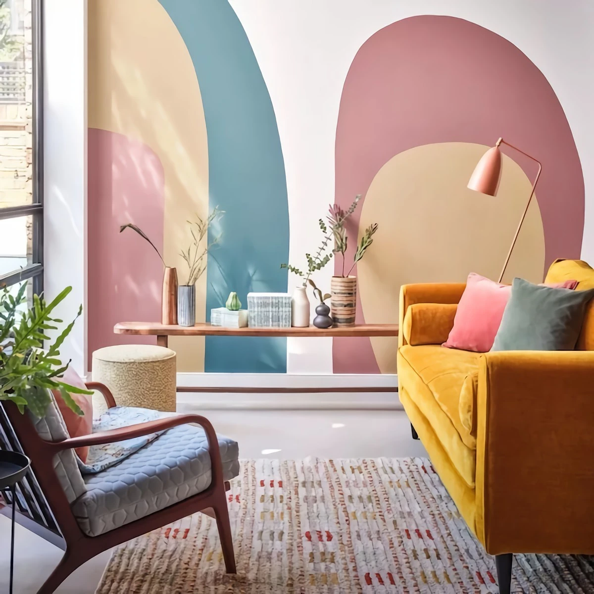
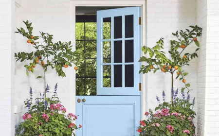
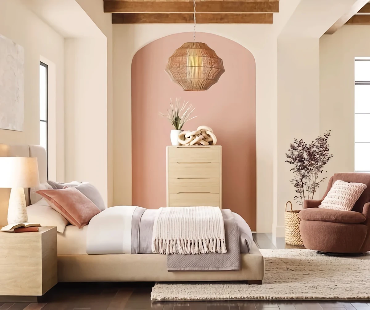
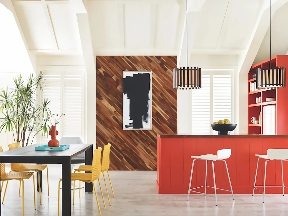
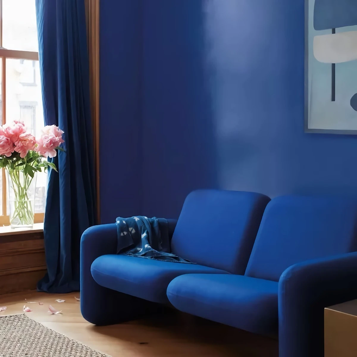
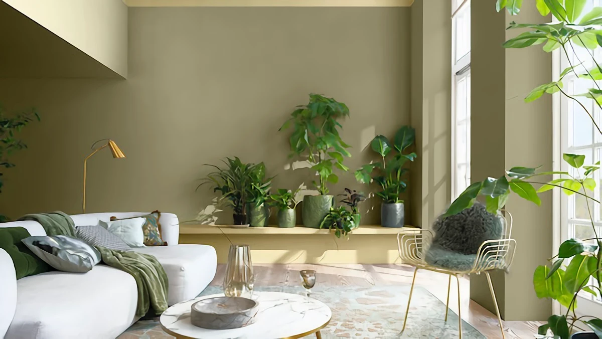
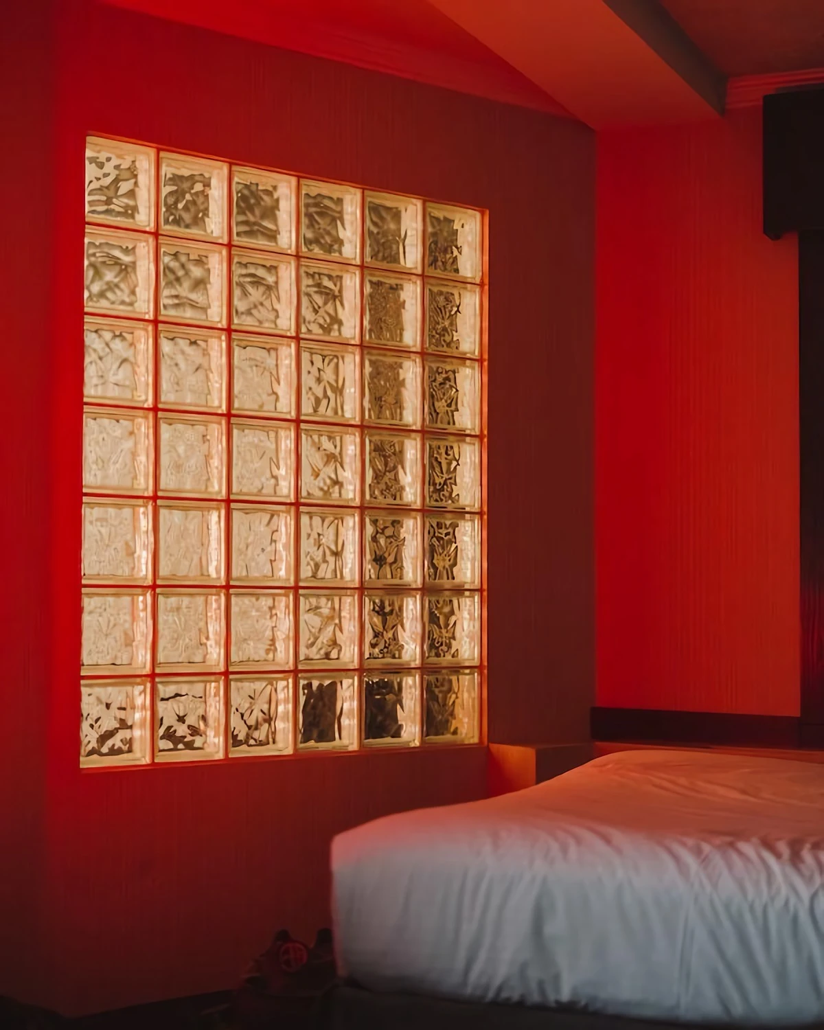
Inspiration:
But is primer really that important, especially if the new color is similar to the old one?
Absolutely, and it’s about more than just coverage. A quality primer, like a Zinsser B-I-N, does three critical jobs your paint can’t: it seals the original surface, prevents old stains from bleeding through, and most importantly, it creates a neutral, uniform base. This ensures the color you fell in love with on the chip is the color you get on your wall. Painting a rich navy over an off-white without a primer can result in a dull, uneven finish, no matter how many coats you apply.
On the back of most paint swatches, you’ll find a number labeled ‘LRV’. This isn’t random; it’s the color’s Light Reflectance Value.
Think of it as a cheat sheet for how light or dark a color will feel in your space. The scale runs from 0 (absolute black) to 100 (pure white). A paint with a high LRV, like Benjamin Moore’s ‘Chantilly Lace’ (LRV 92.2), reflects a huge amount of light and can make a small, north-facing room feel brighter and more expansive. Conversely, a color with a low LRV, such as Farrow & Ball’s ‘Hague Blue’ (LRV 7), will absorb light, creating a dramatic, cozy, and intimate atmosphere perfect for a den or dining room.