Afraid of Dark Paint? Here’s How to Use Rich Jewel Tones Without Regret
I’ve been immersed in the world of interior color for a long time, and I’ve seen countless trends pop up and then fade away. But some things just stick. Rich, deep jewel tones are one of them. These aren’t just fleeting, trendy shades; they’re foundational colors that can make a home feel solid, personal, and incredibly comforting. I’ve walked so many clients back from the ledge of “color fear,” and together, we’ve turned bland, forgettable rooms into spaces with real soul.
In this article
- First, A Little Color Science (The Part That Saves You Money)
- Picking Your Palette (And Your Paint)
- Not Ready to Commit? Try a Color ‘Snack’ First
- How to Paint Dark Colors The Right Way
- Bringing the Whole Room Together
- Troubleshooting: Fixing Common Problems
- The Reality Check: Budgets, Safety, and When to Call for Help
- Galerie d’inspiration
But let’s be honest, it’s not as simple as picking a color named after a gemstone. To get it right, you have to understand how these deep, saturated colors actually behave in a space. It’s a dance between light, texture, and balance. I want to share what I’ve learned—from both the big wins and the occasional “oops, let’s repaint that” moments—to give you the confidence to use these colors like a pro.
First, A Little Color Science (The Part That Saves You Money)
Before you even glance at a paint chip, you need to get a handle on how light works. This is, without a doubt, the most important factor when you’re going dark and dramatic. Two little concepts will save you a world of headaches: Light Reflectance Value (LRV) and metamerism.
Light Reflectance Value (LRV)
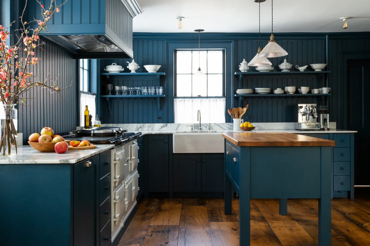
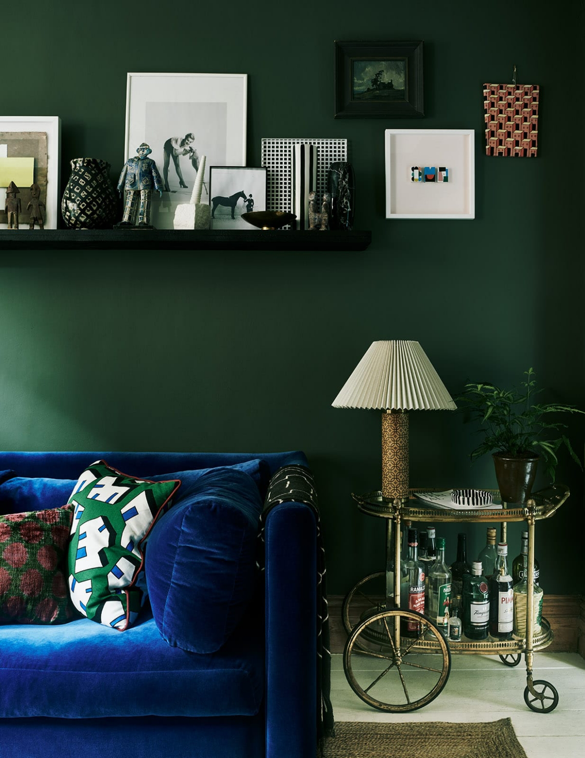
Every paint color has an LRV score, usually from 0 (pure black) to 100 (pure white). Think of it as a measure of how much light a color bounces back into the room. Jewel tones hang out at the low end of the scale. A deep ruby red might have an LRV of 5 to 8, while a rich emerald green could be around 10 to 15. This means they soak up light like a sponge and reflect very little.
Why should you care? Because a low LRV color will make a room feel darker and cozier. This is great if you want an intimate, snug space like a library or a den. But if you paint your large, open-concept living room in a color with an LRV of 6 without a solid lighting plan, you’re going to end up with a cave. I always check the LRV on the manufacturer’s website; it’s a technical spec that tells me more than a tiny swatch ever could.

The Annoying Problem of Metamerism
Ever pick a color at the hardware store, paint it on your wall, and wonder if you got the wrong can? That’s metamerism. It’s what happens when a color looks one way under the fluorescent lights of the store and completely different in the warm, natural light of your home.
Jewel tones are especially prone to this. A sapphire blue that looks electric in the store can turn into a dull, flat navy under the yellow glow of your evening lamps. I learned this the hard way on an early project. I chose a stunning aubergine for a dining room. It was perfect! …In my studio. In the client’s home, the afternoon sun streaming through the window made it look like a muddy brown. We had to repaint.
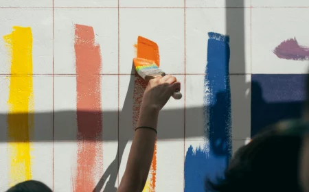
Quick Tip: NEVER trust a small paint chip. The best way to test a color is to get a sample pot (usually $5-$10) and paint a large piece of foam core or a spare bit of drywall. We’re talking at least 2-feet-by-2-feet. Paint two coats, let it dry, and then move that board around the room throughout the day. Check it in the morning, at noon, in the evening, and with your lights on. This is the only way to know what you’re really getting.
Picking Your Palette (And Your Paint)
Using jewel tones is like cooking with powerful spices. Quality matters, and a little can go a long way. Let’s talk about choosing the right color and, just as important, the right finish.
Beyond the Big Three
When you hear “jewel tones,” your mind probably goes to sapphire, emerald, and ruby. Classics, for sure. But the palette is so much bigger. Consider these gorgeous alternatives:
- Garnet: A deep, brownish-red that’s warmer and more earthy than a classic ruby. It’s absolutely beautiful with natural wood and leather furniture.
- Amethyst: A rich purple that can feel both regal and creative. Look for complex versions that lean a little red or blue, not a bright, cartoonish purple.
- Citrine: Not a lemon yellow, but a deep, golden yellow with hints of amber and brown. It brings incredible warmth without being jarring.
- Tourmaline: This often refers to a deep teal or blue-green. It’s a super sophisticated alternative if you want something a bit more complex than a standard emerald.
A good jewel tone paint shouldn’t look flat. Up close, you should see hints of other undertones. That’s what gives the color life on a big wall.
Why Your Paint Sheen is a HUGE Deal
The finish you choose can make or break a jewel-toned room. To be frank, I almost always use a matte or flat finish. Here’s a simple breakdown:
- Matte/Flat Finish: This is my go-to. It has a soft, velvety look because it diffuses light instead of reflecting it. This makes the color feel incredibly rich and luxurious. Big bonus: It’s the best for hiding minor bumps and imperfections on your walls.
- Eggshell/Satin Finish: These have a slight glow and are easier to wipe down. But… that sheen can create distracting hot spots of reflected light, and it will highlight every single flaw in your drywall. If you need durability in a high-traffic area, look for the newer high-end “scrubbable matte” paints. They give you the best of both worlds.
Honestly, I’d avoid anything shinier than eggshell on walls. The reflections on a dark color tend to look a bit cheap and plastic-like.
Not Ready to Commit? Try a Color ‘Snack’ First
Jumping into painting an entire room dark can feel like a massive commitment. So don’t! If you’re nervous, just dip your toe in. This is a low-risk, high-reward way to play with color.
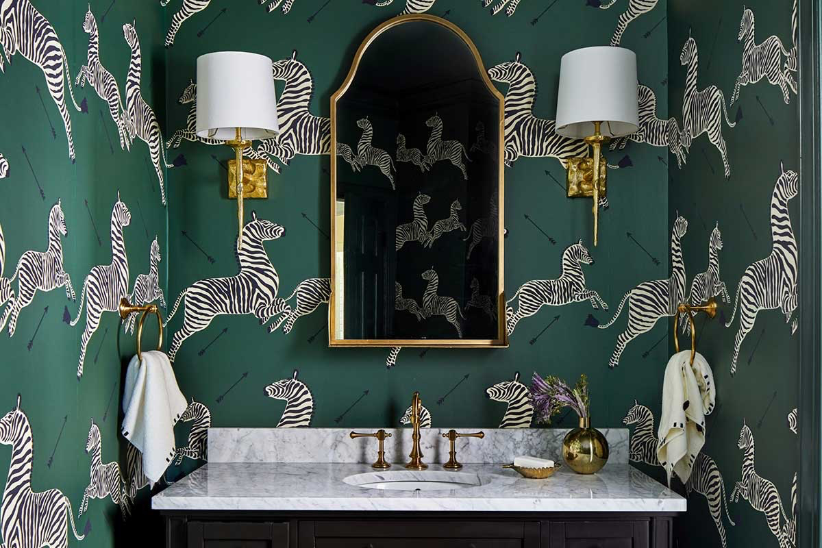
A fantastic starter project is to paint the back of a bookshelf. If you have a white or light-colored bookcase, painting the inside back panel a deep emerald green or sapphire blue creates an incredible pop of drama. It instantly makes the items on your shelves look curated and important.
Another idea? Hit up a thrift store or Facebook Marketplace for a cheap side table or small dresser. For less than $50, you can get a piece of furniture and a quart of paint and create a stunning accent piece. It’s a weekend project that lets you experience the color without the pressure of getting your walls perfect.
How to Paint Dark Colors The Right Way
You cannot cut corners when you’re painting with a deep, saturated color. It’s way less forgiving than beige or off-white. Here are the non-negotiable steps.
- Prep is King: Your walls must be smooth. Fill every nail hole, patch every ding, and sand it all flush. Any texture will scream for attention under a dark color. Then, wash the walls with a mild degreaser (a simple solution of dish soap and water works) to get rid of dust and oils.
- Use a Tinted Primer. This is NOT optional. This is the single biggest pro tip I can give you. Ask the paint store to tint your primer to a medium-gray or a shade close to your final color. This deep base means you’ll need fewer coats of your expensive paint. Expect to pay $70-$90 for a gallon of high-quality, deep-base paint, versus $35 for a cheap one. The tinted primer (around $25-$30 a quart) makes that pricey gallon go way further, saving you time and money.
- Work Smart, Not Hard: Use a good angled brush to “cut in” the edges. Only work in a small section at a time. Cut in a few feet, then immediately roll that part of the wall while the brushed edge is still wet. This prevents “picture framing,” where the edges look like a different color. Always roll from a dry area back into your wet edge to avoid ugly lap marks.
Bringing the Whole Room Together
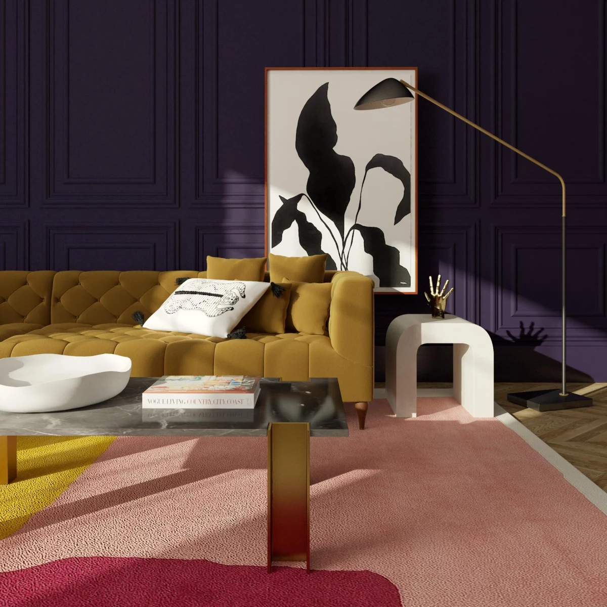
Okay, the wall is painted. Now what? A jewel-toned wall is a statement piece, and it needs the right supporting cast of textures and colors to look intentional and balanced.
Texture is everything. It keeps a dark, flat color from feeling one-dimensional.
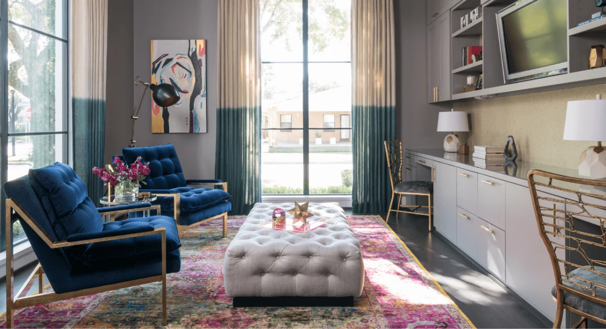
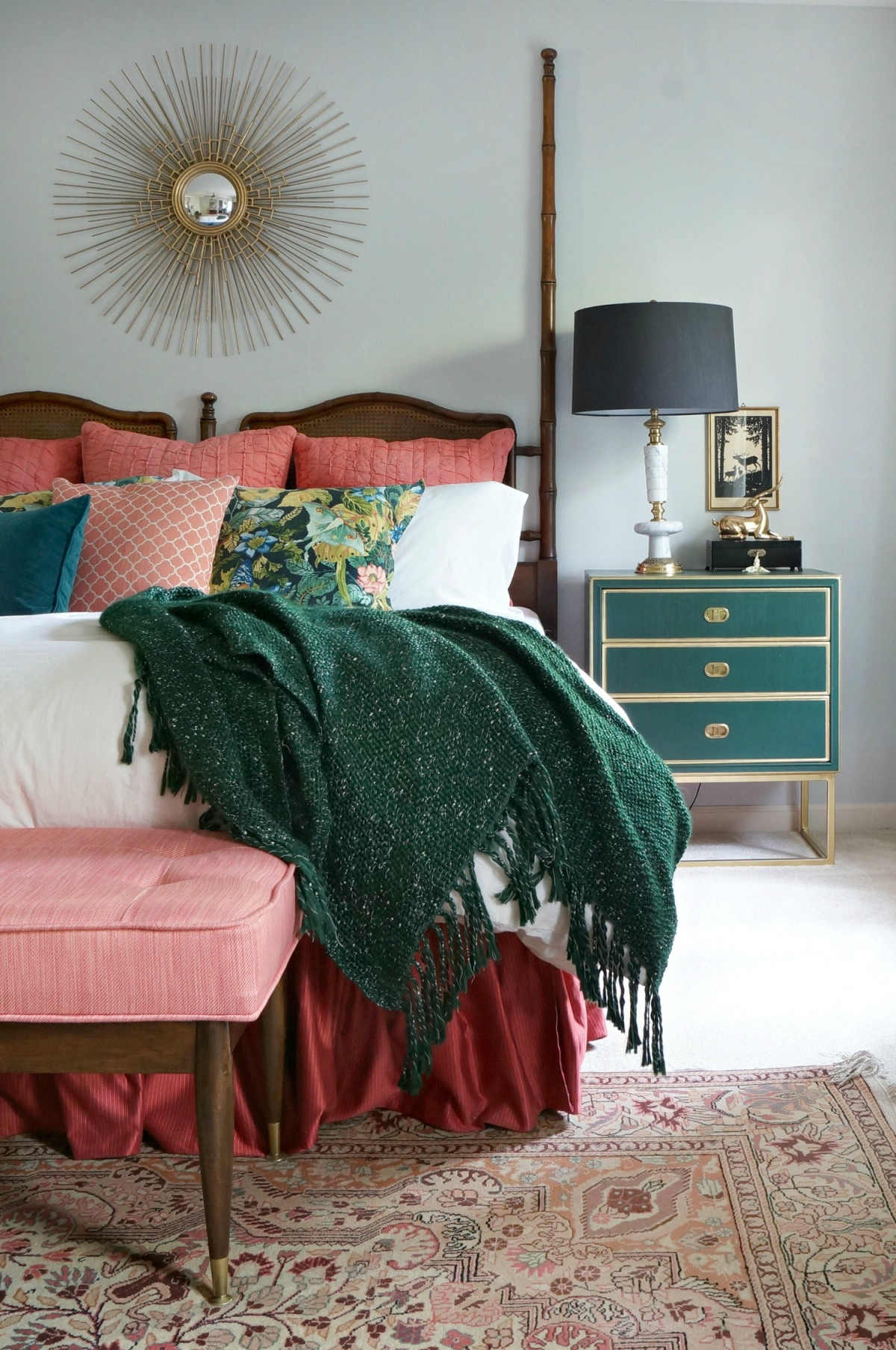
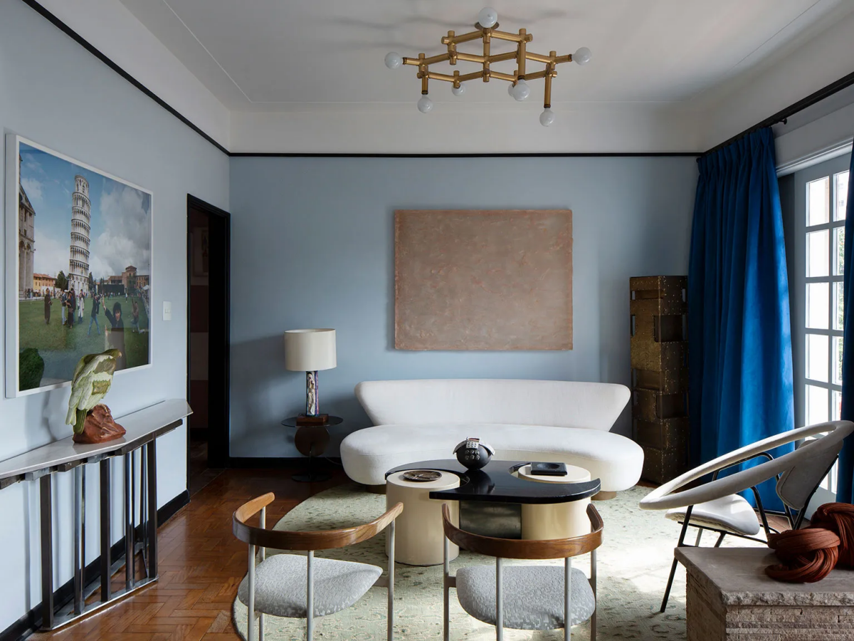
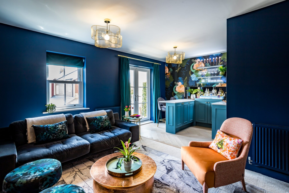
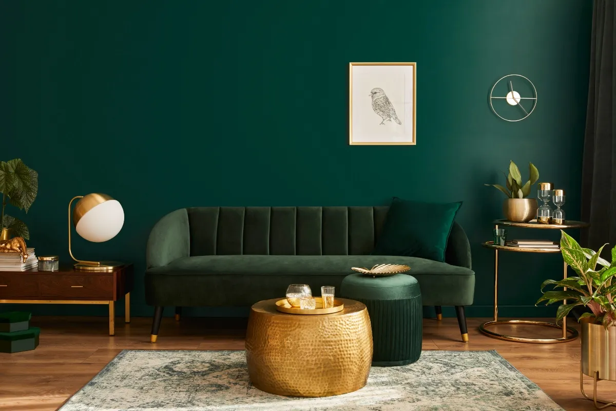
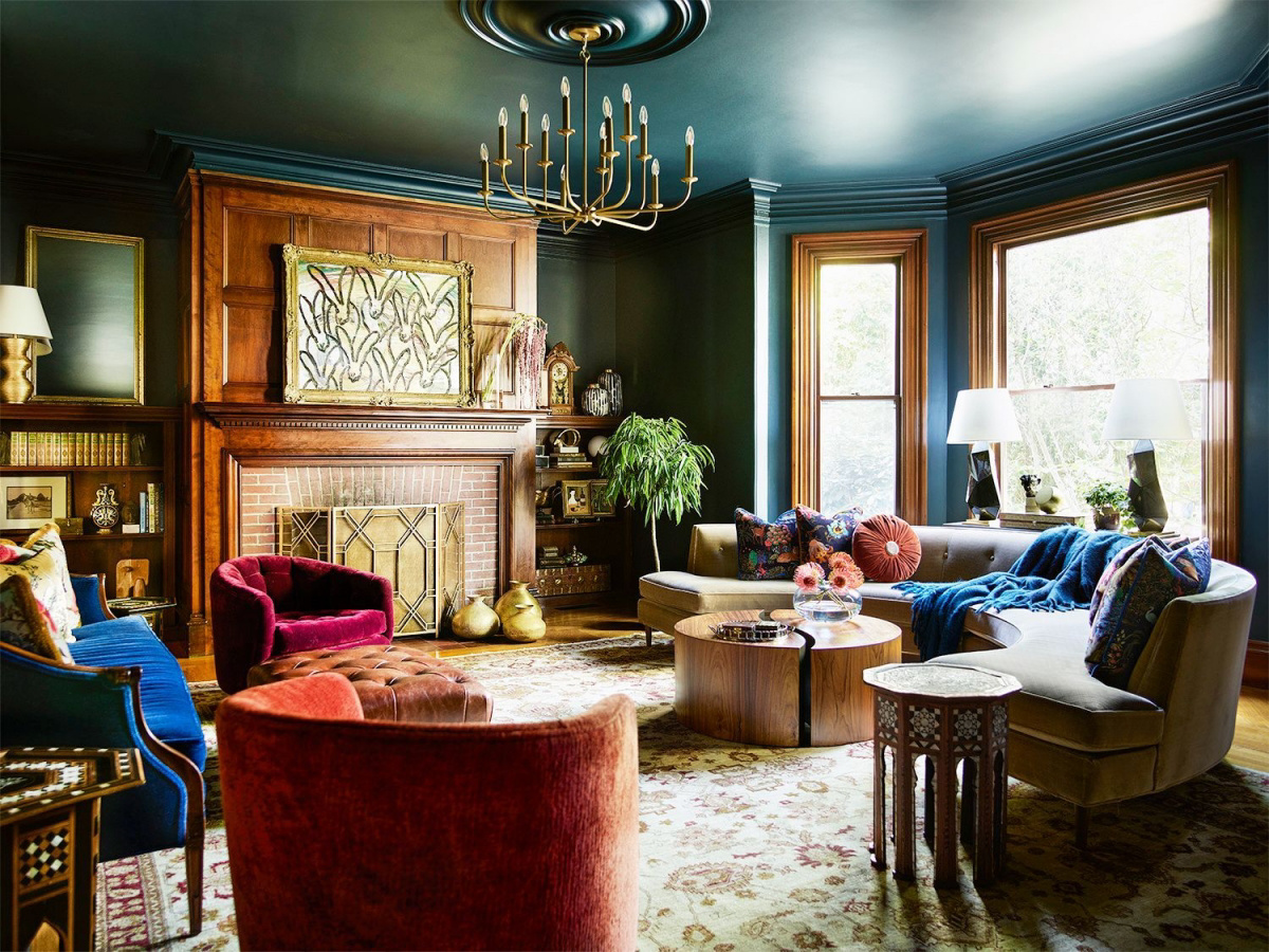
- Fabrics: Velvet is a no-brainer. It catches light beautifully. A sapphire blue velvet sofa against a wall of the same color is a stunning tone-on-tone look. Also think about chunky wool throws, silk pillows, and rich leather.
- Wood: The warmth of wood is the perfect partner for cool jewel tones like blue and green. Dark walnut feels luxurious, while light oak can provide a fresh, modern contrast.
- Metals: You need a little sparkle. As a general rule, I pair warm metals like brass and bronze with cool colors (emerald, sapphire) to add warmth. With warm colors (ruby, garnet), I often use cooler metals like polished nickel to provide a crisp contrast.
Troubleshooting: Fixing Common Problems
People often run into the same few issues when they go dark. The good news is, the fixes are usually pretty simple.
Problem: “The room feels like a dark, sad box.”
This is the number one fear. It usually means you haven’t managed your lighting. You can’t rely on one ceiling light. For an average 12×15 foot room, you need a minimum of three additional light sources. Think: a floor lamp by a chair, a table lamp on a side table, and a small accent light on a bookshelf. Also, a large mirror or a light-colored rug will do wonders to bounce light around and balance the dark walls.
Problem: “My beautiful ‘white’ trim now looks dingy and yellow.”
Heads up! This is a classic mistake. That rich new wall color is making the undertones in your old trim paint stand out. The solution is to repaint your trim in a crisp, clean white. It will make the wall color look even richer and more intentional.
Problem: “My furniture looks all wrong now.”
A strong wall color will highlight what’s in front of it—for better or worse. You don’t need new furniture! Just use textiles to connect things. If your beige sofa feels disconnected from your new navy walls, toss a few pillows on it that have both blue and beige in the pattern. Drape a blue throw over the arm. It’s a simple trick that ties everything together visually.
The Reality Check: Budgets, Safety, and When to Call for Help
Let’s be real about what this takes. A full room makeover is an investment. A weekend accent wall might cost you around $150-$200 for a quality tinted primer, a gallon of premium paint, a good brush, rollers, and tape. Transforming a whole room with new lighting and professional help can easily run into the thousands.
When you’re painting, always make sure you have good ventilation. Open the windows! And if you’re a bit sensitive, consider using a low-VOC or zero-VOC paint to improve your indoor air quality.
And please, if your lighting plan involves anything more than plugging in a new lamp, hire a licensed electrician. It’s just not worth the risk to DIY electrical work.
Finally, know your limits. Painting a smooth, even coat of a dark color is tricky. If you’re not a confident painter, it might be cheaper to hire a pro than to buy twice the paint to fix mistakes. Using these bold colors is a commitment, but it’s one that pays off by creating a home that feels layered, interesting, and completely, uniquely yours.
Galerie d’inspiration
Feeling hesitant about painting an entire living room in a deep sapphire?
Try the
Matte or Velvet Finish: This is the go-to for an immersive, deeply saturated feel. A true matte finish, like Farrow & Ball’s signature Estate Emulsion, absorbs light and creates a soft, chalky texture that makes colors like their ‘Hague Blue’ feel incredibly rich and profound. It’s perfect for creating a cozy atmosphere and hiding minor wall imperfections.
Satin or Eggshell Finish: If your room needs a bit of a lift, a finish with a slight sheen can work wonders. It will catch the light, subtly highlighting architectural details. Brands like Benjamin Moore offer their jewel tones, such as ‘Regent Green,’ in their Aura Eggshell line, which provides a durable, washable surface ideal for hallways or family rooms.
Did you know? Modern paint technology has increased the scuff-resistance of flat and matte finishes by over 50% in the last decade.
This changes everything for lovers of dark colors. The old fear of smudges and fingerprints ruining a perfect matte wall is largely a thing of the past. High-end product lines like Sherwin-Williams Emerald are engineered to be washable and durable, even in the darkest shades. So go ahead and use that deep ‘Rookwood Dark Red’ in your entryway; it can handle daily life beautifully.