That Paint Chip is Lying to You: A Pro’s Guide to Kitchen Finishes That Actually Work
I’ve been slinging paint in people’s homes for over two decades now, and I’ve seen it all. I’ve watched color trends cycle through faster than fashion. Remember when every kitchen had to be a deep Tuscan gold? Then, just a few years later, it was all about those cool, stark grays. But the one room that consistently causes the most stress—and the most buyer’s remorse—is the kitchen.
In this article
It’s not just a room; it’s a workshop. It’s where you make your morning coffee, but it’s also where grease, steam, and sticky fingers are a daily reality.
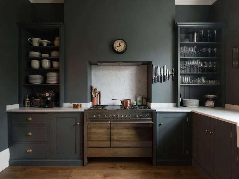
I’ll never forget the frantic call I got from a homeowner a few months after another painter had finished her kitchen. She’d fallen in love with a stunning, deep charcoal gray she saw in a magazine. It looked incredibly chic under the perfect lighting of the paint store. But in her actual kitchen, which faced north and had just one small window, it was a total dungeon. The room felt suffocatingly small, shadows made the countertops look permanently cluttered, and she told me it was genuinely depressing to be in there. We had to repaint the whole thing, a costly lesson for her that ran nearly $2,000. It was a stark reminder for me: picking a kitchen color isn’t just about aesthetics. It’s a technical choice that blends light, function, and paint chemistry.
So, this isn’t another list of trendy colors. Honestly, any color can look great if it’s used in the right way. Instead, think of this as a painter’s brain dump on how to choose colors that are not only beautiful but also tough enough for the job. We’ll get into the stuff that really matters—the science in the can, the tricks pros use for tricky colors, and how to make a choice you’ll love for years to come.
1. The Numbers Don’t Lie: What’s Really in the Can Matters Most
Before we even dream about colors, we have to talk about the technical stuff. This is what separates a paint job that looks good for a few months from one that looks great for years. Amateurs pick a color; pros look at the specs on the back of the chip.
LRV: The Most Important Number You’ve Never Heard Of
Flip over a paint swatch from a decent brand and you’ll see a number listed as “LRV.” That stands for Light Reflectance Value, and it’s a simple scale from 0 (think black hole) to 100 (pure, brilliant white). It tells you exactly how much light a color will bounce back into your room. For a kitchen, this is everything.
- High LRV (60-85+): These are your light and bright colors. They work like a set of mirrors, bouncing light all over the place. This makes any space feel bigger and more open. For a small kitchen or one that’s starved for natural light, I almost always push my clients toward a high LRV. It’s a safety thing, too—you need to see what you’re chopping!
- Mid-Range LRV (35-60): These colors start to absorb a good bit of light. They can create a really cozy and inviting vibe, but you’d better have a solid lighting plan with good under-cabinet lights.
- Low LRV (0-35): Welcome to the dark and moody zone. These colors drink up light. That charcoal gray my client chose? It probably had an LRV of around 10. Using a color this dark on all four walls demands a serious, layered lighting system to keep it from feeling like a cave.
Quick tip: For a kitchen that gets very little natural light, I tell my clients not to even consider a wall color with an LRV below 65. It’s just a recipe for a dark, sad room.
Paint Sheen: Where Beauty Meets Brute Strength
The sheen, or finish, is all about how shiny the paint is. This decision directly controls how easy it is to clean, which is non-negotiable in a kitchen.
Forget a table—let’s just break it down in plain English:
Matte (or Flat) has that gorgeous, velvety, no-shine look that’s popular right now. It’s fantastic at hiding bumps and imperfections on the wall. But for a kitchen? Absolutely not. I almost never recommend it. It’s like a sponge for stains. A single splash of spaghetti sauce means you’re not wiping, you’re repainting that spot. It’s just not built for a workspace.
Eggshell is the lowest sheen I’ll even consider for kitchen walls. It has a very subtle, low luster and offers decent washability for minor stuff. It’s a solid compromise if you really can’t stand shine, and modern formulas are much better than they used to be.
Satin is my go-to, the sweet spot for most kitchens. It has a soft, pearl-like glow that’s incredibly easy to wipe down. Grease, fingerprints, and food splatters come off without leaving a shiny, “burnished” spot on the wall. Plus, that little bit of sheen helps bounce more light around the room.
Semi-Gloss is the workhorse. It’s super durable, scrubbable, and reflects a ton of light. For decades, it was the only choice for kitchens. The big downside? That high shine highlights every single nail pop, ding, or ripple in the drywall. To make it look good, your walls need what we in the trade call a “Level 5 finish.” (Heads up: that means the wall is perfectly, flawlessly smooth, a result of extra skim-coating and sanding. It’s almost impossible for a DIYer to achieve, which is why semi-gloss can be a risky choice for walls). I usually save it for trim, doors, and cabinets.
Oh yeah, and about cabinets… they need their own special paint. We use super-durable products like a urethane alkyd enamel. Think of brands like Sherwin-Williams Emerald Urethane or Benjamin Moore ADVANCE. This stuff cures to a hard, furniture-grade finish that can handle the daily slamming of doors and drawers.
2. How to Handle the “Difficult” Colors Without a Meltdown
Some colors just have a bad reputation. It’s not that they’re ugly; they’re just technically demanding. They take more skill, more time, and—yep—more money to get right.
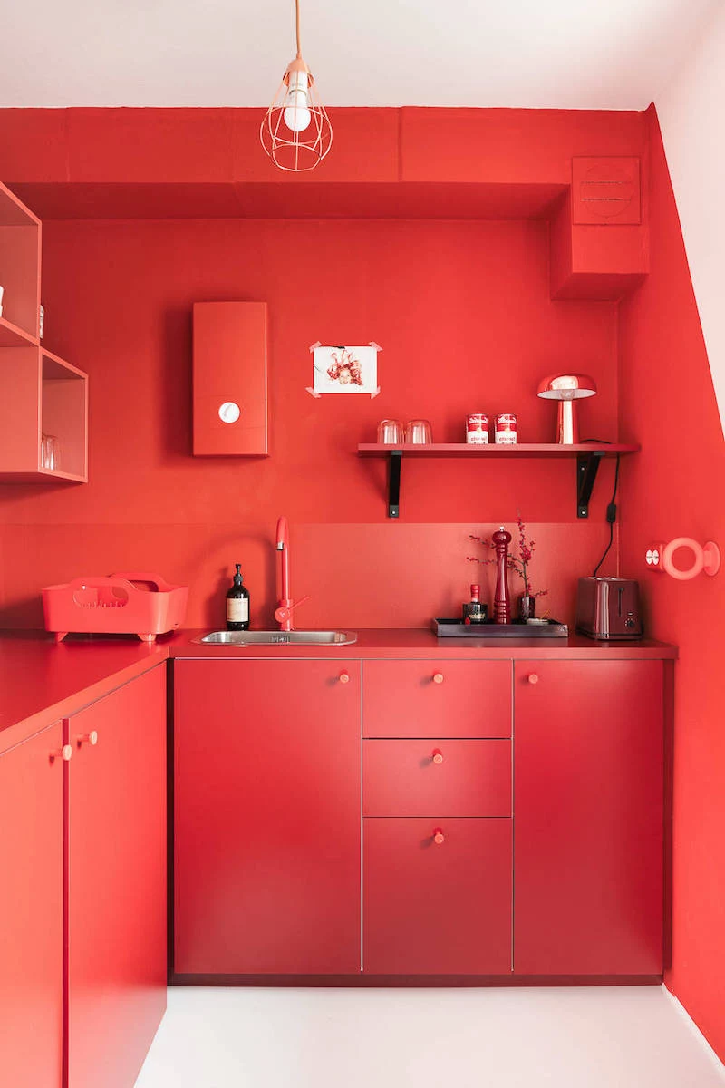
The Challenge of Saturated Reds and Yellows
Vibrant reds and sunny yellows are notoriously tough to apply. The problem is chemistry. The pigments used for these brilliant colors are naturally translucent, meaning they don’t cover very well. You can’t just slap two coats over white and call it a day; it will look streaky and cheap.
Here’s how the pros tackle it:
First, we NEVER use a standard white primer. That’s the #1 mistake homeowners make. For these colors, you need a special gray-tinted primer. It sounds weird, I know, but a specific shade of gray creates a neutral base that helps the red or yellow pop in fewer coats. Some paint lines even have a specific “P4” primer just for reds.
Second, we budget for more time and materials. A normal job is one coat of primer and two topcoats. For a deep red, we plan for a tinted primer and at least three, sometimes four or even five, thin topcoats. Be prepared for the material cost to be up to 50% higher for a deep red, and the labor to take an extra 4-5 hours for an average room.
Here’s a way to get that look without the headache and cost:
Project-in-a-Box: The Perfect Red Accent Wall
- Your Shopping List: 1 Gallon of high-adhesion, gray-tinted primer (expect to pay around $40-$50). 1 Gallon of premium red paint in a satin finish (this can run you $70-$90). A quality roller, a good brush for cutting in, painter’s tape, and drop cloths.
- The Plan: Use that powerful, expensive red on just one strategic wall—like the wall behind your dining nook or the base of your kitchen island. You get all the dramatic impact without overwhelming the space or your wallet.
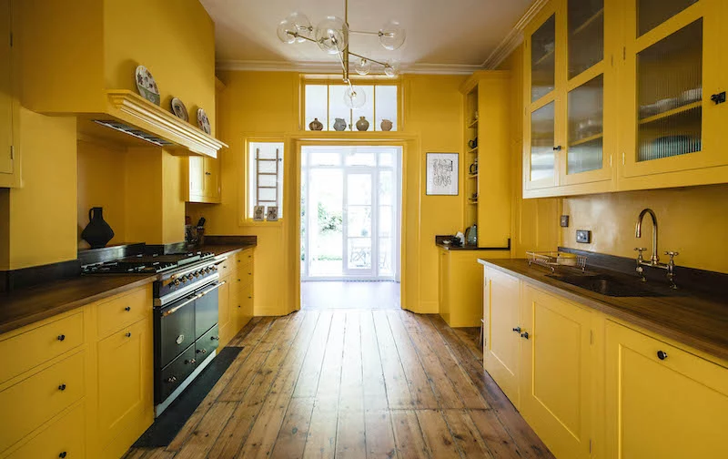
Working with Those Dark, Moody Hues
Dark kitchens can be absolutely stunning, but they come with the practical challenges my panicked client faced. Dark colors swallow light, so you have to give it back to them.
Before I even twist the lid off a can of navy blue or forest green paint, I have a serious chat with the homeowner about lighting. If you’re going dark, excellent under-cabinet task lighting isn’t a nice-to-have; it’s a mandatory safety feature. You have to be able to see what you’re doing!
Quick Win: Don’t have time to paint? Go to Home Depot or Lowe’s today and buy two different types of LED lightbulbs—one “warm white” (around 2700K) and one “daylight” (5000K). They cost a few bucks each. Swap them out in your kitchen tonight and see how dramatically they change your current wall color. It’s the cheapest, fastest way to completely change your room’s mood and a critical first step before choosing a dark paint.
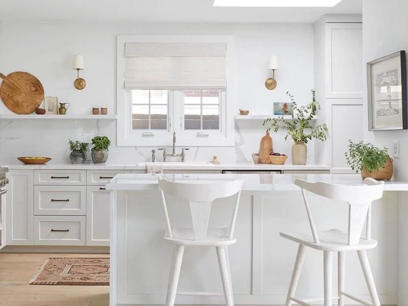
3. The Sneaky Complexity of a “Simple” White Kitchen
So, you want to play it safe with a white kitchen? Easy enough, right? Wrong. Getting white right is surprisingly tricky, and it all comes down to one thing: undertones.
I once had a new apprentice on a job. The client wanted a classic all-white kitchen. He picked a beautiful white tile for the backsplash and what he thought was a matching white for the cabinets. The problem? The tile had a very subtle blueish-cool undertone, and the cabinet paint had a creamy, yellowish-warm undertone. When they were next to each other, the expensive cabinets looked dingy and almost dirty, while the tile looked sterile and cold. It was a disaster we had to fix.
White is rarely just white. There are cool whites with hints of blue, gray, or green, which feel crisp and modern. And there are warm whites with hints of yellow, pink, or beige, which feel cozier and more traditional. The key is to see them in your space. Always, always get a sample pot. Paint a large poster board and hold it up in your kitchen next to your countertops, your backsplash, your floor, and your appliances at different times of the day. Only then will you see its true personality and know if it’s the right one for you.
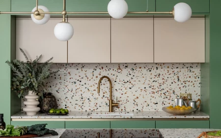
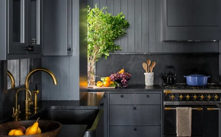
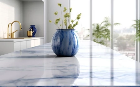
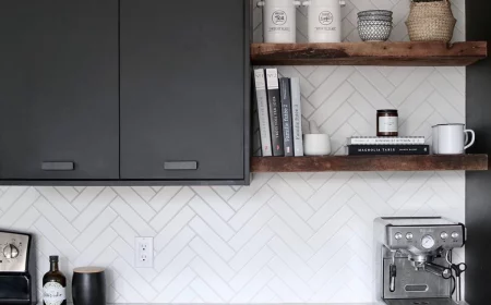
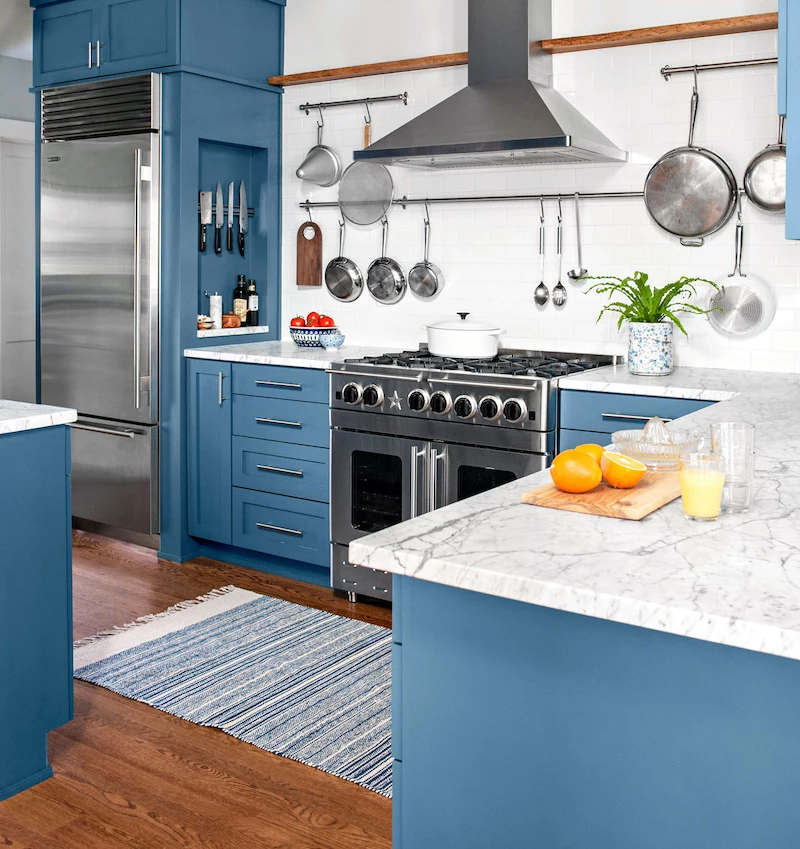
Inspirational Gallery
The Pro’s Choice for Cabinets: Alkyd vs. Urethane
Waterborne Alkyd (e.g., Benjamin Moore ADVANCE): Delivers a coveted, super-smooth, almost oil-like finish that levels beautifully, hiding brush strokes. The trade-off? A longer cure time (up to 30 days) during which you need to be gentle.
Urethane Acryclic (e.g., Sherwin-Williams Emerald Urethane Trim Enamel): Known for its exceptional hardness and durability right out of the can. It cures faster and creates a tough, scrubbable surface ideal for high-traffic kitchens.
For a flawless look with patience, choose alkyd. For maximum durability in a busy family kitchen, urethane is your champion.
A premium paint job is 80% preparation. The final coat is just the victory lap.
This old painter’s adage is the gospel truth in a kitchen. Skipping the clean-sand-prime sequence is the number one cause of chipping, peeling, and paint failure. Degreasing cabinets with a TSP substitute isn’t optional; it’s the foundation of a finish that lasts.
Looking for a high-impact update without the commitment of painting every surface? Zero in on the island. It’s the perfect place to experiment with a bold, contrasting color.
- Deep navy or forest green can ground the space and add a touch of luxury.
- A warm, earthy terracotta can make an all-white kitchen feel more inviting.
- It requires less paint, less time, and instantly becomes the room’s stunning focal point.
What about the ‘fifth wall’?
Don’t neglect the ceiling! Painting it stark builder’s white can make a kitchen with rich, warm walls feel disconnected and cold. For a more cohesive, designer look, consider painting the ceiling a very light version of your wall color (ask the paint store for a 25% tint) or a soft complementary shade. In a kitchen with creamy beige walls, a barely-there blush or a pale, misty blue on the ceiling can add unexpected warmth and sophistication.
The one thing you can’t ignore: Your kitchen’s fixed elements. That paint chip might look perfect in the store, but hold it up against your granite countertop’s veining, your backsplash tile’s undertones, and your floor’s color. A color can have a subtle green undertone that looks beautiful until it’s next to your pinkish-beige tile, at which point it will look sickly. Always test colors in context with the elements you aren’t changing.
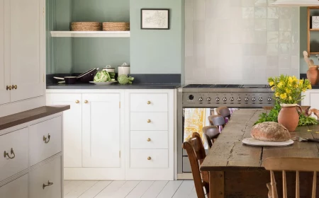
The allure of the English kitchen often lies in its soft, almost chalky aesthetic. This look is less about high-gloss and more about sophisticated, muted depth. Brands like Farrow & Ball or Little Greene specialize in these complex, pigment-rich colors that shift beautifully with the light. Think shades like ‘Pigeon’ or ‘Setting Plaster’—colors that feel lived-in and timeless, creating an atmosphere of cozy, effortless elegance rather than a sterile, brand-new showroom.
- A perfectly smooth, factory-like finish.
- No brush marks or roller stipple, even on detailed cabinet doors.
- Extreme durability and a hard, even coating in every corner and crevice.
The secret? A professional spray application. While DIY-ing with a brush and roller is possible, for a truly high-end, resilient cabinet finish, nothing beats having them professionally sprayed. It’s an investment that pays off in the final look and longevity.
A typical satin or eggshell paint is formulated to withstand around 1,000 to 2,500 scrub cycles. A high-quality semi-gloss can withstand over 5,000.
What does this mean for your kitchen? While a matte finish is trendy for a living room, it’s a disaster waiting to happen behind a sink or stove. Grease splatters and food smudges require frequent wiping. Opt for a Satin, Semi-Gloss, or a specialty matte finish designed for kitchens (like Benjamin Moore’s Scuff-X) for walls and backsplashes to ensure you can clean them without scrubbing the paint right off.
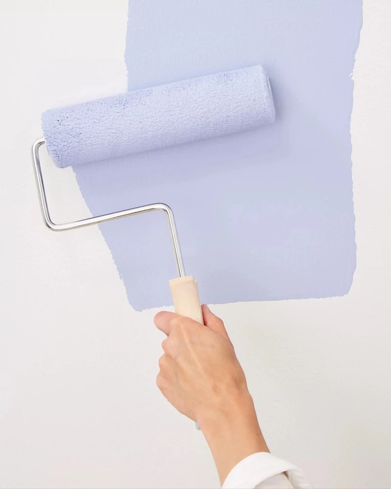
Forget taping a tiny 2×2 inch chip to the wall. To truly see how a color will live in your kitchen, you need to test it at scale. Here’s how the pros do it:
- Get a sample pot, not just a chip.
- Paint two coats onto at least two large (12×12 inch or bigger) foam core boards.
- Move these sample boards around the room throughout the day. Check them in the morning light, at high noon, and under your artificial evening lights.
- Place one board next to a window and another in the darkest corner to see the full range of the color.
After years of cool grays dominating kitchen design, the pendulum is swinging toward warmth and comfort. We’re seeing a huge trend toward complex, earthy neutrals that feel grounding. Think mushroom-inspired ‘greiges’ like Sherwin-Williams’ ‘Accessible Beige,’ soft sage greens like Benjamin Moore’s ‘October Mist,’ and even deep, warm browns. These colors connect the kitchen to nature and create a welcoming, stable environment that serves as a sanctuary from the outside world.