Stop Painting Small Rooms White! Here’s What the Pros Do Instead
After more than two decades with a brush in my hand, I’ve walked into hundreds of homes, and honestly, so many people have the same worry. They’ll point to a small bedroom, a cramped home office, or a narrow hallway and say, “It’s a lost cause. Just paint it white.”
In this article
It’s a common belief that white is the only answer for a tiny space. But that’s one of the biggest myths in my trade. The truth is, making a room feel larger isn’t about one specific color at all. It’s about understanding how color, the paint’s finish, and the light in the room all work together. A can of paint is a powerful tool, but it’s not magic. The real transformation comes from knowing the principles behind what you’re putting on the walls.
I’ve seen a dark, moody color make a tiny powder room feel like an impossibly chic jewel box. I’ve also seen a brilliant white make a small room feel cold, stark, and even smaller. The difference was all in the strategy. This is the field-tested knowledge that can help you see your small rooms not as problems, but as big opportunities.
The Secret Number on the Back of the Paint Chip
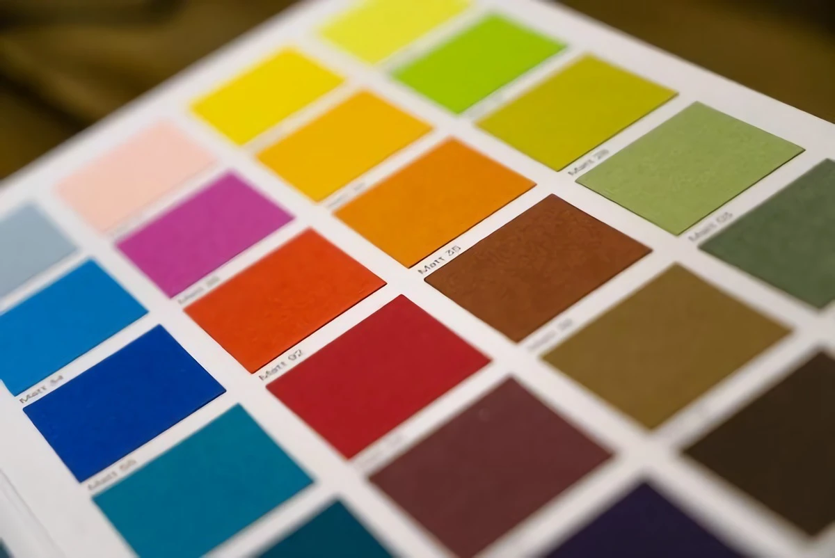
Before you get lost in a sea of paint swatches, you need to understand one key concept: Light Reflectance Value, or LRV. This is probably the single most important number when you’re dealing with a small space, yet most people completely overlook it.
So what is it? Every paint chip has an LRV number printed on the back, usually on a scale from 0 to 100. It simply measures how much light a color reflects back into the room. A color with an LRV of 0 is absolute black (it absorbs all light), while an LRV of 100 is pure white (it reflects all light). Everything else falls somewhere in between.
- High LRV (60 and up): These are your light and airy colors. They bounce a ton of light around, which is the classic approach for making a space feel open.
- Mid-range LRV (20-59): These colors absorb a good bit of light. They can make a space feel much cozier and often have more character than a simple off-white.
- Low LRV (below 20): These are the dark, saturated colors that soak up most of the light. Used correctly, they can create incredible depth and drama, which we’ll get to in a minute.
Understanding LRV helps you move past vague ideas like “light gray.” A soft gray with an LRV of 62 will brighten a room, while a moodier one with an LRV of 45 will give it more substance and weight. This number is your starting point.

Your Windows Are Lying to You
I once had a client who chose a beautiful greige under the fluorescent lights of a home improvement store. It looked perfect. But when we painted her north-facing living room, she called me in a panic. The color looked dull, flat, and almost purple on her walls. This is a lesson you learn fast in this business: the light source changes everything.
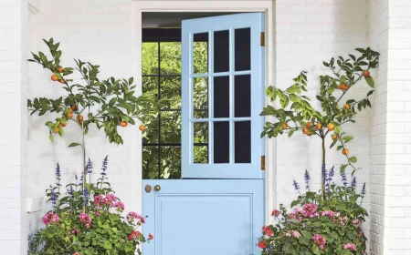
- North-Facing Rooms: The light here is cool and indirect. Colors can look bluer and more muted. A stark, clean white can feel sterile and cold. I often recommend whites with a creamy or yellow undertone—think the color of vanilla ice cream—to counteract that coolness.
- South-Facing Rooms: These rooms are a dream. They get bright, warm light all day and can handle almost any color. Just be careful with very warm colors, like a strong yellow, which can become overpowering in all that sunlight.
- East-Facing Rooms: You get bright, warm light in the morning and cooler, shadier light in the afternoon. Look for versatile colors like soft greens or complex neutrals that look good in both settings.
- West-Facing Rooms: The light is softer in the morning but gets intense and warm in the late afternoon. That warm evening glow can turn a neutral beige into a fiery orange. Cool colors often work beautifully here to balance things out.
Heads up! Never, ever choose a color just by looking at a tiny chip in the store. Buy sample pots of your top two or three choices. They usually cost between $5 and $10 each, and it’s the best money you’ll spend. Paint large squares (at least 2×2 feet) on a couple of different walls in the actual room. Live with them for a few days. See how they change from morning to night. This isn’t an optional step; it’s essential for avoiding a costly mistake.
The Pro-Level Tricks for Small Spaces
A good painter knows it’s not just what you put on the walls, but how you apply it. The sheen of the paint and where you put the color are just as important as the shade itself.
The Sheen Factor: It’s Not Just About Shine
Paint sheen, or finish, is all about how shiny the surface is. This directly impacts how light behaves in your small room.
To be frank, my go-to for small spaces is almost always satin. It has a soft, beautiful glow that reflects some light without being distractingly shiny. This gentle reflection helps open up a space and makes colors feel more alive. Plus, it’s durable and easy to clean. Expect to pay between $50 and $80 for a gallon of high-quality satin paint, but it’s worth every penny over the cheaper stuff.
A matte (or flat) finish has no shine, which is great for hiding imperfections on older walls. The downside? It absorbs light, which can make a room feel a bit flat, and it’s notoriously difficult to clean. I usually save it for ceilings. A gallon of decent matte paint is cheaper, typically running $25 to $40.
Then you have semi-gloss and gloss finishes. They are highly reflective and super durable, which seems great for a small room, right? The problem is, they highlight every single flaw in your wall. Every tiny bump, dent, or roller mark will be magnified. I reserve semi-gloss for trim, doors, and maybe cabinets. Using a high-gloss on a ceiling can look amazing, but it requires a perfectly smooth, flawless surface—what the pros call a “level-5 finish.” (That’s the kind of pristine, mirror-smooth wall you see in high-end design, and it’s a tough, expensive job for a specialist.)
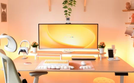
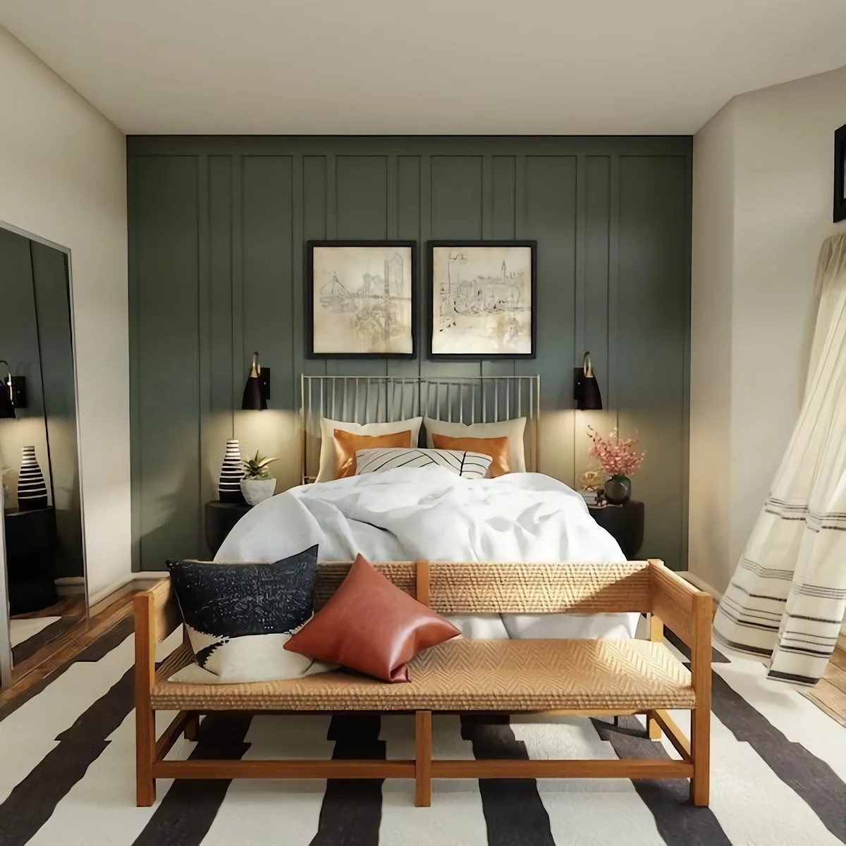
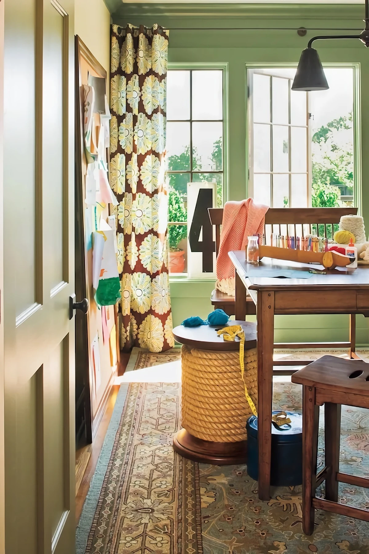
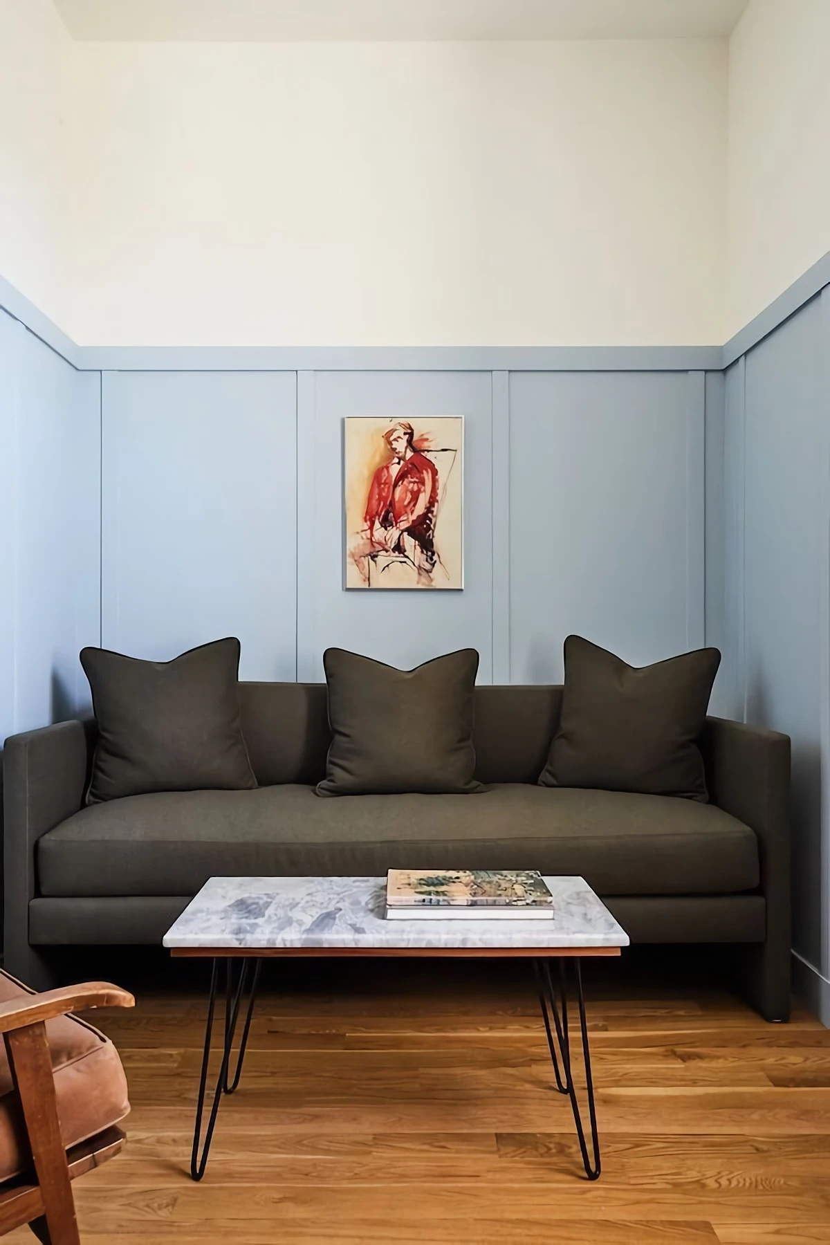
Color Drenching: The Ultimate Small Room Hack
Okay, here it is. One of the most effective techniques for making a small room feel not just larger, but also incredibly sophisticated, is called “color drenching.”
It sounds dramatic, but the idea is simple: you paint the walls, the baseboards, the window and door trim, and sometimes even the doors and ceiling all in the same color. By erasing the jarring lines of white trim, you create a seamless, continuous space. Your eye doesn’t stop at the edges of the wall, so the room feels more expansive and unified. It’s a bold move, but the payoff is huge.
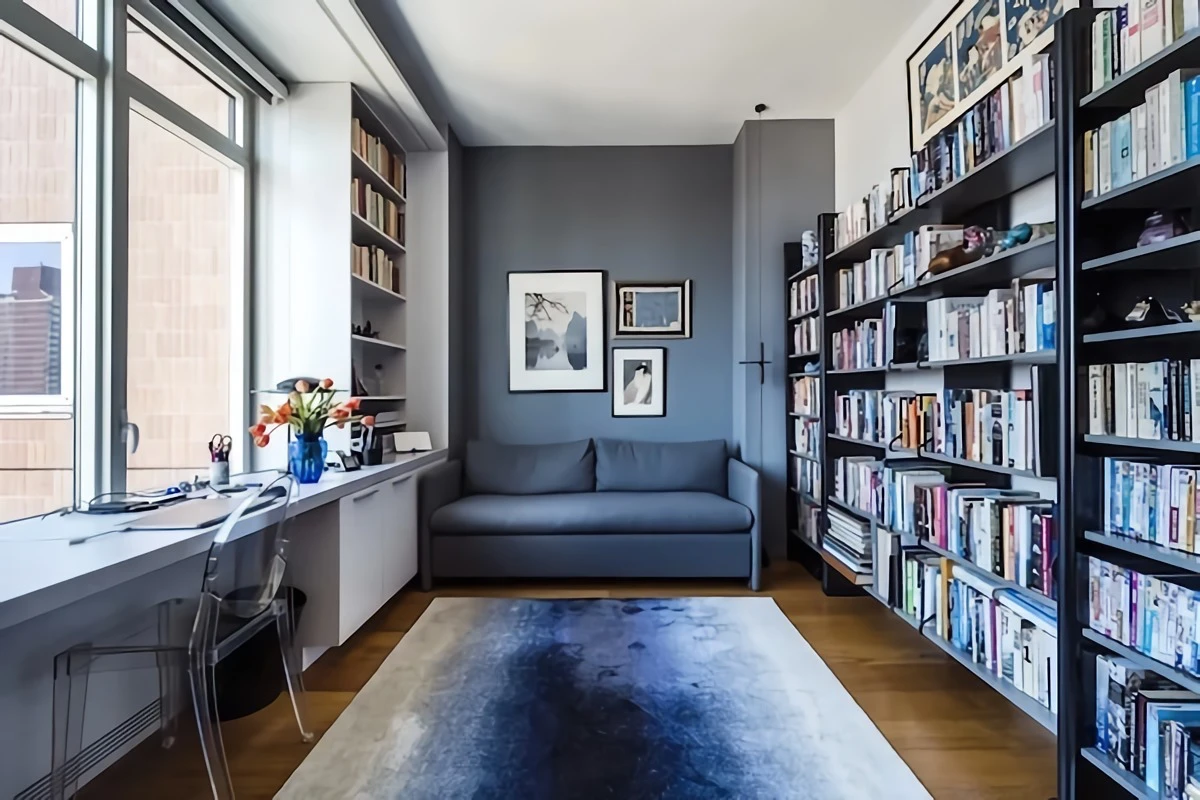
I once worked on a tiny home office that had standard white walls and dark, dated wood trim. It felt choppy and small. We drenched the entire room—walls, trim, even an old radiator—in a deep, moody green with a satin finish. It instantly felt bigger, calmer, and way more expensive.
So, how do you do it?
The most common approach is to use the same color for both the walls and trim but vary the sheen for durability. For instance, use a satin finish on the walls and a semi-gloss in the exact same color on the trim and doors. This gives you a subtle, elegant shift in texture while keeping the look cohesive. For a more modern, uniform look, you can use the same satin finish on everything.
And the ceiling? You can bring the color right up and over for that cozy, jewel-box effect. Or, you can paint the ceiling a slightly lighter version of the wall color (ask the paint store to mix a half-strength formula) to give the illusion of more height.
The biggest mistake I see people make is chickening out and leaving the trim bright white. It completely defeats the purpose of color drenching and makes the room feel choppy all over again!
Your Game Plan and Shopping List
Feeling ready to tackle that small room? Here’s a quick checklist to get you started.
Quick Challenge: Try This Now
Go stand in your smallest room. Now, use your hand to cover up the white trim around the door or the baseboards. Imagine it’s all the same color as the wall. See how the space suddenly feels less busy and more expansive? That’s the power of color drenching!
Painter’s Shopping List:
- Quality Paint: 1 gallon of satin paint in your chosen color. ($50-$80)
- Sample Pots: 2-3 of your top color choices. ($5-$10 each)
- Good Painter’s Tape: The blue or green kind is best. ($8-$15)
- A Good Roller and Frame: A 3/8″ nap is perfect for most walls. ($15-$25 for a set)
- An Angled Brush: For cutting in around trim and corners. ($10-$20)
- Drop Cloths: To protect your floors and furniture. ($5-$25)
- Trays and Liners: For easy cleanup. ($5-$10)
Remember, your small room isn’t a lost cause. It’s a canvas waiting for a smart strategy. Forget the old rules and have a little fun with it. You might be shocked at how big a small space can feel.
Inspiration:
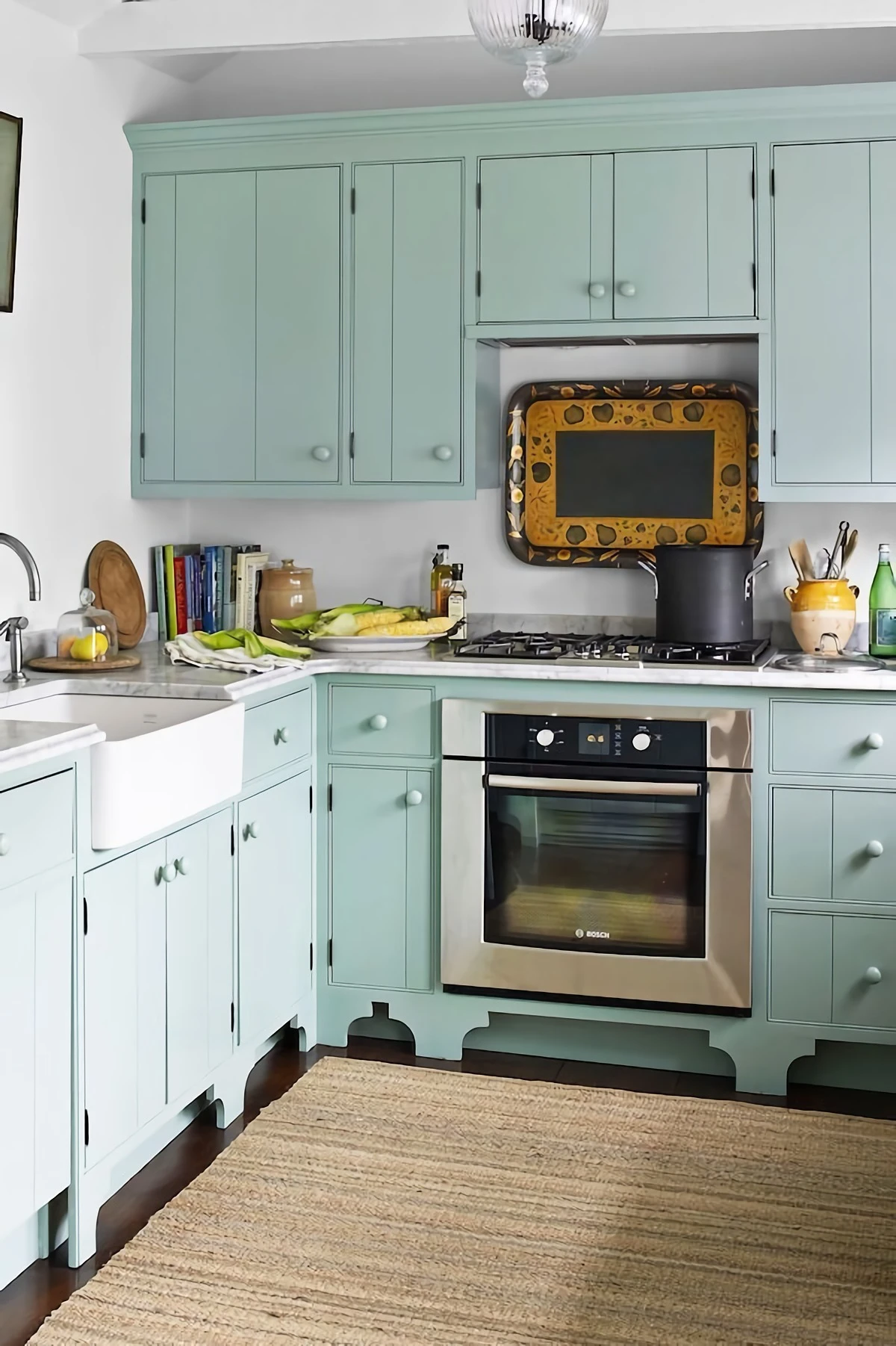
Matte Finish: This popular choice, like Farrow & Ball’s signature Estate Emulsion, offers a soft, velvety look that excels at hiding surface imperfections. However, its low reflectivity absorbs light, which can make a space feel more contained. It’s perfect for creating a cozy, enveloping atmosphere in a bedroom or study.
Satin/Eggshell Finish: With a subtle lustre, finishes like Benjamin Moore’s Aura in Eggshell bounce more light around the room, creating an illusion of space and adding a touch of vitality. The downside? This sheen can highlight drywall flaws. It’s a fantastic choice for hallways and small living areas that need a lift.
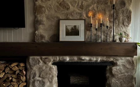
More than 75% of homeowners paint their ceilings ‘ceiling white’ out of habit, not strategy.
This is a missed opportunity! Treating the ceiling as a ‘fifth wall’ can transform a room. For a subtle lift, paint the ceiling a shade that’s two tints lighter on the same paint strip as your wall color. In a powder room or small den, a bold, dark ceiling in a high-gloss finish—think a deep navy or charcoal—can create a dramatic, reflective plane that feels surprisingly expansive and chic.
- Creates a seamless, enveloping feel that blurs the room’s edges.
- Makes ceilings appear higher by eliminating the harsh contrast line of white trim.
- Adds a sophisticated, high-design look with minimal effort.
The secret? Color drenching. This designer trick involves painting not just the walls, but also the trim, doors, and sometimes even the ceiling in the same color. It’s particularly effective with mid-range colors like Sherwin-Williams’ ‘Pewter Green’ or a soft greige, tricking the eye into seeing one continuous, spacious surface.
Can a bold color actually feel… calm?
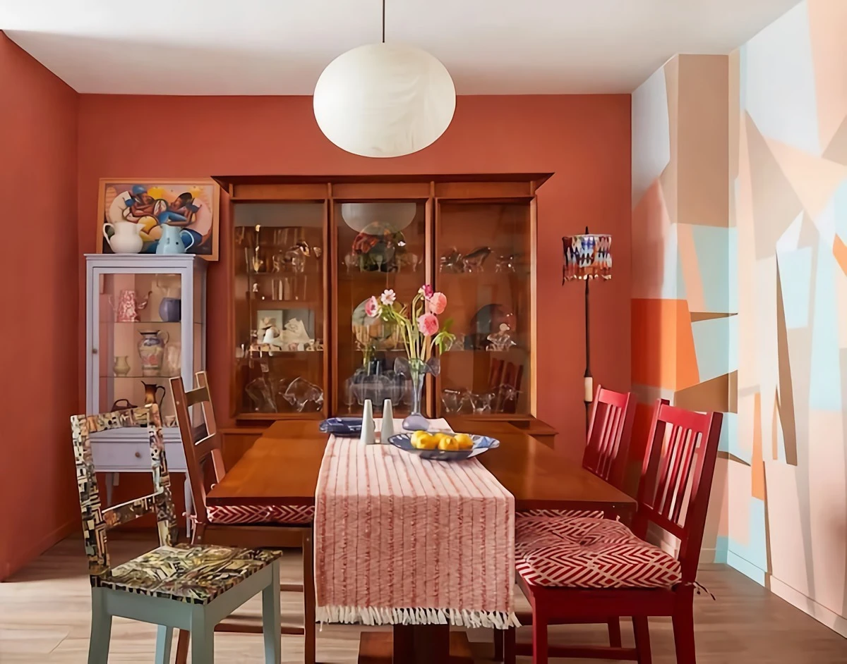
Absolutely, if you choose the right one. Forget jarring primary colors and look to nature-inspired, complex hues. A deep teal like Behr’s ‘In the Moment’ or a rich terracotta reminiscent of baked earth can create a feeling of sanctuary. These colors have an inherent depth that makes a small room feel like a protective haven rather than just a confined space. They absorb visual noise and provide a rich, quiet backdrop for your life.